Does data coverage impact the HADCRUT4 and NASA GISS Temperature Anomalies?

Introduction

This post started with the title “HADCRUT4 and NASA GISS Temperature Anomalies – a Comparison by Latitude“.  After deriving a global temperature anomaly from the HADCRUT4 gridded data, I was intending to compare the results with GISS’s anomalies by 8 latitude zones. However, this opened up an intriguing issue. Are global temperature anomalies impacted by a relative lack of data in earlier periods? The leads to a further issue of whether infilling of the data can be meaningful, and hence be considered to “improve” the global anomaly calculation.

A Global Temperature Anomaly from HADCRUT4 Gridded Data

In a previous post, I looked at the relative magnitudes of early twentieth century and post-1975 warming episodes. In the Hadley datasets, there is a clear divergence between the land and sea temperature data trends post-1980, a feature that is not present in the early warming episode. This is reproduced below as Figure 1.

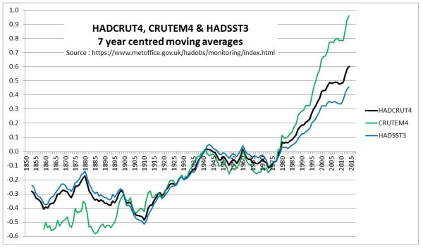
Figure 1 : Graph of Hadley Centre 7 year moving average temperature anomalies for Land (CRUTEM4), Sea (HADSST3) and Combined (HADCRUT4)

The question that needs to be answered is whether the anomalous post-1975 warming on the land is due to real divergence, or due to issues in the estimation of global average temperature anomaly.

In another post – The magnitude of Early Twentieth Century Warming relative to Post-1975 Warming – I looked at the NASA Gistemp data, which is usefully broken down into 8 Latitude Zones. A summary graph is shown in Figure 2.

Figure 2 : NASA Gistemp zonal anomalies and the global anomaly

This is more detail than the HADCRUT4 data, which is just presented as three zones of the Tropics, along with Northern and Southern Hemispheres. However, the Hadley Centre, on their HADCRUT4 Data: download page, have, under  HadCRUT4 Gridded data: additional fields, a file HadCRUT.4.6.0.0.median_ascii.zip. This contains monthly anomalies for 5o by 5o grid cells from 1850 to 2017. There are 36 zones of latitude and 72 zones of longitude. Over 2016 months, there are over 5.22 million grid cells, but only 2.51 million (48%) have data. From this data, I have constructed a global temperature anomaly. The major issue in the calculation is that the grid cells are of different areas. A grid cell nearest to the equator at 0o to 5o has about 23 times the area of a grid cell adjacent to the poles at 85o to 90o. I used the appropriate weighting for each band of latitude.

The question is whether I have calculated a global anomaly similar to the Hadley Centre. Figure 3 is a reconciliation with the published global anomaly mean (available from here) and my own.

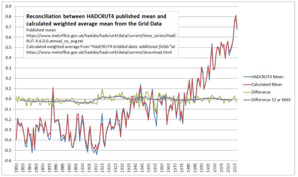
Figure 3 : Reconciliation between HADCRUT4 published mean and calculated weighted average mean from the Gridded Data

Prior to 1910, my calculations are slightly below the HADCRUT 4 published data. The biggest differences are in 1956 and 1915. Overall the differences are insignificant and do not impact on the analysis.

I split down the HADCRUT4 temperature data by eight zones of latitude on a similar basis to NASA Gistemp. Figure 4 presents the results on the same basis as Figure 2.

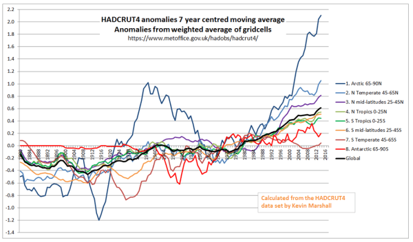
Figure 4 : Zonal surface temperature anomalies a the global anomaly calculated using the HADCRUT4 gridded data.

Visually, there are a number of differences between the Gistemp and HADCRUT4-derived zonal trends.

A potential problem with the global average calculation

The major reason for differences between HADCRUT4 & Gistemp is that the latter has infilled estimated data into areas where there is no data. Could this be a problem?

In Figure 5, I have shown the build-up in global coverage. That is the percentage of 5o by 5o grid cells with an anomaly in the monthly data.

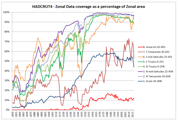
Figure 5 : HADCRUT4 Change in the percentage coverage of each zone in the HADCRUT4 gridded data. 

Figure 5 shows a build-up in data coverage during the late nineteenth and early twentieth centuries. The World Wars (1914-1918 & 1939-1945) had the biggest impact on the Southern Hemisphere data collection. This is unsurprising when one considers it was mostly fought in the Northern Hemisphere, and European powers withdrew resources from their far-flung Empires to protect the mother countries. The only zones with significantly less than 90% grid coverage in the post-1975 warming period are the Arctic and the region below 45S. That is around 19% of the global area.

Finally, comparing comparable zones in the Northen and Southern hemispheres, the tropics seem to have comparable coverage, whilst for the polar, temperate and mid-latitude areas the Northern Hemisphere seems to have better coverage after 1910.

This variation in coverage can potentially lead to wide discrepancies between any calculated temperature anomalies and a theoretical anomaly based upon one with data in all the 5o by 5o grid cells. As an extreme example, with my own calculation, if just one of the 72 grid cells in a band of latitude had a figure, then an “average” would have been calculated for a band right around the world 555km (345 miles) from North to South for that month for that band. In the annual figures by zone, it only requires one of the 72 grid cells, in one of the months, in one of the bands of latitude to have data to calculate an annual anomaly. For the tropics or the polar areas, that is just one in 4320 data points to create an anomaly. This issue will impact early twentieth-century warming episode far more than the post-1975 one. Although I would expect the Hadley centre to have done some data cleanup of the more egregious examples in their calculation, potentially lack of data in grid cells could have quite random impacts, thus biasing the global temperature anomaly trends to an unknown, but significant extent. An appreciation of how this could impact can be appreciated from an example of NASA GISS Global Maps.

NASA GISS Global Maps Temperature Trends Example

NASA GISS Global Maps from GHCN v3 Data provide maps with the calculated change in average temperatures. I have run the maps to compare annual data for 1940 with a baseline of 1881-1910, capturing much of the early twentieth-century warming. The maps are at both the 1200km and 250km smoothing.

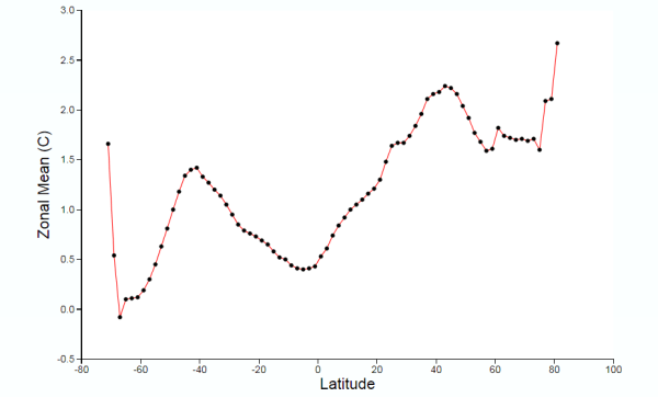
Figure 6 : NASA GISS Global anomaly Map and average anomaly by Latitude comparing 1940 with a baseline of 1881 to 1910 and a 1200km smoothing radius

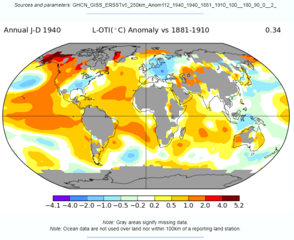
Figure 7 : NASA GISS Global anomaly Map and average anomaly by Latitude comparing 1940 with a baseline of 1881 to 1910 and a 250km smoothing radius. 

With respect to the maps in figures 6 & 7

  • There is no apparent difference in the sea data between the 1200km and 250km smoothing radius, except in the polar regions with more cover in the former. The differences lie in the land area.
  • The grey areas with insufficient data all apply to the land or ocean areas in polar regions.
  • Figure 6, with 1200km smoothing, has most of the land infilled, whilst the 250km smoothing shows the lack of data coverage for much of South America, Africa, the Middle East, South-East Asia and Greenland.

Even with these land-based differences in coverage, it is clear that from either map that at any latitude there are huge variations in calculated average temperature change. For instance, take 40N. This line of latitude is North of San Francisco on the West Coast USA, clips Philidelphia on the East Coast. On the other side of the Atlantic, Madrid, Ankara and Beijing are at about 40N. There are significant points on the line on latitude with estimate warming greater than 1C (e.g. California), whilst at the same time in Eastern Europe, cooling may have exceeded 1C in the period. More extreme is at 60N (Southern Alaska, Stockholm, St Petersburg) the difference in temperature along the line of latitude is over 3C. This compares to a calculated global rise of 0.40C.

This lack of data may have contributed (along with a faulty algorithm) to the differences in the Zonal mean charts by Latitude. The 1200km smoothing radius chart bears little relation to the 250km smoothing radius. For instance:-

  •  1200km shows 1.5C warming at 45S, 250km about zero. 45S cuts through South Island, New Zealand.
  • From the equator to 45N, 1200km shows rise from 0.5C to over 2.0C, 250km shows drop from less than 0.5C to near zero, then rise to 0.2C. At around 45N lies Ottowa, Maine, Bordeaux, Belgrade, Crimea and the most Northern point in Japan.

The differences in the NASA Giss Maps, in a period when available data covered only around half the 2592 5o by 5o grid cells, indicate quite huge differences in trends between different areas. As a consequence, trying to interpolate warming trends from one area to adjacent areas appears to give quite different results in terms of trends by latitude.

Conclusions and Further Questions

The issue I originally focussed upon was the relative size of the early twentieth-century warming to the Post-1975. The greater amount of warming in the later period seemed to be due to the greater warming on land covering just 30% of the total global area. The sea temperature warming phases appear to be pretty much the same.

The issue that I focussed upon was a data issue. The early twentieth century had much less data coverage than after 1975. Further, the Southern Hemisphere had worse data coverage than the Northern Hemisphere, except in the Tropics. This means that in my calculation of a global temperature anomaly from the HADCRUT4 gridded data (which in aggregate was very similar to the published HADCRUT4 anomaly) the average by latitude will not be comparing like with like in the two warming periods. In particular, in the early twentieth-century, a calculation by latitude will not average right the way around the globe, but only on a limited selection of bands of longitude. On average this was about half, but there are massive variations. This would be alright if the changes in anomalies were roughly the same over time by latitude. But an examination of NASA GISS global maps for a period covering the early twentieth-century warming phase reveals that trends in anomalies at the same latitude are quite different over time. This implies that there could be large, but unknown, biases in the data.

I do not believe the analysis ends here. There are a number of areas that I (or others) can try to explore.

  1. Does the NASA GISS infilling of the data get us closer or further away from a what a global temperature anomaly would look like with full data coverage? My guess, based on the extreme example of Antartica trends (discussed here) is that the infilling will move away from the more perfect trend. The data could show otherwise.
  2. Are the changes in data coverage on land more significant than the global average or less? Looking at CRUTEM4 data could resolve this question.
  3. Would anomalies based upon similar grid coverage after 1900 give different relative trend patterns to the published ones based on dissimilar grid coverage?

Whether I get the time to analyze these is another issue.

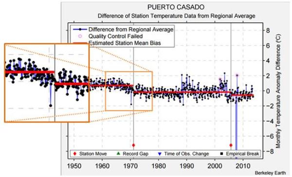
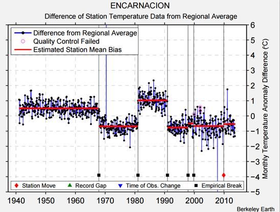
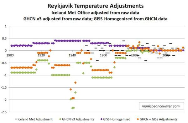
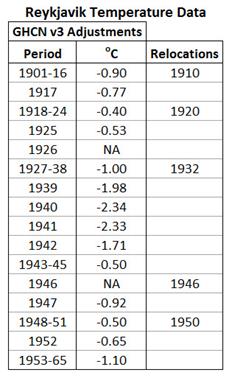
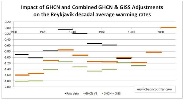
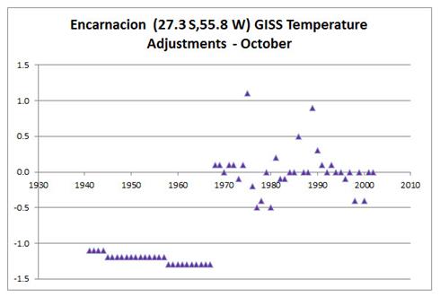
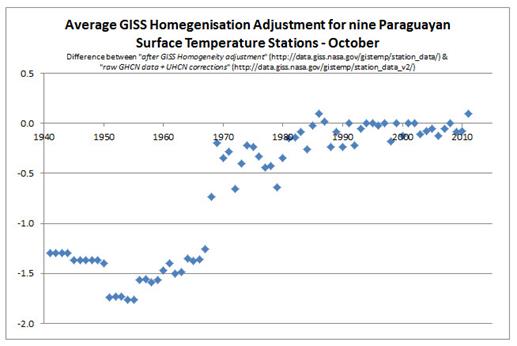
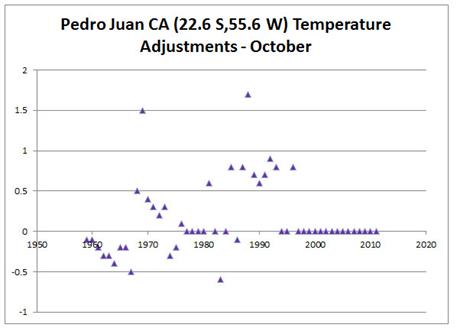
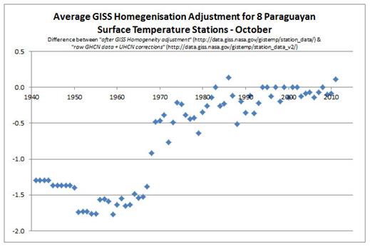
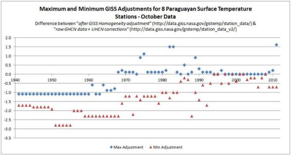
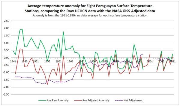
Finally, the problem of trends varying considerably and quite randomly across the globe is the same issue that I found with land data homogenisation discussed here and here. To derive a temperature anomaly for a grid cell, it is necessary to make the data homogeneous. In standard homogenisation techniques, it is assumed that the underlying trends in an area is pretty much the same. Therefore, any differences in trend between adjacent temperature stations will be as a result of data imperfections. I found numerous examples where there were likely differences in trend between adjacent temperature stations. Homogenisation will, therefore, eliminate real but local climatic trends. Averaging incomplete global data where missing data could contain regional but unknown data trends may cause biases at a global scale.

Kevin Marshall

The magnitude of Early Twentieth Century Warming relative to Post-1975 Warming

I was browsing the Berkeley Earth website and came across their estimate of global average temperature change. Reproduced as Figure 1.

Figure 1 – BEST Global Temperature anomaly

The 10-year moving average line in red clearly shows warming from the early twentieth century, (the period 1910 to 1940) being very similar warming from the mid-1970s to the end of the series in both time period and magnitude. Maybe the later warming period is up to one-tenth of a degree Celsius greater than the earlier one. The period from 1850 to 1910 shows stasis or a little cooling, but with high variability. The period from the 1940s to the 1970s shows stasis or slight cooling, and low variability.

This is largely corroborated by HADCRUT4, or at least the version I downloaded in mid-2014.

Figure 2 – HADCRUT4 Global Temperature anomaly

HADCRUT4 estimates that the later warming period is about three-twentieths of a degree Celsius greater than the earlier period and that the recent warming is slightly less than the BEST data.

The reason for the close fit is obvious. 70% of the globe is ocean and for that BEST use the same HADSST dataset as HADCRUT4. Graphics of HADSST are a little hard to come by, but KevinC at skepticalscience usefully produced a comparison of the latest HADSST3 in 2012 with the previous version.

Figure 3  – HADSST Ocean Temperature anomaly from skepticalscience 

This shows the two periods having pretty much the same magnitudes of warming.

It is the land data where the differences lie. The BEST Global Land temperature trend is reproduced below.

Figure 4 – BEST Global Land Temperature anomaly

For BEST global land temperatures, the recent warming was much greater than the early twentieth-century warming. This implies that the sea surface temperatures showed pretty much the same warming in the two periods. But if greenhouse gases were responsible for a significant part of global warming then the warming for both land and sea would be greater after the mid-1970s than in the early twentieth century. Whilst there was a rise in GHG levels in the early twentieth century, it was less than in the period from 1945 to 1975, when there was no warming, and much less than the post-1975 when CO2 levels rose massively. Whilst there can be alternative explanations for the early twentieth-century warming and the subsequent lack of warming for 30 years (when the post-WW2 economic boom which led to a continual and accelerating rise in CO2 levels), without such explanations being clear and robust the attribution of post-1975 warming to rising GHG levels is undermined. It could be just unexplained natural variation.

However, as a preliminary to examining explanations of warming trends, as a beancounter, I believe it is first necessary to examine the robustness of the figures. In looking at temperature data in early 2015, one aspect that I found unsatisfactory with the NASA GISS temperature data was the zonal data. GISS usefully divide the data between 8 bands of latitude, which I have replicated as 7 year centred moving averages in Figure 5.

Figure 5 – NASA Gistemp zonal anomalies and the global anomaly

What is significant is that some of the regional anomalies are far greater in magnitude

The most Southerly is for 90S-64S, which is basically Antarctica, an area covering just under 5% of the globe. I found it odd that there should a temperature anomaly for the region from the 1880s, when there were no weather stations recording on the frozen continent until the mid-1950s. The nearest is Base Orcadas located at 60.8 S 44.7 W, or about 350km north of 64 S. I found that whilst the Base Orcadas temperature anomaly was extremely similar to the Antarctica Zonal anomaly in the period until 1950, it was quite dissimilar in the period after.

Figure 6. Gistemp 64S-90S annual temperature anomaly compared to Base Orcadas GISS homogenised data.

NASA Gistemp has attempted to infill the missing temperature anomaly data by using the nearest data available. However, in this case, Base Orcadas appears to climatically different than the average anomalies for Antarctica, and from the global average as well. The result of this is to effectively cancel out the impact of the massive warming in the Arctic on global average temperatures in the early twentieth century. A false assumption has effectively shrunk the early twentieth-century warming. The shrinkage will be small, but it undermines the NASA GISS being the best estimate of a global temperature anomaly given the limited data available.

Rather than saying that the whole exercise of determining a valid comparison the two warming periods since 1900 is useless, I will instead attempt to evaluate how much the lack of data impacts on the anomalies. To this end, in a series of posts, I intend to look at the HADCRUT4 anomaly data. This will be a top-down approach, looking at monthly anomalies for 5o by 5o grid cells from 1850 to 2017, available from the Met Office Hadley Centre Observation Datasets. An advantage over previous analyses is the inclusion of anomalies for the 70% of the globe covered by ocean. The focus will be on the relative magnitudes of the early twentieth-century and post-1975 warming periods. At this point in time, I have no real idea of the conclusions that can be drawn from the analysis of the data.

Kevin Marshall

Temperature Homogenization at Puerto Casado

Summary

The temperature homogenizations for the Paraguay data within both the BEST and UHCN/Gistemp surface temperature data sets points to a potential flaw within the temperature homogenization process. It removes real, but localized, temperature variations, creating incorrect temperature trends. In the case of Paraguay from 1955 to 1980, a cooling trend is turned into a warming trend. Whether this biases the overall temperature anomalies, or our understanding of climate variation, remains to be explored.


A small place in Mid-Paraguay, on the Brazil/Paraguay border has become the centre of focus of the argument on temperature homogenizations.

For instance here is Dr Kevin Cowtan, of the Department of Chemistry at the University of York, explaining the BEST adjustments at Puerto Casado.

Cowtan explains at 6.40

In a previous video we looked at a station in Paraguay, Puerto Casado. Here is the Berkeley Earth data for that station. Again the difference between the station record and the regional average shows very clear jumps. In this case there are documented station moves corresponding to the two jumps. There may be another small change here that wasn’t picked up. The picture for this station is actually fairly clear.

The first of these “jumps” was a fall in the late 1960s of about 1oC. Figure 1 expands the section of the Berkeley Earth graph from the video, to emphasise this change.

Figure 1 – Berkeley Earth Temperature Anomaly graph for Puerto Casado, with expanded section showing the fall in temperature and against the estimated mean station bias.

The station move is after the fall in temperature.

Shub Niggareth looked at the metadata on the actual station move concluding

IT MOVED BECAUSE THERE IS CHANGE AND THERE IS A CHANGE BECAUSE IT MOVED

That is the evidence of the station move was vague. The major evidence was the fall in temperatures. Alternative evidence is that there were a number of other stations in the area exhibiting similar patterns.

But maybe there was some, unknown, measurement bias (to use Steven Mosher’s term) that would make this data stand out from the rest? I have previously looked eight temperature stations in Paraguay with respect to the NASA Gistemp and UHCN adjustments. The BEST adjustments for the stations, along another in Paul Homewood’s original post, are summarized in Figure 2 for the late 1960s and early 1970s. All eight have similar downward adjustment that I estimate as being between 0.8 to 1.2oC. The first six have a single adjustment. Asuncion Airport and San Juan Bautista have multiple adjustments in the period. Pedro Juan CA was of very poor data quality due to many gaps (see GHCNv2 graph of the raw data) hence the reason for exclusion.

GHCN Name

GHCN Location

BEST Ref

Break Type

Break Year


Concepcion

23.4 S,57.3 W

157453

Empirical

1969


Encarcion

27.3 S,55.8 W

157439

Empirical

1968


Mariscal

22.0 S,60.6 W

157456

Empirical

1970


Pilar

26.9 S,58.3 W

157441

Empirical

1967


Puerto Casado

22.3 S,57.9 W

157455

Station Move

1971


San Juan Baut

26.7 S,57.1 W

157442

Empirical

1970


Asuncion Aero

25.3 S,57.6 W

157448

Empirical

1969


Station Move

1972


Station Move

1973


San Juan Bautista

25.8 S,56.3 W

157444

Empirical

1965


Empirical

1967


Station Move

1971


Pedro Juan CA

22.6 S,55.6 W

19469

Empirical

1968


Empirical

3 in 1970s


Figure 2 – Temperature stations used in previous post on Paraguayan Temperature Homogenisations


Why would both BEST and UHCN remove a consistent pattern covering and area of around 200,000 km2? The first reason, as Roger Andrews has found, the temperature fall was confined to Paraguay. The second reason is suggested by the UHCNv2 raw data1 shown in figure 3.

Figure 3 – UHCNv2 “raw data” mean annual temperature anomalies for eight Paraguayan temperature stations, with mean of 1970-1979=0.

There was an average temperature fall across these eight temperature stations of about half a degree from 1967 to 1970, and over one degree by the mid-1970s. But it was not at the same time. The consistency is only show by the periods before and after as the data sets do not diverge. Any homogenisation program would see that for each year or month for every data set, the readings were out of line with all the other data sets. Now maybe it was simply data noise, or maybe there is some unknown change, but it is clearly present in the data. But temperature homogenisation should just smooth this out. Instead it cools the past. Figure 4 shows the impact average change resulting from the UHCN and NASA GISS homogenisations.

Figure 4 – UHCNv2 “raw data” and NASA GISS Homogenized average temperature anomalies, with the net adjustment.

A cooling trend for the period 1955-1980 has been turned into a warming trend due to the flaw in homogenization procedures.

The Paraguayan data on its own does not impact on the global land surface temperature as it is a tiny area. Further it might be an isolated incident or offset by incidences of understating the warming trend. But what if there are smaller micro climates that are only picked up by one or two temperature stations? Consider figure 5 which looks at the BEST adjustments for Encarnacion, one of the eight Paraguayan stations.

Figure 5 – BEST adjustment for Encarnacion.

There is the empirical break in 1968 from the table above, but also empirical breaks in the 1981 and 1991 that look to be exactly opposite. What Berkeley earth call the “estimated station mean bias” is as a result of actual deviations in the real data. Homogenisation eliminates much of the richness and diversity in the real world data. The question is whether this happens consistently. First we need to understand the term “temperature homogenization“.

Kevin Marshall

Notes

  1. The UHCNv2 “raw” data is more accurately pre-homogenized data. That is the raw data with some adjustments.

Understanding GISS Temperature Adjustments

A couple of weeks ago something struck me as odd. Paul Homewood had been going on about all sorts of systematic temperature adjustments, showing clearly that the past has been cooled between the UHCN “raw data” and the GISS Homogenised data used in the data sets. When I looked at eight stations in Paraguay, at Reykjavik and at two stations on Spitzbergen I was able to corroborate this result. Yet Euan Mearns has looked at groups of stations in central Australia and Iceland, in both finding no warming trend between the raw and adjusted temperature data. I thought that Mearns must be wrong, so when he published on 26 stations in Southern Africa1, I set out to evaluate those results, to find the flaw. I have been unable to fully reconcile the differences, but the notes I have made on the Southern African stations may enable a greater understanding of temperature adjustments. What I do find is that clear trends in the data across a wide area have been largely removed, bringing the data into line with Southern Hemisphere trends. The most important point to remember is that looking at data in different ways can lead to different conclusions.

Net difference and temperature adjustments

I downloaded three lots of data – raw, GCHNv3 and GISS Homogenised (GISS H), then replicated Mearns’ method of calculating temperature anomalies. Using 5 year moving averages, in Chart 1 I have mapped the trends in the three data sets.

There is a large divergence prior to 1900, but for the twentieth century the warming trend is not excessively increased. Further, the warming trend from around 1900 is about half of that in the GISTEMP Southern Hemisphere or global anomalies. Looked in this way Mearns would appear to have a point. But there has been considerable downward adjustment of the early twentieth century warming, so Homewood’s claim of cooling the past is also substantiated. This might be the more important aspect, as the adjusted data makes the warming since the mid-1970s appear unusual.

Another feature is that the GCHNv3 data is very close to the GISS Homogenised data. So in looking the GISS H data used in the creation of the temperature data sets is very much the same as looking at GCHNv3 that forms the source data for GISS.

But why not mention the pre-1900 data where the divergence is huge?

The number of stations gives a clue in Chart 2.

It was only in the late 1890s that there are greater than five stations of raw data. The first year there are more data points left in than removed is 1909 (5 against 4).

Removed data would appear to have a role in the homogenisation process. But is it material? Chart 3 graphs five year moving averages of raw data anomalies, split between the raw data removed and retained in GISS H, along with the average for the 26 stations.

Where there are a large number of data points, it does not materially affect the larger picture, but does remove some of the extreme “anomalies” from the data set. But where there is very little data available the impact is much larger. That is particularly the case prior to 1910. But after 1910, any data deletions pale into insignificance next to the adjustments.

The Adjustments

I plotted the average difference between the Raw Data and the adjustment, along with the max and min values in Chart 4.

The max and min of net adjustments are consistent with Euan Mearns’ graph “safrica_deltaT” when flipped upside down and made back to front. It shows a difficulty of comparing adjusted, where all the data is shifted. For instance the maximum figures are dominated by Windhoek, which I looked at a couple of weeks ago. Between the raw data and the GISS Homogenised there was a 3.6oC uniform increase. There were a number of other lesser differences that I have listed in note 3. Chart 5 shows the impact of adjusting the adjustments is on both the range of the adjustments and the pattern of the average adjustments.

Comparing this with this average variance between the raw data and the GISS Homogenised shows the closer fit if the adjustments to the variance. Please note the difference in scale on Chart 6 from the above!

In the earlier period has by far the most deletions of data, hence the lack of closeness of fit between the average adjustment and average variance. After 1945, the consistent pattern of the average adjustment being slightly higher than the average variance is probably due to a light touch approach on adjustment corrections than due to other data deletions. The might be other reasons as well for the lack of fit, such as the impact of different length of data sets on the anomaly calculations.

Update 15/03/15

Of note is that the adjustments in the early 1890s and around 1930 is about three times the size of the change in trend. This might be partly due to zero net adjustments in 1903 and partly due to the small downward adjustments in post 2000.

The consequences of the adjustments

It should be remembered that GISS use this data to create the GISTEMP surface temperature anomalies. In Chart 7 I have amended Chart 1 to include Southern Hemisphere annual mean data on the same basis as the raw data and GISS H.

It seems fairly clear that the homogenisation process has achieved bringing the Southern Africa data sets into line with the wider data sets. Whether the early twentieth century warming and mid-century cooling are outliers that have been correctly cleansed is a subject for further study.

What has struck me in doing this analysis is that looking at individual surface temperature stations becomes nonsensical, as they are grid reference points. Thus comparing the station moves for Reykjavik with the adjustments will not achieve anything. The implications of this insight will have to wait upon another day.

Kevin Marshall

Notes

1. 26 Data sets

The temperature stations, with the periods for the raw data are below.

Location

Lat

Lon

ID

Pop.

Years

Harare

17.9 S

31.1 E

156677750005

601,000

1897 – 2011

Kimberley

28.8 S

24.8 E

141684380004

105,000

1897 – 2011

Gwelo

19.4 S

29.8 E

156678670010

68,000

1898 – 1970

Bulawayo

20.1 S

28.6 E

156679640005

359,000

1897 – 2011

Beira

19.8 S

34.9 E

131672970000

46,000

1913 – 1991

Kabwe

14.4 S

28.5 E

155676630004

144,000

1925 – 2011

Livingstone

17.8 S

25.8 E

155677430003

72,000

1918 – 2010

Mongu

15.2 S

23.1 E

155676330003

< 10,000

1923 – 2010

Mwinilunga

11.8 S

24.4 E

155674410000

< 10,000

1923 – 1970

Ndola

13.0 S

28.6 E

155675610000

282,000

1923 – 1981

Capetown Safr

33.9 S

18.5 E

141688160000

834,000

1880 – 2011

Calvinia

31.5 S

19.8 E

141686180000

< 10,000

1941 – 2011

East London

33.0 S

27.8 E

141688580005

127,000

1940 – 2011

Windhoek

22.6 S

17.1 E

132681100000

61,000

1921 – 1991

Keetmanshoop

26.5 S

18.1 E

132683120000

10,000

1931 – 2010

Bloemfontein

29.1 S

26.3 E

141684420002

182,000

1943 – 2011

De Aar

30.6 S

24.0 E

141685380000

18,000

1940 – 2011

Queenstown

31.9 S

26.9 E

141686480000

39,000

1940 – 1991

Bethal

26.4 S

29.5 E

141683700000

30,000

1940 – 1991

Antananarivo

18.8 S

47.5 E

125670830002

452,000

1889 – 2011

Tamatave

18.1 S

49.4 E

125670950003

77,000

1951 – 2011

Porto Amelia

13.0 S

40.5 E

131672150000

< 10,000

1947 – 1991

Potchefstroom

26.7 S

27.1 E

141683500000

57,000

1940 – 1991

Zanzibar

6.2 S

39.2 E

149638700000

111,000

1880 – 1960

Tabora

5.1 S

32.8 E

149638320000

67,000

1893 – 2011

Dar Es Salaam

6.9 S

39.2 E

149638940003

757,000

1895 – 2011

2. Temperature trends

To calculate the trends I used the OLS method, both from the formula and using the EXCEL “LINEST” function, getting the same answer each time. If you are able please check my calculations. The GISTEMP Southern Hemisphere and global data can be accessed direct from the NASA GISS website. The GISTEMP trends are from the skepticalscience trends tool. My figures are:-

3. Adjustments to the Adjustments

Location

Recent adjustment

Other adjustment

Other Period
Antananarivo

0.50


Beira


0.10

Mid-70s + inter-war
Bloemfontein

0.70


Dar Es Salaam

0.10


Harare


1.10

About 1999-2002
Keetmanshoop

1.57


Potchefstroom

-0.10


Tamatave

0.39


Windhoek

3.60


Zanzibar

-0.80


Reykjavik Temperature Adjustments – a comparison

Summary

On 20th February, Paul Homewood made some allegations that the temperature adjustments for Reykjavík were not supported by any known reasons. The analysis was somewhat vague. I have looked into the adjustments by both the GHCN v3 and NASA GISS. The major findings, which support Homewood’s view, are:-

  • The GHCN v3 adjustments appear entirely arbitrary. They do not correspond to the frequent temperature relocations. Much of the period from 1901-1965 is cooled by a full one degree centigrade.
  • Even more arbitrary was the adjustments for the period 1939-1942. In years where there was no anomalous spike in the data, a large cool period was created.
  • Also, despite there being complete raw data, the GHCN adjusters decided to dismiss the data from 1926 and 1946.
  • The NASA GISS homogenisation adjustments were much smaller in magnitude, and to some extent partly offset the GHCN adjustments. The greatest warming was of the 1929-51 period.

The combined impact of the adjustments is to change the storyline from the data, suppressing the early twentieth century warming and massively reducing the mid-century cooling. As a result an impression is created that the significant warming since the 1980s is unprecedented.


Analysis of the adjustments

There are a number of data sets to consider. There is the raw data available from 1901 to 2011 at NASA GISS. Nick Stokes has confirmed that this is the same raw data issued by the Iceland Met Office, baring a few roundings. The adjustments made by the Iceland Met Office are unfortunately only available from 1948. Quite separate, is the Global Historical Climatology Network dataset (GHCN v3) from the US National Oceanic and Atmospheric Administration (NOAA) I accessed from NASA GISS, along with the GISS’s own homogenised data used to compile the GISTEMP global temperature anomaly.

The impact of the adjustments from the raw data is as follows

The adjustments by the Icelandic Met Office professionals with a detailed knowledge of the instruments and the local conditions, is quite varied from year-to-year and appears to impose no trend in the data. The impact of GCHN is to massively cool the data prior to 1965. Most years are by about a degree, more than the 0.7oC total twentieth century global average surface temperature increase. The pattern of adjustments has long periods of adjustments that are the same. The major reason could be relocations. Trausti Jonsson, Senior Meteorologist with the Iceland Met Office, has looked at the relocations. He has summarized in the graphic below, along with gaps in the data.

I have matched these relocations with the adjustments.

The relocation dates appear to have no impact on the adjustments. If it does affect the data, the wrong data must be used.

Maybe the adjustments reflect the methods of calculation? Trausti Jonsson says:-

I would again like to make the point that there are two distinct types of adjustments:

1. An absolutely necessary recalculation of the mean because of changes in the observing hours or new information regarding the diurnal cycle of the temperature. For Reykjavík this mainly applies to the period before 1924.

2. Adjustments for relocations. In this case these are mainly based on comparative measurements made before the last relocation in 1973 and supported by comparisons with stations in the vicinity. Most of these are really cosmetic (only 0.1 or 0.2 deg C). There is a rather large adjustment during the 1931 to 1945 period (- 0.4 deg C, see my blog on the matter – you should read it again:http://icelandweather.blog.is/blog/icelandweather/entry/1230185/). 
I am not very comfortable with this large adjustment – it is supposed to be constant throughout the year, but it should probably be seasonally dependent. The location of the station was very bad (on a balcony/rooftop).

So maybe there can be some adjustment prior to 1924, but nothing major after. There is also nothing in the this account, or in the more detailed history, that indicates a reason for the reduction in adjustments in 1917-1925, or the massive increase in negative adjustments in the period 1939-1942.

Further, there is nothing in the local conditions that I can see to then justify GISS imposing an artificial early twentieth century warming period. There are two possible non-data reasons. The first is due to software which homogenizes to the global pattern. The second is human intervention. The adjusters at GISS realised the folks at NOAA had been conspicuously over-zealous in their adjustments, so were trying to restore a bit of credibility to the data story.


The change in the Reykjavík data story

When we compare graphs of raw data to adjusted data, it is difficult to see the impact of adjustments on the trends. The average temperatures vary widely from year to year, masking the underlying patterns. As a rough indication I have therefore taken the average temperature anomaly per decade. The decades are as in common usage, so the 1970s is from 1970-1979. The first decade is actually 1901-1909, and for the adjusted data there are some years missing. The decade of 2000-2009 had no adjustments. The average temperature of 5.35oC was set to zero, to become the anomaly.

The warmest decade was the last decade of 2000-2009. Further, both the raw data (black) and the GISS Homogenised data (orange) show the 1930s to be the second warmest decade. However, whilst the raw data shows the 1930s to be just 0.05oC cooler than the 2000s, GISS estimates it to be 0.75oC cooler. The coolest decades are also different. The raw data shows the 1980s to be the coolest decade, whilst GISS shows the 1900s and the 1910s to be about 0.40oC cooler. The GHCN adjustments (green) virtually eliminate the mid-century cooling.

But adjustments still need to be made. Trausti Jonsson believes that the data prior to 1924 needs to be adjusted downwards to allow for biases in the time of day when readings were taken. This would bring the 1900s and the 1910s more into line with the 1980s, along with lowering the 1920s. The leap in temperatures from the 1910s to the 1930s becomes very similar to that from 1980s to the 2000s, instead of half the magnitude in the GHCNv3 data and two-thirds the magnitude in the GISS Homogenised data.

The raw data tell us there were two similar-sized fluctuations in temperature since 1900 of 1920s-1940s and from 1980s-2010s. In between there was a period cooling that almost entirely cancelled out the earlier warming period. The massive warming since the 1980s is not exceptional, though there might be some minor human influence if patterns are replicated elsewhere.

The adjusted data reduces the earlier warming period and the subsequent cooling that bottomed out in the 1980s. Using the GISS Homogenised data we get the impression of unprecedented warming closely aligned to the rise in greenhouse gas levels. As there is no reason for the adjustments from relocations, or from changes to the method of calculation, the adjustments would appear to be made to fit reality to the adjuster’s beliefs about the world.

Kevin Marshall


Is there a Homogenisation Bias in Paraguay’s Temperature Data?

Last month Paul Homewood at Notalotofpeopleknowthat looked at the temperature data for Paraguay. His original aim was to explain the GISS claims of 2014 being the hottest year.

One of the regions that has contributed to GISS’ “hottest ever year” is South America, particularly Brazil, Paraguay and the northern part of Argentina. In reality, much of this is fabricated, as they have no stations anywhere near much of this area…

….there does appear to be a warm patch covering Paraguay and its close environs. However, when we look more closely, we find things are not quite as they seem.

In “Massive Tampering With Temperatures In South America“, Homewood looked at the “three genuinely rural stations in Paraguay that are currently operating – Puerto Casado, Mariscal and San Juan.” A few days later in “All Of Paraguay’s Temperature Record Has Been Tampered With“, he looked at remaining six stations.

After identifying that all of the three rural stations currently operational in Paraguay had had huge warming adjustments made to their data since the 1950’s, I tended to assume that they had been homogenised against some of the nearby urban stations. Ones like Asuncion Airport, which shows steady warming since the mid 20thC. When I went back to check the raw data, it turns out all of the urban sites had been tampered with in just the same way as the rural ones.

What Homewood does not do is to check the data behind the graphs, to quantify the extent of the adjustment. This is the aim of the current post.

Warning – This post includes a lot of graphs to explain how I obtained my results.

Homewood uses comparisons of two graphs, which he helpful provides the links to. The raw GHCN data + UHSHCN corrections is available here up until 2011 only. The current after GISS homogeneity adjustment data is available here.

For all nine data sets that I downloaded both the raw and homogenised data. By simple subtraction I found the differences. In any one year, they are mostly the same for each month. But for clarity I selected a single month – October – the month of my wife’s birthday.

For the Encarnacion (27.3 S,55.8 W) data sets the adjustments are as follows.

In 1967 the adjustment was -1.3C, in 1968 +0.1C. There is cooling of the past.

The average adjustments for all nine data sets is as follows.

This pattern is broadly consistent across all data sets. These are the maximum and minimum adjustments.

However, this issue is clouded by the special adjustments required for the Pedro Juan CA data set. The raw data set has been patched from four separate files,

Removing does not affect the average picture.

But does affect the maximum and minimum adjustments. This is shows the consistency in the adjustment pattern.

The data sets are incomplete. Before 1941 there is only one data set – Ascuncion Aero. The count for October each year is as follows.

In recent years there are huge gaps in the data, but for the late 1960s when the massive switch in adjustments took place, there are six or seven pairs of raw and adjusted data.

Paul Homewood’s allegation that the past has been cooled is confirmed. However, it does not give a full understanding of the impact on the reported data. To assist, for the full year mean data, I have created temperature anomalies based on the average anomaly in that year.

The raw data shows a significant cooling of up to 1oC in the late 1960s. If anything there has been over-compensation in the adjustments. Since 1970, any warming in the adjusted data has been through further adjustments.

Is this evidence of a conspiracy to “hide a decline” in Paraguayan temperatures? I think not. My alternative hypothesis is that this decline, consistent over a number of thermometers is unexpected. Anybody looking at just one of these data sets recently, would assume that the step change in 40-year-old data from a distant third world country is bound to be incorrect. (Shub has a valid point) That change goes against the known warming trend for over a century from the global temperature data sets and the near stationary temperatures from 1950-1975. More importantly cooling goes against the “known” major driver of temperature recent change – rises in greenhouse gas levels. Do you trust some likely ropey instrument data, or trust your accumulated knowledge of the world? The clear answer is that the instruments are wrong. Homogenisation is then not to local instruments in the surrounding areas, but to the established expert wisdom of the world. The consequent adjustment cools past temperatures by one degree. The twentieth century warming is enhanced as a consequence of not believing what the instruments are telling you. The problem is that this step change is replicated over a number of stations. Paul Homewood had shown that it probably extends into Bolivia as well.

But what happens if the converse happens? What if there is a step rise in some ropey data set from the 1970s and 1980s? This might be large, but not inconsitent with what is known about the world. It is unlikely to be adjusted downwards. So if there have been local or regional step changes in average temperature over time both up and down, the impact will be to increase the rate of warming if the data analysts believe that the world is warming and human beings are the cause of it.

Further analysis is required to determine the extent of the problem – but not from this unpaid blogger giving up my weekends and evenings.

Kevin Marshall

All first time comments are moderated. Please also use the comments as a point of contact, stating clearly that this is the case and I will not click the publish button, subject to it not being abusive. I welcome other points of view, though may give a robust answer.

The Propaganda methods of ….and Then There’s Physics on Temperature Homogenisation

There has been a rash of blog articles about temperature homogenisations that is challenging the credibility of the NASS GISS temperature data. This has lead to attempts by anonymous blogger andthentheresphysics (ATTP) to crudely deflect from the issues identified. It is propagandist’s trick of turning people’s perspectives. Instead of a dispute about some scientific data, ATTP turns the affair into a dispute between those with authority and expertise in scientific analysis, against a few crackpot conspiracy theorists.

The issues on temperature homogenisation are to do with the raw surface temperature data and the adjustments made to remove anomalies or biases within the data. “Homogenisation” is a term used for process of adjusting the anomalous data into line with that from the surrounding data.

The blog articles can be split into three categories. The primary articles are those that make direct reference to the raw data set and the surrounding adjustments. The secondary articles refer to the primary articles, and comment upon them. The tertiary articles are directed at the secondary articles, making little or no reference to the primary articles. I perceive the two ATTP articles as fitting into the scheme below.

Primary Articles

The source of complaints about temperature homogenisations is Paul Homewood at his blog notalotofpeopleknowthat. The source of the articles is NASA’s Goddard Institute for Space Studies (GISS) database. For any weather station GISS provide nice graphs of the temperature data. The current after GISS homogeneity adjustment data is available here and the raw GHCN data + UHSHCN corrections is available here up until 2011 only. For any weather station GISS provide nice graphs of the temperature data. Homewood’s primary analysis was to show the “raw data” side by side.

20/01/15 Massive Tampering With Temperatures In South America

This looked at all three available rural stations in Paraguay. The data from all three at Puerto Casado, Mariscal and San Jan Buatista/Misiones had the same pattern of homogenization adjustments. That is, cooling of the past, so that instead of the raw data showing the 1960s being warmer than today, it was cooler. What could they have been homogenized to?

26/01/15 All Of Paraguay’s Temperature Record Has Been Tampered With

This checked the six available urban sites in Paraguay. Homewood’s conclusion was that

warming adjustments have taken place at every single, currently operational site in Paraguay.

How can homogenization adjustments all go so same way? There is no valid reason for making such adjustments, as there is no reference point for the adjustments.

29/01/15Temperature Adjustments Around The World

Homewood details other examples from Southern Greenland, Iceland, Northern Russia, California, Central Australia and South-West Ireland. Instead of comparing the raw with the adjusted data, he compared the old adjusted data with the recent data. Adjustment decisions are changing over time, making the adjusted data sets give even more pronounced warming trends.

30/01/15 Cooling The Past In Bolivia

Then he looked at all 14 available stations in neighbouring Bolivia. His conclusion

At every station, bar one, we find the ….. past is cooled and the present warmed.”

(The exception was La Paz, where the cooling trend in the raw data had been reduced.)

Why choose Paraguay in the first place? In the first post, Homewood explains that within a NOAA temperature map for the period 1981-2010 there appeared to be a warming hotspot around Paraguay. Being a former accountant he checked the underlying data to see if it existed in the data. Finding an anomaly in one area, he checked more widely.

The other primary articles are

26/01/15 Kevin Cowton NOAA Paraguay Data

This Youtube video was made in response to Christopher Booker’s article in the Telegraph, a secondary source of data. Cowton assumes Booker is the primary source, and is criticizing NOAA data. A screen shot of the first paragraph shows these are untrue.

Further, if you read down the article, Cowton’s highlighting of the data from one weather station is also misleading. Booker points to three, but just illustrates one.

Despite this, it still ranks as a primary source, as there are direct references to the temperature data and the adjustments. They are not GISS adjustments, but might be the same.

29/01/15 Shub Niggurath – The Puerto Casado Story

Shub looked at the station moves. He found that the metadata for the station data is a mess, so there is no actual evidence of the location changing. But, Shub reasons the fact that there was a step change in the data meant that it moved, and the fact that it moved meant there was a change. Shub is a primary source as he looks at the adjustment reason.


Secondary Articles

The three secondary articles by Christopher Booker, James Delingpole and BishopHill are just the connectors in this story.


Tertiary articles of “…and Then There’s Physics”

25/01/15 Puerto Cascado

This looked solely at Booker’s article. It starts

Christopher Booker has a new article in the The Telegraph called Climategate, the sequel: How we are STILL being tricked with flawed data on global warming. The title alone should be enough to convince anyone sensible that it isn’t really worth reading. I, however, not being sensible, read it and then called Booker an idiot on Twitter. It was suggested that rather than insulting him, I should show where he was wrong. Okay, this isn’t really right, as there’s only so much time and effort available, and it isn’t really worth spending it rebutting Booker’s nonsense.

However, thanks to a tweet from Ed Hawkins, it turns out that it is really easy to do. Booker shows data from a site in Paraguay (Puerto Casado) in which the data was adjusted from a trend of -1.37o C per century to +1.36o C per century. Shock, horror, a conspiracy?


ATTP is highlighting an article, but is strongly discouraging anybody from reading it. That is why the referral is a red line in the graphic above. He then says he is not going to provide a rebuttal. ATTP is good to his word and does not provide a rebuttal. Basically it is saying “Don’t look at that rubbish, look at the real authority“. But he is wrong for a number of reasons.

  1. ATTP provides misdirection to an alternative data source. Booker quite clearly states that the source of the data is the NASA GISS temperature set. ATTP cites Berkeley Earth.
  2. Booker clearly states that there are thee rural temperature stations spatially spread that show similar results. ATTP’s argument that a single site was homogenized with the others in the vicinity falls over.
  3. This was further undermined by Paul Homewood’s posting on the same day on the other 6 available sites in Paraguay, all giving similar adjustments.
  4. It was further undermined by Paul Homewood’s posting on 30th January on all 14 sites in Bolivia.

The story is not of a wizened old hack making some extremist claims without any foundation, but of a retired accountant seeing an anomaly, and exploring it. In audit, if there is an issue then you keep exploring it until you can bottom it out. Paul Homewood has found an issue, found it is extensive, but is still far from finding the full extent or depth. ATTP, when confronted by my summary of the 23 stations that corroborate each other chose to delete it. He has now issued an update.

Update 4/2/2015 : It’s come to my attention that some are claiming that this post is misleading my readers. I’m not quite sure why, but it appears to be related to me not having given proper credit for the information that Christopher Booker used in his article. I had thought that linking to his article would allow people to establish that for themselves, but – just to be clear – the idiotic, conspiracy-laden, nonsense originates from someone called Paul Homewood, and not from Chistopher Booker himself. Okay, everyone happy now? J

ATTP cannot accept that he is wrong. He has totally misrepresented the arguments. When confronted with alternative evidence ATTP resorts to vitriolic claims. If someone is on the side of truth and science, they will encourage people to compare and contrast the evidence. He seems to have forgotten the advice about when in a whole…..

01/02/15
Temperature homogenisation

ATTP’s article on Temperature Homogenisation starts

Amazing as it may seem, the whole tampering with temperature data conspiracy has managed to rear its ugly head once again. James Delingpole has a rather silly article that even Bishop Hill calls interesting (although, to be fair, I have a suspicion that in “skeptic” land, interesting sometimes means “I know this is complete bollocks, but I can’t bring myself to actually say so”). All of Delingpole’s evidence seems to come from “skeptic” bloggers, whose lack of understand of climate science seems – in my experience – to be only surpassed by their lack of understanding of the concept of censorship J.

ATPP starts with a presumption of being on the side of truth, with no fault possible on his side. Any objections are due to a conscious effort to deceive. The theory of cock-up or of people not checking their data does not seem to have occurred to him. Then there is a link to Delingpole’s secondary article, but calling it “silly” again deters readers from looking for themselves. If they did, the readers would be presented with flashing images of all the “before” and “after” GISS graphs from Paraguay, along with links to the 6 global sites and Shub’s claims that there is a lack of evidence for the Puerto Casado site being moved. Delingpole was not able the more recent evidence from Bolivia, that further corroborates the story.

He then makes a tangential reference to his deleting my previous comments, though I never once used the term “censorship”, nor did I tag the article “climate censorship”, as I have done to some others. Like on basic physics, ATTP claims to have a superior understanding of censorship.

There are then some misdirects.

  • The long explanation of temperature homogenisation makes some good points. But what it does not do is explain that the size and direction of any adjustment is an opinion, and as such be wrong. It a misdirection to say that the secondary sources are against any adjustments. They are against adjustments that create biases within the data.
  • Quoting Richard Betts’s comment on Booker’s article about negative adjustments in sea temperature data is a misdirection, as Booker (a secondary source) was talking about Paraguay, a land-locked country.
  • Referring to Cowton’s alternative analysis is another misdirect, as pointed out above. Upon reflection, ATTP may find it a tad embarrassing to have this as his major source of authority.

Conclusions

When I studied economics, many lecturers said that if you want to properly understand an argument or debate you need to look at the primary sources, and then compare and contrast the arguments. Although the secondary sources were useful background, particularly in a contentious issue, it is the primary sources on all sides that enable a rounded understanding. Personally, by being challenged by viewpoints that I disagreed with enhanced my overall understanding of the subject.

ATTP has managed to turn this on its head. He uses methods akin to crudest propagandists of last century. They started from deeply prejudiced positions; attacked an opponent’s integrity and intelligence; and then deflected away to what they wanted to say. There never gave the slightest hint that one side might be at fault, or any acknowledgement that the other may have a valid point. For ATTP, and similar modern propagandists, rather than have a debate about the quality of evidence and science, it becomes a war of words between “deniers“, “idiots” and “conspiracy theorists” against the basic physics and the overwhelming evidence that supports that science.

If there is any substance to these allegations concerning temperature adjustments, for any dogmatists like ATTP, it becomes a severe challenge to their view of the world. If temperature records have systematic adjustment biases then climate science loses its’ grip on reality. The climate models cease to be about understanding the real world, but conforming to people’s flawed opinions about the world.

The only way to properly understand the allegations is to examine the evidence. That is to look at the data behind the graphs Homewood presents. I have now done that for the nine Paraguayan weather stations. The story behind that will have to await another day. However, although I find Paul Homewood’s claims of systematic biases in the homogenisation process to be substantiated, I do not believe that it points to a conspiracy (in terms of a conscious and co-ordinated attempt to deceive) on the part of climate researchers.

Has NASA distorted the data on global warming?

The Daily Mail has published some nice graphics from NASA on how the Earth’s climate has changed in recent years. The Mail says

Twenty years ago world leaders met for the first ever climate change summit but new figures show that since then the globe has become hotter and weather has become more weird.

Numbers show that carbon dioxide emissions are up, the global temperature has increased, sea levels are rising along with the earth’s population.

The statistics come as more than 190 nations opened talks on Monday at a United Nations global warming conference in Lima, Peru.

Read more: http://www.dailymail.co.uk/news/article-2857093/Hotter-weirder-How-climate-changed-Earth.html#ixzz3KyaTz1j9

Follow us: @MailOnline on Twitter | DailyMail on Facebook

http://www.dailymail.co.uk/news/article-2857093/Hotter-weirder-How-climate-changed-Earth.html

See if anyone can find a reason for the following.

  1. A nice graphic compares the minimum sea ice extent in 1980 with 2012 – nearly three month after the 2014 minimum. Why not use the latest data?

  2. There is a nice graphic showing the rise in global carbon emissions from 1960 to the present. Notice gradient is quite steep until the mid-70s; there is much shallower gradient to around 2000 when the gradient increases. Why do NASA not produce their temperature anomaly graph to show us all how these emissions are heating up the world?

    Data from http://cdiac.ornl.gov/GCP/.


  3. There is a simple graphic on sea level rise, derived from the satellite data. Why does the NASA graph start in 1997, when the University of Colorado data, that is available free to download, starts in 1993? http://sealevel.colorado.edu/


Some Clues

Sea Ice extent

COI | Centre for Ocean and Ice | Danmarks Meteorologiske Institut

Warming trends – GISTEMP & HADCRUT4

The black lines are an approximate fit of the warming trends.

Sea Level Rise

Graph can be obtained from the University of Colorado.


NB. This is in response to a post by Steve Goddard on Arctic Sea Ice.

Kevin Marshall

Was the twentieth century warming mostly due to human emissions?

There has been no statistically significant warming for at least 15 years. Yet some people, like commentator “Michael the Realist”, who is currently trolling Joanne Nova’s blog, are claiming otherwise. His full claims are as follows

Again look at the following graph.

Now let me explain it to the nth degree.
# The long term trend over the whole period is obviously up.
# The long term trend has pauses and dips due to natural variations but the trend is unchanged.
# The current period is at the top of the trend.
# 2001 to 2010 is the hottest decade on the record despite a preponderance of natural cooling trends. (globally, ocean, land and both hemispheres)
# Hotter than the previous decade of 1991 to 2000 with its preponderance of natural warming events.
# Every decade bar one has been hotter than the previous decade since 1901.

Please explain why the above is true if not AGW with proof.

The claims against the warming standstill I will deal with in a later posting. Here I will look at whether the argument proves, beyond reasonable doubt, that AGW exists and is significant.

There might be a temperature series, but there is no data on greenhouse gases. There is data on the outcome, but there is no presentation of data on the alleged cause. It is like a prosecution conducting a murder trial with a dead body, with the cause of death not established, and no evidence presented linking the accused to the death. I will have to fill this bit in. The alleged cause of most of the twentieth century global warming is human greenhouse gas emissions. The primary greenhouse gas emission is CO2. First I will compare estimated global CO2 emissions with the warming trend. Second, I then show evidence that the twentieth century warming is nothing exceptional.

The relationship of CO2 emissions to average temperature is weak

Some time ago I downloaded estimates of national CO2 emissions data from what is now the CDIAC website, then in filled my own estimates for all major countries where there were data gaps, using the patterns of other countries and my knowledge of economic history. This shows steady growth up to 1945 (with dips in WW1, the Great Depression and at the end of WW2) The post war economic boom, the 1973 oil crisis, the recession of 1980-81 and the credit crunch of 2008 are clearly visible. It therefore seems reasonable and not too dissimilar from the increase in atmospheric CO2 levels.


I have charted the growth in human CO2 emissions against the HADCRUT3 data, putting them on a comparative scale. The 5 year moving average temperature increased by around 0.5oC between 1910 and 1944 and 0.6oC between 1977 and 2004. In the former period, estimated CO2 emissions increased from 0.8 to 1.4 giga tonnes. In the latter period, estimated CO2 emissions increased from 4.9 to 7.4 giga tonnes. The period in between the 5 year moving average temperature decreased very slightly and CO2 emissions increased from 1.4 to 4.9 giga tonnes. 1945 and the late 1998 have two things in common – the start of a stall in average surface temperature increases and an acceleration in the CO2 emission rate of increase. On the face of it, in so far as there is a relationship between CO2 emissions and temperature, it seems to be a pretty weak one.

The longer view

The case for claiming human emissions affect temperature is even weaker if you take a longer perspective. Human CO2 emissions were negligable before the industrial revolution, yet there is plenty of evidence that temperatures have shown larger fluctuations in last couple of millennia. Four example are Law Dome, Esper et al 2012, Gergis et al 2012 and the CO2 Science website.

This Law Dome ice cores are the highest quality ice cores in Antarctica.


There seems to be no warming there at all. With 75% of the global ice packs in Antarctica it is fortunate that there is nothing exceptional about Antarctica warming. But maybe the Arctic is different.

Esper et al 2012, published in Nature, has the following Summer temperature reconstruction for Northern Scandinavia over two millennia.


There is a twentieth century uptick, but only in the context of a long term cooling trend.

Focussing on the last 130 years shows something at odds with the global position.


The highest temperatures were in the 1930s, just like the record temperatures in the USA. The warming trend from the mid-1970s is still far greater than the global averages, but less than the warming trends in the early twentieth century. It corroborates data that shows recent warming trends are higher in the Arctic than the global average, but also shows claims that there is nothing significant in these trends.

I find the most convincing evidence is from the withdrawn Gergis 2012 temperature reconstruction for the combined land and oceanic region of Australasia (0°S-50°S, 110°E-180°E). This is because it set out with the aim of showing the opposite – that the recent warming was much more significant than anything in the last millennium. Despite breaking their own selection rules for proxies, they managed to only demonstrate that the last decade of the last millennium the warmest by the narrowest of margins. See below.


There are many reasons to reject the paper (see here), but one significant point can be illustrated. There were only three reconstructions had any data prior to 1430. There were two tree ring studies from New Zealand, and coral study from Palmyra Atoll. Plotting the decadal averages shows that the erratic Palmyra data suppresses the medieval period and exaggerates the late twentieth century warming. Further, Palmyra Atoll is over 2000 km outside the study area.


Finally, CO2Science.org specialises in accumulating evidence of the impacts of CO2. It also has a database of studies on the medieval warm period. There is a graph that summarizes the quantitative studies


Figure Description: The distribution, in 0.5°C increments, of Level 1 Studies that allow one

to identify the degree by which peak Medieval Warm Period temperatures either exceeded

(positive values, red) or fell short of (negative values, blue) peak Current Warm Period

temperatures.

In conclusion, on the face of it, there is very weak support for human emissions being the cause of most of the warming in the last century by the fact that changes in human emissions do not appear to move in line with changes in temperature. The case is further weakened by evidence that at times in the last 2000 years were warmer than in the current period. It does not discount the possibility that human emissions are responsible for some of the warming. But demonstrating that empirically would mean understanding and accurately measuring the full extent of the natural processes, then demonstrating that these were not operating as strongly as in previous epochs. By definition, the evidence will be more circumstantial than if there was a direct correlation. Furthermore, the larger the actual human impact the more circumstantial will be the evidence.

This post by Steven Goddard brings together a number of pieces of evidence that “real world” data has been systematically adjusted to fit the theory.
BEWARE THE FLASHING GRAPHS LOWER DOWN.

This is only the second time I have reblogged somebody else’s work in the four years my blog has been running. The reason is that I often observe lots of pieces of evidence that suggest bias, but rarely are some of the pieces of evidence put together to corroborate each other.
Other bits of evidence (from memory)
1. The Darwen, Australia temperature record.
2. The temperature record for New Zealand.
3. The temperature record for Australia – which has recently be replaced to evade an external audit.
4. The HADCRUT temperature series being brought into line with GISTEMP to save having to hide the divergence.

It is not just ex-post adjustments of individual temperature series that creates an artificially large warming trend. There are also the statistical methods used to determine the “average” reading.

Real Science

There wasn’t any hockey stick prior to the year 2000.

The 1990 IPCC report showed that temperatures were much cooler than 800 years ago.

www.ipcc.ch/ipccreports/far/wg_I/ipcc_far_wg_I_full_report.pdf

Briffa’s trees showed a sharp decline in temperatures after 1940

The 1975 National Academy Of Sciences report also showed a sharp decline in temperatures after 1940

www.sciencenews.org/view/download/id/37739/name/CHILLING_POSSIBILITIES

NCAR reported a sharp drop in temperatures after 1940

denisdutton.com/newsweek_coolingworld.pdf

The USHCN daily temperature data showed a sharp decline in temperatures after 1940

GISS graphs from the eastern Arctic showed a sharp decline in temperatures after 1940

Data.GISS: GISS Surface Temperature Analysis

GISS US temperature graphs showed a sharp drop in temperatures after 1940

NASA GISS: Science Briefs: Whither U.S. Climate?

The Directors of CRU and NCAR forecast a continuing drop in temperatures.

Hubert Lamb CRU Director : “The last twenty years of this century will be progressively colder

http://news.google.com/newspapers/

John Firor NCAR director : “it appears…

View original post 322 more words