Reykjavik Temperature Adjustments – a comparison

Summary

On 20th February, Paul Homewood made some allegations that the temperature adjustments for Reykjavík were not supported by any known reasons. The analysis was somewhat vague. I have looked into the adjustments by both the GHCN v3 and NASA GISS. The major findings, which support Homewood’s view, are:-

  • The GHCN v3 adjustments appear entirely arbitrary. They do not correspond to the frequent temperature relocations. Much of the period from 1901-1965 is cooled by a full one degree centigrade.
  • Even more arbitrary was the adjustments for the period 1939-1942. In years where there was no anomalous spike in the data, a large cool period was created.
  • Also, despite there being complete raw data, the GHCN adjusters decided to dismiss the data from 1926 and 1946.
  • The NASA GISS homogenisation adjustments were much smaller in magnitude, and to some extent partly offset the GHCN adjustments. The greatest warming was of the 1929-51 period.

The combined impact of the adjustments is to change the storyline from the data, suppressing the early twentieth century warming and massively reducing the mid-century cooling. As a result an impression is created that the significant warming since the 1980s is unprecedented.


Analysis of the adjustments

There are a number of data sets to consider. There is the raw data available from 1901 to 2011 at NASA GISS. Nick Stokes has confirmed that this is the same raw data issued by the Iceland Met Office, baring a few roundings. The adjustments made by the Iceland Met Office are unfortunately only available from 1948. Quite separate, is the Global Historical Climatology Network dataset (GHCN v3) from the US National Oceanic and Atmospheric Administration (NOAA) I accessed from NASA GISS, along with the GISS’s own homogenised data used to compile the GISTEMP global temperature anomaly.

The impact of the adjustments from the raw data is as follows

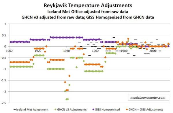
The adjustments by the Icelandic Met Office professionals with a detailed knowledge of the instruments and the local conditions, is quite varied from year-to-year and appears to impose no trend in the data. The impact of GCHN is to massively cool the data prior to 1965. Most years are by about a degree, more than the 0.7oC total twentieth century global average surface temperature increase. The pattern of adjustments has long periods of adjustments that are the same. The major reason could be relocations. Trausti Jonsson, Senior Meteorologist with the Iceland Met Office, has looked at the relocations. He has summarized in the graphic below, along with gaps in the data.

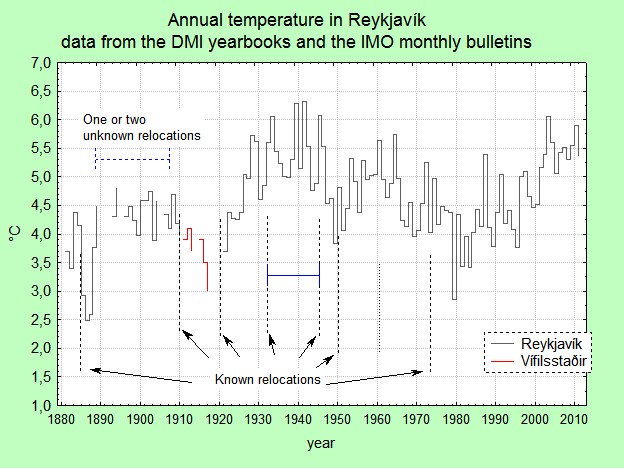
I have matched these relocations with the adjustments.

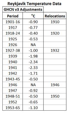
The relocation dates appear to have no impact on the adjustments. If it does affect the data, the wrong data must be used.

Maybe the adjustments reflect the methods of calculation? Trausti Jonsson says:-

I would again like to make the point that there are two distinct types of adjustments:

1. An absolutely necessary recalculation of the mean because of changes in the observing hours or new information regarding the diurnal cycle of the temperature. For Reykjavík this mainly applies to the period before 1924.

2. Adjustments for relocations. In this case these are mainly based on comparative measurements made before the last relocation in 1973 and supported by comparisons with stations in the vicinity. Most of these are really cosmetic (only 0.1 or 0.2 deg C). There is a rather large adjustment during the 1931 to 1945 period (- 0.4 deg C, see my blog on the matter – you should read it again:http://icelandweather.blog.is/blog/icelandweather/entry/1230185/). 
I am not very comfortable with this large adjustment – it is supposed to be constant throughout the year, but it should probably be seasonally dependent. The location of the station was very bad (on a balcony/rooftop).

So maybe there can be some adjustment prior to 1924, but nothing major after. There is also nothing in the this account, or in the more detailed history, that indicates a reason for the reduction in adjustments in 1917-1925, or the massive increase in negative adjustments in the period 1939-1942.

Further, there is nothing in the local conditions that I can see to then justify GISS imposing an artificial early twentieth century warming period. There are two possible non-data reasons. The first is due to software which homogenizes to the global pattern. The second is human intervention. The adjusters at GISS realised the folks at NOAA had been conspicuously over-zealous in their adjustments, so were trying to restore a bit of credibility to the data story.


The change in the Reykjavík data story

When we compare graphs of raw data to adjusted data, it is difficult to see the impact of adjustments on the trends. The average temperatures vary widely from year to year, masking the underlying patterns. As a rough indication I have therefore taken the average temperature anomaly per decade. The decades are as in common usage, so the 1970s is from 1970-1979. The first decade is actually 1901-1909, and for the adjusted data there are some years missing. The decade of 2000-2009 had no adjustments. The average temperature of 5.35oC was set to zero, to become the anomaly.

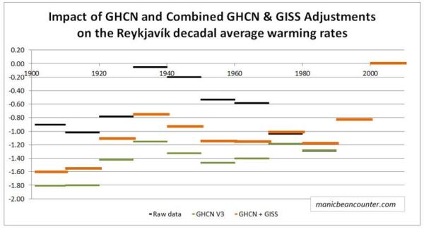
The warmest decade was the last decade of 2000-2009. Further, both the raw data (black) and the GISS Homogenised data (orange) show the 1930s to be the second warmest decade. However, whilst the raw data shows the 1930s to be just 0.05oC cooler than the 2000s, GISS estimates it to be 0.75oC cooler. The coolest decades are also different. The raw data shows the 1980s to be the coolest decade, whilst GISS shows the 1900s and the 1910s to be about 0.40oC cooler. The GHCN adjustments (green) virtually eliminate the mid-century cooling.

But adjustments still need to be made. Trausti Jonsson believes that the data prior to 1924 needs to be adjusted downwards to allow for biases in the time of day when readings were taken. This would bring the 1900s and the 1910s more into line with the 1980s, along with lowering the 1920s. The leap in temperatures from the 1910s to the 1930s becomes very similar to that from 1980s to the 2000s, instead of half the magnitude in the GHCNv3 data and two-thirds the magnitude in the GISS Homogenised data.

The raw data tell us there were two similar-sized fluctuations in temperature since 1900 of 1920s-1940s and from 1980s-2010s. In between there was a period cooling that almost entirely cancelled out the earlier warming period. The massive warming since the 1980s is not exceptional, though there might be some minor human influence if patterns are replicated elsewhere.

The adjusted data reduces the earlier warming period and the subsequent cooling that bottomed out in the 1980s. Using the GISS Homogenised data we get the impression of unprecedented warming closely aligned to the rise in greenhouse gas levels. As there is no reason for the adjustments from relocations, or from changes to the method of calculation, the adjustments would appear to be made to fit reality to the adjuster’s beliefs about the world.

Kevin Marshall


Is there a Homogenisation Bias in Paraguay’s Temperature Data?

Last month Paul Homewood at Notalotofpeopleknowthat looked at the temperature data for Paraguay. His original aim was to explain the GISS claims of 2014 being the hottest year.

One of the regions that has contributed to GISS’ “hottest ever year” is South America, particularly Brazil, Paraguay and the northern part of Argentina. In reality, much of this is fabricated, as they have no stations anywhere near much of this area…

….there does appear to be a warm patch covering Paraguay and its close environs. However, when we look more closely, we find things are not quite as they seem.

In “Massive Tampering With Temperatures In South America“, Homewood looked at the “three genuinely rural stations in Paraguay that are currently operating – Puerto Casado, Mariscal and San Juan.” A few days later in “All Of Paraguay’s Temperature Record Has Been Tampered With“, he looked at remaining six stations.

After identifying that all of the three rural stations currently operational in Paraguay had had huge warming adjustments made to their data since the 1950’s, I tended to assume that they had been homogenised against some of the nearby urban stations. Ones like Asuncion Airport, which shows steady warming since the mid 20thC. When I went back to check the raw data, it turns out all of the urban sites had been tampered with in just the same way as the rural ones.

What Homewood does not do is to check the data behind the graphs, to quantify the extent of the adjustment. This is the aim of the current post.

Warning – This post includes a lot of graphs to explain how I obtained my results.

Homewood uses comparisons of two graphs, which he helpful provides the links to. The raw GHCN data + UHSHCN corrections is available here up until 2011 only. The current after GISS homogeneity adjustment data is available here.

For all nine data sets that I downloaded both the raw and homogenised data. By simple subtraction I found the differences. In any one year, they are mostly the same for each month. But for clarity I selected a single month – October – the month of my wife’s birthday.

For the Encarnacion (27.3 S,55.8 W) data sets the adjustments are as follows.

In 1967 the adjustment was -1.3C, in 1968 +0.1C. There is cooling of the past.

The average adjustments for all nine data sets is as follows.

This pattern is broadly consistent across all data sets. These are the maximum and minimum adjustments.

However, this issue is clouded by the special adjustments required for the Pedro Juan CA data set. The raw data set has been patched from four separate files,

Removing does not affect the average picture.

But does affect the maximum and minimum adjustments. This is shows the consistency in the adjustment pattern.

The data sets are incomplete. Before 1941 there is only one data set – Ascuncion Aero. The count for October each year is as follows.

In recent years there are huge gaps in the data, but for the late 1960s when the massive switch in adjustments took place, there are six or seven pairs of raw and adjusted data.

Paul Homewood’s allegation that the past has been cooled is confirmed. However, it does not give a full understanding of the impact on the reported data. To assist, for the full year mean data, I have created temperature anomalies based on the average anomaly in that year.

The raw data shows a significant cooling of up to 1oC in the late 1960s. If anything there has been over-compensation in the adjustments. Since 1970, any warming in the adjusted data has been through further adjustments.

Is this evidence of a conspiracy to “hide a decline” in Paraguayan temperatures? I think not. My alternative hypothesis is that this decline, consistent over a number of thermometers is unexpected. Anybody looking at just one of these data sets recently, would assume that the step change in 40-year-old data from a distant third world country is bound to be incorrect. (Shub has a valid point) That change goes against the known warming trend for over a century from the global temperature data sets and the near stationary temperatures from 1950-1975. More importantly cooling goes against the “known” major driver of temperature recent change – rises in greenhouse gas levels. Do you trust some likely ropey instrument data, or trust your accumulated knowledge of the world? The clear answer is that the instruments are wrong. Homogenisation is then not to local instruments in the surrounding areas, but to the established expert wisdom of the world. The consequent adjustment cools past temperatures by one degree. The twentieth century warming is enhanced as a consequence of not believing what the instruments are telling you. The problem is that this step change is replicated over a number of stations. Paul Homewood had shown that it probably extends into Bolivia as well.

But what happens if the converse happens? What if there is a step rise in some ropey data set from the 1970s and 1980s? This might be large, but not inconsitent with what is known about the world. It is unlikely to be adjusted downwards. So if there have been local or regional step changes in average temperature over time both up and down, the impact will be to increase the rate of warming if the data analysts believe that the world is warming and human beings are the cause of it.

Further analysis is required to determine the extent of the problem – but not from this unpaid blogger giving up my weekends and evenings.

Kevin Marshall

All first time comments are moderated. Please also use the comments as a point of contact, stating clearly that this is the case and I will not click the publish button, subject to it not being abusive. I welcome other points of view, though may give a robust answer.

The Propaganda methods of ….and Then There’s Physics on Temperature Homogenisation

There has been a rash of blog articles about temperature homogenisations that is challenging the credibility of the NASS GISS temperature data. This has lead to attempts by anonymous blogger andthentheresphysics (ATTP) to crudely deflect from the issues identified. It is propagandist’s trick of turning people’s perspectives. Instead of a dispute about some scientific data, ATTP turns the affair into a dispute between those with authority and expertise in scientific analysis, against a few crackpot conspiracy theorists.

The issues on temperature homogenisation are to do with the raw surface temperature data and the adjustments made to remove anomalies or biases within the data. “Homogenisation” is a term used for process of adjusting the anomalous data into line with that from the surrounding data.

The blog articles can be split into three categories. The primary articles are those that make direct reference to the raw data set and the surrounding adjustments. The secondary articles refer to the primary articles, and comment upon them. The tertiary articles are directed at the secondary articles, making little or no reference to the primary articles. I perceive the two ATTP articles as fitting into the scheme below.

Primary Articles

The source of complaints about temperature homogenisations is Paul Homewood at his blog notalotofpeopleknowthat. The source of the articles is NASA’s Goddard Institute for Space Studies (GISS) database. For any weather station GISS provide nice graphs of the temperature data. The current after GISS homogeneity adjustment data is available here and the raw GHCN data + UHSHCN corrections is available here up until 2011 only. For any weather station GISS provide nice graphs of the temperature data. Homewood’s primary analysis was to show the “raw data” side by side.

20/01/15 Massive Tampering With Temperatures In South America

This looked at all three available rural stations in Paraguay. The data from all three at Puerto Casado, Mariscal and San Jan Buatista/Misiones had the same pattern of homogenization adjustments. That is, cooling of the past, so that instead of the raw data showing the 1960s being warmer than today, it was cooler. What could they have been homogenized to?

26/01/15 All Of Paraguay’s Temperature Record Has Been Tampered With

This checked the six available urban sites in Paraguay. Homewood’s conclusion was that

warming adjustments have taken place at every single, currently operational site in Paraguay.

How can homogenization adjustments all go so same way? There is no valid reason for making such adjustments, as there is no reference point for the adjustments.

29/01/15Temperature Adjustments Around The World

Homewood details other examples from Southern Greenland, Iceland, Northern Russia, California, Central Australia and South-West Ireland. Instead of comparing the raw with the adjusted data, he compared the old adjusted data with the recent data. Adjustment decisions are changing over time, making the adjusted data sets give even more pronounced warming trends.

30/01/15 Cooling The Past In Bolivia

Then he looked at all 14 available stations in neighbouring Bolivia. His conclusion

At every station, bar one, we find the ….. past is cooled and the present warmed.”

(The exception was La Paz, where the cooling trend in the raw data had been reduced.)

Why choose Paraguay in the first place? In the first post, Homewood explains that within a NOAA temperature map for the period 1981-2010 there appeared to be a warming hotspot around Paraguay. Being a former accountant he checked the underlying data to see if it existed in the data. Finding an anomaly in one area, he checked more widely.

The other primary articles are

26/01/15 Kevin Cowton NOAA Paraguay Data

This Youtube video was made in response to Christopher Booker’s article in the Telegraph, a secondary source of data. Cowton assumes Booker is the primary source, and is criticizing NOAA data. A screen shot of the first paragraph shows these are untrue.

Further, if you read down the article, Cowton’s highlighting of the data from one weather station is also misleading. Booker points to three, but just illustrates one.

Despite this, it still ranks as a primary source, as there are direct references to the temperature data and the adjustments. They are not GISS adjustments, but might be the same.

29/01/15 Shub Niggurath – The Puerto Casado Story

Shub looked at the station moves. He found that the metadata for the station data is a mess, so there is no actual evidence of the location changing. But, Shub reasons the fact that there was a step change in the data meant that it moved, and the fact that it moved meant there was a change. Shub is a primary source as he looks at the adjustment reason.


Secondary Articles

The three secondary articles by Christopher Booker, James Delingpole and BishopHill are just the connectors in this story.


Tertiary articles of “…and Then There’s Physics”

25/01/15 Puerto Cascado

This looked solely at Booker’s article. It starts

Christopher Booker has a new article in the The Telegraph called Climategate, the sequel: How we are STILL being tricked with flawed data on global warming. The title alone should be enough to convince anyone sensible that it isn’t really worth reading. I, however, not being sensible, read it and then called Booker an idiot on Twitter. It was suggested that rather than insulting him, I should show where he was wrong. Okay, this isn’t really right, as there’s only so much time and effort available, and it isn’t really worth spending it rebutting Booker’s nonsense.

However, thanks to a tweet from Ed Hawkins, it turns out that it is really easy to do. Booker shows data from a site in Paraguay (Puerto Casado) in which the data was adjusted from a trend of -1.37o C per century to +1.36o C per century. Shock, horror, a conspiracy?


ATTP is highlighting an article, but is strongly discouraging anybody from reading it. That is why the referral is a red line in the graphic above. He then says he is not going to provide a rebuttal. ATTP is good to his word and does not provide a rebuttal. Basically it is saying “Don’t look at that rubbish, look at the real authority“. But he is wrong for a number of reasons.

  1. ATTP provides misdirection to an alternative data source. Booker quite clearly states that the source of the data is the NASA GISS temperature set. ATTP cites Berkeley Earth.
  2. Booker clearly states that there are thee rural temperature stations spatially spread that show similar results. ATTP’s argument that a single site was homogenized with the others in the vicinity falls over.
  3. This was further undermined by Paul Homewood’s posting on the same day on the other 6 available sites in Paraguay, all giving similar adjustments.
  4. It was further undermined by Paul Homewood’s posting on 30th January on all 14 sites in Bolivia.

The story is not of a wizened old hack making some extremist claims without any foundation, but of a retired accountant seeing an anomaly, and exploring it. In audit, if there is an issue then you keep exploring it until you can bottom it out. Paul Homewood has found an issue, found it is extensive, but is still far from finding the full extent or depth. ATTP, when confronted by my summary of the 23 stations that corroborate each other chose to delete it. He has now issued an update.

Update 4/2/2015 : It’s come to my attention that some are claiming that this post is misleading my readers. I’m not quite sure why, but it appears to be related to me not having given proper credit for the information that Christopher Booker used in his article. I had thought that linking to his article would allow people to establish that for themselves, but – just to be clear – the idiotic, conspiracy-laden, nonsense originates from someone called Paul Homewood, and not from Chistopher Booker himself. Okay, everyone happy now? J

ATTP cannot accept that he is wrong. He has totally misrepresented the arguments. When confronted with alternative evidence ATTP resorts to vitriolic claims. If someone is on the side of truth and science, they will encourage people to compare and contrast the evidence. He seems to have forgotten the advice about when in a whole…..

01/02/15
Temperature homogenisation

ATTP’s article on Temperature Homogenisation starts

Amazing as it may seem, the whole tampering with temperature data conspiracy has managed to rear its ugly head once again. James Delingpole has a rather silly article that even Bishop Hill calls interesting (although, to be fair, I have a suspicion that in “skeptic” land, interesting sometimes means “I know this is complete bollocks, but I can’t bring myself to actually say so”). All of Delingpole’s evidence seems to come from “skeptic” bloggers, whose lack of understand of climate science seems – in my experience – to be only surpassed by their lack of understanding of the concept of censorship J.

ATPP starts with a presumption of being on the side of truth, with no fault possible on his side. Any objections are due to a conscious effort to deceive. The theory of cock-up or of people not checking their data does not seem to have occurred to him. Then there is a link to Delingpole’s secondary article, but calling it “silly” again deters readers from looking for themselves. If they did, the readers would be presented with flashing images of all the “before” and “after” GISS graphs from Paraguay, along with links to the 6 global sites and Shub’s claims that there is a lack of evidence for the Puerto Casado site being moved. Delingpole was not able the more recent evidence from Bolivia, that further corroborates the story.

He then makes a tangential reference to his deleting my previous comments, though I never once used the term “censorship”, nor did I tag the article “climate censorship”, as I have done to some others. Like on basic physics, ATTP claims to have a superior understanding of censorship.

There are then some misdirects.

  • The long explanation of temperature homogenisation makes some good points. But what it does not do is explain that the size and direction of any adjustment is an opinion, and as such be wrong. It a misdirection to say that the secondary sources are against any adjustments. They are against adjustments that create biases within the data.
  • Quoting Richard Betts’s comment on Booker’s article about negative adjustments in sea temperature data is a misdirection, as Booker (a secondary source) was talking about Paraguay, a land-locked country.
  • Referring to Cowton’s alternative analysis is another misdirect, as pointed out above. Upon reflection, ATTP may find it a tad embarrassing to have this as his major source of authority.

Conclusions

When I studied economics, many lecturers said that if you want to properly understand an argument or debate you need to look at the primary sources, and then compare and contrast the arguments. Although the secondary sources were useful background, particularly in a contentious issue, it is the primary sources on all sides that enable a rounded understanding. Personally, by being challenged by viewpoints that I disagreed with enhanced my overall understanding of the subject.

ATTP has managed to turn this on its head. He uses methods akin to crudest propagandists of last century. They started from deeply prejudiced positions; attacked an opponent’s integrity and intelligence; and then deflected away to what they wanted to say. There never gave the slightest hint that one side might be at fault, or any acknowledgement that the other may have a valid point. For ATTP, and similar modern propagandists, rather than have a debate about the quality of evidence and science, it becomes a war of words between “deniers“, “idiots” and “conspiracy theorists” against the basic physics and the overwhelming evidence that supports that science.

If there is any substance to these allegations concerning temperature adjustments, for any dogmatists like ATTP, it becomes a severe challenge to their view of the world. If temperature records have systematic adjustment biases then climate science loses its’ grip on reality. The climate models cease to be about understanding the real world, but conforming to people’s flawed opinions about the world.

The only way to properly understand the allegations is to examine the evidence. That is to look at the data behind the graphs Homewood presents. I have now done that for the nine Paraguayan weather stations. The story behind that will have to await another day. However, although I find Paul Homewood’s claims of systematic biases in the homogenisation process to be substantiated, I do not believe that it points to a conspiracy (in terms of a conscious and co-ordinated attempt to deceive) on the part of climate researchers.

Feynman on Communist Science

I am currently engrossed in GENIUS: Richard Feynman and Modern Physics by James Gleick

In July 1962 Feynman went behind the Iron Curtain to attend a conference on gravitation in Warsaw. He was exasperated at the state of Soviet science. He wrote to his wife Gweneth:-

The “work” is always: (1) completely un-understandable, (2) vague and indefinite, (3) something correct that is obvious and self-evident, worked out by long and difficult analysis, and presented as an important discovery, or (4) a claim based on stupidity of the author that some obvious and correct fact, accepted and checked for years is, in fact, false (these are the worst: no argument will convince the idiot), (5) an attempt to do something, probably impossible, but certainly of no utility, which, it is finally revealed at the end, fails or (6) just plain wrong. There is a great deal of “activity in the field” these days, but this “activity” is mainly in showing that the previous “activity” of somebody else resulted in an error or in nothing useful or in something promising. (Page 353)

The failings of Government-backed science are nothing new.