A note on Bias in Australian Temperature Homogenisations

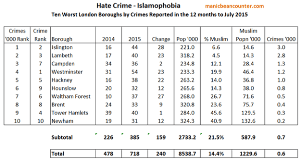
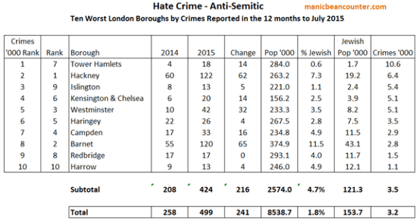
Jo Nova has an interesting and detailed post guest post by Bob Fernley-Jones on heavily homogenised rural sites in Australia by the Australian BOM.

I did a quick comment that was somewhat lacking in clarity. This post is to clarify my points.

In the post Bob Fernley-Jones stated

The focus of this study has been on rural stations having long records, mainly because the BoM homogenisation process has greatest relevance the older the data is.

Venema et al. 2012 stated (Italics mine)

The most commonly used method to detect and remove the effects of artificial changes is the relative homogenization approach, which assumes that nearby stations are exposed to almost the same climate signal and that thus the differences between nearby stations can be utilized to detect inhomogeneities (Conrad and Pollak, 1950). In relative homogeneity testing, a candidate time series is compared to multiple surrounding stations either in a pairwise fashion or to a single composite reference time series computed for multiple nearby stations.

This assumption of nearby temperature stations being exposed to same climate signal is standard practice. Victor Venema, (who has his own blog) is a leading academic expert on temperature homogenisation. However, there are extreme examples where this assumption does not hold. One example is at the end of the 1960s in much of Paraguay where average temperatures fell by one degree. As this was not replicated in the surrounding area both GISTEMP and Berkeley Earth homogenisations eliminated this anomaly. This was despite using very different homogenisation techniques. My analysis is here.

On a wider scale take a look at the GISTEMP land surface temperature anomaly map for 2014 against 1976-2010. (obtained from here)


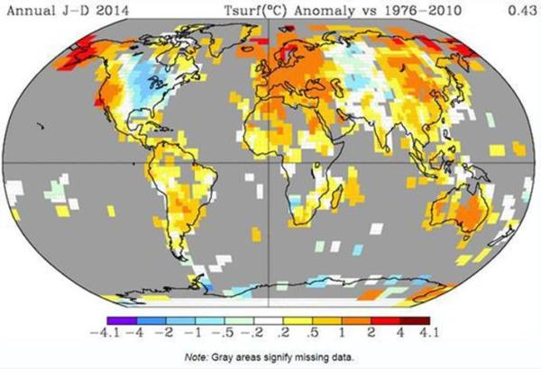
Despite been homogenised and smoothed it is clear that trends are different. Over much of North America there was cooling, bucking the global trend. What this suggests to me is that the greater the distance between weather stations the greater the likelihood that the climate signals will be different. Most importantly for temperature anomaly calculations, over the twentieth century the number of weather stations increased dramatically. So it is more likely homogenisation will end up smoothing out local and sub-regional variations in temperature trends in the early twentieth century than in the later period. This is testable.

Why should this problem occur with expert scientists? Are they super beings who know the real temperature data, but have manufactured some falsehood? I think it is something much more prosaic. Those who work at the Australian BOM believe that the recent warming is human caused. In fact they believe that more than 100% of warming is human caused. When looking at outlier data records, or records that show inconsistencies there is a very human bias. Each time the data is reprocessed they find new inconsistencies, having previously corrected the data.

Kevin Marshall

Islamophobic and Anti-Semitic Hate Crime in London

The BBC has rightly highlighted the 70.7% rise in Islamophobic crime in the 12 months to July 2015 compared to the previous 12 months to 718 instances. Any such jump in crime rates should be taken seriously and tackled. To be attacked for one’s religion, including being punched and having dog faeces smeared on one’s head is repulsive. However, according to the Metropolitan Police Crime Figures it is still less than 0.1% of total 720,939 crimes reported, and still a fraction of the crimes of Rape (5,300) and Robbery against the Person (20,300).

Raheem Kassam of Breitbart has a point when he states that there has been a 93.4% rise in Anti-Semitic crimes to 499 in the same period. He then points out that a Jew is a number of times more likely to be a victim of a religious hate crime in London than a Muslim. However, he fluffs the figures, as he makes a comparison between London crime figures and total numbers of adherents of each religion in the UK. Yet the Greater London Authority has a Datastore with the population by borough, along with the proportion of each religious group. The Metropolitan Police Crime Figures are also by borough. From this I have looked at the ten worst boroughs for Islamophobic and Anti-Semitic Hate Crime, which I have appended below.

In Summary

  • The London Borough with the highest number of reported Islamophobic hate crimes was Westminster with 54 reported in the 12 months ended July 2015, but relative to the number of Muslims living in the borough, Islington had the highest rate with 3.0 hate crimes per 1,000 Muslims.
  • Overall in London reported 718 in Islamophobic hate crimes reported was equivalent to 0.6 per 1,000 Muslims.
  • The London Borough with the highest number of reported Anti-Semitic hate crimes was Hackney with 122 reported in the 12 months ended July 2015, but relative to the number of Jews living in the borough, Tower Hamlets had the highest rate with 10.6 hate crimes per 1,000 Jews.
  • Overall in London reported 499 in Anti-Semitic hate crimes reported was equivalent to 3.2 per 1,000 Jews.
  • A Jew in London is therefore more than five times more likely to be the victim of a religious hate crime than a Muslim. In the London Borough of Tower Hamlets the Jew is over thirty times more likely to be a victim than a Muslim. Even Islington, proportionately the worst borough for Muslims, the Jew is still more than twice as likely to be a victim as the Muslim.

As a final note, late yesterday evening there was an extreme Anti-Semitic attack in North Manchester. Four young men were brutally attacked at a Metrolink Station. The youngest, for a period, was into a coma according to The Jewish Chronicle. I join in the prayers for his speedy and full recovery.

Kevin Marshall

Degenerating Climatology 1: IPCC Statements on Human Caused Warming

This is the first in an occasional series of illustrating the degeneration of climatology away from an empirical science. In my view, for climatology to be progressing it needs to be making ever clearer empirical statements that support the Catastrophic Anthropogenic Global Warming (CAGW) hypothesis and moving away from the bland statements that can just as easily support a weaker form of the hypothesis, or support random fluctuations. In figure 1 this progression is illustrated by the red arrow, with increasing depth of colour. The example given below is an illustration of the opposite tendency.

Obscuring the slowdown in warming in AR5

Every major temperature data set shows that the warming rate this century has been lower than that towards the end of the end of the twentieth century. This is becoming a severe issue for those who believe that the main driver of warming is increasing atmospheric greenhouse gas levels. This gave a severe problem for the IPCC in trying to find evidence for the theory when they published in late 2013.

In the IPCC Fifth Assessment Report Working Group 1 (The Physical Science Basis) Summary for Policy Makers, the headline summary on the atmosphere is:-

Each of the last three decades has been successively warmer at the Earth’s surface than any preceding decade since 1850. In the Northern Hemisphere, 1983–2012 was likely the warmest 30-year period of the last 1400 years (medium confidence).

There are three parts to this.

  • The last three decades have been successively warmer according to the major surface temperature data sets. The 1980s were warmer than the 1970s; the 1990s warmer than the 1980s; and the 2000s warmer than the 1990s.
  • The 1980s was warmer than any preceding decade from the 1850s.
  • In the collective opinion of the climate experts there is greater than a 66% chance that the 1980s was the warmest decade in 1400 years.

What the does not include are the following.

  1. That global average temperature rises have slowed down in the last decade compared with the 1990s. From 2003 in the HADCRUT4 temperature series warming had stopped.
  2. That global average temperature also rose significantly in the mid-nineteenth and early twentieth centuries.
  3. That global average temperature fell in 4 or 5 of the 13 decades from 1880 to 2010.
  4. That in the last 1400 years there was a warm period about 1000 years ago and a significantly cold period that could have reached bottomed out around 1820. That is a Medieval Warm Period and the Little Ice Age.
  5. That there is strong evidence of Roman Warm Period that about 2000 years ago and a Bronze Age warm period about 3000 years ago.

Point (i) to (iii) can be confirmed by figure 2. Both the two major data surface temperature anomalies show warming trends in each of the last three decades, implying successive warming. A similar statement could have been made in 1943 if the data had been available.

In so far as the CAGW hypothesis is broadly defined as a non-trivial human-caused rise in temperatures (the narrower more precise definition being that the temperature change has catastrophic consequences) there is no empirical support found from the actual temperature records or from the longer data reconstructions from proxy data.

The major statement above is amplified by the major statement from the press release of 27/09/2013.

It is extremely likely that human influence has been the dominant cause of the observed warming since the mid-20th century. The evidence for this has grown, thanks to more and better observations, an improved understanding of the climate system response and improved climate models.

This statement does exclude other types of temperature change, let alone other causes of the temperature change. The cooling in the 1960s is not included. The observed temperature change is only the net impact of all influences, known or unknown. Further, the likelihood is based upon expert opinion. If the experts have always given prominence to human influences on warming (as opposed to natural and random influences) then their opinion will be biased. Over time if this opinion is not objectively adjusted in the light of evidence that does not conform to the theory the basis of Bayesian statistic is undermined.

Does the above mean that climatology is degenerating away from a rigorous scientific discipline? I have chosen the latest expert statements, but not compared them with previous statements. A comparable highlighted statement to the human influence statement from the fourth assessment report WG1 SPM (Page 3) is

The understanding of anthropogenic warming and cooling influences on climate has improved since the TAR, leading to very high confidence that the global average net effect of human activities since 1750 has been one of warming, with a radiative forcing of +1.6 [+0.6 to +2.4] W m–2

The differences are

  • The greenhouse gas effect is no longer emphasised. It is now the broader “human influence”.
  • The previous statement was prepared to associate the influence with a much longer period. Probably the collapse of hockey stick studies, with their portrayal of unprecedented warming, has something to do with this.
  • Conversely, the earlier statement is only prepared to say that since 1750 the net effect of human influences has been one of warming. The more recent statement claims a dominant cause of warming has been human caused.

This leads my final point indicating degeneration of climatology away from science. When comparing the WG1 SPMs for TAR, AR4 and AR5 there are shifting statements. In each report the authors have chosen the best statements to fit their case at that point in time. The result is a lack of continuity that might demonstrate and increasing correspondence between theory and data.

Kevin Marshall