Is increasing Great Barrier Reef coral bleaching related to climate change or observation bias?

In the previous post I looked at whether the claimed increase in coral bleaching in the Great Barrier Reef was down to global average temperature rise. I concluded that this was not the case as the GBR has not warmed, or at least not warmed as much as the global temperatures. Here I look further at the data.
The first thing to state is that I recognize that heat stress can occur in corals. Blogger Geoff Price (in post at his own blog on April 2nd 2018, reposted at ATTP eleven months later) stated

(B)leaching via thermal stress is lab reproducible and uncontroversial. If you’re curious, see Jones et al 1998, “Temperature-induced bleaching of corals begins with impairment of the CO2 fixation mechanism in zooxanthellae”.

I am curious. The abstract of Jones et al 1998 states

The early effects of heat stress on the photosynthesis of symbiotic dinoflagellates (zooxanthellae) within the tissues of a reef‐building coral were examined using pulse‐amplitude‐modulated (PAM) chlorophyll fluorescence and photorespirometry. Exposure of Stylophora pistillata to 33 and 34 °C for 4 h resulted in ……….Quantum yield decreased to a greater extent on the illuminated surfaces of coral branches than on lower (shaded) surfaces, and also when high irradiance intensities were combined with elevated temperature (33 °C as opposed to 28 °C). …..

If I am reading this right. the coral was exposed to a temperature increase of 5-6 °C for a period of 4 hours. I can appreciate that the coral would suffer from this sudden change in temperature. Most waterborne creatures would be become distressed if the water temperature was increased rapidly. How much before it would  seriously stress them might vary, but it is not a serious of tests I would like to carry out. But is there evidence of increasing heat stress causing increasing coral bleaching in the real world? That is, has there been both a rise in coral bleaching and a rise in these heat stress conditions? Clearly there will be seasonal changes in water temperature, even though in the tropics it might not be as large as, say, around the coast of the UK. Also, many over the corals migrate up and down the reef, so they could be tolerant of a range of temperatures. Whether worsening climate conditions have exacerbated heat stress conditions to such an extent that increased coral bleaching has occurred will only be confirmed by confronting the conjectures with the empirical data.


Rise in instances of coral bleaching

I went looking for long-term data that coral bleaching is on the increase and came across and early example. 

P. W. Glynn: Coral reef bleaching: Ecological perspectives. Coral Reefs 12, 1–17 (1993). doi:10.1007/BF00303779

From the introduction

Mass coral mortalities in contemporary coral reef ecosystems have been reported in all major reef provinces since the 1870s (Stoddart 1969; Johannes 1975; Endean 1976; Pearson 1981; Brown 1987; Coffroth et al. 1990). Why, then, should the coral reef bleaching and mortality events of the 1980s command great concern? Probably, in large part, because the frequency and scale of bleaching disturbances are unprecedented in the scientific literature.

One such example of observed bleaching is graphed in Glynn’s paper as Figure 1 c

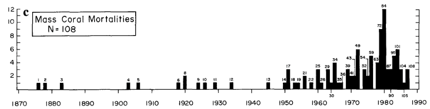
But have coral bleaching events actually risen, or have the observations risen? That is in the past were there less observed bleaching events due to much less bleaching events or much less observations? Since the 1990s have observations of bleaching events increased further due to far more researchers leaving their families the safe climates of temperate countries to endure the perils of diving in waters warmer than a swimming pool? It is only by accurately estimating the observational impact that it is possible to estimate the real impact.
This reminds me of the recent IPPR report, widely discussed including by me, at cliscep and at notalotofpeopleknowthat (e.g. here and here). Extreme claims were lifted a report by billionaire investor Jeremy Grantham, which stated

Since 1950, the number of floods across the world has increased by 15 times, extreme temperature events by 20 times, and wildfires sevenfold

The primary reason was the increase in the number of observations. Grantham mistook increasing recorded observations in a database with real world increases, than embellished the increase in the data to make that appear much more significant. The IPPR then lifted the false perception and the BBC’s Roger Harrabin copied the sentence into his report. The reality is that many extreme weather events occurred prior to the conscientious worldwide cataloguing of them from the 1980s. Just because disasters were not observed and reported to a centralized body did not mean they did not exist.
With respect to catastrophic events in the underlying EM-DAT database it is possible to have some perspective on whether the frequency of reports of disasters are related to increase in actual disasters by looking at the number of deaths. Despite the number of reports going up, the total deaths have gone down. Compared to 1900-1949 in the current decade to mid-2018 “Climate” disaster deaths are down 84%, but reported “Climate” disasters are 65 times more frequent.
I am curious to know how it is one might estimate the real quantity of reported instances of coral bleaching from this data. It would certainly be a lot less than the graph above shows.


Have temperatures increased?

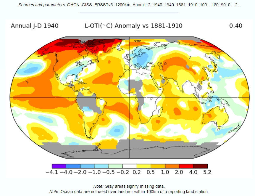
In the previous post I looked at temperature trends in the Great Barrier Reef. There are two main sources that suggest that, contrary to the world as a whole, GBR average temperatures have not increased, or increased much less than the global average. This was shown on the NASA Giss map comparing Jan-2019 with the 1951-1980 average and for two HADSST3 ocean data 5ox5o gridcells. For the latter I only charted the temperature anomaly for two gridcells which are at the North and middle of the GBR. I have updated this chart to include the gridcell 150-155oE / 20-25oS at the southern end of the GBR.

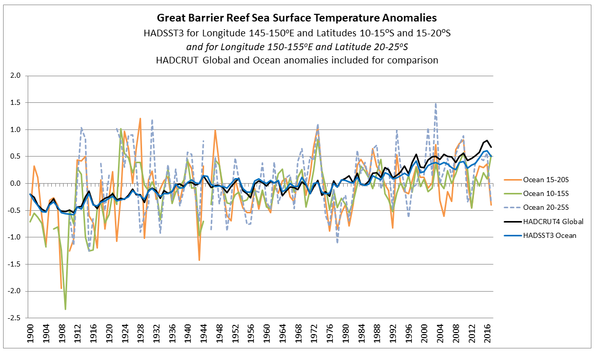
There is an increase in warming trend post 2000, influenced particularly by 2001 and 2003. This is not replicated further north. This is in agreement with the Gistemp map of temperature trends in the previous post, where the Southern end of the GBR showed moderate warming.


Has climate change still impacted on global warming?

However, there is still an issue. If any real, but unknown, increase in coral bleaching has occurred it could still be due to sudden increases in surface sea temperatures, something more in accordance with the test in the lab.
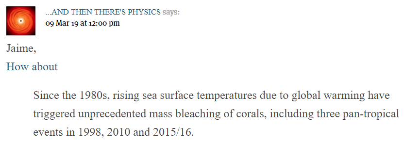
Blogger ATTP (aka Professor Ken Rice) called attention to a recent paper in a comment at cliscep

The link is to a pre-publication copy, without the graphics or supplementary data, to

Global warming and recurrent mass bleaching of corals – Hughes et al Nature 2017

The abstract states


The distinctive geographic footprints of recurrent bleaching on the Great Barrier Reef in 1998, 2002 and 2016 were determined by the spatial pattern of sea temperatures in each year.


So in 2002 the GBR had a localized mass bleaching episode, but did not share in the 2010 pan-tropical events of Rice’s quote. The spatial patterns, and the criteria used are explained.

Explaining spatial patterns
The severity and distinctive geographic footprints of bleaching in each of the three years can be explained by differences in the magnitude and spatial distribution of sea-surface temperature anomalies (Fig. 1a, b and Extended Data Table 1). In each year, 61-63% of reefs experienced four or more Degree Heating Weeks (DHW, oC-weeks). In 1998, heat stress was relatively constrained, ranging from 1-8 DHWs (Fig. 1c). In 2002, the distribution of DHW was broader, and 14% of reefs encountered 8-10 DHWs. In 2016, the spectrum of DHWs expanded further still, with 31% of reefs experiencing 8-16 DHWs (Fig. 1c). The largest heat stress occurred in the northern 1000 km-long section of the Great Barrier Reef. Consequently, the geographic pattern of severe bleaching in 2016 matched the strong north-south gradient in heat stress. In contrast, in 1998 and 2002, heat stress extremes and severe bleaching were both prominent further south (Fig. 1a, b).

For clarification:-

Degree Heating Week (DHW) The NOAA satellite-derived Degree Heating Week (DHW) is an experimental product designed to indicate the accumulated thermal stress that coral reefs experience. A DHW is equivalent to one week of sea surface temperature 1 deg C above the expected summertime maximum.

That is, rather than the long-term temperature rise in global temperatures causing the alleged increase in coral bleaching, it is the human-caused global warming changing the climate by a more indirect means of making extreme heat events more frequent. This seems a bit of a tall stretch. However, the “Degree Heating Week” can be corroborated by the gridcell monthly HADSST3 ocean temperature data for the summer months if both the measures are data are accurate estimates of the underlying data. A paper published last December in Nature Climate Change (also with lead author Prof Terry Hughes) highlighted 1998, 2002, 2016 & 2017 as being major years of coral bleaching. Eco Watch has a short video of maps from the paper showing the locations of bleaching event locations, showing much more observed events in 2016 and 2017 than in 1998 and 2002.

From the 2017 paper any extreme temperature anomalies should be most marked in 2016 across all areas of the GBR. 2002 should be less significant and predominantly in the south. 1998 should be a weaker version of 2002.
Further, if summer extreme temperatures are the cause of heat stress in corals, then 1998, 2002, 2016 & 2017 should have warm summer months.
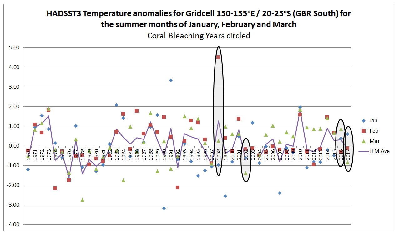
For gridcells 145-150oE / 10-15oS and 150-155oE / 20-25oS respectively representing the northerly and summer extents of the Great Barrier Reef, I have extracted the January February and March anomalies since 1970, then circled the years 1998, 2002, 2016 and 2017. Shown the average of the three summer months.

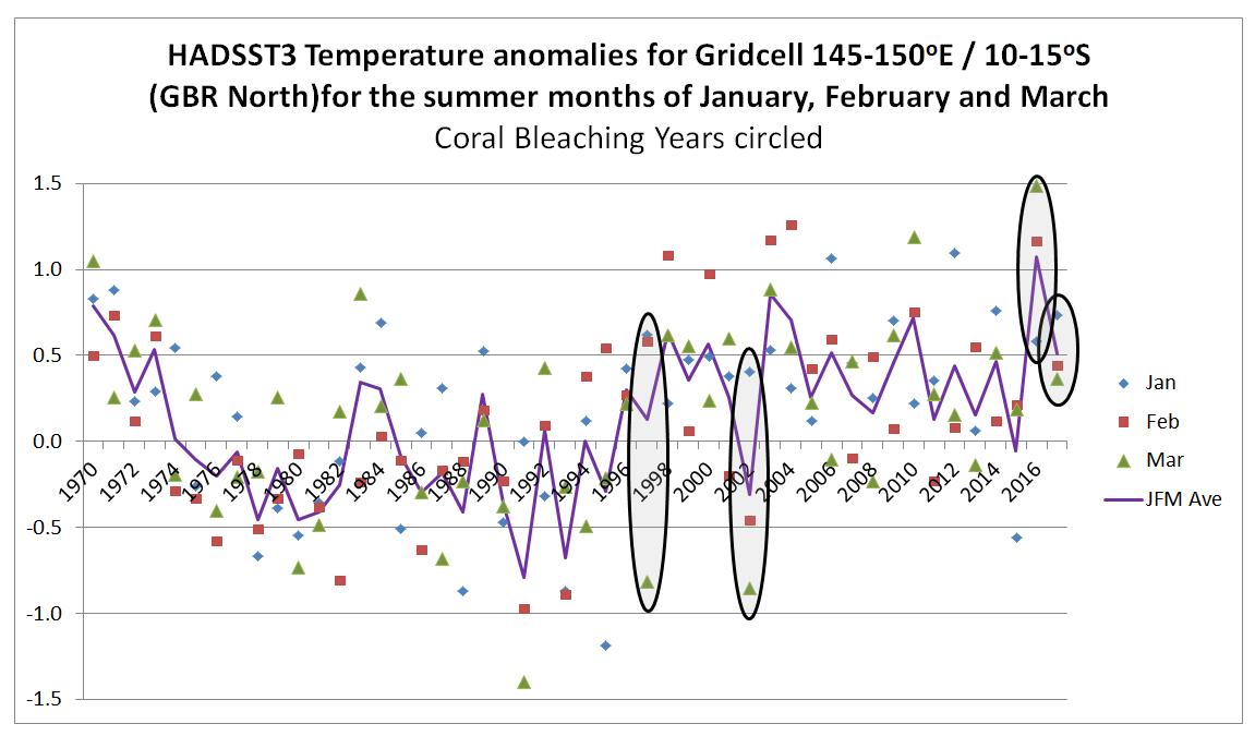
In the North of the GBR, 2016 and 2017 were unusually warm, whilst 2002 was a cool summer and 1998 was not unusual. This is consistent with the papers findings. But 2004 and 2010 were warm years without bleaching.
In the South of the GBR 1998 was exceptionally warm in February. This might suggest an anomalous reading. 2002 was cooler than average and 2016 and 2017 about average.
Also note, that in the North of the GBR summer temperatures appear to be a few tenths of a degree higher from the late 1990s than in the 1980s and early 1990s. In the South there appears to be no such increase. This is the reverse of what was found for the annual average temperatures and the reverse of where the most serious coral bleaching has occurred.
On this basis the monthly summer temperature anomalies do not seem to correspond to the levels of coral bleaching. A further check is to look at the change in the anomaly from the previous month. If sea surface temperatures increase rapidly in summer, this may be the cause of heat stress as much as absolute magnitude above the long-term average.

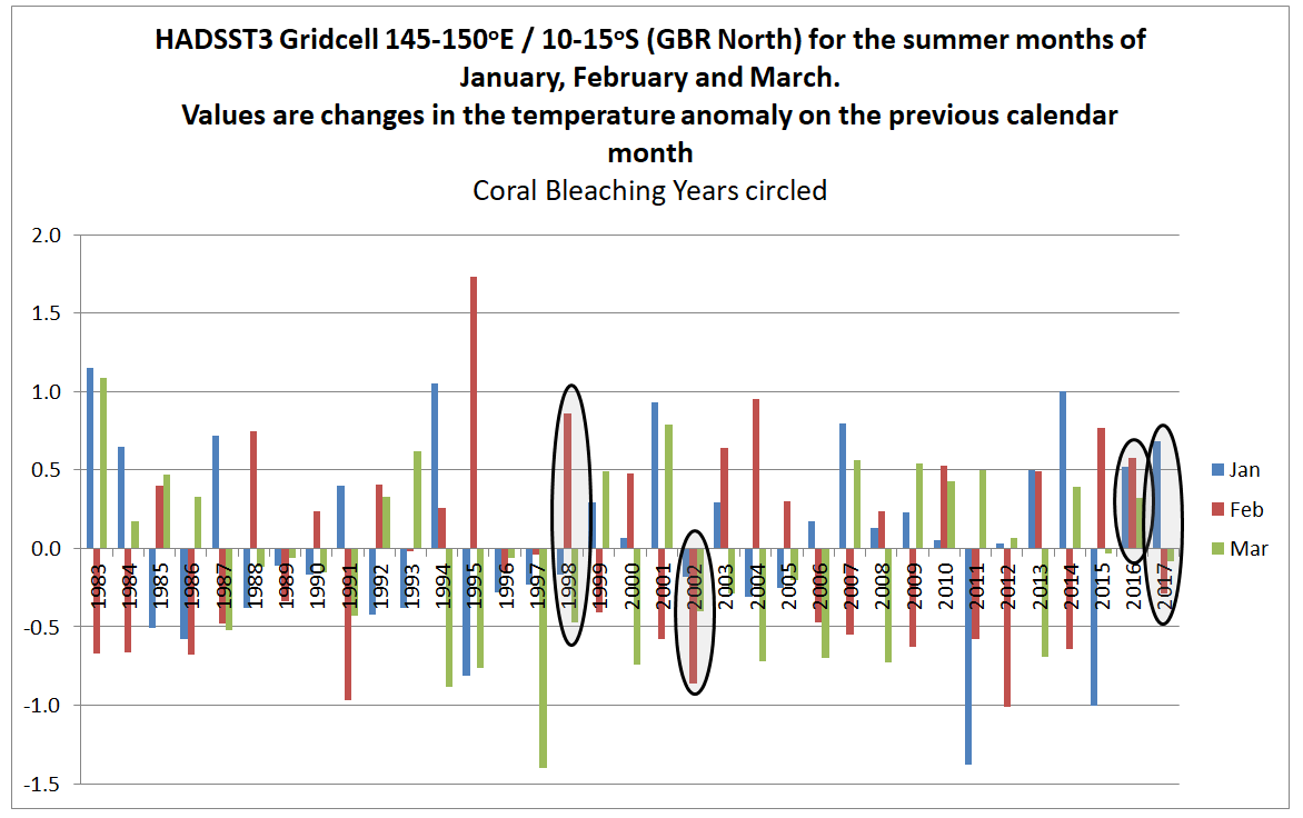
In the North of the GBR the February 1998 anomaly was almost a degree higher than the January anomaly. This is nothing exceptional in the record. 2002, 2016 & 2017 do not stand out at all.

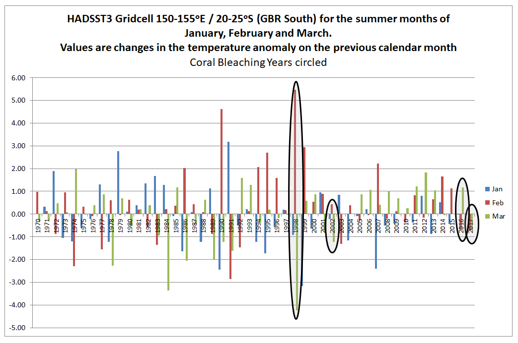
In the South of the GBR, the changes in anomaly from one month to the next are much greater than in the North of the GBR. February 1998 stands out. It could be due to problems in the data. 2002, 2016 and 2017 are unexceptional years. There also appears to be less volatility post 2000 contradicting any belief in climate getting more extreme. I believe it could be an indication that data quality has improved.

Conclusions

Overall, the conjecture that global warming is resulting in increased coral bleaching in the Great Barrier Reeg directly through rising average temperatures, or indirectly through greater volatility in temperature data, is not supported by the HADSST3 surface temperature data from either the North or South of the reef. This does not necessarily mean that there is not a growing problem of heat stress, or though this seems the most likely conclusion. Alternative explanations could be that the sea surface temperature anomaly is inadequate or that other gridcells show something different.
Which brings us back to the problem identified above. How much of the observed increase in coral bleaching is down to real increases in coral bleaching and how much is down to increased observations? In all areas of climate, there is a crucial difference between our perceptions based on limited data and the underlying reality.

Kevin Marshall

Excess Deaths from 2018 Summer Heatwaves

Last month I looked at the claims by the UK Environmental Audit Committee warning of 7,000 heat-related deaths in the 2050s, finding it was the result a making a number of untenable assumptions. Even if the forecast turned out to be true, cold deaths would still be more than five times the hot deaths. With the hottest summer since 1976, it is not surprising that there have been efforts to show there are excess heat deaths.

On the 6th August, The Daily Express headlined UK heatwave turns KILLER: 1,000 more people die this summer than average as temps soar.

Deaths were up in all seven weeks from June 2 to July 20, which saw temperatures reach as high as 95F (35C).

A total of 955 people more than the average have died in England and Wales since the summer began, according to the Office for National Statistics (ONS).

On the 3rd August the Guardian posted Deaths rose 650 above average during UK heatwave – with older people most at risk.

The height of the heatwave was from 25 June to 9 July, according to the Met Office, a run of 15 consecutive days with temperatures above 28C. The deaths registered during the weeks covering this period were 663 higher than the average for the same weeks over the previous five years, a Guardian analysis of data from the Office of National Statistics shows.

Note the Guardian’s lower figure was from a shorter time period.

I like to put figures in context, so I looked up the ONS Dataset:Deaths registered monthly in England and Wales

There they have detailed data from 2006 to July 2018. Estimating the excess deaths from these figures needs some estimation of other factors. However, some indication of excess deaths can be gleaned from taking the variation from the average. In July 2018 there were 40,624 recorded deaths, as against an average of 38,987 deaths in July in the years 2006-2018. There were therefore 1,637 deaths more than average. I have charted the variation from average for each year.

There were above average deaths in July 2018, but there similar figure in the same month in 2014 and 2015. Maybe the mean July temperatures from the Central England Temperature Record show a similar variation?

Not really. July 2006 had high mean temperatures and average deaths, whilst 2015 had low mean temperatures and higher than average deaths.

There is a further element to consider. Every month so far this year has had higher than average deaths. Below I have graphed the variation by month.

January is many times more significant than July. In the first seven months of this year there were 30,000 more deaths recorded than the January-July average for 2006 to 2018. But is this primarily due to the cold start to the year followed by a barbecue summer? Looking at the variations from average 300,000 deaths for the period January to July period, it does not seem this is the case.

Looking at individual months, if extreme temperatures alone caused excess deaths I would expect an even bigger peak during in January 2010 when there was record cold than this year. In January 2010 there were 48363 recorded deaths, against 64157 in January 2018 and a 2006-2018 average of 52383. Clearly there is a large seasonal element to deaths as the average for July is 39091, or three-quarters of the January level. But discerning the temperature related element is extremely tricky, and any estimates of excess deaths to a precise number should be treated with extreme caution.

Kevin Marshall

UK Government Committee 7000 heat-deaths in 2050s assumes UK’s climate policies will be useless

Summary

Last week, on the day forecast to have record temperatures in the UK, the Environmental Audit Committee warns of 7,000 heat-related deaths every year in the UK by the 2050s if the Government did not act quickly. That prediction was based upon Hajat S, et al 2014. Two principle assumptions behind that prognosis did not hold at the date when the paper was submitted. First is that any trend of increasing summer heatwaves in the data period of 1993 to 2006 had by 2012 ended. The six following summers were distinctly mild, dull and wet. Second, based upon estimates from the extreme 2003 heatwave, is that most of the projected heat deaths would occur in NHS hospitals, is the assumption that health professionals in the hospitals would not only ignore the increasing death toll, but fail to take adaptive measures to an observed trend of evermore frequent summer heatwaves. Instead, it would require a central committee to co-ordinate the data gathering and provide the analysis. Without the politicians and bureaucrats producing reports and making recommendations the world will collapse.
There is a third, implied assumption, in the projection. The 7,000 heat-related deaths in the 2050s assumes the complete failure of the Paris Agreement to control greenhouse emissions, let alone keep warming to within any arbitrary 1.5°C or 2°C. That means other countries have failed to follow Britain’s lead in reducing their emissions by 80% by 2050. The implied assumption is that the considerable costs and hardships on imposed on the British people by the Climate Change Act 2008 will have been for nothing.

Announcement on the BBC

In the early morning of last Thursday – a day when there were forecasts of possible record temperatures – the BBC published a piece by Roger Harrabin “Regular heatwaves ‘will kill thousands’”, which began

The current heatwave could become the new normal for UK summers by 2040 because of climate change, MPs say.
The Environmental Audit Committee warns of 7,000 heat-related deaths every year in the UK by 2050 if the government doesn’t act quickly. 
Higher temperatures put some people at increased risk of dying from cardiac, kidney and respiratory diseases.
The MPs say ministers must act to protect people – especially with an ageing population in the UK.

I have left the link in. It is not to a Report by the EAC but to a 2014 paper mentioned once in the report. The paper is Hajat S, et al. J Epidemiol Community Health DOI: 10.1136/jech-2013-202449 “Climate change effects on human health: projections of temperature-related mortality for the UK during the 2020s, 2050s and 2080s”.

Hajat et al 2014

Unusually for a scientific paper, Hajat et al 2014 contains very clear highlighted conclusions.

What is already known on this subject

▸ Many countries worldwide experience appreciable burdens of heat-related and cold-related deaths associated with current weather patterns.

▸ Climate change will quite likely alter such risks, but details as to how remain unclear.

What this study adds

Without adaptation, heat-related deaths would be expected to rise by around 257% by the 2050s from a current annual baseline of around 2000 deaths, and cold-related mortality would decline by 2% from a baseline of around 41 000 deaths.

▸ The increase in future temperature-related deaths is partly driven by expected population growth and ageing.

▸ The health protection of the elderly will be vital in determining future temperature-related health burdens.

There are two things of note. First the current situation is viewed as static. Second, four decades from now heat-related deaths will dramatically increase without adaptation.
With Harrabin’s article there is no link to the Environmental Audit Committee’s report page, direct to the full report, or to the announcement, or even to its homepage.

The key graphic in the EAC report relating to heat deaths reproduces figure 3 in the Hajat paper.

The message being put out is that, given certain assumptions, deaths from heatwaves will increase dramatically due to climate change, but cold deaths will only decline very slightly by the 2050s.
The message from the graphs is if the central projections are true (note the arrows for error bars) in the 2050s cold deaths will still be more than five times the heat deaths. If the desire is to minimize all temperature-related deaths, then even in the 2050s the greater emphasis still ought to be on cold deaths.
The companion figure 4 of the Hajat et al 2014 should also be viewed.

Figure 4 shows that both heat and cold deaths is almost entirely an issue with the elderly, particularly with the 85+ age group.
Hajat et al 2014 looks at regional data for England and Wales. There is something worthy of note in the text to Figure 1(A).

Region-specific and national-level relative risk (95% CI) of mortality due to hot weather. Daily mean temperature 93rd centiles: North East (16.6°C), North West (17.3°C), Yorks & Hum (17.5°C), East Midlands (17.8°C), West Midlands (17.7°C), East England (18.5°C), London (19.6°C), South East (18.3°C), South West (17.6°C), Wales (17.2°C).

The coldest region, the North East, has mean temperatures a full 3°C lower than London, the warmest region. Even with high climate sensitivities, the coldest region (North East) is unlikely to see temperature rises of 3°C in 50 years to make mean temperature as high as London today. Similarly, London will not be as hot as Milan. there would be an outcry if the London had more than three times the heat deaths of Newcastle, or if Milan had had more than three times the heat deaths of London. So how does Hajat et al 2014 reach these extreme conclusions?
There are as number of assumptions that are made, both explicit and implicit.

Assumption 1 : Population Increase

(T)otal UK population is projected to increase from 60 million in mid-2000s to 89 million by mid-2080s

By the 2050s there is roughly a 30% increase in population. Heat death rates per capita only show a 150% increase in five decades.


Assumption 2 : Lack of improvement in elderly vulnerability
Taking the Hajat et al figure 4, the relative proportions hot and cold deaths between age bands is not assumed to change, as my little table below shows.

The same percentage changes for all three age bands I find surprising. As the population ages, I would expect the 65-74 and 74-84 age bands to become relatively healthier, continuing the trends of the last few decades. That will make them less vulnerable to temperature extremes.

Assumption 3 : Climate Sensitivities

A subset of nine regional climate model variants corresponding to climate sensitivity in the range of 2.6–4.9°C was used.

The compares to the IPCC AR5 WG1 SPM Page 16

Equilibrium climate sensitivity is likely in the range 1.5°C to 4.5°C (high confidence)

With a mid-point of 3.75°C compared to the IPCC’s 3°C does not make much difference over 50 years. The IPCC’s RCP8.5 unmitigated emissions growth scenario has 3.7°C (4.5-0.8) of warming from 2010 to 2100. Pro-rata the higher sensitivities give about 2.5°C of warming by the 2050s, still making mean temperatures in the North East just below that of London today.
The IPCC WG1 report was published a few months after the Hajat paper was accepted for publication. However, the ECS range 1.5−4.5 was unchanged from the 1979 Charney report, so there should be a least a footnote justifying the higher senitivitity. An alternative approach to these vague estimates derived from climate models is those derived from changes over the historical instrumental data record using energy budget models. The latest – Lewis and Curry 2018 – gives an estimate of 1.5°C. This finding from the latest research would more than halved any predicted warming to the 2050s of the Hajat paper’s central ECS estimate.

Assumption 4 : Short period of temperature data

The paper examined both regional temperature data and deaths for the period 1993–2006. This 14 period had significant heatwaves in 1995, 2003 and 2006. Climatically this is a very short period, ending a full six years before the paper was submitted.
From the Met Office Hadley Centre Central England Temperature Data I have produced the following graphic of seasonal data for 1975-2012, with 1993-2006 shaded.

Typical mean summer temperatures (JJA) were generally warmer than in both the period before and the six years after. Winter (DJF) average temperatures for 2009 to 2011 were the coldest three run of winters in the whole period. Is this significant?
A couple of weeks ago the GWPF drew attention to a 2012 Guardian article The shape of British summers to come?

It’s been a dull, damp few months and some scientists think we need to get used to it. Melting ice in Greenland could be bringing permanent changes to our climate
The news could be disconcerting for fans of the British summer. Because when it comes to global warming, we can forget the jolly predictions of Jeremy Clarkson and his ilk of a Mediterranean climate in which we lounge among the olive groves of Yorkshire sipping a fine Scottish champagne. The truth is likely to be much duller, and much nastier – and we have already had a taste of it. “We will see lots more floods, droughts, such as we’ve had this year in the UK,” says Peter Stott, leader of the climate change monitoring and attribution team at the Met Office. “Climate change is not a nice slow progression where the global climate warms by a few degrees. It means a much greater variability, far more extremes of weather.”

Six years of data after the end of the data period, but five months before the paper was submitted on 31/01/2013 and nine months before the revised draft was submitted, there was a completely new projection saying the opposite of more extreme heatwaves.
The inclusion more recent available temperature data is likely to have materially impacted on the modelled extreme hot and cold death temperature projections for many decades in the future.

Assumption 5 : Lack of Adaptation
The heat and cold death projections are “without adaptation”. This assumption means that over the decades people do not learn from experience, buy air conditioners, drink water and look out for the increasing vulnerable. People basically ignore the rise in temperatures, so by the 2050s treat a heatwave of 35°C exactly the same as one of 30°C today. To put this into context, it is worth looking as another papers used in the EAC Report.
Mortality in southern England during the 2003 heat wave by place of death – Kovats et al – Health Statistics Quarterly Spring 2006
The only table is reproduced below.

Over half the total deaths were in General Hospitals. What does this “lack of adaptation” assumption imply about the care given by health professionals to vulnerable people in their care? Surely, seeing rising death tolls they would be taking action? Or do they need a political committee in Westminster looking at data well after the event to point out what is happening under there very noses? Even when data been collated and analysed in such publications as the Government-run Health Statistics Quarterly? The assumption of no adaptation should have been alongside and assumption “adaptation after the event and full report” with new extremes of temperature coming as a complete surprise. However, that might still be unrealistic considering “cold deaths” are a current problem.

Assumption 6 : Complete failure of Policy
The assumption high climate sensitivities resulting in large actual rises in global average temperatures in the 2050s and 2080s implies another assumption with political implications. The projection of 7,000 heat-related deaths assumes the complete failure of the Paris Agreement to control greenhouse emissions, let alone keep warming to within any arbitrary 1.5°C or 2°C. The Hajat paper may not state this assumption, but by assuming increasing temperatures from rising greenhouse levels, it is implied that no effective global climate mitigation policies have been implmented. This is a fair assumption. The UNEP emissions Gap Report 2017 (pdf), published in October last year is the latest attempt to estimate the scale of the policy issue. The key is the diagram reproduced below.

The aggregate impact of climate mitigation policy proposals (as interpreted by the promoters of such policies) is much closer to the non-policy baseline than the 1.5°C or 2°C emissions pathways. That means other countries have failed to follow Britain’s lead in reducing their emissions by 80% by 2050. In its headline “Heat-related deaths set to treble by 2050 unless Govt acts” the Environmental Audit Committee are implicitly accepting that the Paris Agreement will be a complete flop. That the considerable costs and hardships on imposed on the British people by the Climate Change Act 2008 will have been for nothing.

Concluding comments

Projections about the consequences of rising temperatures require making restrictive assumptions to achieve a result. In academic papers, some of these assumptions are explicitly-stated, others not. The assumptions are required to limit the “what-if” scenarios that are played out. The expected utility of modeled projections is related to whether the restrictive assumptions bear relation to actual reality and empirically-verified theory. The projection of over 7,000 heat deaths in the 2050s is based upon

(1) Population growth of 30% by the 2050s

(2) An aging population not getting healthier at any particular age

(3) Climate sensitivities higher than the consensus, and much higher than the latest data-based research findings

(4) A short period of temperature data with trends not found in the next few years of available data

(5) Complete lack of adaptation over decades – an implied insult to health professionals and carers

(6) Failure of climate mitigation policies to control the growth in temperatures.

Assumptions (2) to (5) are unrealistic, and making any more realistic would significantly reduce the projected number of heat deaths in the 2050s. The assumption of lack of adaptation is an implied insult to many health professionals who monitor and adapt to changing conditions. In assuming a lack of climate mitigation policies implies that the £319bn Britain is projected is spent on combating climate change between 2014 and 2030 is a waste of money. Based on available data, this assumption is realistic.

Kevin Marshall

Does data coverage impact the HADCRUT4 and NASA GISS Temperature Anomalies?

Introduction

This post started with the title “HADCRUT4 and NASA GISS Temperature Anomalies – a Comparison by Latitude“.  After deriving a global temperature anomaly from the HADCRUT4 gridded data, I was intending to compare the results with GISS’s anomalies by 8 latitude zones. However, this opened up an intriguing issue. Are global temperature anomalies impacted by a relative lack of data in earlier periods? The leads to a further issue of whether infilling of the data can be meaningful, and hence be considered to “improve” the global anomaly calculation.

A Global Temperature Anomaly from HADCRUT4 Gridded Data

In a previous post, I looked at the relative magnitudes of early twentieth century and post-1975 warming episodes. In the Hadley datasets, there is a clear divergence between the land and sea temperature data trends post-1980, a feature that is not present in the early warming episode. This is reproduced below as Figure 1.

Figure 1 : Graph of Hadley Centre 7 year moving average temperature anomalies for Land (CRUTEM4), Sea (HADSST3) and Combined (HADCRUT4)

The question that needs to be answered is whether the anomalous post-1975 warming on the land is due to real divergence, or due to issues in the estimation of global average temperature anomaly.

In another post – The magnitude of Early Twentieth Century Warming relative to Post-1975 Warming – I looked at the NASA Gistemp data, which is usefully broken down into 8 Latitude Zones. A summary graph is shown in Figure 2.

Figure 2 : NASA Gistemp zonal anomalies and the global anomaly

This is more detail than the HADCRUT4 data, which is just presented as three zones of the Tropics, along with Northern and Southern Hemispheres. However, the Hadley Centre, on their HADCRUT4 Data: download page, have, under  HadCRUT4 Gridded data: additional fields, a file HadCRUT.4.6.0.0.median_ascii.zip. This contains monthly anomalies for 5o by 5o grid cells from 1850 to 2017. There are 36 zones of latitude and 72 zones of longitude. Over 2016 months, there are over 5.22 million grid cells, but only 2.51 million (48%) have data. From this data, I have constructed a global temperature anomaly. The major issue in the calculation is that the grid cells are of different areas. A grid cell nearest to the equator at 0o to 5o has about 23 times the area of a grid cell adjacent to the poles at 85o to 90o. I used the appropriate weighting for each band of latitude.

The question is whether I have calculated a global anomaly similar to the Hadley Centre. Figure 3 is a reconciliation with the published global anomaly mean (available from here) and my own.

Figure 3 : Reconciliation between HADCRUT4 published mean and calculated weighted average mean from the Gridded Data

Prior to 1910, my calculations are slightly below the HADCRUT 4 published data. The biggest differences are in 1956 and 1915. Overall the differences are insignificant and do not impact on the analysis.

I split down the HADCRUT4 temperature data by eight zones of latitude on a similar basis to NASA Gistemp. Figure 4 presents the results on the same basis as Figure 2.

Figure 4 : Zonal surface temperature anomalies a the global anomaly calculated using the HADCRUT4 gridded data.

Visually, there are a number of differences between the Gistemp and HADCRUT4-derived zonal trends.

A potential problem with the global average calculation

The major reason for differences between HADCRUT4 & Gistemp is that the latter has infilled estimated data into areas where there is no data. Could this be a problem?

In Figure 5, I have shown the build-up in global coverage. That is the percentage of 5o by 5o grid cells with an anomaly in the monthly data.

Figure 5 : HADCRUT4 Change in the percentage coverage of each zone in the HADCRUT4 gridded data. 

Figure 5 shows a build-up in data coverage during the late nineteenth and early twentieth centuries. The World Wars (1914-1918 & 1939-1945) had the biggest impact on the Southern Hemisphere data collection. This is unsurprising when one considers it was mostly fought in the Northern Hemisphere, and European powers withdrew resources from their far-flung Empires to protect the mother countries. The only zones with significantly less than 90% grid coverage in the post-1975 warming period are the Arctic and the region below 45S. That is around 19% of the global area.

Finally, comparing comparable zones in the Northen and Southern hemispheres, the tropics seem to have comparable coverage, whilst for the polar, temperate and mid-latitude areas the Northern Hemisphere seems to have better coverage after 1910.

This variation in coverage can potentially lead to wide discrepancies between any calculated temperature anomalies and a theoretical anomaly based upon one with data in all the 5o by 5o grid cells. As an extreme example, with my own calculation, if just one of the 72 grid cells in a band of latitude had a figure, then an “average” would have been calculated for a band right around the world 555km (345 miles) from North to South for that month for that band. In the annual figures by zone, it only requires one of the 72 grid cells, in one of the months, in one of the bands of latitude to have data to calculate an annual anomaly. For the tropics or the polar areas, that is just one in 4320 data points to create an anomaly. This issue will impact early twentieth-century warming episode far more than the post-1975 one. Although I would expect the Hadley centre to have done some data cleanup of the more egregious examples in their calculation, potentially lack of data in grid cells could have quite random impacts, thus biasing the global temperature anomaly trends to an unknown, but significant extent. An appreciation of how this could impact can be appreciated from an example of NASA GISS Global Maps.

NASA GISS Global Maps Temperature Trends Example

NASA GISS Global Maps from GHCN v3 Data provide maps with the calculated change in average temperatures. I have run the maps to compare annual data for 1940 with a baseline of 1881-1910, capturing much of the early twentieth-century warming. The maps are at both the 1200km and 250km smoothing.

Figure 6 : NASA GISS Global anomaly Map and average anomaly by Latitude comparing 1940 with a baseline of 1881 to 1910 and a 1200km smoothing radius

Figure 7 : NASA GISS Global anomaly Map and average anomaly by Latitude comparing 1940 with a baseline of 1881 to 1910 and a 250km smoothing radius. 

With respect to the maps in figures 6 & 7

  • There is no apparent difference in the sea data between the 1200km and 250km smoothing radius, except in the polar regions with more cover in the former. The differences lie in the land area.
  • The grey areas with insufficient data all apply to the land or ocean areas in polar regions.
  • Figure 6, with 1200km smoothing, has most of the land infilled, whilst the 250km smoothing shows the lack of data coverage for much of South America, Africa, the Middle East, South-East Asia and Greenland.

Even with these land-based differences in coverage, it is clear that from either map that at any latitude there are huge variations in calculated average temperature change. For instance, take 40N. This line of latitude is North of San Francisco on the West Coast USA, clips Philidelphia on the East Coast. On the other side of the Atlantic, Madrid, Ankara and Beijing are at about 40N. There are significant points on the line on latitude with estimate warming greater than 1C (e.g. California), whilst at the same time in Eastern Europe, cooling may have exceeded 1C in the period. More extreme is at 60N (Southern Alaska, Stockholm, St Petersburg) the difference in temperature along the line of latitude is over 3C. This compares to a calculated global rise of 0.40C.

This lack of data may have contributed (along with a faulty algorithm) to the differences in the Zonal mean charts by Latitude. The 1200km smoothing radius chart bears little relation to the 250km smoothing radius. For instance:-

  •  1200km shows 1.5C warming at 45S, 250km about zero. 45S cuts through South Island, New Zealand.
  • From the equator to 45N, 1200km shows rise from 0.5C to over 2.0C, 250km shows drop from less than 0.5C to near zero, then rise to 0.2C. At around 45N lies Ottowa, Maine, Bordeaux, Belgrade, Crimea and the most Northern point in Japan.

The differences in the NASA Giss Maps, in a period when available data covered only around half the 2592 5o by 5o grid cells, indicate quite huge differences in trends between different areas. As a consequence, trying to interpolate warming trends from one area to adjacent areas appears to give quite different results in terms of trends by latitude.

Conclusions and Further Questions

The issue I originally focussed upon was the relative size of the early twentieth-century warming to the Post-1975. The greater amount of warming in the later period seemed to be due to the greater warming on land covering just 30% of the total global area. The sea temperature warming phases appear to be pretty much the same.

The issue that I focussed upon was a data issue. The early twentieth century had much less data coverage than after 1975. Further, the Southern Hemisphere had worse data coverage than the Northern Hemisphere, except in the Tropics. This means that in my calculation of a global temperature anomaly from the HADCRUT4 gridded data (which in aggregate was very similar to the published HADCRUT4 anomaly) the average by latitude will not be comparing like with like in the two warming periods. In particular, in the early twentieth-century, a calculation by latitude will not average right the way around the globe, but only on a limited selection of bands of longitude. On average this was about half, but there are massive variations. This would be alright if the changes in anomalies were roughly the same over time by latitude. But an examination of NASA GISS global maps for a period covering the early twentieth-century warming phase reveals that trends in anomalies at the same latitude are quite different over time. This implies that there could be large, but unknown, biases in the data.

I do not believe the analysis ends here. There are a number of areas that I (or others) can try to explore.

  1. Does the NASA GISS infilling of the data get us closer or further away from a what a global temperature anomaly would look like with full data coverage? My guess, based on the extreme example of Antartica trends (discussed here) is that the infilling will move away from the more perfect trend. The data could show otherwise.
  2. Are the changes in data coverage on land more significant than the global average or less? Looking at CRUTEM4 data could resolve this question.
  3. Would anomalies based upon similar grid coverage after 1900 give different relative trend patterns to the published ones based on dissimilar grid coverage?

Whether I get the time to analyze these is another issue.

Finally, the problem of trends varying considerably and quite randomly across the globe is the same issue that I found with land data homogenisation discussed here and here. To derive a temperature anomaly for a grid cell, it is necessary to make the data homogeneous. In standard homogenisation techniques, it is assumed that the underlying trends in an area is pretty much the same. Therefore, any differences in trend between adjacent temperature stations will be as a result of data imperfections. I found numerous examples where there were likely differences in trend between adjacent temperature stations. Homogenisation will, therefore, eliminate real but local climatic trends. Averaging incomplete global data where missing data could contain regional but unknown data trends may cause biases at a global scale.

Kevin Marshall

HADCRUT4, CRUTEM4 and HADSST3 Compared

In the previous post, I compared early twentieth-century warming with the post-1975 warming in the Berkeley Earth Global temperature anomaly. From a visual inspection of the graphs, I determined that the greater warming in the later period is due to more land-based warming, as the warming in the oceans (70% of the global area) was very much the same. The Berkeley Earth data ends in 2013, so does not include the impact of the strong El Niño event in the last three years.

Global average temperature series page of the Met Office Hadley Centre Observation Datasets has the average annual temperature anomalies for CRUTEM4 (land-surface air temperature) and HADSST3 (sea-surface temperature)  and HADCRUT4 (combined). From these datasets, I have derived the graph in Figure 1.

Figure 1 : Graph of Hadley Centre annual temperature anomalies for Land (CRUTEM4), Sea (HADSST3) and Combined (HADCRUT4)

  Comparing the early twentieth-century with 1975-2010,

  • Land warming is considerably greater in the later period.
  • Combined land and sea warming is slightly more in the later period.
  • Sea surface warming is slightly less in the later period.
  • In the early period, the surface anomalies for land and sea have very similar trends, whilst in the later period, the warming of the land is considerably greater than the sea surface warming.

The impact is more clearly shown with 7 year centred moving average figures in Figure 2.

Figure 2 : Graph of Hadley Centre 7 year moving average temperature anomalies for Land (CRUTEM4), Sea (HADSST3) and Combined (HADCRUT4)

This is not just a feature of the HADCRUT dataset. NOAA Global Surface Temperature Anomalies for land, ocean and combined show similar patterns. Figure 3 is on the same basis as Figure 2.

Figure 3 : Graph of NOAA 7 year moving average temperature anomalies for Land, Ocean and Combined.

The major common feature is that the estimated land temperature anomalies have shown a much greater warming trend that the sea surface anomalies since 1980, but no such divergence existed in the early twentieth century warming period. Given that the temperature data sets are far from complete in terms of coverage, and the data is of variable quality, is this divergence a reflection of the true average temperature anomalies based on far more complete and accurate data? There are a number of alternative possibilities that need to be investigated to help determine (using beancounter terminology) whether the estimates are a true and fair reflection of the prespective that more perfect data and techniques would provide. My list might be far from exhaustive.

  1. The sea-surface temperature set understates the post-1975 warming trend due to biases within data set.
  2. The spatial distribution of data changed considerably over time. For instance, in recent decades more data has become available from the Arctic, a region with the largest temperature increases in both the early twentieth century and post-1975.
  3. Land data homogenization techniques may have suppressed differences in climate trends where data is sparser. Alternatively, due to relative differences in climatic trends between nearby locations increasing over time, the further back in time homogenization goes, the more accentuated these differences and therefore the greater the suppression of genuine climatic differences. These aspects I discussed here and here.
  4. There is deliberate manipulation of the data to exaggerate recent warming. Having looked at numerous examples three years ago, this is a perspective that I do not believe to have had any significant impact. However, simply believing something not to be the case, even with examples, does not mean that it is not there.
  5. Strong beliefs about how the data should look have, over time and multiple data adjustments created biases within the land temperature anomalies.

What I do believe is that an expert opinion to whether this divergence between the land and sea surface anomalies is a “true and fair view” of the actual state of affairs can only be reached by a detailed examination of the data. Jumping to conclusions – which is evident from many people across the broad spectrum of opinions on catastrophic anthropogenic global warming debate – will fall short of the most rounded opinion that can be gleaned from the data.

Kevin Marshall


Ocean Impact on Temperature Data and Temperature Homgenization

Pierre Gosselin’s notrickszone looks at a new paper.

Temperature trends with reduced impact of ocean air temperature – Frank LansnerJens Olaf Pepke Pedersen.

The paper’s abstract.

Temperature data 1900–2010 from meteorological stations across the world have been analyzed and it has been found that all land areas generally have two different valid temperature trends. Coastal stations and hill stations facing ocean winds are normally more warm-trended than the valley stations that are sheltered from dominant oceans winds.

Thus, we found that in any area with variation in the topography, we can divide the stations into the more warm trended ocean air-affected stations, and the more cold-trended ocean air-sheltered stations. We find that the distinction between ocean air-affected and ocean air-sheltered stations can be used to identify the influence of the oceans on land surface. We can then use this knowledge as a tool to better study climate variability on the land surface without the moderating effects of the ocean.

We find a lack of warming in the ocean air sheltered temperature data – with less impact of ocean temperature trends – after 1950. The lack of warming in the ocean air sheltered temperature trends after 1950 should be considered when evaluating the climatic effects of changes in the Earth’s atmospheric trace amounts of greenhouse gasses as well as variations in solar conditions.

More generally, the paper’s authors are saying that over fairly short distances temperature stations will show different climatic trends. This has a profound implication for temperature homogenization. From Venema et al 2012.

The most commonly used method to detect and remove the effects of artificial changes is the relative homogenization approach, which assumes that nearby stations are exposed to almost the same climate signal and that thus the differences between nearby stations can be utilized to detect inhomogeneities (Conrad and Pollak, 1950). In relative homogeneity testing, a candidate time series is compared to multiple surrounding stations either in a pairwise fashion or to a single composite reference time series computed for multiple nearby stations. 

Lansner and Pederson are, by implication, demonstrating that the principle assumption on which homogenization is based (that nearby temperature stations are exposed to almost the same climatic signal) is not valid. As a result data homogenization will not only eliminate biases in the temperature data (such a measurement biases, impacts of station moves and the urban heat island effect where it impacts a minority of stations) but will also adjust out actual climatic trends. Where the climatic trends are localized and not replicated in surrounding areas, they will be eliminated by homogenization. What I found in early 2015 (following the examples of Paul Homewood, Euan Mearns and others) is that there are examples from all over the world where the data suggests that nearby temperature stations are exposed to different climatic signals. Data homogenization will, therefore, cause quite weird and unstable results. A number of posts were summarized in my post Defining “Temperature Homogenisation”.  Paul Matthews at Cliscep corroborated this in his post of February 2017 “Instability og GHCN Adjustment Algorithm“.

During my attempts to understand the data, I also found that those who support AGW theory not only do not question their assumptions but also have strong shared beliefs in what the data ought to look like. One of the most significant in this context is a Climategate email sent on Mon, 12 Oct 2009 by Kevin Trenberth to Michael Mann of Hockey Stick fame, and copied to Phil Jones of the Hadley centre, Thomas Karl of NOAA, Gavin Schmidt of NASA GISS, plus others.

The fact is that we can’t account for the lack of warming at the moment and it is a travesty that we can’t. The CERES data published in the August BAMS 09 supplement on 2008 shows there should be even more warming: but the data are surely wrong. Our observing system is inadequate. (emphasis mine)

Homogenizing data a number of times, and evaluating the unstable results in the context of strongly-held beliefs will bring the trends evermore into line with those beliefs. There is no requirement for some sort of conspiracy behind deliberate data manipulation for this emerging pattern of adjustments. Indeed a conspiracy in terms of a group knowing the truth and deliberately perverting that evidence does not really apply. Another reason for the conspiracy not applying is the underlying purpose of homogenization. It is to allow that temperature station to be representative of the surrounding area. Without that, it would not be possible to compile an average for the surrounding area, from which the global average in constructed. It is this requirement, in the context of real climatic differences over relatively small areas, I would suggest leads to the deletions of “erroneous” data and the infilling of estimated data elsewhere.

The gradual bringing the temperature data sets into line will beliefs is most clearly shown in the NASA GISS temperature data adjustments. Climate4you produces regular updates of the adjustments since May 2008. Below is the March 2018 version.

The reduction of the 1910 to 1940 warming period (which is at odds with theory) and the increase in the post-1975 warming phase (which correlates with the rise in CO2) supports my contention of the influence of beliefs.

Kevin Marshall


President Trumps Tweet on record cold in New York and Temperature Data

As Record-breaking winter weather grips North-Eastern USA (and much of Canada as well) President Donald Trump has caused quite a stir with his latest Tweet.

There is nothing new in the current President’s tweets causing controversy. This is a hard-hitting one has highlights a point of real significance for AGW theory. After decades of human-caused global warming, record cold temperatures are more significant than record warm temperatures. Record cold can be accommodated within the AGW paradigm by claiming greater variability in climate resultant on the warming. This would be a portent of the whole climate system being thrown into chaos once some tipping point had been breached. But that would also require that warm records are
(a) far more numerous than cold records and
(b) Many new warm records outstrip the old records of a few decades ago by a greater amount than the rise in average temperatures in that area.
I will illustrate with three temperature data sets I looked at a couple of years ago – Reykjavík, Iceland and Isfjord Radio and Svalbard Airport on Svalbard.

Suppose there had been an extremely high and an extremely low temperature in 2009 in Reykjavík. For the extreme high temperature to be a record it would only have to be nominally higher than a record set in 1940 to be a new record. The unadjusted average anomaly data is the same. If the previous record had been set in say 1990, a new high record would only be confirmation of more extreme climate if it was at least 1C higher than the previous record. But a new cold record in 2009 could be up to 1C higher than a 1990 low record to count as greater climate extremes. Similarly in the case of Svalbard Airport, new warm records in 2008 or 2009 would need to be over 4C higher than records set around 1980, and new cold records would need to be up to 4C higher than records set around 1980 to count as effective new warm and cold records.
By rebasing in terms of unadjusted anomaly data (and looking at monthly data) a very large number of possible records could be generated from one temperature station. With thousands of temperature stations with long records, it is possible to generate a huge number of “records” to analyze if the temperatures are becoming more extreme. But absolute record cold records should be few and far between. However, if relative cold records outstrip relative warm records, then there are questions to be asked of the average data. Similarly, if there were a lack of absolute records or a decreasing frequency of relative records, then the beliefs in impending climate chaos would be undermined.

I would not want to jump ahead with the conclusions. The most important element is to mine the temperature data and then analyze the results in multiple ways. There are likely to be surprises that could enhance understanding of climate in quite novel ways.

Kevin Marshall

Evidence for the Stupidest Paper Ever

Judith Curry tweeted a few days ago

This is absolutely the stupidest paper I have ever seen published.

What might cause Judith Curry to make such a statement about Internet Blogs, Polar Bears, and Climate-Change Denial by Proxy? Below are some notes that illustrate what might be considered stupidity.

Warmest years are not sufficient evidence of a warming trend

The US National Oceanic and Atmospheric Administration (NOAA) and National Aeronautics and Space Administration (NASA) both recently reported that 2016 was the warmest year on record (Potter et al. 2016), followed by 2015 and 2014. Currently, 2017 is on track to be the second warmest year after 2016. 

The theory is that rising greenhouse gas levels are leading to warming. The major greenhouse gas is CO2, supposedly accounting for about 75% of the impact. There should, therefore, be a clear relationship between the rising CO2 levels and rising temperatures. The form that the relationship should take is that an accelerating rise in CO2 levels will lead to an accelerating rate of increase in global average temperatures. Earlier this year I graphed the rate of change in CO2 levels from the Mauna Loa data.

The trend over nearly sixty years should be an accelerating trend. Depending on which temperature dataset you use, around the turn of the century warming either stopped or dramatically slowed until 2014. A strong El Nino caused a sharp spike in the last two or three years. The data contradicts the theory in the very period when the signal should be strongest.

Only the stupid would see record global average temperatures (which were rising well before the rise in CO2 was significant) as strong evidence of human influence when a little understanding of theory would show the data contradicts that influence.

Misrepresentation of Consensus Studies

The vast majority of scientists agree that most of the warming since the Industrial Revolution is explained by rising atmospheric greenhouse gas (GHG) concentrations (Doran and Zimmerman 2009, Cook et al. 2013, Stenhouse et al. 2014, Carlton et al 2015, Verheggen et al. 2015), 

Doran and Zimmerman 2009 asked two questions

1. When compared with pre-1800s levels, do you think that mean global temperatures have generally risen, fallen, or remained relatively constant?

2. Do you think human activity is a significant contributing factor in changing mean global temperatures?

Believing that human activity is a significant contributing factor to rising global temperatures does not mean one believes the majority of warming is due to rising GHG concentrations. Only the stupid would fail to see the difference. Further, the results were a subset of all scientists, namely geoscientists. The reported 97% consensus was from a just 79 responses, a small subset of the total 3146 responses. Read the original to find out why.

The abstract to Cook et al. 2013 begins

We analyze the evolution of the scientific consensus on anthropogenic global warming (AGW) in the peer-reviewed scientific literature, examining 11 944 climate abstracts from 1991–2011 matching the topics ‘global climate change’ or ‘global warming’. We find that 66.4% of abstracts expressed no position on AGW, 32.6% endorsed AGW, 0.7% rejected AGW and 0.3% were uncertain about the cause of global warming. Among abstracts expressing a position on AGW, 97.1% endorsed the consensus position that humans are causing global warming. 

Expressing a position does not mean a belief. It could be an assumption. The papers were not necessarily by scientists, but merely authors of academic papers that involved the topics ‘global climate change’ or ‘global warming’. Jose Duarte listed some of the papers that were included in the survey, along with looking at some that were left out. It shows a high level of stupidity to use these flawed surveys as supporting the statement “The vast majority of scientists agree that most of the warming since the Industrial Revolution is explained by rising atmospheric greenhouse gas (GHG) concentrations“.

Belief is not Scientific Evidence

The most recent edition of climate bible from the UNIPCC states (AR5 WG1 Ch10 Page 869)

It is extremely likely that human activities caused more than half of the observed increase in GMST from 1951 to 2010.

Mispresenting surveys about beliefs are necessary because the real world data, even when that data is a deeply flawed statisticdoes not support the belief that “most of the warming since the Industrial Revolution is explained by rising atmospheric greenhouse gas (GHG) concentrations“.  

Even if the survey data supported the statement, the authors are substituting banal statements about beliefs for empirically-based scientific statements. This is the opposite direction to achieving science-based understanding. 

The false Consensus Gap

The article states

This chasm between public opinion and scientific agreement on AGW is now commonly referred to as the consensus gap (Lewandowsky et al. 2013)

Later is stated, in relation to sceptical blogs

Despite the growing evidence in support of AGW, these blogs continue to aggressively deny the causes and/or the projected effects of AGW and to personally attack scientists who publish peer-reviewed research in the field with the aim of fomenting doubt to maintain the consensus gap.

There is no reference that tracks the growing evidence in support of AGW. From WUWT (and other blogs) there has been a lot of debunking of the claims of the signs of climate apocalypse such as

  • Malaria increasing as a result of warming
  • Accelerating polar ice melt / sea level rise
  • Disappearing snows of Kilimanjaro due to warming
  • Kiribati and the Maldives disappearing due to sea level rise
  • Mass species extinction
  • Himalayan glaciers disappearing
  • The surface temperature record being a true and fair estimate of real warming
  • Climate models consistently over-estimating warming

The to the extent that a consensus gap exists it is between the consensus beliefs of the climate alarmist community and actual data. Scientific support from claims about the real world come from conjectures being verified, not by the volume of publications about the subject.

Arctic Sea Ice Decline and threats to Polar Bear Populations

The authors conjecture (with references) with respect to Polar Bears that

Because they can reliably catch their main prey, seals (Stirling and Derocher 2012, Rode et al. 2015), only from the surface of the sea ice, the ongoing decline in the seasonal extent and thickness of their sea-ice habitat (Amstrup et al. 2010, Snape and Forster 2014, Ding et al. 2017) is the most important threat to polar bears’ long-term survival.

That seems plausible enough. Now for the evidence to support the conjecture.

Although the effects of warming on some polar-bear subpopulations are not yet documented and other subpopulations are apparently still faring well, the fundamental relationship between polar-bear welfare and sea-ice availability is well established, and unmitigated AGW assures that all polar bears ultimately will be negatively affected. 

There is a tacit admission that the existing evidence contradicts the theory. There is data showing a declining trend in sea ice for over 35 years, yet in that time the various polar bear populations have been growing significantly, not just “faring well“. Surely there should be a decline by now in the peripheral Arctic areas where the sea ice has disappeared? The only historical evidence of decline is this comment in criticizing Susan Crockford’s work.

For example, when alleging sea ice recovered after 2012, Crockford downplayed the contribution of sea-ice loss to polar-bear population declines in the Beaufort Sea.

There is no reference to this claim, so readers cannot check if the claim is supported. But 2012 was an outlier year, with record lows in the Summer minimum sea ice extent due to unusually fierce storms in August. Losses of polar bears due to random & extreme weather events are not part of any long-term decline in sea ice.

Concluding Comments

The stupid errors made include

  • Making a superficial point from the data to support a conjecture, when deeper understanding contradicts it. This is the case with the conjecture that rising GHG levels are the main cause of recent warming.
  • Clear misrepresentation of opinion surveys.
  • Even if the opinion surveys were correctly interpreted, use of opinion to support scientific conjectures, as opposed looking at statistical tests of actual data or estimates should appear stupid from a scientific perspective.
  • Claims that a consensus gap between consensus and sceptic views when the real gap is between consensus opinion and actual data.
  • Claims that polar bear populations will decline as sea ice declines is contradicted by the historical data. There is no recognition of this contradiction.

I believe Harvey et al paper gives some lessons for climatologists in particular and academics in general.

First is that when making claims crucial to the argument they need to be substantiated. That substantiation needs to be more than referencing others who have said the same claims before.

Second is that points drawn from referenced articles should be accurately represented.

Third, is to recognize that scientific papers need to first reference actual data and estimates, not opinions.  It is by comparing the current opinions with the real world that opportunities for advancement of understanding arise.

Fourth is that any academic discipline should aim to move from conjectures to empirically-based verifiable statements.

I have only picked out some of the more obvious of the stupid points. The question that needs to be asked is why such stupidity should have been agreed upon by 14 academics and then passed peer review?

Kevin Marshall

How the “greater 50% of warming since 1950 is human caused” claim is deeply flawed

Over at Cliscep, Jaime Jessop has rather jokingly raised a central claim of the IPCC Fifth Assessment Report, after someone on Twitter had accused her of not being a real person.

So here’s the deal: Michael Tobis convinces me, on here, that the IPCC attribution statement is scientifically sound and it is beyond reasonable doubt that more than half of the warming post 1950 is indeed caused by emissions, and I will post a photo verifying my actual existence as a real person.

The Report states (AR5 WG1 Ch10 Page 869)

It is extremely likely that human activities caused more than half of the observed increase in GMST from 1951 to 2010.

This extremely likely is at the 95% confidence interval and includes all human causes. The more specific quote on human greenhouse gas emissions is from page 878, section “10.2.4 Single-Step and Multi-Step Attribution and the Role of the Null Hypothesis

Attribution results are typically expressed in terms of conventional ‘frequentist’ confidence intervals or results of hypothesis tests: when it is reported that the response to anthropogenic GHG increase is very likely greater than half the total observed warming, it means that the null hypothesis that the GHG-induced warming is less than half the total can be rejected with the data available at the 10% significance level.

It is a much more circumspect message than the “<a href=”http://stocker IPCC 2013″ target=”_blank”>human influence on the climate system is clear</a>” announcements of WG1 four years ago.  In describing attribution studies, the section states

Overall conclusions can only be as robust as the least certain link in the multi-step procedure.

There are a number of candidates for “least certain link” in terms of empirical estimates. In general, if the estimates are made with reference to the other estimates, or biased by theory/beliefs, then the statistical test is invalidated. This includes the surface temperature data.

Further, if the models have been optimised to fit the surface temperature data, then the >50% is an absolute maximum, whilst the real figure, based on perfect information, is likely to be less than that.

Most of all are the possibilities of unknown unknowns. For, instance, the suggestion that non-human causes could explain pretty much all the post-1950 warming can be inferred from some paleoclimate studies. This reconstruction Greenland ice core (graphic climate4you) shows warming around as great, or greater, than the current warming in the distant past. The timing of a warm cycle is not too far out either.

In the context of Jaime’s challenge, there is more than reasonable doubt in the IPCC attribution statement, even if a statistical confidence of 90% (GHG emissions) or 95% (all human causes) were acceptable as persuasive evidence.

There is a further problem with the statement. Human greenhouse gas emissions are meant to account for all the current warming, not just over 50%. If the full impact of a doubling is CO2 is eventually 3C of warming, then from that the 1960-2010 CO2 rise from 317ppm to 390ppm alone will eventually be 0.9C of warming. Possibly 1.2C of warming from all sources. This graphic from AR5 WG1 Ch10 shows the issues.

The orange line of anthropogenic forcing accounts for nearly 100% of all the measured warming post-1960 of around 0.8C – shown by the large dots. Yet this is about 60% of the warming in from GHG rises if a doubling of CO2 will produce 3C of warming. The issue is with the cluster of dots at the right of the graph, representing the pause, or slow down in warming around the turn of the century. I have produced a couple of charts that illustrate the problem.

In the first graph, the long term impact on temperatures of the CO2 rise from 2003-2012 is 2.5 times that from 1953-1962. Similarly, from the second graph, the long term impact on temperatures of the CO2 rise from 2000-2009 is 2.6 times that from 1950-1959. It is a darn funny lagged response if the rate of temperature rise can significantly slow down when the alleged dominant element causing them to rise accelerates. It could be explained by rising GHG emissions being a minor element in temperature rise, with natural factors both causing some of the warming in the 1976-1998 period, then reversing, causing cooling, in the last few years.

Kevin Marshall


Climate Delusions 2 – Use of Linear Warming Trends to defend Human-caused Warming

This post is part of a planned series about climate delusions. These are short pieces of where the climate alarmists are either deluding themselves, or deluding others, about the evidence to support the global warming hypothesis; the likely implications for changing the climate; the consequential implications of changing / changed climate; or associated policies to either mitigate or adapt to the harms. The delusion consists is I will make suggestions of ways to avoid the delusions.

In the previous post I looked at how for the Karl el al 2015 paper to be a pause-buster required falsely showing a linear trend in the data. In particular it required the selection of the 1950-1999 period for comparing with the twenty-first century warming. Comparison with the previous 25 years would shows a marked decrease in the rate of warming. Now consider again the claims made in the summary.

Newly corrected and updated global surface temperature data from NOAA’s NCEI do not support the notion of a global warming “hiatus.”  Our new analysis now shows that the trend over the period 1950–1999, a time widely agreed as having significant anthropogenic global warming, is 0.113°C decade−1 , which is virtually indistinguishable from the trend over the period 2000–2014 (0.116°C decade−1 ). …..there is no discernable (statistical or otherwise) decrease in the rate of warming between the second half of the 20th century and the first 15 years of the 21st century.

…..

…..the IPCC’s statement of 2 years ago—that the global surface temperature “has shown a much smaller increasing linear trend over the past 15 years than over the past 30 to 60 years”—is no longer valid.

The “pause-buster” linear warming trend needs to be put into context. In terms of timing the Karl reevaluation of the global temperature data was published in the run-up to the COP21 Paris meeting which aimed to get global agreement on reducing global greenhouse gas emissions to near zero by the end of the century. Having a consensus of the World’s leading climate experts admitting that warming was not happening strongly implied that there was no big problem to be dealt with. But is demonstrating a linear warming trend – even if it could be done without the use of grossly misleading statements like in Karl paper – sufficient to show that warming is caused by greenhouse gas emissions?

The IPCC estimates that about three-quarters of all greenhouse emissions are of carbon dioxide. The BBC’s recently made a graphic of the emission types, reproduced as Figure 1.


There is a strong similarity between the rise in CO2 emissions and the rise in CO2 levels. Although I will not demonstrate this here, the emissions data estimates are available from CDIAC where my claim an be verified. The issue arises with the rate of increase in CO2 levels. The full Mauna Loa CO2 record shows a marked increase in CO2 levels since the end of the 1950s, as reproduced in Figure 2.

What is not so clear is that the rate of rise is increasing. In fact in the 1960s CO2 increased on average by less than 1ppm per annum, whereas in the last few years it has exceeded over 2ppm per annum. But the supposed eventual impact of the impact of the rise in CO2 is though a doubling. That implies that if CO2 rises at a constant percentage rate, and the full impact is near instantaneous, then the rate of warming produced from CO2 alone will be linear. In Figure 3 I have shown the percentage annual increase in CO2 levels.

Of note from the graph

  • In every year of the record the CO2 level has increased.
  • The warming impact of the rise in CO2 post 2000 was twice that of the 1960s.
  • There was a marked slowdown in the rate of rise in CO2 in the 1990s, but it was only for a few years below the long term average.
  • After 1998 CO2 growth rates increased to a level greater for any for any previous period.

The empirical data of Mauna Loa CO2 levels shows what should be an increasing impact on average temperatures. The marked slowdown, or pause, in global warming post 2000, is therefore inconsistent with CO2 having a dominant, or even a major role, in producing that warming. Quoting a linear rate of warming over the whole period is people deluding both themselves and others to the empirical failure of the theory.

Possible Objections

You fail to isolate the short-term and long-term effects of CO2 on temperature.

Reply: The lagged, long-term effects would have to be both larger and negative for a long period to account for the divergence. There has so far been no successful and clear modelling, just a number of attempts that amount to excuses.

Natural variations could account for the slowdown.

Reply: Equally natural variations could account for much, if not all, of the average temperature rise.in preceding decades. Non-verifiable constructs that contradict real-world evidence, are for those who delude themselves or others.  Further, if natural factors can be a stronger influence on global average temperature change for more than decade than human-caused factors, then this is a tacit admission that human-caused factors are not a dominant influence on global average temperature change.

Kevin Marshall