Costs of Climate Change in Perspective

This is a draft proposal in which to frame our thinking about the climatic impacts of global warming, without getting lost in trivial details, or questioning motives. This builds upon my replication of the thesis of the Stern Review in a graphical form, although in a slightly modified format.

The continual rise in greenhouse gases due to human emissions is predicted to cause a substantial rise in average global temperatures. This in turn is predicted to lead severe disruption of the global climate. Scientists project that the costs (both to humankind and other life forms) will be nothing short of globally catastrophic.

That is

CGW= f {K}                 (1)

The costs of global warming, CGW are a function of the change in the global average surface temperatures K. This is not a linear function, but of increasing costs per unit of temperature rise. That is

CGW= f {Kx} where x>1            (2)

Graphically


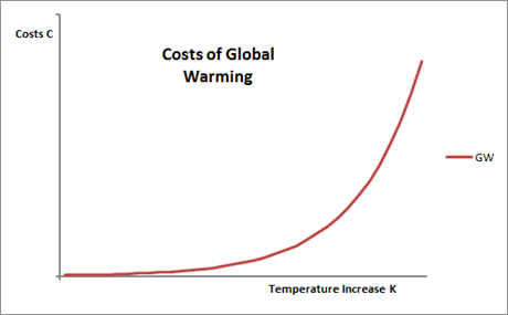
The curve is largely unknown, with large variations in the estimate of the slope. Furthermore, the function may be discontinuous as, there may be tipping points, beyond which the costly impacts of warming become magnified many times. Being unknown, the cost curve is an expectation derived from computer models. The equation thus becomes

E(CGW)= f {Kx}                (3)

The cost curve can be considered as having a number of elements the interrelated elements of magnitude M, time t and likelihood L. There are also costs involved in taking actions based on false expectations. Over a time period, costs are normally discounted, and when considering a policy response, a weighting W should be given to the scientific evidence. That is

E(CGW)=f {M,1/t,L,│Pr-E()│,r,W}    (4)

Magnitude M is the both severity and extent of the impacts on humankind or the planet in general.

Time t is highly relevant to the severity of the problem. Rapid changes in conditions are far more costly than gradual changes. Also impacts in the near future are more costly than those in the more distant future due to the shorter time horizon to put in place measures to lessen those costs.

Likelihood L is also relevant to the issue. Discounting a possible cost that is not certain to happen by the expected likelihood of that occurrence enables unlikely, but catastrophic, events to be considered alongside near certain events.

│Pr-E()│ is the difference between the predicted outcome, based on the best analysis of current data at the local level, and the expected outcome, that forms the basis of adaptive responses. It can work two ways. If there is a failure to predict and adapt to changing conditions then there is a cost. If there is adaptation to anticipation future condition that does not emerge, or is less severe than forecast, there is also a cost. │Pr-E()│= 0 when the outturn is exactly as forecast in every case. Given the uncertainty of future outcomes, there will always be costs incurred would be unnecessary with perfect knowledge.

Discount rate r is a device that recognizes that people prioritize according to time horizons. Discounting future costs or revenue enables us to evaluate the discount future alongside the near future.

Finally the Weighting (W) is concerned with the strength of the evidence. How much credence do you give to projections about the future? Here is where value judgements come into play. I believe that we should not completely ignore alarming projections about the future for which there is weak evidence, but neither should we accept such evidence as the only possible future scenario. Consider the following quotation.

There are uncertain truths — even true statements that we may take to be false — but there are no uncertain certainties. Since we can never know anything for sure, it is simply not worth searching for certainty; but it is well worth searching for truth; and we do this chiefly by searching for mistakes, so that we have to correct them.

Popper, Karl. In Search of a Better World. 1984.

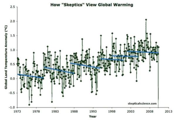
Popper was concerned with hypothesis testing, whilst we are concerned here with accurate projections about states well into the future. However, the same principles apply. We should search for the truth, by looking for mistakes and (in the context of projections) inaccurate perceptions as well. However, this is not to be dismissive of uncertainties. If future climate catastrophe is the true future scenario, the evidence, or signal, will be weak amongst historical data where natural climate variability is quite large. This is illustrated in the graphic below.


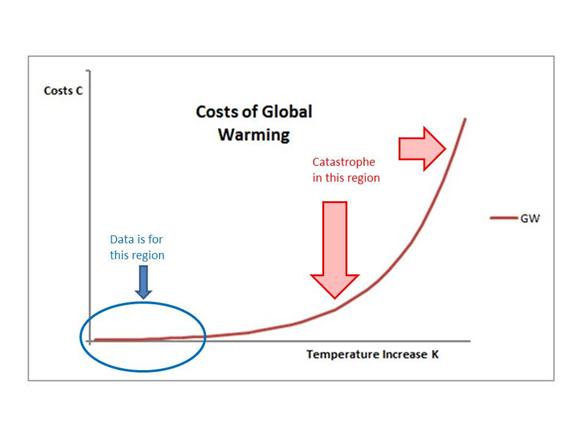
The precarious nature of climate costs prediction.

Historical data is based upon an area where the signal of future catastrophe is weak.

Projecting on the basis of this signal is prone to large errors.

In light of this, it is necessary to concentrate on positive criticism, with giving due weighting to the evidence.

Looking at individual studies, due weighting might include the following:-

  • Uses verification procedures from other disciplines
  • Similarity of results from using different statistical methods and tests to analyse the data
  • Similarity of results using different data sets
  • Corroborated by other techniques to obtain similar results
  • Consistency of results over time as historical data sets become larger and more accurate
  • Consistency of results as data gathering becomes independent of the scientific theorists
  • Consistency of results as data analysis techniques become more open, and standards developed
  • Focus on projections on the local level (sub-regional) level, for which adaptive responses might be possible

To gain increased confidence in the projections, due weighting might include the following:-

  • Making way-marker predictions that are accurate
  • Lack of way-marker predictions that are contradicted
  • Acknowledgement of, and taking account of, way-marker predictions that are contradicted
  • Major pattern predictions that are generally accurate
  • Increasing precision and accuracy as techniques develop
  • Changing the perceptions of the magnitude and likelihood of future costs based on new data
  • Challenging and removal of conflicts of interest that arise from scientists verifying their own projections

    Kevin Marshall

East Australia High Speed Rail – Opening Comments

Bernd Felsche has been blogging recently on proposals for a High Speed Rail project for Eastern Australia. The details and Phase 1 report are here.

In Britain there has recently been approved a HSR project from London to Birmingham, costing at least £17.1bn (A$26.7bn) for just 190km of track. The estimated cost of A$61bn to A$108bn for around 1644km looks remarkably good value in comparison. However, it is worth studying the underlying assumptions.

The Taxpayers Alliance has made a number of damming criticisms of the UK project. In particular that the actual costs could be nearly three times the estimated if supporting infrastructure improvements are taken into account. Having also looked at the Manchester Congestion Charging Scheme in 2008, I thought it might be worth a perusal.

The basis for the project is the projected demand, so my first comments are population and demand levels.

Initial Thoughts on Population

The study assumes a high level of population growth for Australia as a whole. From the current 23m, population is forecast to be between 30 and 40m in 2056. That is growth of 30% to 74% over 45 years. Taking the mid-point, that is 52.2% growth to 35m. East Australia is forecast to grow 58.3% from 17.8m to 28.2m, leaving growth in the rest of Australia of 30.7% (5.2 to 6.8m).


Map from page iii of Executive Summary, annotated with city population growth projections for 2011 to 2056.

The highest growth in population (using Australian Bureau of Statistics, Population Projections Australia 2006 – 2101, 2008 (Series B forecasts updated)) is projected to be in the Brisbane area. Given that this is the least populated end of the line, these population projections need to be put through a sensitivity analysis. With much lower projections for South East Queensland growth it could be that the northern stretch of the line and one third the estimated cost is not economically justified.

Passenger Growth

From the Executive Summary page iv

The population of the east coast states and territory of Australia is forecast to increase from 18 million people in 2011 to 28 million people by 2056. Over 100 million long distance trips are made on the east coast of Australia each year, and this is forecast to grow to 264 million long-distance trips over the next 45 years.

So population will grow by 58% and long distance trips by 164%. By 2036 (with 35% growth in population), they will have grabbed half the project air market in 2036 for Melbourne to Sydney and Brisbane to Sydney. With such a huge capital outlay how can this be?

Capital Cost

From the Executive Summary

International experience suggests it is unrealistic to expect the capital cost of a HSR network to be recovered.

The reason that the projected fares look so cheap, so that there is not going to be any recovery of the costs in fares. So the

competitive ticket prices, with one way fares (in $2011) from Brisbane to Sydney costing $75–$177; Sydney to Melbourne $99–$197; and $16.50 for daily commuters between Newcastle and Sydney

are no such thing. A quick check on single flights from Melbourne to Sydney reveals prices of $125 economy and $850 business. The HSR will be financed out of taxation to grab market share from air travel.

Kevin Marshall


Electric Cars – toys of the rich, subsidised by the masses

Joanna Nova reports on a new study showing that electric cars produce more CO2 that either petrol or diesel cars if that electricity is produced principally from coal-fired power stations.

The most practical electric car

In Britain there is more a market for electric vehicles, but still puny sales. The European Car of the Year is the Chevrolet Volt, which has a 1.4 petrol engine to accompany the electric motor. At £29,995 it costs 50% more than a similarly-sized Ford Focus diesel, even with the £5,000 government subsidy. In fact, it is more than a similarly-sized Audi, BMW or Mercedes and will not last nearly as long. If you look at the detail, the Volt has a claimed CO2 emission 27 g/km, as against 99 g/km for the best diesels. This takes no account of the CO2 emissions from the power stations. In Britain electricity is mostly from gas, with much of the rest from coal and nuclear.

There is also a question of equity. Domestic electricity has a 5% tax added on. Diesel has over 120% added. So the cost for 100 km (using official figures and 15p per kwh + 5% vat) is £2.66 for the Volt and £6.00 for the equivalent diesel car (combined 67.3mpg and £1.43 per litre). But tax is £0.13 and £3.30, so most of the cost saving is in tax. In the UK the average is 12,000 miles or 19,300km per year. So the tax saving from driving the Volt is up to £610 per annum. Although if you travel that distance per annum there will be a number of long distance journeys. Let us assume half the 12,000 miles is on the petrol engine at 50mpg, with petrol at £1.38. Then the annual tax saving drops to just £70.

The biggest saving for electric car owners is in London, with the congestion charge. Drive 5 days a week for 11 months of the year into London, and the conventional car owner will pay £2,750 a year. Drive an electric car or hybrid and the charge is zero.

So what sort of people would be persuaded to buy such a device? It is the small minority who have money for at least two cars, but want to appear concerned about the environment. They have the open-top sports car for summer days, the luxury car for long journeys, and the Volt for trips to the supermarket or to friend’s houses. It is the new form of conspicuous consumption for the intelligentsia, making the Toyota Prius so last year.

The least practical electric car

Launched this year the Renault Twizy is claimed to be about the cheapest “car” available today. As a car it is also by far the smallest available as well, being more a quadricycle, with no proper doors. The cost is kept low by not including the battery which is rented for at least £48 a month. As the Telegraph concludes, it is an expensive toy. My 12 year old son said he would love one when he saw it in a car showroom recently. But he would soon regret it if he was transported to school in it every day, instead of riding on the top-deck of a bus. At least if his dad forgot to plug it in, it would be small enough for him to push.

Lewandowsky et al 2012 from two alternative philosophies of science

The following comment was made on Joanne Nova’s blog, in response to a comment by Jonathan Fordsham that Stephen Lewandowsky did not know what he was getting into by publishing his paper and the subsequent defence of that paper.

Whilst Lewandowsky may not have known what he was getting into, the aim of the paper was to find further reasons to dogmatically dismiss any views that question the established orthodoxy. It is from a view of science that sees conformity and belief in that orthodoxy as the mark of a scientist. From this conformity is the importance of opinion polls and declarations of belief by scientific bodies to this view. Promoting evidence or hypotheses that contradicts orthodoxy risks being branded a heretic or denier.

The alternative, “Popperian” view of science is that progress is often made by over-turning existing hypotheses, or subsuming them within more profound theories. Getting results that contradict hypotheses is a cause for celebration. It then raises a whole series of questions. In this view of science, belief in a specific hypothesis is dangerous. People do not like having their beliefs contradicted, and it would be hugely damaging psychologically to constantly attempt to undermine one’s core beliefs. Belief instead is in finding new understanding of the world by the most rigorous method.

The questionnaire, despite all its biases, clearly showed that the vast majority of respondents, whether skeptic or alarmist rejected cranky conspiracy theories. Lewandowsky’s theory about climate “deniers” having a conspiracist orientation was clearly contradicted by the evidence. A team of people then spent 18 months producing the paper. There is strong circumstantial evidence that the time was spent manipulating the data, choosing the best statistical methods to corroborate their story, and carefully phrasing what they wrote to claim the opposite of what the data revealed.

The “orthodox” view of science was clearly Lewandowsky’s enemy when the evidence contradicted his hypothesis. He could not publish the full results for risk of his status as a scientist and for future funding of his work. The “Popperian” view would have still allowed publication, as it falsifies a hypothesis that Lewandowsky and others believe in.

Kevin Marshall.


The Role of Pivot Tables in Understanding Lewandowsky, Oberauer & Gignac 2012

Summary

Descriptive statistics, particularly in the form of pivot tables enable a bridging of the gap between the public pronouncements and the high level statistical analysis that can only be performed by specialists. In empirically-based scientific papers, data analysis by spread sheet enables the robust questions to be asked by the non-specialist and the expert reviewer alike. In relation to Lewandowsky et. al 2012, it highlights the gulf between the robust public claims and the actual opinion poll results on which it is based.

Introduction

In a blog post “Drilling into Noise” on 17 September, Stephan Lewandowsky (along with co-author Klaus Oberauer) makes an interesting comment

The science of statistics is all about differentiating signal from noise. This exercise is far from trivial: Although there is enough computing power in today’s laptops to churn out very sophisticated analyses, it is easily overlooked that data analysis is also a cognitive activity.

Numerical skills alone are often insufficient to understand a data set—indeed, number-crunching ability that’s unaccompanied by informed judgment can often do more harm than good.

This fact frequently becomes apparent in the climate arena, where the ability to use pivot tables in Excel or to do a simple linear regressions is often over-interpreted as deep statistical competence.

Now let me put this in context.

    The science of statistics is all about differentiating signal from noise. This exercise is far from trivial:

A more typical definition of statistics is

Statistics is the study of how to collect, organize, analyze, and interpret numerical information from data.

So Lewandowsky and Oberauer appear to seem to have a narrow and elitist interpretation.

“it is easily overlooked that data analysis is also a cognitive activity.”

Lewandowsky and Oberauer are cognitive scientists. They are merely claiming that this is within their area of competence.

Numerical skills alone are often insufficient to understand a data set—indeed, number-crunching ability that’s unaccompanied by informed judgment can often do more harm than good.

Agreed – but that implies that what follows should demonstrate something unique, they can only be gained by higher level or “scientific” analysis.

This fact frequently becomes apparent in the climate arena, where the ability to use pivot tables in Excel or to do a simple linear regressions is often over-interpreted as deep statistical competence.

I have not found pivot tables used before to analyse data in the climate arena. Nor have I seen simple linear regressions. The heavyweight statistical analysis from those who dispute the science has centred around one person – Steve McIntyre. In fact, to my knowledge, the first instance of when pivot tables were presented are primary analysis by sceptics was when I published my analysis

I would quite agree that pivot tables are not a replacement for deep statistical analysis. But it has role. My analysis using pivot tables, published on 1st September has a number of things which I identified independently which are not brought out in the original paper. These I present below. Then I will suggest how the reporting in the mainstream media might have been somewhat different if they had seen the pivot table summaries. Finally I will make some suggestions as to how the low level statistical analysis can contribute to relating to more “scientific” statistics.

Analysis using pivot tables

How Many Sceptics?

When I first glanced through the paper at the end of July, I wrote

It was an internet based survey, with links posted on 8 “pro-science” blogs. Five skeptic blogs were approached. As such, one would expect that “pro-science” responses would far outweigh “denialist” responses. I cannot find the split.

On obtaining the data, this was what first looked at. In the posting I looked at the 4 Climate Science questions, classifying into acceptors and rejectors (“denialist”) of the science.


Or summarising into 3 categories


Those who dogmatically rejected every question were outnumbered more than 10 to 1 by those who dogmatically accepted. Those who accept the science comprise three-quarters of the respondents. Most people would believe this to be material to a paper analysing those who reject the science.

NASA faked the moon landing|Therefore (Climate) Science is a Hoax

This is the beginning of the title of the paper. Pivot tables are great analysing this. The row labels are “Climate Science Belief”, the columns are CYMoon, and under “∑ values” enter the count of another column of values.

After a bit of formatting, and three more columns of simple formulas, I got this.


Just 10 out of 1145 respondents agree that NASA faked the moon landings. (I was not the first to publish this result. Anthony Watts piped me by a few hours.)

Strictly this is a claim against the “Climate Change” conspiracy theory CYClimChange and CYMoon. I did this table as well


Of the 64 who strongly accept that the climate change conspiracy theory, just 2 also strongly accept CYMOON. Even worse the title is the other way round. So the sample of those who believe NASA faked the moon landings is just 10. The sample size was just too small to make a prediction. Even worse, you could make the wrong result due to the next issue.

Identification of scam responses

One test was to look at the average agreement to each of 12 conspiracy theories that were independent of the climate area. So I rounded the average response to the nearest whole number for each respondent. And then did a pivot table.


I believe I was the first to identify publically the two that averaged 4 on the conspiracy theories and rejected the climate science. These are the two that Steve McIntyre has dubbed “Super-scammers”.

The biggest conclusion that I see is that the vast majority of respondents, no matter what their views on climate, don’t have much time for conspiracy theories. In fact, if you take out the two super-scammers, the most sceptical bunch are the group that dogmatically reject climate science.

This is confirmed if you take the average conspiracy score for each group.


Taking out the two super-scammers brings the average for the dogmatic rejectors from 1.63 to 1.49. With such small numbers, one or two outliers can have an impact on the data.

Measuring up against the public perception

There were two major newspaper articles that promoted the

The Guardian article on 27th July started

Are climate sceptics more likely to be conspiracy theorists?

New research finds that sceptics also tend to support conspiracy theories such as the moon landing being faked

Even a paper such as the Guardian, which prints all sorts of extremist dogma in denigrating sceptics, would have thought twice about publishing that comment if they had been presented with the tables.

The Telegraph article of 28th August included

“NASA faked the moon landing – Therefore (Climate) Science is a Hoax: An Anatomy of the Motivated Rejection of Science”, was based on a survey of more than 1000 visitors to blogs dedicated to discussion of climate change.

An astute reporter, on the basis of my pivot tables, could reasonably ask Professor Lewandowsky how it follows from just 10 respondents who support the idea that “NASA faked the moon landing” that you can make any sort of prediction about beliefs about climate. The questionnaires were placed on climate blogs, not conspiracy-based blogs, so surely any prediction should be framed the other way round?

It also included

The lead researcher, Professor Stephan Lewandowsky, from the University of Western Australia, said conspiracy theories are the “antithesis to scientific thinking” and those who believe them are more likely to reject the scientific consensus that humans contribute to climate change.

“Science is about weeding out bad ideas,” he told The Daily Telegraph. “With conspiracy theories, you start out with a theory and stick to it no matter what the evidence. So it is not that surprising that conspiracy theorists would not accept scientific propositions … If the scientific evidence is overwhelming and you don’t like the conclusion, you have to find a way to reject those findings.”

An astute reporter, on the basis of my pivot tables, could reasonably ask why Professor Lewandowsky is still sticking to his hypothesis when such small numbers support the wacky conspiracy theories. They may then ask a supplementary question. Given that there were 15 questions on conspiracy theories (14 with results reported), and just 5 on free markets, was not the original purpose to establish the conspiracy theory hypothesis and the secondary one on political orientation?

Suggestions for the Role of Low Level Statistical Analysis

In summary, whilst would quite agreeing that spread sheet analysis using pivot tables are not a replacement for deep statistical analysis there are a number of ways where it can be a powerful aid.

Firstly, it is a quick way of getting a sense of what the data is suggesting. Pivot tables can enable a quick summary visually in lots of different ways. It may need additional classifications, such as my acceptors / rejectors. It also needs thought, and an almost a manic sense of trial and error.

Second, it can give a quick comparison to what is being derived from the higher level statistics or modelling. For scientists it is a way of reviewing the data, to make sure that they have the most important points, and have not gone up blind alleys. For non-scientists (and for those scientists reviewing the work of others) it is a way of quickly getting a sense of whether the conclusions are substantiated by the empirical evidence.

Thirdly, and most importantly, it is a means of communicating to the wider public. It provides a bridge between the mainstream media and the scientists. If climate scientists want to win the trust of the wider public, then they need to relate their work in more intelligible terms, capable of being cross-examined. Instead we have the high level models and a then lot of shouting about how wrong and biased are any criticisms. That leads to a lot of scientists, including Lewandowsky, who are totally incapable of perceiving that they could be wrong, or that there could be even modicum of truth in what the critics say. This denial is best summarized in the graphic displayed in the Lewandowsky and Oberauer posting of the “skeptics” view on recent warming trends. It is a total misrepresentation, used as a means of avoiding intelligent discussion.


Kevin Marshall