Key Error in Climate Policy Illustrated

Good example of the key logical error in climate policy justifications is illustrated by an article posed in a Los Angeles Times article and repeated by Prof. Roger Pielke Jnr on Twitter. This error completely undermines the case for cutting greenhouse gas emissions.

The question is

What’s more important: Keeping the lights on 24 hours a day, 365 days a year, or solving the climate crisis?

It looks to be a trade-off question. But is it a real trade-off?

Before going further I will make some key assumptions for the purposes of this exercise. This is simply to focus in on the key issue.

  1. There is an increasing human-caused climate crisis, that will only get much worse, unless…
  2. Human greenhouse gas (GHG) emissions are cut to zero in the next few decades.
  3. The only costs of solving the climate crisis to the people of California are the few blackouts every year. This will remain fixed into the future. So the fact that California’s electricity costs are substantially higher than the US national average I shall assume for this exercise are nothing to do with any particular state climate-related policies.
  4. The relevant greenhouse gases are well-mixed in the atmosphere. Thus the emissions of California, do not sit in a cloud forever above the sunshine state, but are evenly dispersed over the whole of the earth’s atmosphere.
  5. Global GHG emissions are the aggregate emissions of all nation states (plus international emissions from sea and air). The United States’ GHG emissions are the aggregate emissions of all its member states.

Let us put the blackouts in context. The State of California has a helpful graphic showing a breakdown of the state GHG emissions.

Figure 1: California’s greenhouse gas emissions in 2020 broken out by economic sector

Electricity production, including imports, accounts for just 16% of California’s GHG emissions or about 60 MMtCO2e. Globally in 2020 global GHG emissions were just over 50,000 MMtCO2e. So the replacing existing electricity production from fossil fuels with renewables will cut global emissions by 0.12%. Replacing all GHG emissions from other sources will cut global emissions by 0.74%. So California alone cannot solve the climate crisis. There is no direct trade-off, but rather enduring the blackouts (or other costs) for a very marginal impact on climate change for the people of California. These tiny benefits of course will be shared by the 7960 million people who do not live in California.

More generally, the error is in assuming that the world follows the “leaders” on climate change. Effectively, the world the rest of the world is assumed to think as the climate consensus. An example is from the UK in March 2007 when then Environment Minister David Miliband was promoting a Climate Bill, that later became the Climate Change Act 2008.

In the last 16 years under the UNFCCC COP process there has been concerted efforts to get all countries to come “onboard”, so that the combined impact of local and country-level sacrifices produces the total benefit of stopping climate change. Has this laudable aim been achieved?

I will just go back to 2015, despite the United Nations Framework Convention on Climate Change Treaty (that set up the UNFCCC body) entering into force in March 1994. In preparation for COP 21 Paris most countries submitted “Intended Nationally Determined Contributions” (INDCs). The submissions outlined what post-2020 climate actions they intended to take under a new international agreement, now called the Paris Agreement. On the 1st November 2015 the UNFCCC produced a Synthesis Report of the aggregate impact of the INDCs submitted up to 1st October. The key chart is reproduced below.

Figure 2 : Summary results on the aggregate effect of INDCs to 1st November 2015.

The aggregate impact is for emissions still to rise through to 2030, with no commitments made thereafter. COP21 Paris failed in it’s objectives of a plan to reduce global emissions as was admitted in the ADOPTION OF THE PARIS AGREEMENT communique of 12/12/2015.

  1. Notes with concern that the estimated aggregate greenhouse gas emission levels in 2025 and 2030 resulting from the intended nationally determined contributions do not fall within least-cost 2 ˚C scenarios but rather lead to a projected level of 55 gigatonnes in 2030, and also notes that much greater emission reduction efforts will be required than those associated with the intended nationally determined contributions in order to hold the increase in the global average temperature to below 2 ˚C above pre-industrial levels by reducing emissions to 40 gigatonnes or to 1.5 ˚C above pre-industrial levels by reducing to a level to be identified in the special report referred to in paragraph 21 below;

Paragraph 21 states

  1. Invites the Intergovernmental Panel on Climate Change to provide a special report in 2018 on the impacts of global warming of 1.5 °C above pre-industrial levels and related global greenhouse gas emission pathways;

The request lead, 32 months later, to the scary IPCC SR1.5 of 2018. The annual COP meetings have also been pushing very hard for massive changes. Has this worked?

Figure 3 : Fig ES.3 from UNEP Emissions Gap Report 2022 demonstrating that global emissions have not yet peaked

The answer from the UNEP Emissions Gap Report 2022 executive summary Fig ES.3 is a clear negative. The chart, reproduced above as Figure 3, shows that no significant changes have been made to the commitments since 2015, in that aggregate global emissions will still be higher in 2030 than in 2015. Indeed the main estimate is for emissions in 2030 is 58 GtCO2e, up from 55 GtCO2e in 2015. Attempts to control global emissions, hence the climate, have failed.

Thus, in the context of the above assumptions the question for the people of California becomes.

What’s more important: Keeping a useless policy that is causing blackouts, or not?

To help clarify the point, there is a useful analogy with medicine.

If a treatment is not working, but causing harm to the patient, should you cease treatment?

In medicine, like in climate policy, whether or not the diagnosis was correct is irrelevant. Morally it is wrong to administer useless and harmful policies / treatments. However, there will be strong resistance to any form of recognition of the reality that climate mitigation has failed.

Although the failure to reduce emissions at the global level is more than sufficient to nullify any justification for emissions reductions at sub-global levels, there are many other reasons that would further improve the case for a rational policy-maker to completely abandon all climate mitigation policies.

Australian Beer Prices set to Double Due to Global Warming?

Earlier this week Nature Plants published a new paper Decreases in global beer supply due to extreme drought and heat

The Scientific American has an article “Trouble Brewing? Climate Change Closes In on Beer Drinkers” with the sub-title “Increasing droughts and heat waves could have a devastating effect on barley stocks—and beer prices”. The Daily Mail headlines with “Worst news ever! Australian beer prices are set to DOUBLE because of global warming“. All those climate deniers in Australia have denied future generations the ability to down a few cold beers with their barbecued steaks tofu salads.

This research should be taken seriously, as it is by a crack team of experts across a number of disciplines and Universities. Said, Steven J Davis of University of California at Irvine,

The world is facing many life-threatening impacts of climate change, so people having to spend a bit more to drink beer may seem trivial by comparison. But … not having a cool pint at the end of an increasingly common hot day just adds insult to injury.

Liking the odd beer or three I am really concerned about this prospect, so I rented the paper for 48 hours to check it out. What a sensation it is. Here a few impressions.

Layers of Models

From the Introduction, there were a series of models used.

  1. Created an extreme events severity index for barley based on extremes in historical data for 1981-2010.
  2. Plugged this into five different Earth Systems models for the period 2010-2099. Use this against different RCP scenarios, the most extreme of which shows over 5 times the warming of the 1981-2010 period. What is more severe climate events are a non-linear function of temperature rise.
  3. Then model the impact of these severe weather events on crop yields in 34 World Regions using a “process-based crop model”.
  4. (W)e examine the effects of the resulting barley supply shocks on the supply and price of beer in each region using a global general equilibrium model (Global Trade Analysis Project model, GTAP).
  5. Finally, we compare the impacts of extreme events with the impact of changes in mean climate and test the sensitivity of our results to key sources of uncertainty, including extreme events of different severities, technology and parameter settings in the economic model.

What I found odd was they made no allowance for increasing demand for beer over a 90 year period, despite mentioning in the second sentence that

(G)lobal demand for resource-intensive animal products (meat and dairy) processed foods and alcoholic beverages will continue to grow with rising incomes.

Extreme events – severity and frequency

As stated in point 2, the paper uses different RCP scenarios. These featured prominently in the IPCC AR5 of 2013 and 2014. They go from RCP2.6, which is the most aggressive mitigation scenario, through to RCP 8.5 the non-policy scenario which projected around 4.5C of warming from 1850-1870 through to 2100, or about 3.8C of warming from 2010 to 2090.

Figure 1 has two charts. On the left it shows that extreme events will increase intensity with temperature. RCP2.6 will do very little, but RCP8.5 would result by the end of the century with events 6 times as intense today. Problem is that for up to 1.5C there appears to be no noticeable change what so ever.  That is about the same amount of warming the world has experienced from 1850-2010 per HADCRUT4 there will be no change. Beyond that things take off. How the models empirically project well beyond known experience for a completely different scenario defeats me. It could be largely based on their modelling assumptions, which is in turn strongly tainted by their beliefs in CAGW. There is no reality check that it is the models that their models are not falling apart, or reliant on arbitrary non-linear parameters.

The right hand chart shows that extreme events are porjected to increase in frequency as well. Under RCP 2.6 ~ 4% chance of an extreme event, rising to ~ 31% under RCP 8.5. Again, there is an issue of projecting well beyond any known range.

Fig 2 average barley yield shocks during extreme events

The paper assumes that the current geographical distribution and area of barley cultivation is maintained. They have modelled in 2099, from the 1981-2010 a gridded average yield change with 0.5O x 0.5O resolution to create four colorful world maps representing each of the four RCP emissions scenarios. At the equator, each grid is about 56 x 56 km for an area of 3100 km2, or 1200 square miles. Of course, nearer the poles the area diminishes significantly. This is quite a fine level of detail for projections based on 30 years of data to radically different circumstances 90 years in the future. The results show. Map a) is for RCP 8.5. On average yields are projected to be 17% down. As Paul Homewood showed in a post on the 17th, this projected yield fall should be put in the context of a doubling of yields per hectare since the 1960s.

This increase in productivity has often solely ascribed to the improvements in seed varieties (see Norman Borlaug), mechanization and use of fertilizers. These have undoubtably have had a large parts to play in this productivity improvement. But also important is that agriculture has become more intensive. Forty years ago it was clear that there was a distinction between the intensive farming of Western Europe and the extensive farming of the North American prairies and the Russian steppes. It was not due to better soils or climate in Western Europe. This difference can be staggering. In the Soviet Union about 30% of agricultural output came from around 1% of the available land. These were the plots that workers on the state and collective farms could produce their own food and sell surplus in the local markets.

Looking at chart a in Figure 2, there are wide variations about this average global decrease of 17%.

In North America Montana and North Dakota have areas where barley shocks during extreme years will lead to mean yield changes over 90% higher normal, and the areas around have >50% higher than normal. But go less than 1000 km North into Canada to the Calgary/Saskatoon area and there are small decreases in yields.

In Eastern Bolivia – the part due North of Paraguay – there is the biggest patch of > 50% reductions in the world. Yet 500-1000 km away there is a North-South strip (probably just 56km wide) with less than a 5% change.

There is a similar picture in Russia. On the Kazakhstani border, there are areas of > 50% increases, but in a thinly populated band further North and West, going from around Kirov to Southern Finland is where there are massive decreases in yields.

Why, over the course of decades, would those with increasing yields not increase output, and those with decreasing yields not switch to something else defeats me. After all, if overall yields are decreasing due to frequent extreme weather events, the farmers would be losing money, and those farmers do well when overall yields are down will be making extraordinary profits.

A Weird Economic Assumption

Building up to looking at costs, their is a strange assumption.

(A)nalysing the relative changes in shares of barley use, we find that in most case barley-to-beer shares shrink more than barley-to-livestock shares, showing that food commodities (in this case, animals fed on barley) will be prioritized over luxuries such as beer during extreme events years.

My knowledge of farming and beer is limited, but I believe that cattle can be fed on other things than barley. For instance grass, silage, and sugar beet. Yet, beers require precise quantities of barley and hops of certain grades.

Further, cattle feed is a large part of the cost of a kilo of beef or a litre of milk. But it takes around 250-400g of malted barley to produce a litre of beer. The current wholesale price of malted barley is about £215 a tonne or 5.4 to 8.6p a litre. About cheapest 4% alcohol lager I can find in a local supermarket is £3.29 for 10 x 250ml bottles, or £1.32 a litre. Take off 20% VAT and excise duty leaves 30p a litre for raw materials, manufacturing costs, packaging, manufacturer’s margin, transportation, supermarket’s overhead and supermarket’s margin. For comparison four pints (2.276 litres) of fresh milk costs £1.09 in the same supermarket, working out at 48p a litre. This carries no excise duty or VAT. It might have greater costs due to refrigeration, but I would suggest it costs more to produce, and that feed is far more than 5p a litre.

I know that for a reasonable 0.5 litre bottle of ale it is £1.29 to £1.80 a bottle in the supermarkets I shop in, but it is the cheapest that will likely suffer the biggest percentage rise from increase in raw material prices. Due to taxation and other costs, large changes in raw material prices will have very little impact on final retail costs. Even less so in pubs where a British pint (568ml) varies from the £4 to £7 a litre equivalent.

That is, the assumption is the opposite of what would happen in a free market. In the face of a shortage, farmers will substitute barley for other forms of cattle feed, whilst beer manufacturers will absorb the extra cost.

Disparity in Costs between Countries

The most bizarre claim in the article in contained in the central column of Figure 4, which looks at the projected increases in the cost of a 500 ml bottle of beer in US dollars. Chart h shows this for the most extreme RCP 8.5 model.

I was very surprised that a global general equilibrium model would come up with such huge disparities in costs after 90 years. After all, my understanding of these models used utility-maximizing consumers, profit-maximizing producers, perfect information and instantaneous adjustment. Clearly there is something very wrong with this model. So I decided to compare where I live in the UK with neighbouring Ireland.

In the UK and Ireland there are similar high taxes on beer, with Ireland being slightly more. Both countries have lots of branches of the massive discount chain. They also have some products on their website aldi.co.uk and aldi.ie.  In Ireland a 500 ml can of Sainte Etienne Lager is €1.09 or €2.18 a litre or £1.92 a litre. In the UK it is £2.59 for 4 x 440ml cans or £1.59 a litre. The lager is about 21% more in Ireland. But the tax difference should only be about 15% on a 5% beer (Saint Etienne is 4.8%). Aldi are not making bigger profits in Ireland, they just may have higher costs in Ireland, or lesser margins on other items. It is also comparing a single can against a multipack. So pro-rata the £1.80 ($2.35) bottle of beer in the UK would be about $2.70 in Ireland. Under the RCP 8.5 scenario, the models predict the bottle of beer to rise by $1.90 in the UK and $4.84 in Ireland. Strip out the excise duty and VAT and the price differential goes from zero to $2.20.

Now suppose you were a small beer manufacturer in England, Wales or Scotland. If beer was selling for $2.20 more in Ireland than in the UK, would you not want to stick 20,000 bottles in a container and ship it to Dublin?

If the researchers really understood the global brewing industry, they would realize that there are major brands sold across the world. Many are brewed across in a number of countries to the same recipe. It is the barley that is shipped to the brewery, where equipment and techniques are identical with those in other parts of the world. This researchers seem to have failed to get away from their computer models to conduct field work in a few local bars.

What can be learnt from this?

When making projections well outside of any known range, the results must be sense-checked. Clearly, although the researchers have used an economic model they have not understood the basics of economics. People are not dumb  automatons waiting for some official to tell them to change their patterns of behavior in response to changing circumstances. They notice changes in the world around them and respond to it. A few seize the opportunities presented and can become quite wealthy as a result. Farmers have been astute enough to note mounting losses and change how and what they produce. There is also competition from regions. For example, in the 1960s Brazil produced over half the world’s coffee. The major region for production in Brazil was centered around Londrina in the North-East of Parana state. Despite straddling the Tropic of Capricorn, every few years their would be a spring-time frost which would destroy most of the crop. By the 1990s most of the production had moved north to Minas Gerais, well out of the frost belt. The rich fertile soils around Londrina are now used for other crops, such as soya, cassava and mangoes. It was not out of human design that the movement occurred, but simply that the farmers in Minas Gerais could make bumper profits in the frost years.

The publication of this article shows a problem of peer review. Nature Plants is basically a biology journal. Reviewers are not likely to have specialist skills in climate models or economic theory, though those selected should have experience in agricultural models. If peer review is literally that, it will fail anyway in an inter-disciplinary subject, where the participants do not have a general grounding in all the disciplines. In this paper it is not just economics, but knowledge of product costing as well. It is academic superiors from the specialisms that are required for review, not inter-disciplinary peers.

Kevin Marshall


Changing a binary climate argument into understanding the issues

Last month Geoff Chambers posted “Who’s Binary, Us or Them? Being at cliscep the question was naturally about whether sceptics or alarmists were binary in their thinking. It reminded me about something that went viral on youtube a few year’s ago. Greg Craven’s The Most Terrifying Video You’ll Ever See.

To his credit, Greg Craven in introducing both that human-caused climate change can have a trivial impact recognize that mitigating climate (taking action) is costly. But for the purposes of his decision grid he side-steps these issues to have binary positions on both. The decision is thus based on the belief that the likely consequences (costs) of catastrophic anthropogenic global warming then the likely consequences (costs) of taking action. A more sophisticated statement of this was from a report commissioned in the UK to justify the draconian climate action of the type Greg Craven is advocating. Sir Nicholas (now Lord) Stern’s report of 2006 (In the Executive Summary) had the two concepts of the warming and policy costs separated when it claimed

Using the results from formal economic models, the Review estimates that if we don’t act, the overall costs and risks of climate change will be equivalent to losing at least 5% of global GDP each year, now and forever. If a wider range of risks and impacts is taken into account, the estimates of damage could rise to 20% of GDP or more. In contrast, the costs of action – reducing greenhouse gas emissions to avoid the worst impacts of climate change – can be limited to around 1% of global GDP each year.

Craven has merely simplified the issue and made it more binary. But Stern has the same binary choice. It is a choice between taking costly action, or suffering the much greater possible consequences.  I will look at the policy issue first.

Action on Climate Change

The alleged cause of catastrophic anthropogenic global warming is (CAGW) is human greenhouse gas emissions. It is not just some people’s emissions that must be reduced, but the aggregate emissions of all 7.6 billion people on the planet. Action on climate change (i.e. reducing GHG emissions to near zero) must therefore include all of the countries in which those people live. The UNFCCC, in the run-up to COP21 Paris 2015, invited countries to submit Intended Nationally Determined Contributions (INDCs). Most did so before COP21, and as at June 2018, 165 INDCs have been submitted, representing 192 countries and 96.4% of global emissions. The UNFCCC has made them available to read. So these intentions will be sufficient “action” to remove the risk of CAGW? Prior to COP21, the UNFCCC produced a Synthesis report on the aggregate effect of INDCs. (The link no longer works, but the main document is here.) They produced a graphic that I have shown on multiple occasions of the gap between policy intentions on the desired policy goals. A more recent graphic is from the UNEP Emissions Gap Report 2017, published last October and

Figure 3 : Emissions GAP estimates from the UNEP Emissions GAP Report 2017

In either policy scenario, emissions are likely to be slightly higher in 2030 than now and increasing, whilst the policy objective is for emissions to be substantially lower than today and and decreasing rapidly. Even with policy proposals fully implemented global emissions will be at least 25% more, and possibly greater than 50%, above the desired policy objectives. Thus, even if proposed policies achieve their objective, in Greg Craven’s terms we are left with pretty much all the possible risks of CAGW, whilst incurring some costs. But the “we” is for 7.6 billion people in nearly 200 countries. But the real costs are being incurred by very few countries. For the United Kingdom, with the Climate Change Act 2018 is placing huge costs on the British people, but future generations of Britain’s will achieve very little or zero benefits.

Most people in the world live in poorer countries that will do nothing significant to constrain emissions growth if it that conflicts with economic growth or other more immediate policy objectives. In terms of the some of the most populous developing countries, it is quite clear that achieving the policy objectives will leave emissions considerably higher than today. For instance, China‘s main aims of peaking CO2 emissions around 2030 and lowering carbon emissions per unit of GDP in 2030 by 60-65% compared to 2005 by 2020 could be achieved with emissions in 2030 20-50% higher than in 2017. India has a lesser but similar target of reducing emissions per unit of GDP in 2030 by 30-35% compared to 2005 by 2020. If the ambitious economic growth targets are achieve, emissions could double in 15 years, and still be increasing past the middle of the century. Emissions in Bangladesh and Pakistan could both more than double by 2030, and continue increasing for decades after.

Within these four countries are over 40% of the global population. Many other countries are also likely to have emissions increasing for decades to come, particularly in Asia and Africa. Yet without them changing course global emissions will not fall.

There is another group of countries that are have vested interests in obstructing emission reduction policies. That is those who are major suppliers of fossil fuels. In a letter to Nature in 2015, McGlade and Ekins (The geographical distribution of fossil fuels unused when limiting global warming to 2°C) estimate that the proven global reserves of oil, gas and coal would produce about 2900 GtCO2e. They further estimate that the “non-reserve resources” of fossil fuels represent a further 8000 GtCO2e of emissions. The estimated that to constrain warming to 2C, 75% of proven reserves, and any future proven reserves would need to be left in the ground. Using figures from the BP Statistical Review of World Energy 2016 I produced a rough split by major country.

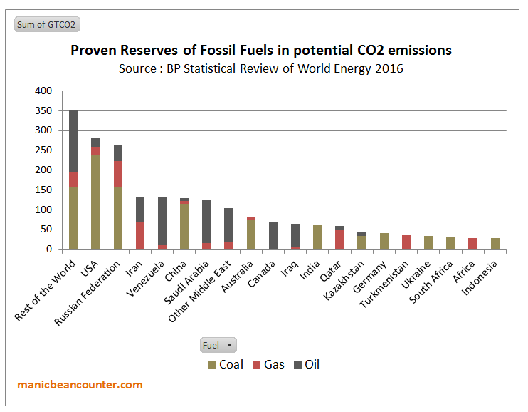
Figure 4 : Fossil fuel Reserves by country, expressed in terms of potential CO2 Emissions

Activists point to the reserves in the rich countries having to be left in the ground. But in the USA, Australia, Canada and Germany production of fossil fuels is not a major part of the economy. Ceasing production would be harmful but not devastating. One major comparison is between the USA and Russia. Gas and crude oil production are similar volumes in both countries. But, the nominal GDP of the US is more than ten times that of Russia. The production of both countries in 2016 was about 550 million tonnes or 3900 million barrels. At $70 a barrel that is around $275bn, equivalent to 1.3% of America’s GDP and 16% of Russia’s. In gas, prices vary, being very low in the highly competitive USA, and highly variable for Russian supply, with major supplier Gazprom acting as a discriminating monopolist. But America’s revenue is likely to be less than 1% of GDP and Russia’s equivalent to 10-15%. There is even greater dependency in the countries of the Middle East. In terms of achieve emissions targets, what is trying to be achieved is the elimination of the major source of the countries economic prosperity in a generation, with year-on-year contractions in fossil fuel sales volumes.

I propose that there are two distinct groups of countries that appear to have a lot lose from a global contraction in GHG emissions to near zero. There are the developing countries who would have to reduce long-term economic growth and the major fossil fuel-dependent countries, who would lose the very foundation of their economic output in a generation. From the evidence of the INDC submissions, there is now no possibility of these countries being convinced to embrace major economic self-harm in the time scales required. The emissions targets are not going to be met. The emissions gap will not be closed to any appreciable degree.

This leaves Greg Craven’s binary decision option of taking action, or not, as irrelevant. As taking action by a country will not eliminate the risk of CAGW, pursuing aggressive climate mitigation policies will impose net harms wherever they implemented. Further, it is not the climate activists who are making the decisions, but policy-makers countries themselves. If the activists believe that others should follow another path, it is them that must make the case. To win over the policy-makers they should have sought to understand their perspectives of those countries, then persuade them to accept their more enlightened outlook. The INDCs show that the climate activists gave failed in this mission. Until such time, when activists talk about the what “we” are doing to change the climate, or what “we” ought to be doing, they are not speaking about

But the activists have won over the United Nations, those who work for many Governments and they dominate academia. For most countries, this puts political leaders in a quandary. To maintain good diplomatic relations with other countries, and to appear as movers on a world stage they create the appearance of taking significant action on climate change for the outside world. On the other hand they are serving their countries through minimizing the real harms that imposing the policies would create. Any “realities” of climate change have become largely irrelevant to climate mitigation policies.

The Risks of Climate Apocalypse

Greg Craven recognized a major issue with his original video. In the shouting match over global warming who should you believe? In How it all Ends (which was followed up by further videos and a book) Craven believes he has the answer.

Figure 5 : Greg Craven’s “How it all Ends”

It was pointed out that the logic behind the grid is bogus. As in Devil’s advocate guise Craven says at 3:50

Wouldn’t that grid argue for action against any possible threat, no matter how costly the action or how ridiculous the threat? Even giant mutant space hamsters? It is better to go broke building a load of rodent traps than risk the possibility of being hamster chow. So this grid is useless.

His answer is to get a sense of how likely the possibility of global warming being TRUE or FALSE is. Given that science is always uncertain, and there are divided opinions.

The trick is not to look at what individual scientists are saying, but instead to look at what the professional organisations are saying. The more prestigious they are, the more weight you can give their statements, because they have got huge reputations to uphold and they don’t want to say something that later makes them look foolish. 

Craven points to the “two most respected in the world“. The National Academy of Sciences (NAS) and the American Association for the Advancement of Science (AAAS). Back in 2007 they had “both issued big statements calling for action, now, on global warming“.  The crucial question from scientists (that is people will a demonstrable expert understanding of the natural world) is not for political advocacy, but whether their statements say their is a risk of climate apocalypse. These two bodies still have statements on climate change.

National Academy of Sciences (NAS) says

There are well-understood physical mechanisms by which changes in the amounts of greenhouse gases cause climate changes. The US National Academy of Sciences and The Royal Society produced a booklet, Climate Change: Evidence and Causes (download here), intended to be a brief, readable reference document for decision makers, policy makers, educators, and other individuals seeking authoritative information on the some of the questions that continue to be asked. The booklet discusses the evidence that the concentrations of greenhouse gases in the atmosphere have increased and are still increasing rapidly, that climate change is occurring, and that most of the recent change is almost certainly due to emissions of greenhouse gases caused by human activities.

Further climate change is inevitable; if emissions of greenhouse gases continue unabated, future changes will substantially exceed those that have occurred so far. There remains a range of estimates of the magnitude and regional expression of future change, but increases in the extremes of climate that can adversely affect natural ecosystems and human activities and infrastructure are expected.

Note, this is conjunction with the Royal Society, which is arguably is (or was) the most prestigious  scientific organisation of them all. It is what not said that is as important as what is actually said. They are saying that there is a an expectation that extremes of climate could get worse. There is nothing that solely backs up the climate apocalypse, but a range of possibilities, including changes somewhat trivial on a global scale. The statement endorses a spectrum of possible positions that undermines the binary TRUE /FALSE position on decision-making.

The RS/NAS booklet has no estimates of the scale of possible climate catastrophism to be avoided. Point 19 is the closest.

Are disaster scenarios about tipping points like ‘turning off the Gulf Stream’ and release of methane from the Arctic a cause for concern?

The summary answer is

Such high-risk changes are considered unlikely in this century, but are by definition hard to predict. Scientists are therefore continuing to study the possibility of such tipping points beyond which we risk large and abrupt changes.

This appears not to support Stern’s contention that unmitigated climate change will costs at least 5% of global GDP by 2100. Another context of the back-tracking on potential catastrophism is to to compare with  Lenton et al 2008 – Tipping elements in the Earth’s climate system. Below is a map showing the the various elements considered.

Figure 6 : Fig 1 of Lenton et al 2008, with explanatory note.

Of the 14 possible tipping elements discussed, only one makes it into the booklet six years later. Surely if the other 13 were still credible more would have been included in booklet, and less on documenting trivial historical changes.

American Association for the Advancement of Science (AAAS) has a video

Figure 7 : AAAS “What We Know – Consensus Sense” video


It starts with the 97% Consensus claims. After asking the listener on how many,  Marshall Sheppard, Prof of Geography at Univ of Georgia states.

The reality is that 97% of scientists are pretty darn certain that humans are contributing to the climate change that we are seeing right now and we better do something about it to soon.

There are two key papers that claimed a 97% consensus. Doran and Zimmerman 2009 asked two questions,

1. When compared with pre-1800s levels, do you think that mean global temperatures have generally risen, fallen, or remained relatively constant?

2. Do you think human activity is a significant contributing factor in changing mean global temperatures?

The second of these two responses was answered in the affirmative by 77 of 79 climate scientists. This was reduced from 3146 responses received. Read the original to find out why it was reduced.

Dave Burton has links to a number of sources on these studies. A relevant quote on Doran and Zimmerman is from the late Bob Carter

Both the questions that you report from Doran’s study are (scientifically) meaningless because they ask what people “think”. Science is not about opinion but about factual or experimental testing of hypotheses – in this case the hypothesis that dangerous global warming is caused by human carbon dioxide emissions.

The abstract to Cook et al. 2013 begins

We analyze the evolution of the scientific consensus on anthropogenic global warming (AGW) in the peer-reviewed scientific literature, examining 11 944 climate abstracts from 1991–2011 matching the topics ‘global climate change’ or ‘global warming’. We find that 66.4% of abstracts expressed no position on AGW, 32.6% endorsed AGW, 0.7% rejected AGW and 0.3% were uncertain about the cause of global warming. Among abstracts expressing a position on AGW, 97.1% endorsed the consensus position that humans are causing global warming. 

Expressing a position does not mean a belief. It could be an assumption. The papers were not necessarily by scientists, but merely authors of academic papers that involved the topics ‘global climate change’ or ‘global warming’. Jose Duarte listed some of the papers that were included in the survey, along with looking at some that were left out.

Neither paper asked a question concerning belief in future climate catastrophism. Sheppard does not make clear the scale of climate change trends from the norm, so the human-caused element could be insignificant. The 97% consensus does not include the policy claims.

The booklet is also misleading as well in the scale of changes. For instance on sea-level rise it states.

Over the past two decades, sea levels have risen almost twice as fast as the average during the twentieth century.

You will get that if you compare the tide gauge data with the two decades of satellite data. The question is whether those two sets of data are accurate. As individual tide gauges do not tend to show acceleration, and others cannot find statistically significant acceleration, the claim seems not to be supported.

At around 4.15 in the consensus video AAAS CEO Alan I. Leshner says

America’s leaders should stop debating the reality of climate change and start deciding the best solutions. Our What we Know report makes clear that climate change threatens us at every level. We can reduce the risk of global warming to protect out people, businesses and communities from harm. At every level from our personal and community health, our economy and our future as a global leader.  Understanding and managing climate change risks is an urgent problem. 

The statement is about combating the potential risks from CAGW. The global part of global warming is significant for policy. The United States share of global emissions is around 13% of global emissions. That share has been falling as America’s emissions have been falling why the global aggregate emissions have been rising. The INDC submission for the United States aimed as getting US emissions in 2025 at 26-28% of 2005 levels, with a large part of that reduction already “achieved” when the report was published. The actual policy difference is likely to be less than 1% of global emissions. So any reduction in risks with respect to climate change seems to be tenuous. A consensus of the best scientific minds should have been able to work this out for themselves.

The NAAS does not give a collective expert opinion on climate catastrophism. This is shown by the inability to distinguish between banal opinions and empirical evidence for a big problem. This is carried over into policy advocacy, where they fail to distinguish between the United States and the world as a whole.

Conclusions

Greg Laden’s decision-making grid is inapplicable to real world decision-making. The decision whether to take action or not is not a unitary one, but needs to be taken at country level. Different countries will have different perspectives on the importance of taking action on climate change relative to other issues. In the real world, the proposals for action are available. In aggregate they will not “solve” the potential risk of climate apocalypse. Whatever the actual scale of CAGW, countries who pursue expensive climate mitigation policies are likely to make their own people worse off than if they did nothing at all.

Laden’s grid assumes that the costs of the climate apocalypse are potentially far greater than the costs of action, no matter how huge. He tries to cut through the arguments by getting the opinions from the leading scientific societies. To put it mildly, they do not currently provide strong scientific evidence for a potentially catastrophic problem. The NAS / Royal Society suggest a range of possible climate change outcomes, with only vague evidence for potentially catastrophic scenarios. It does not seem to back the huge potential costs of unmitigated climate change in the Stern Review. The NAAAS seems to provide vague banal opinions to support political advocacy rather than rigorous analysis based on empirical evidence that one would expect from the scientific community.

It would appear that the binary thinking on both the “science” and on “policy” leads to a dead end, and is leading to net harmful public policy.

What are the alternatives to binary thinking on climate change?

My purpose in looking at Greg Laden’s decision grid is not to destroy an alternative perspective, but to understand where the flaws are for better alternatives. As a former, slightly manic, beancounter, I would (like the Stern Review  and William Nordhaus) look at translating potential CAGW into costs. But then weight it according to a discount rate, and the strength of the evidence. In terms of policy I would similarly look at the likely expected costs of the implemented policies, against the actual expected harms foregone. As I have tried to lay out above, the costs of policy and indeed the potential costs of climate change are largely subjective. Further, those implementing policies might be boxed in by other priorities and various interest groups jostling for position.

But what of the expert scientist who can see the impending on-coming catastrophes to which I am blind and to which climate mitigation will be useless? It is to endeavor to pin down the where, when, type and magnitude of potential changes to climate. With this information ordinary people can adjust their plans. The challenge for those who believe there are real problems is to focus on the data from the natural world and away from inbuilt biases of the climate community. But the most difficult part is from such methods they may lose their beliefs, status and friends.

First is to obtain some perspective. In terms of the science, it is worth looking at the broad range of  different perspectives on the Philosophy of Science. The Stanford Encyclopedia of Philosophy article on the subject is long, but very up to date. In the conclusions, the references to Paul Hoyningen-Huene’s views on what sets science apart seems to be a way out of consensus studies.

Second, is to develop strategies to move away from partisan positions with simple principles, or contrasts, that other areas use. In Fundamentals that Climate Science Ignores I list some of these.

Third, in terms of policy, it is worthwhile having a theoretical framework in which to analyze the problems. After looking at Greg Craven’s video’s in 2010, I developed a graphical analysis that will be familiar to people who have studied Marshallian Supply and Demand curves of Hicksian IS-LM. It is very rough at the edges, but armed with it you will not fall in the trap of thinking like the AAAS that US policy will stop US-based climate change.

Fourth, is to look from other perspectives. Appreciate that other people might have other perspectives that you can learn from. Or alternatively they may have entrenched positions which, although you might disagree with, are powerless to overturn. It should then be possible to orientate yourself, whether as an individual or as part of a group, towards aims that are achievable.

Kevin Marshall

Met Office Extreme Wet Winter Projections

I saw an article in the Telegraph

Met Office warns Britain is heading for ‘unprecedented’ winter rainfall, with records broken by up to 30pc 

Britain is heading for “unprecedented” winter rainfall after the Met Office’s new super computer predicted records will be broken by up to 30 per cent.

Widespread flooding has hit the UK in the past few years leading meteorologists to search for new ways to “quantify the risk of extreme rainfall within the current climate”.

In other words, the Telegraph reporting that the Met Office is projecting that if the current record is, say, 100mm, new records of 130mm could be set.

BBC is reporting something slightly different

High risk of ‘unprecedented’ winter downpours – Met Office

There is an increased risk of “unprecedented” winter downpours such as those that caused extensive flooding in 2014, the UK Met Office says.

Their study suggests there’s now a one in three chance of monthly rainfall records being broken in England and Wales in winter.

The estimate reflects natural variability plus changes in the UK climate as a result of global warming.

The BBC has a nice graphic, of the most extreme winter month of recent years for rainfall.

The BBC goes onto say

Their analysis also showed a high risk of record-breaking rainfall in England and Wales in the coming decade.

“We found many unprecedented events in the model data and this comes out as a 7% risk of a monthly record extreme in a given winter in the next few years, that’s just over Southeast England,” Dr Vikki Thompson, the study’s lead author told BBC News.

“Looking at all the regions of England and Wales we found a 34% chance of an extreme event happening in at least one of those regions each year.”

Not only is there a greater risk, but the researchers were also able to estimate that these events could break existing records by up to 30%.

“That is an enormous number, to have a monthly value that’s 30% larger, it’s a bit like what we had in 2014, and as much again,” said Prof Adam Scaife from the Met Office.

The 30% larger is an outlier.

But over what period is the record?

The Met Office website has an extended version of what the BBC reports. But strangely no figures. There is a little video by Dr Vikki Thomson to explain.

She does say only recent data is used, but no definition of what constitutes recent. A clue lies not in the text, but an explanatory graphic.

It is from 35 years of winters, which ties into the BBC’s graphic from 1981. There are nine regions in England and Wales by the Met Office definition. The tenth political region of London is included in the South East. There could be different regions for the modeling. As Ben Pile and Paul Homewood pointed out in the comments to the Cliscep article, elsewhere the Met Office splits England and Wales into six regions. What is amazing is that the Met Office article does not clarify the number of regions, still less show the current records in the thirty-five years of data. There is therefore no possibility of ever verifying the models.

Put this into context. Northern Ireland and Scotland are excluded, which seems a bit arbitrary. If rainfall was random, then the chance of this coming winter setting a new record in a region is nearly 3%. For any one of nine regions, if data rainfall data independent between regions (which it is not) it is nearly a 26% chance. 34% is higher. But consider the many alternatives ways for the climate patterns to become more extreme and variable. After all, with global warming there climate could be thrown into chaos, so more extreme weather should be emerging as a foretaste of much worse to come. Given the many different aspects of weather, there could be hundreds of possible ways climate could get worse. With rainfall, it could be wetter or drier, in either summer or winter. That is four variables, of which the Met Office choose just one. Or could be in any 1, 2, 3… or 12 month period. Then again, climate change could mean more frequent and violent storms, such as that of 1987. Or it could mean more heatwaves. Statistically, heatwaves records could be a number of different ways, such as, say, 5 consecutive days in a month where the peak daily temperature is more than 5C about the long-term monthly average peak temperature.
So why choose rainfall in winter? Maybe it is because in recent years there have been a number of unusually wet winters. It looks like the Met Office, for all the power of their mighty computers, have fallen for a common fallacy.


Texas sharpshooter fallacy is an informal fallacy which is committed when differences in data are ignored, but similarities are stressed. From this reasoning, a false conclusion is inferred. This fallacy is the philosophical/rhetorical application of the multiple comparisons problem (in statistics) and apophenia (in cognitive psychology). It is related to the clustering illusion, which refers to the tendency in human cognition to interpret patterns where none actually exist.
The name comes from a joke about a Texan who fires some gunshots at the side of a barn, then paints a target centered on the tightest cluster of hits and claims to be a sharpshooter.

A run of extremely wet winters might be due to random clustering, or it could genuine patterns from natural variation, or it could be a sign of human-caused climate change. An indication of random clustering would be to look at many other the different aspects of weather, to see if there is a recent trend of emerging climate chaos. Living in Britain, I suspect that the recent wet weather is just drawing the target around the tightest clusters. Even then, high winter rainfall in Britain high rainfall this is usually accompanied by slightly milder temperatures than average. Extreme winter cold is usually on cloud-free days. So, if winter rainfall is genuinely getting worse it seems that the whole global warming thing for Britain is predicted to become a bit a damp squib.

Kevin Marshall


Are the Paris Floods due to climate changing for the worse?

The flood of the River Seine is now past the 6.1m peak reached in the early hours of the early hours of Saturday 4th June. 36 hours later, the official measurements at Pont d’Austerlitz show that the level is below 5.7m. The peak is was just below the previous major flood in 1982 of 6.15m, but well above the previous flood emergency in 2000, when waters peaked at 3.92m. Below is a snapshot of a continually-updated graphic at the Environment Ministry VIGICRUES site.

Despite it being 16 years since this last emergency, the reaction of the authorities has been impressive. From giving people warnings of the rising levels; evacuating people; stopping all non-emergency vessels on the Seine; protecting those who live on the river; and putting into operation emergency procedures for the movement of art treasures out of basement storage in the Louvre.Without these measures the death toll and the estimated €600m cost of the flood would undoubtedly have been much higher.

The question that must be asked is whether human-caused climate change has made flooding worse on a river that has flooded for centuries. The data is hard to come by. An article in Le Figaro last year gave the top ten record floods, the worst being in 1658.

Although this is does show that the current high of 6.10m is a full 50cm below the tenth worst in 1920, there is no indication of increasing frequency.

From a 2012 report Les entreprises face au risque inondation I have compiled a graphic of all flood maximums which were six metres or higher.

This shows that major floods were much more frequent in the period 1910 to 1960 than in the period before or after. Superficially it would seem that recently flooding had been getting less severe. But this conclusion would ignore the many measures that were put in place after the flood of 1910. The 2014 OECD Report Seine Basin, Île-de-France: Resilience to Major Floods stated:-

Since 1910, the risk of a Seine River flood in the Ile-de-France region has been reduced in various stages by protective structures, including dams built upstream and river development starting in the 1920s, then in the 1950s up until the early 1990s. Major investments have been limited in the last decades, and it appears that protection levels are not up to the standards of many other comparable OECD countries, particularly in Europe. On the other hand, the exposure to the risk and the resulting vulnerability are accentuated by increasing urban density in the economic centre of France, as well as by the construction of a large number of areas activity centres and critical infrastructures (transport, energy, communications, water) along the Seine River.

If the climate impact had become more severe, then one would expect the number of major floods to increase given the limited new measures to prevent them. However, the more substantial measures taken in the last century could explain the reduced frequency of major floods, though the lack of floods between 1882 and 1910 suggests that the early twentieth century could have been an unusually wet period. Without detailed weather records my guess is that it is a bit of both. Extreme rainfall has decreased, whilst flood prevention measures have also had some impact on flood levels.

Kevin Marshall

Beliefs and Uncertainty: A Bayesian Primer

Ron Clutz’s introduction, based on a Scientific American article by John Horgan on January 4, 2016, starts to grapple with the issues involved.

The take home quote from Horgan is on the subject of false positives.

Here is my more general statement of that principle: The plausibility of your belief depends on the degree to which your belief–and only your belief–explains the evidence for it. The more alternative explanations there are for the evidence, the less plausible your belief is. That, to me, is the essence of Bayes’ theorem.

“Alternative explanations” can encompass many things. Your evidence might be erroneous, skewed by a malfunctioning instrument, faulty analysis, confirmation bias, even fraud. Your evidence might be sound but explicable by many beliefs, or hypotheses, other than yours.

In other words, there’s nothing magical about Bayes’ theorem. It boils down to the truism that your belief is only as valid as its evidence. If you have good evidence, Bayes’ theorem can yield good results. If your evidence is flimsy, Bayes’ theorem won’t be of much use. Garbage in, garbage out.
With respect to the question of whether global warming is human caused, there is basically a combination of three elements – (i) Human caused (ii) Naturally caused (iii) Random chaotic variation. There may be a number of sub-elements and an infinite number of combinations including some elements counteracting others, such as El Nino events counteracting underlying warming. Evaluation of new evidence is in the context of explanations being arrived at within a community of climatologists with strong shared beliefs that at least 100% of recent warming is due to human GHG emissions. It is that same community who also decide the measurement techniques for assessing the temperature data; the relevant time frames; and the categorization of the new data. With complex decisions the only clear decision criteria is conformity to the existing consensus conclusions. As a result, the original Bayesian estimates become virtually impervious to new perspectives or evidence that contradicts those original estimates.

Science Matters

Those who follow discussions regarding Global Warming and Climate Change have heard from time to time about the Bayes Theorem. And Bayes is quite topical in many aspects of modern society:

Bayesian statistics “are rippling through everything from physics to cancer research, ecology to psychology,” The New York Times reports. Physicists have proposed Bayesian interpretations of quantum mechanics and Bayesian defenses of string and multiverse theories. Philosophers assert that science as a whole can be viewed as a Bayesian process, and that Bayes can distinguish science from pseudoscience more precisely than falsification, the method popularized by Karl Popper.

Named after its inventor, the 18th-century Presbyterian minister Thomas Bayes, Bayes’ theorem is a method for calculating the validity of beliefs (hypotheses, claims, propositions) based on the best available evidence (observations, data, information). Here’s the most dumbed-down description: Initial belief plus new evidence = new and improved belief.   (A fuller and…

View original post 1,082 more words

Has NASA distorted the data on global warming?

The Daily Mail has published some nice graphics from NASA on how the Earth’s climate has changed in recent years. The Mail says

Twenty years ago world leaders met for the first ever climate change summit but new figures show that since then the globe has become hotter and weather has become more weird.

Numbers show that carbon dioxide emissions are up, the global temperature has increased, sea levels are rising along with the earth’s population.

The statistics come as more than 190 nations opened talks on Monday at a United Nations global warming conference in Lima, Peru.

Read more: http://www.dailymail.co.uk/news/article-2857093/Hotter-weirder-How-climate-changed-Earth.html#ixzz3KyaTz1j9

Follow us: @MailOnline on Twitter | DailyMail on Facebook

http://www.dailymail.co.uk/news/article-2857093/Hotter-weirder-How-climate-changed-Earth.html

See if anyone can find a reason for the following.

  1. A nice graphic compares the minimum sea ice extent in 1980 with 2012 – nearly three month after the 2014 minimum. Why not use the latest data?

  2. There is a nice graphic showing the rise in global carbon emissions from 1960 to the present. Notice gradient is quite steep until the mid-70s; there is much shallower gradient to around 2000 when the gradient increases. Why do NASA not produce their temperature anomaly graph to show us all how these emissions are heating up the world?

    Data from http://cdiac.ornl.gov/GCP/.


  3. There is a simple graphic on sea level rise, derived from the satellite data. Why does the NASA graph start in 1997, when the University of Colorado data, that is available free to download, starts in 1993? http://sealevel.colorado.edu/


Some Clues

Sea Ice extent

COI | Centre for Ocean and Ice | Danmarks Meteorologiske Institut

Warming trends – GISTEMP & HADCRUT4

The black lines are an approximate fit of the warming trends.

Sea Level Rise

Graph can be obtained from the University of Colorado.


NB. This is in response to a post by Steve Goddard on Arctic Sea Ice.

Kevin Marshall

Spending Money on Foreign Aid instead of Renewables

On the Discussion at BishopHill, commentator Raff asked people whether the $1.7 trillion spent so far on renewables should have been spent on foreign aid instead. This is an extended version of my reply.

The money spent on renewables has been net harmful by any measure. It has not only failed to even dent global emissions growth, it will also fail even if the elusive global agreement is reached as the country targets do not stack up. So the people of the emissions-reducing countries will bear both the cost of those policies and practically all the costs of the unabated warming as well. The costs of those policies have been well above anything justified in the likes of the Stern Review. There are plenty of British examples at Bishop Hill of costs being higher than expected and (often) solutions being much less effective than planned from Wind, solar, CCS, power transmission, domestic energy saving etc. Consequences have been to create a new category of poverty and make our energy supplies less secure. In Spain the squandering of money has been proportionately greater and likely made a significant impact of the severity of the economic depression.1

The initial justification for foreign aid came out of the Harrod and Domar growth models. Lack of economic growth was due to lack of investment, and poor countries cannot get finance for that necessary investment. Foreign Aid, by bridging the “financing gap“, would create the desired rate of economic growth. William Easterly looked at 40 years of data in his 2002 book “The Elusive Quest for Growth“. Out of over 80 countries, he could find just one – Tunisia – where foreign aid conformed to the theory. That is where increased aid was followed by increased investment which was followed by increased growth. There were plenty examples of where countries received huge amounts of aid relative to GDP over decades and their economies shrank. Easterly graphically confirmed what the late Peter Bauer said over thirty years ago – “Official aid is more likely to retard development than to promote it.

In both constraining CO2 emissions and Foreign Aid the evidence shows that the pursuit of these policies is not just useless, but possibly net harmful. An analogy could be made with a doctor who continues to pursue courses of treatment when the evidence shows that the treatment not only does not work, but has known and harmful side effects. In medicine it is accepted that new treatments should be rigorously tested, and results challenged, before being applied. But a challenge to that doctor’s opinion would be a challenge to his expert authority and moral integrity. In constraining CO2 emissions and promoting foreign aid it is even more so.

Notes

  1. The rationale behind this claim is explored in a separate posting.

Kevin Marshall

Britain’s Folly in Attempting to Save the World from Global Warming

Last week in the House of Lords1 Viscount Ridley asked Baroness Verma, a minister at the Department of Energy and Climate Change, about the hiatus in global warming. Lord Ridley asked Lady Verma

Would you give us the opinion of your scientific advisers as to when this hiatus is likely to end.

Lady Verma replied

It may have slowed down, but that is a good thing. It could well be that some of the measures we are taking today is helping that to occur.

I already commented at Bishop Hill – repeated by James Delingpole

From 1990 to 2013 global emissions increased by 61%. Of that increase, 67% was from China & India. This is not surprising as they were both growing fast from a low base, and combined contain nearly 40% of global population. The UK, with less than 1% of global population managed to decrease its emissions by 19%. In doing so, they managed to offset nearly 1.2% of the combined increase in China & India.

However this is not the full story, particularly with respect to understanding future emissions growth. Here I extend the analysis of the CDIAC data set2 to give a more comprehensive picture. CDIAC (Carbon Dioxide Information Analysis Centre) have estimates of CO2 emissions in tonnes of carbon equivalent for all countries from 1960 to 2013. These I have split out the countries of India, China and UK. The rest I have lumped into three groups – The major developed ACEJU countries3, the Ex-Warsaw Pact countries4 and ROW5 (Rest of the World). For emissions I have taken the baseline year of 1990, the latest year of 2013 and then forecast emissions for 20206.

The major developed economies have virtually unchanged, although, along with the UK the proportion of global emissions has fallen from 45% to 28% between 1990 and 2013 and are forecasted to fall further to 23% of global emissions even without aggressive emission reduction policies.

The collapse of communism meant the collective emissions of the Ex-Warsaw Pact countries fell by 44% between 1988 and 1999. That in 2020 emissions levels will still be around 20% lower, even though the economies will be far richer, is due to the inefficiencies of the Communist system.

China and India had most of the emissions growth between 1990 and 2013, there emissions growing by 300% and 250% respectively. That growth was equivalent to 16 times the UK emissions in 1990. By 2020 China and India’s emissions growth over 30 years is likely to have cancelled out the UK’s 30% reduction 78 times over. That forecast emissions increase from 1990 to 2020 is also a third larger than the combined 1990 emissions of the major rich countries.

Finally there is the ROW countries, nearly half the World’s population now live and where emissions increased by 130% between 1990 and 2013.

To put these figures in context, we need to look at population figures, which are available from the World Bank7.

The big CO2 emitters in 1990 were the First and Second World countries. Over two-thirds of global emissions were produced by a quarter of the population. Those same countries now produce 40% of global emissions and have 20% of the global population. The population has grown, but only by 10%. In some of the countries it is already falling. China’s population grew by 20%, India’s by 44% and the Rest of the World by 55%, giving a global population growth of 35%. Looking at CO2 emissions in tonnes per capita puts the CO2 emissions problem into perspective.

China started from an extremely low base in terms of emissions per capita. It is unlikely to exceed the rich world’s 1990 emissions per capita in the next 10 years. However, due to slower population growth and its current stage of development, it is unlikely to be the major source of emissions growth through to 2050. It is likely to be overtaken by India, who in turn will be overtaken by the rest of the world before the end of the century. Unless very cheap non-CO2 emitting sources of energy are developed, global emissions will continue to grow. That emissions growth will be the result of genuine economic growth that will see grinding poverty disappear from every country that embraces the modern world.

The UK with less than 1% of the world’s population will continue to have no impact at all despite all the hype of having the World’s “greenest” energy policies. Even if the scariest scenarios of Lord Stern’s nightmares are true, there is absolutely no reason to continue with policies that are pushing ever greater numbers into fuel poverty and jeopardizing security of energy supply. The future impacts will be just the same, but with current policy, Britons will meet that future poorer than without. The British Government is like a doctor that prescribes useless medicine in the knowledge that it has nasty side effects. Most would agree that a GP who did that to a patient should be struck off, even if it were one patient in hundreds.

For the people who still genuinely believe that increasing CO2 emissions will cause catastrophic climate change there are two causes of action. First is to find a plentiful source of non-polluting energy where the full costs are less than coal, but just as reliable. There is genuine pollution from coal in the form of smog, so everyone should be in support of this. Shale gas, then thorium nuclear reactors might be a ways forward in the next few decades. Second is to far more accurately predict the catastrophic consequences of global warming, so adaptation can be made at minimal cost and waste of resources. Every prediction of short term catastrophe (e.g. worsening hurricanes) or a worsening situation (e.g. accelerating sea level rise) has proved to be false, hence the reliance on noisy publicists and political activists that discourage learning from past mistakes.


Please note that first time comments are moderated. I welcome debate. Please use the comments as a point of contact, with a request not to publish.

Kevin Marshall

Notes

  1. As reported by James Delingpole at Brietbart. Also reported at The Daily Mail, Bishop Hill, and Not a Lot of People Know That here and here.
  2. CDIAC is the Carbon Dioxide Information Analysis Centre. The 2014 Budget 1.0 contains estimates of CO2 emissions in tonnes of carbon equivalent for all countries from 1960 to 2013. I have converted the figures to tonnes of CO2.
  3. Australia, Canada, EU (the Western European 15, less UK), Japan and USA. This is most of what used to be called “First World”.
  4. This includes the former USSR countries, plus Eastern Europe. I have added in North Korea, Yugoslavia and Cuba.
  5. By definition this includes Central and South America, Africa, Middle East and South East Asia.
  6. Britain has committed to reduce its emissions by 30% of 1990 levels by 2020. China has pledged to “Reduce CO2 emissions per unit of GDP by 40–45% by 2020 compared to the 2005 level”. I assume 8% GDP growth and achieving a full 45% reduction, which is achievable. Similarly India has pledged to Reduce CO2 emissions per unit of GDP by 20–25% by 2020 compared to the 2005 level. Although it is unlikely to be achieved, based on emissions growth from 2005-2013, I have a assumed 7% GDP growth and achieving a minimum 20% reduction. For the other countries I have assumed half the emissions change from 1999-2013. This is likely to be an underestimate, as many other economies are growing emissions are a fast annual rate. For them this assumes a much reduced growth rate. Also many developed economies, particularly in Southern European showed sharp drops in emissions along with GDP in the credit crunch. They are now emerging, so should be expected to have higher emission growth rates.
  7. The 2020 population figures are assuming that each country’s population will change in the next seven years by the same number that it did in the previous seven. As world population growth in slowing, this might be a reasonable estimate. The result is a population increase of 550 million to 7,675 million.

Pages2K Revised Arctic Reconstructions

Climateaudit reports

Kaufman and the PAGES2K Arctic2K group recently published a series of major corrections to their database, some of which directly respond to Climate Audit criticism. The resulting reconstruction has been substantially revised with substantially increased medieval warmth. His correction of the contaminated Igaliku series is unfortunately incomplete and other defects remain.

This post is on comparing the revised reconstruction with other data. In the comments Jean S provides a graph that compares the revised graph in red with the previous version in black. I have added some comparative time periods.

  1. The Maunder minimum of 1645-1715 corresponds to a very cold period in the Arctic. The end of the minimum was associated with a rebound in temperatures.
  2. The Dalton minimum of 1790-1820 corresponds to a period of sharply declining temperatures, with the end of the period being the coldest in 2,000 years. The end of the minimum was associated with a rebound in temperatures.
  3. The early twentieth century shows about 1.1oC of warming from trough to peak in a time period that corresponds to the 1911-1944 trough-to-peak warming of the global temperature series. It is about twice the size of that calculated globally by HADCRUT4 and GISTEMPa, consistent with there being greater fluctuations in average temperatures at the poles than in the tropics.
  4. The late twentieth century shows about 0.5oC of warming from trough to peak in a time period that corresponds to the 1976-1998 trough-to-peak warming of the global temperature series. This is broadly in line with that calculated globally by HADCRUT4 and GISTEMPa. This possibly corroborates data of individual weather stations having a warming adjustment bias (e.g. Reykjavik and Rutherglen) along with the national data sets of USA (Steve Goddard) and Australia (Jennifer Marohasy and Joanne Nova). Most of all, Paul Homewood has documented adjustment biases in the Arctic data sets.
  5. The proxy data shows a drop in average temperatures from the 1950s to 1970s. The late twentieth century warming appears to be a mirrored rebound of this cooling. Could the measured reductions in Arctic sea ice cover since 1979 partly be due to a similar rebound?

In conclusion, the Pages2K Arctic reconstruction raises some interesting questions, whilst corroborating some things we already know. It demonstrates the utility of these temperature reconstructions. As Steve McIntyre notes, the improvements partly came about through recognizing the issues in the past data set. Hopefully the work will continue, along with trying to collect new proxy data and refine existing techniques of analysis.

UPDATE 23.00

In the above, it is evident that the early twentieth century (c.1911-1944) Arctic warming in the revised reconstruction was twice the size of late twentieth century (c.1976-1978) warming, when global temperature anomalies show the later period as being greater in size. Steve McIntyre’s latest post shows that at least part of the answer may lie in the inclusion of the Okshola, Norway speleothem O18 and Renland, Greenland O18 series. These proxies both show a downturn at the end of the twentieth century. This might conceivably be a much greater influence on the discrepancy than either adjustment biases in temperature data, or differences between actual, not fully known, temperature anomalies between the Arctic region and the World. However, we will get a better understanding by eliminating the obvious outliers in the proxies and by continuing to positively seeking to eliminate bias in the global surface temperature anomalies.

Kevin Marshall

Notes

  1. Earlier this year I calculated the early twentieth century warming rates for the HADCRUT and GISTEMP series. They are


  2. From the same posting the 1976-1998 warming rates are