James Hansen favouring Richard Lindzen over IPCC

Much has been made of James Hansen’s recent claim in a youtube video that runaway global warming will make the oceans boil. However, people have not picked up an earlier point, where the father of global warming alarmism clearly contradicts the consensus.

In the first minute of the clip, Hansen talks about the impact of ice sheets disintegrating in the polar regions. All this extra cold fresh water decreases ocean temperatures. This, in turn, increases the temperature gradient between the poles and the tropics. This, in turn, increases the strength of storms.

If Hansen looks his own GISSTEMP figures for global average temperatures, he will notice that the warming has been higher is the Artic than in the tropics. According to UNIPCC in 2007, the fastest warming in this century will be in the Arctic. I propose that cooling of the Arctic Ocean will have two effects. First it will counterbalance the most extreme warming of the planet, thereby reduce the total temperature rise. Also it will counter-balance some of the rise in temperatures, so reducing the impact of Greenland ice melt and slowing the reduction in sea ice. Second, it will reduce the impact of extreme storms. If melting ice cools the oceans, it is a negative feedback.


Sources of the boiling oceans comment are:-

WUWT comments 2 and 3 by Eric Worrall

http://carbon-sense.com/ on April 13th 2013

C3 Headlines


China’s Renewable Policy in Context – The Ningxia Example

China has been lauded for an aggressive renewable policy, particularly for wind turbines. When you next hear praise for this policy, consider the example of the Ningxia Hui Autonomous Region in Mid-China. There are wind turbines being developed here, but only in the context of massive industrial development. That primary motive for the industrial development in this area is coal. For instance

Sun Mountain has something China needs very badly to feed the thundering beast of its economy: 14.6 billion tons of coal reserves lying under its rocky, arid desert. There are also 5 billion tons of limestone, nearly 2 billion tons of dolomite, and – a modern touch this – 300 days of wind power per year. But there is no doubt that King Coal, a tyrannical monarch who has devoured land and lives in Ningxia for the past 50 years, rules Sun Mountain. If China is to quench its thirst for electricity and industrial chemicals the old king will be on the throne for many years to come.

The scale of the development is seen from another, 2008, article.

Shenhua Ningxia Coal Industry Company….. has begun construction of a 1000 square kilometer coal-chemical complex in northwest China’s Ningxia province. The 280 billion yuan (40 billion USD) project, located at Ningdong, 42 kilometers southeast of provincial capital, Yinchuan, will include coal production, electricity generation and coal chemicals, including coal to liquid fuel conversion (CTL). (Italics mine)

The coal will be partly used for power generation.

By the time the base is fully operational in 2020 it will have eight power plants with a capacity of 30 million KW.

That is eight power plants in one small region, each bigger than anything in Britain. But why develop coal to liquid fuel conversion?

With China’s crude oil imports rising 12.3 percent to 163.17 million tons in 2007, and the price of oil reaching $140 a barrel in 2008, one of the most keenly watched facilities in the Ningdong base will be its coal to oil conversion plants.

As of 2013, one of these plants is already in operation, and should be producing the equivalent of 70,000 barrels per day (bpd) if the mid-2006 forecasts were correct. The other is being constructed, with a capacity of over 90,000 bpd. Although these two plants will only provide the equivalent of 4% of the 163.17 million tonnes imported in 2007, China has huge reserves of coal. Further, Ningxia is one of just 30 main coal producing areas.

This 2008 article admits to drawbacks of CTL.

Coal liquefaction projects have many drawbacks from the point of view of the environment and resource conservation. Firstly they consume vast amounts of water, which is a huge concern in China’s dry northwest. Fifty-seven percent of the land area of Ningxia is desert. The Ningdong coal-chemical base will draw 100 million tons of water from the Yellow river every year. Secondly, the process of liquefying coal emits much more carbon dioxide than conventional coal fired power stations. When fully operational, the Ningdong base will discharge 80,000 cubic meters of Carbon Dioxide (CO2) per day …….. Finally, while liquefied coal fuels provide an alternative to crude oil, they are not necessarily an efficient use of coal. It takes four to five tons of coal to produce one ton of oil, so coal to oil projects deplete coal reserves much more rapidly than conventional coal power generation.

Therefore, China’s rush into renewables should be seen as just a small part of the general industrialisation of China, whilst minimising dependence on external energy sources. The eco-image, such as support for Earth Day and Kite Tournaments is just to keep the environmentalists from trying to sabotage China’s rush to western levels of prosperity for 1300 million people.

Velicogna 2009 and Chen et al 2009 on Acceleration in Antarctic Ice Melt

This blog post started out as some musings on the different way of measuring the changes in the mass of Antarctic land ice, as a follow up to a couple of comments to Jo Nova’s posting “Antarctica gaining Ice Mass — and is not extraordinary compared to 800 years of data.” The problem with this is that it looks at just part of the total ice mass balance. These lead me to look at the major papers that looked to Total Mass Balance. There are two from 2009, using early data from the GRACE satellite gravity mission Velicogna and Chen et al. In comparing the various estimates, I discovered three anomalies that should have been detected as part of the peer review process.

Error in Velicogna Summary

The abstract notes

In Greenland, the mass loss increased from 137 Gt/yr in 2002–2003 to 286 Gt/yr in 2007–2009, i.e., an acceleration of −30 ± 11 Gt/yr2 in 2002–2009. In Antarctica the mass loss increased from 104 Gt/yr in 2002–2006 to 246 Gt/yr in 2006–2009, i.e., an acceleration of −26 ± 14 Gt/yr2 in 2002–2009.

When I tried to replicate this for Greenland, the figures worked out. Starting with 122 Gt/yr a year ice loss in 1992 and adding 30 to each year gives the “137 Gt/yr in 2002–2003 to 286 Gt/yr in 2007–2009“. But for Antarctica, adding 26 to each year cannot give “the mass loss increased from 104 Gt/yr in 2002–2006 to 246 Gt/yr in 2006–2009“. However, if the statement is rephrased with the Greenland timescales as “the mass loss increased from 104 Gt/yr in 2002–2003 to 246 Gt/yr in 2007–2009” then the numbers work out.


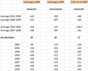
The spread sheet is easy to construct. For Velicogna Antarctica, start with -90 in 2002 and subtract 26 from the preceding year. The average uses the “=AVERAGE()” function in Excel.

So why did this dating error occur? There is no apparent reason in the Velicogna paper to use two different averages over such a short time frame. I might suggest that there is another reason. The two papers were published weeks apart (Velicogna 13th Oct and Chen 22nd Nov) and used the same data for Antarctica over similar periods (Velicogna Apr 02 – Feb 09 and Chen Apr 02 – Jan 09). The impact of both would be enhanced if they had comparative statistics. For instance Zwally & Giovinetto 2011 state

Table 2 includes two GRACE-based mass loss estimates of 104 Gt/year (Velicogna 2009) and 144 Gt/year (Chen et al. 2009) for the period 2002–2006 and two estimates of 246 Gt/year (Velicogna 2009) and of 220 Gt/year (Chen et al. 2009) for the period 2006–2009.

Correcting Velicogna, it becomes

Table 2 includes two GRACE-based mass loss estimates of 142 Gt/year (Velicogna 2009) and 144 Gt/year (Chen et al. 2009) for the period 2002–2006 and two estimates of 233 Gt/year (Velicogna 2009) and of 220 Gt/year (Chen et al. 2009) for the period 2006–2009.

That is, the two papers become far more consistent if the averages are corrected. It would appear that Velicogna changed the dates without doing the maths.

Form of the acceleration

Velicogna states in the abstract

We find that during this time period the mass loss of the ice sheets is not a constant, but accelerating with time, i.e., that the GRACE observations are better represented by a quadratic trend than by a linear one, implying that the ice sheets contribution to sea level becomes larger with time.

This quadratic trend is backed up by graphs on the NASA website (Antarctica) and NOAA websites (Greenland)


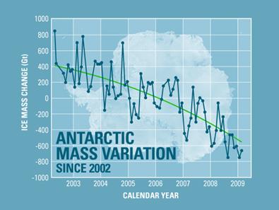
For ice melt Velicogna is stating that, not only would the trend be for each year to be greater than the previous year, but for the incremental increase to be greater than the last.

But, if ∂M is the change in ice mass, from the following functions were used in my spread sheet to replicate both Velicogna’s and Chen’s results.

For Velicogna 2009, Antarctica

∂M = -90 – 26(Year-2002)

For Velicogna 2009, Greenland

∂M = -122 + 30(Year-2002)

For Chen et al. 2009, Antarctica

∂M = -126 + 17(Year-2002)

These are all linear functions. I do not have access to Chen’s paper, but Velicogna’s abstract does not conform to her model.

Discontinuous functions in Chen et al. 2009

The abstract for Chen states

… our data suggest that East Antarctica is losing mass, mostly in coastal regions, at a rate of −57±52 Gt yr−1, apparently caused by increased ice loss since the year 2006.

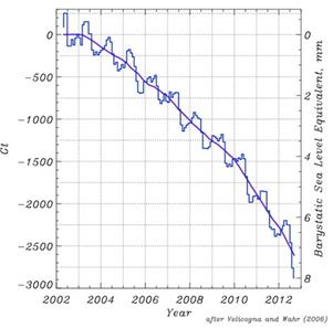
Chen detection of increased ice loss is similar to Velicogna’s. But unlike Velicogna, Chen suggests that there is a discontinuous function. In other words, Chen’s graph would look like this.


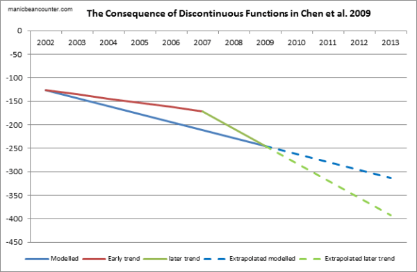
Although it is possible to extrapolate from a discontinuous function, it would be highly misleading to do so. It suggests there is no underlying empirical relationship to be observed, in direct contradiction to Velicogna. Further, over a short period it is impossible to say whether this is the shift in the underlying rate of change in Antarctic melt, or if this new direction be quickly reversed. Fortunately, the two studies were published over three years ago, so there are alternative studies to compare the projection against. This will be the topic of the next post.

J. L. Chen, C. R. Wilson, D. Blankenship & B. D. Tapley Nature Geoscience 2, 859 – 862 (2009) Published online: 22 November 2009 doi:10.1038/ngeo694

Velicogna, I. (2009), Increasing rates of ice mass loss from the Greenland and Antarctic ice sheets revealed by GRACE, Geophys. Res. Lett., 36, L19503, doi:10.1029/2009GL040222

H. Jay Zwally, Mario B. Giovinetto (2011) Surveys in Geophysics September 2011, Volume 32, Issue 4-5, pp 351-376, Overview and Assessment of Antarctic Ice-Sheet Mass Balance Estimates: 1992–2009 10.1007/s10712-011-9123-5

Two Comments on Antarctic Ice Accumulation

Jo Nova blogs on a study that claims the Antarctic continent is accumulating ice mass at a rapid rate. I have made two comments. One is opposing someone who claims that Antarctica is actually losing ice. The other is that the claimed rate of ice accumulation does not make sense against known data on sea levels.

Manicbeancounter

April 17, 2013 at 6:27 am · Reply

John Brooks says

I’m also interested that the mass of antarctic land ice follows solar irradiance. This makes perfect sense. However I can’t see why the effective of an increase in the greenhouse effect wouldn’t have exactly the same result.

Maybe you should look at the period covered by the graph John. There is an 800 year correlation of mass of antarctic land ice with solar irradiance, with the biggest movements in both prior to 1800. Insofar as the greenhouse effect is significant, it is nearly all after 1945.

And for some reason, I’ve got the idea in my head that antarctic land ice is decreasing.

Sure enough from the Carbon Brief link, this quote

Measurements from the Gravity Recovery and Climate Experiment (GRACE) satellite since 2002 have shown that the mass of the Antarctic ice sheet is decreasing at an average rate of 100 cubic kilometres every year – the size of a small UK city.

(emphasis mine)
The size of a city is usually measured in area, not volume. The ancient City of York, for instance, has an area of 272 square kilometres (105 square miles) and a population of 125,000. Or maybe they mean the volume of the buildings in a city? A famous building in New York is the Empire State Building. Not only is it quite tall it also has quite a large volume. Around 1,040,000 cubic metres or 0.001 cubic kilometres in fact. So does the Carbon Brief claim that a small UK city have a volume of buildings equivalent to 100,000 Empire state buildings? Or each average person in a small UK city occupies a building volume greater than Buckingham Palace?
Alternatively, does John Brooks quote a source that does not have a clue about basic maths?

Manicbeancounter

April 17, 2013 at 8:01 am · Reply

I think this paper does not stack up. I worked as a management accountant in industry for 25 years. One thing I learnt early on when estimating or forecasting was to sense-check the estimates. No matter how good your assumptions are, when estimating or extrapolating well beyond the data trend (where there is potential for error), the best check on the data is by reconciling with other data.
From the above

“The SMB of the grounded AIS is approximately 2100 Gt yr−1, with a large interannual variability. Those changes can be as large as 300 Gt yr−1 and represent approximately 6% of the 1989–2009 average (Van den Broeke et al., 2011).”

A gigatonne of ice is equivalent to a cubic kilometre of water. If the land ice volume is increasing, the water must come from somewhere. Nearly all of that water needs to come from the oceans.
Now for some basic maths. A gigatonne is a billion tonnes. As water has a relative density of 1.0, a tonne of water (1,000 litres) is a cubic metre. Therefore a gigatonne of water is a cubic kilometre (1000^3 = 1,000,000,000 = one billion).
A further factor to consider is the area of the oceans. According to my Times Concise Atlas, the total area of the oceans and seas (excluding the enclosed waters like the Dead Sea and Lake Baykal) is 325,000,000km^2. A cubic kilometre of water added to an enclosed sea of one million square kilometres, would raise the sea level by just 1mm (1000mm x 1000m = 1,000,000mm in a kilometre). So 325km^3 = 325Gt-1 of new ice accumulation above sea level in Antarctica would reduce sea levels by 1mm, or 2100GT-1 by 6.5mm.
Some of the ice accumulation will be on ice shelves, so the impact of 2100GT-1 extra ice per annum extra ice might be to reduce sea levels by just 5mm per annum. Also sea levels might be rising by a little less than the 3.2mm a year that official figures claim, but there is no evidence that sea levels are falling. Further, any net ice melt elsewhere (mostly Greenland) is only adding 1mm to sea level rise. So the rest must be mostly due to thermal expansion of the oceans. I think that the evidence for the oceans heating is very weak and of insignificant amounts. Even Kevin Trenberth in his wildest flights of fantasy would not claim the missing heat (from the air surface temperatures) adds more than 1-2mm to sea level rise.
What this study does show is that by honestly looking at data in different ways, it is possible to reach widely different conclusions. It is only by fitting the data to predetermined conclusions (and suppressing anything outside the consensus) that consistency of results can be achieved.

My scepticism on global warming stems from a belief that scientific evidence is strengthened by being corroborated from independent sources. Honest and independent data analysis means that wildly different conclusions can be reached. Comparing and contrasting these independent sources leads me to believe that the public face of the global warming climate change consensus massively exaggerates the problem.

Kevin Marshall

Bjorn Lomborg on Climate Costs in the Australian

Australian Climate Madness blog points to an article, “Wrong way, go back“, in the Australian Newspaper by Skeptical Environmentalist Bjorn Lomberg on Australia’s climate policies. This is my comment.

This statement in the article is significant

When economists estimate the net damage from global warming as a percentage of gross domestic product, they find it will indeed have an overall negative impact in the long run but the impact of moderate warming (1C-2C) will be beneficial. It is only towards the end of the century, when temperatures have risen much more, that global warming will turn negative.

Now consider the Apocalypse Delayed? posting of March 28th. Referring to an Economist article, it says that a number of empirical studies show that climate sensitivity is much lower than the climate models assume. Therefore, moving into the net cost range seems much less likely.
But why are there net costs? Lomberg’s calculations are based on William Nordhaus’s DICE model that

calculates the total costs (from heat waves, hurricanes, crop failure and so on) as well as the total benefits (from cold waves and CO2 fertilisation).

I would claim that the destablisation of the planet’s climate by rapid warming has very little evidence. Claims in AR4 that hurricanes were getting worse; that some African countries would see up to a 50% reduction in crop yields by 2020; that the Himalayan Glaciers would largely disappear by 2035; that the Amazon rainforest could catastrophically collapse – all have been over-turned.
Thus the policy justification for avoiding climate catastrophe as a result rising greenhouse gases is a combination of three components. First, a large rise in temperatures. Second, the resulting destablisation of the climate system having net adverse consequences. Third, is that the cost of constraining the rise in greenhouse gases is less than the cost of doing nothing.
It is only this third aspect that Bjorn Lomberg deals with. Yet despite that he shows that the Australian Government is not “saving the planet for future generations”, but causing huge net harm. Policy-making should consider all three components.

That is, there are three components to the policy justification to combatting “climate change” by constraining the growth in greenhouse gas emissions

  1. That there will be a significant amount of global warming.
  2. That this is net harmful to the planet and the people on it.
  3. That the net harm of policies is less than the net harm of warming. To use a medical analogy, the pain and risks of treatment are less than the disease.

Lomberg, using the best cost model available, comes up with far less costs of global warming than, say, the Stern Review of 2006. He also uses actual policy costs to assess the net harm of global warming. Lomberg does not, however, challenge the amount of warming from a given quantity of CO2 rise, nor the adverse consequences of that warming. The Economist article
and editorial of March 30th conversely challenges the quantity of warming from arising from a given rise in CO2, but just sees it as “apocalypse delayed” and not “apocalypse debunked“.

Kevin Marshall