The Propaganda methods of ….and Then There’s Physics on Temperature Homogenisation

There has been a rash of blog articles about temperature homogenisations that is challenging the credibility of the NASS GISS temperature data. This has lead to attempts by anonymous blogger andthentheresphysics (ATTP) to crudely deflect from the issues identified. It is propagandist’s trick of turning people’s perspectives. Instead of a dispute about some scientific data, ATTP turns the affair into a dispute between those with authority and expertise in scientific analysis, against a few crackpot conspiracy theorists.

The issues on temperature homogenisation are to do with the raw surface temperature data and the adjustments made to remove anomalies or biases within the data. “Homogenisation” is a term used for process of adjusting the anomalous data into line with that from the surrounding data.

The blog articles can be split into three categories. The primary articles are those that make direct reference to the raw data set and the surrounding adjustments. The secondary articles refer to the primary articles, and comment upon them. The tertiary articles are directed at the secondary articles, making little or no reference to the primary articles. I perceive the two ATTP articles as fitting into the scheme below.
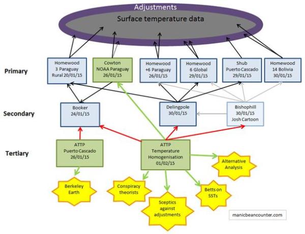
Primary Articles

The source of complaints about temperature homogenisations is Paul Homewood at his blog notalotofpeopleknowthat. The source of the articles is NASA’s Goddard Institute for Space Studies (GISS) database. For any weather station GISS provide nice graphs of the temperature data. The current after GISS homogeneity adjustment data is available here and the raw GHCN data + UHSHCN corrections is available here up until 2011 only. For any weather station GISS provide nice graphs of the temperature data. Homewood’s primary analysis was to show the “raw data” side by side.

20/01/15 Massive Tampering With Temperatures In South America

This looked at all three available rural stations in Paraguay. The data from all three at Puerto Casado, Mariscal and San Jan Buatista/Misiones had the same pattern of homogenization adjustments. That is, cooling of the past, so that instead of the raw data showing the 1960s being warmer than today, it was cooler. What could they have been homogenized to?

26/01/15 All Of Paraguay’s Temperature Record Has Been Tampered With

This checked the six available urban sites in Paraguay. Homewood’s conclusion was that

warming adjustments have taken place at every single, currently operational site in Paraguay.

How can homogenization adjustments all go so same way? There is no valid reason for making such adjustments, as there is no reference point for the adjustments.

29/01/15Temperature Adjustments Around The World

Homewood details other examples from Southern Greenland, Iceland, Northern Russia, California, Central Australia and South-West Ireland. Instead of comparing the raw with the adjusted data, he compared the old adjusted data with the recent data. Adjustment decisions are changing over time, making the adjusted data sets give even more pronounced warming trends.

30/01/15 Cooling The Past In Bolivia

Then he looked at all 14 available stations in neighbouring Bolivia. His conclusion

At every station, bar one, we find the ….. past is cooled and the present warmed.”

(The exception was La Paz, where the cooling trend in the raw data had been reduced.)

Why choose Paraguay in the first place? In the first post, Homewood explains that within a NOAA temperature map for the period 1981-2010 there appeared to be a warming hotspot around Paraguay. Being a former accountant he checked the underlying data to see if it existed in the data. Finding an anomaly in one area, he checked more widely.

The other primary articles are

26/01/15 Kevin Cowton NOAA Paraguay Data

This Youtube video was made in response to Christopher Booker’s article in the Telegraph, a secondary source of data. Cowton assumes Booker is the primary source, and is criticizing NOAA data. A screen shot of the first paragraph shows these are untrue.

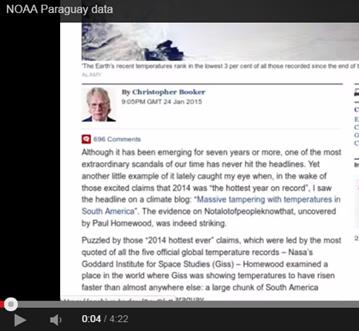
Further, if you read down the article, Cowton’s highlighting of the data from one weather station is also misleading. Booker points to three, but just illustrates one.

Despite this, it still ranks as a primary source, as there are direct references to the temperature data and the adjustments. They are not GISS adjustments, but might be the same.

29/01/15 Shub Niggurath – The Puerto Casado Story

Shub looked at the station moves. He found that the metadata for the station data is a mess, so there is no actual evidence of the location changing. But, Shub reasons the fact that there was a step change in the data meant that it moved, and the fact that it moved meant there was a change. Shub is a primary source as he looks at the adjustment reason.


Secondary Articles

The three secondary articles by Christopher Booker, James Delingpole and BishopHill are just the connectors in this story.


Tertiary articles of “…and Then There’s Physics”

25/01/15 Puerto Cascado

This looked solely at Booker’s article. It starts

Christopher Booker has a new article in the The Telegraph called Climategate, the sequel: How we are STILL being tricked with flawed data on global warming. The title alone should be enough to convince anyone sensible that it isn’t really worth reading. I, however, not being sensible, read it and then called Booker an idiot on Twitter. It was suggested that rather than insulting him, I should show where he was wrong. Okay, this isn’t really right, as there’s only so much time and effort available, and it isn’t really worth spending it rebutting Booker’s nonsense.

However, thanks to a tweet from Ed Hawkins, it turns out that it is really easy to do. Booker shows data from a site in Paraguay (Puerto Casado) in which the data was adjusted from a trend of -1.37o C per century to +1.36o C per century. Shock, horror, a conspiracy?


ATTP is highlighting an article, but is strongly discouraging anybody from reading it. That is why the referral is a red line in the graphic above. He then says he is not going to provide a rebuttal. ATTP is good to his word and does not provide a rebuttal. Basically it is saying “Don’t look at that rubbish, look at the real authority“. But he is wrong for a number of reasons.

  1. ATTP provides misdirection to an alternative data source. Booker quite clearly states that the source of the data is the NASA GISS temperature set. ATTP cites Berkeley Earth.
  2. Booker clearly states that there are thee rural temperature stations spatially spread that show similar results. ATTP’s argument that a single site was homogenized with the others in the vicinity falls over.
  3. This was further undermined by Paul Homewood’s posting on the same day on the other 6 available sites in Paraguay, all giving similar adjustments.
  4. It was further undermined by Paul Homewood’s posting on 30th January on all 14 sites in Bolivia.

The story is not of a wizened old hack making some extremist claims without any foundation, but of a retired accountant seeing an anomaly, and exploring it. In audit, if there is an issue then you keep exploring it until you can bottom it out. Paul Homewood has found an issue, found it is extensive, but is still far from finding the full extent or depth. ATTP, when confronted by my summary of the 23 stations that corroborate each other chose to delete it. He has now issued an update.

Update 4/2/2015 : It’s come to my attention that some are claiming that this post is misleading my readers. I’m not quite sure why, but it appears to be related to me not having given proper credit for the information that Christopher Booker used in his article. I had thought that linking to his article would allow people to establish that for themselves, but – just to be clear – the idiotic, conspiracy-laden, nonsense originates from someone called Paul Homewood, and not from Chistopher Booker himself. Okay, everyone happy now? J

ATTP cannot accept that he is wrong. He has totally misrepresented the arguments. When confronted with alternative evidence ATTP resorts to vitriolic claims. If someone is on the side of truth and science, they will encourage people to compare and contrast the evidence. He seems to have forgotten the advice about when in a whole…..

01/02/15
Temperature homogenisation

ATTP’s article on Temperature Homogenisation starts

Amazing as it may seem, the whole tampering with temperature data conspiracy has managed to rear its ugly head once again. James Delingpole has a rather silly article that even Bishop Hill calls interesting (although, to be fair, I have a suspicion that in “skeptic” land, interesting sometimes means “I know this is complete bollocks, but I can’t bring myself to actually say so”). All of Delingpole’s evidence seems to come from “skeptic” bloggers, whose lack of understand of climate science seems – in my experience – to be only surpassed by their lack of understanding of the concept of censorship J.

ATPP starts with a presumption of being on the side of truth, with no fault possible on his side. Any objections are due to a conscious effort to deceive. The theory of cock-up or of people not checking their data does not seem to have occurred to him. Then there is a link to Delingpole’s secondary article, but calling it “silly” again deters readers from looking for themselves. If they did, the readers would be presented with flashing images of all the “before” and “after” GISS graphs from Paraguay, along with links to the 6 global sites and Shub’s claims that there is a lack of evidence for the Puerto Casado site being moved. Delingpole was not able the more recent evidence from Bolivia, that further corroborates the story.

He then makes a tangential reference to his deleting my previous comments, though I never once used the term “censorship”, nor did I tag the article “climate censorship”, as I have done to some others. Like on basic physics, ATTP claims to have a superior understanding of censorship.

There are then some misdirects.

  • The long explanation of temperature homogenisation makes some good points. But what it does not do is explain that the size and direction of any adjustment is an opinion, and as such be wrong. It a misdirection to say that the secondary sources are against any adjustments. They are against adjustments that create biases within the data.
  • Quoting Richard Betts’s comment on Booker’s article about negative adjustments in sea temperature data is a misdirection, as Booker (a secondary source) was talking about Paraguay, a land-locked country.
  • Referring to Cowton’s alternative analysis is another misdirect, as pointed out above. Upon reflection, ATTP may find it a tad embarrassing to have this as his major source of authority.

Conclusions

When I studied economics, many lecturers said that if you want to properly understand an argument or debate you need to look at the primary sources, and then compare and contrast the arguments. Although the secondary sources were useful background, particularly in a contentious issue, it is the primary sources on all sides that enable a rounded understanding. Personally, by being challenged by viewpoints that I disagreed with enhanced my overall understanding of the subject.

ATTP has managed to turn this on its head. He uses methods akin to crudest propagandists of last century. They started from deeply prejudiced positions; attacked an opponent’s integrity and intelligence; and then deflected away to what they wanted to say. There never gave the slightest hint that one side might be at fault, or any acknowledgement that the other may have a valid point. For ATTP, and similar modern propagandists, rather than have a debate about the quality of evidence and science, it becomes a war of words between “deniers“, “idiots” and “conspiracy theorists” against the basic physics and the overwhelming evidence that supports that science.

If there is any substance to these allegations concerning temperature adjustments, for any dogmatists like ATTP, it becomes a severe challenge to their view of the world. If temperature records have systematic adjustment biases then climate science loses its’ grip on reality. The climate models cease to be about understanding the real world, but conforming to people’s flawed opinions about the world.

The only way to properly understand the allegations is to examine the evidence. That is to look at the data behind the graphs Homewood presents. I have now done that for the nine Paraguayan weather stations. The story behind that will have to await another day. However, although I find Paul Homewood’s claims of systematic biases in the homogenisation process to be substantiated, I do not believe that it points to a conspiracy (in terms of a conscious and co-ordinated attempt to deceive) on the part of climate researchers.

Climategate : The greatest quote is from Kevin Trenberth

As Paul Matthews at IPCC Report and Anthony Watts at Wattsupwiththat are pointing out, 17th November marked the 5th Anniversary of Climategate1. Paul Matthews has his pick of the most significant quotes. But I believe he misses the most important. Kevin Trenberth to Micheal Mann on Mon, 12 Oct 2009 and copied to most of the leading academics2

The fact is that we can’t account for the lack of warming at the moment and it is a travesty that we can’t. The CERES data published in the August BAMS 09 supplement on 2008 shows there should be even more warming: but the data are surely wrong. Our observing system is inadequate. (emphasis mine)

The first sentence is the mostly widely quoted. It is an admission that we, the experts, cannot explain what is happening. The end of the quote is even more important. There is a clear divergence between the predictions from the climate models – the theoretical understanding of the world – and the real world data. Trenberth’s reaction is that the data is wrong, not the theory. His later excuse for continuing belief in the climate models was coined a few months later. The truth is lurking in the murky depths. As with the mythical Loch Ness Monster, the believers in climate catastrophism hold that the evidence will be found, but we are not able to access it yet. This has created a new branch of climatology – the excuses for the pause. At the time of writing there are 65 excuses and new cases are appearing at more than two a week.

Kevin Marshall

Notes

  1. The term Climategate was coined by James Delingpole on 20th November 2009.
  2. Cc: Stephen H Schneider , Myles Allen , peter stott , “Philip D. Jones” , Benjamin Santer , Tom Wigley , Thomas R Karl , Gavin Schmidt , James Hansen , Michael Oppenheimer. This was an email between the high priests of the global warming movement.

Britain’s Folly in Attempting to Save the World from Global Warming

Last week in the House of Lords1 Viscount Ridley asked Baroness Verma, a minister at the Department of Energy and Climate Change, about the hiatus in global warming. Lord Ridley asked Lady Verma

Would you give us the opinion of your scientific advisers as to when this hiatus is likely to end.

Lady Verma replied

It may have slowed down, but that is a good thing. It could well be that some of the measures we are taking today is helping that to occur.

I already commented at Bishop Hill – repeated by James Delingpole

From 1990 to 2013 global emissions increased by 61%. Of that increase, 67% was from China & India. This is not surprising as they were both growing fast from a low base, and combined contain nearly 40% of global population. The UK, with less than 1% of global population managed to decrease its emissions by 19%. In doing so, they managed to offset nearly 1.2% of the combined increase in China & India.

However this is not the full story, particularly with respect to understanding future emissions growth. Here I extend the analysis of the CDIAC data set2 to give a more comprehensive picture. CDIAC (Carbon Dioxide Information Analysis Centre) have estimates of CO2 emissions in tonnes of carbon equivalent for all countries from 1960 to 2013. These I have split out the countries of India, China and UK. The rest I have lumped into three groups – The major developed ACEJU countries3, the Ex-Warsaw Pact countries4 and ROW5 (Rest of the World). For emissions I have taken the baseline year of 1990, the latest year of 2013 and then forecast emissions for 20206.

The major developed economies have virtually unchanged, although, along with the UK the proportion of global emissions has fallen from 45% to 28% between 1990 and 2013 and are forecasted to fall further to 23% of global emissions even without aggressive emission reduction policies.

The collapse of communism meant the collective emissions of the Ex-Warsaw Pact countries fell by 44% between 1988 and 1999. That in 2020 emissions levels will still be around 20% lower, even though the economies will be far richer, is due to the inefficiencies of the Communist system.

China and India had most of the emissions growth between 1990 and 2013, there emissions growing by 300% and 250% respectively. That growth was equivalent to 16 times the UK emissions in 1990. By 2020 China and India’s emissions growth over 30 years is likely to have cancelled out the UK’s 30% reduction 78 times over. That forecast emissions increase from 1990 to 2020 is also a third larger than the combined 1990 emissions of the major rich countries.

Finally there is the ROW countries, nearly half the World’s population now live and where emissions increased by 130% between 1990 and 2013.

To put these figures in context, we need to look at population figures, which are available from the World Bank7.

The big CO2 emitters in 1990 were the First and Second World countries. Over two-thirds of global emissions were produced by a quarter of the population. Those same countries now produce 40% of global emissions and have 20% of the global population. The population has grown, but only by 10%. In some of the countries it is already falling. China’s population grew by 20%, India’s by 44% and the Rest of the World by 55%, giving a global population growth of 35%. Looking at CO2 emissions in tonnes per capita puts the CO2 emissions problem into perspective.

China started from an extremely low base in terms of emissions per capita. It is unlikely to exceed the rich world’s 1990 emissions per capita in the next 10 years. However, due to slower population growth and its current stage of development, it is unlikely to be the major source of emissions growth through to 2050. It is likely to be overtaken by India, who in turn will be overtaken by the rest of the world before the end of the century. Unless very cheap non-CO2 emitting sources of energy are developed, global emissions will continue to grow. That emissions growth will be the result of genuine economic growth that will see grinding poverty disappear from every country that embraces the modern world.

The UK with less than 1% of the world’s population will continue to have no impact at all despite all the hype of having the World’s “greenest” energy policies. Even if the scariest scenarios of Lord Stern’s nightmares are true, there is absolutely no reason to continue with policies that are pushing ever greater numbers into fuel poverty and jeopardizing security of energy supply. The future impacts will be just the same, but with current policy, Britons will meet that future poorer than without. The British Government is like a doctor that prescribes useless medicine in the knowledge that it has nasty side effects. Most would agree that a GP who did that to a patient should be struck off, even if it were one patient in hundreds.

For the people who still genuinely believe that increasing CO2 emissions will cause catastrophic climate change there are two causes of action. First is to find a plentiful source of non-polluting energy where the full costs are less than coal, but just as reliable. There is genuine pollution from coal in the form of smog, so everyone should be in support of this. Shale gas, then thorium nuclear reactors might be a ways forward in the next few decades. Second is to far more accurately predict the catastrophic consequences of global warming, so adaptation can be made at minimal cost and waste of resources. Every prediction of short term catastrophe (e.g. worsening hurricanes) or a worsening situation (e.g. accelerating sea level rise) has proved to be false, hence the reliance on noisy publicists and political activists that discourage learning from past mistakes.


Please note that first time comments are moderated. I welcome debate. Please use the comments as a point of contact, with a request not to publish.

Kevin Marshall

Notes

  1. As reported by James Delingpole at Brietbart. Also reported at The Daily Mail, Bishop Hill, and Not a Lot of People Know That here and here.
  2. CDIAC is the Carbon Dioxide Information Analysis Centre. The 2014 Budget 1.0 contains estimates of CO2 emissions in tonnes of carbon equivalent for all countries from 1960 to 2013. I have converted the figures to tonnes of CO2.
  3. Australia, Canada, EU (the Western European 15, less UK), Japan and USA. This is most of what used to be called “First World”.
  4. This includes the former USSR countries, plus Eastern Europe. I have added in North Korea, Yugoslavia and Cuba.
  5. By definition this includes Central and South America, Africa, Middle East and South East Asia.
  6. Britain has committed to reduce its emissions by 30% of 1990 levels by 2020. China has pledged to “Reduce CO2 emissions per unit of GDP by 40–45% by 2020 compared to the 2005 level”. I assume 8% GDP growth and achieving a full 45% reduction, which is achievable. Similarly India has pledged to Reduce CO2 emissions per unit of GDP by 20–25% by 2020 compared to the 2005 level. Although it is unlikely to be achieved, based on emissions growth from 2005-2013, I have a assumed 7% GDP growth and achieving a minimum 20% reduction. For the other countries I have assumed half the emissions change from 1999-2013. This is likely to be an underestimate, as many other economies are growing emissions are a fast annual rate. For them this assumes a much reduced growth rate. Also many developed economies, particularly in Southern European showed sharp drops in emissions along with GDP in the credit crunch. They are now emerging, so should be expected to have higher emission growth rates.
  7. The 2020 population figures are assuming that each country’s population will change in the next seven years by the same number that it did in the previous seven. As world population growth in slowing, this might be a reasonable estimate. The result is a population increase of 550 million to 7,675 million.

Watermelon Energy Policy – Green Renewables backed by Red Diesel

My last past was on the Fulcrum Power application to build a 20MW diesel power station. I predict that this will be part of the next big scandal to hit so-called renewables sector.

Fulcrum Power are planning to become part of the National Grid’s STOR (Short Term Operating Reserve) scheme. The STOR End of Year Report 2011/12 summary is

In 2011/12 National Grid procured on average 3230 megawatts (MW) for the six seasons, at a cost of £70.4m in availability payments. This was made up on average of 2160 MW for the Committed service and 1071 MW for the Flexible service. The actual MW availability provided through STOR during the peak demand of each day between 1st April 2011 and 31st March 2012, averaged out at 2172 MW. This represents an increase of 6.2% over the average MW availability for peak of each day during the 2010/11 term.

There were 421 successful STOR tenders in 2011/12, of which 191 units were Committed service providers and 230 units were Flexible service providers.

The average availability price for both Committed and Flexible STOR was £9.13/MW/h and the average utilisation price was £232.37/MWh. This represents an increase of 0.6% on 2010/11 average availability prices and a decrease of 7.7% on 2010/11 average utilisation prices.

National Grid utilised a total of 173.3 gigawatt hours (GWh) of STOR, yielding utilisation payments of £32.3m; and thus marks increases of 73% and 66%, respectively, when compared with the total STOR utilisation for 2010/11 and its cost.

The total expenditure for STOR during the 2011/12 term was £102.7m.

This 20MW scheme would add less than 1% to the total STOR capacity, which is currently costing just over £100m per year. Neither is this the

The STOR scheme is used at the moment in case of the emergency shut-down of a major power station. In the future I predict it is likely to be to cover two sources.

  • With increasing reliance on wind turbines, for in the sub-zero winter temperatures, caused by windless high pressure systems.
  • With the shutting down of the older generations of coal and nuclear capacity without new base-load power coming along, to provide peak time capacity on windless days.

The BBC report on the Fulcrum Power planning application stated

Two diesel power stations planned in Plymouth will compensate for fluctuations in supplies from green energy, say developers.

Green Frog Power got planning permission last year and Fulcrum Power has made an application for a similar power station.

Green Frog Power recently received financing of £75m to build 200MW of standby power. They must have these mini stations all over the place. They are not alone. The “STOR Market Information for TR19” report notes that in Year 7 showed that whilst the accepted STOR was around 3000MW, the rejected applications were about 6300MW. There is a huge amount of generating capacity out there of 3MW or more. However, much of this will be old diesel engines, with efficiencies far less than the coal-fired or nuclear power stations than are being shut down. The cost per kwh would also be about two or three times those of the coal-fired power stations, if used as base-load. But used as peak demand carrying load on windless days, they could be five to ten times the cost. The gas-fired power stations currently used for peak times could be switched to base load. All the extra diesel being used could hit car drivers in the wallets as well in the winter.

So the good point here is that the lights are unlikely to go out. We have plenty of temporary capacity. The bad news is that the dithering over shale gas and the banning of new coal-fired power stations could push energy costs through the roof and might even increase CO2 emissions.

James Delingpole likes to call the green movement “watermelons“. That is, they are politically green on the outside, but socialist red on the inside. In Britain, diesel not used for transport does not carry excise duties. It carries a red dye, to easily identify its illicit use in road vehicles. British energy policy is likely to become a watermelon policy – green renewables on the surface, but red diesel at the safety core.

Green Frog Power

STOR scheme description

STOR scheme documents

STOR End of Year Report 2011/12

STOR Market Information for TR19

BBC on the Fulcrum Power planning application


Interpreters of Interpreters to the nth degree

James Delingpole has attracted some ire for saying he is an “interpreter of interpreters”. I commented on Bishop Hill’s Blog

Wasn’t the original hockey stick paper an “interpreter of interpretations”? That is it gathered together a selection of data studies of past climate proxies and tried to give an interpretation – with some elements of bias. The IPCC, liking this paper’s conclusion then interpreted this as being definitive, despite its conclusions being contrary to many other studies. Learned societies, not least the Royal Society then interpret this as being the final argument, being the opinion of 2500 leading scientists. With learned pronouncements from the leading scientific organizations, the BBC, Guardian etc interprets that the science is settled, so the subject is closed. James Delingpole, in putting himself as a second tier interpreter, might be over-reaching himself in the ranking. However, he actually considers the arguments, unlike those who rely on multi-layered interpretations.

But more important than lowly a person is in the interpretation chain, is the reliability of that opinion compared with the ultimate reality that we are interpreting. Scientific enquiry must positively endeavour to free itself from biases. That was part of Popper’s injunction to make hypotheses capable of falsification. But with climate science

In the Hockey Stick Studies you will find (See “The Hockey Stick Illusion”)

  • Positive efforts to choose the limited number of data interpretations that suite the conclusion desired (with some having their own strong biases)
  • Giving these favourable studies an undue statistical bias against those that come to no, or contrary, conclusions.
  • Choosing the statistical tests that give favourable results.
  • A clique of people providing similar results through using similar methods around a core group of papers.
  • Peer review being used as a means of peer pressure in promoting favourable comments and papers, whilst obstructing contrary views.

The IPCC has been set up to act as a biased interpreter. It is there to argue the case for action on global warming climate change, not to arrive at a balanced opinion on the science.

The bias is upon interpretation in one direction is at every level of science and opinion.

  • Funding of research is based on conformity.
  • Pressure groups exist to “out” the non-conformists, like the McCarthyists of two generations ago.
  • There is also pressure on scientific organizations to declare unequivocal support.
  • There is severe censure and libelous statements made against any who dissent.


So, however much Delingpole may provide interpretations of interpretations without reading all the original literature, his opinions might be more valuable than those prestigious scientists who conform.