Proximity to Natural Gas Wells and Reported Health Status Study

A new study has been publisheda tentatively suggesting that there are significant health effects for those living in close proximity to gas fracking sites. The study may make headlines despite the authors expressly stating that the results should be viewed as ‘hypothesis generating’. There are a number of problems with the survey which could indicate small sample size and biases in adjusting for other factors account for the difference. Alternatively there is also the possibility that reported health effects of living near the fracking sites is due to stress from the false perceptions of the risks of living near to a fracking site. Anti-fracking environmentalists may be damaging people’s health and happiness through misinformation.

The study is

Proximity to Natural Gas Wells and Reported Health Status: Results of a Household Survey in Washington County, Pennsylvania (Environ Health Perspect; DOI:10.1289/ehp.1307732)

Peter M. Rabinowitz, Ilya B. Slizovskiy, Vanessa Lamers, Sally J. Trufan, Theodore R. Holford, James D. Dziura, Peter N. Peduzzi, Michael J. Kane, John S. Reif, Theresa R. Weiss, and Meredith H. Stowe


The households were split into three groups based on distance from a gas well. <1km (62 households), 1-2km (57) & >2km (61). The major result was

The number of reported health symptoms per person was higher among residents living <1 km (mean 3.27 ± 3.72) compared with >2 km from the nearest gas well (mean 1.60 ± 2.14, p=0.02).

The study also found significantly higher incidences in two out of five health symptoms in the <1km group than in >2km group.

There are multiple reasons for expecting these tentative results will not be replicated.

  • The small sample size for a very complex set of data.
  • Perceived water quality is not related to fracking.
  • Failure to control properly for obesity and smoking
  • Failure to repeat the sampling process with the same model.
  • Failure to corroborate the results by checks for actual contamination.
  • Biases in answering the questions.


  1. Small sample size

There is an obvious problem with the health status study. The sample size was reported as the sample size of 180 households with 472 people, too small to generate meaningful results when there are a number of inter-related factors involved.

Consider how this sample was selected. To select these households the researchers randomly selected 20 points on a map in each of 38 townships. On a map they located the nearest house to the spot. The researchers were concerned with the possible impact of fracking on ground fed water supplies, which only applied to a minority of households. This was the main reason for reducing the sample From 760 data points to 227 households. 47 refusals reduced this to down to the 180 households for which questionnaires were received. They then put the data through a model “that adjusted for age, gender, household education, smoking, awareness of environmental risk, work type, and animals in house.”

The results were based on comparing two sample groups – one with 62 households and 150 people, the other with 61 households with 192 people. The >2km households were 30% larger than the <1km group, and the average age was 7 years lower. Not only were the numbers small, but there were material differences in the sample groups. It was necessary to adjust for

  1. Perceived water quality is not related to fracking.

Sixty-six percent reported using their ground-fed water (well or natural spring) for drinking water and 84% reported using it for other activities such as bathing.

If there were health effects from contaminated water due to fracking, then there should be a difference in distance between those who drank the water and those who did not. But although there were more households who said the water has an unnatural appearance near the in the <1km group, (13/62 for <1km v 6/61 for >2km), the position was reversed when for those who said taste/odour prevented water use (14/62 for <1km v 19/61 for >2km). If people believed there was a problem with the water due to fracking, then those living near the wells might be more likely to avoid drinking the water than those further away. It was not the case. The proportions drinking the water were the same. It would appear that water quality is generally considered poor in the area. This point can be demonstrated by water sampling.

  1. Failure to control properly for obesity and smoking

Obesity and smoking have long-been accepted as having consequences for health. The questionnaire is in the Supplemental Material. For obesity it asks the respondent their height and weight, but not the height and weight of the other members of the household. For smoking the question is

Does anyone in this household smoke regularly inside the house?

Smoking causes health problems independent of whether someone smokes inside their home or not. Also the numbers of people smoking in a household matters, along with the number of years smoked and the quantity of cigarettes smoked.

  1. Failure to repeat the sampling process with the same model.

The model that filtered out other elements could have had some very large biases within it. For instance, the model could have over-adjusted for smoking. Conducting a completely fresh survey with the same sampling method would have eliminated this possibility.

  1. Failure to corroborate the results by checks for actual contamination.

If there were actual health issues water contamination or air contamination, then there should be some evidence in water and air samples. The authors did not consult any actual monitoring results to show contamination. In the case of water quality In the case of air quality they threw everything at the issue, including ‘operation of diesel equipment and vehicles‘. If there was something in the air and/or in the water that is causing real health problems, then it will be something that cannot be perceived.

  1. Biases in answering the questions.

In the introduction the authors say

A convenience sample survey of 53 community members living near Marcellus Shale development found that respondents attributed a number of health impacts and stressors to the development. Stress was the symptom reported most frequently (Ferrar et al. 2013).

The study said

We found instead that the refusal rate, while less than 25% overall, was higher among households farther from gas wells, suggesting that such households may have been less interested in participating due to lesser awareness of hazards.

If participation was higher in people nearer to wells because of perceived hazards, and the people get stressed by this. It could be that this stress exacerbates the symptoms and/or people on hearing stories of possible health effects notice their own conditions more. That is, the results of reported health effects of living near fracking sites may be to some extent real, but caused by the stress of believing the scare stories. This could be coupled with the fears of resulting in people remembering minor health symptoms, as there might be a cause. This alone could explain why the number of reported symptoms was twice the level for people living near to the gas wells. Conducting a similar, but larger survey with both dwellings where water is mains supplied and from ground-fed wells. If there is “something in the water”, then those who are mains supplied would not suffer from health effects to the same degree.

  1. Thanks to commentator “Entropic Man” at a Bishop-Hill discussion thread for alerting me to this study.

Kevin Marshall
Climategate : The greatest quote is from Kevin Trenberth

As Paul Matthews at IPCC Report and Anthony Watts at Wattsupwiththat are pointing out, 17th November marked the 5th Anniversary of Climategate1. Paul Matthews has his pick of the most significant quotes. But I believe he misses the most important. Kevin Trenberth to Micheal Mann on Mon, 12 Oct 2009 and copied to most of the leading academics2

The fact is that we can’t account for the lack of warming at the moment and it is a travesty that we can’t. The CERES data published in the August BAMS 09 supplement on 2008 shows there should be even more warming: but the data are surely wrong. Our observing system is inadequate. (emphasis mine)

The first sentence is the mostly widely quoted. It is an admission that we, the experts, cannot explain what is happening. The end of the quote is even more important. There is a clear divergence between the predictions from the climate models – the theoretical understanding of the world – and the real world data. Trenberth’s reaction is that the data is wrong, not the theory. His later excuse for continuing belief in the climate models was coined a few months later. The truth is lurking in the murky depths. As with the mythical Loch Ness Monster, the believers in climate catastrophism hold that the evidence will be found, but we are not able to access it yet. This has created a new branch of climatology – the excuses for the pause. At the time of writing there are 65 excuses and new cases are appearing at more than two a week.

Kevin Marshall

Notes

  1. The term Climategate was coined by James Delingpole on 20th November 2009.
  2. Cc: Stephen H Schneider , Myles Allen , peter stott , “Philip D. Jones” , Benjamin Santer , Tom Wigley , Thomas R Karl , Gavin Schmidt , James Hansen , Michael Oppenheimer. This was an email between the high priests of the global warming movement.

Have 250.000 Spanish jobs been sacrificed for the folly of saving the planet?

Spain is one of the leading countries in Europe for Renewables. In 2013 output broke new records, with renewables accounting for 21.1% of Spanish electricity demand, with wind and hydroelectric power production increasing by 12% and 16%, respectively on 2012.

This is to the detriment of the Spanish economy for three financial reasons.

First is the huge amount now likely being spent on wind power subsidies. In 2013 output from wind farms was about 54GWh, or 12% higher than the 48.5GWh produced in 2012. Assuming an average subsidy of €54MWh (the rate for onshore wind turbines in the UK) that would be €2.9billion in subsidies.

Second, there is the huge amount now likely being spent on solar power. Spain is home to the massive Anadasol Solar Power Station. The three sections are expected to produce 495GWh per year, which at 38% of capacity seems a tad high. This will have a guaranteed price of €270 per megawatt. In the UK, the wholesale price is about £45 or €60 a megawatt. The excess cost (or subsidy) is therefore €210MWh, or €100million a year. At this rate, the total 8.2GWh produced by photovoltaics would have attracted a subsidy of €1.7bn in subsidies.

The combined estimated subsidy is worth €4.6bn is equivalent to 0.3% of GDP. Total subsidies are likely to be much more.

Third is the disastrous foray in solar panels lead to huge amounts of investments in solar schemes. In 2008 there were an estimated 30,000 jobs supported in the boom years. These jobs disappeared with the bust. With this sudden boom, caused by extremely generous subsidies, the quality of the panels was poor and overpriced. Many investors would not have got their money back even if the subsidies had remained. Now they will be saddled in debt, with no income. These borrowing were often state-backed. According to Bloomberg this fund was €24bn at the end of 2011. If some of this has to be written off, then there could be a material impact on deficit reduction plans, and thus the levels of unemployment. Government backing loss-making projects costs jobs.

This claim can be cross-checked. In the same Bloomberg article the Renewable Energy Producers Association (Asociación de productores de energías renovables or APPA) was quoted as saying that the renewables industry sustains about 110,000 Spanish jobs. In 2011 Verso Economics, a Kirkcaldy-based outfit, wrote a report about the effect of renewables jobs in Scotland and the impact on the wider UK. Whilst the report found that the jobs in renewables were largely neutral with Scotland – one job lost in the wider economy for each gained in renewables – in the wider UK economy for each job gained in Scottish renewables 3.7 jobs were lost in the wider UK economy. (report here, and reported at Caledonian Mercury, BBC and Scottish Sceptic) If this were replicated in Spain, the net impact of 110,000 jobs in renewables would be 400,000 jobs less jobs in the wider Spanish economy. Without renewables more than 250,000 people could be in work, or over 1% of the labor force.

Why I call Spain’s attempt to save the planet a folly, are the same reasons for calling Britain’s attempts a folly. Any emissions reductions in Europe will be more than offset by many times over from the emerging economies elsewhere. In reducing emissions, Spain will increase unemployment and reduce growth. But future generations will still bear over 80% of any consequences of warming than if no rich country did anything. In the current situation, I believe that a lot of Spanish people might object to their country being called “rich” anyway.

Update 20/11/14 – minor editing.

Spending Money on Foreign Aid instead of Renewables

On the Discussion at BishopHill, commentator Raff asked people whether the $1.7 trillion spent so far on renewables should have been spent on foreign aid instead. This is an extended version of my reply.

The money spent on renewables has been net harmful by any measure. It has not only failed to even dent global emissions growth, it will also fail even if the elusive global agreement is reached as the country targets do not stack up. So the people of the emissions-reducing countries will bear both the cost of those policies and practically all the costs of the unabated warming as well. The costs of those policies have been well above anything justified in the likes of the Stern Review. There are plenty of British examples at Bishop Hill of costs being higher than expected and (often) solutions being much less effective than planned from Wind, solar, CCS, power transmission, domestic energy saving etc. Consequences have been to create a new category of poverty and make our energy supplies less secure. In Spain the squandering of money has been proportionately greater and likely made a significant impact of the severity of the economic depression.1

The initial justification for foreign aid came out of the Harrod and Domar growth models. Lack of economic growth was due to lack of investment, and poor countries cannot get finance for that necessary investment. Foreign Aid, by bridging the “financing gap“, would create the desired rate of economic growth. William Easterly looked at 40 years of data in his 2002 book “The Elusive Quest for Growth“. Out of over 80 countries, he could find just one – Tunisia – where foreign aid conformed to the theory. That is where increased aid was followed by increased investment which was followed by increased growth. There were plenty examples of where countries received huge amounts of aid relative to GDP over decades and their economies shrank. Easterly graphically confirmed what the late Peter Bauer said over thirty years ago – “Official aid is more likely to retard development than to promote it.

In both constraining CO2 emissions and Foreign Aid the evidence shows that the pursuit of these policies is not just useless, but possibly net harmful. An analogy could be made with a doctor who continues to pursue courses of treatment when the evidence shows that the treatment not only does not work, but has known and harmful side effects. In medicine it is accepted that new treatments should be rigorously tested, and results challenged, before being applied. But a challenge to that doctor’s opinion would be a challenge to his expert authority and moral integrity. In constraining CO2 emissions and promoting foreign aid it is even more so.

Notes

  1. The rationale behind this claim is explored in a separate posting.

Kevin Marshall

The Climate Policy Issue Crystallized

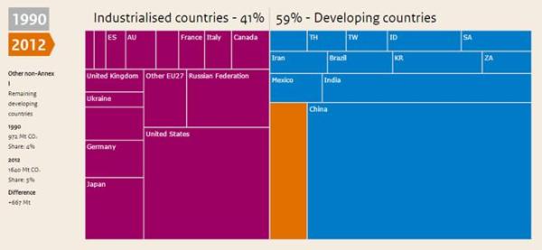
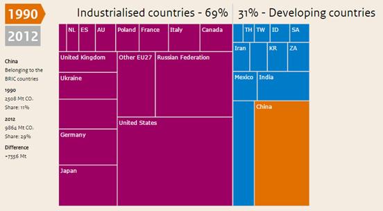
There is a huge amount of nonsense made about how the rich industrialized countries need to cut carbon emissions to save the world from catastrophic global warming. Just about every climate activist group is gearing up to Paris 2015 where at last they feel that world agreement will be reach on restraining the growth of greenhouse gas emissions. Barak Obama will be pushing for a monumental deal in the dying days of his Presidency. There is a graphic that points out, whatever agreement is signed attempts to cut global emissions will be a monumental failure. It comes from the blandly named “Trends in global CO2 emissions: 2013 report” from the PBL Netherlands Environmental Assessment Agency. In the interactive presentation, there is a comparison between the industrialised countries in 1990 and 2012.


In over two decades the emissions of the industrialised countries have fallen slightly, almost entirely due to the large falls in emission in the ex-Warsaw Pact countries consequent on the collapse in the energy-inefficient communist system. In the countries formerly known as the “First World” the emissions have stayed roughly the same. It is the developing countries that account for more than 100% of the emissions increase since 1990. Two-thirds of the entire increase is accounted for by China where in less than a generation emissions quadrupled. Yet still China has half the emissions per capita of United States, Australia or Canada. It emissions growth will slow and stop in the next couple of decades, not because population will peak, or because of any agreement to stop emissions growth. China’s emissions will peak, like with other developed countries, as heavy industry shifts abroad and the country becomes more energy efficient. In the next 30-40 years India is likely to contribute more towards global emissions growth than China. But the “remaining developing countries” is the real elephant in the room. It includes 1050 million people in Africa (excluding South Africa); 185m in South America (excluding Brazil); 182m in Pakistan; 167m in Bangladesh, 98m in Philippines and 90m in Vietnam. The is over 2000 million people, or 30% of the global population that do not currently register on the global emissions scale, but by mid-century could have emissions equivalent to half of the 1990 global emissions. To the end of the century most of the global population increase will be in these countries. As half the countries of the world are in this group any attempt to undermine their potential economic growth through capping emissions would derail any chance of a global agreement.

Hattip Michel of trustyetverify

Kevin Marshall

Ivanpah 392MW Solar Plant a green energy failure even at the planning stage

The Hockey Schtick blog specializes in summarizing scientific papers that have a sceptical leaning. A couple of days ago it posted about the World’s largest solar energy plant applying for a $539million federal grant to help pay off a $1.5 billion federal loan. The Ivanpah solar electric generating plant is owned by Google and renewable energy giant NRG. Google can certainly afford to bear these loses. At the end of 2013 its accounts state that it had Cash, Cash Equivalents & Marketable Securities of $58,717million, $10,000million than the year before.

Technologically the Ivanpah plant sounds impressive. Problem is that in it’s first year of operation it produced one quarter of the projected electricity. As a minor consequence, it was projected to scorch 1,000 birds a year. Instead it is 28,000 in the first year. A three minute summary is at Fox News.

But even at the planning stage there was either no proper business plan presented, or at least no proper scrutiny like a bank would do when making a loan. 1065,000 MWh annually from a 392 MW nameplate is a planned output of 31% of capacity. Even accepting that figure, a $2bn investment with a 20 year payback (zero discount rate) is still nearly $100 MWh. A 10 year payback is much more reasonable. Add maintenance and operating costs easily gets to $200 MWh. A small utility company in Wisconsin buys in extra electricity for $30 MWh. So the planned cost was 6-7 times the wholesale price of electricity.

Maybe this was justified in saving the planet?

The AR4 synthesis report of 2007* said that peer-reviewed estimates of the social costs of carbon from averaged on 2005 $12 per tonne of CO2, but the range from 100 estimates is large (-$3 to $95/tCO2). If we take the bold assumption that the theoretic output of this plant would entirely replace the electricity from a typical coal-fired power station producing 900kg of CO2 per MWh, then the saving is $190t/CO2, or double the very top-end 2005 estimate, or 15 times the average estimate. For some reason, the Social Cost of Carbon is missing from the

Suppose the US was “really serious” about doing its bit to save the planet and tried to cut its CO2 emissions by 80%. In round figures, in 2013 that was 5 billion tonnes of CO2 equivalent (source CDIAC). Using similar schemes, it would cost $760bn a year or 5% of 2013 GDP of $16.8trn. Remember, that is if similar schemes are successful. The Ivanpah solar plant does not look like a success.


* For some reason, the Social Cost of Carbon is missing from the AR5 Synthesis Report published on November 1st. I would guess the reason that it has fallen out of favour is that the marginal abatement costs are much larger than the highest estimates, and the cost of doing nothing per tonne of CO2 are about zero.

Kevin Marshall

BBC understates Cost of Climate Policy by 45 to 50 times

The UNIPCC has just finished a major meeting in Copenhagen to put finalize the wording of their AR5 Synthesis Report. BBC News Environment correspondent Matt McGrath said

The IPCC says that the cost of taking action to keep the rise in temperature under 2 degrees C over the next 76 years will cost about 0.06% of GDP every year.

Over the same period, world GDP is expected to grow at least 300%

The figure of 0.06% of GDP (strictly Gross World Product) seemed a bit low. So I looked up the source of this quote.

The Synthesis Report states on pages 116-117

Estimates of the aggregate economic costs of mitigation vary widely depending on methodologies and assumptions, but increase with the stringency of mitigation (high confidence). Scenarios in which all countries of the world begin mitigation immediately, in which there is a single global carbon price, and in which all key technologies are available, have been used as a cost-effective benchmark for estimating macroeconomic mitigation costs. (Figure 3.4). Under these assumptions, mitigation scenarios that are likely to limit warming to below 2 °C through the 21st century relative to pre-industrial levels entail losses in global consumption —not including benefits of reduced climate change (3.2) as well as co-benefits and adverse side-effects of mitigation (3.5, 4.3) — of 1% to 4% (median: 1.7%) in 2030, 2% to 6% (median: 3.4%) in 2050, and 3% to 11% (median: 4.8%) in 2100, relative to consumption in baseline scenarios that grows anywhere from 300% to more than 900% over the century. These numbers correspond to an annualized reduction of consumption growth by 0.04 to 0.14 (median: 0.06) percentage points over the century relative to annualized consumption growth in the baseline that is between 1.6% and 3% per year.

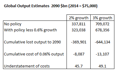
Matt McGarth (or a press officer) has wrongly assumed that 0.06% of GDP is the reduction in output, whereas the Synthesis Report talks about a reduction in growth rate. At any rate of growth, the impact of .06% reduction in growth rates will mean output in 2100 will be 4.8% lower. We can put a monetary impact on this through to 2090. The World Bank estimates global output was $74,910 billion in 2013. To keep the figures simple I will assume that 2014 will be $75,000 bn. The figures are below for 2090.

With 1.94% growth global output in 2090 will be $323,038bn, about $14,774bn less than if there was 2% growth. Cumulatively a 0.06% reduction in growth would be $369,901bn. But a cost of 0.06% each year of global output, with 2% growth is a mere $8,087bn. Misstatement of the UNIPCC’s position understates the cumulative cost by 45.7 times.

Similarly, with 2.94% growth global output in 2090 will be $678,356bn, about $30,716bn less than if there was 3% growth. Cumulatively a 0.06% reduction in growth would be $644,144bn. But a cost of 0.06% each year of global output, with 3% growth is a mere $13,107bn. Misstatement of the UNIPCC’s position understates the cumulative cost by 49.1 times.

The BBC or the UNIPCC needs to issue a correction. The UNIPCC have at last recognized that policy will effect economic growth. It is way too low, particularly for the high-policy countries who are put at an economic disadvantage relative to those countries without policies. Now they need to also look at the additional estimated costs of low carbon energy, along with the hidden costs of regulation and failed policies.

Thanks to Joanne Nova for highlighting the quote.

Kevin Marshall