Two false claims on climate change by the IPPR

An IPPR report  This is a crisis: Facing up to the age of environmental breakdown published yesterday, withing a few hours received criticism from Paul Homewood at notalotofpeopleknowthat, Paul Matthews at cliscep and Andrew Montford at The GWPF.  has is based on an April 2018 paper by billionaire Jeremy Grantham. Two major issues, that I want cover in this post are contained in a passage on page 13.

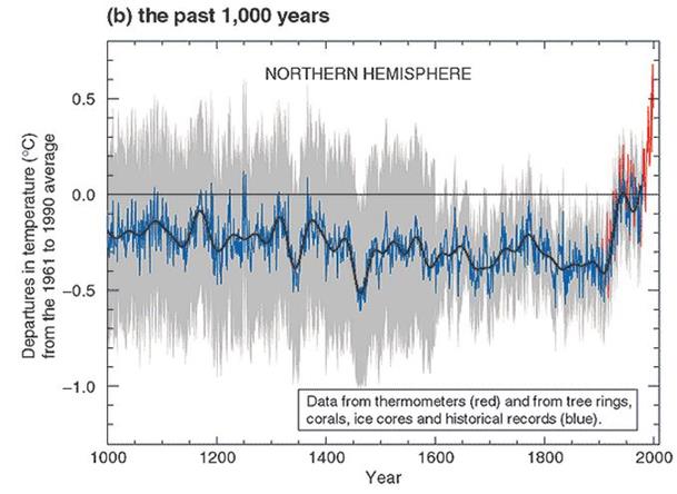
Climate Change : Average global surface temperature increases have accelerated, from an average of 0.007 °C per year from 1900–1950 to 0.025 °C from 1998–2016 (Grantham 2018). ……. Since 1950, the number of floods across the world has increased by 15 times, extreme temperature events by 20 times, and wildfires sevenfold (GMO analysis of EM-DAT 2018).

These two items are lifted from an April 2018 paper The Race of Our Lives Revisited by British investor Jeremy Grantham CBE. I will deal with each in turn.

Warming acceleration

The claim concerning how warming has accelerated comes from Exhibit 2 of The Race of Our Lives Revisited.

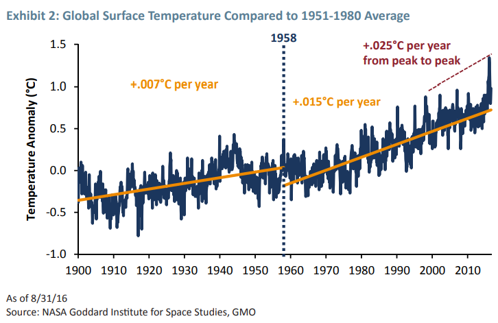
The claimed Gistemp trends are as follows

1900 to 1958  – 0.007 °C/year

1958 to 2016  – 0.015 °C/year

1998 to 2016  – 0.025 °C/year

Using the Skeptical Science trend calculator for Gistemp I get the following figures.

1900 to 1958  – 0.066 ±0.024 °C/decade

1958 to 2016  – 0.150 ±0.022 °C/decade

1998 to 2016  – 0.139 ±0.112 °C/decade

That is odd. Warming rates seem to be slightly lower for 1998-2016 compared to 1958-2016, not higher. This is how Grantham may have derived the incorrect 1998-2016 figure.

For 1998-2016 the range of uncertainty is 0.003 to 0.025 °C/year.

It would appear that the 1900 to 1958 & 1958 to 2016 warming rates are as from the trend calculator, whilst the 1998 to 2016 warming rate of 0.025 °C/year is at the top end of the 2σ uncertainty range.

Credit for spotting this plausible explanation should go to Mike Jackson.

Increase in climate-related disasters since 1950

The IPPR report states

Since 1950, the number of floods across the world has increased by 15 times, extreme temperature events by 20 times, and wildfires sevenfold

Exhibit 7 of The Race of Our Lives Revisited.

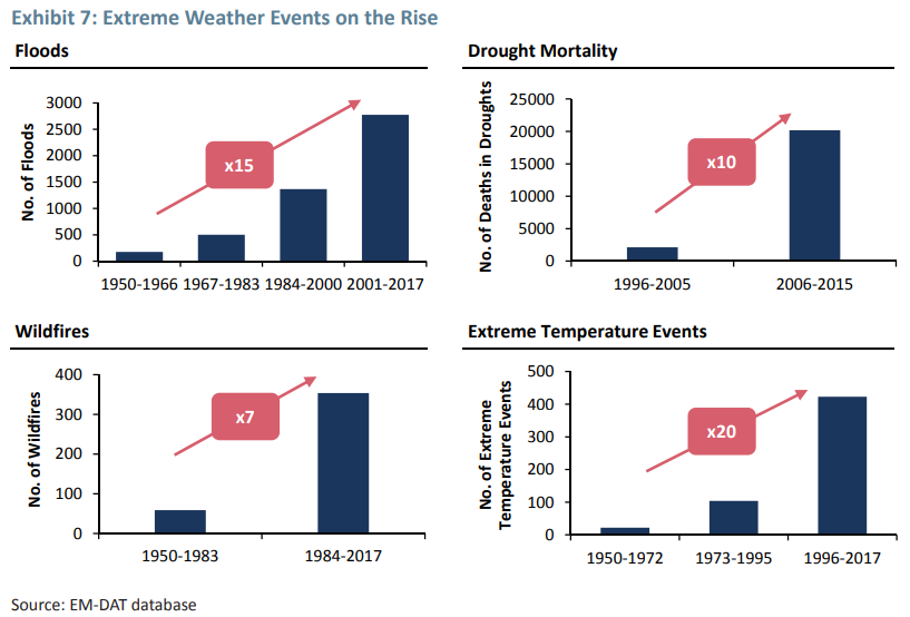
The 15 times “Floods” increase is for 2001-2017 compared to 1950-1966.
The 20 times “Extreme Temperature Events” increase is for 1996-2017 compared to 1950-1972.
The 7 times “Wildfires” increase is for 1984-2017 compared to 1950-1983.

Am I alone in thinking there is something a bit odd in the statement about being from 1950? Grantham is comparing different time periods, yet IPPR make it appear the starting point is from a single year?

But is the increase in the data replicated in reality?

Last year I downloaded all the EM-DAT – The International Disasters Database – from 1900 to the present day. Their disaster types I have classified into four categories.

Over 40% are the “climate”-related disaster types from Grantham’s analysis. Note that this lists the number of “occurrences” in a year. If, within a country in a year there is more than one occurrence of a disaster type, they are lumped together.

I have split the number of occurrences by the four categories by decade. The 2010s is only for 8.5 years.
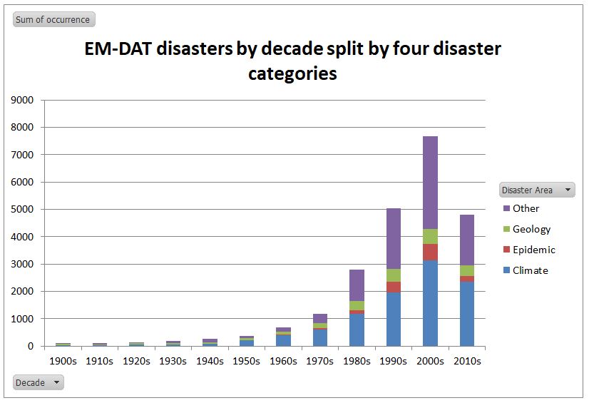
Climate” disasters have increased in the database. Allowing for 8.5 years in the current decade, compared to 1900-1949, “Climate” disasters are 65 times more frequent. Similarly epidemics are 47 times more frequent, geological events 16 times and “other” disasters 34 times.

Is this based on reality, or just vastly improved reporting of disasters from the 1980s? The real impacts are indicated by the numbers of reports deaths. 

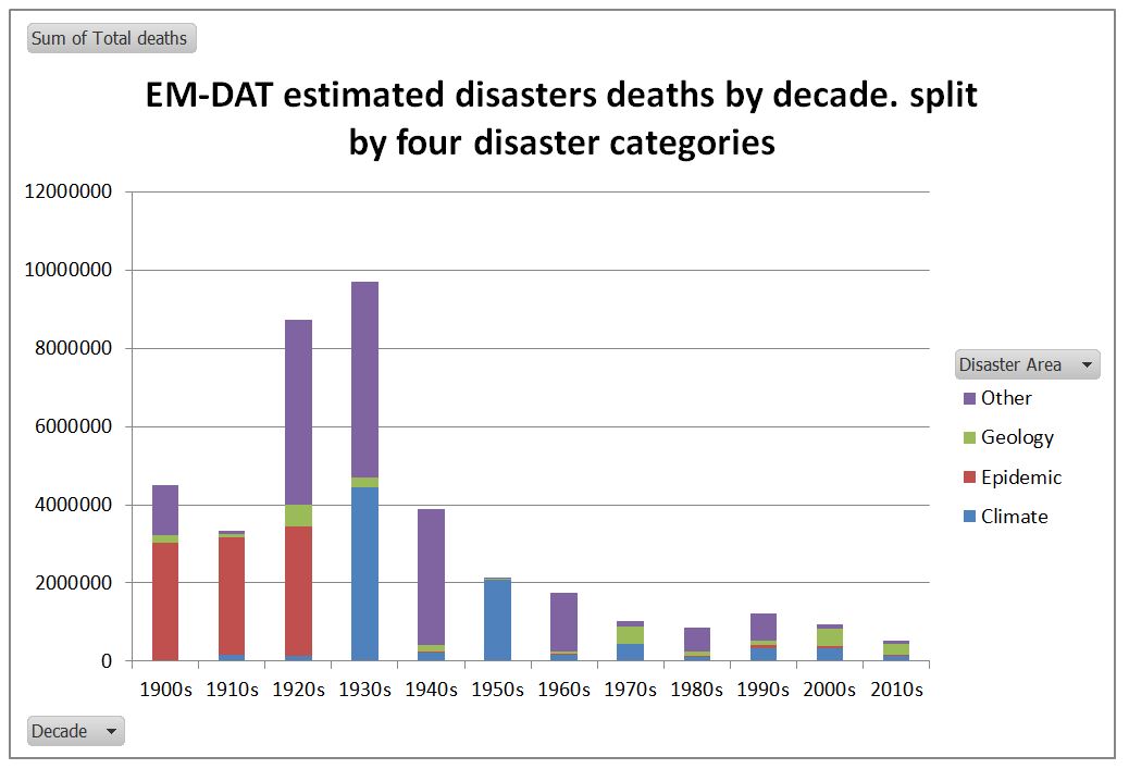
The number of reported disaster deaths has decreased massively compared to the early twentieth century in all four categories, despite the number of reported disasters increasing many times. Allowing for 8.5 years in the current decade, compared to 1900-1949, “Climate” disaster deaths are down 84%. Similarly epidemic deaths are down by 98% and”other” disasters down by 97%. Geological disaster deaths are, however, up by 27%. The reported 272,431 deaths in the 2010s that I have classified under “Geology” includes the estimated 222,570 estimated deaths in the 2010 Haitian Earthquake.

If one looks at the death rate per reported occurrence, “Climate” disaster death rates have declined by 97.7% between 1900-1949 and the 2010s. Due to the increase in reporting, and the more than doubling of the world population, this decline is most likely understated. 

The Rôle of Progressives in Climate Mitigation

The IPPR describes itself as The Progressive Policy Think Tank. From the evidence of the two issues above they have not actually thought about what they are saying. Rather they have just copied the highly misleading data from Jeremy Grantham. There appears to be no real climate crisis emerging when one examines the available data properly. The death rate from extreme weather related events has declined by at least 97.7% between the first half of the twentieth century  and the current decade. This is a very important point for policy. Humans have adapted to the current climate conditions, just have they have reduced the impact of infectious diseases and are increasingly adapting to the impacts of earthquakes and tsunamis. If the climate becomes more extreme, or sea level rise accelerates significantly humans will adapt as well.

There is a curious symmetry here between the perceived catastrophic problem and the perceived efficacy of the solution. That for governments to reduce global emissions to zero. The theory is that rising human emissions, mostly from the burning of fossil fuels, are going to cause dangerous climate change. Global emissions involve 7600 million people in nearly 200 countries. Whatever the UK does, with less than 1% of the global population and less than 1% of global emissions makes no difference to global emissions.

Globally, there are two major reasons that reducing global emissions will fail.

First is that developing countries, with 80%+ of the global population and 65% of emissions, are specifically exempted from any obligation to reduce their emissions. (see Paris Agreement Articles 2.1(a), 2.2 and 4.1) Based on the evidence of the UNEP Emissions GAP Report 2018, and from the COP24 Katowizce meeting in December, there is no change of heart in prospect.

Second is that the reserves of fossil fuels, both proven and estimated, are both considerable and spread over many countries. Reducing global emissions to zero in a generation would mean leaving in the ground fossil fuels that provide a significant part of government revenue in countries such as Russia, Iran, Saudi Arabia, and Turkmenistan. Keeping some fossil fuels in the ground in the UK, Canada, Australia or the United States will increase the global prices and thus the production elsewhere.

The IPPR is promoting is costly and ideological policies in the UK, that will have virtually zero benefits for future generations in terms of climate catastrophes averted. In my book such policies are both regressive and authoritarian, based on failing to understand to the distinction between the real very marginal impacts of policy and the theoretical total impacts.

If IPPR, or even the climate academics, gave proper thought to the issue, then they would conclude the correct response will be to more accurately predict the type, timing, magnitude and location of future climate catastrophes. This information will help people on the ground adapt to those circumstances. In the absence of that information, the best way of adapting to changing climate is the same way as people have been able to adapt to extreme events, whether weather or geological. That is through sustained long-term economic growth, in the initial stages promoted by cheap and reliable energy sources. If there is a real environmental breakdown on its way, the Progressives, with their false claims and exaggerations, will be best kept well away from the scene. Their ideological beliefs render them incapable of getting a rounded perspective on the issues and the damage their policies will cause.

Kevin Marshall

How strong is the Consensus Evidence for human-caused global warming?

You cannot prove a vague theory wrong. If the guess that you make is poorly expressed and the method you have for computing the consequences is a little vague then ….. you see that the theory is good as it can’t be proved wrong. If the process of computing the consequences is indefinite, then with a little skill any experimental result can be made to look like an expected consequence.

Richard Feynman – 1964 Lecture on the Scientific Method

It’s self-evident that democratic societies should base their decisions on accurate information. On many issues, however, misinformation can become entrenched in parts of the community, particularly when vested interests are involved. Reducing the influence of misinformation is a difficult and complex challenge.

The Debunking Handbook 2011 – John Cook and Stephan Lewandowsky

My previous post looked at the attacks on David Rose for daring to suggest that the rapid fall in global land temperatures at the El Nino event were strong evidence that the record highs in global temperatures were not due to human greenhouse gas emissions. The technique used was to look at long-term linear trends. The main problems with this argument were
(a) according to AGW theory warming rates from CO2 alone should be accelerating and at a higher rate than the estimated linear warming rates from HADCRUT4.
(b) HADCRUT4 shows warming stopped from 2002 to 2014, yet in theory the warming from CO2 should have accelerated.

Now there are at least two ways to view my arguments. First is to look at Feynman’s approach. The climatologists and associated academics attacking journalist David Rose chose to do so from a perspective of a very blurred specification of AGW theory. That is human emissions will cause greenhouse gas levels to rise, which will cause global average temperatures to rise. Global average temperature clearly have risen from all long-term (>40 year) data sets, so theory is confirmed. On a rising trend, with large variations due to natural variability, then any new records will be primarily “human-caused”. But making the theory and data slightly less vague reveals an opposite conclusion. Around the turn of the century the annual percentage increase in CO2 emissions went from 0.4% to 0.5% a year (figure 1), which should have lead to an acceleration in the rate of warming. In reality warming stalled.

The reaction was to come up with a load of ad hoc excuses. Hockey Schtick blog reached 66 separate excuses for the “pause” by November 2014, from the peer-reviewed to a comment in the UK Parliament.  This could be because climate is highly complex, with many variables, the presence of each contributing can only be guessed at, let alone the magnitude of each factor and the interrelationships with all factors. So how do you tell which statements are valid information and which are misinformation? I agree with Cook and Lewandowsky that misinformation is pernicious, and difficult to get rid of once it becomes entrenched. So how does one evaluate distinguish between the good information and the bad, misleading or even pernicious?

The Lewandowsky / Cook answer is to follow the consensus of opinion. But what is the consensus of opinion? In climate one variation is to follow a small subset of academics in the area who answer in the affirmative to

1. When compared with pre-1800s levels, do you think that mean global temperatures have generally risen, fallen, or remained relatively constant?

2. Do you think human activity is a significant contributing factor in changing mean global temperatures?

Problem is that the first question is just reading a graph and the second could be is a belief statement will no precision. Anthropogenic global warming has been a hot topic for over 25 years now. Yet these two very vague empirically-based questions, forming the foundations of the subject, should be able to be formulated more precisely. On the second it is a case of having pretty clear and unambiguous estimates as to the percentage of warming, so far, that is human caused. On that the consensus of leading experts are unable to say whether it is 50% or 200% of the warming so far. (There are meant to be time lags and factors like aerosols that might suppress the warming). This from the 2013 UNIPCC AR5 WG1 SPM section D3:-

It is extremely likely that more than half of the observed increase in global average surface temperature from 1951 to 2010 was caused by the anthropogenic increase in greenhouse gas concentrations and other anthropogenic forcings together.

The IPCC, encapsulating the state-of-the-art knowledge, cannot provide firm evidence in the form of a percentage, or even a fairly broad range even with over 60 years of data to work on..  It is even worse than it appears. The extremely likely phrase is a Bayesian probability statement. Ron Clutz’s simple definition from earlier this year was:-

Here’s the most dumbed-down description: Initial belief plus new evidence = new and improved belief.

For the IPCC claim that their statement was extremely likely, at the fifth attempt, they should be able to show some sort of progress in updating their beliefs to new evidence. That would mean narrowing the estimate of the magnitude of impact of a doubling of CO2 on global average temperatures. As Clive Best documented in a cliscep comment in October, the IPCC reports, from 1990 to 2013 failed to change the estimate range of 1.5°C to 4.5°C. Looking up Climate Sensitivity in Wikipedia we get the origin of the range estimate.

A committee on anthropogenic global warming convened in 1979 by the National Academy of Sciences and chaired by Jule Charney estimated climate sensitivity to be 3 °C, plus or minus 1.5 °C. Only two sets of models were available; one, due to Syukuro Manabe, exhibited a climate sensitivity of 2 °C, the other, due to James E. Hansen, exhibited a climate sensitivity of 4 °C. “According to Manabe, Charney chose 0.5 °C as a not-unreasonable margin of error, subtracted it from Manabe’s number, and added it to Hansen’s. Thus was born the 1.5 °C-to-4.5 °C range of likely climate sensitivity that has appeared in every greenhouse assessment since…

It is revealing that quote is under the subheading Consensus Estimates. The climate community have collectively failed to update the original beliefs, based on a very rough estimate. The emphasis on referring to consensus beliefs about the world, rather than looking outward for evidence in the real world, I would suggest is the primary reason for this failure. Yet such community-based beliefs completely undermines the integrity of the Bayesian estimates, making its use in statements about climate clear misinformation in Cook and Lewandowsky’s use of the term. What is more, those in the climate community who look primarily to these consensus beliefs rather than the data of the real world will endeavour to dismiss the evidence, or make up ad hoc excuses, or smear those who try to disagree. A caricature of these perspectives with respect to global average temperature anomalies is available in the form of a flickering widget at John Cooks’ skepticalscience website. This purports to show the difference between “realist” consensus and “contrarian” non-consensus views. Figure 2 is a screenshot of the consensus views, interpreting warming as a linear trend. Figure 3 is a screenshot of the non-consensus or contrarian views. They is supposed to interpret warming as a series of short, disconnected,  periods of no warming. Over time, each period just happens to be at a higher level than the previous. There are a number of things that this indicates.

(a) The “realist” view is of a linear trend throughout any data series. Yet the period from around 1940 to 1975 has no warming or slight cooling depending on the data set. Therefore any linear trend line derived for a longer period than 1970 to 1975 and ending in 2015 will show a lower rate of warming. This would be consistent the rate of CO2 increasing over time, as shown in figure 1. But for shorten the period, again ending in 2015, and once the period becomes less than 30 years, the warming trend will also decrease. This contracts the theory, unless ad hoc excuses are used, as shown in my previous post using the HADCRUT4 data set.

(b) Those who agree with the consensus are called “Realist”, despite looking inwards towards common beliefs. Those who disagree with warming are labelled “Contrarian”. This is not inaccurate when there is a dogmatic consensus. But it utterly false to lump all those who disagree with the same views, especially when no examples are provided of those who hold such views.

(c) The linear trend appears as a more plausible fit than the series of “contrarian” lines. By implication, those who disagree with the consensus are viewed as as having a distinctly more blinkered and distorted perspective than those who follow the consensus. Yet even using gistemp data set (which is gives greatest support to the consensus views) there is a clear break in the linear trend. The less partisan HADCRUT4 data shows an even greater break.

Those who spot the obvious – that around the turn of the century warming stopped or slowed down, when in theory it should have accelerated – are given a clear choice. They can conform to the scientific consensus, denying the discrepancy between theory and data. Or they can act as scientists, denying the false and empirically empty scientific consensus, receiving the full weight of all the false and career-damaging opprobrium that accompanies it.

fig2-sks-realists


fig3-sks-contras

Kevin Marshall


John Cook undermining democracy through misinformation

It seems that John Cook was posting comments in 2011 under the pseudonym Lubos Motl. The year before physicist and blogger Luboš Motl had posted a rebuttal of Cook’s then 104 Global Warming & Climate Change Myths. When someone counters your beliefs point for point, then most people would naturally feel some anger. Taking the online identity of Motl is potentially more than identity theft. It can be viewed as an attempt to damage the reputation of someone you oppose.

However, there is a wider issue here. In 2011 John Cook co-authored with Stephan Lewandowsky The Debunking Handbook, that is still featured prominently on the skepticalscience.com. This short tract starts with the following paragraphs:-

It’s self-evident that democratic societies should base their decisions on accurate information. On many issues, however, misinformation can become entrenched in parts of the community, particularly when vested interests are involved. Reducing the influence of misinformation is a difficult and complex challenge.

A common misconception about myths is the notion that removing its influence is as simple as packing more information into people’s heads. This approach assumes that public misperceptions are due to a lack of knowledge and that the solution is more information – in science communication, it’s known as the “information deficit model”. But that model is wrong: people don’t process information as simply as a hard drive downloading data.

If Cook was indeed using the pseudonym Lubos Motl then he was knowingly putting out into the public arena misinformation in a malicious form. If he misrepresented Motl’s beliefs, then the public may not know who to trust. Targeted against one effective critic, it could trash their reputation. At a wider scale it could allow morally and scientifically inferior views to gain prominence over superior viewpoints. If the alarmist beliefs were superior it what be necessary to misrepresent alternative opinions. Open debate would soon reveal which side had the better views. But in debating and disputing, all sides would sharpen their arguments. What would quickly disappear is the reliance on opinion surveys and rewriting of dictionaries. Instead, proper academics would be distinguishing between quality, relevant evidence from dogmatic statements based on junk sociology and psychology. They would start defining the boundaries of expertise between the basic physics, computer modelling, results analysis, public policy-making, policy-implementation, economics, ethics and the philosophy of science. They may then start to draw on the understanding that has been achieved in these subject areas.

Kevin Marshall

Prof Lewandowsky – Where is the overwhelming evidence of climate change?

On Stephan Lewandowsky’s blog (funded by the Australian people) he claims that there is overwhelming evidence of climate change. My question is as follows

You claim that there is “overwhelming scientific evidence on climate change”. Does this apply to:-

  1. The trivial proposition that there is a greenhouse effect, so a rise in GHG levels will cause some rise in temperature?

    OR

  2. The non-trivial proposition that the unmitigated increase in GHG levels will lead to significant warming with catastrophic consequences?

The trivial proposition is something for a few academics to ponder. It is only when there is reasonable scientific evidence for the non-trivial proposition that a global policy to mitigate could be seriously contemplated.

Having attended John Cook’s lecture at Bristol University a few days ago, I found out that the vast survey of academic papers found a 97% consensus was about belief in the trivial proposition, and some of the papers were authored by non-scientists. That is, Cook presented weak, secondary, evidence of the trivial proposition.

Cook’s lecture also mentioned the four Hiroshima bombs a second of heat accumulation in the climate system since 1998, the widget for which you have on the left-hand side of this blog. Stated this way, there appears to be a non-trivial amount of warming, that anybody can perceive. It is equivalent to the average temperature of the ocean’s increasing at a rate less than 0.0018oC per annum. That is weak evidence for the trivial proposition.

So where is the overwhelming evidence that can justify policy?


This gives rise to a question that Australian citizen’s may one to raise with their elected representatives.

Should Australian taxpayers be funding a partisan blog that is strongly critical of mainstream political opinion, whose sole current contributor is a non-Australian working outside of Australia?

Kevin Marshall

Notes on John Cook’s presentation at Bristol University

On Friday 19th September John Cook talked on “ Dogma vs. consensus: Letting the evidence speak on climate change” at Bristol University. He was introduced by Stephen Lewandowsky, who is now a professor there. The slides are available at Skepticalscience. Here are some notes on the talk, along with brief comments.

The global warming hypothesis

John Cook started by asking people to see if they can define the greenhouse effect as a way of detecting if people know what they are talking about. However, he did not then apply this criteria in evaluating consensus views.

He stated that there is no single cause of global warming (including solar and volcanic), but that there is a major or principle one. From then on Cook proceeded as if there was a single cause. There was no evidence for relative size of each cause of global warming. Nor was there any consideration of the implications if AGW accounted for half or less of the warming rather than the entirety of it.

He stated that there are multiple lines of evidence for AGW actually operating, no mention of the quality of the evidence, or of contrary evidence that the pattern of warming does not fit the models.

Cook et. al 97% scientific consensus paper

Cook than went on to talk about his 97% consensus paper. He then showed the Barak Obama tweet.

In the Q&A John Cook admitted to two things. First, the paper only dealt with declared belief in the broadest, most banal, form of the global warming hypothesis. That is greenhouse gas levels are increasing and there is some warming as a consequence. Second is that the included papers that were outside the realm of climate science1, and quite possibly written by people without a science degree. The Barak Obama tweet account seems to have got the wrong impression.

This should be seen in the light of a comment about why consensus is important.

Communicating consensus isn’t about proving climate change. It’s addresses a public misconception about expert opinion.

John Cook has spectacularly failed on his own terms.

Fake Experts

Cook pointed to a petition of a few years ago signed by over 31,000 American scientists, opposing the Kyoto Treaty on the basis that it would harm the environment, hinder the advance of science and technology and damage the health and welfare of mankind. They also signed to say that there was no convincing evidence of catastrophic global warming.

He calls these people “fake experts” because these “scientists”, but are not “climate scientists”. But as we have seen neither were all the authors on his climate consensus paper.

If scientists from other areas are “fake experts” on climate science, then this equally applies to those making statements in support of the “climate consensus”. That means all the statements by various scientific bodies outside of the field of “climate” are equally worthless. Even more worthless are proclamations by political activists and politicians.

But most of all neither is John Cook a “climate expert”, as his degree is in physics.

Four Hiroshima Bombs and a Zillion Kitten Sneezes

As an encore, Cook had a short presentation on global warming. There were no hockey sticks showing the last thousand years of warming, or even a NASA Gistemp global surface temperature anomaly graph for the last century. The new graph is the earth’s cumulative heat energy accumulation since 1970, broken down into components. It was a bit like the UNIPCC’s graph below from AR5 WG1 Chapter 3. However, I do not remember the uncertainty bands being on Cook’s version.

Seeing that, I whispered to my neighbour “Four Hiroshima Bombs”. Lo and behold the next slide mentioned them. Not a great prediction on my part, as skepticalscience.com has a little widget. But an alternative variant of this was a zillion kitten sneezes a second, or some such preposterous figure. The next slide was a cute picture of a kitten. Cook seems to be parodying his work.

The Escalator with cherries on top

The last slide was of Cook’s “Escalator” graph, or at least the “Skeptics” view. The special feature for the evening was a pair of cherries in the top left, to emphasise that “skeptics” cherry-pick the evidence.

It was left flickering away for the last 15 minutes.


My thoughts on the presentation

Some of the genuine sceptics who left the room were seething, although they hung around and chatted.

But having reviewed my notes and the slides my view is different. John Cook started the presentation by trying to establish his expert authority on the global warming hypothesis. Then he let slip that he does not believe all global warming is from rising greenhouse gas levels. The centrepiece was the 97.4% scientific consensus paper where he was lead author. But, as Cook himself admitted, the survey looked for support for the most banal form of global warming, and the surveyed papers were not all written by climate scientists. Yet Barak Obama is enacting policy based on the false impression of a scientific consensus of dangerous warming.

Then in dissing an alternative viewpoint from actual scientists, Cook has implicitly undermined years of hard campaigning and entryism by green activists in getting nearly every scientific body in the world to make propaganda statements in support of the catastrophic global warming hypothesis and the necessity of immediate action to save the planet. Cook then parodied his own “four Hiroshima bombs a second” widget, before finishing off with a flickering gross misrepresentation of the sceptics, a number of whom were in the room listening politely.

About the final question was from someone who asked about why nearly all the questions were coming from sceptics, when the vast majority of the people in the room were in support of the “science”. At the end there was polite applause, and the room quickly emptied. I think the answer to the lack of questions was the embarrassment people felt. If John Cook is now the leading edge of climate alarmism, then the game is up.

Kevin Marshall

Notes

  1. This was in response to a question from blogger Katabasis pointed out some papers that were clearly not climate science, I believe using Jose Duarte’s list.

Michael Mann’s bias on Hockey Sticks

Two major gripes of mine with the “Climate Consensus” are their making unsubstantiated claims from authority, and a total failure to acknowledge when one of their own makes stupid, alarmist comments that contradict the peer-reviewed consensus.

An example is from Professor Michael Mann commenting on his specialist subject of temperature reconstructions of the past for a Skeptical science “97% Consensus” spin-off campaign.


I will break this statement down.

“There are now dozens of hockey sticks and they all come to the same basic conclusion”

His view is that warming is unprecedented, shown by dozens of hockey sticks that replicate his famous graph in the UNIPCC Third Assessment Report of 2001.

Rather than look at the broader picture warming being unprecedented on any time scale1, I will concentrate on this one thousand year period. If a global reconstruction shows a hockey stick, then (without strong reasoned arguments to the contrary) one would expect the vast majority of temperature reconstructions from actual sites by various methods to also show hockey sticks

CO2Science.com, in their Medieval Warm Period Project, have catalogued loads of these reconstructions from all over the world. They split them into two categories – quantitative and qualitative differentials in the average temperature estimates between the peak of the medieval warm period and now.

It would seem to me that Mann is contradicted by the evidence of dozens of studies, but corroborated by only a few. Mann’s statement of dozens of hockey sticks reaching the same basic conclusion ignores the considerable evidence to the contrary.

“The recent warming does appear to be unprecedented as far back as we can go”

Maybe, as Mann and his fellow “scientists” like to claim, that the people behind this website are in “denial” of the science. Maybe they have just cherry-picked a few studies from a much greater number of reconstructions. So let us look at the evidence the SkS team provide. After all, it is they who are running the show. Under their article on the medieval warm period, there is the following graph of more recent climate reconstructions.


It would seem the “Mann EIV” reconstruction in green does not show a hockey stick, but flat (or gently rising) temperatures from 500-1000 AD; falling temperatures to around 1800; then an uptick starting decades before the major rise in CO2 levels post 1945. The twentieth century rise in temperatures appears to be about half the 0.7oC recorded by the thermometers, leading one to suspect that reconstructions understate past fluctuations in temperature as well. The later Ljungqvist reconstructions shows a more pronounced medieval warm period and a much earlier start of the current warming phase, in around 1700. This is in agreement with the Moberg and Hegerl reconstructions. Further the Moberg reconstruction has a small decline in temperatures post 1950.

Even worse, the graphic was from the Pages2K site. On temperature reconstructions of the last two millennia Pages2K state:-

Despite significant progress over the last few decades, we still do not sufficiently understand the precise sequence of changes related to regional climate forcings, internal variability, system feedbacks, and the responses of surface climate, land-cover, and bio- and hydro-sphere.

Furthermore, at the decadal-to-centennial timescale we do not understand how sensitive the climate is to changes in solar activity, frequency of volcanic eruptions, greenhouse gas and aerosol concentration, and land cover.

So Michael Mann’s statement if warming being unprecedented is contradicted by peer-reviewed science. Skeptical Science published this statement when it was falsified by Mann’s own published research and that of others.

“But even if we didn’t have that evidence, we would still know that humans are warming the planet, changing the climate and that represent a threat if we don’t do something about it”

There is no corroborating evidence to the climate models from temperature reconstructions. In fact, empirical data shows that the models may be claiming as human-caused temperature increases that are naturally-caused, but for reasons not fully understood. So the “knowing” must be assumed to be from belief, just as the threat and the ability of the seven billion “us” to counter that threat are beliefs as well.

Kevin Marshall


Notes

  1. The emergence from the Younger Dryas cooling period 11,500 years ago was at least 10 times the warming of the past 100 years, and was maybe in a period of less than 300 years. See WUWT article here, or the emerging story on the causes here.

Theconsensusproject – unskeptical misinformation on Global Warming

Summary

Following the publication of a survey finding a 97% consensus on global warming in the peer-reviewed literature the team at “skepticalscience.com” launched theconsensusproject.com website. Here I evaluate the claims using two of website owner John Cook’s own terms. First, that “genuine skeptics consider all the evidence in their search for the truth”. Second is that misinformation is highly damaging to democratic societies, and reducing its effects a difficult and complex challenge.

Applying these standards, I find that

  • The 97% consensus paper is very weak evidence to back global warming. Stronger evidence, such as predictive skill and increasing refinement of the human-caused warming hypothesis, are entirely lacking.
  • The claim that “warming is human caused” has been contradicted at the Sks website. Statements about catastrophic consequences are unsupported.
  • The prediction of 8oF of warming this century without policy is contradicted by the UNIPCC reference.
  • The prediction of 4oF of warming with policy fails to state this is contingent on successful implementation by all countires.
  • The costs of unmitigated warming and the costs of policy and residual warming are from cherry-picking from two 2005 sources. Neither source makes the total claim. The claims of the Stern Review, and its critics, are ignored.

Overall, by his own standards, John Cook’s Consensus Project website is a source of extreme unskeptical misinformation.


Introduction

Last year, following the successful publication of their study on “Quantifying the consensus on anthropogenic global warming in the scientific literature“, the team at skepticalscience.com (Sks) created the spinoff website theconsensusproject.com.

I could set some standards of evaluation of my own. But the best way to evaluate this website is by Sks owner and leader, John Cook’s, own standards.

First, he has a rather odd definition of what skeptic. In an opinion piece in 2011 Cook stated:-

Genuine skeptics consider all the evidence in their search for the truth. Deniers, on the other hand, refuse to accept any evidence that conflicts with their pre-determined views.

This definition might be totally at odds with the world’s greatest dictionary in any language, but it is the standard Cook sets.

Also Cook co-wrote a short opinion pamphlet with Stephan Lewandowsky called The Debunking Handbook. It begins

It’s self-evident that democratic societies should base their decisions on accurate information. On many issues, however, misinformation can become entrenched in parts of the community, particularly when vested interests are involved. Reducing the influence of misinformation is a difficult and complex challenge.

Cook fully believes that accuracy is hugely important. Therefore we should see evidence great care in ensuring the accuracy of anything that he or his followers promote.


The Scientific Consensus

The first page is based on the paper

Cooks definition of a skeptic considering “all the evidence” is technically not breached. With over abstracts 12,000 papers evaluated it is a lot of evidence. The problem is nicely explained by Andrew Montford in the GWPF note “FRAUD, BIAS AND PUBLIC RELATIONS – The 97% ‘consensus’ and its critics“.

The formulation ‘that humans are causing global warming’ could have two different meanings. A ‘deep’ consensus reading would take it as all or most of the warming is caused by humans. A ‘shallow’ consensus reading would imply only that some unspecified proportion of the warming observed is attributable to mankind.

It is the shallow consensus that the paper followed, as found by a leaked email from John Cook that Montford quotes.

Okay, so we’ve ruled out a definition of AGW being ‘any amount of human influence’ or ‘more than 50% human influence’. We’re basically going with Ari’s porno approach (I probably should stop calling it that) which is AGW= ‘humans are causing global warming’. e.g. – no specific quantification which is the only way we can do it considering the breadth of papers we’re surveying.

There is another aspect. A similar methodology applied to social science papers produced in the USSR would probably produce an overwhelming consensus supporting the statement “communism is superior to capitalism”. Most papers would now be considered worthless.

There is another aspect is the quality of that evidence. Surveying the abstracts of peer-reviewed papers is a very roundabout way of taking an opinion poll. It is basically some people’s opinions of others implied opinions from short statements on tangentially related issues. In legal terms it is an extreme form of hearsay.

More important still is whether as a true “skeptic” all the evidence (or at least the most important parts) has been considered. Where is the actual evidence that humans cause significant warming? That is beyond the weak correlation between rising greenhouse gas levels and rising average temperatures. Where is the evidence that the huge numbers of climate scientists have understanding of their subject, demonstrated by track record of successful short predictions and increasing refinement of the human-caused warming hypothesis? Where is the evidence that they are true scientists following in the traditions of Newton, Einstein, Curie and Feynman, and not the followers of Comte, Marx and Freud? If John Cook is a true “skeptic”, and is presenting the most substantial evidence, then climate catastrophism is finished. But if Cook leaves out much better evidence then his survey is misinformation, undermining the case for necessary action.


Causes of global warming

The next page is headed.

There is no exclusion of other causes of the global warming since around 1800. But, with respect to the early twentieth century warming Dana Nuccitelli said

CO2 and the Sun played the largest roles in the early century warming, but other factors played a part as well.

However, there is no clear way of sorting out the contribution of the relative components. The statement “the causes of global warming are clear” is false.

On the same page there is this.

This is a series of truth statements about the full-blown catastrophic anthropogenic global warming hypothesis. Regardless of the strength of the evidence in support it is still a hypothesis. One could treat some scientific hypotheses as being essentially truth statements, such as that “smoking causes lung cancer” and “HIV causes AIDS”, as they are so very strongly-supported by the multiple lines of evidence1. There is no scientific evidence provided to substantiate the claim that global warming is harmful, just the shallow 97% consensus belief that humans cause some warming.

This core “global warming is harmful” statement is clear misinformation. It is extremely unskeptical, as it is arrived at by not considering any evidence.


Predictions and Policy

The final page is in three parts – warming prediction without policy; warming prediction with policy; and the benefits and costs of policy.

Warming prediction without policy

The source info for the prediction of 8oF (4.4oC) warming by 2100 without policy is from the 2007 UNIPCC AR4 report. It is now seven years out of date. The relevant table linked to is this:-

There are a whole range of estimates here, all with uncertainty bands. The highest has a best estimate of 4.0oC or 7.2oF. They seem to have taken the highest best estimate and rounded up. But this scenario is strictly for the temperature change at 2090-2099 relative to 1980-1999. This is for a 105 year period, against an 87 year period on the graph. Pro-rata the best estimate for A1F1 scenario is 3.3oC or 6oF.

But a genuine “skeptic” considers all the evidence, not cherry-picks the evidence which suit their arguments. If there is a best estimate to be chosen, which one of the various models should it be? In other areas of science, when faced with a number of models to use for future predictions the one chosen is the one that performs best. Leading climatologist, Dr Roy Spencer, has provided us with such a comparison. Last year he ran 73 of the latest climate CIMP5 models. Compared to actual data every single one was running too hot.

A best estimate on the basis of all the evidence would be somewhere between zero and 1.1oC, the lowest figure available from any of the climate models. To claim a higher figure than the best estimate of the most extreme of the models is not only dismissing reality, but denying the scientific consensus.

But maybe this hiatus in warming of the last 16-26 years is just an anomaly? There are at possibly 52 explanations of this hiatus, with more coming along all the time. However, given that they allow for natural factors and/or undermine the case for climate models accurately describing climate, the case for a single extreme prediction of warming to 2100 is further undermined. To maintain that 8oF of warming is – by Cook’s own definition – an extreme case of climate denial.

Warming prediction with policy

If the 8oF of predicted human-caused warming is extreme, then a policy that successfully halves that potential warming is not 4oF, but half of whatever the accurate prediction would be. But there are further problems. To be successful, that policy involves every major Government of developed countries reducing emissions by 80% (least including USA, Russia, EU, and Japan) by around 2050, and every other major country (at least including Russia, China, India, Brazil, South Africa, Indonesia and Ukraine) constraining emissions at current levels for ever. To get all countries to sign-up to such a policy combatting global warming over all other commitments is near impossible. Then take a look at the world map in 1925-1930 and see if you could reasonably have expected those Governments to have signed commitments binding on the Governments of 1945, let alone today. To omit policy considerations is an act of gross naivety, and clear misinformation.

The benefits and costs of policy

The benefits and costs of policy is the realm of economics, not of climatology. Here Cook’s definition of skeptic does not apply. There is no consensus in economics. However, there are general principles that are applied, or at least were applied when I studied the subject in the 1980s.

  • Modelled projections are contingent on assumptions, and are adjusted for new data.
  • Any competent student must be aware of the latest developments in the field.
  • Evaluation of competing theories is by comparing and contrasting.
  • If you are referencing a paper in support of your arguments, at least check that it does just that.

The graphic claims that the “total costs by 2100” of action are $10 trillion, as against $20 trillion of inaction. The costs of action are made up of more limited damages costs. There are two sources for this claim, both from 2005. The first is from “The Impacts and Costs of Climate Change”, a report commissioned by the EU. In the Executive Summary is stated:-

Given that €1.00 ≈ $1.20, the costs of inaction are $89 trillion and of reducing to 550ppm CO2 equivalent (the often quoted crucial level of 2-3 degrees of warming from a doubling of CO2 levels above pre-industrial levels) $38 trillion, the costs do not add up. However, the average of 43 and 32 is 37.5, or about half of 74. This gives the halving of total costs.

The second is from the German Institute for Economic Research. They state:-

If climate policy measures are not introduced, global climate change damages amounting to up to 20 trillion US dollars can be expected in the year 2100.

This gives the $20 trillion.

The costs of an active climate protection policy implemented today would reach globally around 430 billion US dollars in 2050 and around 3 trillion US dollars in 2100.

This gives the low policy costs of combatting global warming.

It is only by this arbitrary sampling of figures from the two papers that the websites figures can be established. But there is a problem in reconciling the two papers. The first paper has cumulative figures up to 2100. The shorthand for this is “total costs by 2100“. The $20 trillion figure is an estimate for the year 2100. The statement about the policy costs confirms this. This confusion leads the policy costs to be less than 0.1% of global output, instead of around 1% or more.

Further the figures are contradicted by the Stern Review of 2006, which was widely quoted in the UNIPCC AR4. In the summary of conclusions, Stern stated.

Using the results from formal economic models, the Review estimates that if we don’t act, the overall costs and risks of climate change will be equivalent to losing at least 5% of global GDP each year, now and forever. If a wider range of risks and impacts is taken into account, the estimates of damage could rise to 20% of GDP or more.

In contrast, the costs of action – reducing greenhouse gas emissions to avoid the worst impacts of climate change – can be limited to around 1% of global GDP each year.

The benefit/cost ratio is dramatically different. Tol and Yohe provided a criticism of Stern, showing he used the most extreme estimates available. A much fuller criticism is provided by Peter Lilley in 2012. The upshot is that even with a single prediction of the amount and effects of warming, there is a huge range of cost impacts. Cook is truly out of his depth when stating single outcomes. What is worse is that the costs and effectiveness of policy to greenhouse emissions is far greater than benefit-cost analyses allow.


Conclusion

To take all the evidence into account and to present the conclusions in a way that clearly presents the information available, are extremely high standards to adhere to. But theconsensusproject.com does not just fail to get close to these benchmarks, it does the opposite. It totally fails to consider all the evidence. Even the sources it cites are grossly misinterpreted. The conclusion that I draw is that the benchmarks that Cook and the skepticalscience.com team have set are just weapons to shut down opponents, leaving the field clear for their shallow, dogmatic and unsubstantiated beliefs.

Kevin Marshall


Notes

  1. The evidence for “smoking causes lung cancer” I discuss here. The evidence for “HIV causes AIDS” is very ably considered by the AIDS charity AVERT at this page. AVERT is an international HIV and AIDS charity, based in the UK, working to avert HIV and AIDS worldwide, through education, treatment and care. – See more here.
  2. Jose Duarte has examples here.

Hiroshima Bombs of Heat Accumulation – Skeptical Science reversing scientific reality

Skeptical Science blog has a little widget that counts the heat the climate has accumulated since 1998 in terms of Hiroshima Atomic Bombs.

One the first uses of the Hiroshima bomb analogy was by skepticalscience.com stalwart Dana Nuccitelli, in the Guardian.

The rate of heat building up on Earth over the past decade is equivalent to detonating about 4 Hiroshima atomic bombs per second. Take a moment to visualize 4 atomic bomb detonations happening every single second.

But what does this mean in actual heat energy? I did a search, and found out the estimated heat generated by the Hiroshima bomb was about 63TJ, or terra joules, or 63 x 1012 joules. A quick calculation reveals the widget actually uses 62TJ, so I will use that lower value. It is a huge number. The energy was sufficient to kill over 100,000 people, cause horrific injuries to many more, and destroying every building within a large radius of the blast site. Yet in the last 17 years the climate system has accumulated over two billion times that energy.

Most of that energy goes into the oceans, so I was curious to estimate the impact that phenomenal heat accumulation would have on the average temperature of the oceans. Specifically, how long would it take to heat the oceans by 1oC.

The beauty of metric measurements is that weight and volume are combined all around the unit of water. I will ignore the slight differences due to the impurities of sea water for this exercise.

The metric unit of energy, a joule, is not quite so easy to relate to water. The old British thermal unit is better, being the quantity of energy sufficient to raise a pound of water through 1oF. Knowing that 1lb=454g, 1.8oF = 1oC and 1btu ≈ 1055J, means that about 4.2 joules is the energy sufficient to raise 1 gram of water the one degree.

So the Hiroshima bomb had the energy to raise (62 x 1012)/4.2 ≈ 15 x 1012 grams of water through one degree.

That is 15 x 109 kilos (litres) of water, or 15 x 106 tonnes (cubic metres) of water. That is the volume of a lake of 1 kilometre in area, with an average depth of 15 metres.

The largest lake in England is Lake Windermere, which has approximately a volume of 1 cubic kilometre of water, or 1 billion tonnes of water. (The biggest freshwater lake in the United Kingdom by volume is Loch Ness, with about 9 km3 of water.)

It would take the power of 67 Hiroshima bombs to heat Lake Windermere by 1 degree. Or the oceans are accumulating heat at a rate that would the temperature of this lake by one degree in 16.67 seconds.

Although Lake Windermere can look quite large when standing on its shoreline, it is tiny in relative to the Great Lakes, let alone the oceans of the world. With a total area of about 360,000,000 km2, and an average depth of at least 3000 metres, the oceans have a volume of about 1,080,000,000 km3, or contain 108 x 1018 tonnes of water. If all the heat absorbed by the global climate system since 1998 went into the oceans, it would about 18 billion seconds to raise average ocean temperature by 1oC. That is 5,000,000 hours or 208,600 days or 570 years.

Here I am slightly exaggerating the warming rate. The UNIPCC estimates that only 93% of the warming from extra heat absorbed by the climate system was absorbed by the oceans.

But have I got this wrong by a huge margin? The standard way of stating the warming rates – used by the UNIPCC – is in degrees centigrade per decade. This is the same metric that is used for average surface temperatures. Warming of one degree in 570 years becomes 0.0175°C/decade. In Chapter 3 of the UNIPCC AR5 Working Group 1 Report, Figure 3.3 (a) on page 263 is the following.

The ocean below about 1000 metres, or more than two-thirds of the water volume, is warming at a rate less than 0.0175°C/decade. This may be an overstatement. Below 2000 metres, average water temperature rise is around 0.005°C/decade, or 1oC of temperature rise every 2000 years.

The energy of four Hiroshima bombs a second is trivial on a global scale. It causes an amount of temperature change that is barely measurable on a year-on-year basis.

There are two objectives that I believe Skeptical Science team try achieving with their little widget.

The first objective is to reverse people’s perception of reality. Nuclear explosions are clearly seen by everybody. You do not have to be an expert to detect it if you are within a thousand miles of the detonation. Set one off anywhere in the world, even deep underground, and sensitive seismic detectors will register the event from the other side of the globe. Rejection of the evidence of a blast can only be on the basis of clear bias or lying.

But trying to measure changes of thousands of a degree in the unimaginable vastness of the oceans, with changes in the currents and seasonal changes as well is not detectable with a single instrument, or even thousands of such instruments. It requires careful collation and aggregation of the data, with computer modelling filling in the gaps. Small biases in the modelling techniques, whether known or unknown, due to technical reasons or through desiring to get a particular result, will be more crucial than accuracy of the instruments. Even without these issues, there is the small matter of using ten years of good quality data, and longer periods of sparser and lower quality data, to determine underlying trends and the causes of it. Understanding of the nature of the data measurement issue puts the onus on anyone claiming the only possible answer to substantiate those claims.

The second objective is to replace a very tiny change in the very short period for which we have data, into a perception of a scientifically-validated catastrophic problem in the present. Whether it is a catastrophic problem relies on the projections of climate models.

It is easy to see why Skeptical Science needs this switch in the public perception of reality. True understanding of climate heat accumulation means awareness of the limits and the boundaries of our current knowledge. That requires a measure of humility and recognition of when existing knowledge is undermined. It is an inter-disciplinary subject that could result in a whole range of results of equal merit. It does not accord with their polarized vision of infallible enlightened scientists against a bunch of liars and ignoramuses who get nothing right.

Kevin Marshall

NASA corrects errors in the GISTEMP data

In estimating global average temperatures there are a number of different measures to choose from. The UNIPCC tends to favour the British Hadley Centre HADCRUT data. Many of those who believe in the anthropogenic global warming hypothesis have a propensity to believe in the alternative NASA Goddard Institute for Space Studies data. Sceptics criticize GISTEMP due to its continual changes, often in the direction of supporting climate alarmism.

I had downloaded both sets of annual data in April 2011, and also last week. In comparing the two sets of data I noticed something remarkable. Over the last three years the two data sets have converged. The two most significant areas of convergence are in the early twentieth century warming phase (roughly 1910-1944) and the period 1998 to 2010. This convergence is mostly GISTEMP coming into line with HADCRUT. In doing so, it now diverges more from the rise in CO2.

In April 2011 I downloaded the HACRUT3 data, along with GISTEMP. The GISTEMP data carries the same name, but the Hadley centre now has replaced the HADCRUT3 data set with HADCRUT4. Between the two data sets and over just three years, one would expect the four sets of data to be broadly in agreement. To check this I plotted the annual average anomalies figures below.

The GISTEMP 2011 annual mean data, (in light blue) appears to be an outlier of the four data sets. This is especially for the periods 1890-1940 and post 2000.

To emphasise this, I found the difference between data sets, then plotted the five tear centred moving average of the data.

The light green dotted line shows the divergence in data sets three years ago. From 1890 to 1910 the divergence goes from zero to 0.3 degrees. This reduces to almost zero in the early 1940s, increases to 1950, reduces to the late 1960s. From 2000 to 2010 the divergence increases markedly. The current difference, shown by the dark green dotted line shows much greater similarities. The spike around 1910 has disappeared, as has the divergence in the last decade. These changes are more due to changes in GISTEMP (solid blue line) that HADCRUT (solid orange).

To see these changes more clearly, I applied OLS to the warming periods. The start of the period I took as the lowest year at the start, and the end point as the peak. The results of the early twentieth century were as follows:-

GISTEMP 2011 is the clear outlier for three reasons. First it has the most inconsistent measured warming, just 60-70% of the other figures. Second is that the beginning low point is the most inconsistent. Third is the only data set not to have 1944 as the peak of the warming cycle. The anomalies are below.

There were no such issues of start and end of the late twentieth century warming periods, shown below.

There is a great deal of conformity between these data sets. This is not the case for 1998-2010.

The GISTEMP 2011 figures seemed oblivious to the sharp deceleration in warming that occurred post 1998, which was also showing in satellite data. This has now been corrected in the latest figures.

The combined warming from 1976 to 2010 reported by the four data sets is as follows.

GISTEMP 2011 is the clear outlier here, this time being the highest of the four data sets. Different messages from the two warming periods can be gleaned by looking across the four data sets.

GISTEMP 2011 gives the impression of accelerating warming, consistent with the rise in atmospheric CO2 levels. HADCRUT3 suggests that rising CO2 has little influence on temperature, at least without demonstrating another warming element that was present in early part of the twentieth century and not in the latter part. The current data sets lean more towards HADCRUT3 2011 than GISTEMP 2011. Along with the clear pause from 1944 to 1976, it could explain why this is not examined too closely by the climate alarmists. The exception is by DANA1981 at Skepticalscience.com, who tries to account for the early twentieth century warming by natural factors. As it is three years old, it would be interesting to see an update based on more recent data.

What is strongly apparent from recent changes, is that the GISTEMP global surface temperature record contained errors, or inferior methods, that have now been corrected. That does not necessarily mean that it is a more accurate representation of the real world, but that it is more consistent with the British data sets, and less consistent strong forms of the global warming hypothesis.

Kevin Marshall

How Skeptical Science maintains the 97% Consensus fallacy

Richard Tol has at last published a rebuttal of the Cook et al 97% consensus paper. So naturally Skeptical Science, run by John Cook publishes a rebuttal by Dana Nuccitelli. It is cross-posted at the Guardian Climate Consensus – the 97%, that is authored by Dana Nuccitelli. I strongly believe in comparing and contrasting different points of view, and winning an argument on its merits. Here are some techniques that Dana1981 employ that go counter to my view. That is discouraging the reader from looking at the other side by failing to link to opposing views, denigrating the opponents, and distorting the arguments.

Refusing to acknowledge the opponents credentials

Dana says

…… economist and Global Warming Policy Foundation advisor Richard Tol

These are extracts from Tol’s own biography, with my underlines

Richard S.J. Tol is a Professor at the Department of Economics, University of Sussex and the Professor of the Economics of Climate Change…. Vrije Universiteit, Amsterdam. Formerly, he was a Research Professor (in), Dublin, the Michael Otto Professor of Sustainability and Global Change at Hamburg University …..He has had visiting appointments at ……. University of Victoria, British Colombia (&)University College London, and at the Princeton Environmental Institute and the Department of Economics…….. He is ranked among the top 100 economists in the world, and has over 200 publications in learned journals (with 100+ co-authors), 3 books, 5 major reports, 37 book chapters, and many minor publications. He specialises in the economics of energy, environment, and climate, and is interested in integrated assessment modelling. He is an editor for Energy Economics, and an associate editor of economics the e-journal. He is advisor and referee of national and international policy and research. He is an author (contributing, lead, principal and convening) of Working Groups I, II and III of the Intergovernmental Panel on Climate Change…..

Dana and Cook can’t even get close – so they hide it.

Refusing to link the Global Warming Policy Foundation

There is a link to the words. It goes to a desmogblog article which begins with the words

The Global Warming Policy Foundation (GWPF) is a United Kingdom think tank founded by climate change denialist Nigel Lawson.

The description is the GWPF’s website is

We are an all-party and non-party think tank and a registered educational charity which, while open-minded on the contested science of global warming, is deeply concerned about the costs and other implications of many of the policies currently being advocated.

Failing to allow reader to understand the alternative view for themselves

The Guardian does not link to Tol’s article. The SkS article links to the peer-reviewed paper, which costs $19.95. Bishop Hill blog also links you to Tol’s own blog, where he discusses in layman’s terms the article. There is also a 3 minute presentation video, created by the paper’s publishers, where Tol explains the findings.

Distorted evidence on data access

Dana says

The crux of Tol’s paper is that he would have conducted a survey of the climate literature in a slightly different way than our approach. He’s certainly welcome to do just that – as soon as we published our paper, we also launched a webpage to make it as easy as possible for anyone to read the same scientific abstracts that we looked at and test the consensus for themselves.

Tol says

So I asked for the data to run some tests myself. I got a fraction, and over the course of the next four months I got a bit more – but still less than half of all data are available for inspection. Now Cook’s university is sending legal threats to a researcher who found yet another chunk of data.

The Mystery, threatened, researcher

The researcher is Brandon Shollenberger.

Dana says

In addition to making several basic errors, Tol cited numerous denialist and GWPF blog posts, including several about material stolen from our team’s private discussion forum during a hacking.

Brandon gives a description of how obtained the data at “wanna be hackers?“. It was not hacking, in the sense of by-passing passwords and other security, but following the links left around on unprotected sites. What is more, he used similar methods to those used before to get access to a “secret” discussion forum. This forum included some disturbing Photoshop images, including this one of John Cook, complete with insignia of the Sks website.

A glowing endorsement of counter critiques

Dana says

An anonymous individual has also published an elegant analysis
showing that Tol’s method will decrease the consensus no matter what data are put into it. In other words, his 91% consensus result is an artifact of his flawed methodology.

So it must be right then, and also the last word?

Failing to look at the counter-counter critique

Dana, like other fellow believers, does not look at the rebuttal.

Bishop Hill says

This has prompted a remarkable rapid response from an anonymous author here, which says that Tol has it all wrong. If I understand it correctly, Tol has corrected Cook’s results. The critic claims to have worked back from Tol’s results to what should have been Cook’s original results and got a nonsense result, thus demonstrating that Tol’s method is nonsense.

Tol’s reply today equally quickfire and says that his critic, who he has dubbed “Junior” has not used the correct data at all.

Junior did not reconstruct the [matrix] T that I used. This is unfortunate as my T is online…

Junior thus made an error and blamed it on me.

Demonstration of climate science as a belief system

This is my personal view, not of Tol’s, nor of Sks.

Tol in his short presentation, includes this slide as a better categorization of the reviewed papers.

My take on these figures is that 8% give an explicit endorsement, and two-thirds take no position. Taking out the 7970 with no position gives 98.0%. Looking at just those 1010 that take an explicit position gives a “97.6% consensus”.

I accept Jesus as my Lord and Saviour, but I would declare as bunkum any similar survey that scanned New Testament theology peer-reviewed journals to demonstrate the divinity of Christ from the position taken by the authors. People study theology because they are fellow Christians. Atheists or agnostics reject it out of hand. Many scholars are employed by theological colleges, that exit to train people for ministry. Theological journals would be unlikely to accept articles that openly questioned the central tenets of Christianity. If they did many seminaries (but not many Universities) would not subscribe to the publication. In the case of climatology, publishing a paper openly critical of climatology gets a similar reaction to publishing views that some gay people might be so out of choice, rather than discovering their true nature, or that Vladimir Putin’s annexation of Crimea is not dissimilar to Hitler’s annexation of Sudetenland in 1938.

The lack of disagreement and the reactions to objections, I would interpret as “climate science” being an alternative belief system. People with a superior understanding of their subject area have nothing to fear from allowing comparison with alternative and inferior views.

 Kevin Marshall