Veritasium Misinforms on Global Warming

Bishop Hill posts on a You-tube video “13 Misconceptions About Global Warming” from Veritasium (Dr Derek Muller), inviting readers to play a sort of bingo to “spot all the strawmen arguments, cherrypicking, out of date data, and plain old mistakes”. Here is my attempt, restricted to just 13 points.

  1. “Global warming” / “climate change” naming. It might be true that people can deny global warming by pointing to a localized cold weather snap. But it is also true that using the term “climate change” can result in any unusual weather event or short-term trend being blamed on anthropogenic global warming, along with natural global fluctuations. The term “global warming” reminds us that the adverse effects on climate are as a result of rising greenhouse gas levels warming the atmosphere. More importantly the use of the term “global” reminds us those changes in climate due to changes in greenhouse gases is a global issue requiring global solutions. Any mitigation policy that excludes 80% of the global population and two-thirds of global carbon emissions, will not work.


  2. Veritasium claims climate change is also about more extreme weather and ocean acidification, not just the average surface temperature is warming. But there is nothing in the greenhouse gas hypothesis that says a rise in temperatures will result in more extreme weather, nor does Veritasium provide the evidence of this happening. At Wattupwiththat there is a page that demonstrates weather is not getting more extreme from a number of different measures.


  3. Claim that it has not stopped warming as 13 of the 14 hottest years are in this century. This is a strawman, as there was significant warming in the last quarter of the twentieth century. We would only fail to have hottest years if global average temperatures had taken a sharp step decrease.


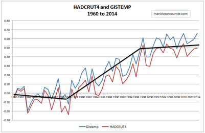
  4. Claims that taking the satellite data of global temperature anomalies into account shows that warming has not stopped. From Kevin Cowtan’s page (copied by Skeptical Science) we can calculate linear trends. It is the RSS satellite data that shows the longest period of no warming – 18 years from 1997-2014 based on the linear trend. It is just 13 years for GISTEMP and 14 years for HADCRUT4. The other satellite data is UAH, where there is just 6 years of no warming.


  5. What he is doing is comparing UAH satellite data that only shows the pause from 2009. There is now 35 years of satellite data, with the total recorded trend of 0.48oC. The RSS data shows 0.51oC of warming. The surface thermometer measures vary between 0.59 and 0.63 oC of warming. This is data cherry-picking.


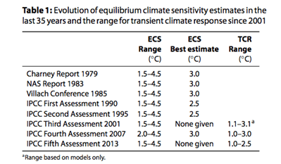
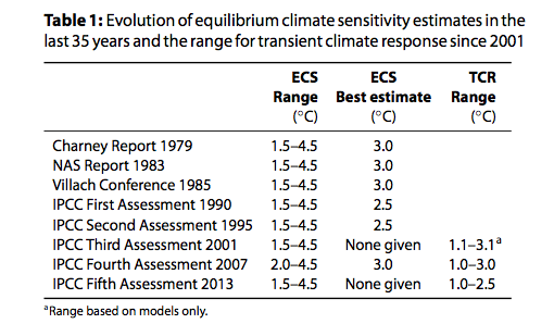
  6. There is a claim that climate sensitivity is lower than thought in the 1980s. Not according to Nicholas Lewis, who found that the range of sensitivities is unchanged from the Charney Report 1979 through to AR5 WG1 of Sept-13


  7. Claims the central estimate for warming from a doubling of CO2 is 3.0oC of warming. Based on this from 2001 from HADCRUT4 shows no warming there would be 0.30oC of warming, when the trend from HADCRUT4 is zero. In a longer period from 1979 for which we have satellite data, an increase in CO2 from 336.8 to 398.5 ppm (Mauna Loa data) implies an increase in temperatures of 0.72oC – between 1.14 on 1.5 times greater than that measured by the temperature series. Even this is misleading, as there was no warming from 1944 to the late 1970s. In 1944 I estimate that CO2 levels were 308ppm, indicating a total warming in the last 70 years of 1.1oC, respectively 1.7 and 2.1 times greater than the trend in GISTEMP and HADCRUT4.


  8. This would appear to contradict this graph, which has no proper labelling showing have 3.0oC of doubling affects temperatures.

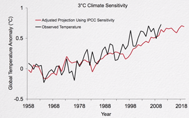
    Specifically from 1958 to 1980 CO2 rose from 315 to 339ppm, indicating warming of about 0.31 oC, but there was no warming in the IPCC projections. A rise in CO2 of 315 to 398.5 ppm from 1958 to 2014 would predict 1.0 oC in warming, almost double the actual data and the IPCC projections. Another point is with the “observed temperature”. It is not identified (probably GISTEMP) and ends on the high of 2010.


  9. Completely ignores the other greenhouse gases that contribute to warming, such as methane and halocarbons.


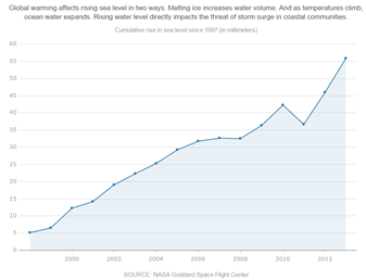
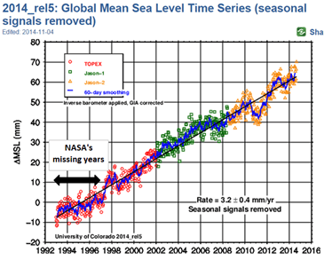
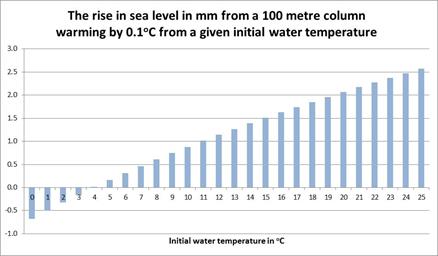
  10. Claims that sea level rise is another indication of global warming, through thermal expansion. This is not necessarily the case. The average temperature of the ocean is 3.9oC. A rise of to 4.0 oC will have zero expansion. If the rise in sea temperatures is confined to the Arctic or in the deep oceans where temperatures are below 4.0 oC, a rise in temperatures would mean a fall in sea levels. Below I have compiled a graph to show the expansion of a 100metre column of water by 0.1 oC from various starting temperatures.


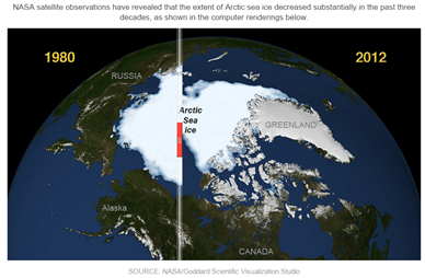
  11. On Arctic Sea ice, is correct in saying that the 40% uptick in the last two years ignores the longer period of data. But in turn, Veritasium ignores evidence pre-satellites that were fluctuations in sea ice. Further, the uptick occurred at precisely the year when previous experts had predicted that summer sea ice cover would disappear. As a consequence, contraction of the sea ice is both less severe and less likely to be linked to human-caused warming than previously thought.


  12. Correctly points out that water vapour is the major greenhouse gas, but incorrectly claims to have evidence that water vapour is increasing in the atmosphere. The evidence is from a graphic from a 2007 PNAS paper.

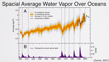
    The evidence from 1900 is the average of 12 models. The confidence intervals are utter rubbish, appearing to be related to the magnitude of the average modelled anomaly. The actual (estimated) data in black does not have a confidence interval. It would appear that this estimated data has a step increase at roughly the time, or slightly before, when the warming stopped in the surface temperature records.


  13. Policy justification is totally wrong.

Veritasium says at 5.35

I’m not claiming it’s going to be some sort of crazy catastrophe, but we are going to get more intense storms, more droughts and floods, the oceans will become more acidic, sea levels will rise and my point is it would be better for all species on this planet and probably cheaper for us if we just started reducing emissions now than if we wait and pay the consequences later.

Every economic justification of policy projects “some sort of crazy catastrophe” that human being and other species will not be able to adapt to. Further they project that global emissions reductions will be both effective and relatively costless, which is contradicted by the evidence. But most of all, there is no political proposal in the climate talks that will reduce global emissions in the next twenty years. The proposals may only constrain the rate of increase.

Kevin Marshall

The Truth About Davey’s Energy Savings

Ed Davey’s claim that the DECC published “a complete picture of everything that affects final energy bills” is refuted by Paul Homewood below.
This is far from an exhaustive list. For instance there are also the costs of upgrading the National Grid to transport the generated the electricity generated in remote wind turbines to the centers of population; the impact on jobs and growth of increasing energy costs relative to other nations;and the more esoteric costs to democracy of having a dogmatic group of people with dogmatic beliefs in a specialist applied subject claiming that this gives them superior insights into public policy-making, policy implementation and economic theory.

NOT A LOT OF PEOPLE KNOW THAT

By Paul Homewood

Scan

Ed Davey has been stung into defending his disastrous energy policies, following revelations that his department had disgracefully attempted to hide data, showing that electricity prices would soon be 40% higher, as a result of climate policies.

The above letter was published in last week’s Sunday Telegraph. Unfortunately, he is being rather economical with the truth.

First, let’s recap on the energy savings which Davey says will make us so much better off. The table below is from the data that DECC tried to hide.

image

https://www.gov.uk/government/publications/estimated-impacts-of-energy-and-climate-change-policies-on-energy-prices-and-bills-2014

The so-called savings are listed under 2).

View original post 507 more words

Ed Hoskins: Capital Cost and Production Effectiveness of Renewable Energy in Europe – the Data

Ed Hoskins provides a very wide-ranging analysis on the capital costs of renewables in Europe, with information about all the major countries. Despite total investment of $500bn so far, renewables provide just 2.9% of actual power generated. Hoskins also provides some graphical data on “Intermittency and Non-dipatchability” of energy output, helping highlight that renewables are not just expensive, they are also pretty useless at providing power when required.
The one weakness in the analysis is in the costs per unit of output – something outside the main purpose of the post. The source of that data is the U.S. Energy Information Administration. This uses (Table 2-5 on page 44 of the pdf file) “Overnight Capital Cost” which measures capital and maintenance costs per unit of capacity. So, for instance, “Onshore Wind” appears to have only 2.2 times the capital cost of “Natural Gas Advanced Combined Cycle”. But assuming the former operates at 25% of capacity and the latter at 85%, the capital costs of wind power becomes 7.5 times that of gas. Similarly, assuming offshore wind operates at 35% of capacity, relative capital costs rise from 6.2 to 14.8 times that of gas.

http://www.eia.gov/forecasts/capitalcost/pdf/updated_capcost.pdf

Another point is that the EIA does not consider conventional coal-fired power stations, possibly inflating the price by some measure of “The Social cost of Carbon”. Using the average price in AR4 of $12 per tonne of CO2 (Synthesis Report Page 69) and that a coal-fired power station produces about 500kg per megawatt, this $6 per megawatt is trivial compared with the much higher cost of renewables.

Tallbloke's Talkshop

Guest post from Ed Hoskins
A comparison of both the Capital Cost and Energy Production Effectiveness of the Renewable Energy in Europe.

The diagrams and table below collate the cost and capacity factors of Renewable Energy power sources, Onshore and Off-shore Wind Farms and Large scale Photovoltaic Solar generation, compared to the cost and output capacity of conventional Gas Fired Electricity generation.

Screen Shot 2014-12-16 at 08.16.07

The associated base data is shown below:

View original post 2,794 more words

Nissan Leaf Fails The Test

Paul Homewood has a very useful comparison between the cost of the electric Nissan Leaf car and a couple of super-efficient Ford Focuses. The electric car turns out to be a much worse buy. But looking at the costs of motoring to the consumer, and the tax costs can be complex, so there are a couple of points that I would amend.
First is that the £5000 rebate on an electric car is relevant to the buying decision. Otherwise it would not be in place. The purchaser of the car ends up paying £5000 less, so that is a reduction in both the depreciation and the borrowing they will face. As a result the annual cost differential on your figures reduces from £3200 to £1350. However, due to the differential in maintenance this figure is more like £1700.
Second is the difference in tax revenue. New cars attract 20% VAT. For the Leaf this is £4750. After the rebate, the exchequer gives out £250. VAT on the focus Focus Diesel is about £3300. In 3 years, the net tax revenue on the Leaf (purchase price, 5% VAT on electricity, 20% VAT in maintenance) is £50. On both Fords it is £5100.
The figures, by chance, fall out the same. Buy a Nissan Leaf instead of a Ford Focus and both you and the Exchequer will be about £5000 worse off over three years.
The differences do not stop there. As AC Osborn rightly points out there is a problem with range. The Leaf is limited to about 100 miles before a recharge of over four hours. As such, for families, it becomes a second car, whereas the a Focus with a range of at least 400 miles and a five minute refill can both serve for the school run / daily commute and for longer trips as well. An electric car becomes more of a lifestyle car, so on cost the Leaf is competing with an Audi A3 or similar.
Kevin Marshall

NOT A LOT OF PEOPLE KNOW THAT

By Paul Homewood

With oil prices falling through the floor, and confirmation of just how much electricity prices are going to rise in the next few years, it is time to look again at the comparative costs of electric and conventional cars.

The Nissan Leaf seems to be the most popular electric car in the UK, and is comparable, from a specification point of view, to the Ford Focus. The Leaf Acenta is the mid range version, and can be compared with the Focus Zetec, which I have shown for both the 1.6 TDCi diesel and Eco 1.0 petrol options.

So first, some basic costs and specifications.

View original post 653 more words

Has NASA distorted the data on global warming?

The Daily Mail has published some nice graphics from NASA on how the Earth’s climate has changed in recent years. The Mail says

Twenty years ago world leaders met for the first ever climate change summit but new figures show that since then the globe has become hotter and weather has become more weird.

Numbers show that carbon dioxide emissions are up, the global temperature has increased, sea levels are rising along with the earth’s population.

The statistics come as more than 190 nations opened talks on Monday at a United Nations global warming conference in Lima, Peru.

Read more: http://www.dailymail.co.uk/news/article-2857093/Hotter-weirder-How-climate-changed-Earth.html#ixzz3KyaTz1j9

Follow us: @MailOnline on Twitter | DailyMail on Facebook

http://www.dailymail.co.uk/news/article-2857093/Hotter-weirder-How-climate-changed-Earth.html

See if anyone can find a reason for the following.

  1. A nice graphic compares the minimum sea ice extent in 1980 with 2012 – nearly three month after the 2014 minimum. Why not use the latest data?

  2. There is a nice graphic showing the rise in global carbon emissions from 1960 to the present. Notice gradient is quite steep until the mid-70s; there is much shallower gradient to around 2000 when the gradient increases. Why do NASA not produce their temperature anomaly graph to show us all how these emissions are heating up the world?

    Data from http://cdiac.ornl.gov/GCP/.


  3. There is a simple graphic on sea level rise, derived from the satellite data. Why does the NASA graph start in 1997, when the University of Colorado data, that is available free to download, starts in 1993? http://sealevel.colorado.edu/


Some Clues

Sea Ice extent

COI | Centre for Ocean and Ice | Danmarks Meteorologiske Institut

Warming trends – GISTEMP & HADCRUT4

The black lines are an approximate fit of the warming trends.

Sea Level Rise

Graph can be obtained from the University of Colorado.


NB. This is in response to a post by Steve Goddard on Arctic Sea Ice.

Kevin Marshall