Warming in Canada is making temperatures less extreme

Yesterday the BBC broadcast “Climate Change – The Facts”. Jaime Jessop has already posted the first of a promised number of critical commentaries. Alex Cull has already started a transcript. Another here.

At the start the narrator says

What we’re doing right now is we’re so rapidly changing the climate, for the first time in the world’s history people can see the impact of climate change.

Greater storms, greater floods, greater heatwaves, extreme sea-level rise.

This reminds me of Jaime’s article of 4th April – Canada’s Burning and it’s Mostly Because of Humans Says Federal Government Report 

The true headline claim from the Canada’s Climate Change Report 2019 was

Both past and future warming in Canada is, on average, about double the magnitude of global warming.

This observation is since 1948. This is partly because land has warmed faster than the oceans and partly because the greatest warming is in the Arctic. See two graphics I produced last year from the HADCRUT4 data. Note that much of the Canada-US border is at 49N, though Toronto is at 44N.

Canada is land based and much of its area is in the in the Arctic. Being part of a continental land mass, Canada also has extremely cold winters and fairly hot summers. But overall it is cold. Average Canadian temperatures from Berkeley Earth in 2013 were still -3.5C, up from -5.5C in 1900. BE graphic reproduced below.

The question is, does this mean that climate is becoming more extreme? The report on page 127 has a useful table

In Canada as a whole, and in four of the six areas, Winter average temperatures have warmed faster than those in the Summer. The other two have coastal influences, where I would expect the difference between  summer and winter to be less extreme than Canada as a whole. Climate has generally become less extreme.
However, if climate is becoming more extreme as a result of general warming then it this would result in more warm temperature records than cold temperature records to be set in recent decades. From Wikipedia has Lists of extreme temperatures in Canada.

Of the 13 Provinces and Territories, only two have heat records more recent than 1950. That is Nunavut in 1989 and Yukon in 2004. For extreme cold, records are more spread out, with the two most recent in 1972 & 1973.

Wikipedia also has lists of highest & lowest temperatures ever recorded in Canada as a whole. The hottest has duplicates in terms of adjacent places, or the same places on adjacent days. Not surprisingly nearly all are located well inland and close to the US border. The record highest is 45.0 °C on July 5, 1937. The bottom half of the list is of records of 43.3 °C or 110 °F. The three most recent were set in 1949, 1960 and 1961.
The coldest ever recorded in Canada was -63.0 °C on February 3, 1947 at Snag Yukon. The third lowest was −59.4 °C in 1975. On the list are three from this century. −49.8 °C on January 11, 2018, −48.6 °C on December 30, 2017 and −42 °C on December 17, 2013. Eleven of the thirteen provinces and territories are represented in the 31 records on the coldest list, and there is 21.9 °C difference between the top and bottom of the list. Seventy years of Winter warming in Canada have raised average temperatures by 3.3 °C, but the extreme low temperatures are 13 °C higher.

It would seem that the biggest news is of winter warming of 3.3 °C in 70 years has resulted in far less extreme cold, and considerably lower extreme cold temperatures. The more moderate summer warming has not resulted in record heatwaves. The evidence is that Canada’s warming has made temperatures less extreme, contradicting the consensus claims that warming leads to more extremes. In Canada, global warming appears to be causing climate changing for the better. So why is the Canadian Government trying to stop it?

Kevin Marshall

Does data coverage impact the HADCRUT4 and NASA GISS Temperature Anomalies?

Introduction

This post started with the title “HADCRUT4 and NASA GISS Temperature Anomalies – a Comparison by Latitude“.  After deriving a global temperature anomaly from the HADCRUT4 gridded data, I was intending to compare the results with GISS’s anomalies by 8 latitude zones. However, this opened up an intriguing issue. Are global temperature anomalies impacted by a relative lack of data in earlier periods? The leads to a further issue of whether infilling of the data can be meaningful, and hence be considered to “improve” the global anomaly calculation.

A Global Temperature Anomaly from HADCRUT4 Gridded Data

In a previous post, I looked at the relative magnitudes of early twentieth century and post-1975 warming episodes. In the Hadley datasets, there is a clear divergence between the land and sea temperature data trends post-1980, a feature that is not present in the early warming episode. This is reproduced below as Figure 1.

Figure 1 : Graph of Hadley Centre 7 year moving average temperature anomalies for Land (CRUTEM4), Sea (HADSST3) and Combined (HADCRUT4)

The question that needs to be answered is whether the anomalous post-1975 warming on the land is due to real divergence, or due to issues in the estimation of global average temperature anomaly.

In another post – The magnitude of Early Twentieth Century Warming relative to Post-1975 Warming – I looked at the NASA Gistemp data, which is usefully broken down into 8 Latitude Zones. A summary graph is shown in Figure 2.

Figure 2 : NASA Gistemp zonal anomalies and the global anomaly

This is more detail than the HADCRUT4 data, which is just presented as three zones of the Tropics, along with Northern and Southern Hemispheres. However, the Hadley Centre, on their HADCRUT4 Data: download page, have, under  HadCRUT4 Gridded data: additional fields, a file HadCRUT.4.6.0.0.median_ascii.zip. This contains monthly anomalies for 5o by 5o grid cells from 1850 to 2017. There are 36 zones of latitude and 72 zones of longitude. Over 2016 months, there are over 5.22 million grid cells, but only 2.51 million (48%) have data. From this data, I have constructed a global temperature anomaly. The major issue in the calculation is that the grid cells are of different areas. A grid cell nearest to the equator at 0o to 5o has about 23 times the area of a grid cell adjacent to the poles at 85o to 90o. I used the appropriate weighting for each band of latitude.

The question is whether I have calculated a global anomaly similar to the Hadley Centre. Figure 3 is a reconciliation with the published global anomaly mean (available from here) and my own.

Figure 3 : Reconciliation between HADCRUT4 published mean and calculated weighted average mean from the Gridded Data

Prior to 1910, my calculations are slightly below the HADCRUT 4 published data. The biggest differences are in 1956 and 1915. Overall the differences are insignificant and do not impact on the analysis.

I split down the HADCRUT4 temperature data by eight zones of latitude on a similar basis to NASA Gistemp. Figure 4 presents the results on the same basis as Figure 2.

Figure 4 : Zonal surface temperature anomalies a the global anomaly calculated using the HADCRUT4 gridded data.

Visually, there are a number of differences between the Gistemp and HADCRUT4-derived zonal trends.

A potential problem with the global average calculation

The major reason for differences between HADCRUT4 & Gistemp is that the latter has infilled estimated data into areas where there is no data. Could this be a problem?

In Figure 5, I have shown the build-up in global coverage. That is the percentage of 5o by 5o grid cells with an anomaly in the monthly data.

Figure 5 : HADCRUT4 Change in the percentage coverage of each zone in the HADCRUT4 gridded data. 

Figure 5 shows a build-up in data coverage during the late nineteenth and early twentieth centuries. The World Wars (1914-1918 & 1939-1945) had the biggest impact on the Southern Hemisphere data collection. This is unsurprising when one considers it was mostly fought in the Northern Hemisphere, and European powers withdrew resources from their far-flung Empires to protect the mother countries. The only zones with significantly less than 90% grid coverage in the post-1975 warming period are the Arctic and the region below 45S. That is around 19% of the global area.

Finally, comparing comparable zones in the Northen and Southern hemispheres, the tropics seem to have comparable coverage, whilst for the polar, temperate and mid-latitude areas the Northern Hemisphere seems to have better coverage after 1910.

This variation in coverage can potentially lead to wide discrepancies between any calculated temperature anomalies and a theoretical anomaly based upon one with data in all the 5o by 5o grid cells. As an extreme example, with my own calculation, if just one of the 72 grid cells in a band of latitude had a figure, then an “average” would have been calculated for a band right around the world 555km (345 miles) from North to South for that month for that band. In the annual figures by zone, it only requires one of the 72 grid cells, in one of the months, in one of the bands of latitude to have data to calculate an annual anomaly. For the tropics or the polar areas, that is just one in 4320 data points to create an anomaly. This issue will impact early twentieth-century warming episode far more than the post-1975 one. Although I would expect the Hadley centre to have done some data cleanup of the more egregious examples in their calculation, potentially lack of data in grid cells could have quite random impacts, thus biasing the global temperature anomaly trends to an unknown, but significant extent. An appreciation of how this could impact can be appreciated from an example of NASA GISS Global Maps.

NASA GISS Global Maps Temperature Trends Example

NASA GISS Global Maps from GHCN v3 Data provide maps with the calculated change in average temperatures. I have run the maps to compare annual data for 1940 with a baseline of 1881-1910, capturing much of the early twentieth-century warming. The maps are at both the 1200km and 250km smoothing.

Figure 6 : NASA GISS Global anomaly Map and average anomaly by Latitude comparing 1940 with a baseline of 1881 to 1910 and a 1200km smoothing radius

Figure 7 : NASA GISS Global anomaly Map and average anomaly by Latitude comparing 1940 with a baseline of 1881 to 1910 and a 250km smoothing radius. 

With respect to the maps in figures 6 & 7

  • There is no apparent difference in the sea data between the 1200km and 250km smoothing radius, except in the polar regions with more cover in the former. The differences lie in the land area.
  • The grey areas with insufficient data all apply to the land or ocean areas in polar regions.
  • Figure 6, with 1200km smoothing, has most of the land infilled, whilst the 250km smoothing shows the lack of data coverage for much of South America, Africa, the Middle East, South-East Asia and Greenland.

Even with these land-based differences in coverage, it is clear that from either map that at any latitude there are huge variations in calculated average temperature change. For instance, take 40N. This line of latitude is North of San Francisco on the West Coast USA, clips Philidelphia on the East Coast. On the other side of the Atlantic, Madrid, Ankara and Beijing are at about 40N. There are significant points on the line on latitude with estimate warming greater than 1C (e.g. California), whilst at the same time in Eastern Europe, cooling may have exceeded 1C in the period. More extreme is at 60N (Southern Alaska, Stockholm, St Petersburg) the difference in temperature along the line of latitude is over 3C. This compares to a calculated global rise of 0.40C.

This lack of data may have contributed (along with a faulty algorithm) to the differences in the Zonal mean charts by Latitude. The 1200km smoothing radius chart bears little relation to the 250km smoothing radius. For instance:-

  •  1200km shows 1.5C warming at 45S, 250km about zero. 45S cuts through South Island, New Zealand.
  • From the equator to 45N, 1200km shows rise from 0.5C to over 2.0C, 250km shows drop from less than 0.5C to near zero, then rise to 0.2C. At around 45N lies Ottowa, Maine, Bordeaux, Belgrade, Crimea and the most Northern point in Japan.

The differences in the NASA Giss Maps, in a period when available data covered only around half the 2592 5o by 5o grid cells, indicate quite huge differences in trends between different areas. As a consequence, trying to interpolate warming trends from one area to adjacent areas appears to give quite different results in terms of trends by latitude.

Conclusions and Further Questions

The issue I originally focussed upon was the relative size of the early twentieth-century warming to the Post-1975. The greater amount of warming in the later period seemed to be due to the greater warming on land covering just 30% of the total global area. The sea temperature warming phases appear to be pretty much the same.

The issue that I focussed upon was a data issue. The early twentieth century had much less data coverage than after 1975. Further, the Southern Hemisphere had worse data coverage than the Northern Hemisphere, except in the Tropics. This means that in my calculation of a global temperature anomaly from the HADCRUT4 gridded data (which in aggregate was very similar to the published HADCRUT4 anomaly) the average by latitude will not be comparing like with like in the two warming periods. In particular, in the early twentieth-century, a calculation by latitude will not average right the way around the globe, but only on a limited selection of bands of longitude. On average this was about half, but there are massive variations. This would be alright if the changes in anomalies were roughly the same over time by latitude. But an examination of NASA GISS global maps for a period covering the early twentieth-century warming phase reveals that trends in anomalies at the same latitude are quite different over time. This implies that there could be large, but unknown, biases in the data.

I do not believe the analysis ends here. There are a number of areas that I (or others) can try to explore.

  1. Does the NASA GISS infilling of the data get us closer or further away from a what a global temperature anomaly would look like with full data coverage? My guess, based on the extreme example of Antartica trends (discussed here) is that the infilling will move away from the more perfect trend. The data could show otherwise.
  2. Are the changes in data coverage on land more significant than the global average or less? Looking at CRUTEM4 data could resolve this question.
  3. Would anomalies based upon similar grid coverage after 1900 give different relative trend patterns to the published ones based on dissimilar grid coverage?

Whether I get the time to analyze these is another issue.

Finally, the problem of trends varying considerably and quite randomly across the globe is the same issue that I found with land data homogenisation discussed here and here. To derive a temperature anomaly for a grid cell, it is necessary to make the data homogeneous. In standard homogenisation techniques, it is assumed that the underlying trends in an area is pretty much the same. Therefore, any differences in trend between adjacent temperature stations will be as a result of data imperfections. I found numerous examples where there were likely differences in trend between adjacent temperature stations. Homogenisation will, therefore, eliminate real but local climatic trends. Averaging incomplete global data where missing data could contain regional but unknown data trends may cause biases at a global scale.

Kevin Marshall

HADCRUT4, CRUTEM4 and HADSST3 Compared

In the previous post, I compared early twentieth-century warming with the post-1975 warming in the Berkeley Earth Global temperature anomaly. From a visual inspection of the graphs, I determined that the greater warming in the later period is due to more land-based warming, as the warming in the oceans (70% of the global area) was very much the same. The Berkeley Earth data ends in 2013, so does not include the impact of the strong El Niño event in the last three years.

Global average temperature series page of the Met Office Hadley Centre Observation Datasets has the average annual temperature anomalies for CRUTEM4 (land-surface air temperature) and HADSST3 (sea-surface temperature)  and HADCRUT4 (combined). From these datasets, I have derived the graph in Figure 1.

Figure 1 : Graph of Hadley Centre annual temperature anomalies for Land (CRUTEM4), Sea (HADSST3) and Combined (HADCRUT4)

  Comparing the early twentieth-century with 1975-2010,

  • Land warming is considerably greater in the later period.
  • Combined land and sea warming is slightly more in the later period.
  • Sea surface warming is slightly less in the later period.
  • In the early period, the surface anomalies for land and sea have very similar trends, whilst in the later period, the warming of the land is considerably greater than the sea surface warming.

The impact is more clearly shown with 7 year centred moving average figures in Figure 2.

Figure 2 : Graph of Hadley Centre 7 year moving average temperature anomalies for Land (CRUTEM4), Sea (HADSST3) and Combined (HADCRUT4)

This is not just a feature of the HADCRUT dataset. NOAA Global Surface Temperature Anomalies for land, ocean and combined show similar patterns. Figure 3 is on the same basis as Figure 2.

Figure 3 : Graph of NOAA 7 year moving average temperature anomalies for Land, Ocean and Combined.

The major common feature is that the estimated land temperature anomalies have shown a much greater warming trend that the sea surface anomalies since 1980, but no such divergence existed in the early twentieth century warming period. Given that the temperature data sets are far from complete in terms of coverage, and the data is of variable quality, is this divergence a reflection of the true average temperature anomalies based on far more complete and accurate data? There are a number of alternative possibilities that need to be investigated to help determine (using beancounter terminology) whether the estimates are a true and fair reflection of the prespective that more perfect data and techniques would provide. My list might be far from exhaustive.

  1. The sea-surface temperature set understates the post-1975 warming trend due to biases within data set.
  2. The spatial distribution of data changed considerably over time. For instance, in recent decades more data has become available from the Arctic, a region with the largest temperature increases in both the early twentieth century and post-1975.
  3. Land data homogenization techniques may have suppressed differences in climate trends where data is sparser. Alternatively, due to relative differences in climatic trends between nearby locations increasing over time, the further back in time homogenization goes, the more accentuated these differences and therefore the greater the suppression of genuine climatic differences. These aspects I discussed here and here.
  4. There is deliberate manipulation of the data to exaggerate recent warming. Having looked at numerous examples three years ago, this is a perspective that I do not believe to have had any significant impact. However, simply believing something not to be the case, even with examples, does not mean that it is not there.
  5. Strong beliefs about how the data should look have, over time and multiple data adjustments created biases within the land temperature anomalies.

What I do believe is that an expert opinion to whether this divergence between the land and sea surface anomalies is a “true and fair view” of the actual state of affairs can only be reached by a detailed examination of the data. Jumping to conclusions – which is evident from many people across the broad spectrum of opinions on catastrophic anthropogenic global warming debate – will fall short of the most rounded opinion that can be gleaned from the data.

Kevin Marshall


The magnitude of Early Twentieth Century Warming relative to Post-1975 Warming

I was browsing the Berkeley Earth website and came across their estimate of global average temperature change. Reproduced as Figure 1.

Figure 1 – BEST Global Temperature anomaly

The 10-year moving average line in red clearly shows warming from the early twentieth century, (the period 1910 to 1940) being very similar warming from the mid-1970s to the end of the series in both time period and magnitude. Maybe the later warming period is up to one-tenth of a degree Celsius greater than the earlier one. The period from 1850 to 1910 shows stasis or a little cooling, but with high variability. The period from the 1940s to the 1970s shows stasis or slight cooling, and low variability.

This is largely corroborated by HADCRUT4, or at least the version I downloaded in mid-2014.

Figure 2 – HADCRUT4 Global Temperature anomaly

HADCRUT4 estimates that the later warming period is about three-twentieths of a degree Celsius greater than the earlier period and that the recent warming is slightly less than the BEST data.

The reason for the close fit is obvious. 70% of the globe is ocean and for that BEST use the same HADSST dataset as HADCRUT4. Graphics of HADSST are a little hard to come by, but KevinC at skepticalscience usefully produced a comparison of the latest HADSST3 in 2012 with the previous version.

Figure 3  – HADSST Ocean Temperature anomaly from skepticalscience 

This shows the two periods having pretty much the same magnitudes of warming.

It is the land data where the differences lie. The BEST Global Land temperature trend is reproduced below.

Figure 4 – BEST Global Land Temperature anomaly

For BEST global land temperatures, the recent warming was much greater than the early twentieth-century warming. This implies that the sea surface temperatures showed pretty much the same warming in the two periods. But if greenhouse gases were responsible for a significant part of global warming then the warming for both land and sea would be greater after the mid-1970s than in the early twentieth century. Whilst there was a rise in GHG levels in the early twentieth century, it was less than in the period from 1945 to 1975, when there was no warming, and much less than the post-1975 when CO2 levels rose massively. Whilst there can be alternative explanations for the early twentieth-century warming and the subsequent lack of warming for 30 years (when the post-WW2 economic boom which led to a continual and accelerating rise in CO2 levels), without such explanations being clear and robust the attribution of post-1975 warming to rising GHG levels is undermined. It could be just unexplained natural variation.

However, as a preliminary to examining explanations of warming trends, as a beancounter, I believe it is first necessary to examine the robustness of the figures. In looking at temperature data in early 2015, one aspect that I found unsatisfactory with the NASA GISS temperature data was the zonal data. GISS usefully divide the data between 8 bands of latitude, which I have replicated as 7 year centred moving averages in Figure 5.

Figure 5 – NASA Gistemp zonal anomalies and the global anomaly

What is significant is that some of the regional anomalies are far greater in magnitude

The most Southerly is for 90S-64S, which is basically Antarctica, an area covering just under 5% of the globe. I found it odd that there should a temperature anomaly for the region from the 1880s, when there were no weather stations recording on the frozen continent until the mid-1950s. The nearest is Base Orcadas located at 60.8 S 44.7 W, or about 350km north of 64 S. I found that whilst the Base Orcadas temperature anomaly was extremely similar to the Antarctica Zonal anomaly in the period until 1950, it was quite dissimilar in the period after.

Figure 6. Gistemp 64S-90S annual temperature anomaly compared to Base Orcadas GISS homogenised data.

NASA Gistemp has attempted to infill the missing temperature anomaly data by using the nearest data available. However, in this case, Base Orcadas appears to climatically different than the average anomalies for Antarctica, and from the global average as well. The result of this is to effectively cancel out the impact of the massive warming in the Arctic on global average temperatures in the early twentieth century. A false assumption has effectively shrunk the early twentieth-century warming. The shrinkage will be small, but it undermines the NASA GISS being the best estimate of a global temperature anomaly given the limited data available.

Rather than saying that the whole exercise of determining a valid comparison the two warming periods since 1900 is useless, I will instead attempt to evaluate how much the lack of data impacts on the anomalies. To this end, in a series of posts, I intend to look at the HADCRUT4 anomaly data. This will be a top-down approach, looking at monthly anomalies for 5o by 5o grid cells from 1850 to 2017, available from the Met Office Hadley Centre Observation Datasets. An advantage over previous analyses is the inclusion of anomalies for the 70% of the globe covered by ocean. The focus will be on the relative magnitudes of the early twentieth-century and post-1975 warming periods. At this point in time, I have no real idea of the conclusions that can be drawn from the analysis of the data.

Kevin Marshall

How strong is the Consensus Evidence for human-caused global warming?

You cannot prove a vague theory wrong. If the guess that you make is poorly expressed and the method you have for computing the consequences is a little vague then ….. you see that the theory is good as it can’t be proved wrong. If the process of computing the consequences is indefinite, then with a little skill any experimental result can be made to look like an expected consequence.

Richard Feynman – 1964 Lecture on the Scientific Method

It’s self-evident that democratic societies should base their decisions on accurate information. On many issues, however, misinformation can become entrenched in parts of the community, particularly when vested interests are involved. Reducing the influence of misinformation is a difficult and complex challenge.

The Debunking Handbook 2011 – John Cook and Stephan Lewandowsky

My previous post looked at the attacks on David Rose for daring to suggest that the rapid fall in global land temperatures at the El Nino event were strong evidence that the record highs in global temperatures were not due to human greenhouse gas emissions. The technique used was to look at long-term linear trends. The main problems with this argument were
(a) according to AGW theory warming rates from CO2 alone should be accelerating and at a higher rate than the estimated linear warming rates from HADCRUT4.
(b) HADCRUT4 shows warming stopped from 2002 to 2014, yet in theory the warming from CO2 should have accelerated.

Now there are at least two ways to view my arguments. First is to look at Feynman’s approach. The climatologists and associated academics attacking journalist David Rose chose to do so from a perspective of a very blurred specification of AGW theory. That is human emissions will cause greenhouse gas levels to rise, which will cause global average temperatures to rise. Global average temperature clearly have risen from all long-term (>40 year) data sets, so theory is confirmed. On a rising trend, with large variations due to natural variability, then any new records will be primarily “human-caused”. But making the theory and data slightly less vague reveals an opposite conclusion. Around the turn of the century the annual percentage increase in CO2 emissions went from 0.4% to 0.5% a year (figure 1), which should have lead to an acceleration in the rate of warming. In reality warming stalled.

The reaction was to come up with a load of ad hoc excuses. Hockey Schtick blog reached 66 separate excuses for the “pause” by November 2014, from the peer-reviewed to a comment in the UK Parliament.  This could be because climate is highly complex, with many variables, the presence of each contributing can only be guessed at, let alone the magnitude of each factor and the interrelationships with all factors. So how do you tell which statements are valid information and which are misinformation? I agree with Cook and Lewandowsky that misinformation is pernicious, and difficult to get rid of once it becomes entrenched. So how does one evaluate distinguish between the good information and the bad, misleading or even pernicious?

The Lewandowsky / Cook answer is to follow the consensus of opinion. But what is the consensus of opinion? In climate one variation is to follow a small subset of academics in the area who answer in the affirmative to

1. When compared with pre-1800s levels, do you think that mean global temperatures have generally risen, fallen, or remained relatively constant?

2. Do you think human activity is a significant contributing factor in changing mean global temperatures?

Problem is that the first question is just reading a graph and the second could be is a belief statement will no precision. Anthropogenic global warming has been a hot topic for over 25 years now. Yet these two very vague empirically-based questions, forming the foundations of the subject, should be able to be formulated more precisely. On the second it is a case of having pretty clear and unambiguous estimates as to the percentage of warming, so far, that is human caused. On that the consensus of leading experts are unable to say whether it is 50% or 200% of the warming so far. (There are meant to be time lags and factors like aerosols that might suppress the warming). This from the 2013 UNIPCC AR5 WG1 SPM section D3:-

It is extremely likely that more than half of the observed increase in global average surface temperature from 1951 to 2010 was caused by the anthropogenic increase in greenhouse gas concentrations and other anthropogenic forcings together.

The IPCC, encapsulating the state-of-the-art knowledge, cannot provide firm evidence in the form of a percentage, or even a fairly broad range even with over 60 years of data to work on..  It is even worse than it appears. The extremely likely phrase is a Bayesian probability statement. Ron Clutz’s simple definition from earlier this year was:-

Here’s the most dumbed-down description: Initial belief plus new evidence = new and improved belief.

For the IPCC claim that their statement was extremely likely, at the fifth attempt, they should be able to show some sort of progress in updating their beliefs to new evidence. That would mean narrowing the estimate of the magnitude of impact of a doubling of CO2 on global average temperatures. As Clive Best documented in a cliscep comment in October, the IPCC reports, from 1990 to 2013 failed to change the estimate range of 1.5°C to 4.5°C. Looking up Climate Sensitivity in Wikipedia we get the origin of the range estimate.

A committee on anthropogenic global warming convened in 1979 by the National Academy of Sciences and chaired by Jule Charney estimated climate sensitivity to be 3 °C, plus or minus 1.5 °C. Only two sets of models were available; one, due to Syukuro Manabe, exhibited a climate sensitivity of 2 °C, the other, due to James E. Hansen, exhibited a climate sensitivity of 4 °C. “According to Manabe, Charney chose 0.5 °C as a not-unreasonable margin of error, subtracted it from Manabe’s number, and added it to Hansen’s. Thus was born the 1.5 °C-to-4.5 °C range of likely climate sensitivity that has appeared in every greenhouse assessment since…

It is revealing that quote is under the subheading Consensus Estimates. The climate community have collectively failed to update the original beliefs, based on a very rough estimate. The emphasis on referring to consensus beliefs about the world, rather than looking outward for evidence in the real world, I would suggest is the primary reason for this failure. Yet such community-based beliefs completely undermines the integrity of the Bayesian estimates, making its use in statements about climate clear misinformation in Cook and Lewandowsky’s use of the term. What is more, those in the climate community who look primarily to these consensus beliefs rather than the data of the real world will endeavour to dismiss the evidence, or make up ad hoc excuses, or smear those who try to disagree. A caricature of these perspectives with respect to global average temperature anomalies is available in the form of a flickering widget at John Cooks’ skepticalscience website. This purports to show the difference between “realist” consensus and “contrarian” non-consensus views. Figure 2 is a screenshot of the consensus views, interpreting warming as a linear trend. Figure 3 is a screenshot of the non-consensus or contrarian views. They is supposed to interpret warming as a series of short, disconnected,  periods of no warming. Over time, each period just happens to be at a higher level than the previous. There are a number of things that this indicates.

(a) The “realist” view is of a linear trend throughout any data series. Yet the period from around 1940 to 1975 has no warming or slight cooling depending on the data set. Therefore any linear trend line derived for a longer period than 1970 to 1975 and ending in 2015 will show a lower rate of warming. This would be consistent the rate of CO2 increasing over time, as shown in figure 1. But for shorten the period, again ending in 2015, and once the period becomes less than 30 years, the warming trend will also decrease. This contracts the theory, unless ad hoc excuses are used, as shown in my previous post using the HADCRUT4 data set.

(b) Those who agree with the consensus are called “Realist”, despite looking inwards towards common beliefs. Those who disagree with warming are labelled “Contrarian”. This is not inaccurate when there is a dogmatic consensus. But it utterly false to lump all those who disagree with the same views, especially when no examples are provided of those who hold such views.

(c) The linear trend appears as a more plausible fit than the series of “contrarian” lines. By implication, those who disagree with the consensus are viewed as as having a distinctly more blinkered and distorted perspective than those who follow the consensus. Yet even using gistemp data set (which is gives greatest support to the consensus views) there is a clear break in the linear trend. The less partisan HADCRUT4 data shows an even greater break.

Those who spot the obvious – that around the turn of the century warming stopped or slowed down, when in theory it should have accelerated – are given a clear choice. They can conform to the scientific consensus, denying the discrepancy between theory and data. Or they can act as scientists, denying the false and empirically empty scientific consensus, receiving the full weight of all the false and career-damaging opprobrium that accompanies it.

fig2-sks-realists


fig3-sks-contras

Kevin Marshall


Climate Experts Attacking a Journalist by Misinformation on Global Warming

Summary

Journalist David Rose was attacked for pointing out in a Daily Mail article that the strong El Nino event, that resulted in record temperatures, was reversing rapidly. He claimed record highs may be not down to human emissions. The Climate Feedback attack article claimed that the El Nino event did not affect the long-term human-caused trend. My analysis shows

  • CO2 levels have been rising at increasing rates since 1950.
  • In theory this should translate in warming at increasing rates. That is a non-linear warming rate.
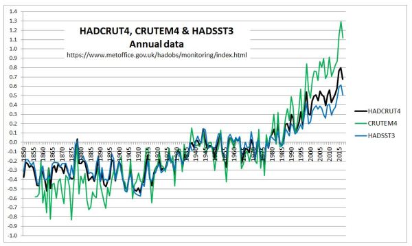
  • HADCRUT4 temperature data shows warming stopped in 2002, only resuming with the El Nino event in 2015 and 2016.
  • At the central climate sensitivity estimate of doubling of CO2 leads to 3C of global warming, HADCRUT4 was already falling short of theoretical warming in 2000. This is without the impact of other greenhouse gases.
  • Putting a linear trend lines through the last 35 to 65 years of data will show very little impact of El Nino, but has a very large visual impact on the divergence between theoretical human-caused warming and the temperature data. It reduces the apparent impact of the divergence between theory and data, but does not eliminate it.

Claiming that the large El Nino does not affect long-term linear trends is correct. But a linear trend neither describes warming in theory or in the leading temperature set. To say, as experts in their field, that the long-term warming trend is even principally human-caused needs a lot of circumspection. This is lacking in the attack article.


Introduction

Journalist David Rose recently wrote a couple of articles in the Daily Mail on the plummeting global average temperatures.
The first on 26th November was under the headline

Stunning new data indicates El Nino drove record highs in global temperatures suggesting rise may not be down to man-made emissions

With the summary

• Global average temperatures over land have plummeted by more than 1C
• Comes amid mounting evidence run of record temperatures about to end
• The fall, revealed by Nasa satellites, has been caused by the end of El Nino

Rose’s second article used the Met Offices’ HADCRUT4 data set, whereas the first used satellite data. Rose was a little more circumspect when he said.

El Nino is not caused by greenhouse gases and has nothing to do with climate change. It is true that the massive 2015-16 El Nino – probably the strongest ever seen – took place against a steady warming trend, most of which scientists believe has been caused by human emissions.

But when El Nino was triggering new records earlier this year, some downplayed its effects. For example, the Met Office said it contributed ‘only a few hundredths of a degree’ to the record heat. The size of the current fall suggests that this minimised its impact.

There was a massive reaction to the first article, as discussed by Jaime Jessop at Cliscep. She particularly noted that earlier in the year there were articles on the dramatically higher temperature record of 2015, such as in a Guardian article in January.There was also a follow-up video conversation between David Rose and Dr David Whitehouse of the GWPF commenting on the reactions. One key feature of the reactions was claiming the contribution to global warming trend of the El Nino effect was just a few hundredths of a degree. I find particularly interesting the Climate Feedback article, as it emphasizes trend over short-run blips. Some examples

Zeke Hausfather, Research Scientist, Berkeley Earth:
In reality, 2014, 2015, and 2016 have been the three warmest years on record not just because of a large El Niño, but primarily because of a long-term warming trend driven by human emissions of greenhouse gases.

….
Kyle Armour, Assistant Professor, University of Washington:
It is well known that global temperature falls after receiving a temporary boost from El Niño. The author cherry-picks the slight cooling at the end of the current El Niño to suggest that the long-term global warming trend has ended. It has not.

…..
KEY TAKE-AWAYS
1.Recent record global surface temperatures are primarily the result of the long-term, human-caused warming trend. A smaller boost from El Niño conditions has helped set new records in 2015 and 2016.

…….

2. The article makes its case by relying only on cherry-picked data from specific datasets on short periods.

To understand what was said, I will try to take the broader perspective. That is to see whether the evidence points conclusively to a single long-term warming trend being primarily human caused. This will point to the real reason(or reasons) for downplaying the impact of an extreme El Nino event on record global average temperatures. There are a number of steps in this process.

Firstly to look at the data of rising CO2 levels. Secondly to relate that to predicted global average temperature rise, and then expected warming trends. Thirdly to compare those trends to global data trends using the actual estimates of HADCRUT4, taking note of the consequences of including other greenhouse gases. Fourthly to put the calculated trends in the context of the statements made above.


1. The recent data of rising CO2 levels
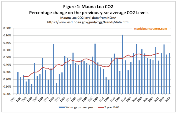
CO2 accounts for a significant majority of the alleged warming from increases in greenhouse gas levels. Since 1958 CO2 (when accurate measures started to be taken at Mauna Loa) levels have risen significantly. Whilst I could produce a simple graph either the CO2 level rising from 316 to 401 ppm in 2015, or the year-on-year increases CO2 rising from 0.8ppm in the 1960s to over 2ppm in in the last few years, Figure 1 is more illustrative.

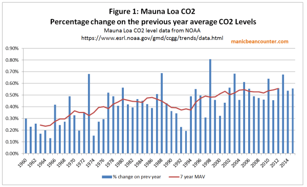
CO2 is not just rising, but the rate of rise has been increasing as well, from 0.25% a year in the 1960s to over 0.50% a year in the current century.


2. Rising CO2 should be causing accelerating temperature rises

The impact of CO2 on temperatures is not linear, but is believed to approximate to a fixed temperature rise for each doubling of CO2 levels. That means if CO2 levels were rising arithmetically, the impact on the rate of warming would fall over time. If CO2 levels were rising by the same percentage amount year-on-year, then the consequential rate of warming would be constant over time.  But figure 1 shows that percentage rise in CO2 has increased over the last two-thirds of a century.  The best way to evaluate the combination of CO2 increasing at an accelerating rate and a diminishing impact of each unit rise on warming is to crunch some numbers. The central estimate used by the IPCC is that a doubling of CO2 levels will result in an eventual rise of 3C in global average temperatures. Dana1981 at Skepticalscience used a formula that produces a rise of 2.967 for any doubling. After adjusting the formula, plugging the Mauna Loa annual average CO2 levels into values in produces Figure 2.

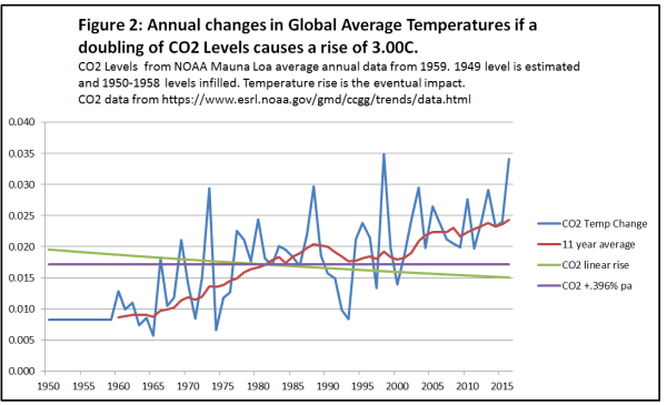
In computing the data I estimated the level of CO2 in 1949 (based roughly on CO2 estimates from Law Dome ice core data) and then assumed a linear increased through the 1950s. Another assumption was that the full impact of the CO2 rise on temperatures would take place in the year following that rise.

The annual CO2 induced temperature change is highly variable, corresponding to the fluctuations in annual CO2 rise. The 11 year average – placed at the end of the series to give an indication of the lagged impact that CO2 is supposed to have on temperatures – shows the acceleration in the expected rate of CO2-induced warming from the acceleration in rate of increase in CO2 levels. Most critically there is some acceleration in warming around the turn of the century.

I have also included the impact of linear trend (by simply dividing the total CO2 increase in the period by the number of years) along with a steady increase of .396% a year, producing a constant rate of temperature rise.

Figure 3 puts the calculations into the context of the current issue.

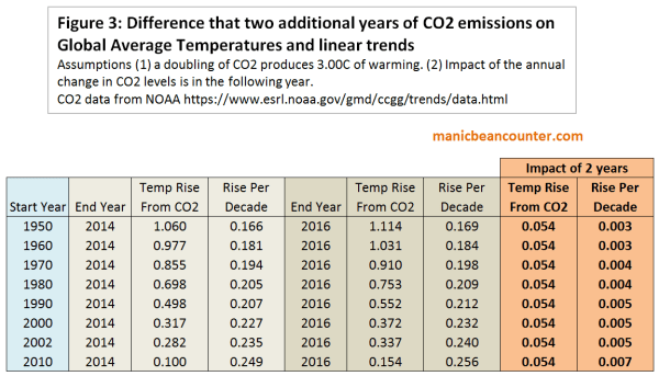
This gives the expected temperature linear temperature trends from various start dates up until 2014 and 2016, assuming a one year lag in the impact of changes in CO2 levels on temperatures. These are the same sort of linear trends that the climate experts used in criticizing David Rose. The difference in warming by more two years produces very little difference – about 0.054C of temperature rise, and an increase in trend of less than 0.01 C per decade. More importantly, the rate of temperature rise from CO2 alone should be accelerating.


3. HADCRUT4 warming

How does one compare this to the actual temperature data? A major issue is that there is a very indeterminate lag between the rise in CO2 levels and the rise in average temperature. Another issue is that CO2 is not the only greenhouse gas. More minor greenhouse gases may have different patterns if increases in the last few decades. However, the change the trends of the resultant warming, but only but the impact should be additional to the warming caused by CO2. That is, in the long term, CO2 warming should account for less than the total observed.
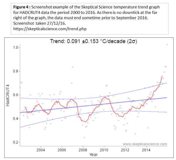
There is no need to do actual calculations of trends from the surface temperature data. The Skeptical Science website has a trend calculator, where one can just plug in the values. Figure 4 shows an example of the graph, which shows that the dataset currently ends in an El Nino peak.

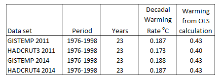
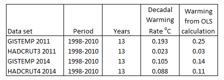
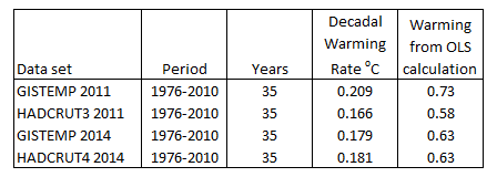
The trend results for HADCRUT4 are shown in Figure 5 for periods up to 2014 and 2016 and compared to the CO2 induced warming.

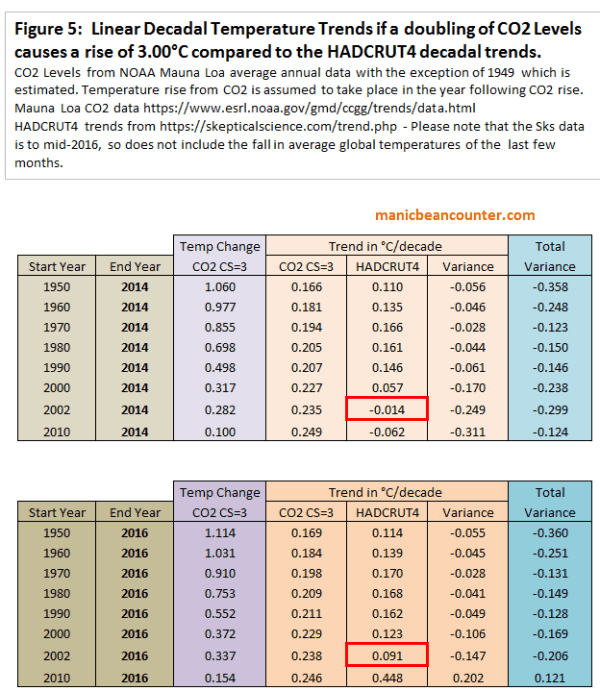
There are a number of things to observe from the trend data.

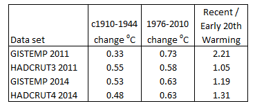
The most visual difference between the two tables is the first has a pause in global warming after 2002, whilst the second has a warming trend. This is attributable to the impact of El Nino. These experts are also right in that it makes very little difference to the long term trend. If the long term is over 40 years, then it is like adding 0.04C per century that long term trend.

But there is far more within the tables than this observations. Concentrate first on the three “Trend in °C/decade” columns. The first is of the CO2 warming impact from figure 3. For a given end year, the shorter the period the higher is the warming trend. Next to this are Skeptical Science trends for the HADCRUT4 data set. Start Year 1960 has a higher trend than Start Year 1950 and Start Year 1970 has a higher trend than Start Year 1960. But then each later Start Year has a lower trend the previous Start Years. There is one exception. The period 2010 to 2016 has a much higher trend than for any other period – a consequence of the extreme El Nino event. Excluding this there are now over three decades where the actual warming trend has been diverging from the theory.

The third of the “Trend in °C/decade” columns is simply the difference between the HADCRUT4 temperature trend and the expected trend from rising CO2 levels. If a doubling of CO2 levels did produce around 3C of warming, and other greenhouse gases were also contributing to warming then one would expect that CO2 would eventually start explaining less than the observed warming. That is the variance would be positive. But CO2 levels accelerated, actual warming stalled, increasing the negative variance.


4. Putting the claims into context

Compare David Rose

Stunning new data indicates El Nino drove record highs in global temperatures suggesting rise may not be down to man-made emissions

With Climate Feedback KEY TAKE-AWAY

1.Recent record global surface temperatures are primarily the result of the long-term, human-caused warming trend. A smaller boost from El Niño conditions has helped set new records in 2015 and 2016.

The HADCRUT4 temperature data shows that there had been no warming for over a decade, following a warming trend. This is in direct contradiction to theory which would predict that CO2-based warming would be at a higher rate than previously. Given that a record temperatures following this hiatus come as part of a naturally-occurring El Nino event it is fair to say that record highs in global temperatures ….. may not be down to man-made emissions.

The so-called long-term warming trend encompasses both the late twentieth century warming and the twenty-first century hiatus. As the later flatly contradicts theory it is incorrect to describe the long-term warming trend as “human-caused”. There needs to be a more circumspect description, such as the vast majority of academics working in climate-related areas believe that the long-term (last 50+ years) warming  is mostly “human-caused”. This would be in line with the first bullet point from the UNIPCC AR5 WG1 SPM section D3:-

It is extremely likely that more than half of the observed increase in global average surface temperature from 1951 to 2010 was caused by the anthropogenic increase in greenhouse gas concentrations and other anthropogenic forcings together.

When the IPCC’s summary opinion, and the actual data are taken into account Zeke Hausfather’s comment that the records “are primarily because of a long-term warming trend driven by human emissions of greenhouse gases” is dogmatic.

Now consider what David Rose said in the second article

El Nino is not caused by greenhouse gases and has nothing to do with climate change. It is true that the massive 2015-16 El Nino – probably the strongest ever seen – took place against a steady warming trend, most of which scientists believe has been caused by human emissions.

Compare this to Kyle Armour’s statement about the first article.

It is well known that global temperature falls after receiving a temporary boost from El Niño. The author cherry-picks the slight cooling at the end of the current El Niño to suggest that the long-term global warming trend has ended. It has not.

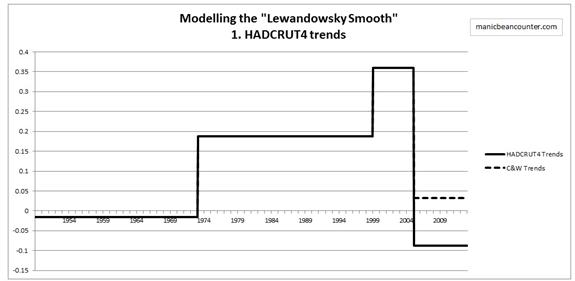
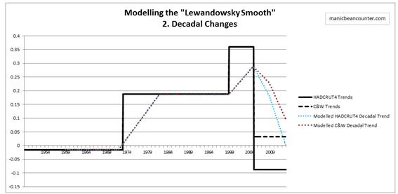
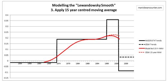
This time Rose seems to have responded to the pressure by stating that there is a long-term warming trend, despite the data clearly showing that this is untrue, except in the vaguest sense. There data does not show a single warming trend. Going back to the skeptical science trends we can break down the data from 1950 into four periods.

1950-1976 -0.014 ±0.072 °C/decade (2σ)

1976-2002 0.180 ±0.068 °C/decade (2σ)

2002-2014 -0.014 ±0.166 °C/decade (2σ)

2014-2016 1.889 ±1.882 °C/decade (2σ)

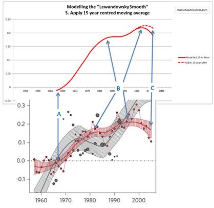
There was warming for about a quarter of a century sandwiched between two periods of no warming. At the end is an uptick. Only very loosely can anyone speak of a long-term warming trend in the data. But basic theory hypotheses a continuous, non-linear, warming trend. Journalists can be excused failing to make the distinctions. As non-experts they will reference opinion that appears sensibly expressed, especially when the alleged experts in the field are united in using such language. But those in academia, who should have a demonstrable understanding of theory and data, should be more circumspect in their statements when speaking as experts in their field. (Kyle Armour’s comment is an extreme example of what happens when academics completely suspend drawing on their expertise.)  This is particularly true when there are strong divergences between the theory and the data. The consequence is plain to see. Expert academic opinion tries to bring the real world into line with the theory by authoritative but banal statements about trends.

Kevin Marshall

The Lewandowsky Smooth

Summary

The Risbey at al. 2014 paper has already had criticism of its claim that some climate models can still take account of actual temperature trends. However, those criticisms did not take into account the “actual” data used, nor did they account for why Stephan Lewandowsky, a professor of psychology, should be a co-author of a climate science paper. I construct simple model using Excel of surface temperature trends that accurately replicates the smoothed temperature data in Risbey et al. 2014. Whereas the HADCRUT4 data set shows the a cooling trend since 2006, a combination of three elements smooths it away to give the appearance of a minimal downturn in a warming trend. Those element are the use of the biases in Cowtan and Way 2013; the use of decadal changes in data (as opposed to change from previous period) and the use of 15 year centred moving averages. As Stephan Lewandowsky was responsible for the “analysis of models and observations” this piece of gross misinformation must be attributed to him, hence the title.

Introduction

Psychology Professor Stephan Lewandowsky has previously claimed that “inexpert mouths” should not be heard. He is a first a psychologist, cum statistician; then a specialist on ethics, and peer review; then publishes on the maths of uncertainty. Now Lewandowsky re-emerges as a Climate Scientist, in

Well-estimated global surface warming in climate projections selected for ENSO phase” James S. Risbey, Stephan Lewandowsky, Clothilde Langlais, Didier P. Monselesan, Terence J. O’Kane & Naomi Oreskes Nature Climate Change (Risbey et al. 2014)

Why the involvement?

Risbey et al. 2014 was the subject of a long post at WUWT by Bob Tisdale. That long post was concerned with the claim that the projections of some climate models could replicate surface temperature data.

Towards the end Tisdale notes

The only parts of the paper that Stephan Lewandowsky was not involved in were writing it and the analysis of NINO3.4 sea surface temperature data in the models. But, and this is extremely curious, psychology professor Stephan Lewandowsky was solely responsible for the “analysis of models and observations”.

Lewandowsky summarizes his contribution at shapingtomorrowsworld. The following is based on that commentary.

Use of Cowtan and Way 2013

Lewandowsky asks “Has global warming “stopped”?” To answer in the negative he uses Cowtan and Way 2013. This was an attempt to correct the coverage biases in the HADCRUT4 data set by infilling through modelling where the temperature series lacked data. Principally real temperature data was lacking at the poles and in parts of Africa. However, the authors first removed some of the HADCRUT4 data, stating reasons for doing so. In total Roman M found it was just 3.34% of the filled-in grid cells, but was strongly biased towards the poles. That is exactly where the HADCRUT4 data was lacking. A computer model was not just infilling for where data was absent, but replacing sparse data with modelled data.

Steve McIntyre plotted the differences between CW2013 and HADCRUT4.

Stephan Lewandowsky should have acknowledged that, through the greater use of modelling techniques, Cowtan and Way was a more circumstantial estimate of global average surface temperature trends than HADCRUT4. This aspect would be the case even if results were achieved by robust methods.

Modelling the smoothing methods

The Cowtan and Way modelled temperature series was then smoothed to create the following series in red.

The smoothing was achieved by employing two methods. First was to look at decadal changes rather than use temperature anomalies – the difference from a fixed point in time. Second was to use 15 year centred moving averages.

To help understand the impact these methods to the observations had on the data I have constructed a simple model of the major HADCRUT4 temperature changes. The skepticalscience.com website very usefully has a temperature trends calculator.

The phases I use in degrees Kelvin per decade are

The Cowtan and Way trend is simply HADCRUT4 with a trend of 0.120 Kelvin per decade for the 2005-2013 period. This simply coverts a cooling trend since 2005 into a warming one, illustrated below.

The next step is to make the trends into decadal trends, by finding the difference with between the current month figure and the one 120 months previous. This derives the following for the Cowtan and Way trend data.

Applying decadal trends spreads the impact of changes in trend over ten years following the change. Using HADCRUT4 would mean decadal trends are now zero.

The next step is to apply 15 year centred moving averages.

The centred moving average spreads the impact of a change in trend to before the change occurred. So warming starts in 1967 instead of 1973. This partly offsets the impact of decadal changes, but further smothers any step changes. The two elements also create a nice smoothing of the data. The difference of Cowtan and Way is to future-proof this conclusion.

Comparison of modelled trend with the “Lewandowsky Smooth”

Despite dividing up over sixty years of data into just 5 periods, I have managed to replicate the essentially features of the decadal trend data.

A. Switch from slight cooling to warming trend in late 1960s, some years before the switch occurred.

B. Double peaks in warming trend, the first below 0.2 degrees per decade, the second slightly above.

C. The smoothed graph ending with warming not far off the peak, obliterating the recent cooling in the HADCRUT4 data.

Lewandowsky may not have used the decadal change as the extra smoothing technique, but whichever technique that was used achieved very similar results to my simple Excel effort. So the answer to Lewandowsky’s question “Has global warming “stopped”?” the answer is “Yes”. Lewandowsky knew this, so has manipulated the data to smooth the problem away. The significance is in a quote from “the DEBUNKING Handbook“.

It’s self-evident that democratic societies should base their decisions on accurate information. On many issues, however, misinformation can become entrenched in parts of the community, particularly when vested interests are involved. Reducing the influence of misinformation is a difficult and complex challenge.

Lewandowsky is providing misinformation, and has an expert understanding of its pernicious effects.

Kevin Marshall

NASA corrects errors in the GISTEMP data

In estimating global average temperatures there are a number of different measures to choose from. The UNIPCC tends to favour the British Hadley Centre HADCRUT data. Many of those who believe in the anthropogenic global warming hypothesis have a propensity to believe in the alternative NASA Goddard Institute for Space Studies data. Sceptics criticize GISTEMP due to its continual changes, often in the direction of supporting climate alarmism.

I had downloaded both sets of annual data in April 2011, and also last week. In comparing the two sets of data I noticed something remarkable. Over the last three years the two data sets have converged. The two most significant areas of convergence are in the early twentieth century warming phase (roughly 1910-1944) and the period 1998 to 2010. This convergence is mostly GISTEMP coming into line with HADCRUT. In doing so, it now diverges more from the rise in CO2.

In April 2011 I downloaded the HACRUT3 data, along with GISTEMP. The GISTEMP data carries the same name, but the Hadley centre now has replaced the HADCRUT3 data set with HADCRUT4. Between the two data sets and over just three years, one would expect the four sets of data to be broadly in agreement. To check this I plotted the annual average anomalies figures below.

The GISTEMP 2011 annual mean data, (in light blue) appears to be an outlier of the four data sets. This is especially for the periods 1890-1940 and post 2000.

To emphasise this, I found the difference between data sets, then plotted the five tear centred moving average of the data.

The light green dotted line shows the divergence in data sets three years ago. From 1890 to 1910 the divergence goes from zero to 0.3 degrees. This reduces to almost zero in the early 1940s, increases to 1950, reduces to the late 1960s. From 2000 to 2010 the divergence increases markedly. The current difference, shown by the dark green dotted line shows much greater similarities. The spike around 1910 has disappeared, as has the divergence in the last decade. These changes are more due to changes in GISTEMP (solid blue line) that HADCRUT (solid orange).

To see these changes more clearly, I applied OLS to the warming periods. The start of the period I took as the lowest year at the start, and the end point as the peak. The results of the early twentieth century were as follows:-

GISTEMP 2011 is the clear outlier for three reasons. First it has the most inconsistent measured warming, just 60-70% of the other figures. Second is that the beginning low point is the most inconsistent. Third is the only data set not to have 1944 as the peak of the warming cycle. The anomalies are below.

There were no such issues of start and end of the late twentieth century warming periods, shown below.

There is a great deal of conformity between these data sets. This is not the case for 1998-2010.

The GISTEMP 2011 figures seemed oblivious to the sharp deceleration in warming that occurred post 1998, which was also showing in satellite data. This has now been corrected in the latest figures.

The combined warming from 1976 to 2010 reported by the four data sets is as follows.

GISTEMP 2011 is the clear outlier here, this time being the highest of the four data sets. Different messages from the two warming periods can be gleaned by looking across the four data sets.

GISTEMP 2011 gives the impression of accelerating warming, consistent with the rise in atmospheric CO2 levels. HADCRUT3 suggests that rising CO2 has little influence on temperature, at least without demonstrating another warming element that was present in early part of the twentieth century and not in the latter part. The current data sets lean more towards HADCRUT3 2011 than GISTEMP 2011. Along with the clear pause from 1944 to 1976, it could explain why this is not examined too closely by the climate alarmists. The exception is by DANA1981 at Skepticalscience.com, who tries to account for the early twentieth century warming by natural factors. As it is three years old, it would be interesting to see an update based on more recent data.

What is strongly apparent from recent changes, is that the GISTEMP global surface temperature record contained errors, or inferior methods, that have now been corrected. That does not necessarily mean that it is a more accurate representation of the real world, but that it is more consistent with the British data sets, and less consistent strong forms of the global warming hypothesis.

Kevin Marshall