The Daily Mail has published some nice graphics from NASA on how the Earth’s climate has changed in recent years. The Mail says
Twenty years ago world leaders met for the first ever climate change summit but new figures show that since then the globe has become hotter and weather has become more weird.
Numbers show that carbon dioxide emissions are up, the global temperature has increased, sea levels are rising along with the earth’s population.
The statistics come as more than 190 nations opened talks on Monday at a United Nations global warming conference in Lima, Peru.
Follow us: @MailOnline on Twitter | DailyMail on Facebook
http://www.dailymail.co.uk/news/article-2857093/Hotter-weirder-How-climate-changed-Earth.html
See if anyone can find a reason for the following.
-
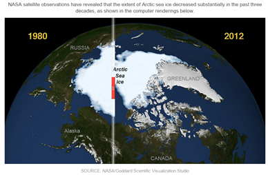
A nice graphic compares the minimum sea ice extent in 1980 with 2012 – nearly three month after the 2014 minimum. Why not use the latest data?
-
There is a nice graphic showing the rise in global carbon emissions from 1960 to the present. Notice gradient is quite steep until the mid-70s; there is much shallower gradient to around 2000 when the gradient increases. Why do NASA not produce their temperature anomaly graph to show us all how these emissions are heating up the world?
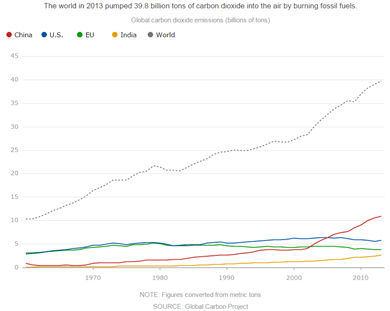
Data from http://cdiac.ornl.gov/GCP/.
-
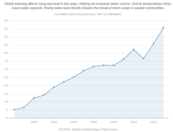
There is a simple graphic on sea level rise, derived from the satellite data. Why does the NASA graph start in 1997, when the University of Colorado data, that is available free to download, starts in 1993? http://sealevel.colorado.edu/
Some Clues
Sea Ice extent

COI | Centre for Ocean and Ice | Danmarks Meteorologiske Institut
Warming trends – GISTEMP & HADCRUT4
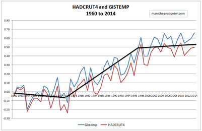
The black lines are an approximate fit of the warming trends.
Sea Level Rise
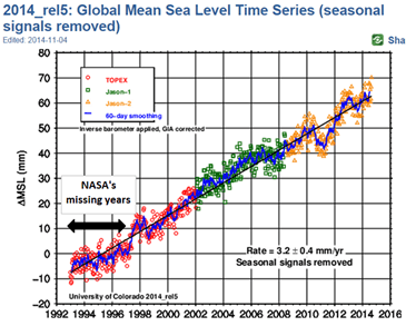
Graph can be obtained from the University of Colorado.
NB. This is in response to a post by Steve Goddard on Arctic Sea Ice.
Kevin Marshall
