Using 15 year trends to replicate GISTEMP average surface temperature anomalies

At Jo Nova’s Unthreaded on 22/06/14, Philip Shehan posted some GISTEMP temperature trend figures that caused a good deal of controversy.

In 15 year steps they are

1924/39 Trend: 0.142 ±0.148 °C/decade (2σ)

1939/54 Trend: -0.088 ±0.144 °C/decade (2σ)

1954/69 Trend: 0.024 ±0.151 °C/decade (2σ)

1969/84 Trend: 0.165 ±0.162 °C/decade (2σ)

1984/99 Trend: 0.234 ±0.167 °C/decade (2σ)

1999- Trend: 0.099 ±0.138 °C/decade (2σ)

Two issues with the trends are

1. They do not really capture the trends in the data.

2. They slope of the 15 year OLS lines is sensitive to shifting the period by one year – for instance replacing 1999-2013 with 1998-2012.

I replicated Philip Shehan’s data (or a least tried to – he does not use J-D years) on a graph, along with shifting the periods a year backwards. Compare these slopes to the 5 year centred moving average curve in light blue.

NASA corrects errors in the GISTEMP data

In estimating global average temperatures there are a number of different measures to choose from. The UNIPCC tends to favour the British Hadley Centre HADCRUT data. Many of those who believe in the anthropogenic global warming hypothesis have a propensity to believe in the alternative NASA Goddard Institute for Space Studies data. Sceptics criticize GISTEMP due to its continual changes, often in the direction of supporting climate alarmism.

I had downloaded both sets of annual data in April 2011, and also last week. In comparing the two sets of data I noticed something remarkable. Over the last three years the two data sets have converged. The two most significant areas of convergence are in the early twentieth century warming phase (roughly 1910-1944) and the period 1998 to 2010. This convergence is mostly GISTEMP coming into line with HADCRUT. In doing so, it now diverges more from the rise in CO2.

In April 2011 I downloaded the HACRUT3 data, along with GISTEMP. The GISTEMP data carries the same name, but the Hadley centre now has replaced the HADCRUT3 data set with HADCRUT4. Between the two data sets and over just three years, one would expect the four sets of data to be broadly in agreement. To check this I plotted the annual average anomalies figures below.

The GISTEMP 2011 annual mean data, (in light blue) appears to be an outlier of the four data sets. This is especially for the periods 1890-1940 and post 2000.

To emphasise this, I found the difference between data sets, then plotted the five tear centred moving average of the data.

The light green dotted line shows the divergence in data sets three years ago. From 1890 to 1910 the divergence goes from zero to 0.3 degrees. This reduces to almost zero in the early 1940s, increases to 1950, reduces to the late 1960s. From 2000 to 2010 the divergence increases markedly. The current difference, shown by the dark green dotted line shows much greater similarities. The spike around 1910 has disappeared, as has the divergence in the last decade. These changes are more due to changes in GISTEMP (solid blue line) that HADCRUT (solid orange).

To see these changes more clearly, I applied OLS to the warming periods. The start of the period I took as the lowest year at the start, and the end point as the peak. The results of the early twentieth century were as follows:-

GISTEMP 2011 is the clear outlier for three reasons. First it has the most inconsistent measured warming, just 60-70% of the other figures. Second is that the beginning low point is the most inconsistent. Third is the only data set not to have 1944 as the peak of the warming cycle. The anomalies are below.

There were no such issues of start and end of the late twentieth century warming periods, shown below.

There is a great deal of conformity between these data sets. This is not the case for 1998-2010.

The GISTEMP 2011 figures seemed oblivious to the sharp deceleration in warming that occurred post 1998, which was also showing in satellite data. This has now been corrected in the latest figures.

The combined warming from 1976 to 2010 reported by the four data sets is as follows.

GISTEMP 2011 is the clear outlier here, this time being the highest of the four data sets. Different messages from the two warming periods can be gleaned by looking across the four data sets.

GISTEMP 2011 gives the impression of accelerating warming, consistent with the rise in atmospheric CO2 levels. HADCRUT3 suggests that rising CO2 has little influence on temperature, at least without demonstrating another warming element that was present in early part of the twentieth century and not in the latter part. The current data sets lean more towards HADCRUT3 2011 than GISTEMP 2011. Along with the clear pause from 1944 to 1976, it could explain why this is not examined too closely by the climate alarmists. The exception is by DANA1981 at Skepticalscience.com, who tries to account for the early twentieth century warming by natural factors. As it is three years old, it would be interesting to see an update based on more recent data.

What is strongly apparent from recent changes, is that the GISTEMP global surface temperature record contained errors, or inferior methods, that have now been corrected. That does not necessarily mean that it is a more accurate representation of the real world, but that it is more consistent with the British data sets, and less consistent strong forms of the global warming hypothesis.

Kevin Marshall

How Skeptical Science maintains the 97% Consensus fallacy

Richard Tol has at last published a rebuttal of the Cook et al 97% consensus paper. So naturally Skeptical Science, run by John Cook publishes a rebuttal by Dana Nuccitelli. It is cross-posted at the Guardian Climate Consensus – the 97%, that is authored by Dana Nuccitelli. I strongly believe in comparing and contrasting different points of view, and winning an argument on its merits. Here are some techniques that Dana1981 employ that go counter to my view. That is discouraging the reader from looking at the other side by failing to link to opposing views, denigrating the opponents, and distorting the arguments.

Refusing to acknowledge the opponents credentials

Dana says

…… economist and Global Warming Policy Foundation advisor Richard Tol

These are extracts from Tol’s own biography, with my underlines

Richard S.J. Tol is a Professor at the Department of Economics, University of Sussex and the Professor of the Economics of Climate Change…. Vrije Universiteit, Amsterdam. Formerly, he was a Research Professor (in), Dublin, the Michael Otto Professor of Sustainability and Global Change at Hamburg University …..He has had visiting appointments at ……. University of Victoria, British Colombia (&)University College London, and at the Princeton Environmental Institute and the Department of Economics…….. He is ranked among the top 100 economists in the world, and has over 200 publications in learned journals (with 100+ co-authors), 3 books, 5 major reports, 37 book chapters, and many minor publications. He specialises in the economics of energy, environment, and climate, and is interested in integrated assessment modelling. He is an editor for Energy Economics, and an associate editor of economics the e-journal. He is advisor and referee of national and international policy and research. He is an author (contributing, lead, principal and convening) of Working Groups I, II and III of the Intergovernmental Panel on Climate Change…..

Dana and Cook can’t even get close – so they hide it.

Refusing to link the Global Warming Policy Foundation

There is a link to the words. It goes to a desmogblog article which begins with the words

The Global Warming Policy Foundation (GWPF) is a United Kingdom think tank founded by climate change denialist Nigel Lawson.

The description is the GWPF’s website is

We are an all-party and non-party think tank and a registered educational charity which, while open-minded on the contested science of global warming, is deeply concerned about the costs and other implications of many of the policies currently being advocated.

Failing to allow reader to understand the alternative view for themselves

The Guardian does not link to Tol’s article. The SkS article links to the peer-reviewed paper, which costs $19.95. Bishop Hill blog also links you to Tol’s own blog, where he discusses in layman’s terms the article. There is also a 3 minute presentation video, created by the paper’s publishers, where Tol explains the findings.

Distorted evidence on data access

Dana says

The crux of Tol’s paper is that he would have conducted a survey of the climate literature in a slightly different way than our approach. He’s certainly welcome to do just that – as soon as we published our paper, we also launched a webpage to make it as easy as possible for anyone to read the same scientific abstracts that we looked at and test the consensus for themselves.

Tol says

So I asked for the data to run some tests myself. I got a fraction, and over the course of the next four months I got a bit more – but still less than half of all data are available for inspection. Now Cook’s university is sending legal threats to a researcher who found yet another chunk of data.

The Mystery, threatened, researcher

The researcher is Brandon Shollenberger.

Dana says

In addition to making several basic errors, Tol cited numerous denialist and GWPF blog posts, including several about material stolen from our team’s private discussion forum during a hacking.

Brandon gives a description of how obtained the data at “wanna be hackers?“. It was not hacking, in the sense of by-passing passwords and other security, but following the links left around on unprotected sites. What is more, he used similar methods to those used before to get access to a “secret” discussion forum. This forum included some disturbing Photoshop images, including this one of John Cook, complete with insignia of the Sks website.

A glowing endorsement of counter critiques

Dana says

An anonymous individual has also published an elegant analysis
showing that Tol’s method will decrease the consensus no matter what data are put into it. In other words, his 91% consensus result is an artifact of his flawed methodology.

So it must be right then, and also the last word?

Failing to look at the counter-counter critique

Dana, like other fellow believers, does not look at the rebuttal.

Bishop Hill says

This has prompted a remarkable rapid response from an anonymous author here, which says that Tol has it all wrong. If I understand it correctly, Tol has corrected Cook’s results. The critic claims to have worked back from Tol’s results to what should have been Cook’s original results and got a nonsense result, thus demonstrating that Tol’s method is nonsense.

Tol’s reply today equally quickfire and says that his critic, who he has dubbed “Junior” has not used the correct data at all.

Junior did not reconstruct the [matrix] T that I used. This is unfortunate as my T is online…

Junior thus made an error and blamed it on me.

Demonstration of climate science as a belief system

This is my personal view, not of Tol’s, nor of Sks.

Tol in his short presentation, includes this slide as a better categorization of the reviewed papers.

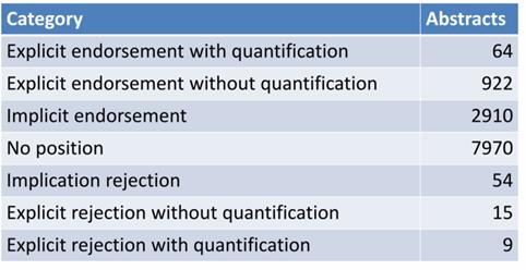
My take on these figures is that 8% give an explicit endorsement, and two-thirds take no position. Taking out the 7970 with no position gives 98.0%. Looking at just those 1010 that take an explicit position gives a “97.6% consensus”.

I accept Jesus as my Lord and Saviour, but I would declare as bunkum any similar survey that scanned New Testament theology peer-reviewed journals to demonstrate the divinity of Christ from the position taken by the authors. People study theology because they are fellow Christians. Atheists or agnostics reject it out of hand. Many scholars are employed by theological colleges, that exit to train people for ministry. Theological journals would be unlikely to accept articles that openly questioned the central tenets of Christianity. If they did many seminaries (but not many Universities) would not subscribe to the publication. In the case of climatology, publishing a paper openly critical of climatology gets a similar reaction to publishing views that some gay people might be so out of choice, rather than discovering their true nature, or that Vladimir Putin’s annexation of Crimea is not dissimilar to Hitler’s annexation of Sudetenland in 1938.

The lack of disagreement and the reactions to objections, I would interpret as “climate science” being an alternative belief system. People with a superior understanding of their subject area have nothing to fear from allowing comparison with alternative and inferior views.

 Kevin Marshall


Sea Level rise extremism of Professor Wanless and possible consequences for Miami-Dade

This article is written out of concern. A senior geology professor in Miami, who also chairs the science committee for the Miami-Dade Climate Change Advisory Task Force, has views on future sea level rise that are way more extreme than the available evidence. As a result, Southeast Florida Regional Plans could have been affected, with public money wasted, unnecessary stress caused to home owners, and land devalued.

Summary

The claim by Professor Wanless at the Conversation that sea levels could rise by 1.25 to 2m by 2100 is way too extreme it is based on top-slicing the estimates on a NOAA 2012 report. The top-end estimates were not included by the UNIPCC in its AR5 Sept 2013 report. In fact, the UNIPCC report stated it had low-confidence in estimates of sea level rise above its top-end 0.82m. The source of NOAA’s higher estimate might be from extrapolating from a 2011 paper on 1992-2010 ice-melt . The two leading authors of this paper also contributed to a much less extreme paper that formed the basis of the UNIPCC report. High estimates of ice melt have been effectively been repudiated by their authors. Further, even the UNIPCC’s estimates for 2100 could be extreme, as they are based on climate models. These climate models have all over-estimated the actual surface temperature rise of the last thirty years. On the basis of the warm bias, the projected consequential sea level rise is most likely much too high.

Professor Wanless has slightly moderated his views from 2008, but still maintains the same reasons for disagreeing with scientific consensus. A consequence of this sea level rise extremism might have been to influence the projected sea level rise in a Southeast Florida Regional Plan of 2012.


Introduction

At “The Conversation” Geology Professor Harold R. Wanless has posted an article “Rising sea levels will be too much, too fast for Florida“. The article is way too extreme on a number of levels. These views are similar to, but slightly moderated from views held in 2008. The consequences on this extremism might have been to adversely affect Southeast Florida Regional Planning.


An extreme Misquote

Professor Wanless says

The US National Oceanic and Atmospheric Administration (NOAA) published its assessment of sea level rise in 2012 as part of the
National Climate Assessment. Including estimates based on limited and maximum melt of the Greenland and Antarctic ice sheets, it anticipated a raise of 4.1 to 6.6ft (1.25 to 2m) by 2100, reaching 2ft (0.6m) by around 2050 and 3ft (0.9m) by around 2075.

Follow the link and the introduction says

Global sea level rise has been a persistent trend for decades. It is expected to continue beyond the end of this century, which will cause significant impacts in the United States. Scientists have very high confidence (greater than 90% chance) that global mean sea level will rise at least 8 inches (0.2 meter) and no more than 6.6 feet (2.0 meters) by 2100.

Professor Wanless relies upon the more extreme range of estimates, failing to mention that they require some very unlikely scenarios.

A quote from an extreme paper

A more authoritative and recent source than the NOAA report is the UNIPCC AR5 Working Group II (the Physical Science Basis) Summary for Policymakers. Page 23 has the following diagram

The likely range of sea level rise based on four climate models is 0.26 to 0.82 metres.


Extreme through looking at scientifically weak and unsupported data

But maybe there are factors that the UNIPCC did not take into account? On page 26 there is the following comment:-

The basis for higher projections of global mean sea level rise in the 21st century has been considered and it has been concluded that there is currently insufficient evidence to evaluate the probability of specific levels above the assessed likely range. Many semi-empirical model projections of global mean sea level rise are higher than process-based model projections (up to about twice as large), but there is no consensus in the scientific community about their reliability and there is thus low confidence in their projections.

In the coded language of the UNIPCC, to have low confidence in something that would support the alarmist cause means they think it is a load of rubbish.


The extreme estimates of ice melt acceleration

The reason Professor Wanless uses NOAAs top end estimate is due to believing in a much accelerated disintegration of the Greenland and Antarctic ice sheets. By looking at recent data a different picture could emerge from the consensus view.

The following from the UNIPCC gives some estimates of the rate of polar ice melt. In page 9

• The average rate of ice loss from the Greenland ice sheet has very likely substantially increased from 34 [–6 to 74] Gt yr–1 over the period 1992 to 2001 to 215 [157 to 274] Gt yr–1 over the period 2002 to 2011.

• The average rate of ice loss from the Antarctic ice sheet has likely increased from 30 [–37 to 97] Gt yr–1 over the period 1992–2001 to 147 [72 to 221] Gt yr–1 over the period 2002 to 2011. There is very high confidence that these losses are mainly from the northern Antarctic Peninsula and the Amundsen Sea sector of West Antarctica.

Further, on page 11 is stated

Over the period 1993 to 2010, global mean sea level rise is, with high confidence, consistent with the sum of the observed contributions from ocean thermal expansion due to warming (1.1 [0.8 to 1.4] mm yr–1), from changes in glaciers (0.76 [0.39 to 1.13] mm yr–1), Greenland ice sheet (0.33 [0.25 to 0.41] mm yr–1), Antarctic ice sheet (0.27 [0.16 to 0.38] mm yr–1), and land water storage (0.38 [0.26 to 0.49] mm yr–1). The sum of these contributions is 2.8 [2.3 to 3.4] mm yr–1.

These estimates are much lower than previous estimates, particularly on the implied acceleration. For instance Rignot et al 2011 looking at the period calculated polar ice melt contribution to sea levels of 0.91 mm yr–1, 50% higher than the UNIPCC. Further the acceleration on this paper from polar ice melt was 0.1 mm yr–21 mm yr–2and 0. 133 mm yr–2 including non-polar ice melt. Even at this rate of acceleration ice melt would only contribute 6 inches (150mm) to sea level rise. The upper NOAA estimates seem to be based upon taking this extreme figures and doubling them.

But less than two years later lead authors Eric Rignot and Isabella Velicogna were also amongst the 50 who wrote Sheppard et al 2012, which seems to have formed the basis for the UNIPCC report, as the figures are pretty much the same. Professor Wanless appears to be backing out of date science that the authors have effectively repudiated.


The climate models are extreme

The climate models that the UNIPCC relies upon for temperature and sea rise levels are themselves extreme. Last year Dr Roy Spencer charted 73 climate model predictions of temperature rise against the actual data for over the last 30 years.

Every single one of the climate models is running too hot.

On that basis, the even the mid-point predicted temperature rise of the weakest of the above models – the 1.0 degree of warming from RCP2.6 – appears too extreme. As a consequence the predicted 40cm mid-point range for sea-level rise to 2100 as a consequence of this temperature rise also appears extreme.


Possible consequences of the extremism

Professor Wanless is chairs the science committee for the Miami-Dade Climate Change Advisory Task Force. At the website is a 2008 presentation from him on expected sea level rise. Here Professor Wanless used the 2007 UNIPCC projection of 20cm to 50cm sea level rise by 2100, and then said (due to unaccounted for ice melt) he expected that rise to be at least 3-5 feet (0.9-1.5m) and possibly 7-9 feet (2.1-2.7m). Six years later he has moderated his views, but still believes sea levels will rise by at least twice the scientific consensus. The 2012 “Southeast Florida Regional Climate Change Action Plan” appears to reflect these views extremist views. Figure 1 on page 7 has projections for sea level rise.

Above the UNIPCC estimated sea levels rises of 17cm to 38cm by 2046-65 compared with 1986-2005. Eye-balling to the graph shows a range of 18-38 cm in 2045 and 28-75cm by 2065. It appears to be way out of line. Please note that the caption is for “Regional Planning Purposes”.

Personal Note

I do not believe that the responsibility for extreme views gaining currency lies with individuals who promote them, but with the abandonment of pluralism in favour of institutionalised dogma. The view that human-caused catastrophic global warming is either extremely likely or certain is accepted without question. Any questioning of the scientific authority has been treated as equivalent to denial of established fact, and with a manufactured moralistic contempt akin to that meted out to those who question the truth of the holocaust. As a result, the extremist and ill-supported pronouncements of scientific “experts” are not questioned. Instead they made headlines throughout the world. The solution is to actively promote pluralism and questioning in science.

Finally, all first time comments are moderated. Please use the comments as a point of contact. If you request for it not to be published, I will not do so provided it is not openly abusive.

I work hard to be accurate. If you can demonstrate that any of the above is inaccurate, I will correct it. If you disagree, I will publish the comment, though I reserve the right to edit out abuse and may respond. It is important that others can compare and contrast the arguments.


Kevin VS Marshall


Reconciling UNIPCC AR5 polar ice melt data with sea level rise

For over a year I have been pondering how to reconcile the near constant rise in sea levels with the accelerating polar ice melt. At the end of September the UNIPCC published the AR5 Working Group II (the Physical Science Basis) Summary for Policymakers which provides some useful evidence.

The following from the UNIPCC gives some estimates of the rate of polar ice melt. In page 9

• The average rate of ice loss from the Greenland ice sheet has very likely substantially increased from 34 [–6 to 74] Gt yr–1 over the period 1992 to 2001 to 215 [157 to 274] Gt yr–1 over the period 2002 to 2011.

• The average rate of ice loss from the Antarctic ice sheet has likely increased from 30 [–37 to 97] Gt yr–1 over the period 1992–2001 to 147 [72 to 221] Gt yr–1 over the period 2002 to 2011. There is very high confidence that these losses are mainly from the northern Antarctic Peninsula and the Amundsen Sea sector of West Antarctica.

Put in sea level rise terms, the combined average rate of ice loss from the polar ice caps increased from 0.18 mm yr–1 over the period 1992 to 2001 to 1.00mm yr–1 over the period 2002 to 2011.

There is a problem with these figures. The melting ice will end up raising sea levels. The satellite data from the University of Colorado shows a near constant rate of rise of 3.2mm yr–1.

Assuming a one year lag in raising sea levels, the 0.18 mm yr–1 over the period 1992 to 2001 is equivalent to 5% of the 3.3mm yr–1 average sea level rise from 1993 to 2002, whilst the 1.00mm yr–1 over the period 2002 to 2011 is equivalent to 32% of the 3.1mm yr–1 average sea level rise from 2003 to 2012. Some other component of sea level rise must be decreasing. The estimates of the other components are given on page 11

Since the early 1970s, glacier mass loss and ocean thermal expansion from warming together explain about 75% of the observed global mean sea level rise (high confidence). Over the period 1993 to 2010, global mean sea level rise is, with high confidence, consistent with the sum of the observed contributions from ocean thermal expansion due to warming (1.1 [0.8 to 1.4] mm yr–1), from changes in glaciers (0.76 [0.39 to 1.13] mm yr–1), Greenland ice sheet (0.33 [0.25 to 0.41] mm yr–1), Antarctic ice sheet (0.27 [0.16 to 0.38] mm yr–1), and land water storage (0.38 [0.26 to 0.49] mm yr–1). The sum of these contributions is 2.8 [2.3 to 3.4] mm yr–1.

The biggest component of sea level rise is thermal expansion. The contribution from this element must be decreasing. Ceteris paribus, that suggests the rate of heat accumulation is decreasing. This contradicts the idea that the lack of surface temperature warming is accounted for by this heat accumulation.

The problem is that all things are not equal. Thermal expansion of water varies greatly with temperature of that water. On page 10 there is the following graphic

The heat content of the upper ocean increased by around 10 x 1022 J from 1993 to 2010. For 700m of ocean depth I estimate this would be 0.1oC. It is a tiny amount that varies greatly with temperature, as shown by the graph below.

As sea temperature varies greatly according to location and depth, it is possible to hypothesise a decline in the thermal expansion with an increase in heat content. This whilst also accepting that both the rate of rise in the heat content of the oceans has accelerated and the contribution to sea level rise due the increase in heat content has decreased. For example one would just have to hypothesise that the increasing heat content had been predominately in the tropics during the 1990s and switched to the Arctic in the 2000s.

Even this switch is not necessary. There is huge variation between areas of the amount of temperature increase over a twenty year period. Consistent with an increase of 0.1 could have been a decrease in average temperatures in an area of ocean as large as the Atlantic and Indian Oceans combined.

But, what makes this less than credible is that this shift almost exactly offset the estimated increase in the ice melt component. Most likely no-one will try to calculate this, as the data is not there. Even with 3,000 Argo Buoys in the oceans, there is still on average just one buoy per 200,000 km3 of ocean, taking about 25 dips a year. The consensus viewpoint appears the less likely than the view that climate models have an exaggerated belief in the impact of greenhouse gases on average temperatures.

There is an opportunity for some further investigation with the data. But a huge amount of work may not yield anything, or may yield conclusion at odds with the “real”, unknown one. However, the first step is to determine how the UNIPCC calculated the figure for thermal expansion. Hopefully it was more substantial than from the difference between the total sea level rise and the estimates for other factors.

Update

At Bishop Hill Unthreaded michael hart Jun 1, 2014 at 4:13 AM refers to some other variables that determines how warming oceans will affect sea level rise through thermal expansion. So now the list includes.

  • The quantity of heat. (see above)
  • The initial temperature of the water which the heat was applied to. (see above)
  • The initial temperature is in turn related to
  1. Latitude – at mid latitudes there is a seasonal variation temperature variation down to about 300 metres.
  2. Depth
  3. Density variation due to salinity (see pdf page 9)

However, there are local variations as well, due to ocean currents that shift over time.

For these reasons, any attempt at estimating thermal expansion will be reliant on assumptions and estimates. The UNIPCC will have simply estimated the difference between estimated “known” factors – ice melt and land water storage – and deducted from the known sea level rise.

In terms of reconciling polar ice melt to sea level rise, there is something that I missed. According to the UNIPCC, glacier melt has a larger contribution to sea level rise than polar ice melt – 0.76 mm yr–1 against 0.60 mm yr–1. It is quite conceivable – particularly since temperatures have stopped rising – that have glacier melt has effectively ceased or even gone into reverse. Unlike with thermal expansion, there should be estimates available to confirm this.