Dixon and Jones confirm a result on the Stephan Lewandowsky Surveys

Congratulations to Ruth Dixon and Jonathan Jones on managing to get a commentary on the two Stephan Lewandowsky, Gilles Gignac & Klaus Oberauer surveys published in Psychological Science. Entitled “Conspiracist Ideation as a Predictor of Climate Science Rejection: An Alternative Analysis” it took two years to get published. Ruth Dixon gives a fuller description on her blog, My Garden Pond. It confirms something that I have stated independently, with the use of pivot tables instead of advanced statistical techniques. In April last year I compared the two surveys in a couple of posts – Conspiracist Ideation Falsified? (CIF) & Extreme Socialist-Environmentalist Ideation as Motivation for belief in “Climate Science” (ESEI).

The major conclusion through their analysis of the survey

All the data really shows is that people who have no opinion about one fairly technical matter (conspiracy theories) also have no opinion about another fairly technical matter (climate change). Complex models mask this obvious (and trivial) finding.

In CIF my summary was

A recent paper, based on an internet survey of American people, claimed that “conspiracist ideation, is associated with the rejection of all scientific propositions tested“. Analysis of the data reveals something quite different. Strong opinions with regard to conspiracy theories, whether for or against, suggest strong support for strongly-supported scientific hypotheses, and strong, but divided, opinions on climate science.

In the concluding comments I said

The results of the internet survey confirm something about people in the United States that I and many others have suspected – they are a substantial minority who love their conspiracy theories. For me, it seemed quite a reasonable hypothesis that these conspiracy lovers should be both suspicious of science and have a propensity to reject climate science. Analysis of the survey results has over-turned those views. Instead I propose something more mundane – that people with strong opinions in one area are very likely to have strong opinions in others. (Italics added)

Dixon and Jones have a far superior means of getting to the results. My method is to input the data into a table, find groupings or classifications, then analyse the results via pivot tables or graphs. This mostly leads up blind alleys, but can develop further ideas. For every graph or table in my posts, there can be a number of others stashed on my hard drive. To call it “trial and error” misses out the understanding to be gained from analysis. Their method (through rejecting linear OLS) is loess local regression. They derive the following plot.

This compares with my pivot table for the same data.

The shows in the Grand Total row that the strongest Climate (band 5) comprise 12% of the total responses. For the smallest group of beliefs about conspiracy theories with just 60/5005 responses, 27% had the strongest beliefs in about climate. The biggest percentage figure is the group who averaged a middle “3” score on both climate and conspiracy theories. That is those with no opinion on either subject.

The more fundamental area that I found is that in the blog survey between strong beliefs in climate science and extreme left-environmentalist political views. It is a separate topic, and its inclusion by Dixon and Jones would have both left much less space for the above insight in 1,000 words, and been much more difficult to publish. The survey data is clear.

The blog survey (which was held on strongly alarmist blogs) shows that most of the responses were highly skewed to anti-free market views (that is lower response score) along with being strongly pro-climate.

The internet survey of the US population allowed 5 responses instead of 4. The fifth was a neutral. This shows a more normal distribution of political beliefs, with over half of the responses in the middle ground.

This shows what many sceptics have long suspected, but I resisted. Belief in “climate science” is driven by leftish world views. Stephan Lewandowsky can only see the link between the “climate denial” beliefs and free-market, because he views left-environmentalist perspectives and “climate science” as a priori truths. This is the reality that everything is to be measured. From this perspective climate science has not failed due to being falsified by the evidence, but because scientists have yet to find the evidence; the models need refining; and there is a motivated PR campaign to undermine these efforts.

Kevin Marshall


Understanding GISS Temperature Adjustments

A couple of weeks ago something struck me as odd. Paul Homewood had been going on about all sorts of systematic temperature adjustments, showing clearly that the past has been cooled between the UHCN “raw data” and the GISS Homogenised data used in the data sets. When I looked at eight stations in Paraguay, at Reykjavik and at two stations on Spitzbergen I was able to corroborate this result. Yet Euan Mearns has looked at groups of stations in central Australia and Iceland, in both finding no warming trend between the raw and adjusted temperature data. I thought that Mearns must be wrong, so when he published on 26 stations in Southern Africa1, I set out to evaluate those results, to find the flaw. I have been unable to fully reconcile the differences, but the notes I have made on the Southern African stations may enable a greater understanding of temperature adjustments. What I do find is that clear trends in the data across a wide area have been largely removed, bringing the data into line with Southern Hemisphere trends. The most important point to remember is that looking at data in different ways can lead to different conclusions.

Net difference and temperature adjustments

I downloaded three lots of data – raw, GCHNv3 and GISS Homogenised (GISS H), then replicated Mearns’ method of calculating temperature anomalies. Using 5 year moving averages, in Chart 1 I have mapped the trends in the three data sets.

There is a large divergence prior to 1900, but for the twentieth century the warming trend is not excessively increased. Further, the warming trend from around 1900 is about half of that in the GISTEMP Southern Hemisphere or global anomalies. Looked in this way Mearns would appear to have a point. But there has been considerable downward adjustment of the early twentieth century warming, so Homewood’s claim of cooling the past is also substantiated. This might be the more important aspect, as the adjusted data makes the warming since the mid-1970s appear unusual.

Another feature is that the GCHNv3 data is very close to the GISS Homogenised data. So in looking the GISS H data used in the creation of the temperature data sets is very much the same as looking at GCHNv3 that forms the source data for GISS.

But why not mention the pre-1900 data where the divergence is huge?

The number of stations gives a clue in Chart 2.

It was only in the late 1890s that there are greater than five stations of raw data. The first year there are more data points left in than removed is 1909 (5 against 4).

Removed data would appear to have a role in the homogenisation process. But is it material? Chart 3 graphs five year moving averages of raw data anomalies, split between the raw data removed and retained in GISS H, along with the average for the 26 stations.

Where there are a large number of data points, it does not materially affect the larger picture, but does remove some of the extreme “anomalies” from the data set. But where there is very little data available the impact is much larger. That is particularly the case prior to 1910. But after 1910, any data deletions pale into insignificance next to the adjustments.

The Adjustments

I plotted the average difference between the Raw Data and the adjustment, along with the max and min values in Chart 4.

The max and min of net adjustments are consistent with Euan Mearns’ graph “safrica_deltaT” when flipped upside down and made back to front. It shows a difficulty of comparing adjusted, where all the data is shifted. For instance the maximum figures are dominated by Windhoek, which I looked at a couple of weeks ago. Between the raw data and the GISS Homogenised there was a 3.6oC uniform increase. There were a number of other lesser differences that I have listed in note 3. Chart 5 shows the impact of adjusting the adjustments is on both the range of the adjustments and the pattern of the average adjustments.

Comparing this with this average variance between the raw data and the GISS Homogenised shows the closer fit if the adjustments to the variance. Please note the difference in scale on Chart 6 from the above!

In the earlier period has by far the most deletions of data, hence the lack of closeness of fit between the average adjustment and average variance. After 1945, the consistent pattern of the average adjustment being slightly higher than the average variance is probably due to a light touch approach on adjustment corrections than due to other data deletions. The might be other reasons as well for the lack of fit, such as the impact of different length of data sets on the anomaly calculations.

Update 15/03/15

Of note is that the adjustments in the early 1890s and around 1930 is about three times the size of the change in trend. This might be partly due to zero net adjustments in 1903 and partly due to the small downward adjustments in post 2000.

The consequences of the adjustments

It should be remembered that GISS use this data to create the GISTEMP surface temperature anomalies. In Chart 7 I have amended Chart 1 to include Southern Hemisphere annual mean data on the same basis as the raw data and GISS H.

It seems fairly clear that the homogenisation process has achieved bringing the Southern Africa data sets into line with the wider data sets. Whether the early twentieth century warming and mid-century cooling are outliers that have been correctly cleansed is a subject for further study.

What has struck me in doing this analysis is that looking at individual surface temperature stations becomes nonsensical, as they are grid reference points. Thus comparing the station moves for Reykjavik with the adjustments will not achieve anything. The implications of this insight will have to wait upon another day.

Kevin Marshall

Notes

1. 26 Data sets

The temperature stations, with the periods for the raw data are below.

Location

Lat

Lon

ID

Pop.

Years

Harare

17.9 S

31.1 E

156677750005

601,000

1897 – 2011

Kimberley

28.8 S

24.8 E

141684380004

105,000

1897 – 2011

Gwelo

19.4 S

29.8 E

156678670010

68,000

1898 – 1970

Bulawayo

20.1 S

28.6 E

156679640005

359,000

1897 – 2011

Beira

19.8 S

34.9 E

131672970000

46,000

1913 – 1991

Kabwe

14.4 S

28.5 E

155676630004

144,000

1925 – 2011

Livingstone

17.8 S

25.8 E

155677430003

72,000

1918 – 2010

Mongu

15.2 S

23.1 E

155676330003

< 10,000

1923 – 2010

Mwinilunga

11.8 S

24.4 E

155674410000

< 10,000

1923 – 1970

Ndola

13.0 S

28.6 E

155675610000

282,000

1923 – 1981

Capetown Safr

33.9 S

18.5 E

141688160000

834,000

1880 – 2011

Calvinia

31.5 S

19.8 E

141686180000

< 10,000

1941 – 2011

East London

33.0 S

27.8 E

141688580005

127,000

1940 – 2011

Windhoek

22.6 S

17.1 E

132681100000

61,000

1921 – 1991

Keetmanshoop

26.5 S

18.1 E

132683120000

10,000

1931 – 2010

Bloemfontein

29.1 S

26.3 E

141684420002

182,000

1943 – 2011

De Aar

30.6 S

24.0 E

141685380000

18,000

1940 – 2011

Queenstown

31.9 S

26.9 E

141686480000

39,000

1940 – 1991

Bethal

26.4 S

29.5 E

141683700000

30,000

1940 – 1991

Antananarivo

18.8 S

47.5 E

125670830002

452,000

1889 – 2011

Tamatave

18.1 S

49.4 E

125670950003

77,000

1951 – 2011

Porto Amelia

13.0 S

40.5 E

131672150000

< 10,000

1947 – 1991

Potchefstroom

26.7 S

27.1 E

141683500000

57,000

1940 – 1991

Zanzibar

6.2 S

39.2 E

149638700000

111,000

1880 – 1960

Tabora

5.1 S

32.8 E

149638320000

67,000

1893 – 2011

Dar Es Salaam

6.9 S

39.2 E

149638940003

757,000

1895 – 2011

2. Temperature trends

To calculate the trends I used the OLS method, both from the formula and using the EXCEL “LINEST” function, getting the same answer each time. If you are able please check my calculations. The GISTEMP Southern Hemisphere and global data can be accessed direct from the NASA GISS website. The GISTEMP trends are from the skepticalscience trends tool. My figures are:-

3. Adjustments to the Adjustments

Location

Recent adjustment

Other adjustment

Other Period
Antananarivo

0.50


Beira


0.10

Mid-70s + inter-war
Bloemfontein

0.70


Dar Es Salaam

0.10


Harare


1.10

About 1999-2002
Keetmanshoop

1.57


Potchefstroom

-0.10


Tamatave

0.39


Windhoek

3.60


Zanzibar

-0.80


Windhoek Temperature adjustments

At Euan Mearn’s blog I made reference to my findings, posted in full last night, that in the Isfjord Radio weather station had adjustments that varied between +4.0oC in 1917 to -1.7oC in the 1950s. I challenged anyone to find bigger adjustments than that. Euan came back with the example of Windhoek in South Africa, claiming 5oC of adjustments between the “raw” and GISS homogenised data.

I cry foul, as the adjustments are throughout the data set. J

That is the whole of the data set has been adjusted up by about 4 oC!

However, comparing the “raw” with the GISS homogenised data, with 5 year moving averages, (alongside the net adjustments) there are some interesting features.

The overall temperatures have been adjusted up by around 4oC, but

  • From the start of the record in 1920 to 1939 the cooling has been retained, if not slightly amplified.
  • The warming from 1938 to 1947 of 1.5oC has been erased by a combination of deleting the 1940 to 1944 data and reducing the 1945-1948 adjustments by 1.4oC.
  • The 1945-1948 adjustments, along with random adjustments and deletion of data mostly remove the near 1.5oC of cooling from the late 1940s to mid-1950s and the slight rebound through to the early 1960s.
  • The early 1970s cooling and the warming to the end of the series in the mid-1980s is largely untouched.

The overall adjustments leave a peculiar picture that cannot be explained by a homogenisation algorithm. The cooling in the 1920s offsets the global trend. Deletion of data and the adjustments in the data counter the peak of warming in the early 1940s in the global data. Natural variations in the raw data between the late 1940s and 1970 appear to have been removed, then the slight early 1970s cooling and the subsequent warming in the raw data left alone. However, the raw data shows average temperatures in the 1980s to be around 0.8oC higher than in the early 1920s. The adjustments seem to have removed this.

This removal of the warming trend tends to disprove something else. There appears to be no clever conspiracy, with a secret set of true figures. Rather, there are a lot of people dipping in to adjusting adjusted data to their view of the world, but nobody really questioning the results. They have totally lost sight of what the real data actually is. If they have compared the final adjusted data with the raw data, then they realised that the adjustments had managed to have eliminated a warming trend of over 1 oC per century.

Kevin Marshall

RealClimate’s Mis-directions on Arctic Temperatures

Summary

Real Climate attempted to rebut the claims that the GISS temperature data is corrupted with unjustified adjustments by

  • Attacking the commentary of Christopher Booker, not the primary source of the allegations.
  • Referring readers instead to a dogmatic source who claims that only 3 stations are affected, something clearly contradicted by Booker and the primary source.
  • Alleging that the complaints are solely about cooling the past, uses a single counter example for Svarlbard of a GISS adjustment excessively warming the past compared to the author’s own adjustments.
  • However, compared to the raw data, the author’s adjustments, based on local knowledge were smaller than GISS, showing the GISS adjustments to be unjustified. But the adjustments bring the massive warming trend into line with (the still large) Reykjavik trend.
  • Examination of the site reveals that the Stevenson screen at Svarlbard airport is right beside the tarmac of the runway, with the heat from planes and the heat from snow-clearing likely affecting measurements. With increasing use of the airport over the last twenty years, it is likely the raw data trend should be reduced, but at an increasing adjustment trend, not decreasing.
  • Further, data from a nearby temperature station at Isfjord Radio reveals that the early twentieth century warming on Spitzbergen may have been more rapid and of greater magnitude. GISS Adjustments reduce that trend by up to 4 degrees, compared with just 1.7 degrees for the late twentieth century warming.
  • Questions arise how raw data for Isfjord Radio could be available for 22 years before the station was established, and how the weather station managed to keep on recording “raw data” between the weather station being destroyed and abandoned in 1941 and being re-opened in 1946.

Introduction

In climate I am used to mis-directions and turning, but in this post I may have found the largest temperature adjustments to date.

In early February, RealClimate – the blog of the climate science consensus – had an article attacking Christopher Booker in the Telegraph. It had strong similarities the methods used by anonymous blogger ….andthentheresphysics. In a previous post I provided a diagram to illustrate ATTP’s methods.


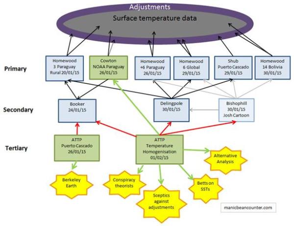
One would expect that a blog supported by the core of the climate scientific consensus would provide a superior defence than an anonymous blogger who censors views that challenge his beliefs. However, RealClimate may have dug an even deeper hole. Paul Homewood covered the article on February 12th, but I feel it only scratched the surface. Using the procedures outlined above I note similarities include:-

  • Attacking the secondary commentary, and not mentioning the primary sources.
  • Misleading statements that understate the extent of the problem.
  • Avoiding comparison of the raw and adjusted data.
  • Single counter examples that do not stand up.

Attacking the secondary commentary

Like ATTP, RealClimate attacked the same secondary source – Christopher Booker – but another article. True academics would have referred Paul Homewood, the source of the allegations.

Misleading statement about number of weather stations

The article referred to was by Victor Venema of Variable Variability. The revised title is “Climatologists have manipulated data to REDUCE global warming“, but the original title can be found from the link address – http://variable-variability.blogspot.de/2015/02/evil-nazi-communist-world-government.html

It was published on 10th February and only refers to Christopher Booker’s original article in the Telegraph article of 24th January without mentioning the author or linking. After quoting from the article Venema states:-

Three, I repeat: 3 stations. For comparison, global temperature collections contain thousands of stations. ……

Booker’s follow-up article of 7th February states:-

Following my last article, Homewood checked a swathe of other South American weather stations around the original three. ……

Homewood has now turned his attention to the weather stations across much of the Arctic, between Canada (51 degrees W) and the heart of Siberia (87 degrees E). Again, in nearly every case, the same one-way adjustments have been made, to show warming up to 1 degree C or more higher than was indicated by the data that was actually recorded.

My diagram above was published on the 8th February, and counted 29 stations. Paul Homewood’s original article on the Arctic of 4th February lists 19 adjusted sites. If RealClimate had actually read the cited article, they would have known that quotation was false in connection to the Arctic. Any undergraduate who made this mistake in an essay would be failed.

Misleading Counter-arguments

Øyvind Nordli – the Real Climate author – provides a counter example from his own research. He compares his adjustments of the Svalbard, (which he did as part of temperature reconstruction for Spitzbergen last year) with those of NASA GISS.

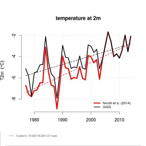
Clearly, he is right in pointing out that his adjustments created a lower warming trend than those of GISS.

I checked the “raw data” with the “GISS Homogenised” for Svalbard and compare with the Reykjavik data I looked at last week, as the raw data is not part of the comparison. To make them comparable, I created anomalies based on the raw data average of 2000-2009. I have also used a 5 year centered moving average.

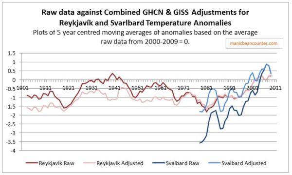
The raw data is in dark, the adjusted data in light. For Reykjavik prior to 1970 the peaks in the data have been clearly constrained, making the warming since 1980 appear far more significant. For the much shorter Svalbard data the total adjustments from GHCN and GISS reduce the warming trend by a full 1.7oC, bringing the warming trend into line with the largely unadjusted Reykjavik. The GHCN & GISS seem to be adjusted to a pre-conceived view of what the data should look like. What Nordli et. al have effectively done is to restore the trend present in the raw data. So Nordli et al, using data on the ground, has effectively reached a similar conclusion to Trausti Jonsson of the Iceland Met Office. The adjustments made thousands of miles away in the United States by homogenization algorithms are massive and unjustified. It just so happens that in this case it is in the opposite direction to cooling the past. I find it somewhat odd Øyvind Nordli, an expert on local conditions, should not challenge these adjustments but choose to give the opposite impression.

What is even worse is that there might be a legitimate reason to adjust downwards the recent warming. In 2010, Anthony Watts looked at the citing of the weather station at Svalbard Airport. Photographs show it to right beside the runway. With frequent snow, steam de-icers will regularly pass, along with planes with hot exhausts. The case is there for a downward adjustment over the whole of the series, with an increasing trend to reflect the increasing aircraft movements. Tourism quintupled between 1991 and 2008. In addition, the University Centre in Svalbad founded in 1993 now has 500 students.

Older data for Spitzbergen

Maybe the phenomenal warming in the raw data for Svarlbard is unprecedented, despite some doubts about the adjustments. Nordli et al 2014 is titled Long-term temperature trends and variability on Spitsbergen: the extended Svalbard Airport temperature series, 1898-2012. Is a study that gathers together all the available data from Spitzbergen, aiming to create a composite temperature record from fragmentary records from a number of places around the Islands. From NASA GISS, I can only find Isfjord Radio for the earlier period. It is about 50km west of Svarlbard, so should give a similar shape of temperature anomaly. According to Nordli et al

Isfjord Radio. The station was established on 1 September 1934 and situated on Kapp Linne´ at the mouth of Isfjorden (Fig. 1). It was destroyed by actions of war in September 1941 but re-established at the same place in July 1946. From 30 June 1976 onwards, the station was no longer used for climatological purposes.

But NASA GISS has data from 1912, twenty-two years prior to the station citing, as does Berkeley Earth. I calculated a relative anomaly to Reykjavik based on 1930-1939 averages, and added the Isfjord Radio figures to the graph.

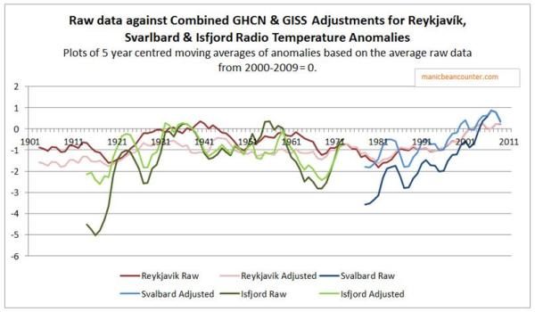
The portion of the raw data for Isfjord Radio, which seems to have been recorded before any thermometer was available, shows a full 5oC rise in the 5 year moving average temperature. The anomaly for 1917 was -7.8oC, compared with 0.6 oC in 1934 and 1.0 oC in 1938. For Svarlbard Airport lowest anomalies are -4.5 oC in 1976 and -4.7 oC in 1988. The peak year is 2.4 oC in 2006, followed by 1.5 oC in 2007. The total GHCNv3 and GISS adjustments are also of a different order. At the start of the Svarlbard series every month was adjusted up by 1.7. The Isfjord Radio 1917 data was adjusted up by 4.0 oC on average, and 1918 by 3.5 oC. February of 1916 & 1918 have been adjusted upwards by 5.4 oC.

So the Spitzbergen warming the trough to peak warming of 1917 to 1934 may have been more rapid and greater than in magnitude that the similar warming from 1976 to 2006. But from the adjusted data one gets the opposite conclusion.

Also we find from Nordli at al

During the Second World War, and also during five winters in the period 18981911, no observations were made in Svalbard, so the only possibility for filling data gaps is by interpolation.

The latest any data recording could have been made was mid-1941, and the island was not reoccupied for peaceful purposes until 1946. The “raw” GHCN data is actually infill. If it followed the pattern of Reykjavik – likely the nearest recording station – temperatures would have peaked during the Second World War, not fallen.

Conclusion

Real Climate should review their articles better. You cannot rebut an enlarging problem by referring to out-of-date and dogmatic sources. You cannot pretend that unjustified temperature adjustments in one direction are somehow made right by unjustified temperature adjustments in another direction. Spitzbergen is not only cold, it clearly experiences vast and rapid fluctuations in average temperatures. Any trend is tiny compared to these fluctuations.