Moon Hoax data suggests Climate Sceptics are sceptical and Climate Alarmists are more dogmatic

It is now nearly seven years since the in-press release of the notorious “Lewandowsky, Oberauer & Gignac – NASA faked the moon landing:Therefore (Climate) Science is a Hoax: An Anatomy of the Motivated Rejection of Science” and the 26 March is the sixth anniversary of its final publication in amended form. Last month I was prompted to look again at the underlying survey data a short article at Medium by Jose Duarte. I fully agree with the differences in between the “published” and “extended” data files, now both archived on a Bristol University server, and have found some others. However, the subject of post is very different.

Main Thesis

Based on the “Moon Hoax” survey data, when confronted with a unknown conspiracy theory, the more sceptical a person is of climate “science” the more likely they are to mildly disagree with the conspiracy, whilst the more accepting a person is of “climate science” the more likely they are to strongly reject the conspiracy. Climate sceptics tend to be more sceptical of statements new to them, whilst those believing in climate science to roundly reject such statements.  Presented with a conspiracy theory that at least a strong minority agree with, then the degree of acceptance shows that sceptics tend to be more conservative or neo-liberal, whilst climate alarmists are more to socialist / progressive / (US) liberal.

The Iraq War Question

One of the first things I found in the “extended” file on the Bristol University server was responses to the missing Iraq question, located at the start of the conspiracy theory questions. The question was

The Iraq War in 2003 was launched for reasons other than to remove WMD from Iraq.

To look at the results, like in my September 2012 analysis, I produced a pivot table of the Iraq War responses against the average of the four “CO2 Science” questions. I did the same for the 14 conspiracy theory questions.

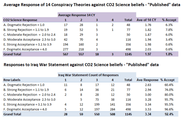
Figure 1 : Comparison of responses to the 14 Conspiracy Theory statements and the IraqNot4WMD with the average response band to the four CO2 Science questions. Note that the “average response” is the raw average response, and not the average of the response bands. For instance if a response had 8 “1” and 6 “2” the raw average response would be 1.43 and the response band would be “1”.

The first thing to note from figure 1 is that the vast majority all responses on average reject all 14 conspiracy theories. The conclusion from these figures is that, with few exceptions, those who reject climate science (skeptics/deniers/contrarians) also reject conspiracy theories, just like those who accept climate “science”. Two notable exceptions are responses 860 and 889 who answered 1 to all four CO2 Science questions and who strongly agreed with nearly all the conspiracy theories. Whether scam responses, or clearly held beliefs, they are outliers in the data sets.
Also of note is that the average response score for both the 14 conspiracy theories and the Iraq War question increases with increasing acceptance of climate science. Thus average responses suggests the opposite to what the paper claims.

Why the difference?

The average score suggests the opposite of far more sophisticated findings of the published paper. To understand more we need to look at the average response counts for the 14 conspiracy theories in more detail.

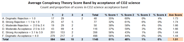
Figure 2: The count of average 14 conspiracy theory scores and the percentage of total responses, split by conspiracy theory band and by acceptance of CO2 science

The average score this time is on the conspiracy theory bands. It now gives the opposite of the conclusion in Figure 1. This time conspiracy theory average score decreases with increasing acceptance of CO2 Science.
The detail suggests why this is the case. % Score 1 – the strong rejection of conspiracy theories – there is an increase in percentage of respondents with increase in belief in climate change. But for score 2 it is the reverse direction. This should be an interesting result in itself. The dogmatic rejection of conspiracy theories appears to be related to belief in climate alarmism, but a less strong rejection – or a more sceptical stance – appears to be related to degree of climate scepticism. I have produced a similar table for the Iraq War question.

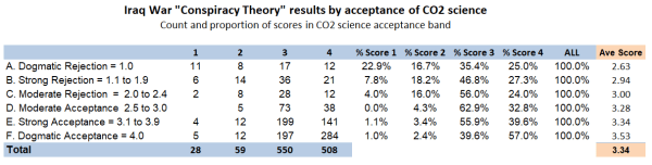
Figure 3: Count of responses to “The Iraq War in 2003 was launched for reasons other than to remove WMD from Iraq” by beliefs in climate science.

An interesting point about the IraqNot4WMD is acceptance by the vast majority, not rejection like for the other conspiracy theories. Strong acceptance of “The Iraq War in 2003 was launched for reasons other than to remove WMD from Iraq” appears to be related to belief in CO2 Science, but lesser acceptance is strongest with those of more moderate views. Less than 10% of responses rejected the statement. Amongst this small minority of responses, disagreement with the statement is related to the rejection of CO2 Science.

Looking at the breakdown of the 14 conspiracy theories gives some further insights.

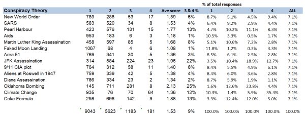
Figure 4 : Analysis of 14 published conspiracy theories using the “published” data

The full title of the “Moon Hoax” paper is

NASA faked the moon landing—Therefore (Climate) Science is a Hoax: An Anatomy of the Motivated Rejection of Science

The title is ill-chosen given that the average score of 1.08 is the lowest of all conspiracy theories, with just 10 out of 1145 expressing any agreement and 93.2% expressing strong disagreement. Even worse, the title infers a chain of thought by a small minority of 3 from among hundreds of other potential combinations, without asking any questions of the respondents. Five years ago I looked at this in detail in “Lewandowsky’s false inference from an absurd correlation”.
There are just two conspiracy theories where acceptance is over one fifth of the total responses – the JFK Assassination and the Oklahoma Bombing.

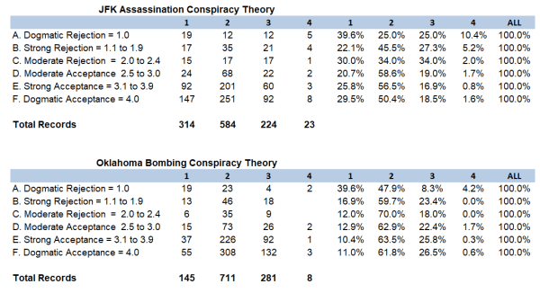
Figure 5: Analysis of the results from CYJFK and CYOKL.

The questions were

The assassination of John F Kennedy was not committed by the lone gunman, Lee Harvey Oswald, but was rather a detailed, organized conspiracy to kill the President.
The Oklahoma City Bombers, Timothy McVeigh and Terry Nicols did not act alone but rather received assistance from Neo Nazi groups.

From Figure 5 both of these, better known, conspiracy theories, strong rejection is related to the rejection of CO2 Science, whilst weaker rejections is related to rejection of CO2 Science. That is the very opposite of the average of 14 conspiracy theories. The dogmatic rejection of conspiracy theories appears to be related to the degree of climate scepticism, but a less strong rejection (i.e. a more sceptical stance) appears to be related to degree of belief in climate alarmism.

With a larger sample of those expressing belief in conspiracy theories there are contradictory results. For moderate acceptance, belief is related to degree of climate scepticism, for CYJFK and degree of belief in climate alarmism for CYOKL. Although the responses are much smaller in number, similar results are present for strong acceptance of the conspiracies if the two scam responses 860 & 889 are removed. This is consistent with the JFK conspiracy being more appealing to conservatives, whilst the Oklahoma Bombing conspiracy being more appealing to (US) liberals.

The 12 Less Popular Conspiracy Theories

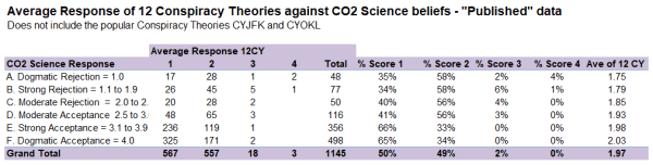
Figure 6 : The Average Response of the 12 less popular conspiracy theories
The element that has not changed is the average conspiracy score.

Compared to the “Ave of 14 CY” in figure 2 there is very little difference with the “Ave of 12CY” end column in Figure 6. But the impact of removing the two most popular conspiracy theories amplifies the features in Figure 2. The stronger the acceptance of climate “science” the greater the propensity to strongly reject a conspiracy theory, whilst the stronger the rejection of climate “science” the greater the propensity to less strongly reject – or to be sceptical about – a conspiracy theory,

Conclusions and further thoughts

There are three major findings.

First is in the analysis of the Iraq War conspiracy theory question. This conspiracy theory was not included in either the pre-publication or final published versions of the paper. Nor were the responses included in the “published” data file that has been available since August 2012. There are mixed messages in the responses when related to the belief in CO2 science. The stand out finding is that strong acceptance of “The Iraq War in 2003 was launched for reasons other than to remove WMD from Iraq” appears to be related to belief in CO2 Science. This should not be a surprise, as the Iraq War was the responsibility of Republican President George W Bush, whilst the survey, conducted on very climate alarmist blogs, shows strong belief in CO2 Science is very closely related to extreme socialist-environmentalist ideation.

Second is a new finding from reanalysis of the data using pivot tables. There is no significant linear relationship between belief in conspiracy theories and degree of acceptance or rejection of CO2 science.

Third, and deriving from the second point, the “Moon Hoax” data indicates about important differences in handling new controversial claims between acceptors and rejecters of climate science. The greater propensity of the rejecters of climate science to only moderately reject conspiracy theories, in the “Moon Hoax” paper was put down to conspiracy ideation, a form of faulty thinking. The data indicates something radically different. When confronted with conspiracy theories for which there is little prior knowledge, the degree to which CO2 science is rejected indicates the likelihood of expressing moderate disagreement with the conspiracy theory. Conversely, the degree of expressed belief in CO2 science indicates the likelihood of immediately rejecting the conspiracy theory. But when confronted with conspiracy theories where there is broad knowledge, the likelihood of some agreement appears to be related to ideological views.
This finding can be put in slightly different language. The degree to which respondents “deny” CO2 science indicates the degree to which they will be sceptical of unfamiliar dogmatic proclamations thrust at them. Conversely, the degree to which respondents express belief in CO2 science indicates the degree to which they will be reject out of hand unfamiliar dogmatic proclamations thrust at them that do not accord with their world view.

Traditionally academic study in the quasi-sciences, along with non-sciences such as history and theology, involved carefully evaluation of the evidence and the differing arguments to reach conclusions. In climate “science” such a sceptical approach is evidence of climate denial. It follows from this consensus science logic that “correct” thinking is achieved by filtering experience through the dominant dogmas or mantras.

As a final point, the conclusions I derive are through analysing the data in different ways using pivot tables. It suggests that responses are not linear, but based on different approaches to processing data. The “Moon Hoax” paper takes a view analogous to that taken by the authorities in Soviet Union. Lack of complete agreement with authority is evidence of denial. Not accepting consensus dogma due to it conflicting with one’s perceptions is inconceivable to members of that consensus, so must be the consequence of receiving misinformation, or being psychologically deficient.

Kevin Marshall

Bogus linking of Cyclone Idai Mozambique to climate change

The news last week was full of reports of the impacts of Cyclone Idai on South-East Africa, particularly on Mozambique. This has inevitably been linked to climate change. Jaime Jessop brings attention to a “Climate Justice” article at the Conversation “Cyclone Idai: rich countries are to blame for disasters like this – here’s how they can make amends“. The article states

It is inevitable that people will connect Idai and climate change. It is always tricky to establish a direct causal link, but thanks to the evidence provided by a number of reports from the Intergovernmental Panel on Climate Change (IPCC), including this most recent one from October 2018, we know that climate change is bound to increase the intensity and frequency of storms like Idai. At the very least, this crisis is a harbinger of what is coming.

As Jessop points out, the most recent IPCC SR15 has low confidence in any increase in trends in global cyclone activity, nor in the severity. In term low confidence I interpret to mean that evidence, if available, is highly speculative and/or is contradicted by better evidence. The Conversation article fails to read the evidence. Climate change is not “bound to increase the intensity and frequency of storms like Idai“. Even if that were, Idai is not caused by climate change.

At the BBC Matt McGarth tries to make the climate connection,

While Cyclone Idai is the seventh such major storm of the Indian Ocean season – more than double the average for this time of year – the long-term trend does not support the idea that these type of events are now more frequent.
The interesting thing for the area is that the frequency of tropical cyclones has decreased ever so slightly over the last 70 years,” said Dr Jennifer Fitchett from the University of the Witwatersrand in South Africa who has studied the question.
Instead, we are getting a much higher frequency of high-intensity storms.
Climate change is also changing a number of factors in the background that are contributing to making the impact of these storms worse.

There is absolutely no doubt that when there is a tropical cyclone like this, then because of climate change the rainfall intensities are higher,” said Dr Friederike Otto, from the University of Oxford, who has carried a number of studies looking at the influence of warming on specific events.
And also because of sea-level rise, the resulting flooding is more intense than it would be without human-induced climate change.

Evidence of more high frequency storms

Dr Jennifer Fitchett enlarges on the change in cyclone activity at the Conversation. In Tropical cyclone Idai: The storm that knew no boundaries she states

Historically, nine storms that had reached tropical cyclone intensity made landfall on Mozambique. A larger number of weaker tropical systems, including tropical storms and depressions affect the region, with a total landfall of all tropical systems of 1.1 per annum.

The link is to an open access article.

Fitchett and Grab 2014 : A 66‐year tropical cyclone record for south‐east Africa: temporal trends in a global context – International Journal of Climatology

Table 1 contains details of historical records for Madagascar and Mozambique. I have summarized the numbers of deaths by year.

The claim of  an increase in severe storms over the last 70 years by Dr Fitchett is evidenced by a glance at this graph. But there are issues. For Mozambique there are no recorded major cyclones between 1956 and 1994, nor for Madagascar between 1959 and 1994. Does this mean that there was major cyclone drought for over thirty-five years?
The history of the two countries suggests reasons for the lack of records other than lack of events to be observed. Historically Mozambique was a lightly-administered Portuguese Colony. There was a War of Independence covering 1964-1974 and following Independence a Civil War 1977-1992. Madagascar became Independent of France in 1960. There was increasing strife, culminating in a socialist-Marxist dictatorship from 1975 to 1993. The dictatorship was largely cut-off from the outside world. 1994 was the first year both countries were clear of the major strife that afflicted them for  decades, so it is hardly surprising this was the first year in decades when the severe impacts of cyclones was reported.
A BBC Report gives colloquial evidence to support the storms being nothing unusual. A video report of Cyclone Idai says it is the strongest winds Mozambique has had in the last ten years.

The evidence of less cyclones, but a claim more high-intensity ones looks like a rejection of objective evidence in favour of sensationalist reporting.

Evidence of Sea Level Rise

The desperation is indicated by mentioning sea level rise, which has risen by a few centimetres in the 50 years. Although centered on the coastal town of Beira, Mozambique, the vast areas impacted also include parts of the land-locked countries of Zimbabwe and Malawi. The nearest point to the sea of either country’s borders appear to be much greater than 150 kilometres. For some perspective, in Britain, the furthest point from the sea is Coton in the Elms at 70 miles or 113km distance.
Singling out one person is maybe unfair. Climate alarmism is a consensus enterprise, which gives primacy to mantras, rather than verification of conjectures with evidence of the natural world. However, the false attribution of sea level rise in the article is by Dr Friederike Otto. One profile I found states:-

Friederike (Fredi) is the Acting Director of the Environmental Change institute and an Associate Professor in the Global Climate Science Programme where she leads several projects understanding the impacts of man-made climate change on natural and social systems with a particular focus on Africa and India.
Her main research interest is on extreme weather events (droughts, heat waves, extreme precipitation), improving and developing methodologies to answer the question ‘whether and to what extent external climate drivers alter the likelihood of extreme weather’. She furthermore investigates the policy implication of this emerging scientific field.
Fredi is co-investigator on the international project World Weather Attribution which aims to provide an assessment of the human-influence on extreme weather in the immediate aftermath of the event occurring.

Dr Otto also featured in Nature last year, for attributing the 2018 Northern European heatwave to climate change. As Jaime Jessop found out, the selective evidence and modelling assumptions to support this attribution was contradicted by looking at the wider data.

Policy Implications

If the real desire is to look at making rational policy decisions to ameliorate the impact of emerging extreme weather events, then it is necessary properly assess the type, severity and geographical extent and likelihood of these impacts. Otherwise resources will be wasted on projects that do not address the issues. That includes only accepting claims made about an emerging impact when they are properly verified by the evidence. Otherwise, climate alarmism will ensure that resources are directed away from making a real difference to the lives of the poorest people.

Not only is the “Climate Justice” movement singling out a few countries to pay compensation for damages without evidence of damage caused, they are also helping to ensure that resources are directed away from making a real difference to the lives of the poorest people.

Kevin Marshall

Revoke Article 50 Petition being dominated by London Labour

There is currently an on-line petition

Revoke Article 50 and remain in the EU

The government repeatedly claims exiting the EU is ‘the will of the people’. We need to put a stop to this claim by proving the strength of public support now, for remaining in the EU. A People’s Vote may not happen – so vote now.

As of noon today it has reached 4.18 million signatures, up from 3 million yesterday morning and just a million two days ago. Guido Fawkes noted that there are a number of foreign signatures, some likely to be fake. A massive EU Second Referendum petition in July 2016 had large numbers of fake signatures created by bots, including large numbers from the Vatican and Antarctica, with at least 77,000 being removed. This might be happening with the current petition. This could be by bots, or by individuals making multiple signatures through using multiple email addresses. I have downloaded the data at around 8am this morning, when there were 3.78 listed signatures, of which 3.64 million were against the 650 UK constituencies.

Analysis By Constituency

I ran the 8am signatures by constituency against data from the General Election 2017, including for the sitting MP, the Political Party in 2017, the electorate and the valid votes cast. I have also used estimated Leave Vote figures by constituency from Politics Professor Chris Hanretty. Although they are estimates, I do believe it is very unlikely that they are more than a few percentage out. An estimated extreme Remain constituency would have been unlikely to have voted Leave. The Constituencies with the top 20 signatures are as follows.

Note that most of consituencies are Labour-held and in London. The constituencies of three key members of the Shadow Cabinet are included. Islington South and Finsbury (Rt Hon Emily Thornberry MP) is number 21 on the list.

Chuka Umunna MP has left the Labour Party. But alongside Caroline Lucas MP and Rt Hon Vince Cable MP, is a non-Labour MP with an extreme pro-Remain stance. All constituencies voted very strongly to Remain in the EU.

I suspect that there is some multiple voting going on. In every single constituency the signatures on an online petition are over a quarter of the number of valid votes in the 2017 General Election. Cities of London & Westminster Constituency exceeds 40%. This is the prime target if you want to send a scam message to the occupants of the Palace of Westminster.

At the opposite end of the spectrum are the bottom 20 constituencies for signatures.

None of the constituencies are in London or South of England. Note that 15 of the constituencies have Labour MPs and are located in the traditional Labour heartlands of the North of England, the Midlands and Wales. Na h-Eileanan an Iar is an exception in that it voted remain. But it is also by far the smallest constituency, so is an anomaly. On average there was a 67% Leave vote.

The dominance of the top 20 metropolitan constituencies had 358,560 signatures at 8am, or 10% of the UK total, compared to 355,526 of the bottom 156 constituencies. Yet in terms of a voice these top 3% of constituencies get represented in the media far more than the bottom 24%. That is a major reason a majority voted to Leave the EU. In many areas people were sick of being controlled by outsiders who have different perspectives, and will not listen to them. The EU Referendum was a big up-yours to the London-based Metropolitans.

Finally, here is a little pivot table of the bottom 156 constituencies by Region and by Party of the MP.

The constituencies represented are just 24% of the total, but around half those in the forgotten regions of Wales, North East, West Midlands and Yorkshire & Humber.

Kevin Marshall

Example of dogmatic pseudo-science on coral reef bleaching

I have already posted twice on coral reefs, but skirted round the article on Coral Alarmism by Geoff Price at his own blog on April 2nd 2018, reposted at ATTP eleven months later. By reposting this article Prof Ken Rice has shown how derisory is the evidence for global warming being the cause of increasing coral bleaching. 

Checking the sources that Price gives for (a) evidence of global warming (b) media sources of coral bleaching reveal there is no unambiguous underlying evidence to make a persuasive case  linking of one with the other. Further. the major peer review paper that Price cites finds that changes in severe coral bleaching events are not explained by global warming.

Evidence of global warming related to coral reefs

The first issue I want to deal with is the evidence that Price presents for the increase in coral bleaching being due to global warming.

Price first states the dogma

In our window of time here and on our watch, we’re observing the unfolding collapse of global coral reef cover – the largest living structures on the planet, relatively priceless in terms of human and economic value, and stunningly beautiful – due to human-induced stresses, now most prominently from human-caused global anthropogenic (greenhouse) warming of the oceans.

The claim of human induced warming is not backed up by any evidence.  That global average temperatures have been rising for well over a century  does not mean that this was human-induced. It could be natural or just some random cyclical cycle in a chaotic complex system, or some combination of all three. The evidence of warming oceans is the NOAA data of estimated increase in ocean heat content from 1960. There are a number of things wrong with this approach. The data period is only from 1960; heat stress in corals is from the amount of temperature rise; and the data is for 0-700m down, whilst most corals reside just a few meters below the surface. A much better measure is the sea surface temperature data records, which measures temperature just below the surface.

Below is the HADCRUT4 land and ocean anomalies temperature anomalies that I charted last year.


Crucially, the HADSST3 ocean warming data shows a similar global average temperature increase in the early twentieth century as the post 1975 warming. Both were about 0.5C, a value likely much less than the seasonal sea surface temperature change. Also, the rise in GHG gases – especially of CO2 – is much more post 1950 than from 1800 to 1940. The data does not support the idea that all warming is human-caused, unless global warming is caused by Mother Gaia anticipating the rise in CO2 levels.

Even then, then rise in global sea surface temperatures is not an indication of warming in a particular area. The Great Barrier Reef, for instance has shown little or no warming since 1980. From my previous post, observed major bleaching events do not correspond to any rise in warming, or any increase in extreme temperatures.

Media Sources do not support hypothesis

Even if Geoff Price cannot provide proper evidence of the rise in average temperatures that coral reefs are experiencing, at least he could provide credible scientific evidence of the link between warming and increase in coral bleaching. Price states

Some articles in major media break through, e.g. Global Warming’s Toll on Coral Reefs: As if They’re ‘Ravaged by War’, though the impact on public awareness and policy action remains low. The impact is global including the Great Barrier Reef (GBR), Japan, the South PacificHawaii, the Florida keys, and Belize.

Rather than presenting empirical evidence, or at least scientific articles, relating increased coral reef bleaching to global warming, Price bizarrely “quotes” from various media sources. To show how bizzare, I have made some notes of the sources,

As if “Ravaged by War”

The “Ravaged by War” article in the New York Times of Jan 4 2018. At the start of the article is stated “large-scale coral bleaching events……were virtually unheard-of before the 1980s“, whereas later on is stated ”before 1982-3, mass bleaching events across wide areas were nonexistent.”  The perceived lack of bleaching before the 1980s is changed into a fact. The lack of perception is due to lack of wide-scale research. But even 1982-3 as the first year of reporting of mass bleaching is contradicted by Figure 1c in Glynn 1993, reference 3 in the Hughes et al 2018 paper that prompted the NYT article. 1978 and 1979 have far more recorded mass coral mortalities than 1982 and 1993.

Evidence of global bleaching

The link is to a page of high quality pictures of coral bleaching from around the world. The rise of digital photography, and the increase in the numbers of people diving reefs with cameras in the last twenty years is evidence observation bias not of real increase. In the past, lack of wide-scale human perception does not mean the issue was not there.

Great Barrier Reef Bleaching

From the UK Independent April 20 2016 is the headline “Great Barrier Reef: Half of natural wonder is ‘dead or dying’ and it is on the brink of extinction, scientists say“.

The event is partly being caused by the strong El Nino weather system that has swept across the world in the last year. But global warming is the underlying cause, say scientists, and so the bleaching and death is likely to continue.

“We’ve never seen anything like this scale of bleaching before. In the northern Great Barrier Reef, it’s like 10 cyclones have come ashore all at once,” said Professor Terry Hughes, conveyor of the National Coral Bleaching Taskforce, 

The claim that global warming is the underlying cause of the bleaching is not attributed to any one person, or group. Prof Terry Hughes only makes a statement about the current state of affairs not being observed before, not that, in reality, it is unprecedented. Again a difference between perceptions and underlying reality.

Japan

The Japanese study is from an environmentalist website Down to Earth on January 13 2017. It states

Experts have, for quite a while now, believed that corals are among the most susceptible organisms to climate change. In fact, the world has already lost 30-40 per cent of its total documented coral cover.

According to the ministry’s estimate, 70 per cent of the Sekisei lagoon in Okinawa had been killed due to bleaching, which occurs when unusually warm water forces coral to expel the algae living in their tissues. Unless water temperatures quickly return to normal, the coral eventually dies from lack of nutrition.

Based on the survey done on 35 locations in Japan’s southernmost reaches from November to December 2016, the ministry observed that the plight of the reef has become “extremely serious” in recent years.

According to a Japanese media, the dead coral has now turned dark brown and is now covered with algae. It also revealed that the average sea surface temperature between June and August 2016 in the southern part of the Okinawa island chain was 30.1°C—one to two degrees warmer than usual. According to the Japan meteorological agency, it was also the highest average temperature since records began in 1982.

There is no link to the original source and from the statement the article is probably relying on media sources in English. Therefore there is no way of verifying whether the claims are due to warming. I would assume that the authors, like myself, do not speak Japanese, and the script is incomprehensible to them. Further, the article highlights just one of 35 locations in the Japanese study. This should be a signal that the cause of that extreme example of coral bleaching is more than just extreme temperatures.

Searching “Sekisei Lagoon” I come up with lots of returns, mostly about Coral bleaching. There was one is a short 2017 article at the Japanese Ministry of Environment website, and sponsored by them. The second paragraph states

(C)orals in the (Sekisei) Lagoon have extensively diminished since park designation because of various reasons: terrestrial runoffs of red clay and wastewater; coral bleaching due to high water temperatures; and outbreaks of the predatory crown-of-thorns starfish (Acanthaster planci). Initial efforts have been made to reduce terrestrial runoffs to help the natural recovery of coral ecosystem health. Studies on coral distribution and techniques for reef rehabilitation are also in progress.

It is does not look like global warming in the sole cause of the excessive coral bleaching in Sekisei Lagoon. It is also local human factors and a large predator. A little research of crown-of-thorns starfish reveals that sudden increases in populations are poorly understood and that it is also found on the Great Barrier Reef. Acanthaster planci has a number of predators, the lack of which might indicate reasons for the outbreaks.

Other Media Sources

The South Pacific source is a blog post from March 2016 on American Samoan Reefs, a small part of the total extent of islands across the vast region. It is about coral bleaching being on hold, but there is an alert due to recent abnormally high temperatures. If bleaching did follow it would have been due to the El Nino event, which caused abnormally high average temperatures globally.

The Hawaii source, does not give a link to the peer reviewed article on which it is based. Looking at the article, it is (a) based on surveys in 2014 and 2015, but with no data on historical events (b) claims that elevated temperatures were present in Hawaii, (but does not show that the global average temperature were not elevated (c) provides no evidence of comparative surveys in the past to show the issue has got worst. In the first sentence of the introduction it is implied that the entire 0.9 °C in average SSTs is due to rise in GHGs, a totally unsupportable statement. Peer J’s boasted rapid peer review process has failed to pick up on this,

The Florida Keys reference is a Washington Post article of June 25 2017 about how loss of the coral reefs through temperature rise will impact on tourism. It assumes that temperature rise is the sole course of coral reef loss.

Finally the Belize article a New York Times opinion piece from July 6 2017, about a researcher visiting the coral reefs. There is no data provided for either local warming or trends in bleaching.

Hughes et al 2018

The major scientific article that Price refers to is

Spatial and temporal patterns of mass bleaching of corals in the Anthropocene DOI: 10.1126/science.aan8048 . (Hughes et al 2018) 

Unusually this paper is open access. I quite like the attempt to reduce the observation bias when they state

Here we compiled de novo the history of recurrent bleaching from 1980 to 2016 for 100 globally distributed coral reef locations in 54 countries using a standardized protocol to examine patterns in the timing, recurrence, and intensity of bleaching episodes, including the latest global bleaching event from 2015 to 2016.

This does not eliminate the observation bias, but will certainly lesson the bias. They then make the observation

Since 1980, 58% of severe bleaching events have been recorded during four strong El Niño periods (1982–1983, 1997–1998, 2009–2010, and 2015–2016) (Fig. 2A), with the remaining 42% occurring during hot summers in other ENSO phases.

Considering that 2017 was also a severe bleaching events and global average temperatures were higher than in the 2015 El Nino year and in 2018, not to state it is an El Nino year is a maybe a bit dubious. Even so, on this basis El Nino free years are runs of 13, 10 and 4. This is not unlike the statement in the abstract

The median return time between pairs of severe bleaching events has diminished steadily since 1980 and is now only 6 years.

The paper makes no direct claims about the increase in observed coral bleaching being related to global warming. But This is because the data does not show this. Supplementary data figure 4 tests the relationship between the number of severe coral bleaching events per location and warming at that location across four regions.

For Australia R2 = 0.0001. That is zero. Better results can be achieved from two random unrelated data sets.
The best relationship is for the West Atlantic – mostly the Caribbean. That is R2 = 0.0939. The downward slope implies a negative relationship.  But still less than 10% of the variation in severe bleaching events is explained by rising temperatures.

Figure 2A of the Supplementary materials I also find interesting in the context of Jaime Jessop’s contention that coral bleaching is related to El Ninos.

Note that this is cumulative recorded severe bleaching events. The relative size of individual years is from the increase in that year.
For Australasia, the three standout years are 1998, 2010 and 2016/2017. These are El Nino years, confirming Jaime’s hypothesus.
For the West Atlantic there were also an unusual number of severe bleaching events in 1995 and 2005. No El Ninos there, but 2005 saw a record number of hurricanes in the area, and 1995 also saw an unusually high number including Hurricane Andrew, the last category 5 to make landfall in the USA. Although excess heat might be the principal cause of stress in coral reefs, I am sure they might also get stressed by severe storms, with the accompanying storm surges.
If severe storms can lead to bleaching there is a problem with observation of bleaching. From Heron et al 2016 we learn that since the 1990s satellites have made twice-weekly recording of surface temperatures are 0.5 degree grids (about 50km), then comparing with the SST data to detect unusual runs of DHWs. Since 2015, a new product was launched with just 5km grids. It is then left to some intrepid scientists to go out in a boat, dive down and take samples. If severe storms do not have unusually high temperatures, then there will be no alerts of bleaching, so unless there are other attempts to observe, this will not be picked up, or could be picked up a short while later after an episode of unusual warming. Before the 1990s, there was no such over-all detection system, and likely much less researchers. Many of the bleaching events occurring before 1990 may not have been picked up, or if they were, there may have been less ability to define that events as major.

Concluding Comments

By re-posting a dogmatic article ATTP has done a service to climate scepticism. Laying out a very bad, but well-referenced, case for global warming causing increased coral reef bleaching shows the inadequacies of that case. Where long periods of data collated on a consistent basis is used there is no correlation. Further, increasing observed frequency of bleaching events since is mostly due El Nino events being closer together, whilst the increase in observed bleaching can be accounted for by the greatly improved methods of detection and the resources put into observing, which are many times what they were a few decades ago.

Geoff Price’s method of presenting the opinions of others, rather than focusing on the underlying data that supports the conjecture, is something in common with ATTP and others of the climate community. When checked, the fail to connect with any underlying reality.

There is a rider to be made. The case for global warming is very poor by the traditional scientific methods of confronting conjectures with evidence of the natural world, and letting such evidence being the ultimate arbiter of that conjecture. From the consensus viewpoint popular today it is collective opinion that is the arbiter. The above is from the former point of view, which means from the latter view this is misinformation.

Nobel Laureate William Nordhaus demonstrates that pursuing climate mitigation will make a nation worse off

Summary

Nobel Laureate Professor William Nordhaus shows that the optimal climate mitigation policy is for far less mitigation than UNIPCCC proposes. That is to constrain warming by 2100 to 3.5°C instead of 2°C or less. But this optimal policy is based on a series of assumptions, including that policy is optimal and near universally applied. The current situation, with most countries without any effective mitigation policies, is that climate mitigation policies within a country will likely make that country worse off, even if they would be better off with the same policies were near universally applied. Countries applying costly climate mitigation policies are making their people worse off.

Context

Last week Bjorn Lomborg tweeted a chart derived from Nordhaus paper from August 2018 in the American Economic Review.

The paper citation is

Nordhaus, William. 2018. “Projections and Uncertainties about Climate Change in an Era of Minimal Climate Policies.” American Economic Journal: Economic Policy10 (3): 333-60.

The chart shows the optimal climate mitigation policy, based upon minimization of (a) the combined projected costs of climate mitigation policy and (b) residual net costs from human-caused climate change, is much closer to the non-policy option of 4.1°C than restraining warming to 2.5°C. By the assumptions of Nordhaus’s model greater warming constraint can only be achieved through much greater policy costs. The abstract concludes

The study confirms past estimates of likely rapid climate change over the next century if major climate-change policies are not taken. It suggests that it is unlikely that nations can achieve the 2°C target of international agreements, even if ambitious policies are introduced in the near term. The required carbon price needed to achieve current targets has risen over time as policies have been delayed.

A statement whose implications are ignored

This study is based on mainstream projections of greenhouse gas emissions and the resultant warming. Prof Nordhaus is in the climate mainstream, not a climate agnostic like myself. Given this, I find the opening statement interesting. (My bold)

Climate change remains the central environmental issue of today. While the Paris Agreement on climate change of 2015 (UN 2015) has been ratified, it is limited to voluntary emissions reductions for major countries, and the United States has withdrawn and indeed is moving backward. No binding agreement for emissions reductions is currently in place following the expiration of the Kyoto Protocol in 2012. Countries have agreed on a target temperature limit of 2°C, but this is far removed from actual policies, and is probably infeasible, as will be seen below.
The reality is that most countries are on a business-as-usual (BAU) trajectory of minimal policies to reduce their emissions; they are taking noncooperative policies that are in their national interest, but far from ones which would represent a global cooperative policy.

Although there is a paper agreement to constrain emissions commensurate with 2°C of warming, most countries are doing nothing – or next to nothing – to control their emissions. The real world situation is completely different to assumptions made in the model. The implications of this are skirted over by Nordhaus, but will be explored below.

The major results at the beginning of the paper are
  • The estimate of the SCC has been revised upward by about 50 percent since the last full version in 2013.
  • The international target for climate change with a limit of 2°C appears to be infeasible with reasonably accessible technologies even with very ambitious abatement strategies.
  • A target of 2.5°C is technically feasible but would require extreme and virtually universal global policy measures in the near future.

SCC is the social cost of carbon. The conclusions about policy are not obtained from understating the projected costs of climate change. Yet the aim to limit warming to 2°C appears infeasible. By implication limiting warming beyond this – such as to 1.5°C – should not be considered by rational policy-makers. Even a target of 2.5°C requires special conditions to be fulfilled and still is less optimal than doing nothing. The conclusion from the paper without going any further is achieving the aims of the Paris Climate Agreement will make the world a worse place than doing nothing. The combined costs of policy and any residual costs of climate change will be much greater than the projected costs of climate change.

Some assumptions

This outputs of a model are achieved by making a number of assumptions. When evaluating whether the model results are applicable to real world mitigation policy consideration needs to be given to whether those assumptions hold true, and the impact on policy if violated. I have picked some of the assumptions. The ones that are a direct or near direct quote, are in italics.

  1. Mitigation policies are optimal.
  2. Mitigation policies are almost universally applied in the near future.
  3. The abatement-cost function is highly convex, reflecting the sharp diminishing returns to reducing emissions.
  4. For the DICE model it is assumed that the rate of decarbonization going forward is −1.5 percent per year.
  5. The existence of a “backstop technology,” which is a technology that produces energy services with zero greenhouse gas (GHG) emissions.
  6. Assumed that there are no “negative emissions” technologies initially, but that negative emissions are available after 2150.
  7. Assumes that damages can be reasonably well approximated by a quadratic function of temperature change.
  8. Equilibrium climate sensitivity (ECS) is a mean warming of 3.1°C for an equilibrium CO2 doubling.

This list is far from exhaustive. For instance, it does not include assumptions about the discount rate, economic growth or emissions growth. However, the case against current climate mitigation policies, or proposed policies, can be made by consideration of the first four.

Implications of assumptions being violated

I am using a deliberately strong term for the assumptions not holding.

Clearly a policy is not optimal if it does not work, or even spends money to increase emissions. More subtle is using sub-optimal policies. For instance, raising the cost of electricity is less regressive the poor are compensated. As a result the emissions reductions are less, and there cost per tonne of CO2  mitigated rises. Or nuclear power is not favoured, so is replaced by a more expensive system of wind turbines and backup energy storage. These might be trivial issues if in general policy was focussed on the optimal policy of a universal carbon tax. No country is even close. Attempts to impose carbon taxes in France and Australia have proved deeply unpopular.

Given the current state of affairs described by Nordhaus in the introduction, the most violated assumption is that mitigation policy is not universally applied. Most countries have no effective climate mitigation policies, and very few have policies in place that are likely to result in any where near the huge global emission cuts required to achieve the 2°C warming limit. (The most recent estimate from the UNEP Emissions Gap Report 2018 is that global emissions need to be 25% lower in 2030 than in 2017). Thus globally the costs of unmitigated climate change will be close to the unmitigated 3% of GDP, with globally the policy costs being a small fraction of 1% of GDP. But a country that spends 1% of GDP on policy – even if that is optimal policy – will only see a miniscule reduction in its expected climate costs. Even the USA with about one seventh of global emissions, on Nordhaus’s assumptions efficiently spending 1% of output might expect future climate costs to fall by maybe 0.1%. The policy cost to mitigation cost for a country on its own is quite different to the entire world working collectively on similar policies. Assumption four of a reduction of 1.5% in global emissions illustrates the point in a slightly different way. If the USA started cutting its emissions by an additional 1.5% a year (they are falling without policy) then it would likely mean global emissions would keep on increasing.

The third assumption is another that is sufficient on its own to undermine climate mitigation. The UK and some States in America are pursuing what would be a less than 2°C pathway if it were universally applied. That means they are committing to a highly convex policy cost curve, (often made steeper by far from optimal policies) with virtually no benefits for future generations.

Best Policies under the model assumptions

The simplest alternative to climate mitigation policies could be to have no policies at all. However, if the climate change cost functions are a true representation, and given the current Paris Agreement this is not a viable option for those less thick-skinned than President Trump, or who have a majority who believe in climate change. Economic theory can provide some insights into the strategies to be employed. For instance if the climate cost curve is a quadratic as in Nordhaus (or steeper – in Stern I believe it was at least a quartic) there are rapidly diminishing returns to mitigation policies in terms of costs mitigated. For a politician who wants to serve their the simplest strategies are to

  • Give the impression of doing something to appear virtuous
  • Incur as little cost as possible, especially those that are visible to the majority
  • Benefit special interest groups, especially those with climate activist participants
  • Get other countries to bear the real costs of mitigation.

This implies that many political leaders who want to serve the best interests of their countries need to adopt a strategy of showing they are doing one thing to appear virtuous, whilst in reality doing something quite different.

In the countries dependent of extracting and exporting fossil fuels for a large part of their national income (e.g. the Gulf States, Russia, Kazakhstan, Turkmenistan etc.) different priorities and much higher marginal policy costs for global mitigation are present. In particular, if, as part of climate policies other countries were to shut down existing fossil fuel extraction, or fail to develop new sources of supply to a significant extent then market prices would rise, to the benefit of other producers.

Conclusion

Using Nordhaus’s model assumptions, if the World as a whole fulfilled the Paris Climate Agreement collectively with optimal policies, then the world would be worse off than if it did nothing. That is due to most countries pursuing little or no actual climate mitigation policies. Within this context, pursuing any costly climate mitigation policies will make a country worse off than doing nothing.

Assuming political leaders have the best interests of their country at heart, and regardless of whether they regard climate change a problem, the optimal policy strategy is to impose as little costly policy as possible for maximum appearance of being virtuous, whilst doing the upmost to get other countries to pursue costly mitigation policies.

Finally

I reached the conclusion that climate mitigation will always make a nation worse off ,using neoclassical graphical analysis, in October 2013.

Kevin Marshall

Is increasing Great Barrier Reef coral bleaching related to climate change or observation bias?

In the previous post I looked at whether the claimed increase in coral bleaching in the Great Barrier Reef was down to global average temperature rise. I concluded that this was not the case as the GBR has not warmed, or at least not warmed as much as the global temperatures. Here I look further at the data.
The first thing to state is that I recognize that heat stress can occur in corals. Blogger Geoff Price (in post at his own blog on April 2nd 2018, reposted at ATTP eleven months later) stated

(B)leaching via thermal stress is lab reproducible and uncontroversial. If you’re curious, see Jones et al 1998, “Temperature-induced bleaching of corals begins with impairment of the CO2 fixation mechanism in zooxanthellae”.

I am curious. The abstract of Jones et al 1998 states

The early effects of heat stress on the photosynthesis of symbiotic dinoflagellates (zooxanthellae) within the tissues of a reef‐building coral were examined using pulse‐amplitude‐modulated (PAM) chlorophyll fluorescence and photorespirometry. Exposure of Stylophora pistillata to 33 and 34 °C for 4 h resulted in ……….Quantum yield decreased to a greater extent on the illuminated surfaces of coral branches than on lower (shaded) surfaces, and also when high irradiance intensities were combined with elevated temperature (33 °C as opposed to 28 °C). …..

If I am reading this right. the coral was exposed to a temperature increase of 5-6 °C for a period of 4 hours. I can appreciate that the coral would suffer from this sudden change in temperature. Most waterborne creatures would be become distressed if the water temperature was increased rapidly. How much before it would  seriously stress them might vary, but it is not a serious of tests I would like to carry out. But is there evidence of increasing heat stress causing increasing coral bleaching in the real world? That is, has there been both a rise in coral bleaching and a rise in these heat stress conditions? Clearly there will be seasonal changes in water temperature, even though in the tropics it might not be as large as, say, around the coast of the UK. Also, many over the corals migrate up and down the reef, so they could be tolerant of a range of temperatures. Whether worsening climate conditions have exacerbated heat stress conditions to such an extent that increased coral bleaching has occurred will only be confirmed by confronting the conjectures with the empirical data.


Rise in instances of coral bleaching

I went looking for long-term data that coral bleaching is on the increase and came across and early example. 

P. W. Glynn: Coral reef bleaching: Ecological perspectives. Coral Reefs 12, 1–17 (1993). doi:10.1007/BF00303779

From the introduction

Mass coral mortalities in contemporary coral reef ecosystems have been reported in all major reef provinces since the 1870s (Stoddart 1969; Johannes 1975; Endean 1976; Pearson 1981; Brown 1987; Coffroth et al. 1990). Why, then, should the coral reef bleaching and mortality events of the 1980s command great concern? Probably, in large part, because the frequency and scale of bleaching disturbances are unprecedented in the scientific literature.

One such example of observed bleaching is graphed in Glynn’s paper as Figure 1 c

But have coral bleaching events actually risen, or have the observations risen? That is in the past were there less observed bleaching events due to much less bleaching events or much less observations? Since the 1990s have observations of bleaching events increased further due to far more researchers leaving their families the safe climates of temperate countries to endure the perils of diving in waters warmer than a swimming pool? It is only by accurately estimating the observational impact that it is possible to estimate the real impact.
This reminds me of the recent IPPR report, widely discussed including by me, at cliscep and at notalotofpeopleknowthat (e.g. here and here). Extreme claims were lifted a report by billionaire investor Jeremy Grantham, which stated

Since 1950, the number of floods across the world has increased by 15 times, extreme temperature events by 20 times, and wildfires sevenfold

The primary reason was the increase in the number of observations. Grantham mistook increasing recorded observations in a database with real world increases, than embellished the increase in the data to make that appear much more significant. The IPPR then lifted the false perception and the BBC’s Roger Harrabin copied the sentence into his report. The reality is that many extreme weather events occurred prior to the conscientious worldwide cataloguing of them from the 1980s. Just because disasters were not observed and reported to a centralized body did not mean they did not exist.
With respect to catastrophic events in the underlying EM-DAT database it is possible to have some perspective on whether the frequency of reports of disasters are related to increase in actual disasters by looking at the number of deaths. Despite the number of reports going up, the total deaths have gone down. Compared to 1900-1949 in the current decade to mid-2018 “Climate” disaster deaths are down 84%, but reported “Climate” disasters are 65 times more frequent.
I am curious to know how it is one might estimate the real quantity of reported instances of coral bleaching from this data. It would certainly be a lot less than the graph above shows.


Have temperatures increased?

In the previous post I looked at temperature trends in the Great Barrier Reef. There are two main sources that suggest that, contrary to the world as a whole, GBR average temperatures have not increased, or increased much less than the global average. This was shown on the NASA Giss map comparing Jan-2019 with the 1951-1980 average and for two HADSST3 ocean data 5ox5o gridcells. For the latter I only charted the temperature anomaly for two gridcells which are at the North and middle of the GBR. I have updated this chart to include the gridcell 150-155oE / 20-25oS at the southern end of the GBR.

There is an increase in warming trend post 2000, influenced particularly by 2001 and 2003. This is not replicated further north. This is in agreement with the Gistemp map of temperature trends in the previous post, where the Southern end of the GBR showed moderate warming.


Has climate change still impacted on global warming?

However, there is still an issue. If any real, but unknown, increase in coral bleaching has occurred it could still be due to sudden increases in surface sea temperatures, something more in accordance with the test in the lab.
Blogger ATTP (aka Professor Ken Rice) called attention to a recent paper in a comment at cliscep

The link is to a pre-publication copy, without the graphics or supplementary data, to

Global warming and recurrent mass bleaching of corals – Hughes et al Nature 2017

The abstract states


The distinctive geographic footprints of recurrent bleaching on the Great Barrier Reef in 1998, 2002 and 2016 were determined by the spatial pattern of sea temperatures in each year.


So in 2002 the GBR had a localized mass bleaching episode, but did not share in the 2010 pan-tropical events of Rice’s quote. The spatial patterns, and the criteria used are explained.

Explaining spatial patterns
The severity and distinctive geographic footprints of bleaching in each of the three years can be explained by differences in the magnitude and spatial distribution of sea-surface temperature anomalies (Fig. 1a, b and Extended Data Table 1). In each year, 61-63% of reefs experienced four or more Degree Heating Weeks (DHW, oC-weeks). In 1998, heat stress was relatively constrained, ranging from 1-8 DHWs (Fig. 1c). In 2002, the distribution of DHW was broader, and 14% of reefs encountered 8-10 DHWs. In 2016, the spectrum of DHWs expanded further still, with 31% of reefs experiencing 8-16 DHWs (Fig. 1c). The largest heat stress occurred in the northern 1000 km-long section of the Great Barrier Reef. Consequently, the geographic pattern of severe bleaching in 2016 matched the strong north-south gradient in heat stress. In contrast, in 1998 and 2002, heat stress extremes and severe bleaching were both prominent further south (Fig. 1a, b).

For clarification:-

Degree Heating Week (DHW) The NOAA satellite-derived Degree Heating Week (DHW) is an experimental product designed to indicate the accumulated thermal stress that coral reefs experience. A DHW is equivalent to one week of sea surface temperature 1 deg C above the expected summertime maximum.

That is, rather than the long-term temperature rise in global temperatures causing the alleged increase in coral bleaching, it is the human-caused global warming changing the climate by a more indirect means of making extreme heat events more frequent. This seems a bit of a tall stretch. However, the “Degree Heating Week” can be corroborated by the gridcell monthly HADSST3 ocean temperature data for the summer months if both the measures are data are accurate estimates of the underlying data. A paper published last December in Nature Climate Change (also with lead author Prof Terry Hughes) highlighted 1998, 2002, 2016 & 2017 as being major years of coral bleaching. Eco Watch has a short video of maps from the paper showing the locations of bleaching event locations, showing much more observed events in 2016 and 2017 than in 1998 and 2002.

From the 2017 paper any extreme temperature anomalies should be most marked in 2016 across all areas of the GBR. 2002 should be less significant and predominantly in the south. 1998 should be a weaker version of 2002.
Further, if summer extreme temperatures are the cause of heat stress in corals, then 1998, 2002, 2016 & 2017 should have warm summer months.
For gridcells 145-150oE / 10-15oS and 150-155oE / 20-25oS respectively representing the northerly and summer extents of the Great Barrier Reef, I have extracted the January February and March anomalies since 1970, then circled the years 1998, 2002, 2016 and 2017. Shown the average of the three summer months.

In the North of the GBR, 2016 and 2017 were unusually warm, whilst 2002 was a cool summer and 1998 was not unusual. This is consistent with the papers findings. But 2004 and 2010 were warm years without bleaching.
In the South of the GBR 1998 was exceptionally warm in February. This might suggest an anomalous reading. 2002 was cooler than average and 2016 and 2017 about average.
Also note, that in the North of the GBR summer temperatures appear to be a few tenths of a degree higher from the late 1990s than in the 1980s and early 1990s. In the South there appears to be no such increase. This is the reverse of what was found for the annual average temperatures and the reverse of where the most serious coral bleaching has occurred.
On this basis the monthly summer temperature anomalies do not seem to correspond to the levels of coral bleaching. A further check is to look at the change in the anomaly from the previous month. If sea surface temperatures increase rapidly in summer, this may be the cause of heat stress as much as absolute magnitude above the long-term average.

In the North of the GBR the February 1998 anomaly was almost a degree higher than the January anomaly. This is nothing exceptional in the record. 2002, 2016 & 2017 do not stand out at all.

In the South of the GBR, the changes in anomaly from one month to the next are much greater than in the North of the GBR. February 1998 stands out. It could be due to problems in the data. 2002, 2016 and 2017 are unexceptional years. There also appears to be less volatility post 2000 contradicting any belief in climate getting more extreme. I believe it could be an indication that data quality has improved.

Conclusions

Overall, the conjecture that global warming is resulting in increased coral bleaching in the Great Barrier Reeg directly through rising average temperatures, or indirectly through greater volatility in temperature data, is not supported by the HADSST3 surface temperature data from either the North or South of the reef. This does not necessarily mean that there is not a growing problem of heat stress, or though this seems the most likely conclusion. Alternative explanations could be that the sea surface temperature anomaly is inadequate or that other gridcells show something different.
Which brings us back to the problem identified above. How much of the observed increase in coral bleaching is down to real increases in coral bleaching and how much is down to increased observations? In all areas of climate, there is a crucial difference between our perceptions based on limited data and the underlying reality.

Kevin Marshall

Empirical evidence contradicts theory that coral bleaching of Great Barrier Reef is a result of Global Warming

At Cliscep, Jaime Jessop looks at Coral Reefs again. She quotes from

Spatial and temporal patterns of mass bleaching of corals in the Anthropocene DOI: 10.1126/science.aan8048 . (Hughes et al 2018) 

The first line is 

The average surface temperature of Earth has risen by close to 1°C as of the 1880s (1), and global temperatures in 2015 and 2016 were the warmest since instrumental record keeping began in the 19th century.

The surface temperature consists of two parts, land and ocean data. HADCRUT4 data since 1850 is as follows.

Recent land warming is significantly greater than ocean warming. Further, in the last 50 years the warming in the tropics was slightly  less than the global average, with the greatest warming being north of the tropics. Below is a split of the HADCRUT4 data into eight bands of latitude that I compiled last year. 

NASA GISS have maps showing trends across the globe. The default is to compare the most recent month with the 1951-1980 average.

The largest coral reef on the planet is the Great Barrier Reef off the North West Coast of Australia. From the map the warming is -0.2 to 0.2 °C. By implication, Hughes et al are claiming that coral bleaching in the Southern Hemisphere is being caused not by local average surface temperature rise but by a global average heavily influenced by land-based northern hemisphere temperature rise.

However, this is only a modeled estimate of trends. Although local data trends for the sea is not readily available, Berkeley Earth does provide trends for towns on the coastline adjacent to the GBR. I have copied the trends for Cairns and Rockhampton, one located in the middle section of the GBR, the other at the Southern tip.

Cairns, in the middle of the GBR, has no warming since 1980, whilst Rockhampton has nearer the global average and no warming trend from 1998 to 2013. This is consistent with the NASA GISS map.

BE are extremely thorough, providing the sites which make up the trend, with the distance from the location. The raw data reveals a more complex picture. For Townsville (one-third of the way from Cairns to Rockhampton) the station list is here. Looking at the list, many of the temperature data sets are of short duration, have poor quality data (e.g. Burdekin Shire Council 4875), or have breaks in the data (e.g. Ayr, Burdekin Shire Council 4876). Another issue with respect to the Great Barrier Reef is that many are inland, so might not be a good proxy for sea surface temperatures. However, there are a couple of stations that can be picked out with long records and near the coast.
Cardwell Post Office 152368 had peak temperatures in the 1970s and cooling since. Relative to other stations, BE’s algorithms estimated there was a station bias of over 0.5°C in the 1970s.

Cairns Airport 152392 (with data since 1908, twenty years before planes first flew from the site! ) has cooling in the 1930s and warming from 1940 to the late 1950s. The opposite of the global averages. There are no station bias adjustments until 1950, showing that this is typical of the regional expectation. Recent warming is confined to 1980s and a little post 2000.

These results are confined to the land. I have found two sites on the GBR that have give a similar picture. Lihou Reef (17.117 S 152.002 E) and Marion Reef (19.090 S 152.386 E). Both for fairly short periods and the quality of the data is poor, which is not surprising considering the locations. But neither show any warming trend since the 1980’s whereas the faint grey line of the global land data does show a warming trend.

The actual temperature data of the GBR indicates that not only are average temperatures not a cause of GBR bleaching, but that calculated global average temperature trends are not replicated on the North East Australian coast. With respect to the world’s largest coral reef, increase incoral bleaching is not empirically linked to any increase in average global temperatures.

UPDATE 11/03/19 – 20:10

Following a comment by Paul Matthews, I have found the sea surface temperature data by location. The HADSST3 data is available in 5o by 5o gridcells. From data that I downloaded last year I have extracted the gridcells for 145-150oE/10-15oS and 145-150oE/15-20oS which cover most of the Great Barrier Reef, plus a large area besides. I have charted the annual averages alongside the HADCRUT4 global and HADSST3 ocean anomalies.

Ocean surface temperatures for the Great Barrier Reef show no warming trend at all, whilst the global averages show a quite distinct warming trend. What is more important, if the coral bleaching is related to sudden increases in sea temperatures then it is the much more massive increases in local data that are important, not the global average. To test whether increases in temperatures are behind bleaching events requires looking for anomalous summer months in the data. Another post is required.     

The context of Jaime Jessop’s Cliscep article

After multiple comments at a blogpost by Jaime Jesssop in early January 2018 Geoff M Price wrote a post at his own blog “On Coal Alarmism” on 2nd April 2018. ATTP re-posted 11 months later on 5th March 2019. Personally I find the post, along with many of the comments, a pseudo-scientific and discriminatory attack piece. That may be the subject of another post.

Kevin Marshall

What would constitute AGW being a major problem?

Ron Clutz has an excellent post. This time on he reports on A Critical Framework for Climate Change. In the post Ron looks at the Karoly/Tamblyn–Happer Dialogue on Global Warming at Best Schools particularly at Happer’s major statement. In my opinion these dialogues are extremely useful, as (to use an old-fashioned British term) are antagonists are forces by skilled opponents to look at the issues in terms of a level playing field. With the back and forth of the dialogue, the relative strengths and weaknesses are exposed. This enables those on the outside to compare and contrast for themselves. Further, as such dialogues never fully resolve anything completely, can point to new paths to develop understanding. 

Ron reprints two flow charts. Whilst the idea is of showing the issues in this way to highlight the issues is extremely useful correct. I have issues with the detail. 


In particular on the scientific question “Is it a major problem?“, I do not think the “No” answers are correct.
If there was no MWP, Roman warming, or Bronze Age warming then this would be circumstantial evidence for current warming being human-caused. If there has been 3 past warming phases at about  1000, 2000 and 3000 years ago, then this is strong circumstantial evidence that current warming is at least in part due to some unknown natural or random factors. Without any past warming phases at all then it would point to the distinctive uniqueness of the current warming, but that still does not mean not necessarily mean that it is a major net problem. There could be benefits as well as adverse consequences to warming. But the existence of previous warming phases under many studies and only being able to claim by flawed statistics that the majority of warming since 1950 in human-caused (when there was some net warming for at least 100 years before that suggests a demonstrable marginal impact of human causes far less than 100% of total warming. Further there is issues with

(a) the quantity of emissions a trace gas to raise that the atmospheric levels by a unit amount

(b) the amount of warming from a doubling of the trace gas – climate sensitivity

(c) the time taken for rises on a trace gas to raise temperatures.

As these are all extremely difficult to measure, so a huge range of equally valid answers. It is an example of the underdetermination of scientific theory.

At the heart of the underdetermination of scientific theory by evidence is the simple idea that the evidence available to us at a given time may be insufficient to determine what beliefs we should hold in response to it.

But even if significant human-caused warming can be established, this does not constitute a major problem. Take sea-level rise. If it could be established that human-caused warming was leading to sea level rise, this may not, on a human scale, be a major problem. At current rates sea levels from the satellites are rising on average by 3.5mm per year. The average adjusted level from the tide gauges are less than that – and the individual tide gauges show little or no acceleration in the last century. But if that rate accelerated to three or four times that level, it is not catastrophic in terms of human planning timescales. 

The real costs to humans are expressed in values. The really large costs of climate change are based not so much on the physical side, but implausible assumptions about the lack of human responses to ongoing changes to the environment. In economics, the neoclassical assumptions of utility maximisation and profit maximisation are replaced by the dumb actor assumption.

An extreme example I found last year. In Britain it was projected that unmitigated global warming could lead to 7000 excess heatwave deaths in the 2050s compared to today. The projection was most of these deaths would occur in over 75s dying in hospitals and care homes. The assumption was that medical professionals and care workers would carry on treating those in the care in the same way as currently, oblivious to increasing suffering and death rates.  

Another extreme example from last year was an article in Nature Plants (a biology journal) Decreases in global beer supply due to extreme drought and heatThere were at least two examples of the dumb actor assumption. First was failure by farmers to adjust output according to changing yields and hence profits. For instance in Southern Canada (Calgary / Edmonton) barley yields under the most extreme warming scenario were projected to fall by around 10-20% by the end of the century. But in parts of Montana and North Dakota – just a few hundred miles south – they would almost double. It was assumed that farmers would continue producing at the same rates regardless, with Canadian farmers making losses and those in Northern USA making massive windfall profits. The second was in retail. For instance the price of a 500ml bottle of beer in Ireland was projected to increase under the most extreme scenario in Ireland by $4.84 compared to $1.90 in neighbouring Britain. Given that most of the beer sold comes from the same breweries; current retail prices in UK and Ireland are comparable (In Ireland higher taxes mean prices up to 15% higher); cost of a 500ml bottle is about $2.00-$2.50 in the UK; and lack of significant trade barriers, there is plenty of scope with even a $1.00 differential for an entrepreneur to purchase a lorry load of beer in the UK and ship it over the Irish Sea. 

On the other hand nearly of the short-term forecasts of an emerging major problem have turned out to be false, or highly extreme. Examples are

  • Himalayan Glaciers will disappear by 2035
  • Up to 50% reductions in crop yields in some African Countries by 2020
  • Arctic essentially ice-free in the summer of 2013
  • Children in the UK not knowing what snow is a few years after 2000
  • In the UK after 2009, global warming will result in milder and wetter summers

Another example of the distinction between a mere difference and a major problem is the February weather. Last week the UK experienced some record high daytime maximum temperatures of 15-20C. It was not a problem. In fact, accompanied by very little wind and clear skies it was extremely pleasant for most people. Typical weather for the month is light rain, clouds and occasional gales. Children on half-term holidays were able to play outside, and when back in school last week many lessons were diverted to the outdoors. Over in Los Angeles, average highs were 61F (16C) compared to  February average of 68F (20C). This has created issues for the elderly staying warm, but created better skiing conditions in the mountains. More different than a major problem. 

So in summary, for AGW to be a major problem it is far from sufficient to establish that most of the global warming is human caused. It is necessary to establish that the impact of that warming is net harmful on a global scale.

Kevin Marshall