Warming in Canada is making temperatures less extreme

Yesterday the BBC broadcast “Climate Change – The Facts”. Jaime Jessop has already posted the first of a promised number of critical commentaries. Alex Cull has already started a transcript. Another here.

At the start the narrator says

What we’re doing right now is we’re so rapidly changing the climate, for the first time in the world’s history people can see the impact of climate change.

Greater storms, greater floods, greater heatwaves, extreme sea-level rise.

This reminds me of Jaime’s article of 4th April – Canada’s Burning and it’s Mostly Because of Humans Says Federal Government Report 

The true headline claim from the Canada’s Climate Change Report 2019 was

Both past and future warming in Canada is, on average, about double the magnitude of global warming.

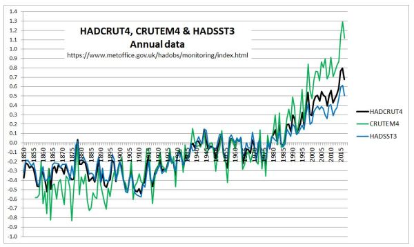
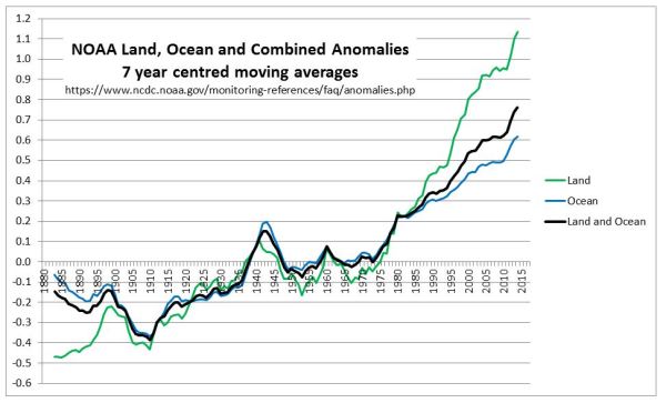
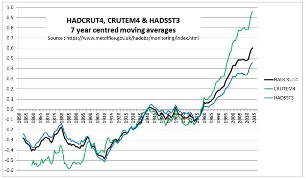
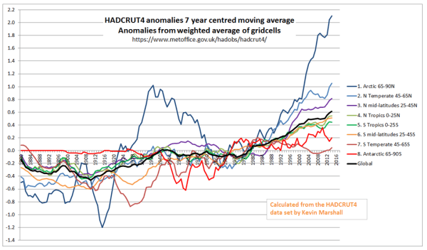
This observation is since 1948. This is partly because land has warmed faster than the oceans and partly because the greatest warming is in the Arctic. See two graphics I produced last year from the HADCRUT4 data. Note that much of the Canada-US border is at 49N, though Toronto is at 44N.

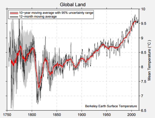
Canada is land based and much of its area is in the in the Arctic. Being part of a continental land mass, Canada also has extremely cold winters and fairly hot summers. But overall it is cold. Average Canadian temperatures from Berkeley Earth in 2013 were still -3.5C, up from -5.5C in 1900. BE graphic reproduced below.

The question is, does this mean that climate is becoming more extreme? The report on page 127 has a useful table

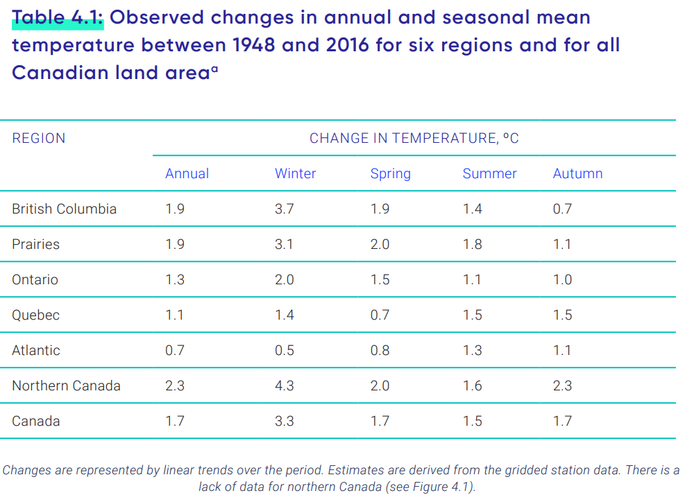
In Canada as a whole, and in four of the six areas, Winter average temperatures have warmed faster than those in the Summer. The other two have coastal influences, where I would expect the difference between  summer and winter to be less extreme than Canada as a whole. Climate has generally become less extreme.
However, if climate is becoming more extreme as a result of general warming then it this would result in more warm temperature records than cold temperature records to be set in recent decades. From Wikipedia has Lists of extreme temperatures in Canada.

Of the 13 Provinces and Territories, only two have heat records more recent than 1950. That is Nunavut in 1989 and Yukon in 2004. For extreme cold, records are more spread out, with the two most recent in 1972 & 1973.

Wikipedia also has lists of highest & lowest temperatures ever recorded in Canada as a whole. The hottest has duplicates in terms of adjacent places, or the same places on adjacent days. Not surprisingly nearly all are located well inland and close to the US border. The record highest is 45.0 °C on July 5, 1937. The bottom half of the list is of records of 43.3 °C or 110 °F. The three most recent were set in 1949, 1960 and 1961.
The coldest ever recorded in Canada was -63.0 °C on February 3, 1947 at Snag Yukon. The third lowest was −59.4 °C in 1975. On the list are three from this century. −49.8 °C on January 11, 2018, −48.6 °C on December 30, 2017 and −42 °C on December 17, 2013. Eleven of the thirteen provinces and territories are represented in the 31 records on the coldest list, and there is 21.9 °C difference between the top and bottom of the list. Seventy years of Winter warming in Canada have raised average temperatures by 3.3 °C, but the extreme low temperatures are 13 °C higher.

It would seem that the biggest news is of winter warming of 3.3 °C in 70 years has resulted in far less extreme cold, and considerably lower extreme cold temperatures. The more moderate summer warming has not resulted in record heatwaves. The evidence is that Canada’s warming has made temperatures less extreme, contradicting the consensus claims that warming leads to more extremes. In Canada, global warming appears to be causing climate changing for the better. So why is the Canadian Government trying to stop it?

Kevin Marshall

HADCRUT4, CRUTEM4 and HADSST3 Compared

In the previous post, I compared early twentieth-century warming with the post-1975 warming in the Berkeley Earth Global temperature anomaly. From a visual inspection of the graphs, I determined that the greater warming in the later period is due to more land-based warming, as the warming in the oceans (70% of the global area) was very much the same. The Berkeley Earth data ends in 2013, so does not include the impact of the strong El Niño event in the last three years.

Global average temperature series page of the Met Office Hadley Centre Observation Datasets has the average annual temperature anomalies for CRUTEM4 (land-surface air temperature) and HADSST3 (sea-surface temperature)  and HADCRUT4 (combined). From these datasets, I have derived the graph in Figure 1.

Figure 1 : Graph of Hadley Centre annual temperature anomalies for Land (CRUTEM4), Sea (HADSST3) and Combined (HADCRUT4)

  Comparing the early twentieth-century with 1975-2010,

  • Land warming is considerably greater in the later period.
  • Combined land and sea warming is slightly more in the later period.
  • Sea surface warming is slightly less in the later period.
  • In the early period, the surface anomalies for land and sea have very similar trends, whilst in the later period, the warming of the land is considerably greater than the sea surface warming.

The impact is more clearly shown with 7 year centred moving average figures in Figure 2.

Figure 2 : Graph of Hadley Centre 7 year moving average temperature anomalies for Land (CRUTEM4), Sea (HADSST3) and Combined (HADCRUT4)

This is not just a feature of the HADCRUT dataset. NOAA Global Surface Temperature Anomalies for land, ocean and combined show similar patterns. Figure 3 is on the same basis as Figure 2.

Figure 3 : Graph of NOAA 7 year moving average temperature anomalies for Land, Ocean and Combined.

The major common feature is that the estimated land temperature anomalies have shown a much greater warming trend that the sea surface anomalies since 1980, but no such divergence existed in the early twentieth century warming period. Given that the temperature data sets are far from complete in terms of coverage, and the data is of variable quality, is this divergence a reflection of the true average temperature anomalies based on far more complete and accurate data? There are a number of alternative possibilities that need to be investigated to help determine (using beancounter terminology) whether the estimates are a true and fair reflection of the prespective that more perfect data and techniques would provide. My list might be far from exhaustive.

  1. The sea-surface temperature set understates the post-1975 warming trend due to biases within data set.
  2. The spatial distribution of data changed considerably over time. For instance, in recent decades more data has become available from the Arctic, a region with the largest temperature increases in both the early twentieth century and post-1975.
  3. Land data homogenization techniques may have suppressed differences in climate trends where data is sparser. Alternatively, due to relative differences in climatic trends between nearby locations increasing over time, the further back in time homogenization goes, the more accentuated these differences and therefore the greater the suppression of genuine climatic differences. These aspects I discussed here and here.
  4. There is deliberate manipulation of the data to exaggerate recent warming. Having looked at numerous examples three years ago, this is a perspective that I do not believe to have had any significant impact. However, simply believing something not to be the case, even with examples, does not mean that it is not there.
  5. Strong beliefs about how the data should look have, over time and multiple data adjustments created biases within the land temperature anomalies.

What I do believe is that an expert opinion to whether this divergence between the land and sea surface anomalies is a “true and fair view” of the actual state of affairs can only be reached by a detailed examination of the data. Jumping to conclusions – which is evident from many people across the broad spectrum of opinions on catastrophic anthropogenic global warming debate – will fall short of the most rounded opinion that can be gleaned from the data.

Kevin Marshall


The magnitude of Early Twentieth Century Warming relative to Post-1975 Warming

I was browsing the Berkeley Earth website and came across their estimate of global average temperature change. Reproduced as Figure 1.

Figure 1 – BEST Global Temperature anomaly

The 10-year moving average line in red clearly shows warming from the early twentieth century, (the period 1910 to 1940) being very similar warming from the mid-1970s to the end of the series in both time period and magnitude. Maybe the later warming period is up to one-tenth of a degree Celsius greater than the earlier one. The period from 1850 to 1910 shows stasis or a little cooling, but with high variability. The period from the 1940s to the 1970s shows stasis or slight cooling, and low variability.

This is largely corroborated by HADCRUT4, or at least the version I downloaded in mid-2014.

Figure 2 – HADCRUT4 Global Temperature anomaly

HADCRUT4 estimates that the later warming period is about three-twentieths of a degree Celsius greater than the earlier period and that the recent warming is slightly less than the BEST data.

The reason for the close fit is obvious. 70% of the globe is ocean and for that BEST use the same HADSST dataset as HADCRUT4. Graphics of HADSST are a little hard to come by, but KevinC at skepticalscience usefully produced a comparison of the latest HADSST3 in 2012 with the previous version.

Figure 3  – HADSST Ocean Temperature anomaly from skepticalscience 

This shows the two periods having pretty much the same magnitudes of warming.

It is the land data where the differences lie. The BEST Global Land temperature trend is reproduced below.

Figure 4 – BEST Global Land Temperature anomaly

For BEST global land temperatures, the recent warming was much greater than the early twentieth-century warming. This implies that the sea surface temperatures showed pretty much the same warming in the two periods. But if greenhouse gases were responsible for a significant part of global warming then the warming for both land and sea would be greater after the mid-1970s than in the early twentieth century. Whilst there was a rise in GHG levels in the early twentieth century, it was less than in the period from 1945 to 1975, when there was no warming, and much less than the post-1975 when CO2 levels rose massively. Whilst there can be alternative explanations for the early twentieth-century warming and the subsequent lack of warming for 30 years (when the post-WW2 economic boom which led to a continual and accelerating rise in CO2 levels), without such explanations being clear and robust the attribution of post-1975 warming to rising GHG levels is undermined. It could be just unexplained natural variation.

However, as a preliminary to examining explanations of warming trends, as a beancounter, I believe it is first necessary to examine the robustness of the figures. In looking at temperature data in early 2015, one aspect that I found unsatisfactory with the NASA GISS temperature data was the zonal data. GISS usefully divide the data between 8 bands of latitude, which I have replicated as 7 year centred moving averages in Figure 5.

Figure 5 – NASA Gistemp zonal anomalies and the global anomaly

What is significant is that some of the regional anomalies are far greater in magnitude

The most Southerly is for 90S-64S, which is basically Antarctica, an area covering just under 5% of the globe. I found it odd that there should a temperature anomaly for the region from the 1880s, when there were no weather stations recording on the frozen continent until the mid-1950s. The nearest is Base Orcadas located at 60.8 S 44.7 W, or about 350km north of 64 S. I found that whilst the Base Orcadas temperature anomaly was extremely similar to the Antarctica Zonal anomaly in the period until 1950, it was quite dissimilar in the period after.

Figure 6. Gistemp 64S-90S annual temperature anomaly compared to Base Orcadas GISS homogenised data.

NASA Gistemp has attempted to infill the missing temperature anomaly data by using the nearest data available. However, in this case, Base Orcadas appears to climatically different than the average anomalies for Antarctica, and from the global average as well. The result of this is to effectively cancel out the impact of the massive warming in the Arctic on global average temperatures in the early twentieth century. A false assumption has effectively shrunk the early twentieth-century warming. The shrinkage will be small, but it undermines the NASA GISS being the best estimate of a global temperature anomaly given the limited data available.

Rather than saying that the whole exercise of determining a valid comparison the two warming periods since 1900 is useless, I will instead attempt to evaluate how much the lack of data impacts on the anomalies. To this end, in a series of posts, I intend to look at the HADCRUT4 anomaly data. This will be a top-down approach, looking at monthly anomalies for 5o by 5o grid cells from 1850 to 2017, available from the Met Office Hadley Centre Observation Datasets. An advantage over previous analyses is the inclusion of anomalies for the 70% of the globe covered by ocean. The focus will be on the relative magnitudes of the early twentieth-century and post-1975 warming periods. At this point in time, I have no real idea of the conclusions that can be drawn from the analysis of the data.

Kevin Marshall

Temperature Homogenization at Puerto Casado

Summary

The temperature homogenizations for the Paraguay data within both the BEST and UHCN/Gistemp surface temperature data sets points to a potential flaw within the temperature homogenization process. It removes real, but localized, temperature variations, creating incorrect temperature trends. In the case of Paraguay from 1955 to 1980, a cooling trend is turned into a warming trend. Whether this biases the overall temperature anomalies, or our understanding of climate variation, remains to be explored.


A small place in Mid-Paraguay, on the Brazil/Paraguay border has become the centre of focus of the argument on temperature homogenizations.

For instance here is Dr Kevin Cowtan, of the Department of Chemistry at the University of York, explaining the BEST adjustments at Puerto Casado.

Cowtan explains at 6.40

In a previous video we looked at a station in Paraguay, Puerto Casado. Here is the Berkeley Earth data for that station. Again the difference between the station record and the regional average shows very clear jumps. In this case there are documented station moves corresponding to the two jumps. There may be another small change here that wasn’t picked up. The picture for this station is actually fairly clear.

The first of these “jumps” was a fall in the late 1960s of about 1oC. Figure 1 expands the section of the Berkeley Earth graph from the video, to emphasise this change.

Figure 1 – Berkeley Earth Temperature Anomaly graph for Puerto Casado, with expanded section showing the fall in temperature and against the estimated mean station bias.

The station move is after the fall in temperature.

Shub Niggareth looked at the metadata on the actual station move concluding

IT MOVED BECAUSE THERE IS CHANGE AND THERE IS A CHANGE BECAUSE IT MOVED

That is the evidence of the station move was vague. The major evidence was the fall in temperatures. Alternative evidence is that there were a number of other stations in the area exhibiting similar patterns.

But maybe there was some, unknown, measurement bias (to use Steven Mosher’s term) that would make this data stand out from the rest? I have previously looked eight temperature stations in Paraguay with respect to the NASA Gistemp and UHCN adjustments. The BEST adjustments for the stations, along another in Paul Homewood’s original post, are summarized in Figure 2 for the late 1960s and early 1970s. All eight have similar downward adjustment that I estimate as being between 0.8 to 1.2oC. The first six have a single adjustment. Asuncion Airport and San Juan Bautista have multiple adjustments in the period. Pedro Juan CA was of very poor data quality due to many gaps (see GHCNv2 graph of the raw data) hence the reason for exclusion.

GHCN Name

GHCN Location

BEST Ref

Break Type

Break Year


Concepcion

23.4 S,57.3 W

157453

Empirical

1969


Encarcion

27.3 S,55.8 W

157439

Empirical

1968


Mariscal

22.0 S,60.6 W

157456

Empirical

1970


Pilar

26.9 S,58.3 W

157441

Empirical

1967


Puerto Casado

22.3 S,57.9 W

157455

Station Move

1971


San Juan Baut

26.7 S,57.1 W

157442

Empirical

1970


Asuncion Aero

25.3 S,57.6 W

157448

Empirical

1969


Station Move

1972


Station Move

1973


San Juan Bautista

25.8 S,56.3 W

157444

Empirical

1965


Empirical

1967


Station Move

1971


Pedro Juan CA

22.6 S,55.6 W

19469

Empirical

1968


Empirical

3 in 1970s


Figure 2 – Temperature stations used in previous post on Paraguayan Temperature Homogenisations


Why would both BEST and UHCN remove a consistent pattern covering and area of around 200,000 km2? The first reason, as Roger Andrews has found, the temperature fall was confined to Paraguay. The second reason is suggested by the UHCNv2 raw data1 shown in figure 3.

Figure 3 – UHCNv2 “raw data” mean annual temperature anomalies for eight Paraguayan temperature stations, with mean of 1970-1979=0.

There was an average temperature fall across these eight temperature stations of about half a degree from 1967 to 1970, and over one degree by the mid-1970s. But it was not at the same time. The consistency is only show by the periods before and after as the data sets do not diverge. Any homogenisation program would see that for each year or month for every data set, the readings were out of line with all the other data sets. Now maybe it was simply data noise, or maybe there is some unknown change, but it is clearly present in the data. But temperature homogenisation should just smooth this out. Instead it cools the past. Figure 4 shows the impact average change resulting from the UHCN and NASA GISS homogenisations.

Figure 4 – UHCNv2 “raw data” and NASA GISS Homogenized average temperature anomalies, with the net adjustment.

A cooling trend for the period 1955-1980 has been turned into a warming trend due to the flaw in homogenization procedures.

The Paraguayan data on its own does not impact on the global land surface temperature as it is a tiny area. Further it might be an isolated incident or offset by incidences of understating the warming trend. But what if there are smaller micro climates that are only picked up by one or two temperature stations? Consider figure 5 which looks at the BEST adjustments for Encarnacion, one of the eight Paraguayan stations.

Figure 5 – BEST adjustment for Encarnacion.

There is the empirical break in 1968 from the table above, but also empirical breaks in the 1981 and 1991 that look to be exactly opposite. What Berkeley earth call the “estimated station mean bias” is as a result of actual deviations in the real data. Homogenisation eliminates much of the richness and diversity in the real world data. The question is whether this happens consistently. First we need to understand the term “temperature homogenization“.

Kevin Marshall

Notes

  1. The UHCNv2 “raw” data is more accurately pre-homogenized data. That is the raw data with some adjustments.