I was browsing the Berkeley Earth website and came across their estimate of global average temperature change. Reproduced as Figure 1.
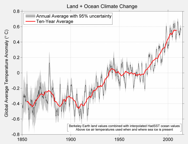
Figure 1 – BEST Global Temperature anomaly
The 10-year moving average line in red clearly shows warming from the early twentieth century, (the period 1910 to 1940) being very similar warming from the mid-1970s to the end of the series in both time period and magnitude. Maybe the later warming period is up to one-tenth of a degree Celsius greater than the earlier one. The period from 1850 to 1910 shows stasis or a little cooling, but with high variability. The period from the 1940s to the 1970s shows stasis or slight cooling, and low variability.
This is largely corroborated by HADCRUT4, or at least the version I downloaded in mid-2014.
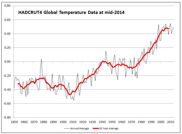
Figure 2 – HADCRUT4 Global Temperature anomaly
HADCRUT4 estimates that the later warming period is about three-twentieths of a degree Celsius greater than the earlier period and that the recent warming is slightly less than the BEST data.
The reason for the close fit is obvious. 70% of the globe is ocean and for that BEST use the same HADSST dataset as HADCRUT4. Graphics of HADSST are a little hard to come by, but KevinC at skepticalscience usefully produced a comparison of the latest HADSST3 in 2012 with the previous version.
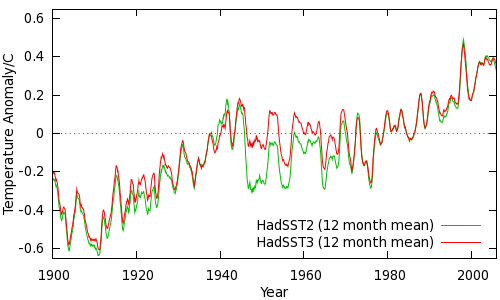
Figure 3 – HADSST Ocean Temperature anomaly from skepticalscience
This shows the two periods having pretty much the same magnitudes of warming.
It is the land data where the differences lie. The BEST Global Land temperature trend is reproduced below.
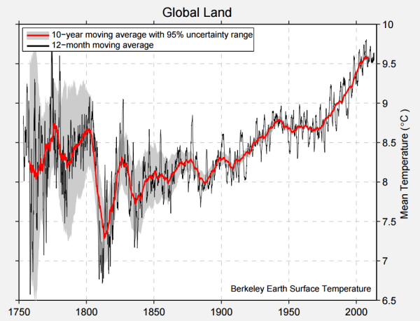
Figure 4 – BEST Global Land Temperature anomaly
For BEST global land temperatures, the recent warming was much greater than the early twentieth-century warming. This implies that the sea surface temperatures showed pretty much the same warming in the two periods. But if greenhouse gases were responsible for a significant part of global warming then the warming for both land and sea would be greater after the mid-1970s than in the early twentieth century. Whilst there was a rise in GHG levels in the early twentieth century, it was less than in the period from 1945 to 1975, when there was no warming, and much less than the post-1975 when CO2 levels rose massively. Whilst there can be alternative explanations for the early twentieth-century warming and the subsequent lack of warming for 30 years (when the post-WW2 economic boom which led to a continual and accelerating rise in CO2 levels), without such explanations being clear and robust the attribution of post-1975 warming to rising GHG levels is undermined. It could be just unexplained natural variation.
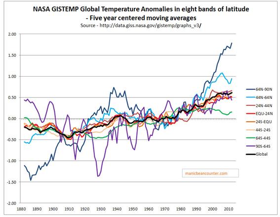
However, as a preliminary to examining explanations of warming trends, as a beancounter, I believe it is first necessary to examine the robustness of the figures. In looking at temperature data in early 2015, one aspect that I found unsatisfactory with the NASA GISS temperature data was the zonal data. GISS usefully divide the data between 8 bands of latitude, which I have replicated as 7 year centred moving averages in Figure 5.

Figure 5 – NASA Gistemp zonal anomalies and the global anomaly
What is significant is that some of the regional anomalies are far greater in magnitude
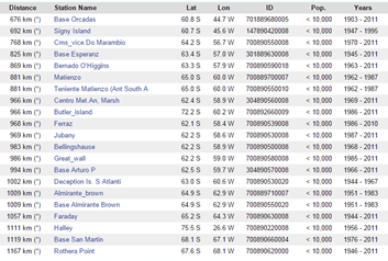
The most Southerly is for 90S-64S, which is basically Antarctica, an area covering just under 5% of the globe. I found it odd that there should a temperature anomaly for the region from the 1880s, when there were no weather stations recording on the frozen continent until the mid-1950s. The nearest is Base Orcadas located at 60.8 S 44.7 W, or about 350km north of 64 S. I found that whilst the Base Orcadas temperature anomaly was extremely similar to the Antarctica Zonal anomaly in the period until 1950, it was quite dissimilar in the period after.
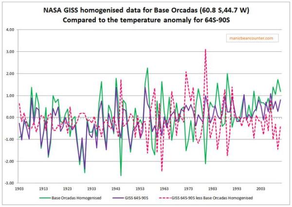
Figure 6. Gistemp 64S-90S annual temperature anomaly compared to Base Orcadas GISS homogenised data.
NASA Gistemp has attempted to infill the missing temperature anomaly data by using the nearest data available. However, in this case, Base Orcadas appears to climatically different than the average anomalies for Antarctica, and from the global average as well. The result of this is to effectively cancel out the impact of the massive warming in the Arctic on global average temperatures in the early twentieth century. A false assumption has effectively shrunk the early twentieth-century warming. The shrinkage will be small, but it undermines the NASA GISS being the best estimate of a global temperature anomaly given the limited data available.
Rather than saying that the whole exercise of determining a valid comparison the two warming periods since 1900 is useless, I will instead attempt to evaluate how much the lack of data impacts on the anomalies. To this end, in a series of posts, I intend to look at the HADCRUT4 anomaly data. This will be a top-down approach, looking at monthly anomalies for 5o by 5o grid cells from 1850 to 2017, available from the Met Office Hadley Centre Observation Datasets. An advantage over previous analyses is the inclusion of anomalies for the 70% of the globe covered by ocean. The focus will be on the relative magnitudes of the early twentieth-century and post-1975 warming periods. At this point in time, I have no real idea of the conclusions that can be drawn from the analysis of the data.