Moon Hoax data suggests Climate Sceptics are sceptical and Climate Alarmists are more dogmatic

It is now nearly seven years since the in-press release of the notorious “Lewandowsky, Oberauer & Gignac – NASA faked the moon landing:Therefore (Climate) Science is a Hoax: An Anatomy of the Motivated Rejection of Science” and the 26 March is the sixth anniversary of its final publication in amended form. Last month I was prompted to look again at the underlying survey data a short article at Medium by Jose Duarte. I fully agree with the differences in between the “published” and “extended” data files, now both archived on a Bristol University server, and have found some others. However, the subject of post is very different.

Main Thesis

Based on the “Moon Hoax” survey data, when confronted with a unknown conspiracy theory, the more sceptical a person is of climate “science” the more likely they are to mildly disagree with the conspiracy, whilst the more accepting a person is of “climate science” the more likely they are to strongly reject the conspiracy. Climate sceptics tend to be more sceptical of statements new to them, whilst those believing in climate science to roundly reject such statements.  Presented with a conspiracy theory that at least a strong minority agree with, then the degree of acceptance shows that sceptics tend to be more conservative or neo-liberal, whilst climate alarmists are more to socialist / progressive / (US) liberal.

The Iraq War Question

One of the first things I found in the “extended” file on the Bristol University server was responses to the missing Iraq question, located at the start of the conspiracy theory questions. The question was

The Iraq War in 2003 was launched for reasons other than to remove WMD from Iraq.

To look at the results, like in my September 2012 analysis, I produced a pivot table of the Iraq War responses against the average of the four “CO2 Science” questions. I did the same for the 14 conspiracy theory questions.
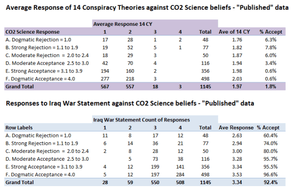
Figure 1 : Comparison of responses to the 14 Conspiracy Theory statements and the IraqNot4WMD with the average response band to the four CO2 Science questions. Note that the “average response” is the raw average response, and not the average of the response bands. For instance if a response had 8 “1” and 6 “2” the raw average response would be 1.43 and the response band would be “1”.

The first thing to note from figure 1 is that the vast majority all responses on average reject all 14 conspiracy theories. The conclusion from these figures is that, with few exceptions, those who reject climate science (skeptics/deniers/contrarians) also reject conspiracy theories, just like those who accept climate “science”. Two notable exceptions are responses 860 and 889 who answered 1 to all four CO2 Science questions and who strongly agreed with nearly all the conspiracy theories. Whether scam responses, or clearly held beliefs, they are outliers in the data sets.
Also of note is that the average response score for both the 14 conspiracy theories and the Iraq War question increases with increasing acceptance of climate science. Thus average responses suggests the opposite to what the paper claims.

Why the difference?

The average score suggests the opposite of far more sophisticated findings of the published paper. To understand more we need to look at the average response counts for the 14 conspiracy theories in more detail.

Figure 2: The count of average 14 conspiracy theory scores and the percentage of total responses, split by conspiracy theory band and by acceptance of CO2 science

The average score this time is on the conspiracy theory bands. It now gives the opposite of the conclusion in Figure 1. This time conspiracy theory average score decreases with increasing acceptance of CO2 Science.
The detail suggests why this is the case. % Score 1 – the strong rejection of conspiracy theories – there is an increase in percentage of respondents with increase in belief in climate change. But for score 2 it is the reverse direction. This should be an interesting result in itself. The dogmatic rejection of conspiracy theories appears to be related to belief in climate alarmism, but a less strong rejection – or a more sceptical stance – appears to be related to degree of climate scepticism. I have produced a similar table for the Iraq War question.

Figure 3: Count of responses to “The Iraq War in 2003 was launched for reasons other than to remove WMD from Iraq” by beliefs in climate science.

An interesting point about the IraqNot4WMD is acceptance by the vast majority, not rejection like for the other conspiracy theories. Strong acceptance of “The Iraq War in 2003 was launched for reasons other than to remove WMD from Iraq” appears to be related to belief in CO2 Science, but lesser acceptance is strongest with those of more moderate views. Less than 10% of responses rejected the statement. Amongst this small minority of responses, disagreement with the statement is related to the rejection of CO2 Science.

Looking at the breakdown of the 14 conspiracy theories gives some further insights.
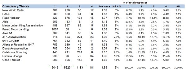
Figure 4 : Analysis of 14 published conspiracy theories using the “published” data

The full title of the “Moon Hoax” paper is

NASA faked the moon landing—Therefore (Climate) Science is a Hoax: An Anatomy of the Motivated Rejection of Science

The title is ill-chosen given that the average score of 1.08 is the lowest of all conspiracy theories, with just 10 out of 1145 expressing any agreement and 93.2% expressing strong disagreement. Even worse, the title infers a chain of thought by a small minority of 3 from among hundreds of other potential combinations, without asking any questions of the respondents. Five years ago I looked at this in detail in “Lewandowsky’s false inference from an absurd correlation”.
There are just two conspiracy theories where acceptance is over one fifth of the total responses – the JFK Assassination and the Oklahoma Bombing.
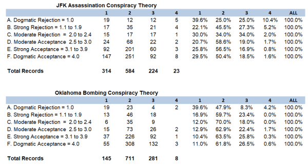
Figure 5: Analysis of the results from CYJFK and CYOKL.

The questions were

The assassination of John F Kennedy was not committed by the lone gunman, Lee Harvey Oswald, but was rather a detailed, organized conspiracy to kill the President.
The Oklahoma City Bombers, Timothy McVeigh and Terry Nicols did not act alone but rather received assistance from Neo Nazi groups.

From Figure 5 both of these, better known, conspiracy theories, strong rejection is related to the rejection of CO2 Science, whilst weaker rejections is related to rejection of CO2 Science. That is the very opposite of the average of 14 conspiracy theories. The dogmatic rejection of conspiracy theories appears to be related to the degree of climate scepticism, but a less strong rejection (i.e. a more sceptical stance) appears to be related to degree of belief in climate alarmism.

With a larger sample of those expressing belief in conspiracy theories there are contradictory results. For moderate acceptance, belief is related to degree of climate scepticism, for CYJFK and degree of belief in climate alarmism for CYOKL. Although the responses are much smaller in number, similar results are present for strong acceptance of the conspiracies if the two scam responses 860 & 889 are removed. This is consistent with the JFK conspiracy being more appealing to conservatives, whilst the Oklahoma Bombing conspiracy being more appealing to (US) liberals.

The 12 Less Popular Conspiracy Theories

Figure 6 : The Average Response of the 12 less popular conspiracy theories
The element that has not changed is the average conspiracy score.

Compared to the “Ave of 14 CY” in figure 2 there is very little difference with the “Ave of 12CY” end column in Figure 6. But the impact of removing the two most popular conspiracy theories amplifies the features in Figure 2. The stronger the acceptance of climate “science” the greater the propensity to strongly reject a conspiracy theory, whilst the stronger the rejection of climate “science” the greater the propensity to less strongly reject – or to be sceptical about – a conspiracy theory,

Conclusions and further thoughts

There are three major findings.

First is in the analysis of the Iraq War conspiracy theory question. This conspiracy theory was not included in either the pre-publication or final published versions of the paper. Nor were the responses included in the “published” data file that has been available since August 2012. There are mixed messages in the responses when related to the belief in CO2 science. The stand out finding is that strong acceptance of “The Iraq War in 2003 was launched for reasons other than to remove WMD from Iraq” appears to be related to belief in CO2 Science. This should not be a surprise, as the Iraq War was the responsibility of Republican President George W Bush, whilst the survey, conducted on very climate alarmist blogs, shows strong belief in CO2 Science is very closely related to extreme socialist-environmentalist ideation.

Second is a new finding from reanalysis of the data using pivot tables. There is no significant linear relationship between belief in conspiracy theories and degree of acceptance or rejection of CO2 science.

Third, and deriving from the second point, the “Moon Hoax” data indicates about important differences in handling new controversial claims between acceptors and rejecters of climate science. The greater propensity of the rejecters of climate science to only moderately reject conspiracy theories, in the “Moon Hoax” paper was put down to conspiracy ideation, a form of faulty thinking. The data indicates something radically different. When confronted with conspiracy theories for which there is little prior knowledge, the degree to which CO2 science is rejected indicates the likelihood of expressing moderate disagreement with the conspiracy theory. Conversely, the degree of expressed belief in CO2 science indicates the likelihood of immediately rejecting the conspiracy theory. But when confronted with conspiracy theories where there is broad knowledge, the likelihood of some agreement appears to be related to ideological views.
This finding can be put in slightly different language. The degree to which respondents “deny” CO2 science indicates the degree to which they will be sceptical of unfamiliar dogmatic proclamations thrust at them. Conversely, the degree to which respondents express belief in CO2 science indicates the degree to which they will be reject out of hand unfamiliar dogmatic proclamations thrust at them that do not accord with their world view.

Traditionally academic study in the quasi-sciences, along with non-sciences such as history and theology, involved carefully evaluation of the evidence and the differing arguments to reach conclusions. In climate “science” such a sceptical approach is evidence of climate denial. It follows from this consensus science logic that “correct” thinking is achieved by filtering experience through the dominant dogmas or mantras.

As a final point, the conclusions I derive are through analysing the data in different ways using pivot tables. It suggests that responses are not linear, but based on different approaches to processing data. The “Moon Hoax” paper takes a view analogous to that taken by the authorities in Soviet Union. Lack of complete agreement with authority is evidence of denial. Not accepting consensus dogma due to it conflicting with one’s perceptions is inconceivable to members of that consensus, so must be the consequence of receiving misinformation, or being psychologically deficient.
Kevin Marshall

Example of dogmatic pseudo-science on coral reef bleaching

I have already posted twice on coral reefs, but skirted round the article on Coral Alarmism by Geoff Price at his own blog on April 2nd 2018, reposted at ATTP eleven months later. By reposting this article Prof Ken Rice has shown how derisory is the evidence for global warming being the cause of increasing coral bleaching. 

Checking the sources that Price gives for (a) evidence of global warming (b) media sources of coral bleaching reveal there is no unambiguous underlying evidence to make a persuasive case  linking of one with the other. Further. the major peer review paper that Price cites finds that changes in severe coral bleaching events are not explained by global warming.

Evidence of global warming related to coral reefs

The first issue I want to deal with is the evidence that Price presents for the increase in coral bleaching being due to global warming.

Price first states the dogma

In our window of time here and on our watch, we’re observing the unfolding collapse of global coral reef cover – the largest living structures on the planet, relatively priceless in terms of human and economic value, and stunningly beautiful – due to human-induced stresses, now most prominently from human-caused global anthropogenic (greenhouse) warming of the oceans.

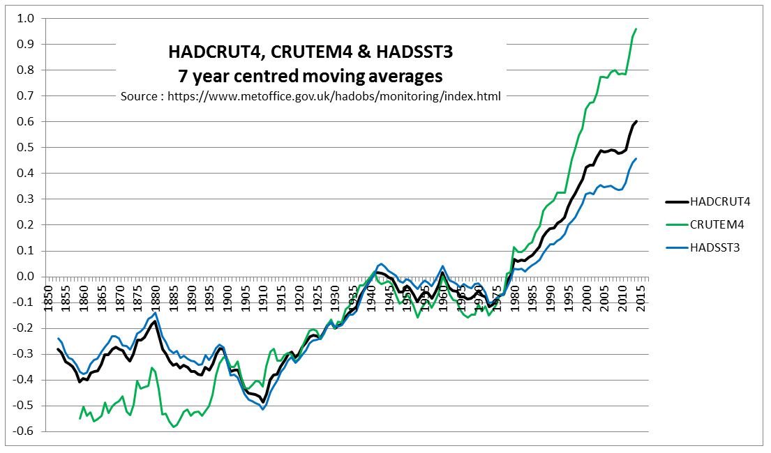
The claim of human induced warming is not backed up by any evidence.  That global average temperatures have been rising for well over a century  does not mean that this was human-induced. It could be natural or just some random cyclical cycle in a chaotic complex system, or some combination of all three. The evidence of warming oceans is the NOAA data of estimated increase in ocean heat content from 1960. There are a number of things wrong with this approach. The data period is only from 1960; heat stress in corals is from the amount of temperature rise; and the data is for 0-700m down, whilst most corals reside just a few meters below the surface. A much better measure is the sea surface temperature data records, which measures temperature just below the surface.

Below is the HADCRUT4 land and ocean anomalies temperature anomalies that I charted last year.


Crucially, the HADSST3 ocean warming data shows a similar global average temperature increase in the early twentieth century as the post 1975 warming. Both were about 0.5C, a value likely much less than the seasonal sea surface temperature change. Also, the rise in GHG gases – especially of CO2 – is much more post 1950 than from 1800 to 1940. The data does not support the idea that all warming is human-caused, unless global warming is caused by Mother Gaia anticipating the rise in CO2 levels.

Even then, then rise in global sea surface temperatures is not an indication of warming in a particular area. The Great Barrier Reef, for instance has shown little or no warming since 1980. From my previous post, observed major bleaching events do not correspond to any rise in warming, or any increase in extreme temperatures.

Media Sources do not support hypothesis

Even if Geoff Price cannot provide proper evidence of the rise in average temperatures that coral reefs are experiencing, at least he could provide credible scientific evidence of the link between warming and increase in coral bleaching. Price states

Some articles in major media break through, e.g. Global Warming’s Toll on Coral Reefs: As if They’re ‘Ravaged by War’, though the impact on public awareness and policy action remains low. The impact is global including the Great Barrier Reef (GBR), Japan, the South PacificHawaii, the Florida keys, and Belize.

Rather than presenting empirical evidence, or at least scientific articles, relating increased coral reef bleaching to global warming, Price bizarrely “quotes” from various media sources. To show how bizzare, I have made some notes of the sources,

As if “Ravaged by War”

The “Ravaged by War” article in the New York Times of Jan 4 2018. At the start of the article is stated “large-scale coral bleaching events……were virtually unheard-of before the 1980s“, whereas later on is stated ”before 1982-3, mass bleaching events across wide areas were nonexistent.”  The perceived lack of bleaching before the 1980s is changed into a fact. The lack of perception is due to lack of wide-scale research. But even 1982-3 as the first year of reporting of mass bleaching is contradicted by Figure 1c in Glynn 1993, reference 3 in the Hughes et al 2018 paper that prompted the NYT article. 1978 and 1979 have far more recorded mass coral mortalities than 1982 and 1993.

Evidence of global bleaching

The link is to a page of high quality pictures of coral bleaching from around the world. The rise of digital photography, and the increase in the numbers of people diving reefs with cameras in the last twenty years is evidence observation bias not of real increase. In the past, lack of wide-scale human perception does not mean the issue was not there.

Great Barrier Reef Bleaching

From the UK Independent April 20 2016 is the headline “Great Barrier Reef: Half of natural wonder is ‘dead or dying’ and it is on the brink of extinction, scientists say“.

The event is partly being caused by the strong El Nino weather system that has swept across the world in the last year. But global warming is the underlying cause, say scientists, and so the bleaching and death is likely to continue.

“We’ve never seen anything like this scale of bleaching before. In the northern Great Barrier Reef, it’s like 10 cyclones have come ashore all at once,” said Professor Terry Hughes, conveyor of the National Coral Bleaching Taskforce, 

The claim that global warming is the underlying cause of the bleaching is not attributed to any one person, or group. Prof Terry Hughes only makes a statement about the current state of affairs not being observed before, not that, in reality, it is unprecedented. Again a difference between perceptions and underlying reality.

Japan

The Japanese study is from an environmentalist website Down to Earth on January 13 2017. It states

Experts have, for quite a while now, believed that corals are among the most susceptible organisms to climate change. In fact, the world has already lost 30-40 per cent of its total documented coral cover.

According to the ministry’s estimate, 70 per cent of the Sekisei lagoon in Okinawa had been killed due to bleaching, which occurs when unusually warm water forces coral to expel the algae living in their tissues. Unless water temperatures quickly return to normal, the coral eventually dies from lack of nutrition.

Based on the survey done on 35 locations in Japan’s southernmost reaches from November to December 2016, the ministry observed that the plight of the reef has become “extremely serious” in recent years.

According to a Japanese media, the dead coral has now turned dark brown and is now covered with algae. It also revealed that the average sea surface temperature between June and August 2016 in the southern part of the Okinawa island chain was 30.1°C—one to two degrees warmer than usual. According to the Japan meteorological agency, it was also the highest average temperature since records began in 1982.

There is no link to the original source and from the statement the article is probably relying on media sources in English. Therefore there is no way of verifying whether the claims are due to warming. I would assume that the authors, like myself, do not speak Japanese, and the script is incomprehensible to them. Further, the article highlights just one of 35 locations in the Japanese study. This should be a signal that the cause of that extreme example of coral bleaching is more than just extreme temperatures.

Searching “Sekisei Lagoon” I come up with lots of returns, mostly about Coral bleaching. There was one is a short 2017 article at the Japanese Ministry of Environment website, and sponsored by them. The second paragraph states

(C)orals in the (Sekisei) Lagoon have extensively diminished since park designation because of various reasons: terrestrial runoffs of red clay and wastewater; coral bleaching due to high water temperatures; and outbreaks of the predatory crown-of-thorns starfish (Acanthaster planci). Initial efforts have been made to reduce terrestrial runoffs to help the natural recovery of coral ecosystem health. Studies on coral distribution and techniques for reef rehabilitation are also in progress.

It is does not look like global warming in the sole cause of the excessive coral bleaching in Sekisei Lagoon. It is also local human factors and a large predator. A little research of crown-of-thorns starfish reveals that sudden increases in populations are poorly understood and that it is also found on the Great Barrier Reef. Acanthaster planci has a number of predators, the lack of which might indicate reasons for the outbreaks.

Other Media Sources

The South Pacific source is a blog post from March 2016 on American Samoan Reefs, a small part of the total extent of islands across the vast region. It is about coral bleaching being on hold, but there is an alert due to recent abnormally high temperatures. If bleaching did follow it would have been due to the El Nino event, which caused abnormally high average temperatures globally.

The Hawaii source, does not give a link to the peer reviewed article on which it is based. Looking at the article, it is (a) based on surveys in 2014 and 2015, but with no data on historical events (b) claims that elevated temperatures were present in Hawaii, (but does not show that the global average temperature were not elevated (c) provides no evidence of comparative surveys in the past to show the issue has got worst. In the first sentence of the introduction it is implied that the entire 0.9 °C in average SSTs is due to rise in GHGs, a totally unsupportable statement. Peer J’s boasted rapid peer review process has failed to pick up on this,

The Florida Keys reference is a Washington Post article of June 25 2017 about how loss of the coral reefs through temperature rise will impact on tourism. It assumes that temperature rise is the sole course of coral reef loss.

Finally the Belize article a New York Times opinion piece from July 6 2017, about a researcher visiting the coral reefs. There is no data provided for either local warming or trends in bleaching.

Hughes et al 2018

The major scientific article that Price refers to is

Spatial and temporal patterns of mass bleaching of corals in the Anthropocene DOI: 10.1126/science.aan8048 . (Hughes et al 2018) 

Unusually this paper is open access. I quite like the attempt to reduce the observation bias when they state

Here we compiled de novo the history of recurrent bleaching from 1980 to 2016 for 100 globally distributed coral reef locations in 54 countries using a standardized protocol to examine patterns in the timing, recurrence, and intensity of bleaching episodes, including the latest global bleaching event from 2015 to 2016.

This does not eliminate the observation bias, but will certainly lesson the bias. They then make the observation

Since 1980, 58% of severe bleaching events have been recorded during four strong El Niño periods (1982–1983, 1997–1998, 2009–2010, and 2015–2016) (Fig. 2A), with the remaining 42% occurring during hot summers in other ENSO phases.

Considering that 2017 was also a severe bleaching events and global average temperatures were higher than in the 2015 El Nino year and in 2018, not to state it is an El Nino year is a maybe a bit dubious. Even so, on this basis El Nino free years are runs of 13, 10 and 4. This is not unlike the statement in the abstract

The median return time between pairs of severe bleaching events has diminished steadily since 1980 and is now only 6 years.

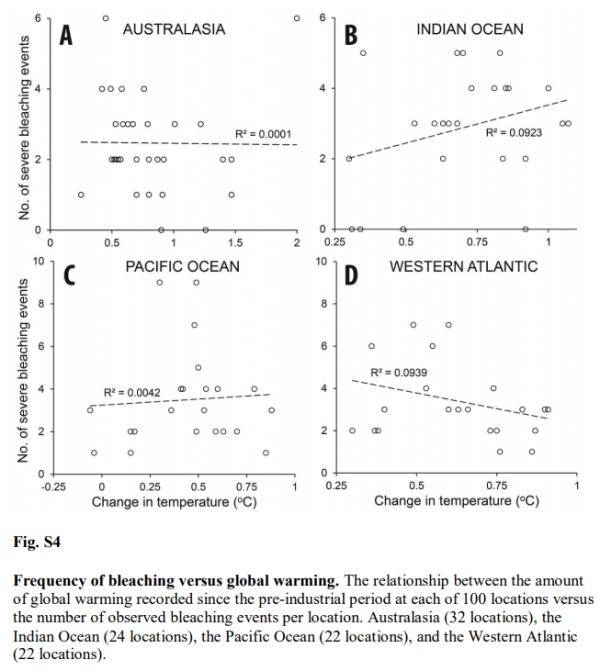
The paper makes no direct claims about the increase in observed coral bleaching being related to global warming. But This is because the data does not show this. Supplementary data figure 4 tests the relationship between the number of severe coral bleaching events per location and warming at that location across four regions.

For Australia R2 = 0.0001. That is zero. Better results can be achieved from two random unrelated data sets.
The best relationship is for the West Atlantic – mostly the Caribbean. That is R2 = 0.0939. The downward slope implies a negative relationship.  But still less than 10% of the variation in severe bleaching events is explained by rising temperatures.

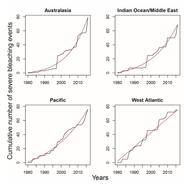
Figure 2A of the Supplementary materials I also find interesting in the context of Jaime Jessop’s contention that coral bleaching is related to El Ninos.

Note that this is cumulative recorded severe bleaching events. The relative size of individual years is from the increase in that year.
For Australasia, the three standout years are 1998, 2010 and 2016/2017. These are El Nino years, confirming Jaime’s hypothesus.
For the West Atlantic there were also an unusual number of severe bleaching events in 1995 and 2005. No El Ninos there, but 2005 saw a record number of hurricanes in the area, and 1995 also saw an unusually high number including Hurricane Andrew, the last category 5 to make landfall in the USA. Although excess heat might be the principal cause of stress in coral reefs, I am sure they might also get stressed by severe storms, with the accompanying storm surges.
If severe storms can lead to bleaching there is a problem with observation of bleaching. From Heron et al 2016 we learn that since the 1990s satellites have made twice-weekly recording of surface temperatures are 0.5 degree grids (about 50km), then comparing with the SST data to detect unusual runs of DHWs. Since 2015, a new product was launched with just 5km grids. It is then left to some intrepid scientists to go out in a boat, dive down and take samples. If severe storms do not have unusually high temperatures, then there will be no alerts of bleaching, so unless there are other attempts to observe, this will not be picked up, or could be picked up a short while later after an episode of unusual warming. Before the 1990s, there was no such over-all detection system, and likely much less researchers. Many of the bleaching events occurring before 1990 may not have been picked up, or if they were, there may have been less ability to define that events as major.

Concluding Comments

By re-posting a dogmatic article ATTP has done a service to climate scepticism. Laying out a very bad, but well-referenced, case for global warming causing increased coral reef bleaching shows the inadequacies of that case. Where long periods of data collated on a consistent basis is used there is no correlation. Further, increasing observed frequency of bleaching events since is mostly due El Nino events being closer together, whilst the increase in observed bleaching can be accounted for by the greatly improved methods of detection and the resources put into observing, which are many times what they were a few decades ago.

Geoff Price’s method of presenting the opinions of others, rather than focusing on the underlying data that supports the conjecture, is something in common with ATTP and others of the climate community. When checked, the fail to connect with any underlying reality.

There is a rider to be made. The case for global warming is very poor by the traditional scientific methods of confronting conjectures with evidence of the natural world, and letting such evidence being the ultimate arbiter of that conjecture. From the consensus viewpoint popular today it is collective opinion that is the arbiter. The above is from the former point of view, which means from the latter view this is misinformation.

Australian Beer Prices set to Double Due to Global Warming?

Earlier this week Nature Plants published a new paper Decreases in global beer supply due to extreme drought and heat

The Scientific American has an article “Trouble Brewing? Climate Change Closes In on Beer Drinkers” with the sub-title “Increasing droughts and heat waves could have a devastating effect on barley stocks—and beer prices”. The Daily Mail headlines with “Worst news ever! Australian beer prices are set to DOUBLE because of global warming“. All those climate deniers in Australia have denied future generations the ability to down a few cold beers with their barbecued steaks tofu salads.

This research should be taken seriously, as it is by a crack team of experts across a number of disciplines and Universities. Said, Steven J Davis of University of California at Irvine,

The world is facing many life-threatening impacts of climate change, so people having to spend a bit more to drink beer may seem trivial by comparison. But … not having a cool pint at the end of an increasingly common hot day just adds insult to injury.

Liking the odd beer or three I am really concerned about this prospect, so I rented the paper for 48 hours to check it out. What a sensation it is. Here a few impressions.

Layers of Models

From the Introduction, there were a series of models used.

  1. Created an extreme events severity index for barley based on extremes in historical data for 1981-2010.
  2. Plugged this into five different Earth Systems models for the period 2010-2099. Use this against different RCP scenarios, the most extreme of which shows over 5 times the warming of the 1981-2010 period. What is more severe climate events are a non-linear function of temperature rise.
  3. Then model the impact of these severe weather events on crop yields in 34 World Regions using a “process-based crop model”.
  4. (W)e examine the effects of the resulting barley supply shocks on the supply and price of beer in each region using a global general equilibrium model (Global Trade Analysis Project model, GTAP).
  5. Finally, we compare the impacts of extreme events with the impact of changes in mean climate and test the sensitivity of our results to key sources of uncertainty, including extreme events of different severities, technology and parameter settings in the economic model.

What I found odd was they made no allowance for increasing demand for beer over a 90 year period, despite mentioning in the second sentence that

(G)lobal demand for resource-intensive animal products (meat and dairy) processed foods and alcoholic beverages will continue to grow with rising incomes.

Extreme events – severity and frequency

As stated in point 2, the paper uses different RCP scenarios. These featured prominently in the IPCC AR5 of 2013 and 2014. They go from RCP2.6, which is the most aggressive mitigation scenario, through to RCP 8.5 the non-policy scenario which projected around 4.5C of warming from 1850-1870 through to 2100, or about 3.8C of warming from 2010 to 2090.

Figure 1 has two charts. On the left it shows that extreme events will increase intensity with temperature. RCP2.6 will do very little, but RCP8.5 would result by the end of the century with events 6 times as intense today. Problem is that for up to 1.5C there appears to be no noticeable change what so ever.  That is about the same amount of warming the world has experienced from 1850-2010 per HADCRUT4 there will be no change. Beyond that things take off. How the models empirically project well beyond known experience for a completely different scenario defeats me. It could be largely based on their modelling assumptions, which is in turn strongly tainted by their beliefs in CAGW. There is no reality check that it is the models that their models are not falling apart, or reliant on arbitrary non-linear parameters.

The right hand chart shows that extreme events are porjected to increase in frequency as well. Under RCP 2.6 ~ 4% chance of an extreme event, rising to ~ 31% under RCP 8.5. Again, there is an issue of projecting well beyond any known range.

Fig 2 average barley yield shocks during extreme events

The paper assumes that the current geographical distribution and area of barley cultivation is maintained. They have modelled in 2099, from the 1981-2010 a gridded average yield change with 0.5O x 0.5O resolution to create four colorful world maps representing each of the four RCP emissions scenarios. At the equator, each grid is about 56 x 56 km for an area of 3100 km2, or 1200 square miles. Of course, nearer the poles the area diminishes significantly. This is quite a fine level of detail for projections based on 30 years of data to radically different circumstances 90 years in the future. The results show. Map a) is for RCP 8.5. On average yields are projected to be 17% down. As Paul Homewood showed in a post on the 17th, this projected yield fall should be put in the context of a doubling of yields per hectare since the 1960s.

This increase in productivity has often solely ascribed to the improvements in seed varieties (see Norman Borlaug), mechanization and use of fertilizers. These have undoubtably have had a large parts to play in this productivity improvement. But also important is that agriculture has become more intensive. Forty years ago it was clear that there was a distinction between the intensive farming of Western Europe and the extensive farming of the North American prairies and the Russian steppes. It was not due to better soils or climate in Western Europe. This difference can be staggering. In the Soviet Union about 30% of agricultural output came from around 1% of the available land. These were the plots that workers on the state and collective farms could produce their own food and sell surplus in the local markets.

Looking at chart a in Figure 2, there are wide variations about this average global decrease of 17%.

In North America Montana and North Dakota have areas where barley shocks during extreme years will lead to mean yield changes over 90% higher normal, and the areas around have >50% higher than normal. But go less than 1000 km North into Canada to the Calgary/Saskatoon area and there are small decreases in yields.

In Eastern Bolivia – the part due North of Paraguay – there is the biggest patch of > 50% reductions in the world. Yet 500-1000 km away there is a North-South strip (probably just 56km wide) with less than a 5% change.

There is a similar picture in Russia. On the Kazakhstani border, there are areas of > 50% increases, but in a thinly populated band further North and West, going from around Kirov to Southern Finland is where there are massive decreases in yields.

Why, over the course of decades, would those with increasing yields not increase output, and those with decreasing yields not switch to something else defeats me. After all, if overall yields are decreasing due to frequent extreme weather events, the farmers would be losing money, and those farmers do well when overall yields are down will be making extraordinary profits.

A Weird Economic Assumption

Building up to looking at costs, their is a strange assumption.

(A)nalysing the relative changes in shares of barley use, we find that in most case barley-to-beer shares shrink more than barley-to-livestock shares, showing that food commodities (in this case, animals fed on barley) will be prioritized over luxuries such as beer during extreme events years.

My knowledge of farming and beer is limited, but I believe that cattle can be fed on other things than barley. For instance grass, silage, and sugar beet. Yet, beers require precise quantities of barley and hops of certain grades.

Further, cattle feed is a large part of the cost of a kilo of beef or a litre of milk. But it takes around 250-400g of malted barley to produce a litre of beer. The current wholesale price of malted barley is about £215 a tonne or 5.4 to 8.6p a litre. About cheapest 4% alcohol lager I can find in a local supermarket is £3.29 for 10 x 250ml bottles, or £1.32 a litre. Take off 20% VAT and excise duty leaves 30p a litre for raw materials, manufacturing costs, packaging, manufacturer’s margin, transportation, supermarket’s overhead and supermarket’s margin. For comparison four pints (2.276 litres) of fresh milk costs £1.09 in the same supermarket, working out at 48p a litre. This carries no excise duty or VAT. It might have greater costs due to refrigeration, but I would suggest it costs more to produce, and that feed is far more than 5p a litre.

I know that for a reasonable 0.5 litre bottle of ale it is £1.29 to £1.80 a bottle in the supermarkets I shop in, but it is the cheapest that will likely suffer the biggest percentage rise from increase in raw material prices. Due to taxation and other costs, large changes in raw material prices will have very little impact on final retail costs. Even less so in pubs where a British pint (568ml) varies from the £4 to £7 a litre equivalent.

That is, the assumption is the opposite of what would happen in a free market. In the face of a shortage, farmers will substitute barley for other forms of cattle feed, whilst beer manufacturers will absorb the extra cost.

Disparity in Costs between Countries

The most bizarre claim in the article in contained in the central column of Figure 4, which looks at the projected increases in the cost of a 500 ml bottle of beer in US dollars. Chart h shows this for the most extreme RCP 8.5 model.

I was very surprised that a global general equilibrium model would come up with such huge disparities in costs after 90 years. After all, my understanding of these models used utility-maximizing consumers, profit-maximizing producers, perfect information and instantaneous adjustment. Clearly there is something very wrong with this model. So I decided to compare where I live in the UK with neighbouring Ireland.

In the UK and Ireland there are similar high taxes on beer, with Ireland being slightly more. Both countries have lots of branches of the massive discount chain. They also have some products on their website aldi.co.uk and aldi.ie.  In Ireland a 500 ml can of Sainte Etienne Lager is €1.09 or €2.18 a litre or £1.92 a litre. In the UK it is £2.59 for 4 x 440ml cans or £1.59 a litre. The lager is about 21% more in Ireland. But the tax difference should only be about 15% on a 5% beer (Saint Etienne is 4.8%). Aldi are not making bigger profits in Ireland, they just may have higher costs in Ireland, or lesser margins on other items. It is also comparing a single can against a multipack. So pro-rata the £1.80 ($2.35) bottle of beer in the UK would be about $2.70 in Ireland. Under the RCP 8.5 scenario, the models predict the bottle of beer to rise by $1.90 in the UK and $4.84 in Ireland. Strip out the excise duty and VAT and the price differential goes from zero to $2.20.

Now suppose you were a small beer manufacturer in England, Wales or Scotland. If beer was selling for $2.20 more in Ireland than in the UK, would you not want to stick 20,000 bottles in a container and ship it to Dublin?

If the researchers really understood the global brewing industry, they would realize that there are major brands sold across the world. Many are brewed across in a number of countries to the same recipe. It is the barley that is shipped to the brewery, where equipment and techniques are identical with those in other parts of the world. This researchers seem to have failed to get away from their computer models to conduct field work in a few local bars.

What can be learnt from this?

When making projections well outside of any known range, the results must be sense-checked. Clearly, although the researchers have used an economic model they have not understood the basics of economics. People are not dumb  automatons waiting for some official to tell them to change their patterns of behavior in response to changing circumstances. They notice changes in the world around them and respond to it. A few seize the opportunities presented and can become quite wealthy as a result. Farmers have been astute enough to note mounting losses and change how and what they produce. There is also competition from regions. For example, in the 1960s Brazil produced over half the world’s coffee. The major region for production in Brazil was centered around Londrina in the North-East of Parana state. Despite straddling the Tropic of Capricorn, every few years their would be a spring-time frost which would destroy most of the crop. By the 1990s most of the production had moved north to Minas Gerais, well out of the frost belt. The rich fertile soils around Londrina are now used for other crops, such as soya, cassava and mangoes. It was not out of human design that the movement occurred, but simply that the farmers in Minas Gerais could make bumper profits in the frost years.

The publication of this article shows a problem of peer review. Nature Plants is basically a biology journal. Reviewers are not likely to have specialist skills in climate models or economic theory, though those selected should have experience in agricultural models. If peer review is literally that, it will fail anyway in an inter-disciplinary subject, where the participants do not have a general grounding in all the disciplines. In this paper it is not just economics, but knowledge of product costing as well. It is academic superiors from the specialisms that are required for review, not inter-disciplinary peers.

Kevin Marshall


IPCC SR1.5 – Notes on Calculations and Assumptions

Given that my previous post was about failing to reconcile the emissions estimates for 1.5°C and 2.0°C of warming in the IPCC fifth assessment report (AR5), I was intrigued to see how the new IPCC “special report on the impacts of global warming of 1.5 °C above pre-industrial levels” would fare. However, that will have to wait for another post, as first there are some “refinements” from AR5 in how results are obtained. From my analysis they would appear that key figures on temperatures and climate sensitivities are highly contrived.

Isn’t 1.5°C of warming already built in? 

Chapter 1 Page 24

Expert judgement based on the available evidence (including model simulations, radiative forcing and climate sensitivity) suggests that if all anthropogenic emissions were reduced to zero immediately, any further warming beyond the 1°C already experienced would likely be less than 0.5°C over the next two to three decades, and also likely less than 0.5°C on a century timescale.

This basically states that if all emissions were stopped now there is more than a 50% chance that warming would not exceed 1.5°C. But using previous assumptions 1.5°C should be already be built in. 

If ECS = 3.0 (as in AR5) then that implies the net effect of all GHGs and all aerosols is less than 396 ppm, despite CO2 on its own in September 2018 being 405.5 ppm (1.6°C of eventual warming). Further, in 2011 the impact of all GHGs combined was equivalent to 430 ppm, or an extra 40 ppm more than CO2 on its own. On that basis we are at the around 445 ppm or fractionally about the 2.0°C warming level. However, in AR5 it was assumed (based on vague estimates) that the negative human impacts of aerosols exactly offset the addition of other GHGs (e.g. methane) so that only CO2 is considered. Even then based on ECS = 3.0 without further emissions 1.5°C will be eventually reached.

But ECS has been lowered.

From Chapter 1 Annex Page 11

…Equilibrium Climate Sensitivity (ECS) of 2.7°C and Transient Climate Response (TCR) of 1.6°C and other parameters as given in Millar et al. (2017).

This raises the CO2-eq level to achieve 1.5°C of warming by 15-16 ppm from 396ppm and the CO2-eq level to achieve 2.0°C by 23-24 ppm from 444 ppm. Mauna Loa CO2 levels in September averaged 405.5 ppm. With ECS = 2.7 this is equivalent to just 1.44°C of eventual warming compared to 1.60°C  when ECS = 3.0. What is more significant is that if ECS were 2.8 eventual warming of 1.50°C would be in the pipeline sometime before the end of the year. ECS = 2.7 is the highest ECS that us currently compatible with the statement made above if CO2 alone is taken into account. Consider this in the light of 2013 AR5 WG1 SPM, which stated on page 16

Equilibrium climate sensitivity is likely in the range 1.5°C to 4.5°C

And in a footnote on the same page.

No best estimate for equilibrium climate sensitivity can now be given because of a lack of agreement on values across assessed lines of evidence and studies.

 In AR5 they chose ECS = 3.0 as it was in the middle of the range. A range unchanged since the Charney Report of 1979. I am not aware of any that establishes ECS is a range that would justify ECS = 2.7 that is not contradicted by other research. For instance Lewis and Curry 2018 gives a median estimate for ECS of 1.66.

Transient Climate Response (TCR)

But how does the Transient Climate Response (TCR) of 1.6°C fit into this? Some context can be had from the very start of the Summary for Policy-Makers SPM-4

A1.1. Reflecting the long-term warming trend since pre-industrial times, observed global mean surface temperature (GMST) for the decade 2006–2015 was 0.87°C (likely between 0.75°C and 0.99°C)

With TCR = 1.6°C for a doubling of CO2 levels what is the warming generated from a rise in CO2 levels from 280 to 400.83 ppm? That is a rise in CO2 levels from pre-industrial times to the average level in 2015. I calculate it to be 0.83°C. Make TCR = 1.7°C and that increases to 0.88°C. It is effectively assuming that both 100% of the rise in average temperatures in over 150 years is due to CO2 alone (consistent with AR5), and there has been no movement whatsoever from the short-term Transient Climate Response to the long-term Equilibrium Climate Sensitivity. However, if TCR is a variable figure derived from a calculation from revealed warming and CO2 rise, it becomes meaningless nonsense unless you can clearly demonstrate the other assumptions are robust. That is (1) 100% of past warming was due to human emissions (2) the impact of GHGs other than CO2 are effectively cancelled out by aerosols etc. (3) natural factors are net zero (4) the average temperature data anomaly is without any systematic biases. For instance, when measured CO2 levels were about 390ppm, the AR5 WG3 SPM stated in the last sentence on page 8

For comparison, the CO2-eq concentration in 2011 is estimated to be 430 ppm (uncertainty range 340 to 520 ppm)

It seems a pretty shaky foundation to the assumption that negative impact of aerosols (with uncertainties) will offset the combined impact of other GHG increases.

Summary and Concluding Comments

On the estimates of climate sensitivity, it appears to be set so that the IPCC can still claim that if emissions stopped tomorrow then there would be a greater than 50% chance of 1.5°C warming never been exceeded. The ECS value of 2.7°C is set at the maximum value, given the assumptions. But ceteris paribus, this will not hold if

  • One waits 3 years and CO2 levels continue increasing at a rate of the last few years.
  • ECS is slightly higher but still well within the accepted range of estimates. Indeed if ECS = 3.0, as in AR5 and AR4 in 2007, then 1.5C of warming was exceeded 5 years ago.
  • The impact of all GHGs together is slightly more than the offsetting impacts of other aerosols.
  • 0.06°C, or more, of the observed rise on temperature since 1850 is not due to GHG emissions.

Then there is the Transient Climate Response (TCR) which appears to be little more than taking the historical temperature change, assuming all of is down to human GHG emissions, and calculating a figure. Including rises in CO2 a century or more ago is hardly transient.

Based on my calculations, the results are highly contrived. They appear as a very fine balance between getting the maximum values for human-caused warming possible and not admitting that 1.5°C or even 2°C is already passed. There is a huge combination of empirical assumptions that are as equally valid as the ones used in the SR1.5 that go one way or the other. Rather than being a robust case, empirically it is highly improbable one.

Finally there is a conundrum here. I have calculated that if ECS = 2.7 and the starting level of CO2 is 280 ppm, then in round numbers, 1.5°C of warming results from CO2 levels of 412 ppm and 2.0°C of warming results from CO2 levels of 468 ppm. With CO2 levels in September 2018 at 406 ppm for 2.0°C of warming requires a rise in CO2 ten times greater than for 1.5°C of warming. So how can the IPCC claim that it is only about twice the amount of emissions? In my previous post I could not find an explanation, even though the emissions numbers reconciled with both past data and future emissions to generate 2.0°C of warming given certain assumptions. In the next I hope to provide an answer, which fits the figures quite closely, but looks pretty embarrassing.

Kevin Marshall

Increasing Extreme Weather Events?

Over at Cliscep, Ben Pile posted Misleading Figures Behind the New Climate Economy. Ben looked at the figures behind the recent New Climate Economy Report from the Global Commission on the Economy and Climate, which claims to be

… a major international initiative to examine how countries can achieve economic growth while dealing with the risks posed by climate change. The Commission comprises former heads of government and finance ministers and leaders in the fields of economics and business, and was commissioned by seven countries – Colombia, Ethiopia, Indonesia, Norway, South Korea, Sweden and the United Kingdom – as an independent initiative to report to the international community.

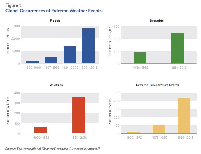
In this post I will briefly look at Figure 1 from the report, re-posted by Ben Pile.

Fig 1 – Global Occurrences of Extreme Weather Events from New Economy Climate Report

Clearly these graphs seem to demonstrate a rapidly worsening situation. However, I am also aware of a report a few years ago authored by Indur Goklany, and published by The Global Warming Policy Foundation  – GLOBAL DEATH TOLL FROM EXTREME WEATHER EVENTS DECLINING

Figure 2 : From Goklany 2010 – Global Death and Death Rates Due to Extreme Weather Events, 1900–2008. Source: Goklany (2009), based on EM-DAT (2009), McEvedy and Jones (1978), and WRI (2009).


Note that The International Disaster Database is EM-DAT. The website is here to check. Clearly these show two very different pictures of events. The climate consensus (or climate alarmist) position is that climate change is getting much worse. The climate sceptic (or climate denier) position is that is that human-caused climate change is somewhat exaggerated. Is one side outright lying, or is their some truth in both sides?

Indur Goklany recognizes the issue in his report. His Figure 2, I reproduce as figure 3.

Figure 3: Average Number of Extreme Weather Events per Year by Decade, 1900–2008.  Source: Goklany (2009), based on EM-DAT (2009).

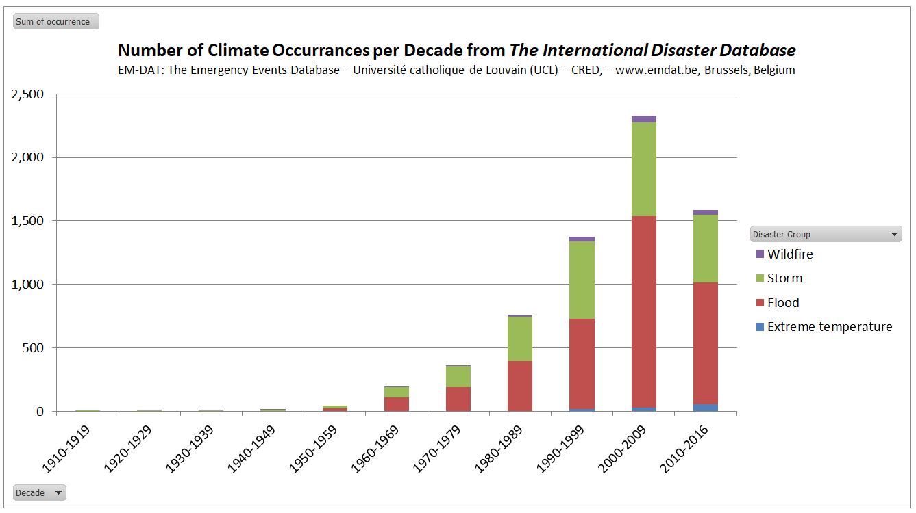
I am from a management accounting background. That means that I check my figures. This evening I registered at the EM-DAT website and downloaded the figures to verify the data. The website looks at all sorts of disaster information, not just climate information. It collates

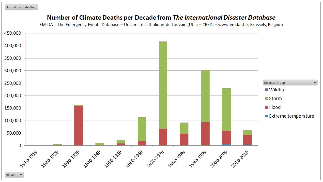
Figure 4 : No of Climatic Occurrences per decade from EM-DAT. Note that 2010-2016 pro rata is similar to 2000-2009

The updated figures through to 2016 show that pro rata, in the current decade occurrences if climate-related events as similar to the last decade. If one is concerned about the human impacts, deaths are more relevant.

Figure 5 : No of Climatic Deaths per decade from EM-DAT. Note that 2010-2016 pro rata is similar to 2000-2009

This shows unprecedented flood deaths in the 1930s. Of the 163218 flood deaths in 6 occurrences, 142000 were due to a flood in China in 1935. Wikipedia’s Ten deadliest natural disasters since 1900 lists at No.8 1935 Yangtze river flood, with 145000 dead. At No.1 is 1931 China floods with 1-4 million deaths. EM-DAT has not registered this disaster.

The decade 1970-1979 was extreme for deaths from storms. 300000 deaths were due to a Bangladesh storm in 1970. Wikipedia’s Ten deadliest natural disasters since 1900 lists at No.2 1970 Bhola cyclone, with ≥500,000.

The decade 1990-1999 had a high flood death toll. Bangladesh 1991 stands out with 138987 dead. Wikipedia No.10 is 1991 Bangladesh cyclone with 138866 dead.

In the decade 2000-2009 EM-DAT records the Myanmar Storm of 2008 with 138366 dead. If Wikipedia had a top 11 deadliest natural disasters since 1900, then Cyclone Nargis of 2 May 2008 could have made the list. From the BBC, with 200000 estimated dead, it would have qualified. But from the Red Cross 84500 Cyclone Nargis may have not made the top 20.

This leaves a clear issue of data. The International Disaster Database will accept occurrences of disasters according to clear criteria. For the past 20-30 years disasters have been clearly recorded. The build-up of a tropical cylone / hurricane is monitored by satellites and film crews are on hand to televise across the world pictures of damaged buildings, dead bodies, and victims lamenting the loss of homes. As I write Hurricane Florence is about to pound the Carolinas, and evacuations have been ordered. The Bhola Cyclone of 1970 was no doubt more ferocious and impacted on a far greater number of people. But the primary reason for the extreme deaths in 1970 Bangladesh was lack of warning and a lack of evacuation places. Even in the Wizard of Oz, based on 1930s United States, in a Tornado most families had a storm cellar. In the extreme poverty of 1970 Bangladesh there was nothing. Now, after decades of moderate growth and some rudimentary warning systems, it is unlikely that a similar storm would cause even a tenth of the death toll.

Even more significant, is that even if (as I hope) Hurricane Florence causes no deaths and limited property damage, it will be sufficiently documented to qualify for an entry on the International Disaster Database. But the quality of evidence for the 1931 China Floods, occurring in a civil war between the Communists and the Kuomintang forces, would be insufficient to qualify for entry. This is why one must be circumspect in interpreting this sort of data over periods when the quality and availability of data varies significantly. The issue I have is not with EM-DAT, but those who misinterpret the data for an ideological purpose.

Kevin Marshall

Changing a binary climate argument into understanding the issues

Last month Geoff Chambers posted “Who’s Binary, Us or Them? Being at cliscep the question was naturally about whether sceptics or alarmists were binary in their thinking. It reminded me about something that went viral on youtube a few year’s ago. Greg Craven’s The Most Terrifying Video You’ll Ever See.

To his credit, Greg Craven in introducing both that human-caused climate change can have a trivial impact recognize that mitigating climate (taking action) is costly. But for the purposes of his decision grid he side-steps these issues to have binary positions on both. The decision is thus based on the belief that the likely consequences (costs) of catastrophic anthropogenic global warming then the likely consequences (costs) of taking action. A more sophisticated statement of this was from a report commissioned in the UK to justify the draconian climate action of the type Greg Craven is advocating. Sir Nicholas (now Lord) Stern’s report of 2006 (In the Executive Summary) had the two concepts of the warming and policy costs separated when it claimed

Using the results from formal economic models, the Review estimates that if we don’t act, the overall costs and risks of climate change will be equivalent to losing at least 5% of global GDP each year, now and forever. If a wider range of risks and impacts is taken into account, the estimates of damage could rise to 20% of GDP or more. In contrast, the costs of action – reducing greenhouse gas emissions to avoid the worst impacts of climate change – can be limited to around 1% of global GDP each year.

Craven has merely simplified the issue and made it more binary. But Stern has the same binary choice. It is a choice between taking costly action, or suffering the much greater possible consequences.  I will look at the policy issue first.

Action on Climate Change

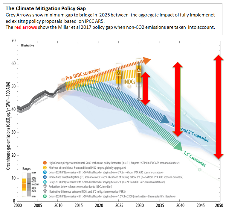
The alleged cause of catastrophic anthropogenic global warming is (CAGW) is human greenhouse gas emissions. It is not just some people’s emissions that must be reduced, but the aggregate emissions of all 7.6 billion people on the planet. Action on climate change (i.e. reducing GHG emissions to near zero) must therefore include all of the countries in which those people live. The UNFCCC, in the run-up to COP21 Paris 2015, invited countries to submit Intended Nationally Determined Contributions (INDCs). Most did so before COP21, and as at June 2018, 165 INDCs have been submitted, representing 192 countries and 96.4% of global emissions. The UNFCCC has made them available to read. So these intentions will be sufficient “action” to remove the risk of CAGW? Prior to COP21, the UNFCCC produced a Synthesis report on the aggregate effect of INDCs. (The link no longer works, but the main document is here.) They produced a graphic that I have shown on multiple occasions of the gap between policy intentions on the desired policy goals. A more recent graphic is from the UNEP Emissions Gap Report 2017, published last October and

Figure 3 : Emissions GAP estimates from the UNEP Emissions GAP Report 2017

In either policy scenario, emissions are likely to be slightly higher in 2030 than now and increasing, whilst the policy objective is for emissions to be substantially lower than today and and decreasing rapidly. Even with policy proposals fully implemented global emissions will be at least 25% more, and possibly greater than 50%, above the desired policy objectives. Thus, even if proposed policies achieve their objective, in Greg Craven’s terms we are left with pretty much all the possible risks of CAGW, whilst incurring some costs. But the “we” is for 7.6 billion people in nearly 200 countries. But the real costs are being incurred by very few countries. For the United Kingdom, with the Climate Change Act 2018 is placing huge costs on the British people, but future generations of Britain’s will achieve very little or zero benefits.

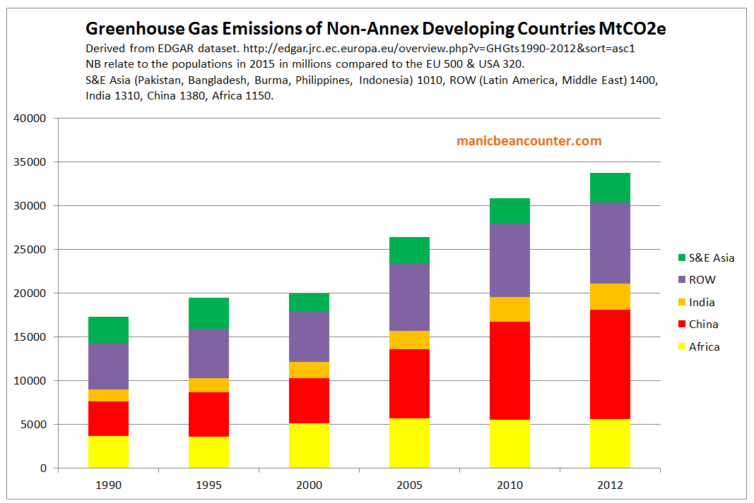
Most people in the world live in poorer countries that will do nothing significant to constrain emissions growth if it that conflicts with economic growth or other more immediate policy objectives. In terms of the some of the most populous developing countries, it is quite clear that achieving the policy objectives will leave emissions considerably higher than today. For instance, China‘s main aims of peaking CO2 emissions around 2030 and lowering carbon emissions per unit of GDP in 2030 by 60-65% compared to 2005 by 2020 could be achieved with emissions in 2030 20-50% higher than in 2017. India has a lesser but similar target of reducing emissions per unit of GDP in 2030 by 30-35% compared to 2005 by 2020. If the ambitious economic growth targets are achieve, emissions could double in 15 years, and still be increasing past the middle of the century. Emissions in Bangladesh and Pakistan could both more than double by 2030, and continue increasing for decades after.

Within these four countries are over 40% of the global population. Many other countries are also likely to have emissions increasing for decades to come, particularly in Asia and Africa. Yet without them changing course global emissions will not fall.

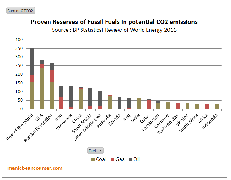
There is another group of countries that are have vested interests in obstructing emission reduction policies. That is those who are major suppliers of fossil fuels. In a letter to Nature in 2015, McGlade and Ekins (The geographical distribution of fossil fuels unused when limiting global warming to 2°C) estimate that the proven global reserves of oil, gas and coal would produce about 2900 GtCO2e. They further estimate that the “non-reserve resources” of fossil fuels represent a further 8000 GtCO2e of emissions. The estimated that to constrain warming to 2C, 75% of proven reserves, and any future proven reserves would need to be left in the ground. Using figures from the BP Statistical Review of World Energy 2016 I produced a rough split by major country.

Figure 4 : Fossil fuel Reserves by country, expressed in terms of potential CO2 Emissions
Activists point to the reserves in the rich countries having to be left in the ground. But in the USA, Australia, Canada and Germany production of fossil fuels is not a major part of the economy. Ceasing production would be harmful but not devastating. One major comparison is between the USA and Russia. Gas and crude oil production are similar volumes in both countries. But, the nominal GDP of the US is more than ten times that of Russia. The production of both countries in 2016 was about 550 million tonnes or 3900 million barrels. At $70 a barrel that is around $275bn, equivalent to 1.3% of America’s GDP and 16% of Russia’s. In gas, prices vary, being very low in the highly competitive USA, and highly variable for Russian supply, with major supplier Gazprom acting as a discriminating monopolist. But America’s revenue is likely to be less than 1% of GDP and Russia’s equivalent to 10-15%. There is even greater dependency in the countries of the Middle East. In terms of achieve emissions targets, what is trying to be achieved is the elimination of the major source of the countries economic prosperity in a generation, with year-on-year contractions in fossil fuel sales volumes.

I propose that there are two distinct groups of countries that appear to have a lot lose from a global contraction in GHG emissions to near zero. There are the developing countries who would have to reduce long-term economic growth and the major fossil fuel-dependent countries, who would lose the very foundation of their economic output in a generation. From the evidence of the INDC submissions, there is now no possibility of these countries being convinced to embrace major economic self-harm in the time scales required. The emissions targets are not going to be met. The emissions gap will not be closed to any appreciable degree.

This leaves Greg Craven’s binary decision option of taking action, or not, as irrelevant. As taking action by a country will not eliminate the risk of CAGW, pursuing aggressive climate mitigation policies will impose net harms wherever they implemented. Further, it is not the climate activists who are making the decisions, but policy-makers countries themselves. If the activists believe that others should follow another path, it is them that must make the case. To win over the policy-makers they should have sought to understand their perspectives of those countries, then persuade them to accept their more enlightened outlook. The INDCs show that the climate activists gave failed in this mission. Until such time, when activists talk about the what “we” are doing to change the climate, or what “we” ought to be doing, they are not speaking about

But the activists have won over the United Nations, those who work for many Governments and they dominate academia. For most countries, this puts political leaders in a quandary. To maintain good diplomatic relations with other countries, and to appear as movers on a world stage they create the appearance of taking significant action on climate change for the outside world. On the other hand they are serving their countries through minimizing the real harms that imposing the policies would create. Any “realities” of climate change have become largely irrelevant to climate mitigation policies.

The Risks of Climate Apocalypse

Greg Craven recognized a major issue with his original video. In the shouting match over global warming who should you believe? In How it all Ends (which was followed up by further videos and a book) Craven believes he has the answer.

Figure 5 : Greg Craven’s “How it all Ends”

It was pointed out that the logic behind the grid is bogus. As in Devil’s advocate guise Craven says at 3:50

Wouldn’t that grid argue for action against any possible threat, no matter how costly the action or how ridiculous the threat? Even giant mutant space hamsters? It is better to go broke building a load of rodent traps than risk the possibility of being hamster chow. So this grid is useless.

His answer is to get a sense of how likely the possibility of global warming being TRUE or FALSE is. Given that science is always uncertain, and there are divided opinions.

The trick is not to look at what individual scientists are saying, but instead to look at what the professional organisations are saying. The more prestigious they are, the more weight you can give their statements, because they have got huge reputations to uphold and they don’t want to say something that later makes them look foolish. 

Craven points to the “two most respected in the world“. The National Academy of Sciences (NAS) and the American Association for the Advancement of Science (AAAS). Back in 2007 they had “both issued big statements calling for action, now, on global warming“.  The crucial question from scientists (that is people will a demonstrable expert understanding of the natural world) is not for political advocacy, but whether their statements say their is a risk of climate apocalypse. These two bodies still have statements on climate change.

National Academy of Sciences (NAS) says

There are well-understood physical mechanisms by which changes in the amounts of greenhouse gases cause climate changes. The US National Academy of Sciences and The Royal Society produced a booklet, Climate Change: Evidence and Causes (download here), intended to be a brief, readable reference document for decision makers, policy makers, educators, and other individuals seeking authoritative information on the some of the questions that continue to be asked. The booklet discusses the evidence that the concentrations of greenhouse gases in the atmosphere have increased and are still increasing rapidly, that climate change is occurring, and that most of the recent change is almost certainly due to emissions of greenhouse gases caused by human activities.

Further climate change is inevitable; if emissions of greenhouse gases continue unabated, future changes will substantially exceed those that have occurred so far. There remains a range of estimates of the magnitude and regional expression of future change, but increases in the extremes of climate that can adversely affect natural ecosystems and human activities and infrastructure are expected.

Note, this is conjunction with the Royal Society, which is arguably is (or was) the most prestigious  scientific organisation of them all. It is what not said that is as important as what is actually said. They are saying that there is a an expectation that extremes of climate could get worse. There is nothing that solely backs up the climate apocalypse, but a range of possibilities, including changes somewhat trivial on a global scale. The statement endorses a spectrum of possible positions that undermines the binary TRUE /FALSE position on decision-making.

The RS/NAS booklet has no estimates of the scale of possible climate catastrophism to be avoided. Point 19 is the closest.

Are disaster scenarios about tipping points like ‘turning off the Gulf Stream’ and release of methane from the Arctic a cause for concern?

The summary answer is

Such high-risk changes are considered unlikely in this century, but are by definition hard to predict. Scientists are therefore continuing to study the possibility of such tipping points beyond which we risk large and abrupt changes.

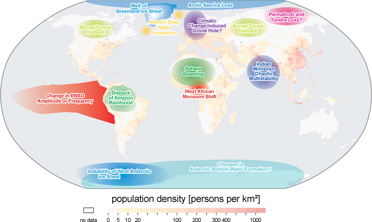
This appears not to support Stern’s contention that unmitigated climate change will costs at least 5% of global GDP by 2100. Another context of the back-tracking on potential catastrophism is to to compare with  Lenton et al 2008 – Tipping elements in the Earth’s climate system. Below is a map showing the the various elements considered.

Figure 6 : Fig 1 of Lenton et al 2008, with explanatory note.

Of the 14 possible tipping elements discussed, only one makes it into the booklet six years later. Surely if the other 13 were still credible more would have been included in booklet, and less on documenting trivial historical changes.

American Association for the Advancement of Science (AAAS) has a video

Figure 7 : AAAS “What We Know – Consensus Sense” video


It starts with the 97% Consensus claims. After asking the listener on how many,  Marshall Sheppard, Prof of Geography at Univ of Georgia states.

The reality is that 97% of scientists are pretty darn certain that humans are contributing to the climate change that we are seeing right now and we better do something about it to soon.

There are two key papers that claimed a 97% consensus. Doran and Zimmerman 2009 asked two questions,

1. When compared with pre-1800s levels, do you think that mean global temperatures have generally risen, fallen, or remained relatively constant?

2. Do you think human activity is a significant contributing factor in changing mean global temperatures?

The second of these two responses was answered in the affirmative by 77 of 79 climate scientists. This was reduced from 3146 responses received. Read the original to find out why it was reduced.

Dave Burton has links to a number of sources on these studies. A relevant quote on Doran and Zimmerman is from the late Bob Carter

Both the questions that you report from Doran’s study are (scientifically) meaningless because they ask what people “think”. Science is not about opinion but about factual or experimental testing of hypotheses – in this case the hypothesis that dangerous global warming is caused by human carbon dioxide emissions.

The abstract to Cook et al. 2013 begins

We analyze the evolution of the scientific consensus on anthropogenic global warming (AGW) in the peer-reviewed scientific literature, examining 11 944 climate abstracts from 1991–2011 matching the topics ‘global climate change’ or ‘global warming’. We find that 66.4% of abstracts expressed no position on AGW, 32.6% endorsed AGW, 0.7% rejected AGW and 0.3% were uncertain about the cause of global warming. Among abstracts expressing a position on AGW, 97.1% endorsed the consensus position that humans are causing global warming. 

Expressing a position does not mean a belief. It could be an assumption. The papers were not necessarily by scientists, but merely authors of academic papers that involved the topics ‘global climate change’ or ‘global warming’. Jose Duarte listed some of the papers that were included in the survey, along with looking at some that were left out.

Neither paper asked a question concerning belief in future climate catastrophism. Sheppard does not make clear the scale of climate change trends from the norm, so the human-caused element could be insignificant. The 97% consensus does not include the policy claims.

The booklet is also misleading as well in the scale of changes. For instance on sea-level rise it states.

Over the past two decades, sea levels have risen almost twice as fast as the average during the twentieth century.

You will get that if you compare the tide gauge data with the two decades of satellite data. The question is whether those two sets of data are accurate. As individual tide gauges do not tend to show acceleration, and others cannot find statistically significant acceleration, the claim seems not to be supported.

At around 4.15 in the consensus video AAAS CEO Alan I. Leshner says

America’s leaders should stop debating the reality of climate change and start deciding the best solutions. Our What we Know report makes clear that climate change threatens us at every level. We can reduce the risk of global warming to protect out people, businesses and communities from harm. At every level from our personal and community health, our economy and our future as a global leader.  Understanding and managing climate change risks is an urgent problem. 

The statement is about combating the potential risks from CAGW. The global part of global warming is significant for policy. The United States share of global emissions is around 13% of global emissions. That share has been falling as America’s emissions have been falling why the global aggregate emissions have been rising. The INDC submission for the United States aimed as getting US emissions in 2025 at 26-28% of 2005 levels, with a large part of that reduction already “achieved” when the report was published. The actual policy difference is likely to be less than 1% of global emissions. So any reduction in risks with respect to climate change seems to be tenuous. A consensus of the best scientific minds should have been able to work this out for themselves.

The NAAS does not give a collective expert opinion on climate catastrophism. This is shown by the inability to distinguish between banal opinions and empirical evidence for a big problem. This is carried over into policy advocacy, where they fail to distinguish between the United States and the world as a whole.

Conclusions

Greg Laden’s decision-making grid is inapplicable to real world decision-making. The decision whether to take action or not is not a unitary one, but needs to be taken at country level. Different countries will have different perspectives on the importance of taking action on climate change relative to other issues. In the real world, the proposals for action are available. In aggregate they will not “solve” the potential risk of climate apocalypse. Whatever the actual scale of CAGW, countries who pursue expensive climate mitigation policies are likely to make their own people worse off than if they did nothing at all.

Laden’s grid assumes that the costs of the climate apocalypse are potentially far greater than the costs of action, no matter how huge. He tries to cut through the arguments by getting the opinions from the leading scientific societies. To put it mildly, they do not currently provide strong scientific evidence for a potentially catastrophic problem. The NAS / Royal Society suggest a range of possible climate change outcomes, with only vague evidence for potentially catastrophic scenarios. It does not seem to back the huge potential costs of unmitigated climate change in the Stern Review. The NAAAS seems to provide vague banal opinions to support political advocacy rather than rigorous analysis based on empirical evidence that one would expect from the scientific community.

It would appear that the binary thinking on both the “science” and on “policy” leads to a dead end, and is leading to net harmful public policy.

What are the alternatives to binary thinking on climate change?

My purpose in looking at Greg Laden’s decision grid is not to destroy an alternative perspective, but to understand where the flaws are for better alternatives. As a former, slightly manic, beancounter, I would (like the Stern Review  and William Nordhaus) look at translating potential CAGW into costs. But then weight it according to a discount rate, and the strength of the evidence. In terms of policy I would similarly look at the likely expected costs of the implemented policies, against the actual expected harms foregone. As I have tried to lay out above, the costs of policy and indeed the potential costs of climate change are largely subjective. Further, those implementing policies might be boxed in by other priorities and various interest groups jostling for position.

But what of the expert scientist who can see the impending on-coming catastrophes to which I am blind and to which climate mitigation will be useless? It is to endeavor to pin down the where, when, type and magnitude of potential changes to climate. With this information ordinary people can adjust their plans. The challenge for those who believe there are real problems is to focus on the data from the natural world and away from inbuilt biases of the climate community. But the most difficult part is from such methods they may lose their beliefs, status and friends.

First is to obtain some perspective. In terms of the science, it is worth looking at the broad range of  different perspectives on the Philosophy of Science. The Stanford Encyclopedia of Philosophy article on the subject is long, but very up to date. In the conclusions, the references to Paul Hoyningen-Huene’s views on what sets science apart seems to be a way out of consensus studies.

Second, is to develop strategies to move away from partisan positions with simple principles, or contrasts, that other areas use. In Fundamentals that Climate Science Ignores I list some of these.

Third, in terms of policy, it is worthwhile having a theoretical framework in which to analyze the problems. After looking at Greg Craven’s video’s in 2010, I developed a graphical analysis that will be familiar to people who have studied Marshallian Supply and Demand curves of Hicksian IS-LM. It is very rough at the edges, but armed with it you will not fall in the trap of thinking like the AAAS that US policy will stop US-based climate change.

Fourth, is to look from other perspectives. Appreciate that other people might have other perspectives that you can learn from. Or alternatively they may have entrenched positions which, although you might disagree with, are powerless to overturn. It should then be possible to orientate yourself, whether as an individual or as part of a group, towards aims that are achievable.

Kevin Marshall

Evidence for the Stupidest Paper Ever

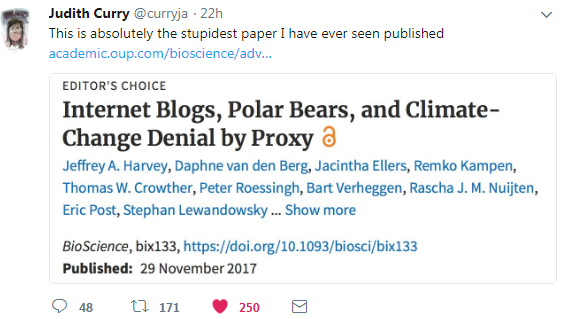
Judith Curry tweeted a few days ago

This is absolutely the stupidest paper I have ever seen published.

What might cause Judith Curry to make such a statement about Internet Blogs, Polar Bears, and Climate-Change Denial by Proxy? Below are some notes that illustrate what might be considered stupidity.

Warmest years are not sufficient evidence of a warming trend

The US National Oceanic and Atmospheric Administration (NOAA) and National Aeronautics and Space Administration (NASA) both recently reported that 2016 was the warmest year on record (Potter et al. 2016), followed by 2015 and 2014. Currently, 2017 is on track to be the second warmest year after 2016. 

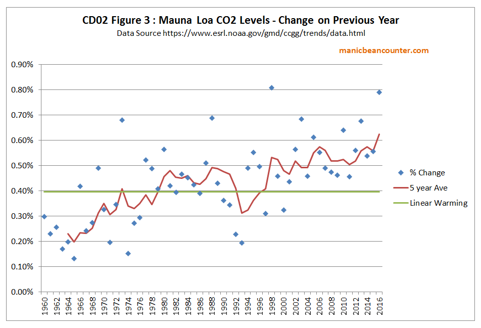
The theory is that rising greenhouse gas levels are leading to warming. The major greenhouse gas is CO2, supposedly accounting for about 75% of the impact. There should, therefore, be a clear relationship between the rising CO2 levels and rising temperatures. The form that the relationship should take is that an accelerating rise in CO2 levels will lead to an accelerating rate of increase in global average temperatures. Earlier this year I graphed the rate of change in CO2 levels from the Mauna Loa data.

The trend over nearly sixty years should be an accelerating trend. Depending on which temperature dataset you use, around the turn of the century warming either stopped or dramatically slowed until 2014. A strong El Nino caused a sharp spike in the last two or three years. The data contradicts the theory in the very period when the signal should be strongest.

Only the stupid would see record global average temperatures (which were rising well before the rise in CO2 was significant) as strong evidence of human influence when a little understanding of theory would show the data contradicts that influence.

Misrepresentation of Consensus Studies

The vast majority of scientists agree that most of the warming since the Industrial Revolution is explained by rising atmospheric greenhouse gas (GHG) concentrations (Doran and Zimmerman 2009, Cook et al. 2013, Stenhouse et al. 2014, Carlton et al 2015, Verheggen et al. 2015), 

Doran and Zimmerman 2009 asked two questions

1. When compared with pre-1800s levels, do you think that mean global temperatures have generally risen, fallen, or remained relatively constant?

2. Do you think human activity is a significant contributing factor in changing mean global temperatures?

Believing that human activity is a significant contributing factor to rising global temperatures does not mean one believes the majority of warming is due to rising GHG concentrations. Only the stupid would fail to see the difference. Further, the results were a subset of all scientists, namely geoscientists. The reported 97% consensus was from a just 79 responses, a small subset of the total 3146 responses. Read the original to find out why.

The abstract to Cook et al. 2013 begins

We analyze the evolution of the scientific consensus on anthropogenic global warming (AGW) in the peer-reviewed scientific literature, examining 11 944 climate abstracts from 1991–2011 matching the topics ‘global climate change’ or ‘global warming’. We find that 66.4% of abstracts expressed no position on AGW, 32.6% endorsed AGW, 0.7% rejected AGW and 0.3% were uncertain about the cause of global warming. Among abstracts expressing a position on AGW, 97.1% endorsed the consensus position that humans are causing global warming. 

Expressing a position does not mean a belief. It could be an assumption. The papers were not necessarily by scientists, but merely authors of academic papers that involved the topics ‘global climate change’ or ‘global warming’. Jose Duarte listed some of the papers that were included in the survey, along with looking at some that were left out. It shows a high level of stupidity to use these flawed surveys as supporting the statement “The vast majority of scientists agree that most of the warming since the Industrial Revolution is explained by rising atmospheric greenhouse gas (GHG) concentrations“.

Belief is not Scientific Evidence

The most recent edition of climate bible from the UNIPCC states (AR5 WG1 Ch10 Page 869)

It is extremely likely that human activities caused more than half of the observed increase in GMST from 1951 to 2010.

Mispresenting surveys about beliefs are necessary because the real world data, even when that data is a deeply flawed statisticdoes not support the belief that “most of the warming since the Industrial Revolution is explained by rising atmospheric greenhouse gas (GHG) concentrations“.  

Even if the survey data supported the statement, the authors are substituting banal statements about beliefs for empirically-based scientific statements. This is the opposite direction to achieving science-based understanding. 

The false Consensus Gap

The article states

This chasm between public opinion and scientific agreement on AGW is now commonly referred to as the consensus gap (Lewandowsky et al. 2013)

Later is stated, in relation to sceptical blogs

Despite the growing evidence in support of AGW, these blogs continue to aggressively deny the causes and/or the projected effects of AGW and to personally attack scientists who publish peer-reviewed research in the field with the aim of fomenting doubt to maintain the consensus gap.

There is no reference that tracks the growing evidence in support of AGW. From WUWT (and other blogs) there has been a lot of debunking of the claims of the signs of climate apocalypse such as

  • Malaria increasing as a result of warming
  • Accelerating polar ice melt / sea level rise
  • Disappearing snows of Kilimanjaro due to warming
  • Kiribati and the Maldives disappearing due to sea level rise
  • Mass species extinction
  • Himalayan glaciers disappearing
  • The surface temperature record being a true and fair estimate of real warming
  • Climate models consistently over-estimating warming

The to the extent that a consensus gap exists it is between the consensus beliefs of the climate alarmist community and actual data. Scientific support from claims about the real world come from conjectures being verified, not by the volume of publications about the subject.

Arctic Sea Ice Decline and threats to Polar Bear Populations

The authors conjecture (with references) with respect to Polar Bears that

Because they can reliably catch their main prey, seals (Stirling and Derocher 2012, Rode et al. 2015), only from the surface of the sea ice, the ongoing decline in the seasonal extent and thickness of their sea-ice habitat (Amstrup et al. 2010, Snape and Forster 2014, Ding et al. 2017) is the most important threat to polar bears’ long-term survival.

That seems plausible enough. Now for the evidence to support the conjecture.

Although the effects of warming on some polar-bear subpopulations are not yet documented and other subpopulations are apparently still faring well, the fundamental relationship between polar-bear welfare and sea-ice availability is well established, and unmitigated AGW assures that all polar bears ultimately will be negatively affected. 

There is a tacit admission that the existing evidence contradicts the theory. There is data showing a declining trend in sea ice for over 35 years, yet in that time the various polar bear populations have been growing significantly, not just “faring well“. Surely there should be a decline by now in the peripheral Arctic areas where the sea ice has disappeared? The only historical evidence of decline is this comment in criticizing Susan Crockford’s work.

For example, when alleging sea ice recovered after 2012, Crockford downplayed the contribution of sea-ice loss to polar-bear population declines in the Beaufort Sea.

There is no reference to this claim, so readers cannot check if the claim is supported. But 2012 was an outlier year, with record lows in the Summer minimum sea ice extent due to unusually fierce storms in August. Losses of polar bears due to random & extreme weather events are not part of any long-term decline in sea ice.

Concluding Comments

The stupid errors made include

  • Making a superficial point from the data to support a conjecture, when deeper understanding contradicts it. This is the case with the conjecture that rising GHG levels are the main cause of recent warming.
  • Clear misrepresentation of opinion surveys.
  • Even if the opinion surveys were correctly interpreted, use of opinion to support scientific conjectures, as opposed looking at statistical tests of actual data or estimates should appear stupid from a scientific perspective.
  • Claims that a consensus gap between consensus and sceptic views when the real gap is between consensus opinion and actual data.
  • Claims that polar bear populations will decline as sea ice declines is contradicted by the historical data. There is no recognition of this contradiction.

I believe Harvey et al paper gives some lessons for climatologists in particular and academics in general.

First is that when making claims crucial to the argument they need to be substantiated. That substantiation needs to be more than referencing others who have said the same claims before.

Second is that points drawn from referenced articles should be accurately represented.

Third, is to recognize that scientific papers need to first reference actual data and estimates, not opinions.  It is by comparing the current opinions with the real world that opportunities for advancement of understanding arise.

Fourth is that any academic discipline should aim to move from conjectures to empirically-based verifiable statements.

I have only picked out some of the more obvious of the stupid points. The question that needs to be asked is why such stupidity should have been agreed upon by 14 academics and then passed peer review?

Kevin Marshall

The Policy Gap in Achieving the Emissions Goals

The Millar et al. 2017 has severe problems with the numbers, as my previous post suggested. But there is a more fundamental problem in achieving emissions goals. It is contained in the introductory paragraphs to an article lead author Richard Millar posted at Carbon Brief

The Paris Agreement set a long-term goal of limiting global warming to “well-below” 2C above pre-industrial levels and to pursue efforts to restrict it to 1.5C.

A key question for the upcoming rounds of the international climate negotiations, particularly when countries review their climate commitments next year, is exactly how fast would we have to cut emissions to reach these goals?

In a new paper, published in Nature Geoscience, we provide updated estimates of the remaining “carbon budget” for 1.5C. This is the total amount of CO2 emissions that we can still emit whilst limiting global average warming to 1.5C.

Our estimates suggest that we would have a remaining carbon budget equivalent to around 20 years at current emissions rates for a 2-in-3 chance of restricting end-of-century warming to below 1.5C.

This suggests that we have a little more breathing space than previously thought to achieve the 1.5C limit. However, although 1.5C is not yet a geophysical impossibility, it remains a very difficult policy challenge.

The problem is with the mixing of singular and plural statements. The third paragraph shows the problem.

In a new paper, published in Nature Geoscience, we provide updated estimates of the remaining “carbon budget” for 1.5C. This is the total amount of CO2 emissions that we can still emit whilst limiting global average warming to 1.5C.

In the first sentence, the collective “we” refers to the ten authors of the paper. That is Richard J. Millar, Jan S. Fuglestvedt, Pierre Friedlingstein, Joeri Rogelj, Michael J. Grubb, H. Damon Matthews, Ragnhild B. Skeie, Piers M. Forster, David J. Frame & Myles R. Allen.  In the second sentence, the collective “we” refers to approximately 7500 million people on the planet, who live about 195 countries. Do they speak for all the people in Russia, India, Nigeria, Iran, Iraq, China, Taiwan, North and South Korea, the United States and Australia for instance? What I would suggest is they are speaking figuratively about what they believe the world ought to be doing.

Yet the political realities are that even though most countries have signed the Paris Agreement, it does not commit them to a particular emissions pathway, nor to eliminate their emissions by a particular date. It only commits them to produce further INDC submissions every five years, along with attending meetings and making the right noises. Their INDC submissions are not scrutinized, still less sent back for “improved ambition” if they are inadequate in contributing to the aggregate global plan.

Looking at the substance of the Adoption proposal of the Paris Agreement, section II, point 17 notes gives an indication of the policy gap.

17. Notes with concern that the estimated aggregate greenhouse gas emission levels in 2025 and 2030 resulting from the intended nationally determined contributions do not fall within least-cost 2 ˚C scenarios but rather lead to a projected level of 55 gigatonnes in 2030, and also notes that much greater emission reduction efforts will be required than those associated with the intended nationally determined contributions in order to hold the increase in the global average temperature to below 2 ˚C above pre-industrial levels by reducing emissions to 40 gigatonnes or to 1.5 ˚C above pre-industrial levels by reducing to a level to be identified in the special report referred to in paragraph 21 below;

But the actual scale of the gap is best seen from the centerpiece graphic of the UNFCCC Synthesis report on the aggregate effect of INDCs, prepared in the run-up to COP21 Paris. Note that this website also has all the INDC submissions in three large Pdf files.

The graphic I have updated with estimates of the policy gap with my take on revised Millar et. al 2017 policy gaps shown by red arrows.

The extent of the arrows could be debated, but will not alter the fact that Millar et. al 2017 are assuming that by adjusting the figures and assuming that they are thinking for the whole world, that the emissions objectives will be achieved. The reality is that very few countries have committed to reducing their emissions by anything like an amount consistent with even a 2°C pathway. Further, that commitment is just until 2030, not for the 70 years beyond that. There is no legally-binding commitment in the Paris Agreement for a country to reduce emissions to zero sometime before the end of the century. Further, a number of countries (including Nigeria, Togo, Saudi Arabia, Turkmenistan, Iraq and Syria) have not signed the Paris Agreement – and the United States has given notification of coming out of the Agreement. Barring huge amounts of funding or some technological miracle most developing countries, with a majority of the world population, will go on increasing their emissions for decades. This includes most of the countries who were Non-Annex Developing Countries to the 1992 Rio Declaration. Collectively they accounted for just over 100% of the global GHG emissions growth between 1990 and  2012.

As some of these Countries’ INDC Submissions clearly state, most will not sacrifice economic growth and the expectations of their people’s for the unproven dogma of politicalized academic activists in completely different cultures say that the world ought to cut emissions. They will attend climate conferences and be seen to be on a world stage, then sign meaningless agreements afterward that commit them to nothing.

As a consequence, if catastrophic anthropogenic global warming is true (like the fairies at the bottom of the garden) and climate mitigation reduction targets are achieved, the catastrophic climate change will be only slightly less catastrophic and the most extreme climate mitigation countries will be a good deal poorer. The non-policy countries will the ones better off. It is the classic free-rider problem, which results in an underprovision of those goods or services. If AGW is somewhat milder, then even these countries will be no worse off.

This is what really irritates me. I live in Britain, where the Climate Change Act 2008 has probably the most ludicrous targets in the world. That Act was meant to lead the world on climate change. The then Environment Secretary David Miliband introduced the bill with this message in March 2007.

From the graphic above COP21 Paris showed that most of the world is not following Britain’s lead. But the “climate scientists” are so stuck in their manipulated models, they forget that their models and beliefs of their peers are not the realities of the wider world. The political realities mean that reduction of CO2 emissions are net harmful to the people of Britain, both now and for future generations of Britains. The activists are just as wilfully negligent in shutting down any independent review of policy as a pharmaceutical company who would push one of its products onto the consumers without an independent evaluation of both the benefits and potential side effects.

Kevin Marshall

The Inferior Methods in Supran and Oreskes 2017

In the previous post I looked at one aspect of the article Assessing ExxonMobil’s Climate Change Communications (1977–2014) by Geoffrey Supran and Naomi Oreskes. I concluded the basis for evaluation of ExxonMobil’s sponsored climate papers – “AGW is real, human-caused, serious, and solvable” –  is a mantra held by people who fail to distinguish between empirical and verifiable statements, tautologies, opinions and public policy that requires some fanciful global political implementation. In this post I look at how the application of that mantra in analyzing journal articles can lead to grossly misleading interpretations.

Under Section 2. Method, in Table 2 the authors lay out their criteria evaluation in terms of how the wording supports (endorses) or doubts elements of the mantra. For AGW is real & human-caused there are quite complex criteria. But for whether it is “serious” and “solvable” they are much more straightforward, and I have reproduced them below.

The acknowledgment or doubt of “AGW as serious” or “AGW as solvable” are in relation to the mantra. That is the only criteria used. Supran and Oreskes would claim that this does not matter. What they are looking at is the positions communicated in the papers relative to the positions expressed by ExxonMobil externally. But there are problems with this methodology in terms of alternative perspectives that are missing.

First is that the underlying quality and clarity of results and relevancy of each paper is ignored. What matters to Supran and Oreskes is the language used.

Second is that ExxonMobil’s papers are not the only research on whether “AGW is real, human-caused, serious, and solvable”. The authors could also take into account the much wider body of papers out there within the broad areas covered by the mantra.

Third, if the totality of the research – whether ExxonMobil’s or the totality of climate research – does not amount to a strong case for anthropogenic global warming being a serious global problem, and nor having a workable solution, why should they promote politicized delusions?

Put this into the context of ExxonMobil – one of the World’s most successful businesses over decades – by applying some of the likely that it would use in assessing a major project or major strategic investment. For instance

  • How good is the evidence that there is a serious problem on a global scale emerging from human GHG emissions?
  • How strong is the evidence that humans have caused the recent warming?
  • Given many years of research, what is the track record of improving the quality and refinement of the output in the climate area?
  • What quality controls and KPIs are in place to enable both internal and external auditors to validate the work?
  • Where projections are made, what checks on the robustness of those projections have been done?
  • Where economic projections are produced, have they been done by competent mainstream economists, what are the assumptions made, and what sensitivity analyses have been done on those assumptions?
  • Does the project potentially harm investors, employees, customers and other stakeholders in the business? Where are the risk assessments of such potential harms, along with the procedures for the reporting and investigation of non-compliances?
  • Does a proposed project risk contravening laws and internal procedures relating to bribery and corruption?
  • Once a project is started, is it possible to amend that project over time or even abandon it should it fail to deliver? What are the contractual clauses that enable project amendment or abandonment and the potential costs of doing so?

Conclusions and further thoughts

Supran and Oreskes evaluate the ExxonMobil articles for AGW and policy in terms of a belief mantra applied to a small subset of the literature on the subject. Each article is looked at independently of all other articles; all other available information; and all other contexts in evaluating the information. This includes ignoring how a successful business evaluates and challenges information in strategic decision-making. Further any legitimate argument or evidence that undermines the mantra is evidence of doubt. It is all about throwing the onus on ExxonMobil to disprove the allegations, but never for Supran and Oreskes justify their mantra or their method of analysis is valid.

There are some questions arising from this, that I hope to pursue in later posts.

1. Is the method of analysis just a means of exposing ExxonMobil’s supposed hypocrisy by statistical means, or does it stem from a deeply flawed and ideological way of perceiving the world, that includes trying to shut out the wider realities of the real world, basic logic and other competing (and possibly superior) perspectives?

2. Whatever spread of misinformation and general hypocrisy might be shown on the part of ExxonMobil from more objective and professional perspectives, is there not greater misinformation sown by the promoters of the “climate consensus“?

3. Can any part of the mantra “AGW is real, human-caused, serious, and solvable” be shown to be false in the real world, beyond reasonable doubt?

Kevin Marshall


Supran and Oreskes on ExxonMobils Communication of Climate Change

Over at Cliscep, Geoff Chambers gave a rather bitter review (with foul language) about a new paper, Assessing ExxonMobil’s Climate Change Communications (1977–2014) by Geoffrey Supran and Naomi Oreskes.
One point that I would like to explore is part of a quote Geoff uses:-

The issue at stake is whether the corporation misled consumers, shareholders and/or the general public by making public statements that cast doubt on climate science and its implications, and which were at odds with available scientific information and with what the company knew. We stress that the question is not whether ExxonMobil ‘suppressed climate change research,’ but rather how they communicated about it.

It is the communication of climate science by a very powerful oil company, that the paper concentrates upon. The approach reveals a lot about the Climate Change movement as well. In particular, this statement in the introduction:-

Research has shown that four key points of understanding about AGW—that it is real, human-caused, serious, and solvable—are important predictors of the public’s perceived issue seriousness, affective issue involvement, support for climate policies, and political activism [62–66].

The references are as follows

[62] Krosnick J A, Holbrook A L, Lowe L and Visser P S 2006 The origins and consequences of democratic citizens’ policy agendas: a study of popular concern about global warming Clim. Change 77 7–43
[63] Ding D, Maibach E W, Zhao X, Roser-Renouf C and Leiserowitz A 2011 Support for climate policy and societal action are linked to perceptions about scientific agreement Nat. Clim. Change 1 462–6
[64] Roser-Renouf C, Maibach E W, Leiserowitz A and Zhao X 2014 The genesis of climate change activism: from key beliefs to political action Clim. Change 125 163–78
[65] Roser-Renouf C, Atkinson L, Maibach E and Leiserowitz A 2016 The consumer as climate activist Int. J. Commun. 10 4759–83
[66] van der Linden S L, Leiserowitz A A, Feinberg G D and Maibach E W 2015 The scientific consensus on climate change as a gateway belief: experimental evidence PLoS One 10 e0118489

For the purposes of Supran and Oreskes study, the understanding that people have of any issue does not require any substance at all beyond their beliefs. For instance, the Jehovah Witness Sect developing an “understanding” that Armageddon would occur in 1975. This certainly affected their activities in the lead up to the momentous history-ending event. Non-believers or members of the Christian Church may have been a little worried, shrugged their shoulders, or even thought the whole idea ridiculous. If similar studies to those on climate activism had been conducted on the prophecy of Armageddon 1975, similar results could have been found to those quoted for AGW beliefs in references 62-66. That is, the stronger the belief in the cause, whether religious evangelism in the case of Jehovah’s Witnesses or ideological environmentalism in the case of AGW, is a predictor of activism in support of the cause. They cannot go further because of an issue with scholarly articles. Claims made must be substantiated, something that cannot be done with respect to the prophecies of climate catastrophism, except in a highly nuanced form.
But the statement that AGW is “real, human-caused, serious, and solvable” – repeated five times in the article – indicates something about the activists understanding of complex issues.
AGW is real” is not a proper scientific statement, as it is not quantified. Given that the impacts on surface temperatures can muffled and delayed nearly indefinitely by natural factors, or swallowed by the oceans, the belief can be independent of any contrary evidence for decades to come.
AGW is human-caused”, is saying “Human-caused global warming is human-caused”. It is a tautology that tells us nothing about the real world.
AGW is serious” is an opinion. It may be a very widely-held opinion, with many articles written with confirming evidence, and many concerned people attending massive conferences where it is discussed. But without clear evidence for emerging net adverse consequences, the opinion is largely unsubstantiated.
AGW is solvable” could be whether it is theoretically solvable, given the technology and policies being implemented. But the statement also includes whether it is politically solvable, getting actual policies to reduce emissions fully implemented. If the “solution” is the reduction of global emissions to a level commensurate with 2C of warming (hence a partial solution), then COP21 in Paris shows that AGW is a long way from being solvable, with no actual solution in sight. Whereas the 2C limit requires global emissions to be lower in 2030 than in 2015, and falling rapidly, fully implemented policies would still see emissions higher in 2030 than in 2015 and still increasing.

The statement AGW is “real, human-caused, serious, and solvable” is, therefore, nothing more than a mantra held by people who fail to distinguish between empirical and verifiable statements, tautologies, opinions and public policy that requires some fanciful global political implementation. 

Kevin Marshall