CAGW – Paralleling Kuhnian Science or New Labour Spin?

A review of Montford’s “Hockey Stick Illusion” suggests that it is an example science described by Thomas Kuhn in “The Structure of Scientific Revolutions”. Both the Hockey Stick in particular, and CAGW theory in general, I believe parallel something entirely different.

Catastrophic AGW theory is not an example of Kuhnian science. It was swallowed whole by the political establishment without going through the strictures of scientific acceptance. Furthermore, it is coupled with a major political policy objective – to constrain CO2 emissions. The IPCC was then set up to confirm and fortify the science and the policy. CAGW is thus not a proper science as such, but “politicised science”.

The Hockey Stick is the major example of this – a public relations ploy to promote policy and direct attention away from proper analysis of the data. The shenanigans may have milder and more short-lived parallels in other fields of science, but better parallels are to be found in New Labour Spin. That is, never admit to error; talk over opponents and view them as self-evidently wrong; deflect adverse comments by saying something different; deflect criticism and error by making an easily answerable point the major issue, or conceding a minor point; and then quickly moving the discussion onto safer ground. Most of all rely on image more than substance. In the case of CAGW, make peer review and agreement with collective experts the ultimate demarcations between science and non-science.

Comparing Politicians to Global Warming Deniers

At CafeHayek, Don Bordeaux has a post that requires careful reading. It is an attack on politicians and overbearing government, couched in a metaphor of global warming deniers.

My comment was

Using the metaphor of global warming is apt, but like any metaphor breaks down once examined closely. I would claim that a global warming “denier” has a more tenable position once the evidence is examined in detail and from different perspectives. Conversely, a denier of the unintended consequences of interventionism, like a holocaust denier, has a less tenable position once the alternative evidence is examined.

This brings me onto a second point. Politicians are selling themselves to get elected, which implies building up coalitions of diverse interest groups. Early Public Choice theory called this Pork-Barrel politics. A more successful approach in the television era is one based on image. That is projecting personality over policy substance. It goes against the notions of weighing up the pros and cons, learning from error in one’s past judgments, and recognizing limitations in one’s abilities and knowledge. Good government requires questioning skeptics, but has a propensity to elect the smooth-talking deniers.

An early example of image-based politics – indeed the forerunner in modern times – is JF Kennedy. A more recent example in Britain is New Labour. The image-based politics justified building up a structural deficit in the boom years. The need to save face, and the political ambitions of the key player, meant that the political business cycle did not operate after the 2005 general election. That is, according to Public Choice Theory, to boost the economy to get re-elected and then take the necessary measures to reduce the deficit immediately after.

NASA excludes an inconvenient figure on 2010 Temperatures

The NASA Earth Observatory has a nice graph to show average global surface temperatures.

I noticed a small anomaly with the 2010 figures. The blue line, for the British Hadley Centre, appears to be missing.

You can check this by downloading the HADCRUT3 data set from here. Popping these figures into an Excel graph I get the following.

Excel even defaulted to the correct colour! The 2010 average temperature anolmaly on this data set is .468, as against .474 in 2005 and .529 in 1998. This is significant in that the NASA GISS figures show 2010 to be the warmest year on record, something that was pre-announced by leader James Hansen before the year was half way through. Try Googling 2010 Warmest Year on record to see the number of hits. But inclusion of the HADCRUT figures refutes the headline. Statistically it may not be significant, but the headlines show that politically it is important. It is the difference between the claim that global warming stopped in 1998, and that it is continuing.

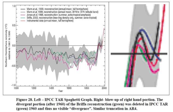
There is previous form in the climate community, as Steve McIntyre has noted. McIntyre has the following graphic (at page 28 of McIntyre, S. 2008b. How do we “know” that 1998 was the warmest year of the millennium?. Ohio State University Seminar, may 16, 2008.)

As Steve McIntyre states

“In the IPCC Third Assessment Report, they did worse than simply ignoring the problem.

They deleted the declining portion after 1960, thereby giving a false sense of coherence

between the proxies. In AR4, as a reviewer, I asked them to restore the deleted portion.

They refused saying that showing this information would be “inappropriate” (See


IPCC WG1 chapter 6 29 Review Comments) and the downward late 20th century portion

of the Briffa et al 2001 reconstruction was once again deleted in IPCC AR4.”

Prof Nir Shaviv Presentation

A couple of blogs (Bishophill and Jo Nova) direct you to a short 30 minute presentation by Prof Vincent Courtillot. The proceeding presentation by Prof. Nir Shaviv on cosmic ray theory, though more technically advanced, is worth a look, especially if you compare the strength of his argument with the IPCC greenhouse theory.

For the non-scientist, the Shaviv thesis of solar changes explaining the 20th century warming episode is better than the IPCC greenhouse theory as

  • Has some corroborating evidence to suggest that cosmic rays are affecting the climate, with the extent.
  • Has a simple computer model that explains most of the twentieth century warming. In particular the two similar periods of warming from 1915 to 1940 and 1975 to 1998, and the pauses are all modelled quite well. Using Occams Razor  (the most succinct hypothesis, or that which needs the fewest assumptions), it beats the anthropogenic greenhouse gas theories. Alternatively, it is a better fit of the data, as AGW only fits the later warming. The early 20th century warming can only be explained by predominantly natural factors.
  • Is happy flicking between the decadal time-scale that he is trying to explain to geological time scale of hundreds of millions of years and then to the influence of solar flares that last a few days. Neither does he have problems with natural variations.

The IPCC greenhouse gas models do have a number of models that concur. But this can be explained that they have similar assumptions and assumptions behind them. Indeed, given the strong coherence it is a weakness that they have such a wide variation in the data. The IPCC

  • Lacks corroborating evidence, particularly of the tropical tropospheric hotspot.
  • Relies on computer models are highly complex, rely on a two-stage process (see note below), and have many ad hoc adjustments.
  • Yet these computer models that do not tie in very well with the data. To explain the lack of warming in the 1945 to 1978 period and post 1998 you have to resort to an ad hoc inclusion of aerosols. The early-twentieth century warming, so similar empirically, has to have a different explanations.
  • Greenhouse gas theory is uncomfortable with looking beyond the twentieth. It cannot explain the medieval warm period, hence the amount of backing for the infamous hockey stick which suggests the twentieth century warming was unusual. Neither can it explain the other natural fluctuations in the current inter-glacial.

An opposite view that Shaviv’s work is insignificant can be referenced at Sourcewatch, a highly pro-AGW site. They state

“While he does believe the earth is warming, he contends that the sun’s rays, rather than human produced CO2, are the cause. But a 2009 analysis of data “on the sun’s output in the last 25 years of the 20th century has firmly put the notion to rest. The data shows that even though the sun’s activity has been decreasing since 1985, global temperatures have continued to rise at an accelerating rate.”

There are counters to this is that Sourcewatch is speaking about the wrong thing. Shaviv contends it is cosmic rays emanating from elsewhere in the galaxy that affect cloud cover and by this means temperature. Solar winds (determined by solar activity) heavily influence the levels of cosmic rays reaching the earth. A much smaller influence is the solar variability. Shaviv shows the following slide (at 17 mins) to show the difference in his measured magnitudes.

Note on IPCC Climate models

The IPCC climate models do not just rely on greenhouse gases directly impacting on the temperature to generate global climate catastrophe. This was nicely summarized by Prof Richard Lindzen in his Congressional testimony of November 17th 2010. (Full pdf here, Warren Meyer comments here)

  1. A doubling of CO2, by itself, contributes only about 1C to greenhouse warming. All models project more warming, because, within models, there are positive feedbacks from water vapour and clouds, and these feedbacks are considered by the IPCC to be uncertain.
  2. If one assumes all warming over the past century is due to anthropogenic greenhouse forcing, then the derived sensitivity of the climate to a doubling of CO2 is less than 1C. The higher sensitivity of existing models is made consistent with observed warming by invoking unknown additional negative forcings from aerosols and solar variability as arbitrary adjustments.