Reconciling recent ice mass balance estimates for Antarctica

This post is a slight modification and extention of a comment made at the cliscep post The Latest Antarctic Ice Sheet Alarmist Con

As a (slightly manic) beancounter I like to reconcile data sets. The differing estimates behind the claims of accelerating ice mass loss in Antarctica do not reconcile, nor with sea level rise data.
The problem of ice loss needs to be looked at in terms of the net of ice losses (e.g. glacier retreat) and ice gains (snow accumulation). Any estimate then needs to be related to other estimates. The Guardian article referred in the  cliscep post states

Separate research published in January found that ice loss from the entire Antarctic continent had increased six-fold since the 1980s, with the biggest losses in the west. The new study indicates West Antarctica has caused 5mm of sea level rise since 1992, consistent with the January study’s findings.

The paper is Rignot et al 2018 “Four decades of Antarctic Ice Sheet mass balance from 1979–2017“. The abstract states

The total mass loss increased from 40 ±
9 Gt/y in 1979–1990 to 50 ± 14 Gt/y in 1989–2000, 166 ± 18 Gt/y
in 1999–2009, and 252 ± 26 Gt/y in 2009–2017. In 2009–2017,
the mass loss was dominated by the Amundsen/Bellingshausen
Sea sectors, in West Antarctica (159 ± 8 Gt/y), Wilkes Land, in
East Antarctica (51 ± 13 Gt/y), and West and Northeast Peninsula
(42 ± 5 Gt/y). The contribution to sea-level rise from Antarctica
averaged 3.6 ± 0.5 mm per decade with a cumulative 14.0 ±
2.0 mm since 1979, including 6.9 ± 0.6 mm from West Antarctica,
4.4 ± 0.9 mm from East Antarctica, and 2.5 ± 0.4 mm from the
Peninsula (i.e., East Antarctica is a major participant in the mass
loss).

Jaime @ 19 May 19 at 7:56 am points to a New Scientist article in January claiming that Antartica ice loss has trebled. The underlying article is from Nature – The IMBIE Team – Mass balance of the Antarctic Ice Sheet from 1992 to 2017. The abstract states

The Antarctic Ice Sheet is an important indicator of climate change and driver of sea-level rise. Here we combine satellite observations of its changing volume, flow and gravitational attraction with modelling of its surface mass balance to show that it lost 2,720 ± 1,390 billion tonnes of ice between 1992 and 2017, which corresponds to an increase in mean sea level of 7.6 ± 3.9 millimeters (errors are one standard deviation). Over this period, ocean-driven melting has caused rates of ice loss from West Antarctica to increase from 53 ± 29 billion to 159 ± 26 billion tonnes per year; ice-shelf collapse has increased the rate of ice loss from the Antarctic Peninsula from 7 ± 13 billion to 33 ± 16 billion tonnes per year. We find large variations in and among model estimates of surface mass balance and glacial isostatic adjustment for East Antarctica, with its average rate of mass gain over the period 1992–2017 (5 ± 46 billion tonnes per year) being the least certain.

The key problem is in the contribution to sea level rise. The Rignot study from 1979-2017 gives 3.6 mm a decade from 1989-2017, about 4.1 mm and from 1999-2017 about 5.6 mm. The IMBIE team estimates over the period 1992-2017 7.9 mm sea level rise, or 3 mm per decade. The Rignot study estimate is over 50% greater than the IMBIE team. Even worse, neither the satellite data for sea level rise from 1992, nor the longer record of tide gauges, show an acceleration in sea level rise.

For instance from NOAA, the satellite data shows a fairly steady 2.9mm a year. rise in sea levels from 1992.

Using the same data, the University of Colorado estimates the average sea level rise to be 3.1 mm a year.

Note that in both the much greater variability in the Jason 2 data, and the slowdown in rise after 2016 when Jason 3 started operating.

The tide gauges show a lesser rate of rise. A calculation from 155 of the best tide gauges around the world found the mean and median rate of sea level rise to be 1.48 mm/yr. 

Yet, if Rignot is correct in recent years Antarctic ice loss must now account for around 22-25% of the sea level rise (satellite record) or almost 50% (tide gauges) of the measured sea level rise. Both show no accleration. What factors have a diminishing contribution to sea level rise over the last 25 years? It cannot be less thermal expansion, as heat uptake is meant to have increased post 2000, more than offsetting the slowdown in surface temperature rise when emissions accelerated. 

Kevin Marshall

Postscript

This is not the first time I have covered rather extreme claims in one of Prof Eric Rignot’s estimates of accleration in ice melt. Six years ago I looked at Rignot et al 2011 – Acceleration of the contribution of the Greenland and Antarctic ice sheets to sea level rise

I compared the 12 monthly rise in sea surface temperatures with the corressponding chart of ice mass balance loss for Greenland and Antarctica. The peaks and troughs corressponded nicely, with about 18 months between ice loss and sea level rise. This is quite remarkable considering that from Rignot et 2011 in the 1990s ice loss would have had very little influence on sea level rise. It is almost as though the modelling has taken the sea level data, multiplied by 360, flipped it, moved it back a few months then tilted to result show acceleration. 

Yet the acceleration of 14.5 ± 2 Gt/yr2 for Antarctica results in decadal increases not too dismillar from those in the abstract of Rignot et al 2018. This would validate the earlier results except for another paper. Shepherd et al Nov 2012 – Reconciled Estimate of Ice-Sheet Mass Balance had a long list of authors including Rignot and three of the four co-authors of the Rignot et al 2011. It set the standard for the time, and was  the key article on the subject in IPCC AR5 WG1. Shepherd et al Nov 2012 has the following Table 1.

For Antartica as  experienced no significant acceleration in ice mass loss in the period 1992-2011. 

Two Contrasting Protests on Climate Change

Yesterday marked two protests related to climate change. One in central London by a group of climate extremists baying for more stringent climate policies. The other right across France demanding the removal of a small additional tax on fuel.

The Climate Extremists

Yesterday a group calling themselves !EXTINCTION REBELLION! had a series of protests around London, including blocking off five major bridges. They have a long history, having been founded almost three weeks ago on Halloween. Their aims are quite clear from a mercifully short video.

It is based on “science“.

The Crux

Even without the other ecological drivers of mass species extinction, natural resource exhaustion and growing human population pressure, human-caused (anthropogenic) climate breakdown alone is enough to wipe out the human species by the end of this century, if governments do not immediately begin to reverse their extractivismand ‘growth’ -based economic policies.

This is why the Extinction Rebellion campaign has at its core a group of activists who are prepared to go to prison for peaceful civil disobedience, to get the necessary media coverage for long enough to leverage the government and the public into war-level mobilisation mode.

When you repeatedly come across the figure of 2 degrees i.e. limiting global warming to 2 degrees, think of what happens to a human body when it experiences a temperature increase of more than 2 degrees.

The recent IPCC SR1.5 was the product of two and a half years trying to come up with scary stories to frighten governments into action. Two examples of the scary headlines from the SPM.

Temperature extremes on land are projected to warm more than GMST (high confidence): extreme hot days in mid-latitudes warm by up to about 3°C at global warming of 1.5°C and about 4°C at 2°C, and extreme cold nights in high latitudes warm by up to about 4.5°C at 1.5°C and about 6°C at 2°C (high confidence). The number of hot days is projected to increase in
most land regions, with highest increases in the tropics (high confidence).

By 2100, global mean sea level rise is projected to be around 0.1 metre lower with global warming of 1.5°C compared to 2°C (medium confidence).

In Britain we will be wiped out by a few 20°C+ hot nights and extra sea level rise of four inches. Maybe we could listen to the 40% of the global population that lives in the tropics.

The “science” section includes this quote from Bill McKibben.

What those numbers mean is quite simple. This industry has announced…in promises to shareholders, that they are determined to burn five times more fossil fuel than the planet’s atmosphere can begin to absorb.

This is not science, but blinkered ideology. Why blinkered? Try going to the CDP Carbon Majors Report 2017 Appendix 1 – Cumulative emissions 1988-2015 %. Below are the top 10.

If the !XR! really believe in the climate apocalypse, shouldn’t they be protesting outside the Chinese, Russian, Iranian and Indian Embassies, and inciting rebellion in those countries? Or are they just climate totalitarians trying to wreck the well-being of the British people?

The Carbon Tax Revolt

On the same day in France there were massive nationwide protests after the Macron government raised its hydrocarbon tax this year by 7.6 cents per litre on diesel and 3.9 cents on petrol. This lead to the formation of the gilets jaunes (yellow vests) movement that have organised at least 630 protests nationwide. From the website blocage17novembre.com. I grabbed the a screenshot map of the protest locations.

These protests became far from peaceful, as frustrated drivers tried to push their way through the protesters. The BBC reports one person killed and 227 killed. The BBC also reports that the 200,000+ protesters are backed by about 75% of the French public.

Yet !EXTINCTION REBELLION! should be supporting the Macron

Lessons for the Climate Extremists

Protests in a single country will not work. Protests in many countries will not work either, as people have other priorities. Further, it is too late to convince countries to sign up to massive cuts in emissions. That opportunity was missed in 1992, when “developing” countries were exempted from any obligation to constrain there emissions. Those countries, with at least 80% of the global population and up to two-thirds of global emissions have shown no inclination to change course. The protests in France show how even very small changes can lead to massive protests. In the UK fuel prices are not raised due to political unpopularity.

If such extremists still believe they are correct in their prophesies, and I am in denial, there are a number of strategies that they can legitimately use to evangelize.

  • Let contrary ideas to their own be evaluated on same unemotive level playing field as their own. In the past on hearing reports of court cases of heinous crimes, I have been convinced more by the daft excuses of the defendant than the prosecution’s evidence.  Alternatively, the overturned terrorist convictions in the 1970s of the Guildford Four and the Birmingham Six undermined belief in the Rule of Law.  So too with the false climate alarmism undermines my belief in scientific evidence.
  • Rather than accept whatever “science” that the supports alarmism is put out, seek to clarify the likelihood, type, extent, location and timing of coming catastrophes. That way, people can better adapt to changing conditions. The problem here is that predictions of doom are most likely false prophesies.
  • Supporting and encouraging Governments where they are encountering popular opposition. Why were !XR! not in France supporting President Macron? He not only supports the ban on fracking (with maybe 80% of Europe’s frackable gas reserves), but also have banned any fossil fuel extraction on French soil. After all !XR! believe this is a WW2 type emergency. Winston Churchill swallowed his loathing of the Bolsheviks to extinguish the Nazi Empire. Is climate not important enough to seek allies and give them some encouragement in time of need?

Climate alarmists will not accept what I say, as this would threaten their world views. They have plenty of others to fall back on for reassurance, but in reality they are just supporting policies that are net harmful.

Kevin Marshall

Australian Beer Prices set to Double Due to Global Warming?

Earlier this week Nature Plants published a new paper Decreases in global beer supply due to extreme drought and heat

The Scientific American has an article “Trouble Brewing? Climate Change Closes In on Beer Drinkers” with the sub-title “Increasing droughts and heat waves could have a devastating effect on barley stocks—and beer prices”. The Daily Mail headlines with “Worst news ever! Australian beer prices are set to DOUBLE because of global warming“. All those climate deniers in Australia have denied future generations the ability to down a few cold beers with their barbecued steaks tofu salads.

This research should be taken seriously, as it is by a crack team of experts across a number of disciplines and Universities. Said, Steven J Davis of University of California at Irvine,

The world is facing many life-threatening impacts of climate change, so people having to spend a bit more to drink beer may seem trivial by comparison. But … not having a cool pint at the end of an increasingly common hot day just adds insult to injury.

Liking the odd beer or three I am really concerned about this prospect, so I rented the paper for 48 hours to check it out. What a sensation it is. Here a few impressions.

Layers of Models

From the Introduction, there were a series of models used.

  1. Created an extreme events severity index for barley based on extremes in historical data for 1981-2010.
  2. Plugged this into five different Earth Systems models for the period 2010-2099. Use this against different RCP scenarios, the most extreme of which shows over 5 times the warming of the 1981-2010 period. What is more severe climate events are a non-linear function of temperature rise.
  3. Then model the impact of these severe weather events on crop yields in 34 World Regions using a “process-based crop model”.
  4. (W)e examine the effects of the resulting barley supply shocks on the supply and price of beer in each region using a global general equilibrium model (Global Trade Analysis Project model, GTAP).
  5. Finally, we compare the impacts of extreme events with the impact of changes in mean climate and test the sensitivity of our results to key sources of uncertainty, including extreme events of different severities, technology and parameter settings in the economic model.

What I found odd was they made no allowance for increasing demand for beer over a 90 year period, despite mentioning in the second sentence that

(G)lobal demand for resource-intensive animal products (meat and dairy) processed foods and alcoholic beverages will continue to grow with rising incomes.

Extreme events – severity and frequency

As stated in point 2, the paper uses different RCP scenarios. These featured prominently in the IPCC AR5 of 2013 and 2014. They go from RCP2.6, which is the most aggressive mitigation scenario, through to RCP 8.5 the non-policy scenario which projected around 4.5C of warming from 1850-1870 through to 2100, or about 3.8C of warming from 2010 to 2090.

Figure 1 has two charts. On the left it shows that extreme events will increase intensity with temperature. RCP2.6 will do very little, but RCP8.5 would result by the end of the century with events 6 times as intense today. Problem is that for up to 1.5C there appears to be no noticeable change what so ever.  That is about the same amount of warming the world has experienced from 1850-2010 per HADCRUT4 there will be no change. Beyond that things take off. How the models empirically project well beyond known experience for a completely different scenario defeats me. It could be largely based on their modelling assumptions, which is in turn strongly tainted by their beliefs in CAGW. There is no reality check that it is the models that their models are not falling apart, or reliant on arbitrary non-linear parameters.

The right hand chart shows that extreme events are porjected to increase in frequency as well. Under RCP 2.6 ~ 4% chance of an extreme event, rising to ~ 31% under RCP 8.5. Again, there is an issue of projecting well beyond any known range.

Fig 2 average barley yield shocks during extreme events

The paper assumes that the current geographical distribution and area of barley cultivation is maintained. They have modelled in 2099, from the 1981-2010 a gridded average yield change with 0.5O x 0.5O resolution to create four colorful world maps representing each of the four RCP emissions scenarios. At the equator, each grid is about 56 x 56 km for an area of 3100 km2, or 1200 square miles. Of course, nearer the poles the area diminishes significantly. This is quite a fine level of detail for projections based on 30 years of data to radically different circumstances 90 years in the future. The results show. Map a) is for RCP 8.5. On average yields are projected to be 17% down. As Paul Homewood showed in a post on the 17th, this projected yield fall should be put in the context of a doubling of yields per hectare since the 1960s.

This increase in productivity has often solely ascribed to the improvements in seed varieties (see Norman Borlaug), mechanization and use of fertilizers. These have undoubtably have had a large parts to play in this productivity improvement. But also important is that agriculture has become more intensive. Forty years ago it was clear that there was a distinction between the intensive farming of Western Europe and the extensive farming of the North American prairies and the Russian steppes. It was not due to better soils or climate in Western Europe. This difference can be staggering. In the Soviet Union about 30% of agricultural output came from around 1% of the available land. These were the plots that workers on the state and collective farms could produce their own food and sell surplus in the local markets.

Looking at chart a in Figure 2, there are wide variations about this average global decrease of 17%.

In North America Montana and North Dakota have areas where barley shocks during extreme years will lead to mean yield changes over 90% higher normal, and the areas around have >50% higher than normal. But go less than 1000 km North into Canada to the Calgary/Saskatoon area and there are small decreases in yields.

In Eastern Bolivia – the part due North of Paraguay – there is the biggest patch of > 50% reductions in the world. Yet 500-1000 km away there is a North-South strip (probably just 56km wide) with less than a 5% change.

There is a similar picture in Russia. On the Kazakhstani border, there are areas of > 50% increases, but in a thinly populated band further North and West, going from around Kirov to Southern Finland is where there are massive decreases in yields.

Why, over the course of decades, would those with increasing yields not increase output, and those with decreasing yields not switch to something else defeats me. After all, if overall yields are decreasing due to frequent extreme weather events, the farmers would be losing money, and those farmers do well when overall yields are down will be making extraordinary profits.

A Weird Economic Assumption

Building up to looking at costs, their is a strange assumption.

(A)nalysing the relative changes in shares of barley use, we find that in most case barley-to-beer shares shrink more than barley-to-livestock shares, showing that food commodities (in this case, animals fed on barley) will be prioritized over luxuries such as beer during extreme events years.

My knowledge of farming and beer is limited, but I believe that cattle can be fed on other things than barley. For instance grass, silage, and sugar beet. Yet, beers require precise quantities of barley and hops of certain grades.

Further, cattle feed is a large part of the cost of a kilo of beef or a litre of milk. But it takes around 250-400g of malted barley to produce a litre of beer. The current wholesale price of malted barley is about £215 a tonne or 5.4 to 8.6p a litre. About cheapest 4% alcohol lager I can find in a local supermarket is £3.29 for 10 x 250ml bottles, or £1.32 a litre. Take off 20% VAT and excise duty leaves 30p a litre for raw materials, manufacturing costs, packaging, manufacturer’s margin, transportation, supermarket’s overhead and supermarket’s margin. For comparison four pints (2.276 litres) of fresh milk costs £1.09 in the same supermarket, working out at 48p a litre. This carries no excise duty or VAT. It might have greater costs due to refrigeration, but I would suggest it costs more to produce, and that feed is far more than 5p a litre.

I know that for a reasonable 0.5 litre bottle of ale it is £1.29 to £1.80 a bottle in the supermarkets I shop in, but it is the cheapest that will likely suffer the biggest percentage rise from increase in raw material prices. Due to taxation and other costs, large changes in raw material prices will have very little impact on final retail costs. Even less so in pubs where a British pint (568ml) varies from the £4 to £7 a litre equivalent.

That is, the assumption is the opposite of what would happen in a free market. In the face of a shortage, farmers will substitute barley for other forms of cattle feed, whilst beer manufacturers will absorb the extra cost.

Disparity in Costs between Countries

The most bizarre claim in the article in contained in the central column of Figure 4, which looks at the projected increases in the cost of a 500 ml bottle of beer in US dollars. Chart h shows this for the most extreme RCP 8.5 model.

I was very surprised that a global general equilibrium model would come up with such huge disparities in costs after 90 years. After all, my understanding of these models used utility-maximizing consumers, profit-maximizing producers, perfect information and instantaneous adjustment. Clearly there is something very wrong with this model. So I decided to compare where I live in the UK with neighbouring Ireland.

In the UK and Ireland there are similar high taxes on beer, with Ireland being slightly more. Both countries have lots of branches of the massive discount chain. They also have some products on their website aldi.co.uk and aldi.ie.  In Ireland a 500 ml can of Sainte Etienne Lager is €1.09 or €2.18 a litre or £1.92 a litre. In the UK it is £2.59 for 4 x 440ml cans or £1.59 a litre. The lager is about 21% more in Ireland. But the tax difference should only be about 15% on a 5% beer (Saint Etienne is 4.8%). Aldi are not making bigger profits in Ireland, they just may have higher costs in Ireland, or lesser margins on other items. It is also comparing a single can against a multipack. So pro-rata the £1.80 ($2.35) bottle of beer in the UK would be about $2.70 in Ireland. Under the RCP 8.5 scenario, the models predict the bottle of beer to rise by $1.90 in the UK and $4.84 in Ireland. Strip out the excise duty and VAT and the price differential goes from zero to $2.20.

Now suppose you were a small beer manufacturer in England, Wales or Scotland. If beer was selling for $2.20 more in Ireland than in the UK, would you not want to stick 20,000 bottles in a container and ship it to Dublin?

If the researchers really understood the global brewing industry, they would realize that there are major brands sold across the world. Many are brewed across in a number of countries to the same recipe. It is the barley that is shipped to the brewery, where equipment and techniques are identical with those in other parts of the world. This researchers seem to have failed to get away from their computer models to conduct field work in a few local bars.

What can be learnt from this?

When making projections well outside of any known range, the results must be sense-checked. Clearly, although the researchers have used an economic model they have not understood the basics of economics. People are not dumb  automatons waiting for some official to tell them to change their patterns of behavior in response to changing circumstances. They notice changes in the world around them and respond to it. A few seize the opportunities presented and can become quite wealthy as a result. Farmers have been astute enough to note mounting losses and change how and what they produce. There is also competition from regions. For example, in the 1960s Brazil produced over half the world’s coffee. The major region for production in Brazil was centered around Londrina in the North-East of Parana state. Despite straddling the Tropic of Capricorn, every few years their would be a spring-time frost which would destroy most of the crop. By the 1990s most of the production had moved north to Minas Gerais, well out of the frost belt. The rich fertile soils around Londrina are now used for other crops, such as soya, cassava and mangoes. It was not out of human design that the movement occurred, but simply that the farmers in Minas Gerais could make bumper profits in the frost years.

The publication of this article shows a problem of peer review. Nature Plants is basically a biology journal. Reviewers are not likely to have specialist skills in climate models or economic theory, though those selected should have experience in agricultural models. If peer review is literally that, it will fail anyway in an inter-disciplinary subject, where the participants do not have a general grounding in all the disciplines. In this paper it is not just economics, but knowledge of product costing as well. It is academic superiors from the specialisms that are required for review, not inter-disciplinary peers.

Kevin Marshall


Increasing Extreme Weather Events?

Over at Cliscep, Ben Pile posted Misleading Figures Behind the New Climate Economy. Ben looked at the figures behind the recent New Climate Economy Report from the Global Commission on the Economy and Climate, which claims to be

… a major international initiative to examine how countries can achieve economic growth while dealing with the risks posed by climate change. The Commission comprises former heads of government and finance ministers and leaders in the fields of economics and business, and was commissioned by seven countries – Colombia, Ethiopia, Indonesia, Norway, South Korea, Sweden and the United Kingdom – as an independent initiative to report to the international community.

In this post I will briefly look at Figure 1 from the report, re-posted by Ben Pile.

Fig 1 – Global Occurrences of Extreme Weather Events from New Economy Climate Report

Clearly these graphs seem to demonstrate a rapidly worsening situation. However, I am also aware of a report a few years ago authored by Indur Goklany, and published by The Global Warming Policy Foundation  – GLOBAL DEATH TOLL FROM EXTREME WEATHER EVENTS DECLINING

Figure 2 : From Goklany 2010 – Global Death and Death Rates Due to Extreme Weather Events, 1900–2008. Source: Goklany (2009), based on EM-DAT (2009), McEvedy and Jones (1978), and WRI (2009).


Note that The International Disaster Database is EM-DAT. The website is here to check. Clearly these show two very different pictures of events. The climate consensus (or climate alarmist) position is that climate change is getting much worse. The climate sceptic (or climate denier) position is that is that human-caused climate change is somewhat exaggerated. Is one side outright lying, or is their some truth in both sides?

Indur Goklany recognizes the issue in his report. His Figure 2, I reproduce as figure 3.

Figure 3: Average Number of Extreme Weather Events per Year by Decade, 1900–2008.  Source: Goklany (2009), based on EM-DAT (2009).

I am from a management accounting background. That means that I check my figures. This evening I registered at the EM-DAT website and downloaded the figures to verify the data. The website looks at all sorts of disaster information, not just climate information. It collates

Figure 4 : No of Climatic Occurrences per decade from EM-DAT. Note that 2010-2016 pro rata is similar to 2000-2009

The updated figures through to 2016 show that pro rata, in the current decade occurrences if climate-related events as similar to the last decade. If one is concerned about the human impacts, deaths are more relevant.

Figure 5 : No of Climatic Deaths per decade from EM-DAT. Note that 2010-2016 pro rata is similar to 2000-2009

This shows unprecedented flood deaths in the 1930s. Of the 163218 flood deaths in 6 occurrences, 142000 were due to a flood in China in 1935. Wikipedia’s Ten deadliest natural disasters since 1900 lists at No.8 1935 Yangtze river flood, with 145000 dead. At No.1 is 1931 China floods with 1-4 million deaths. EM-DAT has not registered this disaster.

The decade 1970-1979 was extreme for deaths from storms. 300000 deaths were due to a Bangladesh storm in 1970. Wikipedia’s Ten deadliest natural disasters since 1900 lists at No.2 1970 Bhola cyclone, with ≥500,000.

The decade 1990-1999 had a high flood death toll. Bangladesh 1991 stands out with 138987 dead. Wikipedia No.10 is 1991 Bangladesh cyclone with 138866 dead.

In the decade 2000-2009 EM-DAT records the Myanmar Storm of 2008 with 138366 dead. If Wikipedia had a top 11 deadliest natural disasters since 1900, then Cyclone Nargis of 2 May 2008 could have made the list. From the BBC, with 200000 estimated dead, it would have qualified. But from the Red Cross 84500 Cyclone Nargis may have not made the top 20.

This leaves a clear issue of data. The International Disaster Database will accept occurrences of disasters according to clear criteria. For the past 20-30 years disasters have been clearly recorded. The build-up of a tropical cylone / hurricane is monitored by satellites and film crews are on hand to televise across the world pictures of damaged buildings, dead bodies, and victims lamenting the loss of homes. As I write Hurricane Florence is about to pound the Carolinas, and evacuations have been ordered. The Bhola Cyclone of 1970 was no doubt more ferocious and impacted on a far greater number of people. But the primary reason for the extreme deaths in 1970 Bangladesh was lack of warning and a lack of evacuation places. Even in the Wizard of Oz, based on 1930s United States, in a Tornado most families had a storm cellar. In the extreme poverty of 1970 Bangladesh there was nothing. Now, after decades of moderate growth and some rudimentary warning systems, it is unlikely that a similar storm would cause even a tenth of the death toll.

Even more significant, is that even if (as I hope) Hurricane Florence causes no deaths and limited property damage, it will be sufficiently documented to qualify for an entry on the International Disaster Database. But the quality of evidence for the 1931 China Floods, occurring in a civil war between the Communists and the Kuomintang forces, would be insufficient to qualify for entry. This is why one must be circumspect in interpreting this sort of data over periods when the quality and availability of data varies significantly. The issue I have is not with EM-DAT, but those who misinterpret the data for an ideological purpose.

Kevin Marshall

UK Government Committee 7000 heat-deaths in 2050s assumes UK’s climate policies will be useless

Summary

Last week, on the day forecast to have record temperatures in the UK, the Environmental Audit Committee warns of 7,000 heat-related deaths every year in the UK by the 2050s if the Government did not act quickly. That prediction was based upon Hajat S, et al 2014. Two principle assumptions behind that prognosis did not hold at the date when the paper was submitted. First is that any trend of increasing summer heatwaves in the data period of 1993 to 2006 had by 2012 ended. The six following summers were distinctly mild, dull and wet. Second, based upon estimates from the extreme 2003 heatwave, is that most of the projected heat deaths would occur in NHS hospitals, is the assumption that health professionals in the hospitals would not only ignore the increasing death toll, but fail to take adaptive measures to an observed trend of evermore frequent summer heatwaves. Instead, it would require a central committee to co-ordinate the data gathering and provide the analysis. Without the politicians and bureaucrats producing reports and making recommendations the world will collapse.
There is a third, implied assumption, in the projection. The 7,000 heat-related deaths in the 2050s assumes the complete failure of the Paris Agreement to control greenhouse emissions, let alone keep warming to within any arbitrary 1.5°C or 2°C. That means other countries have failed to follow Britain’s lead in reducing their emissions by 80% by 2050. The implied assumption is that the considerable costs and hardships on imposed on the British people by the Climate Change Act 2008 will have been for nothing.

Announcement on the BBC

In the early morning of last Thursday – a day when there were forecasts of possible record temperatures – the BBC published a piece by Roger Harrabin “Regular heatwaves ‘will kill thousands’”, which began

The current heatwave could become the new normal for UK summers by 2040 because of climate change, MPs say.
The Environmental Audit Committee warns of 7,000 heat-related deaths every year in the UK by 2050 if the government doesn’t act quickly. 
Higher temperatures put some people at increased risk of dying from cardiac, kidney and respiratory diseases.
The MPs say ministers must act to protect people – especially with an ageing population in the UK.

I have left the link in. It is not to a Report by the EAC but to a 2014 paper mentioned once in the report. The paper is Hajat S, et al. J Epidemiol Community Health DOI: 10.1136/jech-2013-202449 “Climate change effects on human health: projections of temperature-related mortality for the UK during the 2020s, 2050s and 2080s”.

Hajat et al 2014

Unusually for a scientific paper, Hajat et al 2014 contains very clear highlighted conclusions.

What is already known on this subject

▸ Many countries worldwide experience appreciable burdens of heat-related and cold-related deaths associated with current weather patterns.

▸ Climate change will quite likely alter such risks, but details as to how remain unclear.

What this study adds

Without adaptation, heat-related deaths would be expected to rise by around 257% by the 2050s from a current annual baseline of around 2000 deaths, and cold-related mortality would decline by 2% from a baseline of around 41 000 deaths.

▸ The increase in future temperature-related deaths is partly driven by expected population growth and ageing.

▸ The health protection of the elderly will be vital in determining future temperature-related health burdens.

There are two things of note. First the current situation is viewed as static. Second, four decades from now heat-related deaths will dramatically increase without adaptation.
With Harrabin’s article there is no link to the Environmental Audit Committee’s report page, direct to the full report, or to the announcement, or even to its homepage.

The key graphic in the EAC report relating to heat deaths reproduces figure 3 in the Hajat paper.

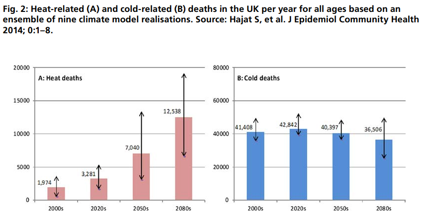
The message being put out is that, given certain assumptions, deaths from heatwaves will increase dramatically due to climate change, but cold deaths will only decline very slightly by the 2050s.
The message from the graphs is if the central projections are true (note the arrows for error bars) in the 2050s cold deaths will still be more than five times the heat deaths. If the desire is to minimize all temperature-related deaths, then even in the 2050s the greater emphasis still ought to be on cold deaths.
The companion figure 4 of the Hajat et al 2014 should also be viewed.

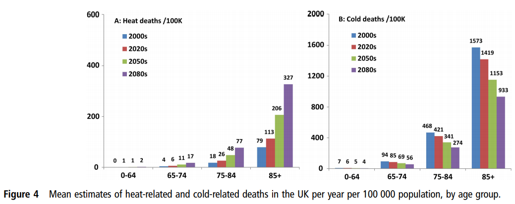
Figure 4 shows that both heat and cold deaths is almost entirely an issue with the elderly, particularly with the 85+ age group.
Hajat et al 2014 looks at regional data for England and Wales. There is something worthy of note in the text to Figure 1(A).

Region-specific and national-level relative risk (95% CI) of mortality due to hot weather. Daily mean temperature 93rd centiles: North East (16.6°C), North West (17.3°C), Yorks & Hum (17.5°C), East Midlands (17.8°C), West Midlands (17.7°C), East England (18.5°C), London (19.6°C), South East (18.3°C), South West (17.6°C), Wales (17.2°C).

The coldest region, the North East, has mean temperatures a full 3°C lower than London, the warmest region. Even with high climate sensitivities, the coldest region (North East) is unlikely to see temperature rises of 3°C in 50 years to make mean temperature as high as London today. Similarly, London will not be as hot as Milan. there would be an outcry if the London had more than three times the heat deaths of Newcastle, or if Milan had had more than three times the heat deaths of London. So how does Hajat et al 2014 reach these extreme conclusions?
There are as number of assumptions that are made, both explicit and implicit.

Assumption 1 : Population Increase

(T)otal UK population is projected to increase from 60 million in mid-2000s to 89 million by mid-2080s

By the 2050s there is roughly a 30% increase in population. Heat death rates per capita only show a 150% increase in five decades.


Assumption 2 : Lack of improvement in elderly vulnerability
Taking the Hajat et al figure 4, the relative proportions hot and cold deaths between age bands is not assumed to change, as my little table below shows.

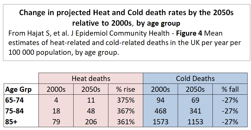
The same percentage changes for all three age bands I find surprising. As the population ages, I would expect the 65-74 and 74-84 age bands to become relatively healthier, continuing the trends of the last few decades. That will make them less vulnerable to temperature extremes.

Assumption 3 : Climate Sensitivities

A subset of nine regional climate model variants corresponding to climate sensitivity in the range of 2.6–4.9°C was used.

The compares to the IPCC AR5 WG1 SPM Page 16

Equilibrium climate sensitivity is likely in the range 1.5°C to 4.5°C (high confidence)

With a mid-point of 3.75°C compared to the IPCC’s 3°C does not make much difference over 50 years. The IPCC’s RCP8.5 unmitigated emissions growth scenario has 3.7°C (4.5-0.8) of warming from 2010 to 2100. Pro-rata the higher sensitivities give about 2.5°C of warming by the 2050s, still making mean temperatures in the North East just below that of London today.
The IPCC WG1 report was published a few months after the Hajat paper was accepted for publication. However, the ECS range 1.5−4.5 was unchanged from the 1979 Charney report, so there should be a least a footnote justifying the higher senitivitity. An alternative approach to these vague estimates derived from climate models is those derived from changes over the historical instrumental data record using energy budget models. The latest – Lewis and Curry 2018 – gives an estimate of 1.5°C. This finding from the latest research would more than halved any predicted warming to the 2050s of the Hajat paper’s central ECS estimate.

Assumption 4 : Short period of temperature data

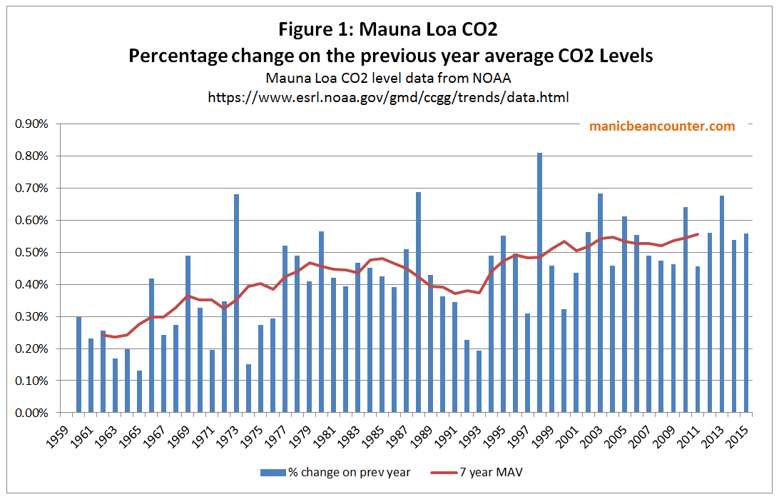
The paper examined both regional temperature data and deaths for the period 1993–2006. This 14 period had significant heatwaves in 1995, 2003 and 2006. Climatically this is a very short period, ending a full six years before the paper was submitted.
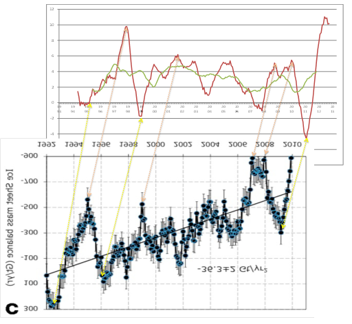
From the Met Office Hadley Centre Central England Temperature Data I have produced the following graphic of seasonal data for 1975-2012, with 1993-2006 shaded.

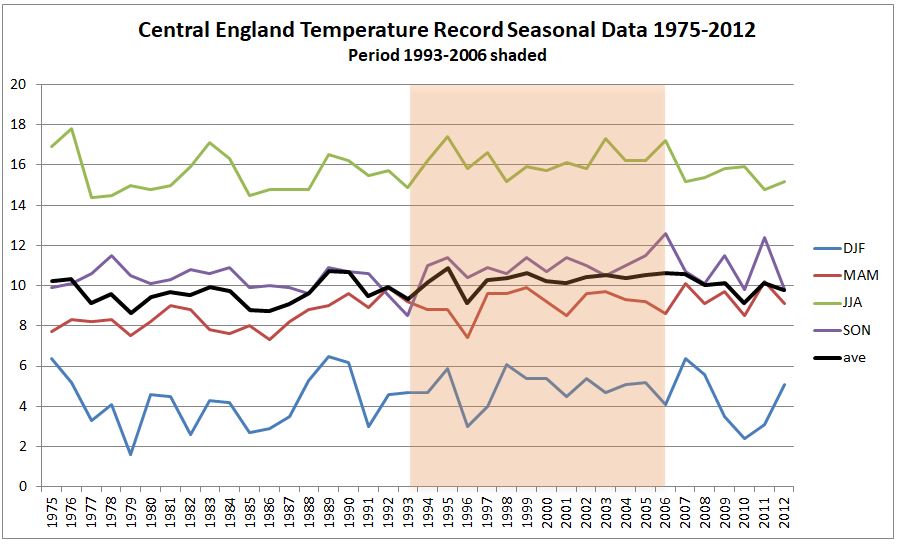
Typical mean summer temperatures (JJA) were generally warmer than in both the period before and the six years after. Winter (DJF) average temperatures for 2009 to 2011 were the coldest three run of winters in the whole period. Is this significant?
A couple of weeks ago the GWPF drew attention to a 2012 Guardian article The shape of British summers to come?

It’s been a dull, damp few months and some scientists think we need to get used to it. Melting ice in Greenland could be bringing permanent changes to our climate
The news could be disconcerting for fans of the British summer. Because when it comes to global warming, we can forget the jolly predictions of Jeremy Clarkson and his ilk of a Mediterranean climate in which we lounge among the olive groves of Yorkshire sipping a fine Scottish champagne. The truth is likely to be much duller, and much nastier – and we have already had a taste of it. “We will see lots more floods, droughts, such as we’ve had this year in the UK,” says Peter Stott, leader of the climate change monitoring and attribution team at the Met Office. “Climate change is not a nice slow progression where the global climate warms by a few degrees. It means a much greater variability, far more extremes of weather.”

Six years of data after the end of the data period, but five months before the paper was submitted on 31/01/2013 and nine months before the revised draft was submitted, there was a completely new projection saying the opposite of more extreme heatwaves.
The inclusion more recent available temperature data is likely to have materially impacted on the modelled extreme hot and cold death temperature projections for many decades in the future.

Assumption 5 : Lack of Adaptation
The heat and cold death projections are “without adaptation”. This assumption means that over the decades people do not learn from experience, buy air conditioners, drink water and look out for the increasing vulnerable. People basically ignore the rise in temperatures, so by the 2050s treat a heatwave of 35°C exactly the same as one of 30°C today. To put this into context, it is worth looking as another papers used in the EAC Report.
Mortality in southern England during the 2003 heat wave by place of death – Kovats et al – Health Statistics Quarterly Spring 2006
The only table is reproduced below.

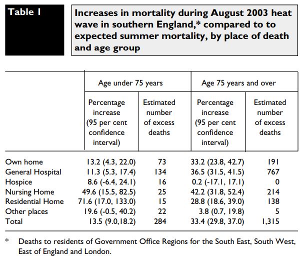
Over half the total deaths were in General Hospitals. What does this “lack of adaptation” assumption imply about the care given by health professionals to vulnerable people in their care? Surely, seeing rising death tolls they would be taking action? Or do they need a political committee in Westminster looking at data well after the event to point out what is happening under there very noses? Even when data been collated and analysed in such publications as the Government-run Health Statistics Quarterly? The assumption of no adaptation should have been alongside and assumption “adaptation after the event and full report” with new extremes of temperature coming as a complete surprise. However, that might still be unrealistic considering “cold deaths” are a current problem.

Assumption 6 : Complete failure of Policy
The assumption high climate sensitivities resulting in large actual rises in global average temperatures in the 2050s and 2080s implies another assumption with political implications. The projection of 7,000 heat-related deaths assumes the complete failure of the Paris Agreement to control greenhouse emissions, let alone keep warming to within any arbitrary 1.5°C or 2°C. The Hajat paper may not state this assumption, but by assuming increasing temperatures from rising greenhouse levels, it is implied that no effective global climate mitigation policies have been implmented. This is a fair assumption. The UNEP emissions Gap Report 2017 (pdf), published in October last year is the latest attempt to estimate the scale of the policy issue. The key is the diagram reproduced below.

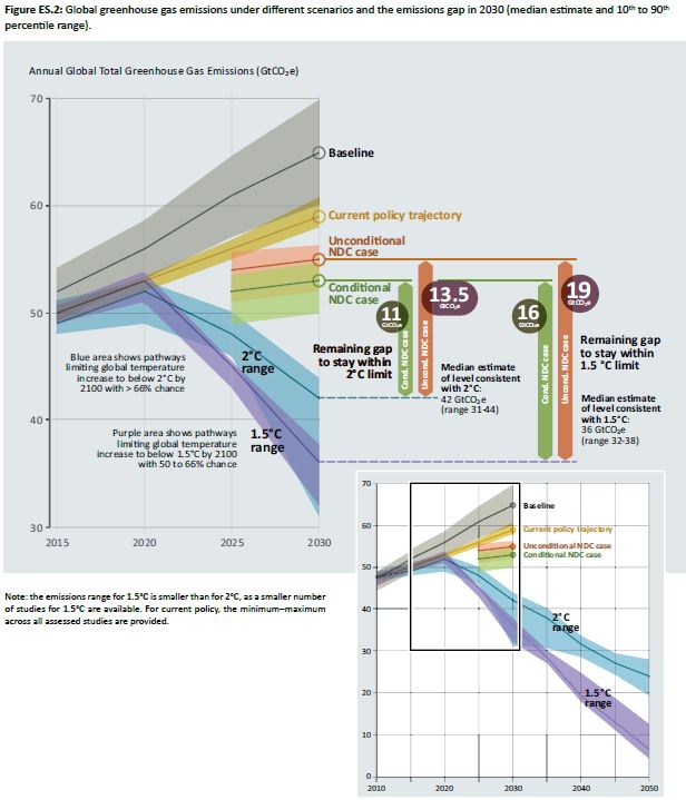
The aggregate impact of climate mitigation policy proposals (as interpreted by the promoters of such policies) is much closer to the non-policy baseline than the 1.5°C or 2°C emissions pathways. That means other countries have failed to follow Britain’s lead in reducing their emissions by 80% by 2050. In its headline “Heat-related deaths set to treble by 2050 unless Govt acts” the Environmental Audit Committee are implicitly accepting that the Paris Agreement will be a complete flop. That the considerable costs and hardships on imposed on the British people by the Climate Change Act 2008 will have been for nothing.

Concluding comments

Projections about the consequences of rising temperatures require making restrictive assumptions to achieve a result. In academic papers, some of these assumptions are explicitly-stated, others not. The assumptions are required to limit the “what-if” scenarios that are played out. The expected utility of modeled projections is related to whether the restrictive assumptions bear relation to actual reality and empirically-verified theory. The projection of over 7,000 heat deaths in the 2050s is based upon

(1) Population growth of 30% by the 2050s

(2) An aging population not getting healthier at any particular age

(3) Climate sensitivities higher than the consensus, and much higher than the latest data-based research findings

(4) A short period of temperature data with trends not found in the next few years of available data

(5) Complete lack of adaptation over decades – an implied insult to health professionals and carers

(6) Failure of climate mitigation policies to control the growth in temperatures.

Assumptions (2) to (5) are unrealistic, and making any more realistic would significantly reduce the projected number of heat deaths in the 2050s. The assumption of lack of adaptation is an implied insult to many health professionals who monitor and adapt to changing conditions. In assuming a lack of climate mitigation policies implies that the £319bn Britain is projected is spent on combating climate change between 2014 and 2030 is a waste of money. Based on available data, this assumption is realistic.

Kevin Marshall

Climate Alarmist Bob Ward’s poor analysis of Research Data

After Christopher Booker’s excellent new Report for the GWPF “Global Warming: A Case Study In Groupthink” was published on 20th February, Bob Ward (Policy and Communications Director at the Grantham Research Institute on Climate Change and the Environment at the LSE) typed a rebuttal article “Do male climate change ‘sceptics’ have a problem with women?“. Ward commenced the article with a highly misleading statement.

On 20 February, the Global Warming Policy Foundation launched a new pamphlet at the House of Lords, attacking the mainstream media for not giving more coverage to climate change ‘sceptics’.

I will lead it to the reader to judge for themselves how misleading the statement is by reading the report or alternatively reading his summary at Capx.co.

At Cliscep (reproduced at WUWT), Jaime Jessop has looked into Ward’s distractive claims about the GWPF gender bias. This comment by Ward particularly caught my eye.

A tracking survey commissioned by the Department for Business, Energy and Industrial Strategy showed that, in March 2017, 7.6% answered “I don’t think there is such a thing as climate change” or “Climate change is caused entirely caused by natural processes”, when asked for their views. Among men the figure was 8.1%, while for women it was 7.1%.

I looked at the Tracking Survey. It is interesting that the Summary of Key Findings contains no mention of gender bias, nor of beliefs on climate change. It is only in the Wave 21 full dataset spreadsheet that you find the results of the question 22.

Q22. Thinking about the causes of climate change, which, if any, of the following best describes your opinion?
[INVERT ORDER OF RESPONSES 1-5]
1. Climate change is entirely caused by natural processes
2. Climate change is mainly caused by natural processes
3. Climate change is partly caused by natural processes and partly caused by human activity
4. Climate change is mainly caused by human activity
5. Climate change is entirely caused by human activity
6. I don’t think there is such a thing as climate change.
7. Don’t know
8. No opinion

Note that the first option presented to the questionee is 5, then 4, then 3, then 2, then 1. There may, therefore, be an inbuilt bias in overstating the support for Climate Change being attributed to human activity. But the data is clearly presented, so a quick pivot table was able to check Ward’s results.

The sample was of 2180 – 1090 females and 1090 males. Adding the responses  to “I don’t think there is such a thing as climate change” or “Climate change is caused entirely caused by natural processes” I get 7.16% for females – (37+41)/1090 – and 8.17% for males – (46+43)/1090. Clearly, Bob Ward has failed to remember what he was taught in high school about roundings.

Another problem is that this is raw data. The opinion pollsters have taken time and care to adjust for various demographic factors by adding a weighting to each line. On this basis, Ward should have reported 6.7% for females, 7.6% for males and 7.1% overall.

More importantly, if males tend to be more sceptical of climate change than females, then they will be less alarmist than females. But the data says something different. Of the weighted responses, to those who opted for the most extreme “Climate change is entirely caused by natural processes“, 12.5% were female and 14.5% were male. Very fractionally at the extreme, men are proportionality more alarmist than females than they are sceptical. More importantly, men are slightly more extreme in their opinions on climate change (for or against) than women.

The middle ground is the response to “Climate change is partly caused by natural processes and partly caused by human activity“. The weighted response was 44.5% female and 40.7% male, confirming that men are more extreme in their views than women.

There is a further finding that can be drawn. The projections by the IPCC for future unmitigated global warming assume that all, or the vast majority of, global warming since 1850 is human-caused. Less than 41.6% of British women and 43.2% of British men agree with this assumption that justifies climate mitigation policies.

Below are my summaries. My results are easily replicated for those with an intermediate level of proficiency in Excel.

Learning Note

The most important lesson for understanding data is to analyse that data from different perspectives, against different hypotheses. Bob Ward’s claim of a male gender bias towards climate scepticism in an opinion survey, upon a slightly broader analysis, becomes one where British males are slightly more extreme and forthright in their views than British females whether for or against. This has parallels to my conclusion when looking at the 2013 US study The Role of Conspiracist Ideation and Worldviews in Predicting Rejection of Science – Stephan Lewandowsky, Gilles E. Gignac, Klaus Oberauer. Here I found that rather than the paper’s finding that conspiracist ideation being “associated with the rejection of all scientific propositions tested”, the data strongly indicated that people with strong opinions on one subject, whether for or against, tend to have strong opinions on other subjects, whether for or against. Like with any bias of perspective, (ideological, religious, gender, race, social class, national, football team affiliation etc.) the way to counter bias is to concentrate on the data. Opinion polls are a poor starting point, but at least they may report on perspectives outside of one’s own immediate belief systems. 

Kevin Marshall

How strong is the Consensus Evidence for human-caused global warming?

You cannot prove a vague theory wrong. If the guess that you make is poorly expressed and the method you have for computing the consequences is a little vague then ….. you see that the theory is good as it can’t be proved wrong. If the process of computing the consequences is indefinite, then with a little skill any experimental result can be made to look like an expected consequence.

Richard Feynman – 1964 Lecture on the Scientific Method

It’s self-evident that democratic societies should base their decisions on accurate information. On many issues, however, misinformation can become entrenched in parts of the community, particularly when vested interests are involved. Reducing the influence of misinformation is a difficult and complex challenge.

The Debunking Handbook 2011 – John Cook and Stephan Lewandowsky

My previous post looked at the attacks on David Rose for daring to suggest that the rapid fall in global land temperatures at the El Nino event were strong evidence that the record highs in global temperatures were not due to human greenhouse gas emissions. The technique used was to look at long-term linear trends. The main problems with this argument were
(a) according to AGW theory warming rates from CO2 alone should be accelerating and at a higher rate than the estimated linear warming rates from HADCRUT4.
(b) HADCRUT4 shows warming stopped from 2002 to 2014, yet in theory the warming from CO2 should have accelerated.

Now there are at least two ways to view my arguments. First is to look at Feynman’s approach. The climatologists and associated academics attacking journalist David Rose chose to do so from a perspective of a very blurred specification of AGW theory. That is human emissions will cause greenhouse gas levels to rise, which will cause global average temperatures to rise. Global average temperature clearly have risen from all long-term (>40 year) data sets, so theory is confirmed. On a rising trend, with large variations due to natural variability, then any new records will be primarily “human-caused”. But making the theory and data slightly less vague reveals an opposite conclusion. Around the turn of the century the annual percentage increase in CO2 emissions went from 0.4% to 0.5% a year (figure 1), which should have lead to an acceleration in the rate of warming. In reality warming stalled.

The reaction was to come up with a load of ad hoc excuses. Hockey Schtick blog reached 66 separate excuses for the “pause” by November 2014, from the peer-reviewed to a comment in the UK Parliament.  This could be because climate is highly complex, with many variables, the presence of each contributing can only be guessed at, let alone the magnitude of each factor and the interrelationships with all factors. So how do you tell which statements are valid information and which are misinformation? I agree with Cook and Lewandowsky that misinformation is pernicious, and difficult to get rid of once it becomes entrenched. So how does one evaluate distinguish between the good information and the bad, misleading or even pernicious?

The Lewandowsky / Cook answer is to follow the consensus of opinion. But what is the consensus of opinion? In climate one variation is to follow a small subset of academics in the area who answer in the affirmative to

1. When compared with pre-1800s levels, do you think that mean global temperatures have generally risen, fallen, or remained relatively constant?

2. Do you think human activity is a significant contributing factor in changing mean global temperatures?

Problem is that the first question is just reading a graph and the second could be is a belief statement will no precision. Anthropogenic global warming has been a hot topic for over 25 years now. Yet these two very vague empirically-based questions, forming the foundations of the subject, should be able to be formulated more precisely. On the second it is a case of having pretty clear and unambiguous estimates as to the percentage of warming, so far, that is human caused. On that the consensus of leading experts are unable to say whether it is 50% or 200% of the warming so far. (There are meant to be time lags and factors like aerosols that might suppress the warming). This from the 2013 UNIPCC AR5 WG1 SPM section D3:-

It is extremely likely that more than half of the observed increase in global average surface temperature from 1951 to 2010 was caused by the anthropogenic increase in greenhouse gas concentrations and other anthropogenic forcings together.

The IPCC, encapsulating the state-of-the-art knowledge, cannot provide firm evidence in the form of a percentage, or even a fairly broad range even with over 60 years of data to work on..  It is even worse than it appears. The extremely likely phrase is a Bayesian probability statement. Ron Clutz’s simple definition from earlier this year was:-

Here’s the most dumbed-down description: Initial belief plus new evidence = new and improved belief.

For the IPCC claim that their statement was extremely likely, at the fifth attempt, they should be able to show some sort of progress in updating their beliefs to new evidence. That would mean narrowing the estimate of the magnitude of impact of a doubling of CO2 on global average temperatures. As Clive Best documented in a cliscep comment in October, the IPCC reports, from 1990 to 2013 failed to change the estimate range of 1.5°C to 4.5°C. Looking up Climate Sensitivity in Wikipedia we get the origin of the range estimate.

A committee on anthropogenic global warming convened in 1979 by the National Academy of Sciences and chaired by Jule Charney estimated climate sensitivity to be 3 °C, plus or minus 1.5 °C. Only two sets of models were available; one, due to Syukuro Manabe, exhibited a climate sensitivity of 2 °C, the other, due to James E. Hansen, exhibited a climate sensitivity of 4 °C. “According to Manabe, Charney chose 0.5 °C as a not-unreasonable margin of error, subtracted it from Manabe’s number, and added it to Hansen’s. Thus was born the 1.5 °C-to-4.5 °C range of likely climate sensitivity that has appeared in every greenhouse assessment since…

It is revealing that quote is under the subheading Consensus Estimates. The climate community have collectively failed to update the original beliefs, based on a very rough estimate. The emphasis on referring to consensus beliefs about the world, rather than looking outward for evidence in the real world, I would suggest is the primary reason for this failure. Yet such community-based beliefs completely undermines the integrity of the Bayesian estimates, making its use in statements about climate clear misinformation in Cook and Lewandowsky’s use of the term. What is more, those in the climate community who look primarily to these consensus beliefs rather than the data of the real world will endeavour to dismiss the evidence, or make up ad hoc excuses, or smear those who try to disagree. A caricature of these perspectives with respect to global average temperature anomalies is available in the form of a flickering widget at John Cooks’ skepticalscience website. This purports to show the difference between “realist” consensus and “contrarian” non-consensus views. Figure 2 is a screenshot of the consensus views, interpreting warming as a linear trend. Figure 3 is a screenshot of the non-consensus or contrarian views. They is supposed to interpret warming as a series of short, disconnected,  periods of no warming. Over time, each period just happens to be at a higher level than the previous. There are a number of things that this indicates.

(a) The “realist” view is of a linear trend throughout any data series. Yet the period from around 1940 to 1975 has no warming or slight cooling depending on the data set. Therefore any linear trend line derived for a longer period than 1970 to 1975 and ending in 2015 will show a lower rate of warming. This would be consistent the rate of CO2 increasing over time, as shown in figure 1. But for shorten the period, again ending in 2015, and once the period becomes less than 30 years, the warming trend will also decrease. This contracts the theory, unless ad hoc excuses are used, as shown in my previous post using the HADCRUT4 data set.

(b) Those who agree with the consensus are called “Realist”, despite looking inwards towards common beliefs. Those who disagree with warming are labelled “Contrarian”. This is not inaccurate when there is a dogmatic consensus. But it utterly false to lump all those who disagree with the same views, especially when no examples are provided of those who hold such views.

(c) The linear trend appears as a more plausible fit than the series of “contrarian” lines. By implication, those who disagree with the consensus are viewed as as having a distinctly more blinkered and distorted perspective than those who follow the consensus. Yet even using gistemp data set (which is gives greatest support to the consensus views) there is a clear break in the linear trend. The less partisan HADCRUT4 data shows an even greater break.

Those who spot the obvious – that around the turn of the century warming stopped or slowed down, when in theory it should have accelerated – are given a clear choice. They can conform to the scientific consensus, denying the discrepancy between theory and data. Or they can act as scientists, denying the false and empirically empty scientific consensus, receiving the full weight of all the false and career-damaging opprobrium that accompanies it.

fig2-sks-realists


fig3-sks-contras

Kevin Marshall


Beliefs and Uncertainty: A Bayesian Primer

Ron Clutz’s introduction, based on a Scientific American article by John Horgan on January 4, 2016, starts to grapple with the issues involved.

The take home quote from Horgan is on the subject of false positives.

Here is my more general statement of that principle: The plausibility of your belief depends on the degree to which your belief–and only your belief–explains the evidence for it. The more alternative explanations there are for the evidence, the less plausible your belief is. That, to me, is the essence of Bayes’ theorem.

“Alternative explanations” can encompass many things. Your evidence might be erroneous, skewed by a malfunctioning instrument, faulty analysis, confirmation bias, even fraud. Your evidence might be sound but explicable by many beliefs, or hypotheses, other than yours.

In other words, there’s nothing magical about Bayes’ theorem. It boils down to the truism that your belief is only as valid as its evidence. If you have good evidence, Bayes’ theorem can yield good results. If your evidence is flimsy, Bayes’ theorem won’t be of much use. Garbage in, garbage out.
With respect to the question of whether global warming is human caused, there is basically a combination of three elements – (i) Human caused (ii) Naturally caused (iii) Random chaotic variation. There may be a number of sub-elements and an infinite number of combinations including some elements counteracting others, such as El Nino events counteracting underlying warming. Evaluation of new evidence is in the context of explanations being arrived at within a community of climatologists with strong shared beliefs that at least 100% of recent warming is due to human GHG emissions. It is that same community who also decide the measurement techniques for assessing the temperature data; the relevant time frames; and the categorization of the new data. With complex decisions the only clear decision criteria is conformity to the existing consensus conclusions. As a result, the original Bayesian estimates become virtually impervious to new perspectives or evidence that contradicts those original estimates.

Science Matters

Those who follow discussions regarding Global Warming and Climate Change have heard from time to time about the Bayes Theorem. And Bayes is quite topical in many aspects of modern society:

Bayesian statistics “are rippling through everything from physics to cancer research, ecology to psychology,” The New York Times reports. Physicists have proposed Bayesian interpretations of quantum mechanics and Bayesian defenses of string and multiverse theories. Philosophers assert that science as a whole can be viewed as a Bayesian process, and that Bayes can distinguish science from pseudoscience more precisely than falsification, the method popularized by Karl Popper.

Named after its inventor, the 18th-century Presbyterian minister Thomas Bayes, Bayes’ theorem is a method for calculating the validity of beliefs (hypotheses, claims, propositions) based on the best available evidence (observations, data, information). Here’s the most dumbed-down description: Initial belief plus new evidence = new and improved belief.   (A fuller and…

View original post 1,082 more words

Freeman Dyson on Climate Models

One of the leading physicists on the planet, Freeman Dyson, has given a video interview to the Vancouver Sun. Whilst the paper emphasizes Dyson’s statements about the impact of more CO2 greening the Earth, there is something more fundamental that can be gleaned.

Referring to a friend who constructed the first climate models, Dyson says at about 10.45

These climate models are excellent tools for understanding climate, but that they are very bad tools for predicting climate. The reason is simple – that they are models which have very few of the factors that may be important, so you can vary one thing at a time ……. to see what happens – particularly carbon dioxide. But there are a whole lot of things that they leave out. ….. The real world is far more complicated than the models.

I believe that Climate Science has lost sight of what this understanding of what their climate models actually are literally attempts to understand the real world, but are not the real world at all. It reminds me of something another physicist spoke about fifty years ago. Richard Feynman, a contemporary that Dyson got to know well in the late 1940s and early 1950s said of theories:-

You cannot prove a vague theory wrong. If the guess that you make is poorly expressed and the method you have for computing the consequences is a little vague then ….. you see that the theory is good as it can’t be proved wrong. If the process of computing the consequences is indefinite, then with a little skill any experimental result can be made to look like an expected consequence.

Complex mathematical models suffer from this vagueness in abundance. When I see supporters of climate arguing the critics of the models are wrong by stating some simple model, and using selective data they are doing what lesser scientists and pseudo-scientists have been doing for decades. How do you confront this problem? Climate is hugely complex, so simple models will always fail on the predictive front. However, unlike Dyson I do not think that all is lost. The climate models have had a very bad track record due to climatologists not being able to relate their models to the real world. There are a number of ways they could do this. A good starting point is to learn from others. Climatologists could draw upon the insights from varied sources. With respect to the complexity of the subject matter, the lack of detailed, accurate data and the problems of prediction, climate science has much in common with economics. There are insights that can be drawn on prediction. One of the first empirical methodologists was the preeminent (or notorious) economist of the late twentieth century – Milton Friedman. Even without his monetarism and free-market economics, he would be known for his 1953 Essay “The Methodology of Positive Economics”. Whilst not agreeing with the entirety of the views expressed (there is no satisfactory methodology of economics) Friedman does lay emphasis on making simple, precise and bold predictions. It is the exact opposite of the Cook et al. survey which claims a 97% consensus on climate, implying that it relates to a massive and strong relationship between greenhouse gases and catastrophic global warming when in fact it relates to circumstantial evidence for a minimal belief in (or assumption of) the most trivial form of human-caused global warming. In relation to climate science, Friedman would say that it does not matter about consistency with the basic physics, nor how elegantly the physics is stated. It could be you believe that the cause of warming comes from the hot air produced by the political classes. What matters that you make bold predictions based on the models that despite being simple and improbable to the non-expert, nevertheless turn out to be true. However, where bold predictions have been made that appear to be improbable (such as worsening hurricanes after Katrina or the effective disappearance of Arctic Sea ice in late 2013) they have turned out to be false.

Climatologists could also draw upon another insight, held by Friedman, but first clearly stated by John Neville Keynes (father of John Maynard Keynes). That is on the need to clearly distinguish between the positive (what is) and the normative (what ought to be). But that distinction was alienate the funders and political hangers-on. It would also mean a clear split of the science and policy.

Hattips to Hilary Ostrov, Bishop Hill, and Watts up with that.


Kevin Marshall

Dixon and Jones confirm a result on the Stephan Lewandowsky Surveys

Congratulations to Ruth Dixon and Jonathan Jones on managing to get a commentary on the two Stephan Lewandowsky, Gilles Gignac & Klaus Oberauer surveys published in Psychological Science. Entitled “Conspiracist Ideation as a Predictor of Climate Science Rejection: An Alternative Analysis” it took two years to get published. Ruth Dixon gives a fuller description on her blog, My Garden Pond. It confirms something that I have stated independently, with the use of pivot tables instead of advanced statistical techniques. In April last year I compared the two surveys in a couple of posts – Conspiracist Ideation Falsified? (CIF) & Extreme Socialist-Environmentalist Ideation as Motivation for belief in “Climate Science” (ESEI).

The major conclusion through their analysis of the survey

All the data really shows is that people who have no opinion about one fairly technical matter (conspiracy theories) also have no opinion about another fairly technical matter (climate change). Complex models mask this obvious (and trivial) finding.

In CIF my summary was

A recent paper, based on an internet survey of American people, claimed that “conspiracist ideation, is associated with the rejection of all scientific propositions tested“. Analysis of the data reveals something quite different. Strong opinions with regard to conspiracy theories, whether for or against, suggest strong support for strongly-supported scientific hypotheses, and strong, but divided, opinions on climate science.

In the concluding comments I said

The results of the internet survey confirm something about people in the United States that I and many others have suspected – they are a substantial minority who love their conspiracy theories. For me, it seemed quite a reasonable hypothesis that these conspiracy lovers should be both suspicious of science and have a propensity to reject climate science. Analysis of the survey results has over-turned those views. Instead I propose something more mundane – that people with strong opinions in one area are very likely to have strong opinions in others. (Italics added)

Dixon and Jones have a far superior means of getting to the results. My method is to input the data into a table, find groupings or classifications, then analyse the results via pivot tables or graphs. This mostly leads up blind alleys, but can develop further ideas. For every graph or table in my posts, there can be a number of others stashed on my hard drive. To call it “trial and error” misses out the understanding to be gained from analysis. Their method (through rejecting linear OLS) is loess local regression. They derive the following plot.

This compares with my pivot table for the same data.

The shows in the Grand Total row that the strongest Climate (band 5) comprise 12% of the total responses. For the smallest group of beliefs about conspiracy theories with just 60/5005 responses, 27% had the strongest beliefs in about climate. The biggest percentage figure is the group who averaged a middle “3” score on both climate and conspiracy theories. That is those with no opinion on either subject.

The more fundamental area that I found is that in the blog survey between strong beliefs in climate science and extreme left-environmentalist political views. It is a separate topic, and its inclusion by Dixon and Jones would have both left much less space for the above insight in 1,000 words, and been much more difficult to publish. The survey data is clear.

The blog survey (which was held on strongly alarmist blogs) shows that most of the responses were highly skewed to anti-free market views (that is lower response score) along with being strongly pro-climate.

The internet survey of the US population allowed 5 responses instead of 4. The fifth was a neutral. This shows a more normal distribution of political beliefs, with over half of the responses in the middle ground.

This shows what many sceptics have long suspected, but I resisted. Belief in “climate science” is driven by leftish world views. Stephan Lewandowsky can only see the link between the “climate denial” beliefs and free-market, because he views left-environmentalist perspectives and “climate science” as a priori truths. This is the reality that everything is to be measured. From this perspective climate science has not failed due to being falsified by the evidence, but because scientists have yet to find the evidence; the models need refining; and there is a motivated PR campaign to undermine these efforts.

Kevin Marshall