Thomas Fuller on polar-bear-gate at Cliscep

This is an extended version of a comment made at Thomas Fuller’s cliscep article Okay, just one more post on polar-bear-gate… I promise…

There are three things highlighted in the post and the comments that illustrate the Polar Bear smear paper as being a rich resource towards understanding the worst of climate alarmism.

First is from Alan Kendall @ 28 Dec 17 at 9:35 am

But what Harvey et al. ignores is that Susan Crockford meticulously quotes from the “approved canon of polar bear research” and exhorts her readers to read it (making an offer to provide copies of papers difficult to obtain). She provides an entree into that canon- an entree obviously used by many and probably to the fury of polar bear “experts”.

This is spot on about Susan Crockford, and, in my opinion, what proper academics should be aiming at. To assess an area where widely different perspectives are possible, I was taught that it is necessary to read and evaluate the original documents. Climate alarmists in general, and this paper in particular, evaluate in relation collective opinion as opposed to more objective criteria. In the paper, “science” is about support for a partly fictional consensus, “denial” is seeking to undermine that fiction. On polar bears this is clearly stated in relation to the two groups of blogs.

We found a clear separation between the 45 science-based blogs and the 45 science-denier blogs. The two groups took diametrically opposite positions on the “scientific uncertainty” frame—specifically regarding the threats posed by AGW to polar bears and their Arctic-ice habitat. Scientific blogs provided convincing evidence that AGW poses a threat to both, whereas most denier blogs did not.

A key element is to frame statements in terms of polar extremes.

Second, is the extremely selective use of the data (or selective analysis methods) to enable the desired conclusion to be reached. Thomas Fuller has clearly pointed out in the article and restated in the comments with respect to WUWT, the following.

Harvey and his 13 co-authors state that WUWT overwhelmingly links to Crockford. I have shown that this is not the case.

Selective use of data (or selective analysis methods) is common on climate alarmism. For instance

  • The original MBH 98 Hockey-Stick graph used out-of-date temperature series, or tree-ring proxies such as at Gaspe in Canada, that were not replicated by later samples.
  • Other temperature reconstructions. Remember Keith Briffa’s Yamal reconstruction, which relied on one tree for the post-1990 reconstructions? (see here and here)
  • Lewandowsky et al “Moon Hoax” paper. Just 10 out of 1145 survey respondents supported the “NASA faked the Moon Landings” conspiracy theory. Of these just 2 dogmatically rejected “climate”. These two faked/scam/rogue respondents 860 & 889 supported every conspiracy theory, underpinning many of the correlations.
  • Smoothing out the pause in warming in Risbey, Lewandowsky et al 2014 “Well-estimated global surface warming in climate projections selected for ENSO phase”. In The Lewandowsky Smooth, I replicated the key features of the temperature graph in Excel, showing how no warming for a decade in Hadcrut4 was made to appear as if there was hardly a cessation of warming.

Third, is to frame the argument in terms of polar extremes. Richard S J Tol @ 28 Dec 17 at 7:13 am

And somehow the information in those 83 posts was turned into a short sequence of zeros and ones.

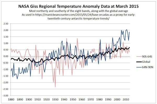
Not only one many issues is there a vast number of intermediate positions possible (the middle ground), there are other dimensions. One is the strength of evidential support for a particular perspective. There could be little or no persuasive evidence. Another is whether there is support for alternative perspectives. For instance, although sea ice data is lacking for the early twentieth-century warming, average temperature data is available for the Arctic. NASA Gistemp (despite its clear biases) has estimates for 64N-90N.

The temperature data seems to clearly indicate that all of the decline in Arctic sea ice from 1979 is unlikely to be attributed to AGW. From the 1880s to 1940 there was a similar magnitude of Arctic warming as from 1979 t0 2010 with cooling in between. Yet the rate of increase in GHG levels was greater from greater in 1975-2010 than 1945-1975, which was in turn greater than the period decades before.

Kevin Marshall


Evidence for the Stupidest Paper Ever

Judith Curry tweeted a few days ago

This is absolutely the stupidest paper I have ever seen published.
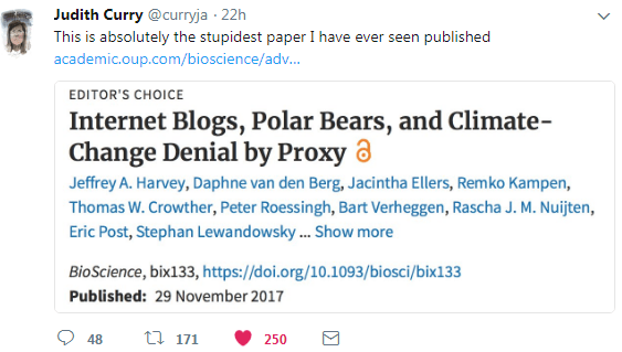
What might cause Judith Curry to make such a statement about Internet Blogs, Polar Bears, and Climate-Change Denial by Proxy? Below are some notes that illustrate what might be considered stupidity.

Warmest years are not sufficient evidence of a warming trend

The US National Oceanic and Atmospheric Administration (NOAA) and National Aeronautics and Space Administration (NASA) both recently reported that 2016 was the warmest year on record (Potter et al. 2016), followed by 2015 and 2014. Currently, 2017 is on track to be the second warmest year after 2016. 

The theory is that rising greenhouse gas levels are leading to warming. The major greenhouse gas is CO2, supposedly accounting for about 75% of the impact. There should, therefore, be a clear relationship between the rising CO2 levels and rising temperatures. The form that the relationship should take is that an accelerating rise in CO2 levels will lead to an accelerating rate of increase in global average temperatures. Earlier this year I graphed the rate of change in CO2 levels from the Mauna Loa data.
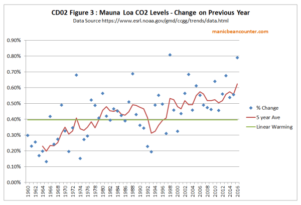
The trend over nearly sixty years should be an accelerating trend. Depending on which temperature dataset you use, around the turn of the century warming either stopped or dramatically slowed until 2014. A strong El Nino caused a sharp spike in the last two or three years. The data contradicts the theory in the very period when the signal should be strongest.

Only the stupid would see record global average temperatures (which were rising well before the rise in CO2 was significant) as strong evidence of human influence when a little understanding of theory would show the data contradicts that influence.

Misrepresentation of Consensus Studies

The vast majority of scientists agree that most of the warming since the Industrial Revolution is explained by rising atmospheric greenhouse gas (GHG) concentrations (Doran and Zimmerman 2009, Cook et al. 2013, Stenhouse et al. 2014, Carlton et al 2015, Verheggen et al. 2015), 

Doran and Zimmerman 2009 asked two questions

1. When compared with pre-1800s levels, do you think that mean global temperatures have generally risen, fallen, or remained relatively constant?

2. Do you think human activity is a significant contributing factor in changing mean global temperatures?

Believing that human activity is a significant contributing factor to rising global temperatures does not mean one believes the majority of warming is due to rising GHG concentrations. Only the stupid would fail to see the difference. Further, the results were a subset of all scientists, namely geoscientists. The reported 97% consensus was from a just 79 responses, a small subset of the total 3146 responses. Read the original to find out why.

The abstract to Cook et al. 2013 begins

We analyze the evolution of the scientific consensus on anthropogenic global warming (AGW) in the peer-reviewed scientific literature, examining 11 944 climate abstracts from 1991–2011 matching the topics ‘global climate change’ or ‘global warming’. We find that 66.4% of abstracts expressed no position on AGW, 32.6% endorsed AGW, 0.7% rejected AGW and 0.3% were uncertain about the cause of global warming. Among abstracts expressing a position on AGW, 97.1% endorsed the consensus position that humans are causing global warming. 

Expressing a position does not mean a belief. It could be an assumption. The papers were not necessarily by scientists, but merely authors of academic papers that involved the topics ‘global climate change’ or ‘global warming’. Jose Duarte listed some of the papers that were included in the survey, along with looking at some that were left out. It shows a high level of stupidity to use these flawed surveys as supporting the statement “The vast majority of scientists agree that most of the warming since the Industrial Revolution is explained by rising atmospheric greenhouse gas (GHG) concentrations“.

Belief is not Scientific Evidence

The most recent edition of climate bible from the UNIPCC states (AR5 WG1 Ch10 Page 869)

It is extremely likely that human activities caused more than half of the observed increase in GMST from 1951 to 2010.

Mispresenting surveys about beliefs are necessary because the real world data, even when that data is a deeply flawed statisticdoes not support the belief that “most of the warming since the Industrial Revolution is explained by rising atmospheric greenhouse gas (GHG) concentrations“.  

Even if the survey data supported the statement, the authors are substituting banal statements about beliefs for empirically-based scientific statements. This is the opposite direction to achieving science-based understanding. 

The false Consensus Gap

The article states

This chasm between public opinion and scientific agreement on AGW is now commonly referred to as the consensus gap (Lewandowsky et al. 2013)

Later is stated, in relation to sceptical blogs

Despite the growing evidence in support of AGW, these blogs continue to aggressively deny the causes and/or the projected effects of AGW and to personally attack scientists who publish peer-reviewed research in the field with the aim of fomenting doubt to maintain the consensus gap.

There is no reference that tracks the growing evidence in support of AGW. From WUWT (and other blogs) there has been a lot of debunking of the claims of the signs of climate apocalypse such as

  • Malaria increasing as a result of warming
  • Accelerating polar ice melt / sea level rise
  • Disappearing snows of Kilimanjaro due to warming
  • Kiribati and the Maldives disappearing due to sea level rise
  • Mass species extinction
  • Himalayan glaciers disappearing
  • The surface temperature record being a true and fair estimate of real warming
  • Climate models consistently over-estimating warming

The to the extent that a consensus gap exists it is between the consensus beliefs of the climate alarmist community and actual data. Scientific support from claims about the real world come from conjectures being verified, not by the volume of publications about the subject.

Arctic Sea Ice Decline and threats to Polar Bear Populations

The authors conjecture (with references) with respect to Polar Bears that

Because they can reliably catch their main prey, seals (Stirling and Derocher 2012, Rode et al. 2015), only from the surface of the sea ice, the ongoing decline in the seasonal extent and thickness of their sea-ice habitat (Amstrup et al. 2010, Snape and Forster 2014, Ding et al. 2017) is the most important threat to polar bears’ long-term survival.

That seems plausible enough. Now for the evidence to support the conjecture.

Although the effects of warming on some polar-bear subpopulations are not yet documented and other subpopulations are apparently still faring well, the fundamental relationship between polar-bear welfare and sea-ice availability is well established, and unmitigated AGW assures that all polar bears ultimately will be negatively affected. 

There is a tacit admission that the existing evidence contradicts the theory. There is data showing a declining trend in sea ice for over 35 years, yet in that time the various polar bear populations have been growing significantly, not just “faring well“. Surely there should be a decline by now in the peripheral Arctic areas where the sea ice has disappeared? The only historical evidence of decline is this comment in criticizing Susan Crockford’s work.

For example, when alleging sea ice recovered after 2012, Crockford downplayed the contribution of sea-ice loss to polar-bear population declines in the Beaufort Sea.

There is no reference to this claim, so readers cannot check if the claim is supported. But 2012 was an outlier year, with record lows in the Summer minimum sea ice extent due to unusually fierce storms in August. Losses of polar bears due to random & extreme weather events are not part of any long-term decline in sea ice.

Concluding Comments

The stupid errors made include

  • Making a superficial point from the data to support a conjecture, when deeper understanding contradicts it. This is the case with the conjecture that rising GHG levels are the main cause of recent warming.
  • Clear misrepresentation of opinion surveys.
  • Even if the opinion surveys were correctly interpreted, use of opinion to support scientific conjectures, as opposed looking at statistical tests of actual data or estimates should appear stupid from a scientific perspective.
  • Claims that a consensus gap between consensus and sceptic views when the real gap is between consensus opinion and actual data.
  • Claims that polar bear populations will decline as sea ice declines is contradicted by the historical data. There is no recognition of this contradiction.

I believe Harvey et al paper gives some lessons for climatologists in particular and academics in general.

First is that when making claims crucial to the argument they need to be substantiated. That substantiation needs to be more than referencing others who have said the same claims before.

Second is that points drawn from referenced articles should be accurately represented.

Third, is to recognize that scientific papers need to first reference actual data and estimates, not opinions.  It is by comparing the current opinions with the real world that opportunities for advancement of understanding arise.

Fourth is that any academic discipline should aim to move from conjectures to empirically-based verifiable statements.

I have only picked out some of the more obvious of the stupid points. The question that needs to be asked is why such stupidity should have been agreed upon by 14 academics and then passed peer review?

Kevin Marshall
Failed Arctic Sea Ice predictions illustrates Degenerating Climatology

The Telegraph yesterday carried an interesting article. Telegraph Experts said Arctic sea ice would melt entirely by September 2016 – they were wrong

Dire predictions that the Arctic would be devoid of sea ice by September this year have proven to be unfounded after latest satellite images showed there is far more now than in 2012.
Scientists such as Prof Peter Wadhams, of Cambridge University, and Prof Wieslaw Maslowski, of the Naval Postgraduate School in Moderey, California, have regularly forecast the loss of ice by 2016, which has been widely reported by the BBC and other media outlets.

In June, Michel at Trustyetverify blog traced a number of these false predictions. Michel summarized

(H)e also predicted until now:
• 2008 (falsified)
• 2 years from 2011 → 2013 (falsified)
• 2015 (falsified)
• 2016 (still to come, but will require a steep drop)
• 2017 (still to come)
• 2020 (still to come)
• 10 to 20 years from 2009 → 2029 (still to come)
• 20 to 30 years from 2010 → 2040 (still to come).

The 2016 prediction is now false. Paul Homewood has been looking at Professor Wadhams’ failed prophesies in a series of posts as well.

The Telegraph goes on to quote from three, more moderate, sources. One of them is :-

Andrew Shepherd, professor of earth observation at University College London, said there was now “overwhelming consensus” that the Arctic would be free of ice in the next few decades, but warned earlier predictions were based on poor extrapolation.
“A decade or so ago, climate models often failed to reproduce the decline in Arctic sea ice extent revealed by satellite observations,” he said.
“One upshot of this was that outlier predictions based on extrapolation alone were able to receive wide publicity.
“But climate models have improved considerably since then and they now do a much better job of simulating historical events.
This means we have greater confidence in their predictive skill, and the overwhelming consensus within the scientific community is that the Arctic Ocean will be effectively free of sea ice in a couple of decades should the present rate of decline continue.

(emphasis mine)

Professor Shepard is saying that the shorter-term (from a few months to a few years) highly dire predictions have turned out to be false, but improved techniques in modelling enable much more sound predictions over 25-50 years to be made. That would require a development on two dimensions – scale and time. Detecting a samll human-caused change over decades needs far greater skill in differentiating from natural variations on a year-by-year time scale from a dramatic shift. Yet it would appear that at the end of the last century there was a natural upturn following from an unusually cold period in the 1950s to the 1970s, as documented by HH Lamb. This resulted in an extension in the sea ice. Detection of the human influence problem is even worse if the natural reduction in sea ice has worked concurrently with that human influence. However, instead of offering us demonstrated increased technical competency in modelling (as opposed to more elaborate models), Professor Shepard offers us the consensus of belief that the more moderate predictions are reliable.
This is a clear example of degenerating climatology that I outlined in last year. In particular, I proposed that rather than progressive climate science – increasing scientific evidence and more rigorous procedures for tighter hypotheses about clear catastrophic anthropogenic global warming – we have degenerating climatology, which is ever weaker and vaguer evidence for some global warming.

If Professor Wadhams had consistently predicted the lack of summer sea ice for a set time period, then it would be strong confirmation of a potentially catastrophic problem. Climatology would have scored a major success. Even if instead of ice-free summers by now, there had been evidence of clear acceleration in the decline in sea ice extent, then it could have been viewed as some progression. But instead we should accept a consensus of belief that will only be confirmed or refuted decades ahead. The interpretation of success or failure. will then, no doubt, be given to the same consensus who were responsible for the vague predictions in the first place.

Kevin Marshall

Reykjavik Temperature Adjustments – a comparison

Summary

On 20th February, Paul Homewood made some allegations that the temperature adjustments for Reykjavík were not supported by any known reasons. The analysis was somewhat vague. I have looked into the adjustments by both the GHCN v3 and NASA GISS. The major findings, which support Homewood’s view, are:-

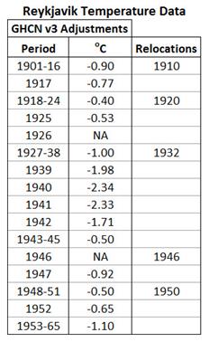
  • The GHCN v3 adjustments appear entirely arbitrary. They do not correspond to the frequent temperature relocations. Much of the period from 1901-1965 is cooled by a full one degree centigrade.
  • Even more arbitrary was the adjustments for the period 1939-1942. In years where there was no anomalous spike in the data, a large cool period was created.
  • Also, despite there being complete raw data, the GHCN adjusters decided to dismiss the data from 1926 and 1946.
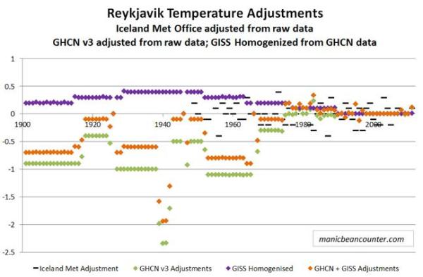
  • The NASA GISS homogenisation adjustments were much smaller in magnitude, and to some extent partly offset the GHCN adjustments. The greatest warming was of the 1929-51 period.

The combined impact of the adjustments is to change the storyline from the data, suppressing the early twentieth century warming and massively reducing the mid-century cooling. As a result an impression is created that the significant warming since the 1980s is unprecedented.


Analysis of the adjustments

There are a number of data sets to consider. There is the raw data available from 1901 to 2011 at NASA GISS. Nick Stokes has confirmed that this is the same raw data issued by the Iceland Met Office, baring a few roundings. The adjustments made by the Iceland Met Office are unfortunately only available from 1948. Quite separate, is the Global Historical Climatology Network dataset (GHCN v3) from the US National Oceanic and Atmospheric Administration (NOAA) I accessed from NASA GISS, along with the GISS’s own homogenised data used to compile the GISTEMP global temperature anomaly.

The impact of the adjustments from the raw data is as follows

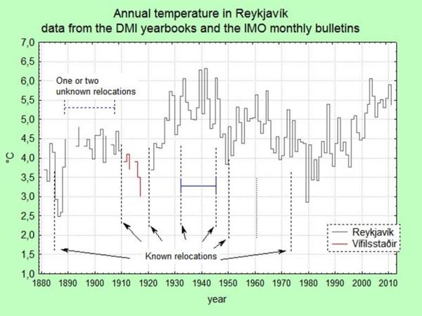
The adjustments by the Icelandic Met Office professionals with a detailed knowledge of the instruments and the local conditions, is quite varied from year-to-year and appears to impose no trend in the data. The impact of GCHN is to massively cool the data prior to 1965. Most years are by about a degree, more than the 0.7oC total twentieth century global average surface temperature increase. The pattern of adjustments has long periods of adjustments that are the same. The major reason could be relocations. Trausti Jonsson, Senior Meteorologist with the Iceland Met Office, has looked at the relocations. He has summarized in the graphic below, along with gaps in the data.

I have matched these relocations with the adjustments.

The relocation dates appear to have no impact on the adjustments. If it does affect the data, the wrong data must be used.

Maybe the adjustments reflect the methods of calculation? Trausti Jonsson says:-

I would again like to make the point that there are two distinct types of adjustments:

1. An absolutely necessary recalculation of the mean because of changes in the observing hours or new information regarding the diurnal cycle of the temperature. For Reykjavík this mainly applies to the period before 1924.

2. Adjustments for relocations. In this case these are mainly based on comparative measurements made before the last relocation in 1973 and supported by comparisons with stations in the vicinity. Most of these are really cosmetic (only 0.1 or 0.2 deg C). There is a rather large adjustment during the 1931 to 1945 period (- 0.4 deg C, see my blog on the matter – you should read it again:http://icelandweather.blog.is/blog/icelandweather/entry/1230185/). 
I am not very comfortable with this large adjustment – it is supposed to be constant throughout the year, but it should probably be seasonally dependent. The location of the station was very bad (on a balcony/rooftop).

So maybe there can be some adjustment prior to 1924, but nothing major after. There is also nothing in the this account, or in the more detailed history, that indicates a reason for the reduction in adjustments in 1917-1925, or the massive increase in negative adjustments in the period 1939-1942.

Further, there is nothing in the local conditions that I can see to then justify GISS imposing an artificial early twentieth century warming period. There are two possible non-data reasons. The first is due to software which homogenizes to the global pattern. The second is human intervention. The adjusters at GISS realised the folks at NOAA had been conspicuously over-zealous in their adjustments, so were trying to restore a bit of credibility to the data story.


The change in the Reykjavík data story

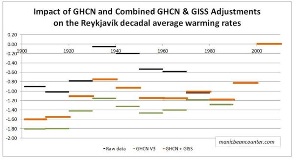
When we compare graphs of raw data to adjusted data, it is difficult to see the impact of adjustments on the trends. The average temperatures vary widely from year to year, masking the underlying patterns. As a rough indication I have therefore taken the average temperature anomaly per decade. The decades are as in common usage, so the 1970s is from 1970-1979. The first decade is actually 1901-1909, and for the adjusted data there are some years missing. The decade of 2000-2009 had no adjustments. The average temperature of 5.35oC was set to zero, to become the anomaly.

The warmest decade was the last decade of 2000-2009. Further, both the raw data (black) and the GISS Homogenised data (orange) show the 1930s to be the second warmest decade. However, whilst the raw data shows the 1930s to be just 0.05oC cooler than the 2000s, GISS estimates it to be 0.75oC cooler. The coolest decades are also different. The raw data shows the 1980s to be the coolest decade, whilst GISS shows the 1900s and the 1910s to be about 0.40oC cooler. The GHCN adjustments (green) virtually eliminate the mid-century cooling.

But adjustments still need to be made. Trausti Jonsson believes that the data prior to 1924 needs to be adjusted downwards to allow for biases in the time of day when readings were taken. This would bring the 1900s and the 1910s more into line with the 1980s, along with lowering the 1920s. The leap in temperatures from the 1910s to the 1930s becomes very similar to that from 1980s to the 2000s, instead of half the magnitude in the GHCNv3 data and two-thirds the magnitude in the GISS Homogenised data.

The raw data tell us there were two similar-sized fluctuations in temperature since 1900 of 1920s-1940s and from 1980s-2010s. In between there was a period cooling that almost entirely cancelled out the earlier warming period. The massive warming since the 1980s is not exceptional, though there might be some minor human influence if patterns are replicated elsewhere.

The adjusted data reduces the earlier warming period and the subsequent cooling that bottomed out in the 1980s. Using the GISS Homogenised data we get the impression of unprecedented warming closely aligned to the rise in greenhouse gas levels. As there is no reason for the adjustments from relocations, or from changes to the method of calculation, the adjustments would appear to be made to fit reality to the adjuster’s beliefs about the world.

Kevin Marshall


Pages2K Revised Arctic Reconstructions

Climateaudit reports

Kaufman and the PAGES2K Arctic2K group recently published a series of major corrections to their database, some of which directly respond to Climate Audit criticism. The resulting reconstruction has been substantially revised with substantially increased medieval warmth. His correction of the contaminated Igaliku series is unfortunately incomplete and other defects remain.

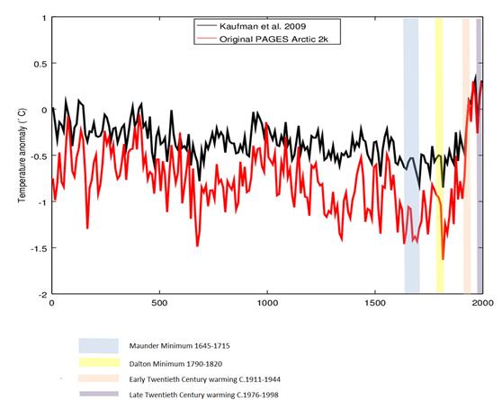
This post is on comparing the revised reconstruction with other data. In the comments Jean S provides a graph that compares the revised graph in red with the previous version in black. I have added some comparative time periods.

  1. The Maunder minimum of 1645-1715 corresponds to a very cold period in the Arctic. The end of the minimum was associated with a rebound in temperatures.
  2. The Dalton minimum of 1790-1820 corresponds to a period of sharply declining temperatures, with the end of the period being the coldest in 2,000 years. The end of the minimum was associated with a rebound in temperatures.
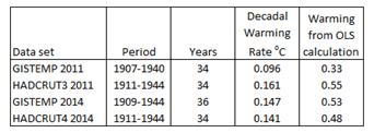
  3. The early twentieth century shows about 1.1oC of warming from trough to peak in a time period that corresponds to the 1911-1944 trough-to-peak warming of the global temperature series. It is about twice the size of that calculated globally by HADCRUT4 and GISTEMPa, consistent with there being greater fluctuations in average temperatures at the poles than in the tropics.
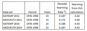
  4. The late twentieth century shows about 0.5oC of warming from trough to peak in a time period that corresponds to the 1976-1998 trough-to-peak warming of the global temperature series. This is broadly in line with that calculated globally by HADCRUT4 and GISTEMPa. This possibly corroborates data of individual weather stations having a warming adjustment bias (e.g. Reykjavik and Rutherglen) along with the national data sets of USA (Steve Goddard) and Australia (Jennifer Marohasy and Joanne Nova). Most of all, Paul Homewood has documented adjustment biases in the Arctic data sets.
  5. The proxy data shows a drop in average temperatures from the 1950s to 1970s. The late twentieth century warming appears to be a mirrored rebound of this cooling. Could the measured reductions in Arctic sea ice cover since 1979 partly be due to a similar rebound?

In conclusion, the Pages2K Arctic reconstruction raises some interesting questions, whilst corroborating some things we already know. It demonstrates the utility of these temperature reconstructions. As Steve McIntyre notes, the improvements partly came about through recognizing the issues in the past data set. Hopefully the work will continue, along with trying to collect new proxy data and refine existing techniques of analysis.

UPDATE 23.00

In the above, it is evident that the early twentieth century (c.1911-1944) Arctic warming in the revised reconstruction was twice the size of late twentieth century (c.1976-1978) warming, when global temperature anomalies show the later period as being greater in size. Steve McIntyre’s latest post shows that at least part of the answer may lie in the inclusion of the Okshola, Norway speleothem O18 and Renland, Greenland O18 series. These proxies both show a downturn at the end of the twentieth century. This might conceivably be a much greater influence on the discrepancy than either adjustment biases in temperature data, or differences between actual, not fully known, temperature anomalies between the Arctic region and the World. However, we will get a better understanding by eliminating the obvious outliers in the proxies and by continuing to positively seeking to eliminate bias in the global surface temperature anomalies.

Kevin Marshall

Notes

  1. Earlier this year I calculated the early twentieth century warming rates for the HADCRUT and GISTEMP series. They are


  2. From the same posting the 1976-1998 warming rates are