Britain’s Folly in Attempting to Save the World from Global Warming

Last week in the House of Lords1 Viscount Ridley asked Baroness Verma, a minister at the Department of Energy and Climate Change, about the hiatus in global warming. Lord Ridley asked Lady Verma

Would you give us the opinion of your scientific advisers as to when this hiatus is likely to end.

Lady Verma replied

It may have slowed down, but that is a good thing. It could well be that some of the measures we are taking today is helping that to occur.

I already commented at Bishop Hill – repeated by James Delingpole

From 1990 to 2013 global emissions increased by 61%. Of that increase, 67% was from China & India. This is not surprising as they were both growing fast from a low base, and combined contain nearly 40% of global population. The UK, with less than 1% of global population managed to decrease its emissions by 19%. In doing so, they managed to offset nearly 1.2% of the combined increase in China & India.

However this is not the full story, particularly with respect to understanding future emissions growth. Here I extend the analysis of the CDIAC data set2 to give a more comprehensive picture. CDIAC (Carbon Dioxide Information Analysis Centre) have estimates of CO2 emissions in tonnes of carbon equivalent for all countries from 1960 to 2013. These I have split out the countries of India, China and UK. The rest I have lumped into three groups – The major developed ACEJU countries3, the Ex-Warsaw Pact countries4 and ROW5 (Rest of the World). For emissions I have taken the baseline year of 1990, the latest year of 2013 and then forecast emissions for 20206.

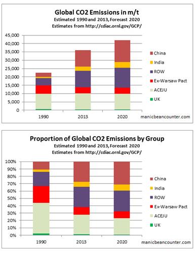
The major developed economies have virtually unchanged, although, along with the UK the proportion of global emissions has fallen from 45% to 28% between 1990 and 2013 and are forecasted to fall further to 23% of global emissions even without aggressive emission reduction policies.

The collapse of communism meant the collective emissions of the Ex-Warsaw Pact countries fell by 44% between 1988 and 1999. That in 2020 emissions levels will still be around 20% lower, even though the economies will be far richer, is due to the inefficiencies of the Communist system.

China and India had most of the emissions growth between 1990 and 2013, there emissions growing by 300% and 250% respectively. That growth was equivalent to 16 times the UK emissions in 1990. By 2020 China and India’s emissions growth over 30 years is likely to have cancelled out the UK’s 30% reduction 78 times over. That forecast emissions increase from 1990 to 2020 is also a third larger than the combined 1990 emissions of the major rich countries.

Finally there is the ROW countries, nearly half the World’s population now live and where emissions increased by 130% between 1990 and 2013.

To put these figures in context, we need to look at population figures, which are available from the World Bank7.

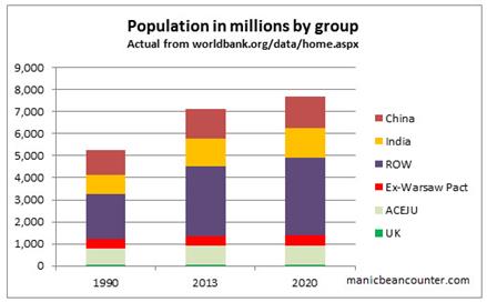
The big CO2 emitters in 1990 were the First and Second World countries. Over two-thirds of global emissions were produced by a quarter of the population. Those same countries now produce 40% of global emissions and have 20% of the global population. The population has grown, but only by 10%. In some of the countries it is already falling. China’s population grew by 20%, India’s by 44% and the Rest of the World by 55%, giving a global population growth of 35%. Looking at CO2 emissions in tonnes per capita puts the CO2 emissions problem into perspective.

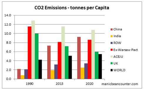
China started from an extremely low base in terms of emissions per capita. It is unlikely to exceed the rich world’s 1990 emissions per capita in the next 10 years. However, due to slower population growth and its current stage of development, it is unlikely to be the major source of emissions growth through to 2050. It is likely to be overtaken by India, who in turn will be overtaken by the rest of the world before the end of the century. Unless very cheap non-CO2 emitting sources of energy are developed, global emissions will continue to grow. That emissions growth will be the result of genuine economic growth that will see grinding poverty disappear from every country that embraces the modern world.

The UK with less than 1% of the world’s population will continue to have no impact at all despite all the hype of having the World’s “greenest” energy policies. Even if the scariest scenarios of Lord Stern’s nightmares are true, there is absolutely no reason to continue with policies that are pushing ever greater numbers into fuel poverty and jeopardizing security of energy supply. The future impacts will be just the same, but with current policy, Britons will meet that future poorer than without. The British Government is like a doctor that prescribes useless medicine in the knowledge that it has nasty side effects. Most would agree that a GP who did that to a patient should be struck off, even if it were one patient in hundreds.

For the people who still genuinely believe that increasing CO2 emissions will cause catastrophic climate change there are two causes of action. First is to find a plentiful source of non-polluting energy where the full costs are less than coal, but just as reliable. There is genuine pollution from coal in the form of smog, so everyone should be in support of this. Shale gas, then thorium nuclear reactors might be a ways forward in the next few decades. Second is to far more accurately predict the catastrophic consequences of global warming, so adaptation can be made at minimal cost and waste of resources. Every prediction of short term catastrophe (e.g. worsening hurricanes) or a worsening situation (e.g. accelerating sea level rise) has proved to be false, hence the reliance on noisy publicists and political activists that discourage learning from past mistakes.


Please note that first time comments are moderated. I welcome debate. Please use the comments as a point of contact, with a request not to publish.

Kevin Marshall

Notes

  1. As reported by James Delingpole at Brietbart. Also reported at The Daily Mail, Bishop Hill, and Not a Lot of People Know That here and here.
  2. CDIAC is the Carbon Dioxide Information Analysis Centre. The 2014 Budget 1.0 contains estimates of CO2 emissions in tonnes of carbon equivalent for all countries from 1960 to 2013. I have converted the figures to tonnes of CO2.
  3. Australia, Canada, EU (the Western European 15, less UK), Japan and USA. This is most of what used to be called “First World”.
  4. This includes the former USSR countries, plus Eastern Europe. I have added in North Korea, Yugoslavia and Cuba.
  5. By definition this includes Central and South America, Africa, Middle East and South East Asia.
  6. Britain has committed to reduce its emissions by 30% of 1990 levels by 2020. China has pledged to “Reduce CO2 emissions per unit of GDP by 40–45% by 2020 compared to the 2005 level”. I assume 8% GDP growth and achieving a full 45% reduction, which is achievable. Similarly India has pledged to Reduce CO2 emissions per unit of GDP by 20–25% by 2020 compared to the 2005 level. Although it is unlikely to be achieved, based on emissions growth from 2005-2013, I have a assumed 7% GDP growth and achieving a minimum 20% reduction. For the other countries I have assumed half the emissions change from 1999-2013. This is likely to be an underestimate, as many other economies are growing emissions are a fast annual rate. For them this assumes a much reduced growth rate. Also many developed economies, particularly in Southern European showed sharp drops in emissions along with GDP in the credit crunch. They are now emerging, so should be expected to have higher emission growth rates.
  7. The 2020 population figures are assuming that each country’s population will change in the next seven years by the same number that it did in the previous seven. As world population growth in slowing, this might be a reasonable estimate. The result is a population increase of 550 million to 7,675 million.

São Paulo Drought – Climate Change is NOT the cause

Seca de São Paulo – Mudança Climática NÃO é a causa

The drought situation in São Paulo is critical. As of late October, the two principle reservoirs that serve the city were below 5% of capacity. Water pressures have been reduced to such an extent that people in the higher parts of the city are without water for most of the time. What is causing this?

The “Climate News Network” (website run by former Guardian & BBC journalists) they attribute this to deforestation and climate change1. They say

The unprecedented drought now affecting São Paulo, South America’s giant metropolis, is believed to be caused by the absence of the “flying rivers” − the vapour clouds from the Amazon that normally bring rain to the centre and south of Brazil.

Some Brazilian scientists say the absence of rain that has dried up rivers and reservoirs in central and southeast Brazil is not just a quirk of nature, but a change brought about by a combination of the continuing deforestation of the Amazon and global warming.

This combination, they say, is reducing the role of the Amazon rainforest as a giant “water pump”, releasing billions of litres of humidity from the trees into the air in the form of vapour.

Meteorologist Jose Marengo, a member of the Intergovernmental Panel on Climate Change, first coined the phrase “flying rivers” to describe these massive volumes of vapour that rise from the rainforest, travel west, and then − blocked by the Andes − turn south.

Satellite images from the Centre for Weather Forecasts and Climate Research of Brazil’s National Space Research Institute (INPE) clearly show that, during January and February this year, the flying rivers failed to arrive, unlike the previous five years.

This explanation of deforestation causing the drought does not hold water. The following is an account of why this drought explanation is flawed.

The “flying rivers” or “rios voadores” is being studied as a Petronas-sponsored long-term project at http://riosvoadores.com.br/english/. Project leader Gérard Moss explains the nature of “flying river”.

The question is, where does the rain come from?

Most of the evaporation comes from the sea… The wind pushes this air over the Amazon Forest, a region where it rains quite a lot. The humid air eventually reaches the Andes, which force it south and that is what we are calling a “flying river

So the most important part of the evaporation is from the sea. A minor part comes from evaporation the Amazon Forest. Yet the Climate News Network is under the impression that all of the evaporation comes from the Amazon. The same is true of the Ecologist, which seems to have used the same material. What is even worse, both sources claim that 22% of the Amazon has been lost. That would mean that the total evaporation from the Amazon region will have reduced by less than this figure and the total moisture content of the “flying rivers” by less than 10%. Even so, there is nowhere provided any data that shows the rainfall in the area is reduced. If the hypothesis were true, then the rainfall near the mouth of the Amazon would be largely unchanged, but as the “flying river” goes south into NE Bolivia and Paraguay, and the Brazilian states of Rondönia, Mato Grosso do Sul, São Paulo, Parana and Santa Catarina, there should be evidence of diminishing rainfall. But despite a quite expensive project employing a number of people and two light aircraft (one a sea plane) there seems to be no effort to gather the data that might falsify the data. Further, project leader Gérard Moss (who is a pilot and engineer) does not seem open to falsification of the hypothesis.
Starting at 7:10 he says:-

My dream is that the Flying Rivers project, through studying (the flying rivers) behaviour, will scientifically prove the amount of rainfall in the south and the Amazon forest. My dream is that we will finally stop exchanging the forest for grazing land and plantations. ….. (T)he project’s greatest challenge is to prove to all us Brazilians, that it’s no longer worth felling one single tree.

Gérard Moss is a pilot and engineer. He is the one who has the use of two aircraft. Further, since mid-2012, the project has been restricted to educational projects2. One such project gives a useful tool that monitors the prevailing wind trajectories. The latest one I downloaded and superimposed the wind direction of the “flying rivers” in think blue arrows.


It would seem that the prevailing easterly winds have shifted south coming ashore in arid Bahia and doing a short loop round to São Paulo, completely missing the Amazon.

Unfortunately, the only map prior to October is for 23/07/14. This gives a similar picture of prevailing winds completely missing the Amazon.


I have a simple hypothesis that can easily be contradicted by archived data held by the website. The cause of the current water shortage lies in January and February, with the failure of the normal summer rains. My hypothesis that this failure was due to similar wind patterns occurring in January and February as found on 27th October. This, naturally occurring, phenomena would have occurred at a similar time to the Gulf Stream shifting course – in the UK shifting north causing extreme storms in Southern England, with flooding in Somerset and the Thames Valley, and in the USA shifting south causing the extreme cold of the Polar Vortex.

There is, however, a further video by the BBC (in English) where Gérard Moss explains that half or more of the rainfall in São Paulo is from the Amazon, as opposed to the sea.

There are three potential sources of water vapour that could condense as rain in the city of São Paulo, but are not mentioned. First is sea evaporation that has not passed over the Amazon. Second is land evaporation from air currents that have not passed over the Amazon, like in the cases above. Third is evaporation from the “flying rivers” airflows after passing over the Amazon. There is up to 2,000 km between the end of the Amazon forest and São Paulo.

Summary

The current extreme drought in the city of São Paulo is not the result of Amazon deforestation for two reasons. First, the deforestation is insufficiently large to account for the drought levels. Second is that evidence points to a natural southerly shift in the current year in the easterly winds coming ashore in Brazil from near the Amazon delta to the much drier coast of Bahia.

But if the deforestation is not the cause of the draught, what are the likely causes? This will be the subject of a further post.

Update 1 14/12/14

I did not get round to the update. This is a background I wrote for the BishopHill discussion.

As my wife comes from Southern Brazil and I have visited the area a number of times, this caught my eye. Before linking the drought to climate change you need to consider the following geographical facts.

  • The City of São Paulo is built on a plateau about 700 metres above sea level. This means that although the Tropic of Capricorn passes through the North of the City, the climate is relatively temperate. The highest recorded temperature is just 35.3 °C.
  • The two principle reservoirs have been supplying the city since the 1920s when the population was less than a million, compared to twenty million today.
  • The area of São Paulo and Rio de Janeiro was once covered by the Atlantic forest. This once extended well south into Argentina and inland to Paraguay – an area bigger than Western Europe. According to Wikipedia 88% has disappeared. (Climate News Network and The Ecologist put the figure at 91.5%) From extensive travel in Parana, Southern São Paulo state and Northern Santa Catarina this figure seems accurate. Most of the deforestation occurred in the twentieth century.
  • The Rivers of São Paulo State mostly form part of the River Plate Basin – that meets the sea in Montevideo, Uruguay. This drains most of southern Brazil, the entire country of Paraguay, Northern Argentina as well as a corner of Bolivia1. The principle river serving the city is the Tietê.
  • São Paulo State is about the same area of the United Kingdom and has a population of 43 million.
  • Upstate there is extensive agriculture, including soybean, sugar cane and cattle.
  • This is the worst drought in 84 years, not ever recorded. The previous one was four years before the American dust bowel of 1934, so there might be common climate factors that have influenced the period.

My conclusion is that the seriousness of the current water crisis is due to the following factors, in order of importance.

  1. Investment in water supply not keeping pace with demand.
  2. A once-in-a-century drought.
  3. Location of a megacity on a plateau, limiting the ability to cheaply extend the water supply.
  4. Changes in rainfall patterns from deforestation.

Notes

  1. Over at the BishopHill blog, commentator Entropic Man has started a discussion thread on the current drought in São Paulo, which he claims is due to deforestation and climate change. As the BishopHill blog is almost entirely given over to climate issues, the inference by Entropic Man is that human-caused climate change is responsible.
  2. The website explains (in Portuguese)

    From the mid-2012, the project is restricted to educational, awareness actions and counts with the collaboration of the CPTEC in providing the data provided on the links of the weather mapsan important tool that allows the general public to see and track the trajectories of the flying rivers.

    Kevin Marshall

The Global Warming Consensus Conundrum

It might be the case that power and money are trumping the truth in global warming. But that power and money is fortified by a belief in the catastrophic anthropogenic global warming hypothesis. This in turn is based on “everybody” who is “anybody” agreeing with everyone else who is “anybody” and claiming that those who question what “everybody” who is “anybody” accepts is a nobody. But the source of the knowledge that “everybody” who is “anybody” agrees with is nobody.

This is in response to the comment by Craig King:-

It is going to take a lot more than facts and evidence to stop this behemoth. Too many people have got too much invested in the CAGW construct for it to be stopped by the truth. Aye, theres the rub, money and power trumps the truth any day of the week.

UNIPCC Risk Management Process

Thanks to Tom0Mason for pointing out the following graphic SPM.3 at from the UNIPCC AR5 WGII report.

He states

Within the documentation (page 9 of the full report) is Figure SPM.3 | Climate-change adaptation as an iterative risk management process with multiple feedbacks. People and knowledge shape the process and its outcomes. [Figure 2-1]

This graphic implies that the UN has the ability to tell governments what to do. You all voted for that didn’t you?

Yes the UN minions have set themselves up as identifiers of risk, assessors of risk, establishers of decision-making criteria, and implementers decision and then they’ll monitor you compliance.

I am not sure that I entirely agree. The UNIPCC might have set themselves up as telling governments what to do, but they only partially heed what they claim in the chart, and governments even less so. For instance on “scoping“, the identification of risks and vulnerabilities is only partially followed through. In AR4 the UNIPCC scrapped around for every possible risk they could find, and then embellished them. They later admitted the Himalayan glaciers were fabricated, but there was nothing on similar fabrications for crop failures in Africa or for the collapse of the Amazon Rainforest. Nor was there an admission that claims of increasing hurricane activity were unsupported; or that the vanishing snows of Kilimanjaro were not from rising temperatures . The process of scoping should include categorizing risks according to magnitude, likelihood and the quality of the evidence. But no such critical evaluation takes place.

Implementation is a loop of

Implement Decision Monitor Review and Learn

In practice (with the UK as an example) implementation is accompanied by an enforcing agency whose monitoring consists of justifying the policy, with no independent audits of the success of the policy, nor identifying any adverse consequences. As a result the reviews to not learn from mistakes, nor how to improve the quality of policy, nor how to take into account new evidence, nor to consider the increasing evidence that the optimal policy is to do nothing.

Kevin Marshall


Pages2K Revised Arctic Reconstructions

Climateaudit reports

Kaufman and the PAGES2K Arctic2K group recently published a series of major corrections to their database, some of which directly respond to Climate Audit criticism. The resulting reconstruction has been substantially revised with substantially increased medieval warmth. His correction of the contaminated Igaliku series is unfortunately incomplete and other defects remain.

This post is on comparing the revised reconstruction with other data. In the comments Jean S provides a graph that compares the revised graph in red with the previous version in black. I have added some comparative time periods.

  1. The Maunder minimum of 1645-1715 corresponds to a very cold period in the Arctic. The end of the minimum was associated with a rebound in temperatures.
  2. The Dalton minimum of 1790-1820 corresponds to a period of sharply declining temperatures, with the end of the period being the coldest in 2,000 years. The end of the minimum was associated with a rebound in temperatures.
  3. The early twentieth century shows about 1.1oC of warming from trough to peak in a time period that corresponds to the 1911-1944 trough-to-peak warming of the global temperature series. It is about twice the size of that calculated globally by HADCRUT4 and GISTEMPa, consistent with there being greater fluctuations in average temperatures at the poles than in the tropics.
  4. The late twentieth century shows about 0.5oC of warming from trough to peak in a time period that corresponds to the 1976-1998 trough-to-peak warming of the global temperature series. This is broadly in line with that calculated globally by HADCRUT4 and GISTEMPa. This possibly corroborates data of individual weather stations having a warming adjustment bias (e.g. Reykjavik and Rutherglen) along with the national data sets of USA (Steve Goddard) and Australia (Jennifer Marohasy and Joanne Nova). Most of all, Paul Homewood has documented adjustment biases in the Arctic data sets.
  5. The proxy data shows a drop in average temperatures from the 1950s to 1970s. The late twentieth century warming appears to be a mirrored rebound of this cooling. Could the measured reductions in Arctic sea ice cover since 1979 partly be due to a similar rebound?

In conclusion, the Pages2K Arctic reconstruction raises some interesting questions, whilst corroborating some things we already know. It demonstrates the utility of these temperature reconstructions. As Steve McIntyre notes, the improvements partly came about through recognizing the issues in the past data set. Hopefully the work will continue, along with trying to collect new proxy data and refine existing techniques of analysis.

UPDATE 23.00

In the above, it is evident that the early twentieth century (c.1911-1944) Arctic warming in the revised reconstruction was twice the size of late twentieth century (c.1976-1978) warming, when global temperature anomalies show the later period as being greater in size. Steve McIntyre’s latest post shows that at least part of the answer may lie in the inclusion of the Okshola, Norway speleothem O18 and Renland, Greenland O18 series. These proxies both show a downturn at the end of the twentieth century. This might conceivably be a much greater influence on the discrepancy than either adjustment biases in temperature data, or differences between actual, not fully known, temperature anomalies between the Arctic region and the World. However, we will get a better understanding by eliminating the obvious outliers in the proxies and by continuing to positively seeking to eliminate bias in the global surface temperature anomalies.

Kevin Marshall

Notes

  1. Earlier this year I calculated the early twentieth century warming rates for the HADCRUT and GISTEMP series. They are


  2. From the same posting the 1976-1998 warming rates are