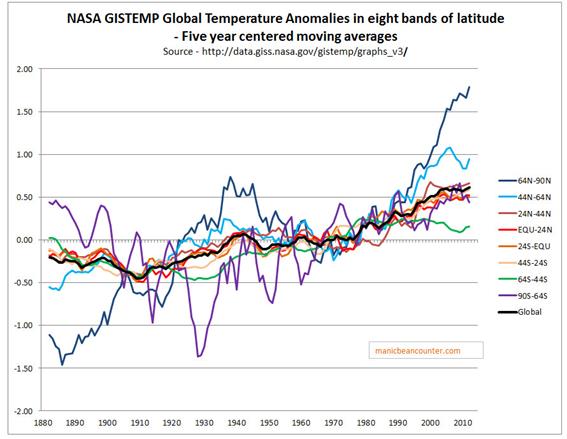
Temperature trends vary greatly across different parts of the globe, an aspect that is not recognized when homogenizing temperatures. At a top level NASA GISS usefully split their global temperature anomaly into eight bands of latitude. I have graphed the five year moving averages for each band, along with the Gistemp global anomaly in Figure 1.
Figure 1. Gistemp global temperature anomalies by band of latitude.
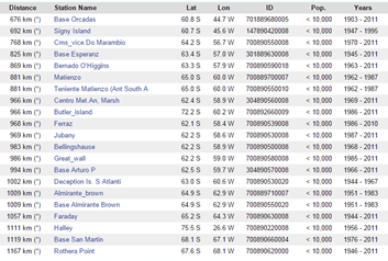
The biggest oddity is the 64S-90S band. This bottom slice of the globe roughly equates to Antarctica, which is South of 66°34′S. Not only was there massive cooling until 1930 – in contradiction to the global trend – but prior to the 1970 was very large volatility in temperatures, despite my using five year moving averages. Looking at the GHCN database of weather stations, there none listed in Antarctica until Rothera point started collecting data in 1946, as shown in Figure 21.
Figure 2. A selection of temperature anomalies in the Antarctica. The most numerous are either on the Antarctic Pennisula, or the islands just to the North.
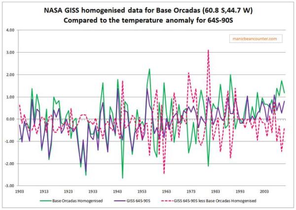
The only long record is at Base Orcadas located at (60.8 S 44.7 W). I have graphed the GISS homogenised temperature anomaly data for station 701889680000 with the Gistemp 64S-90S band in Figure 3.
Figure 3. Gistemp 64S-90S annual temperature anomaly compared to Base Orcadas GISS homogenised data.
There is a remarkable similarity in the data sets until 1950, after which they appear unrelated. This suggests that in the absence of other data, Base Orcadas was the principle element in creating a proxy for the missing Antarctic data, despite it being located outside the area, and not being related to the actual data for well over half a century. The outcome is to bias the overall global temperature anomaly by suppressing the early twentieth century warming, making the late twentieth century warming appear relatively greater than is the underlying reality2. The error is due to assuming that temperature trends are the same at different latitudes are the same, an assumption that the homogenised data shows to be false.
Kevin Marshall
Notes
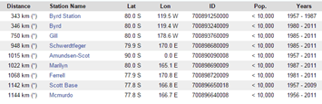
Also in Antarctica (but not listed) there has been data collected at Amundsen-Scot base at the South Pole (90.0 S 0.0 E) since 1957, and at Vostok base (78.5 S 106.9 E) since 1958.
Removing the Antarctic data would increase both the early twentieth century and post 1975 warming periods. But, given that 64S-90S is 5% of the global surface area, I estimate it would increase the earlier warming trends by 5-10% as against 1-3% for the later trend.
The temperature homogenizations for the Paraguay data within both the BEST and UHCN/Gistemp surface temperature data sets points to a potential flaw within the temperature homogenization process. It removes real, but localized, temperature variations, creating incorrect temperature trends. In the case of Paraguay from 1955 to 1980, a cooling trend is turned into a warming trend. Whether this biases the overall temperature anomalies, or our understanding of climate variation, remains to be explored.
A small place in Mid-Paraguay, on the Brazil/Paraguay border has become the centre of focus of the argument on temperature homogenizations.
For instance here is Dr Kevin Cowtan, of the Department of Chemistry at the University of York, explaining the BEST adjustments at Puerto Casado.
Cowtan explains at 6.40
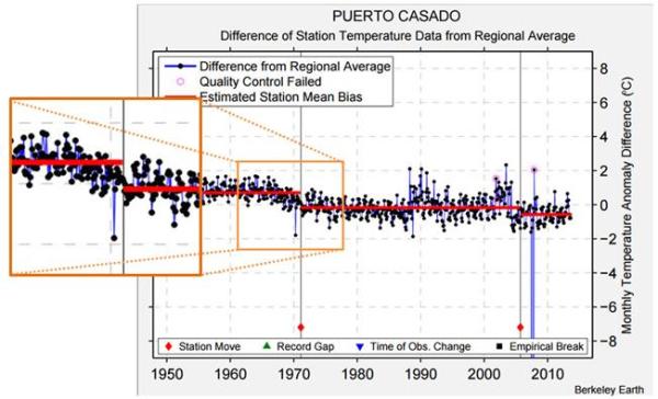
In a previous video we looked at a station in Paraguay, Puerto Casado. Here is the Berkeley Earth data for that station. Again the difference between the station record and the regional average shows very clear jumps. In this case there are documented station moves corresponding to the two jumps. There may be another small change here that wasn’t picked up. The picture for this station is actually fairly clear.
The first of these “jumps” was a fall in the late 1960s of about 1oC. Figure 1 expands the section of the Berkeley Earth graph from the video, to emphasise this change.
Figure 1 – Berkeley Earth Temperature Anomaly graph for Puerto Casado, with expanded section showing the fall in temperature and against the estimated mean station bias.
The station move is after the fall in temperature.
Shub Niggareth looked at the metadata on the actual station move concluding
IT MOVED BECAUSE THERE IS CHANGE AND THERE IS A CHANGE BECAUSE IT MOVED
That is the evidence of the station move was vague. The major evidence was the fall in temperatures. Alternative evidence is that there were a number of other stations in the area exhibiting similar patterns.
But maybe there was some, unknown, measurement bias (to use Steven Mosher’s term) that would make this data stand out from the rest? I have previously looked eight temperature stations in Paraguay with respect to the NASA Gistemp and UHCN adjustments. The BEST adjustments for the stations, along another in Paul Homewood’s original post, are summarized in Figure 2 for the late 1960s and early 1970s. All eight have similar downward adjustment that I estimate as being between 0.8 to 1.2oC. The first six have a single adjustment. Asuncion Airport and San Juan Bautista have multiple adjustments in the period. Pedro Juan CA was of very poor data quality due to many gaps (see GHCNv2 graph of the raw data) hence the reason for exclusion.
Figure 2 – Temperature stations used in previous post on Paraguayan Temperature Homogenisations
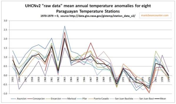
Why would both BEST and UHCN remove a consistent pattern covering and area of around 200,000 km2? The first reason, as Roger Andrews has found, the temperature fall was confined to Paraguay. The second reason is suggested by the UHCNv2 raw data1 shown in figure 3.
Figure 3 – UHCNv2 “raw data” mean annual temperature anomalies for eight Paraguayan temperature stations, with mean of 1970-1979=0.
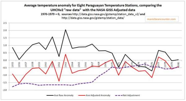
There was an average temperature fall across these eight temperature stations of about half a degree from 1967 to 1970, and over one degree by the mid-1970s. But it was not at the same time. The consistency is only show by the periods before and after as the data sets do not diverge. Any homogenisation program would see that for each year or month for every data set, the readings were out of line with all the other data sets. Now maybe it was simply data noise, or maybe there is some unknown change, but it is clearly present in the data. But temperature homogenisation should just smooth this out. Instead it cools the past. Figure 4 shows the impact average change resulting from the UHCN and NASA GISS homogenisations.
Figure 4 – UHCNv2 “raw data” and NASA GISS Homogenized average temperature anomalies, with the net adjustment.
A cooling trend for the period 1955-1980 has been turned into a warming trend due to the flaw in homogenization procedures.
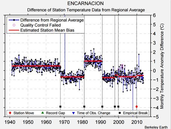
The Paraguayan data on its own does not impact on the global land surface temperature as it is a tiny area. Further it might be an isolated incident or offset by incidences of understating the warming trend. But what if there are smaller micro climates that are only picked up by one or two temperature stations? Consider figure 5 which looks at the BEST adjustments for Encarnacion, one of the eight Paraguayan stations.
Figure 5 – BEST adjustment for Encarnacion.
There is the empirical break in 1968 from the table above, but also empirical breaks in the 1981 and 1991 that look to be exactly opposite. What Berkeley earth call the “estimated station mean bias” is as a result of actual deviations in the real data. Homogenisation eliminates much of the richness and diversity in the real world data. The question is whether this happens consistently. First we need to understand the term “temperature homogenization“.
Kevin Marshall
Notes
The UHCNv2 “raw” data is more accurately pre-homogenized data. That is the raw data with some adjustments.