Climate Experts Attacking a Journalist by Misinformation on Global Warming

Summary

Journalist David Rose was attacked for pointing out in a Daily Mail article that the strong El Nino event, that resulted in record temperatures, was reversing rapidly. He claimed record highs may be not down to human emissions. The Climate Feedback attack article claimed that the El Nino event did not affect the long-term human-caused trend. My analysis shows

  • CO2 levels have been rising at increasing rates since 1950.
  • In theory this should translate in warming at increasing rates. That is a non-linear warming rate.
  • HADCRUT4 temperature data shows warming stopped in 2002, only resuming with the El Nino event in 2015 and 2016.
  • At the central climate sensitivity estimate of doubling of CO2 leads to 3C of global warming, HADCRUT4 was already falling short of theoretical warming in 2000. This is without the impact of other greenhouse gases.
  • Putting a linear trend lines through the last 35 to 65 years of data will show very little impact of El Nino, but has a very large visual impact on the divergence between theoretical human-caused warming and the temperature data. It reduces the apparent impact of the divergence between theory and data, but does not eliminate it.

Claiming that the large El Nino does not affect long-term linear trends is correct. But a linear trend neither describes warming in theory or in the leading temperature set. To say, as experts in their field, that the long-term warming trend is even principally human-caused needs a lot of circumspection. This is lacking in the attack article.


Introduction

Journalist David Rose recently wrote a couple of articles in the Daily Mail on the plummeting global average temperatures.
The first on 26th November was under the headline

Stunning new data indicates El Nino drove record highs in global temperatures suggesting rise may not be down to man-made emissions

With the summary

• Global average temperatures over land have plummeted by more than 1C
• Comes amid mounting evidence run of record temperatures about to end
• The fall, revealed by Nasa satellites, has been caused by the end of El Nino

Rose’s second article used the Met Offices’ HADCRUT4 data set, whereas the first used satellite data. Rose was a little more circumspect when he said.

El Nino is not caused by greenhouse gases and has nothing to do with climate change. It is true that the massive 2015-16 El Nino – probably the strongest ever seen – took place against a steady warming trend, most of which scientists believe has been caused by human emissions.

But when El Nino was triggering new records earlier this year, some downplayed its effects. For example, the Met Office said it contributed ‘only a few hundredths of a degree’ to the record heat. The size of the current fall suggests that this minimised its impact.

There was a massive reaction to the first article, as discussed by Jaime Jessop at Cliscep. She particularly noted that earlier in the year there were articles on the dramatically higher temperature record of 2015, such as in a Guardian article in January.There was also a follow-up video conversation between David Rose and Dr David Whitehouse of the GWPF commenting on the reactions. One key feature of the reactions was claiming the contribution to global warming trend of the El Nino effect was just a few hundredths of a degree. I find particularly interesting the Climate Feedback article, as it emphasizes trend over short-run blips. Some examples

Zeke Hausfather, Research Scientist, Berkeley Earth:
In reality, 2014, 2015, and 2016 have been the three warmest years on record not just because of a large El Niño, but primarily because of a long-term warming trend driven by human emissions of greenhouse gases.

….
Kyle Armour, Assistant Professor, University of Washington:
It is well known that global temperature falls after receiving a temporary boost from El Niño. The author cherry-picks the slight cooling at the end of the current El Niño to suggest that the long-term global warming trend has ended. It has not.

…..
KEY TAKE-AWAYS
1.Recent record global surface temperatures are primarily the result of the long-term, human-caused warming trend. A smaller boost from El Niño conditions has helped set new records in 2015 and 2016.

…….

2. The article makes its case by relying only on cherry-picked data from specific datasets on short periods.

To understand what was said, I will try to take the broader perspective. That is to see whether the evidence points conclusively to a single long-term warming trend being primarily human caused. This will point to the real reason(or reasons) for downplaying the impact of an extreme El Nino event on record global average temperatures. There are a number of steps in this process.

Firstly to look at the data of rising CO2 levels. Secondly to relate that to predicted global average temperature rise, and then expected warming trends. Thirdly to compare those trends to global data trends using the actual estimates of HADCRUT4, taking note of the consequences of including other greenhouse gases. Fourthly to put the calculated trends in the context of the statements made above.


1. The recent data of rising CO2 levels
CO2 accounts for a significant majority of the alleged warming from increases in greenhouse gas levels. Since 1958 CO2 (when accurate measures started to be taken at Mauna Loa) levels have risen significantly. Whilst I could produce a simple graph either the CO2 level rising from 316 to 401 ppm in 2015, or the year-on-year increases CO2 rising from 0.8ppm in the 1960s to over 2ppm in in the last few years, Figure 1 is more illustrative.

CO2 is not just rising, but the rate of rise has been increasing as well, from 0.25% a year in the 1960s to over 0.50% a year in the current century.


2. Rising CO2 should be causing accelerating temperature rises

The impact of CO2 on temperatures is not linear, but is believed to approximate to a fixed temperature rise for each doubling of CO2 levels. That means if CO2 levels were rising arithmetically, the impact on the rate of warming would fall over time. If CO2 levels were rising by the same percentage amount year-on-year, then the consequential rate of warming would be constant over time.  But figure 1 shows that percentage rise in CO2 has increased over the last two-thirds of a century.  The best way to evaluate the combination of CO2 increasing at an accelerating rate and a diminishing impact of each unit rise on warming is to crunch some numbers. The central estimate used by the IPCC is that a doubling of CO2 levels will result in an eventual rise of 3C in global average temperatures. Dana1981 at Skepticalscience used a formula that produces a rise of 2.967 for any doubling. After adjusting the formula, plugging the Mauna Loa annual average CO2 levels into values in produces Figure 2.

In computing the data I estimated the level of CO2 in 1949 (based roughly on CO2 estimates from Law Dome ice core data) and then assumed a linear increased through the 1950s. Another assumption was that the full impact of the CO2 rise on temperatures would take place in the year following that rise.

The annual CO2 induced temperature change is highly variable, corresponding to the fluctuations in annual CO2 rise. The 11 year average – placed at the end of the series to give an indication of the lagged impact that CO2 is supposed to have on temperatures – shows the acceleration in the expected rate of CO2-induced warming from the acceleration in rate of increase in CO2 levels. Most critically there is some acceleration in warming around the turn of the century.

I have also included the impact of linear trend (by simply dividing the total CO2 increase in the period by the number of years) along with a steady increase of .396% a year, producing a constant rate of temperature rise.

Figure 3 puts the calculations into the context of the current issue.

This gives the expected temperature linear temperature trends from various start dates up until 2014 and 2016, assuming a one year lag in the impact of changes in CO2 levels on temperatures. These are the same sort of linear trends that the climate experts used in criticizing David Rose. The difference in warming by more two years produces very little difference – about 0.054C of temperature rise, and an increase in trend of less than 0.01 C per decade. More importantly, the rate of temperature rise from CO2 alone should be accelerating.


3. HADCRUT4 warming

How does one compare this to the actual temperature data? A major issue is that there is a very indeterminate lag between the rise in CO2 levels and the rise in average temperature. Another issue is that CO2 is not the only greenhouse gas. More minor greenhouse gases may have different patterns if increases in the last few decades. However, the change the trends of the resultant warming, but only but the impact should be additional to the warming caused by CO2. That is, in the long term, CO2 warming should account for less than the total observed.
There is no need to do actual calculations of trends from the surface temperature data. The Skeptical Science website has a trend calculator, where one can just plug in the values. Figure 4 shows an example of the graph, which shows that the dataset currently ends in an El Nino peak.

The trend results for HADCRUT4 are shown in Figure 5 for periods up to 2014 and 2016 and compared to the CO2 induced warming.

There are a number of things to observe from the trend data.

The most visual difference between the two tables is the first has a pause in global warming after 2002, whilst the second has a warming trend. This is attributable to the impact of El Nino. These experts are also right in that it makes very little difference to the long term trend. If the long term is over 40 years, then it is like adding 0.04C per century that long term trend.

But there is far more within the tables than this observations. Concentrate first on the three “Trend in °C/decade” columns. The first is of the CO2 warming impact from figure 3. For a given end year, the shorter the period the higher is the warming trend. Next to this are Skeptical Science trends for the HADCRUT4 data set. Start Year 1960 has a higher trend than Start Year 1950 and Start Year 1970 has a higher trend than Start Year 1960. But then each later Start Year has a lower trend the previous Start Years. There is one exception. The period 2010 to 2016 has a much higher trend than for any other period – a consequence of the extreme El Nino event. Excluding this there are now over three decades where the actual warming trend has been diverging from the theory.

The third of the “Trend in °C/decade” columns is simply the difference between the HADCRUT4 temperature trend and the expected trend from rising CO2 levels. If a doubling of CO2 levels did produce around 3C of warming, and other greenhouse gases were also contributing to warming then one would expect that CO2 would eventually start explaining less than the observed warming. That is the variance would be positive. But CO2 levels accelerated, actual warming stalled, increasing the negative variance.


4. Putting the claims into context

Compare David Rose

Stunning new data indicates El Nino drove record highs in global temperatures suggesting rise may not be down to man-made emissions

With Climate Feedback KEY TAKE-AWAY

1.Recent record global surface temperatures are primarily the result of the long-term, human-caused warming trend. A smaller boost from El Niño conditions has helped set new records in 2015 and 2016.

The HADCRUT4 temperature data shows that there had been no warming for over a decade, following a warming trend. This is in direct contradiction to theory which would predict that CO2-based warming would be at a higher rate than previously. Given that a record temperatures following this hiatus come as part of a naturally-occurring El Nino event it is fair to say that record highs in global temperatures ….. may not be down to man-made emissions.

The so-called long-term warming trend encompasses both the late twentieth century warming and the twenty-first century hiatus. As the later flatly contradicts theory it is incorrect to describe the long-term warming trend as “human-caused”. There needs to be a more circumspect description, such as the vast majority of academics working in climate-related areas believe that the long-term (last 50+ years) warming  is mostly “human-caused”. This would be in line with the first bullet point from the UNIPCC AR5 WG1 SPM section D3:-

It is extremely likely that more than half of the observed increase in global average surface temperature from 1951 to 2010 was caused by the anthropogenic increase in greenhouse gas concentrations and other anthropogenic forcings together.

When the IPCC’s summary opinion, and the actual data are taken into account Zeke Hausfather’s comment that the records “are primarily because of a long-term warming trend driven by human emissions of greenhouse gases” is dogmatic.

Now consider what David Rose said in the second article

El Nino is not caused by greenhouse gases and has nothing to do with climate change. It is true that the massive 2015-16 El Nino – probably the strongest ever seen – took place against a steady warming trend, most of which scientists believe has been caused by human emissions.

Compare this to Kyle Armour’s statement about the first article.

It is well known that global temperature falls after receiving a temporary boost from El Niño. The author cherry-picks the slight cooling at the end of the current El Niño to suggest that the long-term global warming trend has ended. It has not.

This time Rose seems to have responded to the pressure by stating that there is a long-term warming trend, despite the data clearly showing that this is untrue, except in the vaguest sense. There data does not show a single warming trend. Going back to the skeptical science trends we can break down the data from 1950 into four periods.

1950-1976 -0.014 ±0.072 °C/decade (2σ)

1976-2002 0.180 ±0.068 °C/decade (2σ)

2002-2014 -0.014 ±0.166 °C/decade (2σ)

2014-2016 1.889 ±1.882 °C/decade (2σ)

There was warming for about a quarter of a century sandwiched between two periods of no warming. At the end is an uptick. Only very loosely can anyone speak of a long-term warming trend in the data. But basic theory hypotheses a continuous, non-linear, warming trend. Journalists can be excused failing to make the distinctions. As non-experts they will reference opinion that appears sensibly expressed, especially when the alleged experts in the field are united in using such language. But those in academia, who should have a demonstrable understanding of theory and data, should be more circumspect in their statements when speaking as experts in their field. (Kyle Armour’s comment is an extreme example of what happens when academics completely suspend drawing on their expertise.)  This is particularly true when there are strong divergences between the theory and the data. The consequence is plain to see. Expert academic opinion tries to bring the real world into line with the theory by authoritative but banal statements about trends.

Kevin Marshall

Beliefs and Uncertainty: A Bayesian Primer

Ron Clutz’s introduction, based on a Scientific American article by John Horgan on January 4, 2016, starts to grapple with the issues involved.

The take home quote from Horgan is on the subject of false positives.

Here is my more general statement of that principle: The plausibility of your belief depends on the degree to which your belief–and only your belief–explains the evidence for it. The more alternative explanations there are for the evidence, the less plausible your belief is. That, to me, is the essence of Bayes’ theorem.

“Alternative explanations” can encompass many things. Your evidence might be erroneous, skewed by a malfunctioning instrument, faulty analysis, confirmation bias, even fraud. Your evidence might be sound but explicable by many beliefs, or hypotheses, other than yours.

In other words, there’s nothing magical about Bayes’ theorem. It boils down to the truism that your belief is only as valid as its evidence. If you have good evidence, Bayes’ theorem can yield good results. If your evidence is flimsy, Bayes’ theorem won’t be of much use. Garbage in, garbage out.
With respect to the question of whether global warming is human caused, there is basically a combination of three elements – (i) Human caused (ii) Naturally caused (iii) Random chaotic variation. There may be a number of sub-elements and an infinite number of combinations including some elements counteracting others, such as El Nino events counteracting underlying warming. Evaluation of new evidence is in the context of explanations being arrived at within a community of climatologists with strong shared beliefs that at least 100% of recent warming is due to human GHG emissions. It is that same community who also decide the measurement techniques for assessing the temperature data; the relevant time frames; and the categorization of the new data. With complex decisions the only clear decision criteria is conformity to the existing consensus conclusions. As a result, the original Bayesian estimates become virtually impervious to new perspectives or evidence that contradicts those original estimates.

Science Matters

Those who follow discussions regarding Global Warming and Climate Change have heard from time to time about the Bayes Theorem. And Bayes is quite topical in many aspects of modern society:

Bayesian statistics “are rippling through everything from physics to cancer research, ecology to psychology,” The New York Times reports. Physicists have proposed Bayesian interpretations of quantum mechanics and Bayesian defenses of string and multiverse theories. Philosophers assert that science as a whole can be viewed as a Bayesian process, and that Bayes can distinguish science from pseudoscience more precisely than falsification, the method popularized by Karl Popper.

Named after its inventor, the 18th-century Presbyterian minister Thomas Bayes, Bayes’ theorem is a method for calculating the validity of beliefs (hypotheses, claims, propositions) based on the best available evidence (observations, data, information). Here’s the most dumbed-down description: Initial belief plus new evidence = new and improved belief.   (A fuller and…

View original post 1,082 more words

Climatic Temperature Variations

In the previous post I identified that the standard definition of temperature homogenisation assumes that there are little or no variations in climatic trends within the homogenisation area. I also highlighted specific instances of where this assumption has failed. However, the examples may be just isolated and extreme instances, or there might be other, offsetting instances so the failures could cancel each other out without a systematic bias globally. Here I explore why this assumption should not be expected to hold anywhere, and how it may have biased the picture of recent warming. After a couple of proposals to test for this bias, I look at alternative scenarios that could bias the global average temperature anomalies. I concentrate on the land surface temperatures, though my comments may also have application to the sea surface temperature data sets.


Comparing Two Recent Warming Phases

An area that I am particularly interested in is the relative size of the early twentieth century warming compared to the more recent warming phase. This relative size, along with the explanations for those warming periods gives a route into determining how much of the recent warming was human caused. Dana Nuccitelli tried such an explanation at skepticalscience blog in 20111. Figure 1 shows the NASA Gistemp global anomaly in black along with a split be eight bands of latitude. Of note are the polar extremes, each covering 5% of the surface area. For the Arctic, the trough to peak of 1885-1940 is pretty much the same as the trough to peak from 1965 to present. But in the earlier period it is effectively cancelled out by the cooling in the Antarctic. This cooling, I found was likely caused by use of inappropriate proxy data from a single weather station3.

Figure 1. Gistemp global temperature anomalies by band of latitude2.

For the current issue, of particular note is the huge variation in trends by latitude from the global average derived from the homogenised land and sea surface data. Delving further, GISS provide some very useful maps of their homogenised and extrapolated data4. I compare two identical time lengths – 1944 against 1906-1940 and 2014 against 1976-2010. The selection criteria for the maps are in figure 2.

Figure 2. Selection criteria for the Gistemp maps.

Figure 3. Gistemp map representing the early twentieth surface warming phase for land data only.


Figure 4. Gistemp map representing the recent surface warming phase for land data only.

The later warming phase is almost twice the magnitude of, and has much the better coverage than, the earlier warming. That is 0.43oC against 0.24oC. In both cases the range of warming in the 250km grid cells is between -2oC and +4oC, but the variations are not the same. For instance, the most extreme warming in both periods is at the higher latitudes. But, with the respect to North America in the earlier period the most extreme warming is over the Northwest Territories of Canada, whilst in the later period the most extreme warming is over Western Alaska, with the Northwest Territories showing near average warming. In the United States, in the earlier period there is cooling over Western USA, whilst in the later period there is cooling over much of Central USA, and strong warming in California. In the USA, the coverage of temperature stations is quite good, at least compared with much of the Southern Hemisphere. Euan Mearns has looked at a number of areas in the Southern Hemisphere4, which he summarised on the map in Figure 5

Figure 5. Euan Mearns says of the above “S Hemisphere map showing the distribution of areas sampled. These have in general been chosen to avoid large centres of human population and prosperity.

For the current analysis Figure 6 is most relevant.

Figure 6. Euan Mearns’ says of the above “The distribution of operational stations from the group of 174 selected stations.

The temperature data for the earlier period is much sparser than for later period. Even where there is data available in the earlier period the temperature data could be based on a fifth of the number of temperature stations as the later period. This may exaggerate slightly the issue, as the coasts of South America and Eastern Australia are avoided.

An Hypothesis on the Homogenisation Impact

Now consider again the description of homogenisation Venema et al 20125, quoted in the previous post.


The most commonly used method to detect and remove the effects of artificial changes is the relative homogenization approach, which assumes that nearby stations are exposed to almost the same climate signal and that thus the differences between nearby stations can be utilized to detect inhomogeneities. In relative homogeneity testing, a candidate time series is compared to multiple surrounding stations either in a pairwise fashion or to a single composite reference time series computed for multiple nearby stations. (Italics mine)


The assumption of the same climate signal over the homogenisation will not apply where the temperature stations are thin on the ground. The degree to which homogenisation eliminates real world variations in trend could be, to some extent, inversely related to the density. Given that the density of temperature data points diminishes in most areas of the world rapidly when one goes back in time beyond 1960, homogenisation in the early warming period far more likely to be between climatically different temperature stations than in the later period. My hypothesis is that, relatively, homogenisation will reduce the early twentieth century warming phase compared the recent warming phase as in earlier period homogenisation will be over much larger areas with larger real climate variations within the homogenisation area.

Testing the Hypothesis

There are at least two ways that my hypothesis can be evaluated. Direct testing of information deficits is not possible.

First is to conduct temperature homogenisations on similar levels of actual data for the entire twentieth century. If done for a region, the actual data used in global temperature anomalies should be run for a region as well. This should show that the recent warming phase is post homogenisation is reduced with less data.

Second is to examine the relative size of adjustments to the availability of comparative data. This can be done in various ways. For instance, I quite like the examination of the Manaus Grid block record Roger Andrews did in a post The Worst of BEST6.

Counter Hypotheses

There are two counter hypotheses on temperature bias. These may undermine my own hypothesis.

First is the urbanisation bias. Euan Mearns in looking at temperature data of the Southern Hemisphere tried to avoid centres of population due to the data being biased. It is easy to surmise the lack of warming Mearns found in central Australia7 was lack of an urbanisation bias from the large cities on the coast. However, the GISS maps do not support this. Ronan and Michael Connolly8 of Global Warming Solved claim that the urbanisation bias in the global temperature data is roughly equivalent to the entire warming of the recent epoch. I am not sure that the urbanisation bias is so large, but even if it were, it could be complementary to my hypothesis based on trends.

Second is that homogenisation adjustments could be greater the more distant in past that they occur. It has been noted (Steve Goddard in particular) that each new set of GISS adjustments adjusts past data. The same data set used to test my hypothesis above could also be utilized to test this hypothesis, by conducting homogenisations runs on the data to date, then only to 2000, then to 1990 etc. It could be that the earlier warming trend is somehow suppressed by homogenizing the most recent data, then working backwards through a number of iterations, each one using the results of the previous pass. The impact on trends that operate over different time periods, but converge over longer periods, could magnify the divergence and thus cause differences in trends decades in the past to be magnified. As such differences in trend appear to the algorithm to be more anomalous than in reality they actually are.

Kevin Marshall

Notes

  1. Dana Nuccitelli – What caused early 20th Century warming? 24.03.2011
  2. Source http://data.giss.nasa.gov/gistemp/graphs_v3/
  3. See my post Base Orcadas as a Proxy for early Twentieth Century Antarctic Temperature Trends 24.05.2015
  4. Euan Mearns – The Hunt For Global Warming: Southern Hemisphere Summary 14.03.2015. Area studies are referenced on this post.
  5. Venema et al 2012 – Venema, V. K. C., Mestre, O., Aguilar, E., Auer, I., Guijarro, J. A., Domonkos, P., Vertacnik, G., Szentimrey, T., Stepanek, P., Zahradnicek, P., Viarre, J., Müller-Westermeier, G., Lakatos, M., Williams, C. N., Menne, M. J., Lindau, R., Rasol, D., Rustemeier, E., Kolokythas, K., Marinova, T., Andresen, L., Acquaotta, F., Fratianni, S., Cheval, S., Klancar, M., Brunetti, M., Gruber, C., Prohom Duran, M., Likso, T., Esteban, P., and Brandsma, T.: Benchmarking homogenization algorithms for monthly data, Clim. Past, 8, 89-115, doi:10.5194/cp-8-89-2012, 2012.
  6. Roger Andrews – The Worst of BEST 23.03.2015
  7. Euan Mearns – Temperature Adjustments in Australia 22.02.2015
  8. Ronan and Michael Connolly – Summary: “Urbanization bias” – Papers 1-3 05.12.2013


Has NASA distorted the data on global warming?

The Daily Mail has published some nice graphics from NASA on how the Earth’s climate has changed in recent years. The Mail says

Twenty years ago world leaders met for the first ever climate change summit but new figures show that since then the globe has become hotter and weather has become more weird.

Numbers show that carbon dioxide emissions are up, the global temperature has increased, sea levels are rising along with the earth’s population.

The statistics come as more than 190 nations opened talks on Monday at a United Nations global warming conference in Lima, Peru.

Read more: http://www.dailymail.co.uk/news/article-2857093/Hotter-weirder-How-climate-changed-Earth.html#ixzz3KyaTz1j9

Follow us: @MailOnline on Twitter | DailyMail on Facebook

http://www.dailymail.co.uk/news/article-2857093/Hotter-weirder-How-climate-changed-Earth.html

See if anyone can find a reason for the following.

  1. A nice graphic compares the minimum sea ice extent in 1980 with 2012 – nearly three month after the 2014 minimum. Why not use the latest data?

  2. There is a nice graphic showing the rise in global carbon emissions from 1960 to the present. Notice gradient is quite steep until the mid-70s; there is much shallower gradient to around 2000 when the gradient increases. Why do NASA not produce their temperature anomaly graph to show us all how these emissions are heating up the world?

    Data from http://cdiac.ornl.gov/GCP/.


  3. There is a simple graphic on sea level rise, derived from the satellite data. Why does the NASA graph start in 1997, when the University of Colorado data, that is available free to download, starts in 1993? http://sealevel.colorado.edu/


Some Clues

Sea Ice extent

COI | Centre for Ocean and Ice | Danmarks Meteorologiske Institut

Warming trends – GISTEMP & HADCRUT4

The black lines are an approximate fit of the warming trends.

Sea Level Rise

Graph can be obtained from the University of Colorado.


NB. This is in response to a post by Steve Goddard on Arctic Sea Ice.

Kevin Marshall

The Global Warming Consensus Conundrum

It might be the case that power and money are trumping the truth in global warming. But that power and money is fortified by a belief in the catastrophic anthropogenic global warming hypothesis. This in turn is based on “everybody” who is “anybody” agreeing with everyone else who is “anybody” and claiming that those who question what “everybody” who is “anybody” accepts is a nobody. But the source of the knowledge that “everybody” who is “anybody” agrees with is nobody.

This is in response to the comment by Craig King:-

It is going to take a lot more than facts and evidence to stop this behemoth. Too many people have got too much invested in the CAGW construct for it to be stopped by the truth. Aye, theres the rub, money and power trumps the truth any day of the week.

Theconsensusproject – unskeptical misinformation on Global Warming

Summary

Following the publication of a survey finding a 97% consensus on global warming in the peer-reviewed literature the team at “skepticalscience.com” launched theconsensusproject.com website. Here I evaluate the claims using two of website owner John Cook’s own terms. First, that “genuine skeptics consider all the evidence in their search for the truth”. Second is that misinformation is highly damaging to democratic societies, and reducing its effects a difficult and complex challenge.

Applying these standards, I find that

  • The 97% consensus paper is very weak evidence to back global warming. Stronger evidence, such as predictive skill and increasing refinement of the human-caused warming hypothesis, are entirely lacking.
  • The claim that “warming is human caused” has been contradicted at the Sks website. Statements about catastrophic consequences are unsupported.
  • The prediction of 8oF of warming this century without policy is contradicted by the UNIPCC reference.
  • The prediction of 4oF of warming with policy fails to state this is contingent on successful implementation by all countires.
  • The costs of unmitigated warming and the costs of policy and residual warming are from cherry-picking from two 2005 sources. Neither source makes the total claim. The claims of the Stern Review, and its critics, are ignored.

Overall, by his own standards, John Cook’s Consensus Project website is a source of extreme unskeptical misinformation.


Introduction

Last year, following the successful publication of their study on “Quantifying the consensus on anthropogenic global warming in the scientific literature“, the team at skepticalscience.com (Sks) created the spinoff website theconsensusproject.com.

I could set some standards of evaluation of my own. But the best way to evaluate this website is by Sks owner and leader, John Cook’s, own standards.

First, he has a rather odd definition of what skeptic. In an opinion piece in 2011 Cook stated:-

Genuine skeptics consider all the evidence in their search for the truth. Deniers, on the other hand, refuse to accept any evidence that conflicts with their pre-determined views.

This definition might be totally at odds with the world’s greatest dictionary in any language, but it is the standard Cook sets.

Also Cook co-wrote a short opinion pamphlet with Stephan Lewandowsky called The Debunking Handbook. It begins

It’s self-evident that democratic societies should base their decisions on accurate information. On many issues, however, misinformation can become entrenched in parts of the community, particularly when vested interests are involved. Reducing the influence of misinformation is a difficult and complex challenge.

Cook fully believes that accuracy is hugely important. Therefore we should see evidence great care in ensuring the accuracy of anything that he or his followers promote.


The Scientific Consensus

The first page is based on the paper

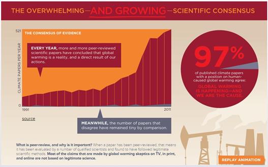
Cooks definition of a skeptic considering “all the evidence” is technically not breached. With over abstracts 12,000 papers evaluated it is a lot of evidence. The problem is nicely explained by Andrew Montford in the GWPF note “FRAUD, BIAS AND PUBLIC RELATIONS – The 97% ‘consensus’ and its critics“.

The formulation ‘that humans are causing global warming’ could have two different meanings. A ‘deep’ consensus reading would take it as all or most of the warming is caused by humans. A ‘shallow’ consensus reading would imply only that some unspecified proportion of the warming observed is attributable to mankind.

It is the shallow consensus that the paper followed, as found by a leaked email from John Cook that Montford quotes.

Okay, so we’ve ruled out a definition of AGW being ‘any amount of human influence’ or ‘more than 50% human influence’. We’re basically going with Ari’s porno approach (I probably should stop calling it that) which is AGW= ‘humans are causing global warming’. e.g. – no specific quantification which is the only way we can do it considering the breadth of papers we’re surveying.

There is another aspect. A similar methodology applied to social science papers produced in the USSR would probably produce an overwhelming consensus supporting the statement “communism is superior to capitalism”. Most papers would now be considered worthless.

There is another aspect is the quality of that evidence. Surveying the abstracts of peer-reviewed papers is a very roundabout way of taking an opinion poll. It is basically some people’s opinions of others implied opinions from short statements on tangentially related issues. In legal terms it is an extreme form of hearsay.

More important still is whether as a true “skeptic” all the evidence (or at least the most important parts) has been considered. Where is the actual evidence that humans cause significant warming? That is beyond the weak correlation between rising greenhouse gas levels and rising average temperatures. Where is the evidence that the huge numbers of climate scientists have understanding of their subject, demonstrated by track record of successful short predictions and increasing refinement of the human-caused warming hypothesis? Where is the evidence that they are true scientists following in the traditions of Newton, Einstein, Curie and Feynman, and not the followers of Comte, Marx and Freud? If John Cook is a true “skeptic”, and is presenting the most substantial evidence, then climate catastrophism is finished. But if Cook leaves out much better evidence then his survey is misinformation, undermining the case for necessary action.


Causes of global warming

The next page is headed.

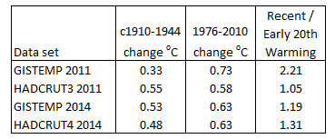
There is no exclusion of other causes of the global warming since around 1800. But, with respect to the early twentieth century warming Dana Nuccitelli said

CO2 and the Sun played the largest roles in the early century warming, but other factors played a part as well.

However, there is no clear way of sorting out the contribution of the relative components. The statement “the causes of global warming are clear” is false.

On the same page there is this.

This is a series of truth statements about the full-blown catastrophic anthropogenic global warming hypothesis. Regardless of the strength of the evidence in support it is still a hypothesis. One could treat some scientific hypotheses as being essentially truth statements, such as that “smoking causes lung cancer” and “HIV causes AIDS”, as they are so very strongly-supported by the multiple lines of evidence1. There is no scientific evidence provided to substantiate the claim that global warming is harmful, just the shallow 97% consensus belief that humans cause some warming.

This core “global warming is harmful” statement is clear misinformation. It is extremely unskeptical, as it is arrived at by not considering any evidence.


Predictions and Policy

The final page is in three parts – warming prediction without policy; warming prediction with policy; and the benefits and costs of policy.

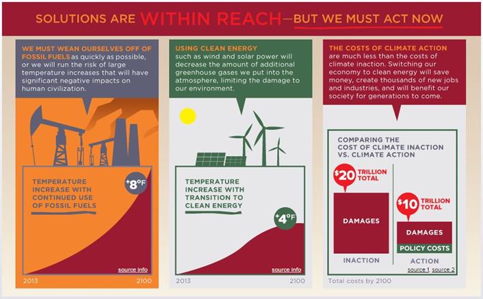
Warming prediction without policy

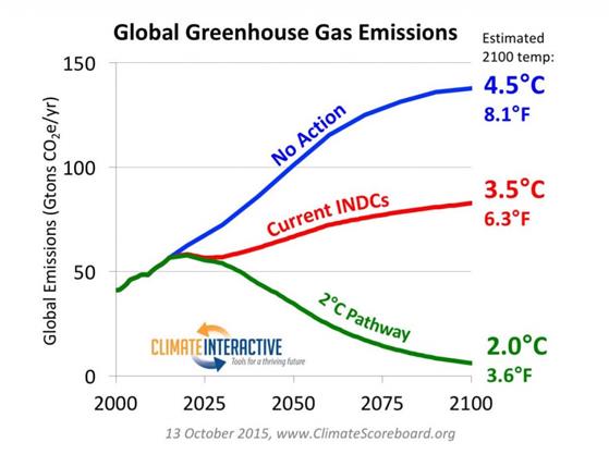
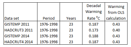
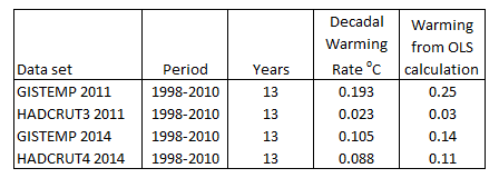
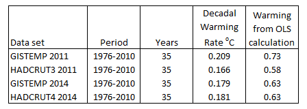
The source info for the prediction of 8oF (4.4oC) warming by 2100 without policy is from the 2007 UNIPCC AR4 report. It is now seven years out of date. The relevant table linked to is this:-

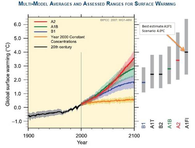
There are a whole range of estimates here, all with uncertainty bands. The highest has a best estimate of 4.0oC or 7.2oF. They seem to have taken the highest best estimate and rounded up. But this scenario is strictly for the temperature change at 2090-2099 relative to 1980-1999. This is for a 105 year period, against an 87 year period on the graph. Pro-rata the best estimate for A1F1 scenario is 3.3oC or 6oF.

But a genuine “skeptic” considers all the evidence, not cherry-picks the evidence which suit their arguments. If there is a best estimate to be chosen, which one of the various models should it be? In other areas of science, when faced with a number of models to use for future predictions the one chosen is the one that performs best. Leading climatologist, Dr Roy Spencer, has provided us with such a comparison. Last year he ran 73 of the latest climate CIMP5 models. Compared to actual data every single one was running too hot.

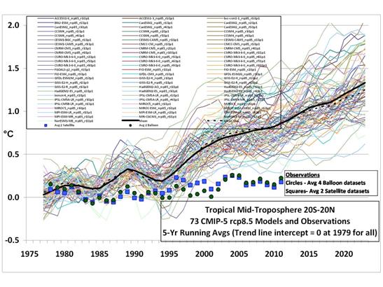
A best estimate on the basis of all the evidence would be somewhere between zero and 1.1oC, the lowest figure available from any of the climate models. To claim a higher figure than the best estimate of the most extreme of the models is not only dismissing reality, but denying the scientific consensus.

But maybe this hiatus in warming of the last 16-26 years is just an anomaly? There are at possibly 52 explanations of this hiatus, with more coming along all the time. However, given that they allow for natural factors and/or undermine the case for climate models accurately describing climate, the case for a single extreme prediction of warming to 2100 is further undermined. To maintain that 8oF of warming is – by Cook’s own definition – an extreme case of climate denial.

Warming prediction with policy

If the 8oF of predicted human-caused warming is extreme, then a policy that successfully halves that potential warming is not 4oF, but half of whatever the accurate prediction would be. But there are further problems. To be successful, that policy involves every major Government of developed countries reducing emissions by 80% (least including USA, Russia, EU, and Japan) by around 2050, and every other major country (at least including Russia, China, India, Brazil, South Africa, Indonesia and Ukraine) constraining emissions at current levels for ever. To get all countries to sign-up to such a policy combatting global warming over all other commitments is near impossible. Then take a look at the world map in 1925-1930 and see if you could reasonably have expected those Governments to have signed commitments binding on the Governments of 1945, let alone today. To omit policy considerations is an act of gross naivety, and clear misinformation.

The benefits and costs of policy

The benefits and costs of policy is the realm of economics, not of climatology. Here Cook’s definition of skeptic does not apply. There is no consensus in economics. However, there are general principles that are applied, or at least were applied when I studied the subject in the 1980s.

  • Modelled projections are contingent on assumptions, and are adjusted for new data.
  • Any competent student must be aware of the latest developments in the field.
  • Evaluation of competing theories is by comparing and contrasting.
  • If you are referencing a paper in support of your arguments, at least check that it does just that.

The graphic claims that the “total costs by 2100” of action are $10 trillion, as against $20 trillion of inaction. The costs of action are made up of more limited damages costs. There are two sources for this claim, both from 2005. The first is from “The Impacts and Costs of Climate Change”, a report commissioned by the EU. In the Executive Summary is stated:-

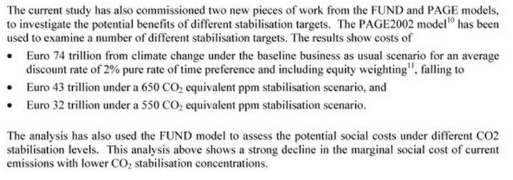
Given that €1.00 ≈ $1.20, the costs of inaction are $89 trillion and of reducing to 550ppm CO2 equivalent (the often quoted crucial level of 2-3 degrees of warming from a doubling of CO2 levels above pre-industrial levels) $38 trillion, the costs do not add up. However, the average of 43 and 32 is 37.5, or about half of 74. This gives the halving of total costs.

The second is from the German Institute for Economic Research. They state:-

If climate policy measures are not introduced, global climate change damages amounting to up to 20 trillion US dollars can be expected in the year 2100.

This gives the $20 trillion.

The costs of an active climate protection policy implemented today would reach globally around 430 billion US dollars in 2050 and around 3 trillion US dollars in 2100.

This gives the low policy costs of combatting global warming.

It is only by this arbitrary sampling of figures from the two papers that the websites figures can be established. But there is a problem in reconciling the two papers. The first paper has cumulative figures up to 2100. The shorthand for this is “total costs by 2100“. The $20 trillion figure is an estimate for the year 2100. The statement about the policy costs confirms this. This confusion leads the policy costs to be less than 0.1% of global output, instead of around 1% or more.

Further the figures are contradicted by the Stern Review of 2006, which was widely quoted in the UNIPCC AR4. In the summary of conclusions, Stern stated.

Using the results from formal economic models, the Review estimates that if we don’t act, the overall costs and risks of climate change will be equivalent to losing at least 5% of global GDP each year, now and forever. If a wider range of risks and impacts is taken into account, the estimates of damage could rise to 20% of GDP or more.

In contrast, the costs of action – reducing greenhouse gas emissions to avoid the worst impacts of climate change – can be limited to around 1% of global GDP each year.

The benefit/cost ratio is dramatically different. Tol and Yohe provided a criticism of Stern, showing he used the most extreme estimates available. A much fuller criticism is provided by Peter Lilley in 2012. The upshot is that even with a single prediction of the amount and effects of warming, there is a huge range of cost impacts. Cook is truly out of his depth when stating single outcomes. What is worse is that the costs and effectiveness of policy to greenhouse emissions is far greater than benefit-cost analyses allow.


Conclusion

To take all the evidence into account and to present the conclusions in a way that clearly presents the information available, are extremely high standards to adhere to. But theconsensusproject.com does not just fail to get close to these benchmarks, it does the opposite. It totally fails to consider all the evidence. Even the sources it cites are grossly misinterpreted. The conclusion that I draw is that the benchmarks that Cook and the skepticalscience.com team have set are just weapons to shut down opponents, leaving the field clear for their shallow, dogmatic and unsubstantiated beliefs.

Kevin Marshall


Notes

  1. The evidence for “smoking causes lung cancer” I discuss here. The evidence for “HIV causes AIDS” is very ably considered by the AIDS charity AVERT at this page. AVERT is an international HIV and AIDS charity, based in the UK, working to avert HIV and AIDS worldwide, through education, treatment and care. – See more here.
  2. Jose Duarte has examples here.

NASA corrects errors in the GISTEMP data

In estimating global average temperatures there are a number of different measures to choose from. The UNIPCC tends to favour the British Hadley Centre HADCRUT data. Many of those who believe in the anthropogenic global warming hypothesis have a propensity to believe in the alternative NASA Goddard Institute for Space Studies data. Sceptics criticize GISTEMP due to its continual changes, often in the direction of supporting climate alarmism.

I had downloaded both sets of annual data in April 2011, and also last week. In comparing the two sets of data I noticed something remarkable. Over the last three years the two data sets have converged. The two most significant areas of convergence are in the early twentieth century warming phase (roughly 1910-1944) and the period 1998 to 2010. This convergence is mostly GISTEMP coming into line with HADCRUT. In doing so, it now diverges more from the rise in CO2.

In April 2011 I downloaded the HACRUT3 data, along with GISTEMP. The GISTEMP data carries the same name, but the Hadley centre now has replaced the HADCRUT3 data set with HADCRUT4. Between the two data sets and over just three years, one would expect the four sets of data to be broadly in agreement. To check this I plotted the annual average anomalies figures below.

The GISTEMP 2011 annual mean data, (in light blue) appears to be an outlier of the four data sets. This is especially for the periods 1890-1940 and post 2000.

To emphasise this, I found the difference between data sets, then plotted the five tear centred moving average of the data.

The light green dotted line shows the divergence in data sets three years ago. From 1890 to 1910 the divergence goes from zero to 0.3 degrees. This reduces to almost zero in the early 1940s, increases to 1950, reduces to the late 1960s. From 2000 to 2010 the divergence increases markedly. The current difference, shown by the dark green dotted line shows much greater similarities. The spike around 1910 has disappeared, as has the divergence in the last decade. These changes are more due to changes in GISTEMP (solid blue line) that HADCRUT (solid orange).

To see these changes more clearly, I applied OLS to the warming periods. The start of the period I took as the lowest year at the start, and the end point as the peak. The results of the early twentieth century were as follows:-

GISTEMP 2011 is the clear outlier for three reasons. First it has the most inconsistent measured warming, just 60-70% of the other figures. Second is that the beginning low point is the most inconsistent. Third is the only data set not to have 1944 as the peak of the warming cycle. The anomalies are below.

There were no such issues of start and end of the late twentieth century warming periods, shown below.

There is a great deal of conformity between these data sets. This is not the case for 1998-2010.

The GISTEMP 2011 figures seemed oblivious to the sharp deceleration in warming that occurred post 1998, which was also showing in satellite data. This has now been corrected in the latest figures.

The combined warming from 1976 to 2010 reported by the four data sets is as follows.

GISTEMP 2011 is the clear outlier here, this time being the highest of the four data sets. Different messages from the two warming periods can be gleaned by looking across the four data sets.

GISTEMP 2011 gives the impression of accelerating warming, consistent with the rise in atmospheric CO2 levels. HADCRUT3 suggests that rising CO2 has little influence on temperature, at least without demonstrating another warming element that was present in early part of the twentieth century and not in the latter part. The current data sets lean more towards HADCRUT3 2011 than GISTEMP 2011. Along with the clear pause from 1944 to 1976, it could explain why this is not examined too closely by the climate alarmists. The exception is by DANA1981 at Skepticalscience.com, who tries to account for the early twentieth century warming by natural factors. As it is three years old, it would be interesting to see an update based on more recent data.

What is strongly apparent from recent changes, is that the GISTEMP global surface temperature record contained errors, or inferior methods, that have now been corrected. That does not necessarily mean that it is a more accurate representation of the real world, but that it is more consistent with the British data sets, and less consistent strong forms of the global warming hypothesis.

Kevin Marshall

Late Bluebells and Rhododendrons

A few years ago here in Britain we were told have every year the flowers were blooming earlier and earlier because of global warming. One of the most beautiful natural woodland signs of spring is a carpet of bluebells in April time. Well this morning I took a walk in Workington in the far north of England and the bluebells were in full bloom. Mixed with the smell of wild garlic it was a wonderful experience. Here in Manchester, the bluebells in my garden – in the most informal, organic and highly naturalistic sense of the term – are still in bloom about a month later than normal. By now I have had to lop the dead heads and pull up the long leaves before they rot, becoming food for the slugs that plague the garden. The rhododendron is blooming at least a week late. They normally are in bloom for two weeks in late May. By 1st June, the flowers are past their best. I also include a picture of the lilac tree, obtained with the house and occasionally pruned in a most irregular fashion.

The rhododendron was purchased from Bodnant Garden in North Wales over 20 years ago. Despite my near total inattention, it seems to grow a little each year. This coincided with the period when I ceased being a volunteer rhodie-basher with the National Trust. In many parts of Britain the common purple-flowering ponticum has spread through many areas with peat soils, becoming an invasive species. The bushes grow to over ten metres high, and completely cover the ground, to the exclusion of other plants, including re-generating trees in woodland areas. The waxy evergreen leaves are also acidic, so once cleared the soil can be poisoned for years after. I describe myself as a “slightly” manic beancounter. There was nothing slight about the manic ferocity that I used to hack the invaders down with a bow saw, smash and tear up the roots with a mattock and then consign the whole lot with to a flaming pyre. 

The bluebell seeds were given to me by the late Joyce and Jack Page, a keen pair of organic gardeners. I was warned that they could spread, so ignored their advice and scattered them in various patches in the both front and back. Now, every other year I dig out all the bulbs I can find, but they keep re-sprouting.


Stephan Lewandowsky on Hurricane Sandy

Jo Nova posts on Stephan Lewandowsky’s analysis of Hurricane Sandy. Below is my comment, with the relevant links.

Lewandowsky has a lot to say about the overwhelming evidence for smoking causing lung cancer, but in substance has just this to say about the impending catastrophic global warming.

Trends such as the tripling of the number of weather-related natural disasters during the last 30 years or the inexorable rise in sea levels. Climate scientists predicted those trends long ago. And they are virtually certain that those trends would not have occurred without us pumping billions of tons of CO2 into the atmosphere.

There are 3 parts to this.

First, the economic analysis of natural disasters is Lewandowsky’s own. He ignores completely the opinions of Roger Pielke Jr, an expert in the field, with many peer reviewed studies on the subject. Pielke Jnr has shown there is nothing exceptional in the normalised cost of Hurricane Sandy. Furthermore, a 2009 report showed that New York is vulnerable to hurricanes, and the shape of the coastline makes it particularly vulnerable to storm surges.

Second, the sea level rise is a trivial issue. From the University of Colorado graph, it is clear that sea levels are rising at a steady rate of 31cm a century.

Third, he claims the predictions of unnamed “experts” have been fulfilled. A balanced analysis would point out that the CO2 levels have risen faster than predicted, but temperatures have not.

Last week I posted a proposal for analysing the costly impacts of global warming. Using the “equation”, I would suggest Lewandowsky overstates both the Magnitude and Likelihood that Sandy was caused by global warming. He misperceives the change in frequency (1/t). Furthermore, given than he has a track record in the highly biased use of statistics in his own field, and his deliberate lack of balance, the Weighting attached to anything he says should be negative. That is, like to newspapers of the Soviet Union, if Lewandowsky claims something, we should read between the lines to see what he does not say. However, unlike the Soviet Union we are still able to look for alternative opinions.


Normalized US Hurricane damage impacts


2012_rel4: Global Mean Sea Level Time Series (seasonal signals removed)

Costs of Climate Change in Perspective

This is a draft proposal in which to frame our thinking about the climatic impacts of global warming, without getting lost in trivial details, or questioning motives. This builds upon my replication of the thesis of the Stern Review in a graphical form, although in a slightly modified format.

The continual rise in greenhouse gases due to human emissions is predicted to cause a substantial rise in average global temperatures. This in turn is predicted to lead severe disruption of the global climate. Scientists project that the costs (both to humankind and other life forms) will be nothing short of globally catastrophic.

That is

CGW= f {K}                 (1)

The costs of global warming, CGW are a function of the change in the global average surface temperatures K. This is not a linear function, but of increasing costs per unit of temperature rise. That is

CGW= f {Kx} where x>1            (2)

Graphically


The curve is largely unknown, with large variations in the estimate of the slope. Furthermore, the function may be discontinuous as, there may be tipping points, beyond which the costly impacts of warming become magnified many times. Being unknown, the cost curve is an expectation derived from computer models. The equation thus becomes

E(CGW)= f {Kx}                (3)

The cost curve can be considered as having a number of elements the interrelated elements of magnitude M, time t and likelihood L. There are also costs involved in taking actions based on false expectations. Over a time period, costs are normally discounted, and when considering a policy response, a weighting W should be given to the scientific evidence. That is

E(CGW)=f {M,1/t,L,│Pr-E()│,r,W}    (4)

Magnitude M is the both severity and extent of the impacts on humankind or the planet in general.

Time t is highly relevant to the severity of the problem. Rapid changes in conditions are far more costly than gradual changes. Also impacts in the near future are more costly than those in the more distant future due to the shorter time horizon to put in place measures to lessen those costs.

Likelihood L is also relevant to the issue. Discounting a possible cost that is not certain to happen by the expected likelihood of that occurrence enables unlikely, but catastrophic, events to be considered alongside near certain events.

│Pr-E()│ is the difference between the predicted outcome, based on the best analysis of current data at the local level, and the expected outcome, that forms the basis of adaptive responses. It can work two ways. If there is a failure to predict and adapt to changing conditions then there is a cost. If there is adaptation to anticipation future condition that does not emerge, or is less severe than forecast, there is also a cost. │Pr-E()│= 0 when the outturn is exactly as forecast in every case. Given the uncertainty of future outcomes, there will always be costs incurred would be unnecessary with perfect knowledge.

Discount rate r is a device that recognizes that people prioritize according to time horizons. Discounting future costs or revenue enables us to evaluate the discount future alongside the near future.

Finally the Weighting (W) is concerned with the strength of the evidence. How much credence do you give to projections about the future? Here is where value judgements come into play. I believe that we should not completely ignore alarming projections about the future for which there is weak evidence, but neither should we accept such evidence as the only possible future scenario. Consider the following quotation.

There are uncertain truths — even true statements that we may take to be false — but there are no uncertain certainties. Since we can never know anything for sure, it is simply not worth searching for certainty; but it is well worth searching for truth; and we do this chiefly by searching for mistakes, so that we have to correct them.

Popper, Karl. In Search of a Better World. 1984.

Popper was concerned with hypothesis testing, whilst we are concerned here with accurate projections about states well into the future. However, the same principles apply. We should search for the truth, by looking for mistakes and (in the context of projections) inaccurate perceptions as well. However, this is not to be dismissive of uncertainties. If future climate catastrophe is the true future scenario, the evidence, or signal, will be weak amongst historical data where natural climate variability is quite large. This is illustrated in the graphic below.


The precarious nature of climate costs prediction.

Historical data is based upon an area where the signal of future catastrophe is weak.

Projecting on the basis of this signal is prone to large errors.

In light of this, it is necessary to concentrate on positive criticism, with giving due weighting to the evidence.

Looking at individual studies, due weighting might include the following:-

  • Uses verification procedures from other disciplines
  • Similarity of results from using different statistical methods and tests to analyse the data
  • Similarity of results using different data sets
  • Corroborated by other techniques to obtain similar results
  • Consistency of results over time as historical data sets become larger and more accurate
  • Consistency of results as data gathering becomes independent of the scientific theorists
  • Consistency of results as data analysis techniques become more open, and standards developed
  • Focus on projections on the local level (sub-regional) level, for which adaptive responses might be possible

To gain increased confidence in the projections, due weighting might include the following:-

  • Making way-marker predictions that are accurate
  • Lack of way-marker predictions that are contradicted
  • Acknowledgement of, and taking account of, way-marker predictions that are contradicted
  • Major pattern predictions that are generally accurate
  • Increasing precision and accuracy as techniques develop
  • Changing the perceptions of the magnitude and likelihood of future costs based on new data
  • Challenging and removal of conflicts of interest that arise from scientists verifying their own projections

    Kevin Marshall