Example of dogmatic pseudo-science on coral reef bleaching

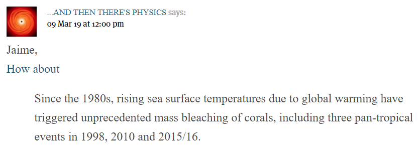
I have already posted twice on coral reefs, but skirted round the article on Coral Alarmism by Geoff Price at his own blog on April 2nd 2018, reposted at ATTP eleven months later. By reposting this article Prof Ken Rice has shown how derisory is the evidence for global warming being the cause of increasing coral bleaching. 

Checking the sources that Price gives for (a) evidence of global warming (b) media sources of coral bleaching reveal there is no unambiguous underlying evidence to make a persuasive case  linking of one with the other. Further. the major peer review paper that Price cites finds that changes in severe coral bleaching events are not explained by global warming.

Evidence of global warming related to coral reefs

The first issue I want to deal with is the evidence that Price presents for the increase in coral bleaching being due to global warming.

Price first states the dogma

In our window of time here and on our watch, we’re observing the unfolding collapse of global coral reef cover – the largest living structures on the planet, relatively priceless in terms of human and economic value, and stunningly beautiful – due to human-induced stresses, now most prominently from human-caused global anthropogenic (greenhouse) warming of the oceans.

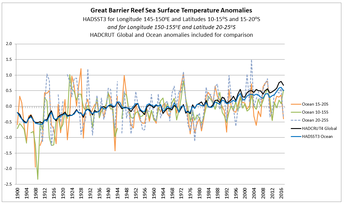
The claim of human induced warming is not backed up by any evidence.  That global average temperatures have been rising for well over a century  does not mean that this was human-induced. It could be natural or just some random cyclical cycle in a chaotic complex system, or some combination of all three. The evidence of warming oceans is the NOAA data of estimated increase in ocean heat content from 1960. There are a number of things wrong with this approach. The data period is only from 1960; heat stress in corals is from the amount of temperature rise; and the data is for 0-700m down, whilst most corals reside just a few meters below the surface. A much better measure is the sea surface temperature data records, which measures temperature just below the surface.

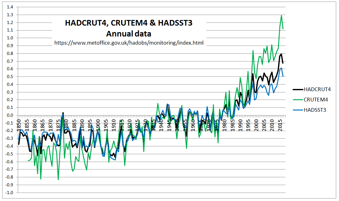
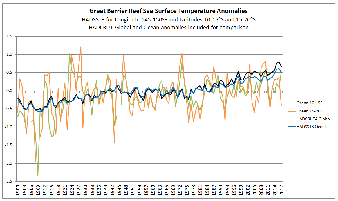
Below is the HADCRUT4 land and ocean anomalies temperature anomalies that I charted last year.


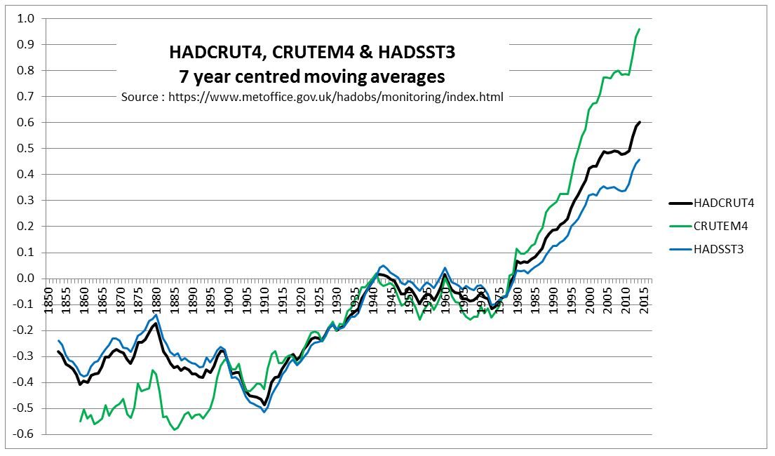
Crucially, the HADSST3 ocean warming data shows a similar global average temperature increase in the early twentieth century as the post 1975 warming. Both were about 0.5C, a value likely much less than the seasonal sea surface temperature change. Also, the rise in GHG gases – especially of CO2 – is much more post 1950 than from 1800 to 1940. The data does not support the idea that all warming is human-caused, unless global warming is caused by Mother Gaia anticipating the rise in CO2 levels.

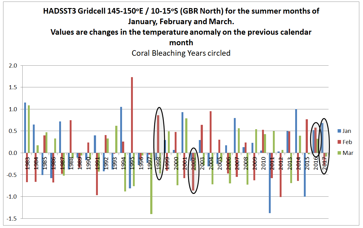
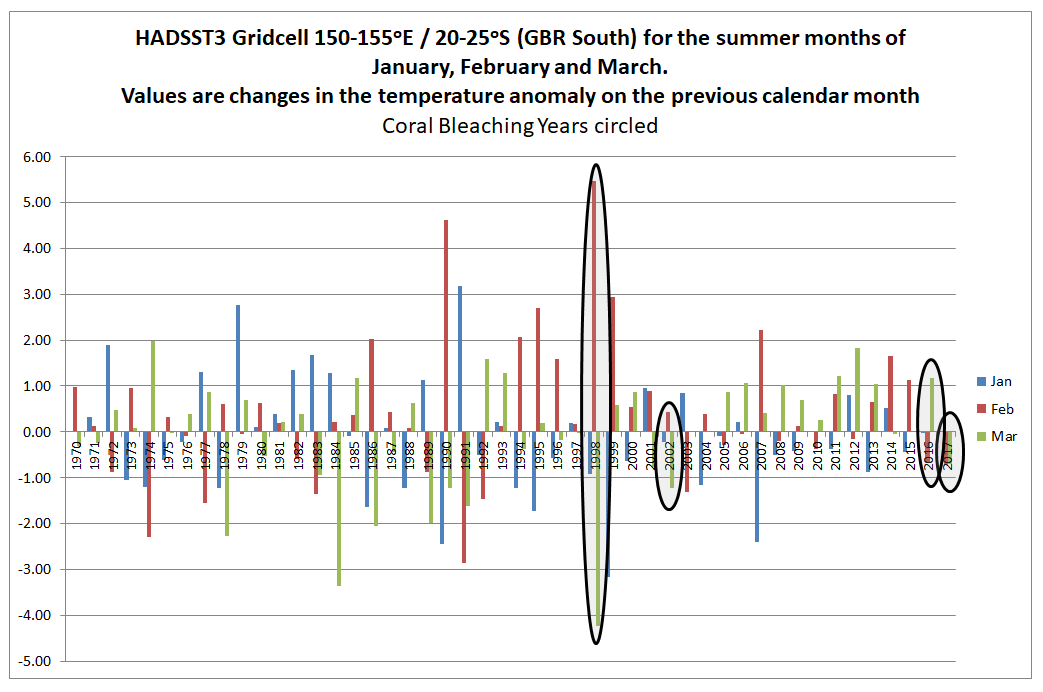
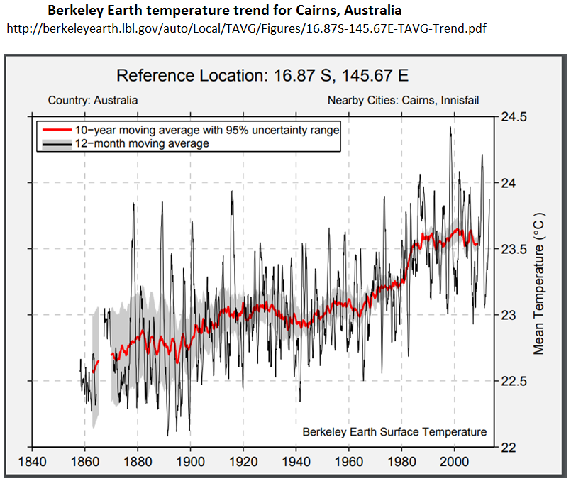
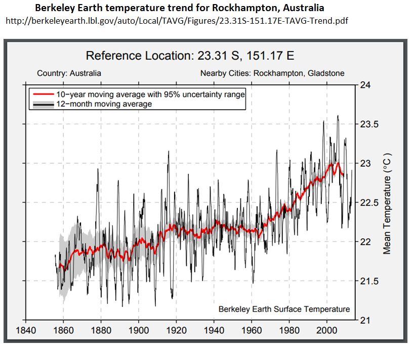
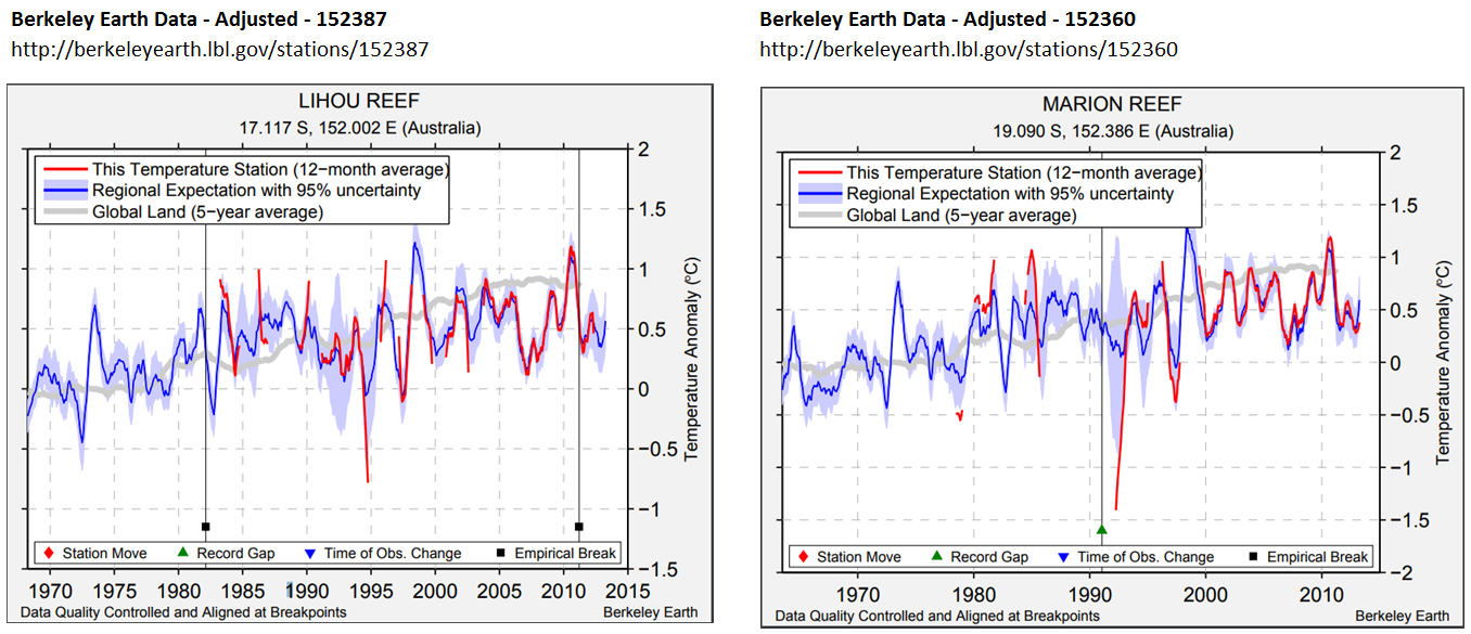
Even then, then rise in global sea surface temperatures is not an indication of warming in a particular area. The Great Barrier Reef, for instance has shown little or no warming since 1980. From my previous post, observed major bleaching events do not correspond to any rise in warming, or any increase in extreme temperatures.

Media Sources do not support hypothesis

Even if Geoff Price cannot provide proper evidence of the rise in average temperatures that coral reefs are experiencing, at least he could provide credible scientific evidence of the link between warming and increase in coral bleaching. Price states

Some articles in major media break through, e.g. Global Warming’s Toll on Coral Reefs: As if They’re ‘Ravaged by War’, though the impact on public awareness and policy action remains low. The impact is global including the Great Barrier Reef (GBR), Japan, the South PacificHawaii, the Florida keys, and Belize.

Rather than presenting empirical evidence, or at least scientific articles, relating increased coral reef bleaching to global warming, Price bizarrely “quotes” from various media sources. To show how bizzare, I have made some notes of the sources,

As if “Ravaged by War”

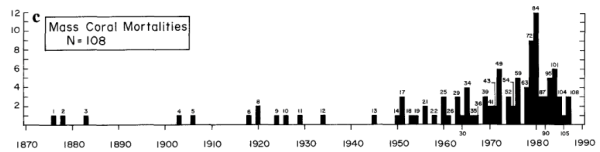
The “Ravaged by War” article in the New York Times of Jan 4 2018. At the start of the article is stated “large-scale coral bleaching events……were virtually unheard-of before the 1980s“, whereas later on is stated ”before 1982-3, mass bleaching events across wide areas were nonexistent.”  The perceived lack of bleaching before the 1980s is changed into a fact. The lack of perception is due to lack of wide-scale research. But even 1982-3 as the first year of reporting of mass bleaching is contradicted by Figure 1c in Glynn 1993, reference 3 in the Hughes et al 2018 paper that prompted the NYT article. 1978 and 1979 have far more recorded mass coral mortalities than 1982 and 1993.

Evidence of global bleaching

The link is to a page of high quality pictures of coral bleaching from around the world. The rise of digital photography, and the increase in the numbers of people diving reefs with cameras in the last twenty years is evidence observation bias not of real increase. In the past, lack of wide-scale human perception does not mean the issue was not there.

Great Barrier Reef Bleaching

From the UK Independent April 20 2016 is the headline “Great Barrier Reef: Half of natural wonder is ‘dead or dying’ and it is on the brink of extinction, scientists say“.

The event is partly being caused by the strong El Nino weather system that has swept across the world in the last year. But global warming is the underlying cause, say scientists, and so the bleaching and death is likely to continue.

“We’ve never seen anything like this scale of bleaching before. In the northern Great Barrier Reef, it’s like 10 cyclones have come ashore all at once,” said Professor Terry Hughes, conveyor of the National Coral Bleaching Taskforce, 

The claim that global warming is the underlying cause of the bleaching is not attributed to any one person, or group. Prof Terry Hughes only makes a statement about the current state of affairs not being observed before, not that, in reality, it is unprecedented. Again a difference between perceptions and underlying reality.

Japan

The Japanese study is from an environmentalist website Down to Earth on January 13 2017. It states

Experts have, for quite a while now, believed that corals are among the most susceptible organisms to climate change. In fact, the world has already lost 30-40 per cent of its total documented coral cover.

According to the ministry’s estimate, 70 per cent of the Sekisei lagoon in Okinawa had been killed due to bleaching, which occurs when unusually warm water forces coral to expel the algae living in their tissues. Unless water temperatures quickly return to normal, the coral eventually dies from lack of nutrition.

Based on the survey done on 35 locations in Japan’s southernmost reaches from November to December 2016, the ministry observed that the plight of the reef has become “extremely serious” in recent years.

According to a Japanese media, the dead coral has now turned dark brown and is now covered with algae. It also revealed that the average sea surface temperature between June and August 2016 in the southern part of the Okinawa island chain was 30.1°C—one to two degrees warmer than usual. According to the Japan meteorological agency, it was also the highest average temperature since records began in 1982.

There is no link to the original source and from the statement the article is probably relying on media sources in English. Therefore there is no way of verifying whether the claims are due to warming. I would assume that the authors, like myself, do not speak Japanese, and the script is incomprehensible to them. Further, the article highlights just one of 35 locations in the Japanese study. This should be a signal that the cause of that extreme example of coral bleaching is more than just extreme temperatures.

Searching “Sekisei Lagoon” I come up with lots of returns, mostly about Coral bleaching. There was one is a short 2017 article at the Japanese Ministry of Environment website, and sponsored by them. The second paragraph states

(C)orals in the (Sekisei) Lagoon have extensively diminished since park designation because of various reasons: terrestrial runoffs of red clay and wastewater; coral bleaching due to high water temperatures; and outbreaks of the predatory crown-of-thorns starfish (Acanthaster planci). Initial efforts have been made to reduce terrestrial runoffs to help the natural recovery of coral ecosystem health. Studies on coral distribution and techniques for reef rehabilitation are also in progress.

It is does not look like global warming in the sole cause of the excessive coral bleaching in Sekisei Lagoon. It is also local human factors and a large predator. A little research of crown-of-thorns starfish reveals that sudden increases in populations are poorly understood and that it is also found on the Great Barrier Reef. Acanthaster planci has a number of predators, the lack of which might indicate reasons for the outbreaks.

Other Media Sources

The South Pacific source is a blog post from March 2016 on American Samoan Reefs, a small part of the total extent of islands across the vast region. It is about coral bleaching being on hold, but there is an alert due to recent abnormally high temperatures. If bleaching did follow it would have been due to the El Nino event, which caused abnormally high average temperatures globally.

The Hawaii source, does not give a link to the peer reviewed article on which it is based. Looking at the article, it is (a) based on surveys in 2014 and 2015, but with no data on historical events (b) claims that elevated temperatures were present in Hawaii, (but does not show that the global average temperature were not elevated (c) provides no evidence of comparative surveys in the past to show the issue has got worst. In the first sentence of the introduction it is implied that the entire 0.9 °C in average SSTs is due to rise in GHGs, a totally unsupportable statement. Peer J’s boasted rapid peer review process has failed to pick up on this,

The Florida Keys reference is a Washington Post article of June 25 2017 about how loss of the coral reefs through temperature rise will impact on tourism. It assumes that temperature rise is the sole course of coral reef loss.

Finally the Belize article a New York Times opinion piece from July 6 2017, about a researcher visiting the coral reefs. There is no data provided for either local warming or trends in bleaching.

Hughes et al 2018

The major scientific article that Price refers to is

Spatial and temporal patterns of mass bleaching of corals in the Anthropocene DOI: 10.1126/science.aan8048 . (Hughes et al 2018) 

Unusually this paper is open access. I quite like the attempt to reduce the observation bias when they state

Here we compiled de novo the history of recurrent bleaching from 1980 to 2016 for 100 globally distributed coral reef locations in 54 countries using a standardized protocol to examine patterns in the timing, recurrence, and intensity of bleaching episodes, including the latest global bleaching event from 2015 to 2016.

This does not eliminate the observation bias, but will certainly lesson the bias. They then make the observation

Since 1980, 58% of severe bleaching events have been recorded during four strong El Niño periods (1982–1983, 1997–1998, 2009–2010, and 2015–2016) (Fig. 2A), with the remaining 42% occurring during hot summers in other ENSO phases.

Considering that 2017 was also a severe bleaching events and global average temperatures were higher than in the 2015 El Nino year and in 2018, not to state it is an El Nino year is a maybe a bit dubious. Even so, on this basis El Nino free years are runs of 13, 10 and 4. This is not unlike the statement in the abstract

The median return time between pairs of severe bleaching events has diminished steadily since 1980 and is now only 6 years.

The paper makes no direct claims about the increase in observed coral bleaching being related to global warming. But This is because the data does not show this. Supplementary data figure 4 tests the relationship between the number of severe coral bleaching events per location and warming at that location across four regions.

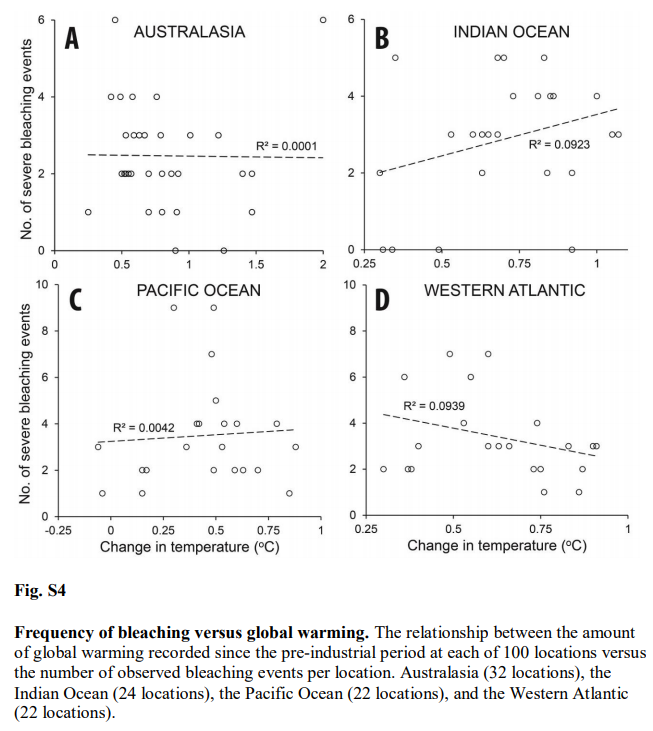
For Australia R2 = 0.0001. That is zero. Better results can be achieved from two random unrelated data sets.
The best relationship is for the West Atlantic – mostly the Caribbean. That is R2 = 0.0939. The downward slope implies a negative relationship.  But still less than 10% of the variation in severe bleaching events is explained by rising temperatures.

Figure 2A of the Supplementary materials I also find interesting in the context of Jaime Jessop’s contention that coral bleaching is related to El Ninos.

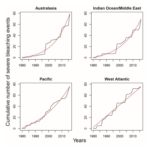
Note that this is cumulative recorded severe bleaching events. The relative size of individual years is from the increase in that year.
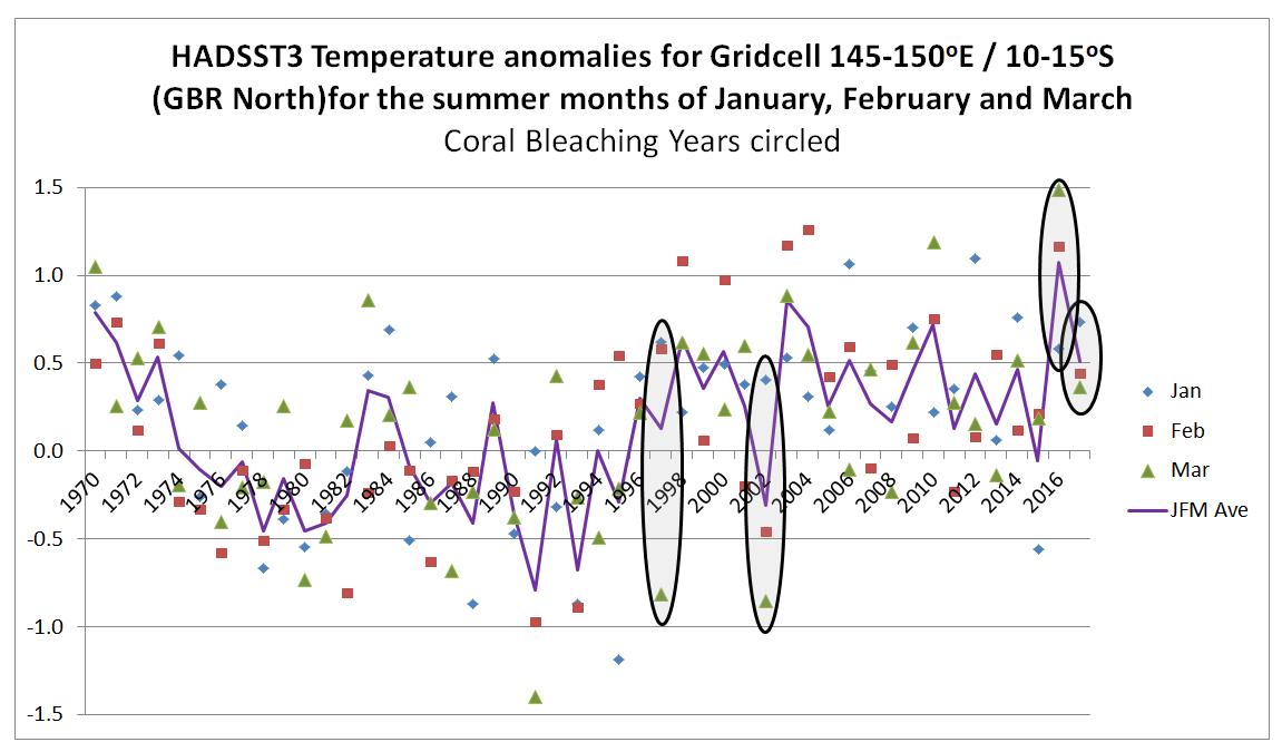
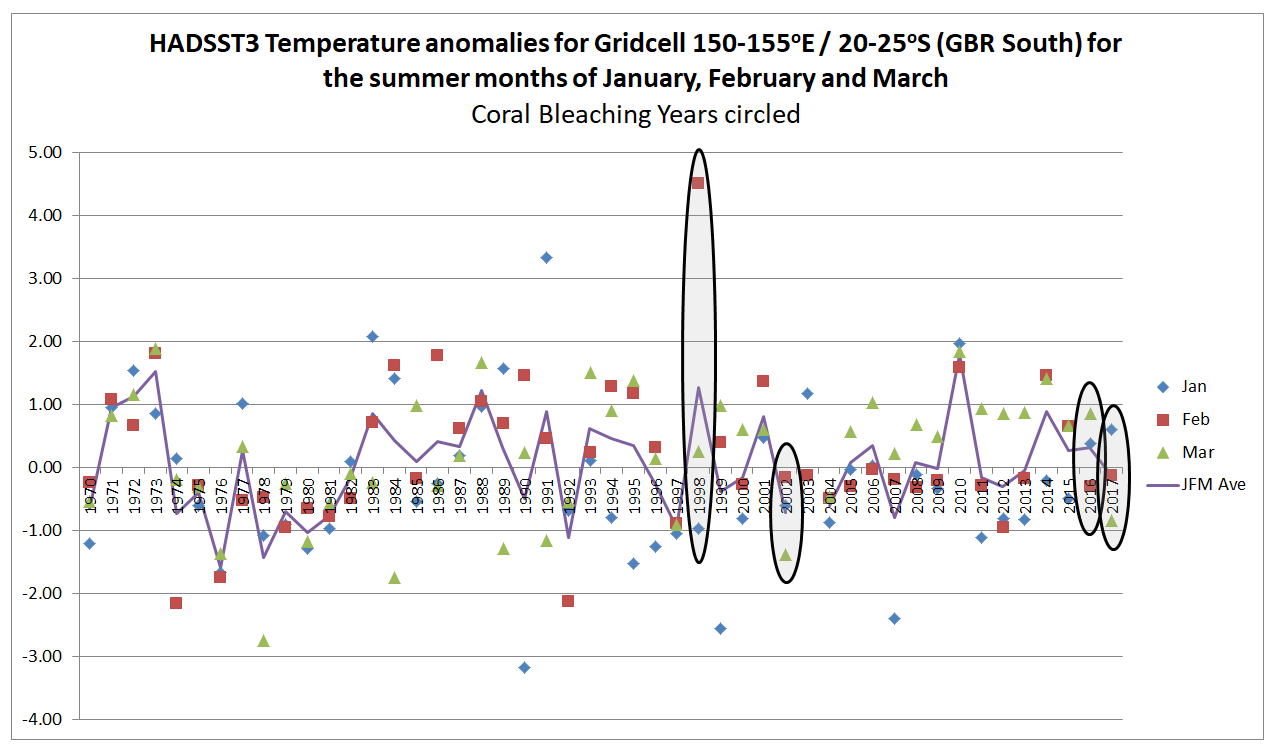
For Australasia, the three standout years are 1998, 2010 and 2016/2017. These are El Nino years, confirming Jaime’s hypothesus.
For the West Atlantic there were also an unusual number of severe bleaching events in 1995 and 2005. No El Ninos there, but 2005 saw a record number of hurricanes in the area, and 1995 also saw an unusually high number including Hurricane Andrew, the last category 5 to make landfall in the USA. Although excess heat might be the principal cause of stress in coral reefs, I am sure they might also get stressed by severe storms, with the accompanying storm surges.
If severe storms can lead to bleaching there is a problem with observation of bleaching. From Heron et al 2016 we learn that since the 1990s satellites have made twice-weekly recording of surface temperatures are 0.5 degree grids (about 50km), then comparing with the SST data to detect unusual runs of DHWs. Since 2015, a new product was launched with just 5km grids. It is then left to some intrepid scientists to go out in a boat, dive down and take samples. If severe storms do not have unusually high temperatures, then there will be no alerts of bleaching, so unless there are other attempts to observe, this will not be picked up, or could be picked up a short while later after an episode of unusual warming. Before the 1990s, there was no such over-all detection system, and likely much less researchers. Many of the bleaching events occurring before 1990 may not have been picked up, or if they were, there may have been less ability to define that events as major.

Concluding Comments

By re-posting a dogmatic article ATTP has done a service to climate scepticism. Laying out a very bad, but well-referenced, case for global warming causing increased coral reef bleaching shows the inadequacies of that case. Where long periods of data collated on a consistent basis is used there is no correlation. Further, increasing observed frequency of bleaching events since is mostly due El Nino events being closer together, whilst the increase in observed bleaching can be accounted for by the greatly improved methods of detection and the resources put into observing, which are many times what they were a few decades ago.

Geoff Price’s method of presenting the opinions of others, rather than focusing on the underlying data that supports the conjecture, is something in common with ATTP and others of the climate community. When checked, the fail to connect with any underlying reality.

There is a rider to be made. The case for global warming is very poor by the traditional scientific methods of confronting conjectures with evidence of the natural world, and letting such evidence being the ultimate arbiter of that conjecture. From the consensus viewpoint popular today it is collective opinion that is the arbiter. The above is from the former point of view, which means from the latter view this is misinformation.

Is increasing Great Barrier Reef coral bleaching related to climate change or observation bias?

In the previous post I looked at whether the claimed increase in coral bleaching in the Great Barrier Reef was down to global average temperature rise. I concluded that this was not the case as the GBR has not warmed, or at least not warmed as much as the global temperatures. Here I look further at the data.
The first thing to state is that I recognize that heat stress can occur in corals. Blogger Geoff Price (in post at his own blog on April 2nd 2018, reposted at ATTP eleven months later) stated

(B)leaching via thermal stress is lab reproducible and uncontroversial. If you’re curious, see Jones et al 1998, “Temperature-induced bleaching of corals begins with impairment of the CO2 fixation mechanism in zooxanthellae”.

I am curious. The abstract of Jones et al 1998 states

The early effects of heat stress on the photosynthesis of symbiotic dinoflagellates (zooxanthellae) within the tissues of a reef‐building coral were examined using pulse‐amplitude‐modulated (PAM) chlorophyll fluorescence and photorespirometry. Exposure of Stylophora pistillata to 33 and 34 °C for 4 h resulted in ……….Quantum yield decreased to a greater extent on the illuminated surfaces of coral branches than on lower (shaded) surfaces, and also when high irradiance intensities were combined with elevated temperature (33 °C as opposed to 28 °C). …..

If I am reading this right. the coral was exposed to a temperature increase of 5-6 °C for a period of 4 hours. I can appreciate that the coral would suffer from this sudden change in temperature. Most waterborne creatures would be become distressed if the water temperature was increased rapidly. How much before it would  seriously stress them might vary, but it is not a serious of tests I would like to carry out. But is there evidence of increasing heat stress causing increasing coral bleaching in the real world? That is, has there been both a rise in coral bleaching and a rise in these heat stress conditions? Clearly there will be seasonal changes in water temperature, even though in the tropics it might not be as large as, say, around the coast of the UK. Also, many over the corals migrate up and down the reef, so they could be tolerant of a range of temperatures. Whether worsening climate conditions have exacerbated heat stress conditions to such an extent that increased coral bleaching has occurred will only be confirmed by confronting the conjectures with the empirical data.


Rise in instances of coral bleaching

I went looking for long-term data that coral bleaching is on the increase and came across and early example. 

P. W. Glynn: Coral reef bleaching: Ecological perspectives. Coral Reefs 12, 1–17 (1993). doi:10.1007/BF00303779

From the introduction

Mass coral mortalities in contemporary coral reef ecosystems have been reported in all major reef provinces since the 1870s (Stoddart 1969; Johannes 1975; Endean 1976; Pearson 1981; Brown 1987; Coffroth et al. 1990). Why, then, should the coral reef bleaching and mortality events of the 1980s command great concern? Probably, in large part, because the frequency and scale of bleaching disturbances are unprecedented in the scientific literature.

One such example of observed bleaching is graphed in Glynn’s paper as Figure 1 c

But have coral bleaching events actually risen, or have the observations risen? That is in the past were there less observed bleaching events due to much less bleaching events or much less observations? Since the 1990s have observations of bleaching events increased further due to far more researchers leaving their families the safe climates of temperate countries to endure the perils of diving in waters warmer than a swimming pool? It is only by accurately estimating the observational impact that it is possible to estimate the real impact.
This reminds me of the recent IPPR report, widely discussed including by me, at cliscep and at notalotofpeopleknowthat (e.g. here and here). Extreme claims were lifted a report by billionaire investor Jeremy Grantham, which stated

Since 1950, the number of floods across the world has increased by 15 times, extreme temperature events by 20 times, and wildfires sevenfold

The primary reason was the increase in the number of observations. Grantham mistook increasing recorded observations in a database with real world increases, than embellished the increase in the data to make that appear much more significant. The IPPR then lifted the false perception and the BBC’s Roger Harrabin copied the sentence into his report. The reality is that many extreme weather events occurred prior to the conscientious worldwide cataloguing of them from the 1980s. Just because disasters were not observed and reported to a centralized body did not mean they did not exist.
With respect to catastrophic events in the underlying EM-DAT database it is possible to have some perspective on whether the frequency of reports of disasters are related to increase in actual disasters by looking at the number of deaths. Despite the number of reports going up, the total deaths have gone down. Compared to 1900-1949 in the current decade to mid-2018 “Climate” disaster deaths are down 84%, but reported “Climate” disasters are 65 times more frequent.
I am curious to know how it is one might estimate the real quantity of reported instances of coral bleaching from this data. It would certainly be a lot less than the graph above shows.


Have temperatures increased?

In the previous post I looked at temperature trends in the Great Barrier Reef. There are two main sources that suggest that, contrary to the world as a whole, GBR average temperatures have not increased, or increased much less than the global average. This was shown on the NASA Giss map comparing Jan-2019 with the 1951-1980 average and for two HADSST3 ocean data 5ox5o gridcells. For the latter I only charted the temperature anomaly for two gridcells which are at the North and middle of the GBR. I have updated this chart to include the gridcell 150-155oE / 20-25oS at the southern end of the GBR.

There is an increase in warming trend post 2000, influenced particularly by 2001 and 2003. This is not replicated further north. This is in agreement with the Gistemp map of temperature trends in the previous post, where the Southern end of the GBR showed moderate warming.


Has climate change still impacted on global warming?

However, there is still an issue. If any real, but unknown, increase in coral bleaching has occurred it could still be due to sudden increases in surface sea temperatures, something more in accordance with the test in the lab.
Blogger ATTP (aka Professor Ken Rice) called attention to a recent paper in a comment at cliscep

The link is to a pre-publication copy, without the graphics or supplementary data, to

Global warming and recurrent mass bleaching of corals – Hughes et al Nature 2017

The abstract states


The distinctive geographic footprints of recurrent bleaching on the Great Barrier Reef in 1998, 2002 and 2016 were determined by the spatial pattern of sea temperatures in each year.


So in 2002 the GBR had a localized mass bleaching episode, but did not share in the 2010 pan-tropical events of Rice’s quote. The spatial patterns, and the criteria used are explained.

Explaining spatial patterns
The severity and distinctive geographic footprints of bleaching in each of the three years can be explained by differences in the magnitude and spatial distribution of sea-surface temperature anomalies (Fig. 1a, b and Extended Data Table 1). In each year, 61-63% of reefs experienced four or more Degree Heating Weeks (DHW, oC-weeks). In 1998, heat stress was relatively constrained, ranging from 1-8 DHWs (Fig. 1c). In 2002, the distribution of DHW was broader, and 14% of reefs encountered 8-10 DHWs. In 2016, the spectrum of DHWs expanded further still, with 31% of reefs experiencing 8-16 DHWs (Fig. 1c). The largest heat stress occurred in the northern 1000 km-long section of the Great Barrier Reef. Consequently, the geographic pattern of severe bleaching in 2016 matched the strong north-south gradient in heat stress. In contrast, in 1998 and 2002, heat stress extremes and severe bleaching were both prominent further south (Fig. 1a, b).

For clarification:-

Degree Heating Week (DHW) The NOAA satellite-derived Degree Heating Week (DHW) is an experimental product designed to indicate the accumulated thermal stress that coral reefs experience. A DHW is equivalent to one week of sea surface temperature 1 deg C above the expected summertime maximum.

That is, rather than the long-term temperature rise in global temperatures causing the alleged increase in coral bleaching, it is the human-caused global warming changing the climate by a more indirect means of making extreme heat events more frequent. This seems a bit of a tall stretch. However, the “Degree Heating Week” can be corroborated by the gridcell monthly HADSST3 ocean temperature data for the summer months if both the measures are data are accurate estimates of the underlying data. A paper published last December in Nature Climate Change (also with lead author Prof Terry Hughes) highlighted 1998, 2002, 2016 & 2017 as being major years of coral bleaching. Eco Watch has a short video of maps from the paper showing the locations of bleaching event locations, showing much more observed events in 2016 and 2017 than in 1998 and 2002.

From the 2017 paper any extreme temperature anomalies should be most marked in 2016 across all areas of the GBR. 2002 should be less significant and predominantly in the south. 1998 should be a weaker version of 2002.
Further, if summer extreme temperatures are the cause of heat stress in corals, then 1998, 2002, 2016 & 2017 should have warm summer months.
For gridcells 145-150oE / 10-15oS and 150-155oE / 20-25oS respectively representing the northerly and summer extents of the Great Barrier Reef, I have extracted the January February and March anomalies since 1970, then circled the years 1998, 2002, 2016 and 2017. Shown the average of the three summer months.

In the North of the GBR, 2016 and 2017 were unusually warm, whilst 2002 was a cool summer and 1998 was not unusual. This is consistent with the papers findings. But 2004 and 2010 were warm years without bleaching.
In the South of the GBR 1998 was exceptionally warm in February. This might suggest an anomalous reading. 2002 was cooler than average and 2016 and 2017 about average.
Also note, that in the North of the GBR summer temperatures appear to be a few tenths of a degree higher from the late 1990s than in the 1980s and early 1990s. In the South there appears to be no such increase. This is the reverse of what was found for the annual average temperatures and the reverse of where the most serious coral bleaching has occurred.
On this basis the monthly summer temperature anomalies do not seem to correspond to the levels of coral bleaching. A further check is to look at the change in the anomaly from the previous month. If sea surface temperatures increase rapidly in summer, this may be the cause of heat stress as much as absolute magnitude above the long-term average.

In the North of the GBR the February 1998 anomaly was almost a degree higher than the January anomaly. This is nothing exceptional in the record. 2002, 2016 & 2017 do not stand out at all.

In the South of the GBR, the changes in anomaly from one month to the next are much greater than in the North of the GBR. February 1998 stands out. It could be due to problems in the data. 2002, 2016 and 2017 are unexceptional years. There also appears to be less volatility post 2000 contradicting any belief in climate getting more extreme. I believe it could be an indication that data quality has improved.

Conclusions

Overall, the conjecture that global warming is resulting in increased coral bleaching in the Great Barrier Reeg directly through rising average temperatures, or indirectly through greater volatility in temperature data, is not supported by the HADSST3 surface temperature data from either the North or South of the reef. This does not necessarily mean that there is not a growing problem of heat stress, or though this seems the most likely conclusion. Alternative explanations could be that the sea surface temperature anomaly is inadequate or that other gridcells show something different.
Which brings us back to the problem identified above. How much of the observed increase in coral bleaching is down to real increases in coral bleaching and how much is down to increased observations? In all areas of climate, there is a crucial difference between our perceptions based on limited data and the underlying reality.

Kevin Marshall

Empirical evidence contradicts theory that coral bleaching of Great Barrier Reef is a result of Global Warming

At Cliscep, Jaime Jessop looks at Coral Reefs again. She quotes from

Spatial and temporal patterns of mass bleaching of corals in the Anthropocene DOI: 10.1126/science.aan8048 . (Hughes et al 2018) 

The first line is 

The average surface temperature of Earth has risen by close to 1°C as of the 1880s (1), and global temperatures in 2015 and 2016 were the warmest since instrumental record keeping began in the 19th century.

The surface temperature consists of two parts, land and ocean data. HADCRUT4 data since 1850 is as follows.

Recent land warming is significantly greater than ocean warming. Further, in the last 50 years the warming in the tropics was slightly  less than the global average, with the greatest warming being north of the tropics. Below is a split of the HADCRUT4 data into eight bands of latitude that I compiled last year. 

NASA GISS have maps showing trends across the globe. The default is to compare the most recent month with the 1951-1980 average.

The largest coral reef on the planet is the Great Barrier Reef off the North West Coast of Australia. From the map the warming is -0.2 to 0.2 °C. By implication, Hughes et al are claiming that coral bleaching in the Southern Hemisphere is being caused not by local average surface temperature rise but by a global average heavily influenced by land-based northern hemisphere temperature rise.

However, this is only a modeled estimate of trends. Although local data trends for the sea is not readily available, Berkeley Earth does provide trends for towns on the coastline adjacent to the GBR. I have copied the trends for Cairns and Rockhampton, one located in the middle section of the GBR, the other at the Southern tip.

Cairns, in the middle of the GBR, has no warming since 1980, whilst Rockhampton has nearer the global average and no warming trend from 1998 to 2013. This is consistent with the NASA GISS map.

BE are extremely thorough, providing the sites which make up the trend, with the distance from the location. The raw data reveals a more complex picture. For Townsville (one-third of the way from Cairns to Rockhampton) the station list is here. Looking at the list, many of the temperature data sets are of short duration, have poor quality data (e.g. Burdekin Shire Council 4875), or have breaks in the data (e.g. Ayr, Burdekin Shire Council 4876). Another issue with respect to the Great Barrier Reef is that many are inland, so might not be a good proxy for sea surface temperatures. However, there are a couple of stations that can be picked out with long records and near the coast.
Cardwell Post Office 152368 had peak temperatures in the 1970s and cooling since. Relative to other stations, BE’s algorithms estimated there was a station bias of over 0.5°C in the 1970s.

Cairns Airport 152392 (with data since 1908, twenty years before planes first flew from the site! ) has cooling in the 1930s and warming from 1940 to the late 1950s. The opposite of the global averages. There are no station bias adjustments until 1950, showing that this is typical of the regional expectation. Recent warming is confined to 1980s and a little post 2000.

These results are confined to the land. I have found two sites on the GBR that have give a similar picture. Lihou Reef (17.117 S 152.002 E) and Marion Reef (19.090 S 152.386 E). Both for fairly short periods and the quality of the data is poor, which is not surprising considering the locations. But neither show any warming trend since the 1980’s whereas the faint grey line of the global land data does show a warming trend.

The actual temperature data of the GBR indicates that not only are average temperatures not a cause of GBR bleaching, but that calculated global average temperature trends are not replicated on the North East Australian coast. With respect to the world’s largest coral reef, increase incoral bleaching is not empirically linked to any increase in average global temperatures.

UPDATE 11/03/19 – 20:10

Following a comment by Paul Matthews, I have found the sea surface temperature data by location. The HADSST3 data is available in 5o by 5o gridcells. From data that I downloaded last year I have extracted the gridcells for 145-150oE/10-15oS and 145-150oE/15-20oS which cover most of the Great Barrier Reef, plus a large area besides. I have charted the annual averages alongside the HADCRUT4 global and HADSST3 ocean anomalies.

Ocean surface temperatures for the Great Barrier Reef show no warming trend at all, whilst the global averages show a quite distinct warming trend. What is more important, if the coral bleaching is related to sudden increases in sea temperatures then it is the much more massive increases in local data that are important, not the global average. To test whether increases in temperatures are behind bleaching events requires looking for anomalous summer months in the data. Another post is required.     

The context of Jaime Jessop’s Cliscep article

After multiple comments at a blogpost by Jaime Jesssop in early January 2018 Geoff M Price wrote a post at his own blog “On Coal Alarmism” on 2nd April 2018. ATTP re-posted 11 months later on 5th March 2019. Personally I find the post, along with many of the comments, a pseudo-scientific and discriminatory attack piece. That may be the subject of another post.

Kevin Marshall

aTTP falsely attacks Bjorn Lomborg’s “Impact of Current Climate Proposals” Paper

The following is a comment to be posted at Bishop Hill, responding to another attempt by blogger ….andThenThere’sPhysics to undermine the work of Bjorn Lomborg. The previous attempt was discussed here. This post includes a number of links, as well as a couple of illustrative screen captures at the foot of the table.

aTTP’s comment is

In fact, you should read Joe Romm’s post about this. He’s showing that the INDCs are likely to lead to around 3.5C which I think is relative to something like the 1860-1880 mean. This is very similar to the MIT’s 3.7, and quite a bit lower than the RCP8.5 of around 4.5C. So, yes, we all know that the INDCs are not going to do as much as some might like, but the impact is likely to be a good deal greater than that implied by Lomborg who has essentially assumed that we get to 2030 and then simply give up.

Nov 11, 2015 at 9:31 AM | …and Then There’s Physics

My Comment

aTTP at 9.31 refers to Joe Romm’s blog post of Nov 3 “Misleading U.N. Report Confuses Media On Paris Climate Talks“. Romm uses Climate Interactive’s Climate Scoreboard Tool to show the INDC submissions (if fully implemented) will result in 3.5°C as against the 4.5°C in the non-policy “No Action” Scenario. This is six times the claimed maximum impact of 0.17°C claimed in Lomberg’s new paper. Who is right? What struck me first was that Romm’s first graph, copied straight from the Climate Interactive’s seem to have a very large estimate for emissions in the “No Action” Scenario producing. Downloading the underlying data, I find the “No Action” global emissions in 2100 are 139.3 GtCO2e, compared with about 110 GtCO2e in Figure SPM5(a) of the AR5 Synthesis Report for the RCP8.5 scenario high emissions scenario. But it is the breakdown per country or region that matters.

For the USA, without action emissions are forecast to rise from 2010 to 2030 by 40%, in contrast to a rise of just 9% in the period 1990 to 2010. It is likely that emissions will fall without policy and will be no higher in 2100 than in 2010. The “no action” scenario overestimates 2030 emissions by 2-3 GtCO2e in 2030 and about 7-8 GtCO2e in 2100.

For the China the overestimation is even greater. Emissions will peak during the next decade as China fully industrializes, just as emissions peaked in most European countries in the 1970s and 1980s. Climate Interactive assumes that emissions will peak at 43 GtCO2e in 2090, whereas other estimates that the emissions peak will be around 16-17 GtCO2e before 2030.

Together, overestimations of the US and China’s “No Action” scenarios account for over half 55-60 GtCO2e 2100 emissions difference between the “No Action” and “Current INDC” scenarios. A very old IT term applies here – GIGO. If aTTP had actually checked the underlying assumptions he would realise that Romm’s rebuttal of Lomborg based on China’s emission assumptions (and repeated on his own blog) are as false as claiming that the availability of free condoms is why population peaks.

Links posted at https://manicbeancounter.com/2015/11/11/attp-falsely-attacks-bjorn-lomborgs-impact-of-current-climate-proposals-paper/

Kevin Marshall


Figures referred to (but not referenced) in the comment above

Figure 1: Climate Interactive’s graph, referenced by Joe Romm.


Figure 2: Reproduction of Figure SPM5(a) from Page 9 of the AR5 Synthesis Report.


Update – posted the following to ATTP’s blog


Defining “Temperature Homogenisation”

Summary

The standard definition of temperature homogenisation is of a process that cleanses the temperature data of measurement biases to only leave only variations caused by real climatic or weather variations. This is at odds with GHCN & GISS adjustments which delete some data and add in other data as part of the homogenisation process. A more general definition is to make the data more homogenous, for the purposes of creating regional and global average temperatures. This is only compatible with the standard definition if assume that there are no real data trends existing within the homogenisation area. From various studies it is clear that there are cases where this assumption does not hold good. The likely impacts include:-

  • Homogenised data for a particular temperature station will not be the cleansed data for that location. Instead it becomes a grid reference point, encompassing data from the surrounding area.
  • Different densities of temperature data may lead to different degrees to which homogenisation results in smoothing of real climatic fluctuations.

Whether or not this failure of understanding is limited to a number of isolated instances with a near zero impact on global temperature anomalies is an empirical matter that will be the subject of my next post.

Introduction

A common feature of many concepts involved with climatology, the associated policies and sociological analyses of non-believers, is a failure to clearly understand of the terms used. In the past few months it has become evident to me that this failure of understanding extends to term temperature homogenisation. In this post I look at the ambiguity of the standard definition against the actual practice of homogenising temperature data.

The Ambiguity of the Homogenisation Definition

The World Meteorological Organisation in its’ 2004 Guidelines on Climate Metadata and Homogenization1 wrote this explanation.

Climate data can provide a great deal of information about the atmospheric environment that impacts almost all aspects of human endeavour. For example, these data have been used to determine where to build homes by calculating the return periods of large floods, whether the length of the frost-free growing season in a region is increasing or decreasing, and the potential variability in demand for heating fuels. However, for these and other long-term climate analyses –particularly climate change analyses– to be accurate, the climate data used must be as homogeneous as possible. A homogeneous climate time series is defined as one where variations are caused only by variations in climate.

Unfortunately, most long-term climatological time series have been affected by a number of nonclimatic factors that make these data unrepresentative of the actual climate variation occurring over time. These factors include changes in: instruments, observing practices, station locations, formulae used to calculate means, and station environment. Some changes cause sharp discontinuities while other changes, particularly change in the environment around the station, can cause gradual biases in the data. All of these inhomogeneities can bias a time series and lead to misinterpretations of the studied climate. It is important, therefore, to remove the inhomogeneities or at least determine the possible error they may cause.

That is temperature homogenisation is necessary to isolate and remove what Steven Mosher has termed measurement biases2, from the real climate signal. But how does this isolation occur?

Venema et al 20123 states the issue more succinctly.

The most commonly used method to detect and remove the effects of artificial changes is the relative homogenization approach, which assumes that nearby stations are exposed to almost the same climate signal and that thus the differences between nearby stations can be utilized to detect inhomogeneities (Conrad and Pollak, 1950). In relative homogeneity testing, a candidate time series is compared to multiple surrounding stations either in a pairwise fashion or to a single composite reference time series computed for multiple nearby stations. (Italics mine)

Blogger …and Then There’s Physics (ATTP) partly recognizes these issues may exist in his stab at explaining temperature homogenisation4.

So, it all sounds easy. The problem is, we didn’t do this and – since we don’t have a time machine – we can’t go back and do it again properly. What we have is data from different countries and regions, of different qualities, covering different time periods, and with different amounts of accompanying information. It’s all we have, and we can’t do anything about this. What one has to do is look at the data for each site and see if there’s anything that doesn’t look right. We don’t expect the typical/average temperature at a given location at a given time of day to suddenly change. There’s no climatic reason why this should happen. Therefore, we’d expect the temperature data for a particular site to be continuous. If there is some discontinuity, you need to consider what to do. Ideally you look through the records to see if something happened. Maybe the sensor was moved. Maybe it was changed. Maybe the time of observation changed. If so, you can be confident that this explains the discontinuity, and so you adjust the data to make it continuous.

What if there isn’t a full record, or you can’t find any reason why the data may have been influenced by something non-climatic? Do you just leave it as is? Well, no, that would be silly. We don’t know of any climatic influence that can suddenly cause typical temperatures at a given location to suddenly increase or decrease. It’s much more likely that something non-climatic has influenced the data and, hence, the sensible thing to do is to adjust it to make the data continuous. (Italics mine)

The assumption of a nearby temperature stations have the same (or very similar) climatic signal, if true would mean that homogenisation would cleanse the data of the impurities of measurement biases. But there is only a cursory glance given to the data. For instance, when Kevin Cowtan gave an explanation of the fall in average temperatures at Puerto Casado neither he, nor anyone else, checked to see if the explanation stacked up beyond checking to see if there had been a documented station move at roughly that time. Yet the station move is at the end of the drop in temperatures, and a few minutes checking would have confirmed that other nearby stations exhibit very similar temperature falls5. If you have a preconceived view of how the data should be, then a superficial explanation that conforms to that preconception will be sufficient. If you accept the authority of experts over personally checking for yourself, then the claim by experts that there is not a problem is sufficient. Those with no experience of checking the outputs following processing of complex data will not appreciate the issues involved.

However, this definition of homogenisation appears to be different from that used by GHCN and NASA GISS. When Euan Mearns looked at temperature adjustments in the Southern Hemisphere and in the Arctic6, he found numerous examples in the GHCN and GISS homogenisations of infilling of some missing data and, to a greater extent, deleted huge chunks of temperature data. For example this graphic is Mearns’ spreadsheet of adjustments between GHCNv2 (raw data + adjustments) and the GHCNv3 (homogenised data) for 25 stations in Southern South America. The yellow cells are where V2 data exist V3 not; the greens cells V3 data exist where V2 data do not.

Definition of temperature homogenisation

A more general definition that encompasses the GHCN / GISS adjustments is of broadly making the data homogenous. It is not done by simply blending the data together and smoothing out the data. Homogenisation also adjusts anomalous data as a result of pairwise comparisons between local temperature stations, or in the case of extreme differences in the GHCN / GISS deletes the most anomalous data. This is a much looser and broader process than homogenisation of milk, or putting some food through a blender.

The definition I cover in more depth in the appendix.

The Consequences of Making Data Homogeneous

A consequence of cleansing the data in order to make it more homogenous gives a distinction that is missed by many. This is due to making the strong assumption that there are no climatic differences between the temperature stations in the homogenisation area.

Homogenisation is aimed at adjusting for the measurement biases to give a climatic reading for the location where the temperature station is located that is a closer approximation to what that reading would be without those biases. With the strong assumption, making the data homogenous is identical to removing the non-climatic inhomogeneities. Cleansed of these measurement biases the temperature data is then both the average temperature readings that would have been generated if the temperature station had been free of biases and a representative location for the area. This latter aspect is necessary to build up a global temperature anomaly, which is constructed through dividing the surface into a grid. Homogenisation, in the sense of making the data more homogenous by blending is an inappropriate term. All what is happening is adjusting for anomalies within the through comparisons with local temperature stations (the GHCN / GISS method) or comparisons with an expected regional average (the Berkeley Earth method).

But if the strong assumption does not hold, homogenisation will adjust these climate differences, and will to some extent fail to eliminate the measurement biases. Homogenisation is in fact made more necessary if movements in average temperatures are not the same and the spread of temperature data is spatially uneven. Then homogenisation needs to not only remove the anomalous data, but also make specific locations more representative of the surrounding area. This enables any imposed grid structure to create an estimated average for that area through averaging the homogenized temperature data sets within the grid area. As a consequence, the homogenised data for a temperature station will cease to be a closer approximation to what the thermometers would have read free of any measurement biases. As homogenisation is calculated by comparisons of temperature stations beyond those immediately adjacent, there will be, to some extent, influences of climatic changes beyond the local temperature stations. The consequences of climatic differences within the homogenisation area include the following.

  • The homogenised temperature data for a location could appear largely unrelated to the original data or to the data adjusted for known biases. This could explain the homogenised Reykjavik temperature, where Trausti Jonsson of the Icelandic Met Office, who had been working with the data for decades, could not understand the GHCN/GISS adjustments7.
  • The greater the density of temperature stations in relation to the climatic variations, the less that climatic variations will impact on the homogenisations, and the greater will be the removal of actual measurement biases. Climate variations are unlikely to be much of an issue with the Western European and United States data. But on the vast majority of the earth’s surface, whether land or sea, coverage is much sparser.
  • If the climatic variation at a location is of different magnitude to that of other locations in the homogenisation area, but over the same time periods and direction, then the data trends will be largely retained. For instance, in Svarlbard the warming temperature trends of the early twentieth century and from the late 1970s were much greater than elsewhere, so were adjusted downwards8.
  • If there are differences in the rate of temperature change, or the time periods for similar changes, then any “anomalous” data due to climatic differences at the location will be eliminated or severely adjusted, on the same basis as “anomalous” data due to measurement biases. For instance in large part of Paraguay at the end of the 1960s average temperatures by around 1oC. Due to this phenomena not occurring in the surrounding areas both the GHCN and Berkeley Earth homogenisation processes adjusted out this trend. As a consequence of this adjustment, a mid-twentieth century cooling in the area was effectively adjusted to out of the data9.
  • If a large proportion of temperature stations in a particular area have consistent measurement biases, then homogenisation will retain those biases, as it will not appear anomalous within the data. For instance, much of the extreme warming post 1950 in South Korea is likely to have been as a result of urbanization10.

Other Comments

Homogenisation is just part of the process of adjusting data for the twin purposes of attempting to correct for biases and building a regional and global temperature anomalies. It cannot, for instance, correct for time of observation biases (TOBS). This needs to be done prior to homogenisation. Neither will homogenisation build a global temperature anomaly. Extrapolating from the limited data coverage is a further process, whether for fixed temperature stations on land or the ship measurements used to calculate the ocean surface temperature anomalies. This extrapolation has further difficulties. For instance, in a previous post11 I covered a potential issue with the Gistemp proxy data for Antarctica prior to permanent bases being established on the continent in the 1950s. Making the data homogenous is but the middle part of a wider process.

Homogenisation is a complex process. The Venema et al 20123 paper on the benchmarking of homogenisation algorithms demonstrates that different algorithms produce significantly different results. What is clear from the original posts on the subject by Paul Homewood and the more detailed studies by Euan Mearns and Roger Andrews at Energy Matters, is that the whole process of going from the raw monthly temperature readings to the final global land surface average trends has thrown up some peculiarities. In order to determine whether they are isolated instances that have near zero impact on the overall picture, or point to more systematic biases that result from the points made above, it is necessary to understand the data available in relation to the overall global picture. That will be the subject of my next post.

Kevin Marshall

Notes

  1. GUIDELINES ON CLIMATE METADATA AND HOMOGENIZATION by Enric Aguilar, Inge Auer, Manola Brunet, Thomas C. Peterson and Jon Wieringa
  2. Steven Mosher – Guest post : Skeptics demand adjustments 09.02.2015
  3. Venema et al 2012 – Venema, V. K. C., Mestre, O., Aguilar, E., Auer, I., Guijarro, J. A., Domonkos, P., Vertacnik, G., Szentimrey, T., Stepanek, P., Zahradnicek, P., Viarre, J., Müller-Westermeier, G., Lakatos, M., Williams, C. N., Menne, M. J., Lindau, R., Rasol, D., Rustemeier, E., Kolokythas, K., Marinova, T., Andresen, L., Acquaotta, F., Fratianni, S., Cheval, S., Klancar, M., Brunetti, M., Gruber, C., Prohom Duran, M., Likso, T., Esteban, P., and Brandsma, T.: Benchmarking homogenization algorithms for monthly data, Clim. Past, 8, 89-115, doi:10.5194/cp-8-89-2012, 2012.
  4. …and Then There’s Physics – Temperature homogenisation 01.02.2015
  5. See my post Temperature Homogenization at Puerto Casado 03.05.2015
  6. For example

    The Hunt For Global Warming: Southern Hemisphere Summary

    Record Arctic Warmth – in 1937

  7. See my post Reykjavik Temperature Adjustments – a comparison 23.02.2015
  8. See my post RealClimate’s Mis-directions on Arctic Temperatures 03.03.2015
  9. See my post Is there a Homogenisation Bias in Paraguay’s Temperature Data? 02.08.2015
  10. NOT A LOT OF PEOPLE KNOW THAT (Paul Homewood) – UHI In South Korea Ignored By GISS 14.02.2015

Appendix – Definition of Temperature Homogenisation

When discussing temperature homogenisations, nobody asks what the term actual means. In my house we consume homogenised milk. This is the same as the pasteurized milk I drank as a child except for one aspect. As a child I used to compete with my siblings to be the first to open a new pint bottle, as it had the cream on top. The milk now does not have this cream, as it is blended in, or homogenized, with the rest of the milk. Temperature homogenizations are different, involving changes to figures, along with (at least with the GHCN/GISS data) filling the gaps in some places and removing data in others1.

But rather than note the differences, it is better to consult an authoritative source. From Dictionary.com, the definitions of homogenize are:-

verb (used with object), homogenized, homogenizing.

  1. to form by blending unlike elements; make homogeneous.
  2. to prepare an emulsion, as by reducing the size of the fat globules in (milk or cream) in order to distribute them equally throughout.
  3. to make uniform or similar, as in composition or function:

    to homogenize school systems.

  4. Metallurgy. to subject (metal) to high temperature to ensure uniform diffusion of components.

Applying the dictionary definitions, data homogenization in science is not about blending various elements together, nor about additions or subtractions from the data set, or adjusting the data. This is particularly true in chemistry.

For UHCN and NASA GISS temperature data homogenization involves removing or adjusting elements in the data that are markedly dissimilar from the rest. It can also mean infilling data that was never measured. The verb homogenize does not fit the processes at work here. This has led to some, like Paul Homewood, to refer to the process as data tampering or worse. A better idea is to look further at the dictionary.

Again from Dictionary.com, the first two definitions of the adjective homogeneous are:-

  1. composed of parts or elements that are all of the same kind; not heterogeneous:

a homogeneous population.

  1. of the same kind or nature; essentially alike.

I would suggest that temperature homogenization is a loose term for describing the process of making the data more homogeneous. That is for smoothing out the data in some way. A false analogy is when I make a vegetable soup. After cooking I end up with a stock containing lumps of potato, carrot, leeks etc. I put it through the blender to get an even constituency. I end up with the same weight of soup before and after. A similar process of getting the same after homogenization as before is clearly not what is happening to temperatures. The aim of making the data homogenous is both to remove anomalous data and blend the data together.

ATTP on Lomborg’s Australian Funding

Blogger …and then there’s physics (ATTP) joins in the hullabaloo about Bjorn Lomberg’s Lomborg’s Consensus Centre is getting A$4m of funding to set up a branch at the University of Western Australia. He says

However, ignoring that Lomborg appears to have a rather tenuous grasp on the basics of climate science, my main issue with what he says is its simplicity. Take all the problems in the world, determine some kind of priority ordering, and then start at the top and work your way down – climate change, obviously, being well down the list. It’s as if Lomborg doesn’t realise that the world is a complex place and that many of the problems we face are related. We can’t necessarily solve something if we don’t also try to address many of the other issues at the same time. It’s this kind of simplistic linear thinking – and that some seem to take it seriously – that irritates me most.

The comment about climatology is just a lead in. ATTP is expressing a normative view about the interrelationship of problems, along with beliefs about the solution. What he is rejecting as simplistic is the method of identifying the interrelated issues separately, understanding the relative size of the problems along with the effectiveness and availability of possible solutions and then prioritizing them.

This errant notion is exacerbated when ATTP implies that Lomborg has received the funding. Lomborg heads up the Copenhagen Consensus Centre and it is they who have received the funding to set up a branch in Australia. This description is from their website

We work with some of the world’s top economists (including 7 Nobel Laureates) to research and publish the smartest solutions to global challenges. Through social, economic and environmental benefit-cost research, we show policymakers and philanthropists how to do the most good for each dollar spent.

It is about bringing together some of the best minds available to understand the problems of the world. It is then to persuade those who are able to do something about the issues. It is not Lomborg’s personal views that are present here, but people with different views and from different specialisms coming together to argue and debate. Anyone who has properly studied economics will soon learn that there are a whole range of different views, many of them plausible. Some glimpse that economic systems are highly interrelated in ways that cannot be remotely specified, leading to the conclusion that any attempt to create a computer model of an economic system will be a highly distorted simplification. At a more basic level they will have learnt that in the real world there are 200 separate countries, all with different priorities. In many there is a whole range of different voiced opinions about what the priorities should be at national, regional and local levels. To address all these interrelated issues together would require the modeller of be omniscient and omnipresent. To actually enact the modeller’s preferred policies over seven billion people would require a level of omnipotence that Stalin could only dream of.

This lack of understanding of economics and policy making is symptomatic of those who believe in climate science. They fail to realize that models are only an attempted abstraction of the real world. Academic economists have long recognized the abstract nature of the subject along with the presence of strong beliefs about the subject. As a result, in the last century many drew upon the rapidly developing philosophy of science to distinguish whether theories were imparting knowledge about the world or confirming beliefs. The most influential by some distance was Milton Friedman. In his seminal essay The Methodology of Positive Economics he suggested the way round this problem was to develop bold yet simple predictions from the theory that, despite being unlikely, are nevertheless come true. I would suggest that you do not need to be too dogmatic in the application. The bold predictions do not need to be right 100% of the time, but an entire research programme should be establishing a good track record over a sustained period. In climatology the bold predictions, that would show a large and increasing problem, have been almost uniformly wrong. For instance:-

  • The rate of melting of the polar ice caps has not accelerated.
  • The rate of sea level rise has not accelerated in the era of satellite measurements.
  • Arctic sea ice did not disappear in the summer of 2013.
  • Hurricanes did not get worse following Katrina. Instead there followed the quietest period on record.
  • Snow has not become a thing of the past in England, nor in Germany.

Other examples have been compiled by Pierre Gosselin at Notrickszone, as part of his list of climate scandals.

Maybe it is different in climatology. The standard response is that the reliability of the models is based on the strength of the consensus in support. This view is not proclaimed by ATTP. Instead from the name it would appear he believes the reliability can be obtained from the basic physics. I have not done any physics since high school and have forgotten most of what I learnt. So in discerning what is reality in that area I have to rely on the opinions of physicists themselves. One of the greatest physicists since Einstein was Richard Feynman. He said fifty years ago in a lecture on the Scientific Method

You cannot prove a vague theory wrong. If the guess that you make is poorly expressed and the method you have for computing the consequences is a little vague then ….. you see that the theory is good as it can’t be proved wrong. If the process of computing the consequences is indefinite, then with a little skill any experimental result can be made to look like an expected consequence.

Climate models, like economic models, will always be vague. This is not due to being poorly expressed (though they often are) but due to the nature of the subject. Short of rejecting climate models as utter nonsense, I would suggest the major way of evaluating whether they say something distinctive about the real world is on the predictive ability. But a consequence of theories always being vague in both economics and climate is you will not be able to use the models as a forecasting tool. As Freeman Dyson (who narrowly missed sharing a Nobel Prize with Feynman) recently said of climate models:-

These climate models are excellent tools for understanding climate, but that they are very bad tools for predicting climate. The reason is simple – that they are models which have very few of the factors that may be important, so you can vary one thing at a time ……. to see what happens – particularly carbon dioxide. But there are a whole lot of things that they leave out. ….. The real world is far more complicated than the models.

This implies that when ATTP is criticizing somebody else’s work with a simple model, or a third person’s work, he is likely criticizing them for looking at a highly complex issue in another way. Whether his way is better, worse or just different we have no way of knowing. All we can infer from his total rejection of ideas of experts in a field to which he lacks even a basic understanding, is that he has no basis of knowing either.

To be fair, I have not looked at the earlier part of ATTP’s article. For instance he says:-

If you want to read a defense of Lomborg, you could read Roger Pielke Jr’s. Roger’s article makes the perfectly reasonable suggestion that we shouldn’t demonise academics, but fails to acknowledge that Lomborg is not an academic by any standard definition…….

The place to look for a “standard definition” of a word is a dictionary. The noun definitions are

noun

8. a student or teacher at a college or university.

9. a person who is academic in background, attitudes, methods, etc.:

He was by temperament an academic, concerned with books and the arts.

10. (initial capital letter) a person who supports or advocates the Platonic school of philosophy.

This is Bjorn Lomborg’s biography from the Copenhagen Consensus website:-

Dr. Bjorn Lomborg is Director of the Copenhagen Consensus Center and Adjunct Professor at University of Western Australia and Visiting Professor at Copenhagen Business School. He researches the smartest ways to help the world, for which he was named one of TIME magazine’s 100 most influential people in the world. His numerous books include The Skeptical Environmentalist, Cool It, How to Spend $75 Billion to Make the World a Better Place and The Nobel Laureates’ Guide to the Smartest Targets for the World 2016-2030.

Lomborg meets both definitions 8 & 9, which seem to be pretty standard. Like with John Cook and William Connolley defining the word sceptic, it would appear that ATTP rejects the authority of those who write the dictionary. Or more accurately does not even to bother to look. Like with rejecting the authority of those who understand economics it suggests ATTP uses the authority of his own dogmatic beliefs as the standard by which to evaluate others.

Kevin Marshall

The Propaganda methods of ….and Then There’s Physics on Temperature Homogenisation

There has been a rash of blog articles about temperature homogenisations that is challenging the credibility of the NASS GISS temperature data. This has lead to attempts by anonymous blogger andthentheresphysics (ATTP) to crudely deflect from the issues identified. It is propagandist’s trick of turning people’s perspectives. Instead of a dispute about some scientific data, ATTP turns the affair into a dispute between those with authority and expertise in scientific analysis, against a few crackpot conspiracy theorists.

The issues on temperature homogenisation are to do with the raw surface temperature data and the adjustments made to remove anomalies or biases within the data. “Homogenisation” is a term used for process of adjusting the anomalous data into line with that from the surrounding data.

The blog articles can be split into three categories. The primary articles are those that make direct reference to the raw data set and the surrounding adjustments. The secondary articles refer to the primary articles, and comment upon them. The tertiary articles are directed at the secondary articles, making little or no reference to the primary articles. I perceive the two ATTP articles as fitting into the scheme below.

Primary Articles

The source of complaints about temperature homogenisations is Paul Homewood at his blog notalotofpeopleknowthat. The source of the articles is NASA’s Goddard Institute for Space Studies (GISS) database. For any weather station GISS provide nice graphs of the temperature data. The current after GISS homogeneity adjustment data is available here and the raw GHCN data + UHSHCN corrections is available here up until 2011 only. For any weather station GISS provide nice graphs of the temperature data. Homewood’s primary analysis was to show the “raw data” side by side.

20/01/15 Massive Tampering With Temperatures In South America

This looked at all three available rural stations in Paraguay. The data from all three at Puerto Casado, Mariscal and San Jan Buatista/Misiones had the same pattern of homogenization adjustments. That is, cooling of the past, so that instead of the raw data showing the 1960s being warmer than today, it was cooler. What could they have been homogenized to?

26/01/15 All Of Paraguay’s Temperature Record Has Been Tampered With

This checked the six available urban sites in Paraguay. Homewood’s conclusion was that

warming adjustments have taken place at every single, currently operational site in Paraguay.

How can homogenization adjustments all go so same way? There is no valid reason for making such adjustments, as there is no reference point for the adjustments.

29/01/15Temperature Adjustments Around The World

Homewood details other examples from Southern Greenland, Iceland, Northern Russia, California, Central Australia and South-West Ireland. Instead of comparing the raw with the adjusted data, he compared the old adjusted data with the recent data. Adjustment decisions are changing over time, making the adjusted data sets give even more pronounced warming trends.

30/01/15 Cooling The Past In Bolivia

Then he looked at all 14 available stations in neighbouring Bolivia. His conclusion

At every station, bar one, we find the ….. past is cooled and the present warmed.”

(The exception was La Paz, where the cooling trend in the raw data had been reduced.)

Why choose Paraguay in the first place? In the first post, Homewood explains that within a NOAA temperature map for the period 1981-2010 there appeared to be a warming hotspot around Paraguay. Being a former accountant he checked the underlying data to see if it existed in the data. Finding an anomaly in one area, he checked more widely.

The other primary articles are

26/01/15 Kevin Cowton NOAA Paraguay Data

This Youtube video was made in response to Christopher Booker’s article in the Telegraph, a secondary source of data. Cowton assumes Booker is the primary source, and is criticizing NOAA data. A screen shot of the first paragraph shows these are untrue.

Further, if you read down the article, Cowton’s highlighting of the data from one weather station is also misleading. Booker points to three, but just illustrates one.

Despite this, it still ranks as a primary source, as there are direct references to the temperature data and the adjustments. They are not GISS adjustments, but might be the same.

29/01/15 Shub Niggurath – The Puerto Casado Story

Shub looked at the station moves. He found that the metadata for the station data is a mess, so there is no actual evidence of the location changing. But, Shub reasons the fact that there was a step change in the data meant that it moved, and the fact that it moved meant there was a change. Shub is a primary source as he looks at the adjustment reason.


Secondary Articles

The three secondary articles by Christopher Booker, James Delingpole and BishopHill are just the connectors in this story.


Tertiary articles of “…and Then There’s Physics”

25/01/15 Puerto Cascado

This looked solely at Booker’s article. It starts

Christopher Booker has a new article in the The Telegraph called Climategate, the sequel: How we are STILL being tricked with flawed data on global warming. The title alone should be enough to convince anyone sensible that it isn’t really worth reading. I, however, not being sensible, read it and then called Booker an idiot on Twitter. It was suggested that rather than insulting him, I should show where he was wrong. Okay, this isn’t really right, as there’s only so much time and effort available, and it isn’t really worth spending it rebutting Booker’s nonsense.

However, thanks to a tweet from Ed Hawkins, it turns out that it is really easy to do. Booker shows data from a site in Paraguay (Puerto Casado) in which the data was adjusted from a trend of -1.37o C per century to +1.36o C per century. Shock, horror, a conspiracy?


ATTP is highlighting an article, but is strongly discouraging anybody from reading it. That is why the referral is a red line in the graphic above. He then says he is not going to provide a rebuttal. ATTP is good to his word and does not provide a rebuttal. Basically it is saying “Don’t look at that rubbish, look at the real authority“. But he is wrong for a number of reasons.

  1. ATTP provides misdirection to an alternative data source. Booker quite clearly states that the source of the data is the NASA GISS temperature set. ATTP cites Berkeley Earth.
  2. Booker clearly states that there are thee rural temperature stations spatially spread that show similar results. ATTP’s argument that a single site was homogenized with the others in the vicinity falls over.
  3. This was further undermined by Paul Homewood’s posting on the same day on the other 6 available sites in Paraguay, all giving similar adjustments.
  4. It was further undermined by Paul Homewood’s posting on 30th January on all 14 sites in Bolivia.

The story is not of a wizened old hack making some extremist claims without any foundation, but of a retired accountant seeing an anomaly, and exploring it. In audit, if there is an issue then you keep exploring it until you can bottom it out. Paul Homewood has found an issue, found it is extensive, but is still far from finding the full extent or depth. ATTP, when confronted by my summary of the 23 stations that corroborate each other chose to delete it. He has now issued an update.

Update 4/2/2015 : It’s come to my attention that some are claiming that this post is misleading my readers. I’m not quite sure why, but it appears to be related to me not having given proper credit for the information that Christopher Booker used in his article. I had thought that linking to his article would allow people to establish that for themselves, but – just to be clear – the idiotic, conspiracy-laden, nonsense originates from someone called Paul Homewood, and not from Chistopher Booker himself. Okay, everyone happy now? J

ATTP cannot accept that he is wrong. He has totally misrepresented the arguments. When confronted with alternative evidence ATTP resorts to vitriolic claims. If someone is on the side of truth and science, they will encourage people to compare and contrast the evidence. He seems to have forgotten the advice about when in a whole…..

01/02/15
Temperature homogenisation

ATTP’s article on Temperature Homogenisation starts

Amazing as it may seem, the whole tampering with temperature data conspiracy has managed to rear its ugly head once again. James Delingpole has a rather silly article that even Bishop Hill calls interesting (although, to be fair, I have a suspicion that in “skeptic” land, interesting sometimes means “I know this is complete bollocks, but I can’t bring myself to actually say so”). All of Delingpole’s evidence seems to come from “skeptic” bloggers, whose lack of understand of climate science seems – in my experience – to be only surpassed by their lack of understanding of the concept of censorship J.

ATPP starts with a presumption of being on the side of truth, with no fault possible on his side. Any objections are due to a conscious effort to deceive. The theory of cock-up or of people not checking their data does not seem to have occurred to him. Then there is a link to Delingpole’s secondary article, but calling it “silly” again deters readers from looking for themselves. If they did, the readers would be presented with flashing images of all the “before” and “after” GISS graphs from Paraguay, along with links to the 6 global sites and Shub’s claims that there is a lack of evidence for the Puerto Casado site being moved. Delingpole was not able the more recent evidence from Bolivia, that further corroborates the story.

He then makes a tangential reference to his deleting my previous comments, though I never once used the term “censorship”, nor did I tag the article “climate censorship”, as I have done to some others. Like on basic physics, ATTP claims to have a superior understanding of censorship.

There are then some misdirects.

  • The long explanation of temperature homogenisation makes some good points. But what it does not do is explain that the size and direction of any adjustment is an opinion, and as such be wrong. It a misdirection to say that the secondary sources are against any adjustments. They are against adjustments that create biases within the data.
  • Quoting Richard Betts’s comment on Booker’s article about negative adjustments in sea temperature data is a misdirection, as Booker (a secondary source) was talking about Paraguay, a land-locked country.
  • Referring to Cowton’s alternative analysis is another misdirect, as pointed out above. Upon reflection, ATTP may find it a tad embarrassing to have this as his major source of authority.

Conclusions

When I studied economics, many lecturers said that if you want to properly understand an argument or debate you need to look at the primary sources, and then compare and contrast the arguments. Although the secondary sources were useful background, particularly in a contentious issue, it is the primary sources on all sides that enable a rounded understanding. Personally, by being challenged by viewpoints that I disagreed with enhanced my overall understanding of the subject.

ATTP has managed to turn this on its head. He uses methods akin to crudest propagandists of last century. They started from deeply prejudiced positions; attacked an opponent’s integrity and intelligence; and then deflected away to what they wanted to say. There never gave the slightest hint that one side might be at fault, or any acknowledgement that the other may have a valid point. For ATTP, and similar modern propagandists, rather than have a debate about the quality of evidence and science, it becomes a war of words between “deniers“, “idiots” and “conspiracy theorists” against the basic physics and the overwhelming evidence that supports that science.

If there is any substance to these allegations concerning temperature adjustments, for any dogmatists like ATTP, it becomes a severe challenge to their view of the world. If temperature records have systematic adjustment biases then climate science loses its’ grip on reality. The climate models cease to be about understanding the real world, but conforming to people’s flawed opinions about the world.

The only way to properly understand the allegations is to examine the evidence. That is to look at the data behind the graphs Homewood presents. I have now done that for the nine Paraguayan weather stations. The story behind that will have to await another day. However, although I find Paul Homewood’s claims of systematic biases in the homogenisation process to be substantiated, I do not believe that it points to a conspiracy (in terms of a conscious and co-ordinated attempt to deceive) on the part of climate researchers.

AndThenTheresPhysics on Paraguayan Temperature Data

The blog andthentheresphysics is a particularly dogmatic and extremist website. Most of the time it provides extremely partisan opinion pieces on climate science, but last week the anonymous blogger had a post “Puerto Casado” concerning an article in the Telegraph about Paraguayan temperature by Christopher Booker. I posted the following comment

The post only looks at one station in isolation, and does not reference original source of the claims.

Paul Homewood at notalotofpeopleknowthat looked at all three available rural stations in Paraguay. The data from Mariscal and San Jan Buatista/Misiones had the same pattern of homogenization adjustments as Puerto Casado. That is, cooling of the past, so that instead of the raw data showing the 1960s being warmer than today, it was cooler.

Using his accountancy mind set, Homewood then (after Booker’s article was published) checked the six available urban sites in Paraguay. His conclusion was that

warming adjustments have taken place at every single, currently operational site in Paraguay.

Then he looked at all 14 available stations in neighbouring Bolivia. His conclusion

At every station, bar one, we find the ….. past is cooled and the present warmed.”

(The exception was La Paz, where the cooling trend in the raw data had been reduced.)

Homogenization of data means correcting for biases. For a 580,000 sq mile area of Central South America it would appears strong adjustment biases to have been introduced in a single direction.

Homewood references every single site. Anyone can easily debunk my summary by searching the following:-

Jan-20 Massive Tampering With Temperatures In South America

Jan-26 All Of Paraguay’s Temperature Record Has Been Tampered With

Jan-30 Cooling The Past In Bolivia

My comment did not contain the hyperlinks or italics. It has been deleted without passing through moderation. The only bit of the moderation policy I believe that I fall foul of is the last.

This blog is also turning out to be both more time consuming and more stressful than anticipated. Some moderation may be based purely on whether or not I/we can face dealing with how a particular comment thread is evolving. This is not a public service and so, in general, any moderation decision is final.

The counter-argument from ATTP is

If you look again at the information for this station the trend before adjustments was -1.37oC per century, after quality control it was -0.89 oC per century, and after adjusting for the station moves was +1.36 oC per century. Also, if you consider the same region for the same months, the trend is +1.37 oC per century, and for the country for the same months it is +1.28 oC per century. So, not only can one justify the adjustments, the result of the adjustments is consistent with what would be expected for that region and for the country.

Paul Homewood has investigated all the other stations in Paraguay or in neighbouring Bolivia and found similar ad hoc adjustments. It completely undermines ATTP’s arguments. This anonymous individual is wrong. Rather than face dealing that he is wrong, ATTP has deleted my comment. He is entitled to his beliefs, and in a free society can proselytize to his heart’s content. But there are boundaries. One of them is in suppressing evidence that undermines the justification for costly and harmful public policies. That is policies that are harming the poor here in Britain, but (and more importantly) can only be remotely successful by destroying the prospect of increasing living standards for over half the world’s population. Paul Homewood and others are increasingly uncovering similar biases in the temperature record in other parts of the world. The underlying data for the global surface temperature sets is in need of a proper, independent audit, to determine the extent of the biases within it. But when the accusation that the Paraguayan temperature data set is corrupted, people will point to ATTP’s blog post as evidence that there is but a single instance, and that instance has been debunked. Another boundary is a value that that many in the criminal justice system also hold dear. The more emotive the subject, the greater all concerned must go out of their way to compare and contrast the arguments. That way, the influence of our very human prejudices will be minimized. Again, independent audits will help eliminate this. If ATTP thinks he has all the answers then he will not be afraid to encourage people to look at both sides, evaluate by independent standards, and make up their own minds.

Kevin Marshall

Comment ATTP 310115

Instances of biases in the temperature sets

This will be added to when I get time.

Paul Homewood on San Diego data 30-01-15

Shub Niggareth looks into the Puerto Casado story 29-01-15

Paul Homewood on Reykjavik, Iceland 30-01-15

Jennifer Marohasy letter on Australian data 15-01-15

Update 01-02-15

I have invited a response from ATTP, by posting #comment-46021.

ATTP

You have deleted two of my comments in the last 24 hours that meet all of your moderation criteria except one – that you cannot face dealing with a challenge. That is your prerogative. However, the first comment, (now posted on my blog) I believe completely undermines your argument. Paul Homewood has shown that the Puerto Casado dataset homogenization did not make it consistent with neighbouring non-homogenized surface temperature stations, but that all the Paraguayan and neighbouring Bolivian surface temperature stations were “homogenized” in the same way. That is, rather than eliminating the biases that local factors can create, the homogenizations, by people far removed from the local situations, effectively corrupted the data set, in a way that fits reality to the data.

I might be wrong in this. But based on your arguments so far I believe that my analysis is better than yours. I also believe that who has the better argument will only be resolved by an independent audit of the adjustments. If you are on the side of truth you would welcome that, just as a prosecutor would welcome the chance to prove their case in court, or a pharmaceutical company would welcome independent testing of their new wonder-drug that could save millions of lives. Even if I am wrong, I will be glad at being refuted by superior arguments, as I will know that to refute my claims will require you to up your game. Humanity will be served by my challenging a weak case and making it stronger. You have generated over 500 comments to your post, so an appeal for help via email should generate some response. If that does not work there are many well-funded organisations that I am sure will rush to your assistance.

There are at least seven options I think you can take.

  1. Ignore me, and pretend nothing has happened. Bad idea. I will start analysing your posts, as you did with Wattsupwiththat, only rather than your pea-shooters firing blanks, I have the heavy artillery with HE shells.
  2. Do an attack post – like desmogblog or Bob Ward of the Grantham Institute might do. Bad idea, I will take that as perverting or suppressing the evidence, and things will get rather rough. After all, I am but a (slightly) manic ex-beancounter, and you have the consensus of science on your side, so why is should sending in the PR thugs be necessary unless you are on the losing side?
  3. Get together a response that genuinely ups the game. Win or lose you will have served humanity as I and others will have to rebut you. Engage and all will gain through greater understanding.
  4. Admit that there are other valid points of view. A start would be to release this comment, which will get posted on my blog anyway. I quite accept that you cannot come up with a rebuttal at the drop-of-a-hat. A simple comment that a response will be made sometime this year is fine by me.
  5. Also call for a truly independent audit of the surface temperature set. It could be for your own reasons, and if truly independent, I will support it. If a whitewash, like the enquiries that Gordon Brown ordered into Climategate, an audit will do more harm than good.
  6. Close down your blog and do something else instead. You choose to be anonymous, and I respect that. Walking away is easy.
  7. Admit that you got this one wrong. You will take some flack, but not from me.