A couple of weeks ago something struck me as odd. Paul Homewood had been going on about all sorts of systematic temperature adjustments, showing clearly that the past has been cooled between the UHCN “raw data” and the GISS Homogenised data used in the data sets. When I looked at eight stations in Paraguay, at Reykjavik and at two stations on Spitzbergen I was able to corroborate this result. Yet Euan Mearns has looked at groups of stations in central Australia and Iceland, in both finding no warming trend between the raw and adjusted temperature data. I thought that Mearns must be wrong, so when he published on 26 stations in Southern Africa1, I set out to evaluate those results, to find the flaw. I have been unable to fully reconcile the differences, but the notes I have made on the Southern African stations may enable a greater understanding of temperature adjustments. What I do find is that clear trends in the data across a wide area have been largely removed, bringing the data into line with Southern Hemisphere trends. The most important point to remember is that looking at data in different ways can lead to different conclusions.
Net difference and temperature adjustments
I downloaded three lots of data – raw, GCHNv3 and GISS Homogenised (GISS H), then replicated Mearns’ method of calculating temperature anomalies. Using 5 year moving averages, in Chart 1 I have mapped the trends in the three data sets.
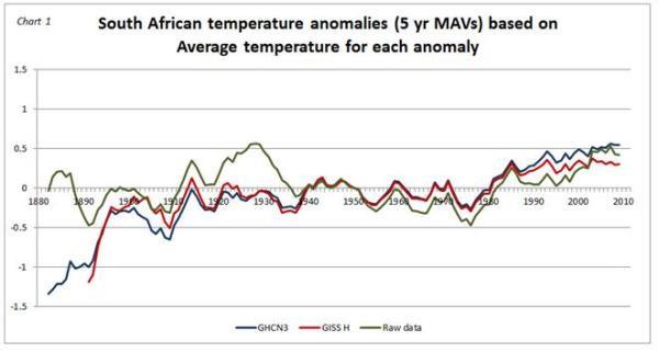
There is a large divergence prior to 1900, but for the twentieth century the warming trend is not excessively increased. Further, the warming trend from around 1900 is about half of that in the GISTEMP Southern Hemisphere or global anomalies. Looked in this way Mearns would appear to have a point. But there has been considerable downward adjustment of the early twentieth century warming, so Homewood’s claim of cooling the past is also substantiated. This might be the more important aspect, as the adjusted data makes the warming since the mid-1970s appear unusual.
Another feature is that the GCHNv3 data is very close to the GISS Homogenised data. So in looking the GISS H data used in the creation of the temperature data sets is very much the same as looking at GCHNv3 that forms the source data for GISS.
But why not mention the pre-1900 data where the divergence is huge?
The number of stations gives a clue in Chart 2.
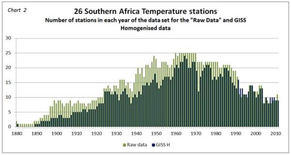
It was only in the late 1890s that there are greater than five stations of raw data. The first year there are more data points left in than removed is 1909 (5 against 4).
Removed data would appear to have a role in the homogenisation process. But is it material? Chart 3 graphs five year moving averages of raw data anomalies, split between the raw data removed and retained in GISS H, along with the average for the 26 stations.
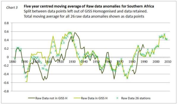
Where there are a large number of data points, it does not materially affect the larger picture, but does remove some of the extreme “anomalies” from the data set. But where there is very little data available the impact is much larger. That is particularly the case prior to 1910. But after 1910, any data deletions pale into insignificance next to the adjustments.
The Adjustments
I plotted the average difference between the Raw Data and the adjustment, along with the max and min values in Chart 4.
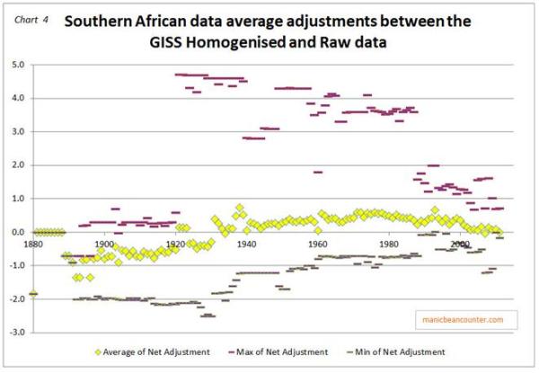
The max and min of net adjustments are consistent with Euan Mearns’ graph “safrica_deltaT” when flipped upside down and made back to front. It shows a difficulty of comparing adjusted, where all the data is shifted. For instance the maximum figures are dominated by Windhoek, which I looked at a couple of weeks ago. Between the raw data and the GISS Homogenised there was a 3.6oC uniform increase. There were a number of other lesser differences that I have listed in note 3. Chart 5 shows the impact of adjusting the adjustments is on both the range of the adjustments and the pattern of the average adjustments.
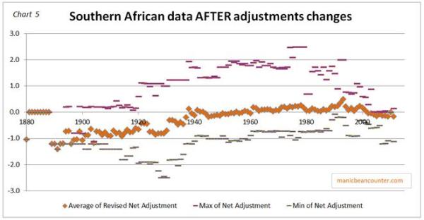
Comparing this with this average variance between the raw data and the GISS Homogenised shows the closer fit if the adjustments to the variance. Please note the difference in scale on Chart 6 from the above!
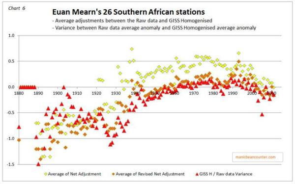
In the earlier period has by far the most deletions of data, hence the lack of closeness of fit between the average adjustment and average variance. After 1945, the consistent pattern of the average adjustment being slightly higher than the average variance is probably due to a light touch approach on adjustment corrections than due to other data deletions. The might be other reasons as well for the lack of fit, such as the impact of different length of data sets on the anomaly calculations.
Update 15/03/15
Of note is that the adjustments in the early 1890s and around 1930 is about three times the size of the change in trend. This might be partly due to zero net adjustments in 1903 and partly due to the small downward adjustments in post 2000.
The consequences of the adjustments
It should be remembered that GISS use this data to create the GISTEMP surface temperature anomalies. In Chart 7 I have amended Chart 1 to include Southern Hemisphere annual mean data on the same basis as the raw data and GISS H.
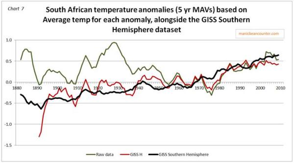
It seems fairly clear that the homogenisation process has achieved bringing the Southern Africa data sets into line with the wider data sets. Whether the early twentieth century warming and mid-century cooling are outliers that have been correctly cleansed is a subject for further study.
What has struck me in doing this analysis is that looking at individual surface temperature stations becomes nonsensical, as they are grid reference points. Thus comparing the station moves for Reykjavik with the adjustments will not achieve anything. The implications of this insight will have to wait upon another day.
Kevin Marshall
Notes
1. 26 Data sets
The temperature stations, with the periods for the raw data are below.
| Location |
Lat |
Lon |
ID |
Pop. |
Years |
| Harare |
17.9 S |
31.1 E |
156677750005 |
601,000 |
1897 – 2011 |
| Kimberley |
28.8 S |
24.8 E |
141684380004 |
105,000 |
1897 – 2011 |
| Gwelo |
19.4 S |
29.8 E |
156678670010 |
68,000 |
1898 – 1970 |
| Bulawayo |
20.1 S |
28.6 E |
156679640005 |
359,000 |
1897 – 2011 |
| Beira |
19.8 S |
34.9 E |
131672970000 |
46,000 |
1913 – 1991 |
| Kabwe |
14.4 S |
28.5 E |
155676630004 |
144,000 |
1925 – 2011 |
| Livingstone |
17.8 S |
25.8 E |
155677430003 |
72,000 |
1918 – 2010 |
| Mongu |
15.2 S |
23.1 E |
155676330003 |
< 10,000 |
1923 – 2010 |
| Mwinilunga |
11.8 S |
24.4 E |
155674410000 |
< 10,000 |
1923 – 1970 |
| Ndola |
13.0 S |
28.6 E |
155675610000 |
282,000 |
1923 – 1981 |
| Capetown Safr |
33.9 S |
18.5 E |
141688160000 |
834,000 |
1880 – 2011 |
| Calvinia |
31.5 S |
19.8 E |
141686180000 |
< 10,000 |
1941 – 2011 |
| East London |
33.0 S |
27.8 E |
141688580005 |
127,000 |
1940 – 2011 |
| Windhoek |
22.6 S |
17.1 E |
132681100000 |
61,000 |
1921 – 1991 |
| Keetmanshoop |
26.5 S |
18.1 E |
132683120000 |
10,000 |
1931 – 2010 |
| Bloemfontein |
29.1 S |
26.3 E |
141684420002 |
182,000 |
1943 – 2011 |
| De Aar |
30.6 S |
24.0 E |
141685380000 |
18,000 |
1940 – 2011 |
| Queenstown |
31.9 S |
26.9 E |
141686480000 |
39,000 |
1940 – 1991 |
| Bethal |
26.4 S |
29.5 E |
141683700000 |
30,000 |
1940 – 1991 |
| Antananarivo |
18.8 S |
47.5 E |
125670830002 |
452,000 |
1889 – 2011 |
| Tamatave |
18.1 S |
49.4 E |
125670950003 |
77,000 |
1951 – 2011 |
| Porto Amelia |
13.0 S |
40.5 E |
131672150000 |
< 10,000 |
1947 – 1991 |
| Potchefstroom |
26.7 S |
27.1 E |
141683500000 |
57,000 |
1940 – 1991 |
| Zanzibar |
6.2 S |
39.2 E |
149638700000 |
111,000 |
1880 – 1960 |
| Tabora |
5.1 S |
32.8 E |
149638320000 |
67,000 |
1893 – 2011 |
| Dar Es Salaam |
6.9 S |
39.2 E |
149638940003 |
757,000 |
1895 – 2011 |
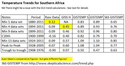
2. Temperature trends
To calculate the trends I used the OLS method, both from the formula and using the EXCEL “LINEST” function, getting the same answer each time. If you are able please check my calculations. The GISTEMP Southern Hemisphere and global data can be accessed direct from the NASA GISS website. The GISTEMP trends are from the skepticalscience trends tool. My figures are:-
3. Adjustments to the Adjustments
| Location |
Recent adjustment |
Other adjustment |
Other Period |
| Antananarivo |
0.50 |
|
|
| Beira |
|
0.10 |
Mid-70s + inter-war |
| Bloemfontein |
0.70 |
|
|
| Dar Es Salaam |
0.10 |
|
|
| Harare |
|
1.10 |
About 1999-2002 |
| Keetmanshoop |
1.57 |
|
|
| Potchefstroom |
-0.10 |
|
|
| Tamatave |
0.39 |
|
|
| Windhoek |
3.60 |
|
|
| Zanzibar |
-0.80 |
|

Euan Mearns
/ 16/03/2015Hi Kevin, you make me sound very average 😉 My surname is MeaRns – there is a big chunk of Scotland, nearby, with same name, covered in wind turbines.
I think we are seeing the same things in the data. This is masked a little by using slightly different averaging techniques and plotting things at different scales. In this S African data set I perhaps played down the warming added by homogenisation. There is a steepening of the trend, but not by much. I have since learned that V2 data is not raw data, it has also been processed. V3 processes V2 and so on.
My average dT for 26 southern African stations V2 is here;
And the average for the same stations, V3, is here:
You can see homogenisation has steepened things a little, but the main effect is to remove the natural cyclicity in the data.
Subtracting V3 from V2 gives this:
Which I think shows same thing as some of your charts. It would be handy if you numbered your charts – makes it easier to have a discussion.
I think where Paul Homewood erred was that he only looked for examples where warming was manufactured. There are as many examples where the opposite happens and it all cancels out. Don’t get me wrong, what GHCN is doing is appalling.
Best
E
manicbeancounter
/ 16/03/2015Euan,
Sincere apologies for getting your name wrong. Will correct it later. Will also number the charts as you suggest.
I agree that we are reaching the similar conclusions, though maybe with different emphasis. The more important aspect for me is to greatly reduce the early twentieth century warm period. The relative size of this warming to the current peak is the strongest indicator we have to how much warming is human caused.
Your last paragraph I disagree with. Although it might be true that it all cancels out, I think GHCN have actually produced a graph showing a net 0.3C of warming. It might have been a Kevin Cowtan Youtube video. However, this is still a conjecture.
I also believe that temperature homogenisation is a flawed process. Exactly how I have yet to work out. One matter is that there is a step missing. There should be “raw” (unadjusted) data; then locally adjusted data (for re-sitings, UHI effects, TOBs, etc.); then homogenised data.
I agree that the “raw” data has adjustments within it, but even this has been dispensed with for GHCNv3. Climate science – which is meant to study the real world – has lost site of the real world data.
euanmearns
/ 16/03/2015Kevin, I don’t think we have a material disagreement, it comes down to emphasis. I’m wondering how BEST get so much warming in southern Africa? They don’t get it all from GHCN style homogenisation. I think they get some of it from urban records. And some more from normalisation, area weighting etc.
I don’t think clockwork homogenisation should be used at all. I would not use the V3 records for anything. Individually they are totally meaningless, most polluted with fragments of code. And I agree that the flattening and loss of natural signal is worrying. It seems like the 1920s to 1940s were pretty warm in a lot of places. One problem right now is V2 stops in 2011.