Study on UK Wind and Solar potential fails on costs

Oxford University’s Smith School of Enterprise and the Environment in August published a report “Could Britain’s energy demand be met entirely by wind and solar?“, a short briefing “Wind and solar power could significantly exceed Britain’s energy needs” with a press release here. Being a (slightly) manic beancounter, I will review the underlying assumptions, particularly the costs.

Summary Points

  • Projected power demand is likely high, as demand will likely fall as energy becomes more expensive.
  • Report assumes massively increased load factors for wind turbines. A lot of this increase is from using benchmarks contingent on technological advances.
  • The theoretical UK scaling up of wind power is implausible. 3.8x for onshore wind, 9.4x for fixed offshore and >4000x for floating offshore wind. This to be achieved in less than 27 years.
  • Most recent cost of capital figures are from 2018, well before the recent steep rises in interest rates. Claim of falling discount rates is false.
  • The current wind turbine capacity is still a majority land based, with a tiny fraction floating offshore. A shift in the mix to more expensive technologies leads to an 82% increase in average levelised costs. Even with the improbable load capacity increases, the average levilised cost increase to 37%.
  • Biggest cost rise is from the need for storing days worth of electricity. The annual cost could be greater than the NHS 2023/24 budget.
  • The authors have not factored in the considerable risks of diminishing marginal returns.

Demand Estimates

The briefing summary states

299 TWh/year is an average of 34 GW, compared with 30 GW average demand in 2022 at grid.iamkate.com. I have no quibble with this value. But what is the five-fold increase by 2050 made-up of?

From page 7 of the full report.

So 2050 maximum energy demand will be slightly lower than today? For wind (comprising 78% of potential renewables output) the report reviews the estimates in Table 1, reproduced below as Figure 1

Figure 1: Table 1 from page 10 of the working paper

The study has quite high estimates of output compared to previously, but things have moved on. This is of course output per year. If the wind turbines operated at 100% capacity then the required for 24 hours a day, 365.25 days a year would be 265.5 GW, made up of 23.5GW for onshore, 64GW for fixed offshore and 178GW for floating offshore. In my opinion 1500 TWh is very much on the high side, as demand will fall as energy becomes far more expensive. Car use will fall, as will energy use in domestic heating when the considerably cheaper domestic gas is abandoned.

Wind Turbine Load Factors

Wind turbines don’t operate at anything like 100% of capacity. The report does not assume this. But it does assume load factors of 35% for onshore and 55% for offshore. Currently floating offshore is insignificant, so offshore wind can be combined together. The UK Government produces quarterly data on renewables, including load factors. In 2022 this average about 28% for onshore wind (17.6% in Q3 to 37.6% in Q1) and 41% for offshore wind (25.9% in Q3 to 51.5% in Q4). This data, shown in four charts in Figure 2 does not seem to shown an improving trend in load capacity.

Figure 2 : Four charts illustrating UK wind load capacities and total capacities

The difference is in the report using benchmark standards, not extrapolating from existing experience. See footnote 19 on page 15. The first ref sited is a 2019 DNV study for the UK Department for Business, Energy & Industrial Strategy. The title – “Potential to improve Load Factor of offshore wind farms in the UK to 2035” – should give a clue as to why benchmark figures might be inappropriate to calculate future average loads. Especially when the report discusses new technologies and much larger turbines being used, whilst also assuming some load capacity improvements from reduced downtimes for maintenance.

Scaling up

The report states on page 10

From the UK Government quarterly data on renewables, these are the figures for Q3 2022. Q1 2023 gives 15.2 GW onshore and 14.1 GW offshore. This offshore value was almost entirely fixed. Current offshore floating capacity is 78 MW (0.078 GW). This implies that to reach the reports objectives of 2050 with 1500 TwH, onshore wind needs to increase 3.8 times, offshore fixed wind 9.4 times and offshore floating wind over 4000 times. Could diminishing returns, in both output capacities and costs per unit of capacity set in with this massive scaling up? Or maintenance problems from rapidly installing floating wind turbines of a size much greater than anything currently in service? On the other hand, the report notes that Scotland has higher average wind speeds than “Wales or Britain”, to which I suspect they mean that Scotland has higher average wind speeds to the rest of the UK. If so, they could be assuming a good proportion of the floating wind turbines will be located off Scotland, where wind speeds are higher and therefore the sea more treacherous. This map of just 19 GW of proposed floating wind turbines is indicative.

Cost of Capital

On page 36 the report states

You indeed find these rates on “Table 2.7: Technology-specific hurdle rates provided by Europe Economics”. My quibble is not that they are 2018 rates, but that during 2008-2020 interests rates were at historically low levels. In a 2023 paper it should recognise that globally interest rates have leapt since then. In the UK, base rates have risen from 0.1% in 2020 to 5.25% at the beginning of August 2023. This will surely affect the discount rates in use.

Wind turbine mix

Costs of wind turbines vary from project to project. However, the location determines the scale of costs. It is usually cheaper to put up a wind turbine on land than fix it to a sea bed, then construct a cable to land. This in turn is cheaper than anchoring a floating turbine to a sea bed often in water too deep to fix to the sea bed. If true, moving from land to floating offshore will increase average costs. For this comparison I will use some 2021 levilized costs of energy for wind turbines from US National Renewable Energy Laboratory (NREL).

Figure 3 : Page 6 of the NREL presentation 2021 Cost of Wind Energy Review

The levilized costs are $34 MWh for land-based, $78 MWh for fixed offshore, and $133 MWh for floating offshore. Based on the 2022 outputs, the UK weighted average levilized cost was about $60 MWh. On the same basis, the report’s weighted average levilized cost for 2050 is about $110 MWh. But allowing for 25% load capacity improvements for onshore and 34% for offshore brings average levilized cost down to $82 MWh. So the different mix of wind turbine types leads to an 83% average cost increase, but efficiency improvements bring this down to 37%. Given the use of benchmarks discussed above it would be reasonable to assume that the prospective mix variance cost increase is over 50%, ceteris paribus.

The levilized costs from the USA can be somewhat meaningless for the UK in the future, with maybe different cost structures. Rather than speculating, it is worth understanding why the levilized cost of floating wind turbines is 70% more than offshore fixed wind turbines, and 290% more (almost 4 times) than onshore wind turbines. To this end I have broken down the levilized costs into their component parts.

Figure 3 : NREL Levilized Costs of Wind 2021 Component Breakdown. A) Breakdown of total costs B) Breakdown of “Other Capex” in chart A

Observations

  • Financial costs are NOT the costs of borrowing on the original investment. The biggest element is cost contingency, followed by commissioning costs. Therefore, I assume that the likely long-term rise interest rates will impact the whole levilized cost.
  • Costs of turbines are a small part of the difference in costs.
  • Unsurprisingly, operating cost, including maintenance, are significantly higher out at sea than on land. Similarly for assembly & installation and for electrical infrastructure.
  • My big surprise is how much greater the cost of foundations are for a floating wind turbine are than a fixed offshore wind turbine. This needs further investigation. In the North Sea there is plenty of experience of floating massive objects with oil rigs, so the technology is not completely new.

What about the batteries?

The above issues may be trivial compared to the issue of “battery” storage for when 100% of electricity comes from renewables, for when the son don’t shine and the wind don’t blow. This is particularly true in the UK when there can be a few day of no wind, or even a few weeks of well below average wind. Interconnectors will help somewhat, but it is likely that neighbouring countries could be experiencing similar weather systems, so might not have any spare. This requires considerable storage of electricity. How much will depend on the excess renewables capacity, the variability weather systems relative to demand, and the acceptable risk of blackouts, or of leaving less essential users with limited or no power. As a ballpark estimate, I will assume 10 days of winter storage. 1500 TWh of annual usage gives 171 GW per hour on average. In winter this might be 200 GW per hour, or 48000 GWh for 10 or 48 million Mwh. The problem is how much would this cost?

In April 2023 it a 30 MWh storage system was announced costing £11 million. This was followed in May by a 99 MWh system costing £30 million. These respectively cost £367,000 and £333,000 per MWh. I will assume there will be considerable cost savings in scaling this up, with a cost of £100,000 per MWh. Multiplying this by 48,000,000 gives a cost estimate of £4.8 trillion, or nearly twice the 2022 UK GDP of £2.5 trillion. If one assumes a 25 year life of these storage facilities, this gives a more “modest” £192 billion annual cost. If this is divided by an annual usage of 1500 TWh it comes out at a cost of 12.8p KWh. These costs could be higher if interest rates are higher. The £192 billion costs are more than the 2023/24 NHS Budget.

This storage requirement could be conservative. On the other hand, if overall energy demand is much lower, due to energy being unaffordable it could be somewhat less. Without fossil fuel backup, there will be a compromise between costs energy storage and rationing with the risk of blackouts.

Calculating the risks

The approach of putting out a report with grandiose claims based on a number of assumptions, then expecting the public to accept those claims as gospel is just not good enough. There are risks that need to be quantified. Then, as a project progresses these risks can be managed, so the desired objectives are achieved in a timely manner using the least resources possible. These are things that ought to be rigorously reviewed before a project is adopted, learning from past experience and drawing on professionals in a number of disciplines. As noted above, there are a number of assumptions made where there are risks of cost overruns and/or shortfalls in claimed delivery. However, the biggest risks come from the law of diminishing marginal returns, a concept that has been understood for over 2 00 years. For offshore wind the optimal sites will be chosen first. Subsequent sites for a given technology will become more expensive per unit of output. There is also the technical issue of increased numbers of wind turbines having a braking effect on wind speeds, especially under stable conditions.

Concluding Comments

Technically, the answer to the question “could Britain’s energy demand be met entirely by wind and solar?” is in the affirmative, but not nearly so positively at the Smith School makes out. There are underlying technical assumptions that will likely not be borne out with further investigations. However, in terms of costs and reliable power output, the answer is strongly in the negative. This is an example of where rigorous review is needed before accepting policy proposals into the public arena. After all, the broader justification of contributing towards preventing “dangerous climate change” is upheld in that an active global net zero policy does not exist. Therefore, the only justification is on the basis of being net beneficial to the UK. From the above analysis, this is certainly not the case.

Nobel Laureate William Nordhaus demonstrates that pursuing climate mitigation will make a nation worse off

Summary

Nobel Laureate Professor William Nordhaus shows that the optimal climate mitigation policy is for far less mitigation than UNIPCCC proposes. That is to constrain warming by 2100 to 3.5°C instead of 2°C or less. But this optimal policy is based on a series of assumptions, including that policy is optimal and near universally applied. The current situation, with most countries without any effective mitigation policies, is that climate mitigation policies within a country will likely make that country worse off, even if they would be better off with the same policies were near universally applied. Countries applying costly climate mitigation policies are making their people worse off.

Context

Last week Bjorn Lomborg tweeted a chart derived from Nordhaus paper from August 2018 in the American Economic Review.

The paper citation is

Nordhaus, William. 2018. “Projections and Uncertainties about Climate Change in an Era of Minimal Climate Policies.” American Economic Journal: Economic Policy10 (3): 333-60.

The chart shows the optimal climate mitigation policy, based upon minimization of (a) the combined projected costs of climate mitigation policy and (b) residual net costs from human-caused climate change, is much closer to the non-policy option of 4.1°C than restraining warming to 2.5°C. By the assumptions of Nordhaus’s model greater warming constraint can only be achieved through much greater policy costs. The abstract concludes

The study confirms past estimates of likely rapid climate change over the next century if major climate-change policies are not taken. It suggests that it is unlikely that nations can achieve the 2°C target of international agreements, even if ambitious policies are introduced in the near term. The required carbon price needed to achieve current targets has risen over time as policies have been delayed.

A statement whose implications are ignored

This study is based on mainstream projections of greenhouse gas emissions and the resultant warming. Prof Nordhaus is in the climate mainstream, not a climate agnostic like myself. Given this, I find the opening statement interesting. (My bold)

Climate change remains the central environmental issue of today. While the Paris Agreement on climate change of 2015 (UN 2015) has been ratified, it is limited to voluntary emissions reductions for major countries, and the United States has withdrawn and indeed is moving backward. No binding agreement for emissions reductions is currently in place following the expiration of the Kyoto Protocol in 2012. Countries have agreed on a target temperature limit of 2°C, but this is far removed from actual policies, and is probably infeasible, as will be seen below.
The reality is that most countries are on a business-as-usual (BAU) trajectory of minimal policies to reduce their emissions; they are taking noncooperative policies that are in their national interest, but far from ones which would represent a global cooperative policy.

Although there is a paper agreement to constrain emissions commensurate with 2°C of warming, most countries are doing nothing – or next to nothing – to control their emissions. The real world situation is completely different to assumptions made in the model. The implications of this are skirted over by Nordhaus, but will be explored below.

The major results at the beginning of the paper are
  • The estimate of the SCC has been revised upward by about 50 percent since the last full version in 2013.
  • The international target for climate change with a limit of 2°C appears to be infeasible with reasonably accessible technologies even with very ambitious abatement strategies.
  • A target of 2.5°C is technically feasible but would require extreme and virtually universal global policy measures in the near future.

SCC is the social cost of carbon. The conclusions about policy are not obtained from understating the projected costs of climate change. Yet the aim to limit warming to 2°C appears infeasible. By implication limiting warming beyond this – such as to 1.5°C – should not be considered by rational policy-makers. Even a target of 2.5°C requires special conditions to be fulfilled and still is less optimal than doing nothing. The conclusion from the paper without going any further is achieving the aims of the Paris Climate Agreement will make the world a worse place than doing nothing. The combined costs of policy and any residual costs of climate change will be much greater than the projected costs of climate change.

Some assumptions

This outputs of a model are achieved by making a number of assumptions. When evaluating whether the model results are applicable to real world mitigation policy consideration needs to be given to whether those assumptions hold true, and the impact on policy if violated. I have picked some of the assumptions. The ones that are a direct or near direct quote, are in italics.

  1. Mitigation policies are optimal.
  2. Mitigation policies are almost universally applied in the near future.
  3. The abatement-cost function is highly convex, reflecting the sharp diminishing returns to reducing emissions.
  4. For the DICE model it is assumed that the rate of decarbonization going forward is −1.5 percent per year.
  5. The existence of a “backstop technology,” which is a technology that produces energy services with zero greenhouse gas (GHG) emissions.
  6. Assumed that there are no “negative emissions” technologies initially, but that negative emissions are available after 2150.
  7. Assumes that damages can be reasonably well approximated by a quadratic function of temperature change.
  8. Equilibrium climate sensitivity (ECS) is a mean warming of 3.1°C for an equilibrium CO2 doubling.

This list is far from exhaustive. For instance, it does not include assumptions about the discount rate, economic growth or emissions growth. However, the case against current climate mitigation policies, or proposed policies, can be made by consideration of the first four.

Implications of assumptions being violated

I am using a deliberately strong term for the assumptions not holding.

Clearly a policy is not optimal if it does not work, or even spends money to increase emissions. More subtle is using sub-optimal policies. For instance, raising the cost of electricity is less regressive the poor are compensated. As a result the emissions reductions are less, and there cost per tonne of CO2  mitigated rises. Or nuclear power is not favoured, so is replaced by a more expensive system of wind turbines and backup energy storage. These might be trivial issues if in general policy was focussed on the optimal policy of a universal carbon tax. No country is even close. Attempts to impose carbon taxes in France and Australia have proved deeply unpopular.

Given the current state of affairs described by Nordhaus in the introduction, the most violated assumption is that mitigation policy is not universally applied. Most countries have no effective climate mitigation policies, and very few have policies in place that are likely to result in any where near the huge global emission cuts required to achieve the 2°C warming limit. (The most recent estimate from the UNEP Emissions Gap Report 2018 is that global emissions need to be 25% lower in 2030 than in 2017). Thus globally the costs of unmitigated climate change will be close to the unmitigated 3% of GDP, with globally the policy costs being a small fraction of 1% of GDP. But a country that spends 1% of GDP on policy – even if that is optimal policy – will only see a miniscule reduction in its expected climate costs. Even the USA with about one seventh of global emissions, on Nordhaus’s assumptions efficiently spending 1% of output might expect future climate costs to fall by maybe 0.1%. The policy cost to mitigation cost for a country on its own is quite different to the entire world working collectively on similar policies. Assumption four of a reduction of 1.5% in global emissions illustrates the point in a slightly different way. If the USA started cutting its emissions by an additional 1.5% a year (they are falling without policy) then it would likely mean global emissions would keep on increasing.

The third assumption is another that is sufficient on its own to undermine climate mitigation. The UK and some States in America are pursuing what would be a less than 2°C pathway if it were universally applied. That means they are committing to a highly convex policy cost curve, (often made steeper by far from optimal policies) with virtually no benefits for future generations.

Best Policies under the model assumptions

The simplest alternative to climate mitigation policies could be to have no policies at all. However, if the climate change cost functions are a true representation, and given the current Paris Agreement this is not a viable option for those less thick-skinned than President Trump, or who have a majority who believe in climate change. Economic theory can provide some insights into the strategies to be employed. For instance if the climate cost curve is a quadratic as in Nordhaus (or steeper – in Stern I believe it was at least a quartic) there are rapidly diminishing returns to mitigation policies in terms of costs mitigated. For a politician who wants to serve their the simplest strategies are to

  • Give the impression of doing something to appear virtuous
  • Incur as little cost as possible, especially those that are visible to the majority
  • Benefit special interest groups, especially those with climate activist participants
  • Get other countries to bear the real costs of mitigation.

This implies that many political leaders who want to serve the best interests of their countries need to adopt a strategy of showing they are doing one thing to appear virtuous, whilst in reality doing something quite different.

In the countries dependent of extracting and exporting fossil fuels for a large part of their national income (e.g. the Gulf States, Russia, Kazakhstan, Turkmenistan etc.) different priorities and much higher marginal policy costs for global mitigation are present. In particular, if, as part of climate policies other countries were to shut down existing fossil fuel extraction, or fail to develop new sources of supply to a significant extent then market prices would rise, to the benefit of other producers.

Conclusion

Using Nordhaus’s model assumptions, if the World as a whole fulfilled the Paris Climate Agreement collectively with optimal policies, then the world would be worse off than if it did nothing. That is due to most countries pursuing little or no actual climate mitigation policies. Within this context, pursuing any costly climate mitigation policies will make a country worse off than doing nothing.

Assuming political leaders have the best interests of their country at heart, and regardless of whether they regard climate change a problem, the optimal policy strategy is to impose as little costly policy as possible for maximum appearance of being virtuous, whilst doing the upmost to get other countries to pursue costly mitigation policies.

Finally

I reached the conclusion that climate mitigation will always make a nation worse off ,using neoclassical graphical analysis, in October 2013.

Kevin Marshall

What would constitute AGW being a major problem?

Ron Clutz has an excellent post. This time on he reports on A Critical Framework for Climate Change. In the post Ron looks at the Karoly/Tamblyn–Happer Dialogue on Global Warming at Best Schools particularly at Happer’s major statement. In my opinion these dialogues are extremely useful, as (to use an old-fashioned British term) are antagonists are forces by skilled opponents to look at the issues in terms of a level playing field. With the back and forth of the dialogue, the relative strengths and weaknesses are exposed. This enables those on the outside to compare and contrast for themselves. Further, as such dialogues never fully resolve anything completely, can point to new paths to develop understanding. 

Ron reprints two flow charts. Whilst the idea is of showing the issues in this way to highlight the issues is extremely useful correct. I have issues with the detail. 


In particular on the scientific question “Is it a major problem?“, I do not think the “No” answers are correct.
If there was no MWP, Roman warming, or Bronze Age warming then this would be circumstantial evidence for current warming being human-caused. If there has been 3 past warming phases at about  1000, 2000 and 3000 years ago, then this is strong circumstantial evidence that current warming is at least in part due to some unknown natural or random factors. Without any past warming phases at all then it would point to the distinctive uniqueness of the current warming, but that still does not mean not necessarily mean that it is a major net problem. There could be benefits as well as adverse consequences to warming. But the existence of previous warming phases under many studies and only being able to claim by flawed statistics that the majority of warming since 1950 in human-caused (when there was some net warming for at least 100 years before that suggests a demonstrable marginal impact of human causes far less than 100% of total warming. Further there is issues with

(a) the quantity of emissions a trace gas to raise that the atmospheric levels by a unit amount

(b) the amount of warming from a doubling of the trace gas – climate sensitivity

(c) the time taken for rises on a trace gas to raise temperatures.

As these are all extremely difficult to measure, so a huge range of equally valid answers. It is an example of the underdetermination of scientific theory.

At the heart of the underdetermination of scientific theory by evidence is the simple idea that the evidence available to us at a given time may be insufficient to determine what beliefs we should hold in response to it.

But even if significant human-caused warming can be established, this does not constitute a major problem. Take sea-level rise. If it could be established that human-caused warming was leading to sea level rise, this may not, on a human scale, be a major problem. At current rates sea levels from the satellites are rising on average by 3.5mm per year. The average adjusted level from the tide gauges are less than that – and the individual tide gauges show little or no acceleration in the last century. But if that rate accelerated to three or four times that level, it is not catastrophic in terms of human planning timescales. 

The real costs to humans are expressed in values. The really large costs of climate change are based not so much on the physical side, but implausible assumptions about the lack of human responses to ongoing changes to the environment. In economics, the neoclassical assumptions of utility maximisation and profit maximisation are replaced by the dumb actor assumption.

An extreme example I found last year. In Britain it was projected that unmitigated global warming could lead to 7000 excess heatwave deaths in the 2050s compared to today. The projection was most of these deaths would occur in over 75s dying in hospitals and care homes. The assumption was that medical professionals and care workers would carry on treating those in the care in the same way as currently, oblivious to increasing suffering and death rates.  

Another extreme example from last year was an article in Nature Plants (a biology journal) Decreases in global beer supply due to extreme drought and heatThere were at least two examples of the dumb actor assumption. First was failure by farmers to adjust output according to changing yields and hence profits. For instance in Southern Canada (Calgary / Edmonton) barley yields under the most extreme warming scenario were projected to fall by around 10-20% by the end of the century. But in parts of Montana and North Dakota – just a few hundred miles south – they would almost double. It was assumed that farmers would continue producing at the same rates regardless, with Canadian farmers making losses and those in Northern USA making massive windfall profits. The second was in retail. For instance the price of a 500ml bottle of beer in Ireland was projected to increase under the most extreme scenario in Ireland by $4.84 compared to $1.90 in neighbouring Britain. Given that most of the beer sold comes from the same breweries; current retail prices in UK and Ireland are comparable (In Ireland higher taxes mean prices up to 15% higher); cost of a 500ml bottle is about $2.00-$2.50 in the UK; and lack of significant trade barriers, there is plenty of scope with even a $1.00 differential for an entrepreneur to purchase a lorry load of beer in the UK and ship it over the Irish Sea. 

On the other hand nearly of the short-term forecasts of an emerging major problem have turned out to be false, or highly extreme. Examples are

  • Himalayan Glaciers will disappear by 2035
  • Up to 50% reductions in crop yields in some African Countries by 2020
  • Arctic essentially ice-free in the summer of 2013
  • Children in the UK not knowing what snow is a few years after 2000
  • In the UK after 2009, global warming will result in milder and wetter summers

Another example of the distinction between a mere difference and a major problem is the February weather. Last week the UK experienced some record high daytime maximum temperatures of 15-20C. It was not a problem. In fact, accompanied by very little wind and clear skies it was extremely pleasant for most people. Typical weather for the month is light rain, clouds and occasional gales. Children on half-term holidays were able to play outside, and when back in school last week many lessons were diverted to the outdoors. Over in Los Angeles, average highs were 61F (16C) compared to  February average of 68F (20C). This has created issues for the elderly staying warm, but created better skiing conditions in the mountains. More different than a major problem. 

So in summary, for AGW to be a major problem it is far from sufficient to establish that most of the global warming is human caused. It is necessary to establish that the impact of that warming is net harmful on a global scale.

Kevin Marshall


Australian Beer Prices set to Double Due to Global Warming?

Earlier this week Nature Plants published a new paper Decreases in global beer supply due to extreme drought and heat

The Scientific American has an article “Trouble Brewing? Climate Change Closes In on Beer Drinkers” with the sub-title “Increasing droughts and heat waves could have a devastating effect on barley stocks—and beer prices”. The Daily Mail headlines with “Worst news ever! Australian beer prices are set to DOUBLE because of global warming“. All those climate deniers in Australia have denied future generations the ability to down a few cold beers with their barbecued steaks tofu salads.

This research should be taken seriously, as it is by a crack team of experts across a number of disciplines and Universities. Said, Steven J Davis of University of California at Irvine,

The world is facing many life-threatening impacts of climate change, so people having to spend a bit more to drink beer may seem trivial by comparison. But … not having a cool pint at the end of an increasingly common hot day just adds insult to injury.

Liking the odd beer or three I am really concerned about this prospect, so I rented the paper for 48 hours to check it out. What a sensation it is. Here a few impressions.

Layers of Models

From the Introduction, there were a series of models used.

  1. Created an extreme events severity index for barley based on extremes in historical data for 1981-2010.
  2. Plugged this into five different Earth Systems models for the period 2010-2099. Use this against different RCP scenarios, the most extreme of which shows over 5 times the warming of the 1981-2010 period. What is more severe climate events are a non-linear function of temperature rise.
  3. Then model the impact of these severe weather events on crop yields in 34 World Regions using a “process-based crop model”.
  4. (W)e examine the effects of the resulting barley supply shocks on the supply and price of beer in each region using a global general equilibrium model (Global Trade Analysis Project model, GTAP).
  5. Finally, we compare the impacts of extreme events with the impact of changes in mean climate and test the sensitivity of our results to key sources of uncertainty, including extreme events of different severities, technology and parameter settings in the economic model.

What I found odd was they made no allowance for increasing demand for beer over a 90 year period, despite mentioning in the second sentence that

(G)lobal demand for resource-intensive animal products (meat and dairy) processed foods and alcoholic beverages will continue to grow with rising incomes.

Extreme events – severity and frequency

As stated in point 2, the paper uses different RCP scenarios. These featured prominently in the IPCC AR5 of 2013 and 2014. They go from RCP2.6, which is the most aggressive mitigation scenario, through to RCP 8.5 the non-policy scenario which projected around 4.5C of warming from 1850-1870 through to 2100, or about 3.8C of warming from 2010 to 2090.

Figure 1 has two charts. On the left it shows that extreme events will increase intensity with temperature. RCP2.6 will do very little, but RCP8.5 would result by the end of the century with events 6 times as intense today. Problem is that for up to 1.5C there appears to be no noticeable change what so ever.  That is about the same amount of warming the world has experienced from 1850-2010 per HADCRUT4 there will be no change. Beyond that things take off. How the models empirically project well beyond known experience for a completely different scenario defeats me. It could be largely based on their modelling assumptions, which is in turn strongly tainted by their beliefs in CAGW. There is no reality check that it is the models that their models are not falling apart, or reliant on arbitrary non-linear parameters.

The right hand chart shows that extreme events are porjected to increase in frequency as well. Under RCP 2.6 ~ 4% chance of an extreme event, rising to ~ 31% under RCP 8.5. Again, there is an issue of projecting well beyond any known range.

Fig 2 average barley yield shocks during extreme events

The paper assumes that the current geographical distribution and area of barley cultivation is maintained. They have modelled in 2099, from the 1981-2010 a gridded average yield change with 0.5O x 0.5O resolution to create four colorful world maps representing each of the four RCP emissions scenarios. At the equator, each grid is about 56 x 56 km for an area of 3100 km2, or 1200 square miles. Of course, nearer the poles the area diminishes significantly. This is quite a fine level of detail for projections based on 30 years of data to radically different circumstances 90 years in the future. The results show. Map a) is for RCP 8.5. On average yields are projected to be 17% down. As Paul Homewood showed in a post on the 17th, this projected yield fall should be put in the context of a doubling of yields per hectare since the 1960s.

This increase in productivity has often solely ascribed to the improvements in seed varieties (see Norman Borlaug), mechanization and use of fertilizers. These have undoubtably have had a large parts to play in this productivity improvement. But also important is that agriculture has become more intensive. Forty years ago it was clear that there was a distinction between the intensive farming of Western Europe and the extensive farming of the North American prairies and the Russian steppes. It was not due to better soils or climate in Western Europe. This difference can be staggering. In the Soviet Union about 30% of agricultural output came from around 1% of the available land. These were the plots that workers on the state and collective farms could produce their own food and sell surplus in the local markets.

Looking at chart a in Figure 2, there are wide variations about this average global decrease of 17%.

In North America Montana and North Dakota have areas where barley shocks during extreme years will lead to mean yield changes over 90% higher normal, and the areas around have >50% higher than normal. But go less than 1000 km North into Canada to the Calgary/Saskatoon area and there are small decreases in yields.

In Eastern Bolivia – the part due North of Paraguay – there is the biggest patch of > 50% reductions in the world. Yet 500-1000 km away there is a North-South strip (probably just 56km wide) with less than a 5% change.

There is a similar picture in Russia. On the Kazakhstani border, there are areas of > 50% increases, but in a thinly populated band further North and West, going from around Kirov to Southern Finland is where there are massive decreases in yields.

Why, over the course of decades, would those with increasing yields not increase output, and those with decreasing yields not switch to something else defeats me. After all, if overall yields are decreasing due to frequent extreme weather events, the farmers would be losing money, and those farmers do well when overall yields are down will be making extraordinary profits.

A Weird Economic Assumption

Building up to looking at costs, their is a strange assumption.

(A)nalysing the relative changes in shares of barley use, we find that in most case barley-to-beer shares shrink more than barley-to-livestock shares, showing that food commodities (in this case, animals fed on barley) will be prioritized over luxuries such as beer during extreme events years.

My knowledge of farming and beer is limited, but I believe that cattle can be fed on other things than barley. For instance grass, silage, and sugar beet. Yet, beers require precise quantities of barley and hops of certain grades.

Further, cattle feed is a large part of the cost of a kilo of beef or a litre of milk. But it takes around 250-400g of malted barley to produce a litre of beer. The current wholesale price of malted barley is about £215 a tonne or 5.4 to 8.6p a litre. About cheapest 4% alcohol lager I can find in a local supermarket is £3.29 for 10 x 250ml bottles, or £1.32 a litre. Take off 20% VAT and excise duty leaves 30p a litre for raw materials, manufacturing costs, packaging, manufacturer’s margin, transportation, supermarket’s overhead and supermarket’s margin. For comparison four pints (2.276 litres) of fresh milk costs £1.09 in the same supermarket, working out at 48p a litre. This carries no excise duty or VAT. It might have greater costs due to refrigeration, but I would suggest it costs more to produce, and that feed is far more than 5p a litre.

I know that for a reasonable 0.5 litre bottle of ale it is £1.29 to £1.80 a bottle in the supermarkets I shop in, but it is the cheapest that will likely suffer the biggest percentage rise from increase in raw material prices. Due to taxation and other costs, large changes in raw material prices will have very little impact on final retail costs. Even less so in pubs where a British pint (568ml) varies from the £4 to £7 a litre equivalent.

That is, the assumption is the opposite of what would happen in a free market. In the face of a shortage, farmers will substitute barley for other forms of cattle feed, whilst beer manufacturers will absorb the extra cost.

Disparity in Costs between Countries

The most bizarre claim in the article in contained in the central column of Figure 4, which looks at the projected increases in the cost of a 500 ml bottle of beer in US dollars. Chart h shows this for the most extreme RCP 8.5 model.

I was very surprised that a global general equilibrium model would come up with such huge disparities in costs after 90 years. After all, my understanding of these models used utility-maximizing consumers, profit-maximizing producers, perfect information and instantaneous adjustment. Clearly there is something very wrong with this model. So I decided to compare where I live in the UK with neighbouring Ireland.

In the UK and Ireland there are similar high taxes on beer, with Ireland being slightly more. Both countries have lots of branches of the massive discount chain. They also have some products on their website aldi.co.uk and aldi.ie.  In Ireland a 500 ml can of Sainte Etienne Lager is €1.09 or €2.18 a litre or £1.92 a litre. In the UK it is £2.59 for 4 x 440ml cans or £1.59 a litre. The lager is about 21% more in Ireland. But the tax difference should only be about 15% on a 5% beer (Saint Etienne is 4.8%). Aldi are not making bigger profits in Ireland, they just may have higher costs in Ireland, or lesser margins on other items. It is also comparing a single can against a multipack. So pro-rata the £1.80 ($2.35) bottle of beer in the UK would be about $2.70 in Ireland. Under the RCP 8.5 scenario, the models predict the bottle of beer to rise by $1.90 in the UK and $4.84 in Ireland. Strip out the excise duty and VAT and the price differential goes from zero to $2.20.

Now suppose you were a small beer manufacturer in England, Wales or Scotland. If beer was selling for $2.20 more in Ireland than in the UK, would you not want to stick 20,000 bottles in a container and ship it to Dublin?

If the researchers really understood the global brewing industry, they would realize that there are major brands sold across the world. Many are brewed across in a number of countries to the same recipe. It is the barley that is shipped to the brewery, where equipment and techniques are identical with those in other parts of the world. This researchers seem to have failed to get away from their computer models to conduct field work in a few local bars.

What can be learnt from this?

When making projections well outside of any known range, the results must be sense-checked. Clearly, although the researchers have used an economic model they have not understood the basics of economics. People are not dumb  automatons waiting for some official to tell them to change their patterns of behavior in response to changing circumstances. They notice changes in the world around them and respond to it. A few seize the opportunities presented and can become quite wealthy as a result. Farmers have been astute enough to note mounting losses and change how and what they produce. There is also competition from regions. For example, in the 1960s Brazil produced over half the world’s coffee. The major region for production in Brazil was centered around Londrina in the North-East of Parana state. Despite straddling the Tropic of Capricorn, every few years their would be a spring-time frost which would destroy most of the crop. By the 1990s most of the production had moved north to Minas Gerais, well out of the frost belt. The rich fertile soils around Londrina are now used for other crops, such as soya, cassava and mangoes. It was not out of human design that the movement occurred, but simply that the farmers in Minas Gerais could make bumper profits in the frost years.

The publication of this article shows a problem of peer review. Nature Plants is basically a biology journal. Reviewers are not likely to have specialist skills in climate models or economic theory, though those selected should have experience in agricultural models. If peer review is literally that, it will fail anyway in an inter-disciplinary subject, where the participants do not have a general grounding in all the disciplines. In this paper it is not just economics, but knowledge of product costing as well. It is academic superiors from the specialisms that are required for review, not inter-disciplinary peers.

Kevin Marshall


Why can’t I reconcile the emissions to achieve 1.5C or 2C of Warming?

Introduction

At heart I am beancounter. That is when presented with figures I like to understand how they are derived. When it comes to the claims about the quantity of GHG emissions that are required to exceed 2°C of warming I cannot get even close, unless by making some a series of  assumptions, some of which are far from being robust. Applying the same set of assumptions I cannot derive emissions consistent with restraining warming to 1.5°C

Further the combined impact of all the assumptions is to create a storyline that appears to me only as empirically as valid as an infinite number of other storylines. This includes a large number of plausible scenarios where much greater emissions can be emitted before 2°C of warming is reached, or where (based on alternative assumptions) plausible scenarios even 2°C of irreversible warming is already in the pipeline.  

Maybe an expert climate scientist will clearly show the errors of this climate sceptic, and use it as a means to convince the doubters of climate science.

What I will attempt here is something extremely unconventional in the world of climate. That is I will try to state all the assumptions made by highlighting them clearly. Further, I will show my calculations and give clear references, so that anyone can easily follow the arguments.

Note – this is a long post. The key points are contained in the Conclusions.

The aim of constraining warming to 1.5 or 2°C

The Paris Climate Agreement was brought about by the UNFCCC. On their website they state.

The Paris Agreement central aim is to strengthen the global response to the threat of climate change by keeping a global temperature rise this century well below 2 degrees Celsius above pre-industrial levels and to pursue efforts to limit the temperature increase even further to 1.5 degrees Celsius. 

The Paris Agreement states in Article 2

1. This Agreement, in enhancing the implementation of the Convention, including its objective, aims to strengthen the global response to the threat of climate change, in the context of sustainable development and efforts to eradicate
poverty, including by:

(a) Holding the increase in the global average temperature to well below 2°C above pre-industrial levels and pursuing efforts to limit the temperature increase to 1.5°C above pre-industrial levels, recognizing that this would significantly reduce the risks and impacts of climate change;

Translating this aim into mitigation policy requires quantification of global emissions targets. The UNEP Emissions Gap Report 2017 has a graphic showing estimates of emissions before 1.5°C or 2°C warming levels is breached.

Figure 1 : Figure 3.1 from the UNEP Emissions Gap Report 2017

The emissions are of all greenhouse gas emissions, expressed in billions of tonnes of CO2 equivalents. From 2010, the quantity of emissions before the either 1.5°C or 2°C is breached are respectively about 600 GtCO2e and 1000 GtCO2e. It is these two figures that I cannot reconcile when using the same  assumptions to calculate both figures. My failure to reconcile is not just a minor difference. Rather, on the same assumptions that 1000 GtCO2e can be emitted before 2°C is breached, 1.5°C is already in the pipeline. In establishing the problems I encounter I will clearly endeavor to clearly state the assumptions made and look at a number of examples.

 Initial assumptions

1 A doubling of CO2 will eventually lead to 3°C of rise in global average temperatures.

This despite the 2013 AR5 WG1 SPM stating on page 16

Equilibrium climate sensitivity is likely in the range 1.5°C to 4.5°C

And stating in a footnote on the same page.

No best estimate for equilibrium climate sensitivity can now be given because of a lack of agreement on values across assessed lines of evidence and studies.

2 Achieving full equilibrium climate sensitivity (ECS) takes many decades.

This implies that at any point in the last few years, or any year in the future there will be warming in progress (WIP).

3 Including other greenhouse gases adds to warming impact of CO2.

Empirically, the IPCC’s Fifth Assessment Report based its calculations on 2010 when CO2 levels were 390 ppm. The AR5 WG3 SPM states in the last sentence on page 8

For comparison, the CO2-eq concentration in 2011 is estimated to be 430 ppm (uncertainty range 340 to 520 ppm)

As with climate sensitivity, the assumption is the middle of an estimated range. In this case over one fifth of the range has the full impact of GHGs being less than the impact of CO2 on its own.

4 All the rise in global average temperature since the 1800s is due to rise in GHGs. 

5 An increase in GHG levels will eventually lead to warming unless action is taken to remove those GHGs from the atmosphere, generating negative emissions. 

These are restrictive assumptions made for ease of calculations.

Some calculations

First a calculation to derive the CO2 levels commensurate with 2°C of warming. I urge readers to replicate these for themselves.
From a Skeptical Science post by Dana1981 (Dana Nuccitelli) “Pre-1940 Warming Causes and Logic” I obtained a simple equation for a change in average temperature T for a given change in CO2 levels.

ΔTCO2 = λ x 5.35 x ln(B/A)
Where A = CO2 level in year A (expressed in parts per million), and B = CO2 level in year B.
I use λ = .809, so that if B = 2A, ΔTCO2 = 3.00

Pre-industrial CO2 levels were 280ppm. 3°C of warming is generated by CO2 levels of 560 ppm, and 2°C of warming is when CO2 levels reach 444 ppm.

From the Mauna Loa CO2 data, average CO2 levels averaged 407 ppm in 2017. Given the assumption (3) and further assuming the impact of other GHGs is unchanged, 2°C of warming would have been surpassed in around 2016 when CO2 levels averaged 404 ppm. The actual rise in global average temperatures is from HADCRUT4 is about half that amount, hence the assumption that the impact of a rise in CO2 takes an inordinately long time for the actual warming to reveal itself. Even with the assumption that 100% of the warming since around 1800 is due to the increase in GHG levels warming in progress (WIP) is about the same as revealed warming. Yet the Sks article argues that some of the early twentieth century warming was due to other than the rise in GHG levels.

This is the crux of the reconciliation problem. From this initial calculation and based on the assumptions, the 2°C warming threshold has recently been breached, and by the same assumptions 1.5°C was likely breached in the 1990s. There are a lot of assumptions here, so I could have missed something or made an error. Below I go into some key examples that verify this initial conclusion. Then I look at how, by introducing a new assumption it is claimed that 2°C warming is not yet reached.

100 Months and Counting Campaign 2008

Trust, yet verify has a post We are Doomed!

This tracks through the Wayback Machine to look at the now defunct 100monthsandcounting.org campaign, sponsored by the left-wing New Economics Foundation. The archived “Technical Note” states that the 100 months was from August 2008, making the end date November 2016. The choice of 100 months turns out to be spot-on with the actual data for CO2 levels; the central estimate of the CO2 equivalent of all GHG emissions by the IPCC in 2014 based on 2010 GHG levels (and assuming other GHGs are not impacted); and the central estimate for Equilibrium Climate Sensitivity (ECS) used by the IPCC. That is, take 430 ppm CO2e, and at 14 ppm for 2°C of warming.
Maybe that was just a fluke or they were they giving a completely misleading forecast? The 100 Months and Counting Campaign was definitely not agreeing with the UNEP Emissions GAP Report 2017 in making the claim. But were they correctly interpreting what the climate consensus was saying at the time?

The 2006 Stern Review

The “Stern Review: The Economics of Climate Change” (archived access here) that was commissioned to provide benefit-cost justification for what became the Climate Change Act 2008. From the Summary of Conclusions

The costs of stabilising the climate are significant but manageable; delay would be dangerous and much more costly.

The risks of the worst impacts of climate change can be substantially reduced if greenhouse gas levels in the atmosphere can be stabilised between 450 and 550ppm CO2 equivalent (CO2e). The current level is 430ppm CO2e today, and it is rising at more than 2ppm each year. Stabilisation in this range would require emissions to be at least 25% below current levels by 2050, and perhaps much more.

Ultimately, stabilisation – at whatever level – requires that annual emissions be brought down to more than 80% below current levels. This is a major challenge, but sustained long-term action can achieve it at costs that are low in comparison to the risks of inaction. Central estimates of the annual costs of achieving stabilisation between 500 and 550ppm CO2e are around 1% of global GDP, if we start to take strong action now.

If we take assumption 1 that a doubling of CO2 levels will eventually lead to 3.0°C of warming and from a base CO2 level of 280ppm, then the Stern Review is saying that the worst impacts can be avoided if temperature rise is constrained to 2.1 – 2.9°C, but only in the range of 2.5 to 2.9°C does the mitigation cost estimate of 1% of GDP apply in 2006. It is not difficult to see why constraining warming to 2°C or lower would not be net beneficial. With GHG levels already at 430ppm CO2e, and CO2 levels rising at over 2ppm per annum, the 2°C of warming level of 444ppm (or the rounded 450ppm) would have been exceeded well before any global reductions could be achieved.

There is a curiosity in the figures. When the Stern Review was published in 2006 estimated GHG levels were 430ppm CO2e, as against CO2 levels for 2006 of 382ppm. The IPCC AR5 states

For comparison, the CO2-eq concentration in 2011 is estimated to be 430 ppm (uncertainty range 340 to 520 ppm)

In 2011, when CO2 levels averaged 10ppm higher than in 2006 at 392ppm, estimated GHG levels were the same. This is a good example of why one should take note of uncertainty ranges.

IPCC AR4 Report Synthesis Report Table 5.1

A year before the 100 Months and Counting campaign The IPCC produced its Fourth Climate Synthesis Report. The 2007 Synthesis Report on Page 67 (pdf) there is table 5.1 of emissions scenarios.

Figure 2 : Table 5.1. IPCC AR4 Synthesis Report Page 67 – Without Footnotes

I inputted the various CO2-eq concentrations into my amended version of Dana Nuccitelli’s magic equation and compared to the calculation warming in Table 5.1

Figure 3 : Magic Equation calculations of warming compared to Table 5.1. IPCC AR4 Synthesis Report

My calculations of warming are the same as that of the IPCC to one decimal place except for the last two calculations. Why are there these rounding differences? From a little fiddling in Excel, it would appear to me that the IPCC got the warming results from a doubling of 3 when calculating to two decimal places, whilst my version of the formula is to four decimal places.

Note the following

  • That other GHGs are translatable into CO2 equivalents. Once translated other GHGs they can be treated as if they were CO2.
  • There is no time period in this table. The 100 Months and Counting Campaign merely punched in existing numbers and made a forecast ahead of the GHG levels that would reach the 2°C of warming.
  • No mention of a 1.5°C warming scenario. If constraining warming to 1.5°C did not seem credible in 2007, which should it be credible in 2014 or 2017, when CO2 levels are higher?

IPCC AR5 Report Highest Level Summary

I believe that the underlying estimates of emissions to achieve the 1.5°C or 2°C  of warming used by the UNFCCC and UNEP come from the UNIPCC Fifth Climate Assessment Report (AR5), published in 2013/4. At this stage I introduce an couple of empirical assumptions from IPCC AR5.

6 Cut-off year for historical data is 2010 when CO2 levels were 390 ppm (compared to 280 ppm in pre-industrial times) and global average temperatures were about 0.8°C above pre-industrial times.

Using the magic equation above, and the 390 ppm CO2 levels, there is around 1.4°C of warming due from CO2. Given 0.8°C of revealed warming to 2010, the residual “warming-in-progress” was 0.6°C.

The highest level of summary in AR5 is a Presentation to summarize the central findings of the Summary for Policymakers of the Synthesis Report, which in turn brings together the three Working Group Assessment Reports. This Presentation can be found at the bottom right of the IPCC AR5 Synthesis Report webpage. Slide 33 of 35 (reproduced below as Figure 4) gives the key policy point. 1000 GtCO2 of emissions from 2011 onwards will lead to 2°C. This is very approximate but concurs with the UNEP emissions gap report.

Figure 4 : Slide 33 of 35 of the AR5 Synthesis Report Presentation.

Now for some calculations.

1900 GtCO2 raised CO2 levels by 110 ppm (390-110). 1 ppm = 17.3 GtCO2

1000 GtCO2 will raise CO2 levels by 60 ppm (450-390).  1 ppm = 16.7 GtCO2

Given the obvious roundings of the emissions figures, the numbers fall out quite nicely.

Last year I divided CDIAC CO2 emissions (from the Global Carbon Project) by Mauna Loa CO2 annual mean growth rates (data) to produce the following.

Figure 5 : CDIAC CO2 emissions estimates (multiplied by 3.664 to convert from carbon units to CO2 units) divided by Mauna Loa CO2 annual mean growth rates in ppm.

17GtCO2 for a 1ppm rise is about right for the last 50 years.

To raise CO2 levels from 390 to 450 ppm needs about 17 x (450-390) = 1020 GtCO2. Slide 33 is a good approximation of the CO2 emissions to raise CO2 levels by 60 ppm.

But there are issues

  • If ECS = 3.00, and 17 GtCO2 of emissions to raise CO2 levels by 1 ppm, then it is only 918 (17*54) GtCO2 to achieve 2°C of warming. Alternatively, in future if there are assume 1000 GtCO2 to achieve 2°C  of warming it will take 18.5 GtCO2 to raise CO2 levels by 1 ppm, as against 17 GtCO2 in the past. It is only by using 450 ppm as commensurate with 2°C of warming that past and future stacks up.
  • If ECS = 3,  from CO2 alone 1.5°C would be achieved at 396 ppm or a further 100 GtCO2 of emissions. This CO2 level was passed in 2013 or 2014.
  • The calculation falls apart if other GHGs are included.  Emissions are assumed equivalent to 430 ppm at 2011. Therefore with all GHGs considered the 2°C warming would be achieved with 238 GtCO2e of emissions ((444-430)*17) and the 1.5°C of warming was likely passed in the 1990s.
  • If actual warming since pre-industrial times to 2010 was 0.8°C, ECS = 3, and the rise in all GHG levels was equivalent to a rise in CO2 from 280 to 430 ppm, then the residual “warming-in-progress” (WIP) was just over 1°C. That it is the WIP exceeds the total revealed warming in well over a century. If there is a short-term temperature response is half or more of the value of full ECS, it would imply even the nineteenth century emissions are yet to have the full impact on global average temperatures.

What justification is there for effectively disregarding the impact of other greenhouse emissions when it was not done previously?

This offset is to be found in section C – The Drivers of Climate Change – in AR5 WG1 SPM . In particular the breakdown, with uncertainties, in table SPM.5. Another story is how AR5 reached the very same conclusion as AR4 WG1 SPM page 4 on the impact of negative anthropogenic forcings but with a different methodology, hugely different estimates of aerosols along with very different uncertainty bands. Further, these historical estimates are only for the period 1951-2010, whilst the starting date for 1.5°C or 2°C is 1850.

From this a further assumption is made when considering AR5.

7 The estimated historical impact of other GHG emissions (Methane, Nitrous Oxide…) has been effectively offset by the cooling impacts of aerosols and precusors. It is assumed that this will carry forward into the future.

UNEP Emissions Gap Report 2014

Figure 1 above is figure 3.1 from the UNEP Emissions GAP Report 2017. The equivalent report from 2014 puts this 1000 GtCO2 of emissions in a clearer context. First a quotation with two accompanying footnotes.

As noted by the IPCC, scientists have determined that an increase in global temperature is proportional to the build-up of long-lasting greenhouse gases in the atmosphere, especially carbon dioxide. Based on this finding, they have estimated the maximum amount of carbon dioxide that could be emitted over time to the atmosphere and still stay within the 2 °C limit. This is called the carbon dioxide emissions budget because, if the world stays within this budget, it should be possible to stay within the 2 °C global warming limit. In the hypothetical case that carbon dioxide was the only human-made greenhouse gas, the IPCC estimated a total carbon dioxide budget of about 3 670 gigatonnes of carbon dioxide (Gt CO2 ) for a likely chance3 of staying within the 2 °C limit . Since emissions began rapidly growing in the late 19th century, the world has already emitted around 1 900 Gt CO2 and so has used up a large part of this budget. Moreover, human activities also result in emissions of a variety of other substances that have an impact on global warming and these substances also reduce the total available budget to about 2 900 Gt CO2 . This leaves less than about 1 000 Gt CO2 to “spend” in the future4 .

3 A likely chance denotes a greater than 66 per cent chance, as specified by the IPCC.

4 The Working Group III contribution to the IPCC AR5 reports that scenarios in its category which is consistent with limiting warming to below 2 °C have carbon dioxide budgets between 2011 and 2100 of about 630-1 180 GtCO2

The numbers do not fit, unless the impact of other GHGs are ignored. As found from slide 33, there is 2900 GtCO2 to raise atmospheric CO2 levels by 170 ppm, of which 1900 GtC02 has been emitted already. The additional marginal impact of other historical greenhouse gases of 770 GtCO2 is ignored. If those GHG emissions were part of historical emissions as the statement implies, then that marginal impact would be equivalent to an additional 45 ppm (770/17) on top of the 390 ppm CO2 level. That is not far off the IPCC estimated CO2-eq concentration in 2011 of 430 ppm (uncertainty range 340 to 520 ppm). But by the same measure 3670 GTCO2e would increase CO2 levels by 216 ppm (3670/17) from 280 to 496 ppm. With ECS = 3, this would eventually lead to a temperature increase of almost 2.5°C.

Figure 1 above is figure 3.1 from the UNEP Emissions GAP Report 2017. The equivalent report from the 2014 report ES.1

Figure 6 : From the UNEP Emissions Gap Report 2014 showing two emissions pathways to constrain warming to 2°C by 2100.

Note that this graphic goes through to 2100; only uses the CO2 emissions; does not have quantities; and only looks at constraining temperatures to 2°C.  To achieve the target requires a period of negative emissions at the end of the century.

A new assumption is thus required to achieve emissions targets.

8 Sufficient to achieve the 1.5°C or 2°C warming targets likely requires many years of net negative emissions at the end of the century.

A Lower Level Perspective from AR5

A simple pie chart does not seem to make sense. Maybe my conclusions are contradicted by the more detailed scenarios? The next level of detail is to be found in table SPM.1 on page 22 of the AR5 Synthesis Report – Summary for Policymakers.

Figure 7 : Table SPM.1 on Page 22 of AR5 Synthesis Report SPM, without notes. Also found as Table 3.1 on Page 83 of AR5 Synthesis Report 

The comment for <430 ppm (the level of 2010) is "Only a limited number of individual model studies have explored levels below 430 ppm CO2-eq. ” Footnote j reads

In these scenarios, global CO2-eq emissions in 2050 are between 70 to 95% below 2010 emissions, and they are between 110 to 120% below 2010 emissions in 2100.

That is, net global emissions are negative in 2100. Not something mentioned in the Paris Agreement, which only has pledges through to 2030. It is consistent with the UNEP Emissions GAP report 2014 Table ES.1. The statement does not refer to a particular level below 430 ppm CO2-eq, which equates to 1.86°C. So how is 1.5°C of warming not impossible without massive negative emissions? In over 600 words of notes there is no indication. For that you need to go to the footnotes to the far more detailed Table 6.3 AR5 WG3 Chapter 6 (Assessing Transformation Pathways – pdf) Page 431. Footnote 7 (Bold mine)

Temperature change is reported for the year 2100, which is not directly comparable to the equilibrium warming reported in WGIII AR4 (see Table 3.5; see also Section 6.3.2). For the 2100 temperature estimates, the transient climate response (TCR) is the most relevant system property.  The assumed 90% range of the TCR for MAGICC is 1.2–2.6 °C (median 1.8 °C). This compares to the 90% range of TCR between 1.2–2.4 °C for CMIP5 (WGI Section 9.7) and an assessed likely range of 1–2.5 °C from multiple lines of evidence reported in the WGI AR5 (Box 12.2 in Section 12.5).

The major reason that 1.5°C of warming is not impossible (but still more unlikely than likely) for CO2 equivalent levels that should produce 2°C+ of warming being around for decades is because the full warming impact takes so long to filter through.  Further, Table 6.3 puts Peak CO2-eq levels for 1.5-1.7°C scenarios at 465-530 ppm, or eventual warming of 2.2 to 2.8°C. Climate WIP is the difference. But in 2018 WIP might be larger than all the revealed warming in since 1870, and certainly since the mid-1970s.

Within AR5 when talking about constraining warming to 1.5°C or 2.0°C it is only the warming which is estimated to be revealed in 2100. There is no indication of how much warming in progress (WIP) there is in 2100 under the various scenarios, therefore I cannot reconcile back the figures. However, for GHG  would appear that the 1.5°C figure relies upon a period of over 100 years for impact of GHGs on warming failing to come through as (even netting off other GHGs with the negative impact of aerosols) by 2100 CO2 levels would have been above 400 ppm for over 85 years, and for most of those significantly above that level.

Conclusions

The original aim of this post was to reconcile the emissions sufficient to prevent 1.5°C or 2°C of warming being exceeded through some calculations based on a series of restrictive assumptions.

  • ECS = 3.0°C, despite the IPCC being a best estimate across different studies. The range is 1.5°C to 4.5°C.
  • All the temperature rise since the 1800s is assumed due to rises in GHGs. There is evidence that this might not be the case.
  • Other GHGs are netted off against aerosols and precursors. Given that “CO2-eq concentration in 2011 is estimated to be 430 ppm (uncertainty range 340 to 520 ppm)” when CO2 levels were around 390 ppm, this assumption is far from robust.
  • Achieving full equilibrium takes many decades. So long in fact that the warming-in-progress (WIP) may currently exceed all the revealed warming in over 150 years, even based on the assumption that all of that revealed historical warming is due to rises in GHG levels.

Even with these assumptions, keeping warming within 1.5°C or 2°C seems to require two assumptions that were not recognized a few years ago. First is to assume net negative global emissions for many years at the end of the century. Second is to talk about projected warming in 2100 rather than warming as a resultant on achieving full ECS.

The whole exercise appears to rest upon a pile of assumptions. Amending the assumptions means one way means admitting that 1.5°C or 2°C of warming is already in the pipeline, or the other way means admitting climate sensitivity is much lower. Yet there appears to be a very large range of empirical assumptions to chose from there could be there are a very large number of scenarios that are as equally valid as the ones used in the UNEP Emissions Gap Report 2017.

Kevin Marshall

Milk loss yields down to heat stress

Last week, Wattupwiththat post “Climate Study: British Children Won’t Know What Milk Tastes Like”. Whilst I greatly admire Anthony Watts, I think this title entirely misses the point.
It refers to an article at the Conservation “How climate change will affect dairy cows and milk production in the UK – new study” by two authors at Aberystwyth University, West Wales. This in turn is a write up of a Plos One article published in May “Spatially explicit estimation of heat stress-related impacts of climate change on the milk production of dairy cows in the United Kingdom“. The reason I disagree is that even with very restrictive assumptions, this paper shows that even with large changes in temperature, the unmitigated costs of climate change are very small. The authors actually give some financial figures. Referring to the 2190s the PLOS One abstract ends:-

In the absence of mitigation measures, estimated heat stress-related annual income loss for this region by the end of this century may reach £13.4M in average years and £33.8M in extreme years.

The introduction states

The value of UK milk production is around £4.6 billion per year, approximately 18% of gross agricultural economic output.

For the UK on average Annual Milk Loss (AML) due to heat stress is projected to rise from 40 kg/cow to over 170 kg/cow. Based on current yields it is from 0.5% to 1.8% in average years. The most extreme region is the south-east where average AML is projected to rise from 80 kg/cow to over 320 kg/cow. That is from 1% to 4.2% in average years. That is, if UK dairy farmers totally ignore the issue of heat stress for decades the industry could see average revenue losses from heat stress rise on average from £23m to £85m. The financial losses are based on constant prices of £0.30 per litre.

With modeled estimates over very long periods, it is worth checking the assumptions.

Price per liter of milk

The profits are based upon a constant price of £0.30 a liter. But prices can fluctuate according to market conditions. Data on annual average prices paid is available from AHDB Dairy, ” a levy-funded, not-for-profit organisation working on behalf of Britain’s dairy farmers.” Each month, since 2004, there are reported the annual average prices paid by dairies over a certain size available here. That is 35-55 in any one month. I have taken the minimum and maximum prices for reported in June each year and shown in Figure 1.

Even annual average milk prices fluctuate depending on market conditions. If milk production is reduced in summer months due to an unusual heat wave causing heat stress, ceteris paribus, prices will rise. It could be that a short-term reduction in supply would increase average farming profits if prices are not fixed. It is certainly not valid to assume fixed prices over many decades.

Dumb farmers

From the section in the paper “Milk loss estimation methods

It was assumed that temperature and relative humidity were the same for all systems, and that no mitigation practices were implemented. We also assumed that cattle were not significantly different from the current UK breed types, even though breeding for heat stress tolerance is one of the proposed measures to mitigate effects of climate change on dairy farms.

This paper is looking at over 70 years in the future. If heatwaves were increasing, so yields falling and cattle were suffering, is it valid to assume that farmers will ignore the problem? Would they not learn from areas with more extreme heatwaves in summer elsewhere such as in central Europe? After all in the last 70 years (since the late 1940s) breeding has increased milk yields phenomenally (from AHDB data, milk yields per cow have increased 15% from 2001/2 to 2016/7 alone) so a bit of breeding to cope with heatwaves should be a minor issue.

The Conversation article states the implausible assumptions in a concluding point.

These predictions assume that nothing is done to mitigate the problems of heat stress. But there are many parts of the world that are already much hotter than the UK where milk is produced, and much is known about what can be done to protect the welfare of the animals and minimise economic losses from heat stress. These range from simple adaptations, such as the providing shade, to installing fans and water misting systems.

Cattle breeding for increased heat tolerance is another potential, which could be beneficial for maintaining pasture-based systems. In addition, changing the location of farming operations is another practice used to address economic challenges worldwide.

What is not recognized here is that farmers in a competitive market have to adapt in the light of new information to stay in business. That is the authors are telling farmers what they will be fully aware of to the extent that their farms conform to the average. Effectively assuming people and dumb, then telling them obvious, is hardly going to get those people to take on board one’s viewpoints.

Certainty of global warming

The Conversation article states

Using 11 different climate projection models, and 18 different milk production models, we estimated potential milk loss from UK dairy cows as climate conditions change during the 21st century. Given this information, our final climate projection analysis suggests that average ambient temperatures in the UK will increase by up to about 3.5℃ by the end of the century.

This warming is consistent with the IPCC global average warming projections using RCP8.5 non-mitigation policy scenario. There are two alternative, indeed opposite, perspectives that might lead rational decision-makers to think this quantity of warming is less than certain.

First, the mainstream media, where the message being put out is that the Paris Climate Agreement can constrain global warming to 2°C or 1.5°C above the levels of the mid-nineteenth century. With around 1°C of warming already if it is still possible to constrain additional global warming to 0.5°C, why should one assume that 3.5°C of warming for the UK is more than a remote possibility in planning?

Second, one could look at the track record of global warming projections from the climate models. The real global warming scare kicked-off with James Hansen’s testimony to Congress in 1988. Despite actual greenhouse gas emissions being closely aligned with rapid warming, actual global warming has been most closely aligned with the assumption of the impact of GHG emissions being eliminated by 2000. Now, if farming decision-makers want to still believe that emissions are the major driver of global warming, they can find plenty of excuses for the failure linked from here. But, rational decision-makers tend to look at the track record and thus take consistent decision-makers with more than a pinch of salt.

Planning horizons

The Conversation article concludes

(W)e estimate that by 2100, heat stress-related annual income losses of average size dairy farms in the most affected regions may vary between £2,000-£6,000 and £6,000-£14,000 (in today’s value), in average and extreme years respectively. Armed with these figures, farmers need to begin planning for a hotter UK using cheaper, longer-term options such as planting trees or installing shaded areas.

This compares to the current the UK average annual dairy farm business income of £80,000 according to the PLOS One article.

There are two sides to investment decision-making. There are potential benefits – in this case avoidance of profit loss – netted against the potential benefits. ADHB Dairy gives some figures for the average herd size in the UK. In 2017 it averaged 146 cows, almost double the 75 cows in 1996. In South East England, that is potentially £41-£96 a cow, if the average herd size there is same as the UK average. If the costs rose in a linear fashion, that would be around 50p to just over a pound a year per cow in the most extreme affected region. But the PLOS One article states that costs will rise exponentially. That means there will be no business justification for evening considering heat stress for the next few decades.

For that investment to be worthwhile, it would require the annual cost of mitigating heat stress to be less than these amounts. Most crucially, rational decision-makers apply some sort of NPV calculation to investments. This includes a discount rate. If most of the costs are to be incurred decades from now – beyond the working lives of the current generation of farmers – then there is no rational reason to take into account heat stress even if global warming is certain.

Summary

The Paper Spatially explicit estimation of heat stress-related impacts of climate change on the milk production of dairy cows in the United Kingdom makes a number of assumptions to reach its headline conclusion of decreased milk yields due to heat stress by the end of the century. The assumption of constant prices defies the economic reality that prices fluctuate with changing supply. The assumption of dumb farmers defies the reality of a competitive market, where they have to respond to new information to stay in business. The assumption of 3.5°C warming in the UK can be taken as unlikely from either the belief Paris Climate Agreement with constrain further warming to 1°C or less OR that the inability of past climate projections to conform to the pattern of warming should give more than reasonable doubt that current projections are credible.  Further the authors seem to be unaware of the planning horizons of normal businesses. Where there will be no significant costs for decades, applying any sort of discount rate to potential investments will mean instant dismissal of any consideration of heat stress issues at the end of the century by the current generation of farmers.

Taking all these assumptions together makes one realize that it is quite dangerous for specialists in another field to take the long range projections of climate models and apply to their own areas, without also considering the economic and business realities.

Kevin Marshall 

UK Government Committee 7000 heat-deaths in 2050s assumes UK’s climate policies will be useless

Summary

Last week, on the day forecast to have record temperatures in the UK, the Environmental Audit Committee warns of 7,000 heat-related deaths every year in the UK by the 2050s if the Government did not act quickly. That prediction was based upon Hajat S, et al 2014. Two principle assumptions behind that prognosis did not hold at the date when the paper was submitted. First is that any trend of increasing summer heatwaves in the data period of 1993 to 2006 had by 2012 ended. The six following summers were distinctly mild, dull and wet. Second, based upon estimates from the extreme 2003 heatwave, is that most of the projected heat deaths would occur in NHS hospitals, is the assumption that health professionals in the hospitals would not only ignore the increasing death toll, but fail to take adaptive measures to an observed trend of evermore frequent summer heatwaves. Instead, it would require a central committee to co-ordinate the data gathering and provide the analysis. Without the politicians and bureaucrats producing reports and making recommendations the world will collapse.
There is a third, implied assumption, in the projection. The 7,000 heat-related deaths in the 2050s assumes the complete failure of the Paris Agreement to control greenhouse emissions, let alone keep warming to within any arbitrary 1.5°C or 2°C. That means other countries have failed to follow Britain’s lead in reducing their emissions by 80% by 2050. The implied assumption is that the considerable costs and hardships on imposed on the British people by the Climate Change Act 2008 will have been for nothing.

Announcement on the BBC

In the early morning of last Thursday – a day when there were forecasts of possible record temperatures – the BBC published a piece by Roger Harrabin “Regular heatwaves ‘will kill thousands’”, which began

The current heatwave could become the new normal for UK summers by 2040 because of climate change, MPs say.
The Environmental Audit Committee warns of 7,000 heat-related deaths every year in the UK by 2050 if the government doesn’t act quickly. 
Higher temperatures put some people at increased risk of dying from cardiac, kidney and respiratory diseases.
The MPs say ministers must act to protect people – especially with an ageing population in the UK.

I have left the link in. It is not to a Report by the EAC but to a 2014 paper mentioned once in the report. The paper is Hajat S, et al. J Epidemiol Community Health DOI: 10.1136/jech-2013-202449 “Climate change effects on human health: projections of temperature-related mortality for the UK during the 2020s, 2050s and 2080s”.

Hajat et al 2014

Unusually for a scientific paper, Hajat et al 2014 contains very clear highlighted conclusions.

What is already known on this subject

▸ Many countries worldwide experience appreciable burdens of heat-related and cold-related deaths associated with current weather patterns.

▸ Climate change will quite likely alter such risks, but details as to how remain unclear.

What this study adds

Without adaptation, heat-related deaths would be expected to rise by around 257% by the 2050s from a current annual baseline of around 2000 deaths, and cold-related mortality would decline by 2% from a baseline of around 41 000 deaths.

▸ The increase in future temperature-related deaths is partly driven by expected population growth and ageing.

▸ The health protection of the elderly will be vital in determining future temperature-related health burdens.

There are two things of note. First the current situation is viewed as static. Second, four decades from now heat-related deaths will dramatically increase without adaptation.
With Harrabin’s article there is no link to the Environmental Audit Committee’s report page, direct to the full report, or to the announcement, or even to its homepage.

The key graphic in the EAC report relating to heat deaths reproduces figure 3 in the Hajat paper.

The message being put out is that, given certain assumptions, deaths from heatwaves will increase dramatically due to climate change, but cold deaths will only decline very slightly by the 2050s.
The message from the graphs is if the central projections are true (note the arrows for error bars) in the 2050s cold deaths will still be more than five times the heat deaths. If the desire is to minimize all temperature-related deaths, then even in the 2050s the greater emphasis still ought to be on cold deaths.
The companion figure 4 of the Hajat et al 2014 should also be viewed.

Figure 4 shows that both heat and cold deaths is almost entirely an issue with the elderly, particularly with the 85+ age group.
Hajat et al 2014 looks at regional data for England and Wales. There is something worthy of note in the text to Figure 1(A).

Region-specific and national-level relative risk (95% CI) of mortality due to hot weather. Daily mean temperature 93rd centiles: North East (16.6°C), North West (17.3°C), Yorks & Hum (17.5°C), East Midlands (17.8°C), West Midlands (17.7°C), East England (18.5°C), London (19.6°C), South East (18.3°C), South West (17.6°C), Wales (17.2°C).

The coldest region, the North East, has mean temperatures a full 3°C lower than London, the warmest region. Even with high climate sensitivities, the coldest region (North East) is unlikely to see temperature rises of 3°C in 50 years to make mean temperature as high as London today. Similarly, London will not be as hot as Milan. there would be an outcry if the London had more than three times the heat deaths of Newcastle, or if Milan had had more than three times the heat deaths of London. So how does Hajat et al 2014 reach these extreme conclusions?
There are as number of assumptions that are made, both explicit and implicit.

Assumption 1 : Population Increase

(T)otal UK population is projected to increase from 60 million in mid-2000s to 89 million by mid-2080s

By the 2050s there is roughly a 30% increase in population. Heat death rates per capita only show a 150% increase in five decades.


Assumption 2 : Lack of improvement in elderly vulnerability
Taking the Hajat et al figure 4, the relative proportions hot and cold deaths between age bands is not assumed to change, as my little table below shows.

The same percentage changes for all three age bands I find surprising. As the population ages, I would expect the 65-74 and 74-84 age bands to become relatively healthier, continuing the trends of the last few decades. That will make them less vulnerable to temperature extremes.

Assumption 3 : Climate Sensitivities

A subset of nine regional climate model variants corresponding to climate sensitivity in the range of 2.6–4.9°C was used.

The compares to the IPCC AR5 WG1 SPM Page 16

Equilibrium climate sensitivity is likely in the range 1.5°C to 4.5°C (high confidence)

With a mid-point of 3.75°C compared to the IPCC’s 3°C does not make much difference over 50 years. The IPCC’s RCP8.5 unmitigated emissions growth scenario has 3.7°C (4.5-0.8) of warming from 2010 to 2100. Pro-rata the higher sensitivities give about 2.5°C of warming by the 2050s, still making mean temperatures in the North East just below that of London today.
The IPCC WG1 report was published a few months after the Hajat paper was accepted for publication. However, the ECS range 1.5−4.5 was unchanged from the 1979 Charney report, so there should be a least a footnote justifying the higher senitivitity. An alternative approach to these vague estimates derived from climate models is those derived from changes over the historical instrumental data record using energy budget models. The latest – Lewis and Curry 2018 – gives an estimate of 1.5°C. This finding from the latest research would more than halved any predicted warming to the 2050s of the Hajat paper’s central ECS estimate.

Assumption 4 : Short period of temperature data

The paper examined both regional temperature data and deaths for the period 1993–2006. This 14 period had significant heatwaves in 1995, 2003 and 2006. Climatically this is a very short period, ending a full six years before the paper was submitted.
From the Met Office Hadley Centre Central England Temperature Data I have produced the following graphic of seasonal data for 1975-2012, with 1993-2006 shaded.

Typical mean summer temperatures (JJA) were generally warmer than in both the period before and the six years after. Winter (DJF) average temperatures for 2009 to 2011 were the coldest three run of winters in the whole period. Is this significant?
A couple of weeks ago the GWPF drew attention to a 2012 Guardian article The shape of British summers to come?

It’s been a dull, damp few months and some scientists think we need to get used to it. Melting ice in Greenland could be bringing permanent changes to our climate
The news could be disconcerting for fans of the British summer. Because when it comes to global warming, we can forget the jolly predictions of Jeremy Clarkson and his ilk of a Mediterranean climate in which we lounge among the olive groves of Yorkshire sipping a fine Scottish champagne. The truth is likely to be much duller, and much nastier – and we have already had a taste of it. “We will see lots more floods, droughts, such as we’ve had this year in the UK,” says Peter Stott, leader of the climate change monitoring and attribution team at the Met Office. “Climate change is not a nice slow progression where the global climate warms by a few degrees. It means a much greater variability, far more extremes of weather.”

Six years of data after the end of the data period, but five months before the paper was submitted on 31/01/2013 and nine months before the revised draft was submitted, there was a completely new projection saying the opposite of more extreme heatwaves.
The inclusion more recent available temperature data is likely to have materially impacted on the modelled extreme hot and cold death temperature projections for many decades in the future.

Assumption 5 : Lack of Adaptation
The heat and cold death projections are “without adaptation”. This assumption means that over the decades people do not learn from experience, buy air conditioners, drink water and look out for the increasing vulnerable. People basically ignore the rise in temperatures, so by the 2050s treat a heatwave of 35°C exactly the same as one of 30°C today. To put this into context, it is worth looking as another papers used in the EAC Report.
Mortality in southern England during the 2003 heat wave by place of death – Kovats et al – Health Statistics Quarterly Spring 2006
The only table is reproduced below.

Over half the total deaths were in General Hospitals. What does this “lack of adaptation” assumption imply about the care given by health professionals to vulnerable people in their care? Surely, seeing rising death tolls they would be taking action? Or do they need a political committee in Westminster looking at data well after the event to point out what is happening under there very noses? Even when data been collated and analysed in such publications as the Government-run Health Statistics Quarterly? The assumption of no adaptation should have been alongside and assumption “adaptation after the event and full report” with new extremes of temperature coming as a complete surprise. However, that might still be unrealistic considering “cold deaths” are a current problem.

Assumption 6 : Complete failure of Policy
The assumption high climate sensitivities resulting in large actual rises in global average temperatures in the 2050s and 2080s implies another assumption with political implications. The projection of 7,000 heat-related deaths assumes the complete failure of the Paris Agreement to control greenhouse emissions, let alone keep warming to within any arbitrary 1.5°C or 2°C. The Hajat paper may not state this assumption, but by assuming increasing temperatures from rising greenhouse levels, it is implied that no effective global climate mitigation policies have been implmented. This is a fair assumption. The UNEP emissions Gap Report 2017 (pdf), published in October last year is the latest attempt to estimate the scale of the policy issue. The key is the diagram reproduced below.

The aggregate impact of climate mitigation policy proposals (as interpreted by the promoters of such policies) is much closer to the non-policy baseline than the 1.5°C or 2°C emissions pathways. That means other countries have failed to follow Britain’s lead in reducing their emissions by 80% by 2050. In its headline “Heat-related deaths set to treble by 2050 unless Govt acts” the Environmental Audit Committee are implicitly accepting that the Paris Agreement will be a complete flop. That the considerable costs and hardships on imposed on the British people by the Climate Change Act 2008 will have been for nothing.

Concluding comments

Projections about the consequences of rising temperatures require making restrictive assumptions to achieve a result. In academic papers, some of these assumptions are explicitly-stated, others not. The assumptions are required to limit the “what-if” scenarios that are played out. The expected utility of modeled projections is related to whether the restrictive assumptions bear relation to actual reality and empirically-verified theory. The projection of over 7,000 heat deaths in the 2050s is based upon

(1) Population growth of 30% by the 2050s

(2) An aging population not getting healthier at any particular age

(3) Climate sensitivities higher than the consensus, and much higher than the latest data-based research findings

(4) A short period of temperature data with trends not found in the next few years of available data

(5) Complete lack of adaptation over decades – an implied insult to health professionals and carers

(6) Failure of climate mitigation policies to control the growth in temperatures.

Assumptions (2) to (5) are unrealistic, and making any more realistic would significantly reduce the projected number of heat deaths in the 2050s. The assumption of lack of adaptation is an implied insult to many health professionals who monitor and adapt to changing conditions. In assuming a lack of climate mitigation policies implies that the £319bn Britain is projected is spent on combating climate change between 2014 and 2030 is a waste of money. Based on available data, this assumption is realistic.

Kevin Marshall

Changing a binary climate argument into understanding the issues

Last month Geoff Chambers posted “Who’s Binary, Us or Them? Being at cliscep the question was naturally about whether sceptics or alarmists were binary in their thinking. It reminded me about something that went viral on youtube a few year’s ago. Greg Craven’s The Most Terrifying Video You’ll Ever See.

To his credit, Greg Craven in introducing both that human-caused climate change can have a trivial impact recognize that mitigating climate (taking action) is costly. But for the purposes of his decision grid he side-steps these issues to have binary positions on both. The decision is thus based on the belief that the likely consequences (costs) of catastrophic anthropogenic global warming then the likely consequences (costs) of taking action. A more sophisticated statement of this was from a report commissioned in the UK to justify the draconian climate action of the type Greg Craven is advocating. Sir Nicholas (now Lord) Stern’s report of 2006 (In the Executive Summary) had the two concepts of the warming and policy costs separated when it claimed

Using the results from formal economic models, the Review estimates that if we don’t act, the overall costs and risks of climate change will be equivalent to losing at least 5% of global GDP each year, now and forever. If a wider range of risks and impacts is taken into account, the estimates of damage could rise to 20% of GDP or more. In contrast, the costs of action – reducing greenhouse gas emissions to avoid the worst impacts of climate change – can be limited to around 1% of global GDP each year.

Craven has merely simplified the issue and made it more binary. But Stern has the same binary choice. It is a choice between taking costly action, or suffering the much greater possible consequences.  I will look at the policy issue first.

Action on Climate Change

The alleged cause of catastrophic anthropogenic global warming is (CAGW) is human greenhouse gas emissions. It is not just some people’s emissions that must be reduced, but the aggregate emissions of all 7.6 billion people on the planet. Action on climate change (i.e. reducing GHG emissions to near zero) must therefore include all of the countries in which those people live. The UNFCCC, in the run-up to COP21 Paris 2015, invited countries to submit Intended Nationally Determined Contributions (INDCs). Most did so before COP21, and as at June 2018, 165 INDCs have been submitted, representing 192 countries and 96.4% of global emissions. The UNFCCC has made them available to read. So these intentions will be sufficient “action” to remove the risk of CAGW? Prior to COP21, the UNFCCC produced a Synthesis report on the aggregate effect of INDCs. (The link no longer works, but the main document is here.) They produced a graphic that I have shown on multiple occasions of the gap between policy intentions on the desired policy goals. A more recent graphic is from the UNEP Emissions Gap Report 2017, published last October and

Figure 3 : Emissions GAP estimates from the UNEP Emissions GAP Report 2017

In either policy scenario, emissions are likely to be slightly higher in 2030 than now and increasing, whilst the policy objective is for emissions to be substantially lower than today and and decreasing rapidly. Even with policy proposals fully implemented global emissions will be at least 25% more, and possibly greater than 50%, above the desired policy objectives. Thus, even if proposed policies achieve their objective, in Greg Craven’s terms we are left with pretty much all the possible risks of CAGW, whilst incurring some costs. But the “we” is for 7.6 billion people in nearly 200 countries. But the real costs are being incurred by very few countries. For the United Kingdom, with the Climate Change Act 2018 is placing huge costs on the British people, but future generations of Britain’s will achieve very little or zero benefits.

Most people in the world live in poorer countries that will do nothing significant to constrain emissions growth if it that conflicts with economic growth or other more immediate policy objectives. In terms of the some of the most populous developing countries, it is quite clear that achieving the policy objectives will leave emissions considerably higher than today. For instance, China‘s main aims of peaking CO2 emissions around 2030 and lowering carbon emissions per unit of GDP in 2030 by 60-65% compared to 2005 by 2020 could be achieved with emissions in 2030 20-50% higher than in 2017. India has a lesser but similar target of reducing emissions per unit of GDP in 2030 by 30-35% compared to 2005 by 2020. If the ambitious economic growth targets are achieve, emissions could double in 15 years, and still be increasing past the middle of the century. Emissions in Bangladesh and Pakistan could both more than double by 2030, and continue increasing for decades after.

Within these four countries are over 40% of the global population. Many other countries are also likely to have emissions increasing for decades to come, particularly in Asia and Africa. Yet without them changing course global emissions will not fall.

There is another group of countries that are have vested interests in obstructing emission reduction policies. That is those who are major suppliers of fossil fuels. In a letter to Nature in 2015, McGlade and Ekins (The geographical distribution of fossil fuels unused when limiting global warming to 2°C) estimate that the proven global reserves of oil, gas and coal would produce about 2900 GtCO2e. They further estimate that the “non-reserve resources” of fossil fuels represent a further 8000 GtCO2e of emissions. The estimated that to constrain warming to 2C, 75% of proven reserves, and any future proven reserves would need to be left in the ground. Using figures from the BP Statistical Review of World Energy 2016 I produced a rough split by major country.

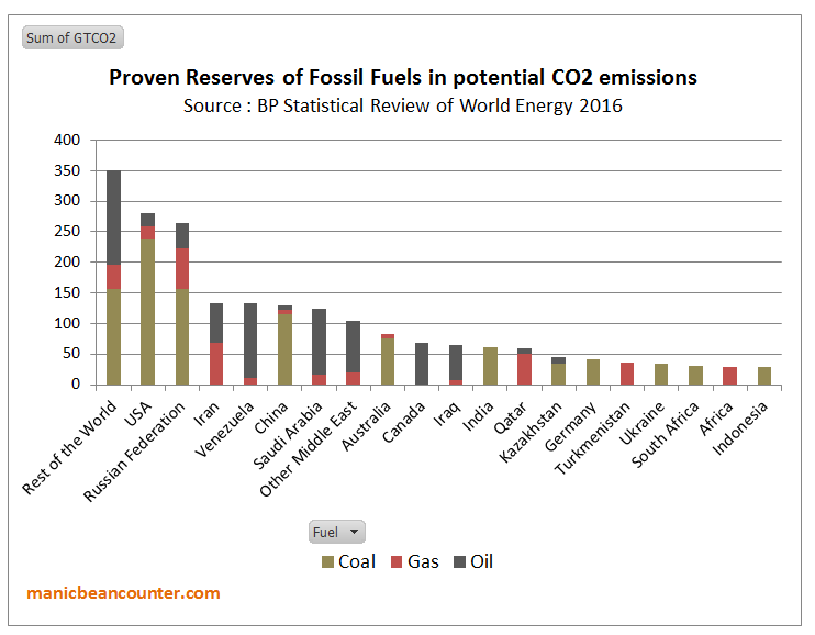
Figure 4 : Fossil fuel Reserves by country, expressed in terms of potential CO2 Emissions

Activists point to the reserves in the rich countries having to be left in the ground. But in the USA, Australia, Canada and Germany production of fossil fuels is not a major part of the economy. Ceasing production would be harmful but not devastating. One major comparison is between the USA and Russia. Gas and crude oil production are similar volumes in both countries. But, the nominal GDP of the US is more than ten times that of Russia. The production of both countries in 2016 was about 550 million tonnes or 3900 million barrels. At $70 a barrel that is around $275bn, equivalent to 1.3% of America’s GDP and 16% of Russia’s. In gas, prices vary, being very low in the highly competitive USA, and highly variable for Russian supply, with major supplier Gazprom acting as a discriminating monopolist. But America’s revenue is likely to be less than 1% of GDP and Russia’s equivalent to 10-15%. There is even greater dependency in the countries of the Middle East. In terms of achieve emissions targets, what is trying to be achieved is the elimination of the major source of the countries economic prosperity in a generation, with year-on-year contractions in fossil fuel sales volumes.

I propose that there are two distinct groups of countries that appear to have a lot lose from a global contraction in GHG emissions to near zero. There are the developing countries who would have to reduce long-term economic growth and the major fossil fuel-dependent countries, who would lose the very foundation of their economic output in a generation. From the evidence of the INDC submissions, there is now no possibility of these countries being convinced to embrace major economic self-harm in the time scales required. The emissions targets are not going to be met. The emissions gap will not be closed to any appreciable degree.

This leaves Greg Craven’s binary decision option of taking action, or not, as irrelevant. As taking action by a country will not eliminate the risk of CAGW, pursuing aggressive climate mitigation policies will impose net harms wherever they implemented. Further, it is not the climate activists who are making the decisions, but policy-makers countries themselves. If the activists believe that others should follow another path, it is them that must make the case. To win over the policy-makers they should have sought to understand their perspectives of those countries, then persuade them to accept their more enlightened outlook. The INDCs show that the climate activists gave failed in this mission. Until such time, when activists talk about the what “we” are doing to change the climate, or what “we” ought to be doing, they are not speaking about

But the activists have won over the United Nations, those who work for many Governments and they dominate academia. For most countries, this puts political leaders in a quandary. To maintain good diplomatic relations with other countries, and to appear as movers on a world stage they create the appearance of taking significant action on climate change for the outside world. On the other hand they are serving their countries through minimizing the real harms that imposing the policies would create. Any “realities” of climate change have become largely irrelevant to climate mitigation policies.

The Risks of Climate Apocalypse

Greg Craven recognized a major issue with his original video. In the shouting match over global warming who should you believe? In How it all Ends (which was followed up by further videos and a book) Craven believes he has the answer.

Figure 5 : Greg Craven’s “How it all Ends”

It was pointed out that the logic behind the grid is bogus. As in Devil’s advocate guise Craven says at 3:50

Wouldn’t that grid argue for action against any possible threat, no matter how costly the action or how ridiculous the threat? Even giant mutant space hamsters? It is better to go broke building a load of rodent traps than risk the possibility of being hamster chow. So this grid is useless.

His answer is to get a sense of how likely the possibility of global warming being TRUE or FALSE is. Given that science is always uncertain, and there are divided opinions.

The trick is not to look at what individual scientists are saying, but instead to look at what the professional organisations are saying. The more prestigious they are, the more weight you can give their statements, because they have got huge reputations to uphold and they don’t want to say something that later makes them look foolish. 

Craven points to the “two most respected in the world“. The National Academy of Sciences (NAS) and the American Association for the Advancement of Science (AAAS). Back in 2007 they had “both issued big statements calling for action, now, on global warming“.  The crucial question from scientists (that is people will a demonstrable expert understanding of the natural world) is not for political advocacy, but whether their statements say their is a risk of climate apocalypse. These two bodies still have statements on climate change.

National Academy of Sciences (NAS) says

There are well-understood physical mechanisms by which changes in the amounts of greenhouse gases cause climate changes. The US National Academy of Sciences and The Royal Society produced a booklet, Climate Change: Evidence and Causes (download here), intended to be a brief, readable reference document for decision makers, policy makers, educators, and other individuals seeking authoritative information on the some of the questions that continue to be asked. The booklet discusses the evidence that the concentrations of greenhouse gases in the atmosphere have increased and are still increasing rapidly, that climate change is occurring, and that most of the recent change is almost certainly due to emissions of greenhouse gases caused by human activities.

Further climate change is inevitable; if emissions of greenhouse gases continue unabated, future changes will substantially exceed those that have occurred so far. There remains a range of estimates of the magnitude and regional expression of future change, but increases in the extremes of climate that can adversely affect natural ecosystems and human activities and infrastructure are expected.

Note, this is conjunction with the Royal Society, which is arguably is (or was) the most prestigious  scientific organisation of them all. It is what not said that is as important as what is actually said. They are saying that there is a an expectation that extremes of climate could get worse. There is nothing that solely backs up the climate apocalypse, but a range of possibilities, including changes somewhat trivial on a global scale. The statement endorses a spectrum of possible positions that undermines the binary TRUE /FALSE position on decision-making.

The RS/NAS booklet has no estimates of the scale of possible climate catastrophism to be avoided. Point 19 is the closest.

Are disaster scenarios about tipping points like ‘turning off the Gulf Stream’ and release of methane from the Arctic a cause for concern?

The summary answer is

Such high-risk changes are considered unlikely in this century, but are by definition hard to predict. Scientists are therefore continuing to study the possibility of such tipping points beyond which we risk large and abrupt changes.

This appears not to support Stern’s contention that unmitigated climate change will costs at least 5% of global GDP by 2100. Another context of the back-tracking on potential catastrophism is to to compare with  Lenton et al 2008 – Tipping elements in the Earth’s climate system. Below is a map showing the the various elements considered.

Figure 6 : Fig 1 of Lenton et al 2008, with explanatory note.

Of the 14 possible tipping elements discussed, only one makes it into the booklet six years later. Surely if the other 13 were still credible more would have been included in booklet, and less on documenting trivial historical changes.

American Association for the Advancement of Science (AAAS) has a video

Figure 7 : AAAS “What We Know – Consensus Sense” video


It starts with the 97% Consensus claims. After asking the listener on how many,  Marshall Sheppard, Prof of Geography at Univ of Georgia states.

The reality is that 97% of scientists are pretty darn certain that humans are contributing to the climate change that we are seeing right now and we better do something about it to soon.

There are two key papers that claimed a 97% consensus. Doran and Zimmerman 2009 asked two questions,

1. When compared with pre-1800s levels, do you think that mean global temperatures have generally risen, fallen, or remained relatively constant?

2. Do you think human activity is a significant contributing factor in changing mean global temperatures?

The second of these two responses was answered in the affirmative by 77 of 79 climate scientists. This was reduced from 3146 responses received. Read the original to find out why it was reduced.

Dave Burton has links to a number of sources on these studies. A relevant quote on Doran and Zimmerman is from the late Bob Carter

Both the questions that you report from Doran’s study are (scientifically) meaningless because they ask what people “think”. Science is not about opinion but about factual or experimental testing of hypotheses – in this case the hypothesis that dangerous global warming is caused by human carbon dioxide emissions.

The abstract to Cook et al. 2013 begins

We analyze the evolution of the scientific consensus on anthropogenic global warming (AGW) in the peer-reviewed scientific literature, examining 11 944 climate abstracts from 1991–2011 matching the topics ‘global climate change’ or ‘global warming’. We find that 66.4% of abstracts expressed no position on AGW, 32.6% endorsed AGW, 0.7% rejected AGW and 0.3% were uncertain about the cause of global warming. Among abstracts expressing a position on AGW, 97.1% endorsed the consensus position that humans are causing global warming. 

Expressing a position does not mean a belief. It could be an assumption. The papers were not necessarily by scientists, but merely authors of academic papers that involved the topics ‘global climate change’ or ‘global warming’. Jose Duarte listed some of the papers that were included in the survey, along with looking at some that were left out.

Neither paper asked a question concerning belief in future climate catastrophism. Sheppard does not make clear the scale of climate change trends from the norm, so the human-caused element could be insignificant. The 97% consensus does not include the policy claims.

The booklet is also misleading as well in the scale of changes. For instance on sea-level rise it states.

Over the past two decades, sea levels have risen almost twice as fast as the average during the twentieth century.

You will get that if you compare the tide gauge data with the two decades of satellite data. The question is whether those two sets of data are accurate. As individual tide gauges do not tend to show acceleration, and others cannot find statistically significant acceleration, the claim seems not to be supported.

At around 4.15 in the consensus video AAAS CEO Alan I. Leshner says

America’s leaders should stop debating the reality of climate change and start deciding the best solutions. Our What we Know report makes clear that climate change threatens us at every level. We can reduce the risk of global warming to protect out people, businesses and communities from harm. At every level from our personal and community health, our economy and our future as a global leader.  Understanding and managing climate change risks is an urgent problem. 

The statement is about combating the potential risks from CAGW. The global part of global warming is significant for policy. The United States share of global emissions is around 13% of global emissions. That share has been falling as America’s emissions have been falling why the global aggregate emissions have been rising. The INDC submission for the United States aimed as getting US emissions in 2025 at 26-28% of 2005 levels, with a large part of that reduction already “achieved” when the report was published. The actual policy difference is likely to be less than 1% of global emissions. So any reduction in risks with respect to climate change seems to be tenuous. A consensus of the best scientific minds should have been able to work this out for themselves.

The NAAS does not give a collective expert opinion on climate catastrophism. This is shown by the inability to distinguish between banal opinions and empirical evidence for a big problem. This is carried over into policy advocacy, where they fail to distinguish between the United States and the world as a whole.

Conclusions

Greg Laden’s decision-making grid is inapplicable to real world decision-making. The decision whether to take action or not is not a unitary one, but needs to be taken at country level. Different countries will have different perspectives on the importance of taking action on climate change relative to other issues. In the real world, the proposals for action are available. In aggregate they will not “solve” the potential risk of climate apocalypse. Whatever the actual scale of CAGW, countries who pursue expensive climate mitigation policies are likely to make their own people worse off than if they did nothing at all.

Laden’s grid assumes that the costs of the climate apocalypse are potentially far greater than the costs of action, no matter how huge. He tries to cut through the arguments by getting the opinions from the leading scientific societies. To put it mildly, they do not currently provide strong scientific evidence for a potentially catastrophic problem. The NAS / Royal Society suggest a range of possible climate change outcomes, with only vague evidence for potentially catastrophic scenarios. It does not seem to back the huge potential costs of unmitigated climate change in the Stern Review. The NAAAS seems to provide vague banal opinions to support political advocacy rather than rigorous analysis based on empirical evidence that one would expect from the scientific community.

It would appear that the binary thinking on both the “science” and on “policy” leads to a dead end, and is leading to net harmful public policy.

What are the alternatives to binary thinking on climate change?

My purpose in looking at Greg Laden’s decision grid is not to destroy an alternative perspective, but to understand where the flaws are for better alternatives. As a former, slightly manic, beancounter, I would (like the Stern Review  and William Nordhaus) look at translating potential CAGW into costs. But then weight it according to a discount rate, and the strength of the evidence. In terms of policy I would similarly look at the likely expected costs of the implemented policies, against the actual expected harms foregone. As I have tried to lay out above, the costs of policy and indeed the potential costs of climate change are largely subjective. Further, those implementing policies might be boxed in by other priorities and various interest groups jostling for position.

But what of the expert scientist who can see the impending on-coming catastrophes to which I am blind and to which climate mitigation will be useless? It is to endeavor to pin down the where, when, type and magnitude of potential changes to climate. With this information ordinary people can adjust their plans. The challenge for those who believe there are real problems is to focus on the data from the natural world and away from inbuilt biases of the climate community. But the most difficult part is from such methods they may lose their beliefs, status and friends.

First is to obtain some perspective. In terms of the science, it is worth looking at the broad range of  different perspectives on the Philosophy of Science. The Stanford Encyclopedia of Philosophy article on the subject is long, but very up to date. In the conclusions, the references to Paul Hoyningen-Huene’s views on what sets science apart seems to be a way out of consensus studies.

Second, is to develop strategies to move away from partisan positions with simple principles, or contrasts, that other areas use. In Fundamentals that Climate Science Ignores I list some of these.

Third, in terms of policy, it is worthwhile having a theoretical framework in which to analyze the problems. After looking at Greg Craven’s video’s in 2010, I developed a graphical analysis that will be familiar to people who have studied Marshallian Supply and Demand curves of Hicksian IS-LM. It is very rough at the edges, but armed with it you will not fall in the trap of thinking like the AAAS that US policy will stop US-based climate change.

Fourth, is to look from other perspectives. Appreciate that other people might have other perspectives that you can learn from. Or alternatively they may have entrenched positions which, although you might disagree with, are powerless to overturn. It should then be possible to orientate yourself, whether as an individual or as part of a group, towards aims that are achievable.

Kevin Marshall

Charles Moore nearly gets Climate Change Politics post Paris Agreement

Charles Moore of the Telegraph has long been one of the towering figures of the mainstream media. In Donald Trump has the courage and wit to look at ‘green’ hysteria and say: no deal (see also at GWPF, Notalotofpeopleknowthat and Tallbloke) he understands not only the impact of Trump withdrawing from the climate agreement on future global emissions, but recognizes that two other major developed countries – Germany and Japan – whilst committed to reduce their emissions and spending lots of money on renewables are also investing heavily in coal. So without climate policy, the United States is reducing its emissions, but with climate commitments, emissions in Japan and Germany are increasing their emissions. However, there is one slight inaccuracy in Charles Moore’s account. He states

As for “Paris”, this is failing, chiefly for the reason that poorer countries won’t decarbonise unless richer ones pay them stupendous sums.

It is worse than this. Many of the poorer countries have not said they will decarbonize. Rather they have said that they will use the money to reduce emissions relative to a business as usual scenario.

Take Pakistan’s INDC. In 2015 they estimate emissions were 405 MtCO2e, up from 182 in 1994. As a result of ambitious planned economic growth, they forecast a BAU of 1603 MtCO2e in 2030. However, they can reduce that by 20% with about $40 billion in finance. That is, with $40bn, average annual emissions growth from 2015-2030 will still be twice that of 1994-2015. Plus Pakistan would like $7-$14bn pa for adaptation to climate change. The INDC Table 7 summarizes the figures.

Or Bangladesh’s INDC. Estimated BAU increase in emissions from 2011 to 2030 is 264%. They will unconditionally cut this by 5% and conditionally by a further 15%. The BAU is 7.75% annual emissions growth, cut to 7.5% unconditionally and 6% with lots of finance. The INDC Table 7 summarizes the figures.

I do not blame either country for taking such an approach, or the many others adopting similar strategies. They are basically saying that they will do nothing that impedes trying to raise living standards through high levels of sustained economic growth. They will play the climate change game, so long as nobody demands that Governments compromise on serving the best interests of their peoples. If only the Government’s of the so-called developed nations would play similar games, rather than impose useless burdens on the people they are supposed to be serving.

There is another category of countries that will not undertake to reduce their emissions – the OPEC members. Saudi Arabia, Iran, Venezuela, Kuwait, UAE and Qatar have all made submissions. Only Iran gives a figure. It will unilaterally cut emissions by 4% against BAU. With the removal of “unjust sanctions” and some financial assistance and technology transfer it conditional offer would be much more. But nowhere is the BAU scenario stated in figures. The reason these OPEC countries will not play ball is quite obvious. To achieve the IPCC objective of constraining warming to 2°C according to McGlade and Ekins 2015 (The geographical distribution of fossil fuels unused when limiting global warming to 2°C) would mean leaving 75% of proven reserves of fossil fuels in the ground and all of the unproven reserves. I did an approximate breakdown by major countries last year, using the BP Statistical Review of World Energy 2016.

It does not take a genius to work out that meeting the 2°C climate mitigation target would shut down a major part of the economies of fossil fuel producing countries in about two decades. No-one has proposed either compensating them, or finding alternatives.

But the climate alarmist community are too caught up in their Groupthink to notice the obvious huge harms that implementing global climate mitigation policies would entail.

Kevin Marshall

More Coal-Fired Power Stations in Asia

A lovely feature of the GWPF site is its extracts of articles related to all aspects of climate and related energy policies. Yesterday the GWPF extracted from an opinion piece in the Hong Kong-based South China Morning Post A new coal war frontier emerges as China and Japan compete for energy projects in Southeast Asia.
The GWPF’s summary:-

Southeast Asia’s appetite for coal has spurred a new geopolitical rivalry between China and Japan as the two countries race to provide high-efficiency, low-emission technology. More than 1,600 coal plants are scheduled to be built by Chinese corporations in over 62 countries. It will make China the world’s primary provider of high-efficiency, low-emission technology.

A summary point in the article is not entirely accurate. (Italics mine)

Because policymakers still regard coal as more affordable than renewables, Southeast Asia’s industrialisation continues to consume large amounts of it. To lift 630 million people out of poverty, advanced coal technologies are considered vital for the region’s continued development while allowing for a reduction in carbon emissions.

Replacing a less efficient coal-fired power station with one of the latest technology will reduce carbon (i.e CO2) emissions per unit of electricity produced. In China, these efficiency savings replacement process may outstrip the growth in power supply from fossil fuels. But in the rest of Asia, the new coal-fired power stations will be mostly additional capacity in the coming decades, so will lead to an increase in CO2 emissions. It is this additional capacity that will be primarily responsible for driving the economic growth that will lift the poor out of extreme poverty.

The newer technologies are important in other types emissions. That is the particle emissions that has caused high levels of choking pollution and smogs in many cities of China and India. By using the new technologies, other countries can avoid the worst excesses of this pollution, whilst still using a cheap fuel available from many different sources of supply. The thrust in China will likely be to replace the high pollution power stations with new technologies or adapt them to reduce the emissions and increase efficiencies. Politically, it is a different way of raising living standards and quality of life than by increasing real disposable income per capita.

Kevin Marshall