Camp Fire California – Lessons in the Limits & Harms of Political Action

I believe that there is a prayer that politicians should adopt.
Called the Serenity Prayer, and written by Reinhold Niebuhr it begins

God grant me the serenity
to accept the things I cannot change;
courage to change the things I can;
and wisdom to know the difference.

The order is the right way round. Most “things” a politician – or even a ruling political party – cannot change. It is in the identification of the things that they can change for the better where they can make a positive difference.

An example comes from the end of last month. For a few days the news in Britain was dominated for days with the stories of the greatest ever wildfire in California. Called the Camp Fire, it killed 86, destroyed 19,000 homes and burnt 240 square miles (62,000 ha)
CBS News 60 Minutes has this short report.
Many politicians, including Governor Brown, blamed climate change. Yet even if wildfires were solely from that cause, the ultimate cause is supposed to be from global greenhouse gas emissions. As in 2016 California’s emissions were around 430 MtCO2e – or about 0.8% of the global total – any climate change policies will make virtually zero difference to global emissions. Even under the 2015 proposed contribution from the USA would not have made much difference as most of the forecast drop in emissions was due to non-policy trends, not due to actual policies. Policy that achieves much less than 10% real reduction from a country that has one-eighth of global emissions is hardly going to have an impact in a period when net global emissions are increasing. That is, impact of any mitigation policies by the State of California or the United States will have approximately zero impact on global emissions.
But no reasonable person would claim that it was all down to climate change, just that climate change may have made the risk of wild fires a little greater.
What are the more immediate causes of wild fires? This is what Munich Re has to say on wildfires in Southeast Australia. (Bold mine) 

The majority of bushfires in southeast Australia are caused by human activity

Bushfire is the only natural hazard in which humans have a direct influence on the hazard situation. The majority of bushfires near populated areas are the consequence of human activity. Lightning causes the smaller portion naturally. Sometimes, a carelessly discarded cigarette or a glass shard, which can focus the sun’s rays is all it takes to start a fire. Heat from motors or engines, or electric sparks from power lines and machines can ignite dry grass. Besides this accidental causes, a significant share of wildfires are started deliberately.

Humans also change the natural fire frequency and intensity. They decrease the natural fire frequency due to deliberate fire suppression near populated areas. If there is no fuel-reduction burning in forests for the purposes of fire prevention, large quantities of combustible material can accumulate at ground level.

Surface fires in these areas can become so intense due to the large amounts of fuel that they spread to the crowns of the trees and rapidly grow into a major fire. If humans had not intervened in the natural bushfire regime, more frequent low-intensity fires would have consumed the forest undergrowth and ensured that woodland grasses and scrubs do not proliferate excessively.

David Evans expands on the issue of fuel load in a 2013 article.

The immediate cause of wildfires is human. Near to people’s homes or businesses there is little that can be done to prevent fires either accidental or deliberate.

But, as any fire safety course will explain, for a fire to happen requires heat, fuel and oxygen. A few tenths of a degree of warming is not going to increase the heat source significantly. As Munich Re explains successful suppression of small fires, or forest management that allows dead material to accumulate, or does not thin the forest. or create fire-breaks will increase the continuous and rich fuel for fires to spread. That is, the unintended consequence of certain types of forest management will be to increase risk of severe fires.

President Trump was then correct in blaming poor forest management for the horrific fire. The reaction from firefighters that the tweets were “demeaning” and “ill-informed” were misplaced. If bad policy contributed to the severity of a fire then politicians should share some of the blame for the damage caused. They should not be defended by those risking their lives to limit the damage resulting from bad policies. If poor building regulations lead to many deaths in a large building then those responsible for the regulations would shoulder some of the blame for those deaths even if an arsonist started the fire. The same applies to forests. After major disasters such as air crashes and earthquakes, regulations are often put in place to prevent future similar disasters even when such regulations would not have prevented the actual disaster. The result of a disaster is to concentrate minds on the wider aspects and plug gaps. But like major disasters, if regulations contributed to the extent of the disaster, the aftermath will be to shift blame elsewhere then fix the underlying problem in a raft of – mostly unnecessary – regulations. President Trump broke these unwritten political rules. But the results are the same, and have occurred quite quickly.

When Trump visited the site of the Camp Fire he met with outgoing Governor Jerry Brown and Lt. Gov. Gavin Newsom he stated on November 19th

Is it happening? Things are changing. ….. And I think, most importantly, we’re doing things about. We’re going to make it better. We’re going to make it a lot better. And it’s going to happen as quickly as it can possibly happen.

From the Daily Caller and WUWT, on December 23rd President Trump signed into law new wildfire legislation that will better allow such fire-prevention management policies. On Christmas Eve President Trump followed this up with an executive order allowing agencies to do more to prevent massive wildfires.

Returning to the serenity prayer, in issuing an Executive order to allow government agencies to reduce fire risk President Trump has done something that is within his power. GOP legislation to better enable others to carry out similar forest management policies, has a slightly less direct impact. Democrats whinging about climate change is far more than failing to accept the things they cannot change. It is about blocking actions that can limit risk and extent of wild fires to maintain ineffectual and costly policies.
Kevin Marshall

BBCs misleading reporting of COP 24 Katowice Agreement

As usual, the annual UNFCCC COP meeting reached an agreement after extra time, said nothing substantial, but tried to dress up the failure as something significant. The BBC’s exuberant reporting of the outcome by Matt McGarth seriously misleads readers as to the substance of the agreement when he states

The Katowice agreement aims to deliver the Paris goals of limiting global temperature rises to well below 2C.

I have written to the BBC Complaints Department asking that they make a correction. Within that letter I cite four references that demonstrate why this McGarth’s statement misleading.

First, there is Climate Action Tracker’s thermometer. I do not believe there have been any additional pledges made in the last few days that would cause CAT to lower their projection from 3oC of warming to below 2oC.
Instead I believe that the COP24 Agreement merely tries to ensure that the pledges are effectively implemented, thus ensuring 3oC of warming rather than the “current policy” 3.3oC of warming.

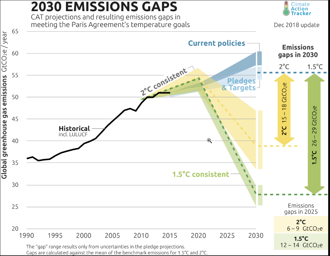
Second, I do not believe there were additional pledges made during the Katowice conference will cut emissions by at least 15 GtCO2e in 2030. This is the minimum difference to be on track to stop global average temperatures exceeding 2oC.  . I enclose a screen shot of Climate Action Tracker’s Emission Gap page.

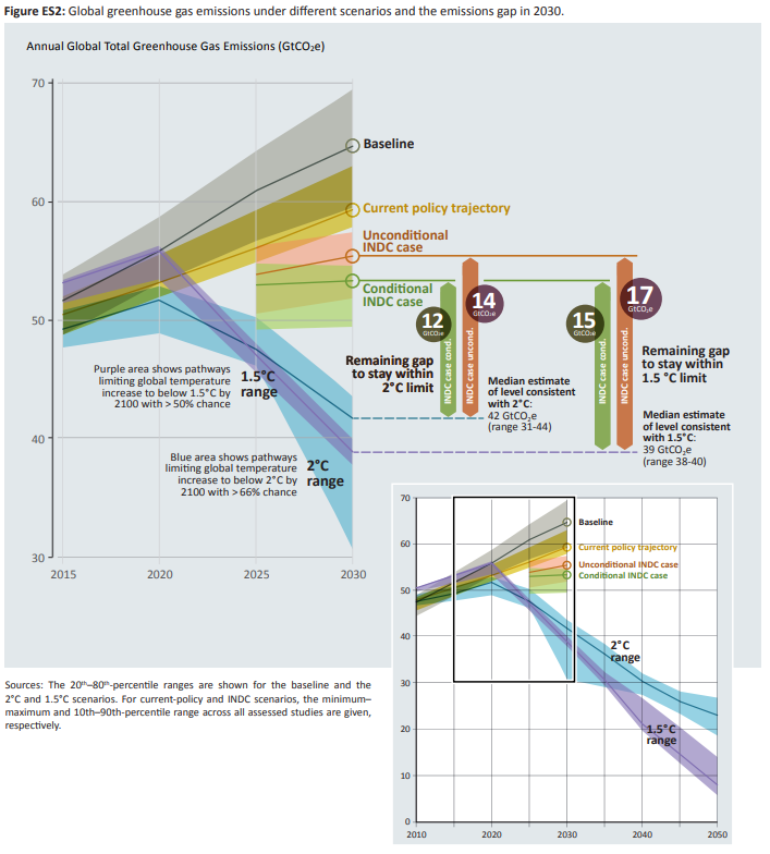
For the original source, I direct readers to the UNEP Emissions Gap Report 2018 , published towards at the end of November. In particular, look to Figure ES.3 on page xviii. The three major points in bold of the Executive Summary (pages xiv to xvii) clarify this graphic.

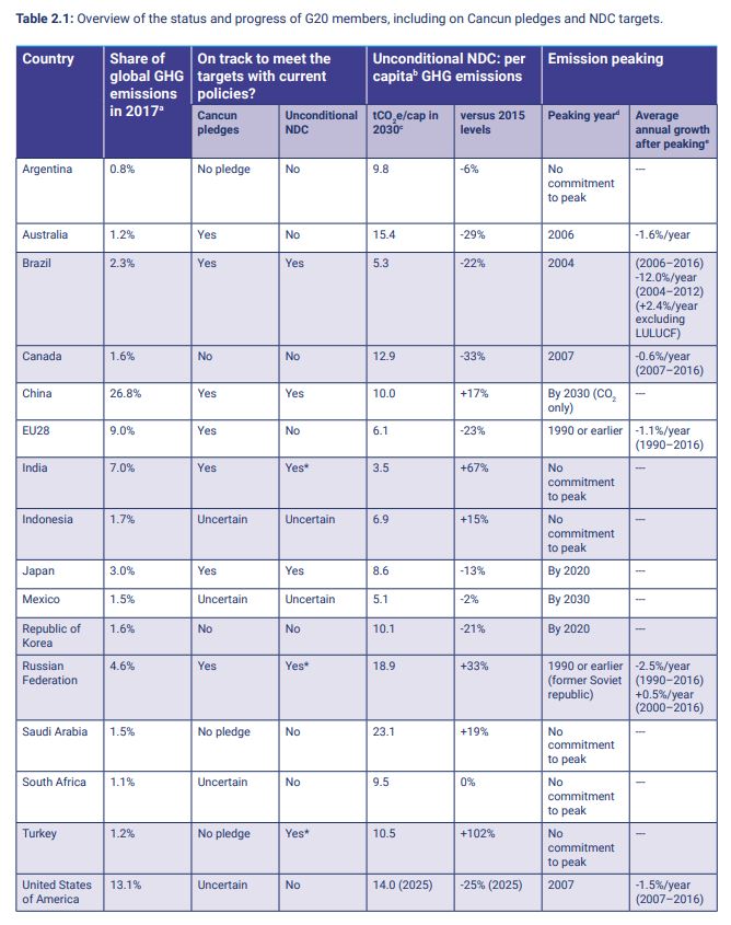
Third, I also draw readers attention to “Table 2.1: Overview of the status and progress of G20 members, including on Cancun pledges and NDC targets” on page 9 of the full UNEP report. A screenshot (without footnotes) is shown below.

The G20 countries accounted for 78% of the 2017 global GHG emissions excluding LULUCF of 49.2 GtCO2e. This was equivalent 72% of total GHG emissions of 53.5 GtCO2e. It might be worth focusing on which countries have increased their pledges in the past couple of weeks. In particular, those countries whose INDC submission pledges of 2015 imply increases in emissions between 2015 and 2030 of at least 0.5 GtCO2e or more (China, India, Russia, Turkey and Indonesia plus Pakistan, Nigeria and Vietnam outside of the G20), as they collectively more than net offset the combined potential emissions decreases of the developed countries such as the USA, EU, Canada and Australia. In a previous post I graphed this proposed emissions increases in figures 2 and 3. They are reproduced below.

Fourth, is that the UNFCCC press announcement makes no mention of any major breakthrough. The only national government mentioned is that of Scotland, who provided £200,000 of additional funding.  Scotland is not an independent Nation, recognized by the United Nations. As a part of the EU, it is not even part of a recognized nation state that makes submissions direct to the UNFCCC. The  SUBMISSION BY LATVIA AND THE EUROPEAN COMMISSION ON BEHALF OF THE EUROPEAN UNION AND ITS MEMBER STATES of 6 March 2015 can be found here.  By being a part of the EU, in the UNFCCC Scotland is two levels below Liechtenstein or Tuvalu. despite having respectively 140 and 480 times the population. But even if Scotland were both independent of the UK and the EU, as a nation state it would hardly seem fair that it was accorded the same voice as India or China with each have about 250 times the population of Scotland.

In the spirit of objectivity and balance, I hope that the BBC makes the  necessary correction.

Kevin Marshall

UNEP Emissions Gap Report 2018 Part 3 – UNEP tacitly admits climate mitigation is a failure

To those following the superficial political spin of climate policy, a UN organisation admitting that climate mitigation has failed may come as a surprise. Yet one does not have to go too deeply into the new UNEP Emissions Gap Report 2018 to see that this tacit admission is clearly the case. It is contained within the 3 major points in the Executive Summary.

By policy failure, I mean to achieve a global substantial reduction in GHG emissions in the near future, even if that reduction is not in line with either the 1.5°C or 2.0°C warming objective. On this measure, the UNEP is tacitly admitting failure it the summary.
The Executive Summary of the UNEP Emissions Gap Report 2018 starts on the pdf page 14 of 112, numbered page xiv.

Point 1 – Current commitments are inadequate

1. Current commitments expressed in the NDCs are inadequate to bridge the emissions gap in 2030. Technically, it is still possible to bridge the gap to ensure global warming stays well below 2°C and 1.5°C, but if NDC ambitions are not increased before 2030, exceeding the 1.5°C goal can no longer be avoided. Now more than ever, unprecedented and urgent action is required by all nations. The assessment of actions by the G20 countries indicates that this is yet to happen; in fact, global CO2 emissions increased in 2017 after three years of stagnation.

This is not a statement about a final push to get policy over the line, but a call for a complete change of direction. The tacit admission is that this is politically impossible. In the amplification it is admitted that in the G20 major economies – most of them developing countries – even the “NDC ambitions” for 2030 are not likely to be achieved. As I showed in the Part 2 post, 9 of the G20 will actually increase their emissions from 2015 to 2030 if the commitments are fully met, and the sum of the emissions increases will be greater than the emissions decreases. The exhortation for “unprecedented and urgent action” is not like Shakespeare’s Henry V rallying his men with a “once more unto the breach chaps and we will crack it” but more about like “Hey good fellows, if we are really going to breach the defenses we need to upgrade from the colorful fireworks to a few kegs of proper gunpowder, then make a few genuine sacrifices. I will be cheering you all the way from the rear“. This sentiment is contained in the following statement.

As the emissions gap assessment shows, this original level of ambition needs to be roughly tripled for the 2°C scenario and increased around fivefold for the 1.5°C scenario.

Point 2 – Emissions are increasing, not decreasing rapidly

2. Global greenhouse gas emissions show no signs of peaking. Global CO2 emissions from energy and industry increased in 2017, following a three-year period of stabilization. Total annual greenhouse gases emissions, including from land-use change, reached a record high of 53.5 GtCO2e in 2017, an increase of 0.7 GtCO2e compared with 2016. In contrast, global GHG emissions in 2030 need to be approximately 25 percent and 55 percent lower than in 2017 to put the world on a least-cost pathway to limiting global warming to 2°C and 1.5°C respectively.

In just 13 years from now global emissions need to be down by a quarter or more than a half to achieve the respective 2°C and 1.5°C targets. Emissions are still going up. Again, an admission that the progress in over two decades is small in relation to the steps needed to achieve anything like a desired outcome.

Point 3 – Scale of the gap in numbers

3. The gap in 2030 between emission levels under full implementation of conditional NDCs and those consistent with least-cost pathways to the 2°C target is 13 GtCO2e. If only the unconditional NDCs are implemented, the gap increases to 15 GtCO2e. The gap in the case of the 1.5°C target is 29 GtCO2e and 32 GtCO2e respectively. This gap has increased compared with 2017 as a result of the expanded and more diverse literature on 1.5°C and 2°C pathways prepared for the IPCC Special Report.

Some developing countries said they would change course conditional on massive amounts of funding. It is clear this will not be forthcoming. Fleshing out the 1.5°C target in the SR1.5 Report showed that it requires more onerous policies than previously thought. Each year UNEP produces a chart that nicely shows the scale of the problem. The 2018 version on page xviii is reproduced as figure 1.

Figure 1 : The emissions GAP in 2030 under the 1.5°C and 2°C scenarios, from the UNEP Emissions Gap Report 2018.

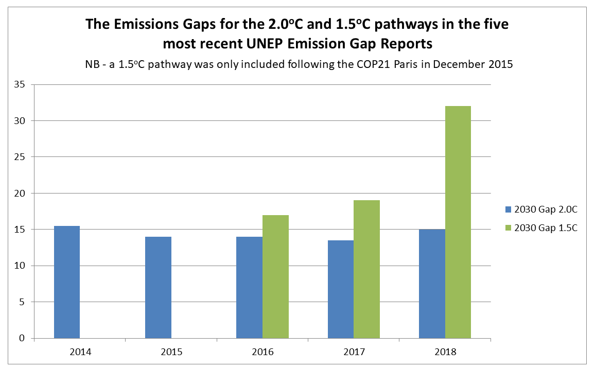
The widening gap between the 1.5°C and 2°C pathways and current projected commitments over the last five reports is shown in figure 2.

This widening gap is primarily a result of recalculations. Increased emissions in 2017 are secondary.

Conclusion

That nearly 200 nations would fail to agree to collectively and substantially reduce global emissions was obvious from the Rio Declaration in 1992. This exempted developing countries from any obligation to reduce their emissions. These developing countries now have at least four fifths of the global population and around two-thirds emissions. It was even more obvious from reading the Paris Agreement, where vague aspirations are evident. It is left to the reader to work out the implications of paragraphs like 4.1 and 4.4, which renders the UNFCCC impotent in reducing emissions. The latest UNEP Emissions Gap Report presents the magnitude of the mitigation policy failure and very clear statements about that failure.

Kevin Marshall

Leave EU Facebook Overspending and the Brexit Result

Last week an Independent article claimed

Brexit: Leave ‘very likely’ won EU referendum due to illegal overspending, says Oxford professor’s evidence to High Court

The article began

It is “very likely” that the UK voted for Brexit because of illegal overspending by the Vote Leave campaign, according to an Oxford professor’s evidence to the High Court.

Professor Philip Howard, director of the Oxford Internet Institute, at the university, said: “My professional opinion is that it is very likely that the excessive spending by Vote Leave altered the result of the referendum.
“A swing of just 634,751 people would have been enough to secure victory for Remain.
“Given the scale of the online advertising achieved with the excess spending, combined with conservative estimates on voter modelling, I estimate that Vote Leave converted the voting intentions of over 800,000 voters in the final days of the campaign as a result of the overspend.”

Is the estimate conservative? Anthony Masters, a Statistical Ambassador for the Royal Statistical Society, questions the statistics in the Spectator. The 800,000 was based upon 80 million Facebook users, 10% of whom clicked in on the advert. Of those clicking, 10% changed their minds.

Masters gave some amplification on in a follow-up blog post Did Vote Leave’s overspending cause their victory?
The reasons for doubting the “conservative” figures are multiple, including
– There were not 80 million voters on Facebook. Of the 46 million voters, at most only 25.6 million had Facebook accounts.
– Click through rate for ads is far less than 10%. In UK in 2016 it was estimated at 0.5%.
– Advertising is not the source of campaigning. It is not even viewed as the primary source, merely bolstering other parts of a campaign through awareness and presence.
– 10% of those reading the advert changing their minds is unlikely. Evidence is far less.
Anthony Masters concludes the Spectator piece by using Professor Howard’s own published criteria.

Prof Howard’s 2005 book, New Media Campaigns and the Managed Citizen, also argues that we should apply a different calculation to that submitted to the High Court. His book says to apply a one per cent click-through rate, where 10 per cent “believe” what they read; and of that 10 per cent act. This ‘belief’ stage appears to have been omitted in the High Court submission’s final calculation. Using these rates, this calculation turns 25.6 million people into 2,560 changed votes – hardly enough to have swung the referendum for Leave, given that their margin of victory was over a million votes. If we share a belief in accuracy, this erroneous claim should have limited reach.

There is further evidence that runs contrary to Prof Howard’s claims.

1. The Polls
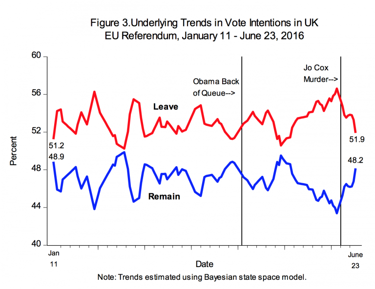
To evaluate the statistical evidence for a conjecture – particularly for a contentious and opinionated issue like Brexit – I believe one needs to look at the wider context. If a Facebook campaign swung the Referendum campaign in the final few days from Remain to Leave, then there should be evidence of a swing in the polls. In the blog article Masters raised three graphs based on the polls that contradict this swing. It would appear that through the four weeks of the official campaign the Remain / Leave split was fairly consistent on a poll of polls basis. From analysis by pollster YouGov, the Leave share peaked on 13th June – ten days before the referendum. The third graphic, from a statistical analysis from the LSE, provides the clearest evidence.

The peak was just three days before the murder of MP Jo Cox by Tommy Mair. Jo Cox was a Remain campaigner, whilst it was reported that the attacker shouted slogans like “Britain First”. The shift in the polls could have been influenced by the glowing tributes to the murdered MP, alongside the speculation of the vile motives a clear Vote Leave supporter. That Jo Cox’s murder should have had no influence, especially when campaigning was suspended as a result of the murder, does not seem credible.

On Twitter, Anthony Masters also pointed to a question in Lord Ashcroft’s poll carried out on the day of the referendum – How the United Kingdom voted on Thursday… and why to a graphic that looked at when people had decided which way to vote. At most 16% of leave voters made up their minds in the last few days, slightly less than the 18% who voted remain.

The same poll looked at the demographics.


This clearly shows the split by age group. The younger a voter the more likely they were to vote Remain. It is not a minor relationship. 73% of 18-24s voted for Remain, whilst 40% of the 65% voted. Similarly, the younger a person the greater the time spent on social media such as Facebook.

2. Voting by area
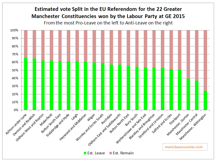
Another, aspect is to look at the geographical analysis. Using Chris Hanretty’s estimates of the EU referendum results by constituency, I concluded that the most pro-Remain areas were the centre of major cities and in the University Cities of Oxford, Cambridge and Bristol. This is where the most vocal people reside.

The most pro-Leave areas were in the minor towns such are Stoke and Boston. Greater Manchester provided a good snapshot of the National picture. Of the 22 constituencies is estimated that just 3 has a majority remain vote. The central to the City of Manchester. The constituencies on the periphery voted to Leave, the strongest being on the east of Manchester and a few miles from the city centre. Manchester Central contains many of the modern flats and converted warehouses of Manchester. Manchester Withington has a preponderance of media types working at Media City for the BBC and ITV, along with education sector professionals.

These are the people who are not just geographically marginalised, but often feel politically marginalised as well.

Concluding comments

Overall, Professor Howard’s claims of late Facebook posts swinging the Referendum result are not credible at all. They are about as crackpot (and contradict) as the claims of Russian influence on the Brexit result.
To really understand the issues one needs to look at the data from different perspectives and the wider context. But the more dogmatic Remainers appear to be using their power and influence – backed by scanty assertions -to thrust their dogmas onto everyone else. This is undermining academic credibility, and the democratic process. By using the courts to pursue their dogmas, it also threatens to pull the legal system into the fray, potentially undermining the respect for the rule of law for those on the periphery.

Kevin Marshall

Natural Variability in Alaskan Glacier Advances and Retreats

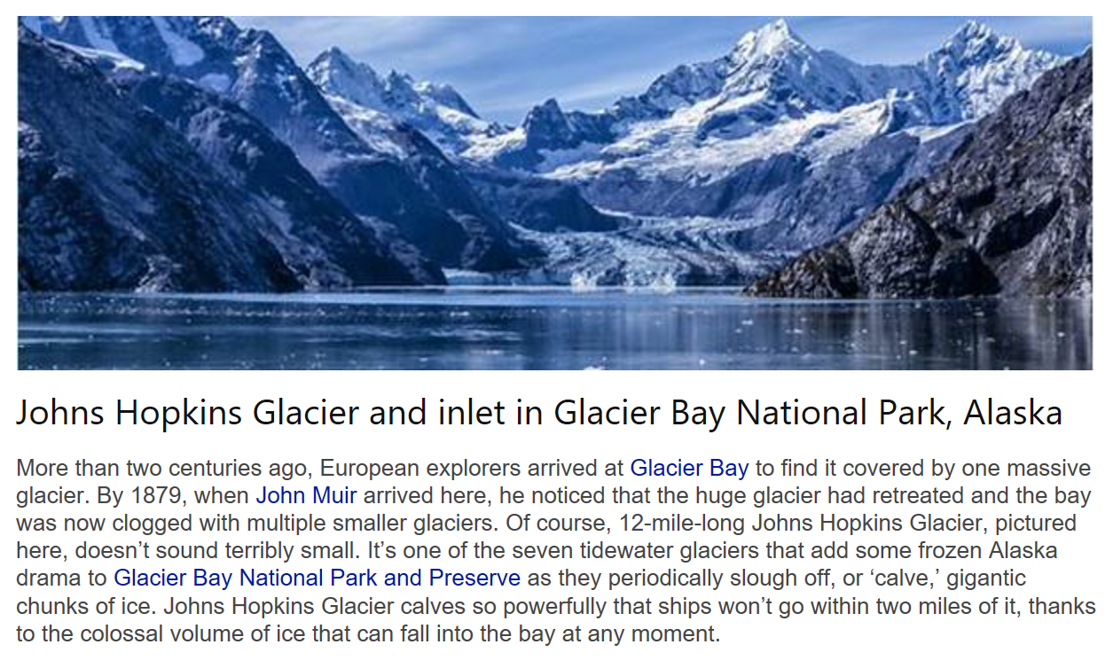
One issue with global warming is discerning how much of that warming is human caused. Global temperature data is only available since 1850. That might contain biases within the data, some recognized (like the urban heat island effect) and others maybe less so. Going further back is notoriously difficult, with proxies for temperature having to be used. Given that (a) recent warming  in the Arctic has been significantly greater than warming at other latitudes (see here) and (b) the prominence given a few years ago to the impact of melting ice sheets, the retreat of Arctic glaciers ought to be a useful proxy. I was reminded of this with yesterday’s Microsoft screensaver of Johns Hopkins Glacier and inlet in Glacier Bay National Park, Alaska.

The caption caught my eye

By 1879, when John Muir arrived here, he noticed that the huge glacier had retreated and the bay was now clogged with multiple smaller glaciers.
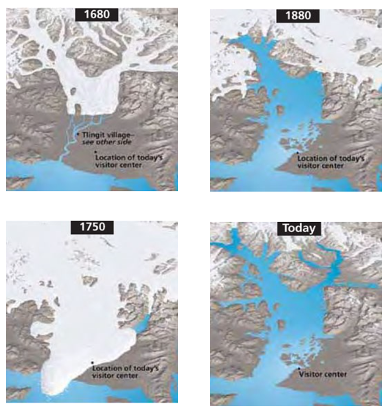
I did a quick search on how for more information on this retreat. At the National Park Service website, there are four images of the estimated glacier extent.
The glacier advanced from 1680 to 1750, retreated dramatically in the next 130 years to 1880, and then retreated less dramatically in the last 130+ years. This does not fit the picture of unprecedented global warming since 1950.

The National Park Service has more detail on the glacial history of the area, with four maps of the estimated glacial extent.

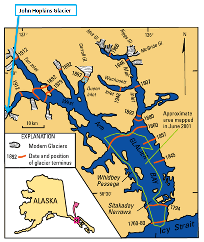
The glacial advance after 1680 enveloped a village of some early peoples. This is not something new to me. Previous estimates of glacier movement in Glacier Bay have only been of the retreat. For instance this map from a 2012 WUWT article shows the approximate retreat extents, not the earlier advance. Is this recently discovered information.

I have marked up the John Hopkins Glacier where the current front is about 50 miles from the glacier extent in 1750.
The National Park Service has a more detailed map of Glacier Bay, with more detailed estimated positions of the glacier terminus at various dates. From this map the greatest measured retreat of John Hopkins Glacier was in 1929. By 1966 it had expanded over a mile and the current terminus in slightly in front of the 1966 terminus. This is an exception to the other glaciers in Glacier Bay which are still retreating, but at a slower rate than in the nineteenth century.

As the human-caused warming is supposed to have predominately after 1950 the glacial advance and retreat patterns of the extensive Glacier Bay area do not appear to conform to those signals.

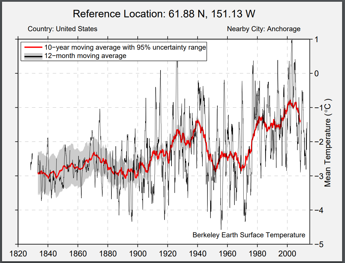
A cross check is from the Berkeley Earth temperature anomaly for Anchorage.

Whilst it might explain minor glacial advances from the 1929 to 1966, it does not explain the more significant glacial retreat in the nineteenth century, nor the lack of significant glacial retreat from the 1970s.

Kevin Marshall

UNEP Emissions Gap Report 2018 Part 2 – Emissions Projections by Country

On previous UNEP Emission Gap Reports I found that although they showed the aggregate global projected emissions, there has been no breakdown by country. As mitigation policies are mostly enacted by nation states, and the aim is to reduce global emissions, it would be useful to actually see how each of the near 200 nation states have pledged contribute to that objective.  Table 2.1 on page 9 of the UNEP Emissions Gap Report 2018 (published last week) goes part way to remedy this glaring omission. The caption states

Table 2.1: Overview of the status and progress of G20 members, including on Cancun pledges and NDC targets.


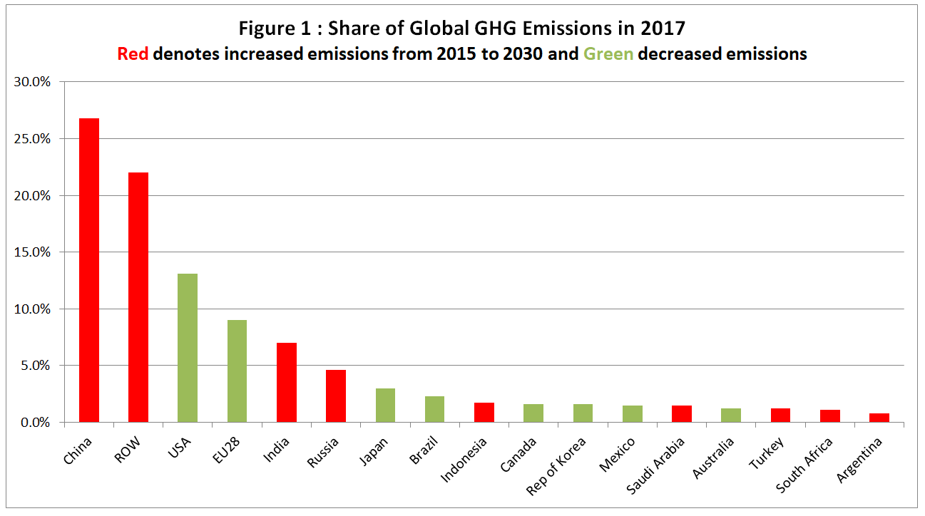
The G20 economies accounted for 78% of global emissions (excluding LULUCF) in 2017. The table does not clearly show the estimate emissions in 2015 and 2030, only the emissions per capita in 2015 (including LULUCF) and the percentage change in emissions per capita from 2015 to 2030. So I have done my own calculations based on this data using the same future population estimates as UNEP. That is from the medium fertility variant of the United Nations World Population Prospects 2017 edition. There are two additional assumptions I have made in arriving at these figures. First, the share of global emissions in 2015 for each country was exactly the same as in 2017. Second, the global shares including LULUCF (Land use, land-use change and forestry) are the same as those excluding LULUCF. This second assumption will likely understate the total emissions shares of countries like Brazil and Indonesia, where land use has high, and variable, emissions impacts. It may impact the country rankings by a small amount. However, the overall picture shown in Figure 1 will not be materially changed as the report states on page XV that the land use element was just 4.2 GtCO2e of the 53.5 GtCO2e estimated emissions in 2017.

In Figure 1 it is only G20 countries with 33% of current global emissions where emissions are projected to be lower 2030 than in 2015. The other G20, with 45% of global emissions, are projected to be higher. There are wide variations. I calculate, Argentina is projected to increase its emissions by 7% or 32 MtCO2e, Turkey by 128% or 521 MtCO2e and India by 93% or 2546 MtCO2e.
To get a clearer picture I have looked at the estimates changes between 2015 and 2030  in Figure 2. Please note the assumptions made above, particularly concerning LULUCF. I also make the additional assumption that in rest of the world emissions will increase in line with projected population growth, so emissions per capita will be unchanged.

The calculated figures show a net increase of 7.4 GtCO2e, compared to EGR2018 estimates of 6 GtCO2e including LULUCF. It might be a reasonable assumption that there are net reductions in removing the rainforests by burning, and increase in trees due to more planting, and the impact of increased growth due to higher CO2 levels will be net positive.
Note that whilst the USA has given notice of exiting the Paris Agreement, and thus its pledges, the pledge was a very soft target. It is more than likely the United States will have the greatest emissions reductions of any country between 2015 and 2030, and have one of the largest percentage reductions as well. These reductions are mostly achieved without economically damaging mitigation policies.
The figures used for the G20 countries in Table 2.1 are only vague estimates as section 2.4.2 (Emissions trends and targets of individual G20 members) implies. However, the assumption of a net increase of 29% for the rest of the world might not be valid if one uses country INDC submissions as a basis for calculation. There are a few countries that have pledged to reduce emissions. Andorra and Liechtenstein are two examples. But among the more populous emerging economies, it is clear from the INDC submissions that there is no intention to reduce emissions.

Figure 3 estimates the implied increase in emissions in the more populous countries outside of the G20 for the unconditional scenarios.

I would also have liked to include DR Republic of Congo, Egypt and Iran, with a combined population of 260 million. However, lack of data in the INDCs prevented this.
Although the 8 countries in Figure 3 contain one eighth of the global population, they currently have just 4% of global emissions. But their aggregate projected emissions increase without outside assistance is 3.0 GtCO2e, on top of 2.1 GtCO2e in 2015. Combined with the 7.4 GtCO2e estimated increase for the G20 countries and it is difficult to see how the UNEP estimates an increase just 3 GtCO2e. (see Figure ES.3 on page XVIII).

There appear to be no countries with a population of more than 40 million outside of the G20 who are promising to decrease their emissions. Tanzania, Colombia, Kenya and Algeria (combined population 190 million people) are all projecting significant emissions increases, whilst Myanmar and Sudan have inadequate data to form an estimate. A quick check of 8 non G20 countries with populations of 30-40 million has the same result. Either an increase in emissions or no data. 

Implications for mitigation policy

In summary, of the 45 nations with a population above 30 million, just 10 have pledged to have emissions lower in 2030 than 2015. The United States will likely achieve this objective are well. The other 34 nations will likely have higher emissions in 2030, with most significantly higher. The 11 emissions-reducing nations have a population of 1.1 billion against 5.3 billion in the 34 other nations and 1.15 billion in nations or territories with a population of less than 30 million. In terms of emissions, barring economic disaster, I estimate it is likely that countries with in excess of 60% of global emissions in 2017 will have emissions in 2030 that exceed those of 2015.  

To put this in context, the Emissions Gap report states on page xv

According to the current policy and NDC scenarios, global emissions are not estimated to peak by 2030.

My analysis confirms this. The Report further states

Total annual greenhouse gases emissions, including from land-use change, reached a record high of 53.5 GtCO2e in 2017, an increase of 0.7 GtCO2e compared with 2016. 
In contrast, global GHG emissions in 2030 need to be approximately 25 percent and 55 percent lower than in 2017 to put the world on a least-cost pathway to limiting global warming to 2°C and 1.5°C respectively.

After over 20 years of annual meeting to achieve global reductions in emissions, there is still no chance of that happening. In the light of this failure UNEP appear to have fudged the figures. Part of this is justified, as many developing countries appear to have put through unjustifiable BAU scenarios then claimed “climate actions” that will bring the projection more into line with what would be a non-policy forecast. COP 24 at Katowice will just be another platform for radical environmentalists to denigrate capitalist nations for being successful, and for a collective finger-wagging at the United States. 

The next part will look at the coded language of the Emissions Gap Report 2018 that effectively admits the 2°C and 1.5°C ambitions are impossible.

Kevin Marshall