There’s a very old joke I’d like to share with you, and it goes something like this:
A man is found repeatedly firing an elephant gun in the local park. “What are you doing that for?” he is asked. “It’s to scare away the elephants”, he opines. “But there are no elephants in this park”, comes the reply. “See,” he smiles, “it’s working already”.
Now, if you were to believe the man with the elephant gun, what you would be dealing with here is a perfect example of what is known as the Preparedness Paradox (sometimes ‘Preventative Paradox’). It is a paradox in which the removal of a problem is misinterpreted as evidence that the problem never existed in the first place.
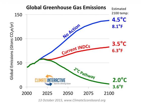
The “Preparedness Paradox” using RCP8.5 was much in evidence in the run-up to and during COP21 Paris in December 2015. But there was another element that I am unable to name.
In the run-up to COP21, nearly every country submitted an INDC (Intended Nationally Determined Contributions). These were primarily to show emissions projections with and without policy through to 2030. Not the UK, as the EU did a joint INDC. Several organisations put forward projections on how the aggregate of the INDCs would play out through to 2100. One such group was Climate Interactive. Using RCP8.5 as a baseline, they projected that the effect of the INDCs would be to constrain 2100 warming to 3.5oC. Just a degree less warming.
The UNFCCC, using a different method, claimed the INDCs would constrain warming to 2.7 °C.
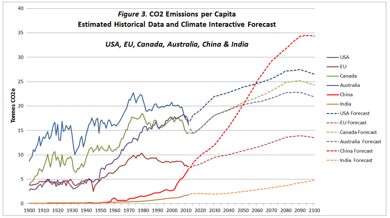
As Climate Interactive C-Roads software allowed downloads, I had a little play with the data. C-Roads had extracted data from the RCP database. This has separate model outputs for each of the four RCPs and for each greenhouse gas. To keep things simple, RCP divides the world into five, rather odd, regions. C-Roads then split out the EU and about 20 major countries from these regions. I downloaded the RCP8.5 CO2 emissions data along with the UN population projections from C-Roads. The CO2 data is expressed in grams of carbon, instead of tonnes of CO2. After a bit of data manipulation, I produced the following chart.
In the actual data to 2012, CO2 emissions per capita have fallen since 1980 in both the USA and the EU27. This is due to various factors, but in general advanced economies grow both through services and through high-value manufacturing. There is no economic reason for either to rise to well beyond pre-1973 peaks. The projection in China is simply crazy. It is this way in part because China’s population is projected to fall to 1 billion by 2100. Indeed, all but one country confirms the “Preparedness Paradox”. That country is India.
The projected CO2 emissions for India were so low that even the 2015 estimate was around 30% below the estimate. The figures for Africa (excluding South Africa) were even worse. Per capita CO2 emissions will barely increase. In other words, more professional BAU scenarios for India and Africa would generate the opposite of the elephant gun approach.
An idea of the revision upwards for India can be gained from the INDC submission. This included the target “to lower the emissions intensity of GDP by 33% to 35% by 2030.“. But this intensity decrease was in the context of an assumed GDP growth of 7.2%. That would imply an 80% increase in emissions in 15 years, at an annual growth rate of ~4%. Emissions in 2014 were 84% higher than in 1999 (3083 and 1980 MtCO2e), so the projection was hardly an exaggeration. 2024 emissions were 42% higher than in 2014 (4371 and 3083 MtCO2e), implying an emissions growth rate of ~3.5%
Another example is Nigeria. In its INDC submission, Nigeria projected its GHG emissions to grow 114% by 2030. But it would unconditionally cut this by 20%. With external financing, it would be cut by 70% relative to BAU. That is, even with external financing, emissions would increase by a third. Yet 1999-2014 GHG emissions only increased by 20%, and 2024 emissions were just ~11% higher than in 2014. No climate financing has been arranged. Nigeria was not alone in publishing a highly exaggerated BAU scenario. I cannot believe that the UNFCCC estimated the impacts of INDCs took these exaggerations fully into account. Neither would Climate Interactive. Whilst RCP8.5 is a gross exaggeration, 2100 emissions projections based on 2015 INDCs
So, whilst you would expect the inputting INDCs into the Climate Interactive C-Roads database to correct the crazy forecasts, these are partly offset by upward revisions elsewhere. But these revisions using INDCs would have been a little circumspect. Whether even a 50% increase in CO2 emissions in 85 years is realistic (even with emission reduction policies in some countries) is another story. As is my extrapolation from AR6 WG1 SPM table SPM.2 that constant global CO2 emissions 2020-2100 would produce ~3.5 °C of warming in 2100.
In a recent comment at Cliscep Jit made the following request
I’ve been considering compiling some killer graphs. A picture paints a thousand words, etc, and in these days of short attention spans, that could be useful. I wanted perhaps ten graphs illustrating “denialist talking points” which, set in a package, would be to the unwary alarmist like being struck by a wet fish. Necessarily they would have to be based on unimpeachable data.
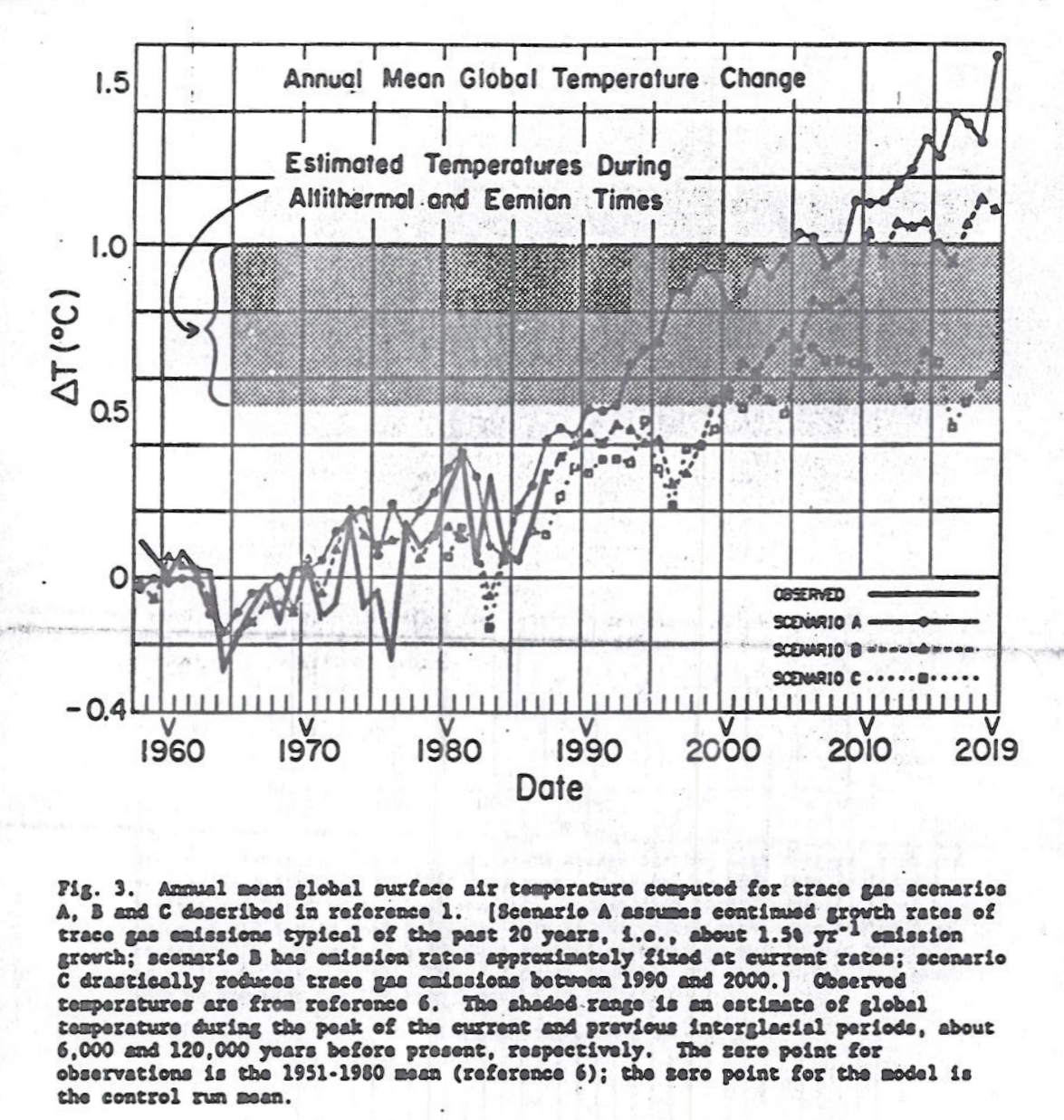
One of the most famous graphs in climate is of the three scenarios used in Congressional Testimony of Dr James Hansen June 23 1988. Copies are poor, being copies of a type-written manuscript. The following is from SeaLevel.info website.
Fig 3 of Hansen’s Congressional Test June 23 1988
The reason for choosing this version rather than the clearer version in the paper online is that the blurb contains the assumptions behind the scenarios. In particular “scenario C drastically reduces trace gas emissions between 1990 and 2000.” In the original article states
scenario C drastically reduces trace gas emissions between 1990 and 2000such that greenhouse forcing ceases to increase after 2000.
In current parlance this is net zero. In the graph this results in temperature peaking about 2007.
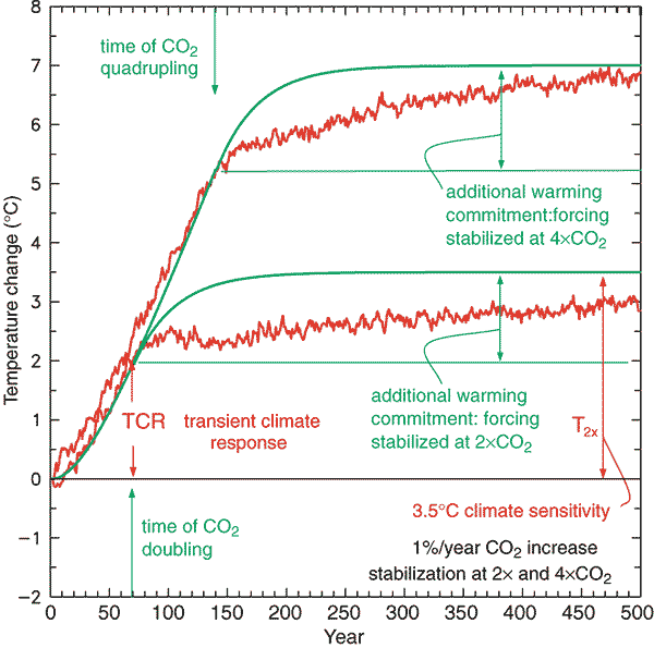
In the IPCC Third Assessment Report (TAR) 2001 there is the concept of Transient Climate Response.
TAR WG1 Figure 9.1: Global mean temperature change for 1%/yr CO2 increase with subsequent stabilisation at 2xCO2 and 4cCO2. The red curves are from a coupled AOGCM simulation (GFDL_R15_a) while the green curves are from a simple illustrative model with no exchange of energy with the deep ocean. The transient climate response, TCR, is the temperature change at the time of CO2 doubling and the equilibrium climate sensitivity, T2x, is the temperature change after the system has reached a new equilibrium for doubled CO2, i.e., after the additional warming commitment has been realised.
Thus, conditional on CO2 rising at 1% a year and the eventual warming from a doubling of CO2 being around 3C, then at the point when doubling has been reached temperatures will have risen by about 2C. From the Mauna Loa data annual average CO2 levels have risen from 316 ppm in 1959 to 414 ppm in 2020. That is 31% in 60 years or less than 0.5% a year. Assuming 3C of eventual warming from a CO2 doubling then the long time period of the transient climate response
much less than 1C of warming could so far have resulted from the rise in CO2 since 1959
it could be decades after net zero is achieved that warming will cease.
the rates of natural absorption of CO2 from the atmosphere are of huge significance.
Calculation of climate sensitivity even with many decades CO2 data and temperature is near impossible unless constraining assumptions are made about the contribution of natural factors; the rate of absorption of CO2 from the atmosphere; outgassing or absorption of CO2 by the oceans; & the time period for the increase in temperatures from actual rates of CO2 increase.
That is, change in a huge number variables within a range of acceptable mainstream beliefs significantly impacts the estimates of emissions pathways to constrain warming to 1.5C or 2C.
If James Hansen in 1988 was not demonstrably wrong false about the response time of the climate system and neither is TAR on the transient climate response, then it could be not be possible to exclude within the range of both the possibility that 1.5C of warming might not be achieved this century and that 2C of warming will be surpassed even if global net zero emissions is achieved a week from now.
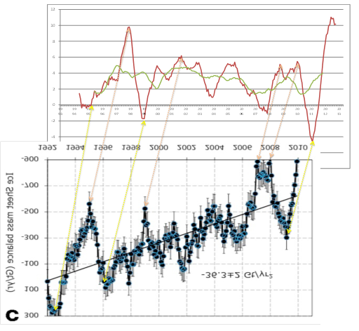
As a (slightly manic) beancounter I like to reconcile data sets. The differing estimates behind the claims of accelerating ice mass loss in Antarctica do not reconcile, nor with sea level rise data. The problem of ice loss needs to be looked at in terms of the net of ice losses (e.g. glacier retreat) and ice gains (snow accumulation). Any estimate then needs to be related to other estimates. The Guardian article referred in the cliscep post states
Separate research published in January found that ice loss from the entire Antarctic continent had increased six-fold since the 1980s, with the biggest losses in the west. The new study indicates West Antarctica has caused 5mm of sea level rise since 1992, consistent with the January study’s findings.
The total mass loss increased from 40 ± 9 Gt/y in 1979–1990 to 50 ± 14 Gt/y in 1989–2000, 166 ± 18 Gt/y in 1999–2009, and 252 ± 26 Gt/y in 2009–2017. In 2009–2017, the mass loss was dominated by the Amundsen/Bellingshausen Sea sectors, in West Antarctica (159 ± 8 Gt/y), Wilkes Land, in East Antarctica (51 ± 13 Gt/y), and West and Northeast Peninsula (42 ± 5 Gt/y). The contribution to sea-level rise from Antarctica averaged 3.6 ± 0.5 mm per decade with a cumulative 14.0 ± 2.0 mm since 1979, including 6.9 ± 0.6 mm from West Antarctica, 4.4 ± 0.9 mm from East Antarctica, and 2.5 ± 0.4 mm from the Peninsula (i.e., East Antarctica is a major participant in the mass loss).
The Antarctic Ice Sheet is an important indicator of climate change and driver of sea-level rise. Here we combine satellite observations of its changing volume, flow and gravitational attraction with modelling of its surface mass balance to show that it lost 2,720 ± 1,390 billion tonnes of ice between 1992 and 2017, which corresponds to an increase in mean sea level of 7.6 ± 3.9 millimeters (errors are one standard deviation). Over this period, ocean-driven melting has caused rates of ice loss from West Antarctica to increase from 53 ± 29 billion to 159 ± 26 billion tonnes per year; ice-shelf collapse has increased the rate of ice loss from the Antarctic Peninsula from 7 ± 13 billion to 33 ± 16 billion tonnes per year. We find large variations in and among model estimates of surface mass balance and glacial isostatic adjustment for East Antarctica, with its average rate of mass gain over the period 1992–2017 (5 ± 46 billion tonnes per year) being the least certain.
The key problem is in the contribution to sea level rise. The Rignot study from 1979-2017 gives 3.6 mm a decade from 1989-2017, about 4.1 mm and from 1999-2017 about 5.6 mm. The IMBIE team estimates over the period 1992-2017 7.9 mm sea level rise, or 3 mm per decade. The Rignot study estimate is over 50% greater than the IMBIE team. Even worse, neither the satellite data for sea level rise from 1992, nor the longer record of tide gauges, show an acceleration in sea level rise.
For instance from NOAA, the satellite data shows a fairly steady 2.9mm a year. rise in sea levels from 1992.
Using the same data, the University of Colorado estimates the average sea level rise to be 3.1 mm a year.
Note that in both the much greater variability in the Jason 2 data, and the slowdown in rise after 2016 when Jason 3 started operating.
The tide gauges show a lesser rate of rise. A calculation from 155 of the best tide gauges around the world found the mean and median rate of sea level rise to be 1.48 mm/yr.
Yet, if Rignot is correct in recent years Antarctic ice loss must now account for around 22-25% of the sea level rise (satellite record) or almost 50% (tide gauges) of the measured sea level rise. Both show no accleration. What factors have a diminishing contribution to sea level rise over the last 25 years? It cannot be less thermal expansion, as heat uptake is meant to have increased post 2000, more than offsetting the slowdown in surface temperature rise when emissions accelerated.
I compared the 12 monthly rise in sea surface temperatures with the corressponding chart of ice mass balance loss for Greenland and Antarctica. The peaks and troughs corressponded nicely, with about 18 months between ice loss and sea level rise. This is quite remarkable considering that from Rignot et 2011 in the 1990s ice loss would have had very little influence on sea level rise. It is almost as though the modelling has taken the sea level data, multiplied by 360, flipped it, moved it back a few months then tilted to result show acceleration.
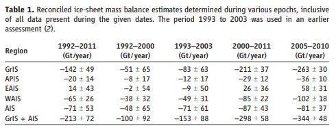
Yet the acceleration of 14.5 ± 2 Gt/yr2 for Antarctica results in decadal increases not too dismillar from those in the abstract of Rignot et al 2018. This would validate the earlier results except for another paper. Shepherd et al Nov 2012 – Reconciled Estimate of Ice-Sheet Mass Balance had a long list of authors including Rignot and three of the four co-authors of the Rignot et al 2011. It set the standard for the time, and was the key article on the subject in IPCC AR5 WG1. Shepherd et al Nov 2012 has the following Table 1.
For Antartica as experienced no significant acceleration in ice mass loss in the period 1992-2011.
Yesterday the BBC broadcast “Climate Change – The Facts”. Jaime Jessop has already posted the first of a promised number of critical commentaries. Alex Cull has already started a transcript. Another here.
At the start the narrator says
What we’re doing right now is we’re so rapidly changing the climate, for the first time in the world’s history people can see the impact of climate change.
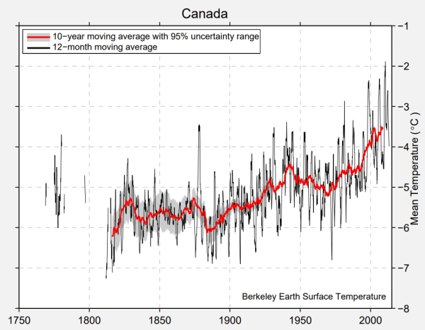
Both past and future warming in Canada is, on average, about double the magnitude of global warming.
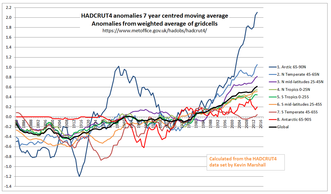
This observation is since 1948. This is partly because land has warmed faster than the oceans and partly because the greatest warming is in the Arctic. See two graphics I produced last year from the HADCRUT4 data. Note that much of the Canada-US border is at 49N, though Toronto is at 44N.
Canada is land based and much of its area is in the in the Arctic. Being part of a continental land mass, Canada also has extremely cold winters and fairly hot summers. But overall it is cold. Average Canadian temperatures from Berkeley Earth in 2013 were still -3.5C, up from -5.5C in 1900. BE graphic reproduced below.
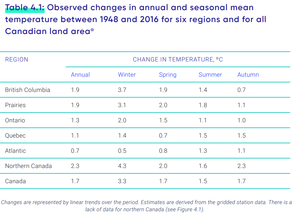
The question is, does this mean that climate is becoming more extreme? The report on page 127 has a useful table
In Canada as a whole, and in four of the six areas, Winter average temperatures have warmed faster than those in the Summer. The other two have coastal influences, where I would expect the difference between summer and winter to be less extreme than Canada as a whole. Climate has generally become less extreme.
However, if climate is becoming more extreme as a result of general warming then it this would result in more warm temperature records than cold temperature records to be set in recent decades. From Wikipedia has Lists of extreme temperatures in Canada.
Of the 13 Provinces and Territories, only two have heat records more recent than 1950. That is Nunavut in 1989 and Yukon in 2004. For extreme cold, records are more spread out, with the two most recent in 1972 & 1973.
Wikipedia also has lists of highest & lowest temperatures ever recorded in Canada as a whole. The hottest has duplicates in terms of adjacent places, or the same places on adjacent days. Not surprisingly nearly all are located well inland and close to the US border. The record highest is 45.0 °C on July 5, 1937. The bottom half of the list is of records of 43.3 °C or 110 °F. The three most recent were set in 1949, 1960 and 1961.
The coldest ever recorded in Canada was -63.0 °C on February 3, 1947 at Snag Yukon. The third lowest was −59.4 °C in 1975. On the list are three from this century. −49.8 °C on January 11, 2018, −48.6 °C on December 30, 2017 and −42 °C on December 17, 2013. Eleven of the thirteen provinces and territories are represented in the 31 records on the coldest list, and there is 21.9 °C difference between the top and bottom of the list. Seventy years of Winter warming in Canada have raised average temperatures by 3.3 °C, but the extreme low temperatures are 13 °C higher.
It would seem that the biggest news is of winter warming of 3.3 °C in 70 years has resulted in far less extreme cold, and considerably lower extreme cold temperatures. The more moderate summer warming has not resulted in record heatwaves. The evidence is that Canada’s warming has made temperatures less extreme, contradicting the consensus claims that warming leads to more extremes. In Canada, global warming appears to be causing climate changing for the better. So why is the Canadian Government trying to stop it?
It is inevitable that people will connect Idai and climate change. It is always tricky to establish a direct causal link, but thanks to the evidence provided by a number of reports from the Intergovernmental Panel on Climate Change (IPCC), including this most recent one from October 2018, we know that climate change is bound to increase the intensity and frequency of storms like Idai. At the very least, this crisis is a harbinger of what is coming.
As Jessop points out, the most recent IPCC SR15 has low confidence in any increase in trends in global cyclone activity, nor in the severity. In term low confidence I interpret to mean that evidence, if available, is highly speculative and/or is contradicted by better evidence. The Conversation article fails to read the evidence. Climate change is not “bound to increase the intensity and frequency of storms like Idai“. Even if that were, Idai is not caused by climate change.
At the BBC Matt McGarth tries to make the climate connection,
While Cyclone Idai is the seventh such major storm of the Indian Ocean season – more than double the average for this time of year – the long-term trend does not support the idea that these type of events are now more frequent.
“The interesting thing for the area is that the frequency of tropical cyclones has decreased ever so slightly over the last 70 years,” said Dr Jennifer Fitchett from the University of the Witwatersrand in South Africa who has studied the question.
“Instead, we are getting a much higher frequency of high-intensity storms.”
Climate change is also changing a number of factors in the background that are contributing to making the impact of these storms worse.
“There is absolutely no doubt that when there is a tropical cyclone like this, then because of climate change the rainfall intensities are higher,” said Dr Friederike Otto, from the University of Oxford, who has carried a number of studies looking at the influence of warming on specific events.
“And also because of sea-level rise, the resulting flooding is more intense than it would be without human-induced climate change.“
Historically, nine storms that had reached tropical cyclone intensity made landfall on Mozambique. A larger number of weaker tropical systems, including tropical storms and depressions affect the region, with a total landfall of all tropical systems of 1.1 per annum.
The link is to an open access article.
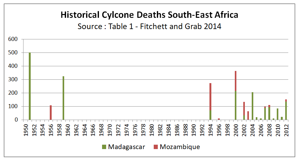
Fitchett and Grab 2014 : A 66‐year tropical cyclone record for south‐east Africa: temporal trends in a global context – International Journal of Climatology
Table 1 contains details of historical records for Madagascar and Mozambique. I have summarized the numbers of deaths by year.
The claim of an increase in severe storms over the last 70 years by Dr Fitchett is evidenced by a glance at this graph. But there are issues. For Mozambique there are no recorded major cyclones between 1956 and 1994, nor for Madagascar between 1959 and 1994. Does this mean that there was major cyclone drought for over thirty-five years?
The history of the two countries suggests reasons for the lack of records other than lack of events to be observed. Historically Mozambique was a lightly-administered Portuguese Colony. There was a War of Independence covering 1964-1974 and following Independence a Civil War 1977-1992. Madagascar became Independent of France in 1960. There was increasing strife, culminating in a socialist-Marxist dictatorship from 1975 to 1993. The dictatorship was largely cut-off from the outside world. 1994 was the first year both countries were clear of the major strife that afflicted them for decades, so it is hardly surprising this was the first year in decades when the severe impacts of cyclones was reported.
A BBC Report gives colloquial evidence to support the storms being nothing unusual. A video report of Cyclone Idai says it is the strongest winds Mozambique has had in the last ten years.
The evidence of less cyclones, but a claim more high-intensity ones looks like a rejection of objective evidence in favour of sensationalist reporting.
Evidence of Sea Level Rise
The desperation is indicated by mentioning sea level rise, which has risen by a few centimetres in the 50 years. Although centered on the coastal town of Beira, Mozambique, the vast areas impacted also include parts of the land-locked countries of Zimbabwe and Malawi. The nearest point to the sea of either country’s borders appear to be much greater than 150 kilometres. For some perspective, in Britain, the furthest point from the sea is Coton in the Elms at 70 miles or 113km distance.
Singling out one person is maybe unfair. Climate alarmism is a consensus enterprise, which gives primacy to mantras, rather than verification of conjectures with evidence of the natural world. However, the false attribution of sea level rise in the article is by Dr Friederike Otto. One profile I found states:-
Friederike (Fredi) is the Acting Director of the Environmental Change institute and an Associate Professor in the Global Climate Science Programme where she leads several projects understanding the impacts of man-made climate change on natural and social systems with a particular focus on Africa and India.
Her main research interest is on extreme weather events (droughts, heat waves, extreme precipitation), improving and developing methodologies to answer the question ‘whether and to what extent external climate drivers alter the likelihood of extreme weather’. She furthermore investigates the policy implication of this emerging scientific field.
Fredi is co-investigator on the international project World Weather Attribution which aims to provide an assessment of the human-influence on extreme weather in the immediate aftermath of the event occurring.
Dr Otto also featured in Nature last year, for attributing the 2018 Northern European heatwave to climate change. As Jaime Jessop found out, the selective evidence and modelling assumptions to support this attribution was contradicted by looking at the wider data.
Policy Implications
If the real desire is to look at making rational policy decisions to ameliorate the impact of emerging extreme weather events, then it is necessary properly assess the type, severity and geographical extent and likelihood of these impacts. Otherwise resources will be wasted on projects that do not address the issues. That includes only accepting claims made about an emerging impact when they are properly verified by the evidence. Otherwise, climate alarmism will ensure that resources are directed away from making a real difference to the lives of the poorest people.
Not only is the “Climate Justice” movement singling out a few countries to pay compensation for damages without evidence of damage caused, they are also helping to ensure that resources are directed away from making a real difference to the lives of the poorest people.
I have already posted twice on coral reefs, but skirted round the article on Coral Alarmism by Geoff Price at his own blog on April 2nd 2018, reposted at ATTP eleven months later. By reposting this article Prof Ken Rice has shown how derisory is the evidence for global warming being the cause of increasing coral bleaching.
Checking the sources that Price gives for (a) evidence of global warming (b) media sources of coral bleaching reveal there is no unambiguous underlying evidence to make a persuasive case linking of one with the other. Further. the major peer review paper that Price cites finds that changes in severe coral bleaching events are not explained by global warming.
Evidence of global warming related to coral reefs
The first issue I want to deal with is the evidence that Price presents for the increase in coral bleaching being due to global warming.
Price first states the dogma
In our window of time here and on our watch, we’re observing the unfolding collapse of global coral reef cover – the largest living structures on the planet, relatively priceless in terms of human and economic value, and stunningly beautiful – due to human-induced stresses, now most prominently from human-caused global anthropogenic (greenhouse) warming of the oceans.
The claim of human induced warming is not backed up by any evidence. That global average temperatures have been rising for well over a century does not mean that this was human-induced. It could be natural or just some random cyclical cycle in a chaotic complex system, or some combination of all three. The evidence of warming oceans is the NOAA data of estimated increase in ocean heat content from 1960. There are a number of things wrong with this approach. The data period is only from 1960; heat stress in corals is from the amount of temperature rise; and the data is for 0-700m down, whilst most corals reside just a few meters below the surface. A much better measure is the sea surface temperature data records, which measures temperature just below the surface.
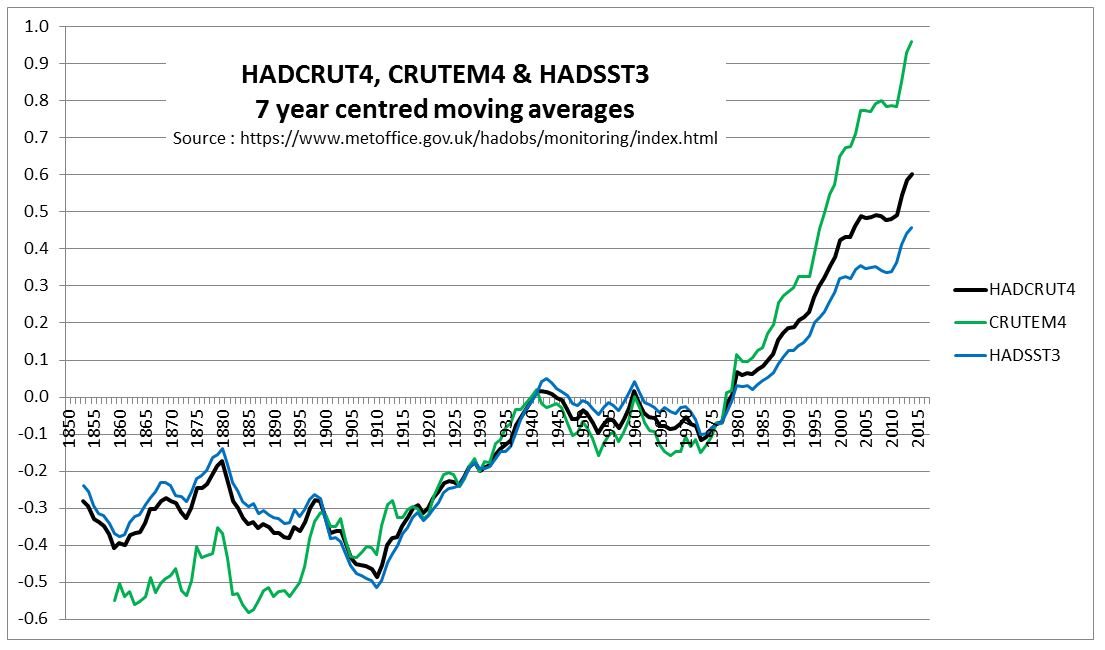
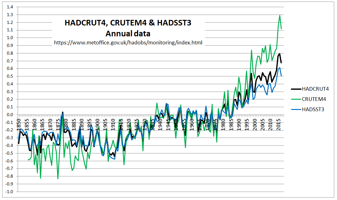
Below is the HADCRUT4 land and ocean anomalies temperature anomalies that I charted last year.
Crucially, the HADSST3 ocean warming data shows a similar global average temperature increase in the early twentieth century as the post 1975 warming. Both were about 0.5C, a value likely much less than the seasonal sea surface temperature change. Also, the rise in GHG gases – especially of CO2 – is much more post 1950 than from 1800 to 1940. The data does not support the idea that all warming is human-caused, unless global warming is caused by Mother Gaia anticipating the rise in CO2 levels.
Even then, then rise in global sea surface temperatures is not an indication of warming in a particular area. The Great Barrier Reef, for instance has shown little or no warming since 1980. From my previous post, observed major bleaching events do not correspond to any rise in warming, or any increase in extreme temperatures.
Media Sources do not support hypothesis
Even if Geoff Price cannot provide proper evidence of the rise in average temperatures that coral reefs are experiencing, at least he could provide credible scientific evidence of the link between warming and increase in coral bleaching. Price states
Rather than presenting empirical evidence, or at least scientific articles, relating increased coral reef bleaching to global warming, Price bizarrely “quotes” from various media sources. To show how bizzare, I have made some notes of the sources,
As if “Ravaged by War”
The “Ravaged by War” article in the New York Times of Jan 4 2018. At the start of the article is stated “large-scale coral bleaching events……were virtually unheard-of before the 1980s“, whereas later on is stated ”before 1982-3, mass bleaching events across wide areas were nonexistent.” The perceived lack of bleaching before the 1980s is changed into a fact. The lack of perception is due to lack of wide-scale research. But even 1982-3 as the first year of reporting of mass bleaching is contradicted by Figure 1c in Glynn 1993, reference 3 in the Hughes et al 2018 paper that prompted the NYT article. 1978 and 1979 have far more recorded mass coral mortalities than 1982 and 1993.
Evidence of global bleaching
The link is to a page of high quality pictures of coral bleaching from around the world. The rise of digital photography, and the increase in the numbers of people diving reefs with cameras in the last twenty years is evidence observation bias not of real increase. In the past, lack of wide-scale human perception does not mean the issue was not there.
Great Barrier Reef Bleaching
From the UK Independent April 20 2016 is the headline “Great Barrier Reef: Half of natural wonder is ‘dead or dying’ and it is on the brink of extinction, scientists say“.
The event is partly being caused by the strong El Nino weather system that has swept across the world in the last year. But global warming is the underlying cause, say scientists, and so the bleaching and death is likely to continue.
“We’ve never seen anything like this scale of bleaching before. In the northern Great Barrier Reef, it’s like 10 cyclones have come ashore all at once,” said Professor Terry Hughes, conveyor of the National Coral Bleaching Taskforce,
The claim that global warming is the underlying cause of the bleaching is not attributed to any one person, or group. Prof Terry Hughes only makes a statement about the current state of affairs not being observed before, not that, in reality, it is unprecedented. Again a difference between perceptions and underlying reality.
Japan
The Japanese study is from an environmentalist website Down to Earth on January 13 2017. It states
Experts have, for quite a while now, believed that corals are among the most susceptible organisms to climate change. In fact, the world has already lost 30-40 per cent of its total documented coral cover.
According to the ministry’s estimate, 70 per cent of the Sekisei lagoon in Okinawa had been killed due to bleaching, which occurs when unusually warm water forces coral to expel the algae living in their tissues. Unless water temperatures quickly return to normal, the coral eventually dies from lack of nutrition.
Based on the survey done on 35 locations in Japan’s southernmost reaches from November to December 2016, the ministry observed that the plight of the reef has become “extremely serious” in recent years.
According to a Japanese media, the dead coral has now turned dark brown and is now covered with algae. It also revealed that the average sea surface temperature between June and August 2016 in the southern part of the Okinawa island chain was 30.1°C—one to two degrees warmer than usual. According to the Japan meteorological agency, it was also the highest average temperature since records began in 1982.
There is no link to the original source and from the statement the article is probably relying on media sources in English. Therefore there is no way of verifying whether the claims are due to warming. I would assume that the authors, like myself, do not speak Japanese, and the script is incomprehensible to them. Further, the article highlights just one of 35 locations in the Japanese study. This should be a signal that the cause of that extreme example of coral bleaching is more than just extreme temperatures.
Searching “Sekisei Lagoon” I come up with lots of returns, mostly about Coral bleaching. There was one is a short 2017 article at the Japanese Ministry of Environment website, and sponsored by them. The second paragraph states
(C)orals in the (Sekisei) Lagoon have extensively diminished since park designation because of various reasons: terrestrial runoffs of red clay and wastewater; coral bleaching due to high water temperatures; and outbreaks of the predatory crown-of-thorns starfish (Acanthaster planci). Initial efforts have been made to reduce terrestrial runoffs to help the natural recovery of coral ecosystem health. Studies on coral distribution and techniques for reef rehabilitation are also in progress.
It is does not look like global warming in the sole cause of the excessive coral bleaching in Sekisei Lagoon. It is also local human factors and a large predator. A little research of crown-of-thorns starfish reveals that sudden increases in populations are poorly understood and that it is also found on the Great Barrier Reef. Acanthaster planci has a number of predators, the lack of which might indicate reasons for the outbreaks.
Other Media Sources
The South Pacific source is a blog post from March 2016 on American Samoan Reefs, a small part of the total extent of islands across the vast region. It is about coral bleaching being on hold, but there is an alert due to recent abnormally high temperatures. If bleaching did follow it would have been due to the El Nino event, which caused abnormally high average temperatures globally.
The Hawaii source, does not give a link to the peer reviewed article on which it is based. Looking at the article, it is (a) based on surveys in 2014 and 2015, but with no data on historical events (b) claims that elevated temperatures were present in Hawaii, (but does not show that the global average temperature were not elevated (c) provides no evidence of comparative surveys in the past to show the issue has got worst. In the first sentence of the introduction it is implied that the entire 0.9 °C in average SSTs is due to rise in GHGs, a totally unsupportable statement. Peer J’s boasted rapid peer review process has failed to pick up on this,
The Florida Keys reference is a Washington Post article of June 25 2017 about how loss of the coral reefs through temperature rise will impact on tourism. It assumes that temperature rise is the sole course of coral reef loss.
Finally the Belize article a New York Times opinion piece from July 6 2017, about a researcher visiting the coral reefs. There is no data provided for either local warming or trends in bleaching.
Hughes et al 2018
The major scientific article that Price refers to is
Spatial and temporal patterns of mass bleaching of corals in the Anthropocene DOI: 10.1126/science.aan8048 . (Hughes et al 2018)
Unusually this paper is open access. I quite like the attempt to reduce the observation bias when they state
Here we compiled de novo the history of recurrent bleaching from 1980 to 2016 for 100 globally distributed coral reef locations in 54 countries using a standardized protocol to examine patterns in the timing, recurrence, and intensity of bleaching episodes, including the latest global bleaching event from 2015 to 2016.
This does not eliminate the observation bias, but will certainly lesson the bias. They then make the observation
Since 1980, 58% of severe bleaching events have been recorded during four strong El Niño periods (1982–1983, 1997–1998, 2009–2010, and 2015–2016) (Fig. 2A), with the remaining 42% occurring during hot summers in other ENSO phases.
Considering that 2017 was also a severe bleaching events and global average temperatures were higher than in the 2015 El Nino year and in 2018, not to state it is an El Nino year is a maybe a bit dubious. Even so, on this basis El Nino free years are runs of 13, 10 and 4. This is not unlike the statement in the abstract
The median return time between pairs of severe bleaching events has diminished steadily since 1980 and is now only 6 years.
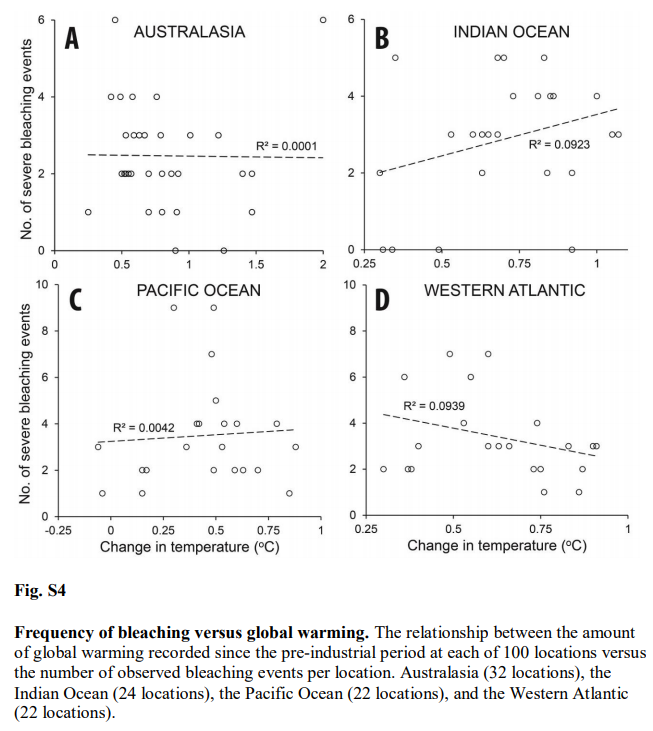
The paper makes no direct claims about the increase in observed coral bleaching being related to global warming. But This is because the data does not show this. Supplementary data figure 4 tests the relationship between the number of severe coral bleaching events per location and warming at that location across four regions.
For Australia R2 = 0.0001. That is zero. Better results can be achieved from two random unrelated data sets. The best relationship is for the West Atlantic – mostly the Caribbean. That is R2 = 0.0939. The downward slope implies a negative relationship. But still less than 10% of the variation in severe bleaching events is explained by rising temperatures.
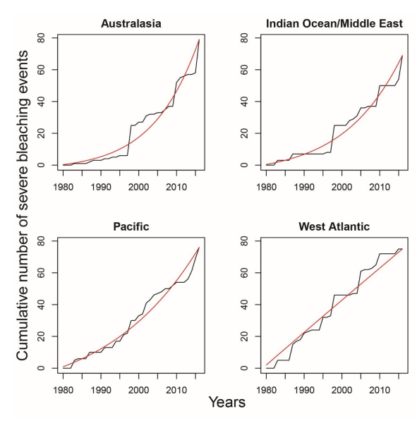
Figure 2A of the Supplementary materials I also find interesting in the context of Jaime Jessop’s contention that coral bleaching is related to El Ninos.
Note that this is cumulative recorded severe bleaching events. The relative size of individual years is from the increase in that year. For Australasia, the three standout years are 1998, 2010 and 2016/2017. These are El Nino years, confirming Jaime’s hypothesus. For the West Atlantic there were also an unusual number of severe bleaching events in 1995 and 2005. No El Ninos there, but 2005 saw a record number of hurricanes in the area, and 1995 also saw an unusually high number including Hurricane Andrew, the last category 5 to make landfall in the USA. Although excess heat might be the principal cause of stress in coral reefs, I am sure they might also get stressed by severe storms, with the accompanying storm surges. If severe storms can lead to bleaching there is a problem with observation of bleaching. From Heron et al 2016 we learn that since the 1990s satellites have made twice-weekly recording of surface temperatures are 0.5 degree grids (about 50km), then comparing with the SST data to detect unusual runs of DHWs. Since 2015, a new product was launched with just 5km grids. It is then left to some intrepid scientists to go out in a boat, dive down and take samples. If severe storms do not have unusually high temperatures, then there will be no alerts of bleaching, so unless there are other attempts to observe, this will not be picked up, or could be picked up a short while later after an episode of unusual warming. Before the 1990s, there was no such over-all detection system, and likely much less researchers. Many of the bleaching events occurring before 1990 may not have been picked up, or if they were, there may have been less ability to define that events as major.
Concluding Comments
By re-posting a dogmatic article ATTP has done a service to climate scepticism. Laying out a very bad, but well-referenced, case for global warming causing increased coral reef bleaching shows the inadequacies of that case. Where long periods of data collated on a consistent basis is used there is no correlation. Further, increasing observed frequency of bleaching events since is mostly due El Nino events being closer together, whilst the increase in observed bleaching can be accounted for by the greatly improved methods of detection and the resources put into observing, which are many times what they were a few decades ago.
Geoff Price’s method of presenting the opinions of others, rather than focusing on the underlying data that supports the conjecture, is something in common with ATTP and others of the climate community. When checked, the fail to connect with any underlying reality.
There is a rider to be made. The case for global warming is very poor by the traditional scientific methods of confronting conjectures with evidence of the natural world, and letting such evidence being the ultimate arbiter of that conjecture. From the consensus viewpoint popular today it is collective opinion that is the arbiter. The above is from the former point of view, which means from the latter view this is misinformation.
In the previous post I looked at whether the claimed increase in coral bleaching in the Great Barrier Reef was down to global average temperature rise. I concluded that this was not the case as the GBR has not warmed, or at least not warmed as much as the global temperatures. Here I look further at the data. The first thing to state is that I recognize that heat stress can occur in corals. Blogger Geoff Price (in post at his own blog on April 2nd 2018, reposted at ATTP eleven months later) stated
(B)leaching via thermal stress is lab reproducible and uncontroversial. If you’re curious, see Jones et al 1998, “Temperature-induced bleaching of corals begins with impairment of the CO2 fixation mechanism in zooxanthellae”.
I am curious. The abstract of Jones et al 1998 states
The early effects of heat stress on the photosynthesis of symbiotic dinoflagellates (zooxanthellae) within the tissues of a reef‐building coral were examined using pulse‐amplitude‐modulated (PAM) chlorophyll fluorescence and photorespirometry. Exposure of Stylophora pistillata to 33 and 34 °C for 4 h resulted in ……….Quantum yield decreased to a greater extent on the illuminated surfaces of coral branches than on lower (shaded) surfaces, and also when high irradiance intensities were combined with elevated temperature (33 °C as opposed to 28 °C). …..
If I am reading this right. the coral was exposed to a temperature increase of 5-6 °C for a period of 4 hours. I can appreciate that the coral would suffer from this sudden change in temperature. Most waterborne creatures would be become distressed if the water temperature was increased rapidly. How much before it would seriously stress them might vary, but it is not a serious of tests I would like to carry out. But is there evidence of increasing heat stress causing increasing coral bleaching in the real world? That is, has there been both a rise in coral bleaching and a rise in these heat stress conditions? Clearly there will be seasonal changes in water temperature, even though in the tropics it might not be as large as, say, around the coast of the UK. Also, many over the corals migrate up and down the reef, so they could be tolerant of a range of temperatures. Whether worsening climate conditions have exacerbated heat stress conditions to such an extent that increased coral bleaching has occurred will only be confirmed by confronting the conjectures with the empirical data.
Rise in instances of coral bleaching
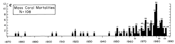
I went looking for long-term data that coral bleaching is on the increase and came across and early example.
P. W. Glynn: Coral reef bleaching: Ecological perspectives. Coral Reefs 12, 1–17 (1993). doi:10.1007/BF00303779
From the introduction
Mass coral mortalities in contemporary coral reef ecosystems have been reported in all major reef provinces since the 1870s (Stoddart 1969; Johannes 1975; Endean 1976; Pearson 1981; Brown 1987; Coffroth et al. 1990). Why, then, should the coral reef bleaching and mortality events of the 1980s command great concern? Probably, in large part, because the frequency and scale of bleaching disturbances are unprecedented in the scientific literature.
One such example of observed bleaching is graphed in Glynn’s paper as Figure 1 c
But have coral bleaching events actually risen, or have the observations risen? That is in the past were there less observed bleaching events due to much less bleaching events or much less observations? Since the 1990s have observations of bleaching events increased further due to far more researchers leaving their families the safe climates of temperate countries to endure the perils of diving in waters warmer than a swimming pool? It is only by accurately estimating the observational impact that it is possible to estimate the real impact. This reminds me of the recent IPPR report, widely discussed including by me, at cliscep and at notalotofpeopleknowthat (e.g. here and here). Extreme claims were lifted a report by billionaire investor Jeremy Grantham, which stated
Since 1950, the number of floods across the world has increased by 15 times, extreme temperature events by 20 times, and wildfires sevenfold
The primary reason was the increase in the number of observations. Grantham mistook increasing recorded observations in a database with real world increases, than embellished the increase in the data to make that appear much more significant. The IPPR then lifted the false perception and the BBC’s Roger Harrabin copied the sentence into his report. The reality is that many extreme weather events occurred prior to the conscientious worldwide cataloguing of them from the 1980s. Just because disasters were not observed and reported to a centralized body did not mean they did not exist. With respect to catastrophic events in the underlying EM-DAT database it is possible to have some perspective on whether the frequency of reports of disasters are related to increase in actual disasters by looking at the number of deaths. Despite the number of reports going up, the total deaths have gone down. Compared to 1900-1949 in the current decade to mid-2018 “Climate” disaster deaths are down 84%, but reported “Climate” disasters are 65 times more frequent. I am curious to know how it is one might estimate the real quantity of reported instances of coral bleaching from this data. It would certainly be a lot less than the graph above shows.
Have temperatures increased?
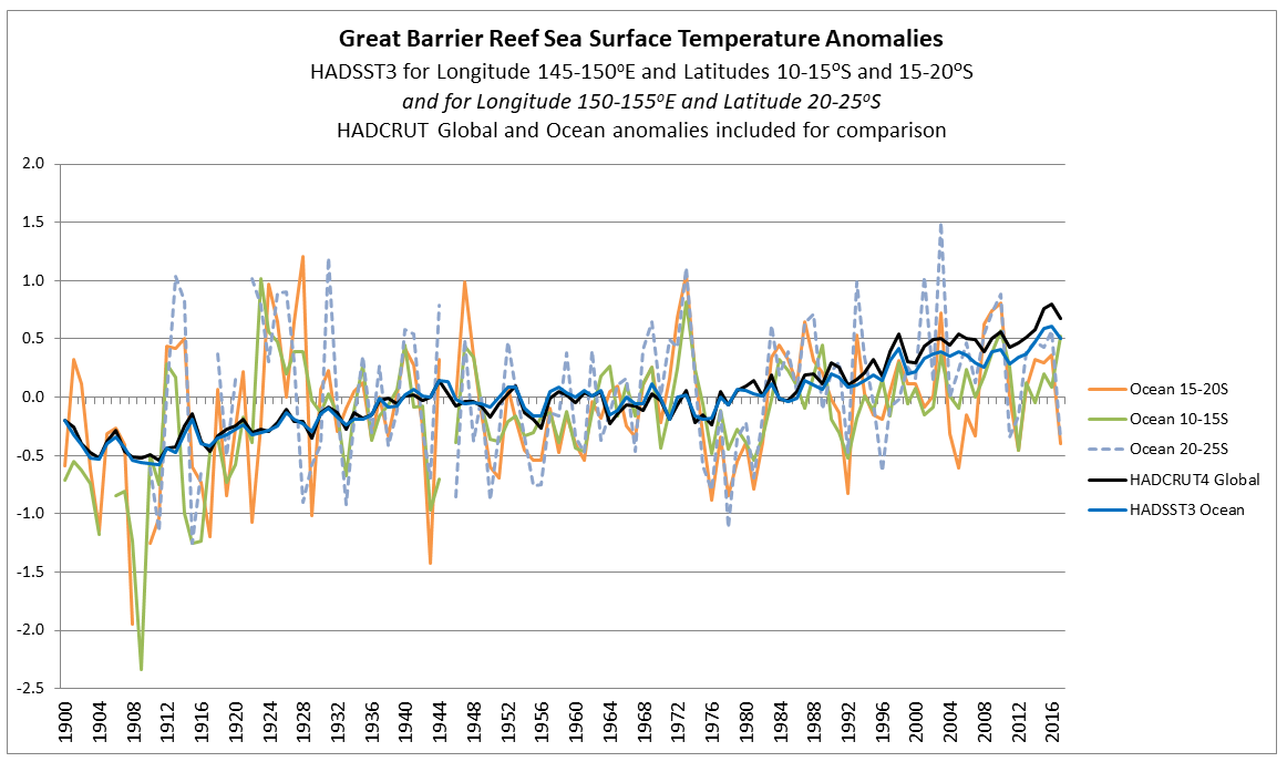
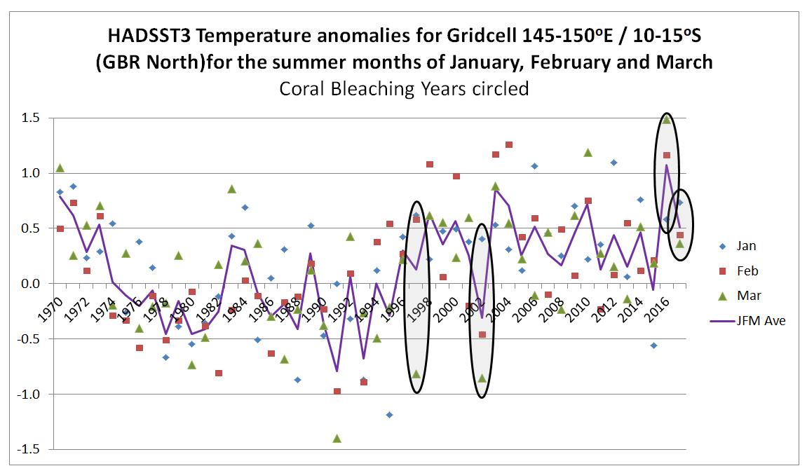
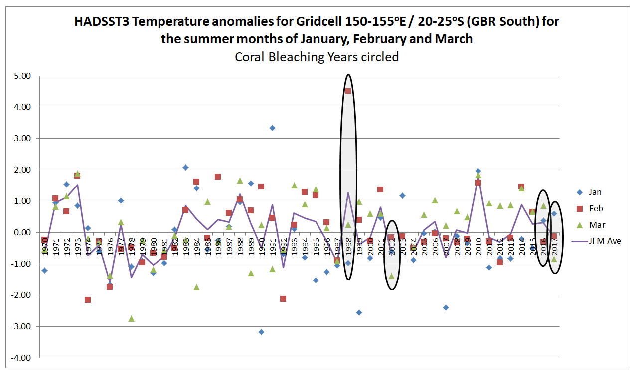
In the previous post I looked at temperature trends in the Great Barrier Reef. There are two main sources that suggest that, contrary to the world as a whole, GBR average temperatures have not increased, or increased much less than the global average. This was shown on the NASA Giss map comparing Jan-2019 with the 1951-1980 average and for two HADSST3 ocean data 5ox5o gridcells. For the latter I only charted the temperature anomaly for two gridcells which are at the North and middle of the GBR. I have updated this chart to include the gridcell 150-155oE / 20-25oS at the southern end of the GBR.
There is an increase in warming trend post 2000, influenced particularly by 2001 and 2003. This is not replicated further north. This is in agreement with the Gistemp map of temperature trends in the previous post, where the Southern end of the GBR showed moderate warming.
Has climate change still impacted on global warming?
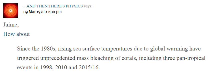
However, there is still an issue. If any real, but unknown, increase in coral bleaching has occurred it could still be due to sudden increases in surface sea temperatures, something more in accordance with the test in the lab. Blogger ATTP (aka Professor Ken Rice) called attention to a recent paper in a comment at cliscep
The link is to a pre-publication copy, without the graphics or supplementary data, to
Global warming and recurrent mass bleaching of corals – Hughes et al Nature 2017
The abstract states
The distinctive geographic footprints of recurrent bleaching on the Great Barrier Reef in 1998, 2002 and 2016 were determined by the spatial pattern of sea temperatures in each year.
So in 2002 the GBR had a localized mass bleaching episode, but did not share in the 2010 pan-tropical events of Rice’s quote. The spatial patterns, and the criteria used are explained.
Explaining spatial patterns The severity and distinctive geographic footprints of bleaching in each of the three years can be explained by differences in the magnitude and spatial distribution of sea-surface temperature anomalies (Fig. 1a, b and Extended Data Table 1). In each year, 61-63% of reefs experienced four or more Degree Heating Weeks (DHW, oC-weeks). In 1998, heat stress was relatively constrained, ranging from 1-8 DHWs (Fig. 1c). In 2002, the distribution of DHW was broader, and 14% of reefs encountered 8-10 DHWs. In 2016, the spectrum of DHWs expanded further still, with 31% of reefs experiencing 8-16 DHWs (Fig. 1c). The largest heat stress occurred in the northern 1000 km-long section of the Great Barrier Reef. Consequently, the geographic pattern of severe bleaching in 2016 matched the strong north-south gradient in heat stress. In contrast, in 1998 and 2002, heat stress extremes and severe bleaching were both prominent further south (Fig. 1a, b).
Degree Heating Week (DHW) The NOAA satellite-derived Degree Heating Week (DHW) is an experimental product designed to indicate the accumulated thermal stress that coral reefs experience. A DHW is equivalent to one week of sea surface temperature 1 deg C above the expected summertime maximum.
That is, rather than the long-term temperature rise in global temperatures causing the alleged increase in coral bleaching, it is the human-caused global warming changing the climate by a more indirect means of making extreme heat events more frequent. This seems a bit of a tall stretch. However, the “Degree Heating Week” can be corroborated by the gridcell monthly HADSST3 ocean temperature data for the summer months if both the measures are data are accurate estimates of the underlying data. A paper published last December in Nature Climate Change (also with lead author Prof Terry Hughes) highlighted 1998, 2002, 2016 & 2017 as being major years of coral bleaching. Eco Watch has a short video of maps from the paper showing the locations of bleaching event locations, showing much more observed events in 2016 and 2017 than in 1998 and 2002.
From the 2017 paper any extreme temperature anomalies should be most marked in 2016 across all areas of the GBR. 2002 should be less significant and predominantly in the south. 1998 should be a weaker version of 2002. Further, if summer extreme temperatures are the cause of heat stress in corals, then 1998, 2002, 2016 & 2017 should have warm summer months. For gridcells 145-150oE / 10-15oS and 150-155oE / 20-25oS respectively representing the northerly and summer extents of the Great Barrier Reef, I have extracted the January February and March anomalies since 1970, then circled the years 1998, 2002, 2016 and 2017. Shown the average of the three summer months.
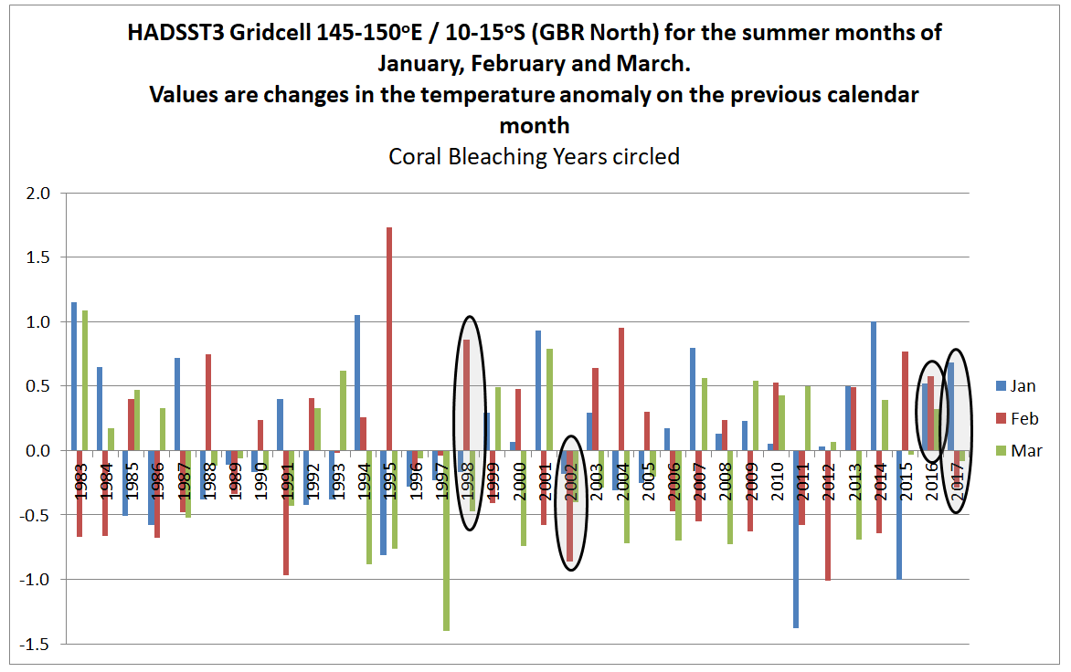
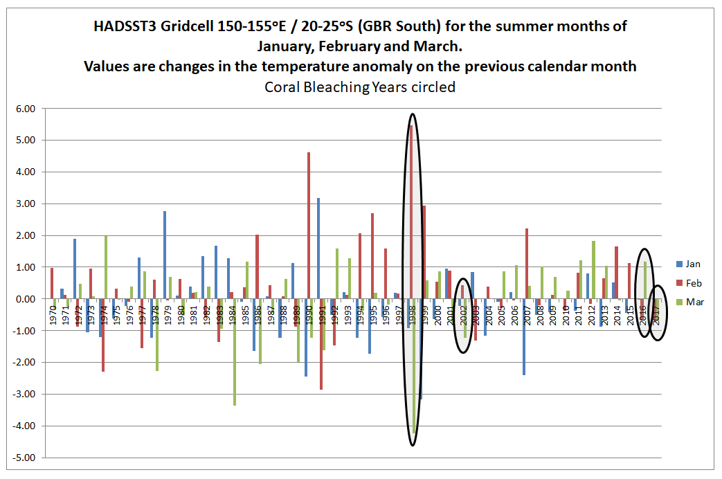
In the North of the GBR, 2016 and 2017 were unusually warm, whilst 2002 was a cool summer and 1998 was not unusual. This is consistent with the papers findings. But 2004 and 2010 were warm years without bleaching. In the South of the GBR 1998 was exceptionally warm in February. This might suggest an anomalous reading. 2002 was cooler than average and 2016 and 2017 about average. Also note, that in the North of the GBR summer temperatures appear to be a few tenths of a degree higher from the late 1990s than in the 1980s and early 1990s. In the South there appears to be no such increase. This is the reverse of what was found for the annual average temperatures and the reverse of where the most serious coral bleaching has occurred. On this basis the monthly summer temperature anomalies do not seem to correspond to the levels of coral bleaching. A further check is to look at the change in the anomaly from the previous month. If sea surface temperatures increase rapidly in summer, this may be the cause of heat stress as much as absolute magnitude above the long-term average.
In the North of the GBR the February 1998 anomaly was almost a degree higher than the January anomaly. This is nothing exceptional in the record. 2002, 2016 & 2017 do not stand out at all.
In the South of the GBR, the changes in anomaly from one month to the next are much greater than in the North of the GBR. February 1998 stands out. It could be due to problems in the data. 2002, 2016 and 2017 are unexceptional years. There also appears to be less volatility post 2000 contradicting any belief in climate getting more extreme. I believe it could be an indication that data quality has improved.
Conclusions
Overall, the conjecture that global warming is resulting in increased coral bleaching in the Great Barrier Reeg directly through rising average temperatures, or indirectly through greater volatility in temperature data, is not supported by the HADSST3 surface temperature data from either the North or South of the reef. This does not necessarily mean that there is not a growing problem of heat stress, or though this seems the most likely conclusion. Alternative explanations could be that the sea surface temperature anomaly is inadequate or that other gridcells show something different. Which brings us back to the problem identified above. How much of the observed increase in coral bleaching is down to real increases in coral bleaching and how much is down to increased observations? In all areas of climate, there is a crucial difference between our perceptions based on limited data and the underlying reality.
At Cliscep, Jaime Jessop looks at Coral Reefs again. She quotes from
Spatial and temporal patterns of mass bleaching of corals in the Anthropocene DOI: 10.1126/science.aan8048 . (Hughes et al 2018)
The first line is
The average surface temperature of Earth has risen by close to 1°C as of the 1880s (1), and global temperatures in 2015 and 2016 were the warmest since instrumental record keeping began in the 19th century.
The surface temperature consists of two parts, land and ocean data. HADCRUT4 data since 1850 is as follows.
Recent land warming is significantly greater than ocean warming. Further, in the last 50 years the warming in the tropics was slightly less than the global average, with the greatest warming being north of the tropics. Below is a split of the HADCRUT4 data into eight bands of latitude that I compiled last year.
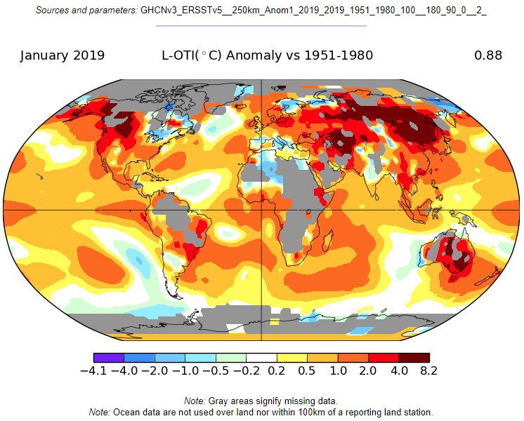
NASA GISS have maps showing trends across the globe. The default is to compare the most recent month with the 1951-1980 average.
The largest coral reef on the planet is the Great Barrier Reef off the North West Coast of Australia. From the map the warming is -0.2 to 0.2 °C. By implication, Hughes et al are claiming that coral bleaching in the Southern Hemisphere is being caused not by local average surface temperature rise but by a global average heavily influenced by land-based northern hemisphere temperature rise.
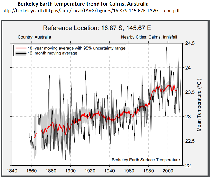
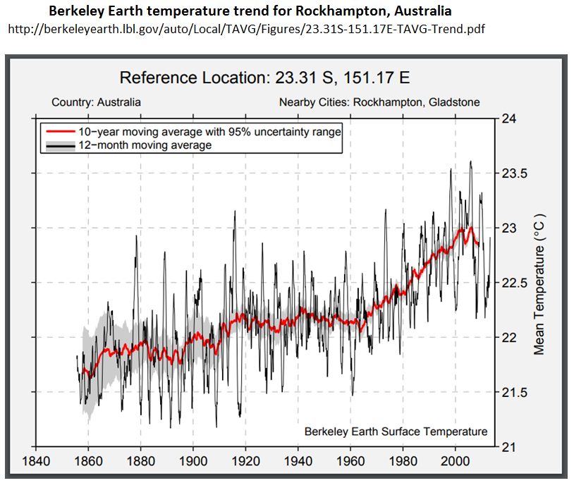
However, this is only a modeled estimate of trends. Although local data trends for the sea is not readily available, Berkeley Earth does provide trends for towns on the coastline adjacent to the GBR. I have copied the trends for Cairns and Rockhampton, one located in the middle section of the GBR, the other at the Southern tip.
Cairns, in the middle of the GBR, has no warming since 1980, whilst Rockhampton has nearer the global average and no warming trend from 1998 to 2013. This is consistent with the NASA GISS map.
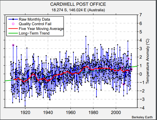
BE are extremely thorough, providing the sites which make up the trend, with the distance from the location. The raw data reveals a more complex picture. For Townsville (one-third of the way from Cairns to Rockhampton) the station list is here. Looking at the list, many of the temperature data sets are of short duration, have poor quality data (e.g. Burdekin Shire Council 4875), or have breaks in the data (e.g. Ayr, Burdekin Shire Council 4876). Another issue with respect to the Great Barrier Reef is that many are inland, so might not be a good proxy for sea surface temperatures. However, there are a couple of stations that can be picked out with long records and near the coast. Cardwell Post Office 152368 had peak temperatures in the 1970s and cooling since. Relative to other stations, BE’s algorithms estimated there was a station bias of over 0.5°C in the 1970s.
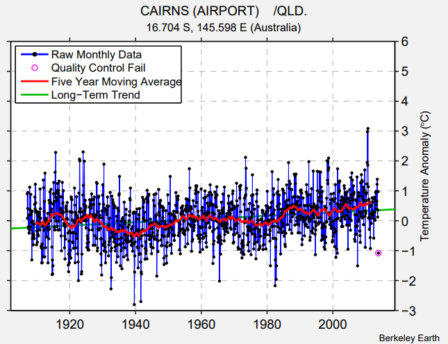
Cairns Airport 152392 (with data since 1908, twenty years before planes first flew from the site! ) has cooling in the 1930s and warming from 1940 to the late 1950s. The opposite of the global averages. There are no station bias adjustments until 1950, showing that this is typical of the regional expectation. Recent warming is confined to 1980s and a little post 2000.
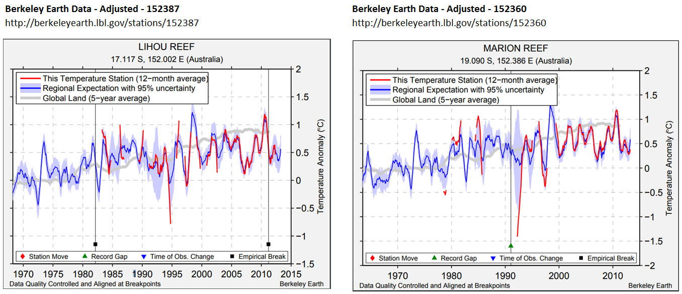
These results are confined to the land. I have found two sites on the GBR that have give a similar picture. Lihou Reef (17.117 S 152.002 E) and Marion Reef (19.090 S 152.386 E). Both for fairly short periods and the quality of the data is poor, which is not surprising considering the locations. But neither show any warming trend since the 1980’s whereas the faint grey line of the global land data does show a warming trend.
The actual temperature data of the GBR indicates that not only are average temperatures not a cause of GBR bleaching, but that calculated global average temperature trends are not replicated on the North East Australian coast. With respect to the world’s largest coral reef, increase incoral bleaching is not empirically linked to any increase in average global temperatures.
UPDATE 11/03/19 – 20:10
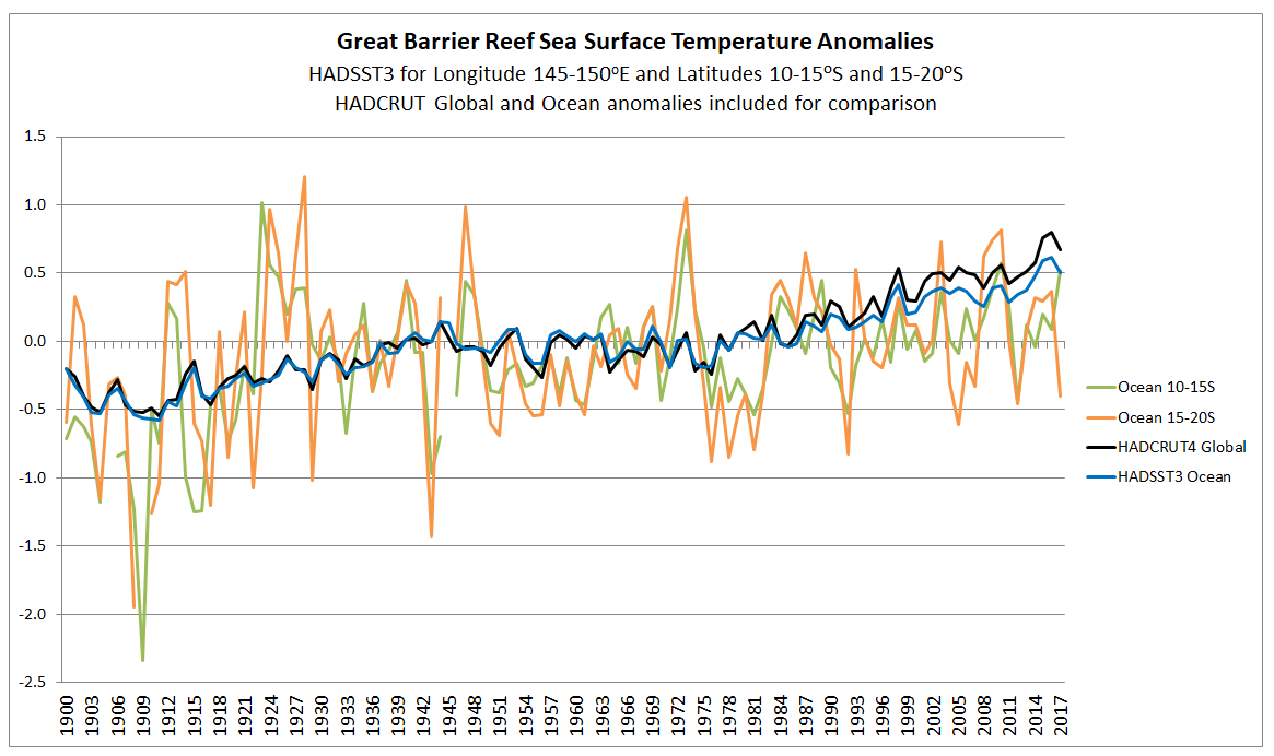
Following a comment by Paul Matthews, I have found the sea surface temperature data by location. The HADSST3 data is available in 5o by 5o gridcells. From data that I downloaded last year I have extracted the gridcells for 145-150oE/10-15oS and 145-150oE/15-20oS which cover most of the Great Barrier Reef, plus a large area besides. I have charted the annual averages alongside the HADCRUT4 global and HADSST3 ocean anomalies.
Ocean surface temperatures for the Great Barrier Reef show
no warming trend at all, whilst the global averages show a quite distinct
warming trend. What is more important, if the coral bleaching is related to sudden
increases in sea temperatures then it is the much more massive increases in
local data that are important, not the global average. To test whether
increases in temperatures are behind bleaching events requires looking for
anomalous summer months in the data. Another post is required.
The context of Jaime Jessop’s Cliscep article
After multiple comments at a blogpost by Jaime Jesssop in early January 2018 Geoff M Price wrote a post at his own blog “On Coal Alarmism” on 2nd April 2018. ATTP re-posted 11 months later on 5th March 2019. Personally I find the post, along with many of the comments, a pseudo-scientific and discriminatory attack piece. That may be the subject of another post.
An IPPR report This is a crisis: Facing up to the age of environmental breakdown published yesterday, withing a few hours received criticism from Paul Homewood at notalotofpeopleknowthat, Paul Matthews at cliscep and Andrew Montford at The GWPF. has is based on an April 2018 paper by billionaire Jeremy Grantham. Two major issues, that I want cover in this post are contained in a passage on page 13.
Climate Change : Average global surface temperature increases have accelerated, from an average of 0.007 °C per year from 1900–1950 to 0.025 °C from 1998–2016 (Grantham 2018). ……. Since 1950, the number of floods across the world has increased by 15 times, extreme temperature events by 20 times, and wildfires sevenfold (GMO analysis of EM-DAT 2018).
These two items are lifted from an April 2018 paper The Race of Our Lives Revisited by British investor Jeremy Grantham CBE. I will deal with each in turn.
Warming acceleration
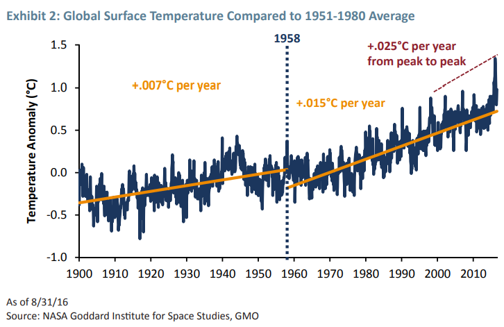
The claim concerning how warming has accelerated comes from Exhibit 2 of The Race of Our Lives Revisited.
The claimed Gistemp trends are as follows
1900 to 1958 – 0.007 °C/year
1958 to 2016 – 0.015 °C/year
1998 to 2016 – 0.025 °C/year
Using the Skeptical Science trend calculator for Gistemp I get the following figures.
1900 to 1958 – 0.066 ±0.024 °C/decade
1958 to 2016 – 0.150 ±0.022 °C/decade
1998 to 2016 – 0.139 ±0.112 °C/decade
That is odd. Warming rates seem to be slightly lower for 1998-2016 compared to 1958-2016, not higher. This is how Grantham may have derived the incorrect 1998-2016 figure.
For 1998-2016 the range of uncertainty is 0.003 to 0.025 °C/year.
It would appear that the 1900 to 1958 & 1958 to 2016 warming rates are as from the trend calculator, whilst the 1998 to 2016 warming rate of 0.025 °C/year is at the top end of the 2σ uncertainty range.
Credit for spotting this plausible explanation should go to Mike Jackson.
Increase in climate-related disasters since 1950
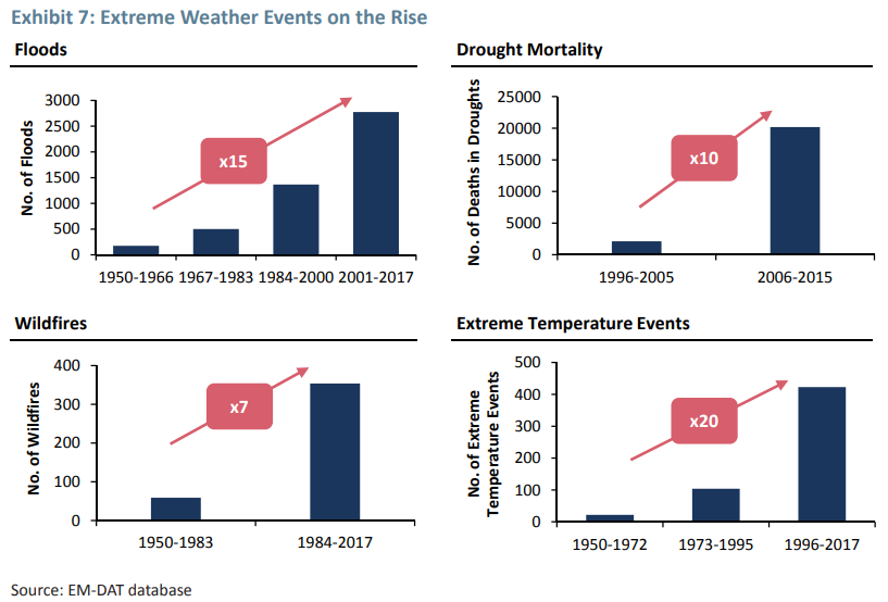
The IPPR report states
Since 1950, the number of floods across the world has increased by 15 times, extreme temperature events by 20 times, and wildfires sevenfold
Exhibit 7 of The Race of Our Lives Revisited.
The 15 times “Floods” increase is for 2001-2017 compared to 1950-1966. The 20 times “Extreme Temperature Events” increase is for 1996-2017 compared to 1950-1972. The 7 times “Wildfires” increase is for 1984-2017 compared to 1950-1983.
Am I alone in thinking there is something a bit odd in the statement about being from 1950? Grantham is comparing different time periods, yet IPPR make it appear the starting point is from a single year?
But is the increase in the data replicated in reality?
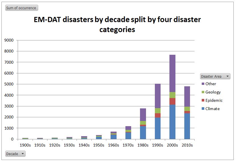
Last year I downloaded all the EM-DAT – The International Disasters Database – from 1900 to the present day. Their disaster types I have classified into four categories.
Over 40% are the “climate”-related disaster types from Grantham’s analysis. Note that this lists the number of “occurrences” in a year. If, within a country in a year there is more than one occurrence of a disaster type, they are lumped together.
I have split the number of occurrences by the four categories by decade. The 2010s is only for 8.5 years.
“Climate” disasters have increased in the database. Allowing for 8.5 years in the current decade, compared to 1900-1949, “Climate” disasters are 65 times more frequent. Similarly epidemics are 47 times more frequent, geological events 16 times and “other” disasters 34 times.
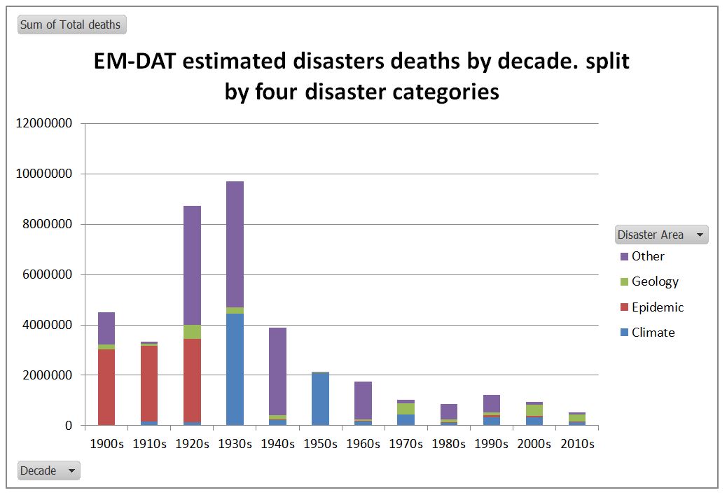
Is this based on reality, or just vastly improved reporting of disasters from the 1980s? The real impacts are indicated by the numbers of reports deaths.
The number of reported disaster deaths has decreased massively compared to the early twentieth century in all four categories, despite the number of reported disasters increasing many times. Allowing for 8.5 years in the current decade, compared to 1900-1949, “Climate” disaster deaths are down 84%. Similarly epidemic deaths are down by 98% and”other” disasters down by 97%. Geological disaster deaths are, however, up by 27%. The reported 272,431 deaths in the 2010s that I have classified under “Geology” includes the estimated 222,570 estimated deaths in the 2010 Haitian Earthquake.
If one looks at the death rate per reported occurrence, “Climate” disaster death rates have declined by 97.7% between 1900-1949 and the 2010s. Due to the increase in reporting, and the more than doubling of the world population, this decline is most likely understated.
The Rôle of Progressives in Climate Mitigation
The IPPR describes itself as The Progressive Policy Think Tank. From the evidence of the two issues above they have not actually thought about what they are saying. Rather they have just copied the highly misleading data from Jeremy Grantham. There appears to be no real climate crisis emerging when one examines the available data properly. The death rate from extreme weather related events has declined by at least 97.7% between the first half of the twentieth century and the current decade. This is a very important point for policy. Humans have adapted to the current climate conditions, just have they have reduced the impact of infectious diseases and are increasingly adapting to the impacts of earthquakes and tsunamis. If the climate becomes more extreme, or sea level rise accelerates significantly humans will adapt as well.
There is a curious symmetry here between the perceived catastrophic problem and the perceived efficacy of the solution. That for governments to reduce global emissions to zero. The theory is that rising human emissions, mostly from the burning of fossil fuels, are going to cause dangerous climate change. Global emissions involve 7600 million people in nearly 200 countries. Whatever the UK does, with less than 1% of the global population and less than 1% of global emissions makes no difference to global emissions.
Globally, there are two major reasons that reducing global emissions will fail.
First is that developing countries, with 80%+ of the global population and 65% of emissions, are specifically exempted from any obligation to reduce their emissions. (see Paris Agreement Articles 2.1(a), 2.2 and 4.1) Based on the evidence of the UNEP Emissions GAP Report 2018, and from the COP24 Katowizce meeting in December, there is no change of heart in prospect.
Second is that the reserves of fossil fuels, both proven and estimated, are both considerable and spread over many countries. Reducing global emissions to zero in a generation would mean leaving in the ground fossil fuels that provide a significant part of government revenue in countries such as Russia, Iran, Saudi Arabia, and Turkmenistan. Keeping some fossil fuels in the ground in the UK, Canada, Australia or the United States will increase the global prices and thus the production elsewhere.
The IPPR is promoting is costly and ideological policies in the UK, that will have virtually zero benefits for future generations in terms of climate catastrophes averted. In my book such policies are both regressive and authoritarian, based on failing to understand to the distinction between the real very marginal impacts of policy and the theoretical total impacts.
If IPPR, or even the climate academics, gave proper thought to the issue, then they would conclude the correct response will be to more accurately predict the type, timing, magnitude and location of future climate catastrophes. This information will help people on the ground adapt to those circumstances. In the absence of that information, the best way of adapting to changing climate is the same way as people have been able to adapt to extreme events, whether weather or geological. That is through sustained long-term economic growth, in the initial stages promoted by cheap and reliable energy sources. If there is a real environmental breakdown on its way, the Progressives, with their false claims and exaggerations, will be best kept well away from the scene. Their ideological beliefs render them incapable of getting a rounded perspective on the issues and the damage their policies will cause.
… a major international initiative to examine how countries can achieve economic growth while dealing with the risks posed by climate change. The Commission comprises former heads of government and finance ministers and leaders in the fields of economics and business, and was commissioned by seven countries – Colombia, Ethiopia, Indonesia, Norway, South Korea, Sweden and the United Kingdom – as an independent initiative to report to the international community.
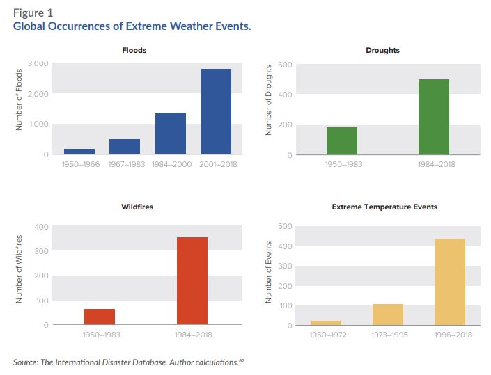
In this post I will briefly look at Figure 1 from the report, re-posted by Ben Pile.
Fig 1 – Global Occurrences of Extreme Weather Events from New Economy Climate Report
Figure 2 : From Goklany 2010 – Global Death and Death Rates Due to Extreme Weather Events, 1900–2008. Source: Goklany (2009), based on EM-DAT (2009), McEvedy and Jones (1978), and WRI (2009).
Note that The International Disaster Database is EM-DAT. The website is here to check. Clearly these show two very different pictures of events. The climate consensus (or climate alarmist) position is that climate change is getting much worse. The climate sceptic (or climate denier) position is that is that human-caused climate change is somewhat exaggerated. Is one side outright lying, or is their some truth in both sides?
Indur Goklany recognizes the issue in his report. His Figure 2, I reproduce as figure 3.
Figure 3: Average Number of Extreme Weather Events per Year by Decade, 1900–2008. Source: Goklany (2009), based on EM-DAT (2009).
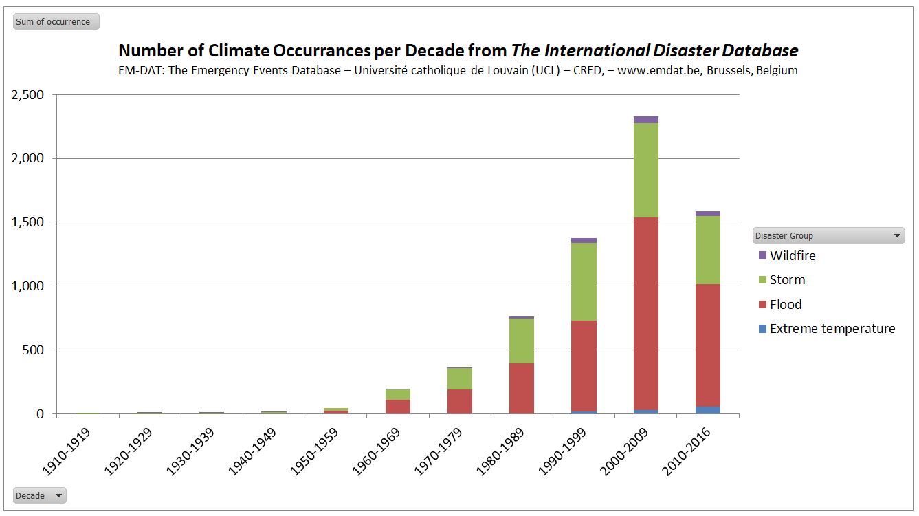
I am from a management accounting background. That means that I check my figures. This evening I registered at the EM-DAT website and downloaded the figures to verify the data. The website looks at all sorts of disaster information, not just climate information. It collates
Figure 4 : No of Climatic Occurrences per decade from EM-DAT. Note that 2010-2016 pro rata is similar to 2000-2009
The updated figures through to 2016 show that pro rata, in the current decade occurrences if climate-related events as similar to the last decade. If one is concerned about the human impacts, deaths are more relevant.
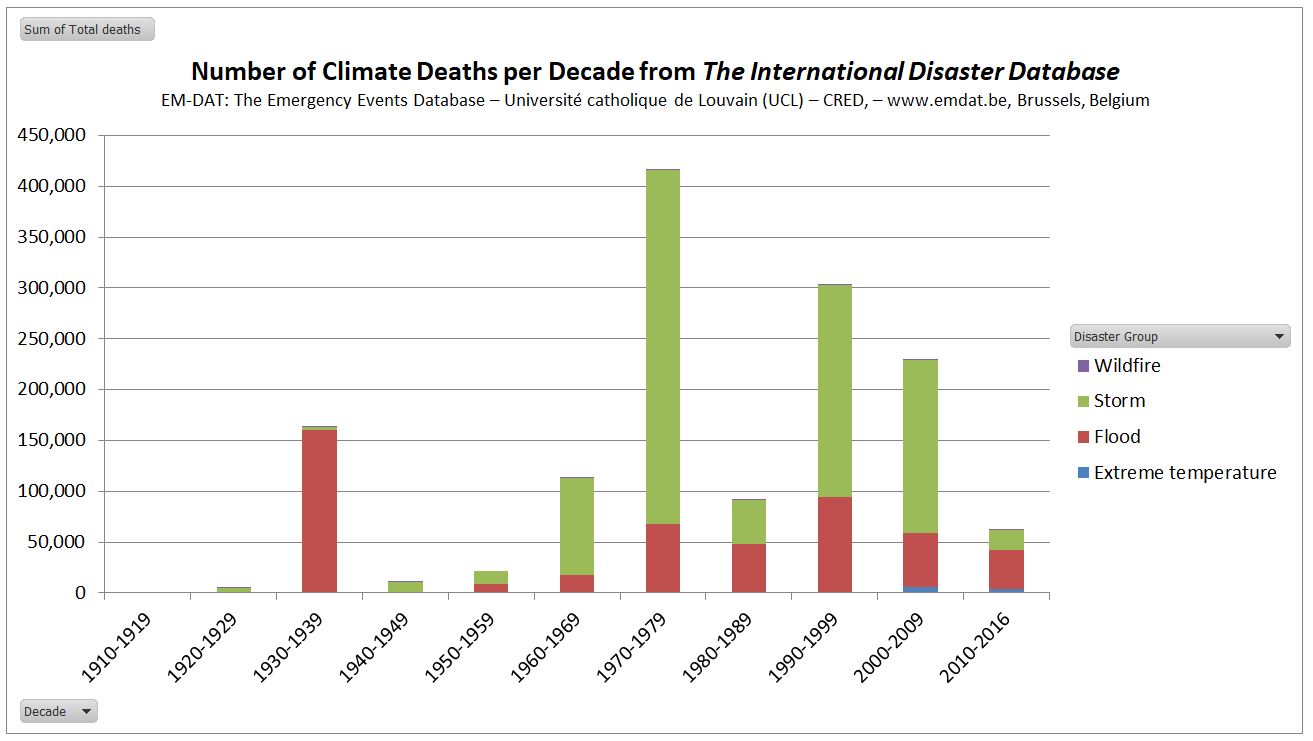
Figure 5 : No of Climatic Deaths per decade from EM-DAT. Note that 2010-2016 pro rata is similar to 2000-2009
This shows unprecedented flood deaths in the 1930s. Of the 163218 flood deaths in 6 occurrences, 142000 were due to a flood in China in 1935. Wikipedia’s Ten deadliest natural disasters since 1900 lists at No.8 1935 Yangtze river flood, with 145000 dead. At No.1 is 1931 China floods with 1-4 million deaths. EM-DAT has not registered this disaster.
The decade 1970-1979 was extreme for deaths from storms. 300000 deaths were due to a Bangladesh storm in 1970. Wikipedia’s Ten deadliest natural disasters since 1900 lists at No.2 1970 Bhola cyclone, with ≥500,000.
The decade 1990-1999 had a high flood death toll. Bangladesh 1991 stands out with 138987 dead. Wikipedia No.10 is 1991 Bangladesh cyclone with 138866 dead.
In the decade 2000-2009 EM-DAT records the Myanmar Storm of 2008 with 138366 dead. If Wikipedia had a top 11 deadliest natural disasters since 1900, then Cyclone Nargis of 2 May 2008 could have made the list. From the BBC, with 200000 estimated dead, it would have qualified. But from the Red Cross 84500 Cyclone Nargis may have not made the top 20.
This leaves a clear issue of data. The International Disaster Database will accept occurrences of disasters according to clear criteria. For the past 20-30 years disasters have been clearly recorded. The build-up of a tropical cylone / hurricane is monitored by satellites and film crews are on hand to televise across the world pictures of damaged buildings, dead bodies, and victims lamenting the loss of homes. As I write Hurricane Florence is about to pound the Carolinas, and evacuations have been ordered. The Bhola Cyclone of 1970 was no doubt more ferocious and impacted on a far greater number of people. But the primary reason for the extreme deaths in 1970 Bangladesh was lack of warning and a lack of evacuation places. Even in the Wizard of Oz, based on 1930s United States, in a Tornado most families had a storm cellar. In the extreme poverty of 1970 Bangladesh there was nothing. Now, after decades of moderate growth and some rudimentary warning systems, it is unlikely that a similar storm would cause even a tenth of the death toll.
Even more significant, is that even if (as I hope) Hurricane Florence causes no deaths and limited property damage, it will be sufficiently documented to qualify for an entry on the International Disaster Database. But the quality of evidence for the 1931 China Floods, occurring in a civil war between the Communists and the Kuomintang forces, would be insufficient to qualify for entry. This is why one must be circumspect in interpreting this sort of data over periods when the quality and availability of data varies significantly. The issue I have is not with EM-DAT, but those who misinterpret the data for an ideological purpose.