Monopoly Water Company campaigns to control its customers

At Guido Fawkes this morning I was confronted with a bright green and yellow advert.

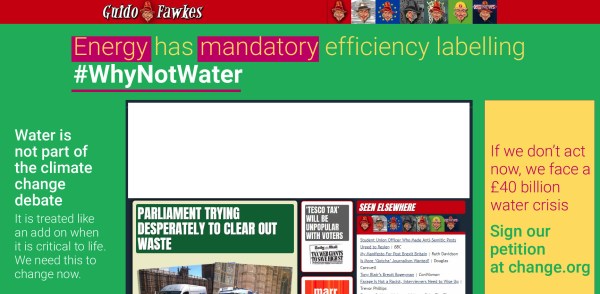
It is an appeal for increased regulation. The reason for the regulation is political.

Water is not part of the climate change debate
It is treated like an add on when it is critical to life. We need to change this now.

Water might be critical to life, but that does not mean the supply is critical. Provision of food and healthcare are also critical to life, and successful provision of both is much more complex and challanging than the supply of the most basic and plentiful of commodities.

If we don’t act now we face a £40 billion water crisis
Sign our petition at change.org

Clicking on the link takes us to a Change.org petition headed

Water efficiency is critical to climate change. Act now to prevent a water crisis.

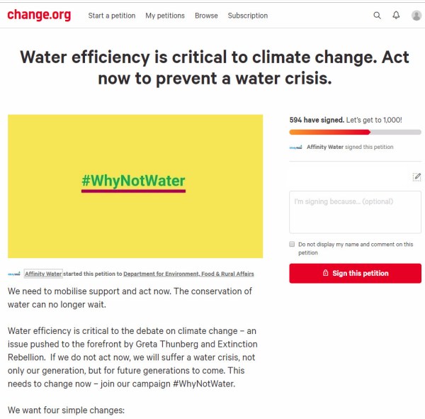
The petition starts with the statement

We need to mobilise support and act now. The conservation of water can no longer wait.
Water efficiency is critical to the debate on climate change – an issue pushed to the forefront by Greta Thunberg and Extinction Rebellion. If we do not act now, we will suffer a water crisis, not only our generation, but for future generations to come. This needs to change now – join our campaign #WhyNotWater.

The heading states “Water efficiency is critical to climate change” implying that changes in water efficiency will affect the actual course of the climate. But the text is “Water efficiency is critical to the debate on climate change”, where some activists claim water efficiency should be part of a debate. The heading implies backing empirical evidence, whereas the text is about beliefs.
Further, a superficial reading of the statement would give the impression that climate change is causing water shortages, and will cause a water crisis. But clicking on the Affinity Water link takes us to a press release on 10th May

Affinity Water warns of water shortages unless government acts now

The UK’s largest water only company, Affinity Water has warned that within the next 25 years and beyond, there may not be enough water due to climate change, population growth and increases in demand.

….

Unlike the advert and the petition there are mentions of other factors that might affect climate change, but no data on the relative magnitudes.

Note that Affinity Water is a limited company, with gross revenues in year to 31 March 2018 of £306.3m, operating profit of £72.3m and profit after tax of £29.6m (Page 107).

The piece finishes with

To find out more about the manifesto visit www.whynotwater.co.ukand to sign a petition to demand the legislation needed for water efficient labelling and water efficient goods and housing visit www.affinitywater.co.uk/ourpetition

The whynotwater website is a bit more forthcoming with the data.

Why should we act?

  • Climate change is likely to reduce our supply of water in our area by 39 million litres of water per day by 2080.
  • The population is growing and is expected to increase 51% by 2080. This is equivalent to approximately 1.8 million more people in our supply area, putting further strain on our resources.
  • Using water wisely is critical in the South East – a severely water-stressed area; did you know there was less rainfall than other parts of the country? Between July 2016 and April 2017 the area received 33% less rainfall than the national average.
  • Customers in the South East also use more water daily – 152 litres per person per day, which is higher than the national average of 141 litres per person per day.

From the above population in the supply area is projected to increase from 3.53 to 5.33 million. With unchanged average water usage of 152 litres, this is implies an increase in consumption of 274 million litres. Population change is projected to have seven times the influence on water demand than climate change on supply. It should be noted that these figures is domestic consumption. Currently Affinity Water supplies around 900 million litres per day, implying over 350 litres per day is from other sources. Based on total average supply, climate change ove 60 years is projected to reduce supply by just 4.3%.

But which projection is more robust, that of population increase, or of falls in water availability? With population it is possible to extrapolate from existing data. From the World Bank data, the population of the UK increased by 11% from 2001 to 2016. At this rate, in 2076 the population will be 52% higher than 2016. Within the South East using national data might be unreliable, as population shifts between regions. But it is likely that by 2080 population in Affinity’s supply areas will be significantly higher than today.

Water availability is not so precise, yet the fall due to climate change of 39 million litres per day is just 7% of existing domestic demand, or 4.3% of total water usage. There are some records at the Met Office of rainfall. In particular in the South East are records for Heathrow Airport and Manston in Kent. I have graphed annual rainfall data, with averages of the last 10 years.

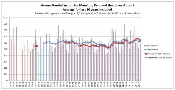
In the past twenty years rainfall has increased in both Manston and Heathrow. Compared to 1979-1998, average annual rainfall in 1999-2018 was 17% higher in Manston and 9% higher in Heathrow. In 60 years from now it might be higher or lower due to random natural climate variability. Any projection of a 4-7% reduction in rainfall is guesswork. If this is still a scientific estimate of unmitigated human-induced climate change, then Affinity better pass the message onto Greta Thurnberg and Extinction Rebellion. From the XR! Website.

THE TRUTH

We are facing an unprecedented global emergency. Life on Earth is in crisis: scientists agree we have entered a period of abrupt climate breakdown, and we are in the midst of a mass extinction of our own making.

This may seem sensationalist even by the the worst tabloid standards, but is the group have toned down a bit. When launched XR! were proclaiminghuman-caused (anthropogenic) climate breakdown alone is enough to wipe out the human species by the end of this century.

As there was no real water crisis in the 1980s and 1990s, why should there be in 2080? The only way there will be a water crisis is if water supply does not increase in line with the projections of rising population. Even then it will hardly contribute to the mass deaths of people in Britain as part of a species extinction. Meeting long-term changing demands should be within the control of the British Government and the regulated water companies. Instead a monopoly water company appears to be falsely attributing the whole problem to an issue outside of its control, campaigning to introduce regulations that are aimed at controlling consumer demand. Rather than serving their client base by additional investment, Affinity Water looks to be deriving fixed demand by controlling them. That investment in new reservoirs, wells, water recycling plants, pipelines from wetter places (Scotland has on average twice the rainfall of the South-East) and even desalination plants could cost billions of pounds. In so doing Affinity Water is listening to a bunch of revolutionaries rather than serving their customers. This must be especially galling for the Affinity Water customers who commute into London and have been inconvenienced by Extinction Rebellion’s blockades over recent months.

Kevin Marshall

Postscript at 4.00pm

The screenshot of the petition petition was taken at around 9.30 this morning, with 594 signatures. It now has 622 signatures. That is less than 5 signatures per hour. In that time Guido Fawkes has likely had over 10,000 unique visitors, based on last weeks figures,

Update 16/05/19 at 23.50

Another day of advertising a Guido Fawkes (and maybe elsewhere) has seen the number of signatures rise to 678. The petition was raised two weeks ago. 

UK Government Committee 7000 heat-deaths in 2050s assumes UK’s climate policies will be useless

Summary

Last week, on the day forecast to have record temperatures in the UK, the Environmental Audit Committee warns of 7,000 heat-related deaths every year in the UK by the 2050s if the Government did not act quickly. That prediction was based upon Hajat S, et al 2014. Two principle assumptions behind that prognosis did not hold at the date when the paper was submitted. First is that any trend of increasing summer heatwaves in the data period of 1993 to 2006 had by 2012 ended. The six following summers were distinctly mild, dull and wet. Second, based upon estimates from the extreme 2003 heatwave, is that most of the projected heat deaths would occur in NHS hospitals, is the assumption that health professionals in the hospitals would not only ignore the increasing death toll, but fail to take adaptive measures to an observed trend of evermore frequent summer heatwaves. Instead, it would require a central committee to co-ordinate the data gathering and provide the analysis. Without the politicians and bureaucrats producing reports and making recommendations the world will collapse.
There is a third, implied assumption, in the projection. The 7,000 heat-related deaths in the 2050s assumes the complete failure of the Paris Agreement to control greenhouse emissions, let alone keep warming to within any arbitrary 1.5°C or 2°C. That means other countries have failed to follow Britain’s lead in reducing their emissions by 80% by 2050. The implied assumption is that the considerable costs and hardships on imposed on the British people by the Climate Change Act 2008 will have been for nothing.

Announcement on the BBC

In the early morning of last Thursday – a day when there were forecasts of possible record temperatures – the BBC published a piece by Roger Harrabin “Regular heatwaves ‘will kill thousands’”, which began

The current heatwave could become the new normal for UK summers by 2040 because of climate change, MPs say.
The Environmental Audit Committee warns of 7,000 heat-related deaths every year in the UK by 2050 if the government doesn’t act quickly. 
Higher temperatures put some people at increased risk of dying from cardiac, kidney and respiratory diseases.
The MPs say ministers must act to protect people – especially with an ageing population in the UK.

I have left the link in. It is not to a Report by the EAC but to a 2014 paper mentioned once in the report. The paper is Hajat S, et al. J Epidemiol Community Health DOI: 10.1136/jech-2013-202449 “Climate change effects on human health: projections of temperature-related mortality for the UK during the 2020s, 2050s and 2080s”.

Hajat et al 2014

Unusually for a scientific paper, Hajat et al 2014 contains very clear highlighted conclusions.

What is already known on this subject

▸ Many countries worldwide experience appreciable burdens of heat-related and cold-related deaths associated with current weather patterns.

▸ Climate change will quite likely alter such risks, but details as to how remain unclear.

What this study adds

Without adaptation, heat-related deaths would be expected to rise by around 257% by the 2050s from a current annual baseline of around 2000 deaths, and cold-related mortality would decline by 2% from a baseline of around 41 000 deaths.

▸ The increase in future temperature-related deaths is partly driven by expected population growth and ageing.

▸ The health protection of the elderly will be vital in determining future temperature-related health burdens.

There are two things of note. First the current situation is viewed as static. Second, four decades from now heat-related deaths will dramatically increase without adaptation.
With Harrabin’s article there is no link to the Environmental Audit Committee’s report page, direct to the full report, or to the announcement, or even to its homepage.

The key graphic in the EAC report relating to heat deaths reproduces figure 3 in the Hajat paper.

The message being put out is that, given certain assumptions, deaths from heatwaves will increase dramatically due to climate change, but cold deaths will only decline very slightly by the 2050s.
The message from the graphs is if the central projections are true (note the arrows for error bars) in the 2050s cold deaths will still be more than five times the heat deaths. If the desire is to minimize all temperature-related deaths, then even in the 2050s the greater emphasis still ought to be on cold deaths.
The companion figure 4 of the Hajat et al 2014 should also be viewed.

Figure 4 shows that both heat and cold deaths is almost entirely an issue with the elderly, particularly with the 85+ age group.
Hajat et al 2014 looks at regional data for England and Wales. There is something worthy of note in the text to Figure 1(A).

Region-specific and national-level relative risk (95% CI) of mortality due to hot weather. Daily mean temperature 93rd centiles: North East (16.6°C), North West (17.3°C), Yorks & Hum (17.5°C), East Midlands (17.8°C), West Midlands (17.7°C), East England (18.5°C), London (19.6°C), South East (18.3°C), South West (17.6°C), Wales (17.2°C).

The coldest region, the North East, has mean temperatures a full 3°C lower than London, the warmest region. Even with high climate sensitivities, the coldest region (North East) is unlikely to see temperature rises of 3°C in 50 years to make mean temperature as high as London today. Similarly, London will not be as hot as Milan. there would be an outcry if the London had more than three times the heat deaths of Newcastle, or if Milan had had more than three times the heat deaths of London. So how does Hajat et al 2014 reach these extreme conclusions?
There are as number of assumptions that are made, both explicit and implicit.

Assumption 1 : Population Increase

(T)otal UK population is projected to increase from 60 million in mid-2000s to 89 million by mid-2080s

By the 2050s there is roughly a 30% increase in population. Heat death rates per capita only show a 150% increase in five decades.


Assumption 2 : Lack of improvement in elderly vulnerability
Taking the Hajat et al figure 4, the relative proportions hot and cold deaths between age bands is not assumed to change, as my little table below shows.

The same percentage changes for all three age bands I find surprising. As the population ages, I would expect the 65-74 and 74-84 age bands to become relatively healthier, continuing the trends of the last few decades. That will make them less vulnerable to temperature extremes.

Assumption 3 : Climate Sensitivities

A subset of nine regional climate model variants corresponding to climate sensitivity in the range of 2.6–4.9°C was used.

The compares to the IPCC AR5 WG1 SPM Page 16

Equilibrium climate sensitivity is likely in the range 1.5°C to 4.5°C (high confidence)

With a mid-point of 3.75°C compared to the IPCC’s 3°C does not make much difference over 50 years. The IPCC’s RCP8.5 unmitigated emissions growth scenario has 3.7°C (4.5-0.8) of warming from 2010 to 2100. Pro-rata the higher sensitivities give about 2.5°C of warming by the 2050s, still making mean temperatures in the North East just below that of London today.
The IPCC WG1 report was published a few months after the Hajat paper was accepted for publication. However, the ECS range 1.5−4.5 was unchanged from the 1979 Charney report, so there should be a least a footnote justifying the higher senitivitity. An alternative approach to these vague estimates derived from climate models is those derived from changes over the historical instrumental data record using energy budget models. The latest – Lewis and Curry 2018 – gives an estimate of 1.5°C. This finding from the latest research would more than halved any predicted warming to the 2050s of the Hajat paper’s central ECS estimate.

Assumption 4 : Short period of temperature data

The paper examined both regional temperature data and deaths for the period 1993–2006. This 14 period had significant heatwaves in 1995, 2003 and 2006. Climatically this is a very short period, ending a full six years before the paper was submitted.
From the Met Office Hadley Centre Central England Temperature Data I have produced the following graphic of seasonal data for 1975-2012, with 1993-2006 shaded.

Typical mean summer temperatures (JJA) were generally warmer than in both the period before and the six years after. Winter (DJF) average temperatures for 2009 to 2011 were the coldest three run of winters in the whole period. Is this significant?
A couple of weeks ago the GWPF drew attention to a 2012 Guardian article The shape of British summers to come?

It’s been a dull, damp few months and some scientists think we need to get used to it. Melting ice in Greenland could be bringing permanent changes to our climate
The news could be disconcerting for fans of the British summer. Because when it comes to global warming, we can forget the jolly predictions of Jeremy Clarkson and his ilk of a Mediterranean climate in which we lounge among the olive groves of Yorkshire sipping a fine Scottish champagne. The truth is likely to be much duller, and much nastier – and we have already had a taste of it. “We will see lots more floods, droughts, such as we’ve had this year in the UK,” says Peter Stott, leader of the climate change monitoring and attribution team at the Met Office. “Climate change is not a nice slow progression where the global climate warms by a few degrees. It means a much greater variability, far more extremes of weather.”

Six years of data after the end of the data period, but five months before the paper was submitted on 31/01/2013 and nine months before the revised draft was submitted, there was a completely new projection saying the opposite of more extreme heatwaves.
The inclusion more recent available temperature data is likely to have materially impacted on the modelled extreme hot and cold death temperature projections for many decades in the future.

Assumption 5 : Lack of Adaptation
The heat and cold death projections are “without adaptation”. This assumption means that over the decades people do not learn from experience, buy air conditioners, drink water and look out for the increasing vulnerable. People basically ignore the rise in temperatures, so by the 2050s treat a heatwave of 35°C exactly the same as one of 30°C today. To put this into context, it is worth looking as another papers used in the EAC Report.
Mortality in southern England during the 2003 heat wave by place of death – Kovats et al – Health Statistics Quarterly Spring 2006
The only table is reproduced below.

Over half the total deaths were in General Hospitals. What does this “lack of adaptation” assumption imply about the care given by health professionals to vulnerable people in their care? Surely, seeing rising death tolls they would be taking action? Or do they need a political committee in Westminster looking at data well after the event to point out what is happening under there very noses? Even when data been collated and analysed in such publications as the Government-run Health Statistics Quarterly? The assumption of no adaptation should have been alongside and assumption “adaptation after the event and full report” with new extremes of temperature coming as a complete surprise. However, that might still be unrealistic considering “cold deaths” are a current problem.

Assumption 6 : Complete failure of Policy
The assumption high climate sensitivities resulting in large actual rises in global average temperatures in the 2050s and 2080s implies another assumption with political implications. The projection of 7,000 heat-related deaths assumes the complete failure of the Paris Agreement to control greenhouse emissions, let alone keep warming to within any arbitrary 1.5°C or 2°C. The Hajat paper may not state this assumption, but by assuming increasing temperatures from rising greenhouse levels, it is implied that no effective global climate mitigation policies have been implmented. This is a fair assumption. The UNEP emissions Gap Report 2017 (pdf), published in October last year is the latest attempt to estimate the scale of the policy issue. The key is the diagram reproduced below.

The aggregate impact of climate mitigation policy proposals (as interpreted by the promoters of such policies) is much closer to the non-policy baseline than the 1.5°C or 2°C emissions pathways. That means other countries have failed to follow Britain’s lead in reducing their emissions by 80% by 2050. In its headline “Heat-related deaths set to treble by 2050 unless Govt acts” the Environmental Audit Committee are implicitly accepting that the Paris Agreement will be a complete flop. That the considerable costs and hardships on imposed on the British people by the Climate Change Act 2008 will have been for nothing.

Concluding comments

Projections about the consequences of rising temperatures require making restrictive assumptions to achieve a result. In academic papers, some of these assumptions are explicitly-stated, others not. The assumptions are required to limit the “what-if” scenarios that are played out. The expected utility of modeled projections is related to whether the restrictive assumptions bear relation to actual reality and empirically-verified theory. The projection of over 7,000 heat deaths in the 2050s is based upon

(1) Population growth of 30% by the 2050s

(2) An aging population not getting healthier at any particular age

(3) Climate sensitivities higher than the consensus, and much higher than the latest data-based research findings

(4) A short period of temperature data with trends not found in the next few years of available data

(5) Complete lack of adaptation over decades – an implied insult to health professionals and carers

(6) Failure of climate mitigation policies to control the growth in temperatures.

Assumptions (2) to (5) are unrealistic, and making any more realistic would significantly reduce the projected number of heat deaths in the 2050s. The assumption of lack of adaptation is an implied insult to many health professionals who monitor and adapt to changing conditions. In assuming a lack of climate mitigation policies implies that the £319bn Britain is projected is spent on combating climate change between 2014 and 2030 is a waste of money. Based on available data, this assumption is realistic.

Kevin Marshall

Carbon Capture and Storage Loses another £100m but saves up to £10bn

Last week the National Audit Office published a report Carbon Capture and Storage: the second competition for government support. The main headline was

“The Department has now tried twice to kick start CCS in the UK, but there are still no examples of the technology working. There are undoubtedly challenges in getting CCS established, but the Department faced an uphill battle as a result of the way it ran the latest competition. Not being clear with HM Treasury about what the budget is from the start would hamper any project, and caused particular problems in this case where the upfront costs are likely to be high. The Department must learn lessons from this experience if it is to stand any chance of ensuring the first CCS plants are built in the near future.”

Amyas Morse, head of the National Audit Office, 20 January 2017

Key elements

  • Two Projects in the Competition.
  • When project cancelled £100m had already been spent.
  • The first competition running from 2007 to 2011.
  • Full subsidy from the Treasury (i.e. Taxpayers) would have been £1 Billion
  • Over 15 years, subsidy from consumers would have been £3.9 Billion to £8.9 Billion
  • Would have captured 1Mt to 2 Mt of CO2 a year.
  • Consumer subsidy between £105 and £172 Mwh, on top of the current wholesale price of around £45 Mwh.

The BBC carried the story, correctly citing many of the costs, as did the Express, which stated

At the time it was cancelled, the competition had two preferred bidders: the White Rose consortium in North Yorkshire which planned to build a new coal plant with the technology, and Shell’s scheme in Peterhead, Aberdeenshire, to fit CCS to an existing gas plant operated by SSE.

The NAO report said the department initially estimated it would cost consumers – who would subsidise electricity from the schemes – between £2 billion and £6 billion over 15 years, but by 2015, this estimate had risen to as much as £8.9 billion.

The report found the Treasury was concerned over the costs to consumers, and that the competition was aiming to deliver CCS before it was cost-efficient to do so.

Joanne Nova points to a July 2015 post on the subject of CCS by Anton Lang. He stated

CCS artificially raises the costs of coal fired power in two ways

First, it raises the initial construction cost for any new large scale coal fired plant by around 60%.

Second, the CCS process is hugely energy intensive — consuming up to 40% of the electricity generated by the plant. So  the plant can only sell 60% of the actual power it produces.

As a (slightly manic) beancounter, I like to put the costs in context.

  1. How much would the cost have been if the Treasury had not pulled the plug per tonne of CO2 saved?
  2. What is the value of the subsidy be if China and India adopted the plan?

In the full NAO report (a 389kb pdf) Figure 6 gives details of the two schemes shortlisted in the competition.

It is the Peterhead scheme that would incur the lower subsidy of £105 Mwh. The £3.9 billion works out at an average 290 Mw production, or 76% of capacity over 15 years. It is cheaper due to adapting old plant. The disadvantage is that there is only 30 Mt of CO2 storage capacity in the area, so the area does not have the facility to develop much more unless further infrastructure development is made to pump the CO2 offshore into old oil wells.

The White Rose scheme has higher subsidy of £172 Mwh. The £8.9 billion works out at an average 394 Mw production, or 88% of capacity over 15 years. It is new plant, but has the advantage of 520 Mt of CO2 storage capacity in the area.

If we add in the £1bn subsidy without interest, over 15 years the cost per tonne of CO2 saved is about £264 (US$330, A$435) for the Peterhead project and £300 (US$374, A$490) for the White Rose project.

The NAO report in figure 12 that the subsidy could come down to £94 Mwh with scale.

Let us see what would be the cost if India and China adopted CCS for the current coal-fired power stations, but increasing capacity by 25% to cover the efficiency losses. Assume subsidy is just $100 Mwh.

According to Greenpeace (could be unreliable), China has about 900,000 MW of capacity. Add in 25% and assume 70% capacity, gives around $700bn a year subsidy. This is about 6% of current GDP.

From Wikipedia, India had 310 000 MW of capacity in 2015.  Add in 25% and assume 70% capacity, gives around $240bn a year subsidy. This is about 12% of current GDP.

I am sure that China and India will want to follow the UK’s lead. The only slight issue is finding a hole big enough. Maybe instead they could build some big greenhouses and grow tomatoes very rapidly.

Kevin Marshall


£319 billion on Climate Change for approximately nothing

The major reason for abandoning the Climate Change Act 2008 is not due to the massive financial burden imposed on families, but because it will do approximately nothing to curb global greenhouse gas emissions. Massive costs are being imposed for near zero prospective benefit.

At the weekend the GWPF published a paper by Peter Lilley MP on the costs of The Climate Change Act 2008. From 2014 to 2030 he estimates a total cost of £319 billion to ensure that in 2030 British greenhouse gas emissions are 57% below their 1990 levels.
Putting this into context, listen to then Environment Minister David Miliband introducing the Climate Change Bill in 2007.

The 2008 Act increased the 2050 target from 60% to 80%. Miliband recognizes that what the UK does is not sufficient to stop a global problem. That requires a global solution. Rather, the aim is for Britain to lead the way, with other industrialized countries encouraged to follow. The developing countries are given a free choice of “a low carbon path of development rather than to repeat the mistakes of the industrialized countries.

Over eight years after the little video was made and seven years after the Climate Change Act was passed (with an increased 2050 emissions reduction target of 80% reduction on 1990 levels) was the COP21 in Paris. The responses from other countries to Britain’s lead were in the INDC submission, which the UNFCCC summarized in a graph, and I have annotated.

The UNFCCC have four bands. First, in orange, is the Pre-INDC scenarios. Then in yellow is the projected global impact if all the vague policy proposals are full enacted. In blue is the least cost 2◦C pathway for global emissions reductions, whilst in green is the least cost 1.5◦C pathway.

I have superimposed lilac arrows showing the UK Climate Act proportionate emissions pathway achieving a 57% emissions reduction by 2030 and an 80% emissions reduction by 2050 compared to the baseline 1990 emissions. That is, if all countries were to follow Britain’s lead, then the 2◦C warming limit would not be breached.

What this clearly shows is that collectively countries have not followed Britain’s lead. Even if the policy proposals were fully enacted (an unlikely scenario) the yellow arrow quite clearly shows that global emissions will still be rising in 2030.

This needs to be put into context of costs and benefits. The year before David Miliband launched the Climate Bill the Stern Review was published. The Summary of Conclusions gave the justification for reducing greenhouse emissions.

Using the results from formal economic models, the Review estimates that if we don’t act, the overall costs and risks of climate change will be equivalent to losing at least 5% of global GDP each year, now and forever. If a wider range of risks and impacts is taken into account, the estimates of damage could rise to 20% of GDP or more. In contrast, the costs of action – reducing greenhouse gas emissions to avoid the worst impacts of climate change – can be limited to around 1% of global GDP each year.

Britain is spending the money to avert catastrophic global warming, but future generations will still be subjected to costs of climate catastrophe. It not much worse in terms of wasting money if the Stern Review grossly exaggerated the likely costs of warming and massively understated the policy costs, as Peter Lilley and Richard Tol laid out in their recent paper “The Stern Review : Ten Years On“.

However, if the British Government had conducted some proper assessment of the effectiveness of policy (or the Opposition has done their job in holding the Government to account) then it would have been clear that sufficient countries would never follow Britain’s lead. Last year Robin Guenier published some notes on Supreme Court Justice Phillip Sands lecture CLIMATE CHANGE and THE RULE OF LAW. Guenier stated of the Rio Declaration of 1992

There’s little, if any, evidence that the undoubted disagreements about the science – the focus of Professor Sands’ concern in his lecture – are the reason it’s proving so difficult to come to an effective agreement to restrict GHG emissions. In contrast however, the Annex I / non-Annex I distinction has had huge consequences. These arise in particular from Article 4.7:

“The extent to which developing country Parties will effectively implement their commitments under the Convention … will take fully into account that economic and social development and poverty eradication are the first and overriding priorities of the developing country Parties.” [My emphasis]

When the Convention was enacted (1992) the effective exemption of developing countries from environmental constraint made some sense. But over the years Non-Annex I countries, which include major economies such as China, India, South Korea, Brazil, South Africa, Saudi Arabia and Iran, have become increasingly powerful: in 2012 responsible for 67% of global CO2 emissions.

Robin Guenier uses estimates for CO2 emissions not (the admittedly harder to estimate) GHG emissions, of which CO2 comprises about two-thirds. But estimates are available from from the European Commission’s “Emissions Database for Global and Atmospheric Research” (EDGAR) for the period 1990 to 2012. I divided up the emissions between the Annex countries and the Non-Annex countries. 

The developing countries accounted for 64% of global GHG emissions in 2012, up from 47% in 1990 and 57% in 2005 when the Stern Review was being written. From 1990 to 2012 global emissions increased by 41% or 15,700 MtCO2e, whilst those of the Non-Annex countries increased by 90% or 16,400 MtCO2e  to 34,600 MtCO2e. The emissions in the United Kingdom decreased in the period (mostly for reasons other than mitigation policies) by 25% to 586 MtCO2e or 1.1% of the estimated global total.

It would have been abundantly clear to anyone who actually looked at the GHG emissions figures by country that the Rio Declaration 1992 was going to prevent any attempt to significantly reduce global GHG emissions. Since 1992 the phenomenal economic growth of countries like China and India, driven by the low energy costs of fossil fuels, have made the impossibility of reducing global emissions even starker. Yet still the IPCC, UNFCCC, many Governments and a large Academic consensus have failed to acknowledge, let alone understand, the real world data. Still they talk about reducing global emissions by over 80% in a couple of generations. In terms of the United Kingdom, the INDC submissions produced last year should have been further confirmation that the Government has no rational justification for imposing the massive costs on families, increasing inequalities and destroying jobs in the process.

Kevin Marshall


The Irony of Ironbridge

The traditional way of producing iron was in small batches, using charcoal as the fuel. In 1709 Abraham Darby I built the world’s first blast furnace fuelled by coke. This enabled a continuous process to be used for production, enabling much greater quantities to be produced. What is more, charcoal is derived from wood, which was by then becoming increasingly scarce in Britain. Coke comes from coal, of which there were increasingly plentiful supplies. The unit costs of iron production therefore came down for the reasons of increased productivity and a cheaper, more plentiful, energy source. Without this switch the industrial revolution would not have started. The reason for building the blast furnace in Coalbrookdale should be obvious.

Darby’s grandson Abraham Darby III used this cheap iron to build, in 1779 the world’s first bridge from fabricated from cast iron. The village by this bridge and the gorge encompassing Coalbrookdale are now known as Ironbridge. It is now a major tourist attraction.

There has been a coal-fired power station in the Ironbridge Gorge since the 1930s. The directions from the site of the original blast furnace are below. The original 200MW facility was replaced in 1969 and 1970 by the twin 500MW facilities seen today. In 2012, one of those facilities was modified to accept wooden pellets that are imported from North America. The will generate up to £100,000,000 a year in renewables obligation certificates, increasing the cost of the electricity to consumers by 75%.

Globally forests are still declining. Wood is a scarce resource and expensive, with the price only likely to increase. Known coal reserves are sufficient to supply current global requirements for centuries, is cheap and the price is falling. Ironbridge can now claim to both a birthplace of the industrial revolution, and a symbol of sending the benefits of the industrial revolution into reverse. Spot the irony.

Labour’s Hypocrisy on Rising Energy Bills

If you go to the Labour Party’s website there is an announcement.

Clicking down will take you to energy price calculator. I found out with Ed’s policy I could save £112 per year.

Two weeks after the announcement, still no links to the actual plan, but there is a video to watch.

Just one minute and twenty-six seconds for a distinguished actor to say the following:-

How do you feel when you see your energy bill sitting at the front door and you know that it is going to be even higher than the last one?

And how do you feel when you read in the newspaper that your energy providers’ profits are up yet again?

Millions of ordinary families are struggling to keep up with bills. Bills that are rising faster than wages.

Since David Cameron became Prime Minister, he’s allowed gas and electricity to rise by an average of £300 a year and sat by as energy companies make record profits. Under this Government a privileged few come before hard-families. Ed Miliband and Labour are going to change that. Ed’s energy plan will mean a tough new regulator with the power to challenge the energy companies and keep prices down. Under Ed’s energy plan gas and electricity bills will be frozen. That’s right frozen. Under the Tories you have overpaid. Labour will fight the cost of living crisis and build an economy that works for working people.

The inference is that your bills are rising solely due to the ever-increasing profits of the energy companies. Further the nasty Tories had it in their power stop it. Along will come Labour and stop all that.

I have looked up the figures. Since the 2009, the energy regulator OFGEM has required the six big energy companies to produce financial data by five segments. That is for electricity generation, along with supply data for electricity and gas, each split between domestic and non-domestic supply. I have analysed all four years of data for the six companies, using links provided by OFGEM. There is, of course, no financial data available for 2013 as the year has yet to finish.

If Labour are correct in their inference of price rises being due to increasing profits then profits will be increasing as a percentage of sales. With the typical household’s bill rising by over 20% between May 2010 and the end of 2012, profits as a percentage of revenue would be rising sharply. The following shows the percentage components of revenue.

The narrow band in purple for profit increased from 1.8% of sales to 3.8%. It is not increasing profits that have caused the price rises. The reason for doubling is because, in total, the six major companies lost money on gas supply in 2009. Nor is there a sharp difference between domestic and non-domestic supply margins. You could claim that the energy companies are making more money on generation instead. They are not, as the full margins, by segment, by year, show below.

The total sales breakdown enhances the picture.

Although total are broadly the same in 2009 and 2012, revenue from domestic customers was 13%, whilst that from non-domestic customers was 17% lower. The reason Labour have a higher figure is they rely on OFGEM’s notional average user, who uses the same amount of energy year-in-year out. Real hard-working families have responded to rising prices by reducing consumption.

What is most important is why unit costs have risen. Labour are correct when they say it is not due to the wholesale price of energy. As already demonstrated, they are incorrect to say it is due to rising profits. The real reason is “other costs”. These rose from 32% to 40% of revenue in just four years. That is from £14.1bn to £17.7bn in just four years or a 25% increase. On declining volumes this is more significant for consumers.

These figures are corroborated by a breakdown by my energy supplier, Scottish Power.

With VAT at 5%, the Scottish power says that its charges to the domestic customer in 2013 are made up of 53% for fuel and 43% for other charges. This compares to the industry average in 2012 of 55.7% for fuel and 40.6% for “other costs” plus “amortization”. The higher proportion of other charges to domestic customers is to be expected, as small domestic customers have lower costs. The relevant domestic figures from the big six are 51.8% for fuel and 44.0% for other charges. Given the obviously rounded Scottish Power figures, they are remarkably close to the industry average.

The supply market is fiercely competitive, hence the real reason for the ability of customers to save money by switching suppliers. Therefore it is doubtful that internal costs will have risen. What has risen is the delivery of the energy to the home (National Grid, local delivery, and cost of meters), along with green levies. So it is likely over 75% of the price increases to the customer are due to factors outside of the energy supplier’s control.

Where does responsibility lie for the above-inflation price increases?

The dash for “clean” energy to save the planet is enshrined in the Climate Change Act 2008. It was pushed through the House of Commons when Ed Miliband was Environment Secretary. This accelerated the growth in green levies and the requirement for a more extensive grid network to carry the wind-generated electricity from remote turbines. Delve further in the profits on electricity generation and you will find that fossil fuel generation has margins of 10%. A price freeze will eliminate the supply profits in six months, and the generation profits in two years. The is a sure way to get a near monopoly in gas supply, and cause the rapid shut-down of three-quarters of generating capacity. It is an act of gross hypocrisy by Ed Miliband to threaten to destroy a competitive industry to remedy a problem that he is responsible for.


NB First time comments are moderated. The comments can be used as a point of contact.

Kevin Marshall

Notes Labour’s Analysis of the Energy Market

Labour’s Green Paper on Energy has been found by Alex Cull (comment at Dec 2, 2013 at 1:03 PM) at the site “Your Britain“, in the Agenda 2015 section. Having read it, I can see why the Labour Party are not keen for the electorate to find the document. Some quick observations, that I believe are sufficient to show that Labour have not bottomed out the only, let alone the best, explanation of why retail prices have risen so fast in last few years. What this clearly shows is that Labour’s proposed policy freeze is not just misplaced; it is positively harmful to Britain having future low-cost and secure energy supplies.

Note 03/12/13: This post will be added to over the coming days.

Update 04/12/13: Note on declining investment in “clean energy”

Billions not Millions

The Executive Summary states

Lack of competition in the retail market has resulted in consumers paying £3.6m more than they need to each year.

Caption to Table 1 on page 7 states

Lack of competition in the retail market has resulted in consumers paying £3.6 billion more than they need to

Error in Calculation

The source of the £3.6bn is from Which?

The consumer group Which? found that 75 per cent of customers are on the most expensive tariffs offered by suppliers – their standard tariff – and are not getting the cheapest deal in the market. They estimate that since 2011, families across the country have paid £3.6 billion a year more than they need to as a result. That means that households are on average paying £136 each year because the retail market is not working in the way that a competitive market should. If this market was genuinely competitive, energy companies would face stronger incentives to drive their costs down and pass savings to consumers through lower prices and cheaper tariffs; but this is not happening.

That implies that

  1. In a perfectly competitive market, the single price would be the very cheapest rate available.
  2. As a consequence the big six energy companies are pocketing the difference.

So, there is a monopoly profit of greater than £3.6bn. Ofgem monitors the big six energy firms. The BBC reported on 25th November that

Overall, profits in generation and supply across the half-dozen firms fell from £3.9bn in 2011 to £3.7bn in 2012.

So the competitive market profit fell from £0.3bn to £0.1bn? I don’t think so. The price differential is due to competition working, not due to its’ failure. Like in many areas, if you shop around you can get a better deal than those who do not, as sellers will discount to win your business. If you do not shop around, you will get a bad deal. Look at insurance, hotel rooms, flights or even consumer goods. Reducing competition will cause profits will rise, and the savvy consumer will lose out. Regulate enough and even those who never haggle will not get a good deal.

Decline in those switching suppliers

…. a confusing system of 900 tariffs makes it hard for consumers to actively engage in this market. Since 2008, the number of people switching energy supplier has fallen by over 50 per cent, and switching levels are now at the lowest level on record. Low levels of switching means that the big energy companies have a ‘captured market’ which reduces the incentives to keep prices competitive.

Fig 1 shows a decline in number of people transferring between suppliers between year to year. This shows a decline from around … to …. Is this evidence of a decline?

All other things being equal, then it is evidence of declining competitiveness. But all other things are not equal. A supplier can take action to retain the business. There is passive action and non-passive action.

Passive action is when the customer tries to move away, or threatens to. They are can offered a better deal to retain the business.

Proactive action is to offer the customer a better deal. For instance, I moved supplier in 2012 on a 12 month contract. In July, just before the end of the deal, the supplier offered me their best deal. This I accepted, after a quick check.

A decline in transfers could therefore be due to suppliers taking action to retain custom. This saves on their costs, and consumer’s inconvenience, whilst keeping the market competitive. As the cost to energy companies is less, this can keep overall costs down.

A test of this is to look at the differential between the standard tariff and the competitive tariffs over time for each supplier. If that has widened over time in line with the decrease in those switching then the Labour Party are correct. If it has widened, I would be surprised given the increasing number and sophistication of the price comparison websites. It would be a failure both of government policy over many years and the market to respond to those incentives.

Differential between wholesale and retail prices

Figure 2 on page 11 is meant illustrate for the electricity and gas markets how the wholesale prices have stayed roughly the same, but the retail prices have widened. The graphic for the electricity market is shown below.

The explanation is as follows.

Wholesale energy prices have been relatively stable since the winter of 2011, rising by an average of 1 per cent a year. However, the large energy companies have increased energy prices by an average of 10.4 per cent a year over this period (Figure 3). This has led to a growing gap between wholesale and retail prices that cannot be explained by the growth in network costs or policy costs which account for 20 per cent and nine per cent of the bill respectively.

So the explanation is derived from the following logic

  1. Prices have risen by over 30% in the last 3 years.
  2. Wholesale prices form the biggest part of the cost to the consumer and have not moved very much.
  3. Other costs have grown, but now only account for 29% of the bill.
  4. By implication, the profits of the energy companies have increased at the expense of the consumer.

Let us first assume that the scales are comparable. The left hand scale is the wholesale cost in £/MWh. The right hand scale in the average annual retail cost per household. In 2010 the average household was paying about £430 for their electricity, compared with £550 in Jan-2013. The wholesale price component rose from around £280 to £310. So “other costs” rose by around £90. This is a huge increase in costs. With around 26 million households, this is around £2.4bn – well on the way to accounting for the £3.6bn claimed above. There is gas as well remember, so there could be an argument.

But what are the other costs?

These include

  1. Standing charges. The costs of operating the National Grid, and replacing meters in homes, along with subsidies for the poor.
  2. Renewables Obligations (RO) and Feed-in-tariffs (FIT). That is the subsidies that the owners of wind turbines and solar panels get over and above the wholesale price of electricity. For instance, operators of offshore wind turbines will get a similar amount in RO as from the market price.
  3. The small, but growing STOR scheme.
  4. The fixed costs of the retail operation. That is the staff to produce the bills, operate the call centres, along with the cost of a sales force to get you to switch.
  5. The net is the retail margin.

Let us assume that “network costs or policy costs” and policy costs doubled in three years as a proportion of the total electricity bill. That is from 14.5% to 29%. That would be £97 of the £90 increase in margin. This hypothetical example needs to be tested with actual data. However, the lack of the rise in profits is corroborated by OFGEM figures for the Big 6 Energy Companies, as I summarized out last week.

The margins on “supply” have not increased, and are still at the level of a discount supermarket. The margins on “generation” derive from selling at wholesale and the proceeds of the subsidies. Unless Labour are implying that the “Big 6” are guilty of false reporting to OFGEM, the vast majority of the increase in differential between wholesale cost and selling price is accounted for by factors other than profits to the energy companies. Labour are implying the vast majority of the increase in differential between wholesale cost and selling price is accounted for by the profits to the energy companies, and therefore misleading the electorate.

Interpretation of clean energy investment figures

Figure 4 is the following chart

The fall in investment, at a time when it should be accelerating, is a result of the policy environment and protracted decision-making by Government. The Government has been widely blamed for failing to provide the policy certainty needed to de-risk investment.

There is an alternative way to interpret this data. Labour lost the general election in May 2010. What might be more significant is the passage of the Climate Change Act 2008. In the next year investment was nearly 3 times higher, then falling each year since. The Climate Change Act 2008 greatly enhanced the incentives for “clean energy” investment, hence the leap. There are only a finite number of opportunities, so the investment is reducing year-on-year. This being despite the biggest source of revenue coming from index-linked subsidies loaded onto electricity bills. Another reason is that many in the industry saw problems with the technology, that are only now coming to light. In particular the lifespan of the turbines might be shorter than previously thought. Further, the opposition to the wind turbines (where most of the investment is concentrated) is increasing, such as against the proposed Atlantic Array that would have blighted the Bristol Channel. Campaigners are also increasingly concerned about noise pollution.

Therefore, I propose that declining investment is not due to Government spin doctors failing to sweet-talk big business, but due to the reality of “clean energy” turning out to fall far short of the sales patter.

NB First time comments are moderated. The comments can be used as a point of contact.

Kevin Marshall

Ed Milibands claims to have published an “energy green paper” untrue

Update 20.00

I owe the Ed Miliband and the Labour Party an apology with reservations. They did publish an “energy green paper” on Friday. The reservations are

  1. It was published at http://www.yourbritain.org.uk/agenda-2015/policy-review/policy-review/energy-green-paper. (Alexa, has no country data for the site)
  2. My mistake was to use the key words “Labour Energy Green Paper” in my bing search. There is (7pm) no reference to this in the first 50 hits, but there are references to the Labour Party website. Even the Chelmsford Weekly News article (No Alexa country data for this site) makes 20.
  3. The Labour Party Website (UK Alexa rank 9,080) still does not reference the document.
  4. The website referred to on the video (http://www.labour.org.uk/freezethatbill) is inaccurate. It should read http://www.labour.org.uk/freeze-that-bill. Even here you will not find a link to the energy green paper.

My mistake, in accusing Ed Miliband of not publishing the paper when he had, was due to a misconception. I assumed that Labour Party spin doctors would be super-efficient, and so the failure to publish would be due to simple, but embarrassing, clerical errors. Having now read the paper, it would seem to go a bit deeper than that.


Labour’s claim to have published a green paper on energy is untrue. There is no link on the internet to any document, whether freely available, or to purchase.

BishopHill reported on Friday 29th November that Labour Party leader Ed Miliband had launched a “Green paper on energy”, proposing a freeze in energy price is Labour wins power in 2015. At the BBC there is a video of Ed Miliband saying

…and what Britain needs is Labour’s strong and credible plan, that we are publishing today, to freeze energy prices until 2017 and reform a broken energy market so it properly works for business and families.

As I always like to read the original source material, I went to look for it.

Tried at http://www.labour.org.uk/news, which announces:-

The Energy Green Paper sets out the steps a One Nation Labour government will take while we reset the market during the 20 month price freeze to ensure energy is affordable and available…

But no link on the site to a pdf, neither a link to a shop where I might procure a paper copy of the green paper.

It gets worse. In the home page, the lower part for the last couple of days has this:-


It says

Read Ed Miliband’s energy plan

The link is to http://action.labour.org.uk/page/s/energy-calculator/.


No details of the plan. No details of the links to a plan. But there is a link to a video of 1.26 minutes long.

At 1.22 there is a link to “labour.org.uk/freezethatbill”.


This takes me straight back to http://action.labour.org.uk/page/s/energy-calculator. The details do not exist.

Further, there is no link at the BBC, The Mirror, The Guardian, at Sky News, nor a number of other websites that have run the story.

The Labour Spin Doctors have been so concerned to get out the media message, they forgot the substance.

Kevin Marshall


Energy Firms making bigger AND smaller profits

We have heard a lot recently about how rising electricity and gas prices are a result of the large profits of the energy companies. Ed Milliband went on the attack at the Labour Party Conference, proposing a price freeze if Labour gets into power. With energy prices going up 10% a year I wandered how large these profits must be. The BBC today gives some clues.

Regulator Ofgem says the big six energy suppliers saw profit margins in the supply of gas and electricity rise to 4.3% in 2012, up from 2.8% in 2011.

And the watchdog says supplier profit per household customer rose to £53 last year, from £30 a year earlier.

However, the power generation profit margins at the firms fell from 24% in 2011 to 20% in 2012.

Overall, profits in generation and supply across the half-dozen firms fell from £3.9bn in 2011 to £3.7bn in 2012.

So the retail profits have increased, but the overall profits have decreased. This is despite turnover having increased due a large hike in prices. It is a incorrect to say that the double-digit price increases paid for larger profits of the big six energy suppliers. The following tries to explain why.

Ofgem has not uploaded this latest data to its website, so I have to piece together from what is available. Factsheet 118 details the comparison of 2011 with 2010. It says


•     the average profit margin across all six suppliers for

supplying gas and electricity to homes and businesses

declined from 3.8 per cent in 2010 to 3.1 per cent in

2011

•     the margins in generation, however, increased from

18.4 per cent in 2010 to 24.4 per cent in 2011. This is

because of higher wholesale electricity prices. Typical

generation margins also tend to be higher than in supply

to finance the capital investment needed to build power

stations.

A summary of these figures is below


In other words, there is mostly an about face from the very profitable 2011, but still much higher profits than in 2010.

Given that the profits from power generation are much higher, we need to look at this more closely. What should be recognized is the relevant rate of return generation is not ROS (Return on Sales), but ROCE (Return on Capital Employed). An indicator of this can be gleaned from Ofgem’s summaries of the major’s accounts for 2011.

For example, Scottish power has two power sectors. In 2011 it had an EBIT of 168.5 on sales of 1677.0 on “generation” and EBIT of 91.0 on sales of 172.0 on “renewables”. So the older generation has a ROS of just 10%, and the newer, cleaner, renewables a ROS of 53%. To some extent this is not surprising. Renewables – mostly wind turbines – require a huge upfront capital investment, but low operating costs. Also, the renewables capital stock is much newer. But an additional figure is also revealing – the terra-watt hours sold. The “generation” produces £82.60m/TWh, whilst “renewables” produces £101.20m/TWh.

The only other producer to give a split of energy generation is EDF energy, only this time between nuclear and non-nuclear. For nuclear power, the ROS is 40% and £48m/TWh, and for non-nuclear power, the ROS is 10% and £47m/TWh. With Hinckley C, the guaranteed index-linked rate is a minimum £92.50m/TWh.

Thoughts

  1. The large profits are in power generation.
  2. The profits in terms of ROS will increase with new investments, even if ROCE stays the same.
  3. The profits in terms of ROS will additionally increase with the investment in renewables and nuclear, even if ROCE stays the same as initial outlay per unit of electricity is much higher, and the operating costs are tiny, when compared with a coal or gas-fired power stations.
  4. Higher capital investment will mean above-inflation rises in headline profits and ROS, even if the proper measure of profit for generation – ROCE – stays the same.
  5. The responsibility for the Climate Change Act 2008, that generates the higher ROS figures (and much more expensive electricity) is primarily due to the last Labour Government. It was steered through by the then Environment Secretary Ed Miliband. To freeze retail prices will reduce the ROCE of the energy companies, giving a clear signal not to invest in the power generating capacity to stop the lights going out. If you want lower prices and profits, then have a truly liberalized market with fossil fuels given equal status.

Kevin Marshall


Watermelon Energy Policy – Green Renewables backed by Red Diesel

My last past was on the Fulcrum Power application to build a 20MW diesel power station. I predict that this will be part of the next big scandal to hit so-called renewables sector.

Fulcrum Power are planning to become part of the National Grid’s STOR (Short Term Operating Reserve) scheme. The STOR End of Year Report 2011/12 summary is

In 2011/12 National Grid procured on average 3230 megawatts (MW) for the six seasons, at a cost of £70.4m in availability payments. This was made up on average of 2160 MW for the Committed service and 1071 MW for the Flexible service. The actual MW availability provided through STOR during the peak demand of each day between 1st April 2011 and 31st March 2012, averaged out at 2172 MW. This represents an increase of 6.2% over the average MW availability for peak of each day during the 2010/11 term.

There were 421 successful STOR tenders in 2011/12, of which 191 units were Committed service providers and 230 units were Flexible service providers.

The average availability price for both Committed and Flexible STOR was £9.13/MW/h and the average utilisation price was £232.37/MWh. This represents an increase of 0.6% on 2010/11 average availability prices and a decrease of 7.7% on 2010/11 average utilisation prices.

National Grid utilised a total of 173.3 gigawatt hours (GWh) of STOR, yielding utilisation payments of £32.3m; and thus marks increases of 73% and 66%, respectively, when compared with the total STOR utilisation for 2010/11 and its cost.

The total expenditure for STOR during the 2011/12 term was £102.7m.

This 20MW scheme would add less than 1% to the total STOR capacity, which is currently costing just over £100m per year. Neither is this the

The STOR scheme is used at the moment in case of the emergency shut-down of a major power station. In the future I predict it is likely to be to cover two sources.

  • With increasing reliance on wind turbines, for in the sub-zero winter temperatures, caused by windless high pressure systems.
  • With the shutting down of the older generations of coal and nuclear capacity without new base-load power coming along, to provide peak time capacity on windless days.

The BBC report on the Fulcrum Power planning application stated

Two diesel power stations planned in Plymouth will compensate for fluctuations in supplies from green energy, say developers.

Green Frog Power got planning permission last year and Fulcrum Power has made an application for a similar power station.

Green Frog Power recently received financing of £75m to build 200MW of standby power. They must have these mini stations all over the place. They are not alone. The “STOR Market Information for TR19” report notes that in Year 7 showed that whilst the accepted STOR was around 3000MW, the rejected applications were about 6300MW. There is a huge amount of generating capacity out there of 3MW or more. However, much of this will be old diesel engines, with efficiencies far less than the coal-fired or nuclear power stations than are being shut down. The cost per kwh would also be about two or three times those of the coal-fired power stations, if used as base-load. But used as peak demand carrying load on windless days, they could be five to ten times the cost. The gas-fired power stations currently used for peak times could be switched to base load. All the extra diesel being used could hit car drivers in the wallets as well in the winter.

So the good point here is that the lights are unlikely to go out. We have plenty of temporary capacity. The bad news is that the dithering over shale gas and the banning of new coal-fired power stations could push energy costs through the roof and might even increase CO2 emissions.

James Delingpole likes to call the green movement “watermelons“. That is, they are politically green on the outside, but socialist red on the inside. In Britain, diesel not used for transport does not carry excise duties. It carries a red dye, to easily identify its illicit use in road vehicles. British energy policy is likely to become a watermelon policy – green renewables on the surface, but red diesel at the safety core.

Green Frog Power

STOR scheme description

STOR scheme documents

STOR End of Year Report 2011/12

STOR Market Information for TR19

BBC on the Fulcrum Power planning application