HADCRUT4, CRUTEM4 and HADSST3 Compared

In the previous post, I compared early twentieth-century warming with the post-1975 warming in the Berkeley Earth Global temperature anomaly. From a visual inspection of the graphs, I determined that the greater warming in the later period is due to more land-based warming, as the warming in the oceans (70% of the global area) was very much the same. The Berkeley Earth data ends in 2013, so does not include the impact of the strong El Niño event in the last three years.

Global average temperature series page of the Met Office Hadley Centre Observation Datasets has the average annual temperature anomalies for CRUTEM4 (land-surface air temperature) and HADSST3 (sea-surface temperature)  and HADCRUT4 (combined). From these datasets, I have derived the graph in Figure 1.

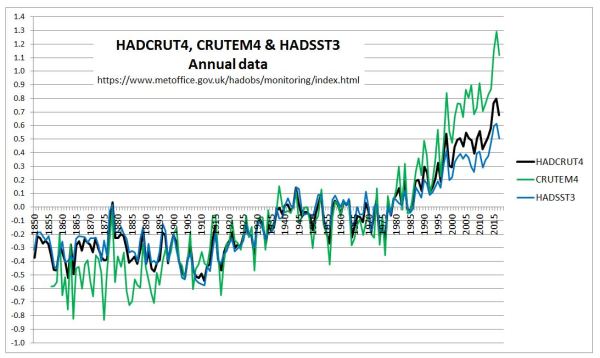
Figure 1 : Graph of Hadley Centre annual temperature anomalies for Land (CRUTEM4), Sea (HADSST3) and Combined (HADCRUT4)

  Comparing the early twentieth-century with 1975-2010,

  • Land warming is considerably greater in the later period.
  • Combined land and sea warming is slightly more in the later period.
  • Sea surface warming is slightly less in the later period.
  • In the early period, the surface anomalies for land and sea have very similar trends, whilst in the later period, the warming of the land is considerably greater than the sea surface warming.

The impact is more clearly shown with 7 year centred moving average figures in Figure 2.

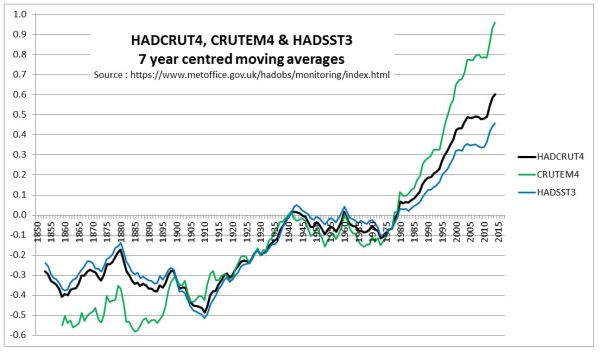
Figure 2 : Graph of Hadley Centre 7 year moving average temperature anomalies for Land (CRUTEM4), Sea (HADSST3) and Combined (HADCRUT4)

This is not just a feature of the HADCRUT dataset. NOAA Global Surface Temperature Anomalies for land, ocean and combined show similar patterns. Figure 3 is on the same basis as Figure 2.

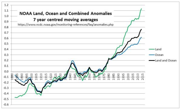
Figure 3 : Graph of NOAA 7 year moving average temperature anomalies for Land, Ocean and Combined.

The major common feature is that the estimated land temperature anomalies have shown a much greater warming trend that the sea surface anomalies since 1980, but no such divergence existed in the early twentieth century warming period. Given that the temperature data sets are far from complete in terms of coverage, and the data is of variable quality, is this divergence a reflection of the true average temperature anomalies based on far more complete and accurate data? There are a number of alternative possibilities that need to be investigated to help determine (using beancounter terminology) whether the estimates are a true and fair reflection of the prespective that more perfect data and techniques would provide. My list might be far from exhaustive.

  1. The sea-surface temperature set understates the post-1975 warming trend due to biases within data set.
  2. The spatial distribution of data changed considerably over time. For instance, in recent decades more data has become available from the Arctic, a region with the largest temperature increases in both the early twentieth century and post-1975.
  3. Land data homogenization techniques may have suppressed differences in climate trends where data is sparser. Alternatively, due to relative differences in climatic trends between nearby locations increasing over time, the further back in time homogenization goes, the more accentuated these differences and therefore the greater the suppression of genuine climatic differences. These aspects I discussed here and here.
  4. There is deliberate manipulation of the data to exaggerate recent warming. Having looked at numerous examples three years ago, this is a perspective that I do not believe to have had any significant impact. However, simply believing something not to be the case, even with examples, does not mean that it is not there.
  5. Strong beliefs about how the data should look have, over time and multiple data adjustments created biases within the land temperature anomalies.

What I do believe is that an expert opinion to whether this divergence between the land and sea surface anomalies is a “true and fair view” of the actual state of affairs can only be reached by a detailed examination of the data. Jumping to conclusions – which is evident from many people across the broad spectrum of opinions on catastrophic anthropogenic global warming debate – will fall short of the most rounded opinion that can be gleaned from the data.

Kevin Marshall


NOAA Future Aridity against Al Gore’s C20th Precipitation Graphic

Paul Homewood has taken a look at an article in yesterdays Daily Mail – A quarter of the world could become a DESERT if global warming increases by just 2ºC.

The article states

Aridity is a measure of the dryness of the land surface, obtained from combining precipitation and evaporation.  

‘Aridification would emerge over 20 to 30 per cent of the world’s land surface by the time the global temperature change reaches 2ºC (3.6ºF)’, said Dr Manoj Joshi from the University of East Anglia’s School of Environmental Sciences and one of the study’s co-authors.  

The research team studied projections from 27 global climate models and identified areas of the world where aridity will substantially change.  

The areas most affected areas are parts of South East Asia, Southern Europe, Southern Africa, Central America and Southern Australia.

Now, having read Al Gore’s authoritative book An Inconvenient Truth there are statements first about extreme flooding, and then about aridity (pages 108-113). The reason for flooding coming first is on a graphic of twentieth-century changes in precipitation on pages 114 & 115.

This graphic shows that, overall, the amount of precipitation has increased globally in the last century by almost 20%.

 However, the effects of climate change on precipitation is not uniform. Precipitation in the 20th century increased overall, as expected with global warming, but in some regions precipitation actually decreased.

The blue dots mark the areas with increased precipitation, the orange dots with decreases. The larger the dot, the larger the change. So, according to Nobel Laureate Al Gore, increased precipitation should be the far more common than increased aridity. If all warming is attributed to human-caused climate change (as the book seems to imply) then over a third of the dangerous 2ºC occurred in the 20th century. Therefore there should be considerable coherence between the recent arid areas and future arid areas.

The Daily Mail reproduces a map from the UEA, showing the high-risk areas.

There are a couple of areas with big differences.

Southern Australia

In the 20th century, much of Australia saw increased precipitation. Within the next two or three decades, the UEA projects it getting considerably arider. Could this change in forecast be the result of the extreme drought that broke in 2012 with extreme flooding? Certainly, the pictures of empty reservoirs taken a few years ago, alongside claims that they would never likely refill show the false predictions.

One such reservoir is Lake Eildon in Victoria. Below is a graphic of capacity levels in selected years. It is possible to compare other years by following the historical water levels for EILDON link.

Similarly, in the same post, I linked to a statement by re-insurer Munich Re stating increased forest fires in Southern Australia were due to human activity. Not by “anthropogenic climate change”, but by discarded fag ends, shards of glass and (most importantly) fires that were deliberately started.

Northern Africa

The UEA makes no claims about increased aridity in Northern Africa, particularly with respect to the Southern and Northern fringes of the Sahara. Increasing desertification of the Sahara used to be claimed as a major consequence of climate change. In the year following Al Gore’s movie and book, the UNIPCC produced its Fourth Climate Assessment Report. Working Group II report, Chapter 9 (Pg 448) on Africa made the following claim.

In other countries, additional risks that could be exacerbated by climate change include greater erosion, deficiencies in yields from rain-fed agriculture of up to 50% during the 2000-2020 period, and reductions in crop growth period (Agoumi, 2003).

Richard North took a detailed look at the background of this claim in 2010. The other African countries were Morocco, Algeria and Tunisia. Agoumi 2003 compiled three reports, only one of which – Morocco – had anything near a 50% claim. Yet Morocco seems, from Al Gore’s graphic to have had a modest increase in rainfall over the last century.

Conclusion

The UEA latest doom-laden prophesy of increased aridity flies in the face of the accepted wisdom that human-caused global warming will result in increased precipitation. In two major areas (Southern Australia and Northern Africa), increased aridity is at add odds with changes in precipitation claimed to have occurred in the 20th Century by Al Gore in An Inconvenient Truth. Yet over a third of the of the dangerous 2ºC warming limit occurred in the last century.

Kevin Marshall


Warming Bias in Temperature Data due to Consensus Belief not Conspiracy

In a Cliscep article Science: One Damned Adjustment After Another? Geoff Chambers wrote:-

So is the theory of catastrophic climate change a conspiracy? According to the strict dictionary definition, it is, in that the people concerned clearly conferred together to do something wrong – namely introduce a consistent bias in the scientific research, and then cover it up.

This was in response to last the David Rose article in the Mail on Sunday, about claims the infamous the Karl et al 2015 breached America’s National Oceanic and Atmospheric Administration (NOAA) own rules on scientific intergrity.

I would counter this claim about conspiracy in respect of temperature records, even in the strict dictionary definition. Still less does it conform to a conspiracy theory in the sense of some group with a grasp of what they believe to be the real truth, act together to provide an alternative to that truth. or divert attention and resources away from that understanding of that truth. like an internet troll. A clue as to know why this is the case comes from on of the most notorious Climategate emails. Kevin Trenberth to Micheal Mann on Mon, 12 Oct 2009 and copied to most of the leading academics in the “team” (including Thomas R. Karl).

The fact is that we can’t account for the lack of warming at the moment and it is a travesty that we can’t. The CERES data published in the August BAMS 09 supplement on 2008 shows there should be even more warming: but the data are surely wrong. Our observing system is inadequate.

It is the first sentence that was commonly quoted, but it is the last part is the most relevant for temperatures anomalies. There is inevitably a number of homogenisation runs to get a single set of anomalies. For example the Reykjavik temperature data was (a) adjusted by the Iceland Met office by standard procedures to allow for known locals biases (b) adjusted for GHCNv2 (the “raw data”) (c) adjusted again in GHCNv3 (d) homogenized by NASA to be included in Gistemp.

There are steps that I have missed. Certainly Gistemp homogenize the data quite frequently for new sets of data. As Paul Matthews notes, adjustments are unstable. Although one data set might on average be pretty much the same as previous ones, there will be quite large anomalies thrown out every time the algorithms are re-run for new data. What is more, due to the nature of the computer algorithms, there is no audit trail, therefore the adjustments are largely unexplainable with reference to the data before, let alone with reference to the original thermometer readings. So how does one know whether the adjustments are reasonable or not, except through a belief in how the results ought to look? In the case of the climatologists like Kevin Trenberth and Thomas R. Karl, variations that show warmer than the previous run will be more readily accepted as correct rather than variations that show cooler. That is, they will find reasons why a particular temperature data set now shows greater higher warming than before. but will reject as outliers results that show less warming than before. It is the same when choosing techniques, or adjusting for biases in the data. This is exacerbated when a number of different bodies with similar belief systems try to seek a consensus of results, like  Zeke Hausfather alludes to in his article at the CarbonBrief. Rather than verifying results in the real world, temperature data seeks to conform to the opinions of others with similar beliefs about the world.

Kevin Marshall