An IPPR report This is a crisis: Facing up to the age of environmental breakdown published yesterday, withing a few hours received criticism from Paul Homewood at notalotofpeopleknowthat, Paul Matthews at cliscep and Andrew Montford at The GWPF. has is based on an April 2018 paper by billionaire Jeremy Grantham. Two major issues, that I want cover in this post are contained in a passage on page 13.
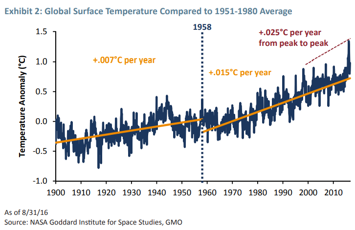
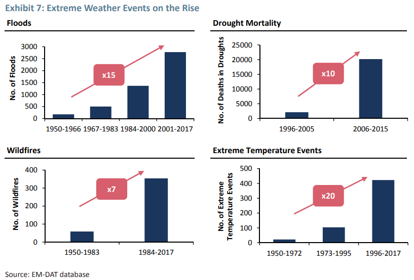
Climate Change : Average global surface temperature increases have accelerated, from an average of 0.007 °C per year from 1900–1950 to 0.025 °C from 1998–2016 (Grantham 2018). ……. Since 1950, the number of floods across the world has increased by 15 times, extreme temperature events by 20 times, and wildfires sevenfold (GMO analysis of EM-DAT 2018).
These two items are lifted from an April 2018 paper The Race of Our Lives Revisited by British investor Jeremy Grantham CBE. I will deal with each in turn.
Warming acceleration
The claim concerning how warming has accelerated comes from Exhibit 2 of The Race of Our Lives Revisited.

The claimed Gistemp trends are as follows
1900 to 1958 – 0.007 °C/year
1958 to 2016 – 0.015 °C/year
1998 to 2016 – 0.025 °C/year
Using the Skeptical Science trend calculator for Gistemp I get the following figures.
1900 to 1958 – 0.066 ±0.024 °C/decade
1958 to 2016 – 0.150 ±0.022 °C/decade
1998 to 2016 – 0.139 ±0.112 °C/decade
That is odd. Warming rates seem to be slightly lower for 1998-2016 compared to 1958-2016, not higher. This is how Grantham may have derived the incorrect 1998-2016 figure.
For 1998-2016 the range of uncertainty is 0.003 to 0.025 °C/year.
It would appear that the 1900 to 1958 & 1958 to 2016 warming rates are as from the trend calculator, whilst the 1998 to 2016 warming rate of 0.025 °C/year is at the top end of the 2σ uncertainty range.
Credit for spotting this plausible explanation should go to Mike Jackson.
Increase in climate-related disasters since 1950
The IPPR report states
Since 1950, the number of floods across the world has increased by 15 times, extreme temperature events by 20 times, and wildfires sevenfold
Exhibit 7 of The Race of Our Lives Revisited.

The 15 times “Floods” increase is for 2001-2017 compared to 1950-1966.
The 20 times “Extreme Temperature Events” increase is for 1996-2017 compared to 1950-1972.
The 7 times “Wildfires” increase is for 1984-2017 compared to 1950-1983.
Am I alone in thinking there is something a bit odd in the statement about being from 1950? Grantham is comparing different time periods, yet IPPR make it appear the starting point is from a single year?
But is the increase in the data replicated in reality?
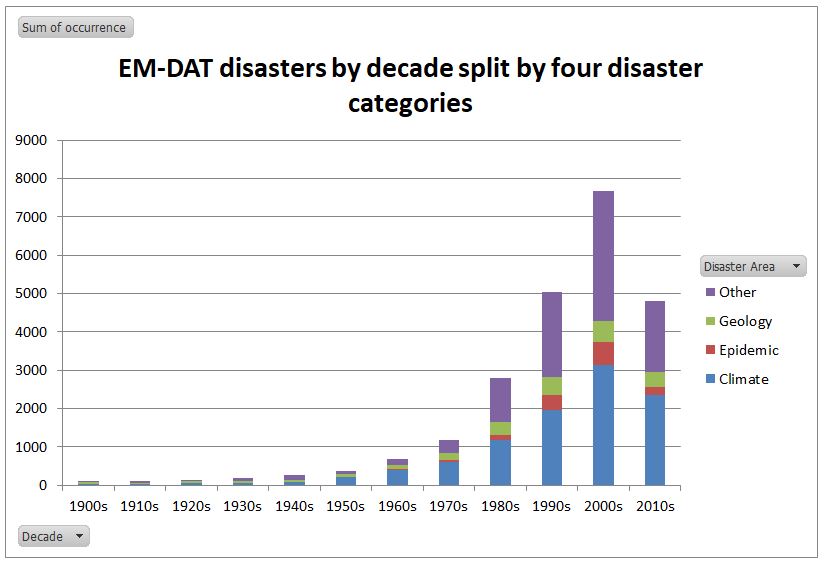
Last year I downloaded all the EM-DAT – The International Disasters Database – from 1900 to the present day. Their disaster types I have classified into four categories.

Over 40% are the “climate”-related disaster types from Grantham’s analysis. Note that this lists the number of “occurrences” in a year. If, within a country in a year there is more than one occurrence of a disaster type, they are lumped together.
I have split the number of occurrences by the four categories by decade. The 2010s is only for 8.5 years.

“Climate” disasters have increased in the database. Allowing for 8.5 years in the current decade, compared to 1900-1949, “Climate” disasters are 65 times more frequent. Similarly epidemics are 47 times more frequent, geological events 16 times and “other” disasters 34 times.
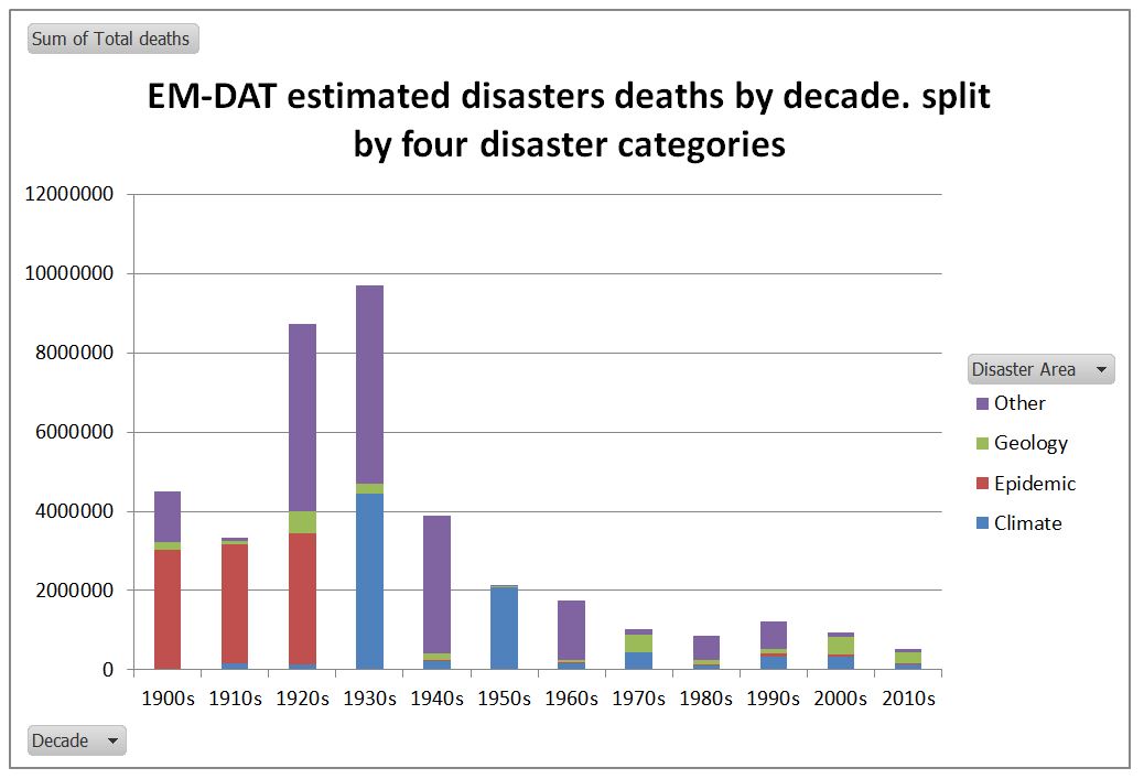
Is this based on reality, or just vastly improved reporting of disasters from the 1980s? The real impacts are indicated by the numbers of reports deaths.

The number of reported disaster deaths has decreased massively compared to the early twentieth century in all four categories, despite the number of reported disasters increasing many times. Allowing for 8.5 years in the current decade, compared to 1900-1949, “Climate” disaster deaths are down 84%. Similarly epidemic deaths are down by 98% and”other” disasters down by 97%. Geological disaster deaths are, however, up by 27%. The reported 272,431 deaths in the 2010s that I have classified under “Geology” includes the estimated 222,570 estimated deaths in the 2010 Haitian Earthquake.
If one looks at the death rate per reported occurrence, “Climate” disaster death rates have declined by 97.7% between 1900-1949 and the 2010s. Due to the increase in reporting, and the more than doubling of the world population, this decline is most likely understated.
The Rôle of Progressives in Climate Mitigation
The IPPR describes itself as The Progressive Policy Think Tank. From the evidence of the two issues above they have not actually thought about what they are saying. Rather they have just copied the highly misleading data from Jeremy Grantham. There appears to be no real climate crisis emerging when one examines the available data properly. The death rate from extreme weather related events has declined by at least 97.7% between the first half of the twentieth century and the current decade. This is a very important point for policy. Humans have adapted to the current climate conditions, just have they have reduced the impact of infectious diseases and are increasingly adapting to the impacts of earthquakes and tsunamis. If the climate becomes more extreme, or sea level rise accelerates significantly humans will adapt as well.
There is a curious symmetry here between the perceived catastrophic problem and the perceived efficacy of the solution. That for governments to reduce global emissions to zero. The theory is that rising human emissions, mostly from the burning of fossil fuels, are going to cause dangerous climate change. Global emissions involve 7600 million people in nearly 200 countries. Whatever the UK does, with less than 1% of the global population and less than 1% of global emissions makes no difference to global emissions.
Globally, there are two major reasons that reducing global emissions will fail.
First is that developing countries, with 80%+ of the global population and 65% of emissions, are specifically exempted from any obligation to reduce their emissions. (see Paris Agreement Articles 2.1(a), 2.2 and 4.1) Based on the evidence of the UNEP Emissions GAP Report 2018, and from the COP24 Katowizce meeting in December, there is no change of heart in prospect.
Second is that the reserves of fossil fuels, both proven and estimated, are both considerable and spread over many countries. Reducing global emissions to zero in a generation would mean leaving in the ground fossil fuels that provide a significant part of government revenue in countries such as Russia, Iran, Saudi Arabia, and Turkmenistan. Keeping some fossil fuels in the ground in the UK, Canada, Australia or the United States will increase the global prices and thus the production elsewhere.
The IPPR is promoting is costly and ideological policies in the UK, that will have virtually zero benefits for future generations in terms of climate catastrophes averted. In my book such policies are both regressive and authoritarian, based on failing to understand to the distinction between the real very marginal impacts of policy and the theoretical total impacts.
If IPPR, or even the climate academics, gave proper thought to the issue, then they would conclude the correct response will be to more accurately predict the type, timing, magnitude and location of future climate catastrophes. This information will help people on the ground adapt to those circumstances. In the absence of that information, the best way of adapting to changing climate is the same way as people have been able to adapt to extreme events, whether weather or geological. That is through sustained long-term economic growth, in the initial stages promoted by cheap and reliable energy sources. If there is a real environmental breakdown on its way, the Progressives, with their false claims and exaggerations, will be best kept well away from the scene. Their ideological beliefs render them incapable of getting a rounded perspective on the issues and the damage their policies will cause.
HaroldW
/ 14/02/2019“This is how Grantham may have derived the incorrect 1998-2016 figure….It would appear that […] the 1998 to 2016 warming rate of 0.025 °C/year is at the top end of the 2σ uncertainty range.”
The annotation in Exhibit 2 (“+0.025 °C/year from peak to peak”) is clear that the claim of 0.025 °C/year arises from drawing a straight line between the 1998 and 2016 peaks.
That is, shall we say, an idiosyncratic method of estimating a temperature trend. There are objections to using the least-squares slope estimator as well, but that is preferable to using individual year values.
HaroldW
/ 14/02/2019Trying to reproduce Grantham’s calculation — the chart cites GISS as the source, so presumably he used the GISTemp series, located at
https://data.giss.nasa.gov/gistemp/tabledata_v3/GLB.Ts.txt
The graph appears to plot annual averages:
1998 average is 85 (units are cK above the base period of 1951-1980)
2016 average is 125
Difference is 0.40 K, over 18 years = 0.022 K/year. Pretty close, especially when the data set values often change by a tick or two over time, as more data is assimilated. Perhaps the difference was 0.45 K when the calculation was originally made, which corresponds to a change rate of 0.025 K/year.
Alternatively, he might have used peak months. From the same webpage:
Peak in Feb 1998 is 121
Peak in Feb 2016 is 165
Difference is 0.44 K, over 18 years = 0.0244 K/year.
manicbeancounter
/ 14/02/2019Whichever method Jeremy Grantham used for the period 1998-2016, it was not the same as the method used for 1900-1958 & 1958-2016.
There are other issues as well. By April 2018 the full year anomaly for 2017 had been available for a few weeks. The trend for 1998-2017 is 0.178 ±0.114 °C/decade, as against 0.154 ±0.022 °C/decade for 1958 to 2017. But then the graph would not end in a dramatic peak.
To be slightly nationalistic, why is a British person using foreign data sets? Maybe it is because HADCRUT4 does not show the same results?
1900 to 1958 – 0.082 ±0.024 °C/decade v 0.066 for Gistemp
1958 to 2016 – 0.131 ±0.022 °C/decade v 0.150
1998 to 2016 – 0.109 ±0.112 °C/decade v 0.139
By Grantham’s own time periods 1958-2016 warming is 2.27 times that of 1900-1958, whilst with HADCRUT4 just 1.60 times. I wonder how much the relative amounts would be without the improvements to the calculation methods in the past decade or so?
From Climate4you

HaroldW
/ 16/02/2019You’re correct that the method of calculating trend for 1998-2016 is not the same as for the prior periods, so Grantham should not have compared them directly.
And as you point out, the use of the GISS dataset (alone), fortuitously or not, provides a high estimate of the 1998-2016 warming, even using his peculiar metric. After seeing enough examples of cherry-picking, it only seems right to provide one’s metric from multiple observation datasets. Looking at the 1998-2016 comparison, GISS (now) shows a temperature difference of 0.40 K. (Extrapolating from Grantham’s result, the difference had been 0.45 K.) HadCRUT4 shows a difference of 0.797-0.539=0.258 K. NCDC shows a difference of 0.95-0.64=0.31 K. Cowtan & Way 2.0: 0.87-0.53=0.34 K. BEST: 0.949-0.590=0.359 K. GISS has the highest estimate of warming from among these datasets.