There’s a very old joke I’d like to share with you, and it goes something like this:
A man is found repeatedly firing an elephant gun in the local park. “What are you doing that for?” he is asked. “It’s to scare away the elephants”, he opines. “But there are no elephants in this park”, comes the reply. “See,” he smiles, “it’s working already”.
Now, if you were to believe the man with the elephant gun, what you would be dealing with here is a perfect example of what is known as the Preparedness Paradox (sometimes ‘Preventative Paradox’). It is a paradox in which the removal of a problem is misinterpreted as evidence that the problem never existed in the first place.
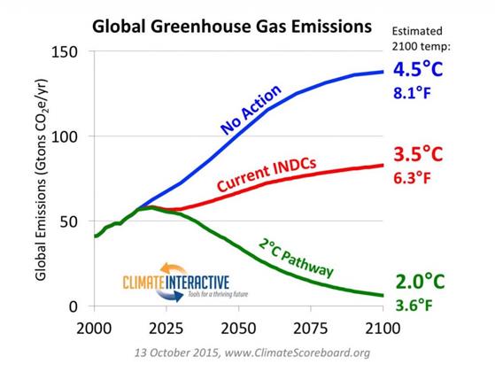
The “Preparedness Paradox” using RCP8.5 was much in evidence in the run-up to and during COP21 Paris in December 2015. But there was another element that I am unable to name.
In the run-up to COP21, nearly every country submitted an INDC (Intended Nationally Determined Contributions). These were primarily to show emissions projections with and without policy through to 2030. Not the UK, as the EU did a joint INDC. Several organisations put forward projections on how the aggregate of the INDCs would play out through to 2100. One such group was Climate Interactive. Using RCP8.5 as a baseline, they projected that the effect of the INDCs would be to constrain 2100 warming to 3.5oC. Just a degree less warming.
The UNFCCC, using a different method, claimed the INDCs would constrain warming to 2.7 °C.
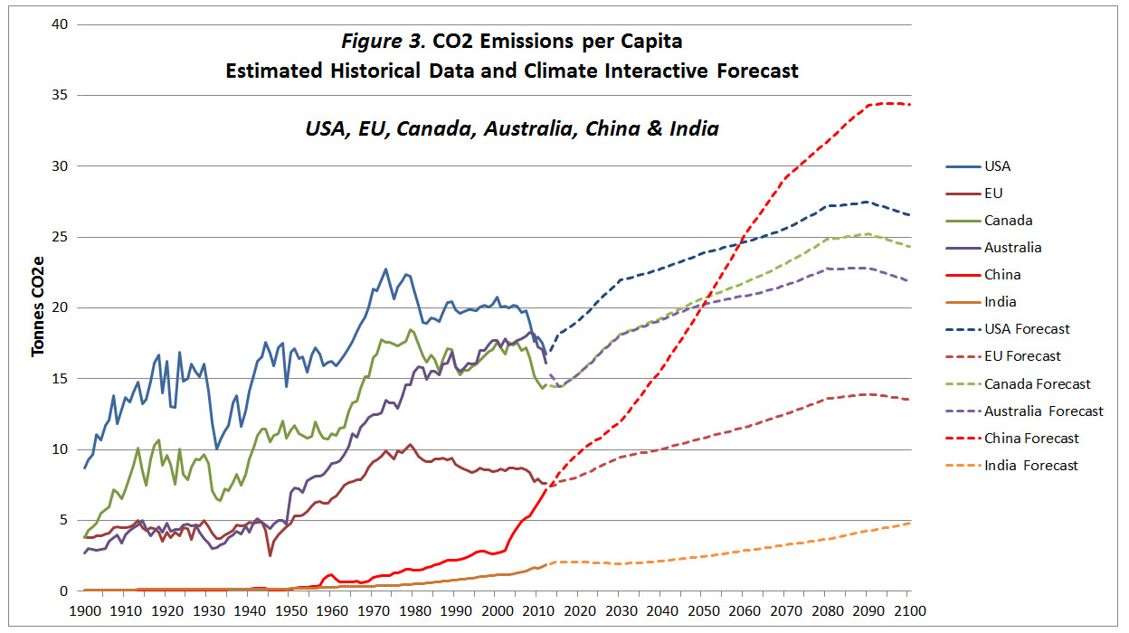
As Climate Interactive C-Roads software allowed downloads, I had a little play with the data. C-Roads had extracted data from the RCP database. This has separate model outputs for each of the four RCPs and for each greenhouse gas. To keep things simple, RCP divides the world into five, rather odd, regions. C-Roads then split out the EU and about 20 major countries from these regions. I downloaded the RCP8.5 CO2 emissions data along with the UN population projections from C-Roads. The CO2 data is expressed in grams of carbon, instead of tonnes of CO2. After a bit of data manipulation, I produced the following chart.
In the actual data to 2012, CO2 emissions per capita have fallen since 1980 in both the USA and the EU27. This is due to various factors, but in general advanced economies grow both through services and through high-value manufacturing. There is no economic reason for either to rise to well beyond pre-1973 peaks. The projection in China is simply crazy. It is this way in part because China’s population is projected to fall to 1 billion by 2100. Indeed, all but one country confirms the “Preparedness Paradox”. That country is India.
The projected CO2 emissions for India were so low that even the 2015 estimate was around 30% below the estimate. The figures for Africa (excluding South Africa) were even worse. Per capita CO2 emissions will barely increase. In other words, more professional BAU scenarios for India and Africa would generate the opposite of the elephant gun approach.
An idea of the revision upwards for India can be gained from the INDC submission. This included the target “to lower the emissions intensity of GDP by 33% to 35% by 2030.“. But this intensity decrease was in the context of an assumed GDP growth of 7.2%. That would imply an 80% increase in emissions in 15 years, at an annual growth rate of ~4%. Emissions in 2014 were 84% higher than in 1999 (3083 and 1980 MtCO2e), so the projection was hardly an exaggeration. 2024 emissions were 42% higher than in 2014 (4371 and 3083 MtCO2e), implying an emissions growth rate of ~3.5%
Another example is Nigeria. In its INDC submission, Nigeria projected its GHG emissions to grow 114% by 2030. But it would unconditionally cut this by 20%. With external financing, it would be cut by 70% relative to BAU. That is, even with external financing, emissions would increase by a third. Yet 1999-2014 GHG emissions only increased by 20%, and 2024 emissions were just ~11% higher than in 2014. No climate financing has been arranged. Nigeria was not alone in publishing a highly exaggerated BAU scenario. I cannot believe that the UNFCCC estimated the impacts of INDCs took these exaggerations fully into account. Neither would Climate Interactive. Whilst RCP8.5 is a gross exaggeration, 2100 emissions projections based on 2015 INDCs
So, whilst you would expect the inputting INDCs into the Climate Interactive C-Roads database to correct the crazy forecasts, these are partly offset by upward revisions elsewhere. But these revisions using INDCs would have been a little circumspect. Whether even a 50% increase in CO2 emissions in 85 years is realistic (even with emission reduction policies in some countries) is another story. As is my extrapolation from AR6 WG1 SPM table SPM.2 that constant global CO2 emissions 2020-2100 would produce ~3.5 °C of warming in 2100.
Last month the BBC headlined an article “Shell facing first UK legal claim over climate impacts of fossil fuels“. Typhoon Rai hit the Philippines in late 2021, damaging millions of homes and resulting in 400 deaths. Some of those affected are suing major oil producer Shell in UK courts, claiming that its emissions had a material impact on the severity of that typhoon. The BBC article states
The company has “materially contributed” to human driven climate change, the letter says, that made the Typhoon more likely and more severe.
The group wants to apply Philippine law (where the damage occurred) in a case to be heard in English courts. I will apply my rather cursory understanding of English tort law. That is, it is up to the litigant to prove their case on the balance of probabilities in an adversarial court system. A case is proved with clear evidence. In this case, each piece of evidence needs to be critically reviewed in light of the connection between human emissions and rising greenhouse gas levels; rising greenhouse gas levels and global average temperature rise; the rise in global average temperatures causing (or excerbating) Typhoon Rai; and the damage caused (especially injury and death being related to some function of (a) the strength of the storm and (b) the population impacted). Being a (somewhat) manic former beancounter, I will concentrate on the empirical data. I will also use a Greenpeace article from 23/10/25, which provides much more detail and a useful link to an attribution study.
That 2% figure
The BBC article states “that Shell is responsible for 2% of historical global greenhouse gases“. This is incorrect. The Greenpeace article gets closer, when it states “41 billion tons of CO2e or more than 2% of global fossil fuel emissions.” Going to the Carbon Majors Shell Page, the information box states that the 41.092 GtCO2 is 2.04% of the total CO2 emissions tracked by Carbon Majors from fossil fuels and cement for the period 1751-2013. This means that total emissions in the database were 2014 GtCO2.
Many would dispute whether a 2% contribution is a material contribution. There is a problem with this estimate. Anthropogenic CO2 emissions are mostly from fossil fuel emissions and cement production, but not entirely. There are also emissions from land-use changes. Further, I believe that the most authoritative source of anthropogenic CO2 emissions estimates are from the UNIPCC Assessment Reports. The most recent edition was the Sixth Assessment Report (AR6), published in 2021. AR6 WG3 SPM stated “Historical cumulative net CO2 emissions from 1850 to 2019 were 2400 ± 240 GtCO2 (high confidence)”. Footnote 10 states that this is at the 68% confidence interval. I was taught over 40 years ago that normal, acceptable, statistical confidence intervals were 95%, or double the 68% value. For a legal case in the UK, this should be confirmed by a Chartered Statistician (CStat) of the Royal Statistical Society (RSS), along with a validation of whether the confidence interval was calculated by a valid statistical method. AR6 used data from the Global Carbon Budget. AR6 is a bit coy about citing this source. However, searching “Friedlingstein” in the pdf of the full AR6 WG1 report, gives a reference to Friedlingstein et al., 2019. This is an annual, peer-reviewed article on the Global Carbon Budget.
The period 1850-2019 of the Global Carbon Budget is a century less than the Carbon Majors period of 1751-2023. To reconcile two data sets, I will ignore the period 1751-1849, as anthropogenic CO2 emissions were a tiny fraction of emissions since 1850. The Global Carbon Budget estimates CO2 emissions in 2019 at over 42 GtCO2, so the period 1850-2023 has emissions of 2570 ± (at least) 514 GtCO2. Ignoring the uncertainties, the Shell “share” of CO2 emissions becomes, at most, 1.6% of the total.
CO2 Emissions and Global Warming
However, this estimate ignores the impact of other greenhouse gas emissions on global warming. What about the impact of methane (CH4) emissions from bovine belching and flatulence? Or the methane emissions from sewage, or rotting waste? Or the Nitrous Oxide (N2O) emissions from burning heavy fuel oil in large container ships and supertankers?
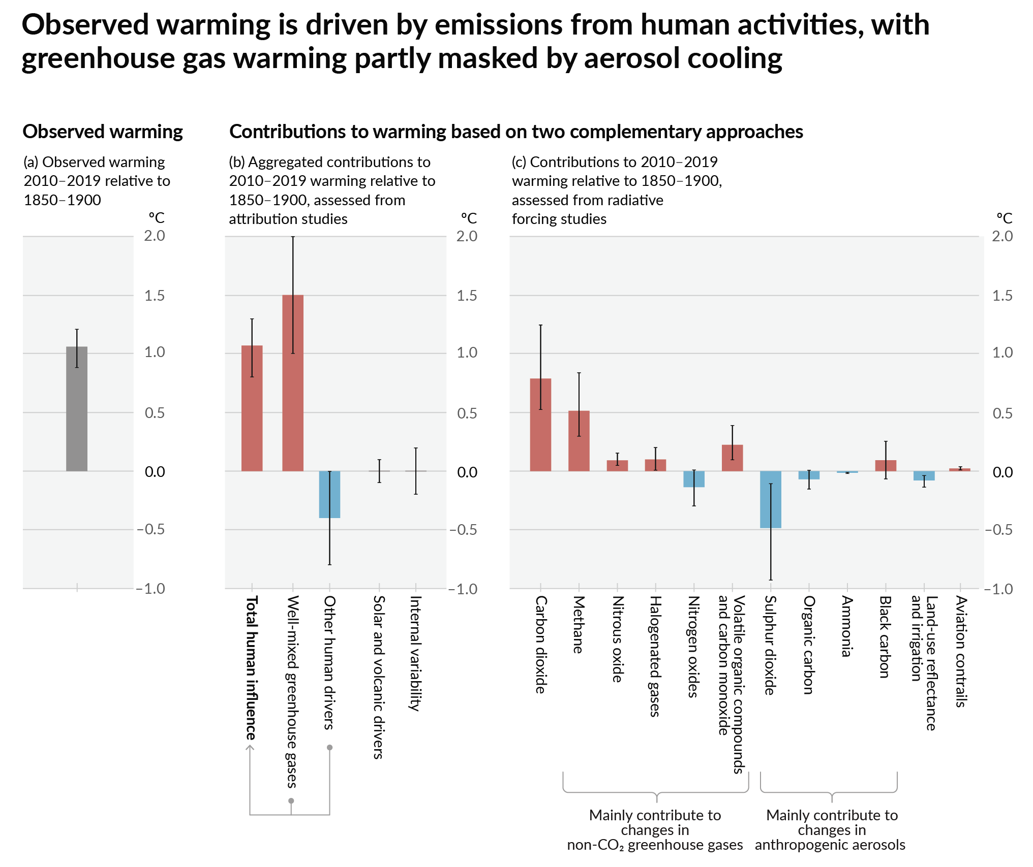
The last IPCC assessment report attempted to attribute the observed relative global warming from 1850-1990 to 2010-2019 to various radiative forcing factors. The key graphic from AR6 WG1 SPM is reproduced as figure 1.
Figure 1 : Figure SPM.2 in IPCC, 2021: Summary for Policymakers. In: Climate Change 2021: The Physical Science Basis. Contribution of Working Group I to the Sixth Assessment Report of the Intergovernmental Panel on Climate Change [Masson-Delmotte, V., P. Zhai, A. Pirani, S.L. Connors, C. Péan, S. Berger, N. Caud, Y. Chen, L. Goldfarb, M.I. Gomis, M. Huang, K. Leitzell, E. Lonnoy, J.B.R. Matthews, T.K. Maycock, T. Waterfield, O. Yelekçi, R. Yu, and B. Zhou (eds.)]. Cambridge University Press, Cambridge, UK and New York, NY,USA, pp. 3−32, doi: 10.1017/9781009157896.001 .]
The key graphic is (c). Carbon dioxide emissions created about 0.8 °C of warming, of which around 80% was from the burning of fossil fuels. Adding to this are the methane emissions from the production of fossil fuels, along with the nitrous oxide and carbon monoxide emissions. Subtracting from this are emissions of nitrogen oxides and sulphur dioxide. The net impact is that about two-thirds of the observed warming. Pro rata, Shell is “responsible” for around 1% of the warming impact or about 0.01 °C of average global temperature over 150 years. Even this could very well be an exaggeration for two reasons. First, the calculated average temperature rise could be biased upwards. Second, some of the true average temperature rise could be due to natural factors, including variations caused by the chaotic nature of climate, or highly complex factors that are incapable of being described by scientific modelling. Much of the warming could be due to a rebound from a period called the Little Ice Age. Further, there was considerable warming during 1910-1940 in the data sets, which, a few years ago, was comparable in magnitude to the post-1975 warming. Yet the global emissions and the rate of rise in CO2 levels were considerably lower than in the later period.
Even using the data from the IPCC AR6, it is very difficult to establish, using a balance of probabilities criterion, that 41 GtCO2 of CO2 emissions raised global average temperatures by at least 0.01 °C since 1850-1900.
Impact of global warming on Typhoons in the Philippines
The BBC article grabbed my attention with the claim that human-caused emissions had made Typhoon Kai both more likely and severe. I am somewhat sceptical, as my cursory knowledge of the empirical evidence is that there is no convincing support for the hypothesis that tropical cyclones (typhoons in the eastern hemisphere, hurricanes in the western hemisphere) have increased markedly since the mid-70s when the rate of global average temperature rise took off. Such a correlation, if established, would be the starting point for claiming that the warming caused the increase.
There are two sources.
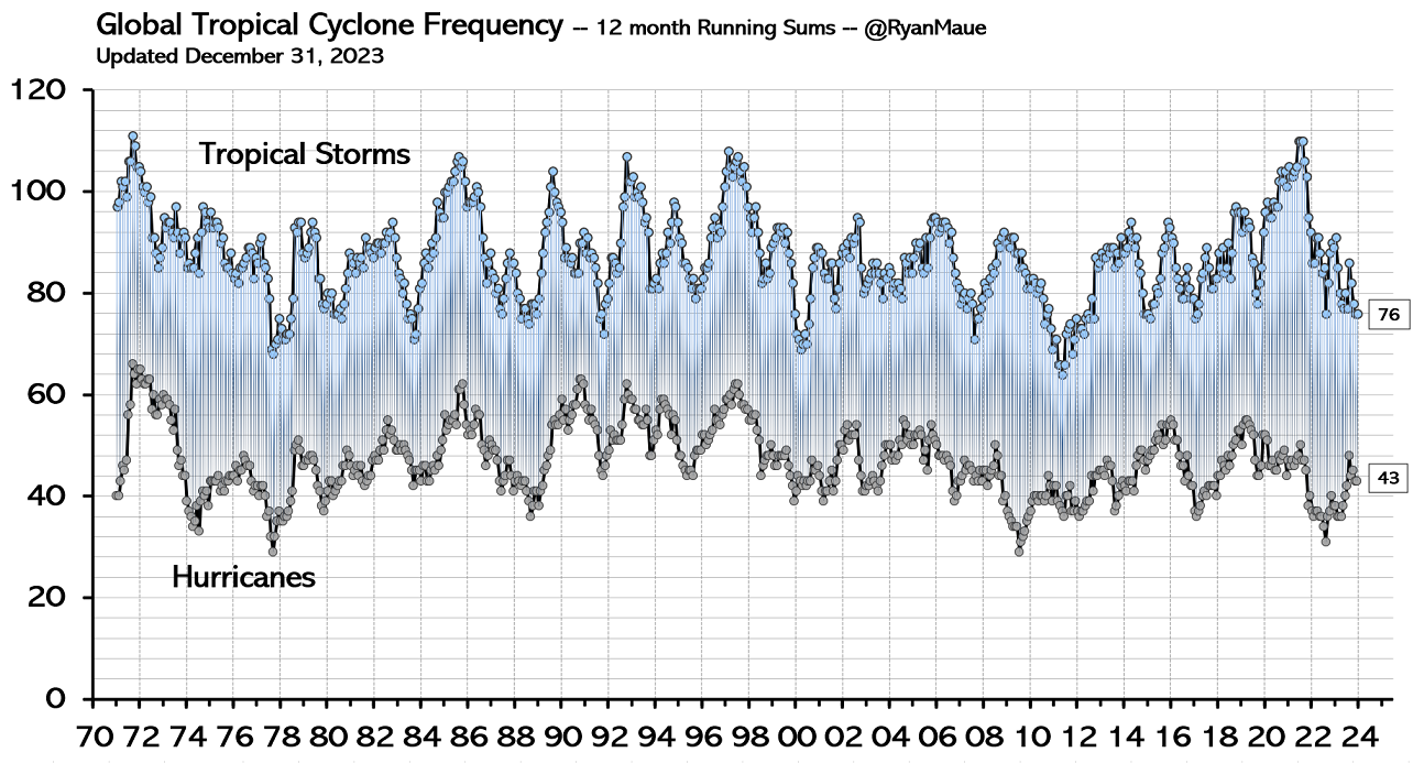
First is a couple of charts from Meteorologist Ryan Maue. These are of tropical cyclone frequency, and global tropical cyclone accumulated cyclone energy (from a peer-reviewed article). Both show data from the early 1970s. Cyclone frequency shows no trend. The cyclone frequency chart is more interesting. There are two major humps in the 1990s; a single peak in the 2000s; a relative energy drought 2008-2015; twin humps 2015-2020 smaller than the 1990s: then a decline into 2023 when the data ceases. At the foot of the chart there is a note. “Global data completeness much lower in the 1970s.” In terms of complete decades, the 1990s and 2000s seem tied for first, then the 2010s, with the 1980s in clear last place.
The second source has charts of Continental US hurricanes making landfall from Roger Pielke Jr. The big advantage is 125 years of consistent data, with no trend in all hurricanes or major hurricanes of Cat 3 and above. With this latest data is an accumulated cyclone energy chart for 1980-2024. This one has a single bar for each calendar year, with a slight downward trend.
With these data-driven prejudices, I took a look at the attribution study that supported the claim of human-caused climate change making Typhoon Rai more likely and more severe. This is, according to the Greenpeace Article, Clarke et al 2025 (The influence of anthropogenic climate change on Super Typhoon Odette (Typhoon Rai) and its impacts in the Philippines). The abstract states
First, we check that the current generation of higher resolution models used in attribution studies can capture the low sea level pressure anomaly associated with Typhoon Odette and hence can be used to study this type of event. A short analysis then compares such circulation analogues and the associated meteorological extremes over three time periods: past (1950-1970), contemporary (2001-2021), and future (2030-2050). Second, a multi-method multi-model probabilistic event attribution finds that extreme daily rainfall such as that observed during Typhoon Odette, has become about twice as likely during the Typhoon season over the southern-central Philippines due to ACC. Third, a large ensemble tropical cyclone hazard model finds that the wind speeds of category 5 landfalling typhoons like Odette have become approximately 70% more likely due to ACC.
Viewing the data analysis and modelling as a black box, inputting data for 1950-1970 and 2001-2021 leads to the conclusion that Cat 5 Typhoon Odette (Rai) was made 70% more likely due to anthropogenic climate change (ACC). To ensure that this conclusion is not an artifact of inconsistent data quality, the processing of that data before inputting it into the models, and the modelling, one would need to see the complete set of raw data. As a preliminary, a count of each category of typhoon for each of the seven decades, or even by year. Why is this important? On a global level, Ryan Maue warned that global data completeness was much lower in the 1970s, which implies that it was improving. That improvement would have been most marked in the areas with the lowest completeness before the 1970s. The Philippines, a developing country made up of a many islands, probably had much poorer data quality in 1950-1970 than the continental USA. Yet Clarke et al is able, in Figure 1, to show maximum wind speeds as Odette/Rai tracked across the mid-Philippines. Data that could have only come from satellites. 60 years earlier, the calculation of typhoon strength could only have come from measurements on the ground, which may have been very few. Therefore, that raw data could often understate the typhoon category. And if there is no data for measured sub-Cat 1 typhoons, then the total number might be understated. Quite detailed data processing is therefore required to obtain approximately comparable data for the 1950s & 1960s with the 21st century. The less processing, the greater the chance of showing an increase that does not exist in reality, but the greater the processing, the greater the distance from actual data. Does Clarke et al tackle this issue?
Under 3.2.1 Observational data on page 18 is stated
In this section, we use a range of gridded observational and reanalysis products.
They haven’t even examined the real raw data. We can’t get any appreciation of how much the data has been transformed.
All is not lost for those who want to make a case for an ACC-caused increase in major typhoons in the Philippines. The UNIPCC has been struggling to make the connection for decades on a global basis. The 2021 AR6 WG1 (The Physical Science Basis) states in para A.3.4
It is likely that the global proportion of major (Category 3–5) tropical cyclone occurrence has increased over the last four decades, and it is very likely that the latitude where tropical cyclones in the western North Pacific reach their peak intensity has shifted northward; these changes cannot be explained by internal variability alone (medium confidence). There is low confidence in long-term (multi-decadal to centennial) trends in the frequency of all-category tropical cyclones. Event attribution studies and physical understanding indicate that human-induced climate change increases heavy precipitation associated with tropical cyclones (high confidence), but data limitations inhibit clear detection of past trends on the global scale.
At the broadest level, my skeptical empiricist view is confirmed. There is no clear evidence of tropical cyclones having increased globally. Which means that the likely claim of major tropical cylones increasing is of a trivial quantity, or minor tropical cyclones have decreased. The significant part is about the western North Pacific. Given that there are a number of other areas globally where tropical cyclones occur, this is somewhat that this is the only area where an ACC influence can be found. But the Philippines could be construed as being in the western North Pacific, if the boundary between north and south is strictly the equator. The main islands of the Philippines lie 5 °- 19 ° N, and the Tropic of Cancer 23.6 ° N. For that reason alone, it is worth investigating.
The full report has quite a few mentions of this finding. on page 1747 is the following reference
Sun, J., D.Wang, X. Hu, Z. Ling, and L.Wang, 2019: Ongoing Poleward Migration of Tropical Cyclone Occurrence Over the Western North Pacific Ocean. Geophysical Research Letters, 46(15), 9110–9117, doi:10.1029/2019gl084260.
Fortunately, the paper is open access. The Key Points are
Tropical cyclone occurrence has been shifting poleward to the coast of East Asia from areas south of 20°N from 1982 to 2018
The preferential tropical cyclone passage has switched from westward moving to northward recurving since 1998
The poleward migration may be primarily attributed to the cyclonic anomaly of the steering flow over East Asia
The main point here is that south of 20°N (which the Philippines occupies), tropical cyclone occurrence has been decreasing. In case of doubt about the geography, check the colourful Figure 1. If one accepts the attribution to human-caused climate change, then the people of the Philippines should be thanking fossil fuel producers, not suing them. However, I am trying to look at what can be established on the balance of probabilities criterion. To repeat the comment in the WG1 SPM
….it is very likely that the latitude where tropical cyclones in the western North Pacific reach their peak intensity has shifted northward; these changes cannot be explained by internal variability alone (medium confidence).
In my (non-legal) opinion, there are two statements in this quotation.
The first is that there is evidence of climatic changes in the western North Pacific. The evidence is from statistical data (with potential data issues), but it far exceeds the balance of probabilities criterion.
The second is a qualitative opinion by a group of experts trying to find evidence of human-caused climate change. Medium confidence is tantamount to the opinion that, applying the balance of probabilities criterion, not even a small part of the observed change can be attributed to human causes.
Linking storm deaths to storm magnitude
In November 1970, Typhoon Bhola hit East Pakistan (now Bangladesh) and West Bengal. The official estimate was 500,000 dead. Most people were killed by the resulting storm surge that flooded the low-lying Ganges Delta. Another tropical cyclone hit Bangladesh in April 1991, killing at least 139,000. These are likely the first and third highest death tolls in the historical record for the old state of Bengal, although the further one goes back, the vaguer the reports. However, since 1991, the reporting of cyclones has become much more precise. The total deaths recorded in all cyclones by Wikipedia (which might be far from complete) since then are below 1,000. The likely reason for a greater than 99% fall in the deaths is the implementation of procedures to save lives. Like storm shelters and/or evacuation of the most vulnerable areas in advance of a cyclone. For the Philippines, with two-thirds of the population of Bangladesh, I count around 21,000 storm deaths in the period 2000-2025. This is highly skewed. The highest reported death toll was Typhoon Haiyan (Yolanda) in 2013 (6,352), followed by Tropical Storm Washi (Sendong) in 2011 (2,546) and Typhoon Bopha (Pablo) in 2012 (1,901). The three years 2011-2013 accounted for just over half the deaths in 2000-2025. The death rate per year from all storms 2000-2011 was about 3 times higher than in 2014-2025. Typhoon Kai in 2021, with 410 deaths, ranks ninth on the list. Of the deaths in 2014-2025, the two worst years were 2022 (467) and 2021 (463). Whilst the Philippines looks to have made great strides in reducing deaths from storms, there is clearly some way to go. That is if the Wikipedia figures are anything to go by.
Deaths are just one measure of the human impacts of powerful storms. There are also injuries, damage to property and the disruption to people’s lives. There has been much research on this topic in general, along with investigations afterwards to understand how the wide range of those human impacts can be lessened when similar events occur in the future. Whether or not the frequency of typhoons is increasing.
Conclusions and additional thoughts
Typhoon Rai was a Category 5 tropical cyclone that crossed the Philippines in December 2021, killing around 410 people. The claim has been made that the calculated 41 GtCO2 (2% of historical emissions) of CO2 emissions generated from the burning of fossil fuels extracted by Shell materially contributed to the severity of the storm.
The 2% material contribution is likely much smaller. In terms of the contribution to the human-caused global warming up to 2021, it is difficult to establish, through rigorous application of the balance probabilities criteria to AR6 WG1 evidence, that this quantity of emissions resulted in even 1% of the warming during 1850-2019. Even then, IPCC modelling makes the assumption that all the actual rise in global average temperatures is human-caused, which seems unwarranted when compared with the empirical evidence.
Key to attributing that warming to a 70% increase in the frequency of Cat 5 typhoons is data showing that such storms have increased both globally and in the Philippines area. The global data does not show such an increase. An attribution study comparing 1950-1970 and 2001-2021 did not look at the raw data. Thus, the authors cannot have looked at data quality and consistency issues in the entire period 1950-2021.
The attribution paper’s claimed increase in the frequency Cat 5 typhoons might conflict with the AR6 WG1 SPM report. The only case, the report finds, of climatic changes to global cyclones globally implies a reduction in tropical cyclones in the area of the Philippines during 1982-2018. Of course, it might still be that tropical cyclones were higher in 2001-2021 compared to 1950-1970, whilst declining during 1982-2018. But that still undermines the attribution paper.
Arguments about whether tropical cyclones have increased or not are invalid if the issue at stake is the human cost. A cursory look at the number of deaths suggests the death toll from the strongest typhoons appears to have decreased by over 90% since a run of severe storms in 2011-2013. This reduction is probably due to measures taken to reduce the human impacts.
As Shell has stated, the case against them is baseless. It is probably more baseless than they realised.
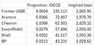
There are some additional thoughts on the Carbon Majors database. The most obvious one is why Shell. After all, BP is the largest historic British fossil fuel producer by potential emissions, although just 4% more than Shell. Globally, at the top of the list is China with seven times the “responsibility” of Shell. More generally, the database has three types of entities. These are (with shares) Investor-owned Company (24%), Nation State (15%) and State-owned Entity (30%). Smaller entities make up the remaining 31%. In fairness, any action should be a class-action suit against the whole world. That is not going to happen, so any successful action taken against investor-owned companies in, say UK or the USA, will be to the benefit of State entities in, say, China, Russia or Iran.
The updated figures are below. If the figures and percentages are outputted from a single database, then dividing the GtCO2 figure by the percentage will give the same global total for emissions from fossil fuels. There is significant variation. For instance, the Aramco figure of 72.457 is 3.66% of 1980, or 3.51% of 2066.
For the first time this report highlights that UK sea level is rising faster than the global average.
As sea levels continue to rise around the UK, the risk of flooding is only going to increase further, says Dr Svetlana Jevrejeva from the National Oceanography Centre.
The examples that the BBC gives of flooding in 2024 at Tetbury and Stratford-upon-Avon are significantly above sea level, and many miles inland. But why let facts get in the way of a good narrative.
On sea-level rise, the Met Office Executive Summary states
Sea level rise around the UK is accelerating.
Since 1901, the sea level around the UK has risen by about 19.5 cm, with two-thirds of this rise happening in just over the last three decades.
The last 3 years were the three highest on record for UK annual mean sea level in a series from 1901, with the 21st Century so far (2001–2024) including the 17 highest years.
Over the past 32 years (1993–2024) UK sea level has risen by 13.4 cm. This is higher than the global estimate of 10.6 cm calculated from satellite altimetry over the same period,
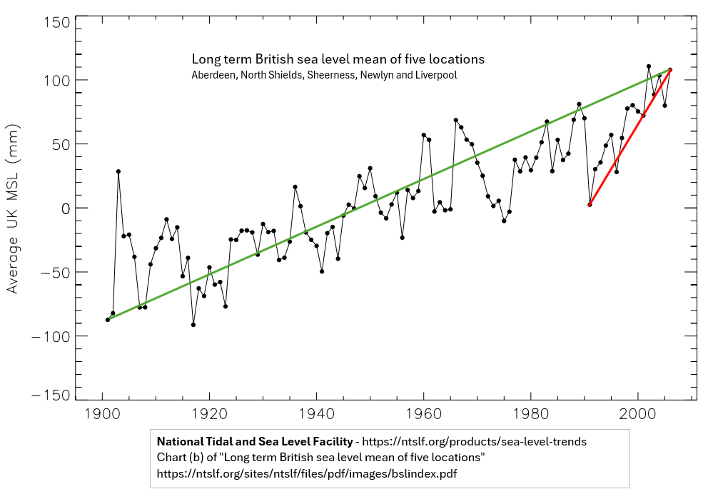
My first reaction on reading this was to assume that the Met Office had copied the methodology of the IPCC AR6 2022. That is, to splice the tide-gauge average data of 1901-1992 with the satellite data from 1993, then hope no one would notice that this splicing accounted for nearly all the apparent acceleration. However, although the year 1993 is there, it is apparent that the comments are derived from a single UK data set. A little research gets a graph of “long-term British sea level mean of five locations” at the National Tidal and Sea Level Facility. I have annotated the graph a little.
The graph does show that 2024 sea levels were about 19.5cm higher than in 1901. But 2024 sea levels were more like 10.5 cm higher than in 1993, not 13.4 cm. Further from 1992 to 1993, sea levels fell dramatically. Almost 7cm, equivalent to a third of the net increase over 124 years. From 1992 to 2024 sea levels rose about 3.8 cm or 1.2 mm yr-1, compared with 1.6 mm yr-1 in 1901-2024. In future Met Office ought to get a professional statistician to calculate trends and perform significance and sensitivity tests on the data. As for the 2024 report, it should be reissued with the unsubstantiated claims about accelerating sea-level rise removed.
This is an expanded version of a comment made at Paul Homewood’s notalotofpeopleknowthat blog.
Congratulations to Ruth Dixon and Jonathan Jones on managing to get a commentary on the two Stephan Lewandowsky, Gilles Gignac & Klaus Oberauer surveys published in Psychological Science. Entitled “Conspiracist Ideation as a Predictor of Climate Science Rejection: An Alternative Analysis” it took two years to get published. Ruth Dixon gives a fuller description on her blog, My Garden Pond. It confirms something that I have stated independently, with the use of pivot tables instead of advanced statistical techniques. In April last year I compared the two surveys in a couple of posts – Conspiracist Ideation Falsified? (CIF) & Extreme Socialist-Environmentalist Ideation as Motivation for belief in “Climate Science” (ESEI).
The major conclusion through their analysis of the survey
All the data really shows is that people who have no opinion about one fairly technical matter (conspiracy theories) also have no opinion about another fairly technical matter (climate change). Complex models mask this obvious (and trivial) finding.
In CIF my summary was
A recent paper, based on an internet survey of American people, claimed that “conspiracist ideation, is associated with the rejection of all scientific propositions tested“. Analysis of the data reveals something quite different. Strong opinions with regard to conspiracy theories, whether for or against, suggest strong support for strongly-supported scientific hypotheses, and strong, but divided, opinions on climate science.
In the concluding comments I said
The results of the internet survey confirm something about people in the United States that I and many others have suspected – they are a substantial minority who love their conspiracy theories. For me, it seemed quite a reasonable hypothesis that these conspiracy lovers should be both suspicious of science and have a propensity to reject climate science. Analysis of the survey results has over-turned those views. Instead I propose something more mundane – that people with strong opinions in one area are very likely to have strong opinions in others. (Italics added)
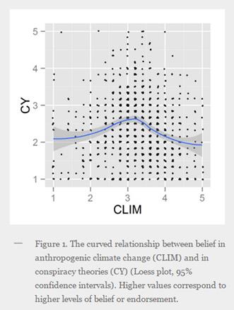
Dixon and Jones have a far superior means of getting to the results. My method is to input the data into a table, find groupings or classifications, then analyse the results via pivot tables or graphs. This mostly leads up blind alleys, but can develop further ideas. For every graph or table in my posts, there can be a number of others stashed on my hard drive. To call it “trial and error” misses out the understanding to be gained from analysis. Their method (through rejecting linear OLS) is loess local regression. They derive the following plot.
This compares with my pivot table for the same data.
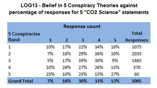
The shows in the Grand Total row that the strongest Climate (band 5) comprise 12% of the total responses. For the smallest group of beliefs about conspiracy theories with just 60/5005 responses, 27% had the strongest beliefs in about climate. The biggest percentage figure is the group who averaged a middle “3” score on both climate and conspiracy theories. That is those with no opinion on either subject.
The more fundamental area that I found is that in the blog survey between strong beliefs in climate science and extreme left-environmentalist political views. It is a separate topic, and its inclusion by Dixon and Jones would have both left much less space for the above insight in 1,000 words, and been much more difficult to publish. The survey data is clear.
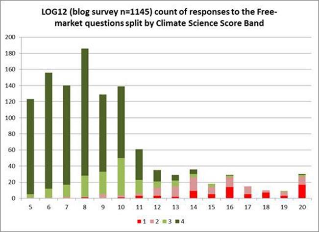
The blog survey (which was held on strongly alarmist blogs) shows that most of the responses were highly skewed to anti-free market views (that is lower response score) along with being strongly pro-climate.
The internet survey of the US population allowed 5 responses instead of 4. The fifth was a neutral. This shows a more normal distribution of political beliefs, with over half of the responses in the middle ground.
This shows what many sceptics have long suspected, but I resisted. Belief in “climate science” is driven by leftish world views. Stephan Lewandowsky can only see the link between the “climate denial” beliefs and free-market, because he views left-environmentalist perspectives and “climate science” as a priori truths. This is the reality that everything is to be measured. From this perspective climate science has not failed due to being falsified by the evidence, but because scientists have yet to find the evidence; the models need refining; and there is a motivated PR campaign to undermine these efforts.
A recent paper, based on an internet survey of American people, claimed that “conspiracist ideation, is associated with the rejection of all scientific propositions tested“. Analysis of the data reveals something quite different. Strong opinions with regard to conspiracy theories, whether for or against, suggest strong support for strongly-supported scientific hypotheses, and strong, but divided, opinions on climate science.
Preamble
In 2012 I spent a lot of time looking at a paper “Lewandowsky, Oberauer & Gignac – NASA faked the moon landing:Therefore (Climate) Science is a Hoax: An Anatomy of the Motivated Rejection of Science” – hereafter called LOG12. The follow up in early 2013 was the notorious Recursive Fury paper that has now been withdrawn (Here and here). When a new paper came out, by the same authors reaching pretty much the same conclusions, I had lost interest.
However, Barry Woods, a victim of the Recursive Fury paper, suggested in a comment:-
Lewandowsky always claimed that his US study replicated LOG12
Could you try the same pivot table analysis as LOG12?
I had a quick look at the file, tried a few pivot tables, had a short email exchange, and found something interesting.
The 2013 US study is “The Role of Conspiracist Ideation and Worldviews in Predicting Rejection of Science” – Stephan Lewandowsky, Gilles E. Gignac, Klaus Oberauer. PLOS one. Hereafter called LOG13.
The two papers were similar in that
The three authors were the same.
Many of the questions were the same, or very similar.
The conclusions were similar.
The two papers are different in that
LOG12 was an internet survey, conducted solely through “pro-science” blogs. LOG13 was another internet survey, but this time of the U.S. population.
LOG12 had just 4 responses. Running 1 to 4 they are strongly/weakly reject and weakly strongly accept. LOG13 had 5 responses. In the middle there was a neutral/don’t know/no opinion option.
At “Shaping Tommorow’s World” Blog, Lewandowsky and Oberauer said of the LOG13 paper:-
Conclusions: Free-market worldviews are an important predictor of the rejection of scientific findings that have potential regulatory implications, such as climate science, but not necessarily of other scientific issues. Conspiracist ideation, by contrast, is associated with the rejection of all scientific propositions tested.
It is the last part that I will deal with in this posting. Free market views I may come back to at a later time.
Comparison of conspiracist orientations and science denial in LOG12 (pro-science blogs) and LOG13 (Americans)
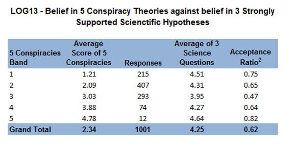
LOG12 had thirteen questions on conspiracy theories and LOG13 nine. In the latter three were on science issues and one on “New World Order”. That left five that are comparable between the papers, but independent of the scientific / political subject matter1.
In LOG12 there were two scientific questions. In short they are “HIV causes AIDS” and “smoking causes lung cancer”. In LOG13 was added “lead in drinking water harms health”
This can be compared by banding the belief in conspiracy theories by the rounded average response.
The first column in the table is the band, taken by rounding the average response to the nearest whole number for the responses to the 5 conspiracy theories. The second column is the unrounded average response within the band. The third column is the number of responses. The fourth column is the average response to the two science questions. The fifth column is acceptance ratio.
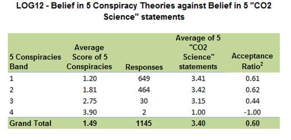
For the LOG12 survey, conducted via “pro-climate science” blogs, the connection is clear. The belief in the five conspiracy theories is inversely related to belief in two well-accepted scientific hypotheses. However, there is strong acceptance of the two science questions by all but two respondents. The two respondents who were in the highest conspiracy category I referred to as “rogue responses” in my earlier analysis, and which Steve McIntyre called “super-scammers”. Take out the two scam responses and there is a picture of degrees of science acceptance and no science denial.
For the LOG13, an internet survey of the American public, there is a somewhat different picture. The belief in three well-accepted scientific hypotheses appears to be related to the strength of opinion for three conspiracy theories, independent of the direction of that opinion. The respondents with the least belief in the scientific hypotheses are those who are in the middle on conspiracy theories. That is those who express no opinion, or give similar weight to both sides. Yet they still are, on average, affirming of the scientific consensus. There is no “rejection of the science” at all by any band of belief in conspiracy theories. Further, the greatest “believers in science” are the 12 who have the greatest “conspiracist” ideation. Like the authors, I have no truck with conspiracy theories. But the evidence does not support the statement “conspiracist ideation, … is associated with the rejection of all scientific propositions tested“. Falsely maligning a group of people will only serve to confirm them in their beliefs.
Comparison of conspiracist orientations and climate science denial in LOG12 (pro-science blogs) and LOG13 (Americans)
A similar comparison can be made between the beliefs in conspiracy theories and the beliefs in climate science.
In LOG12 there appears to be a relationship. 97% of respondents strongly accept climate science and reject conspiracy theories. The 30 who have a modest acceptance of conspiracy theories are a little more lukewarm on climate science. The real odd result are the two scam responses.
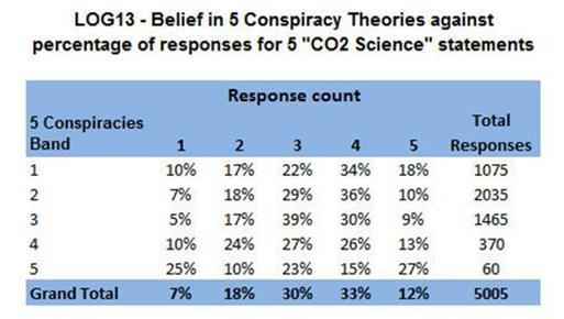
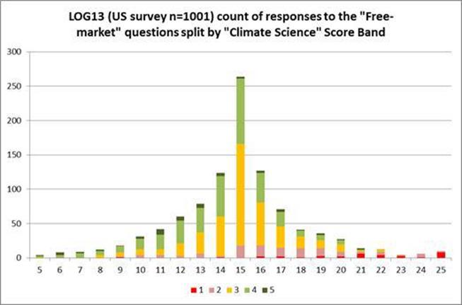
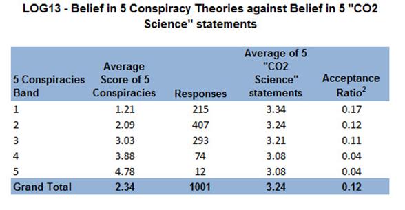
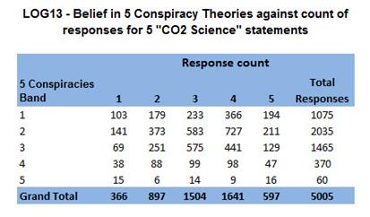
In LOG13 there is a distinct relationship here – the stronger the belief in conspiracy theories, the lower the belief in climate science. But hold on. A score of 3 is neutral, and 5 is total acceptance. The difference is between very lukewarm acceptance and virtually no opinion either way. To claim rejection is misleading. However, the result appears to contradict the previous result the three scientific hypotheses. To understand this result needs closer examination. There were 5 statements and 1001 responses, so 5005 total responses in total. Counting all the responses gives the following result4
To clarify, the “Grand Total” row shows that there were 366 scores of 1 in the 5 CO2 science statements. Of these 15 were by the 12 respondents who averaged a score of 5 in the conspiracy theories. The proportions I believe can be better seen by the percentage of responses in each row.
So 7% of all the 5005 responses were a score of 1. Of the 60 responses by the strongest believers in conspiracy theories, 25% were score of 1.
We get a similar result for belief climate science to belief in three well-accepted scientific hypotheses. Those with the most extreme opinions on conspiracy theories are those with the most extreme opinions on climate change. But there is a crucial difference, in that opinions on climate change are split between acceptance and rejection. The 12 respondents, who were the strongest believers in conspiracy theories, also had the highest proportion of 1s and 5s on the climate questions. The second most extreme group was the 215 respondents on the strong rejection group. The highest proportion of 3s, along with the lowest proportions of 1s and 5s were those in middle band on conspiracy theories. Holding strong opinions on conspiracy theories seems to be a predictor of strong opinions on climate science, but not a predictor of whether that is strong belief or strong rejection.
Corroboration of the result
The results of the internet survey confirm something about people in the United States that I and many others have suspected – they are a substantial minority who love their conspiracy theories. For me, it seemed quite a reasonable hypothesis that these conspiracy lovers should be both suspicious of science and have a propensity to reject climate science. Analysis of the survey results has over-turned those views. Instead I propose something more mundane – that people with strong opinions in one area are very likely to have strong opinions in others.
In relation to the United States, there is a paradox if you follow the “conspiracist ideation”. Along with being a hotbed of conspiracy theorists, the US is also home to 11 or 15 of the World’s top universities and much of the technological revolutions of the past 50 years originate. If science is about conformity and belief in the established expert opinion, this could not have happened.
Kevin Marshall
Notes
Five, non-science, conspiracy theories, in common to LOG12 and LOG13
CYMLK The assassination of Martin Luther King Jr. was the result of an organized conspiracy by U.S. government agencies such as the CIA and FBI.
CYMoon The Apollo moon landings never happened and were staged in a Hollywood film studio.
CYJFK The assassination of John F. Kennedy was not committed by the lone gunman Lee Harvey Oswald but was rather a detailed organized conspiracy to kill the President.
CY911 The U.S. government allowed the 9–11 attacks to take place so that it would have an excuse to achieve foreign (e.g., wars in Afghanistan and Iraq) and domestic (e.g., attacks on civil liberties) goals that had been determined prior to the attacks.
CYDiana Princess Diana’s death was not an accident but rather an organised assassination by members of the British royal family who disliked her.
Acceptance Ratio
Comparing the average scores across the two surveys can be confusing where there are a different number of options. The acceptance ratio makes average scores comparable where there are a large number of responses. Strong acceptance scores 1, strong rejection -1 and the mid-point 0.
Climate Science
LOG 12 had four questions on Climate science
CO2TempUp I believe that burning fossil fuels increases atmospheric temperature to some measurable degree
CO2AtmosUp I believe that the burning of fossil fuels on the scale observed over the last 50 years has increased atmospheric temperature to an appreciable degree
CO2WillNegChange I believe that the burning of fossil fuels on the scale observed over the last 50 years will cause serious negative changes to the planet’s climate, unless there is a substantial switch to non-CO2 emitting energy sources
CO2HasNegChange I believe that the burning of fossil fuels on the scale observed over the last 50 years has caused serious negative changes to the planet’s climate
LOG 13 had five questions on Climate science
CNatFluct I believe that the climate is always changing and what we are currently observing is just natural fluctuation. (R)
CdueGHG I believe that most of the warming over the last 50 years is due to the increase in greenhouse gas concentrations.
CseriousDamage I believe that the burning of fossil fuels over the last 50 years has caused serious damage to the planet’s climate.
CO2causesCC Human CO2 emissions cause climate change.
HumansInsign Humans are too insignificant to have an appreciable impact on global temperature. (R)
Response Count
To replicate my response table, create a pivot table for count of responses for each of the climate change statements. Make the conspiracy bands the row labels, and a climate statement as the column label. Add the results together.
Australian Climate Madness blog points to an article, “Wrong way, go back“, in the Australian Newspaper by Skeptical Environmentalist Bjorn Lomberg on Australia’s climate policies. This is my comment.
This statement in the article is significant
When economists estimate the net damage from global warming as a percentage of gross domestic product, they find it will indeed have an overall negative impact in the long run but the impact of moderate warming (1C-2C) will be beneficial. It is only towards the end of the century, when temperatures have risen much more, that global warming will turn negative.
Now consider the Apocalypse Delayed? posting of March 28th. Referring to an Economist article, it says that a number of empirical studies show that climate sensitivity is much lower than the climate models assume. Therefore, moving into the net cost range seems much less likely.
But why are there net costs? Lomberg’s calculations are based on William Nordhaus’s DICE model that
calculates the total costs (from heat waves, hurricanes, crop failure and so on) as well as the total benefits (from cold waves and CO2 fertilisation).
I would claim that the destablisation of the planet’s climate by rapid warming has very little evidence. Claims in AR4 that hurricanes were getting worse; that some African countries would see up to a 50% reduction in crop yields by 2020; that the Himalayan Glaciers would largely disappear by 2035; that the Amazon rainforest could catastrophically collapse – all have been over-turned.
Thus the policy justification for avoiding climate catastrophe as a result rising greenhouse gases is a combination of three components. First, a large rise in temperatures. Second, the resulting destablisation of the climate system having net adverse consequences. Third, is that the cost of constraining the rise in greenhouse gases is less than the cost of doing nothing.
It is only this third aspect that Bjorn Lomberg deals with. Yet despite that he shows that the Australian Government is not “saving the planet for future generations”, but causing huge net harm. Policy-making should consider all three components.
That is, there are three components to the policy justification to combatting “climate change” by constraining the growth in greenhouse gas emissions
That there will be a significant amount of global warming.
That this is net harmful to the planet and the people on it.
That the net harm of policies is less than the net harm of warming. To use a medical analogy, the pain and risks of treatment are less than the disease.
Lomberg, using the best cost model available, comes up with far less costs of global warming than, say, the Stern Review of 2006. He also uses actual policy costs to assess the net harm of global warming. Lomberg does not, however, challenge the amount of warming from a given quantity of CO2 rise, nor the adverse consequences of that warming. The Economist article and editorialof March 30th conversely challenges the quantity of warming from arising from a given rise in CO2, but just sees it as “apocalypse delayed” and not “apocalypse debunked“.
A new paper in PNAS entitled ‘Using data to attribute episodes of warming and cooling in instrumental records’ looks important. Ka-Kit Tung and Jiansong Zhou of the University of Washington report that anthropogenic global warming has been overcooked. A lot.
My comment was:-
My prediction is that this paper will turn out to have exaggerated the anthropogenic influence, rather than have under-estimated it.
The relevant quote:-
The underlying net anthropogenic warming rate in the industrial era is found to have been steady since 1910 at 0.07–0.08 °C/decade
Greenhouse gas emissions have not been increasing at a steady rate. The most important is CO2. A couple of years ago I tried to estimate from country data (filling in important gaps) how global CO2 emissions had increased. The increases per quarter century were
1900-1925 85%
1925-1950 60%
1950-1975 185%
1975-2000 45%
That meant global CO2 emissions increased more than 12 times (1100%) in 100 years. The conversion rate to retained CO2 seems to be roughly constant – 4Gt of carbon equivalent to increase CO2 levels by 1ppm. Furthermore, the C20th warming was nearly all in two phases. 1910-1945 and 1975-1998. Rather than temperature rise being related to CO2 emissions, it seems out of step. That would imply a combination of two things for the anthropogenic warming rate to be constant at 0.07–0.08 °C/decade. First is that CO2 has massively diminishing returns. Second is that CO2 emissions alone have a much smaller impact on the global average temperature changes (as reported in HADCRUT4), than this paper concludes.
Supplementary Information
This source of the emissions data is
Boden, T.A., G. Marland, and R.J. Andres. 2010. Global, Regional, and National Fossil-Fuel CO2 Emissions. Carbon Dioxide Information Analysis Center, Oak Ridge National Laboratory, U.S. Department of Energy, Oak Ridge, Tenn., U.S.A. doi 10.3334/CDIAC/00001_V2010
The CO2 levels are for Mauna Loa back to 1959, and estimated backwards from there to 1780.
The above chart shows by estimated CO2 emissions (expressed in units of 10Gt of carbon equivalents) shown as against the HADCRUT3 data set. This shows a slow rate of increase in CO2 emissions in the first half of the twentieth century, with falls in emissions during the Great Depression (1929-1933) and at the end of the Second World War (1945). From 1950 to 1973 there was a huge upsurge in emissions with the post-war economic boom, then stalls in 1973 (The OPEC oil embargo) and 1980-83 (global recession). After 2000 there was another surge in emissions, mostly due to rapid growth in China.
The temperature increases followed a different pattern. There were two periods of increasing temperatures in the twentieth century – From 1910-1945 and 1975-1998. The decadal changes graph below shows clearly the change in emissions. The temperature changes by decade exaggerate the falls in temperature in the Edwardian decade and the 1940s.
What is clearly illustrated is why I believe the anthropogenic influence on temperature was not similar in every decade from 1910, as Ka-Kit Tung and Jiansong Zhou claim.
One of the two references is to the care2 website.
Consider the three alleged “links” between climate change and obesity that Dr Curry summarised:-
Rising inactivity rates because of hot temperatures
Drought-induced high prices on healthy foods
Food insecurity promotes unhealthy food choices
Rising inactivity is commonly thought to be due to less manual work, the rise of the car and evermore staring at the TV or computer. If a rise of 0.8C in temperature were a major factor then in Britain you would see (for instance) the Scots being more active than those in the South of England, or people being more active in winter than summer. In both cases the opposite is true.
Drought-induced high prices would have to show that droughts were the main cause of high prices of health foods compared to junk foods. Maybe convenience and taste have something more to do with the preference for unhealthy diets. Also you would need to show that rising food prices are connected to decreasing crop yields. Biofuels may have more with the rising food prices.
Food insecurity diminishes as per capita income rises, whilst obesity increases. That is the poorest of the world have hunger as a problem, whilst the rich countries have obesity as a growing problem. Obesity may be a problem of the poor in the developed nations, but food as a whole is not a problem.
The above article is a very extreme example of
The underdetermination thesis – the idea that any body of evidence can be explained by any number of mutually incompatible theories
Kuhn Vs.Popper: The Struggle for the Soul of Science – Steve Fuller 2003 Page 46.
There is an interesting response by Profs Richard Tol and Roger Pielke Jnr on the latter’s blog to an article in the FT by Lord Stern on energy companies being overvalued
Have Markets Misvalued Energy Companies?
Roger Pielke Jr. and Richard Tol
Writing in the Financial Times (Dec. 9) Lord Stern of Brentford suggests that the financial markets have grossly misjudged the valuation of companies that produce fossil fuels, writing, “the market has either not thought hard enough about the issue or thinks that governments will not do very much.” Stern argues that the misjudgment poses a “risk to the balance sheets of large companies – or to the planet, or both.”
Have markets misvalued energy companies? While markets are of course not perfect, for two reasons we believe that in this instance there is no evidence to suggest that the valuation of fossil fuel producers has been grossly misjudged.
First, let us assume that governments around the world decide to take swift and effective action to reduce emissions. Would this mean that fossil fuel companies would go out of business in the near term? No.
Consider the case of Apple. Apple’s revenues depend upon selling products that will be obsolete within years and historical relics in a generation. That does not stop the company from being among the most highly valued in the world. If the world transitions to carbon free energy supply, the big energy producers of today are likely to play a big role.
Under all scenarios for future energy consumption the world is going to need vastly more energy and – whether governments act to decarbonize or not – vastly different types of energy too. Energy majors are so highly valued not simply because of the fossil fuel reserves they own, but because they have the expertise to supply energy at a massive scale along with a track record of successful and rapid innovation, with the ongoing shale gas and ultradeep oil revolutions as the latest examples.
Second, what if governments fail to deeply cut emissions? Might the impacts of unmitigated climate change lead to a dramatic reduction in the valuation of fossil fuel companies?
According to the work of Nick Stern himself this seems highly unlikely. In his famous review of climate change Stern argued that unmitigated climate change might reduce global GDP by as much as 20% by 2100. Using Stern’s own numbers for the most extreme impacts would mean that instead of growing by 2.5% per year to 2100, GDP would grow by 2.24%, with the largest effects occurring at the end of the century. This hardly seems cause for a dramatic revaluation of fossil fuel companies today.
The impacts estimated by Stern on behalf of the British government are very pessimistic compared to the estimates found in the academic literature. Furthermore, changes in the growth rate of the economy have a muted impact on the growth in energy demand.
Indeed, future demand for energy is largely insensitive to whether governments decide to act on climate change. The more than 1.5 billion people without reliable access to electricity will demand access regardless. A world with unmitigated climate change could in fact be more energy intensive, for instance if more people demand air conditioning. In either case the future for energy companies would be bright.
Humans affect the climate system and it is important for policy makers to respond. But it is unlikely that efforts to second guess the market valuation of energy companies will contribute to such responses. Of course, if Nick Stern really believes that energy companies have been grossly over-valued he could put his money where his convictions lie. Who knows, he may one day be the subject of the sequel to the Big Short. Roger Pielke Jr. is a professor at the University of Colorado. Richard Tol is a professor at the Economic and Social Research Institute in Dublin and at the Vrije Universiteit in Amsterdam.
My own comment is
The Stern review was not only criticized for being too concerned with the more extreme scenarios, but for applying a near zero discount rate. Whatever the economist’s policy-related arguments over discount rates (and Prof. Tol uses 3% plus), the market valuations of share prices are based upon much, much higher discount rates. This is for good reason. Suppose at the end of 1911 someone could have known that there would be an oil embargo in 1973, resulting from a cartel of oil-producing nations usurping the considerable power of the oil companies. What should have been the discount factor on the 1911 price of oil stocks considering in the interim there were two world wars, between which there was a massive global depression? Even if this was the case the local market factors (such as the emergence of the car industry, global growth, the development of the internal combustion engine and the relative fall in the oil price against coal) were far more important than the historical events. I would contend that in 1911, even if were highly likely that an oil company would be rendered bankrupt 60 years later, the discount factor on the share price would be approximately zero.
Furthermore, since the Stern review the scientific evidence has consistently failed to support the more alarmist scenarios resulting from any further warming (e.g. rapid melting of the Himalayan Glaciers or increased severity of hurricanes), nor for extreme temperature rises resulting from positive feedbacks to the CO2 induced warming. To the outsider looking at the emerging evidence, the cost impact of do-nothing scenarios (weighted by risk) is many times lower than when the Stern Review or AR4 were being published.
I fully realise that your comments were moderated to increase the chance of publication. However, if a more balanced version of Stern were done on today’s evidence, I firmly believe that (like Prof. Tol has concluded) current proposed mitigation policies do not have any form of benefit-cost justification.
Lord Stern might be a distinguished climate change activist, but he falls into the same trap of the amateur armchair activist. By seeing the world from their own narrow perspective, they misread the wider opinions and the facts of the real world. It is when such people acquire positions of power, with immoderate views not softened by political experience, that they can become deniers of reality and haters of sections of the community.
Wm Briggs reports on a “forthcoming Bulletin of the American Meteorological Society paper “Making the climate a part of the human world”, in which University of British Columbia geographer Simon Donner argues that religion is the cause of global warming denial. ” (Pre-publication copy here)
Simon Donner’s Views
Donner’s Summary is
“Ongoing public uncertainty about climate change is rooted in a perceived conflict between the scientific evidence for a human role in the climate and a common belief that the weather and climate are controlled by higher powers.”
This is backed up by a number of studies of religions, both ancient and primitive religions from various parts of the world. This includes from Fiji and Papua New Guinea. I can find no reference to the major religions of Islam, Hinduism or Buddhism. There is only one biblical reference, from the Old Testament book of Job, but none from the New Testament – the stories about Jesus and his disciples. Neither is there a distinction between Catholicism and Protestantism, nor a split between evangelical and liberal protestants.
The Religious Sceptics in USA
The majority of the religious sceptics in the USA are the Protestant Evangelicals. Their type of Christianity is centred on biblical study, both individually and corporately, to perceive the revealed word of God and the interpretation for current circumstances. There are the specialists – the ordained pastors – who provide interpretations through sermons. However, this is just the lead for personal study and reflection.
Collectively, these evangelicals are not unified body theologically. For instance, a quick comparison of the Southern Baptist Convention and the Assemblies of God websites will quickly demonstrate the point. Nor are there strong ecumenical links between the major churches, as found in Britain.
This bible-based view of Christianity comes directly from the Reformation. In medieval Europe the Bible was handwritten and only available in Latin. With most people illiterate, reading of the Bible was limited to a few dedicated scholars, with interpretation highly centralised and strictly controlled. Any deviation was treated as heresy, often punishable by death. A combination of the advent of printing and translation into the vernacular suddenly made the word of God accessible to a much wider population. It soon became evident that the established religious orthodoxy was, in many places, unsupported from the sacred text and in some cases fundamentally at odds with that text. It was this need to study that changed public worship so dramatically, with teaching replacing the Mass as the centrepiece.
Politically, access to the Bible democratised understanding and the questioning of authority and centralised power. This gave a scholarly impetus to the development of modern science, and also the Liberal political philosophy of John Locke and the Scottish Enlightenment that in turn heavily influenced the Founding Fathers.
An Alternative Thesis
Evangelicals have as their primary resource the Bible and the interpretation of God’s purpose from within their local congregation. Your average church member will have quite a detailed knowledge of the Bible, being able to quote much of the primary doctrine and some major passages. Generally they also “cherish and defend religious liberty, and deny the right of any secular or religious authority to impose a confession of faith upon a church or body of churches.“ (Southern Baptist Convention). The scepticism towards climate change comes from its presentation. It comes across as a core doctrine that is agreed upon by a consensus of leading scientists. But the truth cannot be perceived by the lay person, but only revealed by impenetrable computer models to scientific experts. Any deviation or questioning of core doctrine is treated with contempt and as a heresy. Yet the high scientific standards that these experts are supposed to follow has been found wanting. There are two areas where this is demonstrated most.
First, the poster hockey stick of a decade ago – showing global temperatures were dramatically higher than at an time in the last millennium – was investigated by the Steve McIntyre. He showed the results were as a result of a number of elements including cherry picking data; giving undue weighting to favourable results; excluding some unfavourable data points; failing to apply proper statistical tests. A book charting this episode is found here, and my comparison of an exchange following a savage book review is here.
Second is the Climategate email release, which showed that the core scientists were a fairly small group, that they viewed the science as far from settled, and they adhered to lower standards of scholarship than was the public perception.
The Inferences from the Donner Paper
Donner has either little understanding of mainstream Christianity in the USA, or he deliberately misrepresents what it stands for. In so doing, he not only completely misses the point of why religious Americans are sceptical but does so in such a way that will make them more antagonistic. The fact that peer review should allow through a paper that clearly does not have proper argument to support the thesis shows a failure to of that process. That a person with no qualifications or prior publishing record in the field of sociology or theology should be allowed to publish on the subject in a journal specialising in the weather shows how far climate science is straying beyond its area of competency. For Christians who unsure of the global warming arguments, clear evidence that a climate scientist not knowing what they are talking about will make them more sceptical. They will be more likely to accept the sceptical comments that the science is flawed, whether the theory, the computer models or the statistics.


