Increasing Extreme Weather Events?

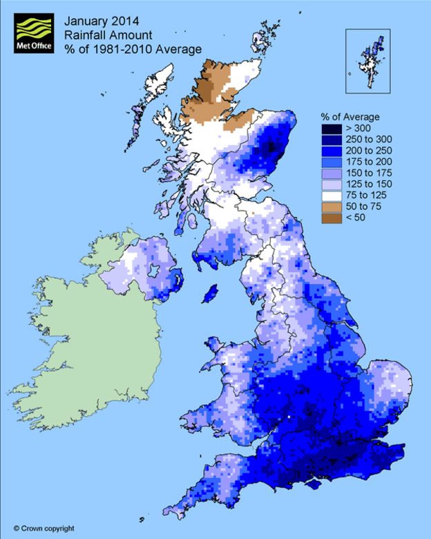
Over at Cliscep, Ben Pile posted Misleading Figures Behind the New Climate Economy. Ben looked at the figures behind the recent New Climate Economy Report from the Global Commission on the Economy and Climate, which claims to be

… a major international initiative to examine how countries can achieve economic growth while dealing with the risks posed by climate change. The Commission comprises former heads of government and finance ministers and leaders in the fields of economics and business, and was commissioned by seven countries – Colombia, Ethiopia, Indonesia, Norway, South Korea, Sweden and the United Kingdom – as an independent initiative to report to the international community.

In this post I will briefly look at Figure 1 from the report, re-posted by Ben Pile.

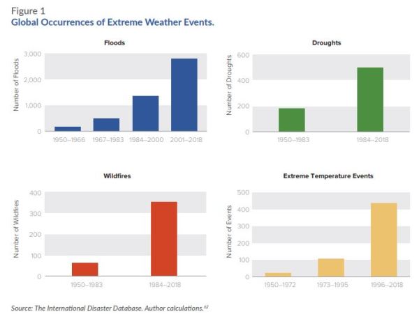
Fig 1 – Global Occurrences of Extreme Weather Events from New Economy Climate Report

Clearly these graphs seem to demonstrate a rapidly worsening situation. However, I am also aware of a report a few years ago authored by Indur Goklany, and published by The Global Warming Policy Foundation  – GLOBAL DEATH TOLL FROM EXTREME WEATHER EVENTS DECLINING

Figure 2 : From Goklany 2010 – Global Death and Death Rates Due to Extreme Weather Events, 1900–2008. Source: Goklany (2009), based on EM-DAT (2009), McEvedy and Jones (1978), and WRI (2009).


Note that The International Disaster Database is EM-DAT. The website is here to check. Clearly these show two very different pictures of events. The climate consensus (or climate alarmist) position is that climate change is getting much worse. The climate sceptic (or climate denier) position is that is that human-caused climate change is somewhat exaggerated. Is one side outright lying, or is their some truth in both sides?

Indur Goklany recognizes the issue in his report. His Figure 2, I reproduce as figure 3.

Figure 3: Average Number of Extreme Weather Events per Year by Decade, 1900–2008.  Source: Goklany (2009), based on EM-DAT (2009).

I am from a management accounting background. That means that I check my figures. This evening I registered at the EM-DAT website and downloaded the figures to verify the data. The website looks at all sorts of disaster information, not just climate information. It collates

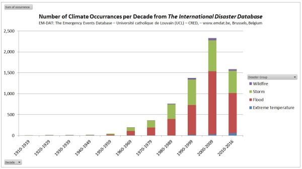
Figure 4 : No of Climatic Occurrences per decade from EM-DAT. Note that 2010-2016 pro rata is similar to 2000-2009

The updated figures through to 2016 show that pro rata, in the current decade occurrences if climate-related events as similar to the last decade. If one is concerned about the human impacts, deaths are more relevant.

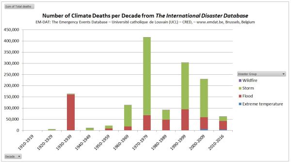
Figure 5 : No of Climatic Deaths per decade from EM-DAT. Note that 2010-2016 pro rata is similar to 2000-2009

This shows unprecedented flood deaths in the 1930s. Of the 163218 flood deaths in 6 occurrences, 142000 were due to a flood in China in 1935. Wikipedia’s Ten deadliest natural disasters since 1900 lists at No.8 1935 Yangtze river flood, with 145000 dead. At No.1 is 1931 China floods with 1-4 million deaths. EM-DAT has not registered this disaster.

The decade 1970-1979 was extreme for deaths from storms. 300000 deaths were due to a Bangladesh storm in 1970. Wikipedia’s Ten deadliest natural disasters since 1900 lists at No.2 1970 Bhola cyclone, with ≥500,000.

The decade 1990-1999 had a high flood death toll. Bangladesh 1991 stands out with 138987 dead. Wikipedia No.10 is 1991 Bangladesh cyclone with 138866 dead.

In the decade 2000-2009 EM-DAT records the Myanmar Storm of 2008 with 138366 dead. If Wikipedia had a top 11 deadliest natural disasters since 1900, then Cyclone Nargis of 2 May 2008 could have made the list. From the BBC, with 200000 estimated dead, it would have qualified. But from the Red Cross 84500 Cyclone Nargis may have not made the top 20.

This leaves a clear issue of data. The International Disaster Database will accept occurrences of disasters according to clear criteria. For the past 20-30 years disasters have been clearly recorded. The build-up of a tropical cylone / hurricane is monitored by satellites and film crews are on hand to televise across the world pictures of damaged buildings, dead bodies, and victims lamenting the loss of homes. As I write Hurricane Florence is about to pound the Carolinas, and evacuations have been ordered. The Bhola Cyclone of 1970 was no doubt more ferocious and impacted on a far greater number of people. But the primary reason for the extreme deaths in 1970 Bangladesh was lack of warning and a lack of evacuation places. Even in the Wizard of Oz, based on 1930s United States, in a Tornado most families had a storm cellar. In the extreme poverty of 1970 Bangladesh there was nothing. Now, after decades of moderate growth and some rudimentary warning systems, it is unlikely that a similar storm would cause even a tenth of the death toll.

Even more significant, is that even if (as I hope) Hurricane Florence causes no deaths and limited property damage, it will be sufficiently documented to qualify for an entry on the International Disaster Database. But the quality of evidence for the 1931 China Floods, occurring in a civil war between the Communists and the Kuomintang forces, would be insufficient to qualify for entry. This is why one must be circumspect in interpreting this sort of data over periods when the quality and availability of data varies significantly. The issue I have is not with EM-DAT, but those who misinterpret the data for an ideological purpose.

Kevin Marshall

Met Office Extreme Wet Winter Projections

I saw an article in the Telegraph

Met Office warns Britain is heading for ‘unprecedented’ winter rainfall, with records broken by up to 30pc 

Britain is heading for “unprecedented” winter rainfall after the Met Office’s new super computer predicted records will be broken by up to 30 per cent.

Widespread flooding has hit the UK in the past few years leading meteorologists to search for new ways to “quantify the risk of extreme rainfall within the current climate”.

In other words, the Telegraph reporting that the Met Office is projecting that if the current record is, say, 100mm, new records of 130mm could be set.

BBC is reporting something slightly different

High risk of ‘unprecedented’ winter downpours – Met Office

There is an increased risk of “unprecedented” winter downpours such as those that caused extensive flooding in 2014, the UK Met Office says.

Their study suggests there’s now a one in three chance of monthly rainfall records being broken in England and Wales in winter.

The estimate reflects natural variability plus changes in the UK climate as a result of global warming.

The BBC has a nice graphic, of the most extreme winter month of recent years for rainfall.

The BBC goes onto say

Their analysis also showed a high risk of record-breaking rainfall in England and Wales in the coming decade.

“We found many unprecedented events in the model data and this comes out as a 7% risk of a monthly record extreme in a given winter in the next few years, that’s just over Southeast England,” Dr Vikki Thompson, the study’s lead author told BBC News.

“Looking at all the regions of England and Wales we found a 34% chance of an extreme event happening in at least one of those regions each year.”

Not only is there a greater risk, but the researchers were also able to estimate that these events could break existing records by up to 30%.

“That is an enormous number, to have a monthly value that’s 30% larger, it’s a bit like what we had in 2014, and as much again,” said Prof Adam Scaife from the Met Office.

The 30% larger is an outlier.

But over what period is the record?

The Met Office website has an extended version of what the BBC reports. But strangely no figures. There is a little video by Dr Vikki Thomson to explain.

She does say only recent data is used, but no definition of what constitutes recent. A clue lies not in the text, but an explanatory graphic.

It is from 35 years of winters, which ties into the BBC’s graphic from 1981. There are nine regions in England and Wales by the Met Office definition. The tenth political region of London is included in the South East. There could be different regions for the modeling. As Ben Pile and Paul Homewood pointed out in the comments to the Cliscep article, elsewhere the Met Office splits England and Wales into six regions. What is amazing is that the Met Office article does not clarify the number of regions, still less show the current records in the thirty-five years of data. There is therefore no possibility of ever verifying the models.

Put this into context. Northern Ireland and Scotland are excluded, which seems a bit arbitrary. If rainfall was random, then the chance of this coming winter setting a new record in a region is nearly 3%. For any one of nine regions, if data rainfall data independent between regions (which it is not) it is nearly a 26% chance. 34% is higher. But consider the many alternatives ways for the climate patterns to become more extreme and variable. After all, with global warming there climate could be thrown into chaos, so more extreme weather should be emerging as a foretaste of much worse to come. Given the many different aspects of weather, there could be hundreds of possible ways climate could get worse. With rainfall, it could be wetter or drier, in either summer or winter. That is four variables, of which the Met Office choose just one. Or could be in any 1, 2, 3… or 12 month period. Then again, climate change could mean more frequent and violent storms, such as that of 1987. Or it could mean more heatwaves. Statistically, heatwaves records could be a number of different ways, such as, say, 5 consecutive days in a month where the peak daily temperature is more than 5C about the long-term monthly average peak temperature.
So why choose rainfall in winter? Maybe it is because in recent years there have been a number of unusually wet winters. It looks like the Met Office, for all the power of their mighty computers, have fallen for a common fallacy.


Texas sharpshooter fallacy is an informal fallacy which is committed when differences in data are ignored, but similarities are stressed. From this reasoning, a false conclusion is inferred. This fallacy is the philosophical/rhetorical application of the multiple comparisons problem (in statistics) and apophenia (in cognitive psychology). It is related to the clustering illusion, which refers to the tendency in human cognition to interpret patterns where none actually exist.
The name comes from a joke about a Texan who fires some gunshots at the side of a barn, then paints a target centered on the tightest cluster of hits and claims to be a sharpshooter.

A run of extremely wet winters might be due to random clustering, or it could genuine patterns from natural variation, or it could be a sign of human-caused climate change. An indication of random clustering would be to look at many other the different aspects of weather, to see if there is a recent trend of emerging climate chaos. Living in Britain, I suspect that the recent wet weather is just drawing the target around the tightest clusters. Even then, high winter rainfall in Britain high rainfall this is usually accompanied by slightly milder temperatures than average. Extreme winter cold is usually on cloud-free days. So, if winter rainfall is genuinely getting worse it seems that the whole global warming thing for Britain is predicted to become a bit a damp squib.

Kevin Marshall


Climate Journalists now out of line with scientists

Judith Curry has reviewed the major climate stories of 2012. She notes

The theme of these seems to be dangerous impacts of climate change, bypassing of course the issue of attribution of these events.  Maybe the big story is that a critical mass of bad weather events happened in the U.S., so we are experiencing in the U.S. another round of what we experienced post Katrina in terms of elevating concern about global warming.

The leaked draft AR5 SPM Page 3 Lines 46-47

Changes in many extreme weather and climate events have been observed, but the level of confidence in these changes varies widely depending on type of extreme and regions considered.

The leaked draft AR5 SPM Page 4 Lines 10-11

There is low confidence in observed large-scale trends in drought, due to lack of direct observations, dependencies of inferred trends on the index choice, and geographical inconsistencies in the trends

The leaked draft AR5 SPM Page 4 Lines 14-16

Tropical cyclone data provides low confidence that any reported long-term changes are robust, after accounting for past changes in observing capabilities. This is a revision from previous IPCC Assessments Reports…

Are the commentators going to come into line with the consensus of scientific opinion, or will it be the other way round? Maybe, like in the disaster movies, they will continue to insist to believe that the world only consists of USA.

For those who still think that extreme weather is still increasing, check out the Wattupwiththat “Extreme Weather” page. In particular take a look at Ryan Maue’s accumulated cyclone energy graph.

Adelaide – a decline in extreme heatwaves?

Joanne Nova has posted data from Ian Hill on extreme heatwaves in Adelaide, Australia. To quote

It’s another mindless record used to remind the public to “keep the faith” and recite the litancy:

“Adelaide had it’s hottest start to the year since 1900 Sky news

Picking three particular days out of 365 and comparing them over a century is about as cherry-pickingly meaningless as it gets. But Ian Hill went back through the records to find that not only have there been 79 heatwaves in Adelaide since 1887, but there have been 51 heat-waves that were hotter since 1887.

I have done a bit of number crunching of my own, that is quite revealing. Higher temperatures are meant to lead to more extreme heatwaves. Using Ian Hill’s figures Adelaide is providing an exception. Hill’s definition of a heatwave is 3 or more consecutive days where the maximum temperature exceeds 38oC. I have downloaded the figures and categorised by decade. There are two ways I have analysed this data. First is by the number of heatwaves per decade. Second is the number of days per decade.


There are a number of points.

  1. The temperature data only starts in 1887, so the 1880s are probably more significant.
  2. The current decade might be more significant.
  3. Last decade, beginning 2000 was no more significant than the decades 1890s, 1900s, or 1930s.
  4. The 1990s was no more significant than the decades 1910s and 1920s

Is there, however, a revival of extreme heatwaves in the last twenty years?

Nope. Just a couple of extreme years in 2008 and 2009.