Hansen’s 1988 Scenario C against Transient Climate Response in IPCC TAR 2001

In a recent comment at Cliscep Jit made the following request

I’ve been considering compiling some killer graphs. A picture paints a thousand words, etc, and in these days of short attention spans, that could be useful. I wanted perhaps ten graphs illustrating “denialist talking points” which, set in a package, would be to the unwary alarmist like being struck by a wet fish. Necessarily they would have to be based on unimpeachable data.

One of the most famous graphs in climate is of the three scenarios used in Congressional Testimony of Dr James Hansen June 23 1988. Copies are poor, being copies of a type-written manuscript. The following is from SeaLevel.info website.

Fig 3 of Hansen’s Congressional Test June 23 1988

The reason for choosing this version rather than the clearer version in the paper online is that the blurb contains the assumptions behind the scenarios. In particular “scenario C drastically reduces trace gas emissions between 1990 and 2000.” In the original article states

scenario C drastically reduces trace gas emissions between 1990 and 2000 such that greenhouse forcing ceases to increase after 2000.

In current parlance this is net zero. In the graph this results in temperature peaking about 2007.

In the IPCC Third Assessment Report (TAR) 2001 there is the concept of Transient Climate Response.

TAR WG1 Figure 9.1: Global mean temperature change for 1%/yr CO2 increase with subsequent stabilisation at 2xCO2 and 4cCO2. The red curves are from a coupled AOGCM simulation (GFDL_R15_a) while the green curves are from a simple illustrative model with no exchange of energy with the deep ocean. The transient climate response, TCR, is the temperature change at the time of CO2 doubling and the equilibrium climate sensitivity, T2x, is the temperature change after the system has reached a new equilibrium for doubled CO2, i.e., after the additional warming commitment has been realised.

Thus, conditional on CO2 rising at 1% a year and the eventual warming from a doubling of CO2 being around 3C, then at the point when doubling has been reached temperatures will have risen by about 2C. From the Mauna Loa data annual average CO2 levels have risen from 316 ppm in 1959 to 414 ppm in 2020. That is 31% in 60 years or less than 0.5% a year. Assuming 3C of eventual warming from a CO2 doubling then the long time period of the transient climate response

  • much less than 1C of warming could so far have resulted from the rise in CO2 since 1959
  • it could be decades after net zero is achieved that warming will cease.
  • the rates of natural absorption of CO2 from the atmosphere are of huge significance.
  • Calculation of climate sensitivity even with many decades CO2 data and temperature is near impossible unless constraining assumptions are made about the contribution of natural factors; the rate of absorption of CO2 from the atmosphere; outgassing or absorption of CO2 by the oceans; & the time period for the increase in temperatures from actual rates of CO2 increase.
  • That is, change in a huge number variables within a range of acceptable mainstream beliefs significantly impacts the estimates of emissions pathways to constrain warming to 1.5C or 2C.
  • If James Hansen in 1988 was not demonstrably wrong false about the response time of the climate system and neither is TAR on the transient climate response, then it could be not be possible to exclude within the range of both the possibility that 1.5C of warming might not be achieved this century and that 2C of warming will be surpassed even if global net zero emissions is achieved a week from now.

Kevin Marshall

Milk loss yields down to heat stress

Last week, Wattupwiththat post “Climate Study: British Children Won’t Know What Milk Tastes Like”. Whilst I greatly admire Anthony Watts, I think this title entirely misses the point.
It refers to an article at the Conservation “How climate change will affect dairy cows and milk production in the UK – new study” by two authors at Aberystwyth University, West Wales. This in turn is a write up of a Plos One article published in May “Spatially explicit estimation of heat stress-related impacts of climate change on the milk production of dairy cows in the United Kingdom“. The reason I disagree is that even with very restrictive assumptions, this paper shows that even with large changes in temperature, the unmitigated costs of climate change are very small. The authors actually give some financial figures. Referring to the 2190s the PLOS One abstract ends:-

In the absence of mitigation measures, estimated heat stress-related annual income loss for this region by the end of this century may reach £13.4M in average years and £33.8M in extreme years.

The introduction states

The value of UK milk production is around £4.6 billion per year, approximately 18% of gross agricultural economic output.

For the UK on average Annual Milk Loss (AML) due to heat stress is projected to rise from 40 kg/cow to over 170 kg/cow. Based on current yields it is from 0.5% to 1.8% in average years. The most extreme region is the south-east where average AML is projected to rise from 80 kg/cow to over 320 kg/cow. That is from 1% to 4.2% in average years. That is, if UK dairy farmers totally ignore the issue of heat stress for decades the industry could see average revenue losses from heat stress rise on average from £23m to £85m. The financial losses are based on constant prices of £0.30 per litre.

With modeled estimates over very long periods, it is worth checking the assumptions.

Price per liter of milk

The profits are based upon a constant price of £0.30 a liter. But prices can fluctuate according to market conditions. Data on annual average prices paid is available from AHDB Dairy, ” a levy-funded, not-for-profit organisation working on behalf of Britain’s dairy farmers.” Each month, since 2004, there are reported the annual average prices paid by dairies over a certain size available here. That is 35-55 in any one month. I have taken the minimum and maximum prices for reported in June each year and shown in Figure 1.

Even annual average milk prices fluctuate depending on market conditions. If milk production is reduced in summer months due to an unusual heat wave causing heat stress, ceteris paribus, prices will rise. It could be that a short-term reduction in supply would increase average farming profits if prices are not fixed. It is certainly not valid to assume fixed prices over many decades.

Dumb farmers

From the section in the paper “Milk loss estimation methods

It was assumed that temperature and relative humidity were the same for all systems, and that no mitigation practices were implemented. We also assumed that cattle were not significantly different from the current UK breed types, even though breeding for heat stress tolerance is one of the proposed measures to mitigate effects of climate change on dairy farms.

This paper is looking at over 70 years in the future. If heatwaves were increasing, so yields falling and cattle were suffering, is it valid to assume that farmers will ignore the problem? Would they not learn from areas with more extreme heatwaves in summer elsewhere such as in central Europe? After all in the last 70 years (since the late 1940s) breeding has increased milk yields phenomenally (from AHDB data, milk yields per cow have increased 15% from 2001/2 to 2016/7 alone) so a bit of breeding to cope with heatwaves should be a minor issue.

The Conversation article states the implausible assumptions in a concluding point.

These predictions assume that nothing is done to mitigate the problems of heat stress. But there are many parts of the world that are already much hotter than the UK where milk is produced, and much is known about what can be done to protect the welfare of the animals and minimise economic losses from heat stress. These range from simple adaptations, such as the providing shade, to installing fans and water misting systems.

Cattle breeding for increased heat tolerance is another potential, which could be beneficial for maintaining pasture-based systems. In addition, changing the location of farming operations is another practice used to address economic challenges worldwide.

What is not recognized here is that farmers in a competitive market have to adapt in the light of new information to stay in business. That is the authors are telling farmers what they will be fully aware of to the extent that their farms conform to the average. Effectively assuming people and dumb, then telling them obvious, is hardly going to get those people to take on board one’s viewpoints.

Certainty of global warming

The Conversation article states

Using 11 different climate projection models, and 18 different milk production models, we estimated potential milk loss from UK dairy cows as climate conditions change during the 21st century. Given this information, our final climate projection analysis suggests that average ambient temperatures in the UK will increase by up to about 3.5℃ by the end of the century.

This warming is consistent with the IPCC global average warming projections using RCP8.5 non-mitigation policy scenario. There are two alternative, indeed opposite, perspectives that might lead rational decision-makers to think this quantity of warming is less than certain.

First, the mainstream media, where the message being put out is that the Paris Climate Agreement can constrain global warming to 2°C or 1.5°C above the levels of the mid-nineteenth century. With around 1°C of warming already if it is still possible to constrain additional global warming to 0.5°C, why should one assume that 3.5°C of warming for the UK is more than a remote possibility in planning?

Second, one could look at the track record of global warming projections from the climate models. The real global warming scare kicked-off with James Hansen’s testimony to Congress in 1988. Despite actual greenhouse gas emissions being closely aligned with rapid warming, actual global warming has been most closely aligned with the assumption of the impact of GHG emissions being eliminated by 2000. Now, if farming decision-makers want to still believe that emissions are the major driver of global warming, they can find plenty of excuses for the failure linked from here. But, rational decision-makers tend to look at the track record and thus take consistent decision-makers with more than a pinch of salt.

Planning horizons

The Conversation article concludes

(W)e estimate that by 2100, heat stress-related annual income losses of average size dairy farms in the most affected regions may vary between £2,000-£6,000 and £6,000-£14,000 (in today’s value), in average and extreme years respectively. Armed with these figures, farmers need to begin planning for a hotter UK using cheaper, longer-term options such as planting trees or installing shaded areas.

This compares to the current the UK average annual dairy farm business income of £80,000 according to the PLOS One article.

There are two sides to investment decision-making. There are potential benefits – in this case avoidance of profit loss – netted against the potential benefits. ADHB Dairy gives some figures for the average herd size in the UK. In 2017 it averaged 146 cows, almost double the 75 cows in 1996. In South East England, that is potentially £41-£96 a cow, if the average herd size there is same as the UK average. If the costs rose in a linear fashion, that would be around 50p to just over a pound a year per cow in the most extreme affected region. But the PLOS One article states that costs will rise exponentially. That means there will be no business justification for evening considering heat stress for the next few decades.

For that investment to be worthwhile, it would require the annual cost of mitigating heat stress to be less than these amounts. Most crucially, rational decision-makers apply some sort of NPV calculation to investments. This includes a discount rate. If most of the costs are to be incurred decades from now – beyond the working lives of the current generation of farmers – then there is no rational reason to take into account heat stress even if global warming is certain.

Summary

The Paper Spatially explicit estimation of heat stress-related impacts of climate change on the milk production of dairy cows in the United Kingdom makes a number of assumptions to reach its headline conclusion of decreased milk yields due to heat stress by the end of the century. The assumption of constant prices defies the economic reality that prices fluctuate with changing supply. The assumption of dumb farmers defies the reality of a competitive market, where they have to respond to new information to stay in business. The assumption of 3.5°C warming in the UK can be taken as unlikely from either the belief Paris Climate Agreement with constrain further warming to 1°C or less OR that the inability of past climate projections to conform to the pattern of warming should give more than reasonable doubt that current projections are credible.  Further the authors seem to be unaware of the planning horizons of normal businesses. Where there will be no significant costs for decades, applying any sort of discount rate to potential investments will mean instant dismissal of any consideration of heat stress issues at the end of the century by the current generation of farmers.

Taking all these assumptions together makes one realize that it is quite dangerous for specialists in another field to take the long range projections of climate models and apply to their own areas, without also considering the economic and business realities.

Kevin Marshall 

Hansen et al 1988 Global Warming Predictions 30 Years on

Last month marked the 30th anniversary of the James Hansen’s Congressional Testimony that kicked off the attempts to control greenhouse gas emissions. The testimony was clearly an attempt, by linking human greenhouse emissions to dangerous global warming, to influence public policy. Unlike previous attempts (such as by then Senator Al Gore), Hansen’s testimony was hugely successful. But do the scientific projections that underpinned the testimony hold up against the actual data? The key part of that testimony was a graph from the Hansen et al 1988* Global climate changes as forecast by Goddard Institute for Space Studies three-dimensional model, produced below.

Figure 1: Hansen et al 1988 – Figure 3(a) in the Congressional Testimony

Note the language of the title of the paper. This is a forecast of global average temperatures contingent upon certain assumptions. The ambiguous part is the assumptions.

The assumptions of Hansen et. al 1988

From the paper.

4. RADIATIVE FORCING IN SCENARIOS A, B AND C

4.1. Trace Gases

  We define three trace gas scenarios to provide an indication of how the predicted climate trend depends upon trace gas growth rates. Scenarios A assumes that growth rates of trace gas emissions typical of the 1970s and 1980s will continue indefinitely; the assumed annual growth averages about 1.5% of current emissions, so the net greenhouse forcing increase exponentially. Scenario B has decreasing trace gas growth rates, such that the annual increase of the greenhouse climate forcing remains approximately constant at the present level. Scenario C drastically reduces trace gas growth between 1990 and 2000 such that the greenhouse climate forcing ceases to increase after 2000.

Scenario A is easy to replicate. Each year increase emissions by 1.5% on the previous year. Scenario B assumes that growth emissions are growing, and policy takes time to be enacted. To bring emissions down to the current level (in 1987 or 1988), reduction is required. Scenario C one presumes are such that trace gas levels are not increasing. As trace gas levels were increasing in 1988 and (from Scenario B) continuing emissions at the 1988 level would continue to increase atmospheric levels the levels of emissions would have been considerably lower than in 1988 by the year 2000. They might be above zero, as small amounts of emissions may not have an appreciable impact on atmospheric levels.

The graph formed Fig. 3. of James Hansen’s testimony to Congress. The caption to the graph repeats the assumptions.

Scenario A assumes continued growth rates of trace gas emissions typical of the past 20 years, i.e., about 1.5% yr-1 emission growth; scenario B has emission rates approximately fixed at current rates; scenario C drastically reduces traces gas emissions between 1990 and 2000.

This repeats the assumptions. Scenario B fixes annual emissions at the levels of the late 1980s, whilst scenario C sees drastic emission reductions.

James Hansen in his speech gave a more succinct description.

We have considered cases ranging from business as usual, which is scenario A, to draconian emission cuts, scenario C, which would totally eliminate net trace gas growth by year 2000.

Note that the resultant warming from fixing emissions at the current rate (Scenario B) is much closer in warming impacts to Scenario A (emissions growth of +1.5% year-on-year) than Scenario C that stops global warming. Yet Scenario B results from global policy being successfully implemented to stop the rise in global emissions.

Which Scenario most closely fits the Actual Data?

To understand which scenario most closely fits the data, we need to look at that trace gas emissions data. There are a number of sources, which give slightly different results. One source, and that which ought to be the most authoritative, is the IPCC Fifth Assessment Report WG3 Summary for Policy Makers graphic SPM.1 is reproduced in Figure 2.

 Figure 2 : AR5 WG3 SPM.1 Total annual anthropogenic GHG emissions (GtCO2eq/yr) by groups of gases 1970-2010. FOLU is Forestry and Other Land Use.

Note that in Figure 2 the other greenhouse gases – F-Gases, N2O and CH4 – are expressed in CO2 equivalents. It is very easy to see which of the three scenarios fits. The historical data up until 1988 shows increasing emissions. After that data emissions have continued to increase. Indeed there is some acceleration, stated on the graph comparing 2000-2010 (+2.2%/yr) with 1970-2000 (+1.3%/yr) . In 2010 GHG emissions growth were not similar to those in the 1980s (about 35 GtCO2e) but much higher. By implication, Scenario C, which assumed draconian emissions cuts is the furthest away from the reality of what has happened. Before considering how closely Scenario A compares to temperature rise, the question is therefore how close actual emissions have increased compared to the +1.5%/yr in scenario A.

From my own rough calculations, total GHG emissions from 1990 to 2010 rose about 29% or 1.3% a year, compared to 41% or 1.7% a year in the period 1970 to 1990. Exponential growth of 1.3% is not far short of the 1.5%. The assumed 1.5% growth rates would have resulted in 2010 emissions of 51 GtCO2e instead of the 49 GtCO2e estimated, well within the margin of error. That is actual trends over 20 years were pretty much the business as usual scenario. The narrower CO2 emissions from fossil fuels and industrial sources from 1990 to 2010 rose about 42% or 1.8% a year, compared to 51% or 2.0% a year in the period 1970 to 1990, above the Scenario A.

The breakdown is shown in Figure 3.

Figure 3 : Rough calculations of exponential emissions growth rates from AR5 WG1 SPM Figure SPM.1 

These figures are somewhat out of date. The UNEP Emissions Gap Report 2017 (pdf) estimated GHG emissions in 2016 at 51.9 GtCO2e. This represents a slowdown in emissions growth in recent years.

Figure 4 shows are the actual decadal exponential growth trends in estimated GHG emissions (with a linear trend to the 51.9 GtCO2e of emissions in 2016 from the UNEP Emissions Gap Report 2017 (pdf)) to my interpretations of the scenario assumptions. That is, from 1990 in Scenario A for 1.5% annual growth in emissions; in Scenario B for emissions to reduce from 38 to 35 GtCO2e in(level of 1987) in the 1990s and continue indefinitely: in Scenario C to reduce to 8 GtCO2e in the 1990s.

Figure 4 : Hansen et al 1988 emissions scenarios, starting in 1990, compared to actual trends from UNIPCC and UNEP data. Scenario A – 1.5% pa emissions growth; Scenario B – Linear decline in emissions from 38 GtCO2e in 1990 to 35 GtCO2e in 2000, constant thereafter; Scenario C – Linear decline  in emissions from 38 GtCO2e in 1990 to 8 GtCO2e in 2000, constant thereafter. 

This overstates the differences between A and B, as it is the cumulative emissions that matter. From my calculations, although in Scenario B 2010 emissions are 68% of Scenario A, cumulative emissions for period 1991-2010 are 80% of Scenario A.

Looking at cumulative emissions is consistent with the claims from the various UN bodies, that limiting to global temperature rise to 1.5°C or 2.0°C of warming relative to some point is contingent of a certain volume of emissions not been exceeded. One of the most recent the key graphic from the UNEP Emissions Gap Report 2017.

Figure 5 : Figure ES.2 from the UNEP Emissions Gap Report 2017, showing the projected emissions gap in 2030 relative to 1.5°C or 2.0°C warming targets. 

Warming forecasts against “Actual” temperature variation

Hansen’s testimony was a clear case of political advocacy. By making Scenario B constant the authors are making a bold policy statement. That is, to stop catastrophic global warming (and thus prevent potentially catastrophic changes to climate systems) requires draconian reductions in emissions. Simply maintaining emissions at the levels of the mid-1980s will make little difference. That is due to the forcing being related to the cumulative quantity of emissions.

Given that the data is not in quite in line with scenario A, if the theory is correct, then I would expect:-

  1. Warming trend to be somewhere between Scenario A and Scenario B. Most people accept 4.2equilibrium climate sensitivity of the Hansen model was 4.2ºC for a doubling of CO2 was too high. The IPCC now uses 3ºC for ECS. More recent research has it much lower still. However, although the rate of the warming might be less, the pattern of warming over time should be similar.
  2. Average temperatures after 2010 to be significantly higher than in 1987.
  3. The rate of warming in the 1990s to be marginally lower than in the period 1970-1990, but still strongly positive.
  4. The rate of warming in the 2000s to be strongly positive marginally higher than in the 1990s.

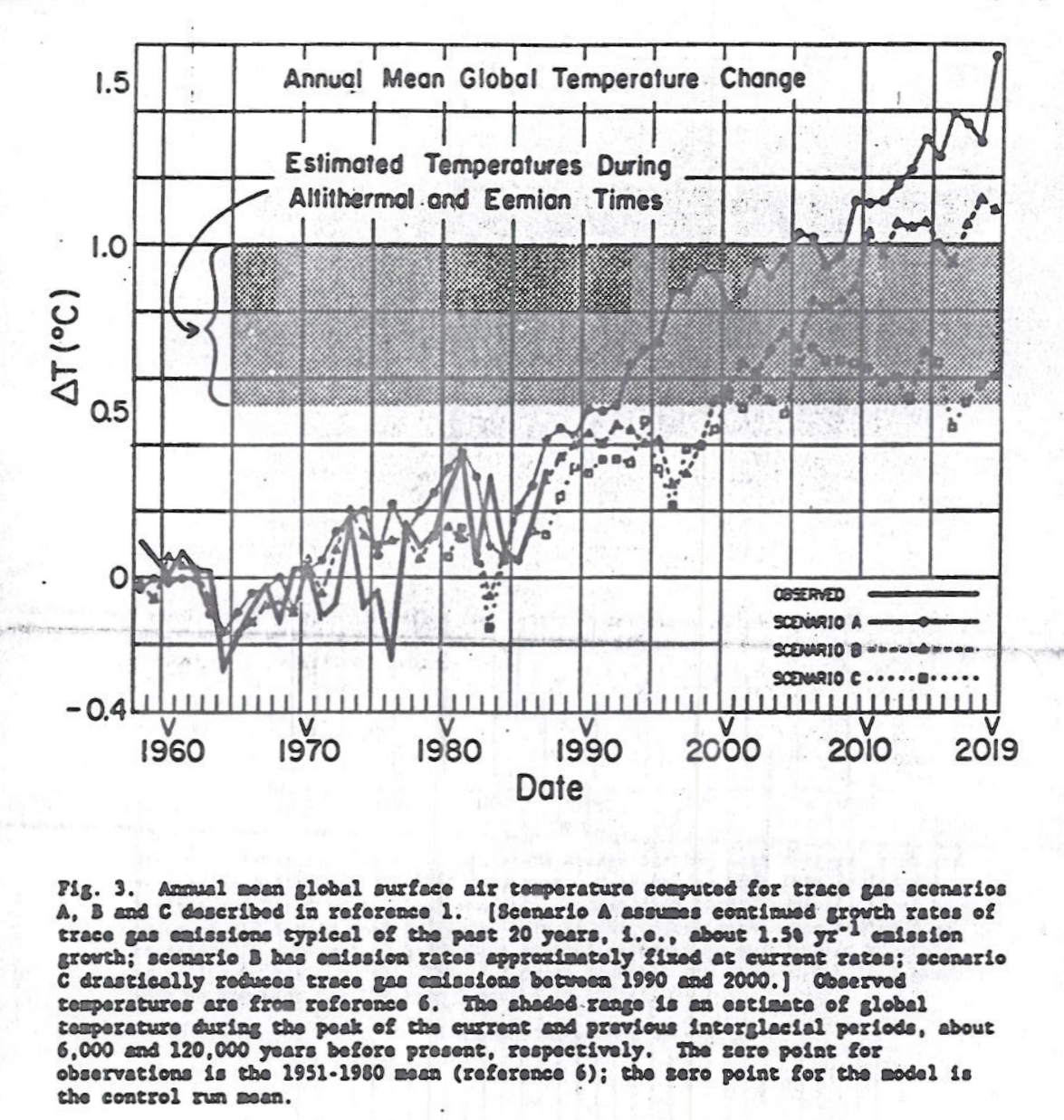
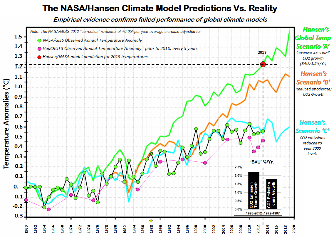
From the model Scenario C, there seems to be about a five year lag in the model between changes in emission rates and changes in temperatures. However, looking at the actual temperature data there is quite a different warming pattern. Five years ago C3 Headlines had a post 2013: The NASA/Hansen Climate Model Prediction of Global Warming Vs. Climate Reality.  The main graphic is in Figure 6

Figure 6 : C3 Headlines – NASA Hansen Prediction Vs Reality

The first thing to note is that the Scenario Assumptions are incorrect. Not only are they labelled as CO2, not GHG emissions, but are all stated wrongly. Stating them correctly would show a greater contradiction between forecasts and reality. However, the Scenario data appears to be reproduced correctly, and the actual graph appears to be in line with a graphic produced last month by Gavin Schmidt last month in his defense of Hansen’s predictions.

The data contradicts the forecasts. Although average temperatures are clearly higher than in in 1987, they are not in line with the forecast of Scenario A which is closest to the actual emissions trends. The rise is way below 70% of the model implied by inputting the lower IPCC climate sensitivity, and allowing for GHG emissions being fractional below the 1.5% per annum of Scenario A. But the biggest problem is where the main divergence occurred. Rather than warming accelerating slightly in the 2000s (after a possible slowdown in the 1990s),  there was no slowdown in the 1990s, but it either collapsed to zero, or massively reduced, depending on the data set was used. This is in clear contradiction of the model. Unless there is an unambiguous and verifiable explanation (rather than a bunch of waffly and contradictory excuses ), the model should be deemed to be wrong. There could be natural and largely unknown natural factors or random data noise that could explain the discrepancy. But equally (and quite plausibly) those same factors could have contributed to the late twentieth century warming.

This simple comparison has an important implication for policy. As there is no clear evidence to link most of the observed warming to GHG emissions, by implication there is no clear support for the belief that reducing GHG emissions will constrain future warming. But reducing global GHG emissions is merely an aspiration. As the graphic in Figure 5 clearly demonstrates, over twenty months after the Paris Climate Agreement was signed there is still no prospect of aggregate GHG emissions falling through policy. Hansen et. al 1988 is therefore a double failure; both as a scientific forecast and a tool for policy advocacy in terms of reducing GHG emissions. If only the supporters would realize their failure, and the useless and costly climate policies could be dismantled.

Kevin Marshall

*Hansen, J., I. Fung, A. Lacis, D. Rind, S. Lebedeff, R. Ruedy, G. Russell, and P. Stone, 1988: Global climate changes as forecast by Goddard Institute for Space Studies three-dimensional model. J. Geophys. Res., 93, 9341-9364, doi:10.1029/JD093iD08p09341.