In a recent comment at Cliscep Jit made the following request
I’ve been considering compiling some killer graphs. A picture paints a thousand words, etc, and in these days of short attention spans, that could be useful. I wanted perhaps ten graphs illustrating “denialist talking points” which, set in a package, would be to the unwary alarmist like being struck by a wet fish. Necessarily they would have to be based on unimpeachable data.
One of the most famous graphs in climate is of the three scenarios used in Congressional Testimony of Dr James Hansen June 23 1988. Copies are poor, being copies of a type-written manuscript. The following is from SeaLevel.info website.
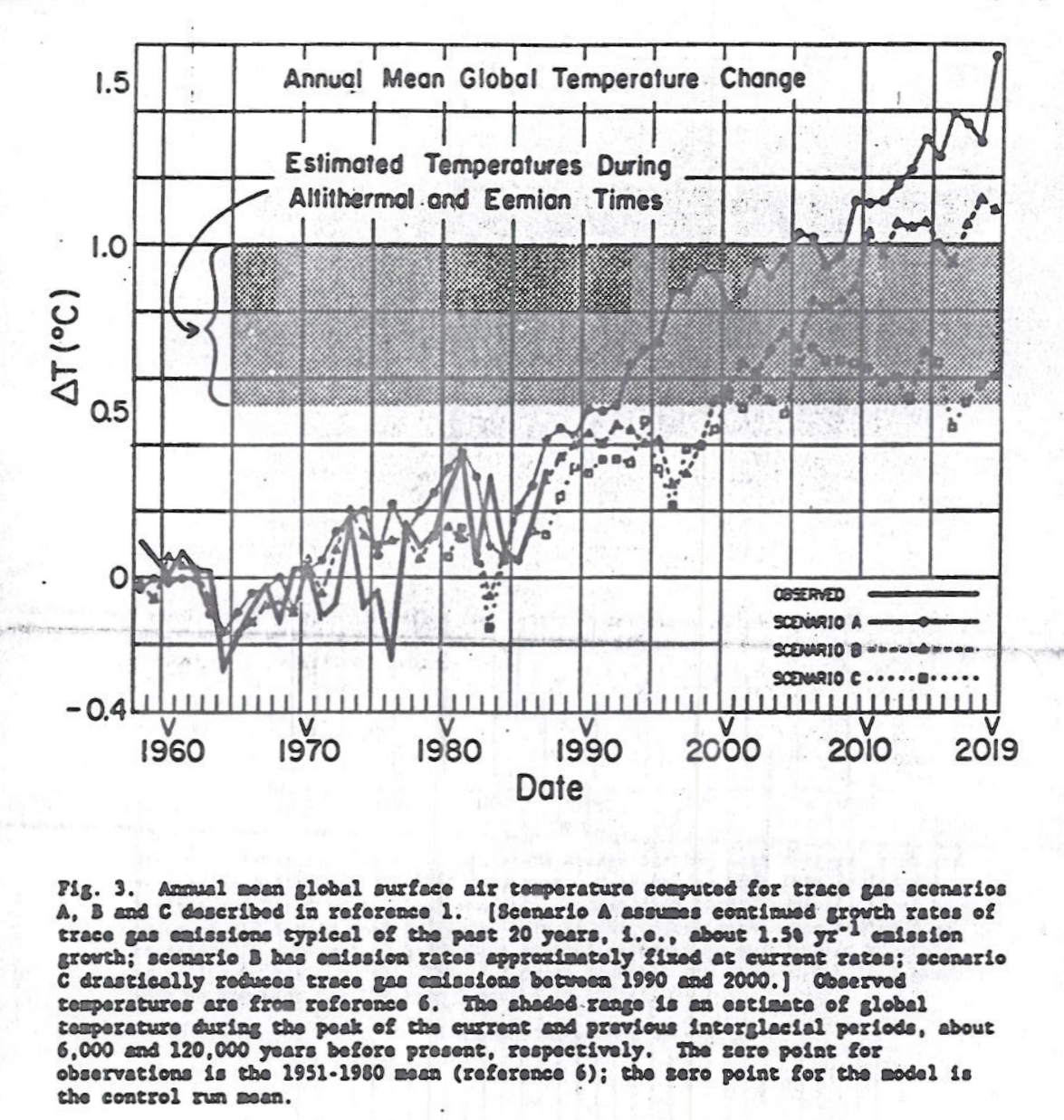
The reason for choosing this version rather than the clearer version in the paper online is that the blurb contains the assumptions behind the scenarios. In particular “scenario C drastically reduces trace gas emissions between 1990 and 2000.” In the original article states
scenario C drastically reduces trace gas emissions between 1990 and 2000 such that greenhouse forcing ceases to increase after 2000.
In current parlance this is net zero. In the graph this results in temperature peaking about 2007.
In the IPCC Third Assessment Report (TAR) 2001 there is the concept of Transient Climate Response.
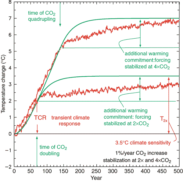
TAR WG1 Figure 9.1: Global mean temperature change for 1%/yr CO2 increase with subsequent stabilisation at 2xCO2 and 4cCO2. The red curves are from a coupled AOGCM simulation (GFDL_R15_a) while the green curves are from a simple illustrative model with no exchange of energy with the deep ocean. The transient climate response, TCR, is the temperature change at the time of CO2 doubling and the equilibrium climate sensitivity, T2x, is the temperature change after the system has reached a new equilibrium for doubled CO2, i.e., after the additional warming commitment has been realised.
Thus, conditional on CO2 rising at 1% a year and the eventual warming from a doubling of CO2 being around 3C, then at the point when doubling has been reached temperatures will have risen by about 2C. From the Mauna Loa data annual average CO2 levels have risen from 316 ppm in 1959 to 414 ppm in 2020. That is 31% in 60 years or less than 0.5% a year. Assuming 3C of eventual warming from a CO2 doubling then the long time period of the transient climate response
- much less than 1C of warming could so far have resulted from the rise in CO2 since 1959
- it could be decades after net zero is achieved that warming will cease.
- the rates of natural absorption of CO2 from the atmosphere are of huge significance.
- Calculation of climate sensitivity even with many decades CO2 data and temperature is near impossible unless constraining assumptions are made about the contribution of natural factors; the rate of absorption of CO2 from the atmosphere; outgassing or absorption of CO2 by the oceans; & the time period for the increase in temperatures from actual rates of CO2 increase.
- That is, change in a huge number variables within a range of acceptable mainstream beliefs significantly impacts the estimates of emissions pathways to constrain warming to 1.5C or 2C.
- If James Hansen in 1988 was not demonstrably wrong false about the response time of the climate system and neither is TAR on the transient climate response, then it could be not be possible to exclude within the range of both the possibility that 1.5C of warming might not be achieved this century and that 2C of warming will be surpassed even if global net zero emissions is achieved a week from now.
Kevin Marshall

Jit
/ 20/08/2021Manic, I’ve only just seen this. Thanks for taking the time to offer an answer to my question. Just checked and so far my folder of killer graphs has only one file – a pair of sea ice extent time series as shown in the IPCC’s first report and its third. I’m sure I intended to go back to the original reports to check they were as the composite has them (which I think I saw on WUWT). The phanerozoic CO2 chart also has a place among the killer graphs. I recently documented its disappearance from Wiki at Cliscep in “Down the Memory Hole.”