BBCs misleading reporting of COP 24 Katowice Agreement

As usual, the annual UNFCCC COP meeting reached an agreement after extra time, said nothing substantial, but tried to dress up the failure as something significant. The BBC’s exuberant reporting of the outcome by Matt McGarth seriously misleads readers as to the substance of the agreement when he states

The Katowice agreement aims to deliver the Paris goals of limiting global temperature rises to well below 2C.

I have written to the BBC Complaints Department asking that they make a correction. Within that letter I cite four references that demonstrate why this McGarth’s statement misleading.

First, there is Climate Action Tracker’s thermometer. I do not believe there have been any additional pledges made in the last few days that would cause CAT to lower their projection from 3oC of warming to below 2oC.
Instead I believe that the COP24 Agreement merely tries to ensure that the pledges are effectively implemented, thus ensuring 3oC of warming rather than the “current policy” 3.3oC of warming.

Second, I do not believe there were additional pledges made during the Katowice conference will cut emissions by at least 15 GtCO2e in 2030. This is the minimum difference to be on track to stop global average temperatures exceeding 2oC.  . I enclose a screen shot of Climate Action Tracker’s Emission Gap page.

For the original source, I direct readers to the UNEP Emissions Gap Report 2018 , published towards at the end of November. In particular, look to Figure ES.3 on page xviii. The three major points in bold of the Executive Summary (pages xiv to xvii) clarify this graphic.

Third, I also draw readers attention to “Table 2.1: Overview of the status and progress of G20 members, including on Cancun pledges and NDC targets” on page 9 of the full UNEP report. A screenshot (without footnotes) is shown below.

The G20 countries accounted for 78% of the 2017 global GHG emissions excluding LULUCF of 49.2 GtCO2e. This was equivalent 72% of total GHG emissions of 53.5 GtCO2e. It might be worth focusing on which countries have increased their pledges in the past couple of weeks. In particular, those countries whose INDC submission pledges of 2015 imply increases in emissions between 2015 and 2030 of at least 0.5 GtCO2e or more (China, India, Russia, Turkey and Indonesia plus Pakistan, Nigeria and Vietnam outside of the G20), as they collectively more than net offset the combined potential emissions decreases of the developed countries such as the USA, EU, Canada and Australia. In a previous post I graphed this proposed emissions increases in figures 2 and 3. They are reproduced below.

Fourth, is that the UNFCCC press announcement makes no mention of any major breakthrough. The only national government mentioned is that of Scotland, who provided £200,000 of additional funding.  Scotland is not an independent Nation, recognized by the United Nations. As a part of the EU, it is not even part of a recognized nation state that makes submissions direct to the UNFCCC. The  SUBMISSION BY LATVIA AND THE EUROPEAN COMMISSION ON BEHALF OF THE EUROPEAN UNION AND ITS MEMBER STATES of 6 March 2015 can be found here.  By being a part of the EU, in the UNFCCC Scotland is two levels below Liechtenstein or Tuvalu. despite having respectively 140 and 480 times the population. But even if Scotland were both independent of the UK and the EU, as a nation state it would hardly seem fair that it was accorded the same voice as India or China with each have about 250 times the population of Scotland.

In the spirit of objectivity and balance, I hope that the BBC makes the  necessary correction.

Kevin Marshall

UNEP Emissions Gap Report 2018 Part 3 – UNEP tacitly admits climate mitigation is a failure

To those following the superficial political spin of climate policy, a UN organisation admitting that climate mitigation has failed may come as a surprise. Yet one does not have to go too deeply into the new UNEP Emissions Gap Report 2018 to see that this tacit admission is clearly the case. It is contained within the 3 major points in the Executive Summary.

By policy failure, I mean to achieve a global substantial reduction in GHG emissions in the near future, even if that reduction is not in line with either the 1.5°C or 2.0°C warming objective. On this measure, the UNEP is tacitly admitting failure it the summary.
The Executive Summary of the UNEP Emissions Gap Report 2018 starts on the pdf page 14 of 112, numbered page xiv.

Point 1 – Current commitments are inadequate

1. Current commitments expressed in the NDCs are inadequate to bridge the emissions gap in 2030. Technically, it is still possible to bridge the gap to ensure global warming stays well below 2°C and 1.5°C, but if NDC ambitions are not increased before 2030, exceeding the 1.5°C goal can no longer be avoided. Now more than ever, unprecedented and urgent action is required by all nations. The assessment of actions by the G20 countries indicates that this is yet to happen; in fact, global CO2 emissions increased in 2017 after three years of stagnation.

This is not a statement about a final push to get policy over the line, but a call for a complete change of direction. The tacit admission is that this is politically impossible. In the amplification it is admitted that in the G20 major economies – most of them developing countries – even the “NDC ambitions” for 2030 are not likely to be achieved. As I showed in the Part 2 post, 9 of the G20 will actually increase their emissions from 2015 to 2030 if the commitments are fully met, and the sum of the emissions increases will be greater than the emissions decreases. The exhortation for “unprecedented and urgent action” is not like Shakespeare’s Henry V rallying his men with a “once more unto the breach chaps and we will crack it” but more about like “Hey good fellows, if we are really going to breach the defenses we need to upgrade from the colorful fireworks to a few kegs of proper gunpowder, then make a few genuine sacrifices. I will be cheering you all the way from the rear“. This sentiment is contained in the following statement.

As the emissions gap assessment shows, this original level of ambition needs to be roughly tripled for the 2°C scenario and increased around fivefold for the 1.5°C scenario.

Point 2 – Emissions are increasing, not decreasing rapidly

2. Global greenhouse gas emissions show no signs of peaking. Global CO2 emissions from energy and industry increased in 2017, following a three-year period of stabilization. Total annual greenhouse gases emissions, including from land-use change, reached a record high of 53.5 GtCO2e in 2017, an increase of 0.7 GtCO2e compared with 2016. In contrast, global GHG emissions in 2030 need to be approximately 25 percent and 55 percent lower than in 2017 to put the world on a least-cost pathway to limiting global warming to 2°C and 1.5°C respectively.

In just 13 years from now global emissions need to be down by a quarter or more than a half to achieve the respective 2°C and 1.5°C targets. Emissions are still going up. Again, an admission that the progress in over two decades is small in relation to the steps needed to achieve anything like a desired outcome.

Point 3 – Scale of the gap in numbers

3. The gap in 2030 between emission levels under full implementation of conditional NDCs and those consistent with least-cost pathways to the 2°C target is 13 GtCO2e. If only the unconditional NDCs are implemented, the gap increases to 15 GtCO2e. The gap in the case of the 1.5°C target is 29 GtCO2e and 32 GtCO2e respectively. This gap has increased compared with 2017 as a result of the expanded and more diverse literature on 1.5°C and 2°C pathways prepared for the IPCC Special Report.

Some developing countries said they would change course conditional on massive amounts of funding. It is clear this will not be forthcoming. Fleshing out the 1.5°C target in the SR1.5 Report showed that it requires more onerous policies than previously thought. Each year UNEP produces a chart that nicely shows the scale of the problem. The 2018 version on page xviii is reproduced as figure 1.

Figure 1 : The emissions GAP in 2030 under the 1.5°C and 2°C scenarios, from the UNEP Emissions Gap Report 2018.

The widening gap between the 1.5°C and 2°C pathways and current projected commitments over the last five reports is shown in figure 2.

This widening gap is primarily a result of recalculations. Increased emissions in 2017 are secondary.

Conclusion

That nearly 200 nations would fail to agree to collectively and substantially reduce global emissions was obvious from the Rio Declaration in 1992. This exempted developing countries from any obligation to reduce their emissions. These developing countries now have at least four fifths of the global population and around two-thirds emissions. It was even more obvious from reading the Paris Agreement, where vague aspirations are evident. It is left to the reader to work out the implications of paragraphs like 4.1 and 4.4, which renders the UNFCCC impotent in reducing emissions. The latest UNEP Emissions Gap Report presents the magnitude of the mitigation policy failure and very clear statements about that failure.

Kevin Marshall

Time will run out to prevent 2°C warming barrier being breached

I have a number of times referred to a graphic “Figure 2 Summary of Results” produced by the UNFCCC for the Paris COP21 Climate Conference in December 2015. It was a centerpiece of the UNFCCC Synthesis report on the aggregate effect of INDCs.

The updated graphic (listed as Figure 2, below the Main Document pdf) is below

This shows in yellow the impact of the INDC submissions covering the period 2015 to 2030) if fully implemented against limiting warming to 2°C  and 1.5°C . This showed the gulf between the vague policy reality and the targets. Simply put, the net result of the INDCs submissions would insufficient for global emissions to peal Yet in reaching an “agreement” the representatives of the entire world collectively put off recognizing that gulf.

For the launch of the UNIPCC AR5 synthesis report in 2014, there were produced a set of slides to briefly illustrate the policy problem. This is slide 20 of 35, showing the  reduction pathways.


The 2°C  of warming central estimate is based upon total GHG emissions in the 21st Century being around 2500 GtCO2e.

At the launch of 2006 Stern Review Sir Nicholas Stern did a short Powerpoint presentation. Slide 4 of the PDF file is below.


The 450ppm CO2e emissions pathway is commensurate with 2°C  of warming. This is based upon total GHG emissions in the 21st Century being around 2000 GtCO2e, with the other 500 GtCO2e presumably coming in the 22nd Century.

The UNFCCC Paris graphic is also based on 2500 GtCO2e it is also possible to calculate the emissions reduction pathway if we assume (a) All INDC commitments are met (b) Forecasts are correct (c) no additional mitigation policies are enacted.

I have produced a basic graph showing the three different scenarios.

The Stern Review assumed global mitigation policy would be enacted around 2010. Cumulative 21st Century emissions would then have been around 450 GtCO2e. With 500 GtCO2e allowed for post 2100, this gave average emissions of around 17 GtCO2e per annum for the rest of the century. 17 GtCO2e, is just under 40% of the emissions in the year the policy would be enacted.

IPCC AR5  assumed global mitigation policy would be enacted around 2020. Cumulative 21st Century emissions would then have been around 950 GtCO2e. A presentation to launch the Synthesis Report rounded this to 1000 GtCO2e as shown in slide 33 of 35.

Assuming that global emissions were brought to zero by the end of the century, this gave average emissions of 20 GtCO2e per annum for the rest of the century. 20 GtCO2e, is just under 40% of the emissions in the year the theoretical global policy would be enacted. The stronger assumption of global emissions being reduced to zero before the end of the century, along with a bit of rounding, offsets the delay.

If the Paris Agreement had been fully implemented, then by 2030 cumulative 21st Century emissions would have around 1500 GtCO2e, leaving average emissions of around 14 GtCO2e per annum for the rest of the century. 17 GtCO2e, is just over 25% of the emissions in the year the policy would be enacted. The failure of the Paris Agreement makes it necessary for true global mitigation policies, if in place by 2030, to be far more drastic that those of just a few years before to achieve the same target.

But the Paris Agreement will not be fully implemented. As Manhatten Contrarian (hattip The GWPF) states, the US was the only major country proposing to reduce its emissions. It looks like China, India, Indonesia, Russia and Germany will all increase their emissions. Further, there is no indication that most countries have any intention of drastically reduce their emissions. To pretend otherwise is to ignore a truism, what I will term the First Law of Climate Mitigation

To reduce global greenhouse gas emissions, the aggregate reduction in countries that reduce their emissions must be greater than aggregate increase in emissions in all other countries.

Modeled projections and targets are rendered meaningless if this truism is ignored. Yet this is what the proposers of climate mitigation policy have been effectively doing for many years. Emissions will therefore breach the mythical 2°C warming barrier, but based on recent data I believe warming will be nowhere near that level.

Kevin Marshall


The Climate Alarmist Reaction to a Trump Presidency

A few weeks ago cliscep had a piece Trump, climate and the future of the world that looked at the immediate reactions to the surprise victory in the US Presidential election amongst the climate community. Brad Keyes noted Jo Romm’s piece will President Trump pull the plug on a livable climate?. To support this Romm stated

Indeed, one independent firm, Lux Research, projected last week that “estimated emissions would be 16 percent higher after two terms of Trump’s policies than they would be after two terms of Clinton’s, amounting to 3.4 billion tons greater emissions over the next eight years.”

There is a little graph to sort of back this up.

Whilst Romm then states two reasons why he does not think emissions will rise so much (Trump will cause a massive recession and will not win a second term) he then states the Twitter quote:-

That said, the damage and delay that even a one-term President Trump could do will make the already difficult task of keeping total warming well below 2°C essentially impossible.

So a difference of much less than 3.4 GtCO2e over eight years will make keeping total warming well below 2°C essentially impossible.
Before looking at the evidence that contradicts this, there are even more bizarre claims made by the expert climate scientists at RealClimate. They use a different graph which is probably a couple of years old and explain:-

Here are some numbers. Carbon emissions from the United States have been dropping since the year 2000, more than on-track to meet a target for the year 2020. Perhaps with continued effort and improving technology, emissions might have dropped to below the 2020 target by 2020, let’s say to 5 gigatons of CO2 per year (5000 megatons in the plot). In actuality, now, let’s say that removing restrictions on energy inefficiency and air pollution could potentially lead to US emissions by 2020 of about 7 gigatons of CO2. This assumes that future growth in emissions followed the faster growth rates from the 1990’s.
Maybe neither of these things will happen exactly, but these scenarios give us a high-end estimate for the difference between the two, which comes to about 4 gigatons of CO2 over four years. There will also probably be extra emissions beyond 2020 due to the lost opportunity to decarbonize and streamline the energy system between now and then. Call it 4-6 gigatons of Trump CO2.
This large quantity of gas can be put into the context of what it will take to avoid the peak warming threshold agreed to in Paris. In order to avoid exceeding a very disruptive warming of 1.5 °C with 66% probability, humanity can release approximately 220 gigatons of CO2 after January, 2017 (IPCC Climate Change 2014 Synthesis report, Table 2.2, corrected for emissions since 2011). The 4-6 Gtons of Trump CO2 will not by itself put the world over this threshold. But global CO2 emission rates are now about 36 gigatons of CO2 per year, giving a time horizon of only about six years of business-as-usual (!) before we cross the line, leaving basically no time for screwing around. To reach the catastrophic 2 °C, about 1000 gigatons of CO2 remain (about 20 years of business as usual). Note that these estimates were done before global temperatures spiked since 2014 — we are currently at 1.2 °C! So these temperature boundaries may be closer than was recently thought.

RealClimate come up with nearly twice the difference made by Joe Romm / Lux Research, but at least admit in the final paragraph that whoever won would not make much difference.
There are two parts to putting these analyses into context – the US context and the global one.
In the USA emissions have indeed been falling since 2000, this despite the population growing. The rate of decline has significantly increased in the years of the Obama Presidency, but for reasons quite separate from actions to reduce emissions. First there was the credit crunch, followed by the slowest recovery in US history. Second, the high oil price encouraged emissions reductions, along with the loss of energy-intensive industries to countries with lower energy costs. Third is that the shale gas revolution has meant switching from coal to gas in electricity production.
But the global context is even more important. RealClimate does acknowledge the global figure, but only mentions CO2 emissions. The 36GtCO2 is only two-thirds of total greenhouse gas emissions of about 55GTCO2e and that figure is rising by 1-2% a year. The graph – reproduced from the USA INDC submission to the UNFCCC – clearly states that it is in million tonnes of carbon dioxide equivalent. What is more, these are vague policy proposals, that President Obama would have been unable to get through Congress. Further, most of the proposed emission reductions were through extrapolating trends that of what has been happening without any policy intervention.
If the 1.5°C limit breached from 220 GtCO2e of additional emissions, it will be breached in the run-up to Christmas 2020. The 1000 GtCO2e for the 2°C limit was from 2011. By simple arithmetic it is now below 800GtCO2e with about 15 years remaining if (a) a doubling of CO2 levels (or equivalent GHG gases) leads to 3°C of warming (b) the estimated quantity of emissions to a unit rise in atmospheric gas levels is correct and (b) the GHG gas emitted is retained for a very long period in the atmosphere.
Even simple arithmetic is not required. Prior to the Paris talks the UNFCCC combined all the INDCs – including that of the USA to cut emissions as shown in the graph above – were globally aggregated and compared to the approximate emissions pathways for 1.5°C and least-cost 2°C warming. The updated version, post-Paris is below.

The difference Donald Trump will make is somewhere in the thickness of the thick yellow line. There is no prospect of the aimed-for blue emissions pathways. No amount of ranting or protests at the President-elect Trump will change the insignificant difference the United States will make with any politically-acceptable and workable set of policies, nor can make in a country with less than a twentieth of the global population and less that one seventh of global emissions.

Kevin Marshall

Richard Tol on a Global Carbon Tax

Richard Tol, one of the World’s leading economists on climate, has just had published The Structure of the Climate Debate, a paper that makes some very good comments on the gulf between optimal policy and the reality of ineffective policy backed by a great army of bureaucrats, rent-seeking politicians and environmentalists who exaggerate the issues. It is this optimal policy  – a global carbon tax to constrain warming to 2C – that I take issue with. Both economic theory and the empirical evidence contradict this.  The following is a comment posted at cliscep

Richard Tol states in his paper

Only a modest carbon tax is needed to keep atmospheric concentrations below a high target but the required tax rapidly increases with the stringency of the target. If concentrations are to be kept below 450 ppm CO2eq, the global carbon tax should reach some $210/tCO2 in 2020 or so (Tol 2013).

The 450 ppm CO2eq, would produce 2C of warming from pre-industrial levels if a doubling of CO2 on its own produces 3C of warming. The UNFCCC produced a graph for COP21 to illustrate the global emissions pathway needed to ensure 2C limit :-

Whereas even with the all the vague policy proposals fully implemented global emissions will be about 10% higher in 2030 than in 2010, the 2C pathway has emissions 10-30% lower. That means a carbon tax of $210/tCO2 (now £170) would have to turn around the global relentless rise in emissions and have them falling rapidly. I am deeply sceptical that such a global policy would achieve anything like the that difference would be achieved even with an omnipotent, omniscient, and omnipresent planner to impose the tax. The reasons for that scepticism can be found by applying the tax to real world examples.
First let us apply a £170/tCO2 carbon tax to petrol, which produces 2.30kg of CO2 per litre. With 20% VAT applied is equivalent to 47p a litre added to the retail price. (Current excise duties with VAT are equivalent to £300/tCO2, the diesel £250/tCO2). For a car doing 15000 miles at 39mpg, this would generate an additional cost to the owner of £820 per year. Maybe a 15-30% increase in the full costs of running a small car in the UK. There is plenty of empirical visence of the effect of the oil price movements in the last couple of decades (especially in the period 2004-2008 when the price increased) to show that costs increases will have a much smaller effect on demand, whereas for the carbon tax to be effective it would need to have a much greater impact than the percentage cost increase.
Second, let us apply a $210/tCO2 carbon tax to coal-fired power stations. They produce about 400kg of CO2 per megawatt, so the cost would rise by $84MWH. In China, coal-fired electricity will retail at less than $30 MwH. China would rapidly switch to nuclear power. Even so, its power generation emissions might not start falling for at least a decade. Alternatively it might switch to gas, where the carbon tax would be half that of coal.
However, there is another lesson from oil prices, this time over the last three years. A small fall in demand leads to large falls in price, in the short term. That is the market responds by offsetting the cost of the global carbon tax. To use terms of basic economics the demand for fossil fuels is highly inelastic with respect to changes in price, and the supply of fossil fuels in the short term is highly inelastic to changes in demand.  Emissions reductions policies have not just turned out to be pretty useless in practice, they are pretty useless in theory (with real world political constraints removed) as well.

Kevin Marshall


CO2 Emissions from Energy production forecast to be rising beyond 2040 despite COP21 Paris Agreement

Last week the US Energy Information Administration (EIA) published their INTERNATIONAL ENERGY OUTLOOK 2016. The Daily Caller (and the GWPF) highlighted the EIA’s summary energy energy production. This shows that the despite the predicted strong growth in nuclear power and implausibly high growth in renewables, usage of fossil fuels are also predicted to rise, as shown in their headline graphic below.

For policy purposes, the important aspect is the translation into CO2 emissions. In the final Chapter 9. Energy-related CO2 Emissions figure 9.3 shows the equivalent CO2 Emissions in billions of tonnes of CO2. I have reproduced the graphic as a stacked bar chart.

Data reproduced as a stacked bar chart.

In 2010 these CO2 emissions are just under two-thirds of total global greenhouse gas emissions. The question is how does this fit into the policy requirements to avoid 2°C from the IPCC’s Fifth Assessment Report? The International Energy Authority summarized the requirements very succicently in World Energy Outlook 2015 Special Report page 18

The long lifetime of greenhouse gases means that it is the cumulative build-up in the atmosphere that matters most. In its latest report, the Intergovernmental Panel on Climate Change (IPCC) estimated that to preserve a 50% chance of limiting global warming to 2 °C, the world can support a maximum carbon dioxide (CO2) emissions “budget” of 3 000 gigatonnes (Gt) (the mid-point in a range of 2 900 Gt to 3 200 Gt) (IPCC, 2014), of which an estimated 1 970 Gt had already been emitted before 2014. Accounting for CO2 emissions from industrial processes and land use, land-use change and forestry over the rest of the 21st century leaves the energy sector with a carbon budget of 980 Gt (the midpoint in a range of 880 Gt to 1 180 Gt) from the start of 2014 onwards.

From the forecast above, cumulative CO2 emissions from 2014 with reach 980 Gt in 2038. Yet in 2040, there is no sign of peak emissions.

Further corroboration comes from the UNFCCC. In preparation for the COP21 from all the country policy proposals they produced a snappily titled Synthesis report on the aggregate effect of intended nationally determined contributions. The UNFCCC have updated the graphics since. Figure 2 of 27 Apr 2016 shows the total GHG emissions, which were about 17 Gt higher than the CO2 emissions from energy emissions in 2010.

The graphic clearly shows that the INDCs – many with very vague and non-verifiable targets – will make very little difference to the non-policy emissions path. Yet even this small impact is contingent on those submissions being implemented in full, which is unlikely in many countries. The 2°C target requires global emissions to peak in 2016 and then head downwards. There are no additional policies even being tabled to achieve this, except possibly by some noisy, but inconsequential, activist groups. Returning to the EIA’s report, figure 9.4 splits the CO2 emissions between the OECD and non-OECD countries.

The OECD countries represent nearly all countries who propose to reduce their CO2 emissions on the baseline 1990 level, but their emissions are forecast by the EIA still to be 19% higher in 2040. However, the increase is small compared to the non-OECD countries – who mostly are either proposing to constrain emissions growth or have no emissions policy proposals – with emissions forecast to treble in fifty years. As a result the global forecast is for CO2 emissions to double. Even if all the OECD countries completely eliminate CO2 emissions by 2040, global emissions will still be a third higher than in 1990. As the rapid economic growth in the former Third World reduces global income inequalities, it is also reducing the inequalities in fossil fuel consumption in energy production. This will continue beyond 2040 when the OECD with a sixth of the world population will still produce a third of global CO2 emissions.

Unless the major emerging economies peak their emissions in the next few years, then reduce the emissions rapidly thereafter, the emissions target allegedly representing 2°C or less of global warming by 2100 will not be met. But for countries like India, Vietnam, Indonesia, Bangladesh, Nigeria, and Ethiopia to do so, with the consequent impact on economic growth, is morally indefensible.

Kevin Marshall


Climate Interactive’s Bogus INDC Forecast

Summary

Joe Romm wrote a post in early November claiming UNFCCC Executive Secretary Christiana Figueres had misled the public in claiming that the “INDCs have the capability of limiting the forecast temperature rise to around 2.7 degrees Celsius by 2100”. Using Climate Interactive’s figures Romm claims the correct figure is 3.5°C. That Romm had one of two sources of the 2.7°C staring at him is a side issue. The major question is how Climate Interactive can achieve a full 1.0°C reduction in expected temperature rise in 2100 and a reduction of 40% in 2100 GHG emissions from pledges covering the period 2015, when the UNFCCC estimates will have a much smaller impact in 2030? Looking at the CO2 emissions, which account for 75-80% of GHG emissions, I have found the majority answer. For OECD countries where emissions per capita have been stable or falling for decades, the “No Action” scenario forecasts that they will rise for decades. For Russia and China, where per capita emissions are likely to peak before 2030 without any policy action, the “No Action” scenario forecasts that they will rise for decades. This is largely offset by Climate Interactive assuming that both emissions and economic growth in India and Africa (where there are no real attempts to control emissions) will stagnate in the coming decades. Just by making more reasonable CO2 emissions forecasts for the OECD, Russia and China can account for half of the claimed 2100 reduction in GHG emissions from the INDC. Climate Interactive’s “No Action” scenario is bogus.


Joe Romm’s use of the Climate Interactive projection

A couple of months ago, prior to the COP21 Paris climate talks, Joe Romm at Climate Progress criticized the claim made in a press release by UNFCCC Executive Secretary Christiana Figueres:

The INDCs have the capability of limiting the forecast temperature rise to around 2.7 degrees Celsius by 2100, by no means enough but a lot lower than the estimated four, five, or more degrees of warming projected by many prior to the INDCs

Romm’s note to the media is

If countries go no further than their current global climate pledges, the earth will warm a total of 3.5°C by 2100.

At a basic level Romm should have done some proper research. As I found out, there are two sources of the claim that are tucked away at the end of a technical appendix to the UNFCCC Synthesis report on the aggregate effect of INDCs. One of these is Climate Action Tracker. On their home page they have a little thermometer which shows the 2.7°C figure. Romm would have seen this, as he refers in the text to CAT’s page on China. The significance may not have registered.

However, the purpose of this post is not to criticize Romm, but the Climate Interactive analysis that Romm uses as the basis of his analysis. Is the Climate Interactive Graph (reproduced in Figure 1) a reasonable estimate of the impact of the INDC submissions (policy pledges) on global emissions?1

Figure 1. Climate Interactive’s graph of impact of the INDC submissions to 2100

What struck me as odd when I first saw this graph was how the INDCs could make such a large impact beyond the 2015-2030 timeframe that they covered when the overall impact was fairly marginal within that timeframe. This initial impression is confirmed by the UNFCCC’s estimate of the INDCs

Figure 2. UNFCCC’s estimate of emissions impact of the INDCs, with the impact shown by the yellow bars. Original here.

There are two things that do not stack up. First is that the “No Action” scenario appears to be a fairly reasonable extrapolation of future emissions without policy. Second, and contrary to that is the first, is that the “Current INDCs” scenario does not make sense in terms of what I have read in the INDCs and is confirmed by the INDCs. To resolve this requires looking at the makeup of the “No Action” scenario. Climate Interactive usefully provide the model for others to do their own estimates,2 With the “User Reference Scenario” giving the “no action” data3, split by type of greenhouse gas and into twenty regions or countries. As about 75-80% of emissions with the model are CO2 Fossil Fuel emissions, I will just look at this area. For simplicity I have also reduced the twenty regions or countries into just seven. That is USA, Other OECD, Russia, China, India, Africa and Rest of the World. There are also lots of ways to look at the data, but some give better understanding of the data than others. Climate Interactive also have population estimates. Population changes over a long period can themselves result in changed emissions, so looking at emissions per capita gives a better sense of the reasonableness of the forecast. I have graphed the areas in figure 3 for the historical period 1970-2010 and the forecast period 2020-2100.

Figure 3 : Fossil Fuel Emissions per capita for six regions from the Climate Interactive “No Action” Scenario.

Understanding the CO2 emissions forecasts

In the USA, emissions per capita peaked at the time of 1973 oil embargo. Since then they have declined slightly. There are a number of reasons for this.

First, higher oil prices gave the economic incentives to be more efficient in usage of oil. In cars there have been massive improvements in fuel efficiency since that time. Industry has also used energy more efficiently. Second, there has been a growth in the use of nuclear power for strategic reasons more than economic. Third is that some of the most energy intensive industries have shifted to other countries, particularly steel and chemicals. Fourth, is that growth in developed countries is mostly in the service sector, whereas growth in developing countries is mostly in manufacturing. Manufacturing tends to have much higher energy usage per unit of output than services. Fifth, is that domestic energy usage is from cars and power for the home. In an emerging economy energy usage will rise rapidly as a larger proportion of the population acquire cars and full heating and lighting systems in the home. Growth is much slower once most households have these luxuries. Sixth is that in the near future emissions might continue to fall with the development of shale gas, with its lower emissions per unit of power than from coal.

I therefore cannot understand why anyone would forecast increasing emissions per capita in the near future, when they have been stable or falling in for decades. Will everyone start to switch to less efficient cars? When these forecasts were made oil was at $100 a barrel levels, and many thought peak oil was upon us. Would private sector companies abandon more efficient energy usage for less efficient and higher cost usage? The USA may abandon nuclear power and shift back to coal for political reasons. But in all forms of energy, production and distribution is likely to continue to become more efficient in all forms.

In the rest of the OECD, there are similar patterns. In Europe energy usage was never as high. In some countries without policy CO2 emissions may rise slightly. In Germany they are replacing nuclear power stations with coal for instance. But market incentives will increase energy efficiency and manufacturing will continue to shift to emerging nations. Again, there appears no reason for a steady increase in emissions per capita to increase in the future.

Russia has a slightly different recent past. Communist central planning was highly inefficient and lead to hugely inefficient energy usage. With the collapse of communism, energy usage fell dramatically. Since then emissions have been increasing, but more slowly than the economy as a whole. Emissions will peak again in a couple of decades. This will likely be at a lower level than in the USA in 1970, despite the harsher climate, as Russia will benefit from technological advances in the intervening period. There is no reason for emissions to go on increasing at such a rapid rate.4

China has recently had phenomenal growth rates. According to UN data, from 1990 to 2012, economic growth averaged 10.3% per annum and CO2 emissions 6.1%. In the not too distant future economic growth will slow as per capita income approaches rich country levels, and emissions growth will slow or peak. But the Climate Interactive forecast has total emissions only peaking in 2090. The reason for China’s and Russia’s forecast per capita emissions exceeding those of the USA is likely due to a failure to allow for population changes. In USA population is forecast to grow, whilst in China and Russia population is forecast to fall.

India has the opposite picture. In recently years economic and CO2 emissions growth has taken off. Current policies of Prime Minister Narendra Modi are to accelerate these growth rates. But in the Climate Interactive forecast growth, economic growth and CO2 emissions growth plummet in the near future. Economic growth is already wrong. I am writing on 30/12/15. To meet the growth forecast for 2010-2015, India’s GDP will need to drop by 20% in the next 24 hours.5

For the continent of Africa, there have been encouraging growth signs in the last few years, after decades when many countries saw stagnation or even shrinking economies. Climate Interative forecasts similar growth to India, but with a forecasts of rapid population growth, the emissions per capita will hardly move.

Revised CO2 emissions forecasts

It is extremely difficult and time consuming to make more accurate CO2 emissions forecasts. As a shortcut, I will look at the impact of revisions on 2100, then at the impact on the effect of the INDCs. This is laid out in Figure 4

Figure 4 : Revised Forecast CO2 Emissions from Fossil Fuels

The first three columns in pale lilac are for CO2 emissions per capita calculated, from the Climate Interactive data. In the 2100 Revised column are more realistic estimates for reasons discussed in the text. In the orange part of the table are the total forecast 2100 Climate Interactive figures for population and CO2 emissions from fossil fuels. In darker orange is the revised emissions forecast (emissions per capita multiplied by forecast population) and the impact of the revision. Overall the forecast is 10.2GtCO2e lower, as no calculation has been made for the rest of the world. To balance back requires emissions of 11.89 tonnes per capita for 2.9 billion people. As ROW includes such countries as Indonesia, Bangladesh, Iran, Vietnam, Brazil and Argentina this figure might be unreasonable 85 years from now.

The revised impact on the INDC submissions

The INDC submissions can be broken down.

The USA, EU, Japan and Australia all have varying levels of cuts to total emissions. So for the OECD as a whole I estimate Climate Interactive over estimates the impact of the INDCs by 8.4GtCO2e

The Russian INDC pledge it is unclear, but it seems to be saying that emissions will peak before 2030 at below 1990 levels6. As my revised forecast is above this level, I estimate Climate Interactive over estimates the impact of the INDCs by 3.2GtCO2e

The Chinese INDC claims pledges that its emissions will have peaked by 2030. This will have happened anyway and at around 10-12 tonnes per capita. I have therefore assumed that emissions will stay constant from 2030 to 2100 whilst the population is falling. Therefore I estimate that Climate Interactive over estimates the impact of the INDCs by 19.5GtCO2e

Overall for these areas the overestimation is around 31 GtCO2e. Instead of 63.5GtCO2e forecast for these countries for 2100 it should be nearer 32.5GtCO2e. This is about half the total 2100 reduction that Climate Interactive claims that the INDC submission will make from all types of greenhouse gases. A more rigorous forecast may have lower per capita emissions in the OECD and China. There may be other countries where similar forecast issues of CO2 emissions might apply. In addition, in note 7 I briefly look at the “No Action” CH4 emissions, the second largest greenhouse gas. There appear to be similar forecast issued there.

In summary, the make-up of the CO2 emissions “No Action” forecast is bogus. It deviates from an objective and professional forecast in a way that grossly exaggerates the impact of any actions to control GHG emissions, or even pledges that constitute nothing more than saying what would happen anyway.

Notes

  1. The conversion of a given quantity of emissions into average surface temperature changes is outside the scope of this article. Also we will assume that all policy pledges will be fully implemented.
  2. On the Home page use the menu for Tools/C-ROADS. Then on the right hand side select “Download C-ROADS”. Install the software. Run the software. Click on “Create New Run” in the centre of the screen.


    This will generate a spreadsheet “User Scenario v3 026.xls”. The figures I use are in the User Reference Scenario tab. The software version I am working from is v4.026v.071.

  3. The “User Reference Scenario” is claimed to be RCP 8.5. I may post at another time on my reconciliation between the original and the Climate Interactive versions.
  4. The forecast estimates for economic growth and emissions for Russia look quite bizarre when the 5 year percentage changes are graphed.


    I cannot see any reason for growth rates to fall to 1% p.a in the long term. But this is the situation with most others areas as well. Nor can I think of a reason for emissions growth rates to increase from 2030 to 2055, or after 2075 expect as a contrivance for consistency purposes.

  5. The forecast estimates for economic growth and emissions for India look even more bizarre than for Russia when the 5 year percentage changes are graphed.


    I am writing on 30/12/15. To meet the growth forecast for 2010-2015, India’s GDP will need to drop by 20% in the next 24 hours. From 2015 to 2030, the period of the INDC submissions, CO2 emissions are forecast to grow by 8.4%. India’s INDC submission implies GHG emissions growth from 2014 to 2030 of 90% to 100%. Beyond that India is forecast to stagnate to EU growth rates, despite being a lower to middle income country. Also, quite contrary to Russia, emissions growth rates are always lower than economic growth rates.

  6. The Russian Federation INDC states

    Limiting anthropogenic greenhouse gases in Russia to 70-75% of 1990 levels by the year 2030 might be a long-term indicator, subject to the maximum possible account of absorbing capacity of forests.

    This appears as ambiguous, but could be taken as meaning a long term maximum.

  7. CH4 (Methane) emissions per Capita

    I have quickly done a similar analysis of methane emissions per capita as in Figure 2 for CO2 emissions. The scale this time is in kilos, not tonnes.

    There are similarities

  • OECD emissions had been falling but are forecast to rise. The rise is not as great as for CO2.
  • In Russia and China emissions are forecast to rise. In Russia this is by a greater amount than for CO2, in China by a lesser amount.
  • In Africa, per capita emissions are forecast to fall slightly. Between 2010, CH4 emissions are forecast to rise 3.1 times and population by 4.3 times.
  • In both the USA and Other OECD (a composite of CI’s categories) total CH4 emissions are forecast in 2100 to be 2.778 times higher than in 2010. In both China and India total CH4 emissions are forecast in 2100 to be 2.420 times higher than in 2010.


No Global Plan from COP21 Paris to Reduce Greenhouse Gas Emissions

Headline news around the world is that a landmark global agreement has been reached.

The BBC headlines

A deal to attempt to limit the rise in global temperatures to less than 2C has been agreed at the climate change summit in Paris after two weeks of negotiations.

The Australian ABC News summarizes

Historic climate deal

  • Deal to limit global warming to “well below” 2C, aiming for 1.5C
  • Greenhouse gas emissions need to peak “as soon as possible”, followed by rapid reduction
  • Deal will eliminate use of coal, oil and gas for energy

Folha de Sao Paulo

A COP21 aprovou neste sábedo (12) em Paris o acordo que obriga pela primeira vez todos os paises signatarios da Convençāo de Clima (1992) a adotar medidas de combate ao aquecimento global.

O chamado Acordo de Paris estabelece que a temperatura global, a partir de agora, só poderá subir ate um teto de “bem menos” de 2oC, na direçāo de 1,5oC.

There is something missing – a plan to cut global greenhouse gas emissions. This is clear from reading paragraphs 17 and 21 of the Agreement.

As I started a couple of weeks ago, the INDCs are not on target for the limiting to 2oC of warming. That would require emissions to be decreasing by 2030. The follow graph from the UNFCCC Synthesis Report on the aggregate effect of the INDCs states this quite clearly.

The 55 gigatonnes forecast in yellow and the required 40 gigatonnes in 2030 are visible. The graphical summary is now recognized within the agreement. Rather than say that genuine emissions reduction plans should be forthcoming, the UNFCCC asks the UNIPCC for some more scary stories and some more modelled emissions forecasts. There is a lot of hot air, but no global plans at all to reach any 2oC target. Nor will there be any global plans in place next year when the leaders of all countries will be asked to sign this agreement.

The Los Angeles Times explains (italics mine)

What is the main goal of the deal?

The stated goal among global climate negotiators has long been to reduce emissions enough so that global temperatures rise no more than 2 degrees Celsius, or 3.6 degrees Fahrenheit, by 2100. That is the level at which scientists say the most catastrophic effects of climate change can be avoided.

That goal was not met in Paris, but few people expected it to be. The commitments that countries made will limit warming to only about 3 degrees. But the agreement includes provisions for revisiting emissions goals every five years with the intention of regularly revising them upward “to reach global peaking of greenhouse gas emissions as soon as possible.”

Now there are going to be five yearly super-summits to try to achieve the point where global emissions will start reducing.

Kevin Marshall

UNFCCC Massively Overstates Impact of INDCs on 2100 Emissions

At the end of October UNFCCC Executive Secretary Christiana Figueres was reported by the BBC as saying

The INDCs have the capability of limiting the forecast temperature rise to around 2.7C by 2100, by no means enough but a lot lower than the estimated four, five, or more degrees of warming projected by many prior to the INDCs.

In the context of the objective of limiting prospective global warming to 2C this statement gives encouraging news. Already the policy proposals are most of the way towards that objective, so a final push at COP21 in Paris is all that is required.

Summary

The analysis by the UNFCCC shows that the policy proposals contained within the INDCs will make very little difference to trends in global emissions of greenhouse gases to 2030. In the accompanying literature, the UNFCCC makes no projections of the difference the INDCs will make beyond 2030. The claim that policy will limit forecast temperature rise to the 2.7C by 2100 is claimed by two other organisations, and is only referenced in a table at the very end of a separate technical annex without any discussion or endorsement. One of these, the IEA, achieves the projection by, post 2050, replacing forecasts contingent on the policy impact of the INDCs with an average of modelled RCP emissions pathways. The RCP website explicitly states that they are not forecasts of potential emissions or climate change, whether with or without policy action. It also states that any of the differences between the pathways be directly attributed to policy differences. The IEA thus replaces real emissions forecasts with data that is unrelated to the real world. The other claim, by Climate Action Tracker, has no explicit statement of how the increasing global emissions through to 2030 start tracking downwards post 2030. Contributing factors may include understating the emissions impact of India and China, along with excluding the likely increasing emissions in the coming decades from the poorest nations.

The claim that any agreement reached in Paris based on the INDCs will constrain to global average temperature rise to 2.7C by 2100 through constraining GHG emissions is therefore unsupported by any rigorous forecast of the policy impact in the referenced documents. Such forecasts are based on making a forecast without policy, then modelling the impact policy will make, stating the assumptions. With 40,000 people attending a conference, the UNFCCC could surely have set aside a couple of million dollars to obtain such a forecast from genuine experts.

In Detail

If Christiana Figueres is correct, the INDC submissions, covering the period 2015-2030 have dramatically changed the course of prospective warming getting two-thirds of the distance between the non-policy and the target of limiting warming to two degrees. Bjorn Lomborg’s recent paper “Impact of Current Climate Proposals” published in the Global Policy journal stated

All climate policies by the US, China, the EU and the rest of the world, implemented from the early 2000s to 2030 and sustained through the century will likely reduce global temperature rise about 0.17°C in 2100. These impact estimates are robust to different calibrations of climate sensitivity, carbon cycling and different climate scenarios. Current climate policy promises will do little to stabilize the climate and their impact will be undetectable for many decades.

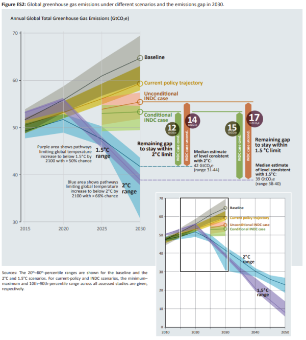
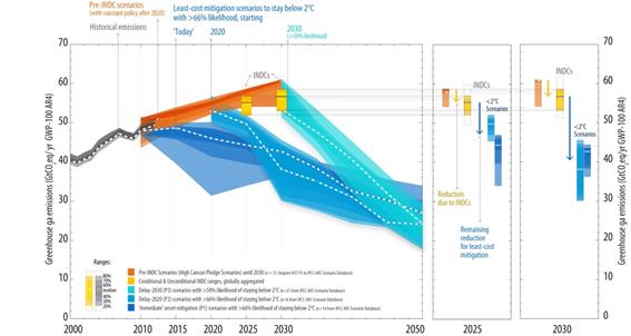
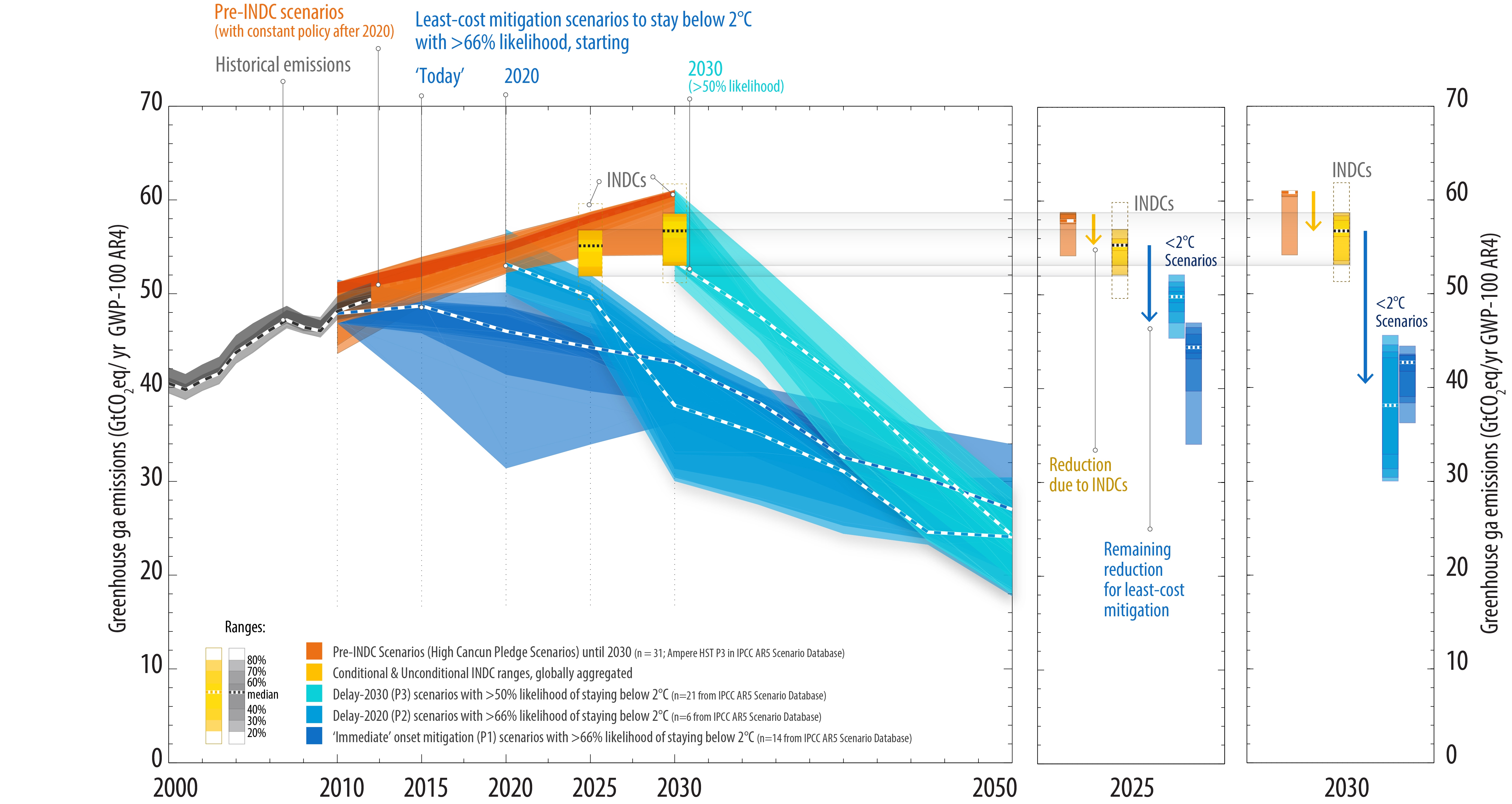
Having read the policy proposals on a large number of INDCs I concur with Lomborg. There is very little in the INDCs that will alter the future course of warming. So why the difference between my reading and the UNFCCC? The Executive Secretary has the World’s leading experts behind her, so there must be substantial support for the claim. The BBC article provides a link to the UNFCCC Synthesis report on the aggregate effect of INDCs. The link is to a number of documents. The main document makes no attempt to project forward the policy impacts to 2100. In fact if it did, the prognosis would be similar to Lomborg’s. The main graphic in Figure 2, also as a separate file, is shown below.

The orange is the pre-INDC pledges, the yellow the INDCs and the blues various scenarios to stay below two degrees.

To the right is two graphics for 2025 and 2030. The yellow arrow is “Reduction due to INDCs” and the blue arrow “Remaining reduction for least-cost mitigation“. For 2030 the INDCs seem to get a quarter of the way to the desired reduction. There is nothing about trends beyond 2030. The graphic could not be clearer. If the INDCs are to obtain constrain emissions consistent to the 2C of warming, the increasing trend from 2010 to 2030 would have to be rapidly turned into a decreasing trend post 2030, with global emissions reduced by half in two decades. As the non-policy trend is for about 4.5C of warming, then to obtain a 2.7C forecast requires the INDCs to collectively cause emissions to peak and then start a downward trend.

It is clear that there is no mention at all of the 2.7C of warming by 2100. No bridge of the 70 years from the period covered by the INDCs to the end of the century. What is more there is nothing in the aggregate policy contained in INDCs that would cause global emissions to first peak, then be set on a downward trend. So where is the reference?

For that you need to look in the Technical Annex section M. Summary of results from other studies. Even then the text does not mention 2100, but table 6 does.

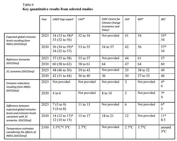
Instead of the UNFCCC making projections to 2100 on the basis of the INDCs for themselves, they use those of others. Yet the UNFCCC should have the expertise in projecting the impact of policy. I will look at three – that of another UN organisation and the two estimating 2.7C resulting from the INDCs.

UNEP Gap Report

The link within the footnote to table 6 is to the Executive Summary of the UNEP Emissions Gap Report 2015. The proper reference should have been to all the documents related to the Gap Report found here. The Executive Summary states

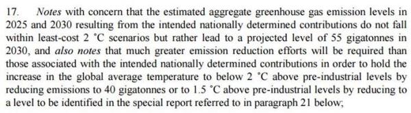
Full implementation of unconditional INDC results in emission level estimates in 2030 that are most consistent with scenarios that limit global average temperature increase to below 3.5 °C until 2100 with a greater than 66 per cent chance.

There is no actual projection from the INDCs. Rather, it looks at the emissions levels and emission trends in 2030 and compares them with modelled estimates that are similar. It is these modelled estimates that produce the 3.5C of warming in 2100. There is no reconciliation between the country-by-country INDCs and the overall global emissions scenarios. Rather it is just picking estimates that seem to fit at a global level. In terms of assessing the impacts of policy it is useless, as the modelled estimates may be markedly different from a forecast based on the latest information.

International Energy Agency (IEA) World Energy Outlook 2015

The link within the footnote to table 6 is to a press release for the IEA’s World Energy Outlook 2015. The footnote d. to table 6 gives an explanation of how the 2.7C projection was arrived at. In particular is the final point

To assess the impact on global average temperature increase, we used MAGICC with an emissions pathway post-2050 in between the representative concentration pathways (RCP) 4.5 and (RCP) 6 scenarios from the IPCC’s Fifth Assessment Report as this was interpreted as representing the best available trajectory compatible with IEA’s INDC Scenario.

The RCP (“Representative Concentration Pathways”) scenarios are explained on the RCP website

RCP 4.5: … is a stabilization scenario where total radiative forcing is stabilized before 2100 by employment of a range of technologies and strategies for reducing greenhouse gas emissions.

RCP 6.0: … is a stabilization scenario where total radiative forcing is stabilized after 2100 without overshoot by employment of a range of technologies and strategies for reducing greenhouse gas emissions.

Under “Characteristics and guidance” the website states (bold mine):-

The RCPs are named according to their 2100 radiative forcing level as reported by the individual modeling teams. …….

The RCPs are not forecasts or boundaries for potential emissions, land-use, or climate change. They are also not policy prescriptive in that they were chosen for scientific purposes to represent the span of the radiative forcing literature at the time of their selection and thus facilitate the mapping of a broad climate space. They therefore do not represent specific futures with respect to climate policy action (or no action) or technological, economic, or political viability of specific future pathways or climates. …..

The RCPs are four independent pathways developed by four individual modeling groups. The socioeconomics underlying each RCP are not unique; and, the RCPs are not a set or representative of the range of potential assumptions. …. The differences between the RCPs can therefore not directly be interpreted as a result of climate policy or particular socioeconomic developments. Any differences can be attributed in part to differences between models and scenario assumptions (scientific, economic, and technological).

The IEA has therefore used a hybrid of emissions scenarios as emissions forecasts to assess the impact policy when the group producing them has specifically said that these scenarios are not directly comparable and should not be used for policy purposes. In so doing, they implicitly make a set of assumptions about policy that may not relate to the real world and are definitely not related to the policies proposed within the INDCs.

Climate Action Tracker (CAT)

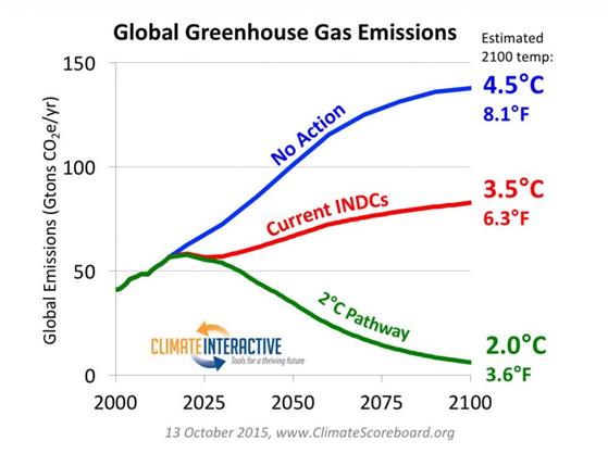
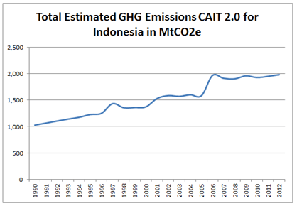
CAT tracks the INDCs from 32 nations that currently have about 80% of global emissions. Their estimate of the INDC impact until 2030 is broadly consistent with the UNFCCC. However, I am not sure where they obtain the historical emissions figures. For countries they appear to be from the World Resources Institute CAIT2.0. CAIT2.0 figures which are slightly different from those in the UNFCCC Country Briefs, but not markedly so in total. CAT’s methodology does have the advantage of providing a breakdown by country until 2030 between the BAU, but beyond 2030 details are distinctly hazy. The 2.7C claim is made on a briefing of 1st October 2015. The main graph behind the 2.7C estimate is reproduced below.

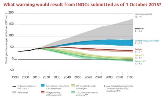
The impact of the INDCs is to see emissions peak about 2030, then gently fall through to the end of the century. From the detailed explanation it is not possible to determine how the emissions peak at the level as collectively the INDCs appear to show an upward trend. The reasons for this are probably from the following:-

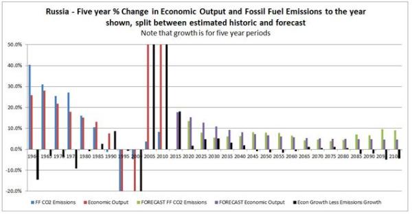
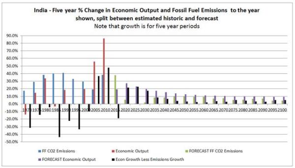
India – The INDC that estimates a tripling of emissions between 2014 and 2030 was not available when the briefing was published, which only assumes a doubling. The country assessment for India then tries to reconcile the difference by some fancy assumptions (lower economic growth rates and a higher emissions intensity reduction than in the INDC), without adjusting the overall assessment. If CAT’s 5GtCO2e estimate of 2030 emissions turns out to be correct (9% of global emissions), it will only be emissions growth delayed not a lower emissions peak. It is unlikely that India’s emissions will peak at less than 10GtCO2e, equivalent to over 20% of 2010 global emissions.

China – will likely reach peak emissions prior to 2030, but that peak will be likely higher than the 13.6GtCO2e forecast The CAT country assessment admits this is the case, but makes no allowance in the emissions forecast.

Missing Countries – Most of Africa, along with Pakistan, Vietnam, Bangladesh, Thailand and Myanmar are missing from the sample. Collectively their current emissions are small, but in the coming decades the share will rise. Africa’s emissions will rise as most of the global population increase in the latter half of the century is forecast to be within the continent. In South Asia there is already economic growth above the world average that will likely continue as the poorer countries follow in the wake of India. By 2100 these countries could collectively have emissions greater than current emissions of the OECD and China combined.

Ambiguities in the INDCs – Many of the INDCs are highly ambiguous. The historical figures are inconsistent; the forecasts are opaque; some key figures are missing; and it is not clear if some pledges in the INDC are in addition to the others, or part of the whole. CAT maximises the impact, rather than trying to frame questions for the submitting countries to clarify. There should be an assessment of these pledge risk factors. These will likely reduce the estimated policy impact.

Without any other hidden assumptions, CAT’s methods are likely to massively overstate the impact of policy. Critically is how increasing global emissions though to 2030 become decreasing global emissions post 2030. As inferred above, I believe it is due to systematic understating emission projections in the sample countries and ignoring the growth in the other countries. It may also be due to making further policy assumptions for the period beyond 2030. We will only be able to assess the impact if CAT provide a full country-by country projections of emissions in 2100 for the sample countries for both BAU and with INDC scenarios, along with projections for the rest of the world. Putting the figures on a table, rather than spending time creating graphs from which figures have to be estimated, would ease the process. If proper forecasts have been generated (that is making a forecast without policy, then modelling the impact policy will make) then the outline figures will be available already.

Concluding Comments

The UNFCCC presents no evidence that policy contained within the INDC submissions will make more than a small difference to global emissions in 2100. Instead they rely on external organisations. One quite clearly substitutes real world forecasts with emissions scenarios that do not relate to real world situations, and assume implementation of policy quite different to that contained with the INDCs. The other is likely to have massively overstated the policy impacts, but a lack of any clear statements as to how the conclusions were arrived at means quantification is not possible. The claims that the policy pledges within the INDCs will massively alter global emissions levels in the latter part of this century (and, subject to the climate models being broadly correct, the rise in global average temperatures) are without any proper foundation. The UNFCCC Executive Secretary Christiana Figueres is has made a misleading statement to drive through policies that are both costly and ineffective.

Such forecasts are based on making a forecast without policy, then modelling the impact policy will make, stating the assumptions. With 40,000 people attending a conference, the UNFCCC could surely have set aside a couple of million dollars to obtain a rigorous forecast from leading experts in that field. The methodology is fairly straightforward. It requires making a forecast for each country without policy, then modelling the impact policy will make, stating the assumptions. The important parts are data gathering, adhering rigorously to a consistent method and leaving an audit trail.

Kevin Marshall

WORLD RESOURCES INSTITUTE and Indonesian Emission Figures

In looking at the Indonesian INDC submission, I came across a confusing array of estimates for Indonesia’s total greenhouse gas emissions. These are the ones I found.

Estimates of Indonesia’s Total Greenhouse Emissions in MtCO2e
Dataset

1990

2000

2005

2010

UNFCCC 1,101 1,444 2,829 1,908
EDGAR 1,165 622 1,171 745
WRI CAIT 2.0 1,026 1,372 1,584 1,928
WRI Blog   1,000 1,400 1,500
Indonesian Govt     1,800  

In graph format the figures are:-

The Indonesian INDC Submission says it will give unconditionally cut emissions by 29% from the BAU of 2881 MtCO2e, it means that in 2030 emissions will be about 100 MtCO2e lower than in 2005 not 1120 MtCO2e lower (UNFCCC) or 530 MtCO2e higher (EDGAR) . But on the basis of the UNFCCC or EGDAR figures by 2010 Indonesia had fallen by a third, so meeting the 2030 unconditional target should prove a doddle. Alternatively, use the World Resources Institute CAIT 2.0 data and Indonesia has unconditionally agreed something much more drastic. Between 2005 and 2010 emissions grow at 4% a year. On that trend, the 2030 BAU becomes 4200 MtCO2e, not 2881 MtCO2e, so the unconditional emissions “cut” is not 29% but 51%.

The worst example is contained in a graph about the Indonesian INDC Submission at the World Resources Institute Blog and reproduced below.

There are a number of things wrong with this graph, including

  • Scale is in KtCO2e, not MtCO2e.
  • Does not use WRI’s own CAIT 2.0. This is despite WRI claiming itprovides free access to comprehensive, reliable, and comparable greenhouse gas emissions data sets, as well as other climate-relevant indicators, to enable analysis on a wide range of climate-related data questions.
  • Nor does is there any trace of Indonesia’s claimed emissions 1800 Mt CO2e in 2005. So where does this wibbly-wobbly projection come from? The reference includes BAPPENAS 2015 – the Indonesian “National Development Planning Agency”. A search finds this graph.

The figure for 2005 is about 1400 MtCO2e, not the 1800 MtCO2e stated in the INDC. The Indonesian’s have fiddled their own unaudited figures to get a politically desired result – an easily achievable “reduction” in GHG emissions. Even worse, the WRI does check the data. There are minor points that the Indonesian “dalam ribu ton” translates on Google as “in thousand tons“, or that anyone who knows climate data would realize that 1,000,000 MtCO2e is greater than 49GtCO2e, the UNIPCCs AR5 global estimate of GHG emissions in 2010.

Finally, the Carbon Brief, in a recent article says that 1997 was a record for forest fires – a record that may be broken in 2015. Already 1600 MtCO2e has been emitted from forest fires. On this basis, therefore, 1997 total Indonesian emissions are likely to be well in excess of 2000 MtCO2e, and a considerable spike in the record.

The WRI CAIT 2.0 data, shows a minor spike. The narrower “GHG Emissions from Land-Use Change and Forestry” was estimated at 904 MtCO2e, as against 1321 MtCO2e in 2006. This is nowhere near the implied Carbon Brief 1997 emissions record. The figures

In summary, emissions figures for Indonesia are just arbitrary estimates, based on extremely limited and contradictory data. Both the WRI and the Indonesian Government cherry-pick data to suit their cause. Whether it is justified depends on the purpose. The WRI states their missions clearly.

That is to impose their environmentalist beliefs and perspectives on everybody else.

Indonesia’s INDC submission begins

This is, in my view, a far more rounded and focused mission. Against the environmentalist ideologies of the UNFCCC I believed that in manipulating figures Indonesia is serving the interests of 250 million Indonesians.

Kevin Marshall