Plan B Environmental Activists deservedly lose High Court battle over Carbon Target

Breaking News

From Belfast Telegraph & itv.com and Science Matters (my bold)

Lawyers for the charity previously argued the Government should have, in light of the current scientific consensus, gone further than its original target of reducing carbon levels by 2050 to 80% of those present in 1990.

They said the decision not to amend the 2050 target put the UK in breach of its international obligations under the Paris Agreement on Climate Change and was influenced by the Government’s belief that a “more ambitious target was not feasible”.

At a hearing on July 4, Jonathan Crow QC told the court: “The Secretary of State’s belief that he needs to have regard to what is feasible, rather than what is necessary, betrays a fundamental misunderstanding of the scheme of the 2008 Act and must be quashed.

“All of the individual claimants are deeply concerned about climate change.”

The barrister argued the Secretary of State’s “continuing refusal” to amend the 2050 target means the UK is playing “Russian roulette with two bullets, instead of one”.

But, refusing permission for a full hearing, Mr Justice Supperstone said Plan B Earth’s arguments were based on an “incorrect interpretation” of the Paris Agreement.

He said: “In my view the Secretary of State was plainly entitled … to refuse to change the 2050 target at the present time.

In a previous post I wrote that

Taking court action to compel Governments to enforce the Paris Climate Agreement is against the real spirit of that Agreement. Controlling global GHG emissions consistent with 2°C, or 1.5°C is only an aspiration, made unachievable by allowing developing countries to decide for themselves when to start reducing their emissions. ……. Governments wanting to both be players on the world stage and serve their countries give the appearance of taking action of controlling emissions, whilst in substance doing very little. This is the real spirit of the Paris Climate Agreement. To take court action to compel a change of policy action in the name of that Agreement should be struck off on that basis.

Now I would not claim Mr Justice Supperstone supports my particular interpretation of the Paris Agreement as an exercise in political maneuvering allowing Governments to appear to be one thing, whilst doing another. But we are both agreed that “Plan B Earth’s arguments were based on an “incorrect interpretation” of the Paris Agreement.

The UNFCCC PDF of the Paris Agreement is here to check. Then check against my previous post, which argues that if the Government acted in the true spirit of the Paris Agreement, it would suspend the costly Climate Change Act 2008 and put efforts into being seen to be doing something about climate change. Why

  • China was praised for joining the emissions party by proposing to stop increasing emissions by 2030.
  • Very few of the INDC emissions will make real large cuts in emissions.
  • The aggregate forecast impact of all the INDC submissions, if fully enacted, will see global  emissions slightly higher than today in 2030, when according to the UNEP emissions GAP report 2017 for 1.5°C warming target they need to be 30% lower in just 12 years time. Paris Agreement Article 4.1 states something that is empirically incompatible with that aim.

In order to achieve the long-term temperature goal set out in Article 2, Parties aim to reach global peaking of greenhouse gas emissions as soon as possible, recognizing that peaking will take longer for developing country Parties,

  • The Paris Agreement allows “developing” countries to keep on increasing their emissions. With about two-thirds of global emissions (and over 80% of the global population), 30% emissions cuts may not be achieved even if all the developed countries cut emissions to zero in 12 years.
  • Nowhere does the Paris Agreement recognize the many countries who rely on fossil fuels for a large part of their national income, for instance in the Middle East and Russia. Cutting emissions to near zero by mid-century would impoverish them within a generation. Yet, with the developing countries also relying on cheap fossil fuels to promote high levels of economic growth for political stability and to meeting the expectations of their people (e.g. Pakistan, Indonesia, India, Turkey) most of the world can carry on for decades whilst some enlightened Governments in the West damage the economic futures of their countries for appearances sake. Activists trying to dictate Government policy through the Courts in a supposedly democratic country ain’t going to change their minds.

Plan B have responded to the judgement. I find this statement interesting.

Tim Crosland, Director of Plan B and former government lawyer, said: ‘We are surprised and disappointed by this ruling and will be lodging an appeal.

‘We consider it clear and widely accepted that the current carbon target is not compatible with the Paris Agreement. Neither the government nor the Committee on Climate Change suggested during our correspondence with them prior to the claim that the target was compatible.

Indeed, it was only in January of this year that the Committee published a report accepting that the Paris Agreement was ‘likely to require’ a more ambitious 2050 target

What I find interesting is that only point that a lawyer has for contradicting Mr Justice Supperstone’s statement that “Plan B Earth’s arguments were based on an “incorrect interpretation” of the Paris Agreement” is with reference to a report by the Committee on Climate Change. From the CCC website

The Committee on Climate Change (the CCC) is an independent, statutory body established under the Climate Change Act 2008.

Our purpose is to advise the UK Government and Devolved Administrations on emissions targets and report to Parliament on progress made in reducing greenhouse gas emissions and preparing for climate change.

The Committee is set up for partisan aims and, from its’s latest report, appears to be quite zealous in fulfilling those aims. Even as a secondary source (to a document which is easy to read) it should be tainted. But, I would suggest that to really understand the aims of the Paris Agreement you need to read the original and put it in the context of the global empirical and political realities. From my experience, the climate enlightened will keep on arguing for ever, and get pretty affronted when anyone tries to confront their blinkered perspectives.

Kevin Marshall

Nature tacitly admits the IPCC AR5 was wrong on Global Warming

There has been a lot of comment on a recent paper at nature geoscience “Emission budgets and pathways consistent with limiting warming to 1.5C” (hereafter Millar et. al 2017)

When making a case for public policy I believe that something akin to a process of due diligence should be carried out on the claims. That is the justifications ought to be scrutinized to validate the claims. With Millar et. al 2017, there are a number of issues with the make-up of the claims that (a) warming of 1.5C or greater will be achieved without policy (b) constraining the emissions  

The baseline warming

The introduction states
Average temperatures for the 2010s are currently 0.87°C above 1861–80,

A similar quote from UNIPCC AR5 WG1 SPM page 5

The total increase between the average of the 1850–1900 period and the 2003–2012 period is 0.78 [0.72 to 0.85] °C, based on the single longest dataset available.

These figures are all from the HADCRUT4 dataset. There are three areas to account for the difference of 0.09°C. Mostly it is the shorter baseline period. Also, the last three years have been influenced by a powerful and natural El-Nino, along with the IPCC using an average of the last 10 years.

The warming in the pipeline

There are valid reasons for the authors differing from the IPCC’s methodology. They start with the emissions from 1870 (even though emissions estimates go back to 1850). Also, if there is no definite finish date, it is very difficult to calculate the warming impact to date. Consider first the full sentence quoted above.

Average temperatures for the 2010s are currently 0.87°C above 1861–80, which would rise to 0.93°C should they remain at 2015 levels for the remainder of the decade.

This implies that there is some warming to come through from the impact of the higher greenhouse gas levels. This seems to be a remarkably low and over a very short time period. Of course, not all the warming since the mid-nineteenth century is from anthropogenic greenhouse gas emissions. The anthropogenic element is just guesstimated. This is show in AR5 WG1 Ch10 Page 869

More than half of the observed increase in global mean surface temperature (GMST) from 1951 to 2010 is very likely due to the observed anthropogenic increase in greenhouse gas (GHG) concentrations.

It was after 1950 when the rate largest increase in CO2 levels was experienced. From 1870 to 1950, CO2 levels rose from around 290ppm to 310ppm or 7%. From 1950 to 2010, CO2 levels rose from around 310ppm to 387ppm or 25%. Add in other GHG gases and there the human-caused warming should be 3-4 times greater in the later period than the earlier one, whereas the warming in the later period was just over twice the amount. Therefore if there is just over a 90% chance (very likely in IPCC speak) of over 50% of the warming post-1950 was human-caused, a statistical test relating to a period more than twice as long would have a lower human-caused element of the warming as being statistically significant. Even then, I view the greater than 50% statistic as being deeply flawed. Especially when post-2000, when the rate of rise in CO2 levels accelerated, whilst the rise in average temperatures dramatically slowed. There are two things that this suggests. First, the impact could be explained by rising GHG emissions being a minor element in temperature rise, with natural factors both causing some of the warming in the 1976-1998 period, then reversing, causing cooling, in the last few years. Second is that there is a darn funny lagged response of rising GHGs (especially CO2) to rises in temperature. That is the amount of warming in the pipeline has increased dramatically. If either idea has any traction then the implied warming to come of just 0.06°is a false estimate. This needs to be elaborated.

Climate Sensitivity

If a doubling of CO2 leads to 3.00°C of warming (the assumption of the IPCC in their emissions calculations), then a rise in CO2 levels from 290ppm to 398 ppm (1870 to 2014) eventually gives 1.37°C of warming. With other GHGs this figure should be around 1.80°C. Half that warming has actually occurred, and some of that is natural. So there is well over 1.0°C still to emerge. It is too late to talk about constraining warming to 1.5°C as the cause of that warming has already occurred.

The implication from the paper in claiming that 0.94°C will result from human emissions in the period 1870-2014 is to reduce the climate sensitivity estimate to around 2.0°C for a doubling of CO2, if only CO2 is considered, or around 1.5°C for a doubling of CO2, if all GHGs are taken into account. (See below) Compare this to AR5 WG1 section D.2 Quantification of Climate System Responses

The equilibrium climate sensitivity quantifies the response of the climate system to constant radiative forcing on multicentury time scales. It is defined as the change in global mean surface temperature at equilibrium that is caused by a doubling of the atmospheric CO2 concentration. Equilibrium climate sensitivity is likely in the range 1.5°C to 4.5°C (high confidence), extremely unlikely less than 1°C (high confidence), and very unlikely greater than 6°C (medium confidence).

The equilibrium climate sensitivity ECS is at the very bottom of the IPCC’s range and equilibrium climate response is reached in 5-6 years instead of mutlicentury time scales. This on top of the implied assumption that there is no net natural warming between 1870 and 2015.

How much GHG emissions?

With respect to policy, as global warming is caused by human greenhouse gas emissions, to prevent further human-caused warming requires reducing, and possibly eliminating global greenhouse emissions. In conjunction with the publication of the AR5 Synthesis report, the IPCC produced a slide show of the policy case laid out in the three vast reports. It was effectively a short summary of a summary of the synthesis report. Approaching the policy climax at slide 30 of 35:-

Apart from the policy objective in AR5 was to limit warming from 2°C, not 1.5°C, it also mentions the need to constrain GHG emissions, not CO2 emissions. Then slide 33 gives the simple policy simplified position to achieve 2°C of warming.

To the end of 2011 1900 GTCO2e of GHGs was estimated to have been emitted, whilst the estimate is around 1000 GTCO2e could be emitted until the 2°C warming was reached.

The is the highly simplified version. At the other end of the scale, AR5 WG3 Ch6 p431 has a very large table in a very small font to consider a lot of the policy options. It is reproduced below, though the resolution is much poorer than the original.

Note 3 states

For comparison of the cumulative CO2 emissions estimates assessed here with those presented in WGI AR5, an amount of 515 [445 to 585] GtC (1890 [1630 to 2150] GtCO2), was already emitted by 2011 since 1870

The top line is for the 1.5°C of warming – the most ambitious policy aim. Of note:-

  • The CO2 equivalent concentration in 2100 (ppm CO2eq ) is 430-480ppm.
  • Cumulative CO2 emissions (GtCO2) from 2011 to 2100 is 630 to 1180.
  • CO2 concentration in 2100 is 390-435ppm.
  • Peak CO2 equivalent concentration is 465-530ppm. This is higher than the 2100 concentration and if for CO2 alone with ECS = 3 would eventually produce 2.0°C to 2.6°C of warming.
  • The Probability of Exceeding 1.5 °C in 2100 is 49-86%. They had to squeeze really hard to say that 1.5°C was more than 50% likely.

Compare the above to this from the abstract of Millar et. al 2017.

If COemissions are continuously adjusted over time to limit 2100 warming to 1.5C, with ambitious non-COmitigation, net future cumulativCOemissions are unlikely to prove less than 250 GtC and unlikely greater than 540 GtC. Hence, limiting warming to 1.5C is not yet a geophysical impossibility, but is likely to require delivery on strengthened pledges for 2030 followed by challengingly deep and rapid mitigation.

They use tonnes of carbon as the unit of measure as against CO2 equivalent. The conversion factor is 3.664, so cumulative CO2 emissions need to be 870-1010 GtCO2 range. As this is to the end of 2015, not 2011 as in the IPCC report, it will be different. Subtracting 150 from the IPCC reports figures would give a range of 480 to 1030. That is, Millar et. al 2017 have reduced the emissions range by 75% to the top end of the IPCC’s range. Given the IPCC considered a range of 1.5-1.7°C of warming, this seems somewhat odd to then say it related to the lower end of the warming band, until you take into account that ECS has been reduced. But then why curtail the range of emissions instead calculating your own? It appears that again the authors are trying to squeeze a result within existing constraints.

However, this does not take into account the much higher levels of peak CO2 equivalent concentrations in table 6.3. Peak CO2 concentrations are around 75-95ppm higher than in 2100. Compare this to the green line in the central graph in Millar et. al 2017. 

 This is less than 50ppm higher than in 2100. Further in 2100 Millar et. al 2017 has CO2 levels of around 500ppm as against a mid-point of 410 in AR5. CO2 rising from 290 to 410ppm with ECS = 3.0 produced 1.50°C of warming. CO2 rising from 290 to 410ppm with ECS = 2.0 produced 1.51°C of warming. Further, this does not include the warming impact of other GHGs. To squeeze into the 1.5°C band, the mid-century overshoot in Millar et. al 2017 is much less than in AR5. This might be required in the modeling assumptions due to the very short time assumed in reaching full equilibrium climate response.

Are the authors playing games?

The figures do not appear to stack up. But then they appear to be playing around with figures, indicated by a statement in the explanation of Figure 2

Like other simple climate models, this lacks an explicit physical link between oceanic heat and carbon uptake. It allows a global feedback between temperature and carbon uptake from the atmosphere, but no direct link with net deforestation. It also treats all forcing agents equally, in the sense that a single set of climate response parameters is used in for all forcing components, despite some evidence of component-specific responses. We do not, however, attempt to calibrate the model directly against observations, using it instead to explore the implications of ranges of uncertainty in emissions, and forcing and response derived directly from the IPCC-AR5, which are derived from multiple lines of evidence and, importantly, do not depend directly on the anomalously cool temperatures observed around 2010.

That is:-

  • The model does not consider an “explicit physical link between oceanic heat and carbon uptake.” The IPCC estimated that over 90% of heat accumulation since 1970 was in the oceans. If the oceans were to belch out some of this heat at a random point in the future the 1.5°C limit will be exceeded.
  • No attempt has been made to “calibrate the model directly against observations”. Therefore there is no attempt to properly reconcile beliefs to the real world.
  • The “multiple lines of evidence” in IPCC-AR5 does not include a glaring anomaly that potentially falsifies the theory and therefore any “need” for policy at all. That is the divergence in actual temperatures trends from theory in this century.

Conclusions

The authors of Millar et. al 2017 have pushed out the boundaries to continue to support climate mitigation policies. To justify constraining emissions sufficient stop 1.5°C of warming the authors would appear to have

  • Assumed that all the warming since 1870 is caused by anthropogenic GHG emissions when there is not even a valid statistical test that confirms even half the warming was from this source.
  • Largely ignored any hidden heat or other long-term response to rises in GHGs.
  • Ignored the divergence between model predictions and actual temperature anomalies since around the turn of the century. This has two consequences. First, the evidence appears to strongly contradict the belief that humans are a major source of global warming and by implication dangerous climate change. Second, if it does not contradict the theory, suggests the amount of warming in the pipeline consequential on human GHG emissions has massively increased. Thus the 1.5°C warming could be breached anyway.
  • Made ECS as low as possible in the long-standing 1.5°C to 4.5°C range. Even assuming ECS is at the mid-point of the range for policy (as the IPCC has done in all its reports) means that warming will breach the 1.5°C level without any further emissions. 

The authors live in their closed academic world of models and shared beliefs. Yet the paper is being used for the continued support of mitigation policy that is both failing to get anywhere close to achieving the objectives and is massively net harmful in any countries that apply it, whether financially or politically.

Kevin Marshall

Commentary at Cliscep, Jo Nova, Daily Caller, Independent, The GWPF

Update 25/09/17 to improve formatting.

Time will run out to prevent 2°C warming barrier being breached

I have a number of times referred to a graphic “Figure 2 Summary of Results” produced by the UNFCCC for the Paris COP21 Climate Conference in December 2015. It was a centerpiece of the UNFCCC Synthesis report on the aggregate effect of INDCs.

The updated graphic (listed as Figure 2, below the Main Document pdf) is below

This shows in yellow the impact of the INDC submissions covering the period 2015 to 2030) if fully implemented against limiting warming to 2°C  and 1.5°C . This showed the gulf between the vague policy reality and the targets. Simply put, the net result of the INDCs submissions would insufficient for global emissions to peal Yet in reaching an “agreement” the representatives of the entire world collectively put off recognizing that gulf.

For the launch of the UNIPCC AR5 synthesis report in 2014, there were produced a set of slides to briefly illustrate the policy problem. This is slide 20 of 35, showing the  reduction pathways.


The 2°C  of warming central estimate is based upon total GHG emissions in the 21st Century being around 2500 GtCO2e.

At the launch of 2006 Stern Review Sir Nicholas Stern did a short Powerpoint presentation. Slide 4 of the PDF file is below.


The 450ppm CO2e emissions pathway is commensurate with 2°C  of warming. This is based upon total GHG emissions in the 21st Century being around 2000 GtCO2e, with the other 500 GtCO2e presumably coming in the 22nd Century.

The UNFCCC Paris graphic is also based on 2500 GtCO2e it is also possible to calculate the emissions reduction pathway if we assume (a) All INDC commitments are met (b) Forecasts are correct (c) no additional mitigation policies are enacted.

I have produced a basic graph showing the three different scenarios.

The Stern Review assumed global mitigation policy would be enacted around 2010. Cumulative 21st Century emissions would then have been around 450 GtCO2e. With 500 GtCO2e allowed for post 2100, this gave average emissions of around 17 GtCO2e per annum for the rest of the century. 17 GtCO2e, is just under 40% of the emissions in the year the policy would be enacted.

IPCC AR5  assumed global mitigation policy would be enacted around 2020. Cumulative 21st Century emissions would then have been around 950 GtCO2e. A presentation to launch the Synthesis Report rounded this to 1000 GtCO2e as shown in slide 33 of 35.

Assuming that global emissions were brought to zero by the end of the century, this gave average emissions of 20 GtCO2e per annum for the rest of the century. 20 GtCO2e, is just under 40% of the emissions in the year the theoretical global policy would be enacted. The stronger assumption of global emissions being reduced to zero before the end of the century, along with a bit of rounding, offsets the delay.

If the Paris Agreement had been fully implemented, then by 2030 cumulative 21st Century emissions would have around 1500 GtCO2e, leaving average emissions of around 14 GtCO2e per annum for the rest of the century. 17 GtCO2e, is just over 25% of the emissions in the year the policy would be enacted. The failure of the Paris Agreement makes it necessary for true global mitigation policies, if in place by 2030, to be far more drastic that those of just a few years before to achieve the same target.

But the Paris Agreement will not be fully implemented. As Manhatten Contrarian (hattip The GWPF) states, the US was the only major country proposing to reduce its emissions. It looks like China, India, Indonesia, Russia and Germany will all increase their emissions. Further, there is no indication that most countries have any intention of drastically reduce their emissions. To pretend otherwise is to ignore a truism, what I will term the First Law of Climate Mitigation

To reduce global greenhouse gas emissions, the aggregate reduction in countries that reduce their emissions must be greater than aggregate increase in emissions in all other countries.

Modeled projections and targets are rendered meaningless if this truism is ignored. Yet this is what the proposers of climate mitigation policy have been effectively doing for many years. Emissions will therefore breach the mythical 2°C warming barrier, but based on recent data I believe warming will be nowhere near that level.

Kevin Marshall


IPCC AR5 Synthesis Report Presentation Miscalculated the Emissions for 2C of Warming

In a previous post I mistakenly claimed that the Ladybird Book on Climate Change (lead author HRH The Prince of Wales) had incorrectly interpreted the AR5 IPCC Synthesis Report in its egg-timer. It is the IPCC that is at fault.
In 2014 the IPCC produced a simplified presentation of 35 slides to summarize the AR5 Synthesis Report Summary for policy makers. A quick summary of a summary of the synthesis report.

Slide 30 on Limiting Temperature Increase to 2C, clearly states that it is global reductions in greenhouse gas emissions that are needed.


The Ladybird egg-timer is adapted from slide 33 of 35.

As a (slightly manic) beancounter I like to reconcile the figures. How are the 1900 GtCO2 and the 1000 GtCO2 arrived at? It could be that it is GtCO2e, like the throughout the synthesis report, where other greenhouse gases are recast in terms of CO2, which accounts for well over half of the warming from trace gases.

Some assumptions for my quick calculations.

1. A doubling of CO2 will lead to a warming of 3C. This was the central estimate of the Charney Report 1979 (pdf), along with all five of the UNIPCC assessment reports.
2. If the pre-industrial level of CO2 was 280ppm, the dangerous 2C of warming will be reached at 445ppm. Rounded this is 450ppm.
3. In 2011 the Mauna Loa CO2 level was 391.63 ppm.
4. Using the CDIAC World CO2 emission figures, gives the following figures for billions of tonnes of CO2 to achieve a 1ppm rise in CO2 levelsin the graph below. In the five years to 2011 on average it took 17.02 billion tonnes of CO2 to raise CO2 levels by 1 ppm. Lets round it to 17.

Now some quick calculations.
Start with 280ppm
Add 111.76 (=1900/17) gives 391.76. Pretty close to the CO2 level in 2011 of 391.63ppm
Add 58.82 (=1000/17) gives 450.58. Given rounding, this pretty close to 450ppm.

There are problems with these calculations.

  • The estimate of 17 GtCO2e is on the high side. The World CO2 emissions from the CDIAC National Emissions spreadsheet gives a sum of 1069.68 GtCO2 from 1960 to 2011, against a rise in CO2 of 74.72 ppm. That is 14.3 GtCO2e over the whole period. Since 2011 there has been a drop towards this long-term average.
  • The Ladybird Book, like the UNFCCC at COP21 Paris December 2015 talks about restraining emissions to 1.5C. If a doubling of CO2 leads to 3.000C of warming then going from 280ppm to 401ppm (the average level in 2015) will eventually 1.555C of warming. This is a tacit admission that climate sensitivity is vastly overstated.
  • But the biggest error of all is that CO2 is only the major greenhouse gas (if you forget about water vapour). It might be the majority of the warming impact and two-thirds of emissions, but it is not all the warming impact according to theory. That alone would indicate that climate sensitivity was 2 instead of 3. But actual warming from 1780 to 2011 was less than 1C, against the 1C from CO2 alone if CS=2. That indicates that CS ≈ 1.3. But not all of the warming in the last 230 years has been due to changes in GHG levels. There was also recovery from the Little Ice Age. Worst of all for climate alarmism is the divergence problem. In this century the rate of warming should have increased as the rate of CO2 levels increased, in turn due to an increase in the rate of rise in CO2 emissions. But warming stopped. Even with the impact of a strong El Nino, the rate of warming slowed dramatically.


Conclusion

The IPCC calculated their figures for 1000 billion tonnes of CO2 emissions for 2C of warming based on CO2 being the only greenhouse gas and a doubling of CO2 levels producing 3C of warming. On that basis 401ppm CO2 level should produce >1.5C of warming. Add in other greenhouse gases and we are in for 2C of warming without any more greenhouse gas emissions. It is only if climate sensitivity is much lower is it theoretically possible to prevent 2C of warming by drastically reducing global CO2 emissions. The IPCC, have concocted figures knowing that they do not reconcile back to their assumptions.

The questions arise are (a) where do the cumulative emissions figures come from? and (b) whether the UNIPCCC has copied these blatant errors in the COP processes?

This is an extended version of a comment made a Paul Homewoods’ notalotofpeopleknowthat blog.

Kevin Marshall

Friends of the Earth distorting the evidence for Fracking in the UK

Summary

Friends of the Earth have a webpage claiming to be “fracking facts”. The key points I make are.

  • The claims of dangers of fracking raise questions, that need to be answered before they can be considered credible.
  • The claim that fracking could affect house prices is totally unsupported.
  • The claim that shale gas will not significantly affect energy prices is based on out of date data. The British Geological Survey has shown that the potential of shale gas is huge. Friends of the Earth has played a major role in preventing that potential being realized.
  • FoE has consequently helped prevent shale gas from relieving the energy crisis brought upon by the Climate Change Act 2008.
  • Claims that pursuing shale gas in Britain will affect global emissions are pure fantasy. Also is a fantasy the belief that Britain is leading the way on emissions reductions. We ain’t leading if collectively the world is not following. The evidence shows clearly shows this.  

In the previous post I looked at how FoE blatantly mislead about an agreement they reached with the Advertising Standards Authority, which caused the unusual step of ASA Chief Executive Guy Parker issuing a strongly worded statement to defend the ASA’s integrity.

In this post I will look at FoE’s position on fracking, from Fracking definition? What does fracking mean? Read our fracking facts

I will look at various statements made (with FoE quotes in purple), showing how well they are supported by the evidence and/or providing alternative perspectives.

From the section What are the dangers of fracking?

Industry statistics from North America show that around 6% of fracking wells leak immediately.

Leaking wells lead to a risk of water contamination. Lord Smith, former chair of the Environment Agency, has said this is the biggest risk posed by fracking.

So it’s particularly concerning that the Government has now said it will allow fracking companies to drill through aquifers which provide household drinking water.

This raises some questions.

  • If leaks are a problem, with respect to fracking in the UK has this been risk assessed, with appropriate measures taken to prevent leaks?
  • Does that statistic of 6% allow for when there is natural leakage in the area of fracking leaking in the water supplies are venting into the atmosphere in the area where fracking is occurring? This was the case in the images of the flaming water faucet in the movie Gasland.
  • Have there been steps taken in the USA to reduce genuine leaks?
  • Has the proportion of wells leaking gas in the USA been increasing or decreasing?
  • Has the average amount of gas leaked been increasing or decreasing?
  • How when extracting gas from well below water aquifers, through a lined tube, that is both water-tight and gas-tight, is that gas (and fracking fluids) meant to leech into the water supply?

Then there is the statement without evidence.

Fracking could also affect house prices.

This was one of the issues FoE in its agreement with the ASA have the assurance not to repeat claims that fracking affects property prices, unless the evidence changes. Legally there might be cop-out where that assurance does not apply to claims made on its website. Literally, the statement is not untrue, just as the claim that a butterfly flapping its wings on the North Downs could lead to a typhoon in the South China Sea.

Would fracking bring down energy bills?

It’s very unlikely. Fracking company Cuadrilla has admitted that any impact on bills would be “basically insignificant”.

Claims that fracking would create a lot of jobs have also been overstated. According to Cuadrilla, each of its proposed 6-year projects in Lancashire that were recently rejected by the council would only have created 11 jobs.

The claim about Cuadrilla is sourced from an Independent article in June 2013.

“We’ve done an analysis and it’s a very small…at the most it’s a very small percentage…basically insignificant,” said Mark Linder, a public relations executive at Bell Pottinger who is also responsible for Cuadrilla’s corporate development.

The article later says

“According to Poyry, Lancashire shale gas production could also reduce the country’s wholesale gas and electricity prices by as much as 4 per cent between 2014 and 2035, which corresponds to an average saving of £810m/year,”

It is not surprising that shale gas developments in Lancashire alone will not have a significant impact on UK energy prices, especially if that is restricted to a few sites by one company. But over three years later the landscape has changed. The British Geological Survey has been publishing estimates of the quantities of shale gas (and oil) that exists beneath the ground.

The figures are at first hard to comprehend. They are large numbers in units of measure that ordinary people (even people with some knowledge of the field) find hard to comprehend, let alone put into some perspective. In my view, the figures need to be related to annual British consumption. Page 8 of the DECC UK Energy Statistics, 2015 & Q4 2015 estimates gas demand at 794 TWh in 2015.

The BGS uses tcf (tera cubic feet) for its’ estimates, which (like a domestic gas bill) can be converted from TWh. The 794 TWh is about 2.7 tcf. Not all shale gas is recoverable. In fact possibly only 10% of reserves is recoverable on existing technology, and depending on the quality of the deposits.

There are also shale oil deposits, measured by the BGS in both barrels and millions of tonnes. Refinery production (a rough estimate of consumption) was 63 million tonnes in 2015. I will again assume 10% recovery, which may be overly prudent.

The biggest shock was published just a few weeks after the Independent article on 27th July 2013. The size of the Bowland shale was truly staggering. The central estimate is 1329 tcf, meaning enough to satisfy 49 years of current UK gas demand. Potentially it is more, due to the depth of deposits in many areas. No significant deposits of oil are thought to be present

On 23rd May 2014 BGS published the results for the Weald Basin, a large area in the South East of England. Whilst there were no significant deposits of gas, the central estimate of 591 million tonnes is enough to supply the UK for one year.

On 25 June 2014 the Welsh Government published the estimates for Wales. The main gas deposits are thought to be in Wrexham/Cheshire and in South Wales and estimated about 65 tcf, or just over two years of UK demand. (Strictly the Welsh estimate is somewhat below this, as Wrexham is on the Welsh border and Cheshire is an English county. )

On 23rd May 2014 BGS published the results for the Midland Valley of Scotland. The central estimate for shale gas was 80.3 tcf (3 years of UK demand) and for shale oil 800 million tonnes (15 months of refinery production).

Most recently on 13th October 2016, BGS published the results for the Jurassic shale of the Wessex area. Central estimate for shale oil was 149 million tonnes, equivalent to three months of UK refinery production.

In all, conservatively there is estimated to be sufficient gas to supply the UK for over 54 years and oil for two and half years. The impact on supply, and therefore the impact on jobs and (in the case of gas) on energy prices, demands on the ability of businesses to profitability develop these resources. As has happened in the USA, the impact on jobs is mostly dependent on the impact on prices, as low prices affect other industries. In the USA, industries that are sensitive to energy prices (or use gas as a raw material) have returned from overseas, boosting jobs. FoE has played no small part in delaying planning applications with spurious arguments, along with generating false fears that could have made regulations more onerous than if an objective assessment of the risks had been made.

Fracking can’t help any short term or medium term energy crisis.

Even if the industry was able to move ahead as fast as it wants, we wouldn’t see significant production until about 2025.

This is actually true and up to date. If it were not for the Climate Change Act along with eco-activists blocking every move to meet the real energy demands in the most affordable and efficient way possible, there would be no prospective energy crisis. In terms of shale gas meeting energy demands (and gas-fired power stations being built) FoE should claim some of the credit for preventing the rapid develop of cheap and reliable energy sources, and thus exacerbating fuel poverty.

Will fracking help us to tackle climate change?

Shale gas and shale oil are fossil fuels. They emit greenhouse gases. Avoiding the worst impacts of climate change means getting off fossil fuels as soon as possible.

Scientists agree that to stop dangerous climate change, 80% of fossil fuels that we know about need to stay in the ground.

Setting up a whole new fossil fuel industry is going in completely the wrong direction, if the UK is to do its fair share to stop climate change.

The hypothesis is that global emissions lead to higher levels of greenhouse gases. In respect of CO2 this is clear. But the evidence that accelerating rate of rise in CO2 levels has led to accelerating average global temperatures is strongly contradicted by real world data. There is no scientific consensus that contracts this conclusion. Further there is no proper scientific evidence to suggest that climate is changing for the worse, if you look at the actual data, like leading climate scientist Dr John Christy does in this lecture. But even if the catastrophic global warming hypothesis were true (despite the weight of real world data against it) global warming is global. Britain is currently emitting about 1.1% of global emissions. Even with all the recently discovered shale gas and oil deposits, under the UK is probably less than 1% of all estimated fossil fuel deposits. Keeping the fossil fuels under British soil in the ground will do nothing to change the global emissions situation.  Britain tried to lead the way with the Climate Change Act of 2008, in committing to reduce its emissions by 80% by 2050. The INDC submissions leading up to COP21 Paris in December 2015 clearly showed that the rest of the countries were collectively not following that lead. The UNFCCC produced a graph showing the difference of the vague policy proposals might make.  I have stuck on the approximate emissions pathway to which the UK is committed.

The FoE is basically objecting to fracking to keep up the appearance that the UK is “doing its bit” to save the world from catastrophic global warming. But in the real world, global warming ain’t happening, neither are the predicted catastrophes. Even if it were, whatever Britain does will make no difference. FoE attempting to deny future jobs growth and stop the alleviation of fuel poverty to maintain the fantasy that Britain is leading the way on climate change.

 Isn’t it better to have our own gas rather than importing it?

…….

If we went all out for shale, our gas imports would stay at current levels as the North Sea supply declines – and imports could increase by 11%.

This claim, without any reference, is based likely based on the same out of date sources as below. If FoE and fellow-travellers kept out of the way with their erroneous legal challenges and distortions then shale gas has a huge potential to cause imports to decline.

Kevin Marshall

£319 billion on Climate Change for approximately nothing

The major reason for abandoning the Climate Change Act 2008 is not due to the massive financial burden imposed on families, but because it will do approximately nothing to curb global greenhouse gas emissions. Massive costs are being imposed for near zero prospective benefit.

At the weekend the GWPF published a paper by Peter Lilley MP on the costs of The Climate Change Act 2008. From 2014 to 2030 he estimates a total cost of £319 billion to ensure that in 2030 British greenhouse gas emissions are 57% below their 1990 levels.
Putting this into context, listen to then Environment Minister David Miliband introducing the Climate Change Bill in 2007.

The 2008 Act increased the 2050 target from 60% to 80%. Miliband recognizes that what the UK does is not sufficient to stop a global problem. That requires a global solution. Rather, the aim is for Britain to lead the way, with other industrialized countries encouraged to follow. The developing countries are given a free choice of “a low carbon path of development rather than to repeat the mistakes of the industrialized countries.

Over eight years after the little video was made and seven years after the Climate Change Act was passed (with an increased 2050 emissions reduction target of 80% reduction on 1990 levels) was the COP21 in Paris. The responses from other countries to Britain’s lead were in the INDC submission, which the UNFCCC summarized in a graph, and I have annotated.

The UNFCCC have four bands. First, in orange, is the Pre-INDC scenarios. Then in yellow is the projected global impact if all the vague policy proposals are full enacted. In blue is the least cost 2◦C pathway for global emissions reductions, whilst in green is the least cost 1.5◦C pathway.

I have superimposed lilac arrows showing the UK Climate Act proportionate emissions pathway achieving a 57% emissions reduction by 2030 and an 80% emissions reduction by 2050 compared to the baseline 1990 emissions. That is, if all countries were to follow Britain’s lead, then the 2◦C warming limit would not be breached.

What this clearly shows is that collectively countries have not followed Britain’s lead. Even if the policy proposals were fully enacted (an unlikely scenario) the yellow arrow quite clearly shows that global emissions will still be rising in 2030.

This needs to be put into context of costs and benefits. The year before David Miliband launched the Climate Bill the Stern Review was published. The Summary of Conclusions gave the justification for reducing greenhouse emissions.

Using the results from formal economic models, the Review estimates that if we don’t act, the overall costs and risks of climate change will be equivalent to losing at least 5% of global GDP each year, now and forever. If a wider range of risks and impacts is taken into account, the estimates of damage could rise to 20% of GDP or more. In contrast, the costs of action – reducing greenhouse gas emissions to avoid the worst impacts of climate change – can be limited to around 1% of global GDP each year.

Britain is spending the money to avert catastrophic global warming, but future generations will still be subjected to costs of climate catastrophe. It not much worse in terms of wasting money if the Stern Review grossly exaggerated the likely costs of warming and massively understated the policy costs, as Peter Lilley and Richard Tol laid out in their recent paper “The Stern Review : Ten Years On“.

However, if the British Government had conducted some proper assessment of the effectiveness of policy (or the Opposition has done their job in holding the Government to account) then it would have been clear that sufficient countries would never follow Britain’s lead. Last year Robin Guenier published some notes on Supreme Court Justice Phillip Sands lecture CLIMATE CHANGE and THE RULE OF LAW. Guenier stated of the Rio Declaration of 1992

There’s little, if any, evidence that the undoubted disagreements about the science – the focus of Professor Sands’ concern in his lecture – are the reason it’s proving so difficult to come to an effective agreement to restrict GHG emissions. In contrast however, the Annex I / non-Annex I distinction has had huge consequences. These arise in particular from Article 4.7:

“The extent to which developing country Parties will effectively implement their commitments under the Convention … will take fully into account that economic and social development and poverty eradication are the first and overriding priorities of the developing country Parties.” [My emphasis]

When the Convention was enacted (1992) the effective exemption of developing countries from environmental constraint made some sense. But over the years Non-Annex I countries, which include major economies such as China, India, South Korea, Brazil, South Africa, Saudi Arabia and Iran, have become increasingly powerful: in 2012 responsible for 67% of global CO2 emissions.

Robin Guenier uses estimates for CO2 emissions not (the admittedly harder to estimate) GHG emissions, of which CO2 comprises about two-thirds. But estimates are available from from the European Commission’s “Emissions Database for Global and Atmospheric Research” (EDGAR) for the period 1990 to 2012. I divided up the emissions between the Annex countries and the Non-Annex countries. 

The developing countries accounted for 64% of global GHG emissions in 2012, up from 47% in 1990 and 57% in 2005 when the Stern Review was being written. From 1990 to 2012 global emissions increased by 41% or 15,700 MtCO2e, whilst those of the Non-Annex countries increased by 90% or 16,400 MtCO2e  to 34,600 MtCO2e. The emissions in the United Kingdom decreased in the period (mostly for reasons other than mitigation policies) by 25% to 586 MtCO2e or 1.1% of the estimated global total.

It would have been abundantly clear to anyone who actually looked at the GHG emissions figures by country that the Rio Declaration 1992 was going to prevent any attempt to significantly reduce global GHG emissions. Since 1992 the phenomenal economic growth of countries like China and India, driven by the low energy costs of fossil fuels, have made the impossibility of reducing global emissions even starker. Yet still the IPCC, UNFCCC, many Governments and a large Academic consensus have failed to acknowledge, let alone understand, the real world data. Still they talk about reducing global emissions by over 80% in a couple of generations. In terms of the United Kingdom, the INDC submissions produced last year should have been further confirmation that the Government has no rational justification for imposing the massive costs on families, increasing inequalities and destroying jobs in the process.

Kevin Marshall


Richard Tol on a Global Carbon Tax

Richard Tol, one of the World’s leading economists on climate, has just had published The Structure of the Climate Debate, a paper that makes some very good comments on the gulf between optimal policy and the reality of ineffective policy backed by a great army of bureaucrats, rent-seeking politicians and environmentalists who exaggerate the issues. It is this optimal policy  – a global carbon tax to constrain warming to 2C – that I take issue with. Both economic theory and the empirical evidence contradict this.  The following is a comment posted at cliscep

Richard Tol states in his paper

Only a modest carbon tax is needed to keep atmospheric concentrations below a high target but the required tax rapidly increases with the stringency of the target. If concentrations are to be kept below 450 ppm CO2eq, the global carbon tax should reach some $210/tCO2 in 2020 or so (Tol 2013).

The 450 ppm CO2eq, would produce 2C of warming from pre-industrial levels if a doubling of CO2 on its own produces 3C of warming. The UNFCCC produced a graph for COP21 to illustrate the global emissions pathway needed to ensure 2C limit :-

Whereas even with the all the vague policy proposals fully implemented global emissions will be about 10% higher in 2030 than in 2010, the 2C pathway has emissions 10-30% lower. That means a carbon tax of $210/tCO2 (now £170) would have to turn around the global relentless rise in emissions and have them falling rapidly. I am deeply sceptical that such a global policy would achieve anything like the that difference would be achieved even with an omnipotent, omniscient, and omnipresent planner to impose the tax. The reasons for that scepticism can be found by applying the tax to real world examples.
First let us apply a £170/tCO2 carbon tax to petrol, which produces 2.30kg of CO2 per litre. With 20% VAT applied is equivalent to 47p a litre added to the retail price. (Current excise duties with VAT are equivalent to £300/tCO2, the diesel £250/tCO2). For a car doing 15000 miles at 39mpg, this would generate an additional cost to the owner of £820 per year. Maybe a 15-30% increase in the full costs of running a small car in the UK. There is plenty of empirical visence of the effect of the oil price movements in the last couple of decades (especially in the period 2004-2008 when the price increased) to show that costs increases will have a much smaller effect on demand, whereas for the carbon tax to be effective it would need to have a much greater impact than the percentage cost increase.
Second, let us apply a $210/tCO2 carbon tax to coal-fired power stations. They produce about 400kg of CO2 per megawatt, so the cost would rise by $84MWH. In China, coal-fired electricity will retail at less than $30 MwH. China would rapidly switch to nuclear power. Even so, its power generation emissions might not start falling for at least a decade. Alternatively it might switch to gas, where the carbon tax would be half that of coal.
However, there is another lesson from oil prices, this time over the last three years. A small fall in demand leads to large falls in price, in the short term. That is the market responds by offsetting the cost of the global carbon tax. To use terms of basic economics the demand for fossil fuels is highly inelastic with respect to changes in price, and the supply of fossil fuels in the short term is highly inelastic to changes in demand.  Emissions reductions policies have not just turned out to be pretty useless in practice, they are pretty useless in theory (with real world political constraints removed) as well.

Kevin Marshall


CO2 Emissions from Energy production forecast to be rising beyond 2040 despite COP21 Paris Agreement

Last week the US Energy Information Administration (EIA) published their INTERNATIONAL ENERGY OUTLOOK 2016. The Daily Caller (and the GWPF) highlighted the EIA’s summary energy energy production. This shows that the despite the predicted strong growth in nuclear power and implausibly high growth in renewables, usage of fossil fuels are also predicted to rise, as shown in their headline graphic below.

For policy purposes, the important aspect is the translation into CO2 emissions. In the final Chapter 9. Energy-related CO2 Emissions figure 9.3 shows the equivalent CO2 Emissions in billions of tonnes of CO2. I have reproduced the graphic as a stacked bar chart.

Data reproduced as a stacked bar chart.

In 2010 these CO2 emissions are just under two-thirds of total global greenhouse gas emissions. The question is how does this fit into the policy requirements to avoid 2°C from the IPCC’s Fifth Assessment Report? The International Energy Authority summarized the requirements very succicently in World Energy Outlook 2015 Special Report page 18

The long lifetime of greenhouse gases means that it is the cumulative build-up in the atmosphere that matters most. In its latest report, the Intergovernmental Panel on Climate Change (IPCC) estimated that to preserve a 50% chance of limiting global warming to 2 °C, the world can support a maximum carbon dioxide (CO2) emissions “budget” of 3 000 gigatonnes (Gt) (the mid-point in a range of 2 900 Gt to 3 200 Gt) (IPCC, 2014), of which an estimated 1 970 Gt had already been emitted before 2014. Accounting for CO2 emissions from industrial processes and land use, land-use change and forestry over the rest of the 21st century leaves the energy sector with a carbon budget of 980 Gt (the midpoint in a range of 880 Gt to 1 180 Gt) from the start of 2014 onwards.

From the forecast above, cumulative CO2 emissions from 2014 with reach 980 Gt in 2038. Yet in 2040, there is no sign of peak emissions.

Further corroboration comes from the UNFCCC. In preparation for the COP21 from all the country policy proposals they produced a snappily titled Synthesis report on the aggregate effect of intended nationally determined contributions. The UNFCCC have updated the graphics since. Figure 2 of 27 Apr 2016 shows the total GHG emissions, which were about 17 Gt higher than the CO2 emissions from energy emissions in 2010.

The graphic clearly shows that the INDCs – many with very vague and non-verifiable targets – will make very little difference to the non-policy emissions path. Yet even this small impact is contingent on those submissions being implemented in full, which is unlikely in many countries. The 2°C target requires global emissions to peak in 2016 and then head downwards. There are no additional policies even being tabled to achieve this, except possibly by some noisy, but inconsequential, activist groups. Returning to the EIA’s report, figure 9.4 splits the CO2 emissions between the OECD and non-OECD countries.

The OECD countries represent nearly all countries who propose to reduce their CO2 emissions on the baseline 1990 level, but their emissions are forecast by the EIA still to be 19% higher in 2040. However, the increase is small compared to the non-OECD countries – who mostly are either proposing to constrain emissions growth or have no emissions policy proposals – with emissions forecast to treble in fifty years. As a result the global forecast is for CO2 emissions to double. Even if all the OECD countries completely eliminate CO2 emissions by 2040, global emissions will still be a third higher than in 1990. As the rapid economic growth in the former Third World reduces global income inequalities, it is also reducing the inequalities in fossil fuel consumption in energy production. This will continue beyond 2040 when the OECD with a sixth of the world population will still produce a third of global CO2 emissions.

Unless the major emerging economies peak their emissions in the next few years, then reduce the emissions rapidly thereafter, the emissions target allegedly representing 2°C or less of global warming by 2100 will not be met. But for countries like India, Vietnam, Indonesia, Bangladesh, Nigeria, and Ethiopia to do so, with the consequent impact on economic growth, is morally indefensible.

Kevin Marshall


Climate Interactive’s Bogus INDC Forecast

Summary

Joe Romm wrote a post in early November claiming UNFCCC Executive Secretary Christiana Figueres had misled the public in claiming that the “INDCs have the capability of limiting the forecast temperature rise to around 2.7 degrees Celsius by 2100”. Using Climate Interactive’s figures Romm claims the correct figure is 3.5°C. That Romm had one of two sources of the 2.7°C staring at him is a side issue. The major question is how Climate Interactive can achieve a full 1.0°C reduction in expected temperature rise in 2100 and a reduction of 40% in 2100 GHG emissions from pledges covering the period 2015, when the UNFCCC estimates will have a much smaller impact in 2030? Looking at the CO2 emissions, which account for 75-80% of GHG emissions, I have found the majority answer. For OECD countries where emissions per capita have been stable or falling for decades, the “No Action” scenario forecasts that they will rise for decades. For Russia and China, where per capita emissions are likely to peak before 2030 without any policy action, the “No Action” scenario forecasts that they will rise for decades. This is largely offset by Climate Interactive assuming that both emissions and economic growth in India and Africa (where there are no real attempts to control emissions) will stagnate in the coming decades. Just by making more reasonable CO2 emissions forecasts for the OECD, Russia and China can account for half of the claimed 2100 reduction in GHG emissions from the INDC. Climate Interactive’s “No Action” scenario is bogus.


Joe Romm’s use of the Climate Interactive projection

A couple of months ago, prior to the COP21 Paris climate talks, Joe Romm at Climate Progress criticized the claim made in a press release by UNFCCC Executive Secretary Christiana Figueres:

The INDCs have the capability of limiting the forecast temperature rise to around 2.7 degrees Celsius by 2100, by no means enough but a lot lower than the estimated four, five, or more degrees of warming projected by many prior to the INDCs

Romm’s note to the media is

If countries go no further than their current global climate pledges, the earth will warm a total of 3.5°C by 2100.

At a basic level Romm should have done some proper research. As I found out, there are two sources of the claim that are tucked away at the end of a technical appendix to the UNFCCC Synthesis report on the aggregate effect of INDCs. One of these is Climate Action Tracker. On their home page they have a little thermometer which shows the 2.7°C figure. Romm would have seen this, as he refers in the text to CAT’s page on China. The significance may not have registered.

However, the purpose of this post is not to criticize Romm, but the Climate Interactive analysis that Romm uses as the basis of his analysis. Is the Climate Interactive Graph (reproduced in Figure 1) a reasonable estimate of the impact of the INDC submissions (policy pledges) on global emissions?1

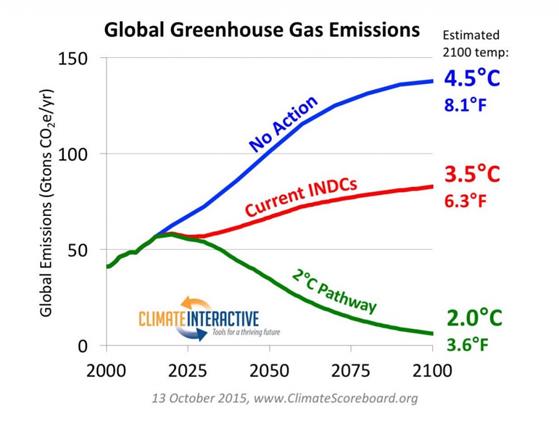
Figure 1. Climate Interactive’s graph of impact of the INDC submissions to 2100

What struck me as odd when I first saw this graph was how the INDCs could make such a large impact beyond the 2015-2030 timeframe that they covered when the overall impact was fairly marginal within that timeframe. This initial impression is confirmed by the UNFCCC’s estimate of the INDCs

Figure 2. UNFCCC’s estimate of emissions impact of the INDCs, with the impact shown by the yellow bars. Original here.

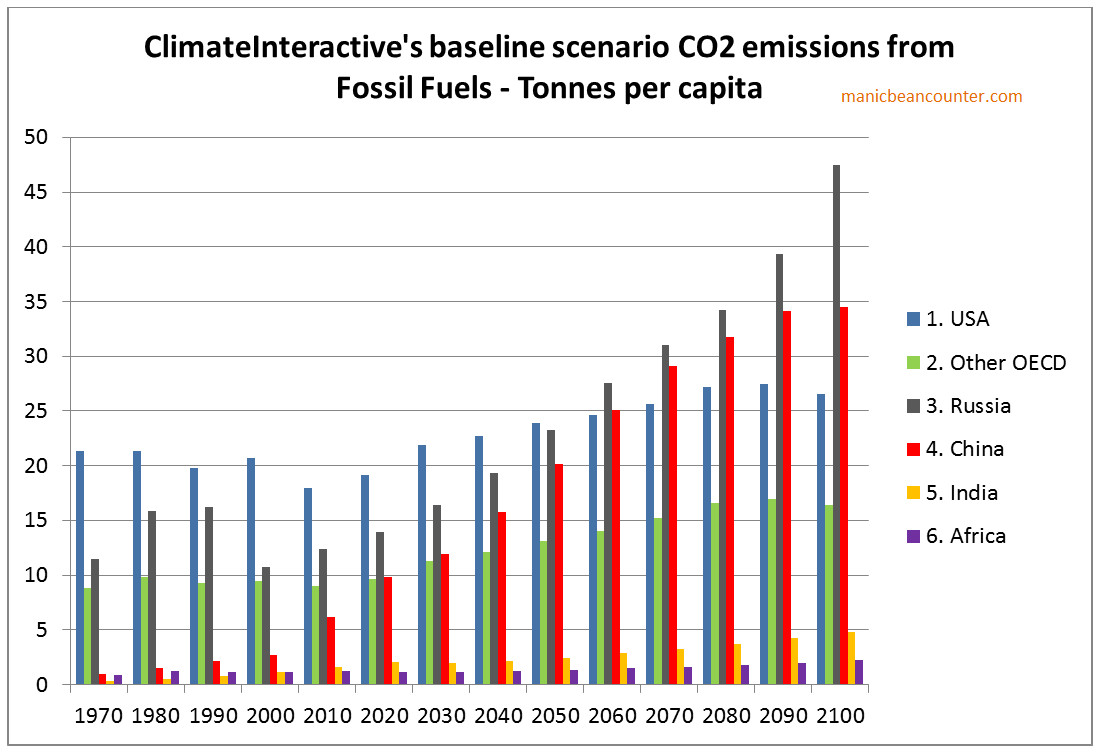
There are two things that do not stack up. First is that the “No Action” scenario appears to be a fairly reasonable extrapolation of future emissions without policy. Second, and contrary to that is the first, is that the “Current INDCs” scenario does not make sense in terms of what I have read in the INDCs and is confirmed by the INDCs. To resolve this requires looking at the makeup of the “No Action” scenario. Climate Interactive usefully provide the model for others to do their own estimates,2 With the “User Reference Scenario” giving the “no action” data3, split by type of greenhouse gas and into twenty regions or countries. As about 75-80% of emissions with the model are CO2 Fossil Fuel emissions, I will just look at this area. For simplicity I have also reduced the twenty regions or countries into just seven. That is USA, Other OECD, Russia, China, India, Africa and Rest of the World. There are also lots of ways to look at the data, but some give better understanding of the data than others. Climate Interactive also have population estimates. Population changes over a long period can themselves result in changed emissions, so looking at emissions per capita gives a better sense of the reasonableness of the forecast. I have graphed the areas in figure 3 for the historical period 1970-2010 and the forecast period 2020-2100.

Figure 3 : Fossil Fuel Emissions per capita for six regions from the Climate Interactive “No Action” Scenario.

Understanding the CO2 emissions forecasts

In the USA, emissions per capita peaked at the time of 1973 oil embargo. Since then they have declined slightly. There are a number of reasons for this.

First, higher oil prices gave the economic incentives to be more efficient in usage of oil. In cars there have been massive improvements in fuel efficiency since that time. Industry has also used energy more efficiently. Second, there has been a growth in the use of nuclear power for strategic reasons more than economic. Third is that some of the most energy intensive industries have shifted to other countries, particularly steel and chemicals. Fourth, is that growth in developed countries is mostly in the service sector, whereas growth in developing countries is mostly in manufacturing. Manufacturing tends to have much higher energy usage per unit of output than services. Fifth, is that domestic energy usage is from cars and power for the home. In an emerging economy energy usage will rise rapidly as a larger proportion of the population acquire cars and full heating and lighting systems in the home. Growth is much slower once most households have these luxuries. Sixth is that in the near future emissions might continue to fall with the development of shale gas, with its lower emissions per unit of power than from coal.

I therefore cannot understand why anyone would forecast increasing emissions per capita in the near future, when they have been stable or falling in for decades. Will everyone start to switch to less efficient cars? When these forecasts were made oil was at $100 a barrel levels, and many thought peak oil was upon us. Would private sector companies abandon more efficient energy usage for less efficient and higher cost usage? The USA may abandon nuclear power and shift back to coal for political reasons. But in all forms of energy, production and distribution is likely to continue to become more efficient in all forms.

In the rest of the OECD, there are similar patterns. In Europe energy usage was never as high. In some countries without policy CO2 emissions may rise slightly. In Germany they are replacing nuclear power stations with coal for instance. But market incentives will increase energy efficiency and manufacturing will continue to shift to emerging nations. Again, there appears no reason for a steady increase in emissions per capita to increase in the future.

Russia has a slightly different recent past. Communist central planning was highly inefficient and lead to hugely inefficient energy usage. With the collapse of communism, energy usage fell dramatically. Since then emissions have been increasing, but more slowly than the economy as a whole. Emissions will peak again in a couple of decades. This will likely be at a lower level than in the USA in 1970, despite the harsher climate, as Russia will benefit from technological advances in the intervening period. There is no reason for emissions to go on increasing at such a rapid rate.4

China has recently had phenomenal growth rates. According to UN data, from 1990 to 2012, economic growth averaged 10.3% per annum and CO2 emissions 6.1%. In the not too distant future economic growth will slow as per capita income approaches rich country levels, and emissions growth will slow or peak. But the Climate Interactive forecast has total emissions only peaking in 2090. The reason for China’s and Russia’s forecast per capita emissions exceeding those of the USA is likely due to a failure to allow for population changes. In USA population is forecast to grow, whilst in China and Russia population is forecast to fall.

India has the opposite picture. In recently years economic and CO2 emissions growth has taken off. Current policies of Prime Minister Narendra Modi are to accelerate these growth rates. But in the Climate Interactive forecast growth, economic growth and CO2 emissions growth plummet in the near future. Economic growth is already wrong. I am writing on 30/12/15. To meet the growth forecast for 2010-2015, India’s GDP will need to drop by 20% in the next 24 hours.5

For the continent of Africa, there have been encouraging growth signs in the last few years, after decades when many countries saw stagnation or even shrinking economies. Climate Interative forecasts similar growth to India, but with a forecasts of rapid population growth, the emissions per capita will hardly move.

Revised CO2 emissions forecasts

It is extremely difficult and time consuming to make more accurate CO2 emissions forecasts. As a shortcut, I will look at the impact of revisions on 2100, then at the impact on the effect of the INDCs. This is laid out in Figure 4

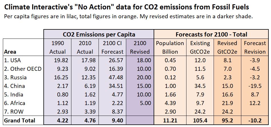
Figure 4 : Revised Forecast CO2 Emissions from Fossil Fuels

The first three columns in pale lilac are for CO2 emissions per capita calculated, from the Climate Interactive data. In the 2100 Revised column are more realistic estimates for reasons discussed in the text. In the orange part of the table are the total forecast 2100 Climate Interactive figures for population and CO2 emissions from fossil fuels. In darker orange is the revised emissions forecast (emissions per capita multiplied by forecast population) and the impact of the revision. Overall the forecast is 10.2GtCO2e lower, as no calculation has been made for the rest of the world. To balance back requires emissions of 11.89 tonnes per capita for 2.9 billion people. As ROW includes such countries as Indonesia, Bangladesh, Iran, Vietnam, Brazil and Argentina this figure might be unreasonable 85 years from now.

The revised impact on the INDC submissions

The INDC submissions can be broken down.

The USA, EU, Japan and Australia all have varying levels of cuts to total emissions. So for the OECD as a whole I estimate Climate Interactive over estimates the impact of the INDCs by 8.4GtCO2e

The Russian INDC pledge it is unclear, but it seems to be saying that emissions will peak before 2030 at below 1990 levels6. As my revised forecast is above this level, I estimate Climate Interactive over estimates the impact of the INDCs by 3.2GtCO2e

The Chinese INDC claims pledges that its emissions will have peaked by 2030. This will have happened anyway and at around 10-12 tonnes per capita. I have therefore assumed that emissions will stay constant from 2030 to 2100 whilst the population is falling. Therefore I estimate that Climate Interactive over estimates the impact of the INDCs by 19.5GtCO2e

Overall for these areas the overestimation is around 31 GtCO2e. Instead of 63.5GtCO2e forecast for these countries for 2100 it should be nearer 32.5GtCO2e. This is about half the total 2100 reduction that Climate Interactive claims that the INDC submission will make from all types of greenhouse gases. A more rigorous forecast may have lower per capita emissions in the OECD and China. There may be other countries where similar forecast issues of CO2 emissions might apply. In addition, in note 7 I briefly look at the “No Action” CH4 emissions, the second largest greenhouse gas. There appear to be similar forecast issued there.

In summary, the make-up of the CO2 emissions “No Action” forecast is bogus. It deviates from an objective and professional forecast in a way that grossly exaggerates the impact of any actions to control GHG emissions, or even pledges that constitute nothing more than saying what would happen anyway.

Notes

  1. The conversion of a given quantity of emissions into average surface temperature changes is outside the scope of this article. Also we will assume that all policy pledges will be fully implemented.
  2. On the Home page use the menu for Tools/C-ROADS. Then on the right hand side select “Download C-ROADS”. Install the software. Run the software. Click on “Create New Run” in the centre of the screen.


    This will generate a spreadsheet “User Scenario v3 026.xls”. The figures I use are in the User Reference Scenario tab. The software version I am working from is v4.026v.071.

  3. The “User Reference Scenario” is claimed to be RCP 8.5. I may post at another time on my reconciliation between the original and the Climate Interactive versions.
  4. The forecast estimates for economic growth and emissions for Russia look quite bizarre when the 5 year percentage changes are graphed.


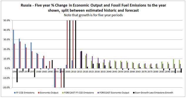
    I cannot see any reason for growth rates to fall to 1% p.a in the long term. But this is the situation with most others areas as well. Nor can I think of a reason for emissions growth rates to increase from 2030 to 2055, or after 2075 expect as a contrivance for consistency purposes.

  5. The forecast estimates for economic growth and emissions for India look even more bizarre than for Russia when the 5 year percentage changes are graphed.


    I am writing on 30/12/15. To meet the growth forecast for 2010-2015, India’s GDP will need to drop by 20% in the next 24 hours. From 2015 to 2030, the period of the INDC submissions, CO2 emissions are forecast to grow by 8.4%. India’s INDC submission implies GHG emissions growth from 2014 to 2030 of 90% to 100%. Beyond that India is forecast to stagnate to EU growth rates, despite being a lower to middle income country. Also, quite contrary to Russia, emissions growth rates are always lower than economic growth rates.

  6. The Russian Federation INDC states

    Limiting anthropogenic greenhouse gases in Russia to 70-75% of 1990 levels by the year 2030 might be a long-term indicator, subject to the maximum possible account of absorbing capacity of forests.

    This appears as ambiguous, but could be taken as meaning a long term maximum.

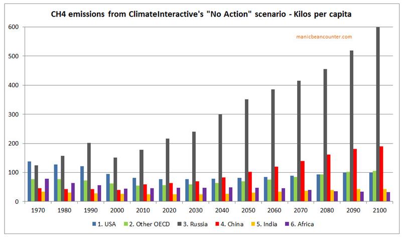
  7. CH4 (Methane) emissions per Capita

    I have quickly done a similar analysis of methane emissions per capita as in Figure 2 for CO2 emissions. The scale this time is in kilos, not tonnes.

    There are similarities

  • OECD emissions had been falling but are forecast to rise. The rise is not as great as for CO2.
  • In Russia and China emissions are forecast to rise. In Russia this is by a greater amount than for CO2, in China by a lesser amount.
  • In Africa, per capita emissions are forecast to fall slightly. Between 2010, CH4 emissions are forecast to rise 3.1 times and population by 4.3 times.
  • In both the USA and Other OECD (a composite of CI’s categories) total CH4 emissions are forecast in 2100 to be 2.778 times higher than in 2010. In both China and India total CH4 emissions are forecast in 2100 to be 2.420 times higher than in 2010.


No Global Plan from COP21 Paris to Reduce Greenhouse Gas Emissions

Headline news around the world is that a landmark global agreement has been reached.

The BBC headlines

A deal to attempt to limit the rise in global temperatures to less than 2C has been agreed at the climate change summit in Paris after two weeks of negotiations.

The Australian ABC News summarizes

Historic climate deal

  • Deal to limit global warming to “well below” 2C, aiming for 1.5C
  • Greenhouse gas emissions need to peak “as soon as possible”, followed by rapid reduction
  • Deal will eliminate use of coal, oil and gas for energy

Folha de Sao Paulo

A COP21 aprovou neste sábedo (12) em Paris o acordo que obriga pela primeira vez todos os paises signatarios da Convençāo de Clima (1992) a adotar medidas de combate ao aquecimento global.

O chamado Acordo de Paris estabelece que a temperatura global, a partir de agora, só poderá subir ate um teto de “bem menos” de 2oC, na direçāo de 1,5oC.

There is something missing – a plan to cut global greenhouse gas emissions. This is clear from reading paragraphs 17 and 21 of the Agreement.

As I started a couple of weeks ago, the INDCs are not on target for the limiting to 2oC of warming. That would require emissions to be decreasing by 2030. The follow graph from the UNFCCC Synthesis Report on the aggregate effect of the INDCs states this quite clearly.

The 55 gigatonnes forecast in yellow and the required 40 gigatonnes in 2030 are visible. The graphical summary is now recognized within the agreement. Rather than say that genuine emissions reduction plans should be forthcoming, the UNFCCC asks the UNIPCC for some more scary stories and some more modelled emissions forecasts. There is a lot of hot air, but no global plans at all to reach any 2oC target. Nor will there be any global plans in place next year when the leaders of all countries will be asked to sign this agreement.

The Los Angeles Times explains (italics mine)

What is the main goal of the deal?

The stated goal among global climate negotiators has long been to reduce emissions enough so that global temperatures rise no more than 2 degrees Celsius, or 3.6 degrees Fahrenheit, by 2100. That is the level at which scientists say the most catastrophic effects of climate change can be avoided.

That goal was not met in Paris, but few people expected it to be. The commitments that countries made will limit warming to only about 3 degrees. But the agreement includes provisions for revisiting emissions goals every five years with the intention of regularly revising them upward “to reach global peaking of greenhouse gas emissions as soon as possible.”

Now there are going to be five yearly super-summits to try to achieve the point where global emissions will start reducing.

Kevin Marshall