Why Plan B’s Climate Court Action should be dismissed

Summary

Taking court action to compel Governments to enforce the Paris Climate Agreement is against the real spirit of that Agreement. Controlling global GHG emissions consistent with 2°C, or 1.5°C is only an aspiration, made unachievable by allowing developing countries to decide for themselves when to start reducing their emissions. In the foreseeable future, the aggregate impact of emissions reduction policies will fail to even reduce global emissions. Therefore, costly emissions reductions policies will always end up being net harmful to the countries where they are imposed. Governments wanting to both be players on the world stage and serve their countries give the appearance of taking action of controlling emissions, whilst in substance doing very little. This is the real spirit of the Paris Climate Agreement. To take court action to compel a change of policy action in the name of that Agreement should be struck off on that basis. I use activist group Plan B’s case before the British Court to get the British Government to make even deeper emissions cuts than those under the Climate Change Act 2008.

Plan B’s Case at the High court

Last week BBC’s environment analyst Roger Harrabin reported Court action to save young from climate bill.

The campaigners – known collectively as Plan B – argue that if the UK postpones emissions cuts, the next generation will be left to pick up the bill.

It is seeking permission from a judge to launch formal legal action.

The government has promised to review its climate commitments.

A spokesperson said it was committed to tackling emissions.

But Plan B believes ministers may breach the law if they don’t cut emissions deeper – in line with an international agreement made in Paris at the end of 2015 to restrict global temperature rise to as close to 1.5C as possible.

From an obscure website crowdjustice

Plan B claim that the government is discriminating against the young by failing to cut emissions fast enough. During the hearing, they argued that the UK government’s current target of limiting global temperature rises to 2°C was not ambitious enough, and that the target ought to be lowered to 1.5°C, in line with the Paris Agreement that the UK ratified in 2015. Justice Supperstone postponed the decision until a later date.

Plan B on their own website state

Plan B is supporting the growing global movement of climate litigation, holding governments and corporations to account for climate harms, fighting for the future for all people, all animals and all life on earth.

What is the basis of discrimination?

The widely-accepted hypothesis is that unless global greenhouse gas (GHG) emissions are reduced to near zero in little more than a generation, global average temperature rise will rise more than 2°C above pre-industrial levels. A further hypothesis is that this in turn will cause catastrophic climate change. Consequent on both hypotheses being true gives the case for policy action. Therefore, failure to reduce global GHG emissions will imperil the young.

A further conjecture is that if all signatories to the Paris Agreement fulfil their commitments it is sufficient to prevent 1.5°C or 2°C of warming. There are a number of documents to consider.

First is the INDC submissions (i.e. Nation States communications of their intended nationally determined contributions), collected together at the UNFCCC website. Most are in English.  To find a country submission I suggest clicking on the relevant letter of the alphabet.

Second, to prevent my readers being send on a wild goose chase through small country submissions, some perspective is needed on relative magnitude of emissions. A clear secondary source (but only based on CO2 emissions) BP Data Analysis Global CO2 Emissions 1965-2017. More data on GHG emissions are from the EU Commissions EDGAR Emissions data and the World Resources Institute CAIT Climate Data Explorer.

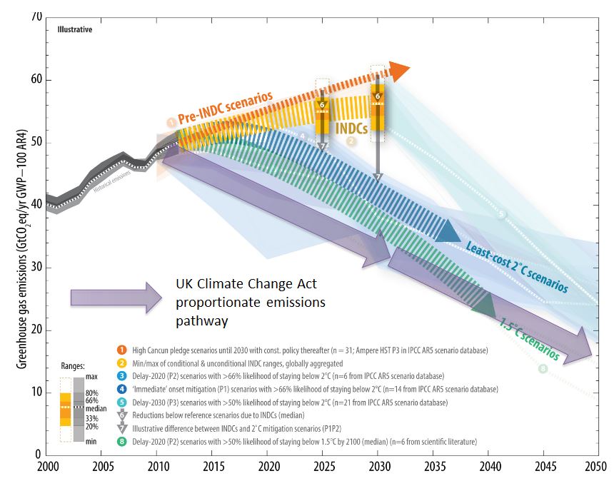
Third is the empirical scale of the policy issue. The UNEP emissions Gap Report 2017 (pdf), published in October last year is the latest attempt to estimate the scale of the policy issue. The key is the diagram reproduced below.

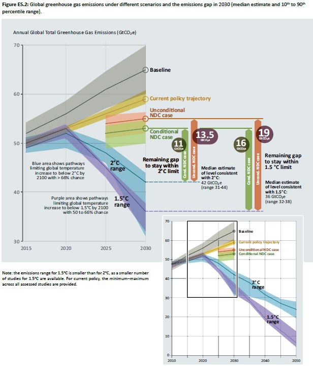
The total of all commitments will still see aggregate emissions rising into the future. That is, the aggregate impact of all the nationally determined contributions is to see emissions rising well into the future. So the response it to somehow persuade Nations States to change their vague commitments to such an extent that aggregate emissions pathways sufficient to prevent 1.5°C or 2°C of warming?

The relevant way to do this ought to be through the Paris Agreement.

Fourth is the Adoption Paris Agreement itself, as held on the UNFCCC website (pdf).


Paris Agreement key points

I would draw readers to Article 2.1(a)

  • Holding the increase in the global average temperature to well below 2°C above pre-industrial levels and pursuing efforts to limit the temperature increase to 1.5°C above pre-industrial levels, recognizing that this would significantly reduce the risks and impacts of climate change;

Article 2.2

  • This Agreement will be implemented to reflect equity and the principle of common but differentiated responsibilities and respective capabilities, in the light of different national circumstances.

My interpretation is that the cumulative aggregate reduction will be only achieved by if those countries that (in the light of their national circumstances) fail to follow the aggregate pathways, are offset by other countries cutting their emissions by a greater amount. It is a numbers game. It is not just a case of compelling some countries to meet the 1.5°C pathway but to compel them to exceed it by some margin.

I would also draw readers to Article 4.1

In order to achieve the long-term temperature goal set out in Article 2, Parties aim to reach global peaking of greenhouse gas emissions as soon as possible, recognizing that peaking will take longer for developing country Parties, and to undertake rapid reductions thereafter in accordance with best available science, so as to achieve a balance between anthropogenic emissions by sources and removals by sinks of greenhouse gases in the second half of this century, on the basis of equity, and in the context of sustainable development and efforts to eradicate poverty.

My reading is that any country defined as “developing” has only an aim of reducing emissions after peaking of their emissions. When they choose to do so depends on a number of criteria. There is not clear mechanism for deciding this, and no surrender of decision-making by countries to external bodies.

Implications of the Paris Agreement

Many developing countries emissions are increasing their emissions. They agreement does not compel them to change course in the near future. Empirically that means to achieve the goals the aggregate emission reductions of countries reducing their emissions must be such that they cancel out the emissions increases in the developing countries. Using EDGAR figures for GHG emissions, and the Rio Declaration 1992 for developing countries (called Non-Annex countries) I estimate they accounted for 64% of global GHG emissions in 2012, the latest year available.


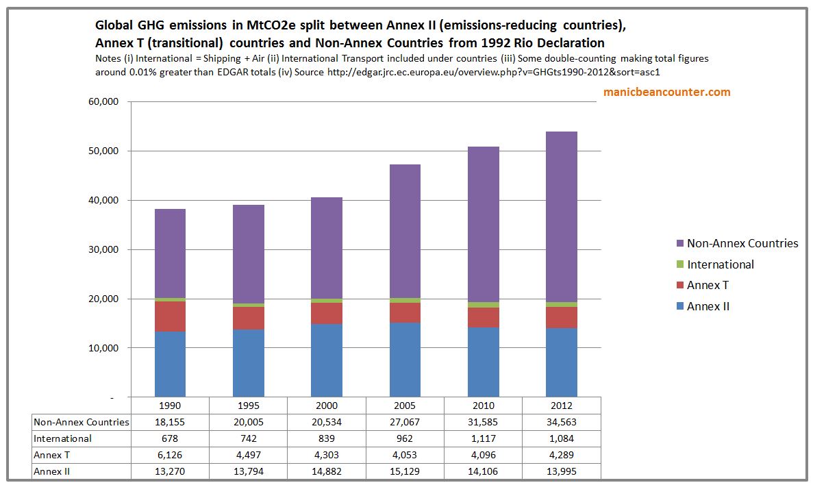
All other sources sum to 19 GtCO2e, the same as the emissions gap between the unconditional INDC case and the 1.5°C case. This presents a stark picture. Even if emissions from all other sources are eliminated by 2030, AND the developing countries do not increase their emissions to 2030, cumulative global emissions are very likely to exceed the 1.5°C and the 2°C warming targets unless the developing countries reduce their emissions rapidly after 2030. That is close down fairly new fossil fuel power stations; remove from the road millions of cars, lorries and buses; and reduce the aspirations of the emerging middle classes to improving life styles. The reality is quite the opposite. No new policies are on the horizon that would significantly reduce global GHG emissions, either from the developed countries in the next couple of years, or the developing countries to start in just over a decade from now. Reading the comments in the INDC emissions (e.g. Indonesia, Pakistan, India), a major reason is that these governments are not willing to sacrifice the futures of their young through risking economic growth and political stability to cut their emissions. So rather than Plan B take the UK Government  to a UK Court, they should be persuading those Governments who do not share their views (most of them) of the greater importance of their case. After all, unlike proper pollution (such as smoke), it does not matter where the emissions are generated in relation to the people affected.

It gets worse. It could be argued that the countries that most affected by mitigation policies are not the poorest seeing economic growth and political stability smashed. It is the fossil fuel dependent countries. McGlade and Ekins 2015 (The geographical distribution of fossil fuels unused when limiting global warming to 2°C) estimated, said to achieve even 2°C target 75% of proven reserves and 100% of new discoveries must be left in the ground. Using these global estimates and the BP estimated proven reserves of fossil fuels I created the following apportionment by major countries.


The United States has the greatest proven fossil fuel reserves in terms of potential emissions. But if one looks at fossil fuel revenues relative to GDP, it is well down the league table. To achieve emission targets countries such like Russia, Saudi Arabia, Kuwait, Turkmenistan, Iraq, and Iran must all be persuaded to shut down their down sales of fossil fuels long before the reserves are exhausted, or markets from developing countries dry up. To do this in a generation would decimate their economies. However, given the increase in fossil fuel usage from developing countries, and the failure of developed countries to significantly reduce emissions through policy this hardly seems a large risk.

However, this misses the point. The spirit of the Paris Agreement is not to cut emissions, but to be seen to be doing something about climate change. For instance, China were held up by the likes of President Obama for aiming to both top out its emissions by 2030, and reduce emissions per unit of GDP. The USA and the EU did this decades ago, so China’s commitments are little more than a Business-as-usual scenario. Many other countries emissions reduction “targets” are attainable without much actual policy. For example, Brazil’s commitment is to “reduce greenhouse gas emissions by 43% below 2005 levels in 2030.” It sounds impressive, until one reads this comment under “Fairness and Ambition

Brazil’s current actions in the global effort against climate change represent one of the largest undertakings by any single country to date, having reduced its emissions by 41% (GWP-100; IPCC SAR) in 2012 in relation to 2005 levels.

Brazil intends to reduce emissions by a further 2% compared to 2005 levels. Very few targets are more than soft targets relative to current or projected trends. Yet the outcome of COP21 Paris enabled headlines throughout the world to proclaim a deal had been reached “to limit global warming to “well below” 2C, aiming for 1.5C”. It enables most Governments to juggle being key players on a world stage, have alarmists congratulating them on doing their bit on saving the planet, whilst making sure that serving the real needs of their countries is not greatly impeded. It is mostly win-win as long as countries do not really believe that targets are achievable. This is where Britain has failed. Under Tony Blair, when the fever of climate alarmism at its height, backed up by the political spin of New Labour and a Conservative opposition wanting to ditch its unelectable image, Green activists wrote the Climate Change Act 2008 with the strict targets to be passed. Britain swallowed climate alarmism whole, and now as a country that keep its promises is implementing useless and costly policies. But they have kept some form of moderation in policies until now. This is illustrated by a graphic from a Committee on Climate Change report last week “Reducing UK emissions 2018 – Progress Report to Parliament” (pdf) (and referenced at cliscep)

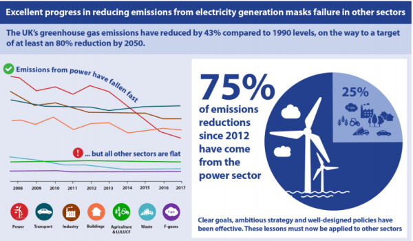
Whilst emissions have come down in the power sector they are flat in transport, industry and in buildings. Pushing real and deep reductions in these sectors means for young people pushing up the costs of motoring (placing driving a car out of the reach of many), of industry (raising costs relative to the countries – especially the non-policy developing countries) and buildings in a country where planning laws make home-owning unaffordable for many and where costs of renting is very high. This on top of further savings in the power industry will be ever more costly as the law of diminishing returns sets in. Forcing more urgent policy actions will increase the financial and other burdens on the young people of today, but do virtually nothing to reach the climate aspirations of the Paris Agreement due to Britain now having less than 1% of global emissions. The Government could be forced out of political fudging to impose policies that will be net harmful to the young and future generations.

Plan B are using an extreme activist interpretation. As reported in Climate Home News after the postponement.

“The UK is not doing enough,” Tim Crosland, director of Plan B told Climate Home News. “The benchmark target is now out of place. We are arguing that it is a breach of human rights.”

The UK has committed to cut emissions by at least 80% of 1990 levels by 2050, with an aim to limit global temperature rise to 2C.

Under the 2008 Climate Change Act, the secretary can revise the target to reflect significant developments in climate change science or in international law or policy.

Plan B want to see the target lowered to be in line with 1.5C, the lower target of the Paris Agreement, which the UK ratified in 2016.

As stated, insofar as the Paris Climate Agreement is a major development of policy, it is one of appearing to do a lot whilst doing very little. By these terms, the stronger case is for repealing the Act, not strengthening its clauses. 

But what if I am wrong on this Paris Agreement being just an exercise in appearances? This then it should be recognized that developing countries will only start to reduce their emissions at some time in the future. By implication, for the world to meet the 1.5°C warming limit, developing countries should be pursuing and emissions reduction pathway much steeper than the 25% reduction between 2015 and 2030 implied in the Emissions GAP Report graphic. It should be at least 50% and nearer 100% in the next decade. Given that the Climate Change Act was brought in so that Britain could lead the world on climate change, Plan B should be looking for a 100% reduction by the end of the year. 

Kevin Marshall


SNP Government’s Out-Sourced Propaganda on Food Waste

In the previous post I promised to provide some clear illustrations of the climate of this policy nonsense in Britain. The United Kingdom has a rather strange constitution, where three of the four countries have devolved assemblies, but largest with 83% of the population does not. The most vocal by far is the Scottish Assembly lead by Scottish Nationalist First Minister Nicola Sturgeon. The United Kingdom has the world’s most strident Climate legislation in the form of the Climate Change Act 2008. The Scottish Nationalists seek to differentiate themselves from the English by usurping the British role of leading the world on Climate Change. Scotland is therefore a useful place to look for the most extreme examples.

Zero Waste Scotland, a Stirling-based company Limited by Guarantee, almost entirely funded by the Scottish Government, exists to promote environmentalist propaganda. In their words .

Zero Waste Scotland exists to create a society where resources are valued and nothing is wasted. 

Take the page on Food Waste

Your food does its job best when it’s on a plate ready to be enjoyed. Saving food saves money and helps to slow down global warming and deforestation. Reducing the amount of food that ends up in the bin also means you can say goodbye to unnecessary packaging waste. If we all make a few small changes and start using up the food we buy, together we can make a big difference.

Look at the “we” part in relation to making a big difference to slowing global warming. It is a Scottish-based website, promoting Scottish Government policy. The context to consider this claim is

  1. Note all the Scottish people will take up the call from the website. Indeed, very few will likely visit the webpage, particularly those who are not already .
  2. Domestic food waste is less than the total food waste. There is waste in farming, food processing, restaurants, schools and retailing.
  3. Food Waste is a only a small part of total Scottish emissions. Zero Waste Scotland estimates 1.5 millions tonnes of 75 millions tonnes.
  4. Scottish emissions of 75 MtCO2E are a small part of global greenhouse emissions of 54000 MtCO2.

The slow-down if all readers of the website and reduce food waste to zero in slowing global warming (assuming the link between warming and GHG less) is much less than 0.0028% of the total.
Will people save money and reduce packaging waste by eliminating food waste? I believe that a cheap healthy diet for a family. I always tried to provide fruit and fresh vegetables for my growing children, as against cakes and ice-cream. With growing children, getting them to eat vegetables was a problem. Cabbage, leaks and mange tout were least successful. Corn on the cob was successful for a while. But we rarely had tinned of baked beans, which were popular. With fruit, some got left depending on the mood, and other foods eaten. Peels and cores added to the waste, along with the unsightly bits of cheaper potatoes and residue of roast chicken, leg of lamb and pork shoulder. (We are not keen on the fat, nor soup made from the stock). We could have saved waste by spending more on quality, or reduced waste by careful planning. For hard-working families there are other considerations. On a weekly shop it is a case of chucking some things in the trolley that will provide quick meals. Detailed planning of meals and careful preparation is sacrificed for family time, relaxation and sleeping. In terms of focusing on food waste could cause other harms, like failing to provide a varied diet to children and maybe spending more. The loss of leisure and family time are potential non-monetary costs.

Zero Waste Scotland gets a 10% reduction from the 5.5 million people in Scotland, that is just 0.00028%, But the people reading are individuals, and maybe decision-makers for the families. A family going from average to zero food waste might reduce global emissions by 0.000000001%.

Imagine is a business making such a grossly misleading claims in the benefits, and hiding of potential harmful side-effects in promoting say, vitamins. They would be prosecuted. But this is not a business selling a product but environmentalist propaganda.

However, there are benefits to the Scottish Government.

First, by having fancy websites, along with signage all over the place, they can claim they are combating climate change. This enables First Minister Sturgeon being able to dream of being making serious speeches to the UN and being photographed next to other world leaders.

Further, this messaging changes peoples perceptions, meaning that anybody who perceives the absurdity is met by incomprehension and a string of half-learnt mantras. Without imposing censorship, in the name of “saving the planet” this promotes a progressive consensus that cannot be challenged.

Third, there are British Government and EU targets to reduce food waste and other environmental concerns. When persuasion does not work, there is greater justification in providing incentives to promote “better” behaviour, as with banning smoking in public places, minimum price for alcohol and a awkward charging for plastic bags. Alternatively by taking some of the decision-making powers about what people eat and how they live their lives out of their hands and placing under the guidance of those who know better. They Scottish Government already tried this with the named person child protection scheme.

Fourth, by out-sourcing (or privatizing) political propaganda, the SNP can avoid the claim of using the Scottish Government website for promoting a political hegemony.

Kevin Marshall


Friends of the Earth distorting the evidence for Fracking in the UK

Summary

Friends of the Earth have a webpage claiming to be “fracking facts”. The key points I make are.

  • The claims of dangers of fracking raise questions, that need to be answered before they can be considered credible.
  • The claim that fracking could affect house prices is totally unsupported.
  • The claim that shale gas will not significantly affect energy prices is based on out of date data. The British Geological Survey has shown that the potential of shale gas is huge. Friends of the Earth has played a major role in preventing that potential being realized.
  • FoE has consequently helped prevent shale gas from relieving the energy crisis brought upon by the Climate Change Act 2008.
  • Claims that pursuing shale gas in Britain will affect global emissions are pure fantasy. Also is a fantasy the belief that Britain is leading the way on emissions reductions. We ain’t leading if collectively the world is not following. The evidence shows clearly shows this.  

In the previous post I looked at how FoE blatantly mislead about an agreement they reached with the Advertising Standards Authority, which caused the unusual step of ASA Chief Executive Guy Parker issuing a strongly worded statement to defend the ASA’s integrity.

In this post I will look at FoE’s position on fracking, from Fracking definition? What does fracking mean? Read our fracking facts

I will look at various statements made (with FoE quotes in purple), showing how well they are supported by the evidence and/or providing alternative perspectives.

From the section What are the dangers of fracking?

Industry statistics from North America show that around 6% of fracking wells leak immediately.

Leaking wells lead to a risk of water contamination. Lord Smith, former chair of the Environment Agency, has said this is the biggest risk posed by fracking.

So it’s particularly concerning that the Government has now said it will allow fracking companies to drill through aquifers which provide household drinking water.

This raises some questions.

  • If leaks are a problem, with respect to fracking in the UK has this been risk assessed, with appropriate measures taken to prevent leaks?
  • Does that statistic of 6% allow for when there is natural leakage in the area of fracking leaking in the water supplies are venting into the atmosphere in the area where fracking is occurring? This was the case in the images of the flaming water faucet in the movie Gasland.
  • Have there been steps taken in the USA to reduce genuine leaks?
  • Has the proportion of wells leaking gas in the USA been increasing or decreasing?
  • Has the average amount of gas leaked been increasing or decreasing?
  • How when extracting gas from well below water aquifers, through a lined tube, that is both water-tight and gas-tight, is that gas (and fracking fluids) meant to leech into the water supply?

Then there is the statement without evidence.

Fracking could also affect house prices.

This was one of the issues FoE in its agreement with the ASA have the assurance not to repeat claims that fracking affects property prices, unless the evidence changes. Legally there might be cop-out where that assurance does not apply to claims made on its website. Literally, the statement is not untrue, just as the claim that a butterfly flapping its wings on the North Downs could lead to a typhoon in the South China Sea.

Would fracking bring down energy bills?

It’s very unlikely. Fracking company Cuadrilla has admitted that any impact on bills would be “basically insignificant”.

Claims that fracking would create a lot of jobs have also been overstated. According to Cuadrilla, each of its proposed 6-year projects in Lancashire that were recently rejected by the council would only have created 11 jobs.

The claim about Cuadrilla is sourced from an Independent article in June 2013.

“We’ve done an analysis and it’s a very small…at the most it’s a very small percentage…basically insignificant,” said Mark Linder, a public relations executive at Bell Pottinger who is also responsible for Cuadrilla’s corporate development.

The article later says

“According to Poyry, Lancashire shale gas production could also reduce the country’s wholesale gas and electricity prices by as much as 4 per cent between 2014 and 2035, which corresponds to an average saving of £810m/year,”

It is not surprising that shale gas developments in Lancashire alone will not have a significant impact on UK energy prices, especially if that is restricted to a few sites by one company. But over three years later the landscape has changed. The British Geological Survey has been publishing estimates of the quantities of shale gas (and oil) that exists beneath the ground.

The figures are at first hard to comprehend. They are large numbers in units of measure that ordinary people (even people with some knowledge of the field) find hard to comprehend, let alone put into some perspective. In my view, the figures need to be related to annual British consumption. Page 8 of the DECC UK Energy Statistics, 2015 & Q4 2015 estimates gas demand at 794 TWh in 2015.

The BGS uses tcf (tera cubic feet) for its’ estimates, which (like a domestic gas bill) can be converted from TWh. The 794 TWh is about 2.7 tcf. Not all shale gas is recoverable. In fact possibly only 10% of reserves is recoverable on existing technology, and depending on the quality of the deposits.

There are also shale oil deposits, measured by the BGS in both barrels and millions of tonnes. Refinery production (a rough estimate of consumption) was 63 million tonnes in 2015. I will again assume 10% recovery, which may be overly prudent.

The biggest shock was published just a few weeks after the Independent article on 27th July 2013. The size of the Bowland shale was truly staggering. The central estimate is 1329 tcf, meaning enough to satisfy 49 years of current UK gas demand. Potentially it is more, due to the depth of deposits in many areas. No significant deposits of oil are thought to be present

On 23rd May 2014 BGS published the results for the Weald Basin, a large area in the South East of England. Whilst there were no significant deposits of gas, the central estimate of 591 million tonnes is enough to supply the UK for one year.

On 25 June 2014 the Welsh Government published the estimates for Wales. The main gas deposits are thought to be in Wrexham/Cheshire and in South Wales and estimated about 65 tcf, or just over two years of UK demand. (Strictly the Welsh estimate is somewhat below this, as Wrexham is on the Welsh border and Cheshire is an English county. )

On 23rd May 2014 BGS published the results for the Midland Valley of Scotland. The central estimate for shale gas was 80.3 tcf (3 years of UK demand) and for shale oil 800 million tonnes (15 months of refinery production).

Most recently on 13th October 2016, BGS published the results for the Jurassic shale of the Wessex area. Central estimate for shale oil was 149 million tonnes, equivalent to three months of UK refinery production.

In all, conservatively there is estimated to be sufficient gas to supply the UK for over 54 years and oil for two and half years. The impact on supply, and therefore the impact on jobs and (in the case of gas) on energy prices, demands on the ability of businesses to profitability develop these resources. As has happened in the USA, the impact on jobs is mostly dependent on the impact on prices, as low prices affect other industries. In the USA, industries that are sensitive to energy prices (or use gas as a raw material) have returned from overseas, boosting jobs. FoE has played no small part in delaying planning applications with spurious arguments, along with generating false fears that could have made regulations more onerous than if an objective assessment of the risks had been made.

Fracking can’t help any short term or medium term energy crisis.

Even if the industry was able to move ahead as fast as it wants, we wouldn’t see significant production until about 2025.

This is actually true and up to date. If it were not for the Climate Change Act along with eco-activists blocking every move to meet the real energy demands in the most affordable and efficient way possible, there would be no prospective energy crisis. In terms of shale gas meeting energy demands (and gas-fired power stations being built) FoE should claim some of the credit for preventing the rapid develop of cheap and reliable energy sources, and thus exacerbating fuel poverty.

Will fracking help us to tackle climate change?

Shale gas and shale oil are fossil fuels. They emit greenhouse gases. Avoiding the worst impacts of climate change means getting off fossil fuels as soon as possible.

Scientists agree that to stop dangerous climate change, 80% of fossil fuels that we know about need to stay in the ground.

Setting up a whole new fossil fuel industry is going in completely the wrong direction, if the UK is to do its fair share to stop climate change.

The hypothesis is that global emissions lead to higher levels of greenhouse gases. In respect of CO2 this is clear. But the evidence that accelerating rate of rise in CO2 levels has led to accelerating average global temperatures is strongly contradicted by real world data. There is no scientific consensus that contracts this conclusion. Further there is no proper scientific evidence to suggest that climate is changing for the worse, if you look at the actual data, like leading climate scientist Dr John Christy does in this lecture. But even if the catastrophic global warming hypothesis were true (despite the weight of real world data against it) global warming is global. Britain is currently emitting about 1.1% of global emissions. Even with all the recently discovered shale gas and oil deposits, under the UK is probably less than 1% of all estimated fossil fuel deposits. Keeping the fossil fuels under British soil in the ground will do nothing to change the global emissions situation.  Britain tried to lead the way with the Climate Change Act of 2008, in committing to reduce its emissions by 80% by 2050. The INDC submissions leading up to COP21 Paris in December 2015 clearly showed that the rest of the countries were collectively not following that lead. The UNFCCC produced a graph showing the difference of the vague policy proposals might make.  I have stuck on the approximate emissions pathway to which the UK is committed.

The FoE is basically objecting to fracking to keep up the appearance that the UK is “doing its bit” to save the world from catastrophic global warming. But in the real world, global warming ain’t happening, neither are the predicted catastrophes. Even if it were, whatever Britain does will make no difference. FoE attempting to deny future jobs growth and stop the alleviation of fuel poverty to maintain the fantasy that Britain is leading the way on climate change.

 Isn’t it better to have our own gas rather than importing it?

…….

If we went all out for shale, our gas imports would stay at current levels as the North Sea supply declines – and imports could increase by 11%.

This claim, without any reference, is based likely based on the same out of date sources as below. If FoE and fellow-travellers kept out of the way with their erroneous legal challenges and distortions then shale gas has a huge potential to cause imports to decline.

Kevin Marshall

£319 billion on Climate Change for approximately nothing

The major reason for abandoning the Climate Change Act 2008 is not due to the massive financial burden imposed on families, but because it will do approximately nothing to curb global greenhouse gas emissions. Massive costs are being imposed for near zero prospective benefit.

At the weekend the GWPF published a paper by Peter Lilley MP on the costs of The Climate Change Act 2008. From 2014 to 2030 he estimates a total cost of £319 billion to ensure that in 2030 British greenhouse gas emissions are 57% below their 1990 levels.
Putting this into context, listen to then Environment Minister David Miliband introducing the Climate Change Bill in 2007.

The 2008 Act increased the 2050 target from 60% to 80%. Miliband recognizes that what the UK does is not sufficient to stop a global problem. That requires a global solution. Rather, the aim is for Britain to lead the way, with other industrialized countries encouraged to follow. The developing countries are given a free choice of “a low carbon path of development rather than to repeat the mistakes of the industrialized countries.

Over eight years after the little video was made and seven years after the Climate Change Act was passed (with an increased 2050 emissions reduction target of 80% reduction on 1990 levels) was the COP21 in Paris. The responses from other countries to Britain’s lead were in the INDC submission, which the UNFCCC summarized in a graph, and I have annotated.

The UNFCCC have four bands. First, in orange, is the Pre-INDC scenarios. Then in yellow is the projected global impact if all the vague policy proposals are full enacted. In blue is the least cost 2◦C pathway for global emissions reductions, whilst in green is the least cost 1.5◦C pathway.

I have superimposed lilac arrows showing the UK Climate Act proportionate emissions pathway achieving a 57% emissions reduction by 2030 and an 80% emissions reduction by 2050 compared to the baseline 1990 emissions. That is, if all countries were to follow Britain’s lead, then the 2◦C warming limit would not be breached.

What this clearly shows is that collectively countries have not followed Britain’s lead. Even if the policy proposals were fully enacted (an unlikely scenario) the yellow arrow quite clearly shows that global emissions will still be rising in 2030.

This needs to be put into context of costs and benefits. The year before David Miliband launched the Climate Bill the Stern Review was published. The Summary of Conclusions gave the justification for reducing greenhouse emissions.

Using the results from formal economic models, the Review estimates that if we don’t act, the overall costs and risks of climate change will be equivalent to losing at least 5% of global GDP each year, now and forever. If a wider range of risks and impacts is taken into account, the estimates of damage could rise to 20% of GDP or more. In contrast, the costs of action – reducing greenhouse gas emissions to avoid the worst impacts of climate change – can be limited to around 1% of global GDP each year.

Britain is spending the money to avert catastrophic global warming, but future generations will still be subjected to costs of climate catastrophe. It not much worse in terms of wasting money if the Stern Review grossly exaggerated the likely costs of warming and massively understated the policy costs, as Peter Lilley and Richard Tol laid out in their recent paper “The Stern Review : Ten Years On“.

However, if the British Government had conducted some proper assessment of the effectiveness of policy (or the Opposition has done their job in holding the Government to account) then it would have been clear that sufficient countries would never follow Britain’s lead. Last year Robin Guenier published some notes on Supreme Court Justice Phillip Sands lecture CLIMATE CHANGE and THE RULE OF LAW. Guenier stated of the Rio Declaration of 1992

There’s little, if any, evidence that the undoubted disagreements about the science – the focus of Professor Sands’ concern in his lecture – are the reason it’s proving so difficult to come to an effective agreement to restrict GHG emissions. In contrast however, the Annex I / non-Annex I distinction has had huge consequences. These arise in particular from Article 4.7:

“The extent to which developing country Parties will effectively implement their commitments under the Convention … will take fully into account that economic and social development and poverty eradication are the first and overriding priorities of the developing country Parties.” [My emphasis]

When the Convention was enacted (1992) the effective exemption of developing countries from environmental constraint made some sense. But over the years Non-Annex I countries, which include major economies such as China, India, South Korea, Brazil, South Africa, Saudi Arabia and Iran, have become increasingly powerful: in 2012 responsible for 67% of global CO2 emissions.

Robin Guenier uses estimates for CO2 emissions not (the admittedly harder to estimate) GHG emissions, of which CO2 comprises about two-thirds. But estimates are available from from the European Commission’s “Emissions Database for Global and Atmospheric Research” (EDGAR) for the period 1990 to 2012. I divided up the emissions between the Annex countries and the Non-Annex countries. 

The developing countries accounted for 64% of global GHG emissions in 2012, up from 47% in 1990 and 57% in 2005 when the Stern Review was being written. From 1990 to 2012 global emissions increased by 41% or 15,700 MtCO2e, whilst those of the Non-Annex countries increased by 90% or 16,400 MtCO2e  to 34,600 MtCO2e. The emissions in the United Kingdom decreased in the period (mostly for reasons other than mitigation policies) by 25% to 586 MtCO2e or 1.1% of the estimated global total.

It would have been abundantly clear to anyone who actually looked at the GHG emissions figures by country that the Rio Declaration 1992 was going to prevent any attempt to significantly reduce global GHG emissions. Since 1992 the phenomenal economic growth of countries like China and India, driven by the low energy costs of fossil fuels, have made the impossibility of reducing global emissions even starker. Yet still the IPCC, UNFCCC, many Governments and a large Academic consensus have failed to acknowledge, let alone understand, the real world data. Still they talk about reducing global emissions by over 80% in a couple of generations. In terms of the United Kingdom, the INDC submissions produced last year should have been further confirmation that the Government has no rational justification for imposing the massive costs on families, increasing inequalities and destroying jobs in the process.

Kevin Marshall


Britain’s Folly in Attempting to Save the World from Global Warming

Last week in the House of Lords1 Viscount Ridley asked Baroness Verma, a minister at the Department of Energy and Climate Change, about the hiatus in global warming. Lord Ridley asked Lady Verma

Would you give us the opinion of your scientific advisers as to when this hiatus is likely to end.

Lady Verma replied

It may have slowed down, but that is a good thing. It could well be that some of the measures we are taking today is helping that to occur.

I already commented at Bishop Hill – repeated by James Delingpole

From 1990 to 2013 global emissions increased by 61%. Of that increase, 67% was from China & India. This is not surprising as they were both growing fast from a low base, and combined contain nearly 40% of global population. The UK, with less than 1% of global population managed to decrease its emissions by 19%. In doing so, they managed to offset nearly 1.2% of the combined increase in China & India.

However this is not the full story, particularly with respect to understanding future emissions growth. Here I extend the analysis of the CDIAC data set2 to give a more comprehensive picture. CDIAC (Carbon Dioxide Information Analysis Centre) have estimates of CO2 emissions in tonnes of carbon equivalent for all countries from 1960 to 2013. These I have split out the countries of India, China and UK. The rest I have lumped into three groups – The major developed ACEJU countries3, the Ex-Warsaw Pact countries4 and ROW5 (Rest of the World). For emissions I have taken the baseline year of 1990, the latest year of 2013 and then forecast emissions for 20206.

The major developed economies have virtually unchanged, although, along with the UK the proportion of global emissions has fallen from 45% to 28% between 1990 and 2013 and are forecasted to fall further to 23% of global emissions even without aggressive emission reduction policies.

The collapse of communism meant the collective emissions of the Ex-Warsaw Pact countries fell by 44% between 1988 and 1999. That in 2020 emissions levels will still be around 20% lower, even though the economies will be far richer, is due to the inefficiencies of the Communist system.

China and India had most of the emissions growth between 1990 and 2013, there emissions growing by 300% and 250% respectively. That growth was equivalent to 16 times the UK emissions in 1990. By 2020 China and India’s emissions growth over 30 years is likely to have cancelled out the UK’s 30% reduction 78 times over. That forecast emissions increase from 1990 to 2020 is also a third larger than the combined 1990 emissions of the major rich countries.

Finally there is the ROW countries, nearly half the World’s population now live and where emissions increased by 130% between 1990 and 2013.

To put these figures in context, we need to look at population figures, which are available from the World Bank7.

The big CO2 emitters in 1990 were the First and Second World countries. Over two-thirds of global emissions were produced by a quarter of the population. Those same countries now produce 40% of global emissions and have 20% of the global population. The population has grown, but only by 10%. In some of the countries it is already falling. China’s population grew by 20%, India’s by 44% and the Rest of the World by 55%, giving a global population growth of 35%. Looking at CO2 emissions in tonnes per capita puts the CO2 emissions problem into perspective.

China started from an extremely low base in terms of emissions per capita. It is unlikely to exceed the rich world’s 1990 emissions per capita in the next 10 years. However, due to slower population growth and its current stage of development, it is unlikely to be the major source of emissions growth through to 2050. It is likely to be overtaken by India, who in turn will be overtaken by the rest of the world before the end of the century. Unless very cheap non-CO2 emitting sources of energy are developed, global emissions will continue to grow. That emissions growth will be the result of genuine economic growth that will see grinding poverty disappear from every country that embraces the modern world.

The UK with less than 1% of the world’s population will continue to have no impact at all despite all the hype of having the World’s “greenest” energy policies. Even if the scariest scenarios of Lord Stern’s nightmares are true, there is absolutely no reason to continue with policies that are pushing ever greater numbers into fuel poverty and jeopardizing security of energy supply. The future impacts will be just the same, but with current policy, Britons will meet that future poorer than without. The British Government is like a doctor that prescribes useless medicine in the knowledge that it has nasty side effects. Most would agree that a GP who did that to a patient should be struck off, even if it were one patient in hundreds.

For the people who still genuinely believe that increasing CO2 emissions will cause catastrophic climate change there are two causes of action. First is to find a plentiful source of non-polluting energy where the full costs are less than coal, but just as reliable. There is genuine pollution from coal in the form of smog, so everyone should be in support of this. Shale gas, then thorium nuclear reactors might be a ways forward in the next few decades. Second is to far more accurately predict the catastrophic consequences of global warming, so adaptation can be made at minimal cost and waste of resources. Every prediction of short term catastrophe (e.g. worsening hurricanes) or a worsening situation (e.g. accelerating sea level rise) has proved to be false, hence the reliance on noisy publicists and political activists that discourage learning from past mistakes.


Please note that first time comments are moderated. I welcome debate. Please use the comments as a point of contact, with a request not to publish.

Kevin Marshall

Notes

  1. As reported by James Delingpole at Brietbart. Also reported at The Daily Mail, Bishop Hill, and Not a Lot of People Know That here and here.
  2. CDIAC is the Carbon Dioxide Information Analysis Centre. The 2014 Budget 1.0 contains estimates of CO2 emissions in tonnes of carbon equivalent for all countries from 1960 to 2013. I have converted the figures to tonnes of CO2.
  3. Australia, Canada, EU (the Western European 15, less UK), Japan and USA. This is most of what used to be called “First World”.
  4. This includes the former USSR countries, plus Eastern Europe. I have added in North Korea, Yugoslavia and Cuba.
  5. By definition this includes Central and South America, Africa, Middle East and South East Asia.
  6. Britain has committed to reduce its emissions by 30% of 1990 levels by 2020. China has pledged to “Reduce CO2 emissions per unit of GDP by 40–45% by 2020 compared to the 2005 level”. I assume 8% GDP growth and achieving a full 45% reduction, which is achievable. Similarly India has pledged to Reduce CO2 emissions per unit of GDP by 20–25% by 2020 compared to the 2005 level. Although it is unlikely to be achieved, based on emissions growth from 2005-2013, I have a assumed 7% GDP growth and achieving a minimum 20% reduction. For the other countries I have assumed half the emissions change from 1999-2013. This is likely to be an underestimate, as many other economies are growing emissions are a fast annual rate. For them this assumes a much reduced growth rate. Also many developed economies, particularly in Southern European showed sharp drops in emissions along with GDP in the credit crunch. They are now emerging, so should be expected to have higher emission growth rates.
  7. The 2020 population figures are assuming that each country’s population will change in the next seven years by the same number that it did in the previous seven. As world population growth in slowing, this might be a reasonable estimate. The result is a population increase of 550 million to 7,675 million.

10GW of extra offshore wind turbines by 2020 – The Real Costs

Projected 10GW in offshore wind turbines by 2020 to add 5% to electricity and gas bills, and reduce UK CO2 emissions by nearly 2%. Cost to exceed benefits by 3.8 or 27 times.


The Telegraph has an article “Offshore wind farm scrapped due to fears over birds

A 200MW extension to the 630MW London Array has been abandoned “over the impact on the red-throated diver, a bird classified as rare or vulnerable by the European Commission“. However,

Ministers say they want between 8GW and 15GW built by 2020, up from 3.6GW now, and suggest a total of about 10GW is most likely.

My comment on this (with references) is

Some statistics to put the 10GW of extra offshore wind power by 2020 in perspective.

Offshore wind power operates at about 35% of nameplate from DECC figures1.

So that will produce about 30,660,000 Mwh of electricity.

At present each megawatt of offshore wind gets 2 renewables obligations certificates, worth £842,8. So that will add £2575m to bills, or about 5%3 of 2012 Electricity AND Gas bills.

But this will help reduce the UKs Carbon emissions. How much?

RenewableUK reckons that each megawatt hour of renewable electricity saves 430kg of CO2 emissions4. So that equates to 13.2 mt, or 1.84% of the 716.4 mt6 1990 baseline emissions.

This has a value as well, called the “social cost of carbon”. The Stern Review reckoned $85t/CO25. The UNIPCC said the average was $126. So that is £675m or £95m towards saving the planet for future generations. Costs are either 3.8 or 27 times the benefits.


The costs of £2575m are not the full costs. There are also extra transmission costs, and backup capacity. A more sceptical view would put a much lower social cost of carbon than the $12 of the UNIPCC.

From note 5, the marginal abatement costs of offshore wind turbines are 3.8 times Stern’s estimate. Perhaps somebody should ask Lord Stern where the marginal abatement costs of less than $85 per tonne of CO2 are to be found. There are millions of households and businesses in this country who would love to know.

Notes

  1. DECC stats here, spreadsheet “Renewable electricity capacity and generation (ET 6.1)”. Offshore wind was 35.2% of nameplate in 2012.
  2. https://www.ofgem.gov.uk/ofgem-publications/58136/buy-out-price-and-mututalisation-ceiling-201314.pdf.
  3. In 2012 the big six energy companies charged about £44bn to all customers. 5% rise assumes they have 85% of the market. Graph here, from this article.
  4. From http://www.renewableuk.com/en/renewable-energy/wind-energy/uk-wind-energy-database/figures-explained.cfm, last section “CO2 Reductions (p.a.) in Tonnes”.
  5. The Stern review noted on pages xvi-xvii

    Preliminary calculations adopting the approach to valuation taken in this Review suggest that the social cost of carbon today, is of the order of $85 per tonne of CO2……. This number is well above marginal abatement costs in many sectors.

  6. The UNIPCC AR4 Summary for Policymakers in 2007 stated on page 22.

    Peer-reviewed estimates of the social cost of carbon in 2005 average US$12 per tonne of CO2, but the range from 100 estimates is large (-$3 to $95/tCO2).

  7. Source World Bank data. UK data at http://data.worldbank.org/country/united-kingdom
  8. The current banding is at https://www.gov.uk/government/uploads/system/uploads/attachment_data/file/211292/ro_banding_levels_2013_17.pdf

First-time comments are moderated. Please use the comments as a point of contact, stating this is the case.

Kevin Marshall


7.

Labour’s Hypocrisy on Rising Energy Bills

If you go to the Labour Party’s website there is an announcement.

Clicking down will take you to energy price calculator. I found out with Ed’s policy I could save £112 per year.

Two weeks after the announcement, still no links to the actual plan, but there is a video to watch.

Just one minute and twenty-six seconds for a distinguished actor to say the following:-

How do you feel when you see your energy bill sitting at the front door and you know that it is going to be even higher than the last one?

And how do you feel when you read in the newspaper that your energy providers’ profits are up yet again?

Millions of ordinary families are struggling to keep up with bills. Bills that are rising faster than wages.

Since David Cameron became Prime Minister, he’s allowed gas and electricity to rise by an average of £300 a year and sat by as energy companies make record profits. Under this Government a privileged few come before hard-families. Ed Miliband and Labour are going to change that. Ed’s energy plan will mean a tough new regulator with the power to challenge the energy companies and keep prices down. Under Ed’s energy plan gas and electricity bills will be frozen. That’s right frozen. Under the Tories you have overpaid. Labour will fight the cost of living crisis and build an economy that works for working people.

The inference is that your bills are rising solely due to the ever-increasing profits of the energy companies. Further the nasty Tories had it in their power stop it. Along will come Labour and stop all that.

I have looked up the figures. Since the 2009, the energy regulator OFGEM has required the six big energy companies to produce financial data by five segments. That is for electricity generation, along with supply data for electricity and gas, each split between domestic and non-domestic supply. I have analysed all four years of data for the six companies, using links provided by OFGEM. There is, of course, no financial data available for 2013 as the year has yet to finish.

If Labour are correct in their inference of price rises being due to increasing profits then profits will be increasing as a percentage of sales. With the typical household’s bill rising by over 20% between May 2010 and the end of 2012, profits as a percentage of revenue would be rising sharply. The following shows the percentage components of revenue.

The narrow band in purple for profit increased from 1.8% of sales to 3.8%. It is not increasing profits that have caused the price rises. The reason for doubling is because, in total, the six major companies lost money on gas supply in 2009. Nor is there a sharp difference between domestic and non-domestic supply margins. You could claim that the energy companies are making more money on generation instead. They are not, as the full margins, by segment, by year, show below.

The total sales breakdown enhances the picture.

Although total are broadly the same in 2009 and 2012, revenue from domestic customers was 13%, whilst that from non-domestic customers was 17% lower. The reason Labour have a higher figure is they rely on OFGEM’s notional average user, who uses the same amount of energy year-in-year out. Real hard-working families have responded to rising prices by reducing consumption.

What is most important is why unit costs have risen. Labour are correct when they say it is not due to the wholesale price of energy. As already demonstrated, they are incorrect to say it is due to rising profits. The real reason is “other costs”. These rose from 32% to 40% of revenue in just four years. That is from £14.1bn to £17.7bn in just four years or a 25% increase. On declining volumes this is more significant for consumers.

These figures are corroborated by a breakdown by my energy supplier, Scottish Power.

With VAT at 5%, the Scottish power says that its charges to the domestic customer in 2013 are made up of 53% for fuel and 43% for other charges. This compares to the industry average in 2012 of 55.7% for fuel and 40.6% for “other costs” plus “amortization”. The higher proportion of other charges to domestic customers is to be expected, as small domestic customers have lower costs. The relevant domestic figures from the big six are 51.8% for fuel and 44.0% for other charges. Given the obviously rounded Scottish Power figures, they are remarkably close to the industry average.

The supply market is fiercely competitive, hence the real reason for the ability of customers to save money by switching suppliers. Therefore it is doubtful that internal costs will have risen. What has risen is the delivery of the energy to the home (National Grid, local delivery, and cost of meters), along with green levies. So it is likely over 75% of the price increases to the customer are due to factors outside of the energy supplier’s control.

Where does responsibility lie for the above-inflation price increases?

The dash for “clean” energy to save the planet is enshrined in the Climate Change Act 2008. It was pushed through the House of Commons when Ed Miliband was Environment Secretary. This accelerated the growth in green levies and the requirement for a more extensive grid network to carry the wind-generated electricity from remote turbines. Delve further in the profits on electricity generation and you will find that fossil fuel generation has margins of 10%. A price freeze will eliminate the supply profits in six months, and the generation profits in two years. The is a sure way to get a near monopoly in gas supply, and cause the rapid shut-down of three-quarters of generating capacity. It is an act of gross hypocrisy by Ed Miliband to threaten to destroy a competitive industry to remedy a problem that he is responsible for.


NB First time comments are moderated. The comments can be used as a point of contact.

Kevin Marshall

Notes Labour’s Analysis of the Energy Market

Labour’s Green Paper on Energy has been found by Alex Cull (comment at Dec 2, 2013 at 1:03 PM) at the site “Your Britain“, in the Agenda 2015 section. Having read it, I can see why the Labour Party are not keen for the electorate to find the document. Some quick observations, that I believe are sufficient to show that Labour have not bottomed out the only, let alone the best, explanation of why retail prices have risen so fast in last few years. What this clearly shows is that Labour’s proposed policy freeze is not just misplaced; it is positively harmful to Britain having future low-cost and secure energy supplies.

Note 03/12/13: This post will be added to over the coming days.

Update 04/12/13: Note on declining investment in “clean energy”

Billions not Millions

The Executive Summary states

Lack of competition in the retail market has resulted in consumers paying £3.6m more than they need to each year.

Caption to Table 1 on page 7 states

Lack of competition in the retail market has resulted in consumers paying £3.6 billion more than they need to

Error in Calculation

The source of the £3.6bn is from Which?

The consumer group Which? found that 75 per cent of customers are on the most expensive tariffs offered by suppliers – their standard tariff – and are not getting the cheapest deal in the market. They estimate that since 2011, families across the country have paid £3.6 billion a year more than they need to as a result. That means that households are on average paying £136 each year because the retail market is not working in the way that a competitive market should. If this market was genuinely competitive, energy companies would face stronger incentives to drive their costs down and pass savings to consumers through lower prices and cheaper tariffs; but this is not happening.

That implies that

  1. In a perfectly competitive market, the single price would be the very cheapest rate available.
  2. As a consequence the big six energy companies are pocketing the difference.

So, there is a monopoly profit of greater than £3.6bn. Ofgem monitors the big six energy firms. The BBC reported on 25th November that

Overall, profits in generation and supply across the half-dozen firms fell from £3.9bn in 2011 to £3.7bn in 2012.

So the competitive market profit fell from £0.3bn to £0.1bn? I don’t think so. The price differential is due to competition working, not due to its’ failure. Like in many areas, if you shop around you can get a better deal than those who do not, as sellers will discount to win your business. If you do not shop around, you will get a bad deal. Look at insurance, hotel rooms, flights or even consumer goods. Reducing competition will cause profits will rise, and the savvy consumer will lose out. Regulate enough and even those who never haggle will not get a good deal.

Decline in those switching suppliers

…. a confusing system of 900 tariffs makes it hard for consumers to actively engage in this market. Since 2008, the number of people switching energy supplier has fallen by over 50 per cent, and switching levels are now at the lowest level on record. Low levels of switching means that the big energy companies have a ‘captured market’ which reduces the incentives to keep prices competitive.

Fig 1 shows a decline in number of people transferring between suppliers between year to year. This shows a decline from around … to …. Is this evidence of a decline?

All other things being equal, then it is evidence of declining competitiveness. But all other things are not equal. A supplier can take action to retain the business. There is passive action and non-passive action.

Passive action is when the customer tries to move away, or threatens to. They are can offered a better deal to retain the business.

Proactive action is to offer the customer a better deal. For instance, I moved supplier in 2012 on a 12 month contract. In July, just before the end of the deal, the supplier offered me their best deal. This I accepted, after a quick check.

A decline in transfers could therefore be due to suppliers taking action to retain custom. This saves on their costs, and consumer’s inconvenience, whilst keeping the market competitive. As the cost to energy companies is less, this can keep overall costs down.

A test of this is to look at the differential between the standard tariff and the competitive tariffs over time for each supplier. If that has widened over time in line with the decrease in those switching then the Labour Party are correct. If it has widened, I would be surprised given the increasing number and sophistication of the price comparison websites. It would be a failure both of government policy over many years and the market to respond to those incentives.

Differential between wholesale and retail prices

Figure 2 on page 11 is meant illustrate for the electricity and gas markets how the wholesale prices have stayed roughly the same, but the retail prices have widened. The graphic for the electricity market is shown below.

The explanation is as follows.

Wholesale energy prices have been relatively stable since the winter of 2011, rising by an average of 1 per cent a year. However, the large energy companies have increased energy prices by an average of 10.4 per cent a year over this period (Figure 3). This has led to a growing gap between wholesale and retail prices that cannot be explained by the growth in network costs or policy costs which account for 20 per cent and nine per cent of the bill respectively.

So the explanation is derived from the following logic

  1. Prices have risen by over 30% in the last 3 years.
  2. Wholesale prices form the biggest part of the cost to the consumer and have not moved very much.
  3. Other costs have grown, but now only account for 29% of the bill.
  4. By implication, the profits of the energy companies have increased at the expense of the consumer.

Let us first assume that the scales are comparable. The left hand scale is the wholesale cost in £/MWh. The right hand scale in the average annual retail cost per household. In 2010 the average household was paying about £430 for their electricity, compared with £550 in Jan-2013. The wholesale price component rose from around £280 to £310. So “other costs” rose by around £90. This is a huge increase in costs. With around 26 million households, this is around £2.4bn – well on the way to accounting for the £3.6bn claimed above. There is gas as well remember, so there could be an argument.

But what are the other costs?

These include

  1. Standing charges. The costs of operating the National Grid, and replacing meters in homes, along with subsidies for the poor.
  2. Renewables Obligations (RO) and Feed-in-tariffs (FIT). That is the subsidies that the owners of wind turbines and solar panels get over and above the wholesale price of electricity. For instance, operators of offshore wind turbines will get a similar amount in RO as from the market price.
  3. The small, but growing STOR scheme.
  4. The fixed costs of the retail operation. That is the staff to produce the bills, operate the call centres, along with the cost of a sales force to get you to switch.
  5. The net is the retail margin.

Let us assume that “network costs or policy costs” and policy costs doubled in three years as a proportion of the total electricity bill. That is from 14.5% to 29%. That would be £97 of the £90 increase in margin. This hypothetical example needs to be tested with actual data. However, the lack of the rise in profits is corroborated by OFGEM figures for the Big 6 Energy Companies, as I summarized out last week.

The margins on “supply” have not increased, and are still at the level of a discount supermarket. The margins on “generation” derive from selling at wholesale and the proceeds of the subsidies. Unless Labour are implying that the “Big 6” are guilty of false reporting to OFGEM, the vast majority of the increase in differential between wholesale cost and selling price is accounted for by factors other than profits to the energy companies. Labour are implying the vast majority of the increase in differential between wholesale cost and selling price is accounted for by the profits to the energy companies, and therefore misleading the electorate.

Interpretation of clean energy investment figures

Figure 4 is the following chart

The fall in investment, at a time when it should be accelerating, is a result of the policy environment and protracted decision-making by Government. The Government has been widely blamed for failing to provide the policy certainty needed to de-risk investment.

There is an alternative way to interpret this data. Labour lost the general election in May 2010. What might be more significant is the passage of the Climate Change Act 2008. In the next year investment was nearly 3 times higher, then falling each year since. The Climate Change Act 2008 greatly enhanced the incentives for “clean energy” investment, hence the leap. There are only a finite number of opportunities, so the investment is reducing year-on-year. This being despite the biggest source of revenue coming from index-linked subsidies loaded onto electricity bills. Another reason is that many in the industry saw problems with the technology, that are only now coming to light. In particular the lifespan of the turbines might be shorter than previously thought. Further, the opposition to the wind turbines (where most of the investment is concentrated) is increasing, such as against the proposed Atlantic Array that would have blighted the Bristol Channel. Campaigners are also increasingly concerned about noise pollution.

Therefore, I propose that declining investment is not due to Government spin doctors failing to sweet-talk big business, but due to the reality of “clean energy” turning out to fall far short of the sales patter.

NB First time comments are moderated. The comments can be used as a point of contact.

Kevin Marshall

Energy Firms making bigger AND smaller profits

We have heard a lot recently about how rising electricity and gas prices are a result of the large profits of the energy companies. Ed Milliband went on the attack at the Labour Party Conference, proposing a price freeze if Labour gets into power. With energy prices going up 10% a year I wandered how large these profits must be. The BBC today gives some clues.

Regulator Ofgem says the big six energy suppliers saw profit margins in the supply of gas and electricity rise to 4.3% in 2012, up from 2.8% in 2011.

And the watchdog says supplier profit per household customer rose to £53 last year, from £30 a year earlier.

However, the power generation profit margins at the firms fell from 24% in 2011 to 20% in 2012.

Overall, profits in generation and supply across the half-dozen firms fell from £3.9bn in 2011 to £3.7bn in 2012.

So the retail profits have increased, but the overall profits have decreased. This is despite turnover having increased due a large hike in prices. It is a incorrect to say that the double-digit price increases paid for larger profits of the big six energy suppliers. The following tries to explain why.

Ofgem has not uploaded this latest data to its website, so I have to piece together from what is available. Factsheet 118 details the comparison of 2011 with 2010. It says


•     the average profit margin across all six suppliers for

supplying gas and electricity to homes and businesses

declined from 3.8 per cent in 2010 to 3.1 per cent in

2011

•     the margins in generation, however, increased from

18.4 per cent in 2010 to 24.4 per cent in 2011. This is

because of higher wholesale electricity prices. Typical

generation margins also tend to be higher than in supply

to finance the capital investment needed to build power

stations.

A summary of these figures is below


In other words, there is mostly an about face from the very profitable 2011, but still much higher profits than in 2010.

Given that the profits from power generation are much higher, we need to look at this more closely. What should be recognized is the relevant rate of return generation is not ROS (Return on Sales), but ROCE (Return on Capital Employed). An indicator of this can be gleaned from Ofgem’s summaries of the major’s accounts for 2011.

For example, Scottish power has two power sectors. In 2011 it had an EBIT of 168.5 on sales of 1677.0 on “generation” and EBIT of 91.0 on sales of 172.0 on “renewables”. So the older generation has a ROS of just 10%, and the newer, cleaner, renewables a ROS of 53%. To some extent this is not surprising. Renewables – mostly wind turbines – require a huge upfront capital investment, but low operating costs. Also, the renewables capital stock is much newer. But an additional figure is also revealing – the terra-watt hours sold. The “generation” produces £82.60m/TWh, whilst “renewables” produces £101.20m/TWh.

The only other producer to give a split of energy generation is EDF energy, only this time between nuclear and non-nuclear. For nuclear power, the ROS is 40% and £48m/TWh, and for non-nuclear power, the ROS is 10% and £47m/TWh. With Hinckley C, the guaranteed index-linked rate is a minimum £92.50m/TWh.

Thoughts

  1. The large profits are in power generation.
  2. The profits in terms of ROS will increase with new investments, even if ROCE stays the same.
  3. The profits in terms of ROS will additionally increase with the investment in renewables and nuclear, even if ROCE stays the same as initial outlay per unit of electricity is much higher, and the operating costs are tiny, when compared with a coal or gas-fired power stations.
  4. Higher capital investment will mean above-inflation rises in headline profits and ROS, even if the proper measure of profit for generation – ROCE – stays the same.
  5. The responsibility for the Climate Change Act 2008, that generates the higher ROS figures (and much more expensive electricity) is primarily due to the last Labour Government. It was steered through by the then Environment Secretary Ed Miliband. To freeze retail prices will reduce the ROCE of the energy companies, giving a clear signal not to invest in the power generating capacity to stop the lights going out. If you want lower prices and profits, then have a truly liberalized market with fossil fuels given equal status.

Kevin Marshall