DECC’s Dumb Global Calculator Model

On the 28th January 2015, the DECC launched a new policy emissions tool, so everyone can design policies to save the world from dangerous climate change. I thought I would try it out. By simply changing the parameters one-by-one, I found that the model is both massively over-sensitive to small changes in input parameters and is based on British data. From the model, it is possible to entirely eliminate CO2 emissions by 2100 by a combination of three things – reducing the percentage travel in urban areas by car from 43% to 29%; reducing the average size of homes to 95m2 from 110m2 today; and for everyone to go vegetarian.

The DECC website says

Cutting carbon emissions to limit global temperatures to a 2°C rise can be achieved while improving living standards, a new online tool shows.

The world can eat well, travel more, live in more comfortable homes, and meet international carbon reduction commitments according to the Global Calculator tool, a project led by the UK’s Department of Energy and Climate Change and co-funded by Climate-KIC.

Built in collaboration with a number of international organisations from US, China, India and Europe, the calculator is an interactive tool for businesses, NGOs and governments to consider the options for cutting carbon emissions and the trade-offs for energy and land use to 2050.

Energy and Climate Change Secretary Edward Davey said:

“For the first time this Global Calculator shows that everyone in the world can prosper while limiting global temperature rises to 2°C, preventing the most serious impacts of climate change.

“Yet the calculator is also very clear that we must act now to change how we use and generate energy and how we use our land if we are going to achieve this green growth.

“The UK is leading on climate change both at home and abroad. Britain’s global calculator can help the world’s crucial climate debate this year. Along with the many country-based 2050 calculators we pioneered, we are working hard to demonstrate to the global family that climate action benefits people.”

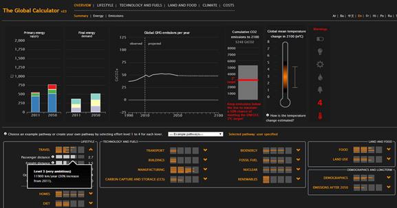
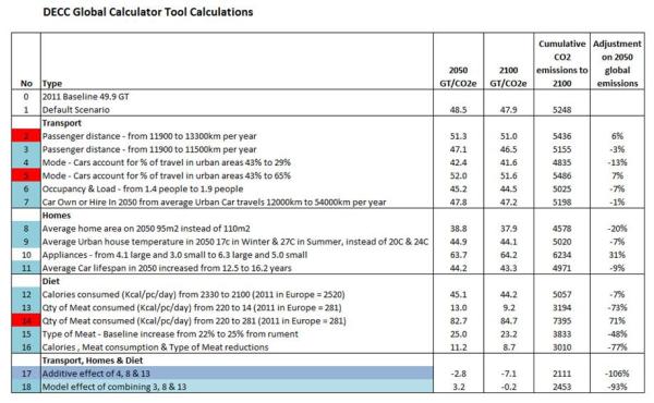
Upon entering the calculator I was presented with some default settings. Starting from a baseline emissions in 2011 of 49.9 GT/CO2e, this would give predicted emissions of 48.5 GT/CO2e in 2050 and 47.9 GT/CO2e in 2100 – virtually unchanged. Cumulative emissions to 2100 would be 5248 GT/CO2e, compared with 3010 GT/CO2e target to give a 50% chance of limiting warming to a 2°C rise. So the game is on to save the world.

I only dealt with the TRAVEL, HOMES and DIET sections on the left.

I went through each of the parameters, noting the results and then resetting back to the baseline.

The TRAVEL section seems to be based on British data, and concentrated on urban people. Extrapolating for the rest of the world seems a bit of a stretch, particularly when over 80% of the world is poorer. I was struck first by changing the mode of travel. If car usage in urban areas fell from 43% to 29%, global emissions from all sources in 2050 would be 13% lower. If car usage in urban areas increased from 43% to 65%, global emissions from all sources in 2050 would be 7% higher. The proportions are wrong (-14% gives -13%, but +22% gives +7%) along with urban travel being too high a proportion of global emissions.

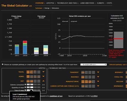
The HOMES section has similar anomalies. Reducing the average home area by 2050 to 95m2 from 110m2 today reduces total global emissions in 2050 by 20%. Independently decreasing average urban house temperature in 2050 from 17oC in Winter & 27oC in Summer, instead of 20oC & 24oC reduces total global emissions in 2050 by 7%. Both seem to be based on British-based data, and highly implausible in a global context.

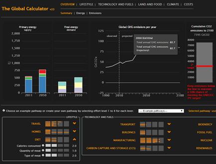
In the DIET section things get really silly. Cutting the average calorie consumption globally by 10% reduces total global emissions in 2050 by 7%. I never realised that saving the planet required some literal belt tightening. Then we move onto meat consumption. The baseline for 2050 is 220 Kcal per person per day, against the current European average of 281 Kcal. Reducing that to 14 Kcal reduces global emissions from all sources in 2050 by 73%. Alternatively, plugging in the “worst case” 281 Kcal, increases global emissions from all sources in 2050 by 71%. That is, if the world becomes as carnivorous in 2050 as the average European in 2011, global emissions from all sources at 82.7 GT/CO2e will be over six times higher the 13.0 GT/CO2e. For comparison, OECD and Chinese emissions from fossil fuels in 2013 were respectively 10.7 and 10.0 GT/CO2e. It seems it will be nut cutlets all round at the climate talks in Paris later this year. No need for China, India and Germany to scrap all their shiny new coal-fired power stations.

Below is the before and after of the increase in meat consumption.

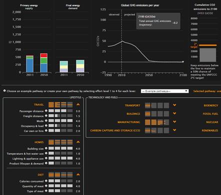
Things get really interesting if I take the three most sensitive, yet independent, scenarios together. That is, reducing urban car use from 43% to 29% of journeys in 2050; reducing the average home area by 2050 to 95m2 from 110m2; and effectively making a sirloin steak (medium rare) and venison in redcurrant sauce things of the past. Adding them together gives global emissions of -2.8 GT/CO2e in 2050 and -7.1 GT/CO2e in 2100, with cumulative emissions to 2100 of 2111 GT/CO2e. The model does have some combination effect. It gives global emissions of 3.2 GT/CO2e in 2050 and -0.2 GT/CO2e in 2100, with cumulative emissions to 2100 of 2453 GT/CO2e. Below is the screenshot of the combined elements, along with a full table of my results.

It might be great to laugh at the DECC for not sense-checking the outputs of its glitzy bit of software. But it concerns me that it is more than likely the same people who are responsible for this nonsense are also responsible for the glossy plans to cut Britain’s emissions by 80% by 2050 without destroying hundreds of thousands of jobs; eviscerating the countryside; and reducing living standards, especially of the poor. Independent and critical review and audit of DECC output is long overdue.

Kevin Marshall


A spreadsheet model is also available, but I used the online tool, with its’ excellent graphics. The calculator is built by a number of organisations.

10GW of extra offshore wind turbines by 2020 – The Real Costs

Projected 10GW in offshore wind turbines by 2020 to add 5% to electricity and gas bills, and reduce UK CO2 emissions by nearly 2%. Cost to exceed benefits by 3.8 or 27 times.


The Telegraph has an article “Offshore wind farm scrapped due to fears over birds

A 200MW extension to the 630MW London Array has been abandoned “over the impact on the red-throated diver, a bird classified as rare or vulnerable by the European Commission“. However,

Ministers say they want between 8GW and 15GW built by 2020, up from 3.6GW now, and suggest a total of about 10GW is most likely.

My comment on this (with references) is

Some statistics to put the 10GW of extra offshore wind power by 2020 in perspective.

Offshore wind power operates at about 35% of nameplate from DECC figures1.

So that will produce about 30,660,000 Mwh of electricity.

At present each megawatt of offshore wind gets 2 renewables obligations certificates, worth £842,8. So that will add £2575m to bills, or about 5%3 of 2012 Electricity AND Gas bills.

But this will help reduce the UKs Carbon emissions. How much?

RenewableUK reckons that each megawatt hour of renewable electricity saves 430kg of CO2 emissions4. So that equates to 13.2 mt, or 1.84% of the 716.4 mt6 1990 baseline emissions.

This has a value as well, called the “social cost of carbon”. The Stern Review reckoned $85t/CO25. The UNIPCC said the average was $126. So that is £675m or £95m towards saving the planet for future generations. Costs are either 3.8 or 27 times the benefits.


The costs of £2575m are not the full costs. There are also extra transmission costs, and backup capacity. A more sceptical view would put a much lower social cost of carbon than the $12 of the UNIPCC.

From note 5, the marginal abatement costs of offshore wind turbines are 3.8 times Stern’s estimate. Perhaps somebody should ask Lord Stern where the marginal abatement costs of less than $85 per tonne of CO2 are to be found. There are millions of households and businesses in this country who would love to know.

Notes

  1. DECC stats here, spreadsheet “Renewable electricity capacity and generation (ET 6.1)”. Offshore wind was 35.2% of nameplate in 2012.
  2. https://www.ofgem.gov.uk/ofgem-publications/58136/buy-out-price-and-mututalisation-ceiling-201314.pdf.
  3. In 2012 the big six energy companies charged about £44bn to all customers. 5% rise assumes they have 85% of the market. Graph here, from this article.
  4. From http://www.renewableuk.com/en/renewable-energy/wind-energy/uk-wind-energy-database/figures-explained.cfm, last section “CO2 Reductions (p.a.) in Tonnes”.
  5. The Stern review noted on pages xvi-xvii

    Preliminary calculations adopting the approach to valuation taken in this Review suggest that the social cost of carbon today, is of the order of $85 per tonne of CO2……. This number is well above marginal abatement costs in many sectors.

  6. The UNIPCC AR4 Summary for Policymakers in 2007 stated on page 22.

    Peer-reviewed estimates of the social cost of carbon in 2005 average US$12 per tonne of CO2, but the range from 100 estimates is large (-$3 to $95/tCO2).

  7. Source World Bank data. UK data at http://data.worldbank.org/country/united-kingdom
  8. The current banding is at https://www.gov.uk/government/uploads/system/uploads/attachment_data/file/211292/ro_banding_levels_2013_17.pdf

First-time comments are moderated. Please use the comments as a point of contact, stating this is the case.

Kevin Marshall


7.

The rising costs of the Renewables Obligation Certificate Scheme

Summary

The cost of Renewables Obligation Certificate scheme ROCs to covert the UK to renewable electricity has more than doubled in less than four years. Whilst the majority of this increase is down to volume increases and inflation, a significant part is down to switching to higher levels of subsidy, particularly for offshore wind farms. This means that the unit cost of electricity from renewables is rising. One wonders if the DECC has factored this into its projected costs of energy to households.

Main Analysis

In my previous posting “Labour’s Hypocrisy on Rising Energy Bills”, I identified that the rise in energy bills over the last few years was mostly due to rising costs external to the energy companies. I only briefly alluded to the causes. This posting looks at the growth in “Renewables Obligation Certificates” (ROCs), the major vehicle to encourage the energy industry to switch to renewables from fossil fuels. Working out the proportion of the “other cost” increases is difficult to work out, but it could be up to a half.

On the 19th December, the Department for Environment, Energy and Climate Change (DECC), issued a great rash of postings to its website. Amongst these of particular interest was “Energy trends section 6: renewables“. This contains a spreadsheet of interest – ET 6.3 “Renewables obligation: certificates and generation”. This gives monthly data covering the period January 2010 to August 2013.

Not all renewables are equal. Different types of renewables attract different ROC rates per MWh (megawatt-hour) of electricity generated. These vary from 0.25 to 5.00. In practice more than 99% of renewable power generated falls into four bands – 0.50, 1.00, 1.50 and 2.00.

Charting the electricity generated in megawatt hours for the period gives the following graph:-


In less than 4 years there has been a spectacular growth in total electricity generated from renewables, from around 1.5m MWh per month in early 2010, to over 3.0m in early 2013. But there has been even greater growth in the generation of renewables with 2.00 ROCs, and the disappearance of the 0.50 ROCs. This can be better seen by the proportions of generation in each of the ROC bands.


In early 2010, less than 5% of renewables generated qualified for 2 ROCs, whereas by 2013 over 20% did. To show the impact more clearly I have devised three indexes. These include all ROC bands for declarations on a monthly basis. (A very tiny number of schemes have annual declarations.)

  1. Renewable electricity generated qualifying for ROCs.
  2. Renewable Obligation Certificates issued.
  3. The buy-out value of the ROCs. This value is declared by the regulator OFGEM, and inflated each year by the Retail Prices Index. The 2013/14 declaration is here, with all the previous rates.

The index is for 12 month periods, with the period January to December 2010 set to 100.


From the period Jan-Dec 2010 to the period Sept 2012-Aug 2013, volume of renewables electricity generated increased by 80%; volume of ROCs by 116%; and value of ROCs by 140%.

There is a rapid growth in renewables, but the real cost per unit generated is increasing more rapidly. In buy-out values terms, the ROCs issued were worth £862m for Jan-Dec 2010 and £2,069m for Sept 2012-Aug 2013. But what type of renewable is responsible for this real cost per unit increase?

The Growth in Wind Turbine generation and ROCs

A major component of renewables has always been wind turbines, but the proportion is increasing. They are split between onshore and offshore. There are three graphs showing this increase.

  1. The proportion of renewables generated from Wind Turbines


    This shows that not only has the proportion of generation from wind turbines increased from around 40% to nearly 60%. More than 100% of the increased proportion is due to offshore wind turbines with 2.00 ROCs per MWh generated.

  2. Wind generated ROCs as a proportion of ROCs issued


    The share of total ROCS for wind turbines now accounts for over 60% of the total. Around 30% is from offshore wind turbines with 2.00 ROCs per MWh generated.

  3. Index of Changes in Renewables Obligation Credits for wind turbines.


From the period Jan-Dec 2010 to the period Sept 2012-Aug 2013, volume of renewables electricity generated increased by 134%; volume of ROCs by 177%; and value of ROCs by 209%. In buy-out values terms, the ROCs issued for wind turbines were worth £426m (49% of the total) for Jan-Dec 2010 and £1,315m (64% of the total) for Sept 2012-Aug 2013.

The true cost of offshore wind power

This analysis has solely concentrated on ET 6.3. The “Renewable electricity capacity and generation” (ET 6.1) file has some useful data on load factors. For wind turbines I have extracted the annual data.


Offshore wind turbines have around 35% higher load factors than onshore.

The vast majority of income for wind turbines is in two parts. There is the wholesale price at around £60 per MWh and the ROC income, which is £42 for onshore and £84 for offshore.

Per annum, with 35% more load, the offshore wind farm can expect about 90% more income per MWh of capacity than the onshore to cover capital and maintenance costs. It is even worse when compared with the gas-fired alternative. The only income for the generator is the £60 per MWh from selling wholesale, but they have the additional costs of at least £20 per MWh for fuel.

Biomass

An area not covered is the growth in the use of Biomass / other fuels at coal-fired power stations. This will be in a posting next year.

Questions on the subsidising of offshore wind turbines

  1. Given that prior to 2010 offshore wind farms were being commissioned with ROCs of 1.00 and 1.50, how much of this increased rate of 2.0 accommodates greater costs (more distant from the shore, and in deeper water) and how much gives greater profits?
  2. Given that a gas-fired power station can cover its operating and capital costs with less than £40 per MWh, should we be considering alternative, and less reliable, forms of electricity generation that seem to need up to four times the income to operate?
  3. Was any independent studies done of the costs of wind-generated power in setting the ROC rates, or was it just on the advice of the renewables industry and a DECC desperate to meet its carbon budget?
  4. Have the DECC factored in the need to give ever higher levels of subsidies to meet renewables targets?

Kevin Marshall