Insight into the mindset of FoE activists

Bishop Hill comments about how

the Charities Commissioners have taken a dim view of an FoE leaflet that claimed that silica – that’s sand to you or me – used in fracking fluid was a known carcinogen.

Up pops a FoE activist making all sorts of comments, including attacking the hosts book The Hockey Stick Illusion. Below is my comment

Phil Clarke’s comments on the hosts book are an insight into the Green Activists.
He says Jan 30, 2016 at 9:58 AM

So you’ve read HSI, then?
I have a reading backlog of far more worthwhile volumes, fiction and non-fiction. Does anybody dispute a single point in Tamino’s adept demolition?

and

Where did I slag off HSI? I simply trust Tamino; the point about innuendo certainly rings true, based on other writings.
So no, I won’t be shelling out for a copy of a hatchet job on a quarter-century old study. But I did read this, in detail
http://www.nature.com/ngeo/journal/v6/n5/full/ngeo1797.html

Tamino’s article was responded to twice by Steve McIntyre. The first looks at the use of non-standard statistical methods and Re-post of “Tamino and the Magic Flute” simply repeats the post of two years before. Tamino had ignored previous rebuttals. A simple illustration is the Gaspé series that Tamino defends. He misses out many issues with this key element in the reconstruction, including that a later sample from the area failed to show a hockey stick.
So Phil Clarke has attacked a book that he has not read, based on biased review by an author in line with his own prejudices. He ignores the counter-arguments, just as the biased review author does as well. Says a lot about the rubbish Cuadrilla are up against.

Kevin Marshall

Shotton Open Cast Coal Mine Protest as an example of Environmental Totalitarianism

Yesterday, in the Greens and the Fascists, Bishop Hill commented on Jonah Goldberg’s book Liberal Fascists. In summing up, BH stated:-

Goldberg is keen to point out that the liberal and progressive left of today do not share the violent tendencies of their fascist forebears: theirs is a gentler totalitarianism (again in the original sense of the word). The same case can be made for the greens. At least for now; it is hard to avoid observing that their rhetoric is becoming steadily more violent and the calls for unmistakably fascist policy measures are ever more common.

The link is to an article in the Ecologist (reprinted from Open Democracy blog) – “Coal protesters must be Matt Ridley’s guilty consience

The coal profits that fill Matt Ridley’s bank account come wet with the blood of those killed and displaced by the climate disaster his mines contribute to, writes T. If hgis consicence is no longer functioning, then others must step into that role to confront him with the evil that he is doing. (Spelling as in the original)

The protest consisted of blocking the road for eight hours to Shotton open cast coal mine. The reasoning was

This was an effective piece of direct action against a mine that is a major contributor to climate disaster, and a powerful statement against the climate-denying Times columnist, Viscount Matt Ridley, that owns the site. In his honour, we carried out the action as ‘Matt Ridley’s Conscience’.

The mine produces about one million tonnes of coal a year out of 8,000 million tonnes globally. The blocking may have reduced annual output by 0.3%. This will be made up from the mine, or from other sources. Coal is not the only source of greenhouse gas emissions, so the coal resulting in less than 0.004% of global greenhouse gas emissions. Further, the alleged impact of GHG emissions on the climate is cumulative. The recoverable coal at Shotton is estimated at 6 million tonnes or 0.0007% of the estimated global reserves of 861 billion tonnes (Page 5). These global reserves could increase as new deposits are found, as has happened in the recent past for coal, gas and oil. So far from being “a major contributor to climate disaster”, Shotton Open Cast Coal Mine is a drop in the ocean.

But is there a climate disaster of which Matt Ridley is in denial? Anonymous author and convicted criminal T does not offer any evidence of current climate disasters. He is not talking about modelled projections, but currently available evidence. So where are all the dead bodies, or the displaced persons? Where are the increased deaths through drought-caused famines? Where are the increased deaths from malaria or other diseases from warmer and worsening conditions? Where is the evidence of increased deaths from extreme weather, such as hurricanes? Where are the refugees from drought-stricken areas, or from low-lying areas now submerged beneath the waves?

The inability to evaluate the evidence is shown by the comment.

Ridley was ( … again) offered a platform on BBC Radio 4 just a week before our hearing, despite his views being roundly debunked by climate scientists.

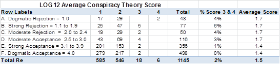
The link leads to a script of the Radio 4 interview with annotated comments. I am not sure that all the collective brains do debunk (that is expose the falseness or hollowness of (an idea or belief)) Matt Ridley’s comments. Mostly it is based on nit-picking or pointing out the contradictions with their own views and values. There are two extreme examples among 75 comments I would like to highlight two.

First is that Matt Ridley mentioned the Hockey Stick graphs and the work of Steve McIntyre in exposing the underlying poor data. The lack of a medieval warm period would provide circumstantial (or indirect) evidence that the warming of the last 200 years is unprecedented. Gavin Schmidt, responded with comments (5) and (6) shown below.

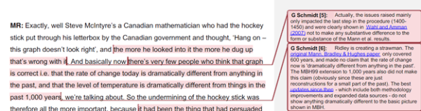
Schmidt is fully aware that Steve McIntyre also examined the Wahl and Amman paper and thoroughly discredited it. In 2008 Andrew Montford wrote a long paper of the shenanigans that went into the publication of the paper, and its lack of statistical significance. Following from this Montford wrote the Hockey Stick Illusion in 2010, which was reviewed by Tamino of RealClimate. Steve McIntyre was able to refute the core arguments in Tamino’s polemic by reposting Tamino and the Magic Flute, which was written in 2008 and covered all the substantial arguments that Tamino made. Montford’s book further shows a number of instances where peer review in academic climatology journals is not a quality control mechanism, but more a device of discrimination between those that support the current research paradigm and those that would undermine that consensus.

Comment 6 concludes

The best updates since then – which include both methodology improvements and expanded data sources – do not show anything dramatically different to the basic picture shown in MBH.

The link is to Chapter 5 on the IPCC AR5 WG1 assessment report. The paleoclimate discussion is a small subsection, a distinct reversal from the prominent place given to the original hockey stick in the third assessment report of 2001. I would contend the picture is dramatically different. Compare the original hockey stick of the past 1,000 years with Figure 5.7 on page 409 of AR5 WG1 Chapter 5.

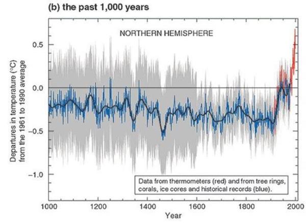
In 2001, the MBH reconstruction was clear. From 1900 to 2000 average temperatures in the Northern Hemisphere have risen by over 1C, far more than the change in any of century. But from at least two of the reconstructions – Ma08eivl and Lj10cps – there have been similarly sized fluctuations in other periods. The evidence now seems to back up Matt Ridley’s position of some human influence on temperatures, but does not support the contention of unprecedented temperature change. Gavin Schmidt’s opinions are not those of an expert witness, but of a blinkered activist.

Schmidt’s comments on hockey stick graphs are nothing compared to comment 35

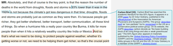
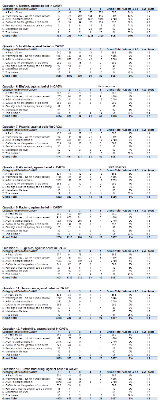
The Carbon Brief (not the climate scientists) rejects evidence that contradicts their views based on nothing more than ideological prejudice. A search for Indur Goklany will find his own website, where he has copies of his papers. Under the “Climate Change” tab is not only the 2009 paper, but a 2011 update – Wealth and Safety: The Amazing Decline in Deaths from Extreme Weather in an Era of Global Warming, 1900–2010. Of interest are two tables.

Table 2 is a reproduction of World Health Organisation data from 2002. It clearly shows that global warming is well down the list of causes of deaths. Goklany states in the article why these figures are based on dubious assumptions. Anonymous T falsely believes that global warming is curr

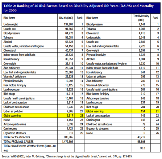
Figure 6 for the period 1990-2010 shows

  • the Global Death and Death Rates per million Due to Extreme Weather Events
  • CO2 Emissions
  • Global average GDP Per Capita

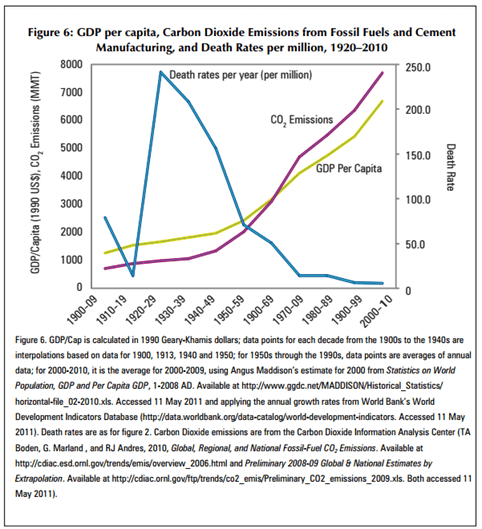
Figure 6 provides strong empirical evidence that increasing CO2 emissions (about 70-80% of total GHG emissions) have not caused increased deaths. They are a consequence of increasing GDP per capita, which as Goklany argues, have resulted in fewer deaths from extreme weather. More importantly, increasing GDP has resulted in increased life expectancy and reductions in malnutrition and deaths that be averted by access to rudimentary health care. Anonymous T would not know this even if he had read all the comments, yet it completely undermines the beliefs that caused him to single out Matt Ridley.

The worst part of Anonymous T’s article

Anonymous T concludes the article as follows (Bold mine)

The legal process efficiently served its function of bureaucratising our struggle, making us attempt to justify our actions in terms of the state’s narrow, violent logic. The ethics of our action are so clear, and declaring myself guilty felt like folding to that.

We found ourselves depressed and demoralised, swamped in legal paperwork. Pleading guilty frees us from the stress of a court case, allowing us to focus on more effective arenas of struggle.

I faced this case from a position of relative privilege – with the sort of appearance, education and lawyers that the courts favour. Even then I found it crushing. Today my thoughts are with those who experience the racism, classism and ableism of the state and its laws in a way that I did not.

That reflection makes me even more convinced of the rightness of our actions. Climate violence strikes along imperialist lines, with those least responsible, those already most disadvantaged by colonial capitalism, feeling the worst impacts.

Those are the people that lead our struggle, but are often also the most vulnerable to repression in the struggle. When fighting alongside those who find themselves at many more intersections of the law’s oppression than I do, I have a responsibility to volunteer first when we need to face up to the police and the state.

Faced with structural injustice and laws that defend it, Matt Ridley’s Conscience had no choice but to disobey. Matt Ridley has no conscience and neither does the state nor its system of laws. Join in. Be the Conscience you want to see in the world.

The writer rejects the rule of law, and is determined to carry out more acts of defiance against it. He intends to commit more acts of violence, with “climate” as a cover for revolutionary Marxism. Further the writer is trying to incite others to follow his lead. He claims to know Matt Ridley’s Conscience better than Ridley himself, but in the next sentence claims that “Matt Ridley has no conscience“. Further this statement would seem to contradict a justification for the criminal acts allegedly made in Bedlington Magistrates Court on December 16th
that the protesters were frustrated by the lack of UK Government action to combat climate change.

It is not clear who is the author of this article, but he/she is one of the following:-

Roger Geffen, 49, of Southwark Bridge Road, London.

Ellen Gibson, 21, of Elm Grove, London;

Philip MacDonald, 28, of Blackstock Road, Finsbury Park, London;

Beth Louise Parkin, 29, of Dodgson House, Bidborough Street, London;

Pekka Piirainen, 23, of Elm Grove, London;

Thomas Youngman, 22, of Hermitage Road, London.

Laurence Watson, 27, of Blackstock Road, Finsbury Park, London;

Guy Shrubsole, 30, of Bavent Road, London;

Lewis McNeill, 34, of no fixed address.

Kevin Marshall

Veritasium Misinforms on Global Warming

Bishop Hill posts on a You-tube video “13 Misconceptions About Global Warming” from Veritasium (Dr Derek Muller), inviting readers to play a sort of bingo to “spot all the strawmen arguments, cherrypicking, out of date data, and plain old mistakes”. Here is my attempt, restricted to just 13 points.

  1. “Global warming” / “climate change” naming. It might be true that people can deny global warming by pointing to a localized cold weather snap. But it is also true that using the term “climate change” can result in any unusual weather event or short-term trend being blamed on anthropogenic global warming, along with natural global fluctuations. The term “global warming” reminds us that the adverse effects on climate are as a result of rising greenhouse gas levels warming the atmosphere. More importantly the use of the term “global” reminds us those changes in climate due to changes in greenhouse gases is a global issue requiring global solutions. Any mitigation policy that excludes 80% of the global population and two-thirds of global carbon emissions, will not work.


  2. Veritasium claims climate change is also about more extreme weather and ocean acidification, not just the average surface temperature is warming. But there is nothing in the greenhouse gas hypothesis that says a rise in temperatures will result in more extreme weather, nor does Veritasium provide the evidence of this happening. At Wattupwiththat there is a page that demonstrates weather is not getting more extreme from a number of different measures.


  3. Claim that it has not stopped warming as 13 of the 14 hottest years are in this century. This is a strawman, as there was significant warming in the last quarter of the twentieth century. We would only fail to have hottest years if global average temperatures had taken a sharp step decrease.


  4. Claims that taking the satellite data of global temperature anomalies into account shows that warming has not stopped. From Kevin Cowtan’s page (copied by Skeptical Science) we can calculate linear trends. It is the RSS satellite data that shows the longest period of no warming – 18 years from 1997-2014 based on the linear trend. It is just 13 years for GISTEMP and 14 years for HADCRUT4. The other satellite data is UAH, where there is just 6 years of no warming.


  5. What he is doing is comparing UAH satellite data that only shows the pause from 2009. There is now 35 years of satellite data, with the total recorded trend of 0.48oC. The RSS data shows 0.51oC of warming. The surface thermometer measures vary between 0.59 and 0.63 oC of warming. This is data cherry-picking.


  6. There is a claim that climate sensitivity is lower than thought in the 1980s. Not according to Nicholas Lewis, who found that the range of sensitivities is unchanged from the Charney Report 1979 through to AR5 WG1 of Sept-13


  7. Claims the central estimate for warming from a doubling of CO2 is 3.0oC of warming. Based on this from 2001 from HADCRUT4 shows no warming there would be 0.30oC of warming, when the trend from HADCRUT4 is zero. In a longer period from 1979 for which we have satellite data, an increase in CO2 from 336.8 to 398.5 ppm (Mauna Loa data) implies an increase in temperatures of 0.72oC – between 1.14 on 1.5 times greater than that measured by the temperature series. Even this is misleading, as there was no warming from 1944 to the late 1970s. In 1944 I estimate that CO2 levels were 308ppm, indicating a total warming in the last 70 years of 1.1oC, respectively 1.7 and 2.1 times greater than the trend in GISTEMP and HADCRUT4.


  8. This would appear to contradict this graph, which has no proper labelling showing have 3.0oC of doubling affects temperatures.

    Specifically from 1958 to 1980 CO2 rose from 315 to 339ppm, indicating warming of about 0.31 oC, but there was no warming in the IPCC projections. A rise in CO2 of 315 to 398.5 ppm from 1958 to 2014 would predict 1.0 oC in warming, almost double the actual data and the IPCC projections. Another point is with the “observed temperature”. It is not identified (probably GISTEMP) and ends on the high of 2010.


  9. Completely ignores the other greenhouse gases that contribute to warming, such as methane and halocarbons.


  10. Claims that sea level rise is another indication of global warming, through thermal expansion. This is not necessarily the case. The average temperature of the ocean is 3.9oC. A rise of to 4.0 oC will have zero expansion. If the rise in sea temperatures is confined to the Arctic or in the deep oceans where temperatures are below 4.0 oC, a rise in temperatures would mean a fall in sea levels. Below I have compiled a graph to show the expansion of a 100metre column of water by 0.1 oC from various starting temperatures.


  11. On Arctic Sea ice, is correct in saying that the 40% uptick in the last two years ignores the longer period of data. But in turn, Veritasium ignores evidence pre-satellites that were fluctuations in sea ice. Further, the uptick occurred at precisely the year when previous experts had predicted that summer sea ice cover would disappear. As a consequence, contraction of the sea ice is both less severe and less likely to be linked to human-caused warming than previously thought.


  12. Correctly points out that water vapour is the major greenhouse gas, but incorrectly claims to have evidence that water vapour is increasing in the atmosphere. The evidence is from a graphic from a 2007 PNAS paper.

    The evidence from 1900 is the average of 12 models. The confidence intervals are utter rubbish, appearing to be related to the magnitude of the average modelled anomaly. The actual (estimated) data in black does not have a confidence interval. It would appear that this estimated data has a step increase at roughly the time, or slightly before, when the warming stopped in the surface temperature records.


  13. Policy justification is totally wrong.

Veritasium says at 5.35

I’m not claiming it’s going to be some sort of crazy catastrophe, but we are going to get more intense storms, more droughts and floods, the oceans will become more acidic, sea levels will rise and my point is it would be better for all species on this planet and probably cheaper for us if we just started reducing emissions now than if we wait and pay the consequences later.

Every economic justification of policy projects “some sort of crazy catastrophe” that human being and other species will not be able to adapt to. Further they project that global emissions reductions will be both effective and relatively costless, which is contradicted by the evidence. But most of all, there is no political proposal in the climate talks that will reduce global emissions in the next twenty years. The proposals may only constrain the rate of increase.

Kevin Marshall

São Paulo Drought – Climate Change is NOT the cause

Seca de São Paulo – Mudança Climática NÃO é a causa

The drought situation in São Paulo is critical. As of late October, the two principle reservoirs that serve the city were below 5% of capacity. Water pressures have been reduced to such an extent that people in the higher parts of the city are without water for most of the time. What is causing this?

The “Climate News Network” (website run by former Guardian & BBC journalists) they attribute this to deforestation and climate change1. They say

The unprecedented drought now affecting São Paulo, South America’s giant metropolis, is believed to be caused by the absence of the “flying rivers” − the vapour clouds from the Amazon that normally bring rain to the centre and south of Brazil.

Some Brazilian scientists say the absence of rain that has dried up rivers and reservoirs in central and southeast Brazil is not just a quirk of nature, but a change brought about by a combination of the continuing deforestation of the Amazon and global warming.

This combination, they say, is reducing the role of the Amazon rainforest as a giant “water pump”, releasing billions of litres of humidity from the trees into the air in the form of vapour.

Meteorologist Jose Marengo, a member of the Intergovernmental Panel on Climate Change, first coined the phrase “flying rivers” to describe these massive volumes of vapour that rise from the rainforest, travel west, and then − blocked by the Andes − turn south.

Satellite images from the Centre for Weather Forecasts and Climate Research of Brazil’s National Space Research Institute (INPE) clearly show that, during January and February this year, the flying rivers failed to arrive, unlike the previous five years.

This explanation of deforestation causing the drought does not hold water. The following is an account of why this drought explanation is flawed.

The “flying rivers” or “rios voadores” is being studied as a Petronas-sponsored long-term project at http://riosvoadores.com.br/english/. Project leader Gérard Moss explains the nature of “flying river”.

The question is, where does the rain come from?

Most of the evaporation comes from the sea… The wind pushes this air over the Amazon Forest, a region where it rains quite a lot. The humid air eventually reaches the Andes, which force it south and that is what we are calling a “flying river

So the most important part of the evaporation is from the sea. A minor part comes from evaporation the Amazon Forest. Yet the Climate News Network is under the impression that all of the evaporation comes from the Amazon. The same is true of the Ecologist, which seems to have used the same material. What is even worse, both sources claim that 22% of the Amazon has been lost. That would mean that the total evaporation from the Amazon region will have reduced by less than this figure and the total moisture content of the “flying rivers” by less than 10%. Even so, there is nowhere provided any data that shows the rainfall in the area is reduced. If the hypothesis were true, then the rainfall near the mouth of the Amazon would be largely unchanged, but as the “flying river” goes south into NE Bolivia and Paraguay, and the Brazilian states of Rondönia, Mato Grosso do Sul, São Paulo, Parana and Santa Catarina, there should be evidence of diminishing rainfall. But despite a quite expensive project employing a number of people and two light aircraft (one a sea plane) there seems to be no effort to gather the data that might falsify the data. Further, project leader Gérard Moss (who is a pilot and engineer) does not seem open to falsification of the hypothesis.
Starting at 7:10 he says:-

My dream is that the Flying Rivers project, through studying (the flying rivers) behaviour, will scientifically prove the amount of rainfall in the south and the Amazon forest. My dream is that we will finally stop exchanging the forest for grazing land and plantations. ….. (T)he project’s greatest challenge is to prove to all us Brazilians, that it’s no longer worth felling one single tree.

Gérard Moss is a pilot and engineer. He is the one who has the use of two aircraft. Further, since mid-2012, the project has been restricted to educational projects2. One such project gives a useful tool that monitors the prevailing wind trajectories. The latest one I downloaded and superimposed the wind direction of the “flying rivers” in think blue arrows.


It would seem that the prevailing easterly winds have shifted south coming ashore in arid Bahia and doing a short loop round to São Paulo, completely missing the Amazon.

Unfortunately, the only map prior to October is for 23/07/14. This gives a similar picture of prevailing winds completely missing the Amazon.


I have a simple hypothesis that can easily be contradicted by archived data held by the website. The cause of the current water shortage lies in January and February, with the failure of the normal summer rains. My hypothesis that this failure was due to similar wind patterns occurring in January and February as found on 27th October. This, naturally occurring, phenomena would have occurred at a similar time to the Gulf Stream shifting course – in the UK shifting north causing extreme storms in Southern England, with flooding in Somerset and the Thames Valley, and in the USA shifting south causing the extreme cold of the Polar Vortex.

There is, however, a further video by the BBC (in English) where Gérard Moss explains that half or more of the rainfall in São Paulo is from the Amazon, as opposed to the sea.

There are three potential sources of water vapour that could condense as rain in the city of São Paulo, but are not mentioned. First is sea evaporation that has not passed over the Amazon. Second is land evaporation from air currents that have not passed over the Amazon, like in the cases above. Third is evaporation from the “flying rivers” airflows after passing over the Amazon. There is up to 2,000 km between the end of the Amazon forest and São Paulo.

Summary

The current extreme drought in the city of São Paulo is not the result of Amazon deforestation for two reasons. First, the deforestation is insufficiently large to account for the drought levels. Second is that evidence points to a natural southerly shift in the current year in the easterly winds coming ashore in Brazil from near the Amazon delta to the much drier coast of Bahia.

But if the deforestation is not the cause of the draught, what are the likely causes? This will be the subject of a further post.

Update 1 14/12/14

I did not get round to the update. This is a background I wrote for the BishopHill discussion.

As my wife comes from Southern Brazil and I have visited the area a number of times, this caught my eye. Before linking the drought to climate change you need to consider the following geographical facts.

  • The City of São Paulo is built on a plateau about 700 metres above sea level. This means that although the Tropic of Capricorn passes through the North of the City, the climate is relatively temperate. The highest recorded temperature is just 35.3 °C.
  • The two principle reservoirs have been supplying the city since the 1920s when the population was less than a million, compared to twenty million today.
  • The area of São Paulo and Rio de Janeiro was once covered by the Atlantic forest. This once extended well south into Argentina and inland to Paraguay – an area bigger than Western Europe. According to Wikipedia 88% has disappeared. (Climate News Network and The Ecologist put the figure at 91.5%) From extensive travel in Parana, Southern São Paulo state and Northern Santa Catarina this figure seems accurate. Most of the deforestation occurred in the twentieth century.
  • The Rivers of São Paulo State mostly form part of the River Plate Basin – that meets the sea in Montevideo, Uruguay. This drains most of southern Brazil, the entire country of Paraguay, Northern Argentina as well as a corner of Bolivia1. The principle river serving the city is the Tietê.
  • São Paulo State is about the same area of the United Kingdom and has a population of 43 million.
  • Upstate there is extensive agriculture, including soybean, sugar cane and cattle.
  • This is the worst drought in 84 years, not ever recorded. The previous one was four years before the American dust bowel of 1934, so there might be common climate factors that have influenced the period.

My conclusion is that the seriousness of the current water crisis is due to the following factors, in order of importance.

  1. Investment in water supply not keeping pace with demand.
  2. A once-in-a-century drought.
  3. Location of a megacity on a plateau, limiting the ability to cheaply extend the water supply.
  4. Changes in rainfall patterns from deforestation.

Notes

  1. Over at the BishopHill blog, commentator Entropic Man has started a discussion thread on the current drought in São Paulo, which he claims is due to deforestation and climate change. As the BishopHill blog is almost entirely given over to climate issues, the inference by Entropic Man is that human-caused climate change is responsible.
  2. The website explains (in Portuguese)

    From the mid-2012, the project is restricted to educational, awareness actions and counts with the collaboration of the CPTEC in providing the data provided on the links of the weather mapsan important tool that allows the general public to see and track the trajectories of the flying rivers.

    Kevin Marshall

The Cassandra Effect and Insulting Climate Sceptics

There are two articles published today that are related. Bishop Hill posts about the “reverse Cassandra effect” and Jo Nova comments on Matt Ridley’s article in today’s Times on THE SCEPTICS ARE RIGHT. DON’T SCAPEGOAT THEM.

Bishop Hill refers to a Wired article on the late Julian Simon published some years ago:-

Simon always found it somewhat peculiar that neither the Science piece nor his public wager with Ehrlich nor anything else that he did, said, or wrote seemed to make much of a dent on the world at large. For some reason he could never comprehend, people were inclined to believe the very worst about anything and everything; they were immune to contrary evidence just as if they’d been medically vaccinated against the force of fact. Furthermore, there seemed to be a bizarre reverse-Cassandra effect operating in the universe: whereas the mythical Cassandra spoke the awful truth and was not believed, these days “experts” spoke awful falsehoods, and they were believed. Repeatedly being wrong actually seemed to be an advantage, conferring some sort of puzzling magic glow upon the speaker.

I believe that the Cassandra effect is still working. What is relevant is how you view awful. Take a classic example of the Cassandra effect. Ignaz Semmelweis found that doctors washing their hands between examining each patient reduced mortality rates. The implied “awful” truth that every experienced hospital doctor in 1840s Vienna had to accept was that, due to their ignorance, they had killed people when they were in the business of saving lives.

But for environmentalists the “scientific truth” that the human race is destroying the planet confirms their beliefs. Politicians whose mission is to make a real difference to the world – an honourable motive – can now take part in saving the planet from an evil menace. Maybe not as spectacularly as James Bond, or Flash Gordon, but they can still expect to receive plaudits and a place in history. Or at least a pat on the back from green activists in Bali, Copenhagen, Cancun….

For those who believe materialism is ultimately depraved; or humankind is inherently sinful; or capitalism will collapse through its inherent contradictions; or the rich got where they are through trampling over those like themselves; – all can latch onto the cause as well. For all these people the awful truth for the world is not so awful for them.

This is why the Cassandra effect is still very much with us. The awful truth is that politicians now find themselves in the same position of those doctors in 1840s Vienna. When they thought they were saving the world, they are in fact harming the futures of their constituents. As Matt Ridley points out in the Times today of climate change:-

Sceptics say it is not happening fast enough to threaten more harm than the wasteful and regressive measures intended to combat it. So far they have been right.

My next article will show that even the most extreme climate change believers can postulate a big enough harm from climate change than the wasteful and regressive measures intended to combat it.

Kevin Marshall

Observations on the Shollenberger Survey

In late 2012 there was a lot of adverse comment about the paper Lewandowsky, Oberauer & Gignac – NASA faked the moon landing:Therefore (Climate) Science is a Hoax: An Anatomy of the Motivated Rejection of Science (in press, Psychological Science). I did my own quick analysis using pivot tables, which was referred to elsewhere.

Last week, Brandon Shollenberger produced a shorter survey that, though tongue in cheek, aimed to replicate the findings of the Lewandowsky et al. He wrote

As you’re aware, Stephan Lewandowsky has written several papers claiming to have found certain traits amongst global warming skeptics. I believe his methodology is fundamentally flawed. I believe a flaw present in his methodology is also present in the work of many others.

To test my belief, I’m seeking participants for a short survey (13 questions). The questions are designed specifically to test a key aspect of Lewandowsky’s methodology. The results won’t be published in any scientific journal, but I’ll do a writeup on them once the survey is closed and share it online.

This was published at the blogs Wattsupwiththat, JoanneNova and BishopHill blogs. The poll is still available to view.

A few hours ago Jo Nova published Shollenberger’s initial findings, as “Warmists Are Never Wrong, Even When Supporting Genocide“. Using the same methodology that Lewandowsky et al (LOG12) “demonstrated” that those who reject the climate religion have a propensity to believe in cranky conspiracy theories, Shollenberger showed that believers in catastrophic global warming have a propensity to believe in genocide, paedophilia and human trafficking. Like for the LOG12, I have run the data through Excel pivot tables to reveal that Shollenberger was successful in undermining LOG12.

Categorizing the responses

For the LOG12 I split the respondents according to the average response to the four LOG12 “climate science” questions.


Similarly, with the Shollenberger survey, I have categorised the respondents according to response to the three questions on global warming. This time I weighted the responses in relation to belief in catastrophic anthropogenic global warming. First I changed the 1 to 5 response to a 0 to 4 response. The weightings were then 1 for Ques 1, 2 for Ques 2 and 4 for Ques 3. By dividing by the maximum score of 28, I obtained a “believer” percentage. Questions are below.

Also, I have looked at the percentage with the outlier scores, along with the average scores.


Preliminary observations

Some brief preliminary observations that stand out from the pivot tables. These are the green bordered summaries below and the responses to the individual questions at the foot.

  1. Compared with LOG12, Schollenberger gets three times the responses and takes a week rather than 18 months to publish the results.
  2. Schollenberger shows the result of only publishing a survey on only one side of the global warming divide, whilst trying to analyse the other side. The vast majority of responses are from people you are not targeting.
  3. The three times response, in a much shorter time frame indicates that sceptics are far more interested in the subject of global warming than the believers.
  4. Proportionately, more far sceptics seem to visit “believer” blogs than “believers” visit sceptic blogs. This should not be controversial. Sceptics look to understand the view they oppose, whilst “believers” look for confirmation. Climate change is no different from many other areas, including many of the softer sciences.
  5. Schollenberger, in his three questions on belief in global warming captures a broader possible range of beliefs in the climate science, than LOG12 does in four questions. In particular it is possible to distinguish between those who believe humans have caused most of the recent warming, but it is fairly trivial, and those who (like the MSM) believes we are all doomed unless we abandon out cars for bicycles and go to 2W lightbulbs everywhere. The LOG12 questions were designed to polarize views into “pro-science” and “deniers”. Schollenberger thus achieves very quickly what millions of dollars spent on opinion surveys conceals. The extreme alarmism that justifies policy is not held by the majority who believe that anthropogenic global warming is an issue.
  6. Both surveys were uncontrolled for “scam” responses. That is for those on one side to be able to mischievously post as an opponent, but with reprehensible views. The Schollenberger survey had more, and (to a lesser extent) a higher proportion of scam responses. Given the knowledge of LOG12, this is not surprising. But, given the proportions of non-scam responses, “believers” seem to have a greater propensity to scam “sceptics” than the opposite.
  7. Thus Schollenberger can demonstrate that Lewandowsky’s conclusions are as much based on scam responses as his survey.


The Survey Questions


Number of Responses to questions 4 to 13, in relation to CAGW score.


Kevin Marshall

Is there a latent problem with wind turbines?

In a posting “Accelerated Depreciation” Bishop hill says

This article at a blog called Billo The Wisp is important if true. Turbine gearbox failures apparently happen typically after 5-7 years rather than the 20 years that we are normally led to believe wind turbines last for. Moreover, their failure can be completely catastrophic, leading to the destruction of the whole turbine.

My comment is quite sceptical.

I do not think that the thrust of this post is correct – that there is a problem that gearboxes in that they will only last for 5-7 years, that has been around for 25 years and that it was so serious that the US government set up a special department to investigate in 2007. Despite all of this, there is still a largely hidden and hugely costly problem of which people are not aware. Having been in the engineering industry for a number of years I would consider the following if involved in the decision to set up a wind farm.

First, wind turbines are electro-mechanical devices. They need servicing and occasional overhauling. Ease of maintenance is important, including the replacement of major components. I would want a recommended maintenance program, along with projected parts costs, required maintenance equipment (e.g. a crane) and standard labour hours.

Second, I would want data on long-term historical performance, service and maintenance costs of each manufacturer’s equipment.

Third, if there was a large wind farm, I would include some spare parts, including major components that should last the life of the equipment. This may include have complete sets of spare parts that can be quickly swapped out – so major maintenance can be done in a workshop and not 200 metres in the air.

Fourth, I would cross-check this against industry journals. Wind turbine manufacture is a huge business with a number of manufacturers selling into a large number of countries. Issues are discussed, like in any industry.

The largest wind farms cost hundreds of millions. Businesses are not naïve. Even with large potential profits, there is always more money to be made through proper investment appraisal and protecting that investment through a thorough maintenance programme. If a major component of a wind turbine only lasted a third the length of time of the main structure, then replacing that component would become a part of the life-time costs. There would be huge incentives to minimize those costs through better design, such as ease of replacement of bearings. The only issue is that the real costs of wind turbines will never come down to a level where subsidies are no longer required.

NB a source of the reliability claims is this June 2010 article, which is now 3.5 years old.

Notes Labour’s Analysis of the Energy Market

Labour’s Green Paper on Energy has been found by Alex Cull (comment at Dec 2, 2013 at 1:03 PM) at the site “Your Britain“, in the Agenda 2015 section. Having read it, I can see why the Labour Party are not keen for the electorate to find the document. Some quick observations, that I believe are sufficient to show that Labour have not bottomed out the only, let alone the best, explanation of why retail prices have risen so fast in last few years. What this clearly shows is that Labour’s proposed policy freeze is not just misplaced; it is positively harmful to Britain having future low-cost and secure energy supplies.

Note 03/12/13: This post will be added to over the coming days.

Update 04/12/13: Note on declining investment in “clean energy”

Billions not Millions

The Executive Summary states

Lack of competition in the retail market has resulted in consumers paying £3.6m more than they need to each year.

Caption to Table 1 on page 7 states

Lack of competition in the retail market has resulted in consumers paying £3.6 billion more than they need to

Error in Calculation

The source of the £3.6bn is from Which?

The consumer group Which? found that 75 per cent of customers are on the most expensive tariffs offered by suppliers – their standard tariff – and are not getting the cheapest deal in the market. They estimate that since 2011, families across the country have paid £3.6 billion a year more than they need to as a result. That means that households are on average paying £136 each year because the retail market is not working in the way that a competitive market should. If this market was genuinely competitive, energy companies would face stronger incentives to drive their costs down and pass savings to consumers through lower prices and cheaper tariffs; but this is not happening.

That implies that

  1. In a perfectly competitive market, the single price would be the very cheapest rate available.
  2. As a consequence the big six energy companies are pocketing the difference.

So, there is a monopoly profit of greater than £3.6bn. Ofgem monitors the big six energy firms. The BBC reported on 25th November that

Overall, profits in generation and supply across the half-dozen firms fell from £3.9bn in 2011 to £3.7bn in 2012.

So the competitive market profit fell from £0.3bn to £0.1bn? I don’t think so. The price differential is due to competition working, not due to its’ failure. Like in many areas, if you shop around you can get a better deal than those who do not, as sellers will discount to win your business. If you do not shop around, you will get a bad deal. Look at insurance, hotel rooms, flights or even consumer goods. Reducing competition will cause profits will rise, and the savvy consumer will lose out. Regulate enough and even those who never haggle will not get a good deal.

Decline in those switching suppliers

…. a confusing system of 900 tariffs makes it hard for consumers to actively engage in this market. Since 2008, the number of people switching energy supplier has fallen by over 50 per cent, and switching levels are now at the lowest level on record. Low levels of switching means that the big energy companies have a ‘captured market’ which reduces the incentives to keep prices competitive.

Fig 1 shows a decline in number of people transferring between suppliers between year to year. This shows a decline from around … to …. Is this evidence of a decline?

All other things being equal, then it is evidence of declining competitiveness. But all other things are not equal. A supplier can take action to retain the business. There is passive action and non-passive action.

Passive action is when the customer tries to move away, or threatens to. They are can offered a better deal to retain the business.

Proactive action is to offer the customer a better deal. For instance, I moved supplier in 2012 on a 12 month contract. In July, just before the end of the deal, the supplier offered me their best deal. This I accepted, after a quick check.

A decline in transfers could therefore be due to suppliers taking action to retain custom. This saves on their costs, and consumer’s inconvenience, whilst keeping the market competitive. As the cost to energy companies is less, this can keep overall costs down.

A test of this is to look at the differential between the standard tariff and the competitive tariffs over time for each supplier. If that has widened over time in line with the decrease in those switching then the Labour Party are correct. If it has widened, I would be surprised given the increasing number and sophistication of the price comparison websites. It would be a failure both of government policy over many years and the market to respond to those incentives.

Differential between wholesale and retail prices

Figure 2 on page 11 is meant illustrate for the electricity and gas markets how the wholesale prices have stayed roughly the same, but the retail prices have widened. The graphic for the electricity market is shown below.

The explanation is as follows.

Wholesale energy prices have been relatively stable since the winter of 2011, rising by an average of 1 per cent a year. However, the large energy companies have increased energy prices by an average of 10.4 per cent a year over this period (Figure 3). This has led to a growing gap between wholesale and retail prices that cannot be explained by the growth in network costs or policy costs which account for 20 per cent and nine per cent of the bill respectively.

So the explanation is derived from the following logic

  1. Prices have risen by over 30% in the last 3 years.
  2. Wholesale prices form the biggest part of the cost to the consumer and have not moved very much.
  3. Other costs have grown, but now only account for 29% of the bill.
  4. By implication, the profits of the energy companies have increased at the expense of the consumer.

Let us first assume that the scales are comparable. The left hand scale is the wholesale cost in £/MWh. The right hand scale in the average annual retail cost per household. In 2010 the average household was paying about £430 for their electricity, compared with £550 in Jan-2013. The wholesale price component rose from around £280 to £310. So “other costs” rose by around £90. This is a huge increase in costs. With around 26 million households, this is around £2.4bn – well on the way to accounting for the £3.6bn claimed above. There is gas as well remember, so there could be an argument.

But what are the other costs?

These include

  1. Standing charges. The costs of operating the National Grid, and replacing meters in homes, along with subsidies for the poor.
  2. Renewables Obligations (RO) and Feed-in-tariffs (FIT). That is the subsidies that the owners of wind turbines and solar panels get over and above the wholesale price of electricity. For instance, operators of offshore wind turbines will get a similar amount in RO as from the market price.
  3. The small, but growing STOR scheme.
  4. The fixed costs of the retail operation. That is the staff to produce the bills, operate the call centres, along with the cost of a sales force to get you to switch.
  5. The net is the retail margin.

Let us assume that “network costs or policy costs” and policy costs doubled in three years as a proportion of the total electricity bill. That is from 14.5% to 29%. That would be £97 of the £90 increase in margin. This hypothetical example needs to be tested with actual data. However, the lack of the rise in profits is corroborated by OFGEM figures for the Big 6 Energy Companies, as I summarized out last week.

The margins on “supply” have not increased, and are still at the level of a discount supermarket. The margins on “generation” derive from selling at wholesale and the proceeds of the subsidies. Unless Labour are implying that the “Big 6” are guilty of false reporting to OFGEM, the vast majority of the increase in differential between wholesale cost and selling price is accounted for by factors other than profits to the energy companies. Labour are implying the vast majority of the increase in differential between wholesale cost and selling price is accounted for by the profits to the energy companies, and therefore misleading the electorate.

Interpretation of clean energy investment figures

Figure 4 is the following chart

The fall in investment, at a time when it should be accelerating, is a result of the policy environment and protracted decision-making by Government. The Government has been widely blamed for failing to provide the policy certainty needed to de-risk investment.

There is an alternative way to interpret this data. Labour lost the general election in May 2010. What might be more significant is the passage of the Climate Change Act 2008. In the next year investment was nearly 3 times higher, then falling each year since. The Climate Change Act 2008 greatly enhanced the incentives for “clean energy” investment, hence the leap. There are only a finite number of opportunities, so the investment is reducing year-on-year. This being despite the biggest source of revenue coming from index-linked subsidies loaded onto electricity bills. Another reason is that many in the industry saw problems with the technology, that are only now coming to light. In particular the lifespan of the turbines might be shorter than previously thought. Further, the opposition to the wind turbines (where most of the investment is concentrated) is increasing, such as against the proposed Atlantic Array that would have blighted the Bristol Channel. Campaigners are also increasingly concerned about noise pollution.

Therefore, I propose that declining investment is not due to Government spin doctors failing to sweet-talk big business, but due to the reality of “clean energy” turning out to fall far short of the sales patter.

NB First time comments are moderated. The comments can be used as a point of contact.

Kevin Marshall

Financial costs of Fulcrum Power’s Green Diesel Plant

The BBC reports on a planning application submitted by Fulcrum Power to Plymouth Council to build a 20 MW diesel engine power station. This plant will operate backup for when renewables energy fails – mostly in the form of the wind failing to blow in the cold weather. Bishop Hill is, rightly, quite scathing because the diesel power is required to backup so-called green solutions. Josh weighs in with a cartoon


My posting is on the scandalous cost of this backup power station.

(Links are at the foot of the posting)

The BBC says

The application by Fulcrum Power is for a 20 megawatt (MW) Stor (Short Term Operating Reserve) power station on the former Toshiba plant at Ernesettle Lane, which company bosses said would cost “several million pounds”.

Its 52 generators will consume more than 1.1m litres of diesel a year, or about one tanker a week.

A litre of diesel with generate around 4kwh hours of electricity. (The normal measure is grams/kwh. A small diesel generator uses about 200 g/kwh and the RD of diesel is about 0.83 from memory). A 20 MW power station will therefore consume about 5,000 litres an hour of fuel. 1.1m litres will be consumed in just 220 hours, which means the plant is expected to operate for the equivalent of full power for just 2.5% of the hours in a year.

These companies will be paid a backup fee by the National Grid and then a rate per kwh generated. For this calculation I will look at just the cost per kwh. The fuel cost is easy. Diesel currently costs about £0.60 a litre, so that is £0.15 per kwh or 50% more than what I paid on my last electricity bill.

I tried to do some quick estimates and believe that the operating costs and cost of capital on “several million pounds” would be as much again. Being a little more curious, I did a search and found the “National Grid STOR Market Information Report No.19” on the National Grid’s Website. There is a bidding process every couple of months for Short Term Operating Reserve (STOR) capacity. Within the report is published the average winning and rejected bid rates. The most recent was season 8.6. As expected the bid is in two parts. First, a standby rate and second a (much higher) generating rate. There are bands, with the lower the standby rate, the higher the generating rate. I plugged the values into Excel and found that on all three rates Fulcrum Power could receive the equivalent of £0.65 Kwh. Gross Revenue would be around £2.86m. Deducting the cost of 1.1m litres for diesel leaves a contribution of £2.2m. There is probably a few hundred thousand of fixed costs, but payback on “several million pounds” looks to be pretty quick.


I have also done a check on other operating hours, shown below. The average in 2011-12 for STOR capacity was nearer 50 hours. At this level the revenue is much lower and more varied – from £1.66m to £2.12m. Dropping to just 5 hours per year still gives £1.34m to £2.04m.

Kevin Marshall

BBC Report

Fulcrum Planning Application

Bishop Hill blog report

Josh Cartoon

Cartoons by Josh

Fulcrum Power

National Grid STOR

National Grid STOR Market Information Report No.19


Tung and Zhou claim of constant decadal anthropogenic warming rates in last 100 years

Bishop Hill reports on

A new paper in PNAS entitled ‘Using data to attribute episodes of warming and cooling in instrumental records’ looks important. Ka-Kit Tung and Jiansong Zhou of the University of Washington report that anthropogenic global warming has been overcooked. A lot.

My comment was:-

My prediction is that this paper will turn out to have exaggerated the anthropogenic influence, rather than have under-estimated it.

The relevant quote:-

The underlying net anthropogenic warming rate in the industrial era is found to have been steady since 1910 at 0.07–0.08 °C/decade

Greenhouse gas emissions have not been increasing at a steady rate. The most important is CO2. A couple of years ago I tried to estimate from country data (filling in important gaps) how global CO2 emissions had increased. The increases per quarter century were

1900-1925 85%

1925-1950 60%

1950-1975 185%

1975-2000 45%

That meant global CO2 emissions increased more than 12 times (1100%) in 100 years. The conversion rate to retained CO2 seems to be roughly constant – 4Gt of carbon equivalent to increase CO2 levels by 1ppm. Furthermore, the C20th warming was nearly all in two phases. 1910-1945 and 1975-1998. Rather than temperature rise being related to CO2 emissions, it seems out of step. That would imply a combination of two things for the anthropogenic warming rate to be constant at 0.07–0.08 °C/decade. First is that CO2 has massively diminishing returns. Second is that CO2 emissions alone have a much smaller impact on the global average temperature changes (as reported in HADCRUT4), than this paper concludes.

Supplementary Information

This source of the emissions data is

Boden, T.A., G. Marland, and R.J. Andres. 2010. Global, Regional, and National Fossil-Fuel CO2 Emissions. Carbon Dioxide Information Analysis Center, Oak Ridge National Laboratory, U.S. Department of Energy, Oak Ridge, Tenn., U.S.A. doi 10.3334/CDIAC/00001_V2010

The CO2 levels are for Mauna Loa back to 1959, and estimated backwards from there to 1780.


The above chart shows by estimated CO2 emissions (expressed in units of 10Gt of carbon equivalents) shown as against the HADCRUT3 data set. This shows a slow rate of increase in CO2 emissions in the first half of the twentieth century, with falls in emissions during the Great Depression (1929-1933) and at the end of the Second World War (1945). From 1950 to 1973 there was a huge upsurge in emissions with the post-war economic boom, then stalls in 1973 (The OPEC oil embargo) and 1980-83 (global recession). After 2000 there was another surge in emissions, mostly due to rapid growth in China.

The temperature increases followed a different pattern. There were two periods of increasing temperatures in the twentieth century – From 1910-1945 and 1975-1998. The decadal changes graph below shows clearly the change in emissions. The temperature changes by decade exaggerate the falls in temperature in the Edwardian decade and the 1940s.


What is clearly illustrated is why I believe the anthropogenic influence on temperature was not similar in every decade from 1910, as Ka-Kit Tung and Jiansong Zhou claim.