Labour’s Green Paper on Energy has been found by Alex Cull (comment at Dec 2, 2013 at 1:03 PM) at the site “Your Britain“, in the Agenda 2015 section. Having read it, I can see why the Labour Party are not keen for the electorate to find the document. Some quick observations, that I believe are sufficient to show that Labour have not bottomed out the only, let alone the best, explanation of why retail prices have risen so fast in last few years. What this clearly shows is that Labour’s proposed policy freeze is not just misplaced; it is positively harmful to Britain having future low-cost and secure energy supplies.
Note 03/12/13: This post will be added to over the coming days.
Update 04/12/13: Note on declining investment in “clean energy”
Billions not Millions
The Executive Summary states
Lack of competition in the retail market has resulted in consumers paying £3.6m more than they need to each year.
Caption to Table 1 on page 7 states
Lack of competition in the retail market has resulted in consumers paying £3.6 billion more than they need to
Error in Calculation
The source of the £3.6bn is from Which?
The consumer group Which? found that 75 per cent of customers are on the most expensive tariffs offered by suppliers – their standard tariff – and are not getting the cheapest deal in the market. They estimate that since 2011, families across the country have paid £3.6 billion a year more than they need to as a result. That means that households are on average paying £136 each year because the retail market is not working in the way that a competitive market should. If this market was genuinely competitive, energy companies would face stronger incentives to drive their costs down and pass savings to consumers through lower prices and cheaper tariffs; but this is not happening.
That implies that
- In a perfectly competitive market, the single price would be the very cheapest rate available.
- As a consequence the big six energy companies are pocketing the difference.
So, there is a monopoly profit of greater than £3.6bn. Ofgem monitors the big six energy firms. The BBC reported on 25th November that
Overall, profits in generation and supply across the half-dozen firms fell from £3.9bn in 2011 to £3.7bn in 2012.
So the competitive market profit fell from £0.3bn to £0.1bn? I don’t think so. The price differential is due to competition working, not due to its’ failure. Like in many areas, if you shop around you can get a better deal than those who do not, as sellers will discount to win your business. If you do not shop around, you will get a bad deal. Look at insurance, hotel rooms, flights or even consumer goods. Reducing competition will cause profits will rise, and the savvy consumer will lose out. Regulate enough and even those who never haggle will not get a good deal.
Decline in those switching suppliers
…. a confusing system of 900 tariffs makes it hard for consumers to actively engage in this market. Since 2008, the number of people switching energy supplier has fallen by over 50 per cent, and switching levels are now at the lowest level on record. Low levels of switching means that the big energy companies have a ‘captured market’ which reduces the incentives to keep prices competitive.
Fig 1 shows a decline in number of people transferring between suppliers between year to year. This shows a decline from around … to …. Is this evidence of a decline?
All other things being equal, then it is evidence of declining competitiveness. But all other things are not equal. A supplier can take action to retain the business. There is passive action and non-passive action.
Passive action is when the customer tries to move away, or threatens to. They are can offered a better deal to retain the business.
Proactive action is to offer the customer a better deal. For instance, I moved supplier in 2012 on a 12 month contract. In July, just before the end of the deal, the supplier offered me their best deal. This I accepted, after a quick check.
A decline in transfers could therefore be due to suppliers taking action to retain custom. This saves on their costs, and consumer’s inconvenience, whilst keeping the market competitive. As the cost to energy companies is less, this can keep overall costs down.
A test of this is to look at the differential between the standard tariff and the competitive tariffs over time for each supplier. If that has widened over time in line with the decrease in those switching then the Labour Party are correct. If it has widened, I would be surprised given the increasing number and sophistication of the price comparison websites. It would be a failure both of government policy over many years and the market to respond to those incentives.
Differential between wholesale and retail prices
Figure 2 on page 11 is meant illustrate for the electricity and gas markets how the wholesale prices have stayed roughly the same, but the retail prices have widened. The graphic for the electricity market is shown below.
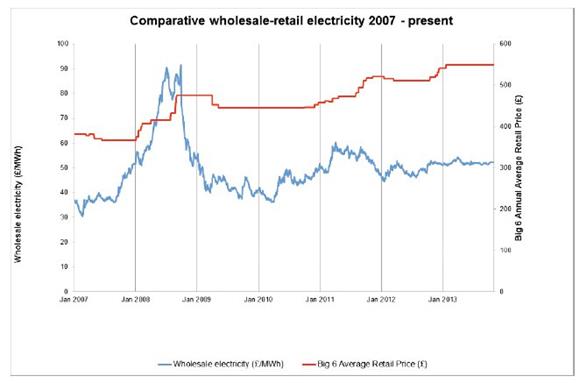
The explanation is as follows.
Wholesale energy prices have been relatively stable since the winter of 2011, rising by an average of 1 per cent a year. However, the large energy companies have increased energy prices by an average of 10.4 per cent a year over this period (Figure 3). This has led to a growing gap between wholesale and retail prices that cannot be explained by the growth in network costs or policy costs which account for 20 per cent and nine per cent of the bill respectively.
So the explanation is derived from the following logic
- Prices have risen by over 30% in the last 3 years.
- Wholesale prices form the biggest part of the cost to the consumer and have not moved very much.
- Other costs have grown, but now only account for 29% of the bill.
- By implication, the profits of the energy companies have increased at the expense of the consumer.
Let us first assume that the scales are comparable. The left hand scale is the wholesale cost in £/MWh. The right hand scale in the average annual retail cost per household. In 2010 the average household was paying about £430 for their electricity, compared with £550 in Jan-2013. The wholesale price component rose from around £280 to £310. So “other costs” rose by around £90. This is a huge increase in costs. With around 26 million households, this is around £2.4bn – well on the way to accounting for the £3.6bn claimed above. There is gas as well remember, so there could be an argument.
But what are the other costs?
These include
- Standing charges. The costs of operating the National Grid, and replacing meters in homes, along with subsidies for the poor.
- Renewables Obligations (RO) and Feed-in-tariffs (FIT). That is the subsidies that the owners of wind turbines and solar panels get over and above the wholesale price of electricity. For instance, operators of offshore wind turbines will get a similar amount in RO as from the market price.
- The small, but growing STOR scheme.
- The fixed costs of the retail operation. That is the staff to produce the bills, operate the call centres, along with the cost of a sales force to get you to switch.
- The net is the retail margin.
Let us assume that “network costs or policy costs” and policy costs doubled in three years as a proportion of the total electricity bill. That is from 14.5% to 29%. That would be £97 of the £90 increase in margin. This hypothetical example needs to be tested with actual data. However, the lack of the rise in profits is corroborated by OFGEM figures for the Big 6 Energy Companies, as I summarized out last week.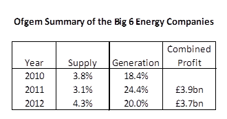
The margins on “supply” have not increased, and are still at the level of a discount supermarket. The margins on “generation” derive from selling at wholesale and the proceeds of the subsidies. Unless Labour are implying that the “Big 6” are guilty of false reporting to OFGEM, the vast majority of the increase in differential between wholesale cost and selling price is accounted for by factors other than profits to the energy companies. Labour are implying the vast majority of the increase in differential between wholesale cost and selling price is accounted for by the profits to the energy companies, and therefore misleading the electorate.
Interpretation of clean energy investment figures
Figure 4 is the following chart
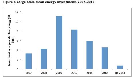
The fall in investment, at a time when it should be accelerating, is a result of the policy environment and protracted decision-making by Government. The Government has been widely blamed for failing to provide the policy certainty needed to de-risk investment.
There is an alternative way to interpret this data. Labour lost the general election in May 2010. What might be more significant is the passage of the Climate Change Act 2008. In the next year investment was nearly 3 times higher, then falling each year since. The Climate Change Act 2008 greatly enhanced the incentives for “clean energy” investment, hence the leap. There are only a finite number of opportunities, so the investment is reducing year-on-year. This being despite the biggest source of revenue coming from index-linked subsidies loaded onto electricity bills. Another reason is that many in the industry saw problems with the technology, that are only now coming to light. In particular the lifespan of the turbines might be shorter than previously thought. Further, the opposition to the wind turbines (where most of the investment is concentrated) is increasing, such as against the proposed Atlantic Array that would have blighted the Bristol Channel. Campaigners are also increasingly concerned about noise pollution.
Therefore, I propose that declining investment is not due to Government spin doctors failing to sweet-talk big business, but due to the reality of “clean energy” turning out to fall far short of the sales patter.
NB First time comments are moderated. The comments can be used as a point of contact.
