You cannot prove a vague theory wrong. If the guess that you make is poorly expressed and the method you have for computing the consequences is a little vague then ….. you see that the theory is good as it can’t be proved wrong. If the process of computing the consequences is indefinite, then with a little skill any experimental result can be made to look like an expected consequence.
Richard Feynman – 1964 Lecture on the Scientific Method
It’s self-evident that democratic societies should base their decisions on accurate information. On many issues, however, misinformation can become entrenched in parts of the community, particularly when vested interests are involved. Reducing the influence of misinformation is a difficult and complex challenge.
The Debunking Handbook 2011 – John Cook and Stephan Lewandowsky
My previous post looked at the attacks on David Rose for daring to suggest that the rapid fall in global land temperatures at the El Nino event were strong evidence that the record highs in global temperatures were not due to human greenhouse gas emissions. The technique used was to look at long-term linear trends. The main problems with this argument were
(a) according to AGW theory warming rates from CO2 alone should be accelerating and at a higher rate than the estimated linear warming rates from HADCRUT4.
(b) HADCRUT4 shows warming stopped from 2002 to 2014, yet in theory the warming from CO2 should have accelerated.
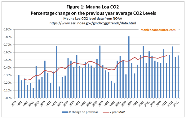
Now there are at least two ways to view my arguments. First is to look at Feynman’s approach. The climatologists and associated academics attacking journalist David Rose chose to do so from a perspective of a very blurred specification of AGW theory. That is human emissions will cause greenhouse gas levels to rise, which will cause global average temperatures to rise. Global average temperature clearly have risen from all long-term (>40 year) data sets, so theory is confirmed. On a rising trend, with large variations due to natural variability, then any new records will be primarily “human-caused”. But making the theory and data slightly less vague reveals an opposite conclusion. Around the turn of the century the annual percentage increase in CO2 emissions went from 0.4% to 0.5% a year (figure 1), which should have lead to an acceleration in the rate of warming. In reality warming stalled.
The reaction was to come up with a load of ad hoc excuses. Hockey Schtick blog reached 66 separate excuses for the “pause” by November 2014, from the peer-reviewed to a comment in the UK Parliament. This could be because climate is highly complex, with many variables, the presence of each contributing can only be guessed at, let alone the magnitude of each factor and the interrelationships with all factors. So how do you tell which statements are valid information and which are misinformation? I agree with Cook and Lewandowsky that misinformation is pernicious, and difficult to get rid of once it becomes entrenched. So how does one evaluate distinguish between the good information and the bad, misleading or even pernicious?
The Lewandowsky / Cook answer is to follow the consensus of opinion. But what is the consensus of opinion? In climate one variation is to follow a small subset of academics in the area who answer in the affirmative to
1. When compared with pre-1800s levels, do you think that mean global temperatures have generally risen, fallen, or remained relatively constant?
2. Do you think human activity is a significant contributing factor in changing mean global temperatures?
Problem is that the first question is just reading a graph and the second could be is a belief statement will no precision. Anthropogenic global warming has been a hot topic for over 25 years now. Yet these two very vague empirically-based questions, forming the foundations of the subject, should be able to be formulated more precisely. On the second it is a case of having pretty clear and unambiguous estimates as to the percentage of warming, so far, that is human caused. On that the consensus of leading experts are unable to say whether it is 50% or 200% of the warming so far. (There are meant to be time lags and factors like aerosols that might suppress the warming). This from the 2013 UNIPCC AR5 WG1 SPM section D3:-
It is extremely likely that more than half of the observed increase in global average surface temperature from 1951 to 2010 was caused by the anthropogenic increase in greenhouse gas concentrations and other anthropogenic forcings together.
The IPCC, encapsulating the state-of-the-art knowledge, cannot provide firm evidence in the form of a percentage, or even a fairly broad range even with over 60 years of data to work on.. It is even worse than it appears. The extremely likely phrase is a Bayesian probability statement. Ron Clutz’s simple definition from earlier this year was:-
Here’s the most dumbed-down description: Initial belief plus new evidence = new and improved belief.
For the IPCC claim that their statement was extremely likely, at the fifth attempt, they should be able to show some sort of progress in updating their beliefs to new evidence. That would mean narrowing the estimate of the magnitude of impact of a doubling of CO2 on global average temperatures. As Clive Best documented in a cliscep comment in October, the IPCC reports, from 1990 to 2013 failed to change the estimate range of 1.5°C to 4.5°C. Looking up Climate Sensitivity in Wikipedia we get the origin of the range estimate.
A committee on anthropogenic global warming convened in 1979 by the National Academy of Sciences and chaired by Jule Charney estimated climate sensitivity to be 3 °C, plus or minus 1.5 °C. Only two sets of models were available; one, due to Syukuro Manabe, exhibited a climate sensitivity of 2 °C, the other, due to James E. Hansen, exhibited a climate sensitivity of 4 °C. “According to Manabe, Charney chose 0.5 °C as a not-unreasonable margin of error, subtracted it from Manabe’s number, and added it to Hansen’s. Thus was born the 1.5 °C-to-4.5 °C range of likely climate sensitivity that has appeared in every greenhouse assessment since…“
It is revealing that quote is under the subheading Consensus Estimates. The climate community have collectively failed to update the original beliefs, based on a very rough estimate. The emphasis on referring to consensus beliefs about the world, rather than looking outward for evidence in the real world, I would suggest is the primary reason for this failure. Yet such community-based beliefs completely undermines the integrity of the Bayesian estimates, making its use in statements about climate clear misinformation in Cook and Lewandowsky’s use of the term. What is more, those in the climate community who look primarily to these consensus beliefs rather than the data of the real world will endeavour to dismiss the evidence, or make up ad hoc excuses, or smear those who try to disagree. A caricature of these perspectives with respect to global average temperature anomalies is available in the form of a flickering widget at John Cooks’ skepticalscience website. This purports to show the difference between “realist” consensus and “contrarian” non-consensus views. Figure 2 is a screenshot of the consensus views, interpreting warming as a linear trend. Figure 3 is a screenshot of the non-consensus or contrarian views. They is supposed to interpret warming as a series of short, disconnected, periods of no warming. Over time, each period just happens to be at a higher level than the previous. There are a number of things that this indicates.
(a) The “realist” view is of a linear trend throughout any data series. Yet the period from around 1940 to 1975 has no warming or slight cooling depending on the data set. Therefore any linear trend line derived for a longer period than 1970 to 1975 and ending in 2015 will show a lower rate of warming. This would be consistent the rate of CO2 increasing over time, as shown in figure 1. But for shorten the period, again ending in 2015, and once the period becomes less than 30 years, the warming trend will also decrease. This contracts the theory, unless ad hoc excuses are used, as shown in my previous post using the HADCRUT4 data set.
(b) Those who agree with the consensus are called “Realist”, despite looking inwards towards common beliefs. Those who disagree with warming are labelled “Contrarian”. This is not inaccurate when there is a dogmatic consensus. But it utterly false to lump all those who disagree with the same views, especially when no examples are provided of those who hold such views.
(c) The linear trend appears as a more plausible fit than the series of “contrarian” lines. By implication, those who disagree with the consensus are viewed as as having a distinctly more blinkered and distorted perspective than those who follow the consensus. Yet even using gistemp data set (which is gives greatest support to the consensus views) there is a clear break in the linear trend. The less partisan HADCRUT4 data shows an even greater break.
Those who spot the obvious – that around the turn of the century warming stopped or slowed down, when in theory it should have accelerated – are given a clear choice. They can conform to the scientific consensus, denying the discrepancy between theory and data. Or they can act as scientists, denying the false and empirically empty scientific consensus, receiving the full weight of all the false and career-damaging opprobrium that accompanies it.


Kevin Marshall

1 Comment