Summary
Journalist David Rose was attacked for pointing out in a Daily Mail article that the strong El Nino event, that resulted in record temperatures, was reversing rapidly. He claimed record highs may be not down to human emissions. The Climate Feedback attack article claimed that the El Nino event did not affect the long-term human-caused trend. My analysis shows
- CO2 levels have been rising at increasing rates since 1950.
- In theory this should translate in warming at increasing rates. That is a non-linear warming rate.
- HADCRUT4 temperature data shows warming stopped in 2002, only resuming with the El Nino event in 2015 and 2016.
- At the central climate sensitivity estimate of doubling of CO2 leads to 3C of global warming, HADCRUT4 was already falling short of theoretical warming in 2000. This is without the impact of other greenhouse gases.
- Putting a linear trend lines through the last 35 to 65 years of data will show very little impact of El Nino, but has a very large visual impact on the divergence between theoretical human-caused warming and the temperature data. It reduces the apparent impact of the divergence between theory and data, but does not eliminate it.
Claiming that the large El Nino does not affect long-term linear trends is correct. But a linear trend neither describes warming in theory or in the leading temperature set. To say, as experts in their field, that the long-term warming trend is even principally human-caused needs a lot of circumspection. This is lacking in the attack article.
Introduction
Journalist David Rose recently wrote a couple of articles in the Daily Mail on the plummeting global average temperatures.
The first on 26th November was under the headline
Stunning new data indicates El Nino drove record highs in global temperatures suggesting rise may not be down to man-made emissions
With the summary
• Global average temperatures over land have plummeted by more than 1C
• Comes amid mounting evidence run of record temperatures about to end
• The fall, revealed by Nasa satellites, has been caused by the end of El Nino
Rose’s second article used the Met Offices’ HADCRUT4 data set, whereas the first used satellite data. Rose was a little more circumspect when he said.
El Nino is not caused by greenhouse gases and has nothing to do with climate change. It is true that the massive 2015-16 El Nino – probably the strongest ever seen – took place against a steady warming trend, most of which scientists believe has been caused by human emissions.
But when El Nino was triggering new records earlier this year, some downplayed its effects. For example, the Met Office said it contributed ‘only a few hundredths of a degree’ to the record heat. The size of the current fall suggests that this minimised its impact.
There was a massive reaction to the first article, as discussed by Jaime Jessop at Cliscep. She particularly noted that earlier in the year there were articles on the dramatically higher temperature record of 2015, such as in a Guardian article in January.There was also a follow-up video conversation between David Rose and Dr David Whitehouse of the GWPF commenting on the reactions. One key feature of the reactions was claiming the contribution to global warming trend of the El Nino effect was just a few hundredths of a degree. I find particularly interesting the Climate Feedback article, as it emphasizes trend over short-run blips. Some examples
Zeke Hausfather, Research Scientist, Berkeley Earth:
In reality, 2014, 2015, and 2016 have been the three warmest years on record not just because of a large El Niño, but primarily because of a long-term warming trend driven by human emissions of greenhouse gases.….
Kyle Armour, Assistant Professor, University of Washington:
It is well known that global temperature falls after receiving a temporary boost from El Niño. The author cherry-picks the slight cooling at the end of the current El Niño to suggest that the long-term global warming trend has ended. It has not.…..
KEY TAKE-AWAYS
1.Recent record global surface temperatures are primarily the result of the long-term, human-caused warming trend. A smaller boost from El Niño conditions has helped set new records in 2015 and 2016.…….
2. The article makes its case by relying only on cherry-picked data from specific datasets on short periods.
To understand what was said, I will try to take the broader perspective. That is to see whether the evidence points conclusively to a single long-term warming trend being primarily human caused. This will point to the real reason(or reasons) for downplaying the impact of an extreme El Nino event on record global average temperatures. There are a number of steps in this process.
Firstly to look at the data of rising CO2 levels. Secondly to relate that to predicted global average temperature rise, and then expected warming trends. Thirdly to compare those trends to global data trends using the actual estimates of HADCRUT4, taking note of the consequences of including other greenhouse gases. Fourthly to put the calculated trends in the context of the statements made above.
1. The recent data of rising CO2 levels
CO2 accounts for a significant majority of the alleged warming from increases in greenhouse gas levels. Since 1958 CO2 (when accurate measures started to be taken at Mauna Loa) levels have risen significantly. Whilst I could produce a simple graph either the CO2 level rising from 316 to 401 ppm in 2015, or the year-on-year increases CO2 rising from 0.8ppm in the 1960s to over 2ppm in in the last few years, Figure 1 is more illustrative.
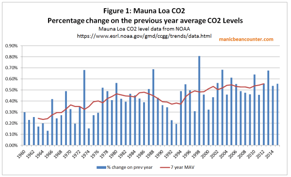
CO2 is not just rising, but the rate of rise has been increasing as well, from 0.25% a year in the 1960s to over 0.50% a year in the current century.
2. Rising CO2 should be causing accelerating temperature rises
The impact of CO2 on temperatures is not linear, but is believed to approximate to a fixed temperature rise for each doubling of CO2 levels. That means if CO2 levels were rising arithmetically, the impact on the rate of warming would fall over time. If CO2 levels were rising by the same percentage amount year-on-year, then the consequential rate of warming would be constant over time. But figure 1 shows that percentage rise in CO2 has increased over the last two-thirds of a century. The best way to evaluate the combination of CO2 increasing at an accelerating rate and a diminishing impact of each unit rise on warming is to crunch some numbers. The central estimate used by the IPCC is that a doubling of CO2 levels will result in an eventual rise of 3C in global average temperatures. Dana1981 at Skepticalscience used a formula that produces a rise of 2.967 for any doubling. After adjusting the formula, plugging the Mauna Loa annual average CO2 levels into values in produces Figure 2.
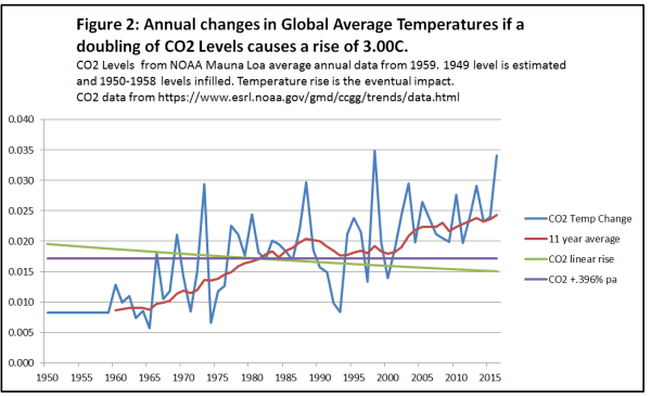
In computing the data I estimated the level of CO2 in 1949 (based roughly on CO2 estimates from Law Dome ice core data) and then assumed a linear increased through the 1950s. Another assumption was that the full impact of the CO2 rise on temperatures would take place in the year following that rise.
The annual CO2 induced temperature change is highly variable, corresponding to the fluctuations in annual CO2 rise. The 11 year average – placed at the end of the series to give an indication of the lagged impact that CO2 is supposed to have on temperatures – shows the acceleration in the expected rate of CO2-induced warming from the acceleration in rate of increase in CO2 levels. Most critically there is some acceleration in warming around the turn of the century.
I have also included the impact of linear trend (by simply dividing the total CO2 increase in the period by the number of years) along with a steady increase of .396% a year, producing a constant rate of temperature rise.
Figure 3 puts the calculations into the context of the current issue.
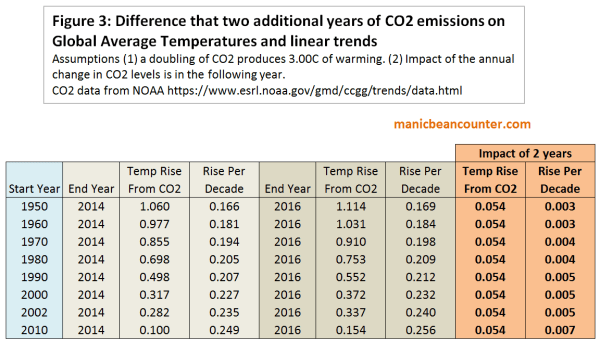
This gives the expected temperature linear temperature trends from various start dates up until 2014 and 2016, assuming a one year lag in the impact of changes in CO2 levels on temperatures. These are the same sort of linear trends that the climate experts used in criticizing David Rose. The difference in warming by more two years produces very little difference – about 0.054C of temperature rise, and an increase in trend of less than 0.01 C per decade. More importantly, the rate of temperature rise from CO2 alone should be accelerating.
3. HADCRUT4 warming
How does one compare this to the actual temperature data? A major issue is that there is a very indeterminate lag between the rise in CO2 levels and the rise in average temperature. Another issue is that CO2 is not the only greenhouse gas. More minor greenhouse gases may have different patterns if increases in the last few decades. However, the change the trends of the resultant warming, but only but the impact should be additional to the warming caused by CO2. That is, in the long term, CO2 warming should account for less than the total observed.
There is no need to do actual calculations of trends from the surface temperature data. The Skeptical Science website has a trend calculator, where one can just plug in the values. Figure 4 shows an example of the graph, which shows that the dataset currently ends in an El Nino peak.
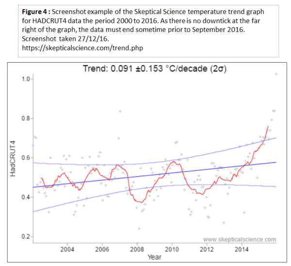
The trend results for HADCRUT4 are shown in Figure 5 for periods up to 2014 and 2016 and compared to the CO2 induced warming.
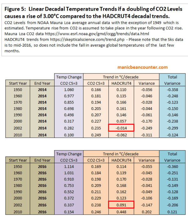
There are a number of things to observe from the trend data.
The most visual difference between the two tables is the first has a pause in global warming after 2002, whilst the second has a warming trend. This is attributable to the impact of El Nino. These experts are also right in that it makes very little difference to the long term trend. If the long term is over 40 years, then it is like adding 0.04C per century that long term trend.
But there is far more within the tables than this observations. Concentrate first on the three “Trend in °C/decade” columns. The first is of the CO2 warming impact from figure 3. For a given end year, the shorter the period the higher is the warming trend. Next to this are Skeptical Science trends for the HADCRUT4 data set. Start Year 1960 has a higher trend than Start Year 1950 and Start Year 1970 has a higher trend than Start Year 1960. But then each later Start Year has a lower trend the previous Start Years. There is one exception. The period 2010 to 2016 has a much higher trend than for any other period – a consequence of the extreme El Nino event. Excluding this there are now over three decades where the actual warming trend has been diverging from the theory.
The third of the “Trend in °C/decade” columns is simply the difference between the HADCRUT4 temperature trend and the expected trend from rising CO2 levels. If a doubling of CO2 levels did produce around 3C of warming, and other greenhouse gases were also contributing to warming then one would expect that CO2 would eventually start explaining less than the observed warming. That is the variance would be positive. But CO2 levels accelerated, actual warming stalled, increasing the negative variance.
4. Putting the claims into context
Compare David Rose
Stunning new data indicates El Nino drove record highs in global temperatures suggesting rise may not be down to man-made emissions
With Climate Feedback KEY TAKE-AWAY
1.Recent record global surface temperatures are primarily the result of the long-term, human-caused warming trend. A smaller boost from El Niño conditions has helped set new records in 2015 and 2016.
The HADCRUT4 temperature data shows that there had been no warming for over a decade, following a warming trend. This is in direct contradiction to theory which would predict that CO2-based warming would be at a higher rate than previously. Given that a record temperatures following this hiatus come as part of a naturally-occurring El Nino event it is fair to say that record highs in global temperatures ….. may not be down to man-made emissions.
The so-called long-term warming trend encompasses both the late twentieth century warming and the twenty-first century hiatus. As the later flatly contradicts theory it is incorrect to describe the long-term warming trend as “human-caused”. There needs to be a more circumspect description, such as the vast majority of academics working in climate-related areas believe that the long-term (last 50+ years) warming is mostly “human-caused”. This would be in line with the first bullet point from the UNIPCC AR5 WG1 SPM section D3:-
It is extremely likely that more than half of the observed increase in global average surface temperature from 1951 to 2010 was caused by the anthropogenic increase in greenhouse gas concentrations and other anthropogenic forcings together.
When the IPCC’s summary opinion, and the actual data are taken into account Zeke Hausfather’s comment that the records “are primarily because of a long-term warming trend driven by human emissions of greenhouse gases” is dogmatic.
Now consider what David Rose said in the second article
El Nino is not caused by greenhouse gases and has nothing to do with climate change. It is true that the massive 2015-16 El Nino – probably the strongest ever seen – took place against a steady warming trend, most of which scientists believe has been caused by human emissions.
Compare this to Kyle Armour’s statement about the first article.
It is well known that global temperature falls after receiving a temporary boost from El Niño. The author cherry-picks the slight cooling at the end of the current El Niño to suggest that the long-term global warming trend has ended. It has not.
This time Rose seems to have responded to the pressure by stating that there is a long-term warming trend, despite the data clearly showing that this is untrue, except in the vaguest sense. There data does not show a single warming trend. Going back to the skeptical science trends we can break down the data from 1950 into four periods.
1950-1976 -0.014 ±0.072 °C/decade (2σ)
1976-2002 0.180 ±0.068 °C/decade (2σ)
2002-2014 -0.014 ±0.166 °C/decade (2σ)
2014-2016 1.889 ±1.882 °C/decade (2σ)
There was warming for about a quarter of a century sandwiched between two periods of no warming. At the end is an uptick. Only very loosely can anyone speak of a long-term warming trend in the data. But basic theory hypotheses a continuous, non-linear, warming trend. Journalists can be excused failing to make the distinctions. As non-experts they will reference opinion that appears sensibly expressed, especially when the alleged experts in the field are united in using such language. But those in academia, who should have a demonstrable understanding of theory and data, should be more circumspect in their statements when speaking as experts in their field. (Kyle Armour’s comment is an extreme example of what happens when academics completely suspend drawing on their expertise.) This is particularly true when there are strong divergences between the theory and the data. The consequence is plain to see. Expert academic opinion tries to bring the real world into line with the theory by authoritative but banal statements about trends.
5 Comments