Joe Romm eco-fanaticism shown in Sea-Level Rise claims

The previous post was quite long and involved. But to see why Jo Romm is so out of order in criticizing President Trump’s withdrawal from the Paris Climate Agreement, one only has to examine the sub-heading of his rant  Trump falsely claims Paris deal has a minimal impact on warming. –

It may be time to sell your coastal property.

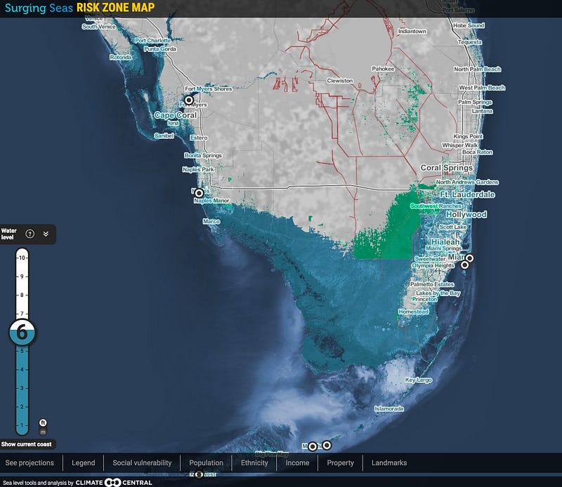
This follows with a graphic of Florida.

This implies that people in Southern Florida should take in account a 6 metre (236 inch) rise in sea levels as a result of President Trump’s decision. Does this implied claim stack up. As in the previous post, let us take a look at Climate Interactive’s data.

Without policy, Climate Interactive forecast that US emissions without policy will be 14.44 GtCO2e, just over 10% of global GHG emissions, and up from 6.8 GtCO2e in 2010. At most, even on CIs flawed reasoning, global emissions will be just 7% lower in 2100 with US policy. In the real world, the expensive job-destroying policy of the US will make global emissions around 1% lower even under the implausible assumption that the country were to extend the policy through to the end of the century. That would be a tiny fraction of one degree lower, even making a further assumption that a doubling of CO2 levels causes 3C of warming (an assumption contradicted by recent evidence). Now it could be that every other country will follow suit, and abandon all climate mitigation policies. This would be a unlikely scenario, given that I have not sensed a great enthusiasm for other countries to follow the lead of the current Leader of the Free World. But even if that did happen, the previous post showed that current policies do not amount to very much difference in emissions. Yet let us engage on a flight of fancy and assume for the moment that President Trump abandoning the Paris Climate Agreement will (a) make the difference between 1.5C of warming, with negligable sea-level rise and 4.2C of warming with the full impact of sea-level rise being felt (b) 5% of that rise. What difference will this make to sea-level rise?

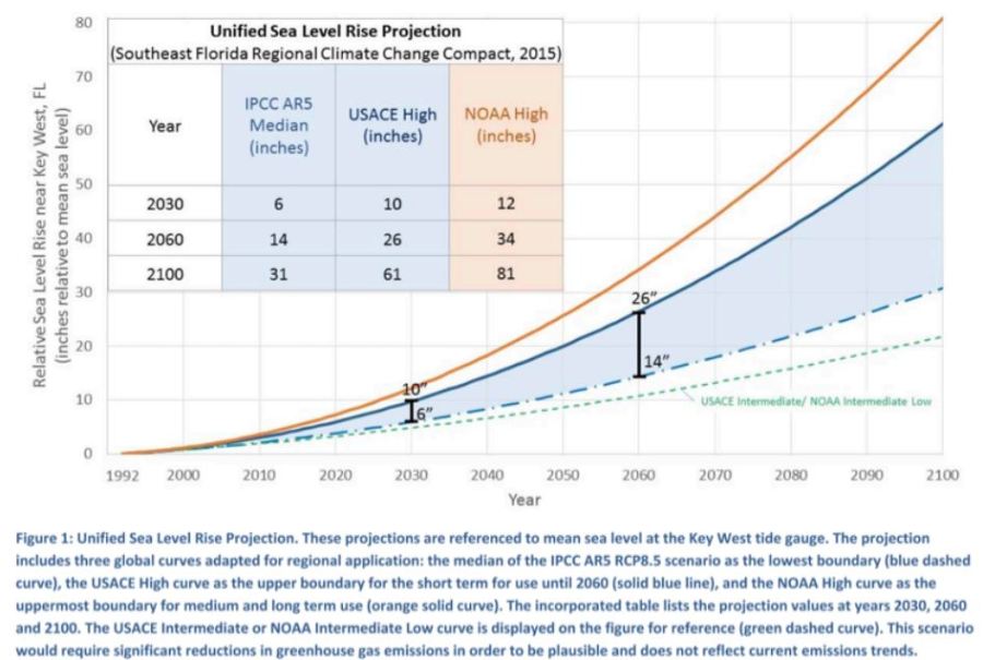
The Miami-Dade Climate Change website has a report from The Sea Level Rise Task Force that I examined last November. Figure 1 of that report gives projections of sea-level rise assuming the no global climate policy.

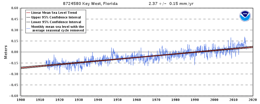
Taking the most extreme NOAA projection it will be around the end of next century before sea-levels rose by 6 metres. Under the IPCC AR5 median estimates – and this is meant to be the Climate Bible for policy-makers – it would be hundreds of years before that sea-level rise would be achieved. Let us assume that the time horizon of any adult thinking of buying a property, is through to 2060, 42 years from now. The NOAA projection is 30 inches (0.76 metres) for the full difference in sea-level rise, or 1.5 inches (0.04 metres) for the slightly more realistic estimate. Using the mainstream IPCC AR5 median estimate, sea-level rise is 11 inches (0.28 metres) for the full difference in sea-level rise, or 0.6 inches (0.01 metres) for the slightly more realistic estimate. The real world evidence suggests that even these tiny projected sea level rises are exaggerated. Sea tide gauges around Florida have failed to show an acceleration in the rate of sea level rise. For example this from NOAA for Key West.

2.37mm/year is 9 inches a century. Even this might be an exaggeration, as in Miami itself, where the recorded increase is 2.45mm/year, the land is estimated to be sinking at 0.53mm/year.

Concluding Comments

If people based their evidence on the real world, President Trump pulling out of the Paris Climate Agreement will make somewhere between zero and an imperceptible difference to sea-level rise. If they base their assumptions on mainstream climate models, the difference is still imperceptible. But those with the biggest influence on policy are more influenced by the crazy alarmists like Joe Romm. The real worry should be that many policy-makers State level will be encouraged to waste even more money on unnecessary flood defenses, and could effectively make low-lying properties near worthless by planning blight when there is no real risk.

Kevin Marshall


Joe Romm inadvertently exposes why Paris Climate Agreement aims are unachievable

Summary

Joe Romm promotes a myth that the Paris Climate Agreement will make a huge difference to future greenhouse gas emissions. Below I show how the modelled impact of think tank Climate Interactive conclusion of a large difference is based on emissions forecasts of implausible large emissions growth in policy countries, and low emissions growth in the non-policy developing countries.


In the previous post I looked at how blogger Joe Romm falsely rebutted a claim that President Donald Trump had made that the Paris climate deal would only reduce only reduce future warming in 2100 by a mere 0.2°C. Romm was wrong on two fronts. He first did not check the data behind his assertions and second,  in comparing two papers by the same organisation he did not actually read the explanation in the later paper on how it differed from the first. In this post I look at how he has swallowed whole the fiction of bogus forecasts, that means the mere act of world leaders signing a bit of paper leads to huge changes in forecast emissions.

In his post  Trump falsely claims Paris deal has a minimal impact on warming, Romm states

In a speech from the White House Rose Garden filled with thorny lies and misleading statements, one pricks the most: Trump claimed that the Paris climate deal would only reduce future warming in 2100 by a mere 0.2°C. White House talking points further assert that “according to researchers at MIT, if all member nations met their obligations, the impact on the climate would be negligible… less than .2 degrees Celsius in 2100.”

The Director of MIT’s System Dynamics Group, John Sterman, and his partner at Climate Interactive, Andrew Jones, quickly emailed ThinkProgress to explain, “We are not these researchers and this is not our finding.”

They point out that “our business as usual, reference scenario leads to expected warming by 2100 of 4.2°C. Full implementation of current Paris pledges plus all announced mid-century strategies would reduce expected warming by 2100 to 3.3°C, a difference of 0.9°C [1.6°F].”

The reference scenario is RCP8.5, used in the IPCC AR5 report published in 2013 and 2014. This is essentially a baseline non-policy forecast against which the impact of climate mitigation policies can be judged. The actual RCP website produces emissions estimates by type of greenhouse gas, of which breaks around three-quarters is CO2. The IPCC and Climate Interactive add these different gases together with an estimate of global emissions in 2100. Climate Interactive current estimate as of April 2017 is 137.58 GtCO2e for the the reference scenario and the National Plans will produce 85.66 GTCO2e. These National would allegedly make global emissions 37.7% than they would have been without them, assuming they are extended beyond 2030. Climate Interactive have summarized this in a graph.

To anyone who actually reads the things, this does not make sense. The submissions made prior to the December 2015 COP21 in Paris were mostly political exercises, with very little of real substance from all but a very few countries, such as the United Kingdom. Why it does not make sense becomes clear from the earlier data that I extracted from Climate Interactives’ C-ROADS Climate Simulator version v4.026v.071 around November 2015.  This put the RCP8.5 global GHG emissions estimate in 2100 at the equivalent of 139.3 GtCO2e. But policy is decided and implemented at country level. To determine the impact of policy proposal there must be some sort of breakdown of emissions. C-ROADS does not provide a breakdown by all countries, but does to divide the world into up to 15 countries and regions. One derived break-down is into 7 countries or regions. That is the countries of USA, Russia, China and India, along with the country groups of EU27, Other Developed Countries and Other Developing Countries. Also available are population and GDP historical data and forecasts. Using this RCP8.5 and built-in population forecasts I derived the following GHG emissions per capita for the historical period 1970 to 2012 and the forecast period 2013 to 2100.

Like when I looked at Climate Interactives’ per capita CO2 emissions from fossil fuels estimates at the end of 2015, these forecasts did not make much sense. Given that these emissions are the vast majority of total GHG emissions it is not surprising that the same picture emerges.

In the USA and the EU I can think of no apparent reason for the forecast of per capita emissions to rise when they have been falling since 1973 and 1980 respectively. It would require for energy prices to keep falling, and for all sectors to be needlessly wasteful. The same goes for other developed countries, which along with Canada and Australia, includes the lesser developed countries of Turkey and Mexico. Indeed why would these countries go from per capita emissions similar to the EU27 now to those of the USA in 2100?

In Russia, emissions have risen since the economy bottomed out in the late 1990s following the collapse of communism. It might end up with higher emissions than the USA in 1973 due to the much harsher and extreme climate. But technology has vastly improved in the last half century and it should be the default assumption that it will continue to improve through the century. It looks like someone, or a number of people, have failed to reconcile the country estimate with the forecast decline in population from 143 million in 2010 to 117 million. But more than this, there is something seriously wrong with emission estimates that would imply that the Russian people become evermore inefficient and wasteful in their energy use.

In China there are similar issues. Emissions have increased massively in the last few decades on the back of even more phenomenal growth, that surpasses the growth of any large economy in history. But emissions per capita will likely peak due to economic reasons in the next couple of decades, and probably at a much lower level than the USA in 1973. But like Russia, population is also forecast to be much lower than currently. From a population of 1340 million in 2010, Climate Interactive forecasts population to peak at  1420 million in 2030 (from 2020 to 2030 growth slows to 2 million a year) to 1000 million in 2100. From 2080 (forecast population 1120) to 2100 population is forecast to decline by 6 million a year.

The emissions per capita for India I would suggest are far too low. When made, the high levels of economic growth were predicted to collapse post 2012. When I wrote the previous post on 30th December 2015, to meet the growth forecast for 2010-2015, India’s GDP would have needed to drop by 20% in the next 24 hours. It did not happen, and in the 18 months since actual growth has further widened the gap with forecast. Similarly forecast growth in GHG emissions are far too low. The impact of 1.25 billion people today (and 1.66 billion in 2100) is made largely irrelevant, nicely side-lining a country who has declared economic growth is a priority.

As with the emissions forecast for India, the emissions forecast for other developing countries is far too pessimistic, based again on too pessimistic growth forecasts. This mixed group of countries include the 50+ African nations, plus nearly all of South America. Other countries in the group include Pakistan, Bangladesh, Myanmar, Thailand, Indonesia, Vietnam, Haiti, Trinidad, Iraq, Iran and Kiribati. There are at least a score more I have omitted, in total making up around 42% of the current global population and 62% of the forecast population in 2100. That is 3 billion people today against 7 billion in 2100. A graph summarizing of Climate Interactive’s population figures is below.

This can be compared with total GHG emissions.

For the USA, the EU27, the other Developed countries and China, I have made more reasonable emissions per capita estimates for 2100.

These more reasonable estimates (assuming there is no technological breakthrough that makes zero carbon energy much cheaper than any carbon technology) produce a reduction in projected emissions of the same order of magnitude as the supposed reduction resulting from implementation of the National Plans. However, global emissions will not be this level, as non-policy developing nations are likely to have much higher emissions. Adjusting for this gives my rough estimate for global emissions in 2100.

The overall emissions forecast is not very dissimilar to that of RCP8.5. Only this time the emissions growth has shift dramatically from the policy countries to the non-policy countries. This is consistent with the data from 1990 to 2012, where I found that the net emissions growth was accounted for by the increase in emissions from developing countries who were not signatories to reducing emissions under the 1992 Rio Declaration. As a final chart I have put the revised emission estimates for India and Other Developing Countries to scale alongside Climate Interactives’ Scoreboard graphic at the top of the page.

This clearly shows that the emissions pathway consistent the constraining warming to  2°C will only be attained if the developing world collectively start reducing their emissions in a very few years from now. In reality, the priority of many is continued economic growth, which will see emissions rise for decades.

Concluding Comments

This is a long post, covering a lot of ground. In summary though it shows environmental activist has Joe Romm has failed to check the claims he is promoting. An examination of Climate Interactive (CI) data underlying the claims that current policies will reduce global temperature by 0.9°C through reducing GHG global emissions does not stand up to scrutiny. That 0.9°C claim is based on global emissions being around 35-40% lower than they would have been without policy. Breaking the CI data down into 7 countries and regions reveals that

  • the emissions per capita forecasts for China and Russia show implausibly high levels of emissions growth, when they show peak in a few years.
  • the emissions per capita forecasts for USA and EU27 show emissions increasing after being static or falling for a number of decades.
  • the emissions per capita forecasts for India and Other Developing Countries show emissions increasing as at implausibly lower rates than in recent decades.

The consequence is that by the mere act of signing an agreement makes apparent huge differences to projected future emissions. In reality it is folks playing around with numbers and not achieving anything at all, except higher energy prices and job-destroying regulations. However, it does save the believers in the climate cult from having to recognize the real world. Given the massed hordes of academics and political activists, that is a very big deal indeed.

Kevin Marshall 

Joe Romm falsely accuses President Trump understating Impact of Paris Deal on Global Warming

Joe Romm of Climate Progress had a post two weeks ago Trump falsely claims Paris deal has a minimal impact on warming

Romm states

In a speech from the White House Rose Garden filled with thorny lies and misleading statements, one pricks the most: Trump claimed that the Paris climate deal would only reduce future warming in 2100 by a mere 0.2°C. White House talking points further assert that “according to researchers at MIT, if all member nations met their obligations, the impact on the climate would be negligible… less than .2 degrees Celsius in 2100.”

The deeply prejudiced wording, written for an extremely partisan readership, encourages readers to accept the next part without question.

The 0.2°C estimate used by Trump may be from another MIT group; the Joint Program on the Science and Policy of Global Change did have such an estimate in early 2015, before all of the Paris pledges were in. But, their post-Paris 2016 analysis also concluded the impact of the full pledges was closer to 1°C.

The source for the 0.2°C claim is the MIT JOINT PROGRAM ON THE SCIENCE AND POLICY OF GLOBAL CHANGE. ENERGY & CLIMATE OUTLOOK PERSPECTIVES FROM 2015

This states

New in this edition of the Outlook are estimates of the impacts of post-2020 proposals from major countries that were submitted by mid-August 2015 for the UN Conference of Parties (COP21) meeting in Paris in December 2015.

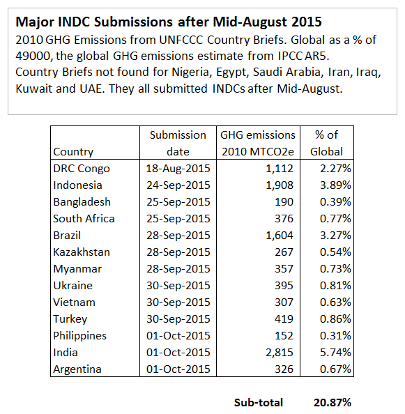
So what INDC submissions were in by Mid-August? From the submissions page (and with the size of total 2010 GHG Emissions from the Country Briefs) we get the following major countries.

In box 4 of the outlook, it is only Korea that is not included in the 0.2°C impact estimate. That is just over half the global emissions are covered in the MIT analysis. But there were more countries who submitted after mid-August.

The major countries include

 
My table is not fully representative, as the UNFCCC did not include country briefs for Nigeria, Egypt, Saudi Arabia, Iran, Iraq, Kuwait and UAE. All these countries made INDC submissions along with a lot of more minor GHG emitters. I would suggest that by mid-August all the major countries that wanted to proclaim how virtuous they are in combating climate change were the early producers of the INDC submissions. Countries like the Gulf States, India and Indonesia tended to slip their documents in somewhat later with a lot of measly words to make it appear that they were proposing far more than token gestures and pleas for subsidies. Therefore, the 0.2°C estimate likely included two-thirds to three-quarters of all the real emission constraint proposals. So how does an analysis a few months later produce almost five times the impact on emissions?

The second paragraph of the page the later article Joe Romm links to clearly states difference in methodology between the two estimates.


A useful way to assess that impact is to simulate the effects of policies that extend the Agreement’s 188 pledges (known as Nationally Determined Contributions, or NDCs) to the end of the century. In a new study that takes this approach, a team of climate scientists and economists from the MIT Joint Program on the Science and Policy of Global Change led by research scientist Andrei Sokolov finds that by 2100, the Paris Agreement reduces the SAT considerably, but still exceeds the 2 C goal by about 1 C.

The primary difference is that the earlier study tries to measure the actual, real world, impacts of existing policy, and policy pledges, if those policies are fully enacted. In the USA, those pledges would need Congressional approval to be enacted. The later study takes these submissions, (which were only through to 2030) and tries to estimate the impact if they were extended until 2100.  That is renewables subsidies that push up domestic and business energy costs would be applied for 85 years rather than 15. It is not surprising that if you assume policy proposals are extended for over five times their original period, that they will produce almost five times the original impact. To understand this all that is required is to actually read and comprehend what is written. But Joe Romm is so full of bile for his President and so mad-crazy to save the planet from the evils of Climate Change and (mostly US) big business that he is blinded to that simple reality-check.

The fuller story is that even if all policies were fully enacted and extended to 2100, the impact on emissions would be far smaller than Joe Romm claims. That will be the subject of the next post.

Kevin Marshall

The Climate Alarmist Reaction to a Trump Presidency

A few weeks ago cliscep had a piece Trump, climate and the future of the world that looked at the immediate reactions to the surprise victory in the US Presidential election amongst the climate community. Brad Keyes noted Jo Romm’s piece will President Trump pull the plug on a livable climate?. To support this Romm stated

Indeed, one independent firm, Lux Research, projected last week that “estimated emissions would be 16 percent higher after two terms of Trump’s policies than they would be after two terms of Clinton’s, amounting to 3.4 billion tons greater emissions over the next eight years.”

There is a little graph to sort of back this up.

Whilst Romm then states two reasons why he does not think emissions will rise so much (Trump will cause a massive recession and will not win a second term) he then states the Twitter quote:-

That said, the damage and delay that even a one-term President Trump could do will make the already difficult task of keeping total warming well below 2°C essentially impossible.

So a difference of much less than 3.4 GtCO2e over eight years will make keeping total warming well below 2°C essentially impossible.
Before looking at the evidence that contradicts this, there are even more bizarre claims made by the expert climate scientists at RealClimate. They use a different graph which is probably a couple of years old and explain:-

Here are some numbers. Carbon emissions from the United States have been dropping since the year 2000, more than on-track to meet a target for the year 2020. Perhaps with continued effort and improving technology, emissions might have dropped to below the 2020 target by 2020, let’s say to 5 gigatons of CO2 per year (5000 megatons in the plot). In actuality, now, let’s say that removing restrictions on energy inefficiency and air pollution could potentially lead to US emissions by 2020 of about 7 gigatons of CO2. This assumes that future growth in emissions followed the faster growth rates from the 1990’s.
Maybe neither of these things will happen exactly, but these scenarios give us a high-end estimate for the difference between the two, which comes to about 4 gigatons of CO2 over four years. There will also probably be extra emissions beyond 2020 due to the lost opportunity to decarbonize and streamline the energy system between now and then. Call it 4-6 gigatons of Trump CO2.
This large quantity of gas can be put into the context of what it will take to avoid the peak warming threshold agreed to in Paris. In order to avoid exceeding a very disruptive warming of 1.5 °C with 66% probability, humanity can release approximately 220 gigatons of CO2 after January, 2017 (IPCC Climate Change 2014 Synthesis report, Table 2.2, corrected for emissions since 2011). The 4-6 Gtons of Trump CO2 will not by itself put the world over this threshold. But global CO2 emission rates are now about 36 gigatons of CO2 per year, giving a time horizon of only about six years of business-as-usual (!) before we cross the line, leaving basically no time for screwing around. To reach the catastrophic 2 °C, about 1000 gigatons of CO2 remain (about 20 years of business as usual). Note that these estimates were done before global temperatures spiked since 2014 — we are currently at 1.2 °C! So these temperature boundaries may be closer than was recently thought.

RealClimate come up with nearly twice the difference made by Joe Romm / Lux Research, but at least admit in the final paragraph that whoever won would not make much difference.
There are two parts to putting these analyses into context – the US context and the global one.
In the USA emissions have indeed been falling since 2000, this despite the population growing. The rate of decline has significantly increased in the years of the Obama Presidency, but for reasons quite separate from actions to reduce emissions. First there was the credit crunch, followed by the slowest recovery in US history. Second, the high oil price encouraged emissions reductions, along with the loss of energy-intensive industries to countries with lower energy costs. Third is that the shale gas revolution has meant switching from coal to gas in electricity production.
But the global context is even more important. RealClimate does acknowledge the global figure, but only mentions CO2 emissions. The 36GtCO2 is only two-thirds of total greenhouse gas emissions of about 55GTCO2e and that figure is rising by 1-2% a year. The graph – reproduced from the USA INDC submission to the UNFCCC – clearly states that it is in million tonnes of carbon dioxide equivalent. What is more, these are vague policy proposals, that President Obama would have been unable to get through Congress. Further, most of the proposed emission reductions were through extrapolating trends that of what has been happening without any policy intervention.
If the 1.5°C limit breached from 220 GtCO2e of additional emissions, it will be breached in the run-up to Christmas 2020. The 1000 GtCO2e for the 2°C limit was from 2011. By simple arithmetic it is now below 800GtCO2e with about 15 years remaining if (a) a doubling of CO2 levels (or equivalent GHG gases) leads to 3°C of warming (b) the estimated quantity of emissions to a unit rise in atmospheric gas levels is correct and (b) the GHG gas emitted is retained for a very long period in the atmosphere.
Even simple arithmetic is not required. Prior to the Paris talks the UNFCCC combined all the INDCs – including that of the USA to cut emissions as shown in the graph above – were globally aggregated and compared to the approximate emissions pathways for 1.5°C and least-cost 2°C warming. The updated version, post-Paris is below.

The difference Donald Trump will make is somewhere in the thickness of the thick yellow line. There is no prospect of the aimed-for blue emissions pathways. No amount of ranting or protests at the President-elect Trump will change the insignificant difference the United States will make with any politically-acceptable and workable set of policies, nor can make in a country with less than a twentieth of the global population and less that one seventh of global emissions.

Kevin Marshall

Climate Interactive’s Bogus INDC Forecast

Summary

Joe Romm wrote a post in early November claiming UNFCCC Executive Secretary Christiana Figueres had misled the public in claiming that the “INDCs have the capability of limiting the forecast temperature rise to around 2.7 degrees Celsius by 2100”. Using Climate Interactive’s figures Romm claims the correct figure is 3.5°C. That Romm had one of two sources of the 2.7°C staring at him is a side issue. The major question is how Climate Interactive can achieve a full 1.0°C reduction in expected temperature rise in 2100 and a reduction of 40% in 2100 GHG emissions from pledges covering the period 2015, when the UNFCCC estimates will have a much smaller impact in 2030? Looking at the CO2 emissions, which account for 75-80% of GHG emissions, I have found the majority answer. For OECD countries where emissions per capita have been stable or falling for decades, the “No Action” scenario forecasts that they will rise for decades. For Russia and China, where per capita emissions are likely to peak before 2030 without any policy action, the “No Action” scenario forecasts that they will rise for decades. This is largely offset by Climate Interactive assuming that both emissions and economic growth in India and Africa (where there are no real attempts to control emissions) will stagnate in the coming decades. Just by making more reasonable CO2 emissions forecasts for the OECD, Russia and China can account for half of the claimed 2100 reduction in GHG emissions from the INDC. Climate Interactive’s “No Action” scenario is bogus.


Joe Romm’s use of the Climate Interactive projection

A couple of months ago, prior to the COP21 Paris climate talks, Joe Romm at Climate Progress criticized the claim made in a press release by UNFCCC Executive Secretary Christiana Figueres:

The INDCs have the capability of limiting the forecast temperature rise to around 2.7 degrees Celsius by 2100, by no means enough but a lot lower than the estimated four, five, or more degrees of warming projected by many prior to the INDCs

Romm’s note to the media is

If countries go no further than their current global climate pledges, the earth will warm a total of 3.5°C by 2100.

At a basic level Romm should have done some proper research. As I found out, there are two sources of the claim that are tucked away at the end of a technical appendix to the UNFCCC Synthesis report on the aggregate effect of INDCs. One of these is Climate Action Tracker. On their home page they have a little thermometer which shows the 2.7°C figure. Romm would have seen this, as he refers in the text to CAT’s page on China. The significance may not have registered.

However, the purpose of this post is not to criticize Romm, but the Climate Interactive analysis that Romm uses as the basis of his analysis. Is the Climate Interactive Graph (reproduced in Figure 1) a reasonable estimate of the impact of the INDC submissions (policy pledges) on global emissions?1
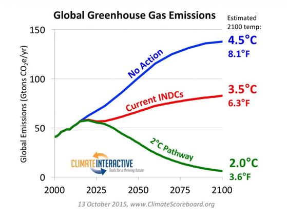
Figure 1. Climate Interactive’s graph of impact of the INDC submissions to 2100

What struck me as odd when I first saw this graph was how the INDCs could make such a large impact beyond the 2015-2030 timeframe that they covered when the overall impact was fairly marginal within that timeframe. This initial impression is confirmed by the UNFCCC’s estimate of the INDCs
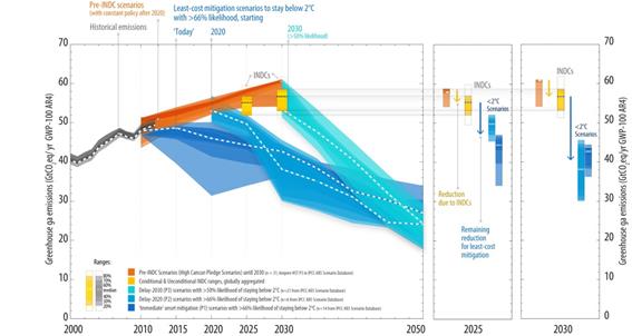
Figure 2. UNFCCC’s estimate of emissions impact of the INDCs, with the impact shown by the yellow bars. Original here.

There are two things that do not stack up. First is that the “No Action” scenario appears to be a fairly reasonable extrapolation of future emissions without policy. Second, and contrary to that is the first, is that the “Current INDCs” scenario does not make sense in terms of what I have read in the INDCs and is confirmed by the INDCs. To resolve this requires looking at the makeup of the “No Action” scenario. Climate Interactive usefully provide the model for others to do their own estimates,2 With the “User Reference Scenario” giving the “no action” data3, split by type of greenhouse gas and into twenty regions or countries. As about 75-80% of emissions with the model are CO2 Fossil Fuel emissions, I will just look at this area. For simplicity I have also reduced the twenty regions or countries into just seven. That is USA, Other OECD, Russia, China, India, Africa and Rest of the World. There are also lots of ways to look at the data, but some give better understanding of the data than others. Climate Interactive also have population estimates. Population changes over a long period can themselves result in changed emissions, so looking at emissions per capita gives a better sense of the reasonableness of the forecast. I have graphed the areas in figure 3 for the historical period 1970-2010 and the forecast period 2020-2100.
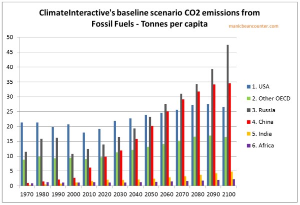
Figure 3 : Fossil Fuel Emissions per capita for six regions from the Climate Interactive “No Action” Scenario.

Understanding the CO2 emissions forecasts

In the USA, emissions per capita peaked at the time of 1973 oil embargo. Since then they have declined slightly. There are a number of reasons for this.

First, higher oil prices gave the economic incentives to be more efficient in usage of oil. In cars there have been massive improvements in fuel efficiency since that time. Industry has also used energy more efficiently. Second, there has been a growth in the use of nuclear power for strategic reasons more than economic. Third is that some of the most energy intensive industries have shifted to other countries, particularly steel and chemicals. Fourth, is that growth in developed countries is mostly in the service sector, whereas growth in developing countries is mostly in manufacturing. Manufacturing tends to have much higher energy usage per unit of output than services. Fifth, is that domestic energy usage is from cars and power for the home. In an emerging economy energy usage will rise rapidly as a larger proportion of the population acquire cars and full heating and lighting systems in the home. Growth is much slower once most households have these luxuries. Sixth is that in the near future emissions might continue to fall with the development of shale gas, with its lower emissions per unit of power than from coal.

I therefore cannot understand why anyone would forecast increasing emissions per capita in the near future, when they have been stable or falling in for decades. Will everyone start to switch to less efficient cars? When these forecasts were made oil was at $100 a barrel levels, and many thought peak oil was upon us. Would private sector companies abandon more efficient energy usage for less efficient and higher cost usage? The USA may abandon nuclear power and shift back to coal for political reasons. But in all forms of energy, production and distribution is likely to continue to become more efficient in all forms.

In the rest of the OECD, there are similar patterns. In Europe energy usage was never as high. In some countries without policy CO2 emissions may rise slightly. In Germany they are replacing nuclear power stations with coal for instance. But market incentives will increase energy efficiency and manufacturing will continue to shift to emerging nations. Again, there appears no reason for a steady increase in emissions per capita to increase in the future.

Russia has a slightly different recent past. Communist central planning was highly inefficient and lead to hugely inefficient energy usage. With the collapse of communism, energy usage fell dramatically. Since then emissions have been increasing, but more slowly than the economy as a whole. Emissions will peak again in a couple of decades. This will likely be at a lower level than in the USA in 1970, despite the harsher climate, as Russia will benefit from technological advances in the intervening period. There is no reason for emissions to go on increasing at such a rapid rate.4

China has recently had phenomenal growth rates. According to UN data, from 1990 to 2012, economic growth averaged 10.3% per annum and CO2 emissions 6.1%. In the not too distant future economic growth will slow as per capita income approaches rich country levels, and emissions growth will slow or peak. But the Climate Interactive forecast has total emissions only peaking in 2090. The reason for China’s and Russia’s forecast per capita emissions exceeding those of the USA is likely due to a failure to allow for population changes. In USA population is forecast to grow, whilst in China and Russia population is forecast to fall.

India has the opposite picture. In recently years economic and CO2 emissions growth has taken off. Current policies of Prime Minister Narendra Modi are to accelerate these growth rates. But in the Climate Interactive forecast growth, economic growth and CO2 emissions growth plummet in the near future. Economic growth is already wrong. I am writing on 30/12/15. To meet the growth forecast for 2010-2015, India’s GDP will need to drop by 20% in the next 24 hours.5

For the continent of Africa, there have been encouraging growth signs in the last few years, after decades when many countries saw stagnation or even shrinking economies. Climate Interative forecasts similar growth to India, but with a forecasts of rapid population growth, the emissions per capita will hardly move.

Revised CO2 emissions forecasts

It is extremely difficult and time consuming to make more accurate CO2 emissions forecasts. As a shortcut, I will look at the impact of revisions on 2100, then at the impact on the effect of the INDCs. This is laid out in Figure 4
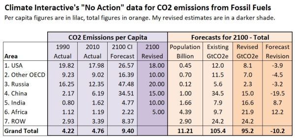
Figure 4 : Revised Forecast CO2 Emissions from Fossil Fuels

The first three columns in pale lilac are for CO2 emissions per capita calculated, from the Climate Interactive data. In the 2100 Revised column are more realistic estimates for reasons discussed in the text. In the orange part of the table are the total forecast 2100 Climate Interactive figures for population and CO2 emissions from fossil fuels. In darker orange is the revised emissions forecast (emissions per capita multiplied by forecast population) and the impact of the revision. Overall the forecast is 10.2GtCO2e lower, as no calculation has been made for the rest of the world. To balance back requires emissions of 11.89 tonnes per capita for 2.9 billion people. As ROW includes such countries as Indonesia, Bangladesh, Iran, Vietnam, Brazil and Argentina this figure might be unreasonable 85 years from now.

The revised impact on the INDC submissions

The INDC submissions can be broken down.

The USA, EU, Japan and Australia all have varying levels of cuts to total emissions. So for the OECD as a whole I estimate Climate Interactive over estimates the impact of the INDCs by 8.4GtCO2e

The Russian INDC pledge it is unclear, but it seems to be saying that emissions will peak before 2030 at below 1990 levels6. As my revised forecast is above this level, I estimate Climate Interactive over estimates the impact of the INDCs by 3.2GtCO2e

The Chinese INDC claims pledges that its emissions will have peaked by 2030. This will have happened anyway and at around 10-12 tonnes per capita. I have therefore assumed that emissions will stay constant from 2030 to 2100 whilst the population is falling. Therefore I estimate that Climate Interactive over estimates the impact of the INDCs by 19.5GtCO2e

Overall for these areas the overestimation is around 31 GtCO2e. Instead of 63.5GtCO2e forecast for these countries for 2100 it should be nearer 32.5GtCO2e. This is about half the total 2100 reduction that Climate Interactive claims that the INDC submission will make from all types of greenhouse gases. A more rigorous forecast may have lower per capita emissions in the OECD and China. There may be other countries where similar forecast issues of CO2 emissions might apply. In addition, in note 7 I briefly look at the “No Action” CH4 emissions, the second largest greenhouse gas. There appear to be similar forecast issued there.

In summary, the make-up of the CO2 emissions “No Action” forecast is bogus. It deviates from an objective and professional forecast in a way that grossly exaggerates the impact of any actions to control GHG emissions, or even pledges that constitute nothing more than saying what would happen anyway.

Notes

  1. The conversion of a given quantity of emissions into average surface temperature changes is outside the scope of this article. Also we will assume that all policy pledges will be fully implemented.
  2. On the Home page use the menu for Tools/C-ROADS. Then on the right hand side select “Download C-ROADS”. Install the software. Run the software. Click on “Create New Run” in the centre of the screen.

    This will generate a spreadsheet “User Scenario v3 026.xls”. The figures I use are in the User Reference Scenario tab. The software version I am working from is v4.026v.071.

  3. The “User Reference Scenario” is claimed to be RCP 8.5. I may post at another time on my reconciliation between the original and the Climate Interactive versions.
  4. The forecast estimates for economic growth and emissions for Russia look quite bizarre when the 5 year percentage changes are graphed.
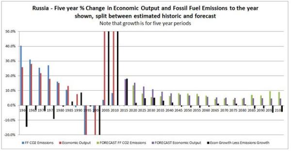

    I cannot see any reason for growth rates to fall to 1% p.a in the long term. But this is the situation with most others areas as well. Nor can I think of a reason for emissions growth rates to increase from 2030 to 2055, or after 2075 expect as a contrivance for consistency purposes.

  5. The forecast estimates for economic growth and emissions for India look even more bizarre than for Russia when the 5 year percentage changes are graphed.
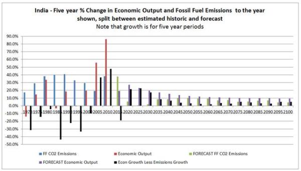

    I am writing on 30/12/15. To meet the growth forecast for 2010-2015, India’s GDP will need to drop by 20% in the next 24 hours. From 2015 to 2030, the period of the INDC submissions, CO2 emissions are forecast to grow by 8.4%. India’s INDC submission implies GHG emissions growth from 2014 to 2030 of 90% to 100%. Beyond that India is forecast to stagnate to EU growth rates, despite being a lower to middle income country. Also, quite contrary to Russia, emissions growth rates are always lower than economic growth rates.

  6. The Russian Federation INDC states

    Limiting anthropogenic greenhouse gases in Russia to 70-75% of 1990 levels by the year 2030 might be a long-term indicator, subject to the maximum possible account of absorbing capacity of forests.

    This appears as ambiguous, but could be taken as meaning a long term maximum.

  7. CH4 (Methane) emissions per Capita

    I have quickly done a similar analysis of methane emissions per capita as in Figure 2 for CO2 emissions. The scale this time is in kilos, not tonnes.

    There are similarities
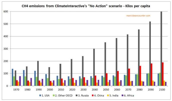
  • OECD emissions had been falling but are forecast to rise. The rise is not as great as for CO2.
  • In Russia and China emissions are forecast to rise. In Russia this is by a greater amount than for CO2, in China by a lesser amount.
  • In Africa, per capita emissions are forecast to fall slightly. Between 2010, CH4 emissions are forecast to rise 3.1 times and population by 4.3 times.
  • In both the USA and Other OECD (a composite of CI’s categories) total CH4 emissions are forecast in 2100 to be 2.778 times higher than in 2010. In both China and India total CH4 emissions are forecast in 2100 to be 2.420 times higher than in 2010.


aTTP falsely attacks Bjorn Lomborg’s “Impact of Current Climate Proposals” Paper

The following is a comment to be posted at Bishop Hill, responding to another attempt by blogger ….andThenThere’sPhysics to undermine the work of Bjorn Lomborg. The previous attempt was discussed here. This post includes a number of links, as well as a couple of illustrative screen captures at the foot of the table.

aTTP’s comment is

In fact, you should read Joe Romm’s post about this. He’s showing that the INDCs are likely to lead to around 3.5C which I think is relative to something like the 1860-1880 mean. This is very similar to the MIT’s 3.7, and quite a bit lower than the RCP8.5 of around 4.5C. So, yes, we all know that the INDCs are not going to do as much as some might like, but the impact is likely to be a good deal greater than that implied by Lomborg who has essentially assumed that we get to 2030 and then simply give up.

Nov 11, 2015 at 9:31 AM | …and Then There’s Physics

My Comment

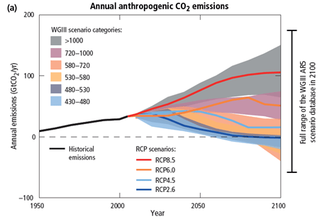
aTTP at 9.31 refers to Joe Romm’s blog post of Nov 3 “Misleading U.N. Report Confuses Media On Paris Climate Talks“. Romm uses Climate Interactive’s Climate Scoreboard Tool to show the INDC submissions (if fully implemented) will result in 3.5°C as against the 4.5°C in the non-policy “No Action” Scenario. This is six times the claimed maximum impact of 0.17°C claimed in Lomberg’s new paper. Who is right? What struck me first was that Romm’s first graph, copied straight from the Climate Interactive’s seem to have a very large estimate for emissions in the “No Action” Scenario producing. Downloading the underlying data, I find the “No Action” global emissions in 2100 are 139.3 GtCO2e, compared with about 110 GtCO2e in Figure SPM5(a) of the AR5 Synthesis Report for the RCP8.5 scenario high emissions scenario. But it is the breakdown per country or region that matters.

For the USA, without action emissions are forecast to rise from 2010 to 2030 by 40%, in contrast to a rise of just 9% in the period 1990 to 2010. It is likely that emissions will fall without policy and will be no higher in 2100 than in 2010. The “no action” scenario overestimates 2030 emissions by 2-3 GtCO2e in 2030 and about 7-8 GtCO2e in 2100.

For the China the overestimation is even greater. Emissions will peak during the next decade as China fully industrializes, just as emissions peaked in most European countries in the 1970s and 1980s. Climate Interactive assumes that emissions will peak at 43 GtCO2e in 2090, whereas other estimates that the emissions peak will be around 16-17 GtCO2e before 2030.

Together, overestimations of the US and China’s “No Action” scenarios account for over half 55-60 GtCO2e 2100 emissions difference between the “No Action” and “Current INDC” scenarios. A very old IT term applies here – GIGO. If aTTP had actually checked the underlying assumptions he would realise that Romm’s rebuttal of Lomborg based on China’s emission assumptions (and repeated on his own blog) are as false as claiming that the availability of free condoms is why population peaks.

Links posted at https://manicbeancounter.com/2015/11/11/attp-falsely-attacks-bjorn-lomborgs-impact-of-current-climate-proposals-paper/

Kevin Marshall


Figures referred to (but not referenced) in the comment above

Figure 1: Climate Interactive’s graph, referenced by Joe Romm.


Figure 2: Reproduction of Figure SPM5(a) from Page 9 of the AR5 Synthesis Report.


Update – posted the following to ATTP’s blog