The Closest yet to my perspective on Climate Change

 Michael S. Bernstam of the Hoover Institution has produced a short post Inconvenient Math. (hattip The GWPF). The opening paragraphs are:-

Climate change faces a neglected actuarial problem. Too many conditions must be met to warrant a policy action on climate change. The following four stipulations must each be highly probable:

1. Global warming will accumulate at 0.12 degrees Celsius or higher per decade.

2. It is anthropogenic, due largely to carbon dioxide emissions.

3. The net effect is harmful to human well-being in the long run.

4. Preventive measures are efficient, that is, feasible at the costs not exceed-ing the benefits.

But even if the probability of each of these stipulations is as high as 85 percent, their compound probability is as low as 50 percent. This makes a decision to act or not to act on climate change equivalent to flipping a coin.

Bernstam later states

In the case of climate change, the conditions are four. They are not random, nor are they arbitrary. To see this, one can run a thought experiment and drop or ignore any of the above foursome. At once, the entire call for action on climate change becomes pointless. If global warming is not ongoing, there is no need to stop it. If it is not anthropogenic, there is no need to curb carbon dioxide emissions. If it is not harmful, there is no need to worry. If preventive measures are inefficient, they would not help and there is no use applying them. It follows that all four conditions are necessary. If just one of them does not hold, action is unnecessary or useless.

That is, for action on climate change to be justified (in terms of having a reasonable expectation that by acting to combat climate change a better future will be created than by not acting) there must be human-caused warming of sufficient magnitude to produce harmful consequences, AND measures that cost less than the expected future costs that they offset.

These sentiments are a simplified version of a series of posts I made in October 2013, where I very crudely deriving two cost curves (costs of climate change and climate mitigation). This aimed to replicate a takeaway quote from the Stern Review.

Using the results from formal economic models, the Review estimates that if we don’t act, the overall costs and risks of climate change will be equivalent to losing at least 5% of global GDP each year, now and forever. If a wider range of risks and impacts is taken into account, the estimates of damage could rise to 20% of GDP or more. In contrast, the costs of action – reducing greenhouse gas emissions to avoid the worst impacts of climate change – can be limited to around 1% of global GDP each year.

I looked at the idea of multiplying the various probabilities together, at least for the costs of climate change.  But instead of the boundary it is a continuous function of an infinite number of possible scenarios. In general I believe the more extreme the costs of warming, the less likely it is to happen. The reason is that we derive the non-visible part of the cost curve can only be objectively derived from the revealed warming from the recent past. Separation of the costs of warming-induced climate change are extremely difficult from the costs of random extreme weather events. Even worse, the costs of extreme natural weather events (especially in terms of death toll) has been falling over time, as Indur Goklany has documented. The fall-back for global-warming theory is to use the late Milton Friedman’s Methodology of Positive Economics. That is to evaluate theory credibility on its predictive ability. If in the short-run climate scientists (or anyone who believes in climate alarmism like Al Gore) are able to make predictions about the signals of impending climate apocalypse, then this should give some credibility for claims of substantially worse to come. The problem is there are a huge number of failed predictions of climate worsening, but not a single one that has come true. This would signify that the true risk (as opposed to the perceived risk from the climate community) of climate change is approximately zero. The divergence of belief from the evidence is likely from the collective navel-gazing of post normal science.

The policy aspect that Bernstam fails to explore is the re-distributional aspects of policy. The theory is that global warming is caused by global greenhouse gas emissions. Therefore climate mitigation must comprise of reducing those global emissions. However, as the COP21 Paris showed most of the worlds population live in countries where there are no GHG emissions reduction policies even proposed. But actually reducing emissions means increasing energy costs, and hampering businesses with onerous regulations. Policy countries are given a comparative disadvantage to non-policy countries, as I tried to show here. The implication is that if developed countries strongly pursue high cost mitigation policies, the marginal cost of non-policy emerging economies switching to emissions reduction policies increases. Thus, whilst Donald Trump’s famous tweet that Global Warming is a Chinese hoax to make US manufacturing non-competitive is false, the impact of climate mitigation policies as currently pursued are the same as if it were true.

There is also a paradox with the costs of climate change. The costs of climate change are largely related to the unexpected nature of the costly events. For instance, ceteris paribus. a category 1 hurricane could be more costly in a non-hurricane area than a stronger hurricane in say Florida. The reason is that in the non-hurricane area buildings will not be as resistant to storms, nor will there be early warning procedures in place as in Florida. The paradox is that more successful climate scientists are in forecasting the risks of climate change, the more people can adapt to climate change, reducing the costs. The current focus on climate consensus, rather than focusing on increasing competency and developing real expertise in the field is actually harmful to future generations if climate change is a actually a serious emerging problem. But the challenge for the climate alarmists is that in developing the real expertise may result in their beliefs about the world are false.

Finally, Bernstam fails to acknowledge an immutable law of public policy. Large complex public policy projects with vague aims; poorly defined plans and lack of measurable costs tend to overshoot on costs and under-perform of benefits. Climate mitigation is an extreme example of complexity, lack of clear objects and lack object measurement of costs per unit of emissions saved.

Kevin Marshall

Joe Romm eco-fanaticism shown in Sea-Level Rise claims

The previous post was quite long and involved. But to see why Jo Romm is so out of order in criticizing President Trump’s withdrawal from the Paris Climate Agreement, one only has to examine the sub-heading of his rant  Trump falsely claims Paris deal has a minimal impact on warming. –

It may be time to sell your coastal property.

This follows with a graphic of Florida.

This implies that people in Southern Florida should take in account a 6 metre (236 inch) rise in sea levels as a result of President Trump’s decision. Does this implied claim stack up. As in the previous post, let us take a look at Climate Interactive’s data.

Without policy, Climate Interactive forecast that US emissions without policy will be 14.44 GtCO2e, just over 10% of global GHG emissions, and up from 6.8 GtCO2e in 2010. At most, even on CIs flawed reasoning, global emissions will be just 7% lower in 2100 with US policy. In the real world, the expensive job-destroying policy of the US will make global emissions around 1% lower even under the implausible assumption that the country were to extend the policy through to the end of the century. That would be a tiny fraction of one degree lower, even making a further assumption that a doubling of CO2 levels causes 3C of warming (an assumption contradicted by recent evidence). Now it could be that every other country will follow suit, and abandon all climate mitigation policies. This would be a unlikely scenario, given that I have not sensed a great enthusiasm for other countries to follow the lead of the current Leader of the Free World. But even if that did happen, the previous post showed that current policies do not amount to very much difference in emissions. Yet let us engage on a flight of fancy and assume for the moment that President Trump abandoning the Paris Climate Agreement will (a) make the difference between 1.5C of warming, with negligable sea-level rise and 4.2C of warming with the full impact of sea-level rise being felt (b) 5% of that rise. What difference will this make to sea-level rise?

The Miami-Dade Climate Change website has a report from The Sea Level Rise Task Force that I examined last November. Figure 1 of that report gives projections of sea-level rise assuming the no global climate policy.

Taking the most extreme NOAA projection it will be around the end of next century before sea-levels rose by 6 metres. Under the IPCC AR5 median estimates – and this is meant to be the Climate Bible for policy-makers – it would be hundreds of years before that sea-level rise would be achieved. Let us assume that the time horizon of any adult thinking of buying a property, is through to 2060, 42 years from now. The NOAA projection is 30 inches (0.76 metres) for the full difference in sea-level rise, or 1.5 inches (0.04 metres) for the slightly more realistic estimate. Using the mainstream IPCC AR5 median estimate, sea-level rise is 11 inches (0.28 metres) for the full difference in sea-level rise, or 0.6 inches (0.01 metres) for the slightly more realistic estimate. The real world evidence suggests that even these tiny projected sea level rises are exaggerated. Sea tide gauges around Florida have failed to show an acceleration in the rate of sea level rise. For example this from NOAA for Key West.

2.37mm/year is 9 inches a century. Even this might be an exaggeration, as in Miami itself, where the recorded increase is 2.45mm/year, the land is estimated to be sinking at 0.53mm/year.

Concluding Comments

If people based their evidence on the real world, President Trump pulling out of the Paris Climate Agreement will make somewhere between zero and an imperceptible difference to sea-level rise. If they base their assumptions on mainstream climate models, the difference is still imperceptible. But those with the biggest influence on policy are more influenced by the crazy alarmists like Joe Romm. The real worry should be that many policy-makers State level will be encouraged to waste even more money on unnecessary flood defenses, and could effectively make low-lying properties near worthless by planning blight when there is no real risk.

Kevin Marshall


Joe Romm inadvertently exposes why Paris Climate Agreement aims are unachievable

Summary

Joe Romm promotes a myth that the Paris Climate Agreement will make a huge difference to future greenhouse gas emissions. Below I show how the modelled impact of think tank Climate Interactive conclusion of a large difference is based on emissions forecasts of implausible large emissions growth in policy countries, and low emissions growth in the non-policy developing countries.


In the previous post I looked at how blogger Joe Romm falsely rebutted a claim that President Donald Trump had made that the Paris climate deal would only reduce only reduce future warming in 2100 by a mere 0.2°C. Romm was wrong on two fronts. He first did not check the data behind his assertions and second,  in comparing two papers by the same organisation he did not actually read the explanation in the later paper on how it differed from the first. In this post I look at how he has swallowed whole the fiction of bogus forecasts, that means the mere act of world leaders signing a bit of paper leads to huge changes in forecast emissions.

In his post  Trump falsely claims Paris deal has a minimal impact on warming, Romm states

In a speech from the White House Rose Garden filled with thorny lies and misleading statements, one pricks the most: Trump claimed that the Paris climate deal would only reduce future warming in 2100 by a mere 0.2°C. White House talking points further assert that “according to researchers at MIT, if all member nations met their obligations, the impact on the climate would be negligible… less than .2 degrees Celsius in 2100.”

The Director of MIT’s System Dynamics Group, John Sterman, and his partner at Climate Interactive, Andrew Jones, quickly emailed ThinkProgress to explain, “We are not these researchers and this is not our finding.”

They point out that “our business as usual, reference scenario leads to expected warming by 2100 of 4.2°C. Full implementation of current Paris pledges plus all announced mid-century strategies would reduce expected warming by 2100 to 3.3°C, a difference of 0.9°C [1.6°F].”

The reference scenario is RCP8.5, used in the IPCC AR5 report published in 2013 and 2014. This is essentially a baseline non-policy forecast against which the impact of climate mitigation policies can be judged. The actual RCP website produces emissions estimates by type of greenhouse gas, of which breaks around three-quarters is CO2. The IPCC and Climate Interactive add these different gases together with an estimate of global emissions in 2100. Climate Interactive current estimate as of April 2017 is 137.58 GtCO2e for the the reference scenario and the National Plans will produce 85.66 GTCO2e. These National would allegedly make global emissions 37.7% than they would have been without them, assuming they are extended beyond 2030. Climate Interactive have summarized this in a graph.

To anyone who actually reads the things, this does not make sense. The submissions made prior to the December 2015 COP21 in Paris were mostly political exercises, with very little of real substance from all but a very few countries, such as the United Kingdom. Why it does not make sense becomes clear from the earlier data that I extracted from Climate Interactives’ C-ROADS Climate Simulator version v4.026v.071 around November 2015.  This put the RCP8.5 global GHG emissions estimate in 2100 at the equivalent of 139.3 GtCO2e. But policy is decided and implemented at country level. To determine the impact of policy proposal there must be some sort of breakdown of emissions. C-ROADS does not provide a breakdown by all countries, but does to divide the world into up to 15 countries and regions. One derived break-down is into 7 countries or regions. That is the countries of USA, Russia, China and India, along with the country groups of EU27, Other Developed Countries and Other Developing Countries. Also available are population and GDP historical data and forecasts. Using this RCP8.5 and built-in population forecasts I derived the following GHG emissions per capita for the historical period 1970 to 2012 and the forecast period 2013 to 2100.

Like when I looked at Climate Interactives’ per capita CO2 emissions from fossil fuels estimates at the end of 2015, these forecasts did not make much sense. Given that these emissions are the vast majority of total GHG emissions it is not surprising that the same picture emerges.

In the USA and the EU I can think of no apparent reason for the forecast of per capita emissions to rise when they have been falling since 1973 and 1980 respectively. It would require for energy prices to keep falling, and for all sectors to be needlessly wasteful. The same goes for other developed countries, which along with Canada and Australia, includes the lesser developed countries of Turkey and Mexico. Indeed why would these countries go from per capita emissions similar to the EU27 now to those of the USA in 2100?

In Russia, emissions have risen since the economy bottomed out in the late 1990s following the collapse of communism. It might end up with higher emissions than the USA in 1973 due to the much harsher and extreme climate. But technology has vastly improved in the last half century and it should be the default assumption that it will continue to improve through the century. It looks like someone, or a number of people, have failed to reconcile the country estimate with the forecast decline in population from 143 million in 2010 to 117 million. But more than this, there is something seriously wrong with emission estimates that would imply that the Russian people become evermore inefficient and wasteful in their energy use.

In China there are similar issues. Emissions have increased massively in the last few decades on the back of even more phenomenal growth, that surpasses the growth of any large economy in history. But emissions per capita will likely peak due to economic reasons in the next couple of decades, and probably at a much lower level than the USA in 1973. But like Russia, population is also forecast to be much lower than currently. From a population of 1340 million in 2010, Climate Interactive forecasts population to peak at  1420 million in 2030 (from 2020 to 2030 growth slows to 2 million a year) to 1000 million in 2100. From 2080 (forecast population 1120) to 2100 population is forecast to decline by 6 million a year.

The emissions per capita for India I would suggest are far too low. When made, the high levels of economic growth were predicted to collapse post 2012. When I wrote the previous post on 30th December 2015, to meet the growth forecast for 2010-2015, India’s GDP would have needed to drop by 20% in the next 24 hours. It did not happen, and in the 18 months since actual growth has further widened the gap with forecast. Similarly forecast growth in GHG emissions are far too low. The impact of 1.25 billion people today (and 1.66 billion in 2100) is made largely irrelevant, nicely side-lining a country who has declared economic growth is a priority.

As with the emissions forecast for India, the emissions forecast for other developing countries is far too pessimistic, based again on too pessimistic growth forecasts. This mixed group of countries include the 50+ African nations, plus nearly all of South America. Other countries in the group include Pakistan, Bangladesh, Myanmar, Thailand, Indonesia, Vietnam, Haiti, Trinidad, Iraq, Iran and Kiribati. There are at least a score more I have omitted, in total making up around 42% of the current global population and 62% of the forecast population in 2100. That is 3 billion people today against 7 billion in 2100. A graph summarizing of Climate Interactive’s population figures is below.

This can be compared with total GHG emissions.

For the USA, the EU27, the other Developed countries and China, I have made more reasonable emissions per capita estimates for 2100.

These more reasonable estimates (assuming there is no technological breakthrough that makes zero carbon energy much cheaper than any carbon technology) produce a reduction in projected emissions of the same order of magnitude as the supposed reduction resulting from implementation of the National Plans. However, global emissions will not be this level, as non-policy developing nations are likely to have much higher emissions. Adjusting for this gives my rough estimate for global emissions in 2100.

The overall emissions forecast is not very dissimilar to that of RCP8.5. Only this time the emissions growth has shift dramatically from the policy countries to the non-policy countries. This is consistent with the data from 1990 to 2012, where I found that the net emissions growth was accounted for by the increase in emissions from developing countries who were not signatories to reducing emissions under the 1992 Rio Declaration. As a final chart I have put the revised emission estimates for India and Other Developing Countries to scale alongside Climate Interactives’ Scoreboard graphic at the top of the page.

This clearly shows that the emissions pathway consistent the constraining warming to  2°C will only be attained if the developing world collectively start reducing their emissions in a very few years from now. In reality, the priority of many is continued economic growth, which will see emissions rise for decades.

Concluding Comments

This is a long post, covering a lot of ground. In summary though it shows environmental activist has Joe Romm has failed to check the claims he is promoting. An examination of Climate Interactive (CI) data underlying the claims that current policies will reduce global temperature by 0.9°C through reducing GHG global emissions does not stand up to scrutiny. That 0.9°C claim is based on global emissions being around 35-40% lower than they would have been without policy. Breaking the CI data down into 7 countries and regions reveals that

  • the emissions per capita forecasts for China and Russia show implausibly high levels of emissions growth, when they show peak in a few years.
  • the emissions per capita forecasts for USA and EU27 show emissions increasing after being static or falling for a number of decades.
  • the emissions per capita forecasts for India and Other Developing Countries show emissions increasing as at implausibly lower rates than in recent decades.

The consequence is that by the mere act of signing an agreement makes apparent huge differences to projected future emissions. In reality it is folks playing around with numbers and not achieving anything at all, except higher energy prices and job-destroying regulations. However, it does save the believers in the climate cult from having to recognize the real world. Given the massed hordes of academics and political activists, that is a very big deal indeed.

Kevin Marshall 

SNP Government’s Out-Sourced Propaganda on Food Waste

In the previous post I promised to provide some clear illustrations of the climate of this policy nonsense in Britain. The United Kingdom has a rather strange constitution, where three of the four countries have devolved assemblies, but largest with 83% of the population does not. The most vocal by far is the Scottish Assembly lead by Scottish Nationalist First Minister Nicola Sturgeon. The United Kingdom has the world’s most strident Climate legislation in the form of the Climate Change Act 2008. The Scottish Nationalists seek to differentiate themselves from the English by usurping the British role of leading the world on Climate Change. Scotland is therefore a useful place to look for the most extreme examples.

Zero Waste Scotland, a Stirling-based company Limited by Guarantee, almost entirely funded by the Scottish Government, exists to promote environmentalist propaganda. In their words .

Zero Waste Scotland exists to create a society where resources are valued and nothing is wasted. 

Take the page on Food Waste

Your food does its job best when it’s on a plate ready to be enjoyed. Saving food saves money and helps to slow down global warming and deforestation. Reducing the amount of food that ends up in the bin also means you can say goodbye to unnecessary packaging waste. If we all make a few small changes and start using up the food we buy, together we can make a big difference.

Look at the “we” part in relation to making a big difference to slowing global warming. It is a Scottish-based website, promoting Scottish Government policy. The context to consider this claim is

  1. Note all the Scottish people will take up the call from the website. Indeed, very few will likely visit the webpage, particularly those who are not already .
  2. Domestic food waste is less than the total food waste. There is waste in farming, food processing, restaurants, schools and retailing.
  3. Food Waste is a only a small part of total Scottish emissions. Zero Waste Scotland estimates 1.5 millions tonnes of 75 millions tonnes.
  4. Scottish emissions of 75 MtCO2E are a small part of global greenhouse emissions of 54000 MtCO2.

The slow-down if all readers of the website and reduce food waste to zero in slowing global warming (assuming the link between warming and GHG less) is much less than 0.0028% of the total.
Will people save money and reduce packaging waste by eliminating food waste? I believe that a cheap healthy diet for a family. I always tried to provide fruit and fresh vegetables for my growing children, as against cakes and ice-cream. With growing children, getting them to eat vegetables was a problem. Cabbage, leaks and mange tout were least successful. Corn on the cob was successful for a while. But we rarely had tinned of baked beans, which were popular. With fruit, some got left depending on the mood, and other foods eaten. Peels and cores added to the waste, along with the unsightly bits of cheaper potatoes and residue of roast chicken, leg of lamb and pork shoulder. (We are not keen on the fat, nor soup made from the stock). We could have saved waste by spending more on quality, or reduced waste by careful planning. For hard-working families there are other considerations. On a weekly shop it is a case of chucking some things in the trolley that will provide quick meals. Detailed planning of meals and careful preparation is sacrificed for family time, relaxation and sleeping. In terms of focusing on food waste could cause other harms, like failing to provide a varied diet to children and maybe spending more. The loss of leisure and family time are potential non-monetary costs.

Zero Waste Scotland gets a 10% reduction from the 5.5 million people in Scotland, that is just 0.00028%, But the people reading are individuals, and maybe decision-makers for the families. A family going from average to zero food waste might reduce global emissions by 0.000000001%.

Imagine is a business making such a grossly misleading claims in the benefits, and hiding of potential harmful side-effects in promoting say, vitamins. They would be prosecuted. But this is not a business selling a product but environmentalist propaganda.

However, there are benefits to the Scottish Government.

First, by having fancy websites, along with signage all over the place, they can claim they are combating climate change. This enables First Minister Sturgeon being able to dream of being making serious speeches to the UN and being photographed next to other world leaders.

Further, this messaging changes peoples perceptions, meaning that anybody who perceives the absurdity is met by incomprehension and a string of half-learnt mantras. Without imposing censorship, in the name of “saving the planet” this promotes a progressive consensus that cannot be challenged.

Third, there are British Government and EU targets to reduce food waste and other environmental concerns. When persuasion does not work, there is greater justification in providing incentives to promote “better” behaviour, as with banning smoking in public places, minimum price for alcohol and a awkward charging for plastic bags. Alternatively by taking some of the decision-making powers about what people eat and how they live their lives out of their hands and placing under the guidance of those who know better. They Scottish Government already tried this with the named person child protection scheme.

Fourth, by out-sourcing (or privatizing) political propaganda, the SNP can avoid the claim of using the Scottish Government website for promoting a political hegemony.

Kevin Marshall


Warming Bias in Temperature Data due to Consensus Belief not Conspiracy

In a Cliscep article Science: One Damned Adjustment After Another? Geoff Chambers wrote:-

So is the theory of catastrophic climate change a conspiracy? According to the strict dictionary definition, it is, in that the people concerned clearly conferred together to do something wrong – namely introduce a consistent bias in the scientific research, and then cover it up.

This was in response to last the David Rose article in the Mail on Sunday, about claims the infamous the Karl et al 2015 breached America’s National Oceanic and Atmospheric Administration (NOAA) own rules on scientific intergrity.

I would counter this claim about conspiracy in respect of temperature records, even in the strict dictionary definition. Still less does it conform to a conspiracy theory in the sense of some group with a grasp of what they believe to be the real truth, act together to provide an alternative to that truth. or divert attention and resources away from that understanding of that truth. like an internet troll. A clue as to know why this is the case comes from on of the most notorious Climategate emails. Kevin Trenberth to Micheal Mann on Mon, 12 Oct 2009 and copied to most of the leading academics in the “team” (including Thomas R. Karl).

The fact is that we can’t account for the lack of warming at the moment and it is a travesty that we can’t. The CERES data published in the August BAMS 09 supplement on 2008 shows there should be even more warming: but the data are surely wrong. Our observing system is inadequate.

It is the first sentence that was commonly quoted, but it is the last part is the most relevant for temperatures anomalies. There is inevitably a number of homogenisation runs to get a single set of anomalies. For example the Reykjavik temperature data was (a) adjusted by the Iceland Met office by standard procedures to allow for known locals biases (b) adjusted for GHCNv2 (the “raw data”) (c) adjusted again in GHCNv3 (d) homogenized by NASA to be included in Gistemp.

There are steps that I have missed. Certainly Gistemp homogenize the data quite frequently for new sets of data. As Paul Matthews notes, adjustments are unstable. Although one data set might on average be pretty much the same as previous ones, there will be quite large anomalies thrown out every time the algorithms are re-run for new data. What is more, due to the nature of the computer algorithms, there is no audit trail, therefore the adjustments are largely unexplainable with reference to the data before, let alone with reference to the original thermometer readings. So how does one know whether the adjustments are reasonable or not, except through a belief in how the results ought to look? In the case of the climatologists like Kevin Trenberth and Thomas R. Karl, variations that show warmer than the previous run will be more readily accepted as correct rather than variations that show cooler. That is, they will find reasons why a particular temperature data set now shows greater higher warming than before. but will reject as outliers results that show less warming than before. It is the same when choosing techniques, or adjusting for biases in the data. This is exacerbated when a number of different bodies with similar belief systems try to seek a consensus of results, like  Zeke Hausfather alludes to in his article at the CarbonBrief. Rather than verifying results in the real world, temperature data seeks to conform to the opinions of others with similar beliefs about the world.

Kevin Marshall

IPCC AR5 Synthesis Report Presentation Miscalculated the Emissions for 2C of Warming

In a previous post I mistakenly claimed that the Ladybird Book on Climate Change (lead author HRH The Prince of Wales) had incorrectly interpreted the AR5 IPCC Synthesis Report in its egg-timer. It is the IPCC that is at fault.
In 2014 the IPCC produced a simplified presentation of 35 slides to summarize the AR5 Synthesis Report Summary for policy makers. A quick summary of a summary of the synthesis report.

Slide 30 on Limiting Temperature Increase to 2C, clearly states that it is global reductions in greenhouse gas emissions that are needed.


The Ladybird egg-timer is adapted from slide 33 of 35.

As a (slightly manic) beancounter I like to reconcile the figures. How are the 1900 GtCO2 and the 1000 GtCO2 arrived at? It could be that it is GtCO2e, like the throughout the synthesis report, where other greenhouse gases are recast in terms of CO2, which accounts for well over half of the warming from trace gases.

Some assumptions for my quick calculations.

1. A doubling of CO2 will lead to a warming of 3C. This was the central estimate of the Charney Report 1979 (pdf), along with all five of the UNIPCC assessment reports.
2. If the pre-industrial level of CO2 was 280ppm, the dangerous 2C of warming will be reached at 445ppm. Rounded this is 450ppm.
3. In 2011 the Mauna Loa CO2 level was 391.63 ppm.
4. Using the CDIAC World CO2 emission figures, gives the following figures for billions of tonnes of CO2 to achieve a 1ppm rise in CO2 levelsin the graph below. In the five years to 2011 on average it took 17.02 billion tonnes of CO2 to raise CO2 levels by 1 ppm. Lets round it to 17.

Now some quick calculations.
Start with 280ppm
Add 111.76 (=1900/17) gives 391.76. Pretty close to the CO2 level in 2011 of 391.63ppm
Add 58.82 (=1000/17) gives 450.58. Given rounding, this pretty close to 450ppm.

There are problems with these calculations.

  • The estimate of 17 GtCO2e is on the high side. The World CO2 emissions from the CDIAC National Emissions spreadsheet gives a sum of 1069.68 GtCO2 from 1960 to 2011, against a rise in CO2 of 74.72 ppm. That is 14.3 GtCO2e over the whole period. Since 2011 there has been a drop towards this long-term average.
  • The Ladybird Book, like the UNFCCC at COP21 Paris December 2015 talks about restraining emissions to 1.5C. If a doubling of CO2 leads to 3.000C of warming then going from 280ppm to 401ppm (the average level in 2015) will eventually 1.555C of warming. This is a tacit admission that climate sensitivity is vastly overstated.
  • But the biggest error of all is that CO2 is only the major greenhouse gas (if you forget about water vapour). It might be the majority of the warming impact and two-thirds of emissions, but it is not all the warming impact according to theory. That alone would indicate that climate sensitivity was 2 instead of 3. But actual warming from 1780 to 2011 was less than 1C, against the 1C from CO2 alone if CS=2. That indicates that CS ≈ 1.3. But not all of the warming in the last 230 years has been due to changes in GHG levels. There was also recovery from the Little Ice Age. Worst of all for climate alarmism is the divergence problem. In this century the rate of warming should have increased as the rate of CO2 levels increased, in turn due to an increase in the rate of rise in CO2 emissions. But warming stopped. Even with the impact of a strong El Nino, the rate of warming slowed dramatically.


Conclusion

The IPCC calculated their figures for 1000 billion tonnes of CO2 emissions for 2C of warming based on CO2 being the only greenhouse gas and a doubling of CO2 levels producing 3C of warming. On that basis 401ppm CO2 level should produce >1.5C of warming. Add in other greenhouse gases and we are in for 2C of warming without any more greenhouse gas emissions. It is only if climate sensitivity is much lower is it theoretically possible to prevent 2C of warming by drastically reducing global CO2 emissions. The IPCC, have concocted figures knowing that they do not reconcile back to their assumptions.

The questions arise are (a) where do the cumulative emissions figures come from? and (b) whether the UNIPCCC has copied these blatant errors in the COP processes?

This is an extended version of a comment made a Paul Homewoods’ notalotofpeopleknowthat blog.

Kevin Marshall

My Amazon Review of Ladybird Book of Climate Change

The following is my Amazon review of Ladybird Book of Climate Change.

The format goes back to the Ladybird Books of my childhood, with text on the left and a nice colour picture on the right. Whilst lacking in figures and references it provides an excellent summary of the current case of climate alarmism and the mitigation policies required to “save the world”. As such it is totally lopsided.
For instance, on page 35 is a drawing of 3 children holding a banner with “1.5 to stay alive”. The central estimate of the climate consensus since the Charney report of 1979 is that a doubling of CO2 levels will lead to 3C of warming. That means a rise from 280 to 400ppm would give 1.54C of warming. With the impact of the rise in other greenhouse gas levels the 2C of warming should already of happened. Either it is somehow hidden, ready to jump out at us unawares, or the the impact of emissions on climate has been exaggerated, so policy is not required.
The other major problem is with policy. The policy proposals are centered around what individuals in the UK can do. That is recycle more, eat less red meat and turn the heat down. There is no recognition that it is global GHG emissions that cause atmospheric GHG levels to rise. If the theory is correct, constraint of global warming means global emissions reductions. That includes the 80%+ of the global population who live in countries exempt from any obligation to constrain emissions. Including all the poorest countries, these countries accounted for all the emissions growth from 1990 to at least 2012.
If people genuinely want to learn about a controversial subject then they need to read different viewpoints. This is as true of climate change as history, economics or philosophy.

Ladybird Book on Climate Change

A couple of weeks ago there was a big splash about the forthcoming Ladybird Book for adults on Climate Change. (Daily Mail, Guardian, Sun, Telegraph etc.) Given that it was inspired by HRH The Prince of Wales, who wrote the forward, it should sell well. Even better, having just received a copy in a format that harks back to the Ladybird Books I grew up with. That is on each double page words on the left and a high quality coloured picture filling the right hand page. Unlike, the previous adult Ladybird series, which was humorous, this is the first in a series that seeks to educate.

The final paragraph of the forward states:-

I hope this modest attempt to alert a global public to the “wolf at the door” will make some small contribution towards requisite action; action that must be urgently scaled up, and scaled up now.

The question is whether there is enough here to convince the undecided. Is this is founded on real science, then there should be a sufficient level of evidence to show

(a) there is a huge emerging problem with climate.

(b) that the problem is human caused.

(b) that there are a set of potential steps that can be taken to stop constrain this problem.

(c) that the cure is not worse than the disease.

(d) that sufficient numbers will take up the policy to meet the targets.

My approach is is to look at whether there is sufficient evidence to persuade a jury. Is there evidence that would convict humanity of the collective sin of destroying the planet for future generations? And is there evidence that to show that, through humanity collectively working for the common good, catastrophe can be averted and a better future can be bequeathed to those future generations? That presumes that there is sufficient quality of evidence that an impartial Judge would not throw the evidence out as hearsay.

Evidence for an Emerging Problem with Climate.

Page 8 on melting ice and rising sea levels starts with the reduced Arctic sea ice. The only quantifiable estimate of the climate change other than the temperature graph on page 6, in claiming at the end of the 2016 melt season the sea ice levels were two-thirds that of at the end of the end of the twentieth century.

Any jury would hear that there has only been satellite data of sea ice extent since 1979; that this was the end of a period known as the “sea ice years“; that the maximum winter ice extent in April was likely less in the eighteenth century than today; that ships log books suggest that general sea ice extent was the roughly the same one hundred and fifty years ago as today; and that in the Antarctic average sea ice extent increase has largely offset the Arctic decrease.

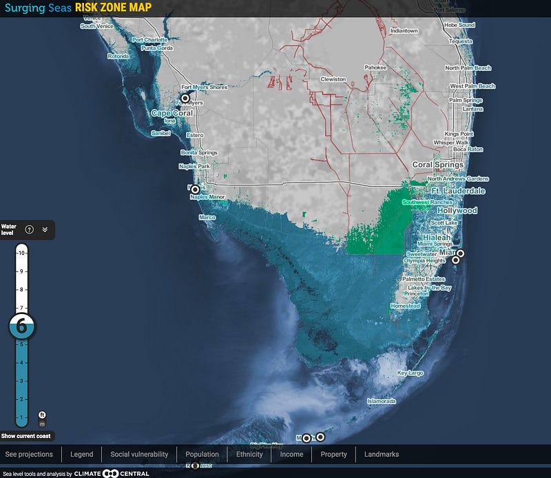
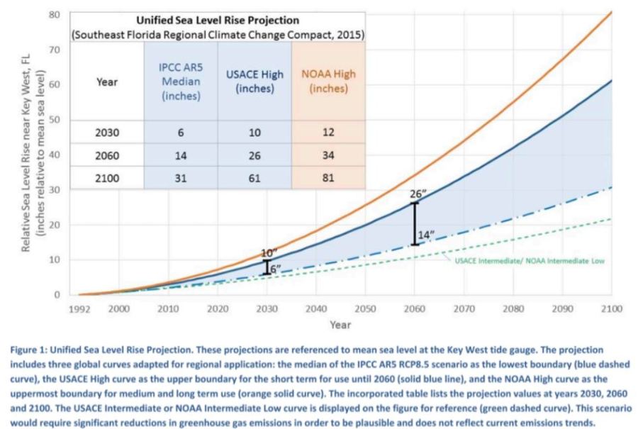
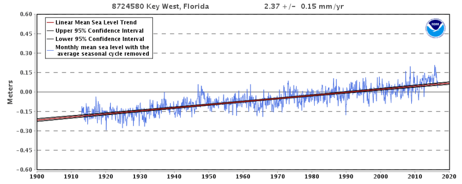
The rest about sea levels correctly state both that they have risen; that the reasons for the rise are a combination of warming seas and melting ice caps. It is also correct that flooding occurs in storm surges. But there is no quantification of the rise in sea levels (about 8-12 inches a century), nor of the lack of evidence of the predicted acceleration.

Page 10 on heatwaves, droughts, floods and storms states that they can cause disruption, economic damage and loss of life. there are also recent examples, and speculation about future trends. But no evidence of emerging trends, particularly increasing loss of life. This lack of evidence is because the evidence of the harms of extreme weather appear on the decrease. Indur Goklany has been a rich source of the counter-evidence over many years.

Page 12 begins

Threats to food and water supply, human health and national security, and the risk of humanitarian crises are all potentially increases by climate change.

The rest is just padding out this speculation.

Page 14 is on disappearing wildlife. One quote

The polar bear has come to symbolize the threats posed to wildlife by climate change….

You can probably find many images of starved dead polar bears to back this up. But the truth is that this creatures live by hunting, and as they get older slow down, so are no longer fast enough to catch seals, their main food source. Zoologist Susan Crockford has a blog detailing how polar bear numbers have increased in recent years, and far from being threatened the species is thriving.

The climate change problem is mostly human caused

The book details that emissions of greenhouse gas levels have gone up, and so have the levels of greenhouse gases. The only quantities is for CO2, the major greenhouse gas. (Page 20) There is simple diagram explaining how CO2 emissions impacts on atmospheric CO2 levels, before explaining the major sources of the net increase – fossil fuel emissions and clearing forests. There is no actual testing of the theory against the data. But Page 20 begins

The scientific evidence shows that dominant cause of the rapid warming of the Earth’s climate over the last half century has been the activities of people…

The relevant quote from UNIPCC AR5 WG1 SPM section D3 says something slightly differently.

It is extremely likely that more than half of the observed increase in global average surface temperature from 1951 to 2010 was caused by the anthropogenic increase in greenhouse gas concentrations and other anthropogenic forcings together.

The extremely likely phrase is a Bayesian estimate. It is a belief that should be updated on the best available evidence. Lack of evidence, after much searching, suggests the original guess was wrong. Therefore true Bayesians would downgrade their certainties if they cannot refine the estimates over time. But this was written in 2013. Since the Carney Report of 1979 and the previous four IPCC reports of 1990 to 2007, there has been no refinement in the estimate of how much warming will eventually result from a doubling of CO2.

But how does the evidence stack up? On page 6 there is a chart of global surface temperature anomalies. That increase in temperatures can be tested against the doubling effect of CO2. Since around the turn of century the rate of rise in CO2 emissions and atmospheric CO2 levels has accelerated. But global warming stopped  for over a decade until 2014, only to restart due to a natural phenomena. Comparing the actual data to the theory, fails to support the strong beliefs that GHG emissions are the dominant cause of recent warming. 

Policy to contain the problem

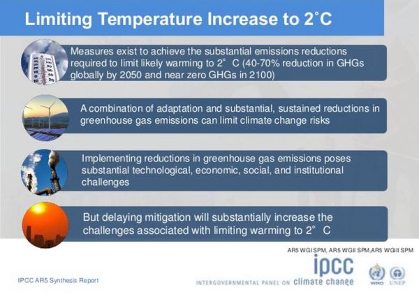
Page 34 go into the benefits of containing warming to 1.5C. Given that the central estimate from the climate community since 1979 has been that a doubling of CO2 will lead to and eventual rise in average temperature of 3C, a rise in CO2 levels from the pre-industrial levels of 280ppm to 400ppm reached in 2015 would give 1.544C of warming. With other greenhouse gases it should be nearer to 2C of warming. Either it is way too late (and the warming is lurking like the Loch Ness monster is the dark and murky depths) or the central estimate is exaggerated. So the picture of three young people holding a banner with 1.5 to stay alive is of the doomed who we can do nothing about, or false alarmism.

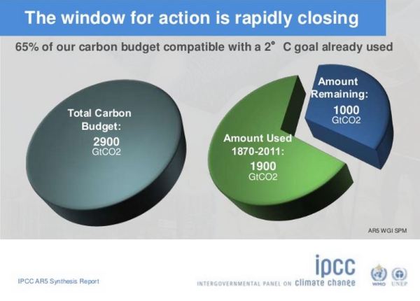
Page 36 has a nice graphic adopted from the IPCC Synthesis Report of 2014, showing the liquid dripping through an egg-timer. It shows the estimate that 2000 billion tonnes of CO2 have been emitted so far, 1000 billion tonnes can be emitted before the 2 C of warming is breached. This was from a presentation to summarize the IPCC AR5 Synthesis Report of 2014. Slide 33 of 35.

Problem is that this was the data up to 2011, not five years later to 2016; it was for GHG emissions in billions of tonnes of CO2 equivalents; and the 40 billions tonnes of CO2 emissions should be around 52-55 billion tonnes CO2e GHG emissions. See for instance the EU Commission’s EDGAR figures, estimating 54GtCO2e in 2012 and 51GtCO2e in 2010 (against the IPCCs 49 GtCO2e). So the revised figure is about 750GtCO2e of emissions before this catestrophic figure is breached. The Ladybird book does not have references, to keep things simple, but should at least properly reflect the updated numbers. The IPCC stretched the numbers in 2014 in order to keep the show on the road to such extent that they fall apart on even a cursory examination. The worst part is at the very top of the egg-timer, coloured scarlett is “Coal, oil and gas reserves that cannot be used“. These are spread across the globe. Most notably the biggest reserves are in China, USA, Russia, Canada, Australia, Middle East and Venezuela, with the rest of the World have a substantial share of the rest.

The cure is worse than the disease

For the rest of the book to suggest European solutions like recycling, eating less red meat, turning down the heating to 17C and more organic farming, the authors write about making very marginal differences to emissions in a few countries with a small minority of global emissions. Most of those reserves will not be left in the ground no matter how much the first in line to the Throne gets hot under the collar. The global emissions will keep on increasing from non-policy countries with over 80% of the global population, two-thirds of global emissions and nearly 100% of the world’s poorest people. Below is a breakdown of those countries.

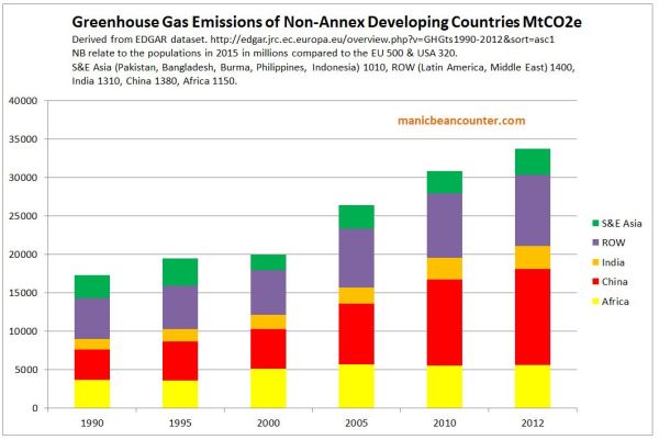
These countries collectively produced 35000 MtCOe in 2012, or 35 GtCO2e. That will increase well into the future short of inventing a safe nuclear reactor the size weight and cost of a washing machine. Now compare to the global emissions pathways to stop the 1.5C  or 2C of warming prepared by the UNFCCC for the 2015 Paris talks.


The combined impact of all the vague policy proposals do not stop global emissions from rising. It is the non-policy developing countries that make the real difference between policy proposals and the modelled warming pathways. If those countries do not keep using fossil fuels at increasing rates, then they deprive billions of people of increasing living standards for themselves and their children. Yet this must happen very quickly for the mythical 2C of warming not to be breached. So in the UK we just keep on telling people not to waste so much food, buy organic, ride a bike and put on a jumper.

There is no strong evidence would convict humanity of the collective sin of destroying the planet for future generations. Nor is there evidence that to show that a better future can be bequeathed to those future generations when the policies would destroy the economic future of the vast majority. The book neatly encapsulates how blinkered are the climate alarmists to both the real-world evidence and the wider moral policy perspectives.

Kevin Marshall


Bernie Saunders demonstrates why he was not fit to be President

Senator Bernie Saunders of Vermont was for a while running a close second to Hillary Clinton in the Democrat Primaries. Had his extreme left views, advanced years and the fact that he is the junior Senator from the 49th most populous State, he might have stood a chance against a former First Lady and Secretary of State. But Senator Sanders’ recent questioning of Scott Pruitt shows why he is unfit for high office. Ron Clutz has transcribed more of the dialog, by I think two statements encapsulate this.

At 0.45

As you may know, some 97% of scientists who have written articles for peer-reviewed journals have concluded that climate change is real, it is caused by human activity, and it is already causing devastating problems in the US and around the world. Do you believe that climate change is caused by carbon emissions from human activity?

There is no 97% survey of scientists which conclude these things. As Ron Clutz observes the nearest to definite questions was Examining the Scientific Consensus on Climate Change – Doran and Zimmerman 2009, where the second question was

2. Do you think human activity is a significant contributing factor in changing mean global temperatures?

One could answer “yes” if you thought that 10% of the rise in the was due to land use changes, and the rest due to natural factors. It does not ask about fossil fuel emissions, and the question allows for belief in other factors other than human activity whether known or unknown. Neither does it ask if temperature rise is net harmful, with huge devastating impacts already evident.

There is also the Cook et. al survey of peer-reviewed academic papers that I looked after listening to a lecture Cook gave at Bristol University in late 2014. The survey just looked to the assumption that humans cause some warming, whether explicit or implied. Like the Doran and Zimmerman survey it is just hearsay. This Sen. Sanders presents as good evidence that there is already a clear catastrophic problem caused by changes in the climate. If there is real and overwhelming evidence, why does Sen. Sanders not refer to that instead of misrepresenting bogus opinion polls?

Senator Sanders then goes even further.  At 1.50

While you are not certain, the vast majority of scientists are telling us that if we do not get our act together and transform out energy system away from fossil fuel there is a real question as to the quality of the planet that we are going to be leaving our children and our grandchildren. So you are applying for a job as Administrator at the EPH to protect our environment. Overwhelming majority of scientists say we have to act boldly and your’re telling me that there needs to be more debate on this issue and that we should not be acting boldly.

Sanders now says a majority of scientists are telling us we must change our energy systems. Aside from the fact that only a very small minority of scientists have any sort of competency in the field of climate, (and there is evidence a lot of demonstrated incompetency within the small group e.g. here), they have no expertise in the economic or moral cases for policy. For policy the interpretation of the moral imperatives and the practical possibilities should be the realm of politicians. For those who sit on specialist committees, they should at least have their own developed views on the field.

Senator Bernie Saunders has taken some very dodgy opinion polls, grossly exaggerated the findings, and then ascribed statements to the climatologists that are far removed, and way beyond, any competencies they might have. As I see it, the role of President of the United States, as a leader, is to critically interpret what they are given in order to make decisions for the nation. That is the exact opposite of what Sanders did last week.

Kevin Marshall 


Friends of the Earth distorting the evidence for Fracking in the UK

Summary

Friends of the Earth have a webpage claiming to be “fracking facts”. The key points I make are.

  • The claims of dangers of fracking raise questions, that need to be answered before they can be considered credible.
  • The claim that fracking could affect house prices is totally unsupported.
  • The claim that shale gas will not significantly affect energy prices is based on out of date data. The British Geological Survey has shown that the potential of shale gas is huge. Friends of the Earth has played a major role in preventing that potential being realized.
  • FoE has consequently helped prevent shale gas from relieving the energy crisis brought upon by the Climate Change Act 2008.
  • Claims that pursuing shale gas in Britain will affect global emissions are pure fantasy. Also is a fantasy the belief that Britain is leading the way on emissions reductions. We ain’t leading if collectively the world is not following. The evidence shows clearly shows this.  

In the previous post I looked at how FoE blatantly mislead about an agreement they reached with the Advertising Standards Authority, which caused the unusual step of ASA Chief Executive Guy Parker issuing a strongly worded statement to defend the ASA’s integrity.

In this post I will look at FoE’s position on fracking, from Fracking definition? What does fracking mean? Read our fracking facts

I will look at various statements made (with FoE quotes in purple), showing how well they are supported by the evidence and/or providing alternative perspectives.

From the section What are the dangers of fracking?

Industry statistics from North America show that around 6% of fracking wells leak immediately.

Leaking wells lead to a risk of water contamination. Lord Smith, former chair of the Environment Agency, has said this is the biggest risk posed by fracking.

So it’s particularly concerning that the Government has now said it will allow fracking companies to drill through aquifers which provide household drinking water.

This raises some questions.

  • If leaks are a problem, with respect to fracking in the UK has this been risk assessed, with appropriate measures taken to prevent leaks?
  • Does that statistic of 6% allow for when there is natural leakage in the area of fracking leaking in the water supplies are venting into the atmosphere in the area where fracking is occurring? This was the case in the images of the flaming water faucet in the movie Gasland.
  • Have there been steps taken in the USA to reduce genuine leaks?
  • Has the proportion of wells leaking gas in the USA been increasing or decreasing?
  • Has the average amount of gas leaked been increasing or decreasing?
  • How when extracting gas from well below water aquifers, through a lined tube, that is both water-tight and gas-tight, is that gas (and fracking fluids) meant to leech into the water supply?

Then there is the statement without evidence.

Fracking could also affect house prices.

This was one of the issues FoE in its agreement with the ASA have the assurance not to repeat claims that fracking affects property prices, unless the evidence changes. Legally there might be cop-out where that assurance does not apply to claims made on its website. Literally, the statement is not untrue, just as the claim that a butterfly flapping its wings on the North Downs could lead to a typhoon in the South China Sea.

Would fracking bring down energy bills?

It’s very unlikely. Fracking company Cuadrilla has admitted that any impact on bills would be “basically insignificant”.

Claims that fracking would create a lot of jobs have also been overstated. According to Cuadrilla, each of its proposed 6-year projects in Lancashire that were recently rejected by the council would only have created 11 jobs.

The claim about Cuadrilla is sourced from an Independent article in June 2013.

“We’ve done an analysis and it’s a very small…at the most it’s a very small percentage…basically insignificant,” said Mark Linder, a public relations executive at Bell Pottinger who is also responsible for Cuadrilla’s corporate development.

The article later says

“According to Poyry, Lancashire shale gas production could also reduce the country’s wholesale gas and electricity prices by as much as 4 per cent between 2014 and 2035, which corresponds to an average saving of £810m/year,”

It is not surprising that shale gas developments in Lancashire alone will not have a significant impact on UK energy prices, especially if that is restricted to a few sites by one company. But over three years later the landscape has changed. The British Geological Survey has been publishing estimates of the quantities of shale gas (and oil) that exists beneath the ground.

The figures are at first hard to comprehend. They are large numbers in units of measure that ordinary people (even people with some knowledge of the field) find hard to comprehend, let alone put into some perspective. In my view, the figures need to be related to annual British consumption. Page 8 of the DECC UK Energy Statistics, 2015 & Q4 2015 estimates gas demand at 794 TWh in 2015.

The BGS uses tcf (tera cubic feet) for its’ estimates, which (like a domestic gas bill) can be converted from TWh. The 794 TWh is about 2.7 tcf. Not all shale gas is recoverable. In fact possibly only 10% of reserves is recoverable on existing technology, and depending on the quality of the deposits.

There are also shale oil deposits, measured by the BGS in both barrels and millions of tonnes. Refinery production (a rough estimate of consumption) was 63 million tonnes in 2015. I will again assume 10% recovery, which may be overly prudent.

The biggest shock was published just a few weeks after the Independent article on 27th July 2013. The size of the Bowland shale was truly staggering. The central estimate is 1329 tcf, meaning enough to satisfy 49 years of current UK gas demand. Potentially it is more, due to the depth of deposits in many areas. No significant deposits of oil are thought to be present

On 23rd May 2014 BGS published the results for the Weald Basin, a large area in the South East of England. Whilst there were no significant deposits of gas, the central estimate of 591 million tonnes is enough to supply the UK for one year.

On 25 June 2014 the Welsh Government published the estimates for Wales. The main gas deposits are thought to be in Wrexham/Cheshire and in South Wales and estimated about 65 tcf, or just over two years of UK demand. (Strictly the Welsh estimate is somewhat below this, as Wrexham is on the Welsh border and Cheshire is an English county. )

On 23rd May 2014 BGS published the results for the Midland Valley of Scotland. The central estimate for shale gas was 80.3 tcf (3 years of UK demand) and for shale oil 800 million tonnes (15 months of refinery production).

Most recently on 13th October 2016, BGS published the results for the Jurassic shale of the Wessex area. Central estimate for shale oil was 149 million tonnes, equivalent to three months of UK refinery production.

In all, conservatively there is estimated to be sufficient gas to supply the UK for over 54 years and oil for two and half years. The impact on supply, and therefore the impact on jobs and (in the case of gas) on energy prices, demands on the ability of businesses to profitability develop these resources. As has happened in the USA, the impact on jobs is mostly dependent on the impact on prices, as low prices affect other industries. In the USA, industries that are sensitive to energy prices (or use gas as a raw material) have returned from overseas, boosting jobs. FoE has played no small part in delaying planning applications with spurious arguments, along with generating false fears that could have made regulations more onerous than if an objective assessment of the risks had been made.

Fracking can’t help any short term or medium term energy crisis.

Even if the industry was able to move ahead as fast as it wants, we wouldn’t see significant production until about 2025.

This is actually true and up to date. If it were not for the Climate Change Act along with eco-activists blocking every move to meet the real energy demands in the most affordable and efficient way possible, there would be no prospective energy crisis. In terms of shale gas meeting energy demands (and gas-fired power stations being built) FoE should claim some of the credit for preventing the rapid develop of cheap and reliable energy sources, and thus exacerbating fuel poverty.

Will fracking help us to tackle climate change?

Shale gas and shale oil are fossil fuels. They emit greenhouse gases. Avoiding the worst impacts of climate change means getting off fossil fuels as soon as possible.

Scientists agree that to stop dangerous climate change, 80% of fossil fuels that we know about need to stay in the ground.

Setting up a whole new fossil fuel industry is going in completely the wrong direction, if the UK is to do its fair share to stop climate change.

The hypothesis is that global emissions lead to higher levels of greenhouse gases. In respect of CO2 this is clear. But the evidence that accelerating rate of rise in CO2 levels has led to accelerating average global temperatures is strongly contradicted by real world data. There is no scientific consensus that contracts this conclusion. Further there is no proper scientific evidence to suggest that climate is changing for the worse, if you look at the actual data, like leading climate scientist Dr John Christy does in this lecture. But even if the catastrophic global warming hypothesis were true (despite the weight of real world data against it) global warming is global. Britain is currently emitting about 1.1% of global emissions. Even with all the recently discovered shale gas and oil deposits, under the UK is probably less than 1% of all estimated fossil fuel deposits. Keeping the fossil fuels under British soil in the ground will do nothing to change the global emissions situation.  Britain tried to lead the way with the Climate Change Act of 2008, in committing to reduce its emissions by 80% by 2050. The INDC submissions leading up to COP21 Paris in December 2015 clearly showed that the rest of the countries were collectively not following that lead. The UNFCCC produced a graph showing the difference of the vague policy proposals might make.  I have stuck on the approximate emissions pathway to which the UK is committed.

The FoE is basically objecting to fracking to keep up the appearance that the UK is “doing its bit” to save the world from catastrophic global warming. But in the real world, global warming ain’t happening, neither are the predicted catastrophes. Even if it were, whatever Britain does will make no difference. FoE attempting to deny future jobs growth and stop the alleviation of fuel poverty to maintain the fantasy that Britain is leading the way on climate change.

 Isn’t it better to have our own gas rather than importing it?

…….

If we went all out for shale, our gas imports would stay at current levels as the North Sea supply declines – and imports could increase by 11%.

This claim, without any reference, is based likely based on the same out of date sources as below. If FoE and fellow-travellers kept out of the way with their erroneous legal challenges and distortions then shale gas has a huge potential to cause imports to decline.

Kevin Marshall