Sea Level Rise Acceleration as a sign of Impending Climate Apoclaypse

Global warming alarmism first emerged in the late 1980s, three decades ago. Put very simply, the claim is that climate change, resulting from human-caused increases in trace gases, is a BIG potential problem. The BIG solution is to control reduce global greenhouse gas emissions through a co-ordinated global action. The actual evidence shows a curious symmetry. The proponents of alarmism have failed to show that rises in greenhouse gas levels are making non-trivial difference on a global scale, and the aggregate impact of the policy proposals on global emissions, if fully implemented, will make a trivial difference to global emissions pathways. The Adoption of the Paris Agreement communique paragraph 17 clearly states the failure. My previous post puts forward reasons why the impact of mitigation policies will remain trivial.

In terms of an emerging large problem, the easiest to visualize, and the most direct impact from rising average temperatures is rising sea levels. Rising temperatures will lead to sea level rise principally through meltwater from the polar ice-caps and thermal expansion of the oceans. Given that sea levels have been rising since the last ice age, if a BIG climate problem is emerging then it should be detectable in accelerating sea level rise. If the alarmism is credible, then after 30 years of failure to implement the BIG solution, the unrelenting increases in global emissions and the accelerating rise in CO2 levels for decades, then there should be a clear response in terms of acceleration in the rate of sea level rise.

There is a strong debate as to whether sea-level rise is accelerating or not. Dr. Roy Spencer at WUWT makes a case for there being mild acceleration since about 1950. Based on the graph below (from Church and White 2013) he concludes:-

The bottom line is that, even if (1) we assume the Church & White tide gauge data are correct, and (2) 100% of the recent acceleration is due to humans, it leads to only 0.3 inches per decade that is our fault, a total of 2 inches since 1950.

As Judith Curry mentioned in her continuing series of posts on sea level rise, we should heed the words of the famous oceanographer, Carl Wunsch, who said,

“At best, the determination and attribution of global-mean sea-level change lies at the very edge of knowledge and technology. Both systematic and random errors are of concern, the former particularly, because of the changes in technology and sampling methods over the many decades, the latter from the very great spatial and temporal variability. It remains possible that the database is insufficient to compute mean sea-level trends with the accuracy necessary to discuss the impact of global warming, as disappointing as this conclusion may be.”

In metric, the so-called human element of 2 inches since 1950 is 5 centimetres. The total in over 60 years is less than 15 centimetres. The time period for improving sea defences to cope with this is way beyond normal human planning horizons. Go to any coastal strip with sea defences, such as the dykes protecting much of the Netherlands, with a measure and imagine increasing those defences by 15 centimetres.

However, a far more thorough piece is from Dave Burton (of Sealevel.info) in three comments. Below is his a repost of his comments.

Agreed. On Twitter, or when sloppy and in a hurry, I say “no acceleration.” That’s shorthand for, “There’s been no significant, sustained acceleration in the rate of sea-level rise, over the last nine or more decades, detectable in the measurement data from any of the longest, highest-quality, coastal sea-level records.” Which is right.

That is true at every site with a very long, high-quality measurement record. If you do a quadratic regression over the MSL data, depending on the exact date interval you analyze, you may find either a slight acceleration or deceleration, but unless you choose a starting date prior to the late 1920s, you’ll find no practically-significant difference from perfect linearity. In fact, for the great majority of cases, the acceleration or deceleration doesn’t even manage statistical significance.

What do I mean by “practically-significant,” you might wonder? I mean that, if the acceleration or deceleration continued for a century, it wouldn’t affect sea-level by more than a few inches. That means it’s likely dwarfed by common coastal processes like vertical land motion, sedimentation, and erosion, so it is of no practical significance.

For instance, here’s one of the very best Pacific tide gauges. It is at a nearly ideal location (mid-ocean, which minimizes ENSO effects), on a very tectonically stable island, with very little vertical land motion, and a very trustworthy, 100% continuous, >113-year measurement record (1905/1 through 2018/3):

As you can see, there have been many five-year to ten-year “sloshes-up” and “sloshes-down,” but there’s been no sustained acceleration, and no apparent effect from rising CO2 levels.

The linear trend is +1.482 ±0.212 mm/year (which is perfectly typical).

Quadratic regression calculates an acceleration of -0.00539 ±0.01450 mm/yr².

The minus sign means deceleration, but it is nowhere near statistically significant.

To calculate the effect of a century of sustained acceleration on sea-level, you divide the acceleration by two, and multiply it by the number of years squared, 100² = 10,000. In this case, -0.00539/2 × 10,000 = -27 mm (about one inch).

That illustrates a rule-of-thumb that’s worth memorizing: if you see claimed sea-level acceleration or deceleration numbers on the order of 0.01 mm/yr² or less, you can stop calculating and immediately pronounce it practically insignificant, regardless of whether it is statistically significant.

However, the calculation above actually understates the effect of projecting the quadratic curve out another 100 years, compared to a linear projection, because the starting rate of SLR is wrong. On the quadratic curve, the point of “average” (linear) trend is the midpoint, not the endpoint. So to see the difference at 100 years out, between the linear and quadratic projections, we should calculate from that mid-date, rather than the current date. In this case, that adds 56.6 years, so we should multiply half the acceleration by 156.6² = 24,524.

-0.00539/2 × 24,524 = -66 mm = -2.6 inches (still of no practical significance).

Church & White have been down this “acceleration” road before. Twelve years ago they published the most famous sea-level paper of all, A 20th Century Acceleration in Global Sea-Level Rise, known everywhere as “Church & White (2006).”

It was the first study anywhere which claimed to have detected an acceleration in sea-level rise over the 20th century. Midway through the paper they finally tell us what that 20th century acceleration was:

“For the 20th century alone, the acceleration is smaller at 0.008 ± 0.008 mm/yr² (95%).”

(The paper failed to mention that all of the “20th century acceleration” which their quadratic regression detected had actually occurred prior to the 1930s, but never mind that.)

So, applying the rule-of-thumb above, the first thing you should notice is that 0.008 mm/yr² of acceleration, even if correct, is practically insignificant. It is so tiny that it just plain doesn’t matter.

In 2009 they posted on their web site a new set of averaged sea-level data, from a different set of tide gauges. But they published no paper about it, and I wondered why not. So I duplicated their 2006 paper’s analysis, using their new data, and not only did it, too, show slight deceleration after 1925, all the 20th century acceleration had gone away, too. Even for the full 20th century their data showed a slight (statistically insignificant) deceleration.

My guess is that the reason they wrote no paper about it was that the title would have had to have been something like this:

Church and White (2009), Never mind: no 20th century acceleration in global sea-level rise, after all.

There is no real disagreement between the too accounts. Roy Spencer is saying that if the Church and White paper is correct there is trivial acceleration, Dave Burton is making a more general point about there being no statistically significant acceleration or deceleration in any data set.                                                At Key West in low-lying Florida, the pattern of near constant of sea level rise over the past century is similar to Honolulu. The rate of rise is about 50% more at 9 inches per century but more in line with the long-term global average from tide gauges. Given that Hawaii is a growing volcanic island, this should not come as a surprise.

I choose Key West from Florida, as supposedly from projecting from this real data, and climate models, the Miami-Dade Sea Level Rise Task Force produced the following Unified Sea Level Rise Projection.

The projections of significant acceleration in the rate of sea level rise are at odds with the historical data, but should be discernible as the projection includes over two decades of actual data. Further, as the IPCC AR5 RCP8.5 scenario is the projection without climate mitigation policy, the implied assumption for this report for adapting to a type of climate change is that climate mitigation policies will be completely useless. As this graphic is central to the report, it would appear it is the usage of the most biased projections that appears to be influencing public policy. Basic validation of theory against modelled trends in the peer-reviewed literature (Dr Roy Spencer) or against actual measured data (Dave Burton) appears to be rejected in favour of beliefs in the mainstream climate consensus.

The curious symmetry of climate alarmism between evidence for BIG potential climate problem and the lack of an agreed BIG mitigation policy solution is evident is sea level rise projections. Unfortunately, given that policy is based on the ridiculous projections, it is people outside of the consensus that will suffer. Expensive and unnecessary flood defences will be built and low-lying areas will be blighted by alarmist reports.


Kevin Marshall


Sea Level Rise Projections and Policy

One blog I follow is TrustYetVerify. The latest post – Projecting sea level 300, nah, 1000 years in the future – is straightforward and highlights some significant issues for climate policy.

He compares claims of an activist in a Belgium newspaper that unmitigated climate change will result in sea level rise of 5 metres in 300 years, with a graphic from UNIPCC AR5 WG1 Chapter 13 on sea level rise that showed a at most around a 3 metre rise.

There was a good spot by Michel in relation to a graphic from a December 2017 presentation on the impacts of an 8 metre rise in sea levels by the year 3000. In was originally from a 2004 Greenpeace document. Only the earlier document also had the impacts of current sea inundation and a 1 metre sea level rise.

There are some lessons that can be learnt.

Marginal Difference of policy

The current sea coverage is of large areas of the Netherlands that are not currently covered by sea water. To create the graphic, they have removed the dykes that have enabled the Netherlands to vastly increase its land area. This not only vastly exaggerates the impact of sea level rise, but contains the assumption that people are too dumb to counter the impact of sea level rise by building dykes higher. Given that even the exaggerated claims are 5 metres in 300 years, that means an average rate of rising of 17mm per annum and a maximum rate of maybe 30mm. What is more, any rise is predictable over maybe decades. Decisions can be made over 20-50 year timescales, which are far less onerous than taking the long-term perspective. Even if a 5 metre rise over 300 years was accurate, either building dykes now assuming sea levels are 5 metres higher, or abandoning areas that will be inundated will cause needless costs for this generation and the next few generations.
The is an even greater policy assumption, that I repeatedly point out. Climate mitigation through reducing greenhouse gas emissions requires that global emissions are reduced.  It does not matter whether Belgium, and the Netherlands make massive cuts their emissions, if most other countries do not follow similar policies. As a graphic 3.1 from the UNEP Emissions Gap Report 2017 clearly demonstrates, the net impact of all proposed policies is very little compared to doing nothing, and a long way from the 1.5°C or the 2°C targets. This is after over 20 years of annual COP meetings to obtain much bigger reductions.

The marginal impact of sea-level rise is therefore exaggerated by

  • Assuming that the existing flood defences vanish.
  • Assuming people do not build any more defences.
  • Exaggerating the projected rise.
  • Looking at a far greater timescale than rational planning ought to take place.
  • Falsely promoting emissions reductions to combat sea level rise impacts, knowing that whatever a few countries do will not make a difference to overall emissions. If significant warming is caused by human GHG emissions, and this leads to significant sea level rise, then current emissions policies are largely a waste of time.


Checking and Interpreting Forecasts / Projections

Consider the sea level rise graphic from UNIPCC AR5 WG1 Chapter 13 .

Consider the projections for the year 2500.

The High Scenarios shows sea level rise of 1.5 to 6.5m in 2500 for >700ppm CO2.
Medium scenarios show sea level rise of 0.2 to 2.3m in 2500 for 500-700ppm CO2.
Low scenarios show sea level rise of 0.5 to 1.0m in 2500 for <500ppm CO2.

How can the medium scenarios project a lower bottom end than the low scenarios?

The explanation probably lies in different modelling assumptions. After all the greater the scenario from the current state of affairs, the greater the uncertainty range, unless you assume that the structure of the model contains truths not revealing from any observations.

Further note the High scenarios lower limit is only 30cm a century, and the top end is 1.3m a century, whilst the medium scenarios bottom end over five centuries is roughly the rate of sea level rise per century for the last few centuries. That is, well within the medium scenario uncertainty range is the possibility that some global warming will make no difference to the rate of sea level rise.

What I also find interesting is that under the medium scenarios, Antarctica is gaining ice, hence reducing sea levels, but under the low scenarios has no impact whatsoever. Again, this shows the different modelling assumptions used.

Concluding note

Suppose a pharmaceutical company promoted a product with clearly exaggerated claims of its effectiveness, false alarm for the need for the product, and deliberately played down the harms that the product could cause to the patient? There would be an outcry, and the company being sued in a world without regulations. In most countries, strict regulations mean that to market a new product, the onus is on that company to demonstrate the product works, and that side effects are known. But it is alright to promote such falsehoods to “save the plant for future generations“. Indeed, to shout down critics as deniers of climate change. 

Kevin Marshall

Joe Romm eco-fanaticism shown in Sea-Level Rise claims

The previous post was quite long and involved. But to see why Jo Romm is so out of order in criticizing President Trump’s withdrawal from the Paris Climate Agreement, one only has to examine the sub-heading of his rant  Trump falsely claims Paris deal has a minimal impact on warming. –

It may be time to sell your coastal property.

This follows with a graphic of Florida.

This implies that people in Southern Florida should take in account a 6 metre (236 inch) rise in sea levels as a result of President Trump’s decision. Does this implied claim stack up. As in the previous post, let us take a look at Climate Interactive’s data.

Without policy, Climate Interactive forecast that US emissions without policy will be 14.44 GtCO2e, just over 10% of global GHG emissions, and up from 6.8 GtCO2e in 2010. At most, even on CIs flawed reasoning, global emissions will be just 7% lower in 2100 with US policy. In the real world, the expensive job-destroying policy of the US will make global emissions around 1% lower even under the implausible assumption that the country were to extend the policy through to the end of the century. That would be a tiny fraction of one degree lower, even making a further assumption that a doubling of CO2 levels causes 3C of warming (an assumption contradicted by recent evidence). Now it could be that every other country will follow suit, and abandon all climate mitigation policies. This would be a unlikely scenario, given that I have not sensed a great enthusiasm for other countries to follow the lead of the current Leader of the Free World. But even if that did happen, the previous post showed that current policies do not amount to very much difference in emissions. Yet let us engage on a flight of fancy and assume for the moment that President Trump abandoning the Paris Climate Agreement will (a) make the difference between 1.5C of warming, with negligable sea-level rise and 4.2C of warming with the full impact of sea-level rise being felt (b) 5% of that rise. What difference will this make to sea-level rise?

The Miami-Dade Climate Change website has a report from The Sea Level Rise Task Force that I examined last November. Figure 1 of that report gives projections of sea-level rise assuming the no global climate policy.

Taking the most extreme NOAA projection it will be around the end of next century before sea-levels rose by 6 metres. Under the IPCC AR5 median estimates – and this is meant to be the Climate Bible for policy-makers – it would be hundreds of years before that sea-level rise would be achieved. Let us assume that the time horizon of any adult thinking of buying a property, is through to 2060, 42 years from now. The NOAA projection is 30 inches (0.76 metres) for the full difference in sea-level rise, or 1.5 inches (0.04 metres) for the slightly more realistic estimate. Using the mainstream IPCC AR5 median estimate, sea-level rise is 11 inches (0.28 metres) for the full difference in sea-level rise, or 0.6 inches (0.01 metres) for the slightly more realistic estimate. The real world evidence suggests that even these tiny projected sea level rises are exaggerated. Sea tide gauges around Florida have failed to show an acceleration in the rate of sea level rise. For example this from NOAA for Key West.

2.37mm/year is 9 inches a century. Even this might be an exaggeration, as in Miami itself, where the recorded increase is 2.45mm/year, the land is estimated to be sinking at 0.53mm/year.

Concluding Comments

If people based their evidence on the real world, President Trump pulling out of the Paris Climate Agreement will make somewhere between zero and an imperceptible difference to sea-level rise. If they base their assumptions on mainstream climate models, the difference is still imperceptible. But those with the biggest influence on policy are more influenced by the crazy alarmists like Joe Romm. The real worry should be that many policy-makers State level will be encouraged to waste even more money on unnecessary flood defenses, and could effectively make low-lying properties near worthless by planning blight when there is no real risk.

Kevin Marshall


Blighting of Fairbourne by flawed report and BBC reporting

The Telegraph is reporting (hattip Paul Homewood)

A Welsh village is to sue the government after a climate change report suggested their community would soon be washed away by rising sea levels.

The document says Fairbourne will soon be lost to the sea, and recommends that it is “decommissioned”.

However, I was not sure about some of the figures in the Telegraph report, so I checked for myself.

West of Wales Shoreline Management Plan 2(SMP2) is available in sections. Fairbourne is covered in file 4d3 – Section 4 Coastal Area D PDZ11.pdf under folder West of W…\Eng…\Coastal Area D

On page 16 is the following graphic.

Fairbourne is the grey area to the bottom left of the image. In 50 years about a third of the village will be submerged at high tide and in 100 years all of the village. This is without changes to flood defences. Even worse is this comment.

Over the 100 years with 2m SLR the area would be typically 1.5m below normal tidal levels.

Where would they have got this 1-2m of sea level rise from? In the Gwynedd council Cabinet Report 22/01/13 Topic : Shoreline Management Plan 2 it states

The WoWSMP2 was undertaken in defined stages as outlined in the Defra guidance published in March 2006.

And on sea level rise it states

There is a degree of uncertainty at present regarding the rate of sea level rise. There is an upper and lower estimate which produces a range of possibilities between 1m and 2m in the next 100 years. It will take another 10 to 20 years of data to determine where we are on the graph and what the projection for the future is.

Does the Defra guidance bear any resemblance to the expert opinion? In the UNIPCC AR5 Working Group 1 Summary for Policymakers page 21 is Table SPM.2

At the foot of the table is the RCP8.5 business as usual scenario for sea level rise.

The flood risk images produced in 2011 assume 0.36m of sea level rise in 50 years or about 2061. This is at the very top end of the RCP8.5 scenario estimates for 2046-2065. It is above the sea level rise projections with mitigation policies. Similarly a rise of 1m in 100 years is equivalent to the top end of the RCP8.5 scenario estimates for 2081-2100 of 0.82m. With any other mitigation scenario, the sea level rise is below that.

This means that the West of Wales Shoreline Management Plan 2 assumes that the Climate Change Act 2008 (which has increased electricity bills by at least 30% since it was passed, and blighted many rural areas with wind turbines) will have no impact at all. For added effect, it takes the most extreme estimate of sea level rise and doubles it.

It gets worse. The action group Fairbourne Facing Change has a website

The Fairbourne Facing Change Community Action Group (FFC) was established in direct response to the alarming way the West of Wales Shoreline Management Plan 2(SMP2) was publicised on national and local television. The BBC programme ‘Week in Week Out’ broadcast on Tuesday, 11th February 2014, did not present an accurate and balanced reporting of the situation. This, then followed with further inaccurate coverage culminating in unnecessary concern, anxiety, and panic for the community.

The BBC has long been the mouthpiece for an extremist view on climate change. The lack of balance has caused real distress and helped exacerbate the situation. Even, though the 2013 report was unduly alarmist in its forecasts, there is nothing in the figures to support the statement that

Fairbourne is expected to enter into “managed retreat” in 2025 when the council will stop maintaining defences due to rising sea levels.

And

More than 400 homes are expected to be abandoned in the village by 2055 as part of the council’s shoreline management plan (SMP) policy.

With sea level rise of about 3mm a year, and with forecast acceleration, the council is alleged to find it no longer worthwhile to maintain the sea defences when sea levels of have risen by one or two inches, and will have completely abandoned the village based on a sea level rise of less than 14 inches. With a shovel on my own I could construct an 18-inch high barrier out of the loose stone from the on a couple of mile front well before 2025.

Kevin Marshall


Massive Exaggeration on Southern Alaskan Glacial ice melt

Paul Homewood has a lovely example of gross exaggeration on climate change. He has found the following quote from a University of Oregon study

Incessant mountain rain, snow and melting glaciers in a comparatively small region of land that hugs the southern Alaska coast and empties fresh water into the Gulf of Alaska would create the sixth largest coastal river in the world if it emerged as a single stream, a recent study shows.

Since it’s broken into literally thousands of small drainages pouring off mountains that rise quickly from sea level over a short distance, the totality of this runoff has received less attention, scientists say. But research that’s more precise than ever before is making clear the magnitude and importance of the runoff, which can affect everything from marine life to global sea level.

The collective fresh water discharge of this region is more than four times greater than the mighty Yukon River of Alaska and Canada, and half again as much as the Mississippi River, which drains all or part of 31 states and a land mass more than six times as large.

“Freshwater runoff of this magnitude can influence marine biology, near shore oceanographic studies of temperature and salinity, ocean currents, sea level and other issues,” said David Hill, lead author of the research and an associate professor in the College of Engineering at Oregon State University.

“This is an area of considerable interest, with its many retreating glaciers,” Hill added, “and with this data as a baseline we’ll now be able to better monitor how it changes in the future.” (Bold mine)

This implies that melting glaciers are a significant portion of the run-off. I thought I would check this out. From the yukoninfo website I find

The watershed’s total drainage area is 840 000 sq. km (323 800 sq. km in Canada) and it discharges 195 cubic kilometres of water per year.

Therefore the runoff is about 780 cubic kilometres per year.

From Wikipedia I find that the Mississippi River has an average annual discharge of 16,792 m3/s. This implies the average discharge into the Gulf of Alaska is about 25,000 m3/s. This equates to 90,000,000 m3 per hour or 2,160,000,000 m3 per day. That is 2.16 cubic kilometres per day, or 788 cubic kilometres per year. If this gross runoff was net, it would account for two thirds of the 3.2mm sea level rise recorded by the satellites. How much of this might be from glacial ice melt? This is quite difficult to estimate. From the UNIPCC AR5 WGI SPM of Sept-13 we have the following statement.

Since the early 1970s, glacier mass loss and ocean thermal expansion from warming together explain about 75% of the observed global mean sea level rise (high confidence). Over the period 1993 to 2010, global mean sea level rise is, with high confidence, consistent with the sum of the observed contributions from ocean thermal expansion due to warming (1.1 [0.8 to 1.4] mm yr–1), from changes in glaciers (0.76 [0.39 to 1.13] mm yr–1), Greenland ice sheet (0.33 [0.25 to 0.41] mm yr–1), Antarctic ice sheet (0.27 [0.16 to 0.38] mm yr–1), and land water storage (0.38 [0.26 to 0.49] mm yr–1). The sum of these contributions is 2.8 [2.3 to 3.4] mm yr–1. {13.3}

How much of this 0.76 mm yr–1 (around 275 cubic kilometres) is accounted for by Southern Alaska?

The author of the Oregon study goes onto say.

This is one of the first studies to accurately document the amount of water being contributed by melting glaciers, which add about 57 cubic kilometers of water a year to the estimated 792 cubic kilometers produced by annual precipitation in this region.

That is 20% (range 14-40%) of the global glacial ice melt outside of Greenland and Iceland is accounted for by Southern Alaska. Northern and Central Alaska, along with Northern Canada are probably far more significant. The Himalayan glaciers are huge, especially compared to the Alps or the Andes which are also meant to be melting. There might be glaciers in Northern Russia as well. Maybe 1%-10% of the global total comes from Southern Alaska, or 3 to 30 cubic kilometres per annum, not 14-40%. The Oregon Article points to two photographs on Flikr (1 & 2) which together seem less than a single cubic kilometre of loss per year. From Homewood’s descriptions of the area, most of the glacial retreat in the area may have been in the nineteenth and early twentieth centuries.

Maybe someone can provide a reconciliation that will make the figures stack up. Maybe the 57 cubic kilometres is a short-term tend – a sibgle year even?

Kevin Marshall

Sea Level rise extremism of Professor Wanless and possible consequences for Miami-Dade

This article is written out of concern. A senior geology professor in Miami, who also chairs the science committee for the Miami-Dade Climate Change Advisory Task Force, has views on future sea level rise that are way more extreme than the available evidence. As a result, Southeast Florida Regional Plans could have been affected, with public money wasted, unnecessary stress caused to home owners, and land devalued.

Summary

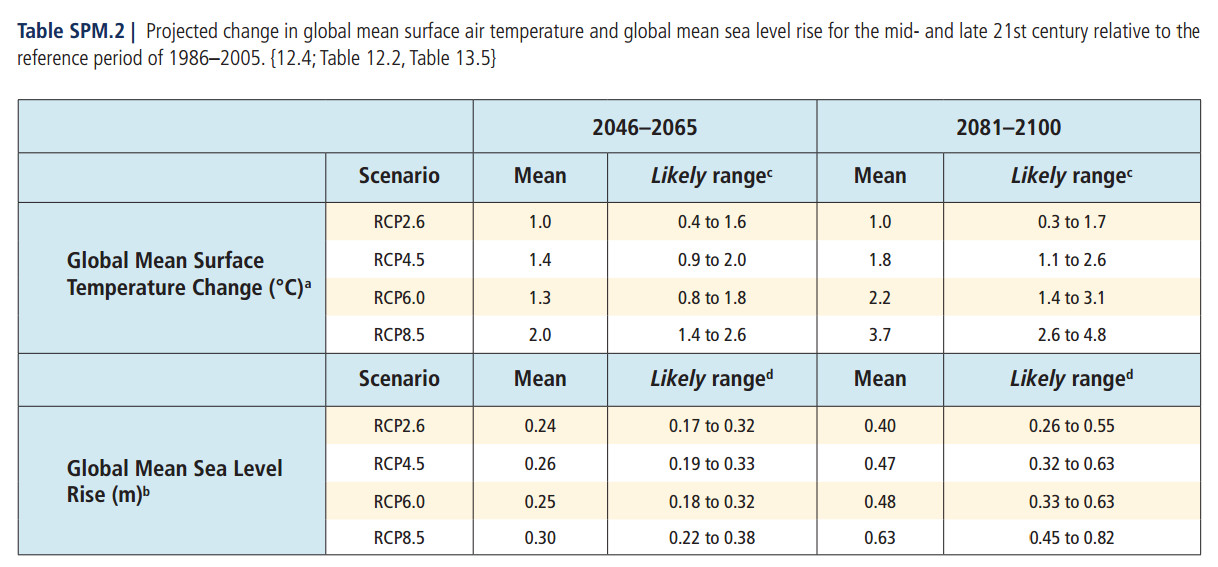
The claim by Professor Wanless at the Conversation that sea levels could rise by 1.25 to 2m by 2100 is way too extreme it is based on top-slicing the estimates on a NOAA 2012 report. The top-end estimates were not included by the UNIPCC in its AR5 Sept 2013 report. In fact, the UNIPCC report stated it had low-confidence in estimates of sea level rise above its top-end 0.82m. The source of NOAA’s higher estimate might be from extrapolating from a 2011 paper on 1992-2010 ice-melt . The two leading authors of this paper also contributed to a much less extreme paper that formed the basis of the UNIPCC report. High estimates of ice melt have been effectively been repudiated by their authors. Further, even the UNIPCC’s estimates for 2100 could be extreme, as they are based on climate models. These climate models have all over-estimated the actual surface temperature rise of the last thirty years. On the basis of the warm bias, the projected consequential sea level rise is most likely much too high.

Professor Wanless has slightly moderated his views from 2008, but still maintains the same reasons for disagreeing with scientific consensus. A consequence of this sea level rise extremism might have been to influence the projected sea level rise in a Southeast Florida Regional Plan of 2012.


Introduction

At “The Conversation” Geology Professor Harold R. Wanless has posted an article “Rising sea levels will be too much, too fast for Florida“. The article is way too extreme on a number of levels. These views are similar to, but slightly moderated from views held in 2008. The consequences on this extremism might have been to adversely affect Southeast Florida Regional Planning.


An extreme Misquote

Professor Wanless says

The US National Oceanic and Atmospheric Administration (NOAA) published its assessment of sea level rise in 2012 as part of the
National Climate Assessment. Including estimates based on limited and maximum melt of the Greenland and Antarctic ice sheets, it anticipated a raise of 4.1 to 6.6ft (1.25 to 2m) by 2100, reaching 2ft (0.6m) by around 2050 and 3ft (0.9m) by around 2075.

Follow the link and the introduction says

Global sea level rise has been a persistent trend for decades. It is expected to continue beyond the end of this century, which will cause significant impacts in the United States. Scientists have very high confidence (greater than 90% chance) that global mean sea level will rise at least 8 inches (0.2 meter) and no more than 6.6 feet (2.0 meters) by 2100.

Professor Wanless relies upon the more extreme range of estimates, failing to mention that they require some very unlikely scenarios.

A quote from an extreme paper

A more authoritative and recent source than the NOAA report is the UNIPCC AR5 Working Group II (the Physical Science Basis) Summary for Policymakers. Page 23 has the following diagram

The likely range of sea level rise based on four climate models is 0.26 to 0.82 metres.


Extreme through looking at scientifically weak and unsupported data

But maybe there are factors that the UNIPCC did not take into account? On page 26 there is the following comment:-

The basis for higher projections of global mean sea level rise in the 21st century has been considered and it has been concluded that there is currently insufficient evidence to evaluate the probability of specific levels above the assessed likely range. Many semi-empirical model projections of global mean sea level rise are higher than process-based model projections (up to about twice as large), but there is no consensus in the scientific community about their reliability and there is thus low confidence in their projections.

In the coded language of the UNIPCC, to have low confidence in something that would support the alarmist cause means they think it is a load of rubbish.


The extreme estimates of ice melt acceleration

The reason Professor Wanless uses NOAAs top end estimate is due to believing in a much accelerated disintegration of the Greenland and Antarctic ice sheets. By looking at recent data a different picture could emerge from the consensus view.

The following from the UNIPCC gives some estimates of the rate of polar ice melt. In page 9

• The average rate of ice loss from the Greenland ice sheet has very likely substantially increased from 34 [–6 to 74] Gt yr–1 over the period 1992 to 2001 to 215 [157 to 274] Gt yr–1 over the period 2002 to 2011.

• The average rate of ice loss from the Antarctic ice sheet has likely increased from 30 [–37 to 97] Gt yr–1 over the period 1992–2001 to 147 [72 to 221] Gt yr–1 over the period 2002 to 2011. There is very high confidence that these losses are mainly from the northern Antarctic Peninsula and the Amundsen Sea sector of West Antarctica.

Further, on page 11 is stated

Over the period 1993 to 2010, global mean sea level rise is, with high confidence, consistent with the sum of the observed contributions from ocean thermal expansion due to warming (1.1 [0.8 to 1.4] mm yr–1), from changes in glaciers (0.76 [0.39 to 1.13] mm yr–1), Greenland ice sheet (0.33 [0.25 to 0.41] mm yr–1), Antarctic ice sheet (0.27 [0.16 to 0.38] mm yr–1), and land water storage (0.38 [0.26 to 0.49] mm yr–1). The sum of these contributions is 2.8 [2.3 to 3.4] mm yr–1.

These estimates are much lower than previous estimates, particularly on the implied acceleration. For instance Rignot et al 2011 looking at the period calculated polar ice melt contribution to sea levels of 0.91 mm yr–1, 50% higher than the UNIPCC. Further the acceleration on this paper from polar ice melt was 0.1 mm yr–21 mm yr–2and 0. 133 mm yr–2 including non-polar ice melt. Even at this rate of acceleration ice melt would only contribute 6 inches (150mm) to sea level rise. The upper NOAA estimates seem to be based upon taking this extreme figures and doubling them.

But less than two years later lead authors Eric Rignot and Isabella Velicogna were also amongst the 50 who wrote Sheppard et al 2012, which seems to have formed the basis for the UNIPCC report, as the figures are pretty much the same. Professor Wanless appears to be backing out of date science that the authors have effectively repudiated.


The climate models are extreme

The climate models that the UNIPCC relies upon for temperature and sea rise levels are themselves extreme. Last year Dr Roy Spencer charted 73 climate model predictions of temperature rise against the actual data for over the last 30 years.

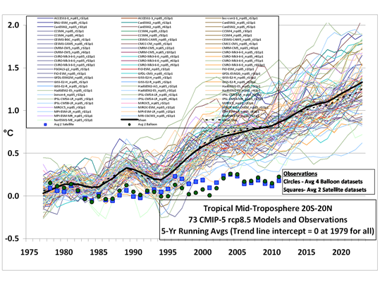
Every single one of the climate models is running too hot.

On that basis, the even the mid-point predicted temperature rise of the weakest of the above models – the 1.0 degree of warming from RCP2.6 – appears too extreme. As a consequence the predicted 40cm mid-point range for sea-level rise to 2100 as a consequence of this temperature rise also appears extreme.


Possible consequences of the extremism

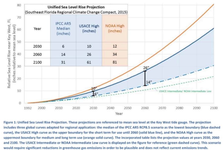
Professor Wanless is chairs the science committee for the Miami-Dade Climate Change Advisory Task Force. At the website is a 2008 presentation from him on expected sea level rise. Here Professor Wanless used the 2007 UNIPCC projection of 20cm to 50cm sea level rise by 2100, and then said (due to unaccounted for ice melt) he expected that rise to be at least 3-5 feet (0.9-1.5m) and possibly 7-9 feet (2.1-2.7m). Six years later he has moderated his views, but still believes sea levels will rise by at least twice the scientific consensus. The 2012 “Southeast Florida Regional Climate Change Action Plan” appears to reflect these views extremist views. Figure 1 on page 7 has projections for sea level rise.

Above the UNIPCC estimated sea levels rises of 17cm to 38cm by 2046-65 compared with 1986-2005. Eye-balling to the graph shows a range of 18-38 cm in 2045 and 28-75cm by 2065. It appears to be way out of line. Please note that the caption is for “Regional Planning Purposes”.

Personal Note

I do not believe that the responsibility for extreme views gaining currency lies with individuals who promote them, but with the abandonment of pluralism in favour of institutionalised dogma. The view that human-caused catastrophic global warming is either extremely likely or certain is accepted without question. Any questioning of the scientific authority has been treated as equivalent to denial of established fact, and with a manufactured moralistic contempt akin to that meted out to those who question the truth of the holocaust. As a result, the extremist and ill-supported pronouncements of scientific “experts” are not questioned. Instead they made headlines throughout the world. The solution is to actively promote pluralism and questioning in science.

Finally, all first time comments are moderated. Please use the comments as a point of contact. If you request for it not to be published, I will not do so provided it is not openly abusive.

I work hard to be accurate. If you can demonstrate that any of the above is inaccurate, I will correct it. If you disagree, I will publish the comment, though I reserve the right to edit out abuse and may respond. It is important that others can compare and contrast the arguments.


Kevin VS Marshall


Reconciling UNIPCC AR5 polar ice melt data with sea level rise

For over a year I have been pondering how to reconcile the near constant rise in sea levels with the accelerating polar ice melt. At the end of September the UNIPCC published the AR5 Working Group II (the Physical Science Basis) Summary for Policymakers which provides some useful evidence.

The following from the UNIPCC gives some estimates of the rate of polar ice melt. In page 9

• The average rate of ice loss from the Greenland ice sheet has very likely substantially increased from 34 [–6 to 74] Gt yr–1 over the period 1992 to 2001 to 215 [157 to 274] Gt yr–1 over the period 2002 to 2011.

• The average rate of ice loss from the Antarctic ice sheet has likely increased from 30 [–37 to 97] Gt yr–1 over the period 1992–2001 to 147 [72 to 221] Gt yr–1 over the period 2002 to 2011. There is very high confidence that these losses are mainly from the northern Antarctic Peninsula and the Amundsen Sea sector of West Antarctica.

Put in sea level rise terms, the combined average rate of ice loss from the polar ice caps increased from 0.18 mm yr–1 over the period 1992 to 2001 to 1.00mm yr–1 over the period 2002 to 2011.

There is a problem with these figures. The melting ice will end up raising sea levels. The satellite data from the University of Colorado shows a near constant rate of rise of 3.2mm yr–1.

Assuming a one year lag in raising sea levels, the 0.18 mm yr–1 over the period 1992 to 2001 is equivalent to 5% of the 3.3mm yr–1 average sea level rise from 1993 to 2002, whilst the 1.00mm yr–1 over the period 2002 to 2011 is equivalent to 32% of the 3.1mm yr–1 average sea level rise from 2003 to 2012. Some other component of sea level rise must be decreasing. The estimates of the other components are given on page 11

Since the early 1970s, glacier mass loss and ocean thermal expansion from warming together explain about 75% of the observed global mean sea level rise (high confidence). Over the period 1993 to 2010, global mean sea level rise is, with high confidence, consistent with the sum of the observed contributions from ocean thermal expansion due to warming (1.1 [0.8 to 1.4] mm yr–1), from changes in glaciers (0.76 [0.39 to 1.13] mm yr–1), Greenland ice sheet (0.33 [0.25 to 0.41] mm yr–1), Antarctic ice sheet (0.27 [0.16 to 0.38] mm yr–1), and land water storage (0.38 [0.26 to 0.49] mm yr–1). The sum of these contributions is 2.8 [2.3 to 3.4] mm yr–1.

The biggest component of sea level rise is thermal expansion. The contribution from this element must be decreasing. Ceteris paribus, that suggests the rate of heat accumulation is decreasing. This contradicts the idea that the lack of surface temperature warming is accounted for by this heat accumulation.

The problem is that all things are not equal. Thermal expansion of water varies greatly with temperature of that water. On page 10 there is the following graphic

The heat content of the upper ocean increased by around 10 x 1022 J from 1993 to 2010. For 700m of ocean depth I estimate this would be 0.1oC. It is a tiny amount that varies greatly with temperature, as shown by the graph below.

As sea temperature varies greatly according to location and depth, it is possible to hypothesise a decline in the thermal expansion with an increase in heat content. This whilst also accepting that both the rate of rise in the heat content of the oceans has accelerated and the contribution to sea level rise due the increase in heat content has decreased. For example one would just have to hypothesise that the increasing heat content had been predominately in the tropics during the 1990s and switched to the Arctic in the 2000s.

Even this switch is not necessary. There is huge variation between areas of the amount of temperature increase over a twenty year period. Consistent with an increase of 0.1 could have been a decrease in average temperatures in an area of ocean as large as the Atlantic and Indian Oceans combined.

But, what makes this less than credible is that this shift almost exactly offset the estimated increase in the ice melt component. Most likely no-one will try to calculate this, as the data is not there. Even with 3,000 Argo Buoys in the oceans, there is still on average just one buoy per 200,000 km3 of ocean, taking about 25 dips a year. The consensus viewpoint appears the less likely than the view that climate models have an exaggerated belief in the impact of greenhouse gases on average temperatures.

There is an opportunity for some further investigation with the data. But a huge amount of work may not yield anything, or may yield conclusion at odds with the “real”, unknown one. However, the first step is to determine how the UNIPCC calculated the figure for thermal expansion. Hopefully it was more substantial than from the difference between the total sea level rise and the estimates for other factors.

Update

At Bishop Hill Unthreaded michael hart Jun 1, 2014 at 4:13 AM refers to some other variables that determines how warming oceans will affect sea level rise through thermal expansion. So now the list includes.

  • The quantity of heat. (see above)
  • The initial temperature of the water which the heat was applied to. (see above)
  • The initial temperature is in turn related to
  1. Latitude – at mid latitudes there is a seasonal variation temperature variation down to about 300 metres.
  2. Depth
  3. Density variation due to salinity (see pdf page 9)

However, there are local variations as well, due to ocean currents that shift over time.

For these reasons, any attempt at estimating thermal expansion will be reliant on assumptions and estimates. The UNIPCC will have simply estimated the difference between estimated “known” factors – ice melt and land water storage – and deducted from the known sea level rise.

In terms of reconciling polar ice melt to sea level rise, there is something that I missed. According to the UNIPCC, glacier melt has a larger contribution to sea level rise than polar ice melt – 0.76 mm yr–1 against 0.60 mm yr–1. It is quite conceivable – particularly since temperatures have stopped rising – that have glacier melt has effectively ceased or even gone into reverse. Unlike with thermal expansion, there should be estimates available to confirm this.


Two Comments on Antarctic Ice Accumulation

Jo Nova blogs on a study that claims the Antarctic continent is accumulating ice mass at a rapid rate. I have made two comments. One is opposing someone who claims that Antarctica is actually losing ice. The other is that the claimed rate of ice accumulation does not make sense against known data on sea levels.

Manicbeancounter

April 17, 2013 at 6:27 am · Reply

John Brooks says

I’m also interested that the mass of antarctic land ice follows solar irradiance. This makes perfect sense. However I can’t see why the effective of an increase in the greenhouse effect wouldn’t have exactly the same result.

Maybe you should look at the period covered by the graph John. There is an 800 year correlation of mass of antarctic land ice with solar irradiance, with the biggest movements in both prior to 1800. Insofar as the greenhouse effect is significant, it is nearly all after 1945.

And for some reason, I’ve got the idea in my head that antarctic land ice is decreasing.

Sure enough from the Carbon Brief link, this quote

Measurements from the Gravity Recovery and Climate Experiment (GRACE) satellite since 2002 have shown that the mass of the Antarctic ice sheet is decreasing at an average rate of 100 cubic kilometres every year – the size of a small UK city.

(emphasis mine)
The size of a city is usually measured in area, not volume. The ancient City of York, for instance, has an area of 272 square kilometres (105 square miles) and a population of 125,000. Or maybe they mean the volume of the buildings in a city? A famous building in New York is the Empire State Building. Not only is it quite tall it also has quite a large volume. Around 1,040,000 cubic metres or 0.001 cubic kilometres in fact. So does the Carbon Brief claim that a small UK city have a volume of buildings equivalent to 100,000 Empire state buildings? Or each average person in a small UK city occupies a building volume greater than Buckingham Palace?
Alternatively, does John Brooks quote a source that does not have a clue about basic maths?

Manicbeancounter

April 17, 2013 at 8:01 am · Reply

I think this paper does not stack up. I worked as a management accountant in industry for 25 years. One thing I learnt early on when estimating or forecasting was to sense-check the estimates. No matter how good your assumptions are, when estimating or extrapolating well beyond the data trend (where there is potential for error), the best check on the data is by reconciling with other data.
From the above

“The SMB of the grounded AIS is approximately 2100 Gt yr−1, with a large interannual variability. Those changes can be as large as 300 Gt yr−1 and represent approximately 6% of the 1989–2009 average (Van den Broeke et al., 2011).”

A gigatonne of ice is equivalent to a cubic kilometre of water. If the land ice volume is increasing, the water must come from somewhere. Nearly all of that water needs to come from the oceans.
Now for some basic maths. A gigatonne is a billion tonnes. As water has a relative density of 1.0, a tonne of water (1,000 litres) is a cubic metre. Therefore a gigatonne of water is a cubic kilometre (1000^3 = 1,000,000,000 = one billion).
A further factor to consider is the area of the oceans. According to my Times Concise Atlas, the total area of the oceans and seas (excluding the enclosed waters like the Dead Sea and Lake Baykal) is 325,000,000km^2. A cubic kilometre of water added to an enclosed sea of one million square kilometres, would raise the sea level by just 1mm (1000mm x 1000m = 1,000,000mm in a kilometre). So 325km^3 = 325Gt-1 of new ice accumulation above sea level in Antarctica would reduce sea levels by 1mm, or 2100GT-1 by 6.5mm.
Some of the ice accumulation will be on ice shelves, so the impact of 2100GT-1 extra ice per annum extra ice might be to reduce sea levels by just 5mm per annum. Also sea levels might be rising by a little less than the 3.2mm a year that official figures claim, but there is no evidence that sea levels are falling. Further, any net ice melt elsewhere (mostly Greenland) is only adding 1mm to sea level rise. So the rest must be mostly due to thermal expansion of the oceans. I think that the evidence for the oceans heating is very weak and of insignificant amounts. Even Kevin Trenberth in his wildest flights of fantasy would not claim the missing heat (from the air surface temperatures) adds more than 1-2mm to sea level rise.
What this study does show is that by honestly looking at data in different ways, it is possible to reach widely different conclusions. It is only by fitting the data to predetermined conclusions (and suppressing anything outside the consensus) that consistency of results can be achieved.

My scepticism on global warming stems from a belief that scientific evidence is strengthened by being corroborated from independent sources. Honest and independent data analysis means that wildly different conclusions can be reached. Comparing and contrasting these independent sources leads me to believe that the public face of the global warming climate change consensus massively exaggerates the problem.

Kevin Marshall

AR5 First Order Draft Summary for Policymakers – a few notes on pages 1 to 8

Alec Rawls has taken the brave step of releasing the first order draft of the UNIPCC AR5 Report. Anthony Watts has republished at Wattsupwiththat.

Although Alec Rawls published in breach of signed undertakings, I comment and quote the report in the public interest. There is more than a single, unequivocal, interpretation of the data. To claim otherwise is dogma. This dogma is being used to justify policies that promote net harm to western economies, particularly the poorer and more vulnerable sections of society. In the name of this dogma, impartiality is being annulled and dissenters called nutters.

I have started with some initial observations on the first eight pages on the Summary for Policymakers – the only bit that people ever read. Like utterings from the Kremlin on the 1970s and 1980s, the coded language says as much or more than the actual words.

Major points

  1. No admission of lack of recent rise in the surface temperature record.
  2. But the lack of recent rise is accounted for by a step change in the warming in the Southern Oceans.
  3. AR4 got it wrong on decreasing precipitation in the tropics (which underlay Africagate), and they got it wrong on increasing hurricanes.
  4. Sea level rise is not accelerating. In fact the recent rise since 1993 is similar to the 1930-1950 period.
  5. Global glacier melt is not accelerating. Himalayas do not even get a mention.
  6. Medieval Warm Period gains more recognition than the AR4. However, recent studies will render AR5 out of date before it even published.

Page 3 Lines 21-25.
On temperatures there is a cover-up of the recent lack of warming. They cannot admit that global average temperatures have not changed for 15 years.

Page 3 Lines 38-40. Precipitation in the tropics likely increased over the last decade, reversing a previous trend from mid-70s to mid-90s. The AR4 prediction of some African countries experiencing up to a 50% reduction in crop yields by 2020 (Africagate) was based upon a belief increasing extreme drought.

Page 3 Lines 46-48

Changes in many extreme weather and climate events have been observed, but the level of confidence in these changes varies widely depending on type of extreme and regions considered. Overall the most robust global changes are seen in measures of temperature {FAQ 2.2, 2.6} (see Table SPM.1).

Translation – Saying that an extreme weather events are evidence of global warming has no scientific validity. Best measures are of global temperature, which we can’t admit have been failing to rise.

Page 4 Line 14. An admission that previous IPCC reports got it wrong on tropical cyclones getting more extreme.

Page 4. Lot of stuff on Trenberth’s missing heat being in the oceans. Oceans have been warming since 1971. The lack of warming of air temperatures since the mid-90s could be accounted for by this comment on lines 36-37

It is very likely that the Southern Ocean has warmed throughout the full ocean depth since the 1990s, at a rate of about 0.03°C per decade.

The lack temperature rise is explained by the heating up of the oceans. Global warming is now confined to the Southern Ocean. It is imperceptible, so on the Southern perimeter it is not sufficient to have stopped the increase in Antarctic sea ice from extending slightly.

Then this

Warming of the ocean accounts for more than 90% of the extra energy stored by the Earth between 1971 and 2010. Upper ocean (0–700 m) heat content very likely increased at a rate between 74 [43 to 105] × 1012 W and 137 [120 to 154] × 1012 W for the relatively well-sampled 40 year period from 1971 to 2010. Warming has also been observed globally below 4000 m and below 1000 m in the Southern Ocean, in spite of sparse sampling (see Figure SPM.1). {3.2, Box 3.1, Figure 3.2, Figure 3.3}

The very likely heating of the Southern Ocean, is based on sparse sampling?

Page 4. Line 46. Seas have very likely become saltier. That is has become less alkaline. On Page 6 lines 30-31, Ph decline is 0.015 to 0.024 per decade over last 3 decades. Call becoming less alkaline “acidification”, which is inaccurate. Oceans are heading towards Ph neutrality.

Page 5. Glaciers are globally still shrinking. No mention of Himalayas, and no mention of global acceleration. Range is “210 [145 to 275] Gt yr–1 to 371 [321 to 421] Gt yr–1“. Omit to convert these to sea level rise. 210 Gt = 0.64mm. 421 Gt = 1.29mm (Oceans = 326.2m km2 & 1 Gt water = 1 km3). In old money, glaciers are contributing 2.5 to 5.1 inches per century.

Page 5 Lines 47-49. Sea levels

It is virtually certain that over the 20th century the mean rate of increase was between 1.4 to 2.0 mm yr-1, and between 2.7 and 3.7 mm yr-1 since 1993. It is likely that rates of increase were similar to the latter between 1930 and 1950.

Translation. Sea levels are rising but not accelerating. If sea levels are a lagged response to rising surface temperatures, then (using the HADCRUT3 surface temperature data) we would expect the rise in sea levels to level off in the next few years, unless there is continued warming in the oceans.

Pages 6 to 7 Long-Term Perspective from Paleoclimatic Records

There was a medieval warm period, despite what Micheal Mann and others said in 1998 and 1999. But the MWP is less than the temperatures at the end of the twentieth century. However, due to time schedules for acceptance into AR5, they ignore Christiansen and Ljungqvist April 2012 and Ljungqvist et al 2012. The later, despite including discredited proxies such as Briffa’s notorious Yamal data, quite clearly shows rom 120 proxies that the 10th century had higher temperatures than at the end of the 20th century.


Similarly the Esper et. al 2012 of summer temperatures in Northern Scandinavia will render this part of the report out-of-date prior to it being published.

In 2006 the UNIPCC could bring themselves to bend the rules to allow in a corrupt scientific paper that suited their purposes, but this time they ignore two strong cases that undermine their case. If there is an AR6 around 2020, the UNIPCC will have to face the scientific evidence.

Page 8 The last IPCC report overestimated the impact of aerosols. The net impact of greenhouse gases and aerosols rises from 1.72 W m-2 to 2.40 W m-2. Negative forcings dramatically fall. The positive forcing impact falls, despite the major contributor, CO2 rising from 1.66 W m-2 to 1.82 W m-2. The net impact of CO2 reduces from 100% to around 75% of warming impact. It is no longer possible to talk of “rising CO2” as a shorthand for anthropogenically-caused rising greenhouse gases.

NB – the SPM file I refer to can be accessed below. Please compare my comments with the file.

SummaryForPolicymakers_WG1AR5-SPM_FOD_Final

Kevin Marshall

Cold water on sea level rise alarmism

The new article in Nature on “Recent contributions of glaciers and ice caps to sea level rise” (Jacob et al. 2012) is in stark contrast to what has gone before. It is far from the previous claims.

The main estimates before Jacob et al. 2012 were:-

  • The Himalayan Glaciers will disappear by 2035. (UNIPCC AR4 2007) Changed to the Himalayan Glaciers may disappear by 2350. (UNIPCC 2010)
  • The Grace Satellite data shows that the polar ice caps are not only melting, but the melt rate is accelerating. Velicogna 2009 claimed that the acceleration in Greenland was −30 ± 11 bnt/yr2 to 286 bnt/yr-1 in 2007 to 2009, and in Antarctica was −26 ± 14 bnt/yr2 to 246 bnt/yr-1 in 2007 to 2009. Concentrating on the period from 2006 to early 2009 for Antarctica only , Chen et al. 2009 estimated that the continent was losing ice at the rate of 190 ± 77 bnt/yr-1, two-thirds is of which comes from West Antarctica, covering about a quarter of the total land surface area. By 2010, the loss from both polar caps would, by Veligona’s estimate be 600 to 650 bnt/yr-1.
  • The average of these two articles was that in 2010 there would be around 600 bnt/yr-1 loss per year.
  • One of the articles’ authors, Prof John Wahr of University of Colarado, Boulder, had previously stated that the Grace measurements indicate an accelerating trend in Greenland. The current graph at Wahr’s website for Greenland shows a distinct accelerating trend through to the start of 2010.

    Mass variability summed over the entire Greenland Ice Sheet, monthly Gravity Recovery and Climate Experiment (GRACE) results (black line; the orange line is a smoothed version) April 2002 and December 2009.

    Prof John Wahl’s graph of Greenland Ice sheet loss, indicating a doubling of the rate of loss over the period to around 150 bnt/yr-1 in 2009.

  • In Zwally and Giovinetto 2011, using three separate estimation techniques, and including the pre-satellite data from 1992 to 2002, estimated the range of +27 to -40 bnt/yr-1.

The new paper in Nature:-

  • Estimates no net loss from the Himalayas in the period 2003 to 2010. When the claim that the Himalayas would lose their glaciers by 2035, Rajendra Pauchari, head of the UNIPCC said the doubts were “voodoo science”. Now even the more moderate claim of melting over hundreds of years looks to be in doubt. Josh has penned a cartoon to illustrate this point.

  • Velicogna 2009, seems somewhat extreme. The Nature paper would estimates a loss of 50% to 75% Velicogna estimate for 2010.
  • Most importantly, there is no mention of acceleration of ice melt from the polar ice caps. This sudden turn-around might be to a sudden change in the data. The sea level rise appears to have stalled in the last 18-24 months, so the sea ice melt (which the Nature paper estimates accounts for 40% of the sea level rise) may have stalled as well. (See Appendix 2). It is necessary to re-run the Nature paper numbers for 2011 data to confirm if this is the case.

In conclusion, it looks that the new nature paper reaches a more moderate position than previous papers using the GRACE satellite data, as it uses a longer period, and subjects the data to a more detailed breakdown. However, in terms of the polar ice melt, it still more extreme than a paper that uses a longer timeframe and three distinct methods of calculation.

Appendix 1 – Leo Hickman in the Guardian has a breakdown of the figures, that nicely puts the issue in context.

Glaciers
Ignore Region Rate (Gt yr-1)
1 Iceland -11.±.2
2 Svalbard -3.±.2
3 Franz Josef Land 0.±.2
4 Novaya Zemlya -4.±.2
5 Severnaya Zemlya -1.±.2
6 Siberia and Kamchatka 2.±.10
7 Altai 3.±.6
8 High Mountain Asia -4.±.20
8a Tianshan -5.±.6
8b Pamirs and Kunlun Shan -1.±.5
8c Himalaya and Karakoram -5.±.6
8d Tibet and Qilian Shan 7.±.7
9 Caucasus 1.±.3
10 Alps -2.±.3
11 Scandinavia 3.±.5
12 Alaska -46.±.7
13 Northwest America excl. Alaska 5.±.8
14 Baffin Island -33.±.5
15 Ellesmere, Axel Heiberg and Devon Islands -34.±.6
16 South America excl. Patagonia -6.±.12
17 Patagonia -23.±.9
18 New Zealand 2.±.3
19 Greenland ice sheet.+.PGICs -222.±.9
20 Antarctica ice sheet.+.PGICs -165.±.72
  Total -536.±.93
  GICs excl. Greenland and Antarctica PGICs -148.±.30
  Antarctica.+.Greenland ice sheet and PGICs -384.±.71
  Total contribution to SLR -1.48.±.0.26
  SLR due to GICs excl. Greenland and Antarctica PGICs -0.41.±.0.08
  SLR due to Antarctica.+.Greenland ice sheet and PGICs -1.06.±.0.19


Appendix 2 – University of Colarado Sea level Rise Estimates