John Ridgway has an article at cliscep.com “RCP8.5: The Ultimate Elephant Gun?“. This response is an extension of a comment made.
The article states
There’s a very old joke I’d like to share with you, and it goes something like this:
A man is found repeatedly firing an elephant gun in the local park. “What are you doing that for?” he is asked. “It’s to scare away the elephants”, he opines. “But there are no elephants in this park”, comes the reply. “See,” he smiles, “it’s working already”.
Now, if you were to believe the man with the elephant gun, what you would be dealing with here is a perfect example of what is known as the Preparedness Paradox (sometimes ‘Preventative Paradox’). It is a paradox in which the removal of a problem is misinterpreted as evidence that the problem never existed in the first place.
The “Preparedness Paradox” using RCP8.5 was much in evidence in the run-up to and during COP21 Paris in December 2015. But there was another element that I am unable to name.
In the run-up to COP21, nearly every country submitted an INDC (Intended Nationally Determined Contributions). These were primarily to show emissions projections with and without policy through to 2030. Not the UK, as the EU did a joint INDC. Several organisations put forward projections on how the aggregate of the INDCs would play out through to 2100. One such group was Climate Interactive. Using RCP8.5 as a baseline, they projected that the effect of the INDCs would be to constrain 2100 warming to 3.5oC. Just a degree less warming.
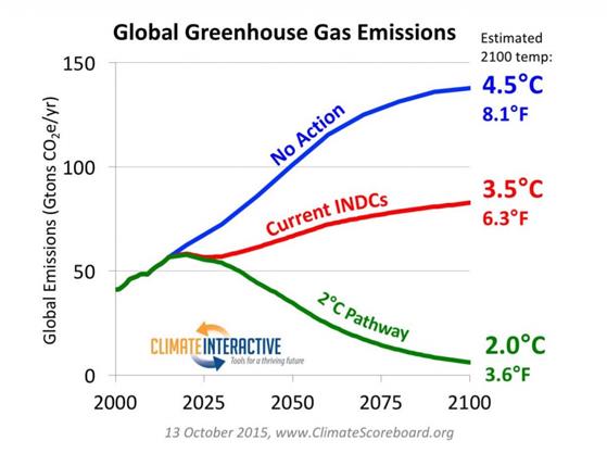
The UNFCCC, using a different method, claimed the INDCs would constrain warming to 2.7 °C.
As Climate Interactive C-Roads software allowed downloads, I had a little play with the data. C-Roads had extracted data from the RCP database. This has separate model outputs for each of the four RCPs and for each greenhouse gas. To keep things simple, RCP divides the world into five, rather odd, regions. C-Roads then split out the EU and about 20 major countries from these regions. I downloaded the RCP8.5 CO2 emissions data along with the UN population projections from C-Roads. The CO2 data is expressed in grams of carbon, instead of tonnes of CO2. After a bit of data manipulation, I produced the following chart.
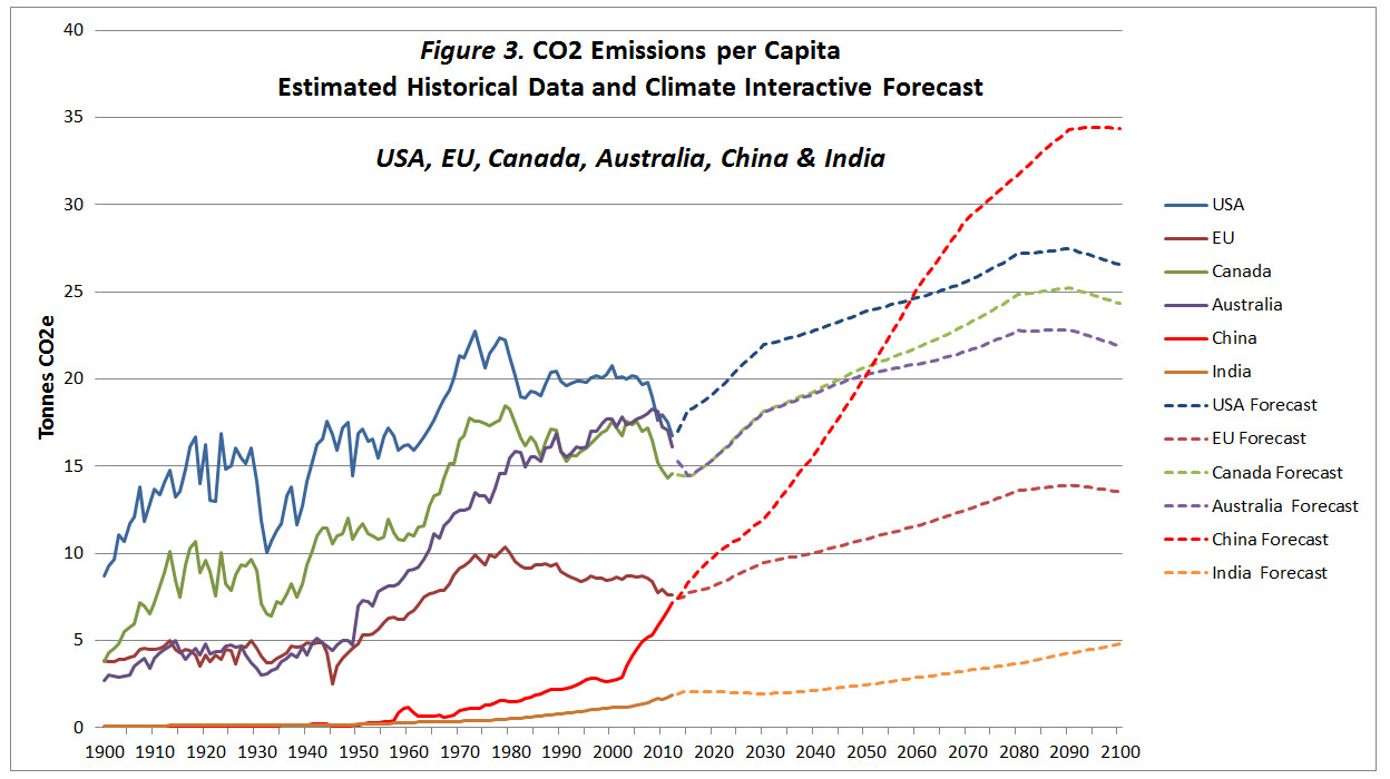
In the actual data to 2012, CO2 emissions per capita have fallen since 1980 in both the USA and the EU27. This is due to various factors, but in general advanced economies grow both through services and through high-value manufacturing. There is no economic reason for either to rise to well beyond pre-1973 peaks. The projection in China is simply crazy. It is this way in part because China’s population is projected to fall to 1 billion by 2100. Indeed, all but one country confirms the “Preparedness Paradox”. That country is India.
The projected CO2 emissions for India were so low that even the 2015 estimate was around 30% below the estimate. The figures for Africa (excluding South Africa) were even worse. Per capita CO2 emissions will barely increase. In other words, more professional BAU scenarios for India and Africa would generate the opposite of the elephant gun approach.
An idea of the revision upwards for India can be gained from the INDC submission. This included the target “to lower the emissions intensity of GDP by 33% to 35% by 2030.“. But this intensity decrease was in the context of an assumed GDP growth of 7.2%. That would imply an 80% increase in emissions in 15 years, at an annual growth rate of ~4%. Emissions in 2014 were 84% higher than in 1999 (3083 and 1980 MtCO2e), so the projection was hardly an exaggeration. 2024 emissions were 42% higher than in 2014 (4371 and 3083 MtCO2e), implying an emissions growth rate of ~3.5%
Another example is Nigeria. In its INDC submission, Nigeria projected its GHG emissions to grow 114% by 2030. But it would unconditionally cut this by 20%. With external financing, it would be cut by 70% relative to BAU. That is, even with external financing, emissions would increase by a third. Yet 1999-2014 GHG emissions only increased by 20%, and 2024 emissions were just ~11% higher than in 2014. No climate financing has been arranged. Nigeria was not alone in publishing a highly exaggerated BAU scenario. I cannot believe that the UNFCCC estimated the impacts of INDCs took these exaggerations fully into account. Neither would Climate Interactive. Whilst RCP8.5 is a gross exaggeration, 2100 emissions projections based on 2015 INDCs
So, whilst you would expect the inputting INDCs into the Climate Interactive C-Roads database to correct the crazy forecasts, these are partly offset by upward revisions elsewhere. But these revisions using INDCs would have been a little circumspect. Whether even a 50% increase in CO2 emissions in 85 years is realistic (even with emission reduction policies in some countries) is another story. As is my extrapolation from AR6 WG1 SPM table SPM.2 that constant global CO2 emissions 2020-2100 would produce ~3.5 °C of warming in 2100.