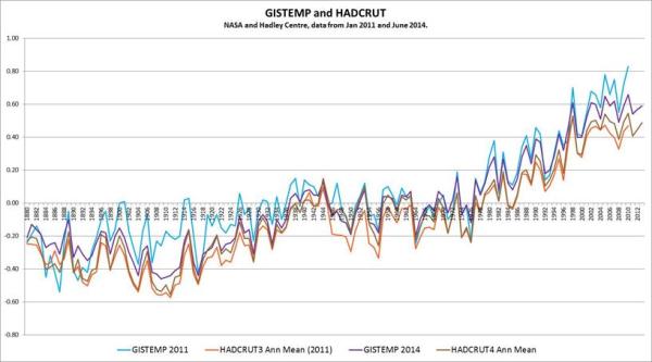
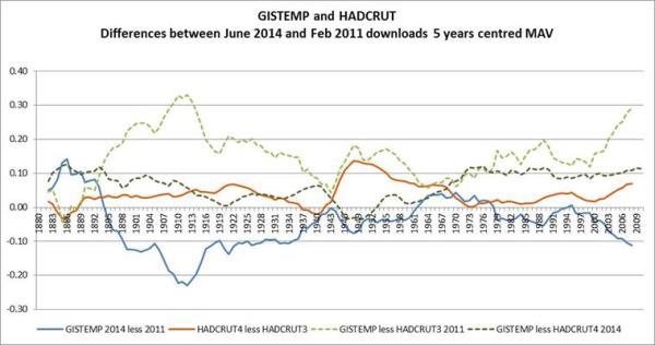
In the previous post I identified that the standard definition of temperature homogenisation assumes that there are little or no variations in climatic trends within the homogenisation area. I also highlighted specific instances of where this assumption has failed. However, the examples may be just isolated and extreme instances, or there might be other, offsetting instances so the failures could cancel each other out without a systematic bias globally. Here I explore why this assumption should not be expected to hold anywhere, and how it may have biased the picture of recent warming. After a couple of proposals to test for this bias, I look at alternative scenarios that could bias the global average temperature anomalies. I concentrate on the land surface temperatures, though my comments may also have application to the sea surface temperature data sets.
Comparing Two Recent Warming Phases
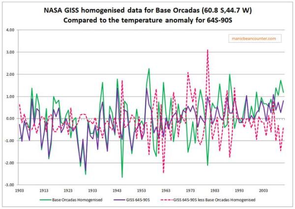
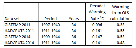
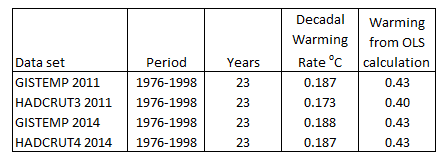
An area that I am particularly interested in is the relative size of the early twentieth century warming compared to the more recent warming phase. This relative size, along with the explanations for those warming periods gives a route into determining how much of the recent warming was human caused. Dana Nuccitelli tried such an explanation at skepticalscience blog in 20111. Figure 1 shows the NASA Gistemp global anomaly in black along with a split be eight bands of latitude. Of note are the polar extremes, each covering 5% of the surface area. For the Arctic, the trough to peak of 1885-1940 is pretty much the same as the trough to peak from 1965 to present. But in the earlier period it is effectively cancelled out by the cooling in the Antarctic. This cooling, I found was likely caused by use of inappropriate proxy data from a single weather station3.
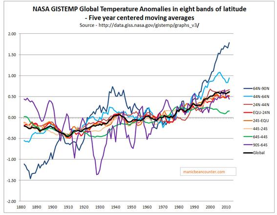
Figure 1. Gistemp global temperature anomalies by band of latitude2.
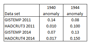
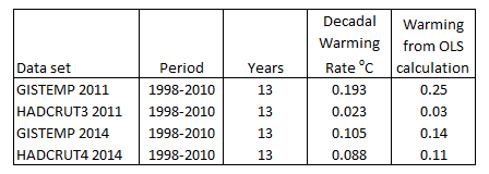
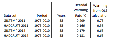
For the current issue, of particular note is the huge variation in trends by latitude from the global average derived from the homogenised land and sea surface data. Delving further, GISS provide some very useful maps of their homogenised and extrapolated data4. I compare two identical time lengths – 1944 against 1906-1940 and 2014 against 1976-2010. The selection criteria for the maps are in figure 2.
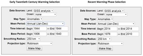
Figure 2. Selection criteria for the Gistemp maps.
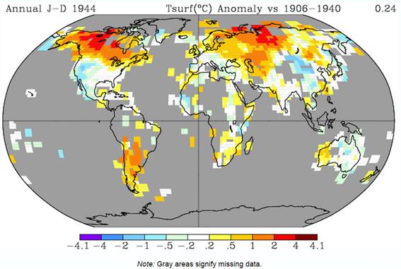
Figure 3. Gistemp map representing the early twentieth surface warming phase for land data only.

Figure 4. Gistemp map representing the recent surface warming phase for land data only.
The later warming phase is almost twice the magnitude of, and has much the better coverage than, the earlier warming. That is 0.43oC against 0.24oC. In both cases the range of warming in the 250km grid cells is between -2oC and +4oC, but the variations are not the same. For instance, the most extreme warming in both periods is at the higher latitudes. But, with the respect to North America in the earlier period the most extreme warming is over the Northwest Territories of Canada, whilst in the later period the most extreme warming is over Western Alaska, with the Northwest Territories showing near average warming. In the United States, in the earlier period there is cooling over Western USA, whilst in the later period there is cooling over much of Central USA, and strong warming in California. In the USA, the coverage of temperature stations is quite good, at least compared with much of the Southern Hemisphere. Euan Mearns has looked at a number of areas in the Southern Hemisphere4, which he summarised on the map in Figure 5

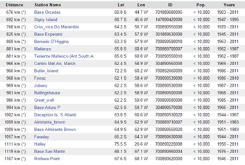
Figure 5. Euan Mearns says of the above “S Hemisphere map showing the distribution of areas sampled. These have in general been chosen to avoid large centres of human population and prosperity.”
For the current analysis Figure 6 is most relevant.

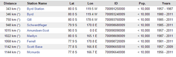
Figure 6. Euan Mearns’ says of the above “The distribution of operational stations from the group of 174 selected stations.“
The temperature data for the earlier period is much sparser than for later period. Even where there is data available in the earlier period the temperature data could be based on a fifth of the number of temperature stations as the later period. This may exaggerate slightly the issue, as the coasts of South America and Eastern Australia are avoided.
An Hypothesis on the Homogenisation Impact
Now consider again the description of homogenisation Venema et al 20125, quoted in the previous post.
The most commonly used method to detect and remove the effects of artificial changes is the relative homogenization approach, which assumes that nearby stations are exposed to almost the same climate signal and that thus the differences between nearby stations can be utilized to detect inhomogeneities. In relative homogeneity testing, a candidate time series is compared to multiple surrounding stations either in a pairwise fashion or to a single composite reference time series computed for multiple nearby stations. (Italics mine)
The assumption of the same climate signal over the homogenisation will not apply where the temperature stations are thin on the ground. The degree to which homogenisation eliminates real world variations in trend could be, to some extent, inversely related to the density. Given that the density of temperature data points diminishes in most areas of the world rapidly when one goes back in time beyond 1960, homogenisation in the early warming period far more likely to be between climatically different temperature stations than in the later period. My hypothesis is that, relatively, homogenisation will reduce the early twentieth century warming phase compared the recent warming phase as in earlier period homogenisation will be over much larger areas with larger real climate variations within the homogenisation area.
Testing the Hypothesis
There are at least two ways that my hypothesis can be evaluated. Direct testing of information deficits is not possible.
First is to conduct temperature homogenisations on similar levels of actual data for the entire twentieth century. If done for a region, the actual data used in global temperature anomalies should be run for a region as well. This should show that the recent warming phase is post homogenisation is reduced with less data.
Second is to examine the relative size of adjustments to the availability of comparative data. This can be done in various ways. For instance, I quite like the examination of the Manaus Grid block record Roger Andrews did in a post The Worst of BEST6.
Counter Hypotheses
There are two counter hypotheses on temperature bias. These may undermine my own hypothesis.
First is the urbanisation bias. Euan Mearns in looking at temperature data of the Southern Hemisphere tried to avoid centres of population due to the data being biased. It is easy to surmise the lack of warming Mearns found in central Australia7 was lack of an urbanisation bias from the large cities on the coast. However, the GISS maps do not support this. Ronan and Michael Connolly8 of Global Warming Solved claim that the urbanisation bias in the global temperature data is roughly equivalent to the entire warming of the recent epoch. I am not sure that the urbanisation bias is so large, but even if it were, it could be complementary to my hypothesis based on trends.
Second is that homogenisation adjustments could be greater the more distant in past that they occur. It has been noted (Steve Goddard in particular) that each new set of GISS adjustments adjusts past data. The same data set used to test my hypothesis above could also be utilized to test this hypothesis, by conducting homogenisations runs on the data to date, then only to 2000, then to 1990 etc. It could be that the earlier warming trend is somehow suppressed by homogenizing the most recent data, then working backwards through a number of iterations, each one using the results of the previous pass. The impact on trends that operate over different time periods, but converge over longer periods, could magnify the divergence and thus cause differences in trends decades in the past to be magnified. As such differences in trend appear to the algorithm to be more anomalous than in reality they actually are.
Kevin Marshall
Notes
- Dana Nuccitelli – What caused early 20th Century warming? 24.03.2011
- Source http://data.giss.nasa.gov/gistemp/graphs_v3/
- See my post Base Orcadas as a Proxy for early Twentieth Century Antarctic Temperature Trends 24.05.2015
- Euan Mearns – The Hunt For Global Warming: Southern Hemisphere Summary 14.03.2015. Area studies are referenced on this post.
- Venema et al 2012 – Venema, V. K. C., Mestre, O., Aguilar, E., Auer, I., Guijarro, J. A., Domonkos, P., Vertacnik, G., Szentimrey, T., Stepanek, P., Zahradnicek, P., Viarre, J., Müller-Westermeier, G., Lakatos, M., Williams, C. N., Menne, M. J., Lindau, R., Rasol, D., Rustemeier, E., Kolokythas, K., Marinova, T., Andresen, L., Acquaotta, F., Fratianni, S., Cheval, S., Klancar, M., Brunetti, M., Gruber, C., Prohom Duran, M., Likso, T., Esteban, P., and Brandsma, T.: Benchmarking homogenization algorithms for monthly data, Clim. Past, 8, 89-115, doi:10.5194/cp-8-89-2012, 2012.
- Roger Andrews – The Worst of BEST 23.03.2015
- Euan Mearns – Temperature Adjustments in Australia 22.02.2015
-
Ronan and Michael Connolly – Summary: “Urbanization bias” – Papers 1-3 05.12.2013